Mineral SW 9637 by Sherwin Williams
Find Calm in Every Brushstroke
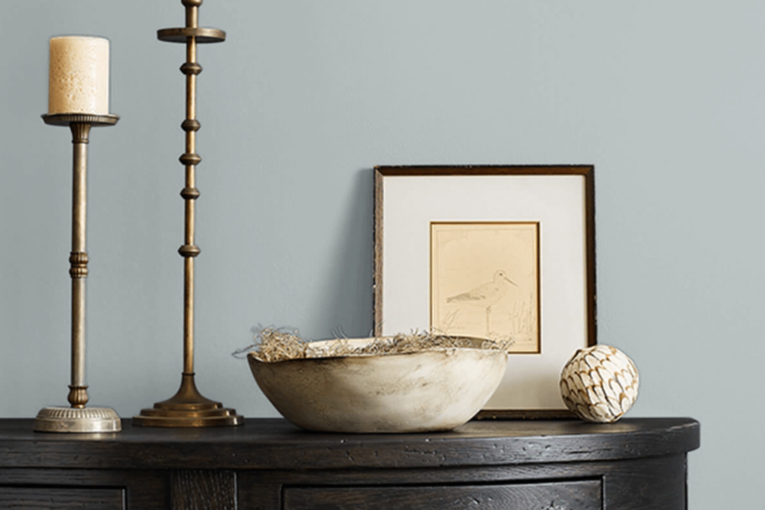
Mineral is a soft, neutral color that easily complements various decor styles, from modern to traditional. It’s an excellent choice for walls, as it tends to enhance natural light, making spaces appear brighter and more open.
Using SW 9637 Mineral can help you refresh any room without overwhelming it with strong color. Its calm nature works beautifully for bedrooms and living areas, providing a serene atmosphere that’s perfect for relaxing. It pairs well with bold colors and natural elements like wood and stone.
Whether you’re repainting a single room or updating your entire home, Mineral offers a clean, sophisticated backdrop that’s sure to please.
via sherwin-williams.com
What Color Is Mineral SW 9637 by Sherwin Williams?
Table of Contents
MineralSW 9637 by Sherwin Williams presents a calming, understated grayish-green hue that offers versatility and sophistication in any living space. This color has a natural, earthy quality that feels grounded and can serve as a neutral or subtle accent to a room. Its muted tone makes it an excellent option for those looking to create a serene and inviting atmosphere.
This color pairs wonderfully with a variety of materials and textures, enhancing the overall aesthetic of a room. Natural wood, whether light or dark, complements the earthiness of MineralSW 9637. Leather and linen also work nicely, adding a touch of warmth or softness respectively. For a more modern touch, metallics like brushed nickel or copper can introduce a hint of refinement.
Interior styles that benefit most from MineralSW 9637 include farmhouse, Scandinavian, and coastal. These styles share a common appreciation for natural elements and a soft color palette, making MineralSW 9637 an ideal choice. In a farmhouse setting, it harmonizes with rustic woods and vintage pieces.
In Scandinavian interiors, it supports a clean, minimalistic look, while in coastal designs, it pairs well with light blues, sandy beiges, and crisp whites to mimic the natural palette of the seaside.
housekeepingbay.com
Is Mineral SW 9637 by Sherwin Williams Warm or Cool color?
MineralSW 9637 by Sherwin Williams is a versatile color that blends well with various home décor styles. A warm gray with a hint of beige, it creates a soothing atmosphere, making it ideal for living rooms and bedrooms where a calm feel is desired. Being a neutral shade, it pairs effortlessly with both bright and subdued colors, allowing homeowners flexibility in their decorating choices.
This color can also help small spaces appear larger and more open due to its light-reflecting qualities. In rooms with plenty of natural light, MineralSW 9637 warmly complements the brightness, adding a soft yet cozy touch to the space.
It’s particularly effective in modern and minimalist interiors as it provides a clean, sleek backdrop that highlights other design elements without overwhelming them.
For a practical choice in painting due to its ability to mask everyday wear and tear, MineralSW 9637 maintains a fresh look longer, making it suitable for high-traffic areas.
Its adaptability in various settings and themes makes it a popular choice among homeowners looking to achieve a serene and welcoming ambiance.
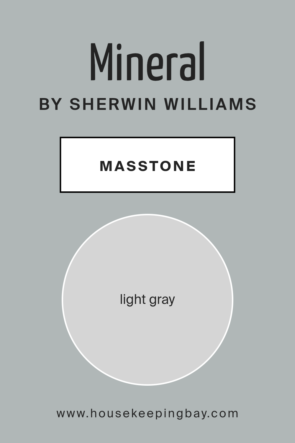
What is the Masstone of the Mineral SW 9637 by Sherwin Williams?
MineralSW 9637 by Sherwin Williams has a masstone hue of light gray, identified by the color code #D5D5D5. This neutral, soft gray tone offers a versatile backdrop for various home decorating styles. It integrates effortlessly into any space, providing a muted foundation that complements both bold and subtle color palettes.
This light gray can make rooms feel more spacious and open, contributing to a calming atmosphere. It’s especially effective in areas that receive plenty of natural light, as the color reflects the light, enhancing the sense of airiness.
Moreover, MineralSW 9637 is practical for busy areas of the home like living rooms or hallways. Being a light color, it can help mask the occasional scuff and is straightforward to touch up if needed. The simplicity and adaptability of this light gray make it a reliable choice for anyone seeking to freshen up their home without overwhelming it with stronger colors.
housekeepingbay.com
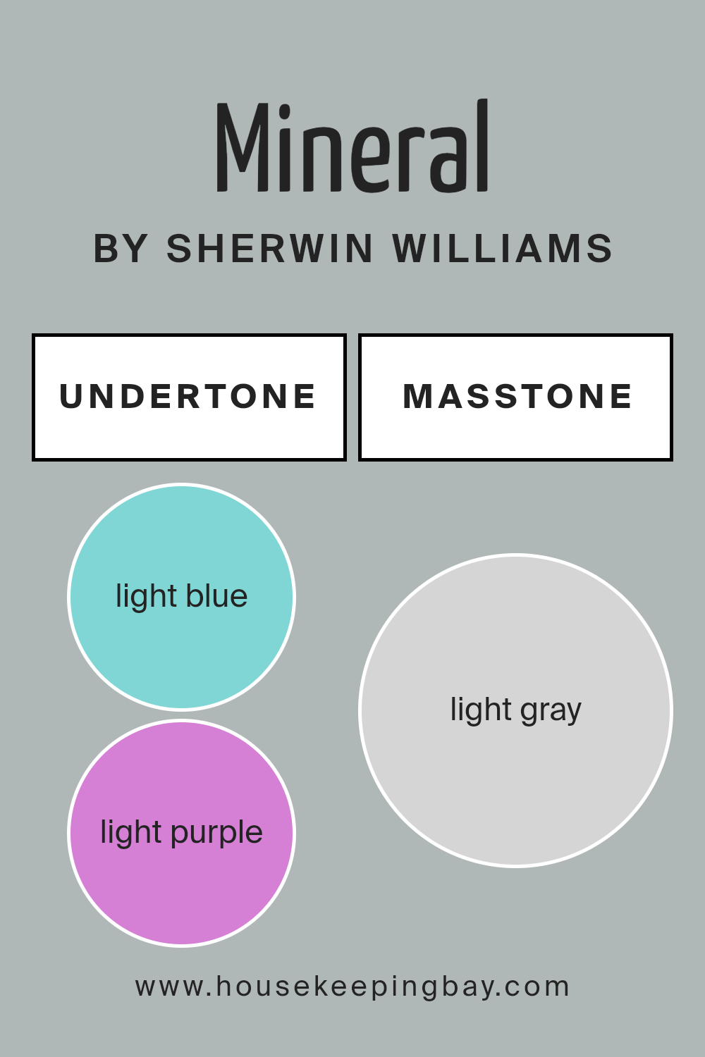
Undertones of Mineral SW 9637 by Sherwin Williams
Sherwin Williams MineralSW 9637 is a versatile color that carries a range of subtle undertones, including light blue, light purple, pale yellow, lilac, mint, pale pink, and grey. These undertones influence how the color appears under different lighting conditions and can significantly affect the ambiance of a room.
Each undertone brings its unique aspect to the paint. For instance, light blue and mint add a fresh and calming effect, making the room feel airy and more spacious. Light purple and lilac give a soft, gentle touch that can make spaces feel soothing and restful.
Pale yellow injects a subtle brightness, bringing a warm and welcoming energy that can make a space feel more inviting. Pale pink offers a hint of warmth, which can make the space feel cozy and comfortable. Lastly, the grey undertone provides a neutral backdrop, tying all the other undertones together and ensuring they don’t overpower the space.
When applied to interior walls, MineralSW 9637 adapts to different lighting conditions, shifting its appearance throughout the day. In natural daylight, the cooler undertones might be more pronounced, making the room feel lively and fresh.
In artificial lighting, the warmer tones such as pale yellow and pale pink might become more dominant, lending the room a cozy, relaxed vibe.
Using MineralSW 9637, careful consideration should be given to the room’s lighting and existing decor to fully utilize the potential of these undertones. This can help achieve the desired atmosphere, whether it’s bright and energizing or soft and calming.
Overall, MineralSW 9637 is highly adaptable and can be used effectively in various interior design settings.
housekeepingbay.com
How Does Lighting Affect Mineral SW 9637 by Sherwin Williams?
Lighting plays a crucial role in how colors appear in a space. Depending on the type of light—natural or artificial—colors can look dramatically different. For the color MineralSW 9637 by Sherwin Williams, its perception changes under various lighting conditions.
In artificial light, MineralSW 9637, which is a soft, muted shade, might appear slightly darker and warmer. This is because many artificial lights, especially warmer bulbs, can enhance the yellow and red tones in the paint. In natural light, however, the true character of MineralSW 9637 comes through more clearly.
Natural light, especially during midday, tends to be bluer, allowing this color to show its calm and soothing qualities without alteration.
The orientation of a room also greatly influences how MineralSW 9637 is perceived:
1. North-faced rooms: These rooms receive less direct sunlight, which may make this color appear more subdued and cooler. It retains a steadier look throughout the day but may need good artificial lighting to prevent it from looking too flat.
2. South-faced rooms: In these rooms, there’s an abundance of bright, warm light all day. This sunlight can make MineralSW 9637 look lighter and slightly warmer, enhancing its underlying beige tones and making the space feel airy and open.
3. East-faced rooms: These rooms get plenty of light in the morning. MineralSW 9637 will appear bright and vibrant in the morning but could turn a shade cooler and more muted as the day progresses and natural light diminishes.
4. West-faced rooms: Evening light, which is warmer, will warm up MineralSW 9637, particularly in the late afternoon and evening. The color could change from being cooler around midday to warmer and more welcoming by sunset.
By understanding these influences, one can predict how MineralSW 9637 will behave in various settings, helping in making informed decisions about where to apply it to achieve the desired effect.
housekeepingbay.com
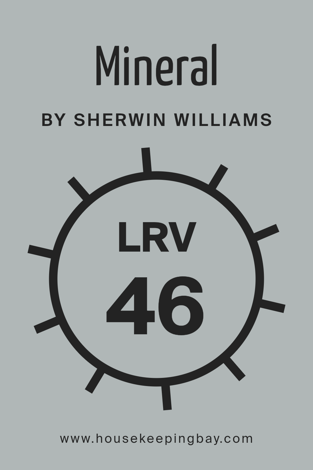
What is the LRV of Mineral SW 9637 by Sherwin Williams?
LRV stands for Light Reflectance Value, a measurement used to determine the percentage of light a paint color can reflect. This value ranges from 0 to 100, with 0 being absolute black, which absorbs all light, and 100 being pure white, reflecting all light.
LRV is crucial for choosing paint colors because it helps assess how light or dark a color will look once applied to walls. A higher LRV means the color will appear lighter, making rooms feel more open and airy, while a lower LRV can make a space appear cozier and more enclosed.
Considering the LRV of MineralSW 9637 by Sherwin Williams is 46.402, it sits nearly at the midpoint of the scale. This means it won’t reflect light as much as lighter colors but isn’t so dark as to absorb most light. This mid-range LRV makes it a versatile choice for various settings, offering a balance between warmth and brightness.
It will not dramatically lighten a dark room but will also not darken a bright room excessively. This characteristic allows the color to maintain its true hue under different lighting conditions without significant alteration, providing a stable and predictable appearance on walls.
housekeepingbay.com
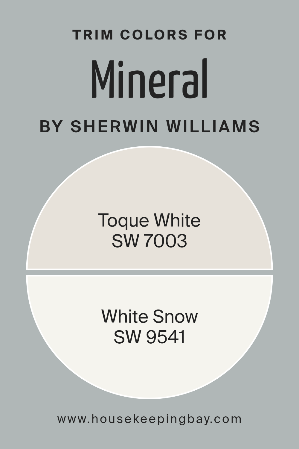
What are the Trim colors of Mineral SW 9637 by Sherwin Williams?
Trim colors are selected to complement the main colors used on walls and larger surfaces, acting as an accent that defines and finishes the spaces within a home. For MineralSW 9637 by Sherwin Williams, a shade like SW 7003 – Toque White or SW 9541 – White Snow can be an excellent choice for trim.
These lighter trim colors create a subtle but effective contrast that highlights architectural features and frames the richer or muted tones of the primary wall color, ensuring that each room feels cohesively designed.
The use of trim colors not only clarifies the spatial boundaries but also adds a refined detail, enhancing the overall aesthetic and making the interior spaces appear more polished and professionally planned.
SW 7003 – Toque White is a soft, warm white that has a calming effect in any space it adorns. It brings a gentle brightness that is not overpowering, making it an ideal background enhancer that pairs well with darker or vibrant hues.
On the other hand, SW 9541 – White Snow is a crisp, clean white with a slightly cool undertone. This color offers a refreshing clarity, perfect for creating a sharp contrast that can make the main colors pop and enhance the perception of light and space within a room.
These choices are pivotal in achieving a balanced and harmonious look in any decorating scheme.
You can see recommended paint colors below:
housekeepingbay.com
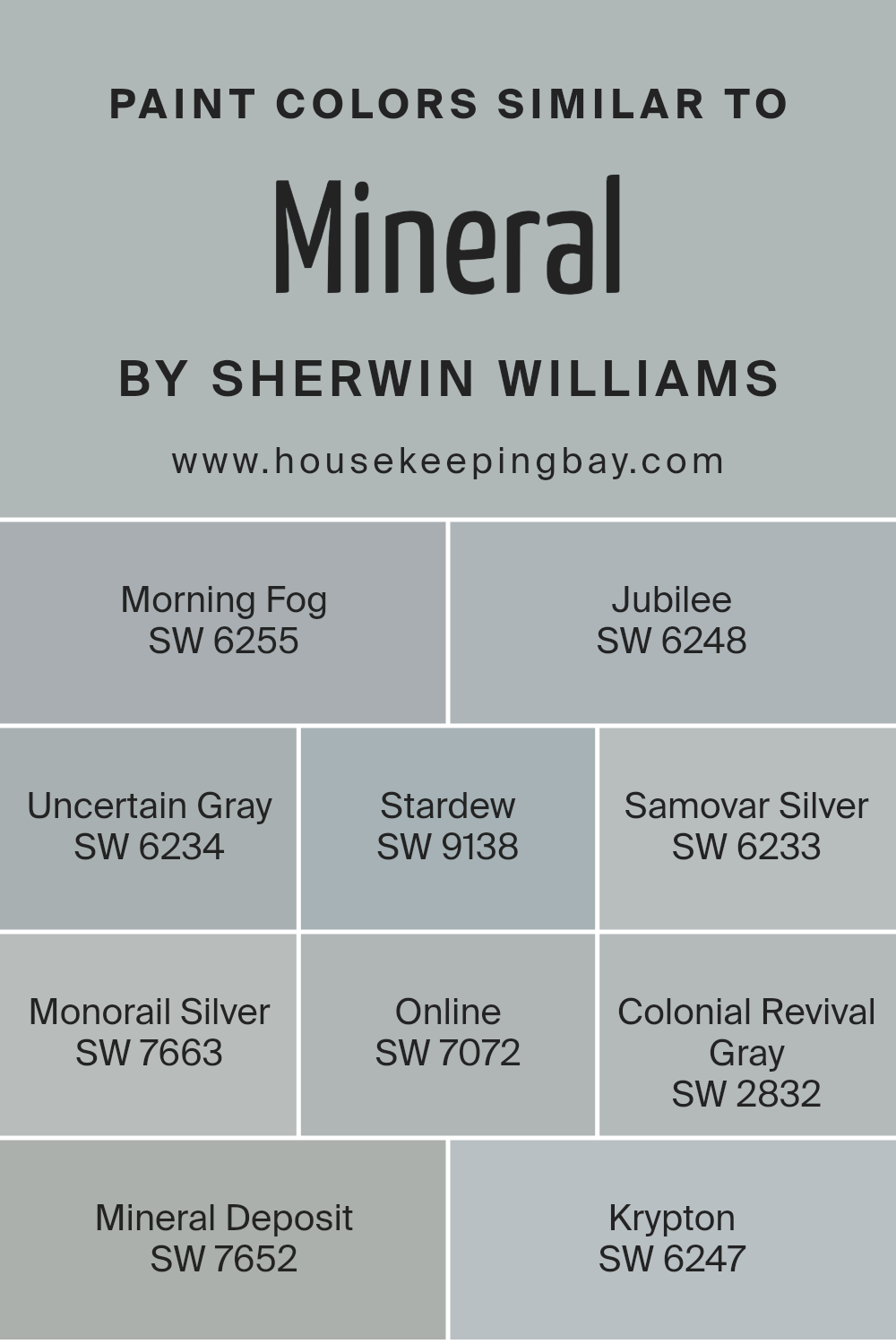
Colors Similar to Mineral SW 9637 by Sherwin Williams
Similar colors are crucial in design because they create a sense of harmony and fluidity within a space, making it visually cohesive and pleasing. When colors share a similar tone or belong to the same color palette, like those similar to MineralSW 9637 by Sherwin Williams, they can be easily mixed and matched to enhance the aesthetics of any room. Using variants of a principal color allows for subtle contrasts that are soothing to the eye, rather than stark, jarring differences.
Morning Fog SW 6255 offers a gentle gray with a soft whisper of blue, ideal for a serene room atmosphere. Jubilee SW 6248 deepens this approach, presenting a muted lavender-gray that brings a quiet sophistication to spaces.
Uncertain Gray SW 6234 provides an intermediate balance, neither too dark nor too pale, perfect for those seeking neutrality.
Stardew SW 9138 introduces a dusty blue-green, reminiscent of a foggy morning by the sea. Samovar Silver SW 6233 shifts to a lighter, metallic silver, giving a crisp, modern feel.
Monorail Silver SW 7663 ventures into darker territory, a bold silver with industrial undertones, excellent for a contemporary look.
Online SW 7072 displays a true gray that offers versatility and modern appeal. Colonial Revival Gray SW 2832 tips towards a stone gray with historical elegance, suitable for both traditional and modern decor. Mineral Deposit SW 7652 echoes the rocky hues of a quarry, excellent for adding depth and interest.
Krypton SW 6247 rounds out our palette with a cool, airy blue, refreshing like a light breeze in a calm sky, perfect for creating a soothing retreat from the outside world. All of these colors play beautifully together, allowing for creative freedom while maintaining a unified visual flow.
You can see recommended paint colors below:
- SW 6255 Morning Fog
- SW 6248 Jubilee
- SW 6234 Uncertain Gray
- SW 9138 Stardew
- SW 6233 Samovar Silver
- SW 7663 Monorail Silver
- SW 7072 Online
- SW 2832 Colonial Revival Gray
- SW 7652 Mineral Deposit
- SW 6247 Krypton
housekeepingbay.com
How to Use Mineral SW 9637 by Sherwin Williams In Your Home?
Mineral SW 9637 by Sherwin Williams is a unique paint color that offers a soothing feel to any room. With its soft, warm gray hue, it blends naturally with various decor styles. Perfect for creating a serene atmosphere, Mineral is ideal for use in bedrooms where calmness is preferred.
In living rooms, this color pairs well with both bold and muted furnishing, allowing for a cohesive look without overwhelming the senses.
For those looking to update their kitchen or bathroom, Mineral acts as a neutral backdrop. It contrasts beautifully with both light and dark cabinets, enhancing natural wood as well as colored finishes. Easy to apply, this paint is durable, making it suitable for high-traffic areas while maintaining a fresh appearance.
Mineral’s versatility extends to home offices or study areas, promoting a focused environment. It reflects light gently, helping to keep spaces bright but not stark. Whether updating a single room or repainting the entire house, Mineral SW 9637 provides a timeless, refined palette.
Mineral SW 9637 by Sherwin Williams vs Online SW 7072 by Sherwin Williams
Mineral SW 9637 by Sherwin Williams is a soft, muted green shade with gray undertones, giving it a calming and subtle appearance ideal for creating a peaceful environment. It’s versatile, fitting well in spaces intended for relaxation or focus, such as bedrooms or home offices. This color can serve as a gentle backdrop for various decor styles, from modern to rustic.
In contrast, Online SW 7072 is a darker, more pronounced gray that carries blue undertones. This hue offers a sleek, contemporary feel, making it suitable for modern living areas and workspaces aiming for a more sophisticated aesthetic. Online can add depth and drama to a room, providing a strong foundation for both vibrant and muted color palettes.
Both colors are unique and can set distinct tones within a space. Mineral is lighter and soothing, while Online is bolder and more statement-making. When deciding between the two, consider the mood and functionality you want for the room.
You can see recommended paint color below:
housekeepingbay.com
Mineral SW 9637 by Sherwin Williams vs Samovar Silver SW 6233 by Sherwin Williams
The two Sherwin Williams colors, Mineral SW 9637 and Samovar Silver SW 6233, offer unique tones for different decorating moods. Mineral SW 9637 presents a muted, earthy gray with subtle green undertones, creating a soft, soothing atmosphere.
This color is versatile, suitable for spaces aiming for a natural, understated feel. In contrast, Samovar Silver SW 6233 is a lighter gray with cool blue undertones, giving it a more modern, airy look. This shade is excellent for brightening up spaces and works well in contemporary settings.
Both colors are neutral, making them easy to pair with various decor elements, but each brings its distinct vibe—Mineral with its warmth and depth, and Samovar Silver with its crisp, clean appearance. Choosing between them depends on the desired mood and the specific room characteristics like lighting and space size.
You can see recommended paint color below:
housekeepingbay.com
Mineral SW 9637 by Sherwin Williams vs Stardew SW 9138 by Sherwin Williams
Mineral SW 9637 by Sherwin Williams is a muted gray that offers a subtle, organic feel, ideal for creating a calming and peaceful atmosphere in any space. This color pairs well with both bright and dark colors, making it versatile for various decorating styles.
In contrast, Stardew SW 9138 showcases a gentle blue with gray undertones, giving it a serene and soothing quality. It’s an excellent choice for rooms where a restful environment is desired, such as bedrooms or bathrooms.
Both colors share a calming presence but differ in their influence on a room’s mood. While Mineral tends to provide a neutral backdrop, Stardew adds a hint of coolness, potentially enhancing feelings of relaxation. Choosing between them would depend on the desired warmth or coolness in the color scheme of your space.
You can see recommended paint color below:
housekeepingbay.com
Mineral SW 9637 by Sherwin Williams vs Mineral Deposit SW 7652 by Sherwin Williams
Mineral SW 9637 by Sherwin Williams is a soft, muted green with subtle earthy undertones. This color has a gentle, soothing appearance, making it ideal for spaces where you want to create a calm and relaxing atmosphere. It works well in living areas and bedrooms where a touch of nature-inspired serenity is desired.
On the contrary, Mineral Deposit SW 7652 also from Sherwin Williams, leans more towards a muted gray shade with hints of blue. This tone is cooler compared to Mineral SW 9637 and offers a more neutral backdrop suitable for various settings.
It is particularly effective in modern living spaces or bathrooms, providing a clean, crisp look that pairs well with contemporary decor.
Both colors offer unique possibilities. Mineral SW 9637 infuses spaces with warmth and natural vibes, while Mineral Deposit SW 7652 delivers a fresher, more urban feel. Choosing between them depends on the mood and style you wish to achieve in your space.
You can see recommended paint color below:
- SW 7652 Mineral Deposit
housekeepingbay.com
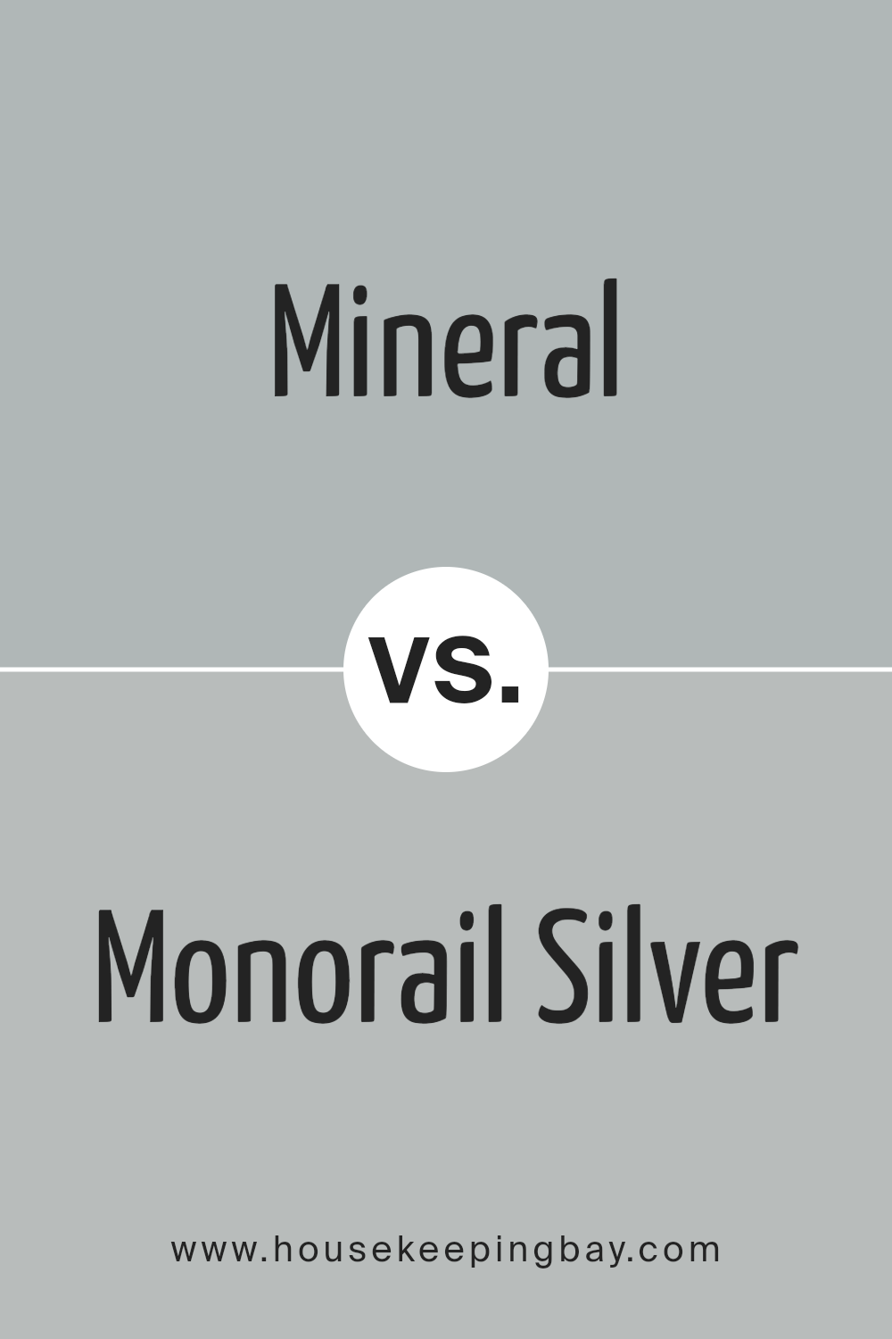
Mineral SW 9637 by Sherwin Williams vs Monorail Silver SW 7663 by Sherwin Williams
Mineral SW 9637 by Sherwin Williams is a soft, soothing gray with subtle blue undertones, giving it a serene and gentle feel. This color works well in spaces designed for relaxation and calm, such as bedrooms or bathrooms. Its lightness reflects ample light, making rooms feel more open and airy.
Monorail Silver SW 7663, also by Sherwin Williams, is a deeper gray that leans towards a more industrial and robust look. This shade contains slight green undertones that give it a cool, modern edge, making it suitable for contemporary living spaces or offices.
It’s ideal for areas that benefit from a more pronounced color depth to create character and definition.
When comparing these two, Mineral is lighter and softer, perfect for a peaceful vibe, while Monorail Silver is stronger and bolder, great for adding a touch of sophistication. Both colors offer unique atmospheres and can dramatically influence the mood and style of a room.
You can see recommended paint color below:
- SW 7663 Monorail Silver
housekeepingbay.com
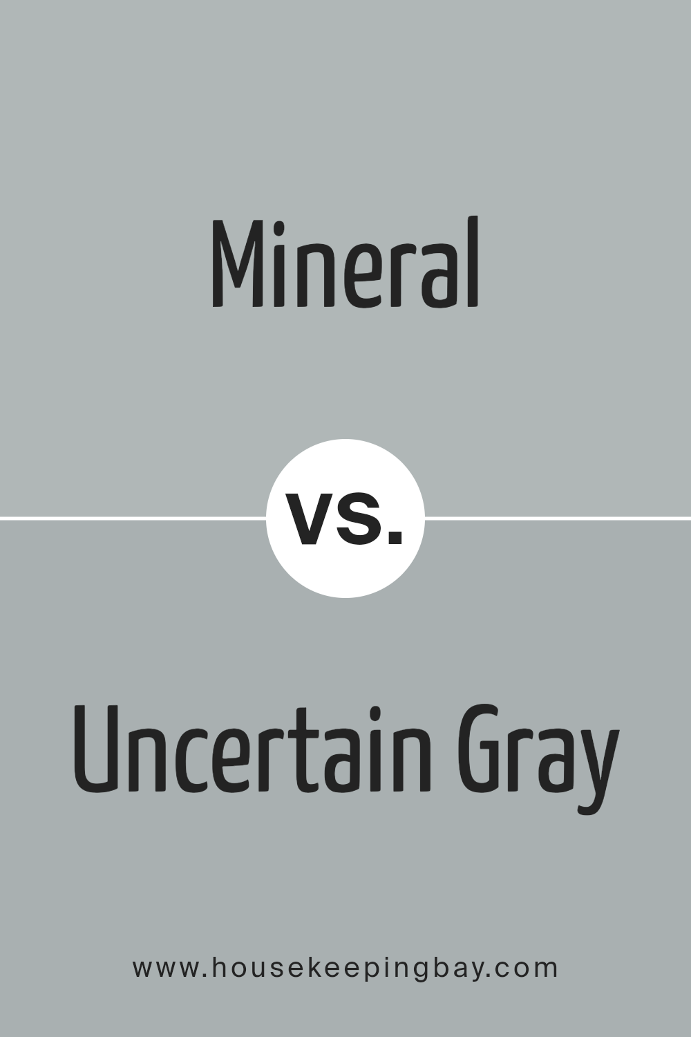
Mineral SW 9637 by Sherwin Williams vs Uncertain Gray SW 6234 by Sherwin Williams
Mineral SW 9637 by Sherwin Williams is a calming, earthy hue that adds a soothing touch to any space. Its natural tones are reminiscent of a quiet, serene landscape, making it ideal for creating a peaceful atmosphere in rooms meant for relaxation, such as bedrooms or living areas.
In contrast, Uncertain Gray SW 6234 is a cooler, more neutral gray that brings a subtle sophistication to its surroundings. It pairs well with a wide variety of decor styles and colors, providing a versatile backdrop that complements both bright and muted accents.
While Mineral offers a warm embrace with its gentle earthiness, Uncertain Gray presents a crisp, clean look that can make smaller spaces appear larger and more open. Both colors support a range of design aesthetics, but Mineral tends to evoke a cozy, inviting feel, and Uncertain Gray leans towards a modern, minimalistic vibe.
Each has its own character, making them suitable for different preferences and purposes.
You can see recommended paint color below:
- SW 6234 Uncertain Gray
housekeepingbay.com
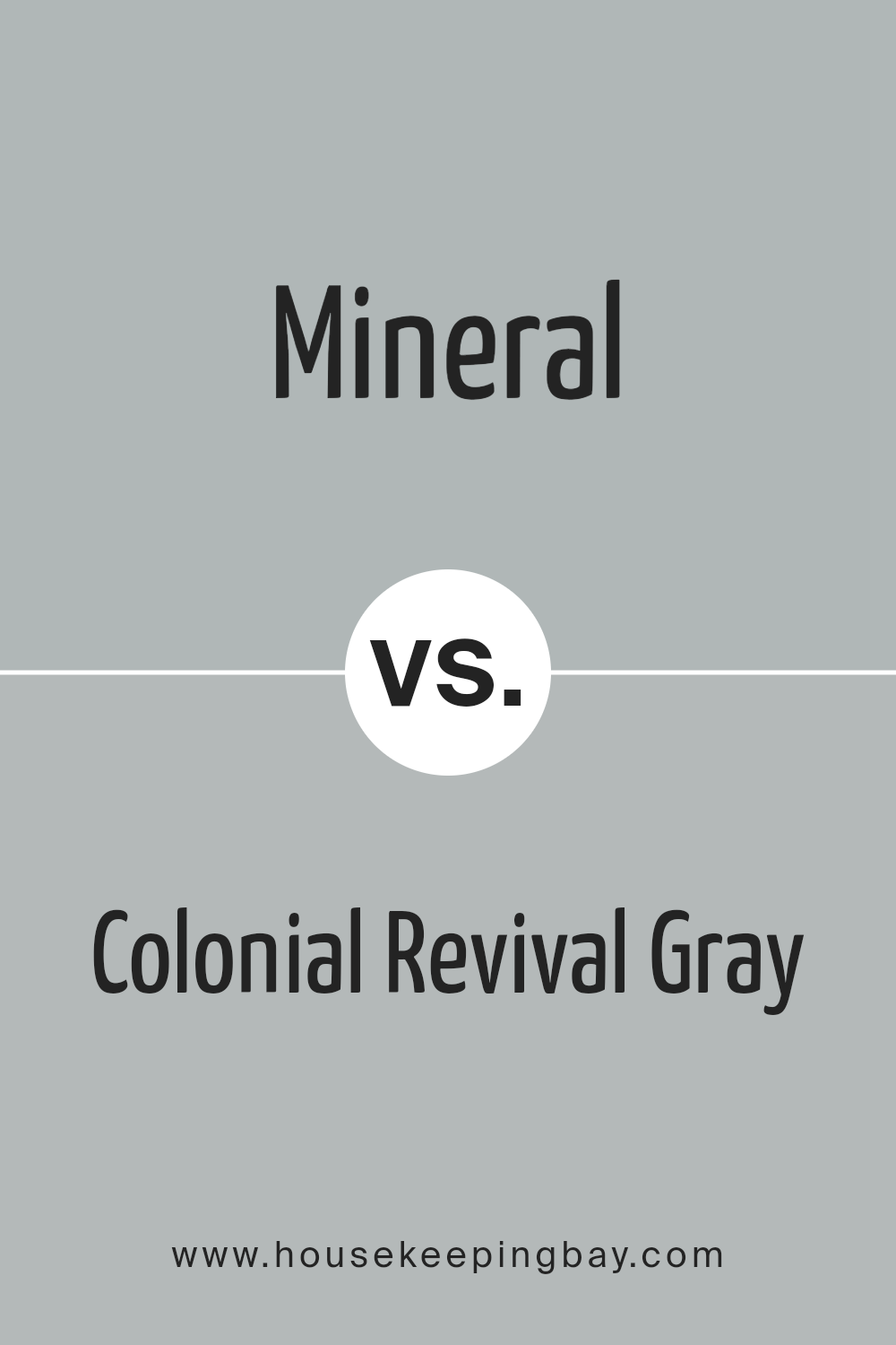
Mineral SW 9637 by Sherwin Williams vs Colonial Revival Gray SW 2832 by Sherwin Williams
The first color, Mineral SW 9637 by Sherwin Williams, presents as a soft and understated gray with blue undertones, giving it a cool, soothing feel. This color can really lighten up a room with its airy vibe, making it perfect for spaces meant for relaxation.
In contrast, Colonial Revival Gray SW 2832 has a warmer hue, leaning slightly towards taupe. This shade can infuse any space with a cozy and welcoming atmosphere, suitable for more formal or traditional settings like dining areas or living rooms.
Both colors have their unique attributes: Mineral SW 9637 works well in spaces needing a calm, serene backdrop, while Colonial Revival Gray SW 2832 offers a more robust, grounded aesthetic. Depending on the ambiance you want to create, these colors can significantly alter the perception of a space. Whether aiming for relaxation or a traditional elegance, each color supports different styles and tastes effectively.
You can see recommended paint color below:
housekeepingbay.com
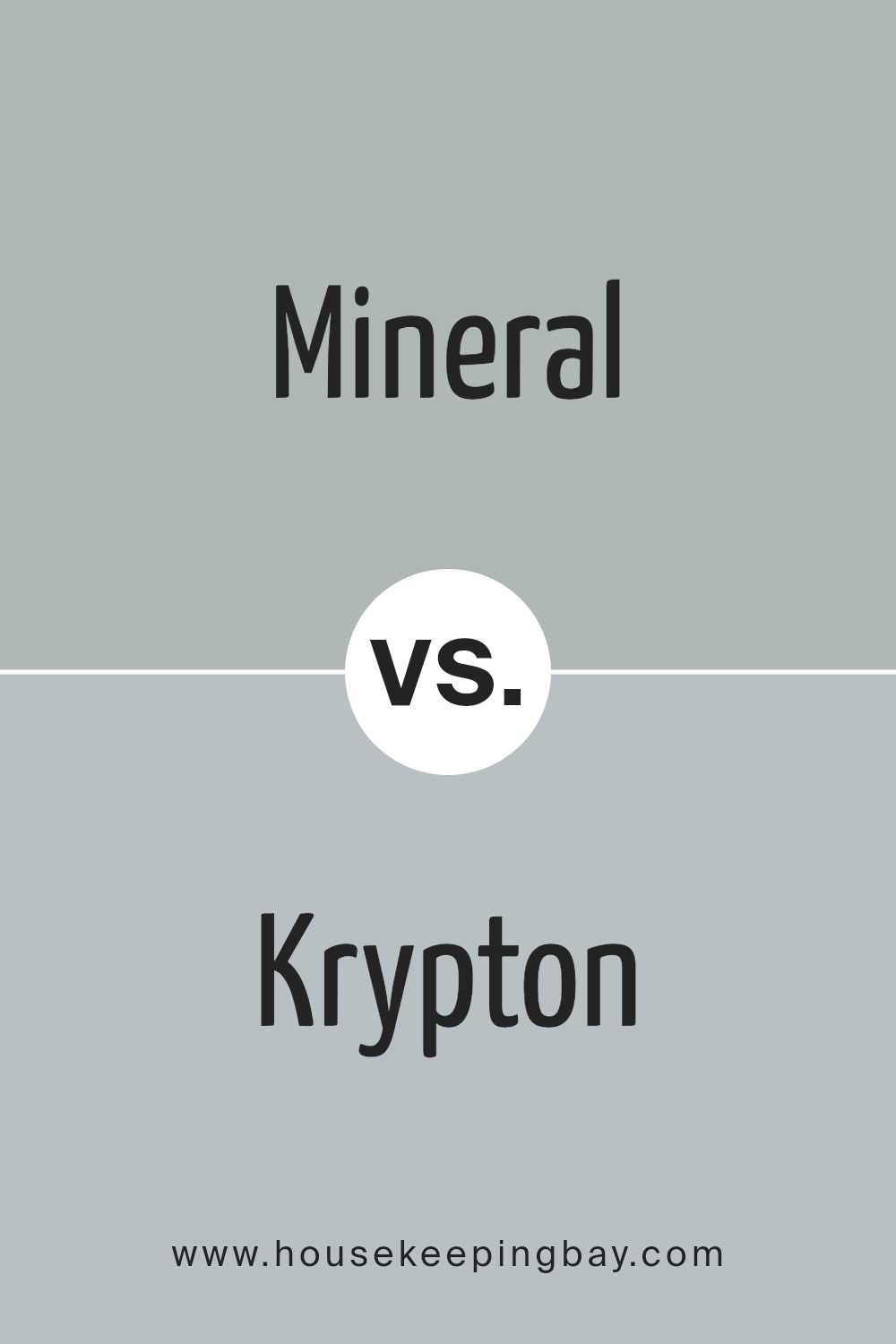
Mineral SW 9637 by Sherwin Williams vs Krypton SW 6247 by Sherwin Williams
Mineral SW 9637 by Sherwin Williams is a soft, silvery green that gives off a subtle and natural feel. This color is light and airy, making it perfect if you’re going for a gentle and soothing atmosphere in a room. It pairs well with light woods and other understated hues, providing a calm backdrop that’s easy on the eyes.
Krypton SW 6247, also by Sherwin Williams, leans more towards a neutral blue with gray undertones. This shade is cooler compared to Mineral and offers a serene, yet more modern appeal. It fits well in spaces aiming for a clean and contemporary look, working nicely with darker furniture and metal accents.
Both colors add a refreshing touch to interiors but in distinctly different ways. Mineral’s green undertones bring warmth and a touch of nature, while Krypton’s cool blue creates a sleek and minimalistic vibe. Depending on your stylistic goals, either choice enhances the environment subtly and beautifully.
You can see recommended paint color below:
housekeepingbay.com
Mineral SW 9637 by Sherwin Williams vs Morning Fog SW 6255 by Sherwin Williams
Mineral SW 9637 by Sherwin Williams is a soft, gentle blue with gray undertones, giving it a muted, soothing vibe that feels cozy and calming, especially in well-lit spaces. It pairs well with bright white trim or darker furniture, offering a sense of peacefulness.
Morning Fog SW 6255 is another serene color, but it leans more towards a neutral gray with just a hint of blue. This makes it incredibly versatile for use in various rooms, such as kitchens and bathrooms, where it provides a clean, contemporary look without feeling cold.
While both colors promote a tranquil environment, Mineral tends to impart a bit more warmth due to its blue base, whereas Morning Fog presents a crisp backdrop that could complement a wider range of decor.
Either one would work well in a modern home setting, depending on the mood you want to achieve: warmer and softer with Mineral or more neutral and flexible with Morning Fog.
You can see recommended paint color below:
housekeepingbay.com
Mineral SW 9637 by Sherwin Williams vs Jubilee SW 6248 by Sherwin Williams
Sherwin Williams’ Mineral SW 9637 is a calming, nature-inspired gray with blue undertones, giving it a serene and airy feel that’s perfect for creating a peaceful and restful environment. It mirrors elements of a soft, foggy morning and works well in spaces intended for relaxation, such as bedrooms and bathrooms.
In contrast, Jubilee SW 6248, is also a gray shade but leans towards a subdued, dusky lavender. This color infuses spaces with a subtle hint of sophistication and modernity. It suits areas where a touch of intimacy is desired, like dining rooms or small sitting areas.
Both Mineral and Jubilee belong to the gray family but offer unique undertones that set distinct moods. Mineral feels more straightforward and clean because of its blue undertones, while Jubilee brings a warmer, more enveloping atmosphere with its lavender hues. Each color works beautifully in specific settings or can be combined for a layered, harmonious look.
You can see recommended paint color below:
- SW 6248 Jubilee
housekeepingbay.com
Its subtle undertones make it an ideal choice for anyone looking to create a serene and inviting atmosphere in their home without opting for a stark neutral. The color pairs well with a variety of decor styles and enhances the aesthetic appeal of accessories and furnishings.
Moreover, its calming effect makes it easy to integrate into bedrooms, living rooms, or offices where a peaceful environment is paramount.
Given its adaptability and beautiful hue, SW 9637 Mineral can significantly contribute to the overall vibe of a home, making spaces feel more harmonious and refined. For those considering a new paint color, SW 9637 Mineral should definitely be on the list.
housekeepingbay.com
Ever wished paint sampling was as easy as sticking a sticker? Guess what? Now it is! Discover Samplize's unique Peel & Stick samples. Get started now and say goodbye to the old messy way!
Get paint samples


