Studio Taupe SW 7549 by Sherwin Williams
Elevating Neutrals - A Timeless Appeal
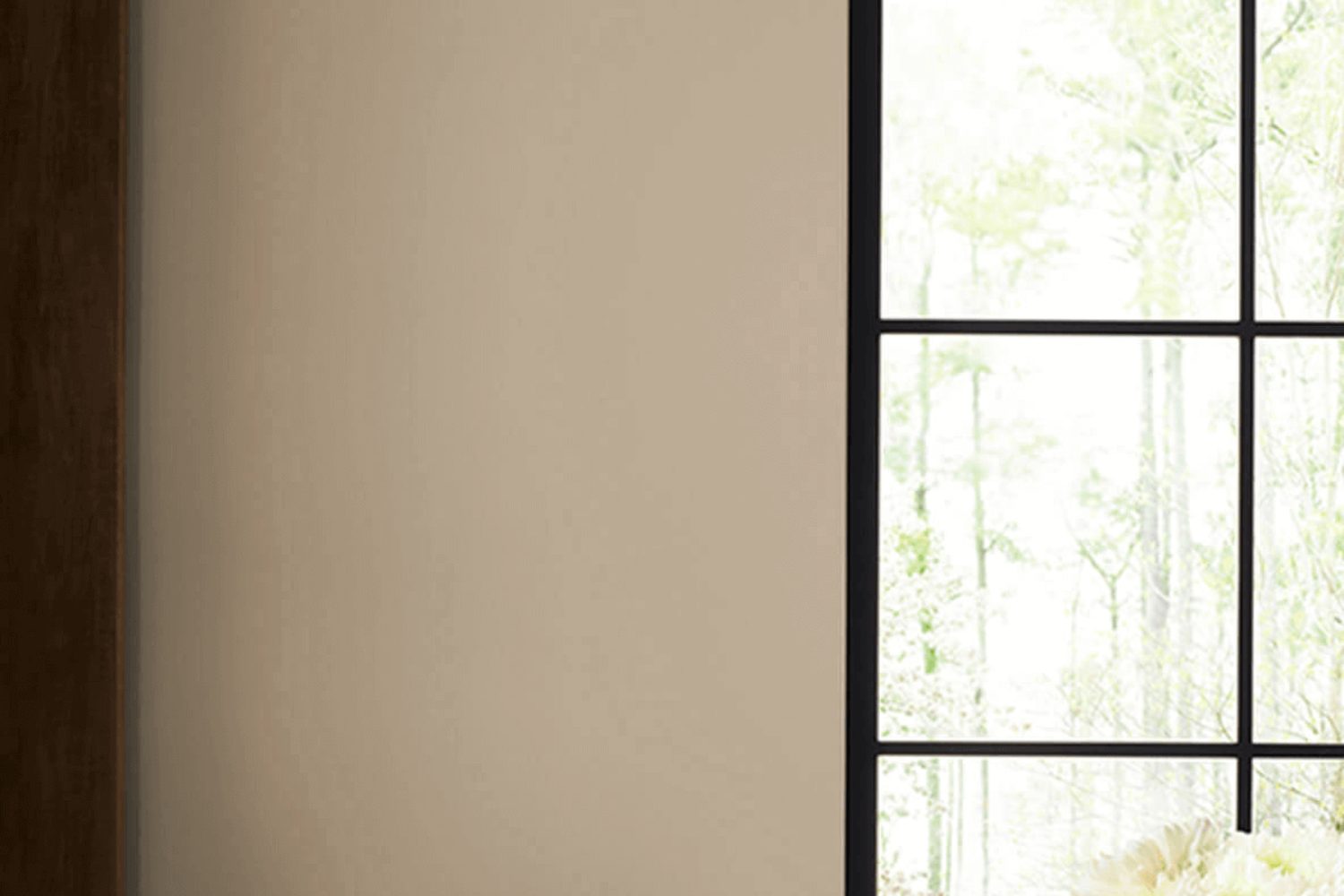
When it comes to giving your space a fresh, elegant look, choosing the right paint color is a crucial step. Enter SW 7549 Studio Taupe by Sherwin Williams, a color that’s as versatile as it is beautiful. Studio Taupe is a rich, warm hue that strikes the perfect balance between sophistication and comfort, making it an ideal choice for anyone looking to update their home or office.
You might be wondering what makes Studio Taupe stand out among the numerous options available. First off, its unique blend of brown and gray delivers a neutral backdrop that works wonderfully with a wide range of decor styles, from modern minimalist to rustic chic. This means you can easily incorporate it into your existing design or use it as a foundation for a whole new look.
Plus, its calming nature creates a welcoming atmosphere that’s just right for living rooms, bedrooms, or even home offices.
But how does it behave under different lighting conditions? One of the best things about Studio Taupe is its adaptability. In natural light, it reveals a soft, earthy quality, while artificial lighting brings out its warmer undertones, adding a cozy glow to any space. Whether you’re aiming for a subtle change or a dramatic transformation, Studio Taupe by Sherwin Williams is a choice that promises to enhance your surroundings in the most stylish way possible.
by sherwin williams
What Color Is Studio Taupe SW 7549 by Sherwin Williams?
Studio Taupe SW 7549 by Sherwin Williams is a versatile and warm hue that brings a cozy and inviting atmosphere to any space. This color stands out for its balanced mix of brown and gray, making it a perfect neutral that can blend seamlessly with a variety of interior styles and palettes. Its understated elegance makes it especially suitable for minimalist, modern, and even traditional spaces, ensuring a timeless backdrop that complements various decor elements.
The beauty of Studio Taupe lies in its flexibility; it works well in living rooms, bedrooms, and home offices, providing a soothing and comfortable ambiance that encourages relaxation and focus. When paired with soft textures like plush throws or velvet cushions, it adds a layer of depth and comfort to the room. The warmth of Studio Taupe can also be enhanced by using natural materials such as wood, leather, and stone, creating a harmonious and grounded space.
Metallic accents in gold or brass can introduce a touch of sophistication to a room decorated in Studio Taupe, while crisp white trims or linens offer a fresh contrast that brightens the space. Whether used as a main color for walls or as an accent for furniture and accessories, Studio Taupe SW 7549 offers a stable foundation for exploring different styles and personal touches in home decor.
housekeepingbay.com
Is Studio Taupe SW 7549 by Sherwin Williams Warm or Cool color?
Studio Taupe SW 7549 by Sherwin Williams is a paint color that brings a unique vibe to any home. This color falls into the taupe category, a mix of brown and gray, making it a versatile choice for various spaces. The beauty of Studio Taupe lies in its ability to fit into different style settings, from modern and sleek to cozy and traditional.
This color works well in homes because it serves as a perfect backdrop. It doesn’t overpower a room but instead complements the furniture and decor, allowing personal style to shine through. Whether it’s used on walls in living areas, bedrooms, or even in bathrooms, Studio Taupe adds a touch of warmth and sophistication without making the space feel closed in.
It’s particularly helpful in rooms that don’t get a lot of natural light. Instead of darkening the room, it tends to keep the space feeling airy and open. This quality makes it a go-to choice for homeowners looking to create a serene and inviting atmosphere in their homes.
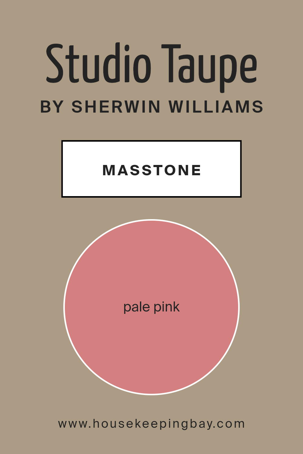
What is the Masstone of the Studio Taupe SW 7549 by Sherwin Williams?
Studio Taupe SW 7549 by Sherwin Williams showcases a masstone that might surprise you – it’s a pale pink hue resembling #D58080. This unique shade adds a subtle warmth to any space without overwhelming it. Imagine the soft blush of a morning sky gently illuminating your room; that’s the effect you get with this color. It’s versatile, allowing it to blend seamlessly into different home styles, from modern to traditional.
The pale pink masstone influences the room’s mood, bringing in an air of calm and comfort. It’s like having a soft, cozy blanket wrapped around your space, making it feel more inviting and homely. This color works well in bedrooms and living areas where relaxation is key. Plus, it pairs beautifully with a wide range of colors, from earthy tones to bold hues, allowing for creativity in decorating. The lightness of the color helps in making small rooms appear brighter and more spacious, enhancing the overall aesthetic of your home without making a drastic change.
housekeepingbay.com
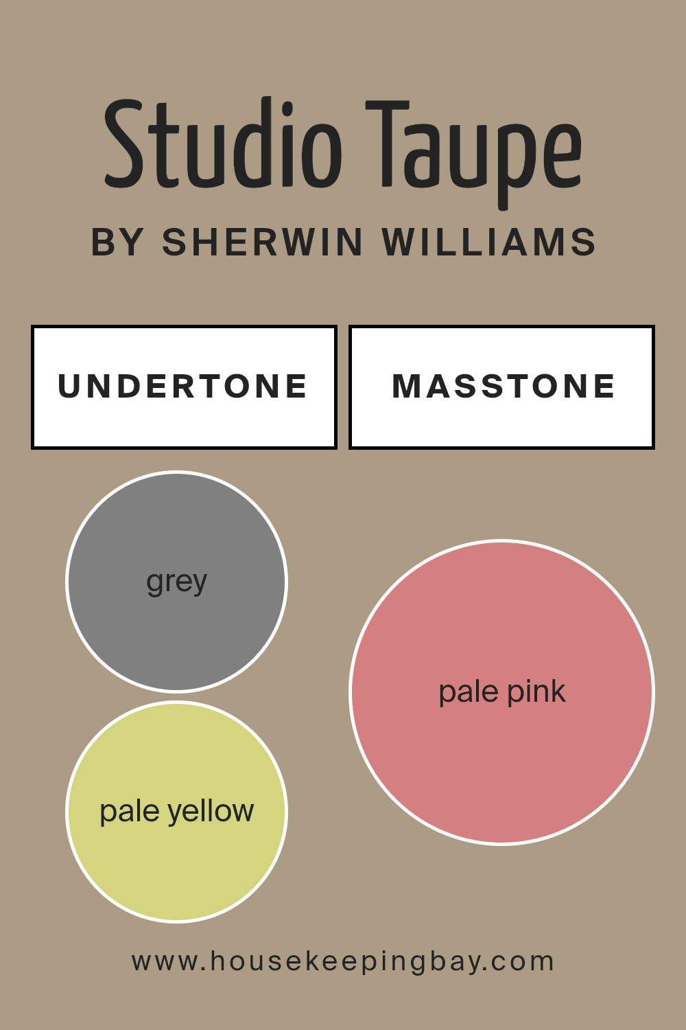
Undertones of Studio Taupe SW 7549 by Sherwin Williams
Studio Taupe SW 7549 by Sherwin Williams is a rich color that might seem simple at first glance, but it actually has a complex mix of undertones which can change how it looks based on lighting and surrounding colors. Undertones are like hidden colors that aren’t immediately noticeable but can affect the main color’s appearance. For Studio Taupe, these undertones include a variety of shades such as grey, pale yellow, mint, light purple, lilac, orange, olive, light gray, light blue, yellow, light green, pink, purple, fuchsia, violet, red, and brown.
These undertones play a crucial role in decorating because they can shift the color’s look under different conditions. For example, in a room with lots of natural light, the pale yellow or light green undertones might make Studio Taupe appear warmer and more welcoming. In contrast, in a space with lesser light, grey or light gray undertones could make it seem cooler and more reserved.
When applied to interior walls, the diverse undertones of Studio Taupe SW 7549 make it a versatile choice. It can complement a wide range of color schemes and design styles. Warm undertones like orange or light purple could create a cozy, serene atmosphere, while cooler undertones like mint or light blue might give a more refreshing and calm vibe. This means that Studio Taupe can adapt well to different rooms, from a sunny living room to a dimly lit study, always adding depth and complexity to the space. Its ability to match various decors and moods makes it a popular choice for those looking to add sophistication and subtle elegance to their interiors.
housekeepingbay.com
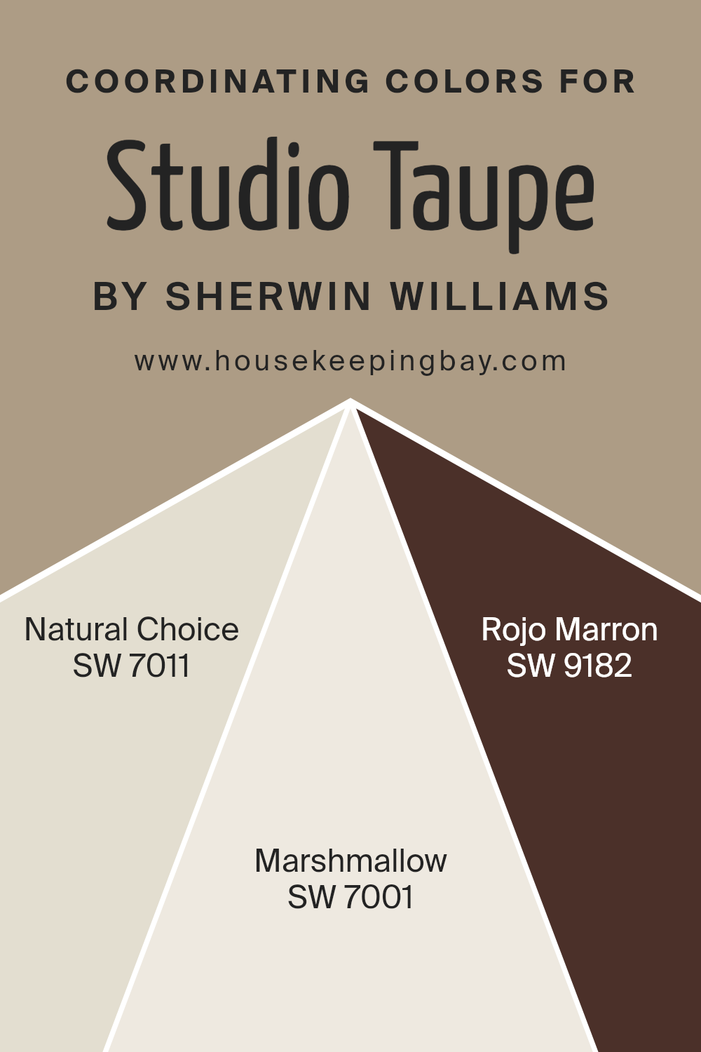
Coordinating Colors of Studio Taupe SW 7549 by Sherwin Williams
Coordinating colors are hues that complement each other when used together in a design space, creating a harmonious and balanced visual experience. They work by aligning with the tone and warmth of a primary color, enhancing its aesthetic appeal without overwhelming it. For instance, when considering Studio Taupe SW 7549 by Sherwin Williams as the primary color, certain shades are selected as its coordinating colors to enrich its earthy, versatile appeal without competing for attention. These coordinating colors are chosen for their ability to support and uplift the primary hue, making the overall design feel cohesive and thoughtfully curated.
Natural Choice SW 7011 is one such coordinating color, offering a soft, understated backdrop that allows the deeper tones of Studio Taupe to truly stand out. Its light, airy quality can make spaces feel more open and serene, complementing the grounded nature of Studio Taupe. Marshmallow SW 7001, on the other hand, brings a bright, crisp contrast to the mix.
Its clean, inviting presence adds a layer of freshness that can illuminate and enhance the warmth of Studio Taupe, creating a welcoming ambiance. Rojo Marron SW 9182 introduces a bold, rich dynamism to the palette. This deep, warm hue adds an element of sophistication and depth, drawing out the subtler earthy tones of Studio Taupe and providing an exquisite contrast to the lighter coordinating colors. Together, these shades create a palette that is both diverse and harmonious, offering multiple ways to enrich interior spaces with nuanced color relationships.
You can see recommended paint colors below:
- SW 7011 Natural Choice
- SW 7001 Marshmallow
- SW 9182 Rojo Marron
housekeepingbay.com
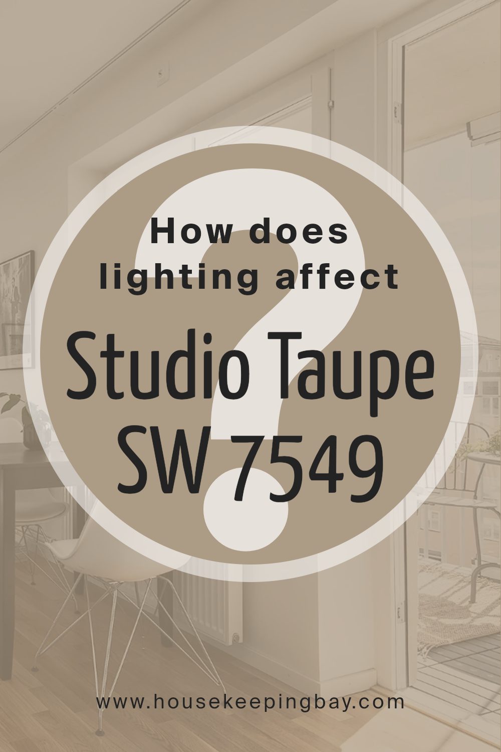
How Does Lighting Affect Studio Taupe SW 7549 by Sherwin Williams?
Lighting plays a crucial role in how we see and perceive colors. It can change the way a color looks dramatically, making it brighter, darker, or even shifting its hue. This is because colors do not have light; they reflect it, and the quality of light they reflect affects how we see them.
Let’s talk about Studio Taupe SW 7549 by Sherwin Williams and how different lighting conditions affect its appearance. Studio Taupe is a warm, rich color with a balance of gray and brown. It’s a versatile color that can look different depending on the light it’s under.
- In artificial light, Studio Taupe tends to look warmer. Incandescent bulbs, common in many homes, can make it appear more brown-ish and cozy, perfect for living rooms or bedrooms where you want a snug and inviting atmosphere. LED bulbs, which can vary in color temperature, can make it lean more towards its gray qualities if they emit a cooler, daylight-like light.
- Under natural light, Studio Taupe changes throughout the day. Morning light is softer and can make the color appear softer and slightly more gray. As the sun moves overhead, the color can warm up, highlighting its brown tones, and by evening as the light turns golden, it becomes richer and warmer.
- The direction of the room also influences how Studio Taupe looks. North-faced rooms get less direct sunlight, so the color may appear more consistent throughout the day but slightly cooler and more muted. South-faced rooms bask in plenty of sunlight, making Studio Taupe look warmer and brighter, enhancing its cozy qualities.
- East-faced rooms catch the morning sun, making Studio Taupe look soft and slightly grayish in the morning, transitioning to warmer in the afternoon as the natural light decreases. West-faced rooms do the opposite; they may start cooler during the morning, then become warmly lit in the evening light, making the color appear richer and warmer.
Understanding how lighting affects colors, especially a nuanced one like Studio Taupe SW 7549, can help in making informed decisions for your space, ensuring the color works harmoniously under varying lighting conditions.
housekeepingbay.com
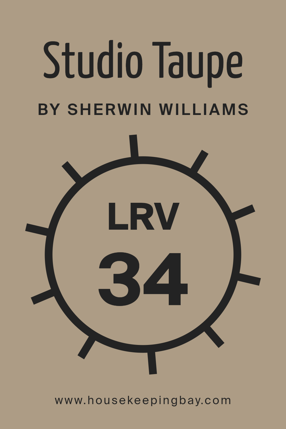
What is the LRV of Studio Taupe SW 7549 by Sherwin Williams?
For Studio Taupe SW 7549 by Sherwin Williams, with an LRV of 34.474, it’s on the darker side of the scale, meaning it won’t reflect a lot of light. In a room, this color can add warmth and depth, creating a cozy and inviting atmosphere. However, because of its lower LRV, it’s important to consider the room’s lighting.
In spaces with plenty of natural light, Studio Taupe can look beautifully rich and welcoming. But in rooms lacking natural light, it might appear even darker, significantly affecting the room’s overall feel. So, this particular LRV value suggests that Studio Taupe is versatile, fitting well in various settings, but its effect is greatly influenced by the room’s existing light conditions.
housekeepingbay.com
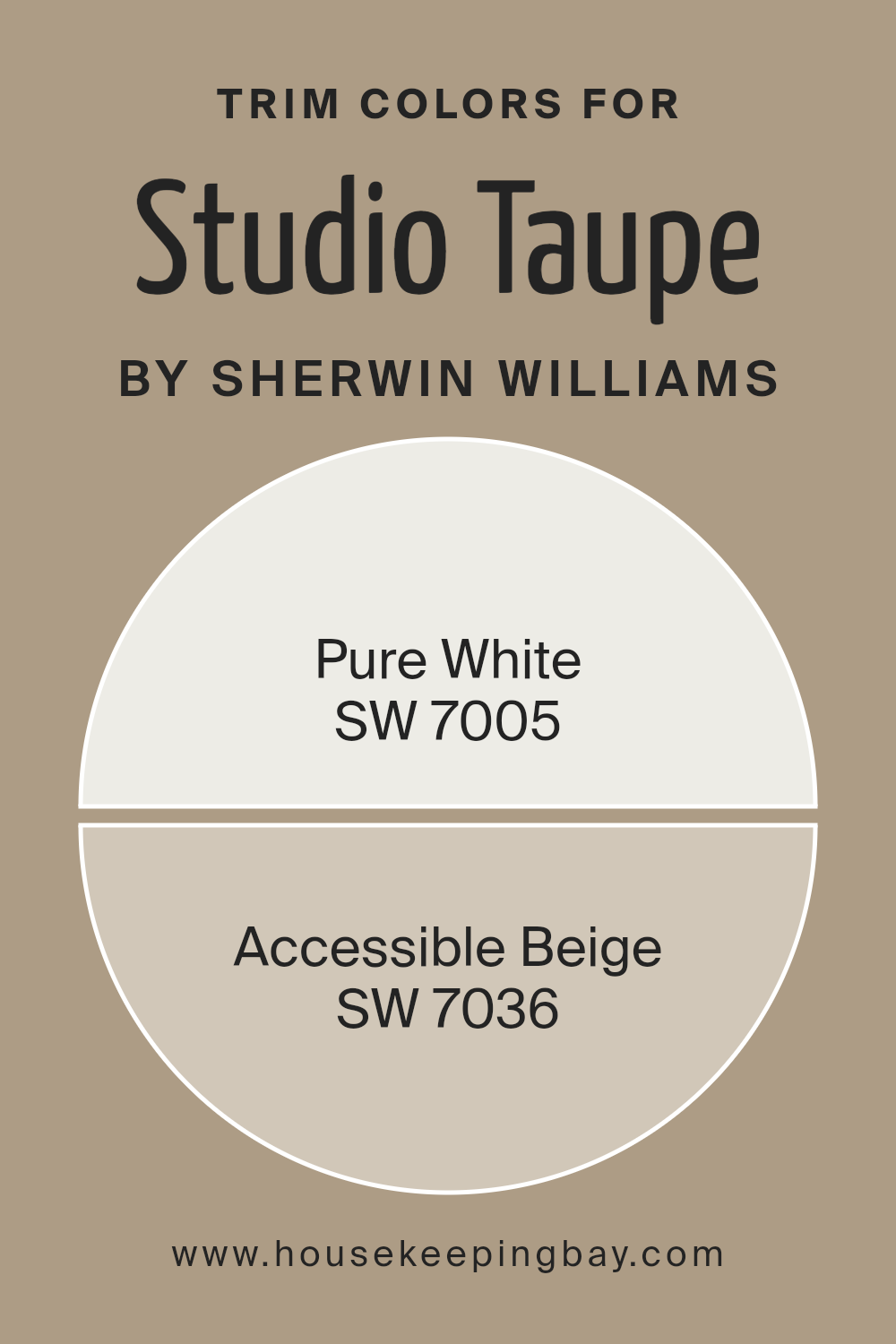
What are the Trim colors of Studio Taupe SW 7549 by Sherwin Williams?
Trim colors are the shades selected for the architectural details and edges that frame and define spaces, like door frames, window casings, skirting boards, and crown molding. Choosing the right trim color is important in interior design as it highlights these features, creates contrast, and can amplify the main color used on the walls. For Studio Taupe SW 7549, a refined and versatile hue by Sherwin Williams, selecting the right trim color can significantly influence the room’s atmosphere and aesthetic cohesion. Using specific trim colors, such as SW 7005 – Pure White or SW 7036 – Accessible Beige, can subtly enhance the beauty of Studio Taupe, providing a smooth transition between the wall color and the trim that suits various decor styles and preferences.
Pure White SW 7005 is a clean and crisp white that radiates freshness and simplicity. It’s a universal color that pairs beautifully with Studio Taupe, setting a stark, yet sophisticated contrast that can make the taupe pop and give the room a more defined and spacious feel. On the other hand, Accessible Beige SW 7036 is a warm and welcoming neutral that shares an earthy base with Studio Taupe.
It offers a more seamless transition between the wall and trim, creating a cohesive look that’s comforting and understated. This softer contrast is perfect for those aiming for a calm and collected ambiance in their space, subtly enriching the room’s character without overwhelming it.
You can see recommended paint colors below:
- SW 7005 Pure White
- SW 7036 Accessible Beige
housekeepingbay.com
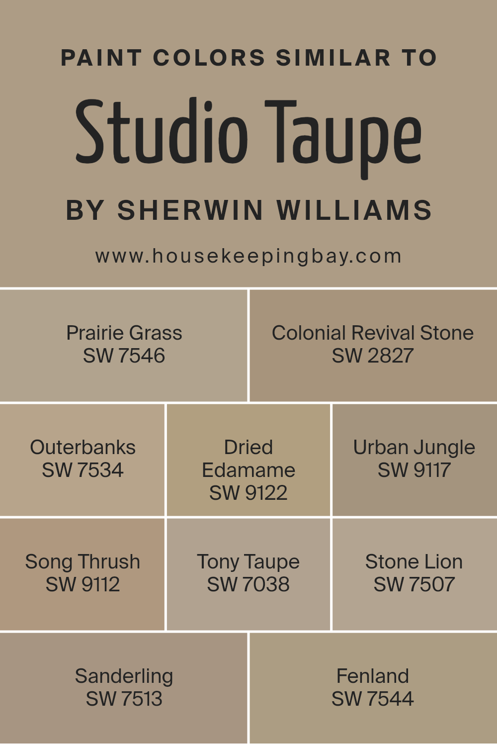
Colors Similar to Studio Taupe SW 7549 by Sherwin Williams
Choosing similar colors to Studio Taupe SW 7549 offered by Sherwin Williams can help create a cohesive and harmonious space that feels both comfortable and stylish. When colors like Prairie Grass SW 7546, Colonial Revival Stone SW 2827, and Outerbanks SW 7534 are used together, they complement each other because they share a similar intensity and undertone.
This makes the transition from room to room feel smooth and well thought out. Colors like Dried Edamame SW 9122 and Urban Jungle SW 9117 add a subtle variety that keeps the eye interested without overwhelming it. These colors work well because they balance each other, keeping spaces feeling grounded yet dynamic.
Meanwhile, Song Thrush SW 9112 and Tony Taupe SW 7038 offer a slightly different approach, bringing in a bit of contrast while still aligning with the overall palette. This subtle shift creates depth and character in the space. Stone Lion SW 7507, Sanderling SW 7513, and Fenland SW 7544 provide versatility within this similar color scheme. They allow for layering of shades that support a cohesive look without everything being the same color. Utilizing colors within the same spectrum offers an easy way to design a room that feels put together and intentional. This method ensures that the colors in your space will complement each other beautifully, creating a seamless and inviting atmosphere.
You can see recommended paint colors below:
- SW 7546 Prairie Grass
- SW 2827 Colonial Revival Stone
- SW 7534 Outerbanks
- SW 9122 Dried Edamame
- SW 9117 Urban Jungle
- SW 9112 Song Thrush
- SW 7038 Tony Taupe
- SW 7507 Stone Lion
- SW 7513 Sanderling
- SW 7544 Fenland
housekeepingbay.com
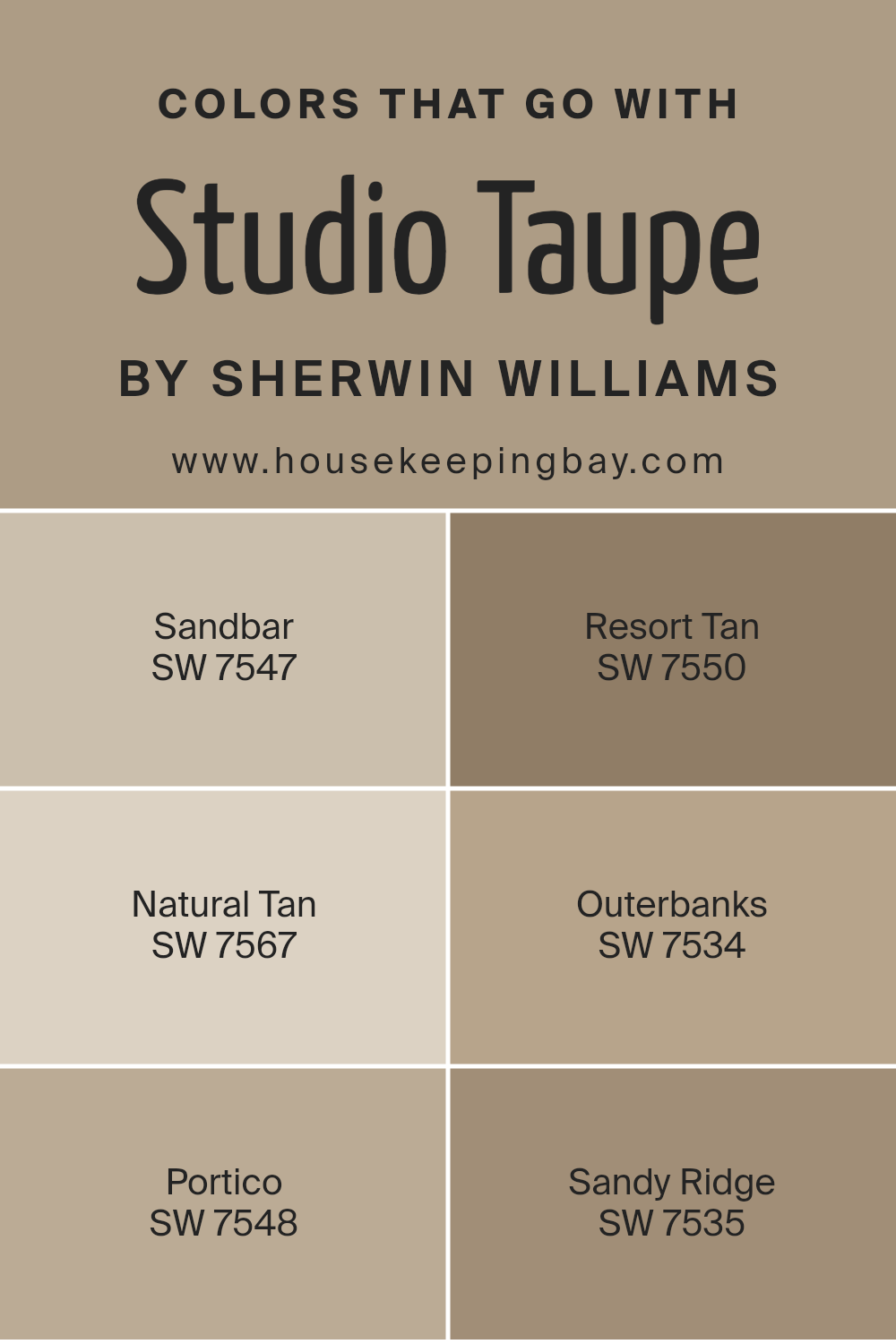
Colors that Go With Studio Taupe SW 7549 by Sherwin Williams
Choosing colors that pair well with Studio Taupe SW 7549 by Sherwin Williams is crucial because they can enhance the overall aesthetic and mood of a space. Studio Taupe is a versatile color that serves as a solid foundation for various interior themes, ranging from modern to rustic. To achieve a harmonious and appealing palette, incorporating complementary colors like SW 7547 – Sandbar, SW 7550 – Resort Tan, SW 7567 – Natural Tan, SW 7534 – Outerbanks, SW 7548 – Portico, and SW 7535 – Sandy Ridge, plays a significant role. These colors work together to create a balanced and inviting environment, making a room feel more put together and thoughtfully designed.
Sandbar is a gentle hue that brings a soft warmth to spaces, making it perfect for creating a cozy atmosphere without overwhelming the senses. Resort Tan adds a bit of earthiness and depth, grounding the lighter tones in the palette. Natural Tan, true to its name, offers a sense of comfort and simplicity, making any room feel welcoming and lived-in. Outerbanks has a richer, deeper tone that suggests sophistication and luxury, perfect for accent walls or furniture.
Portico, with its slightly gray undertones, provides a cool contrast to the warmth of Studio Taupe, adding dimension to the space. Lastly, Sandy Ridge has a muted, sandy appearance that complements the other colors by adding a touch of serenity and calm. Together, these colors enrich the versatility and beauty of Studio Taupe, allowing for countless design possibilities.
You can see recommended paint colors below:
- SW 7547 Sandbar
- SW 7550 Resort Tan
- SW 7567 Natural Tan
- SW 7534 Outerbanks
- SW 7548 Portico
- SW 7535 Sandy Ridge
housekeepingbay.com
How to Use Studio Taupe SW 7549 by Sherwin Williams In Your Home?
Studio Taupe SW 7549 by Sherwin-Williams is a versatile paint color that adds warmth and sophistication to any room. This color is a beautiful blend of gray and brown, making it perfect for creating a cozy and welcoming atmosphere in your home. It’s not too dark or too light, which means it works well in big spaces as well as in smaller rooms.
People can use Studio Taupe in various ways around their home. For example, it’s great for living rooms or bedrooms as it provides a calm and relaxing backdrop. In a home office, it can help create a focused yet comfortable environment. Because of its neutral tone, it pairs nicely with a wide range of colors, from soft whites to bolder hues, allowing for flexibility in decorating.
Moreover, Studio Taupe can be used on accent walls to add depth or as a main color scheme to give rooms a unified, elegant look. It’s also ideal for exterior use, offering a stylish facade to any home. Whether you’re updating a kitchen, bathroom, or dining area, Studio Taupe brings a touch of modernity without being overpowering.
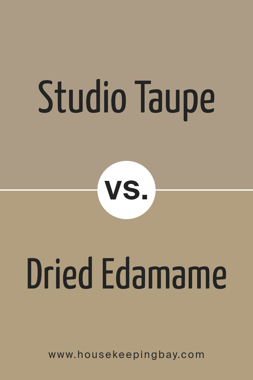
Studio Taupe SW 7549 by Sherwin Williams vs Dried Edamame SW 9122 by Sherwin Williams
Studio Taupe SW 7549 by Sherwin Williams is a warm and inviting beige color. It has a soothing presence, making it perfect for creating a cozy and comfortable feel in any room. Its versatility allows it to blend well with a variety of décor styles, from modern to traditional. On the other hand, Dried Edamame SW 9122 is a unique green-gray shade that brings a subtle touch of nature into your space. It’s a bit cooler compared to Studio Taupe, offering a fresh and serene vibe that is both calming and grounding.
While Studio Taupe adds warmth and a sense of understated elegance, Dried Edamame provides a gentle splash of color that can make a space feel more lively yet still very much at peace. Both colors stand out for their ability to create a comfortable and inviting atmosphere, but they do so in distinctly different ways.
You can see recommended paint color below:
- SW 9122 Dried Edamame
housekeepingbay.com
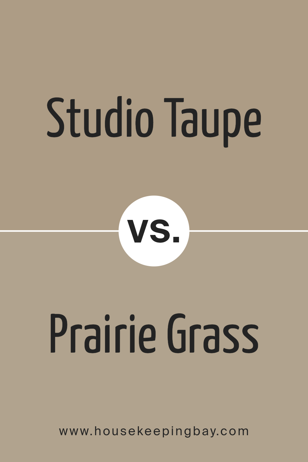
Studio Taupe SW 7549 by Sherwin Williams vs Prairie Grass SW 7546 by Sherwin Williams
Studio Taupe SW 7549 by Sherwin Williams is a warm, mid-tone neutral that leans towards a soft brown with a hint of gray. It’s a cozy and inviting color that works well in many spaces, offering a balance between being too dark or too light. It’s versatile and can easily pair with a variety of decor styles, creating a soothing atmosphere.
On the other hand, Prairie Grass SW 7546 by Sherwin Williams is a lighter, earthy green with a subtle gray undertone. It evokes a sense of calm and brings a hint of nature indoors. This color is great for adding a soft touch of color to a room without overwhelming it. Its natural vibe pairs well with woods and neutral tones, giving rooms a fresh, airy feel.
Both Studio Taupe and Prairie Grass offer unique ways to enhance a space – Studio Taupe adds warmth and depth, while Prairie Grass introduces a refreshing, natural element. Depending on the mood or theme you’re aiming for, each color has its charm in creating inviting spaces.
You can see recommended paint color below:
- SW 7546 Prairie Grass
housekeepingbay.com
Studio Taupe SW 7549 by Sherwin Williams vs Colonial Revival Stone SW 2827 by Sherwin Williams
Studio Taupe SW 7549 by Sherwin Williams is a warm, inviting neutral that leans towards a soft, cozy beige with hints of gray. It creates a serene and comfortable atmosphere in any room. This versatile color works well in spaces where you want a calming, yet sophisticated backdrop. It pairs beautifully with a wide range of decor styles and colors, making it ideal for living rooms, bedrooms, and even kitchens.
Colonial Revival Stone SW 2827, on the other hand, is a slightly lighter neutral with a perfect balance between beige and gray. This color has a timeless elegance and provides a slightly airier and more open feel compared to Studio Taupe. It’s great for rooms that you want to feel spacious and bright. Colonial Revival Stone offers a subtle sophistication that is equally adaptable in various settings, from traditional to contemporary.
Both colors share a neutral palette, but Studio Taupe brings in a bit more warmth and coziness, while Colonial Revival Stone offers a fresher, crisper foundation that can make spaces feel more expansive and luminous.
You can see recommended paint color below:
housekeepingbay.com
Studio Taupe SW 7549 by Sherwin Williams vs Fenland SW 7544 by Sherwin Williams
Studio Taupe SW 7549 and Fenland SW 7544 by Sherwin Williams are both warm, inviting colors, but they have their unique qualities. Studio Taupe is a soft, gentle beige with a hint of gray. It’s a versatile color that can make any space feel comfy and stylish. It’s like a cozy sweater for your room, making it perfect for living rooms or bedrooms where a soothing atmosphere is key.
On the other hand, Fenland SW 7544 has a deeper, earthier tone. It’s a blend of green and brown, resembling the natural colors of a forest floor. Fenland offers a bit more richness and warmth, making it great for creating a snug and welcoming space. It works well in areas where you want to add a touch of nature and depth, like in a den or study.
While both colors create a cozy vibe, Studio Taupe leans towards a lighter, airier feel, and Fenland offers a deeper, natural embrace. Depending on the mood you want to set, either of these colors could be the perfect choice for your space.
You can see recommended paint color below:
- SW 7544 Fenland
housekeepingbay.com
Studio Taupe SW 7549 by Sherwin Williams vs Tony Taupe SW 7038 by Sherwin Williams
Studio Taupe SW 7549 and Tony Taupe SW 7038, both by Sherwin Williams, are two shades of taupe that offer subtle differences for home decoration. Studio Taupe is a bit lighter, giving a soft, warm feeling that can make small rooms feel a bit bigger and welcoming. It works well when you want a hint of coziness without making the space feel tight.
On the other hand, Tony Taupe is darker, providing a stronger statement. It’s great for creating a sense of elegance and grounding in larger rooms or areas where you want more depth and character. This color can add richness to spaces without overwhelming them with darkness.
Both colors are versatile and can blend with a variety of decor styles, from modern to rustic. Choosing between them comes down to the effect you want in your space—lighter and airier with Studio Taupe or more anchored and sophisticated with Tony Taupe.
You can see recommended paint color below:
- SW 7038 Tony Taupe

housekeepingbay.com
Studio Taupe SW 7549 by Sherwin Williams vs Sanderling SW 7513 by Sherwin Williams
Studio Taupe SW 7549 and Sanderling SW 7513, both by Sherwin Williams, are unique colors that bring a subtle elegance to any space. Studio Taupe is a warmer, richer hue, reminiscent of a classic, cozy clay tone. It has a depth that adds sophistication and a grounding effect, perfect for creating a welcoming atmosphere in living spaces or bedrooms.
On the other hand, Sanderling SW 7513 is lighter, offering a softer, more serene vibe. It’s closer to a pale, sandy beige, which reflects more natural light, making rooms feel more open and airy. This color works wonders in smaller spaces or areas where you want to promote a calm and peaceful setting.
While both colors share an earthy base, Studio Taupe leans towards a denser, more enveloping feel, making it great for statement walls or larger rooms. Sanderling, with its lightness, is ideal for a fresh, clean look, especially in casual living areas or bathrooms. Together, they complement each other beautifully, allowing for a versatile palette that can suit various decorating styles.
You can see recommended paint color below:
- SW 7513 Sanderling
housekeepingbay.com
Studio Taupe SW 7549 by Sherwin Williams vs Stone Lion SW 7507 by Sherwin Williams
Studio Taupe SW 7549 and Stone Lion SW 7507 are two colors by Sherwin Williams that have their own unique appeal but share some similarities. Studio Taupe is a gentle, warm gray with a touch of brown, offering a cozy and inviting feel to any room. It’s a versatile color that works well in spaces where you want a neutral backdrop that is soothing and soft. On the other hand, Stone Lion SW 7507 leans more into the beige family, with a richer, warmer tone.
It’s a bit deeper than Studio Taupe, giving rooms a more grounded and substantial look. While both colors provide a neutral palette that can pair well with a variety of decor styles and colors, Stone Lion carries a bit more warmth, making spaces feel snug and welcoming. Choosing between them depends on the atmosphere you’re aiming to create – Studio Taupe for a lighter, airier feel or Stone Lion for a cozy, warm ambiance.
You can see recommended paint color below:
- SW 7507 Stone Lion
housekeepingbay.com
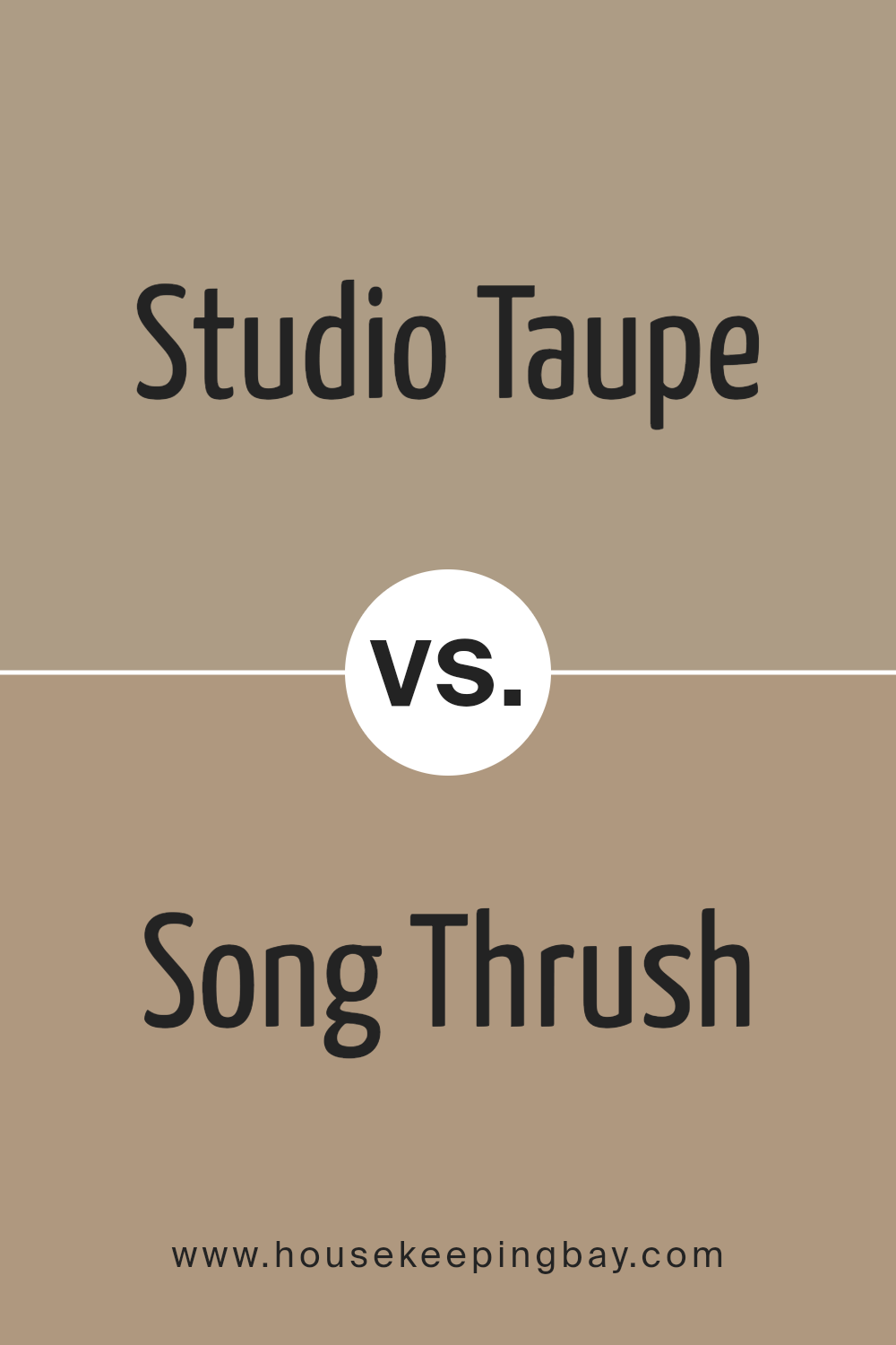
Studio Taupe SW 7549 by Sherwin Williams vs Song Thrush SW 9112 by Sherwin Williams
Studio Taupe SW 7549 by Sherwin Williams is a warm, mid-tone neutral color. It brings a subtle coziness to spaces, making it perfect for creating a welcoming atmosphere in almost any room. Its earthy tones help it blend easily with various decor styles, from modern to classic.
On the other hand, Song Thrush SW 9112 is slightly darker and richer, with a grounding quality that can add depth and warmth to an interior. This color has a robust presence that can make spaces feel more intimate and enclosed. While both colors share an earthy base, Song Thrush leans more towards a comforting, enveloping vibe, making it ideal for areas where you want to foster relaxation and warmth.
Both Studio Taupe and Song Thrush are versatile, but their individual characteristics make them suitable for different moods and settings. Studio Taupe is your go-to for an airy, open feel, while Song Thrush is perfect when you’re looking to create a cozy, snug environment.
You can see recommended paint color below:
- SW 9112 Song Thrush
housekeepingbay.com
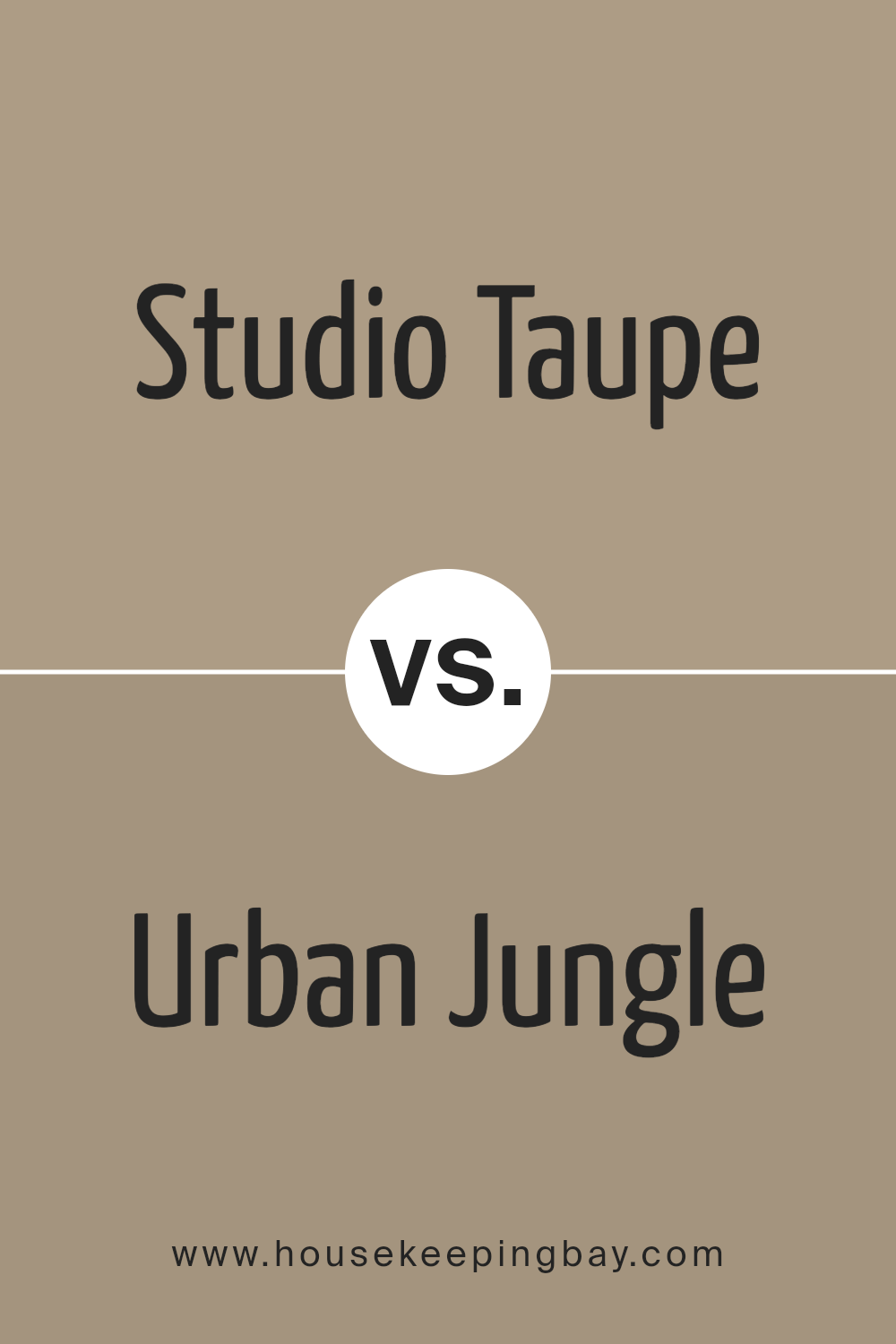
Studio Taupe SW 7549 by Sherwin Williams vs Urban Jungle SW 9117 by Sherwin Williams
Studio Taupe SW 7549 and Urban Jungle SW 9117 are two different colors by Sherwin Williams that offer unique vibes for spaces. Studio Taupe is a lighter, soft brown with a cozy, warm feeling. It’s perfect for creating a comfortable and inviting atmosphere in a room. You can think of it like a gentle hug from a room, making spaces feel snug and homely.
On the other hand, Urban Jungle is a deeper, rich green shade that brings a touch of nature indoors. It’s like bringing the calmness of a forest into your home, offering a feeling of tranquility and refreshment. Urban Jungle adds depth and character to a space, making it feel lively and connected to the outdoors.
While Studio Taupe lays down a subtle and tranquil base, perfect for almost any room, Urban Jungle steps in with a bolder statement, suggesting vitality and growth. Choosing between them depends on the mood you want to set: serene and grounded with Studio Taupe or vibrant and earthy with Urban Jungle.
You can see recommended paint color below:
- SW 9117 Urban Jungle
housekeepingbay.com
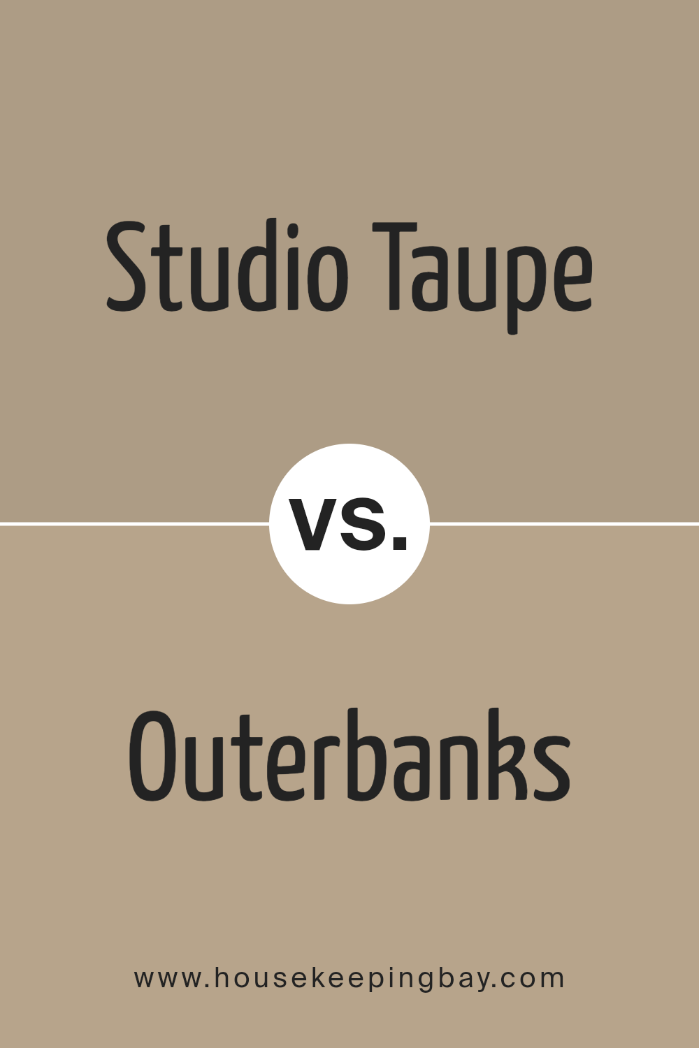
Studio Taupe SW 7549 by Sherwin Williams vs Outerbanks SW 7534 by Sherwin Williams
Studio Taupe SW 7549 and Outerbanks SW 7534 are both colors by Sherwin Williams, but they have different vibes. Studio Taupe is like a warm, cozy blanket; it’s a light to medium shade that mixes brown and grey, creating a soft backdrop for any room. It’s kind of like a hug from a color – it makes spaces feel snug and welcoming.
On the other hand, Outerbanks SW 7534 takes things a bit darker. It leans more towards a rich brown with a hint of grey. This color has a stronger presence, giving rooms a more grounded and solid feel. It’s like the strength of a tree trunk, offering a sense of stability and warmth.
When you compare them, Studio Taupe is lighter and more adaptable, fitting easily with different styles and spaces. Outerbanks, with its depth, brings a bold and cozy touch, anchoring a room with its earthy tone. Both are beautiful, but your choice depends on the mood you want to create: light and flexible with Studio Taupe, or strong and warm with Outerbanks.
You can see recommended paint color below:
- SW 7534 Outerbanks
housekeepingbay.com
Conclusion
Concluding, SW 7549 Studio Taupe by Sherwin Williams is truly a versatile color that can transform any space in your home. Thanks to its warm, inviting hue, it offers a perfect balance between comfort and style, making it an ideal choice for creating cozy, welcoming spaces. Whether you’re looking to give your living room a fresh update or want to add a touch of elegance to your bedroom, Studio Taupe has got you covered.
Not only does this color pair beautifully with a wide range of decors and themes, but it also has the unique ability to adapt to different lighting conditions, showcasing various shades throughout the day. This adaptability means it can seamlessly fit into your home, reflecting your personal style while enhancing the overall ambiance.
So, if you’re thinking about giving your walls a new lease of life, consider Studio Taupe. It’s not just a paint color; it’s a way to add warmth, depth, and sophistication to your home without overwhelming it. Whether you’re aiming for a modern, minimalist look or a more traditional vibe, Studio Taupe can help you achieve it. Give your home the makeover it deserves with SW 7549 Studio Taupe by Sherwin Williams.
housekeepingbay.com
Ever wished paint sampling was as easy as sticking a sticker? Guess what? Now it is! Discover Samplize's unique Peel & Stick samples. Get started now and say goodbye to the old messy way!
Get paint samples


