Tea Light SW 7681 by Sherwin Williams
Unveiling the Subtle Glow of Serenity
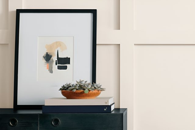
Welcome to our introduction to SW 7681 Tea Light by Sherwin Williams – a paint color that lights up any room with its warm and inviting hue.
If you’re looking for a color that brings a cozy and comfortable atmosphere to your space, Tea Light is a fantastic choice. This particular shade offers a gentle touch of color that’s not too overwhelming but still adds a significant amount of warmth and character to a room.
Tea Light has a unique charm that makes it versatile for various settings.
Whether you’re updating your living room, bedroom, or even your kitchen, this color has the power to transform any space into a welcoming area. It pairs beautifully with a wide range of decor styles, from modern minimalist to rustic country.
Choosing the right paint color can sometimes be a challenge, but SW 7681 Tea Light makes it easy to create a soothing and cheerful environment. Its subtle beauty has the potential to brighten up your walls and complement your home’s overall aesthetic.
In this article, we will explore how Tea Light can be incorporated into your home and why it might be the perfect choice for your next renovation project. Get ready to give your home a touch of warmth and brightness with Tea Light.
via sherwin-williams.com
What Color Is Tea Light SW 7681 by Sherwin Williams?
Tea Light SW 7681 by Sherwin Williams is a soothing, muted shade that seamlessly blends warmth and a delicate sophistication. This color is like a gentle whisper in a room, offering a sense of calm and refinement without overwhelming the senses.
It’s a versatile hue that brings to life the subtle elegance of spaces, making it perfect for creating serene and inviting interiors.
This color works wonders in interior styles that value simplicity and understated beauty. Think of modern minimalism where the focus is on decluttering and highlighting the essence of each piece.
Tea Light SW 7681 serves as an exquisite backdrop, enhancing the clean lines and functional design of minimalistic layouts. It’s equally at home in Scandinavian interiors, where comfort and a connection to natural elements are key.
Here, its light, airy quality complements the organic materials and textures prevalent in Nordic design.
When it comes to materials and textures, Tea Light SW 7681 pairs beautifully with natural wood, from pale birch to deeper walnut, highlighting their grain and warmth.
It also works well with matte finishes on metals for a touch of modernity, as well as with textured fabrics like linen or cotton to enhance the tactile experience of a space.
The beauty of this color lies in its ability to act as a subtle canvas, allowing materials and textures within the room to stand out, yet bringing its own gentle warmth to the overall palette.
housekeepingbay.com
Table of Contents
Is Tea Light SW 7681 by Sherwin Williams Warm or Cool color?
Tea Light SW 7681 by Sherwin Williams is a soft, inviting color that brings warmth and light into any room. This hue is part of the yellow family but it’s very gentle, not too bright or overpowering. It’s like the glow of a candle, cozy and calm. When used in homes, Tea Light makes spaces feel more welcoming and comfortable.
This color works great in rooms where you relax, such as living rooms or bedrooms. It pairs nicely with whites, creating a fresh look, or with darker colors for a bit of contrast.
Because it’s not too bold, it doesn’t take over the space but adds just the right amount of color to make a room feel more alive.
Tea Light can also make small rooms appear larger and more open because of its lightness. It reflects light well, making spaces seem brighter.
This quality is especially helpful in rooms that don’t get a lot of natural light. Overall, Tea Light SW 7681 is a great choice if you’re looking to add a touch of warmth and coziness to your home without overwhelming it with color.
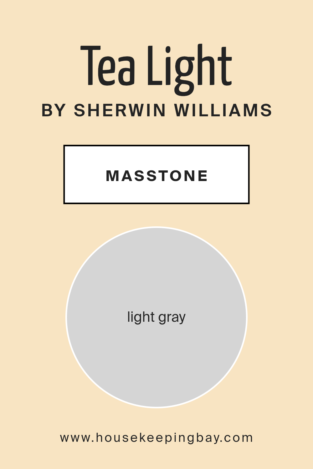
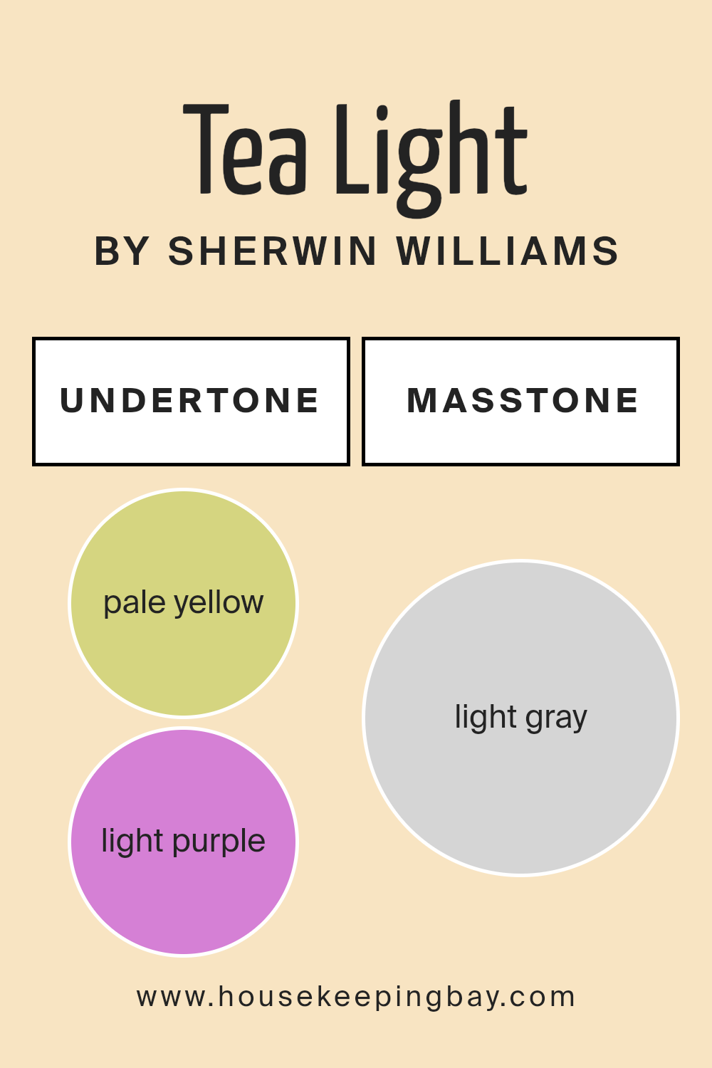
What is the Masstone of the Tea Light SW 7681 by Sherwin Williams?
Tea Light SW 7681 by Sherwin Williams has a masstone or main color that looks like light gray, specifically the shade #D5D5D5. This color is soft and peaceful, making it a perfect pick for anyone looking to create a calm and welcoming space in their home.
Light gray has a magical quality of being both cool and warm, which means it works well in rooms that get lots of sunlight as well as those that are a bit darker.
Because this shade of gray is on the lighter side, it helps make small rooms look bigger and more open. It’s like a breath of fresh air for any space, adding a touch of modern simplicity. This color can act as a quiet background, allowing your furniture and decor to stand out without competing for attention.
It’s also super flexible, matching well with almost any color you want to pair it with, from bright and vibrant to soft and subtle. This makes Tea Light SW 7681 a fantastic choice for creating a cozy, stylish home.
housekeepingbay.com
Undertones of Tea Light SW 7681 by Sherwin Williams
Tea Light SW 7681 by Sherwin Williams is a unique color that comes with some interesting undertones. Specifically, it has pale yellow and light purple undertones. Understanding these undertones is key to knowing how this color will look in different settings.
Undertones are like secret ingredients that can change the appearance of colors under various lighting conditions. They affect how we perceive colors, making them appear cooler or warmer. For Tea Light SW 7681, the pale yellow undertone adds a touch of warmth, making spaces feel cozy and inviting.
On the other hand, the light purple undertone introduces a subtle coolness, adding a touch of sophistication and depth.
When applied to interior walls, Tea Light SW 7681 doesn’t just show as a simple color. The impact of its undertones comes into play, influencing the atmosphere of the room. In bright, natural light, the pale yellow undertone might become more noticeable, creating a sunny, cheerful vibe.
In artificial light or during the evening, the light purple might stand out, lending an elegant and tranquil feel to the space.
Therefore, the presence of these undertones means that Tea Light SW 7681 can offer a dynamic look to interior walls, appearing slightly different at various times of the day or under different lighting conditions.
This adaptability makes it a versatile choice for anyone looking to add a layer of complexity and character to their home.
housekeepingbay.com
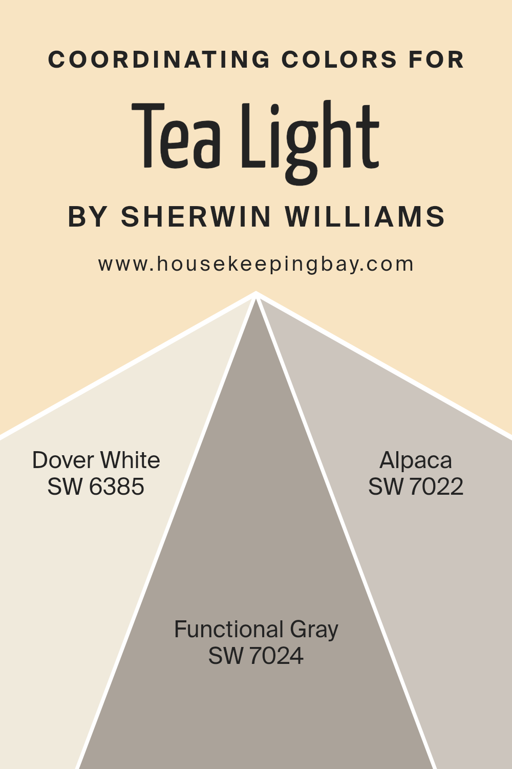
Coordinating Colors of Tea Light SW 7681 by Sherwin Williams
Coordinating colors are hues that when used together in a space, enhance the overall aesthetic appeal and create a cohesive look. They are selected based on their ability to complement and balance each other, ensuring that no single color overwhelms the space.
For example, Tea Light SW 7681 by Sherwin Williams, a pale, soothing green, can be beautifully complemented by a trio of coordinating colors: Dover White SW 6385, Functional Gray SW 7024, and Alpaca SW 7022. These colors work together to create a harmonious and inviting environment.
Dover White SW 6385 is a warm, creamy white that adds a touch of brightness without being stark, making it an ideal companion for the softness of Tea Light. It can bring a fresh and airy feel to any room, acting as a perfect backdrop for the more expressive colors.
Functional Gray SW 7024, on the other hand, is a medium gray that grounds the space with its solid, earthy tone. It pairs elegantly with the lightness of Tea Light and the brightness of Dover White, providing a sophisticated neutrality.
Alpaca SW 7022 offers a unique blend of gray and brown, creating a warm, versatile taupe that complements the gentle nature of Tea Light. This color has the remarkable ability to blend well with both warm and cool tones, adding depth and complexity to the overall palette.
Together, these coordinating colors help in achieving a balanced and harmonious look that’s both inviting and stylish.
You can see recommended paint colors below:
- SW 6385 Dover White
- SW 7024 Functional Gray
- SW 7022 Alpaca
housekeepingbay.com
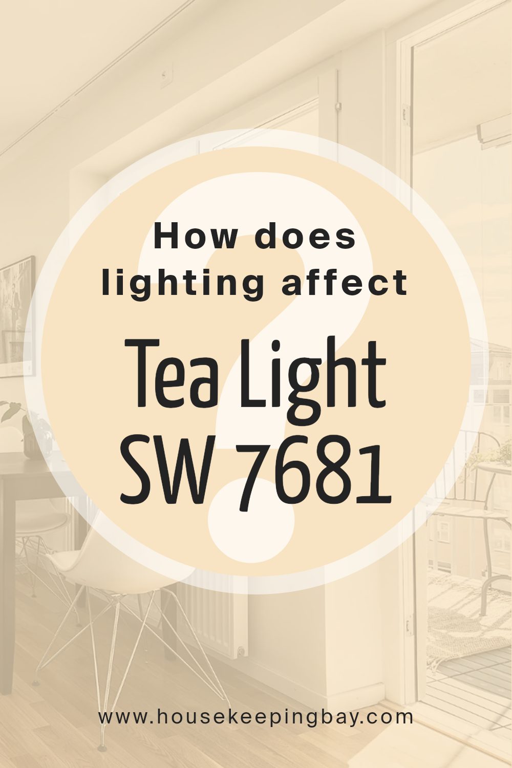
How Does Lighting Affect Tea Light SW 7681 by Sherwin Williams?
Lighting plays a crucial role in how we see and experience color. Its effect on colors transforms the way they appear, both subtly and dramatically. When thinking about painting a room, understanding how light impacts color is crucial.
For instance, the color Tea Light SW 7681 by Sherwin Williams will look different in various types of light.
In artificial light, the type of bulbs you use affects Tea Light’s appearance. LED or fluorescent lighting can make Tea Light look cooler or slightly bluish, while incandescent light gives it a warmer, cozier feel.
This means that at night, or in rooms without natural light, Tea Light’s true color might shift depending on the light bulbs you’ve chosen.
Natural light, on the other hand, changes throughout the day and affects how Tea Light looks. In rooms facing north, which tend to get less direct sunlight, Tea Light may appear more muted and cooler, giving a calm and tranquil feel.
This softer light won’t bring out the warmth in Tea Light as much, tending towards a more delicate appearance.
South-facing rooms are flooded with warmer, brighter light for most of the day, making Tea Light appear brighter and more lively. This direct sunlight can enhance the color, making the room feel inviting and warm.
East-faced rooms get morning light, which is bright and warm. Early in the day, Tea Light will look vibrant and cozy, but as the day goes on and the natural light fades, the color may seem cooler and more subdued.
West-facing rooms receive evening light, which is warmer and has a golden quality. Tea Light in these rooms will transition throughout the day, starting cooler in the morning and becoming warmly illuminated by sunset, offering a richer appearance by evening.
Understanding these dynamics helps in choosing the right room and lighting conditions to use Tea Light SW 7681, ensuring it complements your space beautifully under various lighting.
housekeepingbay.com
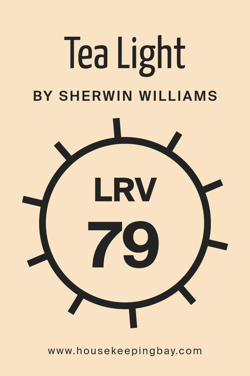
What is the LRV of Tea Light SW 7681 by Sherwin Williams?
LRV stands for Light Reflectance Value, which is a measurement indicating how much light a paint color reflects or absorbs. Picture this: when light hits your wall, some of it bounces back into the room, and this is what makes the room brighter or darker.
An LRV scale goes from 0 to 100, where 0 is pure black, absorbing all light, and 100 is pure white, reflecting all light. So, colors with a high LRV make a room feel brighter and more open because they reflect more light back into the space.
On the other hand, colors with a low LRV can make a room feel cozier and smaller since they absorb more light.
Given that Tea Light SW 7681 by Sherwin Williams has an LRV of 79.154, it falls into the category of colors that will significantly brighten up a space by reflecting most of the light that hits its surface.
This means that when you use this color on your walls, it can make the room feel airy and spacious. It is especially beneficial in spaces that don’t get a lot of natural light, as it can help to make the space feel naturally brighter.
The high LRV of Tea Light also means it has the versatility to work well in many different types of rooms, adapting well to changes in lighting conditions throughout the day.
housekeepingbay.com
What is LRV? Read It Before You Choose Your Ideal Paint Color
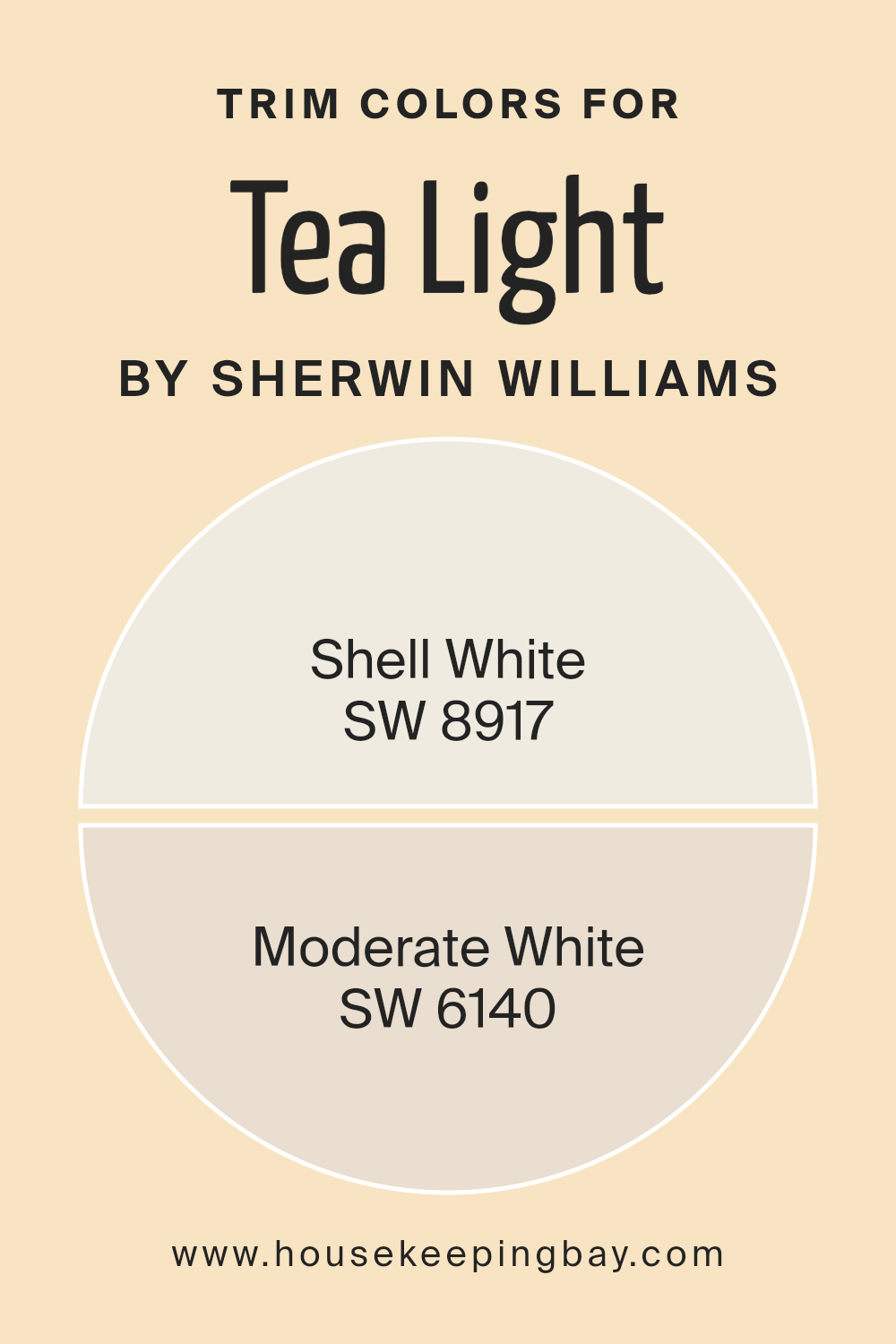
What are the Trim colors of Tea Light SW 7681 by Sherwin Williams?
Trim colors serve as an essential aspect of interior or exterior design, providing a visual frame or contrast to the main color on walls or other surfaces. When it comes to Tea Light SW 7681 by Sherwin Williams, selecting the right trim color can significantly enhance the overall appearance and ambiance of a room.
Trim colors like Shell White SW 8917 and Moderate White SW 6140 are specifically chosen to complement or subtly contrast with Tea Light SW 7681, defining edges, corners, and architectural details that might otherwise blend into the background.
This strategic use of trim colors not only accentuates the architectural elements of a space but also creates a cohesive look that adds depth and character to the design.
Shell White SW 8917 is a soft, warm white with a hint of underlying creaminess that brings a gentle brightness to the spaces it inhabits. This color is especially suited as a trim color for Tea Light SW 7681, as it softly delineates spaces without harsh contrasts, promoting a serene and welcoming environment.
On the other hand, Moderate White SW 6140 offers a slightly deeper tone, rich with a subtle complexity that adds a layer of sophistication to the palette.
As a trim color, Moderate White SW 6140 enhances Tea Light SW 7681 by adding depth and interest to the room, making architectural details pop in a refined and understated way.
Together, these trim colors ensure that rooms painted in Tea Light SW 7681 look polished and pulled together, highlighting the beauty of the space’s design elements.
You can see recommended paint colors below:
housekeepingbay.com
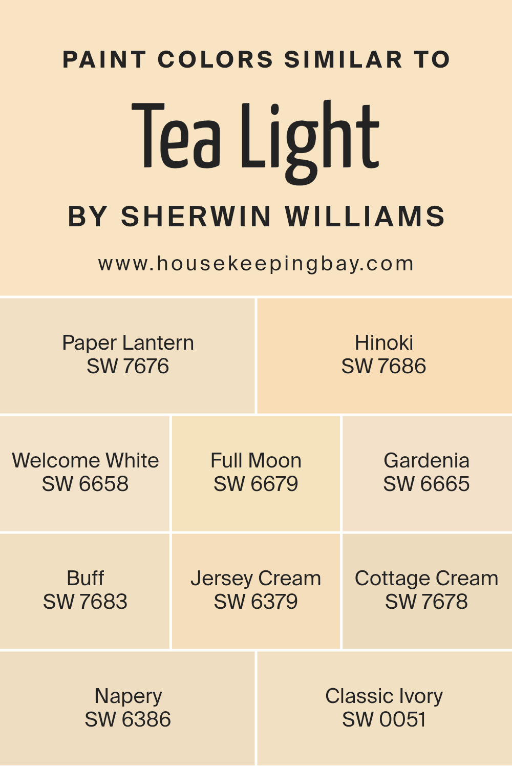
Colors Similar to Tea Light SW 7681 by Sherwin Williams
When decorating a space, choosing the right color palette is essential, and using similar colors can create a harmonious and balanced look. For instance, colors akin to Tea Light SW 7681 by Sherwin Williams share a subtle and soothing vibe that’s perfect for creating a serene space.
These colors, ranging from soft off-whites to gentle creams, work together by providing a seamless color flow, making a room feel connected and cohesively designed.
Their similar tones mean they can be mixed and matched with ease, allowing for a versatile use in various decor styles without overwhelming the senses.
Among these hues, Paper Lantern SW 7676 presents a soft, warm glow, reminiscent of the gentle light of its namesake, adding a cozy ambiance to any space.
Hinoki SW 7686, on the other hand, provides a hint of earthiness, grounding the airy palette with its more anchored feel.
Welcome White SW 6658 offers a crisp, clean background, making it a perfect base for layering additional colors. Full Moon SW 6679 and Gardenia SW 6665 introduce a subtle distinction between cool and warm undertones, respectively, giving more depth to a monochromatic scheme.
Buff SW 7683, Jersey Cream SW 6379, and Cottage Cream SW 7678 lean towards a buttery softness, enveloping a room in warmth. Napery SW 6386 enriches the collection with a golden touch that sparkles under natural light.
Lastly, Classic Ivory SW 0051 pulls the assortment together, acting as a neutral bridge that enhances the collective appeal of these companionable hues. These colors, by nature, support and enhance one another, proving that a well-thought-out selection can elevate the aesthetic of any interior.
You can see recommended paint colors below:
- SW 7676 Paper Lantern
- SW 7686 Hinoki
- SW 6658 Welcome White
- SW 6679 Full Moon
- SW 6665 Gardenia
- SW 7683 Buff
- SW 6379 Jersey Cream
- SW 7678 Cottage Cream
- SW 6386 Napery
- SW 0051 Classic Ivory
housekeepingbay.com
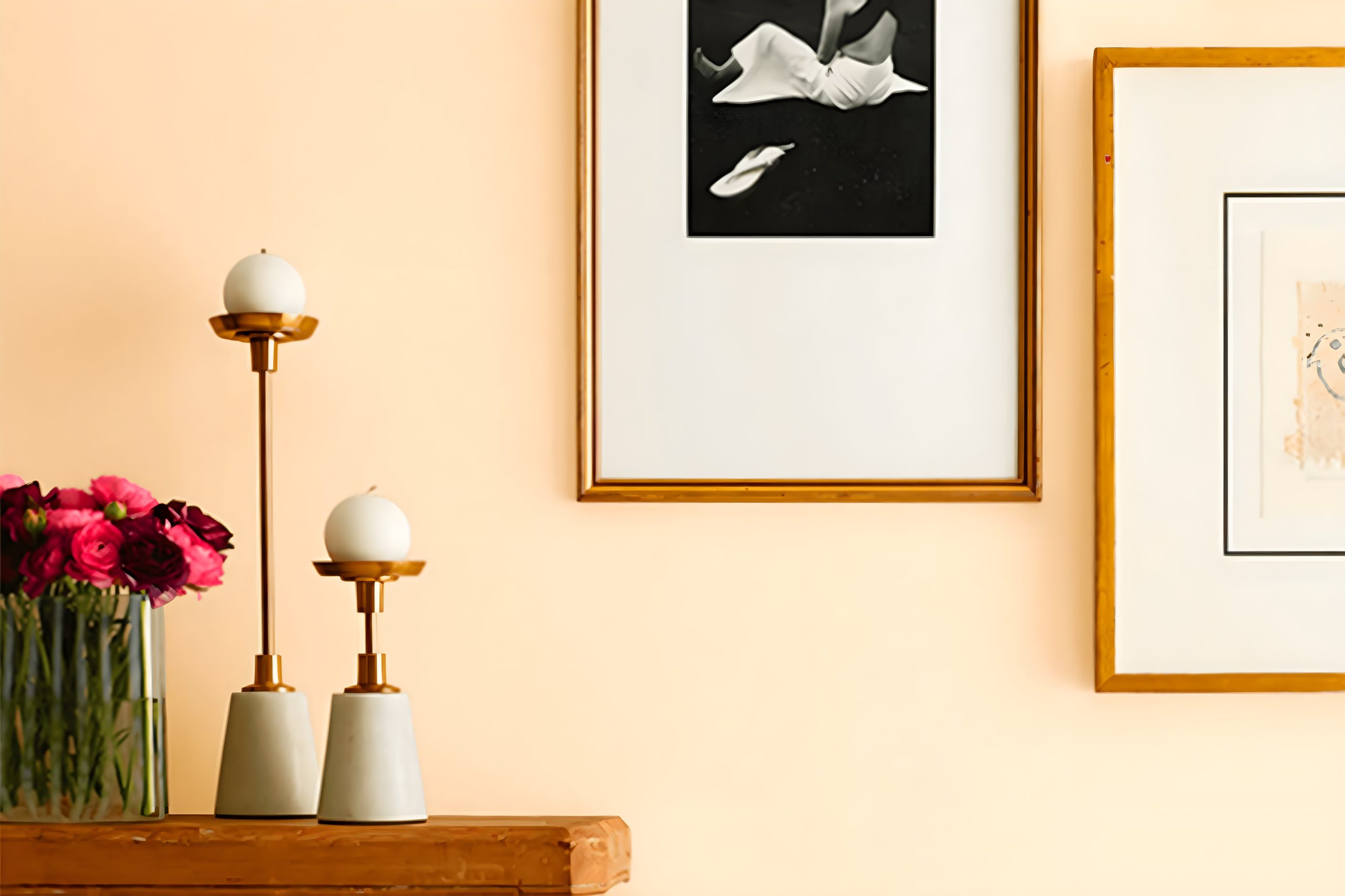
How to Use Tea Light SW 7681 by Sherwin Williams In Your Home?
Tea Light SW 7681 by Sherwin Williams is a paint color that can add a soft, warm touch to any room in your home. This light, creamy shade is perfect for creating a cozy and inviting atmosphere. You can use Tea Light in various ways to enhance your living space.
For instance, painting your living room or bedroom walls with this color can make the rooms feel more comfortable and relaxed. It’s a great choice for areas where you want to unwind and feel at ease.
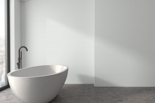
Additionally, Tea Light works wonderfully in smaller spaces or rooms without much natural light, as its warm tones help brighten up the area and make it appear larger. Kitchens and bathrooms can also benefit from this color, providing a cheerful and clean look.
Pairing Tea Light with darker tones or vibrant accents can add a lovely contrast to your decor, making it versatile for numerous styles and preferences. Whether you’re looking to freshen up a single room or repaint your whole house, Tea Light SW 7681 offers a beautiful backdrop that’s both inviting and comforting.
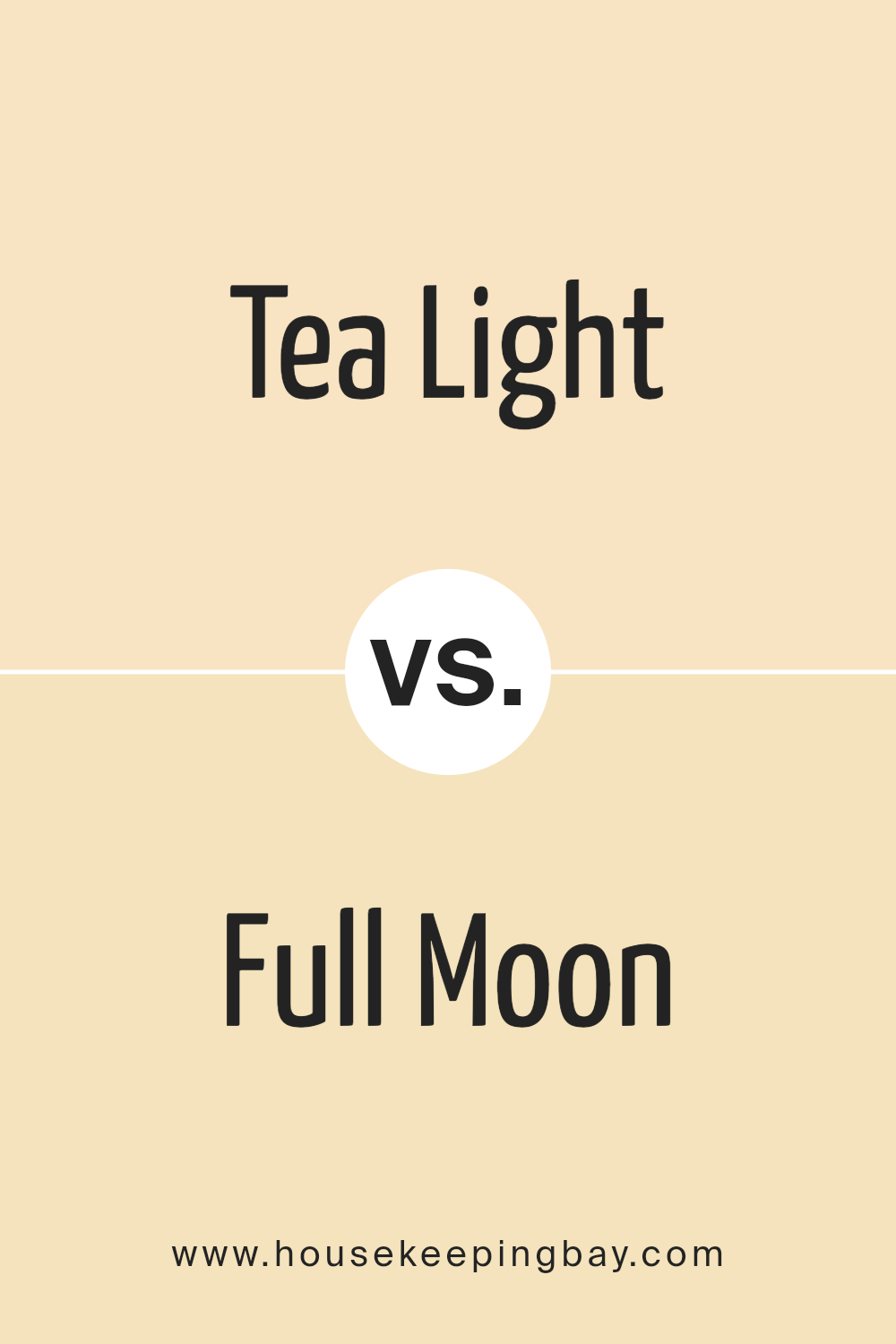
Tea Light SW 7681 by Sherwin Williams vs Full Moon SW 6679 by Sherwin Williams
Tea Light SW 7681 by Sherwin Williams is a warm, soothing color that reminds you of a cozy, sunlit room in the morning. It has a gentle vibe that makes any space feel welcoming and calm. On the other hand, Full Moon SW 6679 is a vibrant, bright color.
It’s much lighter than Tea Light, and it brings a cheerful energy to any room. If you think of Tea Light as a soft hug, then Full Moon is like a burst of happiness. Both colors can make a space feel nice, but in different ways.
Tea Light is more about creating a relaxed, peaceful atmosphere, while Full Moon is all about making things feel lively and bright. Depending on what kind of mood you want to set, you might choose one color over the other.
You can see recommended paint color below:
- SW 6679 Full Moon
housekeepingbay.com
Tea Light SW 7681 by Sherwin Williams vs Paper Lantern SW 7676 by Sherwin Williams
Tea Light SW 7681 by Sherwin Williams is a soft and cozy hue. It’s kind of like the warm glow from a candle, giving spaces a welcoming and peaceful feel.
It’s a neutral color that blends well with other shades, making it great for any room looking for a touch of warmth without being too bold.
On the other hand, Paper Lantern SW 7676 has a slightly different vibe. It’s a bit lighter and has a fresher feel to it, similar to the soft light of a morning sky. This color is perfect for making small spaces appear larger and brighter.
It’s very versatile and can create a relaxed and airy environment in any area of your home.
Both colors are pretty and soft, but Tea Light SW 7681 brings warmth and coziness, while Paper Lantern SW 7676 offers a brighter and more refreshing look. Depending on what mood you’re aiming for in your space, either color could be the perfect choice.
You can see recommended paint color below:
- SW 7676 Paper Lantern
housekeepingbay.com
Tea Light SW 7681 by Sherwin Williams vs Buff SW 7683 by Sherwin Williams
Tea Light SW 7681 by Sherwin Williams is a soft and mild color, reminding you of the gentle light of a tea candle. It has a soothing feel, almost like a pale, creamy beige or a very light tan. This color brings a subtle warmth to a room, making spaces feel cozy but still light and airy.
On the other hand, Buff SW 7683 is a bit richer and warmer. Think of it as the color of golden sand or a light caramel. It’s still in the neutral zone but adds a bit more depth and warmth to a space compared to Tea Light.
Buff has the power to make a room feel more grounded and welcoming without overwhelming the senses.
When you put Tea Light and Buff side by side, you’ll notice that Tea Light leans towards a softer, lighter touch, while Buff brings in a bit more warmth and depth. Both are great choices for making a space feel inviting, just in slightly different ways.
You can see recommended paint color below:
- SW 7683 Buff
housekeepingbay.com
Tea Light SW 7681 by Sherwin Williams vs Hinoki SW 7686 by Sherwin Williams
Tea Light SW 7681 by Sherwin Williams and Hinoki SW 7686, both from Sherwin Williams, offer unique tones that bring different moods into a room. Tea Light is a soft, subtle shade that leans towards a light, creamy background with just a hint of warmth.
It’s perfect for creating a calm and inviting atmosphere in your home, making rooms feel more open and airy.
On the other hand, Hinoki moves a bit darker, presenting a richer, more grounded color that resembles the natural wood tones found in the Hinoki cypress. This color provides a cozy, warm feeling, making it ideal for spaces where you want to add depth and a sense of comfort.
When you compare these two, Tea Light offers a brighter, lighter canvas, suggesting freshness and simplicity. Hinoki, with its deeper, woodier tone, brings a robust warmth to spaces, perfect for those seeking a more anchored, natural aesthetic.
Together, they could complement each other well in a home, with Tea Light brightening spaces and Hinoki adding character and warmth.
You can see recommended paint color below:
- SW 7686 Hinoki
housekeepingbay.com
Tea Light SW 7681 by Sherwin Williams vs Jersey Cream SW 6379 by Sherwin Williams
Tea Light SW 7681 by Sherwin Williams is a soft and gentle color, very much like the light glow of a candle, as its name suggests. It’s a kind of beige that leans slightly towards grey, giving it a calm and soothing vibe.
This color is great for creating a serene and peaceful atmosphere in any room, making spaces feel more open and airy.
On the other hand, Jersey Cream SW 6379 breaks away from the subtlety of Tea Light by introducing a warmer and richer tone. Jersey Cream is a soft, creamy yellow that brings a cozy and inviting feeling.
It’s like the warm, comforting light of the morning sun gently filling a room. This color adds a touch of cheerfulness and warmth, perfect for creating a welcoming space.
While both colors share a softness in their appearance, Tea Light offers a cooler, more understated elegance, and Jersey Cream provides a warm, sunny embrace without using overwhelming brightness.
Each color has its unique way of enhancing a space with its own special charm.
You can see recommended paint color below:
- SW 6379 Jersey Cream
housekeepingbay.com
Tea Light SW 7681 by Sherwin Williams vs Napery SW 6386 by Sherwin Williams
Tea Light SW 7681 and Napery SW 6386, both by Sherwin Williams, are two distinct shades with their unique charm. Tea Light is a soft, warm beige with just a hint of yellow, creating a cozy and inviting atmosphere.
It’s the kind of color that feels like a gentle hug for any room, making spaces feel more welcoming and relaxed.
On the other hand, Napery has a richer, deeper tone, leaning more into a golden hue. It brings a sunny warmth to a room, reminiscent of a bright, cheerful morning. The color is a bit more pronounced than Tea Light, offering a stronger statement without overwhelming a space.
When comparing the two, Tea Light works well for those seeking a subtle, neutral backdrop that easily blends with other colors and decor. Napery, while still neutral, adds a touch more vibrancy and energy to a room due to its deeper golden tone.
Both colors are versatile and can enhance the beauty of a space, depending on the atmosphere you’re aiming to create.
You can see recommended paint color below:
- SW 6386 Napery
housekeepingbay.com
Tea Light SW 7681 by Sherwin Williams vs Classic Ivory SW 0051 by Sherwin Williams
Tea Light SW 7681 by Sherwin Williams is a cozy, inviting color that has a bit more depth and warmth. It’s like looking at a space where soft sunlight filters in, creating a gentle, soothing atmosphere.
This color wraps a room in a kind of glow that feels both comfortable and uplifting, making spaces feel welcoming and lived-in.
On the other hand, Classic Ivory SW 0051 by Sherwin Williams is lighter and has a crisp freshness to it. It’s akin to the feeling of crisp linen or the first light of dawn.
Classic Ivory brings a clean simplicity to a space, offering a backdrop that feels both timeless and airy. It can open up a room, making it feel larger and brighter.
While both colors offer a sense of calm and coziness, Tea Light leans toward a warmer, richer ambiance, and Classic Ivory leans towards a lighter, more open vibe. They both can beautifully transform a space, but the choice between them depends on the desired mood and feel of the room.
You can see recommended paint color below:
- SW 0051 Classic Ivory
housekeepingbay.com
Tea Light SW 7681 by Sherwin Williams vs Welcome White SW 6658 by Sherwin Williams
Tea Light SW 7681 by Sherwin Williams is a soft, gentle hue, presenting as a subtle, warm neutral. It’s like the light, comforting glow of a candle, offering a cozy and inviting ambiance to any space. Its understated elegance provides a serene backdrop, perfect for rooms where calm and peace are desired.
On the other hand, Welcome White SW 6658 by Sherwin Williams shines as a bright, crisp white. It’s a cheerful color that brings a sense of freshness and clarity to a room.
Unlike the muted tones of Tea Light, Welcome White acts as a canvas, making it an excellent choice for areas that benefit from an open and airy feel.
Putting them side by side, Tea Light and Welcome White differ in mood and application. Tea Light’s warmth makes rooms feel snug and welcoming, while Welcome White opens up spaces, reflecting light and making details pop.
Both colors have their unique charm, offering different ways to enhance the beauty of a home.
You can see recommended paint color below:
- SW 6658 Welcome White
housekeepingbay.com
Tea Light SW 7681 by Sherwin Williams vs Gardenia SW 6665 by Sherwin Williams
Tea Light SW 7681 by Sherwin Williams is a soothing, soft color. It feels like a gentle hug of warmth on a bright, sunny day. This color is very subtle, close to a pale, creamy white with just a hint of warmth to it. It’s perfect for making rooms feel more open, airy, and calm.
It goes well in places you want to relax in, like bedrooms or living rooms.
On the other hand, Gardenia SW 6665 is also a soft color, but it has a different vibe. It’s more like a cheerful whisper of yellow that brings to mind the gentle petals of the Gardenia flower. This color adds a subtle, sunny lift to any space without being too bold or overpowering.
It’s like the soft glow of morning light, making it great for kitchens, bathrooms, or anywhere you want a hint of happiness and warmth.
Both colors, Tea Light and Gardenia, are soft and light, but Tea Light leans towards a warm, creamy hue, while Gardenia brings in a touch of soft yellow, offering brightness and a cheerful ambiance. They’re both great for creating a peaceful, welcoming atmosphere in a home.
You can see recommended paint color below:
- SW 6665 Gardenia
housekeepingbay.com
Tea Light SW 7681 by Sherwin Williams vs Cottage Cream SW 7678 by Sherwin Williams
Tea Light SW 7681 by Sherwin Williams is a soft, warm tone that brings a cozy and inviting feel to any room. It’s a gentle hue that can make spaces feel airy and light, without being overly bright or stark. It’s great for creating a relaxing atmosphere.
Cottage Cream SW 7678 by Sherwin Williams, on the other hand, is a creamy, comforting color. This shade is slightly richer and more saturated than Tea Light, offering a hint of warmth that can make a room feel welcoming and snug.
It’s a bit more noticeable on the walls, adding a layer of coziness to the environment.
When you compare the two, Tea Light is lighter and has a more neutral, subdued feel. It’s perfect for those looking for a hint of color without overwhelming the senses. Cottage Cream is warmer and has a touch more color, making it ideal for adding a cozy, comforting vibe to a space.
Both colors work well to create a serene and inviting atmosphere, but the choice between them depends on the mood you’re looking to create in your space.
You can see recommended paint color below:
- SW 7678 Cottage Cream
housekeepingbay.com
Conclusion
Tea Light SW 7681 by Sherwin Williams is a light and airy color that brings a sense of calmness and relaxation to any space. This versatile shade, with its subtle warmth, is perfect for creating a cozy atmosphere.
Whether it’s used in a living room, bedroom, or even a bathroom, Tea Light adds a touch of elegance and simplicity, making it an ideal choice for those looking to freshen up their home decor.
Its ability to pair well with a wide range of colors and materials enables homeowners and designers alike to experiment with different styles while maintaining a harmonious and inviting environment.
Considering its adaptability and the serene ambiance it fosters, Tea Light SW 7681 is more than just a paint color; it’s a means to transform a house into a home. Its understated charm enhances the aesthetics of a space without overwhelming it, allowing for personal touches and decorative elements to stand out.
Whether aiming for a minimalist, modern, or a more traditional look, this color serves as a beautiful backdrop, proving its significance in interior design. For anyone looking to update their living space, Tea Light offers a fresh and modern feel that is both uplifting and timeless.
housekeepingbay.com
Ever wished paint sampling was as easy as sticking a sticker? Guess what? Now it is! Discover Samplize's unique Peel & Stick samples. Get started now and say goodbye to the old messy way!
Get paint samples