Take Five SW 6513 by Sherwin Williams
Elevate Your Space Unveiling the Magic of This Vibrant Shade
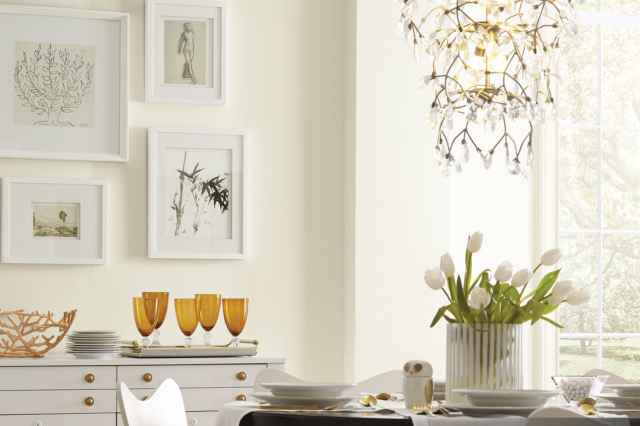
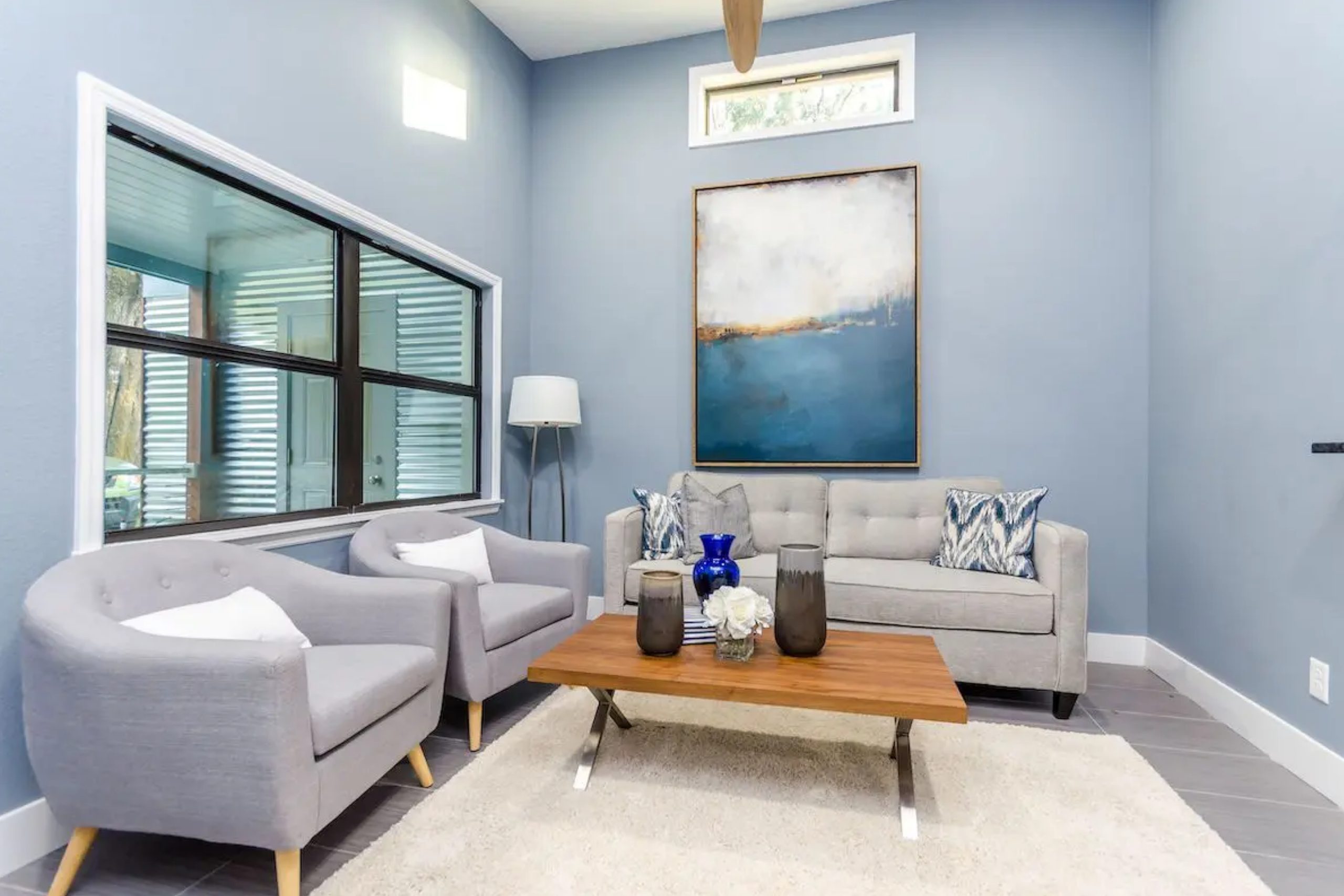
Kicking off a new painting project can be both exciting and a bit overwhelming. One of the first steps to transforming any space is choosing the right color. That’s where SW 6513 Take Five by Sherwin Williams comes into play. This particular shade is like a breath of fresh air, perfect for anyone looking to refresh their space with a subtle yet impactful change.
Take Five is not just any color; it’s a unique blend that strikes the perfect balance between comfort and style. Its versatility makes it ideal for virtually any room, whether you’re aiming to create a serene bedroom, a lively living room, or a welcoming kitchen. The beauty of Take Five lies in its ability to complement a wide range of decor styles, from modern minimalism to cozy traditional.
Choosing the right paint color is more than just picking a shade you like; it’s about setting the mood and tone for your space. Take Five offers a soothing backdrop that can easily be built upon with various textures and accent colors, allowing for a cohesive look without feeling too matched or overly coordinated.
This shade acts as a canvas, inviting you to bring your unique aesthetic to the forefront.Whether you’re a seasoned DIYer or a novice in home decoration, SW 6513 Take Five by Sherwin Williams is a fantastic pick that promises to revitalize any space without overwhelming it. Its understated elegance and adaptability make it a go-to choice for those looking to achieve a fresh, contemporary look.
via sherwin-williams.com
What Color Is Take Five SW 6513 by Sherwin Williams?
Take Five SW 6513 by Sherwin Williams is a unique shade that effortlessly brings a sense of calm and sophistication to any space. This color is a serene blue that leans towards the lighter, more muted side of the spectrum. It’s the kind of blue that reminds you of a clear sky on a sunny day or the gentle waves of a tranquil sea. What makes Take Five stand out is its ability to blend both a fresh, airy feel with a touch of depth, making it versatile for various interior styles.
Take Five works wonders in interior designs that favor a modern, minimalist look, Scandinavian simplicity, or even coastal charm. It’s a color that can anchor a room without overwhelming it with intensity. This shade has a magical way of making small spaces appear larger and more open, while also bringing a sense of coziness and comfort to larger areas.
In terms of pairing with materials and textures, Take Five is quite the team player. It goes beautifully with natural wood, from light oak to richer walnut, enhancing the wood’s natural grain and warmth. Metals, like brushed nickel or soft gold, also complement this color, adding a touch of elegance.
When it comes to textiles, consider soft, tactile fabrics like cotton, linen, or even silk to highlight Take Five’s soothing essence. Textured accents like jute rugs or chunky knit throws can also add depth and interest, making the space feel inviting and well-balanced.

housekeepingbay.com
Table of Contents
Is Take Five SW 6513 by Sherwin Williams Warm or Cool color?
Take FiveSW 6513 by Sherwin Williams is a unique color that brings a calm and serene vibe to any room. Imagine a shade of green that feels like a gentle whisper of nature inside your home; that’s Take Five for you. This color has a special way of making spaces feel more open and airy, adding a touch of peacefulness that’s both refreshing and subtle.
When you use Take Five in your home, it acts like a quiet background, letting your furniture and decorations stand out. It’s almost like it works as a team with your room, making everything else look better. Because of its softness, it’s perfect for places where you want to relax, like bedrooms or living rooms. Plus, it has this cool ability to blend well with both modern and traditional styles, making it a versatile choice for any home.
The lightness of Take Five can also make small spaces seem bigger and brighter, which is great if you’re trying to give a room a more open feel. It’s like a breath of fresh air for your home, making it a cozy and inviting place to be.
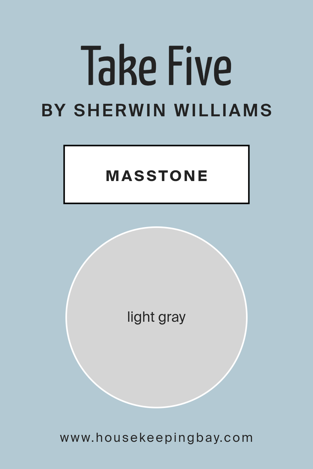
What is the Masstone of the Take Five SW 6513 by Sherwin Williams?
Take Five SW 6513 by Sherwin Williams shows off a masstone of light gray, known as #D5D5D5. This soft and gentle hue is like the perfect middle-ground color; it’s not too bright and not too dark. In homes, this light gray brings a calm and cozy vibe to any room. It’s the kind of color that makes your space feel bigger and more open without trying too hard.
Because it’s so neutral, it works well with almost any other color. This means you can add bright pillows or colorful art, and they’ll pop against the light gray backdrop. It’s also great for rooms that don’t get a lot of natural light, as it helps bounce whatever light there is around the room, making the space feel lighter and more welcoming.
So, whether you’re sprucing up your living room, bedroom, or even your bathroom, Take Five adds a quiet charm that’s hard to beat. It’s like a gentle hug for your walls, making any space feel just right.
housekeepingbay.com
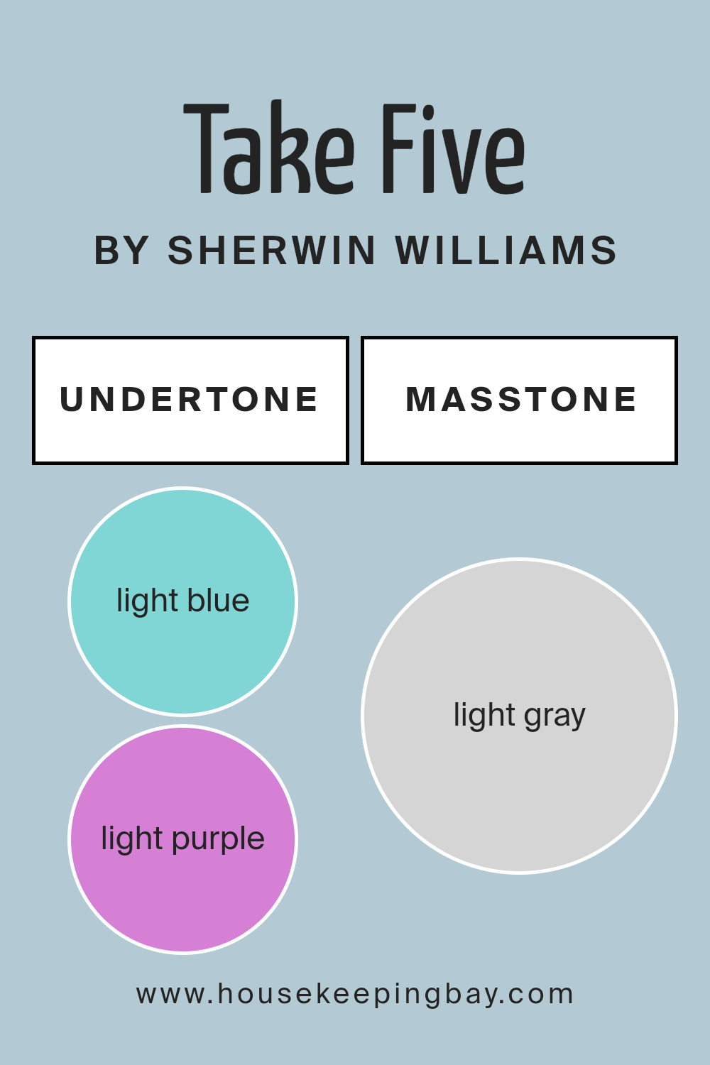
Undertones of Take Five SW 6513 by Sherwin Williams
Take Five SW 6513 by Sherwin Williams is a unique color with interesting undertones that make it stand out. Specifically, it has light blue and light purple undertones. Undertones are subtle colors that lie beneath the surface color. They can change how we perceive the main color, especially under different lighting conditions or when paired with other colors.
In the case of Take Five SW 6513, the light blue undertone adds a cool, refreshing vibe to the color. This makes the paint feel airy and calming, which is perfect for creating a relaxed atmosphere in a room. On the other hand, the light purple undertone introduces a hint of warmth and sophistication.
This blend of cool and warm undertones makes Take Five a versatile paint color that can adapt to various interior styles and lighting conditions.
When applied to interior walls, the undertones of Take Five play a significant role in the overall look and feel of the space. In natural light, the light blue undertone might become more prominent, giving the room a serene and open feel. Meanwhile, in artificial light, the light purple undertone might peek through, adding depth and complexity to the wall color.
This interplay of undertones means that Take Five can create dynamic and inviting spaces, making it a great choice for anyone looking to add a touch of uniqueness to their home.
housekeepingbay.com
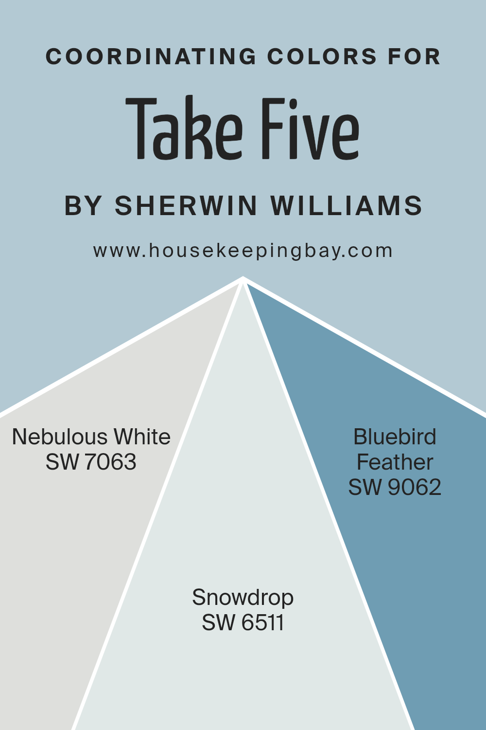
Coordinating Colors of Take Five SW 6513 by Sherwin Williams
Coordinating colors are hues that work in harmony with a primary color to create a cohesive and visually appealing palette. They can be used across various elements in a space, such as walls, furniture, and decor, to achieve a balanced look. When it comes to Take Five SW 6513 by Sherwin Williams, a distinctive shade that serves as a fantastic starting point for setting up a room’s atmosphere, finding the right coordinating colors is key to enhancing its unique appeal.
SW 7063 – Nebulous White, a subtly soft and airy shade, adds a touch of calm and serenity to spaces, making it an excellent companion for the more pronounced Take Five. It’s ideal for creating a relaxed and inviting environment. SW 6511 – Snowdrop, on the other hand, introduces a crisp and clean vibe that illuminates and enlarges spaces.
This color is perfect for adding freshness and a sense of openness when paired with Take Five. Lastly, SW 9062 – Bluebird Feather offers a gentle touch of nature’s tranquility. Its muted blue tone brings a soothing and grounding effect, perfectly complementing the lively yet sophisticated character of Take Five.
Together, these coordinating colors from Sherwin Williams blend seamlessly, offering endless possibilities for designing a harmonious and inviting space.
You can see recommended paint colors below:
- SW 7063 Nebulous White
- SW 6511 Snowdrop
- SW 9062 Bluebird Feather
housekeepingbay.com
How Does Lighting Affect Take Five SW 6513 by Sherwin Williams?
Lighting can greatly impact how we see colors. The way a color looks can change under different lights. This is because light sources vary in their color temperatures and intensities. Take for example, “Take Five” SW 6513 by Sherwin Williams. This paint color can look different in artificial light compared to natural sunlight.
In artificial light, such as LED or fluorescent lighting, “Take Five” might appear more muted or slightly different in tone. Artificial light can either warm up or cool down the color, depending on the bulb. This is important to consider when choosing this color for spaces mainly lit with lamps or overhead lights.
- In natural light, “Take Five” will show its true color, but the amount and angle of sunlight will affect its appearance. The direction your room faces plays a big role in how this color behaves throughout the day.
- North-faced rooms get less direct sunlight, so they tend to have cooler, softer light. In these rooms, “Take Five” might look a bit more subdued and cooler, bringing out the color’s subtle nuances.
- South-faced rooms enjoy abundant sunlight, making colors look brighter and more vivid. Here, “Take Five” would likely appear lighter and more vibrant, showing off its true hue throughout most of the day.
- East-faced rooms get plenty of morning light, which is warm and bright. “Take Five” would start the day looking cheerful and lively, but as the day progresses and the natural light diminishes, the color may take on a softer appearance.
- West-faced rooms receive the evening light, which can be warm and intense. In these rooms, “Take Five” may look warmer and more dynamic in the late afternoon and evening as it reflects the red and orange tones of the setting sun.
Understanding how light affects color helps in making informed decisions about paint choices and room arrangements. “Take Five” by Sherwin Williams offers versatility but its final look will depend on the lighting it’s under, whether it’s the soft glow of a lamp or the bright warmth of the sun.
housekeepingbay.com
What is the LRV of Take Five SW 6513 by Sherwin Williams?
LRV stands for Light Reflectance Value. In simple terms, it’s a measure of how much light a paint color reflects or absorbs once it’s on your wall. The LRV scale goes from 0 to 100. A color with an LRV of 0 is pure black, absorbing all light, while a color with an LRV of 100 is pure white, reflecting all light back.
Why does this matter?
Well, a room painted with a high LRV color will appear lighter and more open because it bounces more light around. On the other hand, a lower LRV color will absorb more light, making a room look cozier but also potentially darker.
Take the color Take Five SW 6513 by Sherwin Williams, which has an LRV of 56.209. This puts it in the mid-range of the LRV scale.
It means this color is pretty balanced in terms of reflecting and absorbing light. In a room with plenty of natural light, Take Five will look lively and engaging without being overwhelmingly bright. In a less well-lit space, the color will still work to keep the room from feeling too dark but won’t brighten the space as much as a higher LRV color would.
So, depending on your room’s lighting, Take Five could be a very versatile choice, neither too light nor too dark, making it a solid middle-ground option for various spaces.

housekeepingbay.com
What is LRV? Read It Before You Choose Your Ideal Paint Color
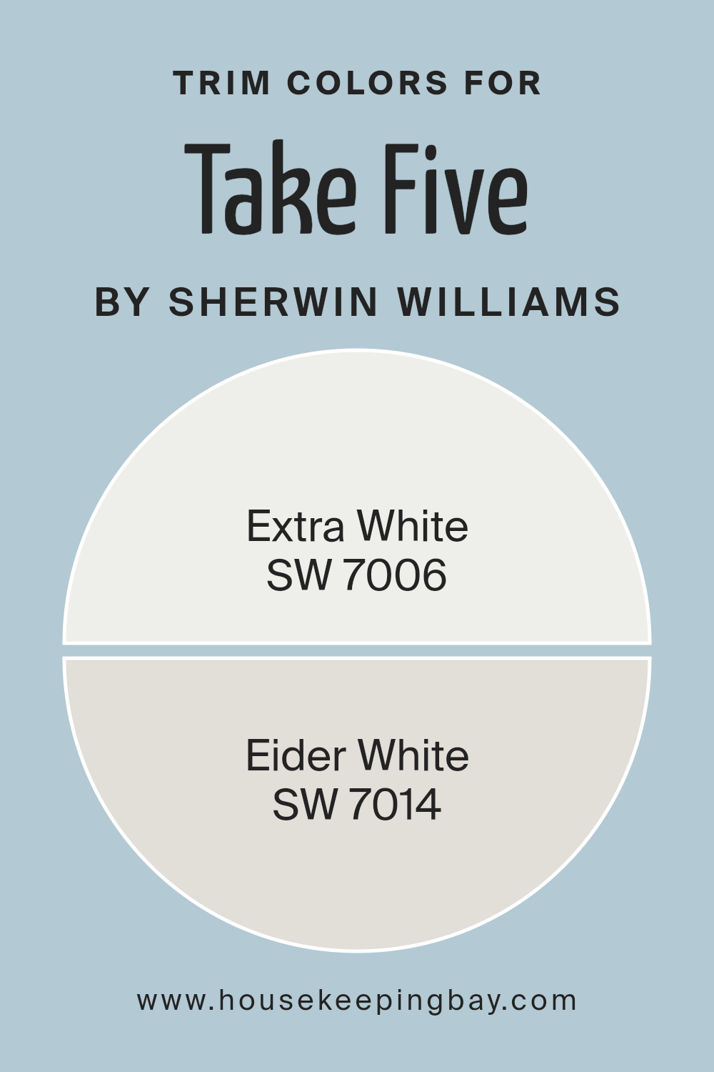
What are the Trim colors of Take Five SW 6513 by Sherwin Williams?
Trim colors are specific shades used for details such as door frames, window trims, and skirtings in a room, acting as accents that can enhance and define the space’s overall aesthetic. In the context of using Take Five SW 6513 by Sherwin Williams, a lively and refreshing hue, choosing the right trim color is crucial for creating a cohesive look.
Trim colors like SW 7006 – Extra White and SW 7014 – Eider White are popular choices that can complement the primary color, providing contrast or continuity in interior design. These trims can frame the room, drawing attention to architectural details, and provide a polished finish to the space, affecting its perceived size and brightness.
SW 7006 – Extra White is a bright and crisp white that brings a sense of freshness and clarity to a room, making it an excellent choice for accentuating the breezy and light feel of Take Five SW 6513. As a trim, it can make the walls pop, adding vibrancy and a clean, sharp edge to the interior design.
On the other hand, SW 7014 – Eider White presents a softer approach, with its slightly grayish hue offering a subtle contrast that enhances the room’s warmth and sophistication. It’s particularly effective in creating a seamless transition between the wall color and the trim, lending itself to a more muted and harmonious aesthetic. Both colors, by framing and highlighting, play pivotal roles in achieving the desired ambiance in a space decorated with Take Five SW 6513.
You can see recommended paint colors below:
housekeepingbay.com
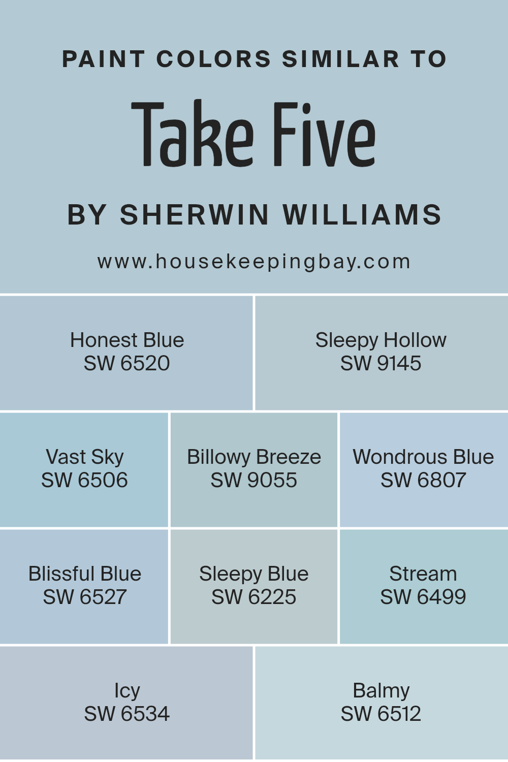
Colors Similar to Take Five SW 6513 by Sherwin Williams
Choosing similar colors is important because they create a seamless and cohesive look in a design or space. When colors closely relate to one another, like those similar to Take Five SW 6513 by Sherwin Williams, they provide a harmonious and tranquil environment.
This similarity in hues allows for a fluid transition from one color to the next, making a room feel well put together and thought out. By selecting shades like Honest Blue SW 6520 or Sleepy Hollow SW 9145, you introduce variations that are both refreshing and soothing, enriching the overall aesthetic without overwhelming the senses.
For instance, Vast Sky SW 6506 offers a light and airy feel that can open up a space, while Billowy Breeze SW 9055 brings in a touch of softness, akin to a gentle whisper across the room. Wondrous Blue SW 6807 adds a hint of mystery, inviting a deeper appreciation for the space.
Blissful Blue SW 6527, Sleepy Blue SW 6225, and Stream SW 6499 contribute to a calming palette, perfect for creating serene retreats. The cooler tone of Icy SW 6534 provides a crisp freshness, and Balmy SW 6512 rounds off the collection by enveloping spaces in a warm and inviting hug.
Together, these colors work in concert to produce a setting that is both inviting and cohesive, proving how vital similar hues are to achieving a polished and unified look.
You can see recommended paint colors below:
- SW 6520 Honest Blue
- SW 9145 Sleepy Hollow
- SW 6506 Vast Sky
- SW 9055 Billowy Breeze
- SW 6807 Wondrous Blue
- SW 6527 Blissful Blue
- SW 6225 Sleepy Blue
- SW 6499 Stream
- SW 6534 Icy
- SW 6512 Balmy
housekeepingbay.com
How to Use Take Five SW 6513 by Sherwin Williams In Your Home?
Take Five SW 6513 by Sherwin Williams is a lovely paint color that can make a big difference in your home. This shade is soft and versatile, perfect for creating a calm and inviting atmosphere in any room. If you’re thinking about giving your living space a fresh look, Take Five is a great choice.
You can use this color in various ways. For example, it’s excellent for painting walls in your living room, bedroom, or even your kitchen. It creates a gentle backdrop that makes your furniture and decor stand out. If you don’t want to paint an entire room, consider using Take Five for an accent wall. This provides a subtle pop of color without overwhelming the space.
Take Five also works well in small spaces like bathrooms or hallways, making them feel bigger and brighter. Pair it with white trim or furniture for a clean, modern look, or match it with darker colors for a cozy feel. Whether you want to refresh a single room or your whole house, Take Five can help you achieve a beautiful, welcoming home.
Take Five SW 6513 by Sherwin Williams vs Wondrous Blue SW 6807 by Sherwin Williams
Take Five SW 6513 by Sherwin Williams is a serene mid-tone blue with subtle green undertones, offering a calming and refreshing feel. With a moderate LRV of 27, it pairs well with coordinating colors like Pure White SW 7005, Green Onyx SW 9128, and March Wind SW 7668. Ideal for various spaces, it creates tranquil retreats in bedrooms, cozy living rooms with natural wood tones, and spa-like bathrooms when combined with crisp whites and light grays.
Wondrous Blue SW 6807 by Sherwin Williams is a bright, cheerful blue with subtle purple undertones, giving it a vibrant and playful appearance. It pairs beautifully with soft whites and grays, adding a lively touch to any room.
You can see recommended paint color below:
- SW 6807 Wondrous Blue

housekeepingbay.com
Take Five SW 6513 by Sherwin Williams vs Vast Sky SW 6506 by Sherwin Williams
Take Five SW 6513 and Vast Sky SW 6506 are both beautiful colors by Sherwin Williams, but they’re pretty different when you look closely. Take Five is a deeper, rich blue-green color. It’s like a blend of the ocean and forest, giving off a cozy and somewhat sophisticated vibe. It’s perfect for creating a sense of calm and elegance in a space.
On the other hand, Vast Sky SW 6506 is a lighter, more airy blue. It’s reminiscent of a clear, sunny day and brings a fresh and open feel to any room. This color is great for making a small space look bigger or adding a burst of brightness to a dull room.
In summary, if you’re aiming for a darker, cozy feel, Take Five is the way to go. But if you prefer something lighter and more uplifting, Vast Sky would be your best bet.
You can see recommended paint color below:
- SW 6506 Vast Sky

housekeepingbay.com
Take Five SW 6513 by Sherwin Williams vs Billowy Breeze SW 9055 by Sherwin Williams
Take Five SW 6513 and Billowy Breeze SW 9055, both by Sherwin Williams, are distinct in their vibes and appeal. Take Five is a deeper, blue-green shade, reminiscent of a serene, lush forest. It’s the kind of color that feels refreshing and grounded, perfect for creating a cozy and tranquil space. It has a richness that adds depth and character to any room.
On the other hand, Billowy Breeze is a much lighter and softer blue. It’s airy and gentle, evoking the feeling of a clear, sunny sky. This color brings a sense of lightness and openness, making it ideal for creating a relaxed and peaceful ambiance. It’s the kind of hue that can brighten up a space and give it a more expansive feel.
While both shades fall within the blue/green spectrum, Take Five offers depth and richness, and Billowy Breeze brings lightness and calm. Depending on the atmosphere you want to create, each color has its unique charm and purpose.
You can see recommended paint color below:
- SW 9055 Billowy Breeze

housekeepingbay.com
Take Five SW 6513 by Sherwin Williams vs Honest Blue SW 6520 by Sherwin Williams
Take Five SW 6513 by Sherwin Williams and Honest Blue SW 6520 are both beautiful shades, but they bring different vibes to a space. Take Five is a lighter blue with a gentle touch. It’s not too bold and has a calming effect, making it perfect for creating a peaceful and serene atmosphere. It’s like looking at the sky on a clear, sunny day.
On the other hand, Honest Blue SW 6520 is a deeper, more pronounced blue. This color adds a bit more drama and intensity to a room without overwhelming it. It’s like the ocean depth, offering a sense of sophistication and depth.
When comparing the two, Take Five is more subdued and can open up a smaller room, making it feel airy and spacious. Honest Blue, though, adds character and can be a stunning statement in a space, perfect for accent walls or decor that needs to stand out. Both colors have their unique appeal, depending on the mood and style you want to achieve.
You can see recommended paint color below:
- SW 6520 Honest Blue

housekeepingbay.com
Take Five SW 6513 by Sherwin Williams vs Icy SW 6534 by Sherwin Williams
Take Five SW 6513 by Sherwin Williams and Icy SW 6534 by Sherwin Williams are two distinct colors that offer unique vibes to any space. Take Five is a deeper, more saturated color that brings a sense of coziness and warmth to a room. It’s like a comforting hug from an old friend, making spaces feel more intimate and snug.
On the other hand, Icy is much lighter and gives off a crisp, refreshing feeling. It’s like a breath of fresh air, making rooms feel open and bright. This color can help small spaces appear larger and more inviting. While Take Five adds depth and character, Icy introduces lightness and a sense of calm.
Both colors have their charm and can dramatically change the look and feel of a room, depending on what atmosphere you’re aiming to create. Whether you’re looking for warmth and coziness or a bright and airy vibe, these colors offer great options.
You can see recommended paint color below:
- SW 6534 Icy

housekeepingbay.com
Take Five SW 6513 by Sherwin Williams vs Stream SW 6499 by Sherwin Williams
Take Five SW 6513 and Stream SW 6499 by Sherwin Williams are two diverse colors that offer unique vibes. Take Five is a deep, rich blue with a slight hint of green, providing a sense of calm and serenity. It’s like looking into a deep, tranquil pool of water, offering a soothing atmosphere. On the other hand, Stream is a lighter, more vibrant shade of blue that brings a fresh and airy feel to any space. It’s reminiscent of a clear sky on a sunny day, uplifting and bright.
While Take Five adds depth and sophistication to a room, making it perfect for creating a cozy and inviting space, Stream injects energy and brightness, making a room feel more open and lively. Both colors can beautifully transform a space, but the choice between them depends on the desired mood and atmosphere.
If you’re aiming for a tranquil, peaceful setting, Take Five is the way to go. But if you’re after a more vibrant, energetic space, Stream should be your pick.
You can see recommended paint color below:
- SW 6499 Stream

housekeepingbay.com
Take Five SW 6513 by Sherwin Williams vs Sleepy Blue SW 6225 by Sherwin Williams
Take Five SW 6513 by Sherwin Williams is a unique color with a cozy feel, almost like a light sea-green mixed with a touch of soft gray. It’s a color that brings a fresh and calming vibe to any space, making it perfect for rooms where you want to relax and unwind. On the other hand, Sleepy Blue SW 6225 is a softer, lighter shade. It leans more towards a tranquil, baby blue but with a hint of gray that keeps it from being too bright. This color is ideal for creating a peaceful and serene environment, great for bedrooms or bathrooms where you want to feel calm and soothed.
Both colors share a calming quality but in different ways. Take Five has a bit more energy and presence, thanks to its slight green undertone, giving rooms a rejuvenating feel. Sleepy Blue, however, is more subdued and gentle, offering a more traditional sense of tranquility and restfulness.
Choosing between them comes down to the kind of atmosphere you want to create: refreshed and lively with Take Five, or quiet and serene with Sleepy Blue.
You can see recommended paint color below:
- SW 6225 Sleepy Blue

housekeepingbay.com
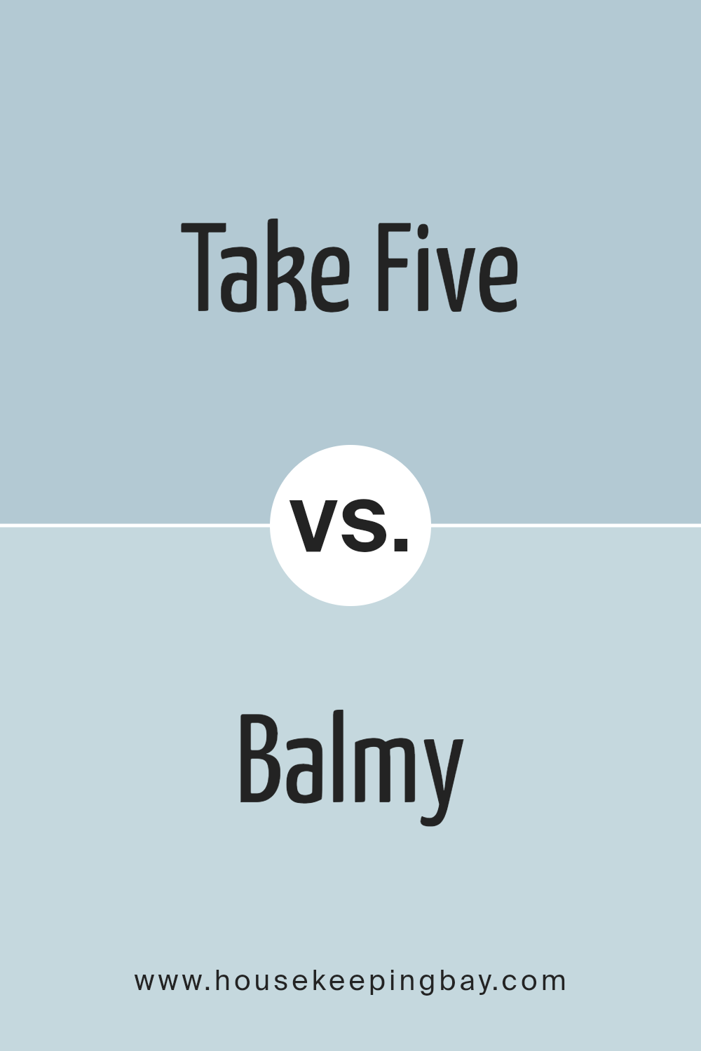
Take Five SW 6513 by Sherwin Williams vs Balmy SW 6512 by Sherwin Williams
“Take Five SW 6513” and “Balmy SW 6512” by Sherwin Williams are two beautiful colors that add a unique charm to any space. “Take Five” is a bit darker and richer, creating a cozy and slightly more dramatic look. It’s a color that stands out, adding depth and interest to rooms.
On the other hand, “Balmy” is lighter and has a softer appearance. It brings a calm and soothing vibe, making it perfect for creating a peaceful and relaxing atmosphere. Both colors share a similar cool undertone, which means they can complement each other well in a room, but their difference in darkness means “Take Five” could be a great choice for accent walls or furniture, while “Balmy” could work beautifully as a main wall color, offering a gentle backdrop for various decor styles.
Together, they could create a harmonious balance, mixing the right amount of tranquility with a hint of elegance.
You can see recommended paint color below:
- SW 6512 Balmy
housekeepingbay.com
Take Five SW 6513 by Sherwin Williams vs Blissful Blue SW 6527 by Sherwin Williams
Take Five SW 6513 by Sherwin Williams is a fresh, calming color that gently fills any room with a sense of tranquility. It’s a soft, muted teal that leans towards the green side of the spectrum, creating a cozy yet sophisticated atmosphere. This color is perfect for spaces where you want to relax and unwind, like bedrooms or living rooms.
On the other hand, Blissful Blue SW 6527 by Sherwin Williams is a light, airy blue that brings to mind clear skies on a sunny day. It’s brighter and has a more straightforward blue tone, offering a crisp and refreshing vibe. Blissful Blue is ideal for creating a light and breezy feeling in spaces, making it well-suited for bathrooms, kitchens, or any area you want to infuse with a touch of serenity and openness.
Both colors offer a unique approach to bringing calm and elegance into a space, but their different hues—Take Five adding a hint of green and Blissful Blue offering a pure blue experience—provide distinct atmospheres depending on what feeling you are aiming to achieve in your room.
You can see recommended paint color below:
- SW 6527 Blissful Blue

housekeepingbay.com
Take Five SW 6513 by Sherwin Williams vs Sleepy Hollow SW 9145 by Sherwin Williams
Take Five SW 6513 by Sherwin Williams is a refreshing and lively blue that brings a sense of calm and cleanliness to a space. It has a bright and airy feel, perfect for adding a touch of serenity to any room. This color can make small spaces appear larger and more inviting.
On the other hand, Sleepy Hollow SW 9145, also by Sherwin Williams, is a deeper, more muted blue with green undertones. It provides a cozy and soothing atmosphere, making it ideal for spaces where relaxation is key, like bedrooms or living rooms.
While Take Five is more about brightness and a fresh vibe, Sleepy Hollow leans towards creating a warm and comforting environment. Both colors offer a unique charm, with Take Five suits those looking for a vibrant uplift, and Sleepy Hollow catering to those desiring a snug and secure feel. Together, they present diverse options for decorating, depending on the mood you want to create.
You can see recommended paint color below:
- SW 9145 Sleepy Hollow

housekeepingbay.com
Conclusion
In summary, Take Five SW 6513 by Sherwin Williams is a paint color that is gaining popularity for its unique appeal and versatility. It offers a fresh perspective to any space, providing a soothing and calming effect. This shade stands out as an excellent choice for those looking to refresh their home or office with a modern and stylish look. Its ability to blend well with various decor styles and preferences makes it a go-to option for both designers and homeowners alike.
Furthermore, Take Five SW 6513 is not just about its aesthetic appeal, but also about its practicality. It has shown to be a durable choice for various applications, whether in a bustling living room or a peaceful bedroom setting. Its adaptability in different lighting conditions also adds to its charm, ensuring that the color remains consistent through the day.
Overall, Take Five SW 6513 by Sherwin Williams proves to be a smart pick for anyone seeking to inject a breath of fresh air into their spaces with minimal fuss.
housekeepingbay.com
Ever wished paint sampling was as easy as sticking a sticker? Guess what? Now it is! Discover Samplize's unique Peel & Stick samples. Get started now and say goodbye to the old messy way!
Get paint samples