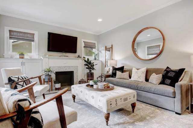
Swanky Gray SW 6261 by Sherwin Williams
Elegance in Every Brush Stroke
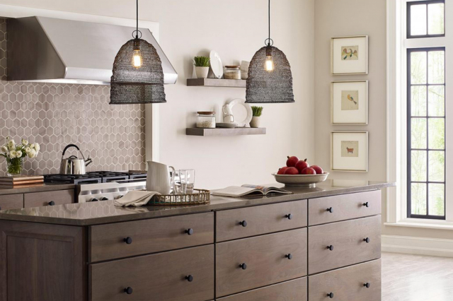
Welcome to your quick guide on SW 6261 Swanky Gray by Sherwin Williams! This sophisticated color is a fantastic choice for anyone looking to add a touch of elegance and modern flair to their space.
Swanky Gray strikes the perfect balance between warm and cool tones, making it extremely versatile and suitable for a variety of rooms and design styles.
Whether you’re updating your living room, bedroom, or even your kitchen, Swanky Gray has the potential to transform your space into something truly special.
Not only does this color look beautiful on walls, but it also pairs wonderfully with a wide range of decor, from contemporary pieces to more classical touches.
It’s a color that can help unify different elements of a room, creating a cohesive and inviting atmosphere. For those interested in refreshing their home’s look, Swanky Gray is a smart, stylish choice that’s bound to impress.
Plus, Sherwin Williams paints are known for their quality and durability, meaning your stylish new look will last for years to come.
If you’re thinking about giving your home a makeover, consider Swanky Gray for a look that’s both trendy and timeless.
via sherwin-williams.com
What Color Is Swanky Gray SW 6261 by Sherwin Williams?
Swanky Gray SW 6261 by Sherwin Williams is a subtle, sophisticated shade of gray that brings a touch of elegance and modernity to any space.
This particular gray finds the perfect balance between warm and cool tones, making it incredibly versatile and adaptable to a variety of settings and lighting conditions.
It’s not too dark, nor too light, placing it right in that sweet spot where it can enhance the sense of space in a room without overpowering it.
Swanky Gray works exceptionally well in contemporary and minimalist interior styles, thanks to its clean, understated quality.
However, its flexibility means it can also fit beautifully into more traditional or transitional spaces, adding a modern twist without clashing with classic elements.
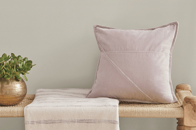
When it comes to pairing with materials and textures, Swanky Gray is a real team player. It complements natural wood tones, from light oaks to rich walnuts, bringing out their warmth.
Metals like brushed nickel or stainless steel look sleek against its backdrop, while softer textures like velvet or wool in furnishings add a layer of depth and comfort to the ambiance.
For accents, think about incorporating pops of color through artwork or accessories; Swanky Gray makes a great canvas for both bold and pastel hues, allowing them to shine without competition.
housekeepingbay.com
Table of Contents
Is Swanky Gray SW 6261 by Sherwin Williams Warm or Cool color?
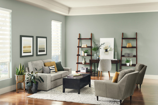
Swanky Gray SW 6261 by Sherwin Williams is a unique and versatile color that can bring a touch of elegance and contemporary style to any home. This shade of gray has a subtle sophistication that can enhance different spaces.
Its muted tones mean it pairs well with a wide range of other colors, from bright and bold to soft and neutral, giving you the flexibility to create varied looks in your home.
Swanky Gray works great in living rooms, bedrooms, and even kitchens, adding depth and character without overwhelming the space.
The magic of Swanky Gray lies in its ability to adapt to different lighting conditions. In rooms with a lot of natural light, it can appear lighter and more airy, making spaces feel bigger.
In spaces with less light, it adds a cozy and inviting feel. This adaptability makes Swanky Gray an excellent choice for anyone looking to refresh their home’s look with a color that is both stylish and practical.
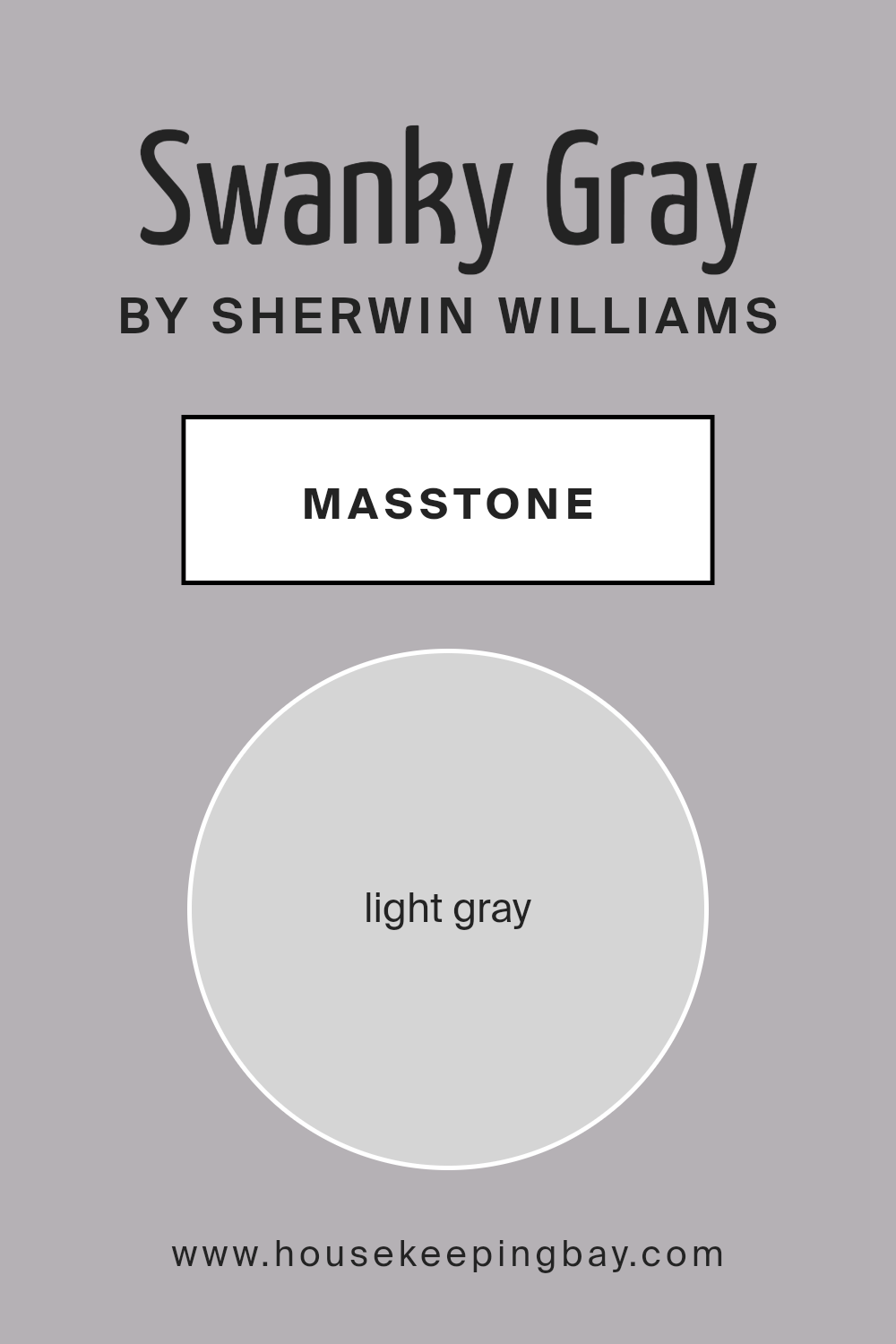
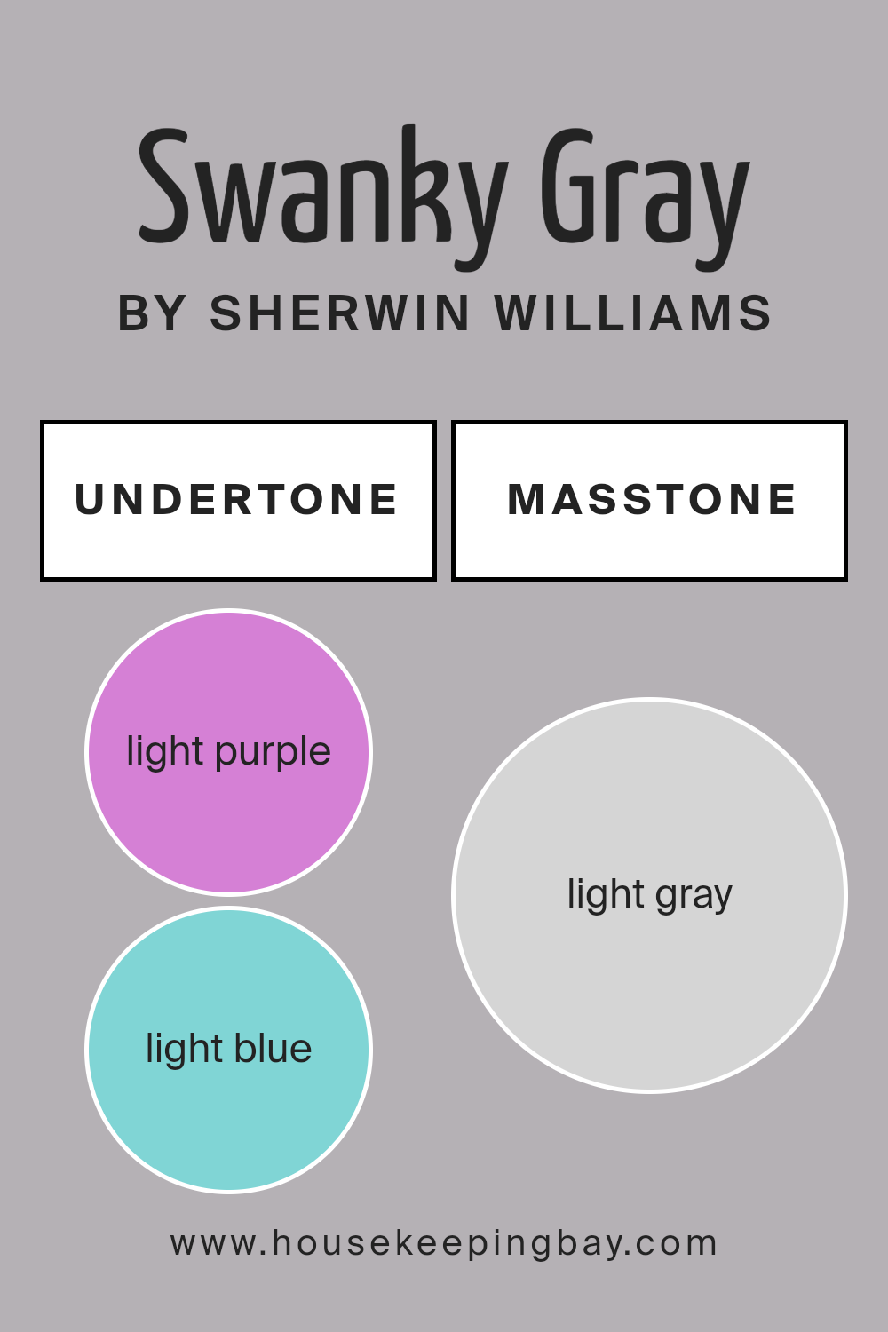
What is the Masstone of the Swanky Gray SW 6261 by Sherwin Williams?
Swanky Gray SW 6261 by Sherwin Williams has a masstone, or main color, of light gray (#D5D5D5). This gentle shade of gray is super versatile, making it a great choice for homes.
Because it’s a light gray, it has a soft and subtle feel that doesn’t overpower a room. This color can make small spaces appear bigger and brighter, as light colors reflect light better than dark colors.
Swanky Gray works well in any room, from kitchens to bedrooms, because it’s like a chameleon. It can fit in with different styles and colors, acting as a neutral backdrop.
This means you can have fun decorating with colorful furniture or artwork, and Swanky Gray will support, not clash, with your choices. It also provides a calming atmosphere, creating a peaceful and relaxing vibe in your home.
Whether you have a modern or traditional taste in decor, Swanky Gray can adapt and work beautifully.
housekeepingbay.com
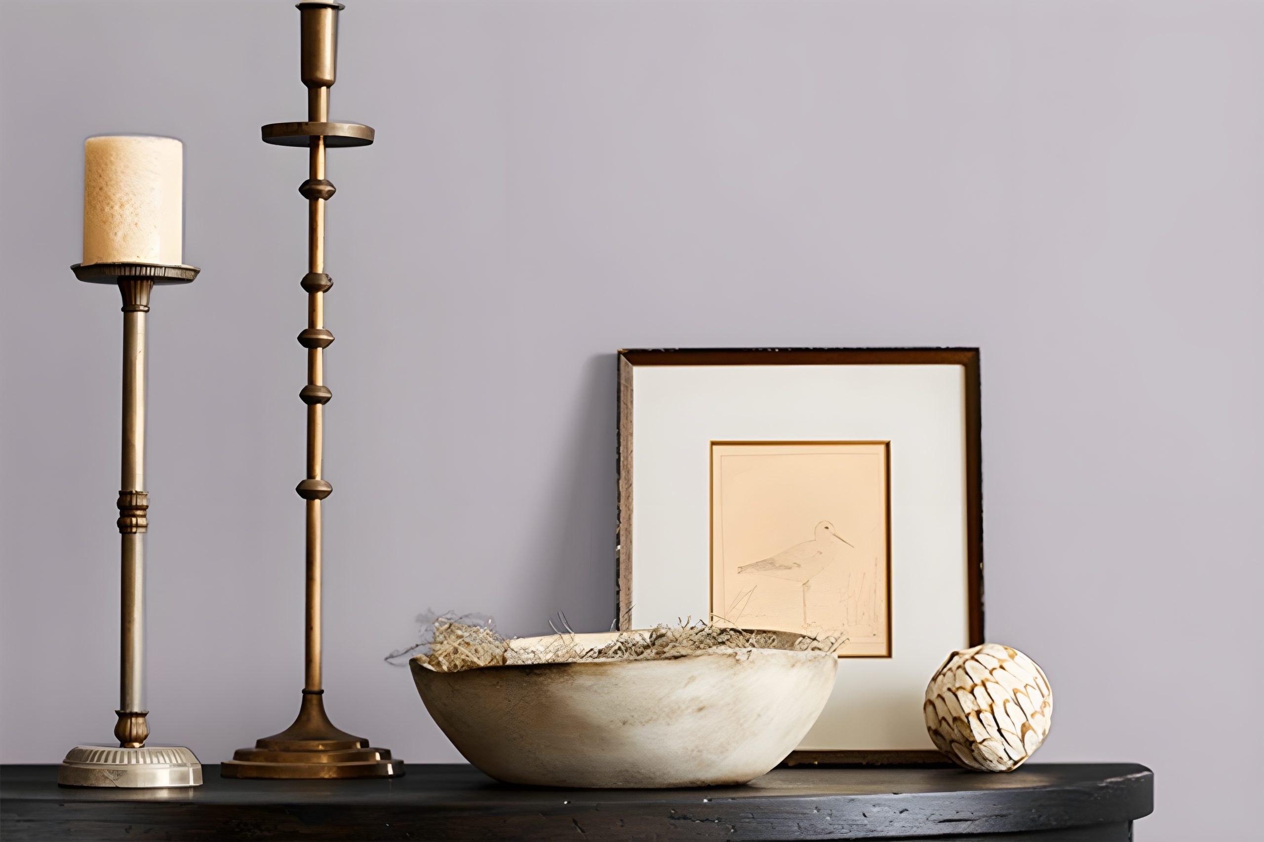
Undertones of Swanky Gray SW 6261 by Sherwin Williams
Swanky Gray SW 6261 by Sherwin Williams is a unique color that might seem just gray at first glance, but it’s so much more when you look closer. The beauty of this color lies in its undertones; it has hints of light purple and light blue.
These subtle colors mixed into the gray give it a special feel and look that can change depending on where and how it’s used.
Undertones are like secret ingredients in a recipe – they can completely change the outcome.
They affect how we perceive the main color. For instance, a gray with blue undertones might look cooler, making a room feel more serene, while a gray with purple undertones adds warmth, creating a cozy atmosphere.
When Swanky Gray is used on interior walls, those light purple and light blue undertones play with the light in the room.
During the day, as natural light changes, Swanky Gray will shift its appearance, sometimes looking more purple, other times more blue, and often a complex, intriguing gray.
This makes it a versatile color choice for spaces where the mood needs to shift from energetic in the morning to relaxing in the evening.
Using Swanky Gray in your home means you get a color that’s not just flat or boring; it’s a gray that’s full of life, subtly changing and adding depth and interest to your walls.
Its undertones can complement various decor styles and preferences, making it an excellent choice for anyone wanting to add a sophisticated and dynamic touch to their space.
housekeepingbay.com
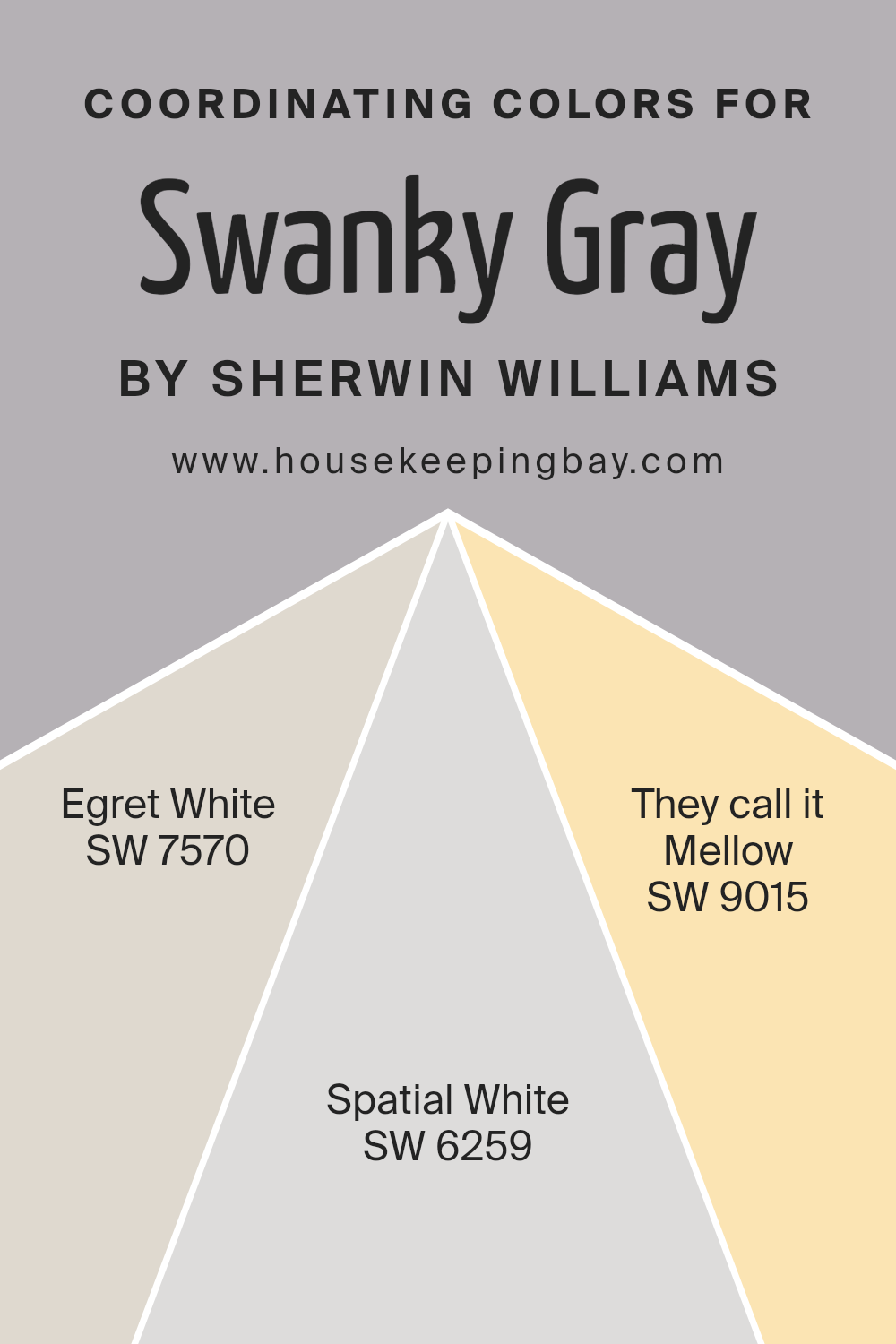
Coordinating Colors of Swanky Gray SW 6261 by Sherwin Williams
Coordinating colors are shades that harmonize well with a primary color, enhancing the overall aesthetic of a room or design. They work together to create a pleasing balance, making sure that no color outshines the other, yet each retains its unique appeal.
When considering Swanky Gray SW 6261 by Sherwin Williams, one can find a set of coordinating colors that perfectly complement its subtle elegance.
These coordinating hues ensure that Swanky Gray’s unique charm is neither overshadowed nor understated, working together to bring out the best in each other and in the space they adorn.
For instance, Egret White SW 7570 is a soft, warm white with just enough depth to enrich the sophisticated tone of Swanky Gray without overpowering it.
This color has a gentle presence that adds a layer of warmth to interiors, making spaces feel welcoming and thoughtfully curated.
Spatial White SW 6259, on the other hand, leans towards a cooler tone, offering a crisp contrast that highlights Swanky Gray’s versatility in different lighting and settings. It’s like a breath of fresh air, ensuring that the space remains open and airy.
Lastly, They Call It Mellow SW 9015 introduces a subdued, creamy hue that bridges the gap between warm and cool tones. This color brings a subtle, soothing vibe, ensuring that the combination with Swanky Gray offers a harmonious and laid-back atmosphere.
Together, these coordinating colors create a balanced, attractive setting that enhances the beauty of Swanky Gray, making any room appear more cohesive and inviting.
You can see recommended paint colors below:
- SW 7570 Egret White
- SW 6259 Spatial White
- SW 9015 They call it Mellow
housekeepingbay.com
How Does Lighting Affect Swanky Gray SW 6261 by Sherwin Williams?
Lighting has a big impact on how colors look in a room. Depending on the type of light—natural or artificial—colors can look different. Let’s look at how this works with a specific color, Swanky Gray SW 6261 by Sherwin Williams.
In artificial light, the way Swanky Gray looks can change based on the kind of bulbs you’re using. Warm bulbs make this color seem cozier and richer, adding a bit of a yellow tone to it.
Cooler LED bulbs, on the other hand, might make Swanky Gray look sharper and more modern, bringing out its cooler notes. This shows how changing just a light bulb can tweak the color vibe in a room.
Natural light also plays a big role in how Swanky Gray appears. This interaction changes throughout the day and depends on which way your windows face.
- North-faced rooms: These rooms get less direct sunlight, making them cooler in tone. Swanky Gray might look more muted and shadowy here, giving off a calm and serene vibe but might feel a tad cooler than it would in other settings.
- South-faced rooms: These rooms enjoy abundant sunlight, making them warm and bright. In south-facing rooms, Swanky Gray will feel warmer and livelier, showing off its warmer, softer side throughout most of the day.
- East-faced rooms: Morning light is warm and bright in these rooms, making Swanky Gray look soft and inviting in the morning. As the day goes on, and the natural light fades, the color might appear more neutral and subdued.
- West-faced rooms: Here, the situation is the opposite of east-faced rooms. Swanky Gray will start the day looking neutral, and as the sun sets, the color warms up, becoming more dynamic and richer in the late afternoon to evening light.
Understanding these effects helps in making smart choices about where to use specific colors like Swanky Gray in your home, ensuring you get the mood and atmosphere you’re aiming for in each room.
housekeepingbay.com
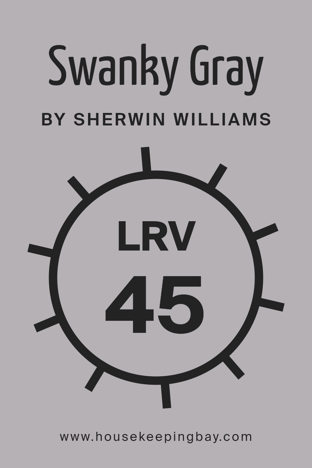
What is the LRV of Swanky Gray SW 6261 by Sherwin Williams?
LRV stands for Light Reflectance Value, which is a measure used to describe the percentage of visible and usable light that a paint color reflects when it’s applied to walls or other surfaces.
Think of it as a scale from 0 to 100, where 0 is completely black, absorbing all light, and 100 is pure white, reflecting all light back.
This measure helps you understand how light or dark a color will look in a room once it’s on the walls.
Colors with a higher LRV make a room feel brighter and more open because they reflect more light. On the other hand, colors with a lower LRV can make a space feel cozier and more intimate because they absorb more light.
Swanky Gray by Sherwin Williams, with an LRV of 44.669, sits in the middle range. This means it neither reflects light like lighter colors do nor absorbs it like darker shades.
In practical terms, this color can offer a balanced and versatile backdrop for your room. It’s dark enough to add depth and character to the space but also has enough light reflectance to keep the room from feeling too closed in or dim, especially in well-lit areas.
This midpoint LRV allows Swanky Gray to adapt to different lighting conditions through the day, subtly changing its appearance and mood.
Whether your room gets a lot of natural light or relies on artificial lighting, Swanky Gray will interact with these light sources in a way that keeps the space feeling welcoming and comfortably dynamic.
housekeepingbay.com
What is LRV? Read It Before You Choose Your Ideal Paint Color
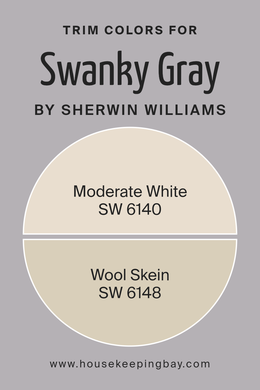
What are the Trim colors of Swanky Gray SW 6261 by Sherwin Williams?
Trim colors, like SW 6140 – Moderate White and SW 6148 – Wool Skein by Sherwin Williams, play a vital role in complementing and accentuating the main color of a room, in this case, Swanky Gray SW 6261.
These colors are specifically chosen for the trim—in areas like door frames, moldings, and baseboards—to enhance the overall aesthetic appeal of a space.
By selecting the right trim colors, you can highlight the architectural elements of a room, creating a cohesive and polished look.
Trim colors also help in defining the spatial perception of a room, making it feel more structured and neatly segmented.
Moderate White SW 6140 is a warm, inviting shade of white with a softness that can brighten the edges around Swanky Gray, providing a gentle contrast that’s neither too stark nor overwhelming.
Its subtlety can make the gray tones of Swanky Gray appear more pronounced and grounded. On the other hand, Wool Skein SW 6148 offers a slightly richer and deeper tone, with its nature-inspired, neutral beige adding an element of warmth and complexity.
This color can work wonders in softening the transition between the walls and the trim, creating a harmonious and balanced environment that feels welcoming and thoughtfully designed.
Together, these trim colors significantly contribute to the overall aesthetic, making Swanky Gray look its best by framing it in tones that resonate elegance and understated sophistication.
You can see recommended paint colors below:
- SW 6140 Moderate White
- SW 6148 Wool Skein
housekeepingbay.com
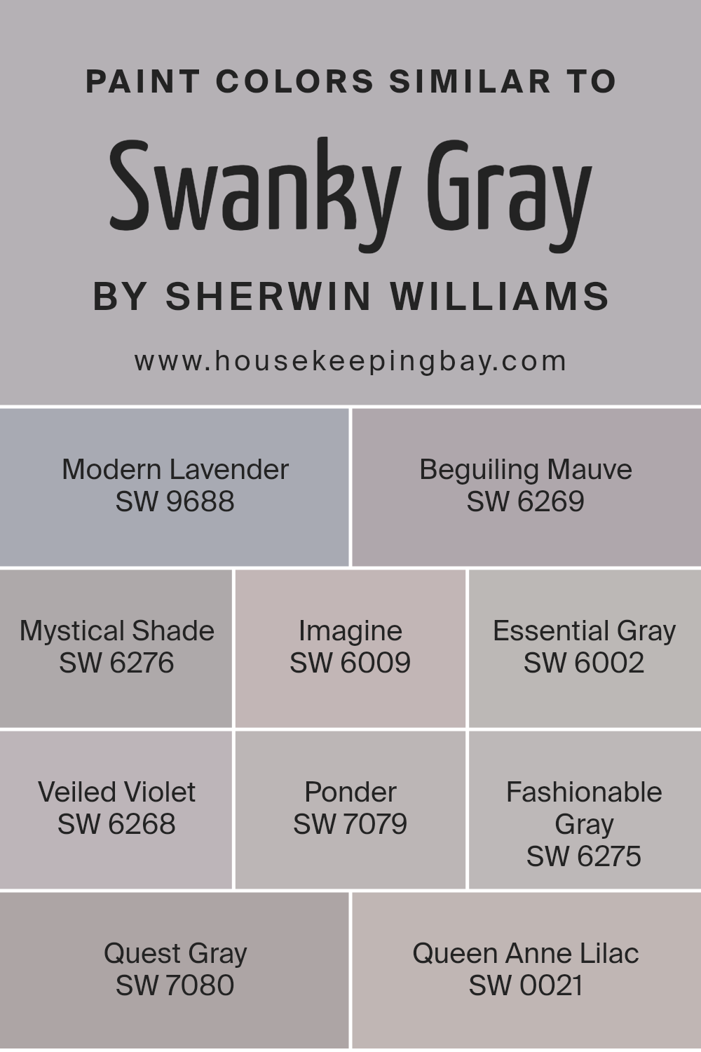
Colors Similar to Swanky Gray SW 6261 by Sherwin Williams
Similar colors play a crucial role in creating a harmonious and appealing visual experience, particularly in the realm of interior design and painting.
When colors like Swanky Gray SW 6261 by Sherwin Williams and its counterparts, including Modern Lavender, Beguiling Mauve, Mystical Shade, Imagine, Essential Gray, Veiled Violet, Ponder, Fashionable Gray, Quest Gray, and Queen Anne Lilac, are used together, they create a seamless and cohesive look.
These similar shades work together by subtly varying in tone or hue, offering depth and complexity without overwhelming the eye.
For instance, Modern Lavender and Beguiling Mauve bring in a soft, gentle pop of color, reminiscent of a serene lavender field or a subtle mauve whisper in a twilight sky, adding a touch of elegance without straying far from the base palette.
Mystical Shade and Imagine introduce a deeper, more mysterious essence, inviting a sense of wonder and creativity into the space.
Essential Gray and Veiled Violet offer a neutral base with a hint of unexpected color, perfect for grounding a room while keeping it lively.
Ponder and Fashionable Gray infuse a sophisticated edge, perfect for modern and chic spaces. Quest Gray and Queen Anne Lilac, meanwhile, extend the palette into a more adventurous territory, bringing in a touch of exploration and royal sophistication, respectively.
Each color, while maintaining its uniqueness, complements Swanky Gray SW 6261, ensuring that any combination will enhance the space with balance, elegance, and a harmonious visual flow.
You can see recommended paint colors below:
- SW 9688 Modern Lavender
- SW 6269 Beguiling Mauve
- SW 6276 Mystical Shade
- SW 6009 Imagine
- SW 6002 Essential Gray
- SW 6268 Veiled Violet
- SW 7079 Ponder
- SW 6275 Fashionable Gray
- SW 7080 Quest Gray
- SW 0021 Queen Anne Lilac
housekeepingbay.com
How to Use Swanky Gray SW 6261 by Sherwin Williams In Your Home?
Swanky Gray SW 6261 by Sherwin Williams is a sophisticated yet inviting color that brings a modern and elegant touch to any home. This versatile shade of gray has the unique ability to add depth and interest to spaces without overwhelming them.
Whether you’re looking to refresh your living room, bedroom, or even your kitchen, Swanky Gray can be the perfect backdrop. For a cozy and coordinated look, try pairing it with soft whites or creamy tones in your furniture and accents.
This will create a soothing and balanced atmosphere. If you’re aiming for a bit more contrast and drama, consider using brighter colors or rich textures as accents against Swanky Gray walls. The color works wonderfully in spaces with natural light but also adds warmth to rooms that might not get as much sunlight. Choosing Swanky Gray for your home means adding a touch of sophistication that’s both stylish and timeless.
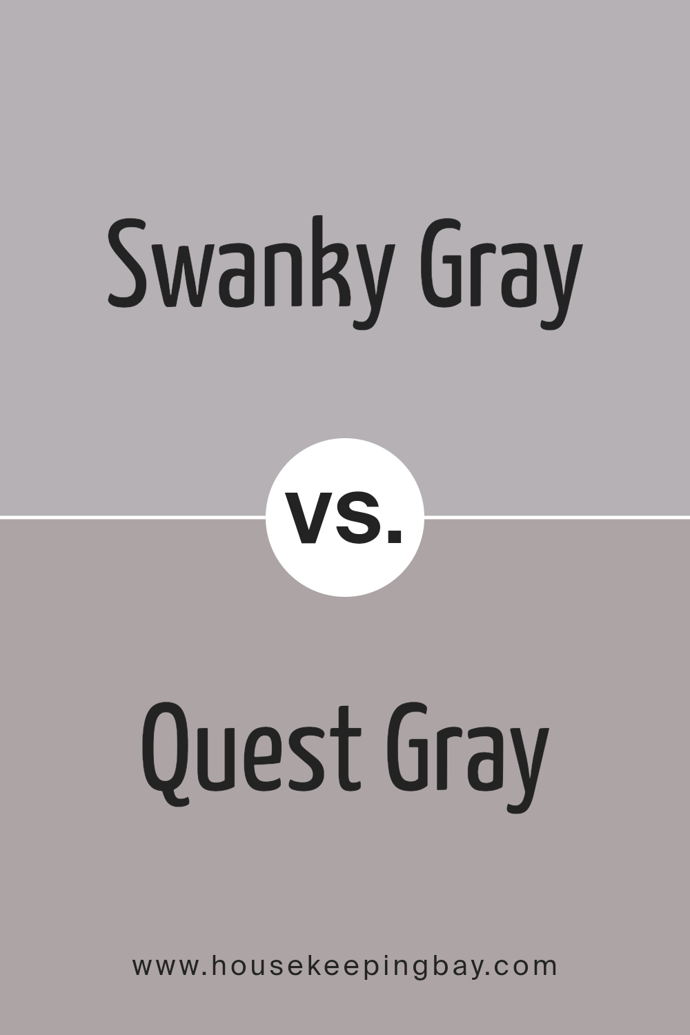
Swanky Gray SW 6261 by Sherwin Williams vs Quest Gray SW 7080 by Sherwin Williams
Swanky Gray SW 6261 and Quest Gray SW 7080, both from Sherwin Williams, offer subtle but distinct vibes for any space. Swanky Gray is a tad lighter, bringing a soft, elegant feel to rooms.
It’s like a gentle morning mist, creating a soothing backdrop for both modern and traditional decors. On the other hand, Quest Gray stands out with a deeper tone, suggesting a stronger, more grounded presence.
Think of it as the shadow beneath a tree on a sunny day, offering a sense of stability and comfort.
While Swanky Gray might open up smaller spaces with its airy quality, Quest Gray adds depth and warmth, making larger rooms feel cozier.
Despite both being grays, their different shades can influence the mood and size perception of a room.
In summary, Swanky Gray lightens and enlarges spaces with its breezy charm, whereas Quest Gray anchors and warms with its earthy strength.
You can see recommended paint color below:
- SW 7080 Quest Gray
housekeepingbay.com
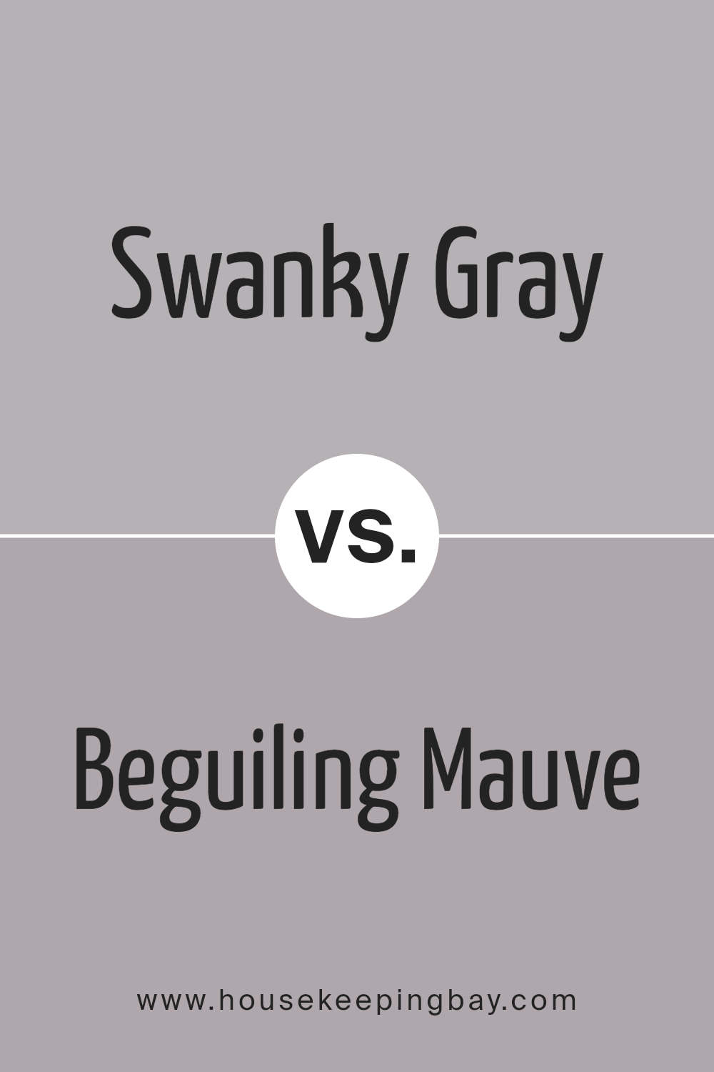
Swanky Gray SW 6261 by Sherwin Williams vs Beguiling Mauve SW 6269 by Sherwin Williams
Swanky Gray and Beguiling Mauve, both by Sherwin Williams, have their own unique appeal. Swanky Gray, a sophisticated and versatile color, falls into the cooler side of the spectrum.
It’s a type of gray that feels at home in modern and minimalist designs, offering a sleek, understated background that can match well with a variety of decor styles.
On the other hand, Beguiling Mauve introduces a warmer, more inviting tone. This color leans towards a soft, subtle pink with hints of purple, giving it a cozy, comforting feel.
It’s perfect for creating a serene and welcoming space, suitable for bedrooms or living areas where a gentle ambiance is desired.
While Swanky Gray offers a chic, contemporary look, Beguiling Mauve brings a touch of warmth and softness, showcasing the power of color to influence the mood and style of a room.
You can see recommended paint color below:
- SW 6269 Beguiling Mauve
housekeepingbay.com
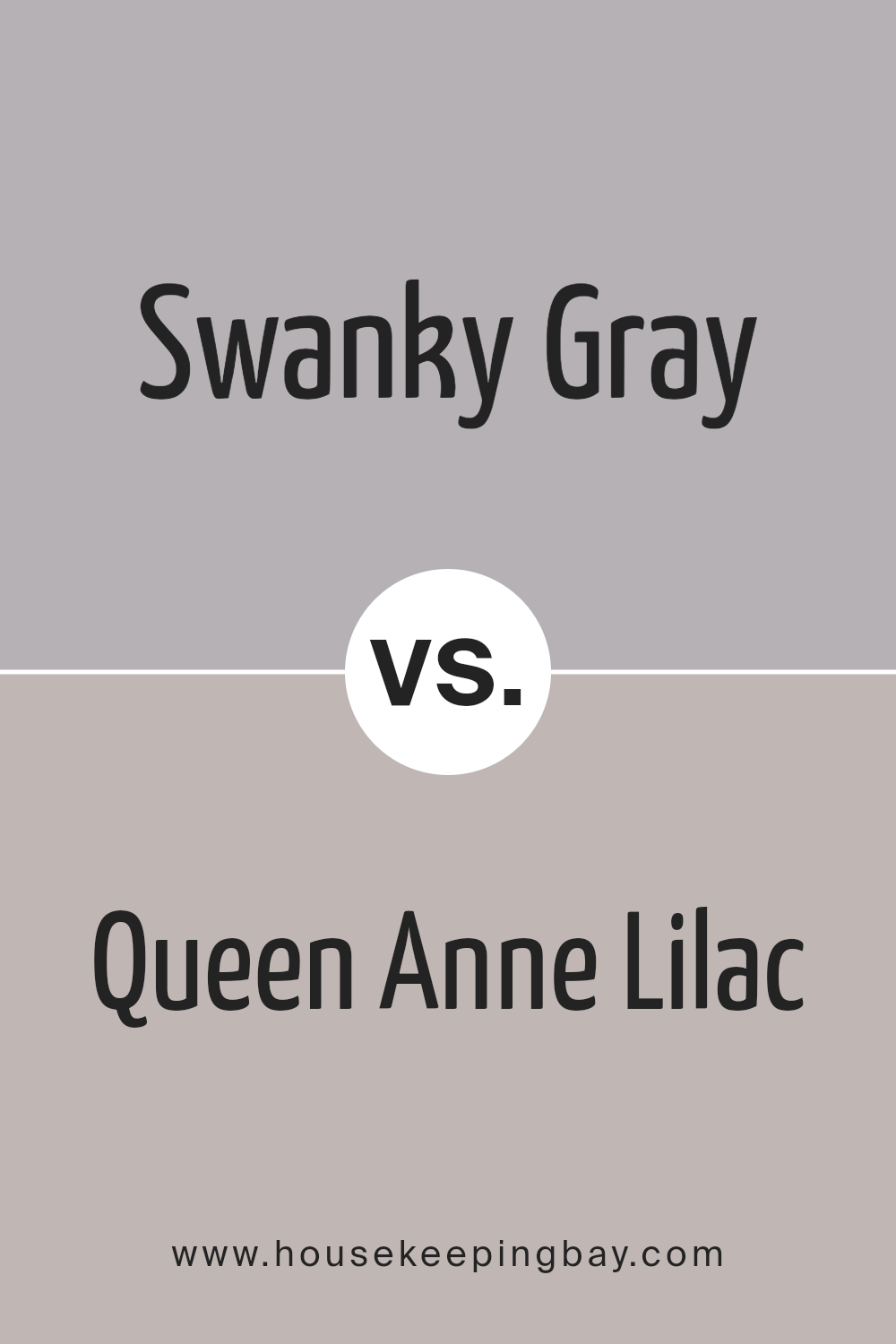
Swanky Gray SW 6261 by Sherwin Williams vs Queen Anne Lilac SW 0021 by Sherwin Williams
Swanky Gray (SW 6261) by Sherwin Williams is a stylish, modern gray that brings a sophisticated and cool vibe to any space. Its versatility means it can fit well in various settings, from living rooms to bedrooms, adding a touch of elegance without overwhelming the room.
This color works great as a base, allowing other colors or decor elements to stand out without competing for attention.
On the other hand, Queen Anne Lilac (SW 0021) by Sherwin Williams, is a soft, gentle purple with a whimsical quality that can create a soothing and calming atmosphere.
It’s a fantastic option if you want to add a subtle touch of color to a room without it being too bold or striking. This shade is ideal for spaces where you want to promote relaxation and creativity.
While Swanky Gray offers a chic and refined look, Queen Anne Lilac brings a touch of warmth and imagination.
Both colors have their unique appeal, making them suitable for different tastes and spaces.
You can see recommended paint color below:
- SW 0021 Queen Anne Lilac
housekeepingbay.com
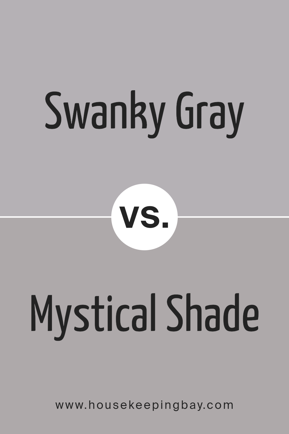
Swanky Gray SW 6261 by Sherwin Williams vs Mystical Shade SW 6276 by Sherwin Williams
Swanky Gray and Mystical Shade, both by Sherwin Williams, are distinctly unique colors that add different vibes to a space. Swanky Gray (SW 6261) is a cool, sophisticated gray that brings a modern look to any room.
It’s a versatile color that matches well with various decor styles, making it a popular choice for those wanting a sleek, contemporary feel.
Mystical Shade (SW 6276), on the other hand, leans towards a deeper, more dramatic tone. This color offers a hint of mystery and elegance, perfect for creating a cozy and inviting atmosphere.
While it’s also in the gray family, Mystical Shade has a more profound presence, making it ideal for accent walls or rooms where a stronger character is desired.
Both colors serve different purposes based on the mood you’re trying to achieve. Swanky Gray works well in open, bright spaces, contributing to a clean and airy feel.
Mystical Shade fits spaces where warmth and depth are the goals, adding a rich backdrop that enhances the room’s overall aesthetic. Choosing between them depends on whether you prefer a calm, neutral backdrop or a statement shade with a bit more depth.
You can see recommended paint color below:
- SW 6276 Mystical Shade
housekeepingbay.com
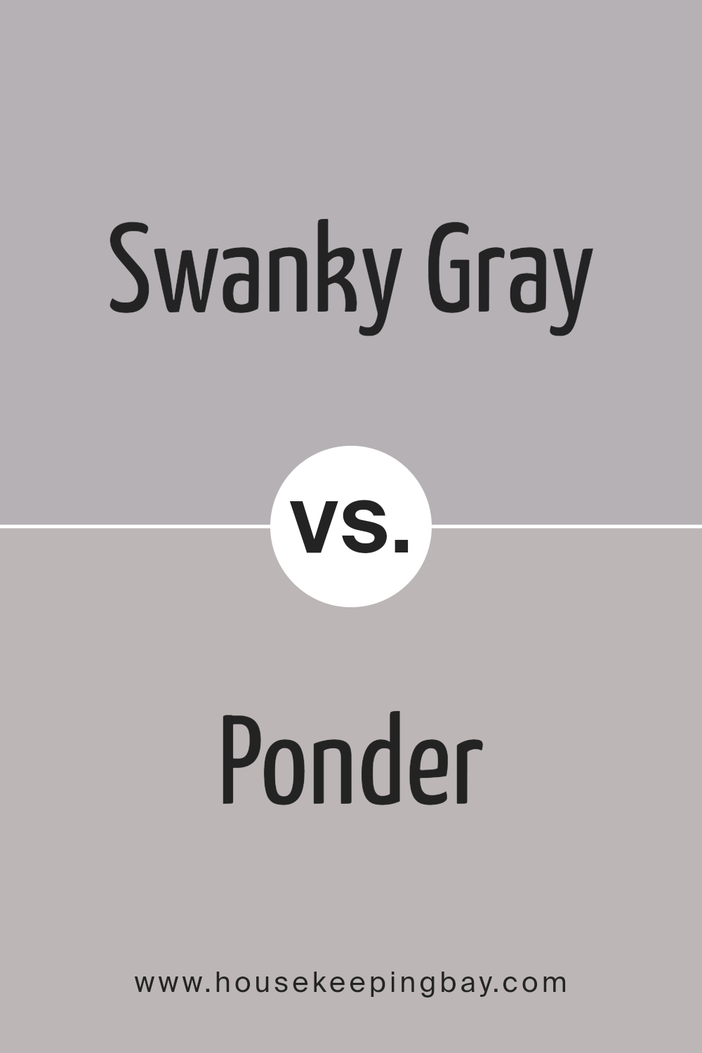
Swanky Gray SW 6261 by Sherwin Williams vs Ponder SW 7079 by Sherwin Williams
Swanky Gray SW 6261 by Sherwin Williams and Ponder SW 7079 by Sherwin Williams are two unique shades that belong to the gray family, but they have their own distinct vibes.
Swanky Gray is a lighter, softer shade that gives off a gentle and calm feeling. It’s the kind of color you might choose for a peaceful and airy room. Ponder, on the other hand, is a bit deeper and stronger.
It’s a gray with more presence, offering a sense of depth and sophistication.
While Swanky Gray feels more open and breezy, Ponder suggests a bit of mystery and seriousness, making it great for creating a more anchored and thoughtful atmosphere.
Even though both colors are grays, Swanky Gray leans towards creating a lighter, more relaxed space, and Ponder provides a backdrop for a richer, more intense mood.
Choosing between them depends on what kind of feel you want for your space – lighter and soothing, or deeper and more enveloping.
You can see recommended paint color below:
- SW 7079 Ponder
housekeepingbay.com
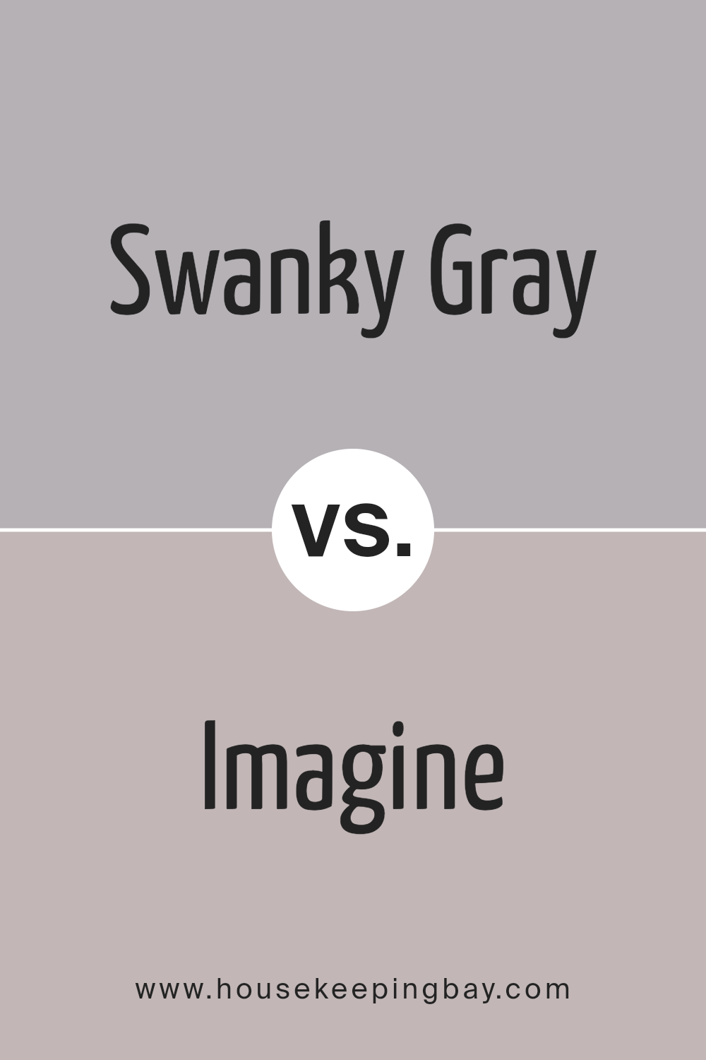
Swanky Gray SW 6261 by Sherwin Williams vs Imagine SW 6009 by Sherwin Williams
Swanky Gray and Imagine by Sherwin Williams are two distinctive colors that can transform a space in unique ways. Swanky Gray is a sophisticated, soft gray that carries a hint of warmth.
This elegance ensures it fits well in rooms seeking a touch of modern flair without becoming too cold or industrial. On the other side, Imagine is a deeper, more earthy shade.
It’s a color that reminds you of nature, offering a feeling of calmness and serenity. This makes it perfect for spaces where relaxation is key, like bedrooms or cozy living areas.
While both colors are versatile, Swanky Gray leans more towards a chic, contemporary vibe, and Imagine draws from a palette inspired by natural elements.
Whether you’re aiming for a sleek, trendy look or a grounded, comforting atmosphere, these colors offer appealing choices tailored to different aesthetic preferences and moods.
Their unique characteristics ensure that each can create a memorable and distinct space.
You can see recommended paint color below:
- SW 6009 Imagine
housekeepingbay.com
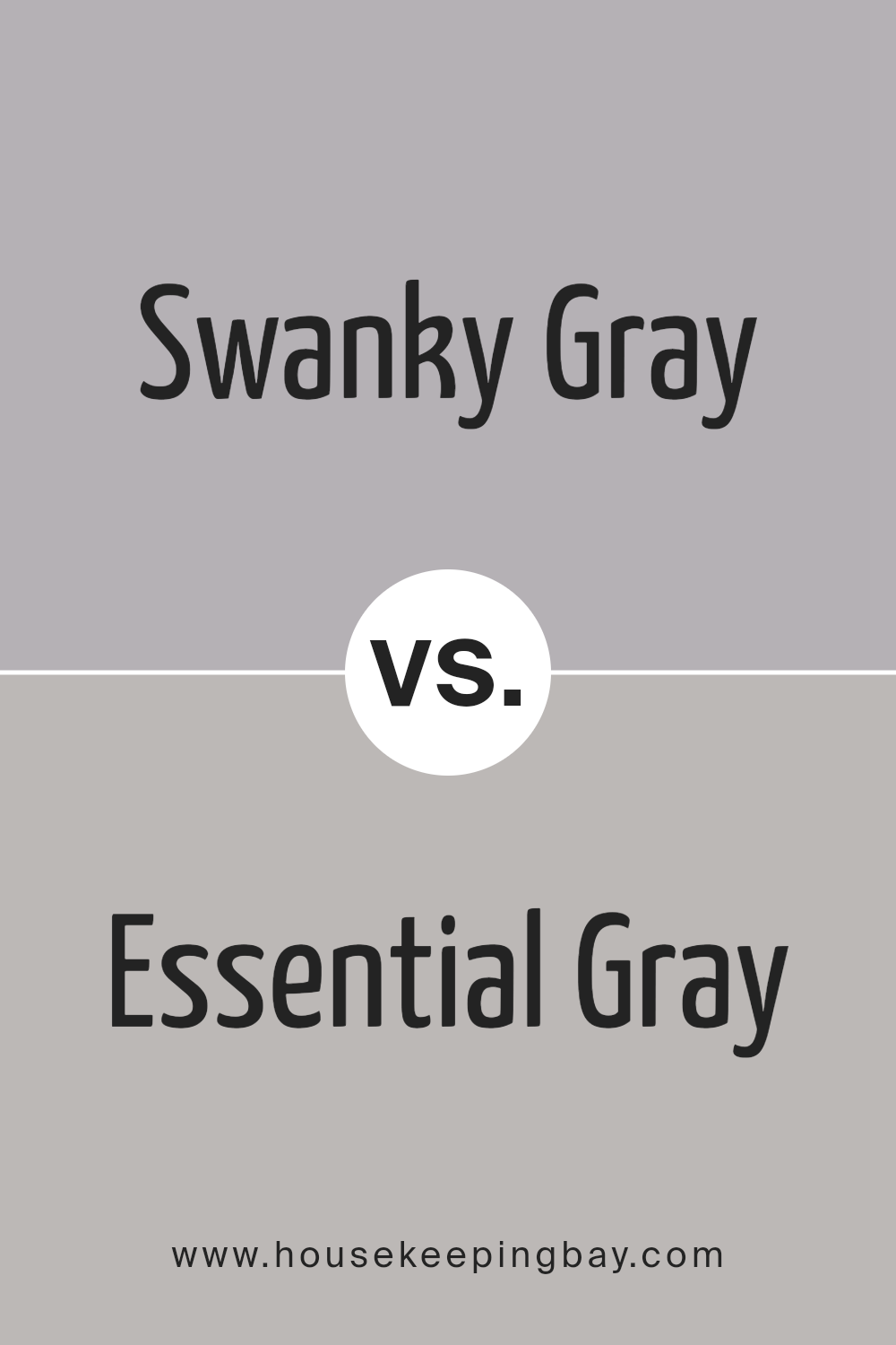
Swanky Gray SW 6261 by Sherwin Williams vs Essential Gray SW 6002 by Sherwin Williams
Swanky Gray SW 6261 by Sherwin Williams and Essential Gray SW 6002 by Sherwin Williams are two different shades of gray, each with its own unique feel.
Swanky Gray is a bit more on the bold side, giving off a strong and somewhat deeper look. It’s great for someone wanting to make a bit of a statement in a room without going too dark.
On the other hand, Essential Gray is lighter and more subtle. This color is perfect for those looking for a soft, calm vibe in their space. It’s easy on the eyes and works well in areas where you want to relax.
Although both colors are gray, Swanky Gray leans towards a stronger presence, making it ideal for accent walls or rooms where you want a bit more drama.
Essential Gray, however, is your go-to for a gentle backdrop, suitable for nearly any room. In summary, choose Swanky Gray for a bolder look and Essential Gray for a lighter, more tranquil atmosphere.
You can see recommended paint color below:
- SW 6002 Essential Gray
housekeepingbay.com
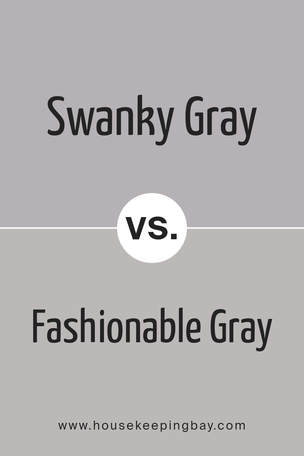
Swanky Gray SW 6261 by Sherwin Williams vs Fashionable Gray SW 6275 by Sherwin Williams
Swanky Gray SW 6261 by Sherwin Williams and Fashionable Gray SW 6275 by Sherwin Williams are two interesting shades to compare.
Swanky Gray is a subtle, soft color that leans a bit towards the cooler side of gray, giving off a calm and soothing vibe. It’s perfect for creating a peaceful and serene space, making rooms feel more spacious and airy.
On the other hand, Fashionable Gray is slightly warmer and richer, adding a bit of sophistication and depth to any room.
It has a cozy feel, making it great for spaces where you want to add a touch of elegance without overwhelming the area with too dark a color.
Both colors are versatile and can blend well with various decors. While Swanky Gray might be better suited for a modern, minimalist look due to its cooler tones, Fashionable Gray is ideal for adding warmth to a room, making it feel welcoming and chic.
Depending on the mood you want to create, either color can be a great choice for your home.
You can see recommended paint color below:
- SW 6275 Fashionable Gray
housekeepingbay.com
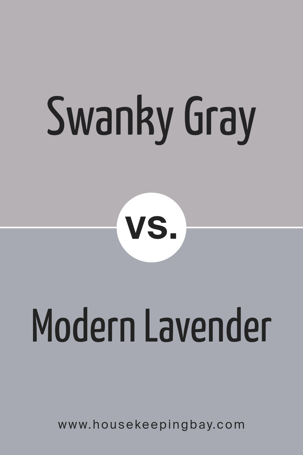
Swanky Gray SW 6261 by Sherwin Williams vs Modern Lavender SW 9688 by Sherwin Williams
Swanky Gray SW 6261 and Modern Lavender SW 9688, both by Sherwin Williams, offer unique vibes for any space. Swanky Gray is a sophisticated and versatile shade that gives a calm, grounded feeling.
It’s perfect for creating a sleek, modern look or a cozy, inviting atmosphere. This color works well in any room, adding depth without overwhelming the space.
On the other hand, Modern Lavender SW 9688 brings a soft and gentle touch. It’s a subtle lavender shade that infuses rooms with a sense of calm and creativity.
This color leans towards a more playful and whimsical aesthetic, making it great for spaces where you want to add a hint of personality and warmth, like bedrooms or creative spaces.
While Swanky Gray acts as a strong foundation, offering a timeless elegance, Modern Lavender adds a layer of light-heartedness and flair.
Both colors can transform a room, but they do so in significantly different ways – Swanky Gray with its understated sophistication, and Modern Lavender with its fresh, uplifting energy.
You can see recommended paint color below:
- SW 9688 Modern Lavender
housekeepingbay.com
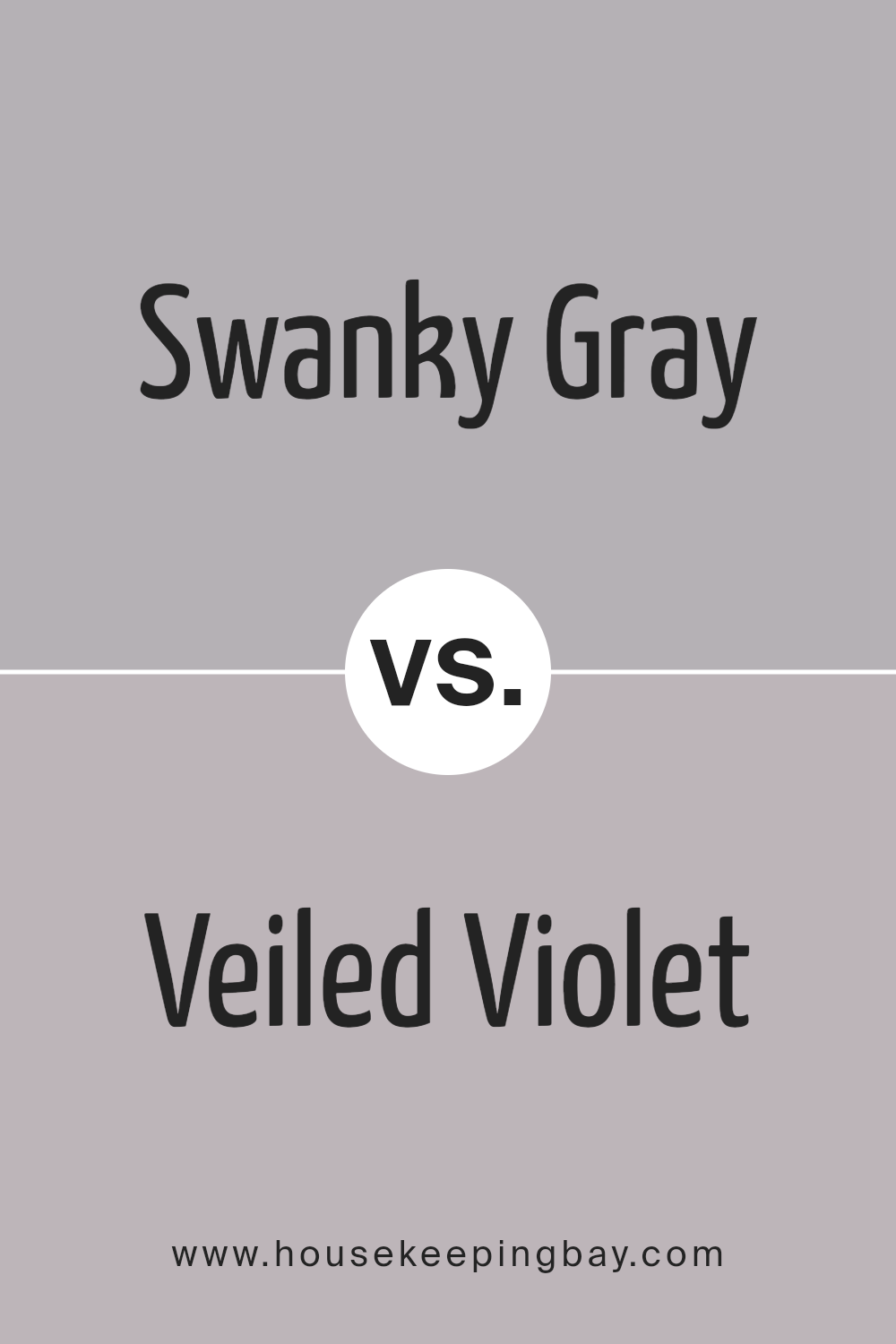
Swanky Gray SW 6261 by Sherwin Williams vs Veiled Violet SW 6268 by Sherwin Williams
Swanky Gray SW 6261 and Veiled Violet SW 6268, both by Sherwin Williams, have their unique appeal. Swanky Gray is a sophisticated and versatile color.
It’s a type of gray that carries a subtle elegance, making it perfect for spaces where you want a modern yet timeless look. It’s great for rooms that need a calm and collected ambiance, as it can blend seamlessly with various decor styles.
On the other hand, Veiled Violet SW 6268 offers a delicate touch of color. It’s not your typical violet; it has a softness to it that can bring a warm and inviting feel to any room.
This color has a way of adding depth without overwhelming a space, making it an excellent choice for bedrooms or bathrooms where you want to add a hint of personality without going too bold.
While Swanky Gray leans more towards a neutral, sophisticated coolness, Veiled Violet introduces a gentle, soothing warmth. Both colors have their charm and can transform spaces in different ways.
Whether you’re looking for the understated elegance of gray or the gentle warmth of violet, these colors have much to offer.
You can see recommended paint color below:
- SW 6268 Veiled Violet
housekeepingbay.com
Conclusion
Swanky Gray SW 6261 by Sherwin Williams is a versatile paint color that effortlessly blends with a variety of decor styles, making it a popular choice for those looking to refresh their spaces without committing to a bold or overly dramatic change.
Its unique blend offers a perfect balance between warmth and sophistication, allowing it to adapt to different lighting conditions and complement a wide range of furnishings and accessories.
This adaptability makes Swanky Gray an ideal backdrop for both modern and traditional interiors, providing a subtle yet impactful foundation for any room.
As a color that strikes a fine balance between making a statement and creating a serene atmosphere, Swanky Gray serves as a solid choice for homeowners and designers alike.
Its ability to enhance the aesthetic appeal of a space without overwhelming it is a key attribute, enabling subtle transitions between rooms and promoting a cohesive look throughout the home.
Whether used in a living room, bedroom, or kitchen, Swanky Gray offers a timeless elegance that elevates the overall design while maintaining a welcoming and comfortable environment.
housekeepingbay.com
Ever wished paint sampling was as easy as sticking a sticker? Guess what? Now it is! Discover Samplize's unique Peel & Stick samples. Get started now and say goodbye to the old messy way!
Get paint samples