Roycroft Bronze Green SW 2846 by Sherwin Williams
Embracing Elegance with Timeless Bronze Tones
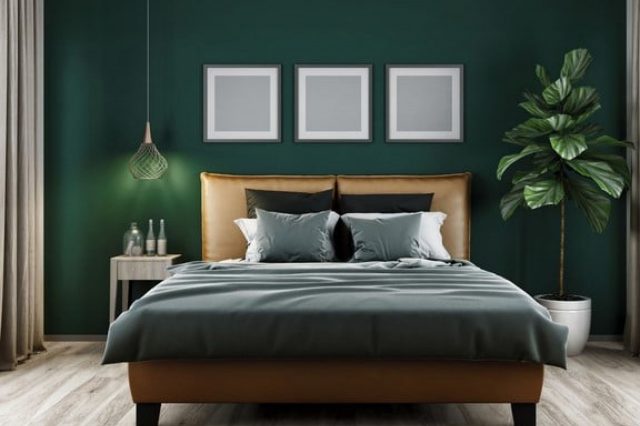
Introducing SW 2846 Roycroft Bronze Green by Sherwin Williams, a stunning and versatile paint color that brings a touch of elegance and nature-inspired beauty to any space. This unique shade, part of the Sherwin Williams historical collection, strikes a fine balance between earthy charm and refined sophistication.
Roycroft Bronze Green has a deep, rich quality that works wonderfully in a variety of settings, from traditional to modern, making it a favorite among homeowners and designers alike.
Whether you’re planning to refresh your living room, bedroom, or even the exterior of your home, Roycroft Bronze Green offers a distinctive look that can instantly transform the ambiance of a space.
Its greenish-bronze hue pairs well with a wide range of color palettes, allowing for flexibility in design and décor. This color not only adds depth and character to walls but also complements wood finishes, metals, and natural textures beautifully, creating harmonious and inviting interiors.
Choosing the right paint color is crucial for setting the mood and style of your home, and SW 2846 Roycroft Bronze Green by Sherwin Williams presents a fantastic option for those looking to make a sophisticated yet bold statement. As we explore this color further, we’ll uncover its many benefits and how it can enhance the look and feel of your home.
via sherwin-williams.com
What Color Is Roycroft Bronze Green SW 2846 by Sherwin Williams?
The color Roycroft Bronze Green SW 2846 by Sherwin Williams brings a subtle yet profound depth to any space. It’s a rich, earthy hue that strikes a perfect balance between green and bronze, creating a warm, inviting atmosphere.
This color has an organic feel to it, reminiscent of dense forests or the aged patina of bronze sculptures, adding a touch of sophistication and timeless elegance to interiors.
Roycroft Bronze Green works exceptionally well in various interior styles, particularly those that draw inspiration from nature, such as rustic, craftsman, or modern farmhouse designs.
Its versatility also allows it to fit beautifully within more traditional or vintage settings, where its depth can complement wood finishes and antique decor.
When it comes to pairing materials and textures with this unique color, natural elements work best. Think along the lines of dark wood, leather, and natural stone.
These materials enhance the color’s richness without overpowering it. For textures, consider soft, plush fabrics like velvet or wool in neutral tones to add contrast and warmth to the space.
Linen and cotton in lighter shades can also provide a refreshing balance, ensuring the color stands out as a focal point without making the room feel too heavy or dark.
housekeepingbay.com
Table of Contents
Is Roycroft Bronze Green SW 2846 by Sherwin Williams Warm or Cool color?
Roycroft Bronze Green SW 2846 by Sherwin Williams is a unique and warm paint color that adds a cozy, earthy touch to any home. This rich, deep shade of green has brown undertones, making it a perfect choice for those looking to add a bit of nature-inspired calm to their spaces.
When used on walls, it creates a stunning backdrop that highlights furniture and decor, allowing for a wide range of styling options.
Whether you’re aiming for a rustic look, a modern vibe, or something in between, Roycroft Bronze Green can easily adapt to your design scheme.
In rooms with plenty of natural light, this color takes on a lively, vibrant tone, while in spaces with less light, it provides a snug, enveloping feel. This versatility makes it an excellent choice for living rooms, bedrooms, and even home offices.
Pairing it with natural materials like wood, stone, or leather can enhance its earthy quality, making spaces feel grounded and serene. Overall, Roycroft Bronze Green SW 2846 helps create inviting, comfortable homes that welcome relaxation and rejuvenation.
What is the Masstone of the Roycroft Bronze Green SW 2846 by Sherwin Williams?
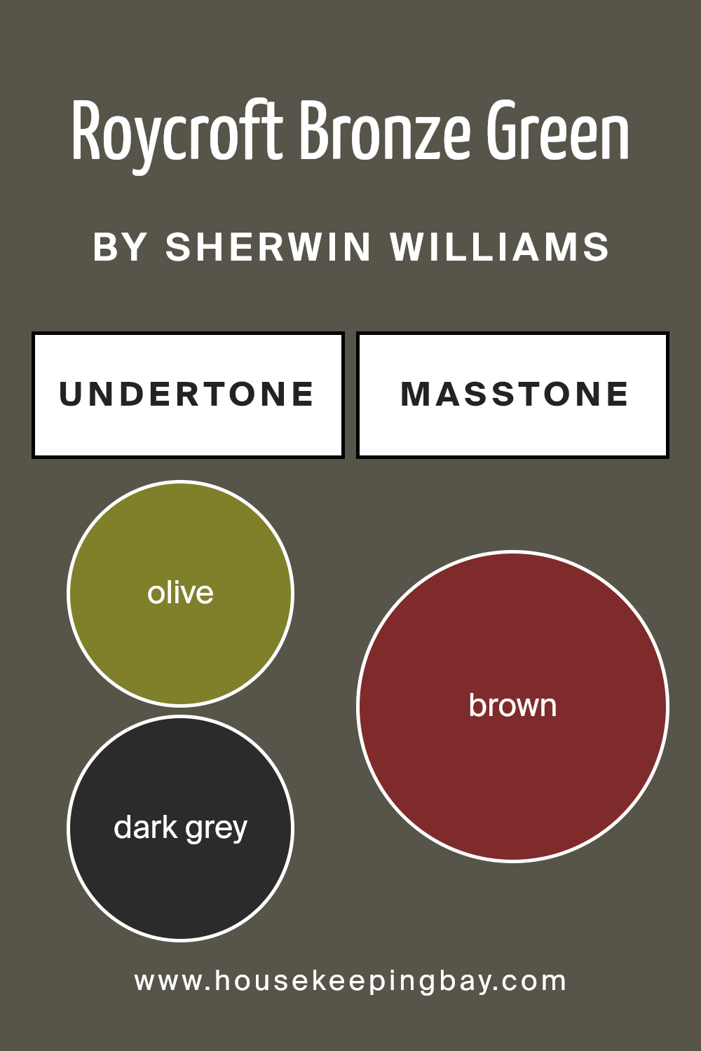
The Roycroft Bronze Green SW 2846 by Sherwin Williams has a masstone, or main color, that looks brown (#802B2B). This color has a rich, earthy feel that can bring warmth and a sense of coziness to any room in a house.
When used on walls, it creates a backdrop that feels both comforting and stylish. It’s the kind of color that works well in many areas of a home, like living rooms, bedrooms, or even kitchens, providing a solid foundation that can complement various decors, from modern to traditional.
Because its main tone is brown, it helps in making spaces feel more welcoming and snug. It’s especially good for homes in cooler climates, as the depth of the color adds a layer of visual warmth.
On the other hand, in well-lit, sunny rooms, this color can pick up lighter, more subtle tones, showing its versatility. Furniture in neutral colors or materials like wood can look particularly nice against this backdrop, making the space feel grounded and put together.

housekeepingbay.com
Undertones of Roycroft Bronze Green SW 2846 by Sherwin Williams
Roycroft Bronze Green SW 2846 by Sherwin Williams is a unique color with complex undertones, giving it depth and versatility. This color harbors undertones of olive and dark grey. These undertones aren’t just subtle hints; they play a significant role in how we perceive the color.
Olive undertones bring in a natural, earthy vibe. They make Roycroft Bronze Green feel more grounded and connected to the outdoors. This touch of olive turns the color into a bridge between nature and interior spaces, making rooms feel more open and welcoming.
Dark grey undertones add sophistication. They provide a solid, profound base to the color, making it look richer and more mature. This sophistication makes it a great fit for spaces aiming for a more refined or elegant look.
When applied to interior walls, the undertones of Roycroft Bronze Green can significantly impact the room’s atmosphere. Depending on the lighting, these undertones can shift the color’s appearance.
In bright, natural light, the olive undertones might become more pronounced, enhancing the room’s warmth and coziness. In artificial or dim light, the dark grey undertones might dominate, giving the space a more formal and serene feel.
Understanding these undertones is crucial to using Roycroft Bronze Green effectively. They can make the color adapt in surprising ways, ensuring a lively yet balanced ambiance in any room.
housekeepingbay.com
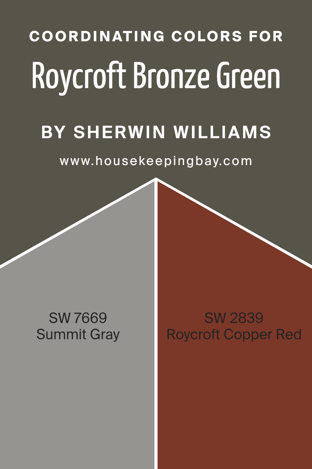
Coordinating Colors of Roycroft Bronze Green SW 2846 by Sherwin Williams
When it comes to home decorating and design, coordinating colors play a crucial role in creating a harmonious and inviting space. Coordinating colors are those that complement each other well when used together in a room.
They are different from matching colors because they don’t have to look alike; instead, they work together to enhance the overall aesthetic and mood of a space. For instance, the color Roycroft Bronze Green SW 2846 by Sherwin Williams finds its harmony with colors like SW 7669 – Summit Gray and SW 2839 – Roycroft Copper Red.
These colors, when combined, offer a balanced and cohesive look that elevates the design of any room.
Summit Gray is a soft, muted color with a versatile appeal. It carries a serene quality, making it an excellent backdrop for Roycroft Bronze Green, as it doesn’t compete for attention but rather complements its richness. On the other hand, Roycroft Copper Red brings a warm, earthy tone to the mix.
This color has a rustic charm that pairs beautifully with the deep and sophisticated hue of Roycroft Bronze Green, creating a cozy and welcoming atmosphere. Together, these coordinating colors work in harmony to create a space that is both stylish and comfortable, proving that the right color combinations can transform any room into a beautifully composed setting.
You can see recommended paint colors below:
- SW 7669 Summit Gray
- SW 2839 Roycroft Copper Red
housekeepingbay.com
How Does Lighting Affect Roycroft Bronze Green SW 2846 by Sherwin Williams?
Lighting plays a crucial role in how we perceive colors. The same paint, like Roycroft Bronze Green SW 2846 by Sherwin Williams, can look different under various light sources. Understanding this can help you decide where to use this paint to get the look you’re aiming for.
In artificial light, the type of bulb matters. Incandescent bulbs, which give off a warm glow, can make Roycroft Bronze Green look cozier and more inviting, highlighting its earthy tones.
LED or fluorescent lights, which are cooler, might bring out more of the green’s freshness, making the color appear slightly sharper and more vibrant.
When it comes to natural light, the direction your room faces significantly impacts how Roycroft Bronze Green will look. North-faced rooms get less direct sunlight, which can make colors look more muted. In such rooms, Roycroft Bronze Green might appear darker and more subdued, losing some of its vibrancy but enhancing its sophisticated quality.
South-faced rooms bathe in abundant sunlight, brightening and warming colors. Here, Roycroft Bronze Green can look lively and radiant, with its green undertones coming forward, making the space feel vibrant and full of energy.
East-faced rooms get the most light in the morning. This morning light is warm and golden, making Roycroft Bronze Green look soft and welcoming in the morning but cooler and more reserved as the day progresses and the natural light diminishes.
West-faced rooms receive intense evening light that can make Roycroft Bronze Green look very dynamic.
During sunset, the color can appear warmer and more intense, creating a cozy and inviting atmosphere that shifts throughout the day from a cooler, more balanced green to a richer, more profound hue in the evening light.
In summary, Roycroft Bronze Green’s appearance can vary greatly depending on the lighting, changing from vibrant and lively in south and west-facing rooms to more muted and sophisticated in north and east-facing rooms. Knowing this can help you choose the right room to paint to match the mood and atmosphere you’re trying to achieve.
housekeepingbay.com
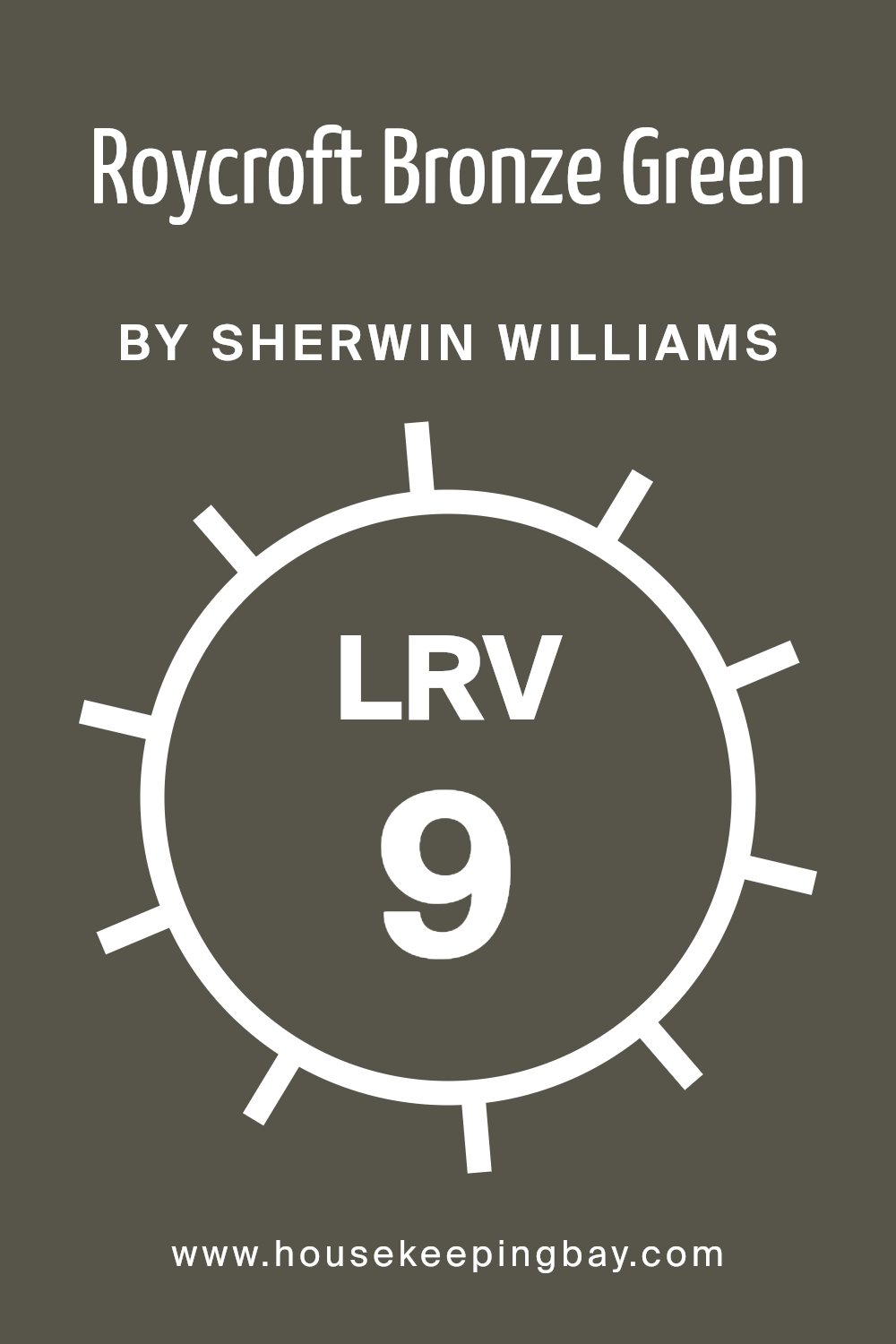
What is the LRV of Roycroft Bronze Green SW 2846 by Sherwin Williams?
LRV stands for Light Reflectance Value, which is a measure of the percentage of light a paint color reflects from or absorbs into a painted surface. It’s a scale that ranges from 0 to 100, with 0 being completely black, absorbing all light, and 100 being pure white, reflecting all light back.
The LRV helps in understanding how light or dark a color will look once applied to walls and how it changes under different lighting conditions. In simpler terms, it’s a way to figure out how bright or dark a color will appear in a room, which can have a big impact on the mood and feel of the space.
With an LRV of 8.847, Roycroft Bronze Green SW 2846 by Sherwin Williams is on the darker end of the spectrum, meaning it absorbs much more light than it reflects. This characteristic can make spaces painted in this color feel cozier and more enclosed.
It’s a color that doesn’t bounce a lot of light around, which could make it ideal for creating a rich, intimate atmosphere in a room. However, it’s also important to consider that because of its low LRV, using this color in a small or poorly lit room could potentially make the space feel smaller or darker.
To balance this, pairing it with lighter colors or using it on an accent wall could help maintain a sense of spaciousness and light in the room.
housekeepingbay.com
What is LRV? Read It Before You Choose Your Ideal Paint Color
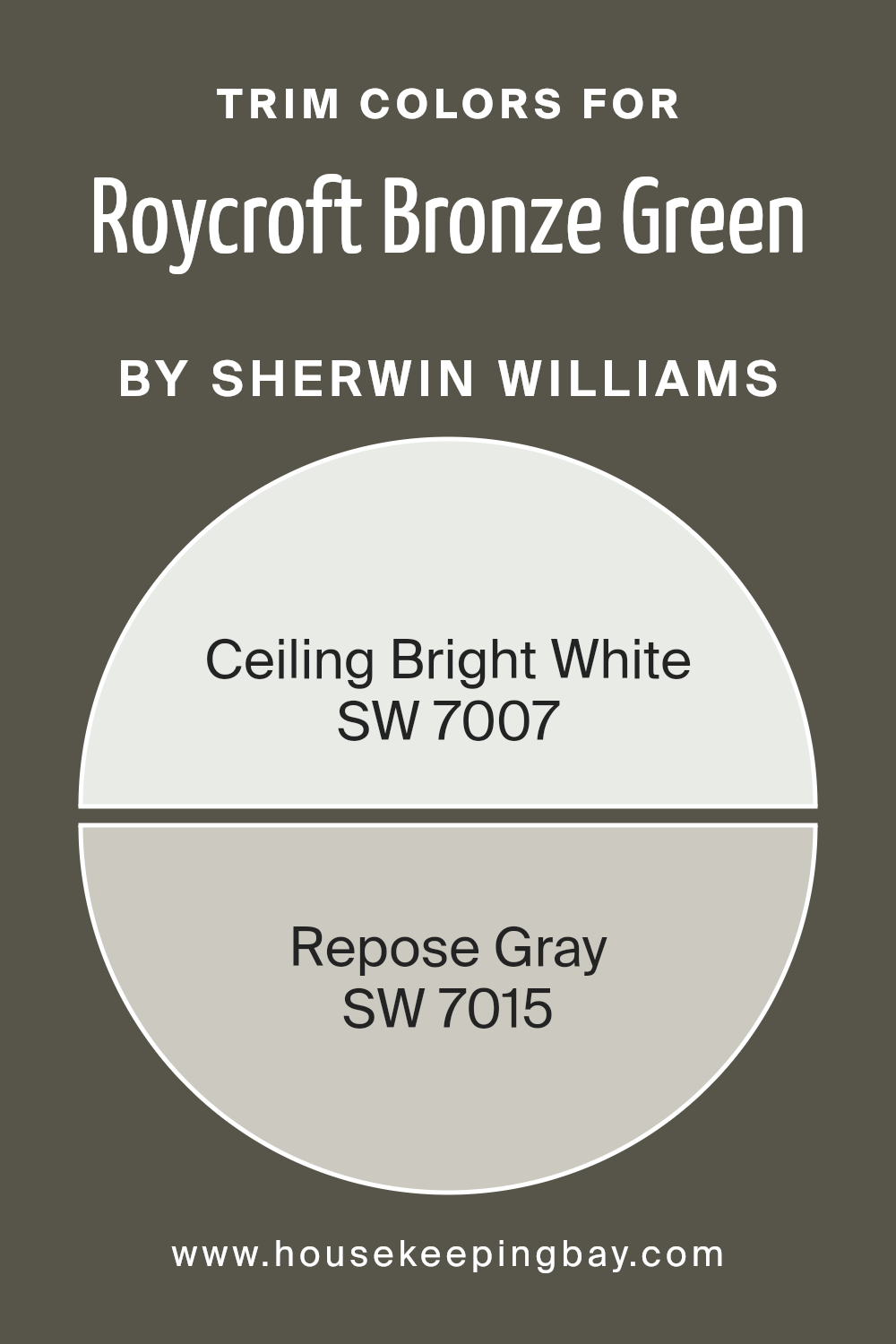
What are the Trim colors of Roycroft Bronze Green SW 2846 by Sherwin Williams?
Trim colors are specific shades used for painting the edges and frames around walls, doors, windows, and other fixtures in a room to accentuate the architectural details or to add a pop of contrast against the primary wall colors.
When considering Roycroft Bronze Green SW 2846 by Sherwin Williams, a rich and earthy green hue, choosing the right trim colors is vital to highlight its depth and bring a cohesive look to the space.
Trim colors play a critical role in tying a room’s aesthetic together, enhancing the overall design by defining boundaries and creating visual interest. They can make the main color stand out more and give the room a finished look.
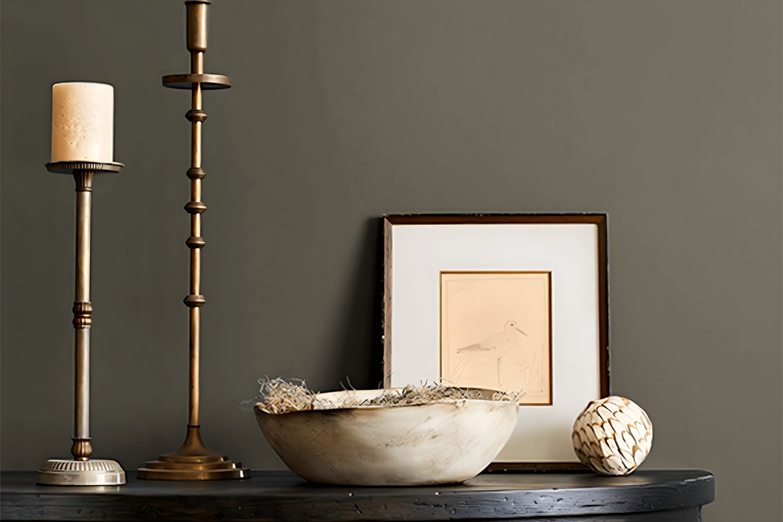
For Roycroft Bronze Green, using SW 7007 – Ceiling Bright White and SW 7015 – Repose Gray as trim colors can beautifully complement the deep green, providing a balance between warmth and crispness.
Ceiling Bright White is a true white with a clean look, offering a striking contrast that can make the green appear more vibrant while making spaces feel larger and brighter. Repose Gray, on the other hand, is a light to medium gray that carries warm undertones, softening the transition between the wall color and trim.
This blend of a soft gray and a pure white against the richness of Roycroft Bronze Green can pull a room together, making it feel thoughtfully designed and pleasing to the eye.
You can see recommended paint colors below:
- SW 7007 Ceiling Bright White
- SW 7015 Repose Gray
housekeepingbay.com
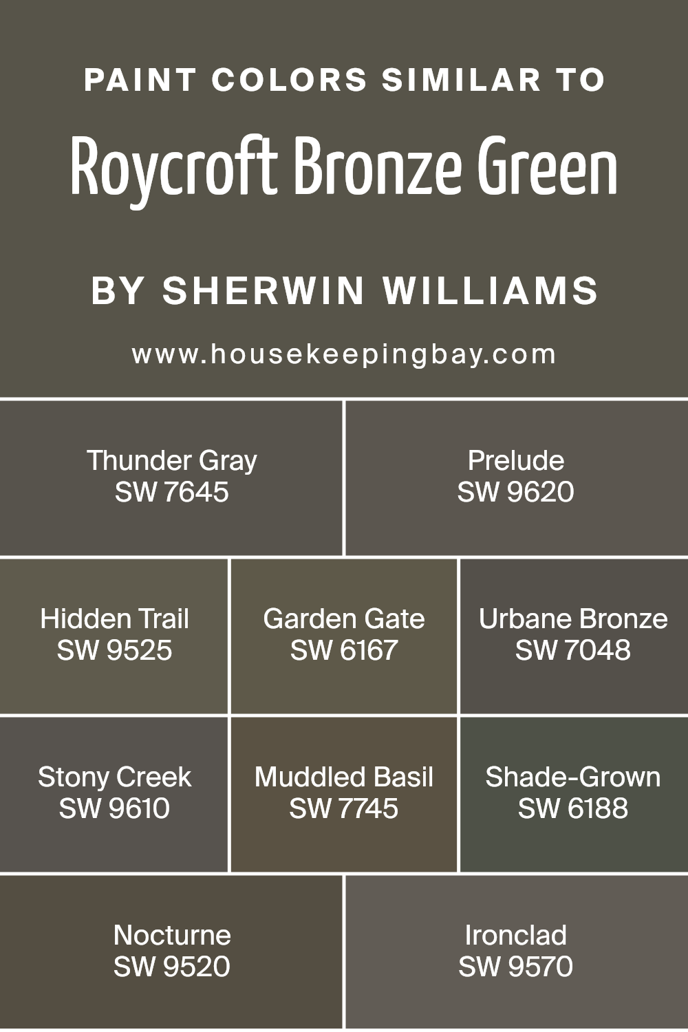
Colors Similar to Roycroft Bronze Green SW 2846 by Sherwin Williams
Color plays a vital role in designing and decorating spaces, and utilizing similar colors can create a harmonious and cohesive look. Similar colors, like those related to Roycroft Bronze Green SW 2846 by Sherwin Williams, have a unique connection.
They share a common hue, varying in brightness or saturation but retaining a core visual similarity that makes them blend seamlessly when used together.
This family of colors, which includes shades like Thunder Gray, Prelude, Hidden Trail, Garden Gate, and others, works together to enrich a space with depth and complexity without overwhelming it with high contrast.
Thunder Gray and Prelude offer muted, soothing tones, providing a solid foundation for spaces aiming for a serene aesthetic. Hidden Trail and Garden Gate introduce an earthy, welcoming feel, perfect for creating a cozy environment.
On the darker side, Urbane Bronze and Stony Creek bring about a sense of sophistication and groundedness, ideal for accentuating focal points or adding character. Muddled Basil and Shade-Grown offer a refreshing touch with their green undertones, reminiscent of nature and tranquility.
To add a bit of drama, Nocturne and Ironclad can be incorporated, lending an air of mystery and elegance with their deeper hues.
Together, these colors work in harmony, allowing for a versatile palette that can be tailored to fit any design style or preference, making them an excellent choice for anyone looking to create a beautiful, unified space.
You can see recommended paint colors below:
- SW 7645 Thunder Gray
- SW 9620 Prelude
- SW 9525 Hidden Trail
- SW 6167 Garden Gate
- SW 7048 Urbane Bronze
- SW 9610 Stony Creek
- SW 7745 Muddled Basil
- SW 6188 Shade-Grown
- SW 9520 Nocturne
- SW 9570 Ironclad
housekeepingbay.com
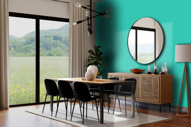
How to Use Roycroft Bronze Green SW 2846 by Sherwin Williams In Your Home?
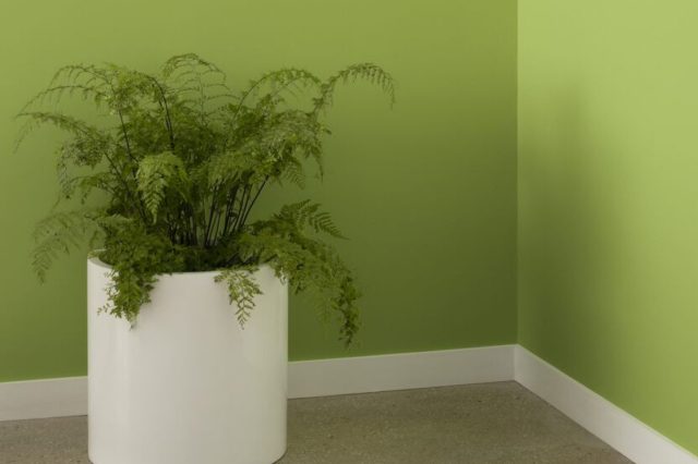
Roycroft Bronze Green SW 2846 by Sherwin Williams is a unique and stunning paint color that can really add some personality to your home. Picture this dark, earthy green on your living room or bedroom walls, making the space feel cozy, warm, and inviting.
It’s like bringing a bit of the outdoors inside, without getting your feet dirty! This color is perfect for someone who wants to add a touch of nature and sophistication to their space.
You can use Roycroft Bronze Green in various ways around your home. For a bold move, paint all the walls in a room with this color to create a dramatic and enveloping atmosphere. If you’re not ready for such a big change, why not paint just one wall as an accent?
This can be a fantastic backdrop for art, photos, or even your TV. It also pairs beautifully with natural materials like wood and leather, so consider it for rooms with wooden floors or furniture.
And don’t forget about the exterior! This color can also make your home stand out by using it on your front door or shutters. So, whether inside or out, Roycroft Bronze Green offers a versatile option for bringing richness and depth to your living spaces.
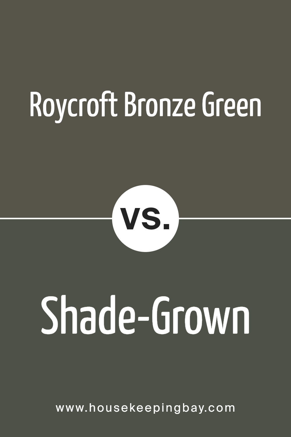
Roycroft Bronze Green SW 2846 by Sherwin Williams vs Shade-Grown SW 6188 by Sherwin Williams
Roycroft Bronze Green and Shade-Grown, both by Sherwin Williams, are two unique colors that bring their own personalities to spaces. Roycroft Bronze Green, with its deep, complex base, leans towards a traditional yet bold green. It has a touch of bronze that adds warmth, making it perfect for cozy, sophisticated rooms.
On the other hand, Shade-Grown presents a slightly softer and more subtle green. It’s closer to a natural, earthy tone with a peaceful, calming effect. This makes it ideal for creating a serene environment in any room.
While both colors share a green base, Roycroft Bronze Green stands out for its rich, darker hue and the warmth it brings, reminiscent of historical elegance. Shade-Grown, however, is lighter and inclines towards a fresher, more understated look, offering a contemporary twist.
Depending on the mood you want to set, Roycroft Bronze Green adds depth and character, whereas Shade-Grown invites a more gentle, soothing atmosphere.
You can see recommended paint color below:
- SW 6188 Shade-Grown
housekeepingbay.com
Roycroft Bronze Green SW 2846 by Sherwin Williams vs Urbane Bronze SW 7048 by Sherwin Williams
Roycroft Bronze Green SW 2846 and Urbane Bronze SW 7048, both by Sherwin Williams, offer unique touches to any space, but they bring different vibes. Roycroft Bronze Green leans into a deeper, earthy green with hints of bronze that give it a unique twist.
This color brings a touch of nature indoors, making it perfect for creating a cozy and grounding environment. It’s like walking through a dense, serene forest.
On the other hand, Urbane Bronze is a much warmer, richer color, resembling the dark, comforting embrace of chocolate mixed with the sophistication of bronze. It’s more of a neutral with a strong presence, great for adding depth and elegance to a room.
Urbane Bronze carries a certain richness and versatility, making it suitable for a variety of spaces looking for a bold yet refined statement.
Though both colors share a bronzed undertone, Roycroft Bronze Green offers a cool, earthy retreat, while Urbane Bronze presents a warm, inviting sanctuary, each creating distinctly different atmospheres in a home.
You can see recommended paint color below:

housekeepingbay.com
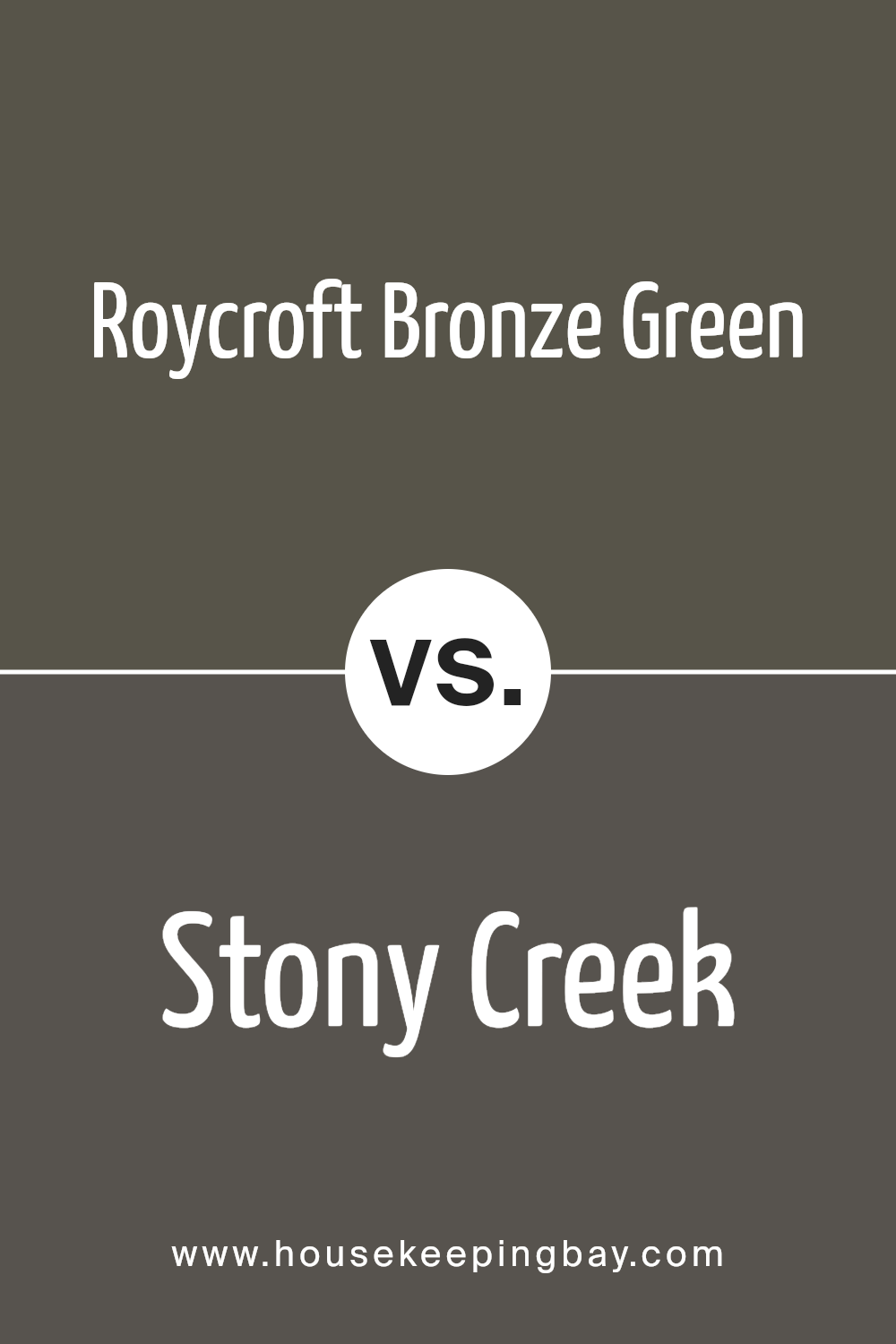
Roycroft Bronze Green SW 2846 by Sherwin Williams vs Stony Creek SW 9610 by Sherwin Williams
Roycroft Bronze Green SW 2846 and Stony Creek SW 9610 by Sherwin Williams are two unique colors with different vibes. Roycroft Bronze Green has a deep, rich tone that leans towards a darker shade of green.
It’s like the color of a dense forest at dusk, giving off a cozy and somewhat mysterious feel. It carries a vintage charm, perfect for creating a sophisticated and classic look.
On the other hand, Stony Creek SW 9610 is a lighter and more neutral color. It’s a mix of gray with a hint of green, resembling the smooth pebbles you might find in a calm, flowing creek.
This color is more subtle and versatile, fitting well in spaces that aim for a peaceful and serene atmosphere.
While both colors can bring nature into a space, Roycroft Bronze Green adds depth and character with its darker tone, whereas Stony Creek offers a gentle and clean look that’s easy to match with different decor styles.
You can see recommended paint color below:
- SW 9610 Stony Creek
housekeepingbay.com
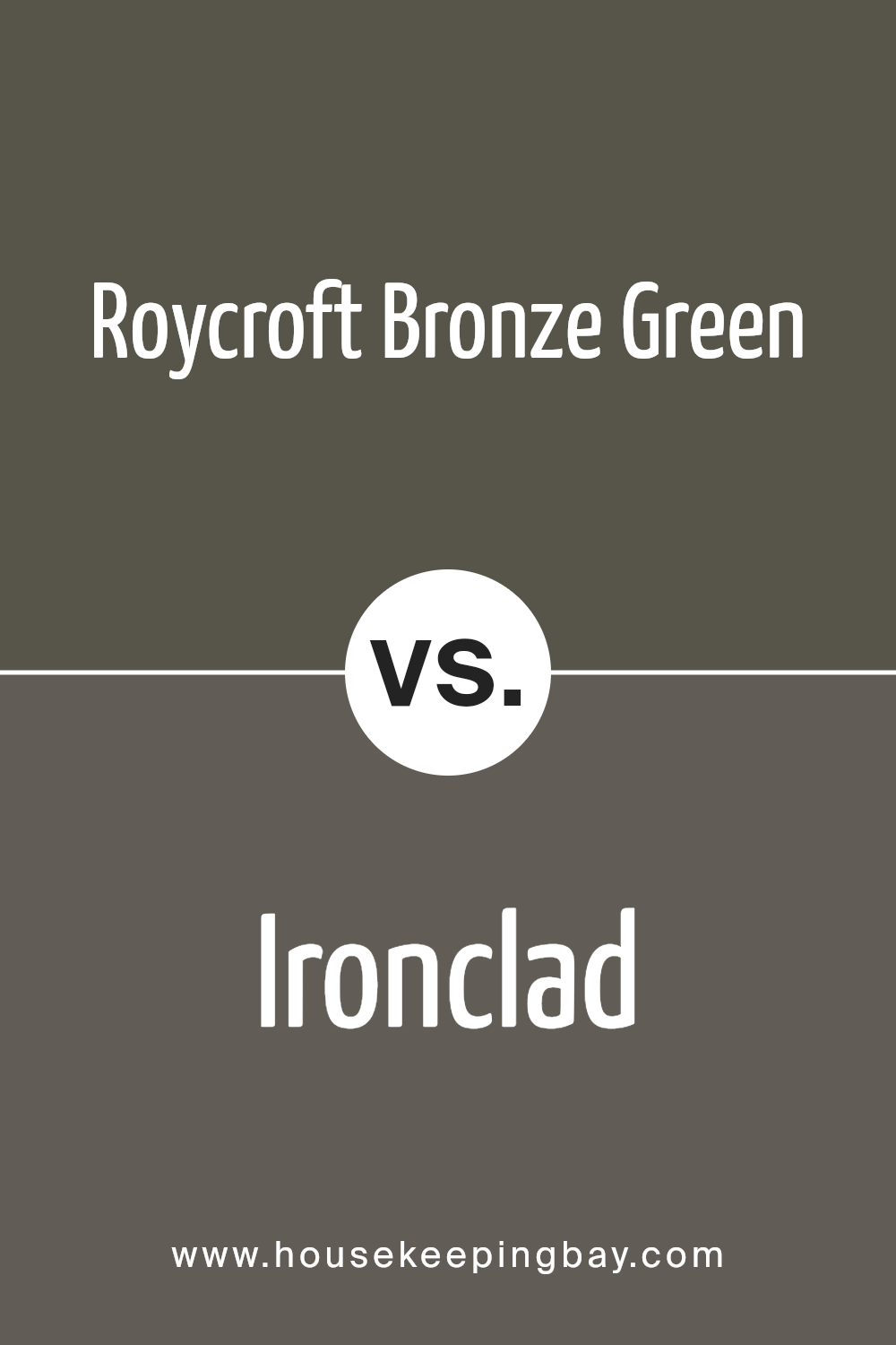
Roycroft Bronze Green SW 2846 by Sherwin Williams vs Ironclad SW 9570 by Sherwin Williams
Roycroft Bronze Green SW 2846 by Sherwin Williams and Ironclad SW 9570 by Sherwin Williams are two distinctive shades, each with its own unique appeal. Roycroft Bronze Green carries a deep, rich tone that blends green and bronze hues, creating a warm and cozy atmosphere.
This color leans towards a natural, earthy vibe, making it perfect for spaces where you want to add a touch of nature-inspired comfort. On the other hand, Ironclad SW 9570 offers a cooler, more neutral grey.
This color is versatile, fitting well in modern and minimalist designs due to its sleek, sophisticated finish. While Roycroft Bronze Green adds warmth and depth to a room, Ironclad provides a clean, contemporary look.
Both colors serve different moods and settings: Roycroft Bronze Green enriches a space with its lush, inviting feel, whereas Ironclad gives a space a sharp, clean aesthetic, making them ideal for varied design intentions.
You can see recommended paint color below:
- SW 9570 Ironclad
housekeepingbay.com
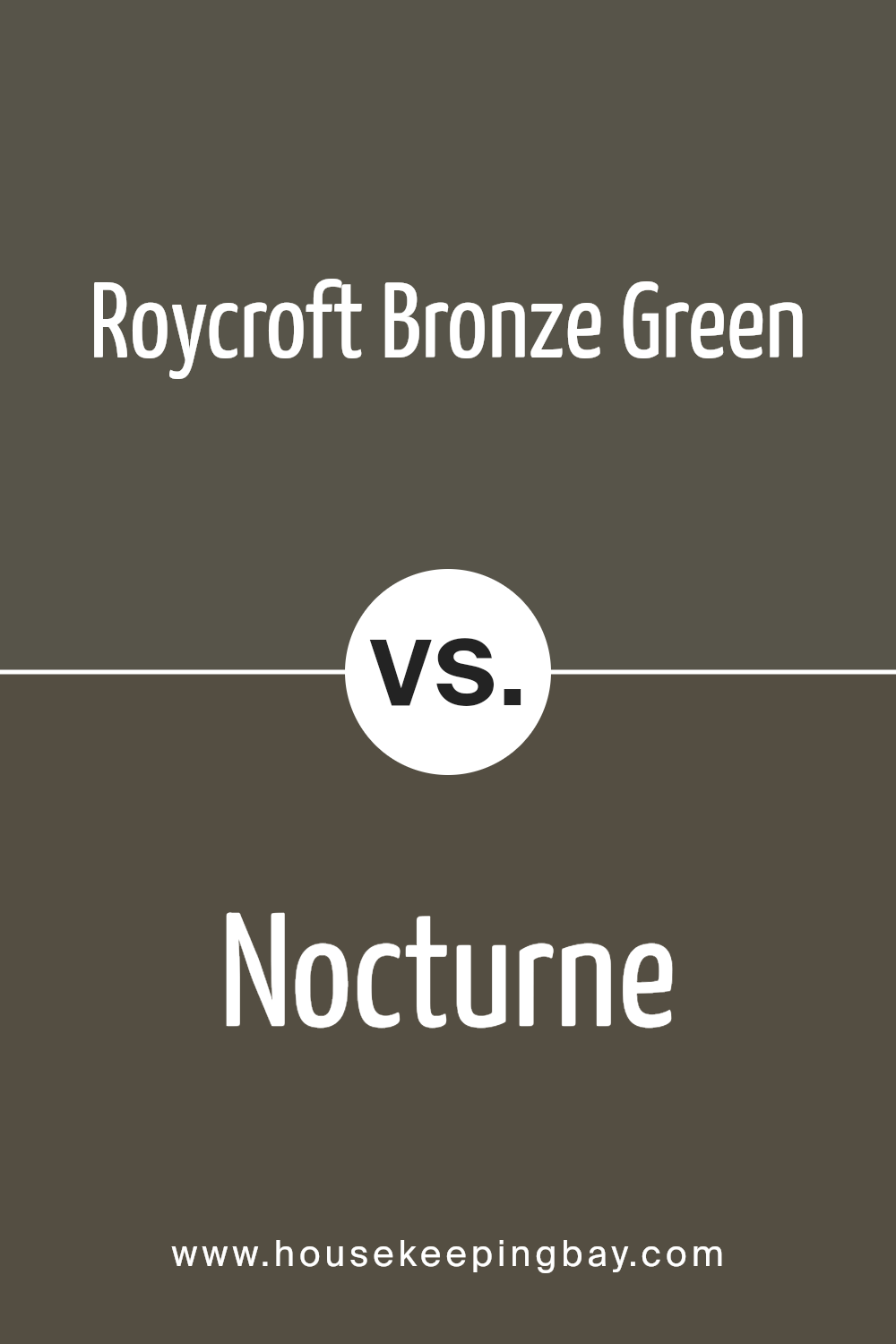
Roycroft Bronze Green SW 2846 by Sherwin Williams vs Nocturne SW 9520 by Sherwin Williams
Roycroft Bronze Green SW 2846 by Sherwin Williams and Nocturne SW 9520 by Sherwin Williams are two unique colors, each with its own vibe. Roycroft Bronze Green is a deep, rich green with hints of bronze that give it a warm, welcoming feel.
It’s like a cozy, dark forest green that can make any room feel more grounded and connected to nature. On the other hand, Nocturne is a soft, dark grayish-blue. It’s peaceful and soothing, making spaces feel calm and restful. It’s like looking at the sky on a clear, starry night.
When comparing them, Roycroft Bronze Green adds warmth and earthiness to a space, while Nocturne brings a sense of tranquility and expansive openness.
Both colors offer a touch of sophistication but in different ways: Roycroft Bronze Green with its earthy, natural undertones, and Nocturne with its serene, dreamy quality. They’re perfect for creating distinct moods in your home, depending on what feeling you want to inspire.
You can see recommended paint color below:
housekeepingbay.com
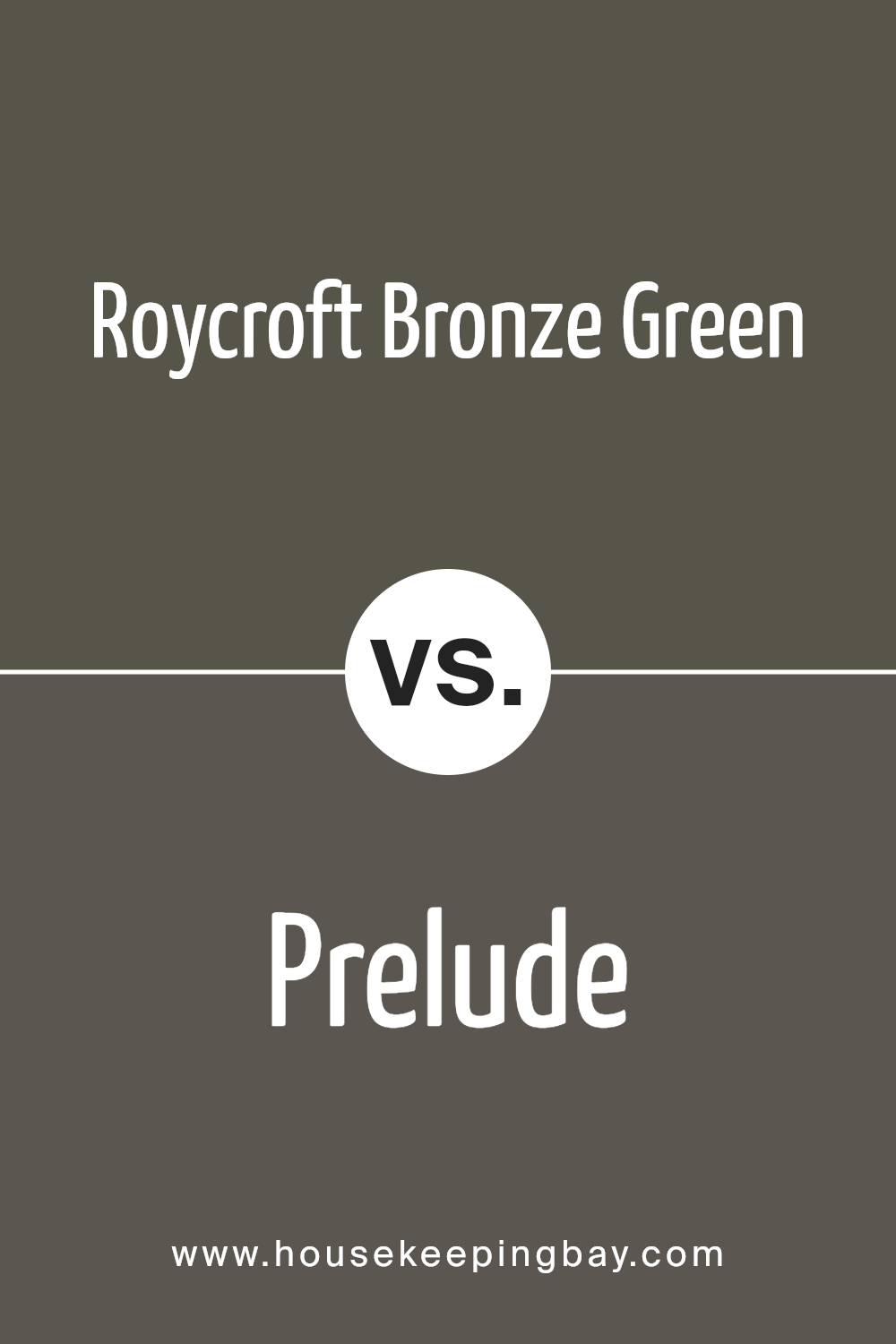
Roycroft Bronze Green SW 2846 by Sherwin Williams vs Prelude SW 9620 by Sherwin Williams
Roycroft Bronze Green SW 2846 by Sherwin Williams is a unique color, bringing a deep, earthy feel to any space. It has a rich, almost historical quality to it, as if it’s telling stories of the past. This color would make a room feel cozy and anchored, thanks to its muted, yet substantial presence.
It carries a certain weight that’s perfect for creating a sophisticated ambiance in libraries, dens, or any space aiming for a grounded, classic look.
On the other hand, Prelude SW 9620 by Sherwin Williams is lighter and softer. This color offers a fresh, airy feel, instantly brightening up a space.
Prelude is more about bringing in a sense of calm and tranquility, ideal for bedrooms, bathrooms, or anywhere you want to introduce a gentle, relaxing vibe. It stands out by providing a clean and inviting atmosphere, without overwhelming the senses.
Both colors serve different moods and settings. Roycroft Bronze Green sets a solid, traditional tone, while Prelude introduces a light, serene touch.
You can see recommended paint color below:
- SW 9620 Prelude
housekeepingbay.com
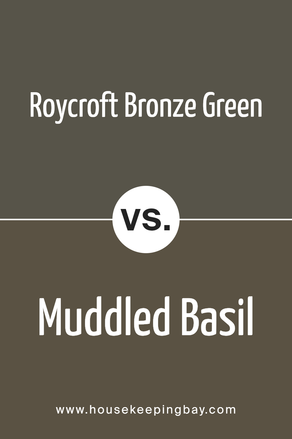
Roycroft Bronze Green SW 2846 by Sherwin Williams vs Muddled Basil SW 7745 by Sherwin Williams
Roycroft Bronze Green SW 2846 and Muddled Basil SW 7745 are both unique colors by Sherwin Williams, but they have some distinct differences.
Roycroft Bronze Green is a deeper, richer color. It looks a bit like dark, leafy greens with a hint of bronze that gives it a warm, earthy feel. This color would make a room feel cozy and grounded.
It’s perfect for a space where you want a touch of nature with a sophisticated twist.
On the other hand, Muddled Basil is lighter and fresher. It reminds you of the color of basil leaves with a bit of gray mixed in. This makes it a great choice for spaces that need a bright and airy feel. It’s still earthy, but in a lighter, more subtle way than Roycroft Bronze Green.
So, if you’re deciding between the two, consider the mood you want to create. Roycroft Bronze Green brings warmth and depth, while Muddled Basil offers a lighter, refreshing touch.
You can see recommended paint color below:
- SW 7745 Muddled Basil
housekeepingbay.com
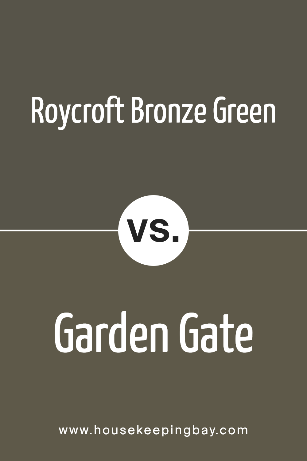
Roycroft Bronze Green SW 2846 by Sherwin Williams vs Garden Gate SW 6167 by Sherwin Williams
Roycroft Bronze Green SW 2846 and Garden Gate SW 6167, both by Sherwin Williams, offer distinct vibes for any space. Roycroft Bronze Green brings a deep, rich tone to the table, leaning towards a historical and sophisticated feel.
It’s a color that appears almost like a dark, leafy green mixed with earthy brown, giving it a grounded and mature look.
On the other hand, Garden Gate SW 6167 is a lighter, more muted shade. It leans towards a soft, grayish-green, suggesting a calming and serene atmosphere. This color is versatile, fitting well in spaces that aim for a peaceful and gentle ambiance.
While Roycroft Bronze Green sets a bold and classic mood, perfect for creating a statement or adding depth, Garden Gate offers a subtle touch of nature. It’s more laid-back, ideal for those looking to soften a room’s look or add a neutral background with just a hint of color.
In a nutshell, Roycroft Bronze Green suits traditional, earthy settings, and Garden Gate is your go-to for serene, light-filled rooms.
You can see recommended paint color below:
- SW 6167 Garden Gate
housekeepingbay.com
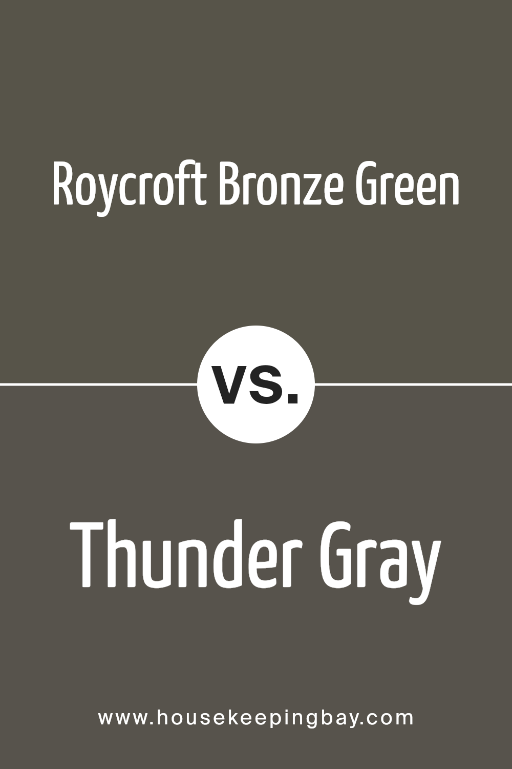
Roycroft Bronze Green SW 2846 by Sherwin Williams vs Thunder Gray SW 7645 by Sherwin Williams
Roycroft Bronze Green and Thunder Gray from Sherwin Williams are two distinct colors with unique vibes. Roycroft Bronze Green, a deep, earthy hue, reminds one of a dense forest at dusk, full of mystery and natural beauty.
It has a soothing quality, evoking the serenity and richness of nature. This color is perfect for creating a cozy, grounding atmosphere in any space.
On the other hand, Thunder Gray is a versatile, dark gray color with a modern feel. It’s like looking at a stormy sky, hinting at sophistication and elegance.
Thunder Gray works well in spaces that aim for a contemporary look, providing a strong, yet neutral backdrop that complements various decor styles.
While both colors share a depth and intensity, Roycroft Bronze Green leans more towards a warm, inviting palette, making spaces feel enclosed and intimate. Thunder Gray, with its cooler undertones, offers a crisp, clean look that’s more about creating a sleek, refined space.
Whether you’re going for a touch of nature or contemporary chic, these colors have distinct characteristics that serve different design goals.
You can see recommended paint color below:
- SW 7645 Thunder Gray
housekeepingbay.com
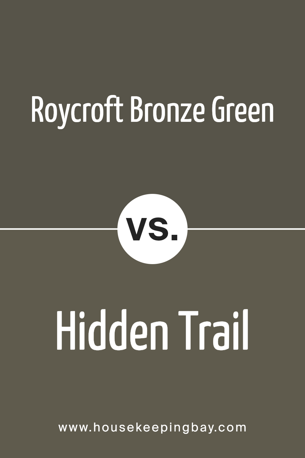
Roycroft Bronze Green SW 2846 by Sherwin Williams vs Hidden Trail SW 9525 by Sherwin Williams
Roycroft Bronze Green SW 2846 and Hidden Trail SW 9525 are two unique colors offered by Sherwin Williams, each with its distinct vibe. Roycroft Bronze Green is a darker, richer color that brings a feeling of earthiness and robust depth to a space.
It’s the kind of color that can anchor a room and make it feel grounded, offering a sense of stability and calm. On the other hand, Hidden Trail SW 9525 is a bit lighter and leans towards a softer, more subtle appearance. It has an airy quality to it that can make a room feel more open and relaxed.
While both colors are inspired by nature, Roycroft Bronze Green tends to lean towards a more traditional, classic look, whereas Hidden Trail has a more modern and contemporary feel.
In summary, choosing between them comes down to what atmosphere you want to create: the cozy, solid embrace of Roycroft Bronze Green or the gentle, welcoming touch of Hidden Trail.
You can see recommended paint color below:
- SW 9525 Hidden Trail
housekeepingbay.com
Conclusion
Roycroft Bronze Green SW 2846 by Sherwin Williams is a color that stands out for its unique blend of sophistication and natural charm. This versatile shade, derived from a palette that emphasizes both beauty and practicality, has a way of bringing a sense of calm and elegance to any space.
Its rich, deep tones capture the essence of the outdoors, offering a perfect balance between a luxurious and earthy feel. Whether applied in a study, living room, or as an accent in a kitchen, Roycroft Bronze Green adds a touch of refined taste without overwhelming the senses.
Homeowners and designers alike will find Roycroft Bronze Green SW 2846 to be a delightful choice when looking to introduce a sense of serenity and style into their environments. Its adaptability in complementing a wide range of décors and furnishings makes it a highly sought-after color.
The timeless appeal of this shade ensures that it can seamlessly integrate into various interior themes, from traditional to modern, adding depth and character to any project.
As a testament to its versatility, Roycroft Bronze Green stands as a testament to Sherwin Williams’ commitment to offering colors that not only beautify spaces but also enrich the lives of those dwelling within them.

housekeepingbay.com
Ever wished paint sampling was as easy as sticking a sticker? Guess what? Now it is! Discover Samplize's unique Peel & Stick samples. Get started now and say goodbye to the old messy way!
Get paint samples