Rockweed SW 2735 by Sherwin Williams
Check the Elegance of Nature's Depths
When you’re considering a fresh look for your home, finding the perfect paint color can be a big decision. SW 2735 Rockweed by Sherwin Williams could be just what you need. This color provides a subtle and soothing atmosphere, making it great for spaces where you want to relax and feel at ease.
Rockweed is a unique shade that brings to mind the serenity of a quiet, coastal landscape. It’s a greenish-gray that works well with a variety of decorating styles, from modern minimalism to rustic country.
Its natural tones help create a comforting environment, ideal for living rooms, bedrooms, or even home offices where a calm setting can enhance productivity.
Pairing this color with the right accents can also make a significant difference in your space. Light woods, soft whites, or even bolder colors can complement Rockweed nicely, depending on the look you’re going for.
So, if you’re ready to refresh your walls, SW 2735 Rockweed could provide that peaceful backdrop you’re seeking.

via sherwin-williams.com
What Color Is Rockweed SW 2735 by Sherwin Williams?
Rockweed SW 2735 by Sherwin Williams is a deep, muted green with hints of gray, providing a soothing, natural appeal that recalls the colors of dense foliage or the calm of a forest floor. This versatile hue works remarkably well in interior styles that favor earthy, organic elements, such as rustic, Scandinavian, and modern farmhouse designs.
The understated elegance of Rockweed makes it an excellent choice for living rooms, bedrooms, and home offices where a touch of serenity is desired.
In terms of pairing, Rockweed SW 2735 complements a wide array of materials and textures. It pairs beautifully with natural wood tones, from light pine to rich walnut, enhancing the warmth of the wood. Textiles like linen or cotton in white or soft beige can lighten the overall feel of the room, providing a pleasing contrast.
Additionally, this color coordinates well with stones and metals. Think of slate tiles in a bathroom or brass fixtures in a kitchen, where the green can offset these materials without overwhelming them.
For those keen on adding a subtle yet impactful backdrop to their space, Rockweed SW 2735 offers a robust solution that harmonizes with many décor elements, supporting a cohesive and inviting interior atmosphere.
housekeepingbay.com
Is Rockweed SW 2735 by Sherwin Williams Warm or Cool color?
Rockweed SW 2735 by Sherwin Williams is a distinctive paint color that can significantly impact home interiors. This hue is a deep, rich green with earthy brown undertones, making it a natural choice for those looking to add a sense of warmth and depth to their spaces.
Rockweed works well in various settings due to its versatility. It pairs beautifully with both rustic and modern decor, offering a grounded yet sophisticated backdrop.
In living rooms or bedrooms, Rockweed can create a cozy, inviting atmosphere, encouraging relaxation and comfort. The deep green hue also pairs nicely with natural materials like wood or stone, enhancing the organic feel of a room.
In kitchens or dining areas, using Rockweed on cabinets or walls can add a luxurious touch without overwhelming the space. Additionally, this color can help smaller spaces feel more enclosed and intimate, making it an excellent choice for studies or home offices where focus and calm are key.
Overall, Rockweed SW 2735 is versatile and functional, suitable for many home styles.
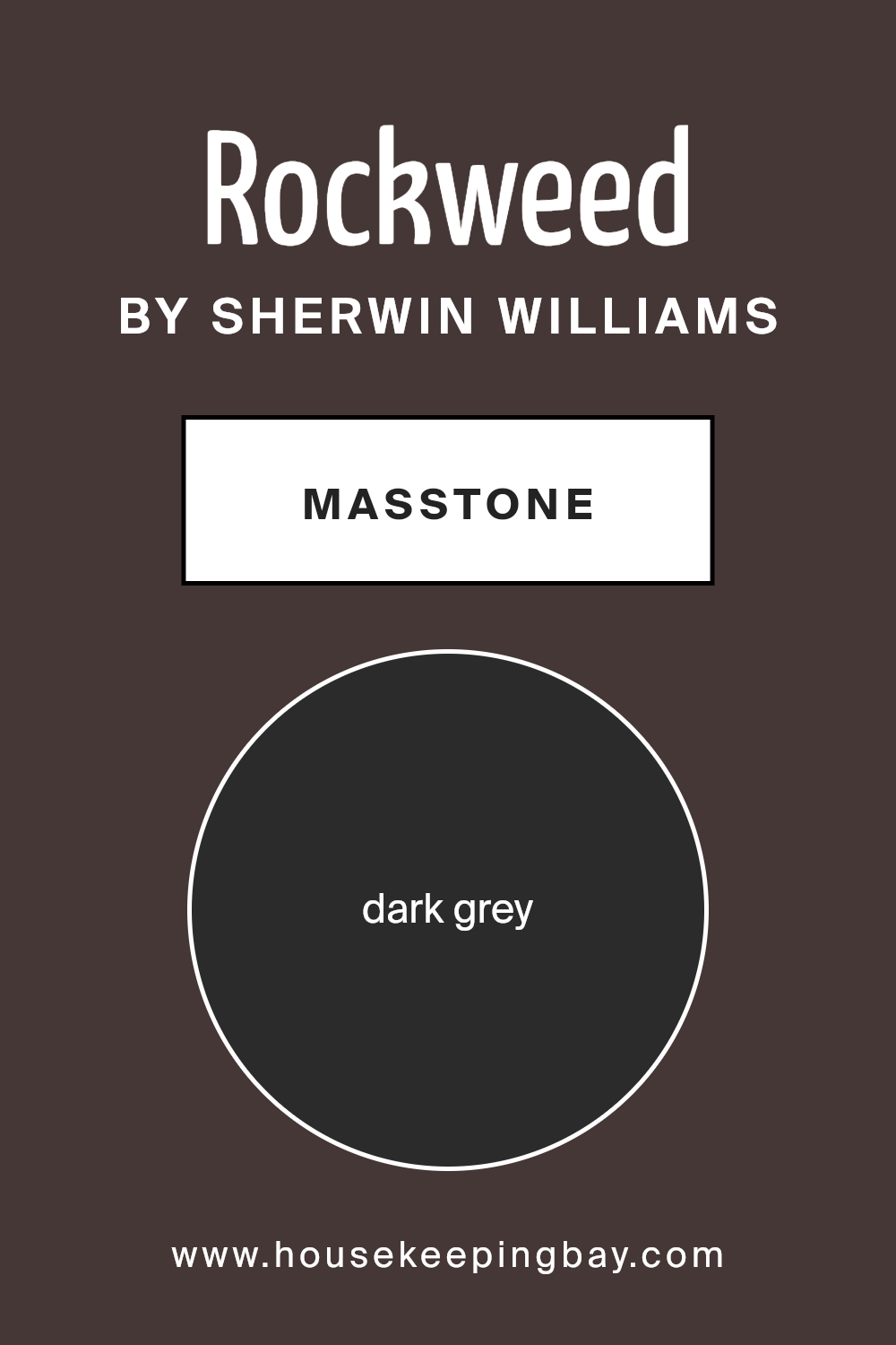
What is the Masstone of the Rockweed SW 2735 by Sherwin Williams?
RockweedSW 2735 by Sherwin Williams, with its masstone of Dark grey (#2B2B2B), offers a versatile and grounding color choice for home interiors. This deep, nearly black shade can serve various purposes in home decorating.
As a background color, it works exceptionally well to highlight and contrast lighter colors or bright accessories, making them pop and giving rooms a dynamic look. Its neutrality means it effortlessly coordinates with a wide range of colors, from soft pastels to vibrant hues, adding depth and sophistication to a space.
In smaller rooms or spaces without much natural light, using RockweedSW 2735 might make the area feel more enclosed. However, when used on an accent wall or paired with good lighting and lighter colors, it can add an elegant, comforting feel without overwhelming the space.
Additionally, this dark grey is practical for homes as it can very effectively hide marks and smudges, making it a durable choice particularly for high-traffic areas.
housekeepingbay.com
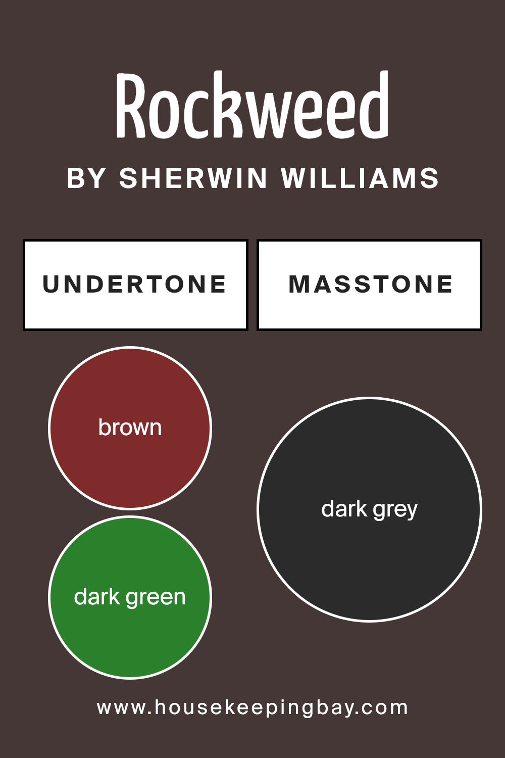
Undertones of Rockweed SW 2735 by Sherwin Williams
RockweedSW 2735 by Sherwin Williams is a unique paint color that may look simple at first glance but is actually complex due to its various undertones. This color has hints of brown, dark green, navy, olive, purple, dark turquoise, and grey. These undertones play a key role in how the color appears under different lighting conditions and when paired with other hues.
When a color has multiple undertones like RockweedSW 2735, the way it appears can significantly shift depending on the light source. For instance, in a room with plenty of natural light, the green and turquoise undertones might become more prominent, giving the walls a lively and organic feel.
Conversely, in a dimly lit space, the brown and grey undertones might dominate, making the color appear more subdued and grounding.
On interior walls, the complexity of RockweedSW 2735 can offer a dynamic backdrop that interacts with furniture and decor. For example, wooden furniture can enhance its brown and olive undertones, creating a cozy, earthy atmosphere.
Meanwhile, metallic or blue accents might highlight its navy and dark turquoise undertones, lending a more modern and sophisticated look.
The varied undertones of RockweedSW 2735 mean that it can adapt well to different styles and preferences, making it a versatile choice for interior spaces. It can subtly shift its character from warm and inviting to cool and refined, depending on the accompanying elements in the room.
housekeepingbay.com
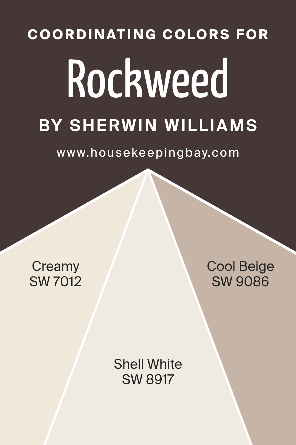
Coordinating Colors of Rockweed SW 2735 by Sherwin Williams
Coordinating colors are hues that complement each other, working harmoniously to enhance the character of a primary color. In the case of Rockweed SW 2735 by Sherwin Williams, the colors recommended to coordinate with it include SW 7012 – Creamy, SW 8917 – Shell White, and SW 9086 – Cool Beige.
These colors share a base tone that aligns with Rockweed, ensuring that when used together, they offer a balanced and pleasing visual experience. The synergy between these colors helps create a cohesive look in any space, making it easier to achieve a professional design outcome without overwhelming the primary shade.
Creamy SW 7012 provides a soft, warm touch that has the power to add a gentle, comforting feel to the environment, making it ideal for living spaces or bedrooms where relaxation is key. Shell White SW 8917 offers a lighter, almost ethereal quality that freshens up a space, making it well-suited for trim or ceilings to give a lifted, airy effect.
Finally, Cool Beige SW 9086 serves as a versatile backdrop, a neutral with enough depth to stand alone on walls or as a complementary tone for accent areas, harmonizing well with both vibrant and subdued colors.
You can see recommended paint colors below:
- SW 7012 Creamy
- SW 8917 Shell White
- SW 9086 Cool Beige
housekeepingbay.com
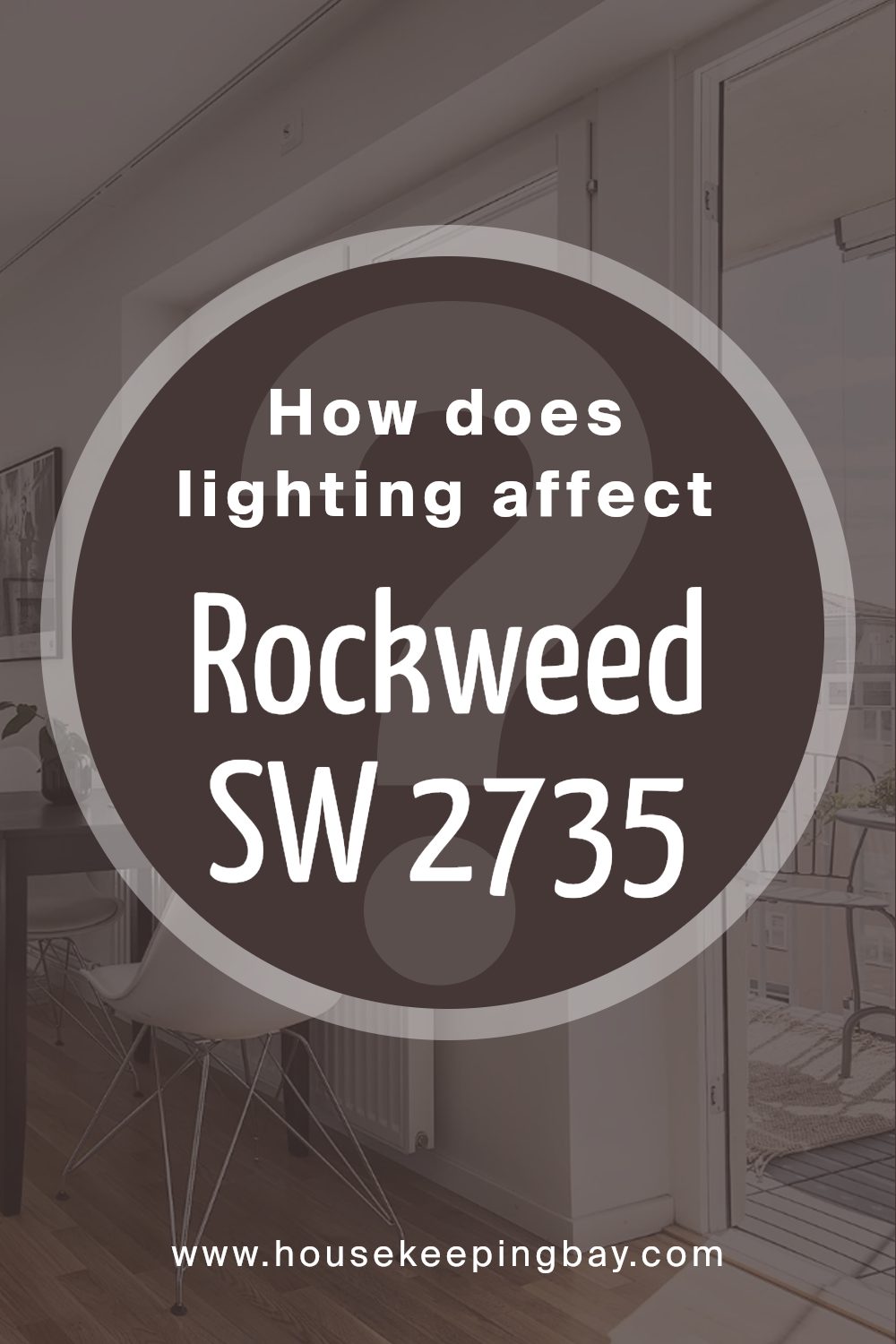
How Does Lighting Affect Rockweed SW 2735 by Sherwin Williams?
Lighting plays a critical role in determining how colors appear in different environments. For instance, Rockweed SW 2735 by Sherwin Williams can look quite different under varying light sources. This color, a deep, earthy green, can show varied hues depending on the lighting conditions.
In artificial light, Rockweed SW 2735 tends to appear warmer and somewhat darker. Standard incandescent bulbs, with their yellowish output, can enhance the green’s warmer undertones, making it feel cozier and more intimate. On the other hand, fluorescent lighting, which leans on the cooler side, might give Rockweed SW 2735 a slightly sharper and crisper appearance, highlighting its depth.
Natural light reveals the truest color of Rockweed SW 2735, but this too varies throughout the day and according to which direction a room faces. In north-facing rooms, which receive less direct sunlight and are often imbued with cooler light, Rockweed SW 2735 can appear more muted and more shadowy, emphasizing its mossy qualities. This shade can make rooms feel calm and elegant.
South-facing rooms enjoy abundant brightness most of the day, making Rockweed SW 2735 appear lighter and livelier. The ample sunlight can bring out the vitality of the green, making the space feel fresh and vibrant, ideal for living or working spaces that benefit from a natural vibe.
In east-facing rooms, morning light is bright and warm; thus, Rockweed SW 2735 will look radiant and lively in the morning, transitioning to a serene and deeper hue as the day progresses. Conversely, in west-facing rooms, the color will begin more subdued in the morning and gain vibrance in the afternoon to early evening as the light intensifies, creating a dynamic visual experience that shifts with the time of day.
Overall, Rockweed SW 2735’s perception can change significantly in different lighting scenarios, making it a versatile choice for various spaces and orientations.
housekeepingbay.com
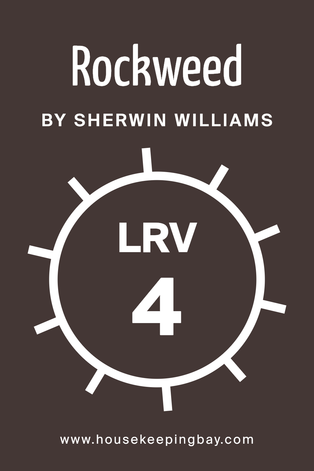
What is the LRV of Rockweed SW 2735 by Sherwin Williams?
LRV stands for Light Reflectance Value, a measure indicating how much light a paint color reflects or absorbs when applied to a surface. This value ranges from 0 to 100, where 0 means the paint absorbs all light (appearing very dark) and 100 reflects all light (appearing very bright).
Understanding LRV is crucial when choosing paint colors because it helps predict how a color will look in a specific environment. High LRV colors make spaces appear lighter and more open, while low LRV colors can make a room feel cozier but smaller and darker.
Regarding the LRV of Rockweed SW 2735 by Sherwin Williams, which is 4.222, this is a very low value. It means that this color absorbs most of the light that hits it, reflecting back very little. As a result, it will look quite dark when painted on walls, potentially making a room feel smaller or more enclosed.
When using this color, careful consideration of room lighting and size is important because its low LRV can significantly affect the atmosphere and perceived space within the room.
It’s ideal for creating a dramatic or intimate space but may not suit areas where a light, airy feel is desired.
housekeepingbay.com
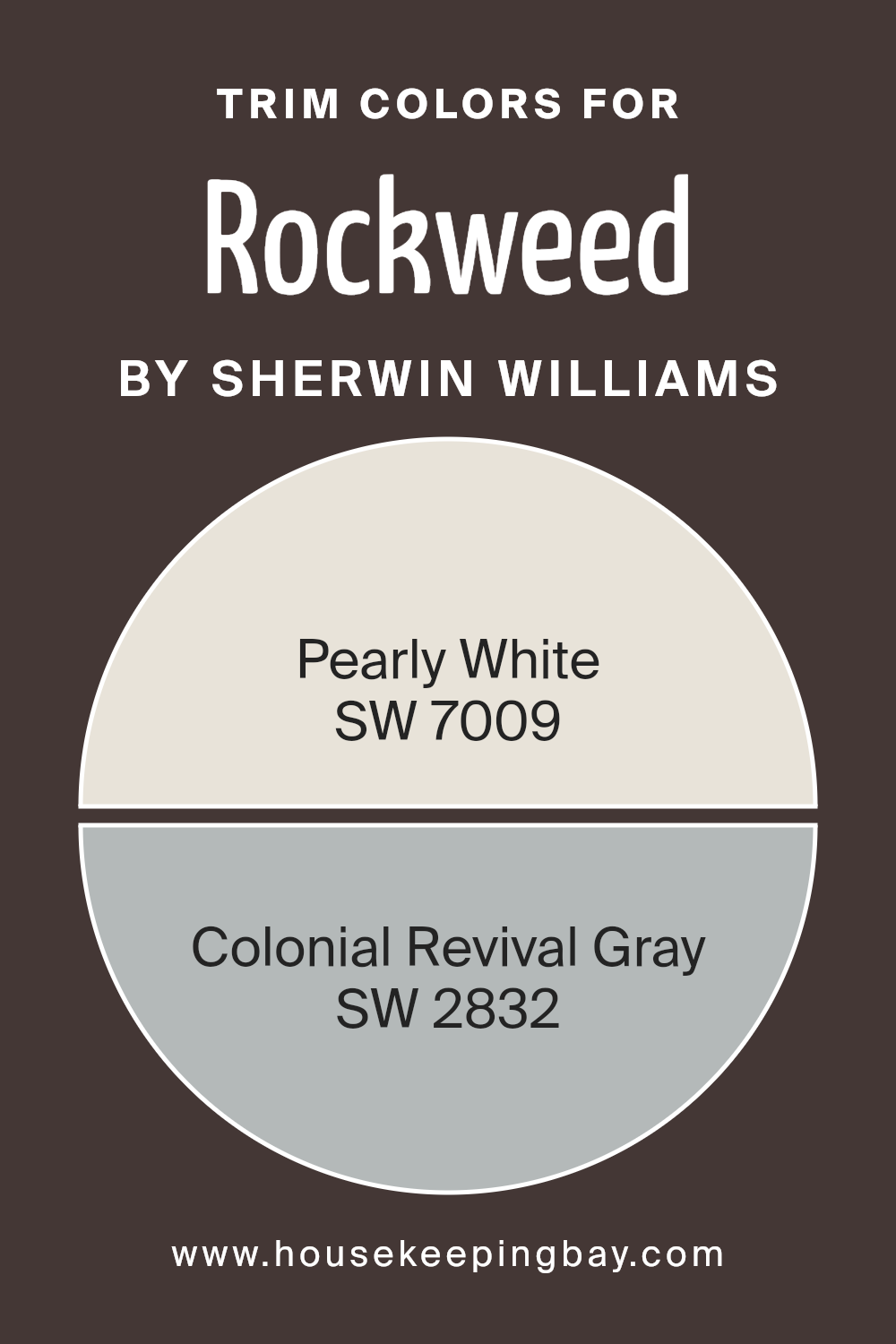
What are the Trim colors of Rockweed SW 2735 by Sherwin Williams?
Trim colors, such as SW 7009 – Pearly White and SW 2832 – Colonial Revival Gray by Sherwin Williams, serve as accent hues that highlight and define the architectural features of a home or space, such as window frames, doors, and moldings.
Choosing the right trim color can significantly impact the overall visual appeal of a building, assisting in outlining distinct areas or detailing that might otherwise blend into the background. A well-picked trim color can also complement the main color scheme, like RockweedSW 2735, and tie the aesthetics of a building together in a coherent and visually appealing way.
SW 7009 – Pearly White is a soft, warm white that brings a light and airy feel to any space. It pairs beautifully with deeper shades, providing a gentle contrast that can make architectural details pop without overwhelming the senses.
On the other hand, SW 2832 – Colonial Revival Gray is a muted gray that offers a sophisticated and timeless appeal, making it perfect for lending a sense of solidity and tradition to the background palette of RockweedSW 2735.
This color can help in giving a subtle yet impactful definition to spaces, enhancing the overall structural design of a home or building.
You can see recommended paint colors below:
housekeepingbay.com
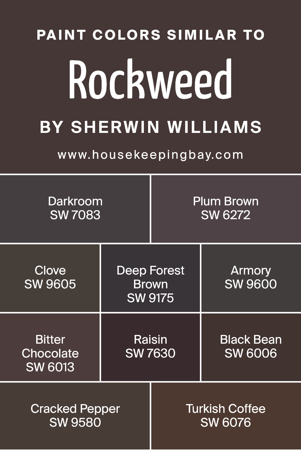
Colors Similar to Rockweed SW 2735 by Sherwin Williams
Similar colors play a pivotal role in design, providing a seamless visual experience. By using hues like Rockweed SW 2735 by Sherwin Williams and its related shades, you create a sophisticated harmony that is pleasing to the eye.
Colors that share a similar depth or undertone can tie different elements and textures together, making a space feel cohesive and thoughtfully put together. For example, Darkroom SW 7083 lends a mysterious depth with its gray undertones, perfect for accent walls.
Plum Brown SW 6272 brings warmth with its rich, deep purple hue, ideal for cozy, intimate spaces. Clove SW 9605 offers a subdued, earthy brown that works well in achieving a grounded, rustic look. Deep Forest Brown SW 9175, with its hint of green, mimics the dark, dense colors of a forest, suitable for creating a nature-inspired theme.
Armory SW 9600 has a unique bluish-gray tint that can infuse a modern yet timeless charm into any room. Bitter Chocolate SW 6013 envelopes spaces with its dark, luscious chocolate brown, adding a layer of luxury and comfort.
Raisin SW 7630, with its deep burgundy tone, introduces sophistication and a touch of drama, perfect for drawing attention in a space. Black Bean SW 6006, one of the darkest of the set, provides a strong statement when used for trim or furniture, offering stark contrasts.
Cracked Pepper SW 9580 uses its charcoal base to bring a sleek, contemporary feel that pairs well with brighter or lighter colors to balance out intensity. Lastly, Turkish Coffee SW 6076, rich and robust like its namesake, lays a perfect foundation for creating a warm, inviting environment.
These colors, when used together, can transform any room into a visually cohesive and appealing space.
You can see recommended paint colors below:
- SW 7083 Darkroom
- SW 6272 Plum Brown
- SW 9605 Clove
- SW 9175 Deep Forest Brown
- SW 9600 Armory
- SW 6013 Bitter Chocolate
- SW 7630 Raisin
- SW 6006 Black Bean
- SW 9580 Cracked Pepper
- SW 6076 Turkish Coffee
housekeepingbay.com
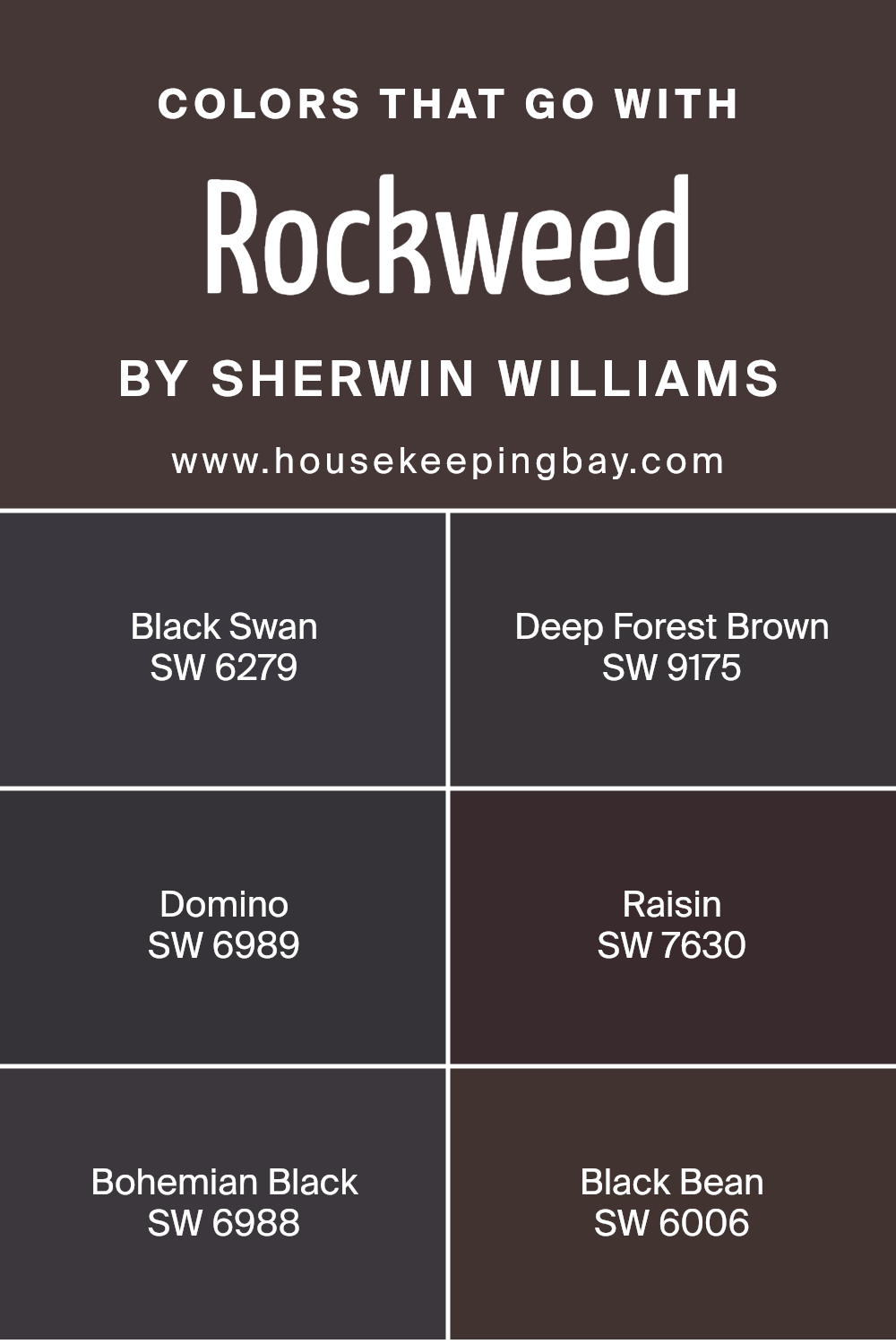
Colors that Go With Rockweed SW 2735 by Sherwin Williams
Choosing the right colors that complement Rockweed SW 2735 by Sherwin Williams is crucial for creating a harmonious and appealing look in your interior space. These colors provide a versatile palette that can help to cohesively bring a room together while adding depth and warmth.
Colors like SW 6279 – Black Swan and SW 9175 – Deep Forest Brown offer rich, dark tones that contrast beautifully with the soft neutrality of Rockweed. Black Swan is a deep, dark color that adds an element of sophistication, while Deep Forest Brown brings a warm, earthy tone that can make a space feel welcoming and cozy.
Additionally, incorporating shades like SW 6989 – Domino, SW 7630 – Raisin, SW 6988 – Bohemian Black, and SW 6006 – Black Bean can enrich the environment by adding unique undertones and textures. Domino is a near-black that provides a modern, stark contrast, perfect for accents and feature walls.
Raisin, on the other hand, introduces a subtle hint of purple, offering a touch of softness and mystery to the palette. Bohemian Black has a chalky, matte quality that works well to absorb light and add gravity to any room.
Lastly, Black Bean’s deep, charcoal hue serves as a strong foundation that pairs well with lighter tones of Rockweed, ensuring the space remains grounded yet airy. By carefully selecting these cohesive but varied shades, any room can achieve a balanced and refined look.
You can see recommended paint colors below:
- SW 6279 Black Swan
- SW 9175 Deep Forest Brown
- SW 6989 Domino
- SW 7630 Raisin
- SW 6988 Bohemian Black
- SW 6006 Black Bean
housekeepingbay.com
How to Use Rockweed SW 2735 by Sherwin Williams In Your Home?
Rockweed SW 2735 by Sherwin Williams is a versatile paint color that adds a subtle touch of nature to any space in your home. This shade, a deep green with hints of gray, works well in both large living areas and smaller, intimate spaces like bedrooms or studies. It pairs beautifully with natural materials like wood and stone, enhancing the cozy, grounded feel of a room.
For those looking to refresh their kitchen or bathroom, Rockweed can offer a sophisticated backdrop to cabinets and walls, especially when contrasted with lighter colors and metallic fixtures. In a bedroom, using Rockweed on one accent wall can create a focal point without overwhelming the space, promoting a sense of calm and relaxation.
Additionally, Rockweed SW 2735 can be a smart choice for exterior use, such as on shutters and doors, where it harmonizes well with outdoor surroundings. It withstands different lighting conditions, maintaining its rich hue throughout the day. Whether you’re repainting a room or adding touches to your exterior, Rockweed offers a tasteful and flexible solution.
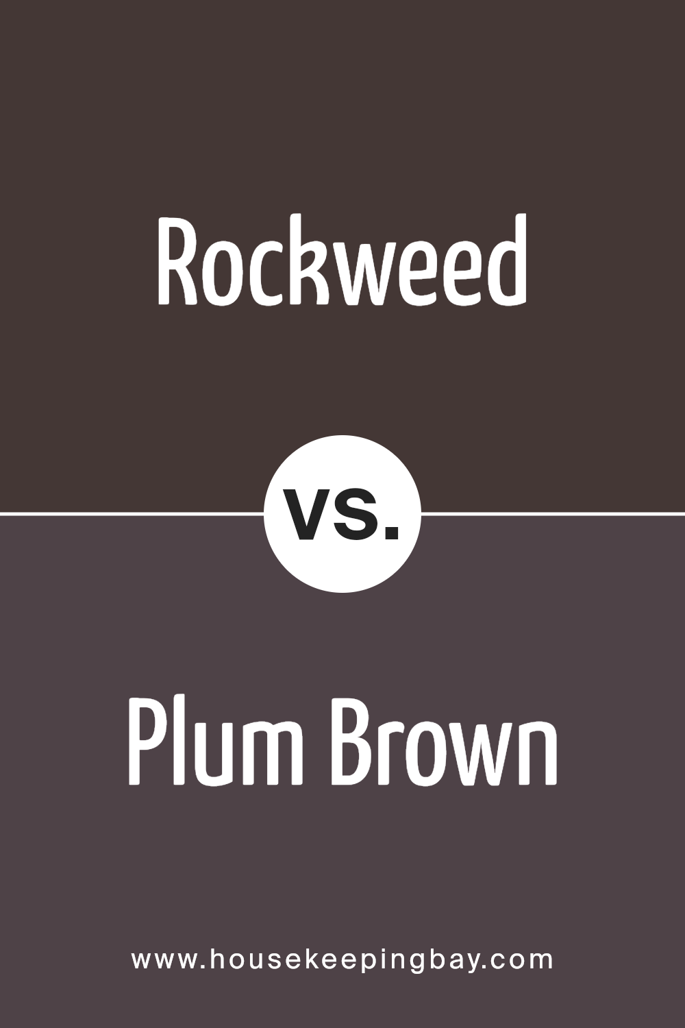
Rockweed SW 2735 by Sherwin Williams vs Plum Brown SW 6272 by Sherwin Williams
Rockweed SW 2735 by Sherwin Williams is a gentle, nature-inspired color that mirrors the neutral shades of coastal rocks and seaweed. It has a muted, earthy feel, suitable for creating a serene and inviting atmosphere in any room. The calmness of Rockweed makes it versatile, working well in spaces aimed at relaxation like living rooms or bedrooms.
Plum Brown SW 6272, in contrast, features a rich, deep purple with brown undertones that gives it a warm, cozy vibe. This color is more dramatic and impactful, ideal for adding depth and a touch of luxury to spaces. It can create a focal point in areas designed for intimacy or reflection, such as dining rooms or home offices.
Both colors reflect natural elements but convey different moods: Rockweed is subtle and calming, while Plum Brown is bold and sophisticated, making them suitable for different purposes or tastes in home decor.
You can see recommended paint color below:
- SW 6272 Plum Brown
housekeepingbay.com
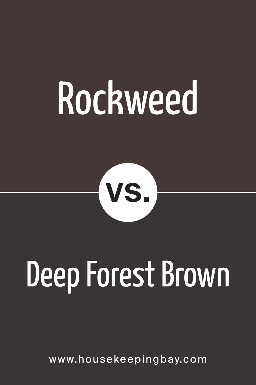
Rockweed SW 2735 by Sherwin Williams vs Deep Forest Brown SW 9175 by Sherwin Williams
Rockweed SW 2735 by Sherwin Williams is a neutral shade that leans towards green, giving it an earthy, natural vibe. It’s a versatile color that can easily blend with various decor styles, making spaces feel grounded and relaxed.
Deep Forest Brown SW 9175, also by Sherwin Williams, is a much darker color with a robust brown tone. This color tends to add a sense of warmth and richness to a room, making it ideal for creating a cozy and inviting atmosphere.
While Rockweed provides a subtle, soothing backdrop, Deep Forest Brown offers a bold and sophisticated presence. Rockweed works well in spaces where you want a light, fresh feel, whereas Deep Forest Brown is perfect when aiming for a more dramatic and intimate setting. Each color sets a different mood and can be selected based on the desired impact on the space.
You can see recommended paint color below:
- SW 9175 Deep Forest Brown
housekeepingbay.com
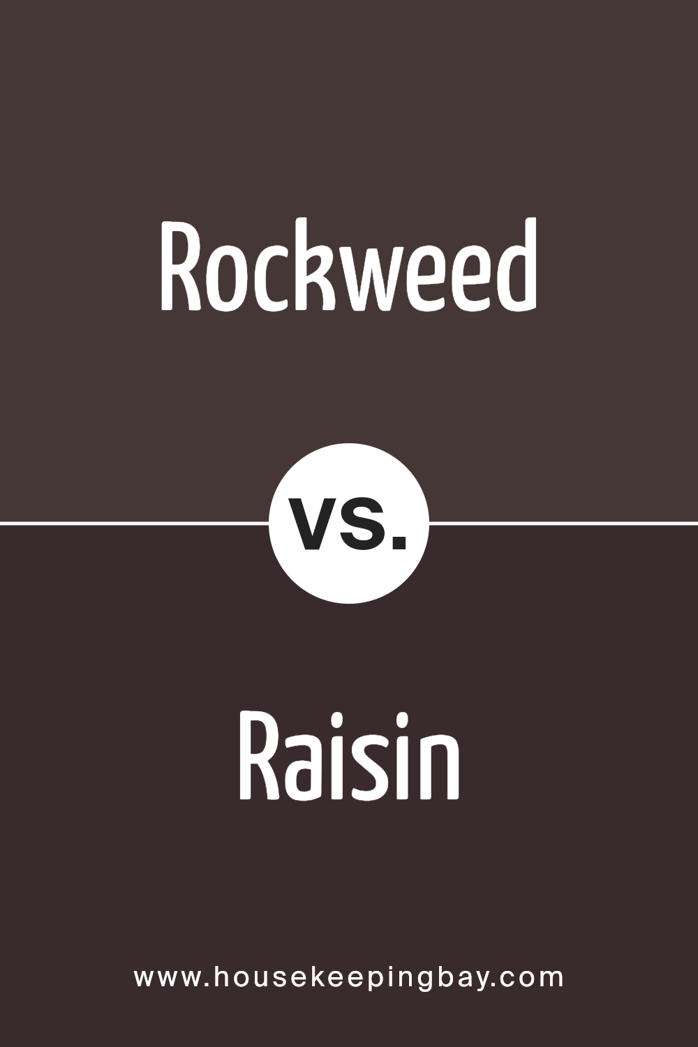
Rockweed SW 2735 by Sherwin Williams vs Raisin SW 7630 by Sherwin Williams
Rockweed SW 2735 by Sherwin Williams is a shade of green that brings to mind the natural tones found in seaweed or moss. This color offers a muted and soothing feel, ideal for creating a serene environment. It pairs well with natural elements like wood and stone, contributing to a grounded, organic aesthetic.
Raisin SW 7630, by contrast, is a deep, rich purple with undertones of brown and red. This color provides a sense of warmth and sophistication. It’s an excellent choice for spaces where you want to add a touch of drama or luxury. Due to its depth, Raisin can make large rooms feel cozier and more intimate.
Both colors have their unique appeal and can significantly influence the atmosphere of a space. Rockweed works best for a calm, nature-inspired vibe, while Raisin is suited for creating a bold, elegant look.
You can see recommended paint color below:
- SW 7630 Raisin
housekeepingbay.com
Rockweed SW 2735 by Sherwin Williams vs Black Bean SW 6006 by Sherwin Williams
Rockweed SW 2735 by Sherwin Williams is a rich green hue that closely resembles the dark, mossy colors often seen in a forest. This color has a natural, earthy feel, making it well-suited for spaces where you want to bring elements of the outdoors inside. It is smooth and soothing, offering a sense of calm and grounding.
In contrast, Black Bean SW 6006 is a deep, dark brown that borders on black. It’s a robust and bold color that can make a strong statement in any area. This color is excellent for creating dramatic accents or for use in areas where a sense of warmth and depth is desired.
While Rockweed adds a touch of nature and relaxation, Black Bean provides a solid foundation and commanding presence. Both colors can dramatically affect the ambiance of a room, depending on how they are used, whether as primary paint colors or as accents.
You can see recommended paint color below:
- SW 6006 Black Bean
housekeepingbay.com
Rockweed SW 2735 by Sherwin Williams vs Bitter Chocolate SW 6013 by Sherwin Williams
Rockweed SW 2735 by Sherwin Williams is a soothing, neutral beige tone with a warm undertone, perfect for creating a cozy and inviting atmosphere in any room. This color works well in spaces where you want a calm and neutral backdrop that pairs easily with a variety of decor styles and colors.
Bitter Chocolate SW 6013, also by Sherwin Williams, presents a rich, deep brown that gives a sense of warmth and sophistication. This darker shade can make a bold statement and is ideal for accent walls or to add depth and contrast when used alongside lighter tones.
When comparing Rockweed and Bitter Chocolate, we see that Rockweed offers a light, airy feel, which can help to make a small room appear larger and more open. In contrast, Bitter Chocolate tends to draw in the walls and can create a more intimate, enclosed feeling which suits larger spaces well. Each color provides its own unique benefits, depending on how and where it’s used.
You can see recommended paint color below:
- SW 6013 Bitter Chocolate

housekeepingbay.com
Rockweed SW 2735 by Sherwin Williams vs Turkish Coffee SW 6076 by Sherwin Williams
Rockweed SW 2735 by Sherwin Williams is a calming, soft green hue that brings to mind the natural tones of a peaceful, coastal landscape. It’s a subdued color that works well in spaces where a sense of serenity and connection to nature are desired. This green shade is versatile, pairing nicely with both light and dark accents, making it a good choice for living rooms, bedrooms, or bathrooms seeking a gentle, soothing atmosphere.
Turkish Coffee SW 6076, by contrast, is a deep, rich brown with warm undertones, evoking the robust essence of freshly brewed coffee. It provides a feeling of warmth and coziness and is perfect for creating a more intimate environment. Ideal for accent walls, cabinetry, or even an entire room, this color adds a strong presence that can make large spaces feel more enclosed and welcoming.
These colors contrast sharply in their visual impact and the moods they create, making them suited for different purposes in home decor.
You can see recommended paint color below:

housekeepingbay.com
Rockweed SW 2735 by Sherwin Williams vs Clove SW 9605 by Sherwin Williams
Rockweed SW 2735 and Clove SW 9605, both by Sherwin Williams, offer distinct tones for interior spaces. Rockweed SW 2735 presents a muted green with a subtle gray undertone. This color evokes a natural, calm atmosphere, making it great for rooms where you would want a sense of serenity and relaxation, such as bedrooms or reading areas. Its greenish tone pairs well with natural wood finishes, creamy whites, and soft earth tones.
On the flip side, Clove SW 9605 leans towards a deeper, richer brown with a warm undertone. This color can add warmth and a cozy feeling to any space. It’s particularly suitable for living rooms and dining areas, where it can create a welcoming vibe.
Clove works nicely with other warm tones, but it can also balance out cooler shades like blues and grays.
Both colors provide versatile options for creating inviting interiors, but they cater to different aesthetic preferences and moods.
You can see recommended paint color below:

housekeepingbay.com
Rockweed SW 2735 by Sherwin Williams vs Cracked Pepper SW 9580 by Sherwin Williams
Rockweed SW 2735 by Sherwin Williams is a vivid shade likened to dark seaweed or deep moss. It has an earthy vibe which gives spaces a grounded feeling, making it suitable for rooms where a touch of nature is desired. This deep green hue pairs well with natural materials like wood and stone, enhancing rustic or traditional decor.
In contrast, Cracked Pepper SW 9580 is a bold, almost black color with a strong presence. It’s an excellent choice for creating dramatic accents in a home, perfect for highlighting areas or for use on doors and trim. Despite its intensity, it maintains a warm undertone, preventing it from feeling too stark.
Both colors are dark, yet they evoke distinct emotions and styles. While Rockweed adds a natural, calming element, Cracked Pepper offers a more sophisticated, contemporary appeal. Each works well with different textures and complementary colors, depending on the look you want to achieve.
You can see recommended paint color below:

housekeepingbay.com
Rockweed SW 2735 by Sherwin Williams vs Darkroom SW 7083 by Sherwin Williams
Rockweed SW 2735 by Sherwin Williams is a rich, greenish-brown color with earthy tones that give a warm, cozy feel to any space. It’s ideal for those looking to create a nurturing, homey environment since its deep, soft hue pairs well with natural materials like wood or stone.
This color works well in living areas, bedrooms, or even a study where a soothing, grounded atmosphere is desired.
In contrast, Darkroom SW 7083 by Sherwin Williams leans more towards a dramatic, charcoal gray, offering a sophisticated and modern appeal. This deep gray serves as a strong, solid background, perfect for accentuating brighter colors or metallic decor.
It’s particularly suitable for contemporary living spaces, offices, or even accent walls that aim to make a bold statement.
Using these colors together can create a contrasting yet harmonious look. Rockweed adds warmth, while Darkroom provides a stylish depth, making them a suitable combination for those looking to balance comfort with modernity in their interiors.
You can see recommended paint color below:
housekeepingbay.com
Rockweed SW 2735 by Sherwin Williams vs Armory SW 9600 by Sherwin Williams
Rockweed SW 2735 by Sherwin Williams is a warm, earthy brown with subtle green undertones. It evokes a sense of natural comfort and groundedness, making it a solid choice for spaces where relaxation and simplicity are key. This color aligns well with rustic or natural decor, and it pairs beautifully with natural wood and stone elements.
In contrast, Armory SW 9600 is a darker, more muted gray with a hint of blue. This shade is versatile and sophisticated, offering a more neutral backdrop suitable for a variety of design styles from modern to traditional. Its subtle blue undertones can bring a cool, calming effect to a space, which works well in busy or brightly lit areas.
While both colors offer unique atmospheres, Rockweed leans towards warmth and earthiness, whereas Armory provides a cooler, more neutral aesthetic. Each can be used effectively depending on the mood and style you want to achieve in a room.
You can see recommended paint color below:
housekeepingbay.com
What stands out to me is its ability to act as both a primary and accent color, depending on the room’s layout and the accompanying décor. This flexibility is particularly valuable in design, making it a smart choice for those wishing to create a cohesive yet dynamic aesthetic in their home or office.
Moreover, the practical applications of Rockweed in various settings, from kitchens to bedrooms and even exteriors, illustrate its broad appeal. Its compatibility with natural materials like wood and stone enhances its earthy vibe, making any space feel more welcoming and lived-in.
The thought of using SW 2735 Rockweed in my future projects excites me as it seems to promise a timeless elegance that could adapt to evolving trends and personal tastes.
In short, my view of SW 2735 Rockweed is entirely positive. I see it as a standout choice for anyone looking to infuse depth and character into their surroundings.
The color’s balance between warmth and richness might just be what many of us are looking for in our quest to create meaningful and appealing environments.

housekeepingbay.com
Ever wished paint sampling was as easy as sticking a sticker? Guess what? Now it is! Discover Samplize's unique Peel & Stick samples. Get started now and say goodbye to the old messy way!
Get paint samples


