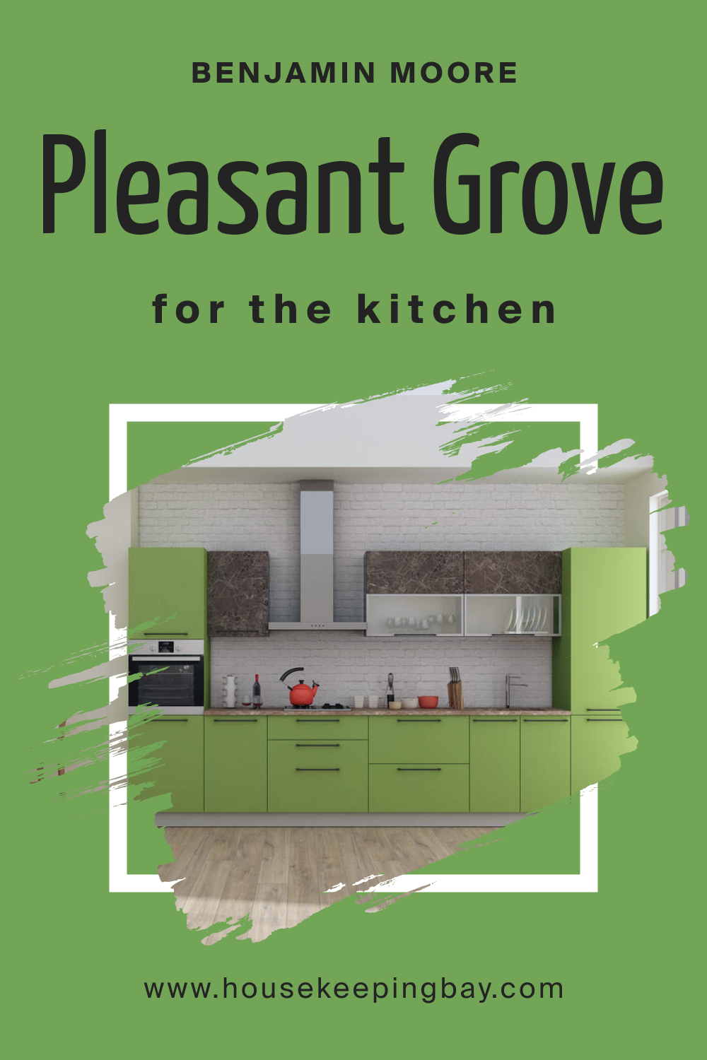
Pleasant Grove 552 Paint Color by Benjamin Moore
Choosing the right color for a space can be a journey of exploration.
Choosing the right color for a space can be a journey of exploration. Colors define the ambiance of a room, influencing emotions, perceptions, and even the apparent size of the space. Among the myriad options, Pleasant Grove 552 by Benjamin Moore stands out as an intriguing choice.
housekeepingbay.com
What Color Is Pleasant Grove 552?
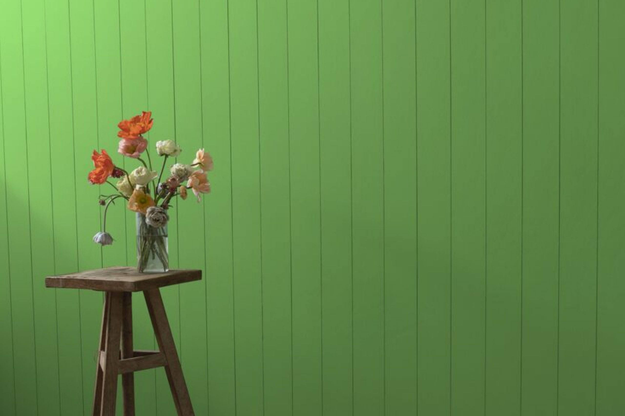
Pleasant Grove 552 is a muted, mid-tone green, reminiscent of early spring foliage. It encapsulates the essence of a grove under the soft sunlight, bringing nature indoors. Its versatility makes it apt for a range of interior styles, from rustic country to modern minimalist. The shade pairs beautifully with natural wood textures, stone finishes, and even metallic accents, lending itself to diverse design possibilities.
housekeepingbay.com
Table of Contents
Is It a Warm Or Cool Color?
Despite its green undertone, Pleasant Grove 552 leans towards the cooler spectrum. This coolness imparts a sense of calm and serenity to spaces, making it an ideal choice for bedrooms, living areas, and even home offices. Its cool undertones make rooms feel spacious and airy, especially when used in well-lit areas.
Undertones of Pleasant Grove 552
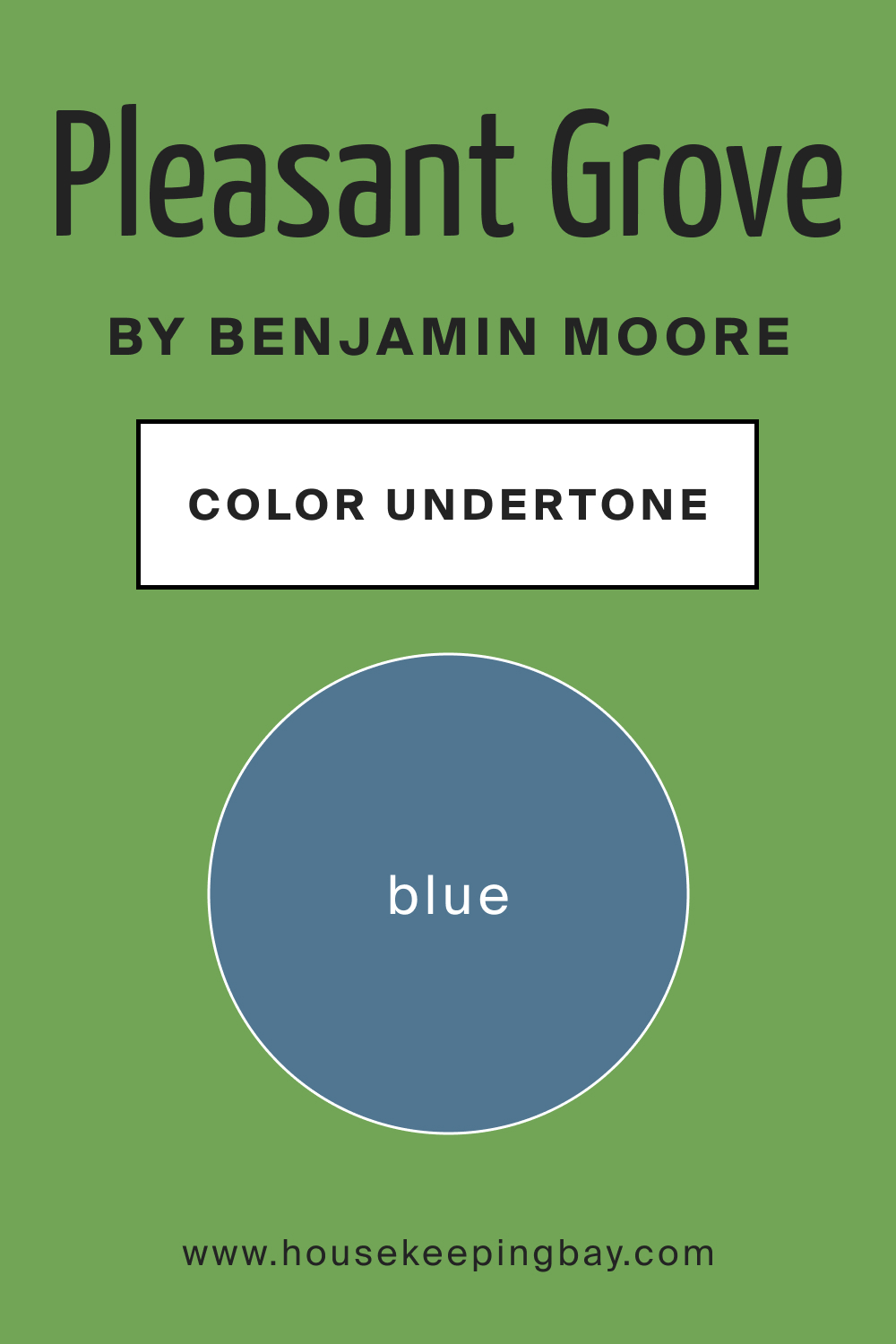
Every color has undertones, which can subtly alter its appearance based on surroundings and lighting. Pleasant Grove 552 possesses subtle blue undertones. This characteristic makes the green appear slightly more teal in specific settings. Recognizing these undertones is crucial when coordinating decor or pairing it with other colors. On interior walls, these undertones can either be amplified or muted depending on adjacent colors and furnishings.
housekeepingbay.com
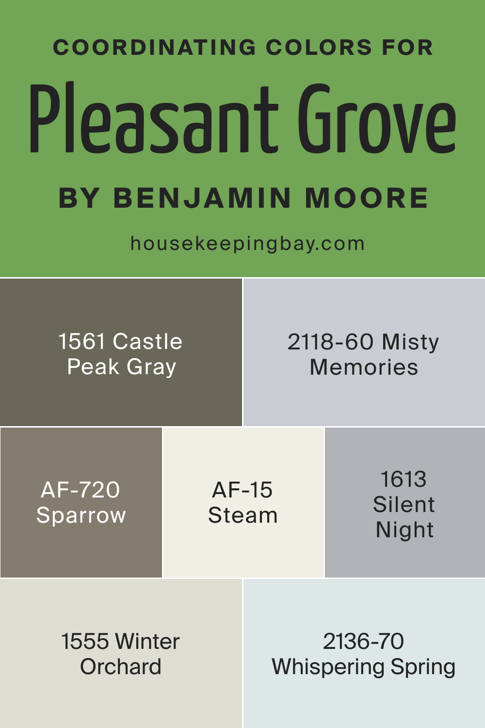
Coordinating Colors of Pleasant Grove 552
Coordinating colors harmonize with the primary shade, enhancing its beauty and preventing visual monotony. For Pleasant Grove 552, excellent coordinating colors include:
- BM 1555 Winter Orchard : A soft, muted gray with lavender undertones.
- BM 1561 Castle Peak Gray : A timeless neutral with earthy undertones.
- AF-15 Steam : A versatile off-white, almost ethereal in its subtlety.
- AF-720 Sparrow : A deeper gray, evoking the softness of a sparrow’s plumage.
Additional coordinating shades are:
- Silent Night 1613 : A tranquil blue-gray.
- Whispering Spring 2136-70 : A gentle pale blue.
- Misty Memories 2118-60 : A muted lavender gray.
housekeepingbay.com
How Does Lighting Affect Pleasant Grove 552?
Lighting plays a pivotal role in how we perceive colors. Under natural daylight, Pleasant Grove 552 shines in its true essence—soft and soothing. In artificial light, its blue undertones may become more prominent, lending a cooler vibe to the room. In north-facing rooms, the color can appear slightly darker, exuding a cozier feel. South-facing rooms, bathed in ample light, will make the color look brighter and more vibrant. East and west-facing rooms will see a mix of these effects, with the color shifting subtly from morning to evening.
housekeepingbay.com
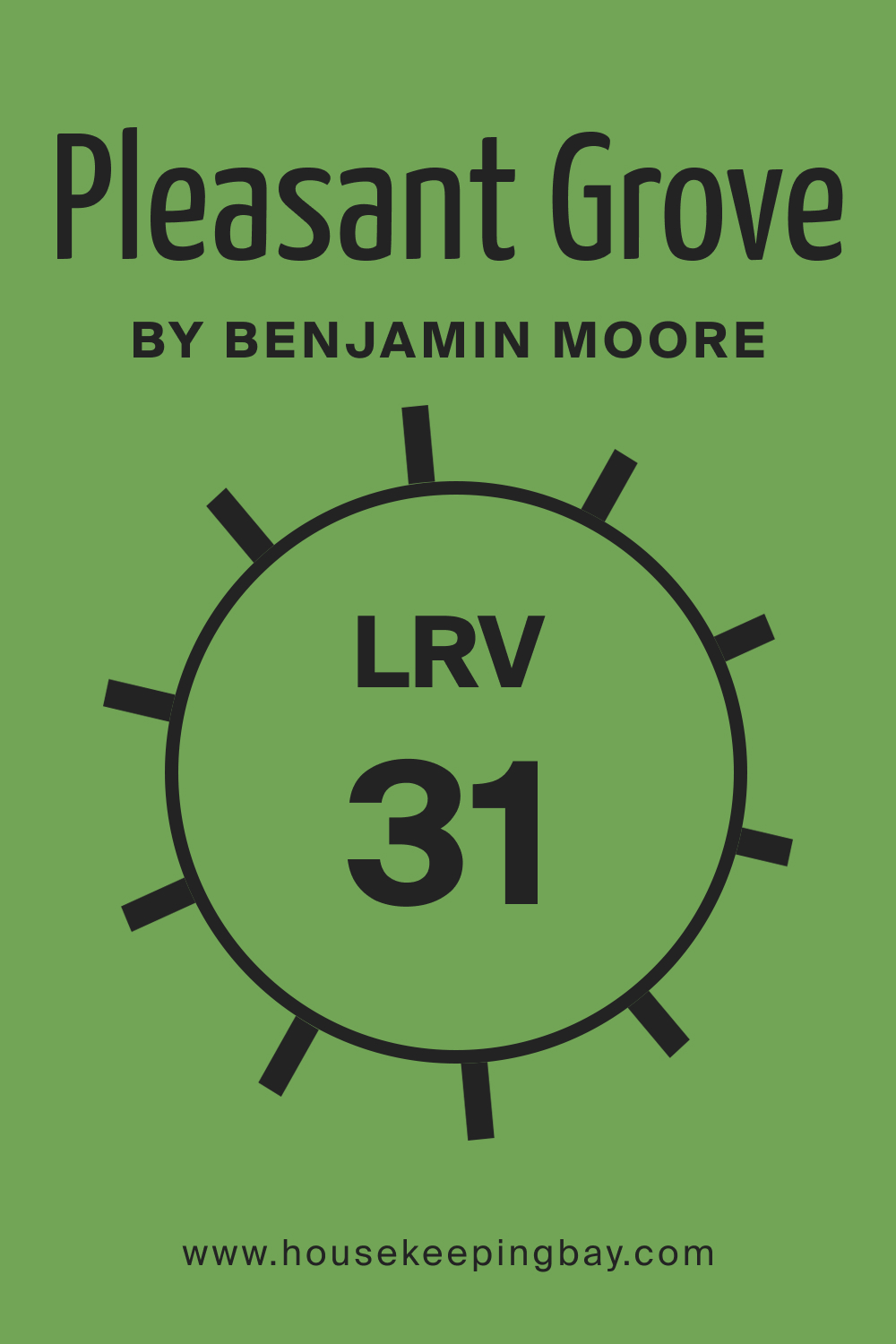
LRV of Pleasant Grove 552
The Light Reflectance Value (LRV) measures the percentage of light a color reflects. With an LRV of 31, Pleasant Grove 552 sits in the mid-range. This means it won’t make spaces feel too closed in, but it’s also not overly bright. In practical terms, it strikes a balance, making it suitable for both large and small spaces without overwhelming them or feeling too stark.
housekeepingbay.com
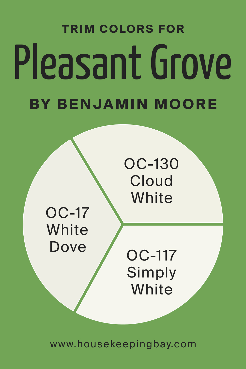
Trim Colors of Pleasant Grove 552
Trim colors frame and accentuate wall colors, adding depth and layers to a room’s aesthetics.
For Pleasant Grove 552, using shades of white from the same brand can enhance its beauty. Consider pairing it with OC-17 White Dove for a crisp look, OC-130 Cloud White for a soft, dreamy aesthetic, or OC-117 Simply White for a clean and modern vibe.
housekeepingbay.com
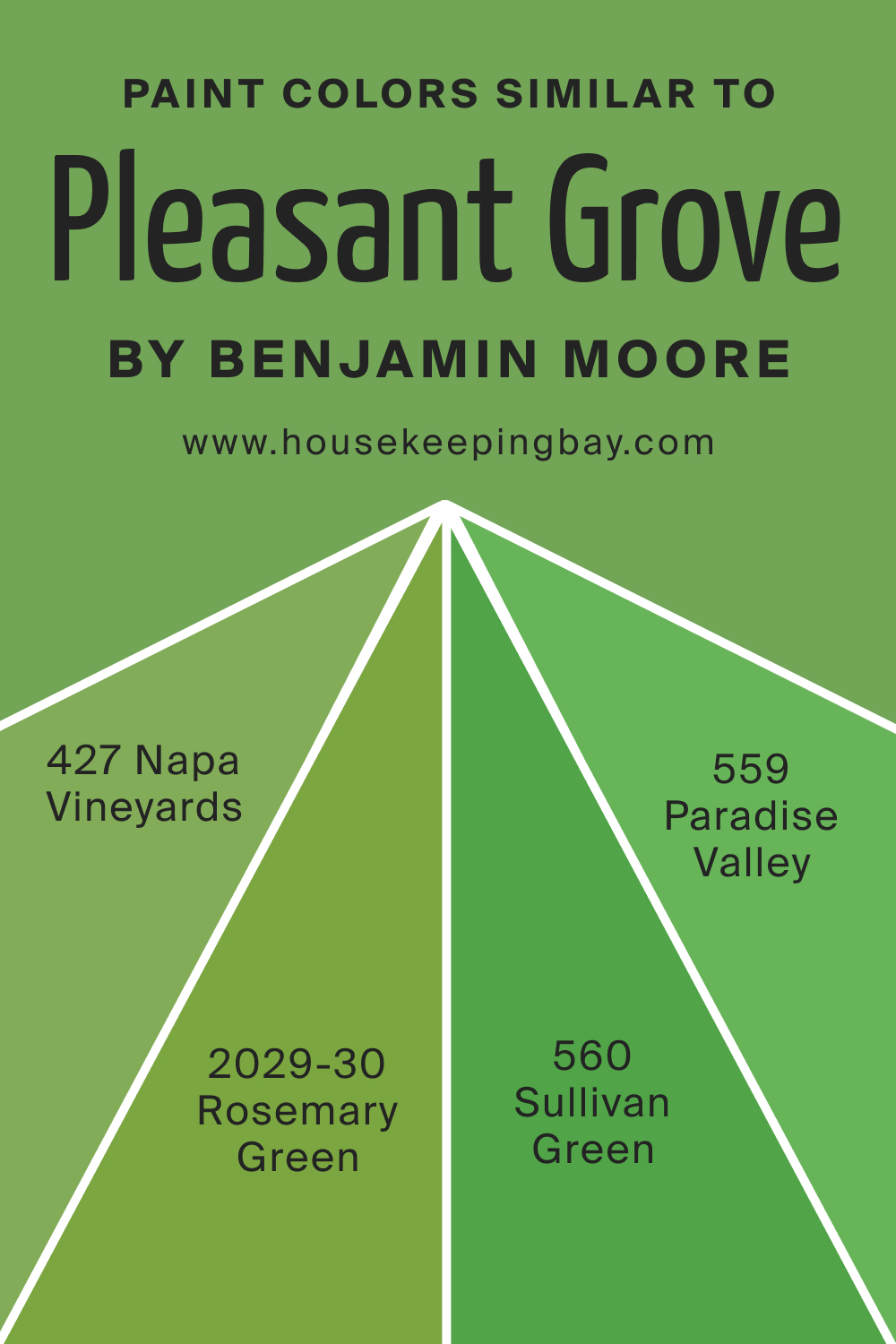
Colors Similar to Pleasant Grove 552
Knowing similar colors aids in making informed choices, especially when trying to achieve a specific vibe.
Though Pleasant Grove 552 is unique, shades like BM 427 Napa Vineyards, a rich, earthy green; BM 2029-30 Rosemary Green, an herb-inspired hue; BM 560 Sullivan Green, reminiscent of deep forests; and BM 559 Paradise Valley, a vibrant jewel-tone, come close.
housekeepingbay.com
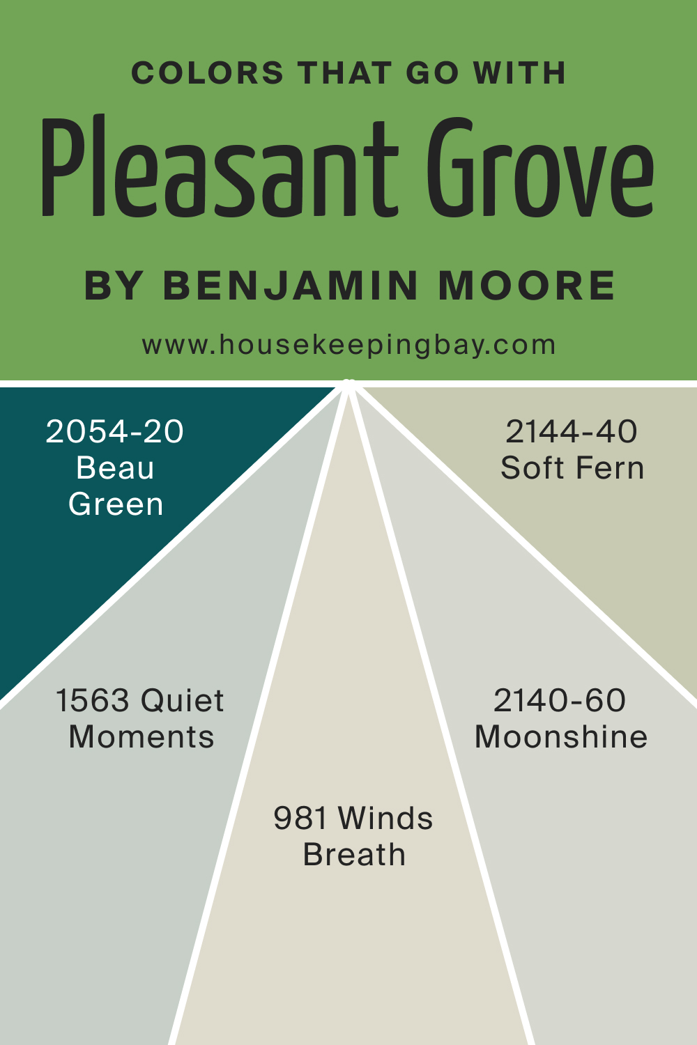
Colors That Go With Pleasant Grove 552
Creating a harmonious palette is vital for cohesive interiors. Pleasant Grove 552 pairs well with Benjamin Moore’s Beau Green 2054-20, a darker green; Quiet Moments 1563, a calming blue-gray; Soft Fern 2144-40, a lighter, earthy green; Winds Breath 981, a muted beige; and Moonshine 2140-60, a soft, airy gray.
Pleasant Grove 552, with its versatility and organic charm, is set to transform spaces into serene havens.
housekeepingbay.com
How to Use Pleasant Grove 552 In Your Home?
Pleasant Grove 552 is a versatile shade, bringing to mind fresh foliage and quiet forests. Its adaptability allows it to grace various rooms, from tranquil bedrooms to lively kitchens. This shade fits seamlessly into styles like modern farmhouse, coastal, Scandinavian, and even traditional interiors. Its muted green tones complement natural elements, such as wooden furniture and stone finishes, making it an ideal choice for homes aiming to bring the serenity of nature indoors.
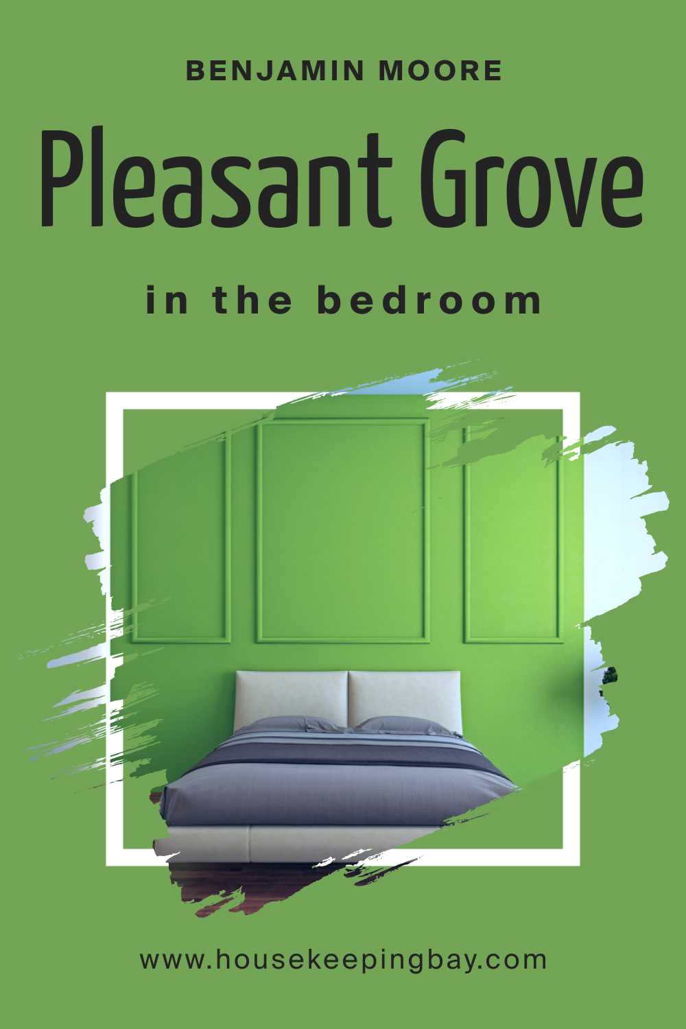
How to Use Pleasant Grove 552 in the Bedroom?
In bedrooms, Pleasant Grove 552 serves as a calming backdrop, promoting rest and rejuvenation. When paired with neutral linens, soft textiles, and ambient lighting, it creates a sanctuary-like atmosphere. Using gold or brass accents, like bedside lamps, can add a touch of elegance and warmth to the cool undertones of this shade.
housekeepingbay.com
How to Use Pleasant Grove 552 in the Bathroom?
In bathrooms, this color can evoke a spa-like ambiance. Whether it’s a primary bathroom suite or a tiny powder room, Pleasant Grove 552 complements white fixtures, marble countertops, and brushed metal finishes. Think of a freestanding tub against a wall of this lush color, punctuated with greenery in woven baskets for a holistic experience.

housekeepingbay.com
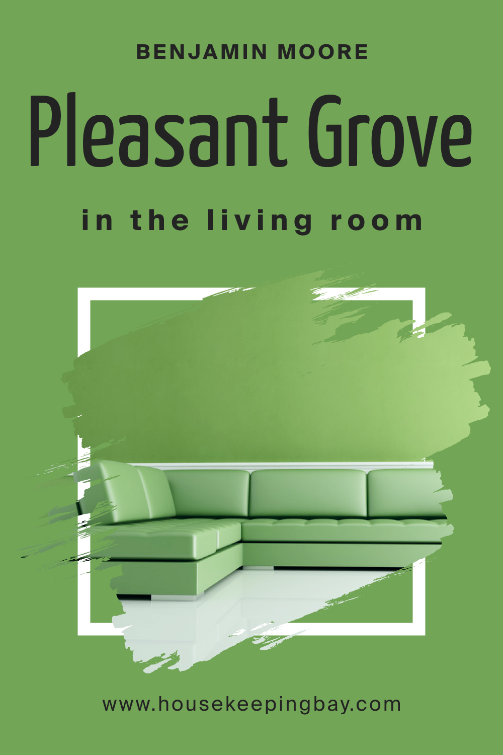
How to Use Pleasant Grove 552 in the Living Room?
Living rooms adorned with Pleasant Grove 552 feel fresh and inviting. The color sets a relaxed tone, which can be accentuated with beige sofas, wooden coffee tables, and textured throws. Wall hangings in earthy or muted colors and indoor plants enhance its organic appeal, making the space feel interconnected and harmonious.
housekeepingbay.com
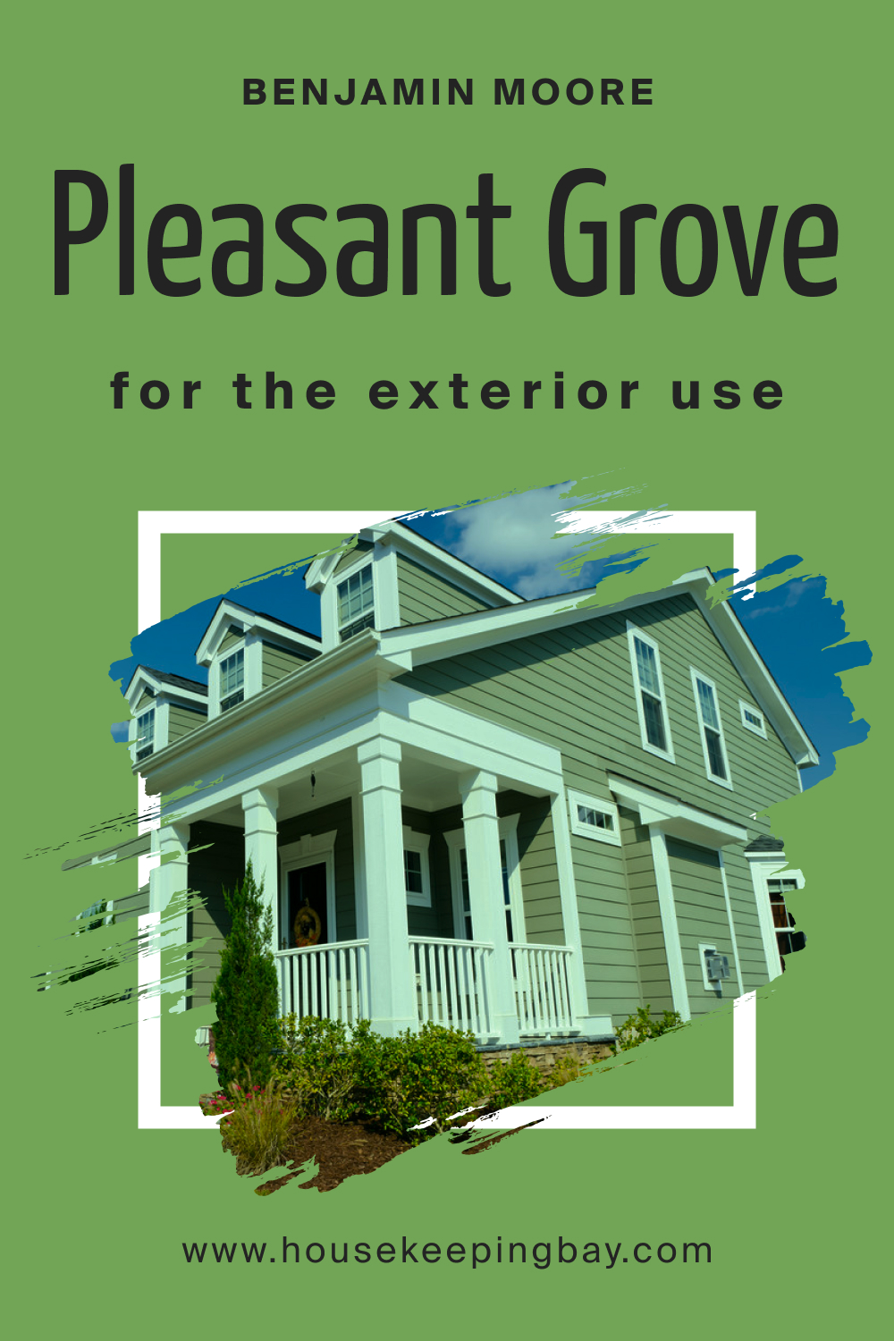
How to Use Pleasant Grove 552 for an Exterior?
Exteriors painted in Pleasant Grove 552 stand out elegantly. This color harmonizes beautifully with natural stone pathways, wooden porches, and lush gardens. White trims and black or bronze fixtures accentuate its depth, creating a timeless and sophisticated home facade that neighbors will surely admire.
housekeepingbay.com
How to Use Pleasant Grove 552 in the Kitchen?
Kitchens sporting Pleasant Grove 552 breathe life and energy. It’s a refreshing alternative to the usual whites and grays. Stainless steel appliances, marble or wooden countertops, and open shelving showcasing curated dishes make for a captivating culinary space. Hanging pendant lights, especially in warm tones, can further elevate the look.
housekeepingbay.com
How to Use Pleasant Grove 552 on the Kitchen Cabinets?
Painting kitchen cabinets in Pleasant Grove 552 can transform the entire kitchen’s vibe. The muted green provides a sophisticated alternative to the conventional whites, lending a gourmet feel. Paired with brushed gold or brass hardware, these cabinets can become the highlight of your kitchen. Ensure to balance the green with neutral walls or backsplash to keep it from overwhelming the space.

housekeepingbay.com
Comparing Pleasant Grove 552 With Other Colors
Colors shape our perception of spaces, evoke emotions, and play a pivotal role in setting the tone of any room. Comparing different shades enables designers and homeowners to understand subtle nuances, undertones, and the potential impact of a color on the ambiance of a space. It allows them to make informed decisions, ensuring that the chosen hue perfectly complements the interior’s design style, lighting, and furniture.
Moreover, by contrasting colors, one can identify the versatility, adaptability, and the visual warmth or coolness of a particular shade, making it crucial to analyze and compare before finalizing.
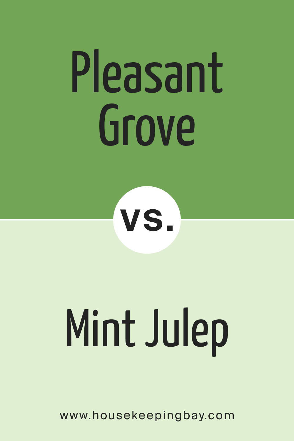
Pleasant Grove 552 vs. BM 547 Mint Julep
While both greens, Pleasant Grove 552 carries a depth that Mint Julep lacks. Mint Julep is lighter and cooler, reminiscent of fresh spring mornings. Pleasant Grove, on the other hand, has an earthier undertone, evoking feelings of dense forests.
housekeepingbay.com
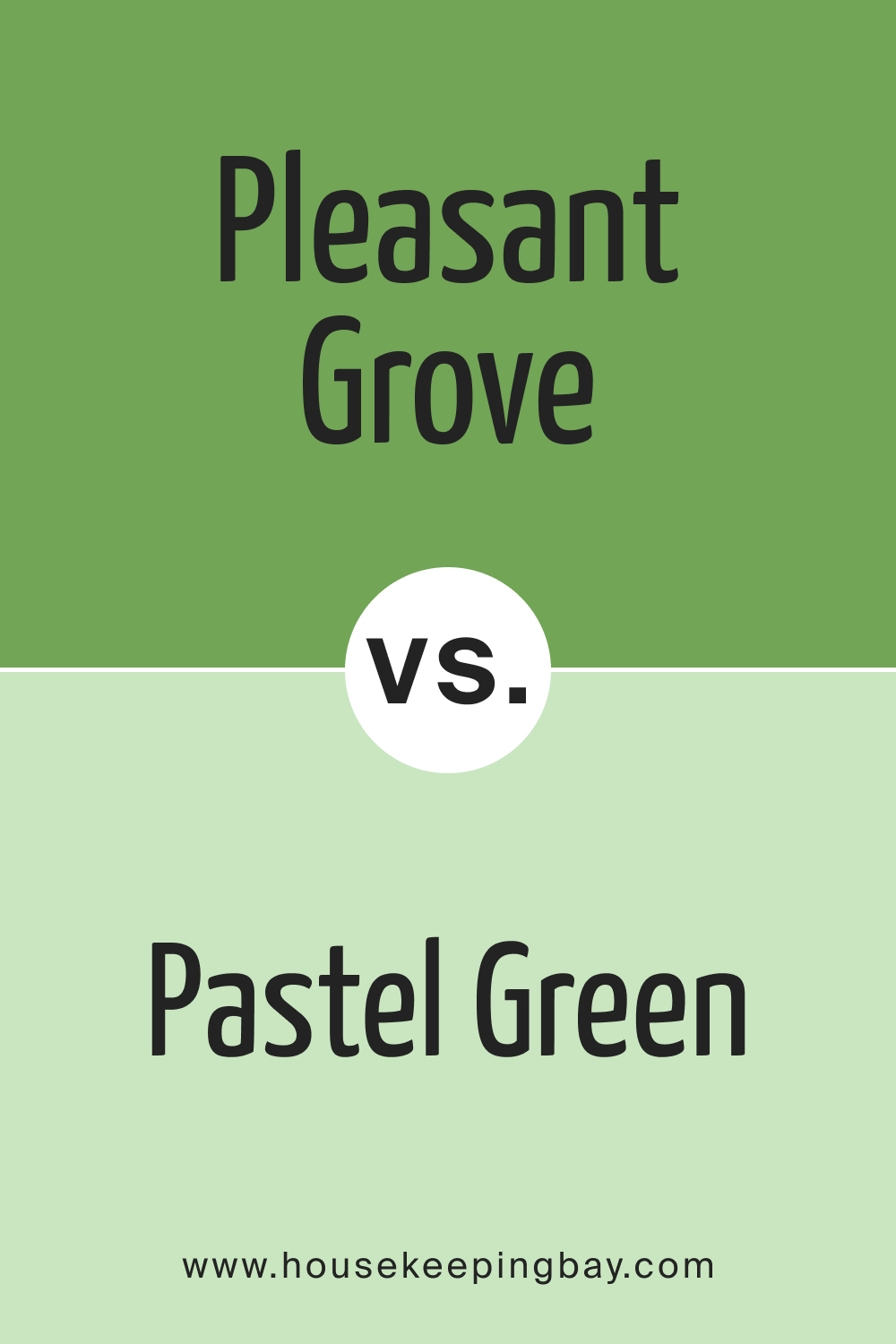
Pleasant Grove 552 vs. BM 548 Pastel Green
Pastel Green is soft and airy, while Pleasant Grove 552 is more grounded and robust. While both can provide a refreshing aura, Pastel Green might be favored in settings desiring a delicate touch, whereas Pleasant Grove leans more towards maturity.
housekeepingbay.com
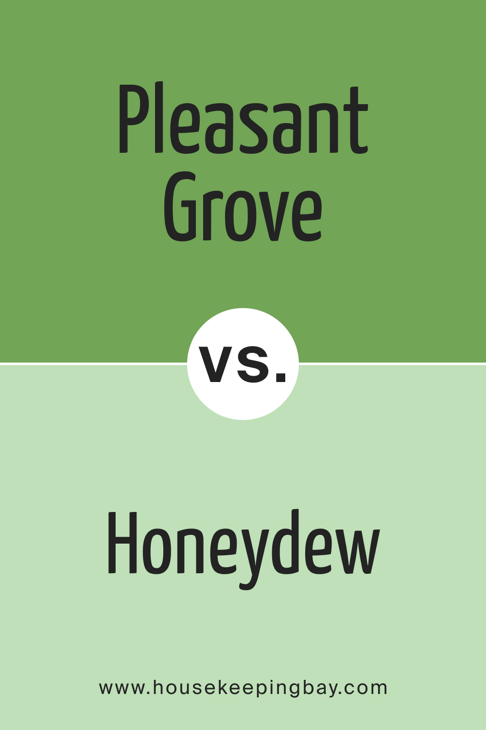
Pleasant Grove 552 vs. BM 549 Honeydew
Honeydew presents a subtle sweetness, offering a hint of yellow undertones. In contrast, Pleasant Grove 552 brings forth a more natural green, making it versatile for various settings, unlike the specialized charm of Honeydew.
housekeepingbay.com
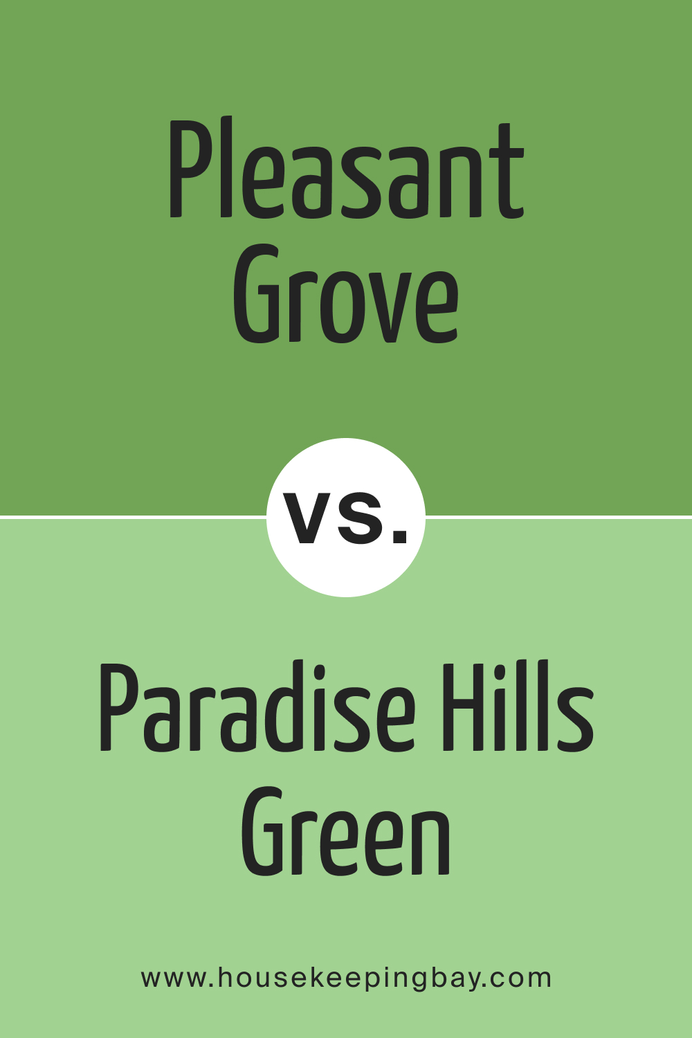
Pleasant Grove 552 vs. BM 550 Paradise Hills Green
Paradise Hills Green and Pleasant Grove 552 are close cousins, with the former being slightly brighter. Paradise Hills Green can be ideal for spaces needing an uplifting touch, while Pleasant Grove works wonders in creating tranquil atmospheres.
housekeepingbay.com
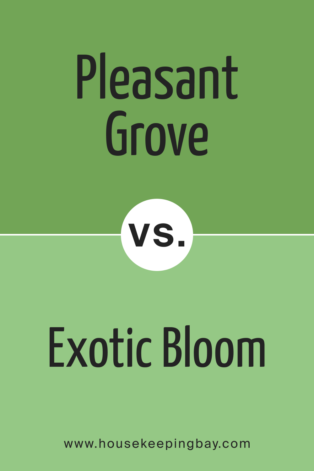
Pleasant Grove 552 vs. BM 551 Exotic Bloom
Exotic Bloom is a more vibrant and lively green compared to the subdued nature of Pleasant Grove 552. Where Exotic Bloom shouts tropical summer, Pleasant Grove whispers serene woodland.
housekeepingbay.com
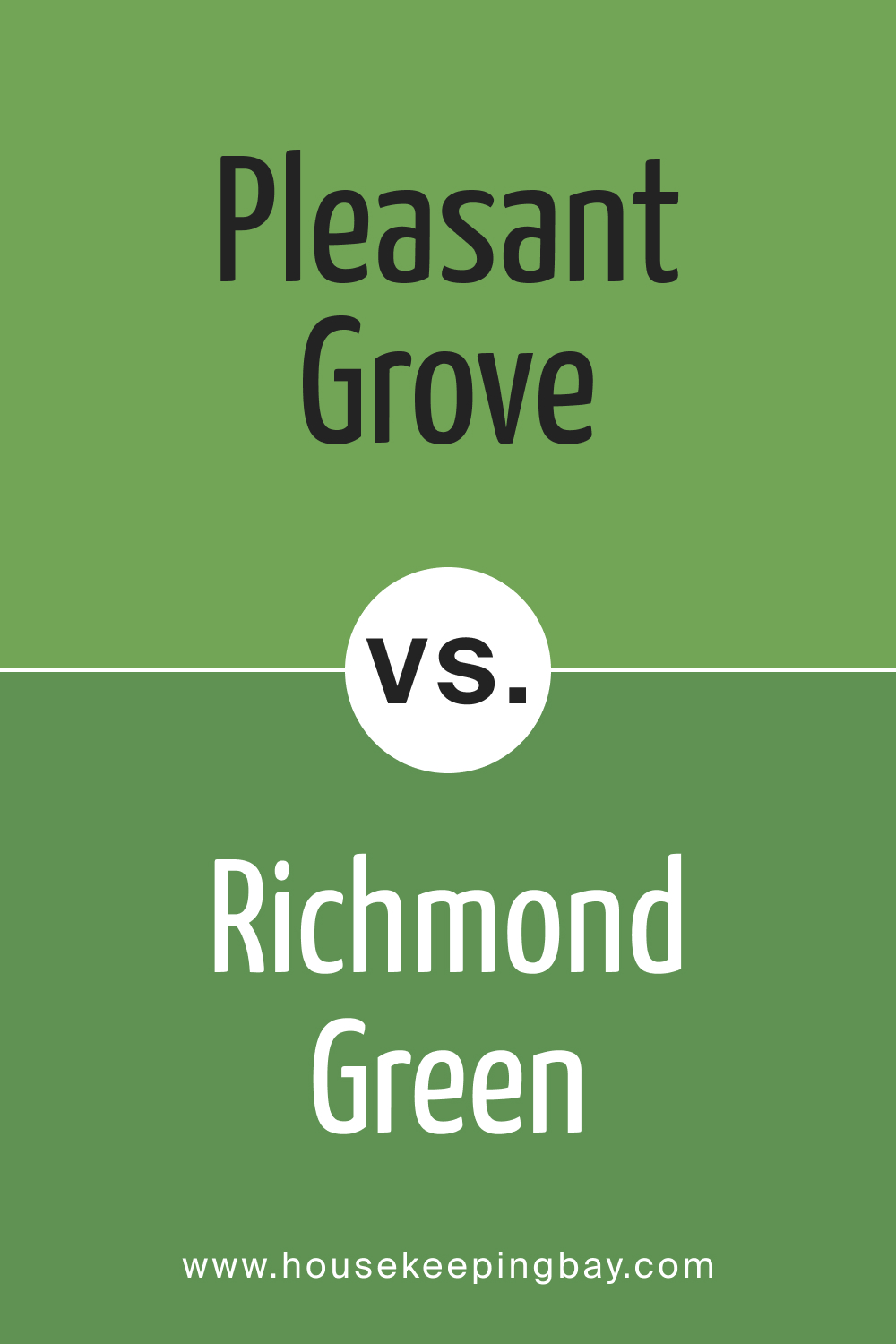
Pleasant Grove 552 vs. BM 553 Richmond Green
Richmond Green carries a timeless elegance. It’s a deeper shade with blue undertones, whereas Pleasant Grove 552 maintains its pure green essence. Richmond Green might be ideal for more opulent spaces, while Pleasant Grove 552 can suit contemporary settings.
housekeepingbay.com
Conclusion
Pleasant Grove 552 is a remarkably adaptable green, embodying the serenity of nature and offering a perfect balance between vibrancy and calmness. While comparisons with other hues illuminate its unique properties, its true essence lies in its versatility. Whether paired with contrasting brights or subdued neutrals, Pleasant Grove 552 has the potential to breathe life into any space, affirming its stature as a must-consider for those seeking the rejuvenating aura of nature in their interiors.
housekeepingbay.com
Ever wished paint sampling was as easy as sticking a sticker? Guess what? Now it is! Discover Samplize's unique Peel & Stick samples. Get started now and say goodbye to the old messy way!
Get paint samples


