Lime White CW-95 by Benjamin Moore
Illuminating Interiors with a Fresh Twist
Lime White, part of Benjamin Moore’s collection, stands out for its ability to bring a soft, warm glow to any room it graces. Unlike stark white, Lime White carries a hint of warmth that makes spaces feel more inviting and cozy, which is why many homeowners and interior designers are drawn to it.
In the article, we explore various aspects of CW-95 Lime White, from its aesthetic qualities to how it pairs with different decor styles and color schemes. Whether you’re looking to refresh your living space, add a touch of elegance to your bedroom, or create a serene atmosphere in your bathroom, Lime White offers a flexible solution that complements a wide range of interior designs.
Moreover, the article provides practical tips for applying Lime White in your home, including lighting considerations, color combinations, and room-specific advice. By the end of the read, you’ll have a thorough understanding of how to make the most out of this beautiful paint color, transforming your home into a more comfortable and stylish space.
Whether you’re renovating your entire home or simply looking for a change in one room, CW-95 Lime White by Benjamin Moore offers a fresh perspective on interior design.
via benjaminmoore.com
What Color Is Lime White CW-95 by Benjamin Moore?
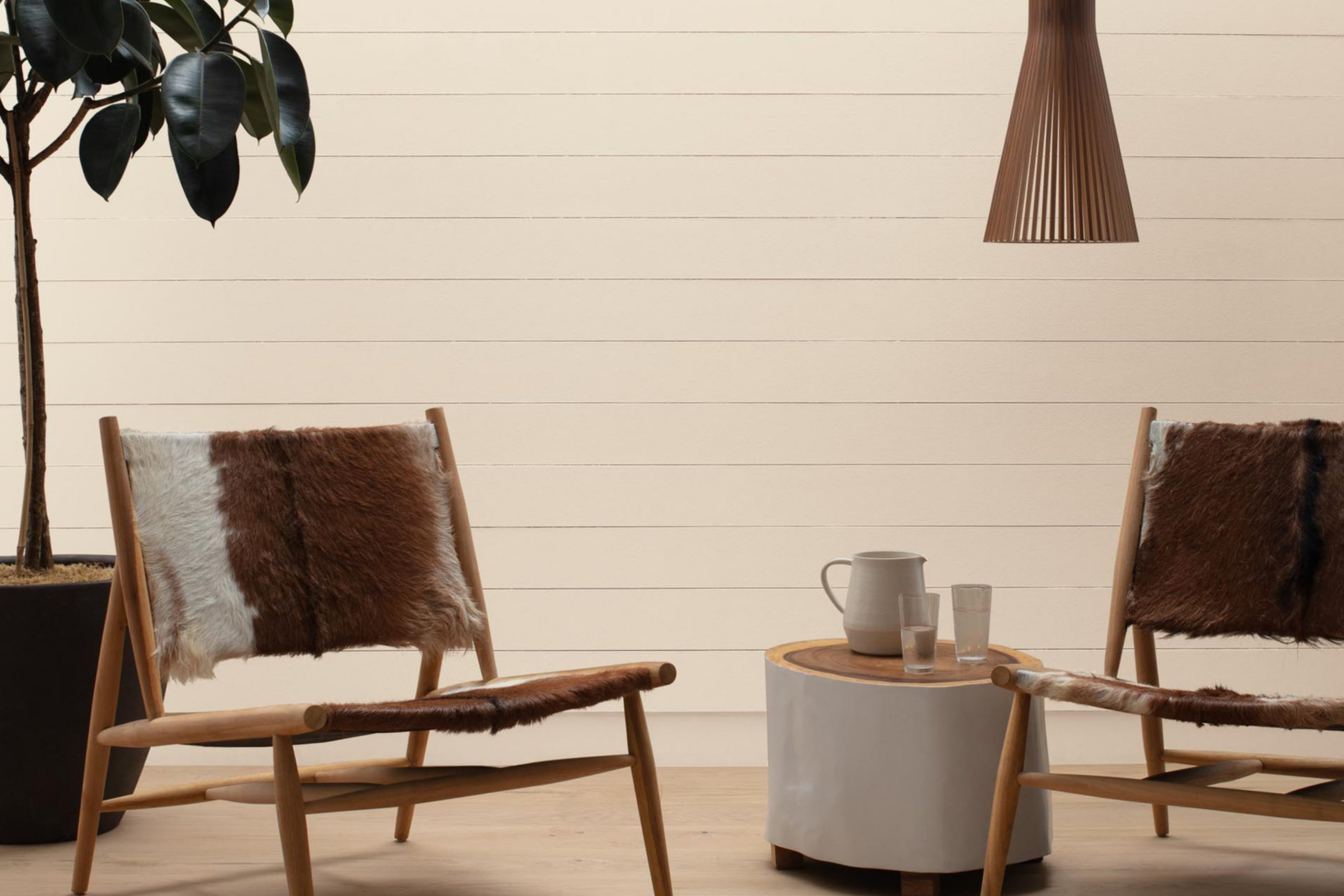
Lime White CW-95 by Benjamin Moore is a soft, soothing color that exudes a sense of calm and simplicity. It’s not just plain white; it has a hint of warmth, like the gentlest touch of sunlight in the morning. This beautiful shade belongs to the off-white family, making it versatile and easy to incorporate into various interior designs.
Lime White works best in styles that prioritize comfort, light, and a sense of openness. Think Scandinavian minimalism where simplicity and functionality are key, or a cozy farmhouse style that combines rustic charm with a light and airy palette. It’s also perfect for modern spaces that focus on clean lines and minimalistic aesthetics, adding a layer of warmth without overwhelming the senses.
When it comes to pairing with materials and textures, Lime White CW-95 is a team player. It looks stunning against natural wood, from pale birch to rich walnut, highlighting the material’s natural beauty. Metals like brass and copper add a touch of elegance to this color, especially in light fixtures or decorative accents.
For textures, consider soft, plush fabrics in neutral tones or even bolder colors to add depth and interest. Linen curtains or a woolly throw can make a room feel more inviting, while still keeping the atmosphere light and refreshing.
housekeepingbay.com
Table of Contents
Is Lime White CW-95 by Benjamin Moore Warm or Cool color?
Lime White CW-95 by Benjamin Moore is a subtle, creamy white paint color that feels warm and welcoming. This color is really good at making spaces feel cozy and inviting, without overpowering them. Its softness means it can fit in almost anywhere in a home, from living rooms to bedrooms, and even kitchens and bathrooms.
What’s special about Lime White CW-95 is how it interacts with light. In rooms with a lot of natural light, it can look brighter and more open, giving the illusion of more space. In rooms with less light, it adds warmth, making the space feel snug and comfortable. This adaptability makes it a great choice for many homes, regardless of their style or the amount of light they get.
Another great thing about this color is how well it plays with others. It’s a fantastic background for both bold and muted colors, allowing furniture and decorations to stand out. Whether you’re going for a modern, minimal look, or something more traditional and filled with personality, Lime White CW-95 can support your vision, making your home feel just right.
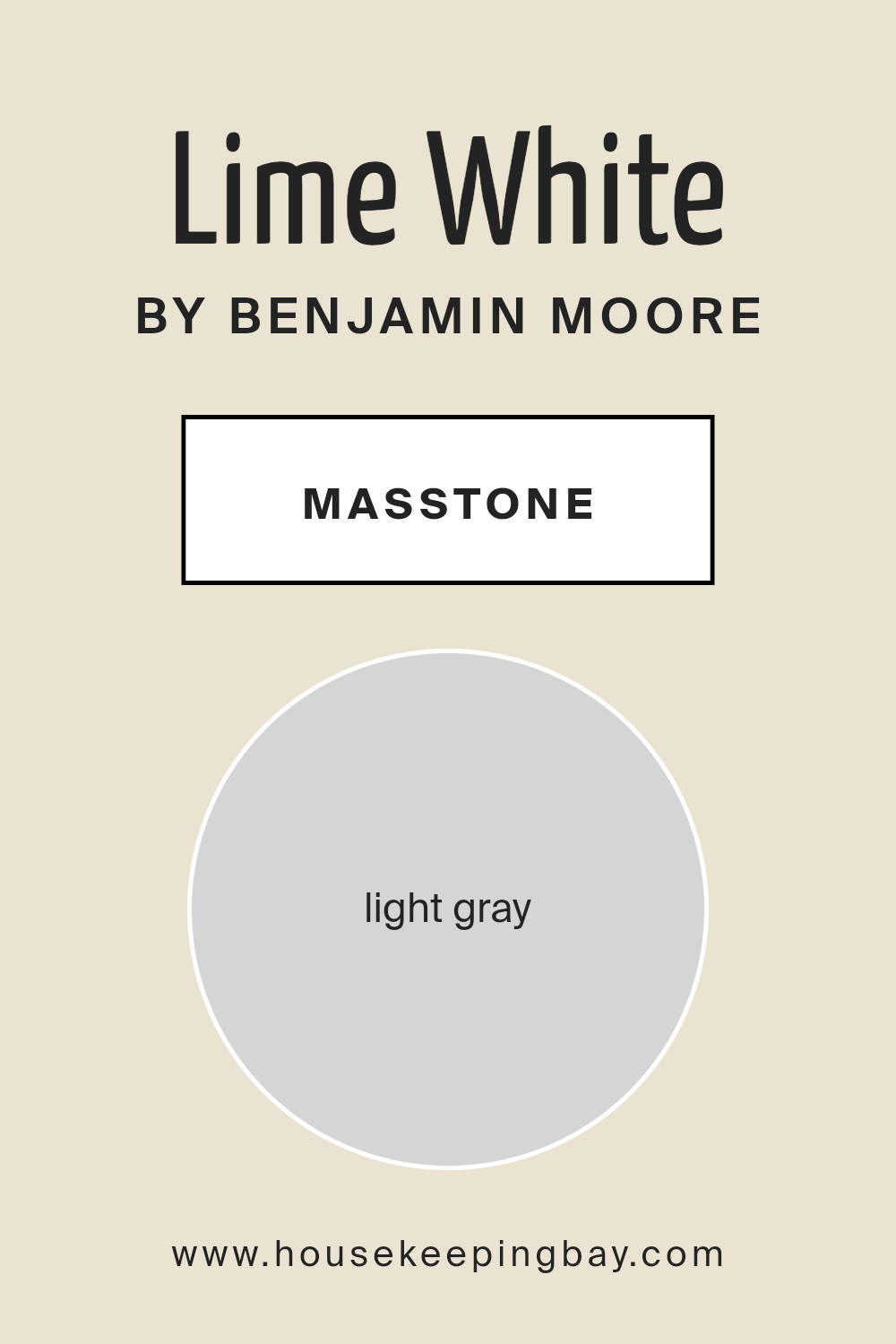
What is the Masstone of the Lime White CW-95 by Benjamin Moore?
Lime White CW-95 by Benjamin Moore has a masstone or the main color that looks like light gray, similar to the color code #D5D5D5. This soft, soothing shade can truly transform a house into a cozy home. Its light gray tone is super versatile, making it a great choice for almost any room. Whether it’s the living room, bedroom, or even the kitchen, this color brings in a sense of calm and quiet elegance. It’s like a gentle backdrop that lets your furniture and décor pop, without overwhelming the space.
Since it’s such a light and neutral color, Lime White CW-95 does a fantastic job at making small rooms appear bigger and brighter. It reflects light well, so even on those days when the sun isn’t shining too bright, this color helps keep your home feeling light and airy.
Plus, it’s easy to match with almost any color scheme, whether you love bold colors or prefer softer, more muted tones. This makes it a super practical choice for anyone looking to freshen up their home with a touch of timeless charm.
housekeepingbay.com
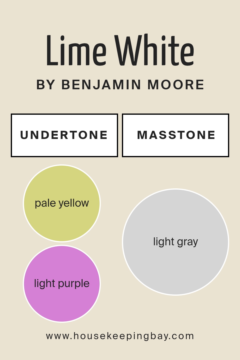
Undertones of Lime White CW-95 by Benjamin Moore
Lime White CW-95 by Benjamin Moore is a unique paint color known for its subtle complexity. What makes this color special are its undertones – pale yellow and light purple. You might wonder, why does that matter? Well, undertones play a huge role in how we perceive color. They can shift the mood of a room, affecting how we feel in the space.
Think of undertones like a secret ingredient that can change the flavor of a dish. In Lime White CW-95, the pale yellow undertone adds a hint of warmth, making the space feel cozy and inviting. It’s like a touch of sunshine on a cloudy day, giving the walls a soft glow. This is great for rooms that don’t get a lot of natural light, as it can make them feel brighter and more welcoming.
On the other hand, the light purple undertone brings a touch of cool sophistication. It’s this subtle hint of elegance that can make a room feel more refined without being too flashy. This balance between warmth and elegance is what sets Lime White CW-95 apart.
When you paint your interior walls with Lime White CW-95, these undertones interact with the room’s lighting, furnishings, and décor, affecting the overall atmosphere. During the day, with natural light streaming in, the walls might lean more towards the warm, pale yellow, creating a cheerful vibe.
At night, under artificial lighting, the light purple might become more noticeable, adding a layer of calm sophistication. This makes Lime White CW-95 a versatile choice, adaptable to many styles and settings.
housekeepingbay.com
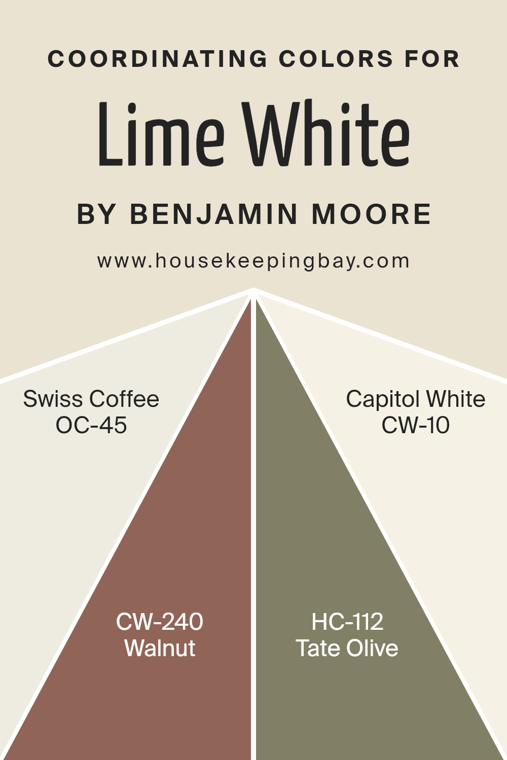
Coordinating Colors of Lime White CW-95 by Benjamin Moore
Coordinating colors are hues that complement each other when used together in a design scheme, creating a harmonious and balanced look. These colors are selected based on their positions on the color wheel, their saturation, and brightness levels, ensuring they enhance each other’s beauty without clashing. For instance, Lime White CW-95 by Benjamin Moore can be perfectly complemented by a palette of coordinating colors such as OC-45 – Swiss Coffee, CW-240 – Walnut, HC-112 – Tate Olive, and CW-10 – Capitol White, each bringing its unique character to the mix while maintaining an overall cohesiveness.
Swiss Coffee OC-45 is a warm, inviting off-white with just the right balance of creaminess, making any space feel cozy and bright. Its subtle undertones make it versatile for pairing with a variety of décor elements, standing out beautifully against Lime White.
Walnut CW-240, on the other hand, is a deep, rich brown that adds a touch of elegance and grounded sophistication, providing a strong contrast that highlights the lighter tones of Lime White. Tate Olive HC-112 offers a natural, earthy green that evokes a sense of calm and brings a touch of the outdoors inside, blending seamlessly with Lime White for a soft, organic look.
Lastly, Capitol White CW-10 is a crisp, clean white with a slightly cool tone, offering a fresh contrast that amplifies the vibrant qualities of Lime White, making spaces appear larger and more inviting. Together, these colors create a cohesive palette that enhances the beauty of each hue while ensuring a harmonious space.
You can see recommended paint colors below:
- OC-45 Swiss Coffee
- CW-240 Walnut
- HC-112 Tate Olive
- CW-10 Capitol White
housekeepingbay.com
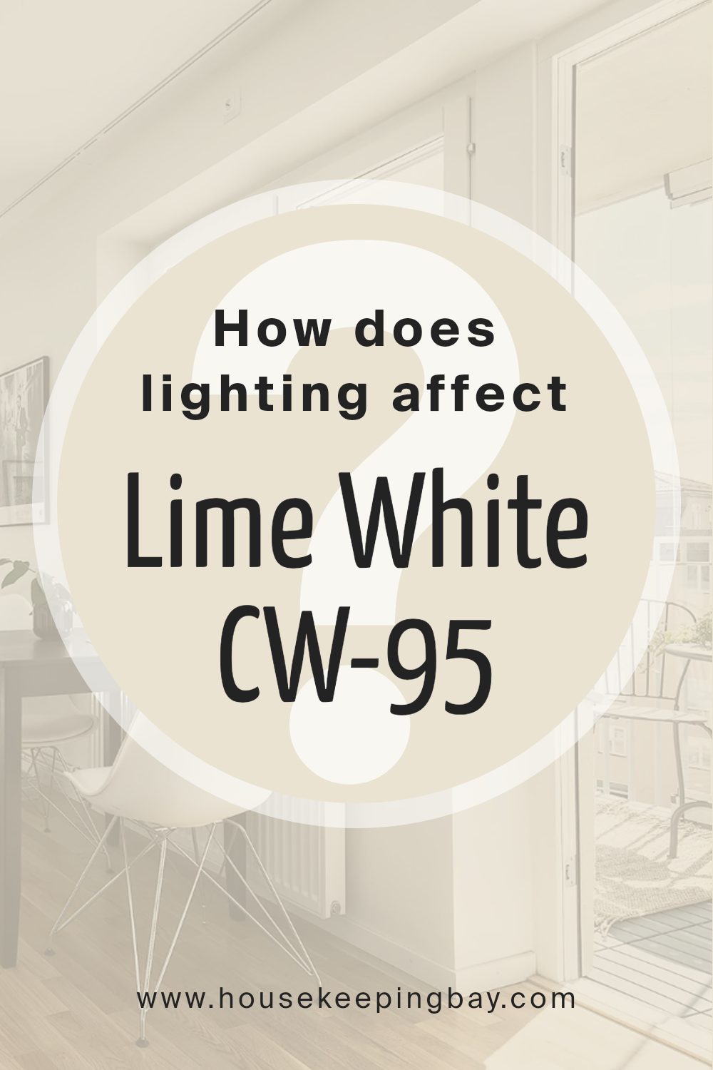
How Does Lighting Affect Lime White CW-95 by Benjamin Moore?
Lighting plays a crucial role in the way we perceive colors. When light shines on an object, it reflects certain wavelengths, which we then see as color. Different types of light can make the same color appear different. This is important to consider when choosing paint, like Benjamin Moore’s Lime WhiteCW-95, for your space.
In artificial light, Lime WhiteCW-95’s appearance can vary depending on the type of bulb used. Warm lights, like those from incandescent bulbs, can make Lime WhiteCW-95 look creamier and softer, bringing out its warm undertones. Cool lights, such as those from LED bulbs, might make it appear brighter and more neutral, emphasizing any subtle green undertones.
Natural light brings out the truest color of Lime WhiteCW-95, but its look can still change throughout the day and depend on the room’s orientation. In north-faced rooms, which receive less direct sunlight, Lime WhiteCW-95 may look slightly cooler and more muted. This can give the space a calm and serene vibe, but the color may not appear as vibrant.
South-faced rooms get ample sunlight, making Lime WhiteCW-95 look warmer and more luminous. The paint will likely reveal its creamy warmth, creating a bright and inviting atmosphere. This orientation is great for showcasing the color’s full beauty.
- In east-faced rooms, Lime WhiteCW-95 receives soft morning light, making the color look gentle and warm in the morning, but cooler in the afternoon. It’s perfect for spaces used mainly in the first half of the day.
- In west-faced rooms, the paint color can look quite different. As the intense afternoon sunlight pours in, Lime WhiteCW-95 may take on a brighter, warmer glow, perfect for rooms used more in the evenings.
- Understanding how light affects Lime WhiteCW-95 helps ensure you pick the best space in your home to use this versatile color, achieving the atmosphere you desire.
housekeepingbay.com
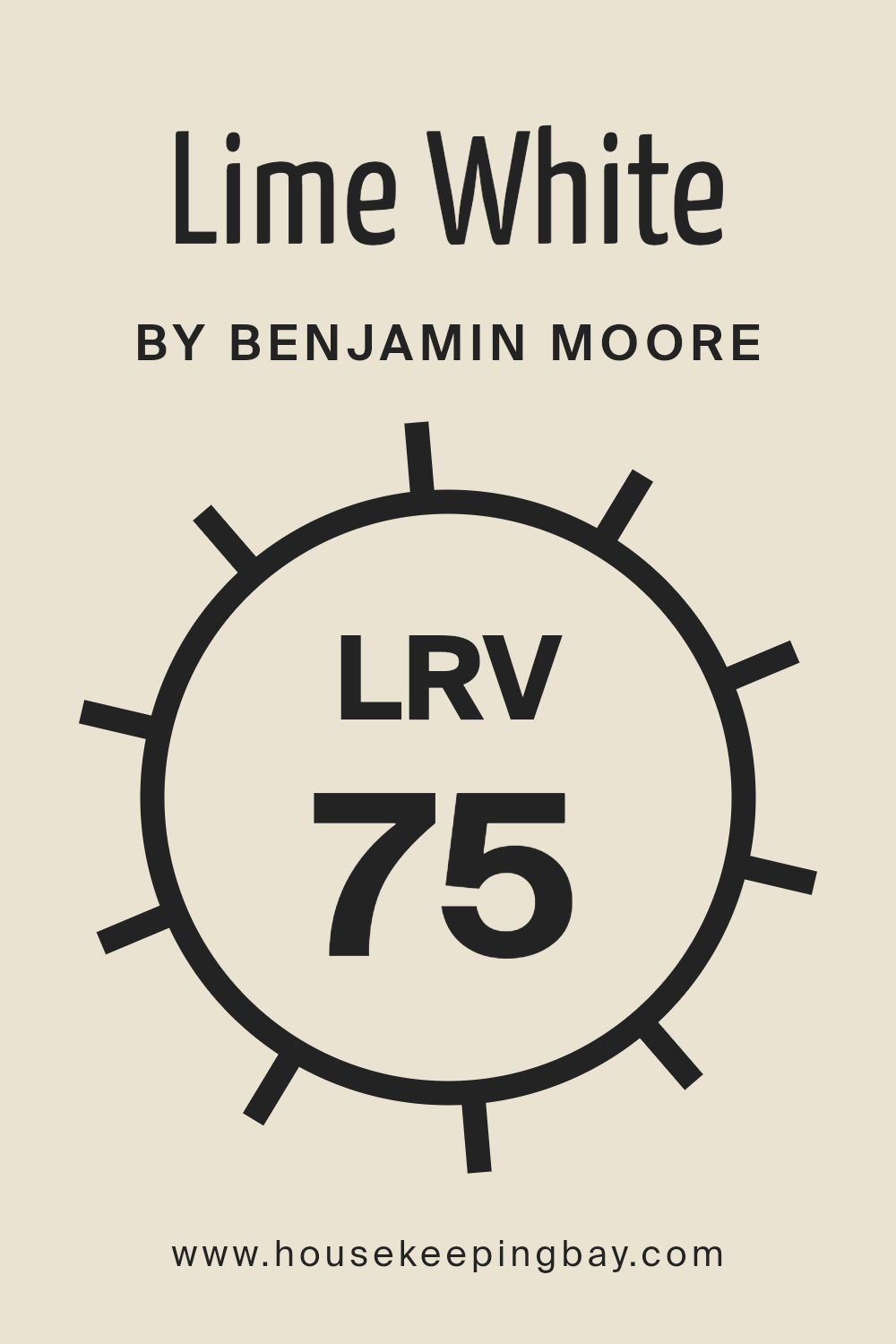
What is the LRV of Lime White CW-95 by Benjamin Moore?
LRV stands for Light Reflectance Value, a measure used to describe the percentage of light a paint color reflects off a surface back into the room compared to pure white, which reflects 100% of light. This value ranges from 0, which is completely black and absorbs all light, to 100, which is pure white and reflects all light. The LRV is essential because it helps us understand how light or dark a color will look on our walls once applied. It affects not just the brightness of the room but also the atmosphere and mood. High LRV colors make a room feel more open and airy, while low LRV colors make it feel cozier and more intimate.
With an LRV of 75.37, Benjamin Moore’s Lime WhiteCW-95 is on the lighter side, meaning it reflects a good amount of light.
This makes the color a great choice for making a space feel brighter and more spacious. Since it’s not too close to pure white, it still brings warmth and character to the space, adding a subtle hint of color that enriches the room without overwhelming it with brightness. This particular LRV value indicates that Lime WhiteCW-95 is versatile, working well in rooms with either a lot of natural light or in spaces needing a bit of a brightness boost, without the starkness that comes with higher LRV shades.
housekeepingbay.com
What is LRV? Read It Before You Choose Your Ideal Paint Color
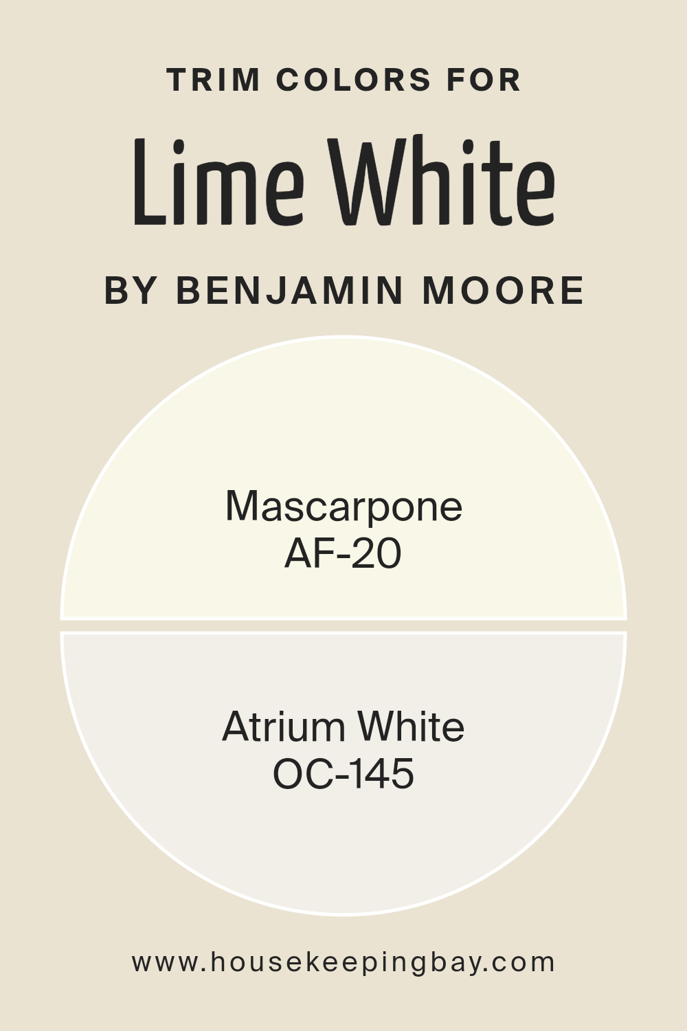
What are the Trim colors of Lime White CW-95 by Benjamin Moore?
Trim colors are the shades selected to paint the architectural details of a room or exterior parts of a house, such as door frames, window trims, baseboards, and crown moldings. These colors play a pivotal role in defining the overall look and feel of a space.
They serve to highlight the structural features of a home, creating a visual frame that enhances the main wall colors. When used effectively, trim colors can add depth and dimension, making spaces appear more polished and cohesive. In the case of Lime White CW-95 by Benjamin Moore, choosing the right trim color is crucial to accentuate its subtle beauty without overpowering it.
AF-20 Mascarpone and OC-145 Atrium White are excellent trim colors that complement Lime White CW-95, each bringing out its unique character in a harmonious way. Mascarpone is a warm, creamy white that offers a soft, inviting contrast against the cool, understated elegance of Lime White CW-95, ensuring the space feels welcoming and well-balanced.
On the other hand, Atrium White has a crisp, luminous quality that provides a gentle lift to the muted tones of Lime White CW-95, creating an airy and light ambiance that enhances the room’s aesthetic appeal. Together, these trim colors work to frame and enrich the visual experience, grounding the main color and allowing it to truly shine.
You can see recommended paint colors below:
- AF-20 Mascarpone
- OC-145 Atrium White
housekeepingbay.com
How to Use Lime White CW-95 by Benjamin Moore In Your Home?
Lime White CW-95 by Benjamin Moore is a beautiful, subtle paint color that can add a fresh touch to any home. Its light, creamy hue brings warmth to spaces, making rooms feel cozy and inviting. This color works wonders in a variety of settings, whether you want to freshen up your living room, kitchen, or even your bedroom.
It pairs well with natural elements like wood or stone, enhancing the aesthetic of your space without overwhelming it. Lime White CW-95 can also serve as an excellent backdrop for artwork or as a base for bolder color accents in home decor.
For those looking to give their home a gentle, welcoming vibe, painting walls or even furniture with Lime White CW-95 can be a simple yet effective choice. Its versatility allows it to blend seamlessly with different styles, whether you’re going for a modern, minimalist look or a more traditional, cozy atmosphere.
Conclusion
Lime White CW-95 by Benjamin Moore is a versatile, soft off-white with subtle green undertones, offering a fresh and inviting look. It pairs beautifully with both cool and warm colors, making it an excellent choice for various spaces. This shade works well in both modern and traditional settings, providing a bright, clean backdrop that enhances natural light and complements a wide range of decor styles.
Whether used on walls, trim, or cabinetry, Lime White CW-95 brings a sense of calm and sophistication to any room. It is recommended for those seeking a neutral, yet impactful, color option that offers flexibility in pairing with other colors and design elements.
This paint color’s timeless appeal and practicality are emphasized, suggesting that it can suit a variety of tastes and settings. Overall, Lime White CW-95 by Benjamin Moore is portrayed as a sophisticated choice that can effortlessly elevate the aesthetic of any home.
housekeepingbay.com
Ever wished paint sampling was as easy as sticking a sticker? Guess what? Now it is! Discover Samplize's unique Peel & Stick samples. Get started now and say goodbye to the old messy way!
Get paint samples


