Gorgeous White SW 6049 by Sherwin Williams
A Classic Color with a Modern Touch
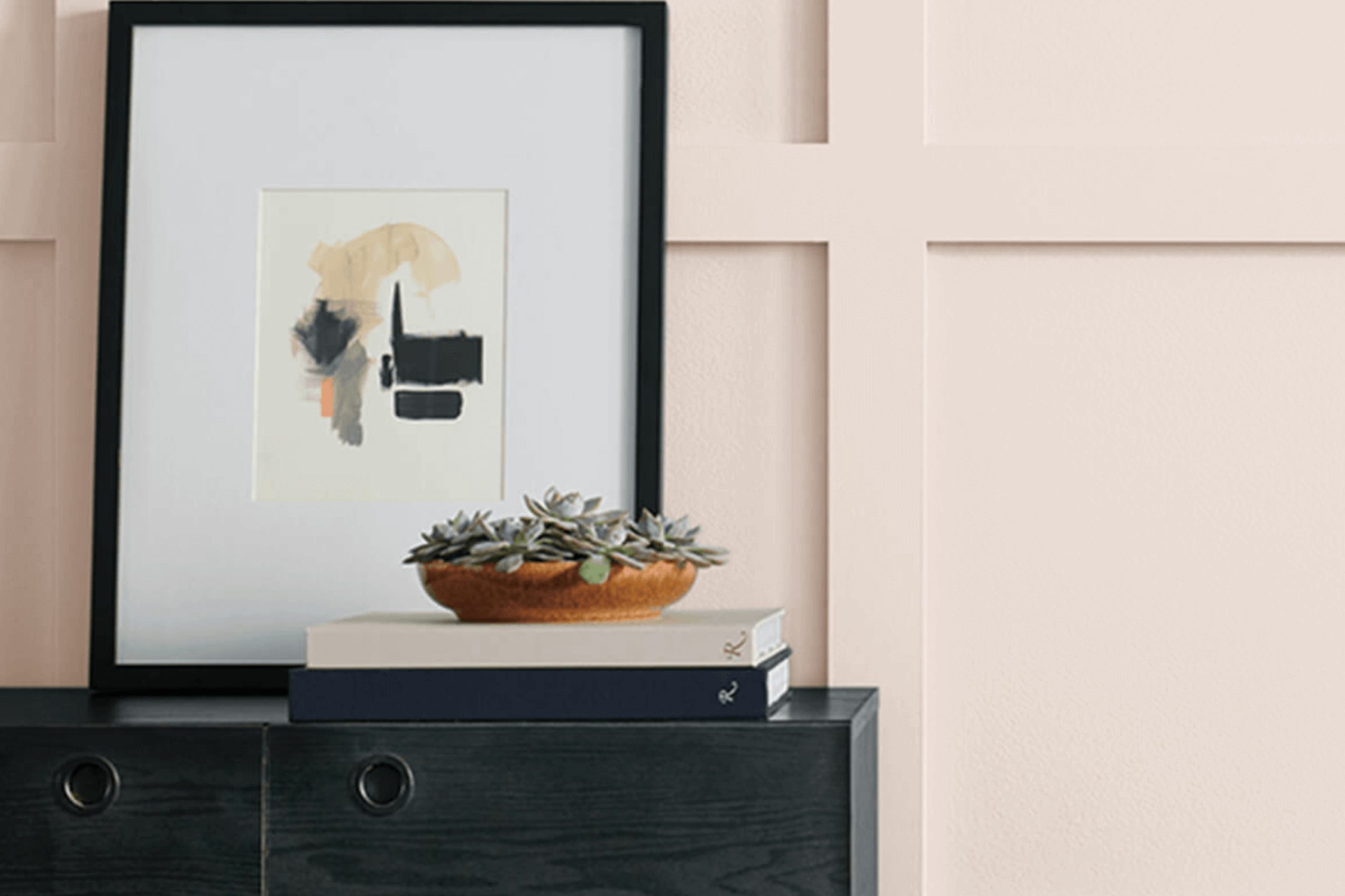
Choosing the right paint color can truly change the feeling of a space, and SW 6049 Gorgeous White by Sherwin Williams is a perfect candidate for those seeking a fresh, clean, and simple look. This shade offers more than just a basic white; it provides a subtle warmth that can make a room feel inviting and comfortable.
The gentle undertones in Gorgeous White set it apart, adding depth to its classic appearance and ensuring it doesn’t feel stark or cold.
When applying it to your walls, you might notice how it balances beautifully with natural light, enhancing a room’s natural charm. This color works seamlessly in various settings, from modern and minimalist designs to more traditional or eclectic interiors. You can pair it easily with bolder accent colors or keep things simple with neutral tones for a calm, cohesive look.
Using Gorgeous White can help you feel in tune with the space, achieving a timeless aesthetic. Whether you’re updating a single room or repainting an entire home, Gorgeous White can be a reliable choice.
It’s often those small details, like the perfect shade of paint, that make a big impact on how you feel in your home.
via sherwin-williams.com
What Color Is Gorgeous White SW 6049 by Sherwin Williams?
Gorgeous White SW 6049 by Sherwin Williams is a soft, elegant color that brings warmth and light into a room. This versatile shade of white has a hint of beige, which gives it a welcoming and cozy feel. It works well across various interior styles, making it an excellent choice for both traditional and modern spaces.
In a traditional setting, Gorgeous White can highlight classic wood furniture and moldings, adding a touch of sophistication without overpowering the other elements.
When used in modern interiors, this color provides a clean backdrop that allows sleek furniture lines and bold art pieces to stand out.
Gorgeous White pairs beautifully with natural materials such as wood, especially lighter tones like oak or maple. It also complements soft textiles like linen and cotton, adding a touch of comfort to any space. When mixed with metallic accents in gold or brass, the color exudes a subtle sense of luxury.
In terms of textures, consider pairing this white with woven rugs or textured wall hangings to add depth. Its subtle warmth also harmonizes well with soft gray tones and muted blues, making it a flexible choice for living rooms, bedrooms, or even kitchens. Its understated elegance will make any space feel inviting and complete.
housekeepingbay.com
Is Gorgeous White SW 6049 by Sherwin Williams Warm or Cool color?
Gorgeous White SW 6049 by Sherwin Williams offers a soft, warm tone that can give your home a cozy look. This color, with its gentle hint of warmth, suits spaces where comfort and relaxation are priorities. Being versatile, Gorgeous White works well in living rooms, bedrooms, and kitchens, effortlessly complementing a range of furniture and decor styles.
Natural light plays a key role; when sunlight pours in, the color subtly brightens, creating a welcoming atmosphere. Artificial light at night gives it a creamy, inviting glow.
This particular white pairs nicely with bold colors, creating a balanced contrast, while also beautifully matching other neutrals for a harmonious blend.
In smaller rooms, using Gorgeous White can make the space feel larger and airier. With this shade, your home can feel both fresh and timeless, improving the overall feeling of each room without overwhelming the senses.
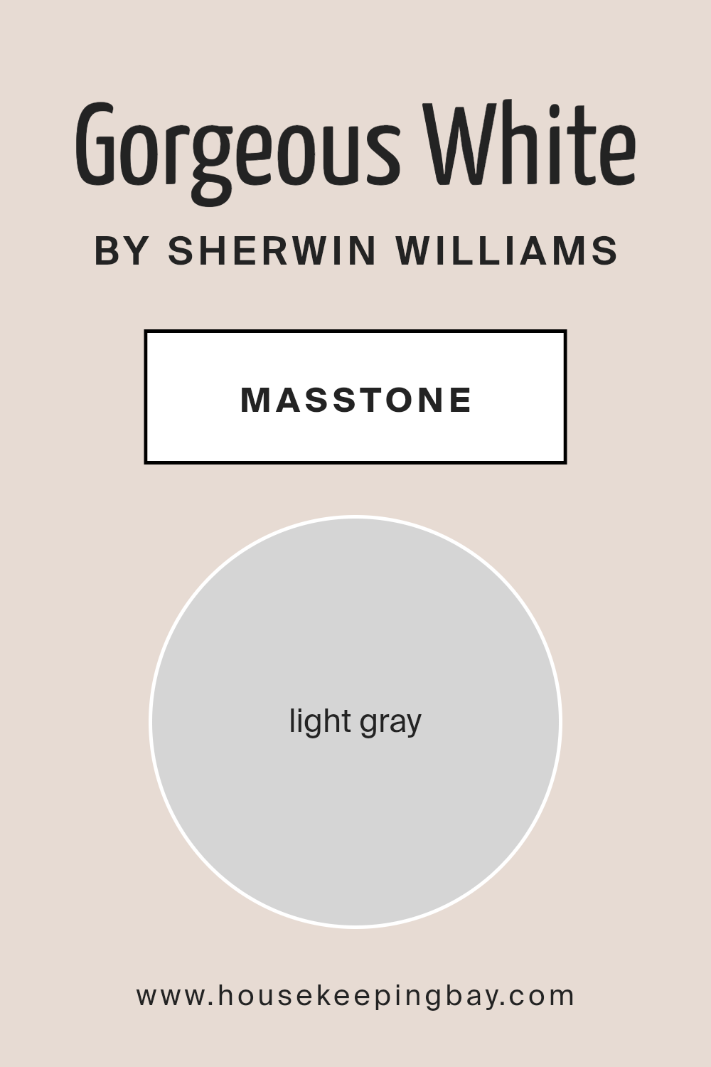
What is the Masstone of the Gorgeous White SW 6049 by Sherwin Williams?
Gorgeous White SW 6049 by Sherwin Williams is a lovely light gray color (#D5D5D5) that adds a soft and calming touch to any room. This shade of gray is versatile, making it an excellent choice for both modern and traditional homes. When used on walls, it can make a room feel bright and airy, reflecting natural light beautifully.
The subtle gray tones in Gorgeous White help create a neutral backdrop, allowing other colors in the room, like furniture and decor, to stand out.
This color works well in any space, from living rooms to bedrooms, creating a serene environment. It pairs nicely with both warm and cool color schemes, making it easy to coordinate with different design elements. If you have wood floors or furniture, Gorgeous White can complement the natural tones, enhancing the overall look of the room.
It’s a great choice for anyone who wants a clean, elegant atmosphere without overwhelming the space.
housekeepingbay.com
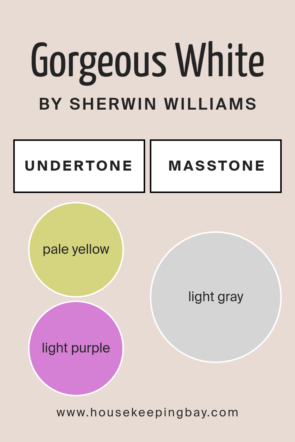
Undertones of Gorgeous White SW 6049 by Sherwin Williams
Gorgeous White SW 6049 by Sherwin Williams appears simple at first glance, but its subtle undertones make it unique. This paint color contains hints of pale yellow, light purple, light blue, pale pink, mint, lilac, and grey. These undertones can affect how the color looks in different lighting conditions.
For instance, in bright sunlight, the pale yellow and mint undertones may become more noticeable, giving the room a warm and lively feel. On cloudy days or in dim light, the grey and light purple tones might come forward, creating a softer, more tranquil atmosphere.
These undertones ensure that Gorgeous White is not a plain white but rather a complex shade that can adapt to any environment. The slight pink and lilac hints can make a room feel cozy and intimate, while the blues and greys can add a touch of coolness and calmness. As the light changes throughout the day, Gorgeous White can appear different, making it a dynamic choice for interior walls.
Overall, the mix of undertones in this color adds depth and interest. When used in a room, Gorgeous White provides a neutral backdrop that can harmonize with various furnishings while still offering a subtle play of color.
housekeepingbay.com
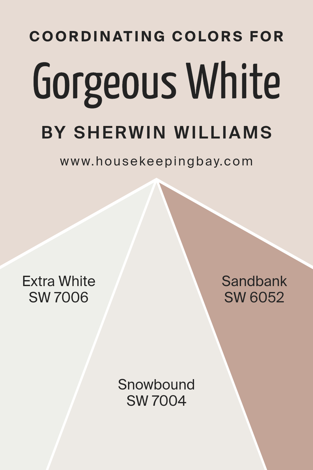
Coordinating Colors of Gorgeous White SW 6049 by Sherwin Williams
Coordinating colors are hues that work well together to create a harmonious look in a space. These colors complement each other by either matching or contrasting nicely, enhancing the overall aesthetic. For Sherwin Williams’ Gorgeous White SW 6049, a warm, soft white, the coordinating colors chosen are SW 7006 – Extra White, SW 7004 – Snowbound, and SW 6052 – Sandbank.
Each of these colors brings out different qualities in Gorgeous White, adding depth and interest to the design.
SW 7006 – Extra White is a crisp, clean white that provides a sharp contrast to Gorgeous White, highlighting its warmth and adding a modern edge to the space. SW 7004 – Snowbound offers a slightly softer take on white, still bright but with a hint of warmth that makes it feel welcoming when used alongside Gorgeous White.
SW 6052 – Sandbank, on the other hand, introduces a warm, earthy tone to the palette. This color has a sandy, beige quality that pairs beautifully with Gorgeous White, adding texture and an inviting feel.
Together, these colors create a balanced, stylish look, each enhancing the subtle beauty of Gorgeous White while contributing to a cohesive design scheme.
You can see recommended paint colors below:
- SW 7006 Extra White
- SW 7004 Snowbound
- SW 6052 Sandbank
housekeepingbay.com
How Does Lighting Affect Gorgeous White SW 6049 by Sherwin Williams?
Lighting plays a crucial role in how we perceive color. It can change the appearance of a color dramatically, making it seem lighter, darker, warmer, or cooler. This is particularly important when choosing paint colors like Gorgeous White SW 6049 from Sherwin Williams.
In natural light, Gorgeous White looks quite different depending on the time of day and the room’s orientation. In north-facing rooms, natural light tends to be cooler and dimmer. This can make Gorgeous White take on a slight blue or gray undertone, which might make the space feel cooler.
In south-facing rooms, natural light is warm and bright for most of the day. Gorgeous White will seem warmer and more welcoming, almost glowing in the abundant sunlight. It remains a soft, pleasant white with slightly warm undertones, which can make such spaces feel larger and more open.
East-facing rooms receive bright, warm light in the morning and cooler light in the afternoon. In these rooms, Gorgeous White will have a warm glow early in the day, creating a cozy atmosphere. As the light shifts to cooler tones in the afternoon, slight gray undertones may appear, giving a more neutral feel.
West-facing rooms have the opposite pattern, with cooler light in the morning and warm, golden light in the afternoon. Here, Gorgeous White might look more neutral or even slightly gray in the morning, transforming later in the day when the sunlight becomes warmer. This shift can give a vibrant, inviting look to spaces during the late afternoon and evening.
In artificial lighting, Gorgeous White can look different based on the bulb’s type. Warm white bulbs (like incandescent or some LEDs) will enhance its warm undertones, while cool white bulbs might bring out the cooler, gray tones in the paint.
Understanding these effects helps in creating the desired ambiance by carefully choosing lighting in combination with paint colors.
housekeepingbay.com
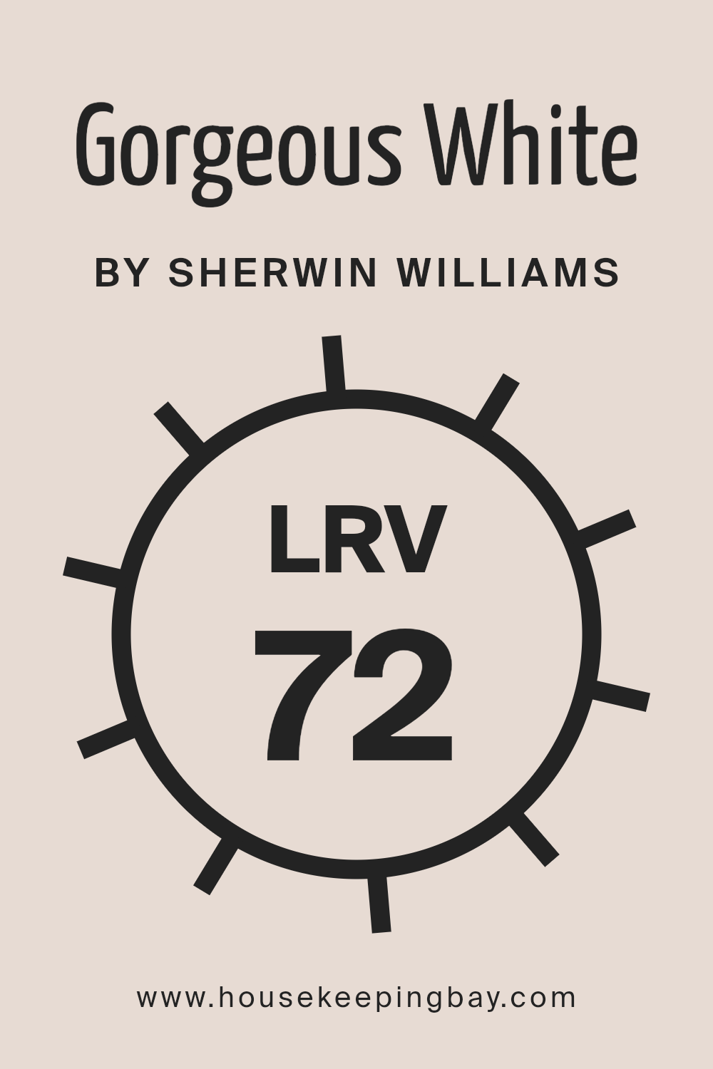
What is the LRV of Gorgeous White SW 6049 by Sherwin Williams?
LRV, which stands for Light Reflectance Value, is a scale that measures the amount of light a color reflects. It ranges from 0 to 100, where 0 represents absolute black that reflects no light, and 100 represents pure white that reflects all light. Higher LRV numbers mean the color is lighter and reflects more light, while lower numbers mean the color is darker and absorbs more light.
Understanding a color’s LRV is important because it tells you how bright or dark a room might feel once the color is applied to the walls. A higher LRV can make a room feel more open and airy as it reflects more light, while a lower LRV can make a space feel cozier and more intimate.
The LRV of Gorgeous White by Sherwin Williams is 72.233, which places it on the lighter side of the scale. This means it reflects a substantial amount of light, contributing to a brighter and more spacious feel in a room.
Colors with such a high LRV are well-suited for rooms that may need a boost of light, like smaller spaces or areas with limited natural light.
With Gorgeous White, the walls will appear bright and fresh, helping to create a sense of openness. This makes Gorgeous White an excellent choice for those who want to achieve a clean and airy atmosphere in their homes, enhancing the perception of space and light within a room.
housekeepingbay.com
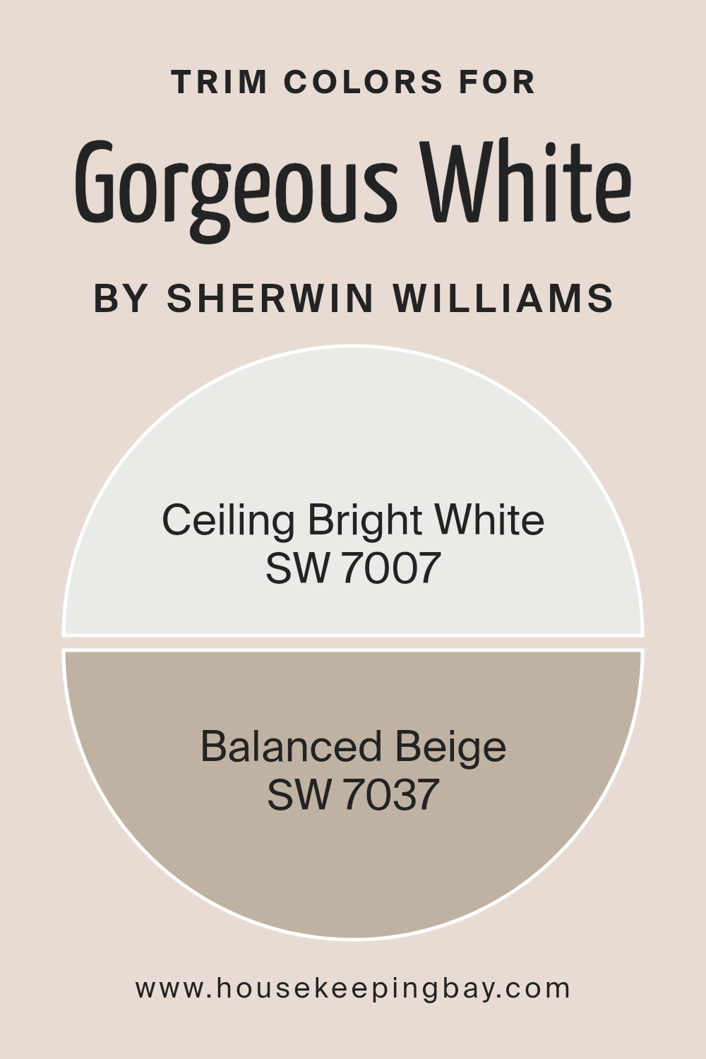
What are the Trim colors of Gorgeous White SW 6049 by Sherwin Williams?
Trim colors are specific paint colors used for finishing details such as moldings, baseboards, and frames around windows and doors. They create a visual contrast or complement to the main wall color, adding depth and character to a room.
When using Gorgeous White SW 6049 by Sherwin Williams as the main wall color, selecting the right trim colors becomes essential to enhance the overall aesthetic. Ceiling Bright White SW 7007 can be a refreshing choice for trim, providing a crisp and clean look.
Its bright and neutral tone can make the edges of the room feel sharper and more defined, letting the Gorgeous White walls truly stand out.
Balanced Beige SW 7037, on the other hand, offers a warm and inviting look as a trim color. It carries a subtle taupe undertone, which can add a layer of coziness and sophistication to the room.
By using Balanced Beige for trims, you can create a gentle contrast against the Gorgeous White walls, offering a seamless yet stylish transition between the main color and the details.
This combination not only highlights the architectural features of the space but also adds an elegant touch without overwhelming the simplicity of the white walls.
You can see recommended paint colors below:
housekeepingbay.com
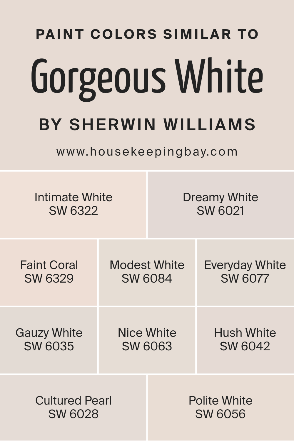
Colors Similar to Gorgeous White SW 6049 by Sherwin Williams
Selecting similar colors is crucial for creating a cohesive and harmonious space. Colors that resemble Sherwin Williams’ Gorgeous White, such as Intimate White, Dreamy White, and Faint Coral, help achieve this effect by providing subtle variations on a theme.
Intimate White is a soft, gentle hue with a hint of blush that adds warmth without being overpowering, while Dreamy White offers a serene, creamy tone with a slightly muted finish.
These colors create a peaceful atmosphere, perfect for spaces meant for relaxation. Faint Coral adds a touch of muted pink, giving a friendly and welcoming vibe to any room.
Other shades like Modest White, Everyday White, and Gauzy White contribute their own nuances to the overall aesthetic. Modest White is understated, lending a classic and refined feel, while Everyday White is a straightforward, clean option for a fresh look.
Gauzy White has a delicate, airy quality to it, enhancing the lightness of any space. Similarly, Nice White and Hush White offer different levels of warmth, with Nice White leaning towards a subtle creaminess and Hush White providing a quiet, soothing tone.
Cultured Pearl brings a refined, elegant touch, while Polite White is soft and inviting, perfect for maintaining a warm yet neutral environment. These similar colors work together to enrich rooms without overwhelming, making spaces feel thoughtfully curated and balanced.
You can see recommended paint colors below:
- SW 6322 Intimate White
- SW 6021 Dreamy White
- SW 6329 Faint Coral
- SW 6084 Modest White
- SW 6077 Everyday White
- SW 6035 Gauzy White
- SW 6063 Nice White
- SW 6042 Hush White
- SW 6028 Cultured Pearl
- SW 6056 Polite White
housekeepingbay.com
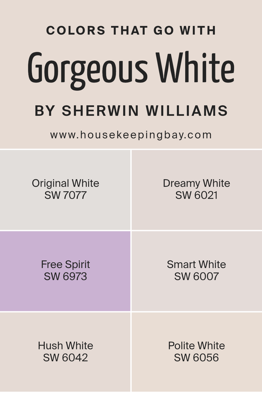
Colors that Go With Gorgeous White SW 6049 by Sherwin Williams
Choosing the right colors to pair with Gorgeous White SW 6049 by Sherwin Williams can change the feel of a space. Each complementary hue contributes to the room’s atmosphere in its own way. SW 7077 Original White is a pure and clean white that adds brightness, making Gorgeous White stand out even more.
Meanwhile, SW 6021 Dreamy White brings a softer, almost ethereal quality that enhances the room’s calm and inviting nature. SW 6973 Free Spirit, a soft, light blue, can create a refreshing balance, offering a hint of coolness that contrasts nicely with the warmth of Gorgeous White.
The subtle elegance of SW 6007 Smart White is a light beige that blends well, providing a peaceful backdrop that maintains a cohesive look.
SW 6042 Hush White, a soft, muted hue, offers a gentle contrast that subtly enriches the space without overwhelming it. Lastly, SW 6056 Polite White, with its understated pink undertone, introduces a whisper of warmth, complementing Gorgeous White’s creamy depth.
These colors together bring harmony and dimension to any room, allowing Gorgeous White to be the star while creating an atmosphere that feels both balanced and inviting.
Selecting the right combinations ensures that the area feels thoughtfully curated and comfortable for any occasion.
You can see recommended paint colors below:
- SW 7077 Original White
- SW 6021 Dreamy White
- SW 6973 Free Spirit
- SW 6007 Smart White
- SW 6042 Hush White
- SW 6056 Polite White
housekeepingbay.com
How to Use Gorgeous White SW 6049 by Sherwin Williams In Your Home?
Gorgeous White SW 6049 by Sherwin Williams is a warm, off-white paint color that adds a soft, welcoming touch to any room. It is perfect for creating a cozy, inviting environment without feeling too stark or cold. This color works well in both traditional and modern spaces, enhancing the natural light in a room and making it feel brighter and more open.
In the living room, Gorgeous White can serve as a perfect backdrop for colorful artwork or vibrant furniture, allowing these pieces to stand out. In the kitchen, it pairs wonderfully with wooden cabinets or stainless steel appliances, giving the space a fresh and clean feeling.
In bedrooms, this soft white creates a peaceful atmosphere, excellent for relaxation and rest.
Gorgeous White also complements various wood tones, stone surfaces, and textiles, making it a versatile choice for anyone looking to refresh their home with a timeless look.
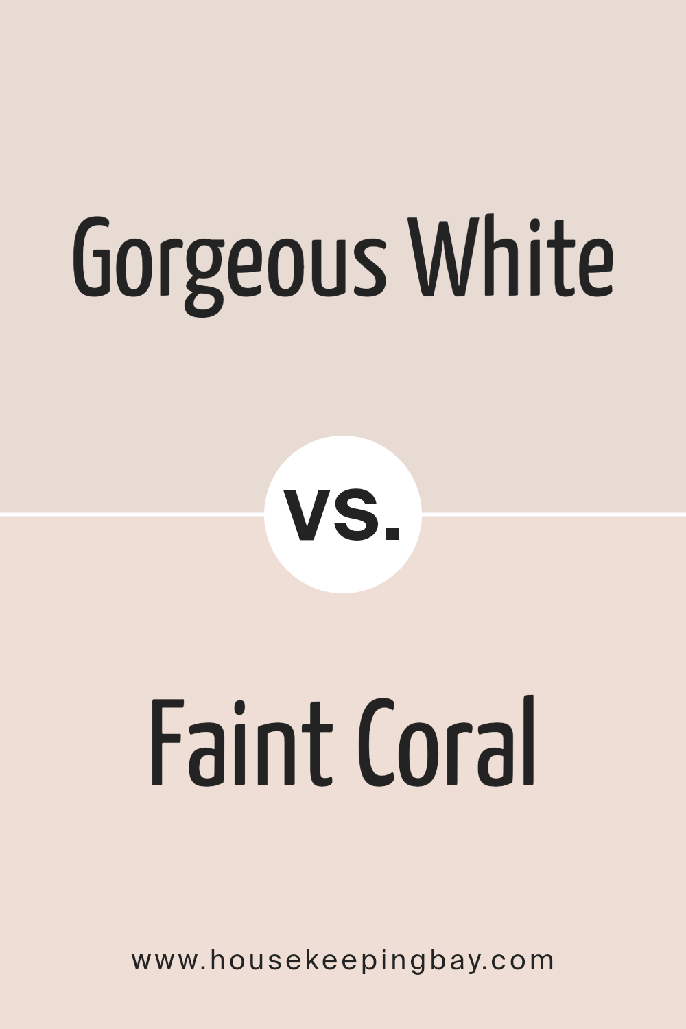
Gorgeous White SW 6049 by Sherwin Williams vs Faint Coral SW 6329 by Sherwin Williams
Gorgeous White SW 6049 by Sherwin Williams is a soft white with a hint of warmth, making it an excellent choice for creating a light and airy space. It offers a clean and fresh look, ideal for making rooms feel larger and more open. Its subtlety allows it to blend well with a variety of design styles and color schemes, providing a neutral backdrop that complements both bold and muted tones.
Faint Coral SW 6329 adds a gentle touch of color with its soft pinkish-peach hue. This color brings a sense of warmth and coziness to a room, offering a subtle yet noticeable contrast against more neutral colors. It works well in spaces where you want to introduce a bit of character without overwhelming the senses.
Paired together, Gorgeous White and Faint Coral create a balanced and inviting palette, perfect for living rooms or bedrooms seeking a cozy yet airy aesthetic.
You can see recommended paint color below:
housekeepingbay.com
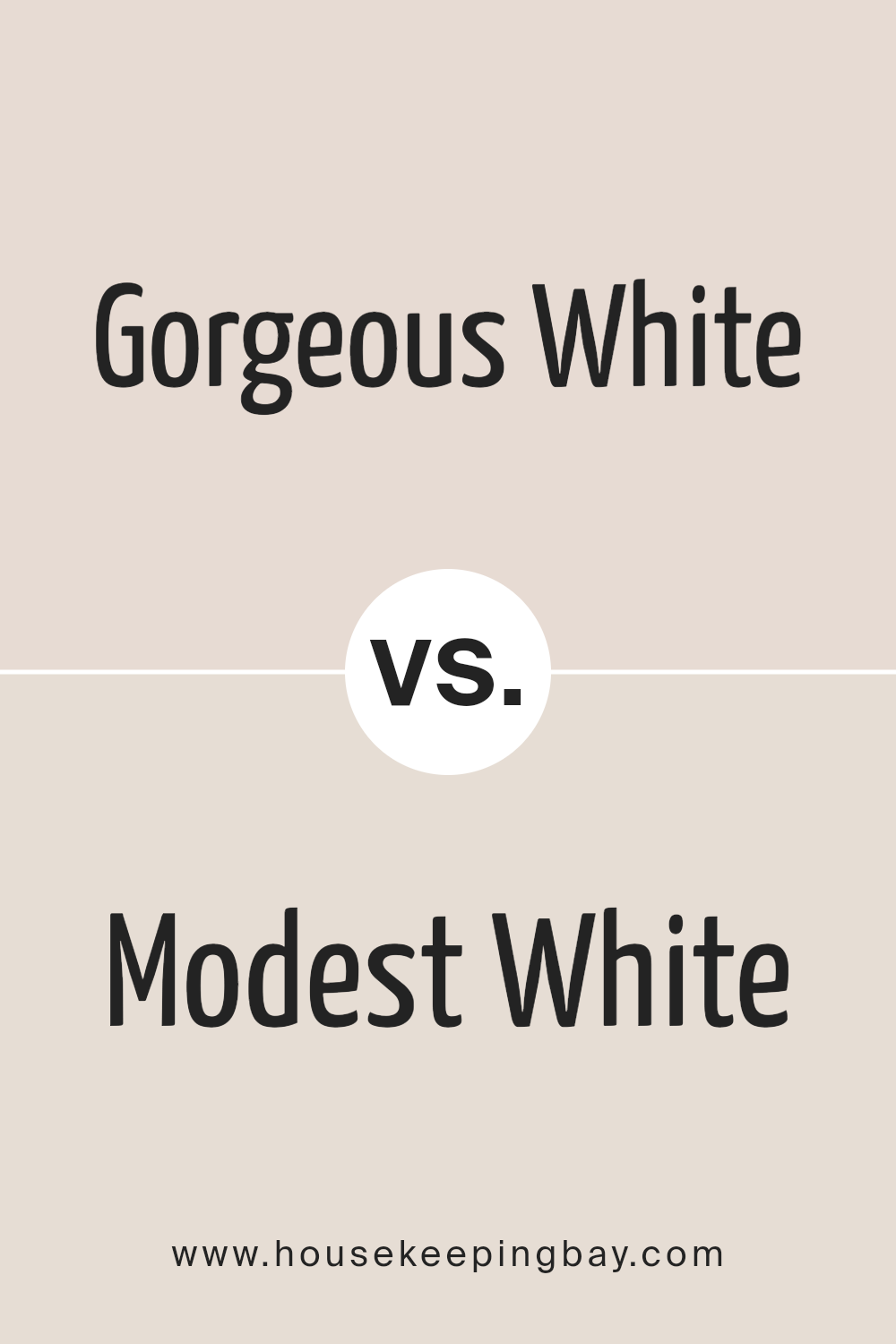
Gorgeous White SW 6049 by Sherwin Williams vs Modest White SW 6084 by Sherwin Williams
Gorgeous White SW 6049 by Sherwin Williams is a soft white with subtle pink undertones, creating a warm and inviting feel. It’s ideal for spaces where you want a bright yet cozy atmosphere. This shade is perfect for living rooms or bedrooms where you want a touch of elegance without being too stark.
Modest White SW 6084, also by Sherwin Williams, leans more toward a creamy off-white with subtle beige tones. It offers a more neutral and grounded appearance compared to Gorgeous White. This color works well in areas where a more understated and calming environment is desired, such as dining rooms or home offices.
Both colors provide a warm ambiance, but Gorgeous White adds a slight blush, while Modest White brings a calming beige. Depending on your style, Gorgeous White suits a more charming setting, while Modest White offers a serene and subtle look.
You can see recommended paint color below:
housekeepingbay.com
Gorgeous White SW 6049 by Sherwin Williams vs Polite White SW 6056 by Sherwin Williams
Gorgeous White SW 6049 and Polite White SW 6056, both by Sherwin Williams, present unique takes on the idea of white. Gorgeous White carries a slight warmth in its tone, making spaces feel inviting and cozy. It works well in living rooms or bedrooms where you want a comforting vibe.
Polite White SW 6056, however, has its own warming qualities, but leans slightly towards a subtle beige undertone. This makes it ideal for spaces needing a gentle, neutral background. Putting these two together, Gorgeous White can seem softer, whereas Polite White gives off a more traditional appearance.
Both colors are versatile, suitable for creating calm and welcoming environments. While Gorgeous White might shine in brighter rooms due to its hint of warmth, Polite White can add depth to areas needing a neutral setting. Both colors complement a variety of styles and decor while maintaining a subtle elegance.
You can see recommended paint color below:
- SW 6056 Polite White
housekeepingbay.com
Gorgeous White SW 6049 by Sherwin Williams vs Nice White SW 6063 by Sherwin Williams
Gorgeous White SW 6049 and Nice White SW 6063, both from Sherwin Williams, bring different tones to a space. Gorgeous White has a warm, inviting feel with subtle pink undertones. This adds a cozy touch, making it suitable for rooms aiming for a soft and comfortable atmosphere. It’s great for areas where you want warmth without overpowering.
Nice White SW 6063, in contrast, leans more neutral. It has beige undertones that make it versatile and adaptable to various settings. Whether you’re going for modern or traditional décor, Nice White provides a clean and balanced backdrop.
Gorgeous White can make a room feel warm and welcoming, while Nice White offers a more neutral and adaptable appearance. Depending on whether you want warmth or neutrality, these whites from Sherwin Williams cater to different preferences, letting you choose the perfect shade for your home.
You can see recommended paint color below:
housekeepingbay.com
Gorgeous White SW 6049 by Sherwin Williams vs Hush White SW 6042 by Sherwin Williams
Gorgeous White SW 6049 by Sherwin Williams is a soft, elegant white with a hint of warmth, making it versatile for various spaces. It creates an inviting and cozy atmosphere, ideal for all types of rooms or as a base color to complement other shades. This white has a gentle presence, adding brightness without feeling stark or cold.
Hush White SW 6042, meanwhile, leans more towards a muted and calm tone. It carries a subtle touch of warmth, but with a quieter and more relaxed vibe. This color is great for spaces that need a more subdued and peaceful ambiance, offering a soothing backdrop without overpowering the room.
In comparison, Gorgeous White is slightly brighter and warmer, while Hush White adds a calm and subdued quality. Both provide lightness but cater to distinct feelings—one more vibrant and welcoming, the other more serene and grounding.
You can see recommended paint color below:
housekeepingbay.com
Gorgeous White SW 6049 by Sherwin Williams vs Everyday White SW 6077 by Sherwin Williams
Gorgeous White SW 6049 by Sherwin Williams offers a soft, creamy base that leans subtly towards warmth. It provides a soothing, balanced backdrop ideal for relaxing spaces. Its understated elegance makes it versatile, accentuating both modern and traditional interiors.
Everyday White SW 6077, while also a neutral, presents a slightly cooler tone. This hue works seamlessly in contemporary settings, providing a crisp, clean appearance. It reflects light efficiently, brightening spaces and making them feel more open.
Both colors create a welcoming, calm environment but have distinct undertones. Gorgeous White suggests a touch of warmth, bringing a cozy, inviting feel. Everyday White, slightly cooler, offers clarity and a fresh, airy vibe. They share a refined simplicity but fit different design goals: one for cozy elegance and the other for clear sophistication.
Their differences lie in warmth versus coolness, influencing mood and perception.
You can see recommended paint color below:
housekeepingbay.com
Gorgeous White SW 6049 by Sherwin Williams vs Intimate White SW 6322 by Sherwin Williams
Gorgeous White SW 6049 and Intimate White SW 6322, both by Sherwin Williams, are soft, gentle colors that bring a sense of warmth and cohesion to a space. Gorgeous White leans towards a subtle, soft lavender undertone, giving it a cool, serene appearance. It works well in spaces where a calm ambiance is desired, offering a fresh backdrop that doesn’t overpower other decor elements.
Intimate White, on the other hand, carries a slight pinkish hue. This warmth makes it ideal for creating cozy, inviting spaces. It adds a touch of warmth without being too bold, making it suitable for bedrooms or living rooms where comfort is key.
Both colors serve well as neutrals, pairing effortlessly with a wide range of accents and furnishings. They both reflect light beautifully, making spaces feel brighter and more open. Choosing between them depends on whether you prefer a cooler or warmer feel in your room.
You can see recommended paint color below:
- SW 6322 Intimate White
housekeepingbay.com
Gorgeous White SW 6049 by Sherwin Williams vs Dreamy White SW 6021 by Sherwin Williams
Gorgeous White SW 6049 and Dreamy White SW 6021 by Sherwin Williams are two soft and subtle shades of white with distinct undertones that set them apart. Gorgeous White leans towards a barely-there blush pink, infusing spaces with a gentle warmth.
It complements rooms that desire a slight touch of color without overpowering them. This tone adds a sense of coziness and comfort, ideal for living rooms or bedrooms seeking calmness.
On the contrary, Dreamy White offers a cooler and more neutral feel. Its undertone is more aligned with beige, giving a classic and timeless appearance. Dreamy White provides a clean and versatile backdrop, perfect for modern and minimalist interiors. It brightens spaces without feeling stark, making it suitable for kitchens or bathrooms.
Both colors provide a sophisticated foundation for interiors, with Gorgeous White adding warmth and Dreamy White offering a crisp and clean environment.
You can see recommended paint color below:
housekeepingbay.com
Gorgeous White SW 6049 by Sherwin Williams vs Cultured Pearl SW 6028 by Sherwin Williams
Gorgeous White SW 6049 and Cultured Pearl SW 6028, both from Sherwin Williams, offer subtle warmth and elegance. Gorgeous White leans towards a slightly creamier white, offering a cozy and inviting atmosphere. It reflects light beautifully and can make a space feel open and airy, perfect for living rooms or bedrooms. Its warmth can complement various styles, from modern to classic, making it versatile.
Cultured Pearl, meanwhile, has a gentle touch of gray, which introduces a cooler undertone compared to Gorgeous White. This color provides a more muted, calming vibe, ideal for spaces requiring a relaxed feel. It pairs well with cool-toned furniture and decor, offering a sophisticated look.
In essence, Gorgeous White imbues spaces with warmth and brightness, while Cultured Pearl adds a soft, neutral backdrop with a hint of sophistication. Both colors are excellent choices, and the selection depends on the desired mood.
You can see recommended paint color below:
housekeepingbay.com
Gorgeous White SW 6049 by Sherwin Williams vs Gauzy White SW 6035 by Sherwin Williams
Gorgeous White SW 6049 by Sherwin Williams gives a bright, clean look to any space. It’s a very pure white, which makes it versatile for different styles and settings. Its clean nature allows it to bounce light effectively around a room, making spaces feel larger and more open.
In contrast, Gauzy White SW 6035, also from Sherwin Williams, provides a softer and slightly warmer appearance. This off-white shade adds a touch of coziness and warmth, making it suitable for creating comfortable and inviting spaces.
While both colors have a fresh and airy feel, the subtle warmth of Gauzy White can make it more suited to complementing natural materials like wood or stone. Gorgeous White is ideal for modern, crisp interiors, and Gauzy White works well in rooms where a relaxed, warm atmosphere is desired.
Matching these shades with the right accents can enhance their individual characteristics.
You can see recommended paint color below:
housekeepingbay.com
Whether in a modern minimalist space or a cozy traditional home, Gorgeous White offers a clean backdrop that effortlessly complements other colors and textures.
I see it as an ideal choice for anyone wanting to refresh their living space. Its ability to reflect light beautifully means it can make even the smallest room feel more open and airy. This color harmonizes well with natural elements like wood and stone, adding a touch of elegance to any space without overwhelming the senses.
For those, like me, who appreciate a serene environment, Gorgeous White offers a subtle yet profound impact. It maintains its charm under different lighting conditions throughout the day, ensuring that the room always feels inviting.
In sum, SW 6049 Gorgeous White proves itself as a timeless color that enhances any space with its simplicity and grace.
housekeepingbay.com
Ever wished paint sampling was as easy as sticking a sticker? Guess what? Now it is! Discover Samplize's unique Peel & Stick samples. Get started now and say goodbye to the old messy way!
Get paint samples


