Fawn Brindle SW 7640 by Sherwin Williams
Bring Warmth and Comfort to Your Space
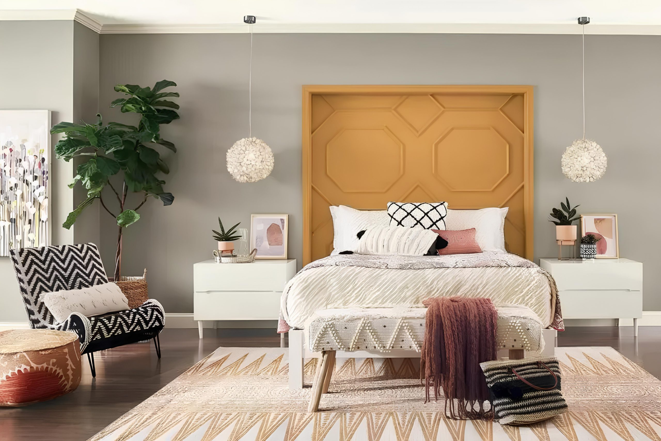
Choosing the right paint color for your space can be as challenging as it is exciting. SW 7640 Fawn Brindle by Sherwin Williams is an option that could offer the perfect balance in your home. This color has a calm and subtle quality, making it suitable for various settings. Whether you’re considering it for a cozy living room or a sophisticated bedroom, Fawn Brindle carries a warm and inviting tone.
This color is not too bold, but it carries enough depth to add interest to your walls. Its unique blend of warm brown and gray provides a grounding effect, which can make any room feel more comforting. It’s a neutral with personality, offering a subtly rich backdrop that complements different styles and furnishings.
If you’ve been trying to find a paint color that can bring cohesion to your space without overpowering it, Fawn Brindle may just be the answer. It works well under different lighting conditions, maintaining its charm in both natural daylight and soft evening light.
This enduring shade seamlessly ties together various elements in a room, from textiles to decorative pieces, making it a dependable choice for any interior project.
via sherwin-williams.com
What Color Is Fawn Brindle SW 7640 by Sherwin Williams?
Table of Contents
Fawn Brindle SW 7640 by Sherwin Williams is a warm, earthy grey with hints of brown, creating a versatile and calming hue. This color has a subtle, soft undertone that gives spaces a welcoming and relaxed feel. In natural light, it can appear light and airy, while in dimmer settings, it brings cozy and grounded vibes.
This shade works wonderfully in a range of interior styles. In modern settings, Fawn Brindle adds warmth and softness to sleek lines and minimalist designs. It complements industrial interiors by balancing raw materials like metal and concrete. For farmhouse or rustic styles, it pairs beautifully with wood accents and natural fibers, enhancing the inviting atmosphere.
Fawn Brindle also pairs well with a variety of materials and textures. It complements warm woods like oak and walnut, enhancing their natural beauty. The color works well with soft textiles such as linen and cotton, adding a touch of elegance. Metals like brass or bronze provide a chic contrast, adding depth to the overall look. Pairing Fawn Brindle with ceramics or stone elements creates a harmonious blend, bringing nature’s simplicity indoors.
Suiting any room, from living areas to bedrooms, Fawn Brindle offers versatility, making it an ideal choice for creating a balanced and harmonious space.
housekeepingbay.com
Is Fawn Brindle SW 7640 by Sherwin Williams Warm or Cool color?
Fawn Brindle SW 7640 by Sherwin Williams is a versatile and warm neutral paint color. It combines a gentle mix of soft taupe and gray, making it a great choice for various rooms in a house. Its neutral tone helps create a cozy and inviting atmosphere in any space. Fawn Brindle pairs well with both modern and traditional styles, offering flexibility in design.
It works beautifully in living rooms, bedrooms, or even hallways, where it adds depth without overwhelming. This color reflects light nicely, making spaces feel more open and airy, yet still warm and welcoming. In rooms with ample natural light, Fawn Brindle appears brighter, while in dimmer rooms, its richness creates a snug environment.
It harmonizes well with whites, wood tones, and even bolder accents, allowing homeowners to easily update or accessorize. Fawn Brindle brings a touch of calmness and sophistication to home interiors.
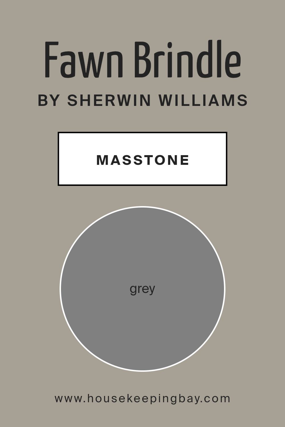
What is the Masstone of the Fawn Brindle SW 7640 by Sherwin Williams?
Fawn Brindle SW 7640 by Sherwin Williams has a masstone of Grey (#808080), which makes it a versatile color for home interiors. Because of its neutral base, it works well in any room. The gray undertones create a calming and balanced look, making a space feel welcoming and comfortable. This color pairs nicely with both warm and cool decor.
In a living room, Fawn Brindle can complement wooden furniture or metal accents. In a bedroom, it can provide a peaceful backdrop for bedding in various colors. Fawn Brindle also adapts to different lighting. In natural light, it might show its warmer beige side, while artificial light can emphasize the gray, giving rooms a cozy feel.
The soft nature of this color makes it an excellent choice for homeowners who want a subtle yet sophisticated look, without overpowering other elements in the room.
housekeepingbay.com
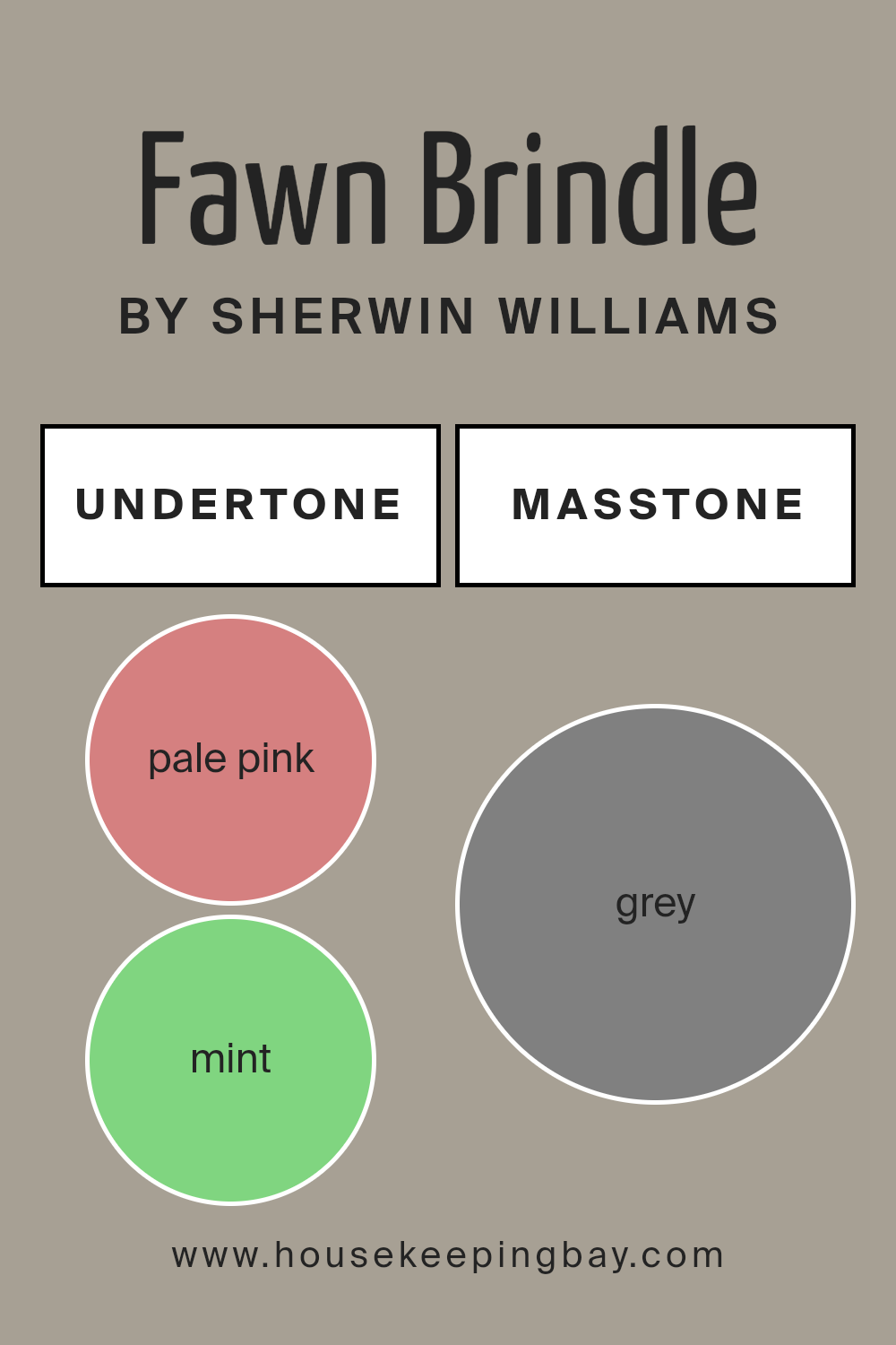
Undertones of Fawn Brindle SW 7640 by Sherwin Williams
Fawn Brindle SW 7640 by Sherwin Williams is a versatile paint color that contains rich and varied undertones, giving it a complex and layered appearance. Some of these undertones include pale pink, mint, pale yellow, lilac, light purple, light blue, and several others. Undertones play a crucial role in how a color is perceived. They can cause the main color to appear warmer or cooler, depending on the lighting and surrounding colors.
In the case of Fawn Brindle, the pale pink and pale yellow undertones tend to add warmth, making the color feel cozy and inviting. On the other hand, the light blue and mint undertones can contribute a cooler, more refreshing vibe. The olive and light green undertones add an earthy feel, grounding the color and making it more neutral. This combination allows Fawn Brindle to adapt to different settings within an interior space.
On interior walls, the presence of these undertones helps Fawn Brindle shift slightly depending on the lighting. In a room with a lot of natural light, the mint and light blue undertones may stand out, creating a crisp and fresh look. In dimmer settings or under incandescent lighting, the warm undertones such as pale pink and orange may become more prominent, offering a softer and more comforting ambiance.
housekeepingbay.com
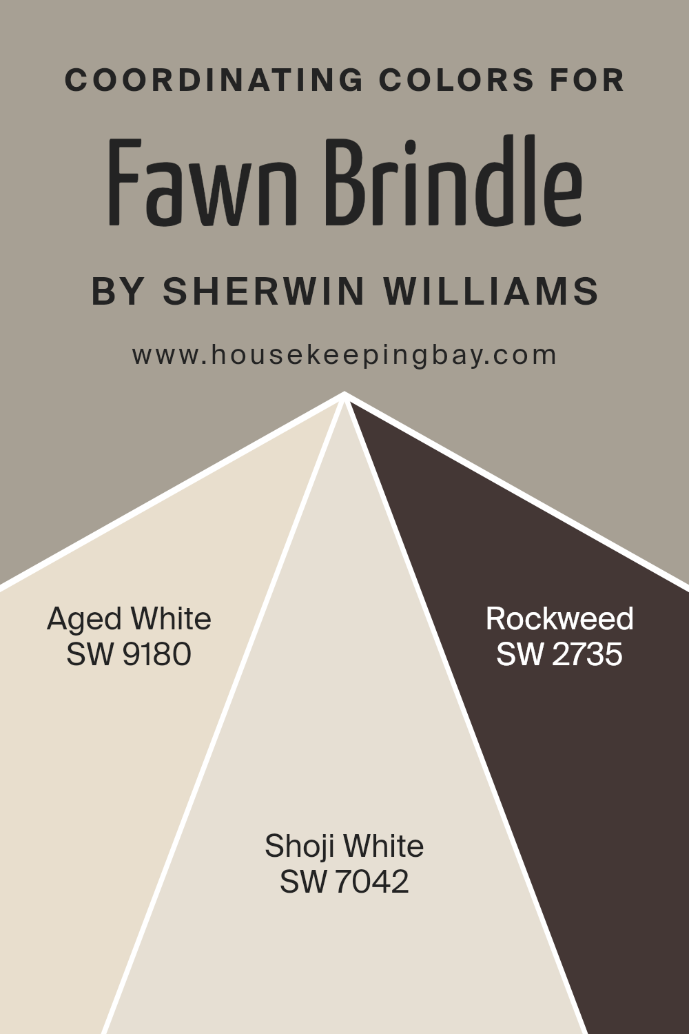
Coordinating Colors of Fawn Brindle SW 7640 by Sherwin Williams
Coordinating colors are shades that complement a primary color in a space and enhance its visual appeal. They create harmony in a room by providing contrast and balance, contributing significantly to the mood and ambiance of the area. For Sherwin Williams’ Fawn Brindle SW 7640, suitable coordinating colors include SW 9180 – Aged White, SW 7042 – Shoji White, and SW 2735 – Rockweed. These shades harmonize with Fawn Brindle, enriching its earthy feel and grounding quality.
Aged White SW 9180 is a warm, creamy hue that adds a soft, inviting touch to any room. It works well with Fawn Brindle, creating a cozy atmosphere by providing a gentle, subtle contrast. Shoji White SW 7042 offers a crisp yet warm shade with gray undertones, lending a modern edge that balances Fawn Brindle’s natural tone.
It enhances the space by adding brightness and lightness. On the other hand, Rockweed SW 2735 is a deep, mossy green, infusing the area with depth and richness. This color pairs with Fawn Brindle by adding a touch of nature and enhancing the overall earthy feeling. Together, these colors create a well-rounded palette, perfect for various design styles.
You can see recommended paint colors below:
housekeepingbay.com
How Does Lighting Affect Fawn Brindle SW 7640 by Sherwin Williams?
Lighting plays a crucial role in how we perceive colors. Different types of light can change how a color looks. With natural light, time of day and the room’s direction affect how colors appear. Artificial lighting, like LED, fluorescent, or incandescent lights, also changes color perception.
Fawn Brindle SW 7640 by Sherwin Williams is a neutral, earthy tone. This color can change depending on the lighting. In natural light, Fawn Brindle can appear warmer or cooler. In bright, direct sunlight, it may seem more muted. In dimmer light, it might look darker and richer.
In a north-facing room, where light is generally cooler and softer, Fawn Brindle may appear slightly more grayish or muted. This is because northern light doesn’t have warm tones. The color might feel calm but a little subdued.
In a south-facing room, which gets more direct sunlight and warmer light, Fawn Brindle will typically look brighter and warmer. The color can have more vibrant undertones, bringing out any warmth in the paint.
In an east-facing room, the morning light is cool and bluish, but in the afternoon, the room becomes shadowed. Fawn Brindle in the morning might seem serene and slightly gray, while later in the day, it could take on a more neutral tone.
In a west-facing room, the morning light is duller, but the afternoon brings warm, golden light. Here, Fawn Brindle might appear muted in the morning but take on a warmer, richer tone in the late afternoon and evening.
In artificial light, the color can vary based on the bulb type. Under incandescent light, Fawn Brindle might appear warmer and more yellow. LED lighting can make it seem cooler or closer to its true color, depending on the bulb’s warmth. Fluorescent lighting might make it seem more washed out or neutral.
Each light source brings out different qualities of Fawn Brindle, affecting how it complements other colors and furnishings in a space.

housekeepingbay.com
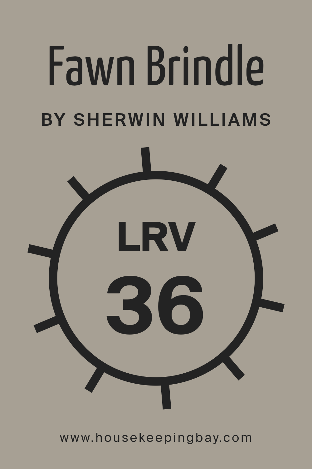
What is the LRV of Fawn Brindle SW 7640 by Sherwin Williams?
LRV, or Light Reflectance Value, is a measure used to determine how much light a color reflects compared to how much it absorbs. This value is on a scale from 0 to 100, where 0 means the color completely absorbs all light (like true black), and 100 means it reflects all the light (like pure white). When choosing paint colors, the LRV helps understand how light or dark a color will appear once applied to walls.
A higher LRV means the color will look lighter and brighter, making spaces feel larger and more open. Conversely, a lower LRV means the color will absorb more light, appearing darker and potentially making the space feel more intimate or smaller.
For the color Fawn Brindle by Sherwin Williams, with an LRV of 35.534, it means the color leans to the darker side of the spectrum. It reflects a moderate amount of light and absorbs slightly more than a lighter shade would. This can make it a good choice for creating a cozy atmosphere in a room. Fawn Brindle’s deeper tone can add warmth and depth to spaces, and it might look different depending on how much natural light is in the room.
In a well-lit space, it might still reveal its undertones, while in a dimmer space, it will appear richer and darker. The LRV is important for ensuring that the color matches the intended mood and function of the room.
housekeepingbay.com
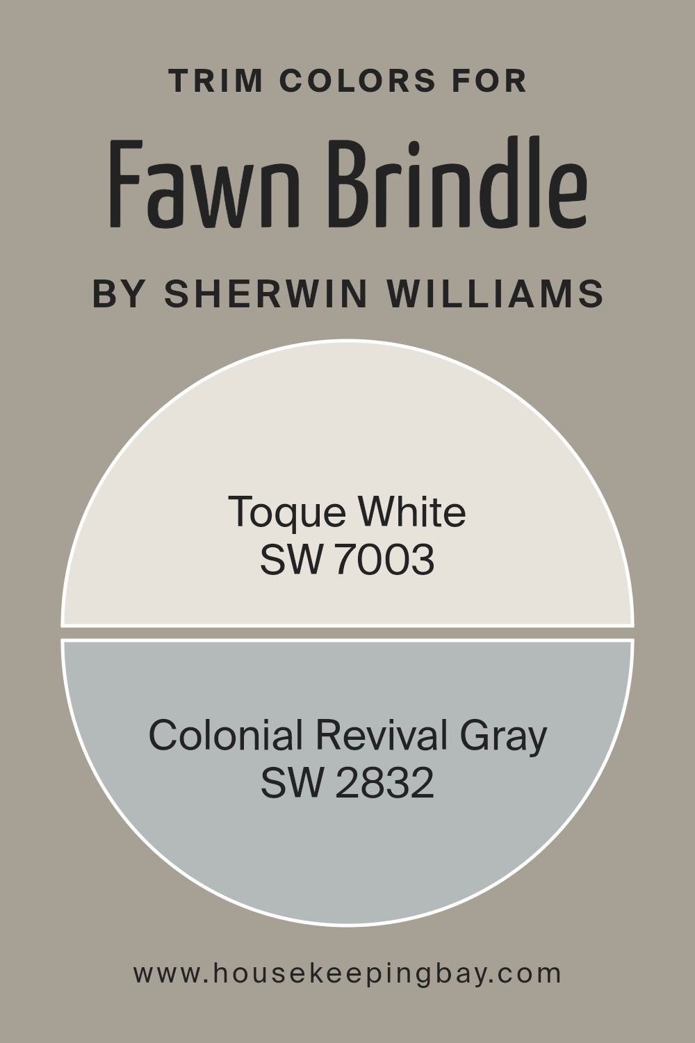
What are the Trim colors of Fawn Brindle SW 7640 by Sherwin Williams?
Trim colors refer to the colors used on the edges, moldings, door frames, and other boundary elements of a space to create contrast or complement the primary wall color. They play a vital role in defining the architectural details of a room and adding depth to the overall design. Fawn Brindle SW 7640 by Sherwin Williams benefits greatly from thoughtfully chosen trim colors as they help emphasize its warm, earthy undertones.
Toque White SW 7003, a soft, muted white, offers a subtle contrast that brightens and freshens a space without overpowering the primary hue. This choice maintains a sense of light and space while allowing the primary color to remain prominent.
On the other hand, Colonial Revival Gray SW 2832 provides a more traditional, refined look that pairs well with the gentle warmth of Fawn Brindle. This gray offers a balance of coolness that can enhance the character of a room, giving it a more classic appeal.
This choice can make the space appear more sophisticated, as it blends understated elegance with the natural, earthy tones of the primary shade. Using these trim colors can significantly influence the room’s atmosphere, highlighting architectural features while creating a pleasing visual contrast with Fawn Brindle.
You can see recommended paint colors below:
housekeepingbay.com
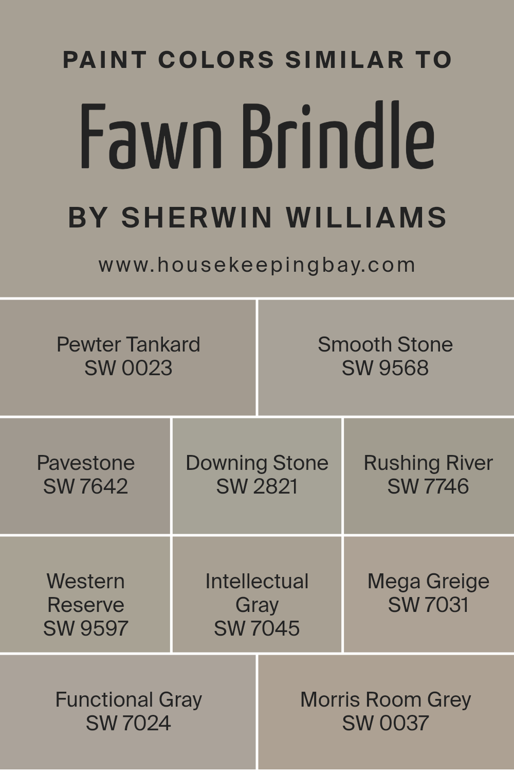
Colors Similar to Fawn Brindle SW 7640 by Sherwin Williams
Similar colors are crucial in design because they create harmony and a soothing environment. When colors are alike, they work together to create a seamless look that feels balanced and visually pleasing. Fawn Brindle by Sherwin Williams serves as an anchor, with colors like Pewter Tankard and Smooth Stone complementing it by offering a subtle play between warm and cool tones.
Pavestone adds depth with its rich, muted gray, while Downing Stone introduces a classic, timeless feel. Rushing River brings a touch of earthy warmth that can make spaces feel cozy and inviting. Western Reserve, with its deeper hue, adds a sense of grounded stability.
Intellectual Gray carries a serene air, balancing between modern and classic aesthetics. Mega Greige, with its neutral undertones, allows other colors to shine while maintaining a grounded base. Functional Gray offers a versatile option, lending spaces a look of understated elegance.
Morris Room Grey, with its slightly darker shade, can infuse rooms with a sophisticated, traditional ambiance. Together, these colors align to create a palette that is cohesive and versatile, suited for various styles and settings. They complement each other without overwhelming, offering a backdrop where other design elements can shine.
You can see recommended paint colors below:
- SW 0023 Pewter Tankard
- SW 9568 Smooth Stone
- SW 7642 Pavestone
- SW 2821 Downing Stone
- SW 7746 Rushing River
- SW 9597 Western Reserve
- SW 7045 Intellectual Gray
- SW 7031 Mega Greige
- SW 7024 Functional Gray
- SW 0037 Morris Room Grey
housekeepingbay.com
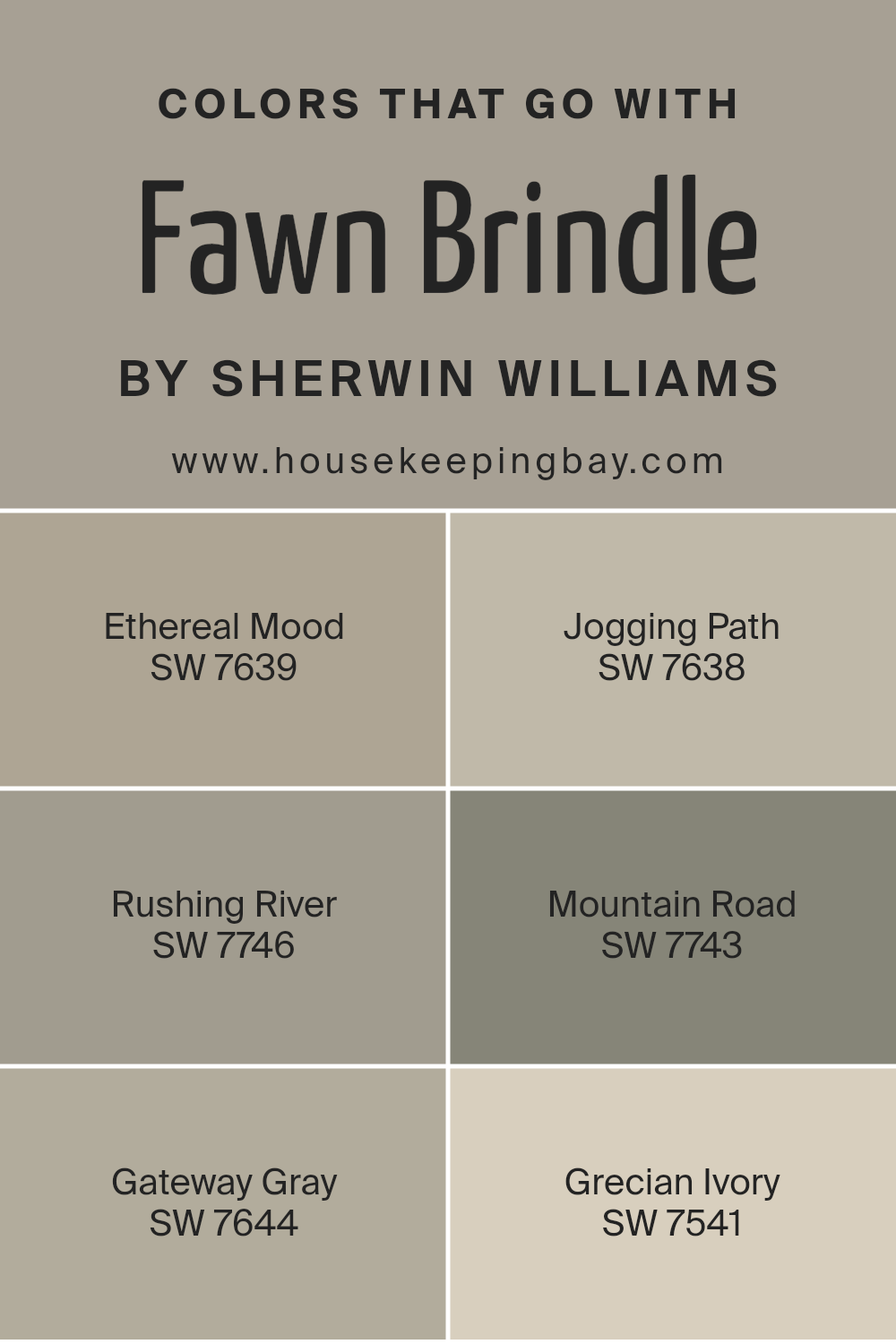
Colors that Go With Fawn Brindle SW 7640 by Sherwin Williams
Fawn Brindle SW 7640 by Sherwin Williams is a versatile and warm neutral that pairs beautifully with a range of hues. The colors chosen to accompany it create a harmonious palette that enhances any space. SW 7639 Ethereal Mood is a soft, muted gray that adds a calming effect, making it perfect for bedrooms or relaxation areas. SW 7638 Jogging Path, with its earthy undertones, complements Fawn Brindle by adding depth and a touch of nature, ideal for living rooms or entryways.
SW 7746 Rushing River introduces a muted green that provides a refreshing contrast, bringing a sense of the outdoors inside, while SW 7743 Mountain Road, a deep and rich green, adds a dramatic touch, perfect for feature walls or accent pieces.
SW 7644 Gateway Gray, a warm gray with brown undertones, subtly ties everything together, offering a cohesive feel ideal for open spaces. Finally, SW 7541 Grecian Ivory delivers a light, creamy hue that brightens up the palette, making spaces feel airy and inviting. Each color has its unique role, contributing to a balanced design that enhances the natural appeal of Fawn Brindle.
You can see recommended paint colors below:
- SW 7639 Ethereal Mood
- SW 7638 Jogging Path
- SW 7746 Rushing River
- SW 7743 Mountain Road
- SW 7644 Gateway Gray
- SW 7541 Grecian Ivory
housekeepingbay.com
How to Use Fawn Brindle SW 7640 by Sherwin Williams In Your Home?
Fawn Brindle SW 7640 by Sherwin Williams is a versatile paint color, perfect for creating a cozy atmosphere in any home. This warm, neutral shade of brown has subtle gray undertones, making it a great choice for rooms where you want a calming and inviting feel. Use it in the living room or bedroom to add warmth without overwhelming the space. It pairs well with both light and dark furniture, allowing for flexibility in decor.
In the kitchen, Fawn Brindle can add depth to your cabinetry or accent walls, complementing stainless steel appliances and wood finishes.
In the bathroom, it creates a spa-like atmosphere when paired with white fixtures and soft, plush towels. Consider using it on accent pieces like a feature wall or bookshelves to bring cohesion to open-plan areas. This color also works wonderfully in hallways and entryways, creating a seamless transition from room to room.
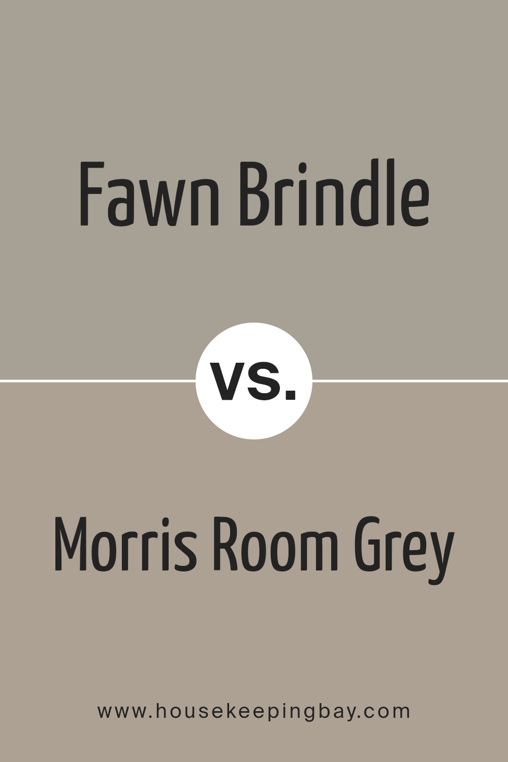
Fawn Brindle SW 7640 by Sherwin Williams vs Morris Room Grey SW 0037 by Sherwin Williams
Fawn Brindle SW 7640 by Sherwin Williams presents a warm, earthy tone, reminiscent of natural elements like sand or clay. This color creates a cozy, inviting atmosphere, ideal for living rooms or bedrooms where comfort matters. Its rich undertone often blends well with a variety of furniture and accessories, making it a versatile choice for different styles.
Morris Room Grey SW 0037, also by Sherwin Williams, offers a more neutral, classic aesthetic. This shade resembles the soft, muted grey of weathered stones or antique textiles.
It brings a sense of calm and sophistication, suitable for both traditional and contemporary spaces. Because of its subdued nature, this color complements a wide range of color palettes, working well with both bold and subtle accents.
While Fawn Brindle adds warmth and earthiness, Morris Room Grey provides neutrality and elegance. Both colors can enhance homes but evoke different moods and stylistic expressions.
You can see recommended paint color below:
- SW 0037 Morris Room Grey
housekeepingbay.com
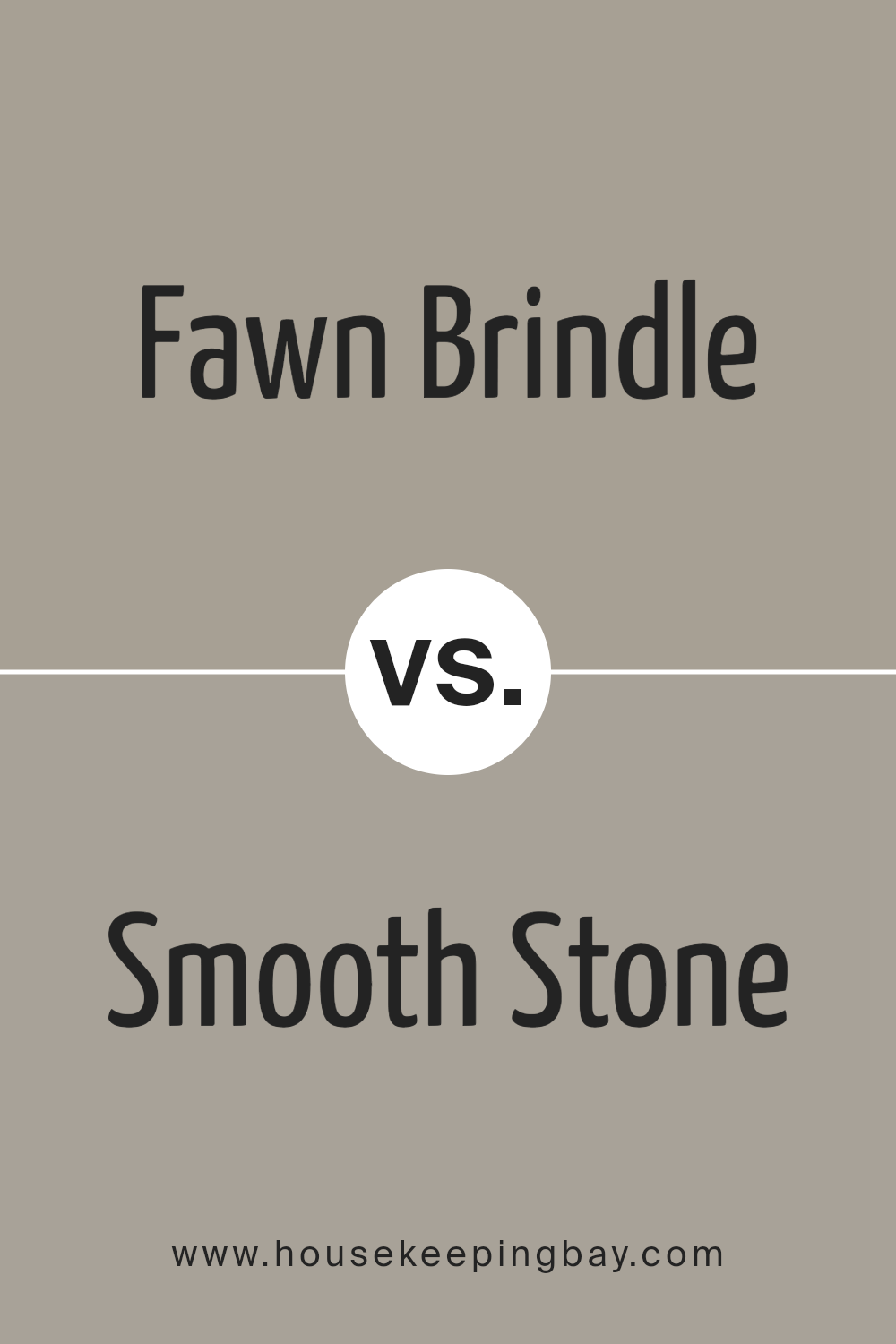
Fawn Brindle SW 7640 by Sherwin Williams vs Smooth Stone SW 9568 by Sherwin Williams
Fawn Brindle SW 7640 by Sherwin Williams is a warm, earthy tone that balances brown and gray. It brings a cozy and inviting feel to a room, making it a great choice for living spaces and bedrooms. Its neutral quality allows it to pair well with various colors and materials, complementing both modern and traditional decor styles.
Smooth Stone SW 9568, another color by Sherwin Williams, is a lighter gray. It offers a calm and subtle appearance, adding brightness while maintaining neutrality. This shade serves well in rooms with less natural light, helping to open up spaces and provide a clean backdrop for colorful accents or furniture.
Both colors provide versatility, yet they offer different vibes: Fawn Brindle’s warmth suits spaces needing a snug touch, while Smooth Stone’s lighter tone benefits areas looking for a peaceful and airy atmosphere. Each complements various interior designs, enhancing room aesthetics with its unique shade.
You can see recommended paint color below:
- SW 9568 Smooth Stone
housekeepingbay.com
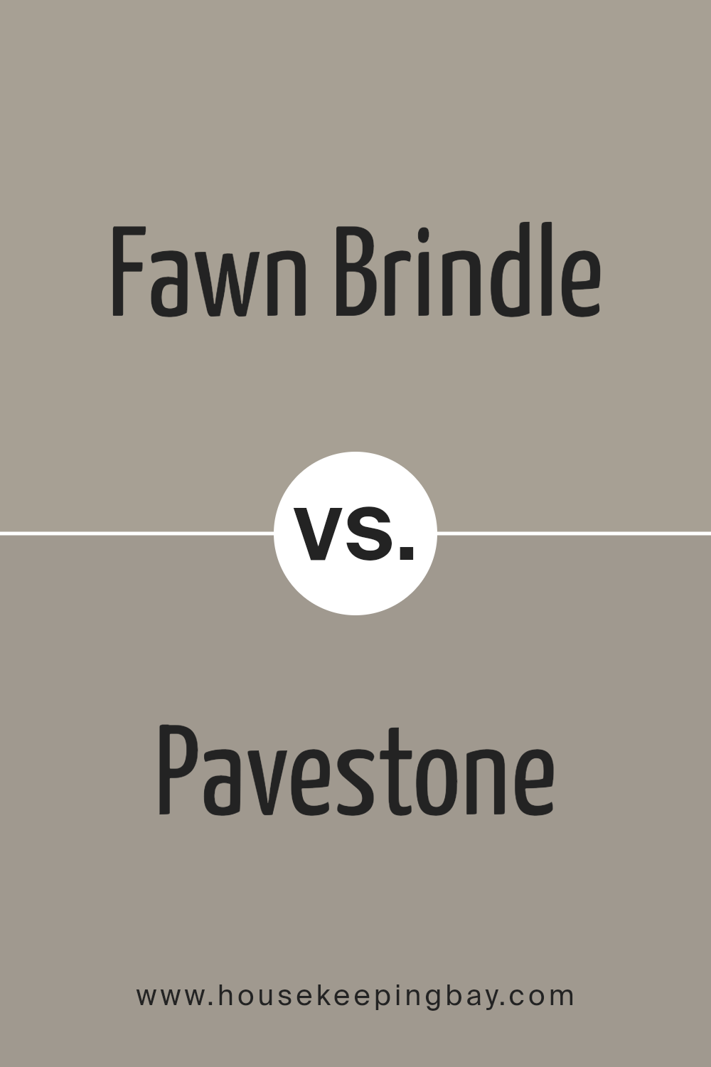
Fawn Brindle SW 7640 by Sherwin Williams vs Pavestone SW 7642 by Sherwin Williams
Fawn Brindle SW 7640 by Sherwin Williams presents a warm, earthy tone with its subtle mix of gray and brown. Its versatile nature works well in various settings, from cozy living rooms to welcoming entryways. This color provides a natural, grounded feel, complementing wood textures and soft, muted decor. It offers a comforting backdrop, making spaces feel calm and inviting.
Pavestone SW 7642, also by Sherwin Williams, carries a cooler grayish-brown hue. It leans slightly more toward gray, providing a more contemporary and sophisticated vibe. Ideal for modern spaces, Pavestone offers a sleek, clean look, making it a good choice for kitchen cabinets or stylish office setups. It pairs beautifully with metal accents and crisp white trims, adding depth and character.
While both colors belong to the same family and can harmonize well, Fawn Brindle brings warmth, while Pavestone introduces cool elegance.
You can see recommended paint color below:
housekeepingbay.com
Fawn Brindle SW 7640 by Sherwin Williams vs Western Reserve SW 9597 by Sherwin Williams
Fawn Brindle SW 7640 by Sherwin Williams is a soft, earthy brown shade with subtle gray undertones. It feels warm and inviting, making it an excellent choice for creating cozy spaces in homes. The color strikes a balance between neutrality and depth, making it versatile enough to pair with various design elements, from wooden accents to vibrant, colorful decor.
Western Reserve SW 9597, also by Sherwin Williams, offers a more traditional and muted appearance. It leans towards a historic and classic vibe, characterized by its deeper gray tones. This shade has a touch of understated elegance, perfect for those aiming for a sophisticated yet timeless look.
While Fawn Brindle exudes warmth and coziness, Western Reserve projects a cool and subdued atmosphere. Both colors are neutral, but their distinct undertones provide varied moods—one is inviting and earthy, while the other feels classic and dignified. Choosing between them would depend on the desired ambiance.
You can see recommended paint color below:
- SW 9597 Western Reserve
housekeepingbay.com
Fawn Brindle SW 7640 by Sherwin Williams vs Pewter Tankard SW 0023 by Sherwin Williams
Fawn Brindle SW 7640 and Pewter Tankard SW 0023 by Sherwin Williams are two popular colors with distinct characteristics. Fawn Brindle is a soft, muted brown with hints of gray, creating a warm, earthy tone. This color works well in living spaces where you want to create an inviting, cozy atmosphere. It pairs beautifully with natural wood accents and lighter neutral colors, adding depth without overpowering the room.
Pewter Tankard, a slightly deeper gray with undertones of green, offers a more modern and sophisticated look. Its cool tone can enhance contemporary settings, providing a clean and crisp backdrop that complements sleek furniture and metallic accents. This color fits well in spaces aiming for an elegant and polished feel.
When choosing between them, consider Fawn Brindle for warmth and comfort, while Pewter Tankard suits spaces seeking a sleek, modern vibe. Both colors can transform a room’s mood effectively through their unique palettes.
You can see recommended paint color below:
- SW 0023 Pewter Tankard
housekeepingbay.com
Fawn Brindle SW 7640 by Sherwin Williams vs Functional Gray SW 7024 by Sherwin Williams
Fawn Brindle SW 7640 by Sherwin Williams is a warm, earthy tone with subtle brown and gray undertones. It feels cozy and inviting, making spaces feel comfortable and connected with nature. It works well in living rooms, bedrooms, or spaces where you want a warm, welcoming atmosphere.
Functional Gray SW 7024, also by Sherwin Williams, is a cooler shade of gray. It leans more towards a neutral gray, providing a clean and polished look. This color suits modern and minimalist spaces, creating a sleek and sophisticated environment without feeling stark.
Both colors can be paired with different accents to suit various styles. Fawn Brindle pairs well with warm, natural wood tones or light creams, enhancing its earthy feel. Functional Gray pairs nicely with crisp whites and metallics, adding contrast and elegance. While Fawn Brindle adds warmth to a room, Functional Gray brings a chic, versatile backdrop, allowing decorative elements to stand out.
You can see recommended paint color below:
- SW 7024 Functional Gray
housekeepingbay.com
Fawn Brindle SW 7640 by Sherwin Williams vs Rushing River SW 7746 by Sherwin Williams
Fawn Brindle SW 7640 by Sherwin Williams offers a warm, earthy tone. It resembles natural stone with a versatile taupe base, which makes it suitable for creating a cozy atmosphere. It’s a great backdrop when seeking comfort in a space. This color works well in living rooms or bedrooms, where it adds a touch of nature-inspired calmness.
Rushing River SW 7746, meanwhile, leans towards a soft greenish hue. It brings in a more natural, fresh vibe. This shade feels airy and slightly cool, perfect for creating a relaxed environment. Ideal for kitchens or bathrooms, it adds a hint of the outdoors into your home.
Both colors work well with other naturals and muted tones, but Fawn Brindle adds warmth with its brown undertones, while Rushing River offers a breezy, light presence. They balance each other, yet each has a unique contribution to an interior space.
You can see recommended paint color below:
housekeepingbay.com
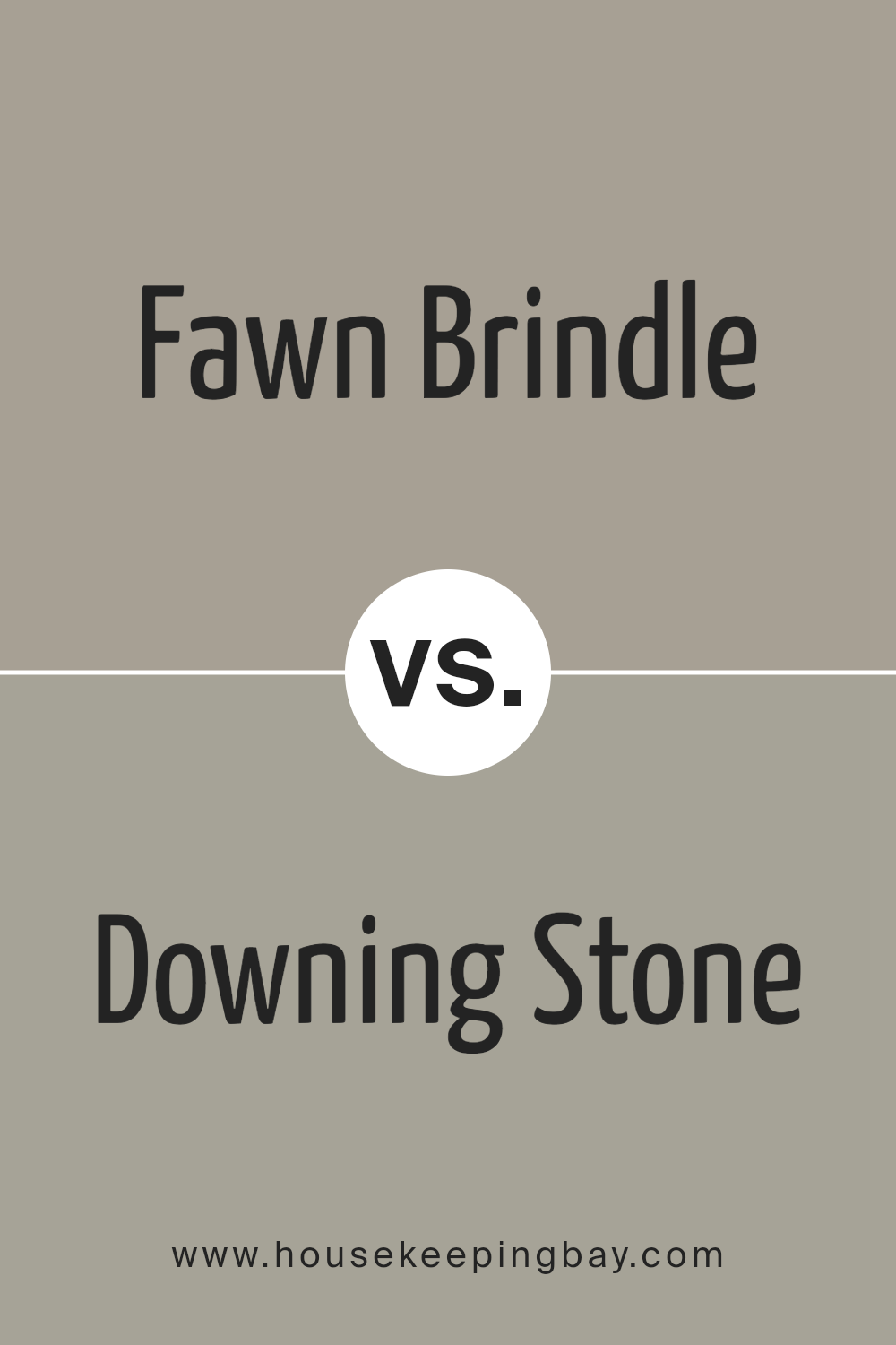
Fawn Brindle SW 7640 by Sherwin Williams vs Downing Stone SW 2821 by Sherwin Williams
Fawn Brindle SW 7640 and Downing Stone SW 2821 by Sherwin Williams differ in mood and hue. Fawn Brindle offers a soft, warm gray with hints of brown, adding coziness and comfort to spaces. It suits living rooms or bedrooms where a welcoming atmosphere feels crucial.
In contrast, Downing Stone presents a medium gray with earthy undertones, lending a more traditional, grounded feel. It fits well in areas aiming for sophistication or formality, like studies or dining rooms. Both colors work neutrally, allowing flexibility in design. Fawn Brindle pairs nicely with soft whites and muted pastels for a gentle feel, while Downing Stone harmonizes with deep blues or rich wood tones for a classic look.
Ultimately, Fawn Brindle adds warmth, creating spaces that feel inviting, while Downing Stone contributes depth, bringing stability and timelessness. Each color carries its unique character, making them suitable for different styles and preferences.
You can see recommended paint color below:
housekeepingbay.com
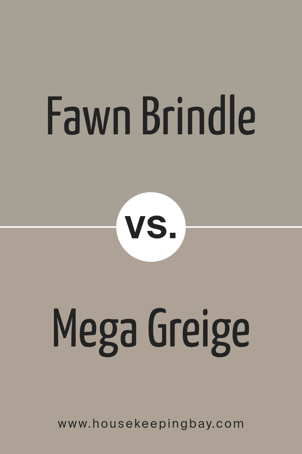
Fawn Brindle SW 7640 by Sherwin Williams vs Mega Greige SW 7031 by Sherwin Williams
Fawn Brindle SW 7640 and Mega Greige SW 7031 by Sherwin Williams both belong to the neutral color family, yet they offer distinct vibes.
Fawn Brindle presents softly muted taupe with a subtle hint of warmth. This color often exudes a cozy, inviting atmosphere, making spaces feel comfortable without overwhelming them. It works well in living spaces, providing a backdrop that complements various styles and furnishings.
Mega Greige, a bit darker and more robust, carries stronger gray undertones with hints of brown. This shade tends to provide a more grounded, sophisticated look. Its depth gives rooms a modern and elegant feel, ideal for those who prefer a more contemporary aesthetic.
While both colors share versatility and ease of coordination, Fawn Brindle leans slightly warmer, adding subtle warmth, whereas Mega Greige offers a more balanced, neutral tone. These differences can help you decide based on the mood and style you’d like to achieve.
You can see recommended paint color below:
housekeepingbay.com
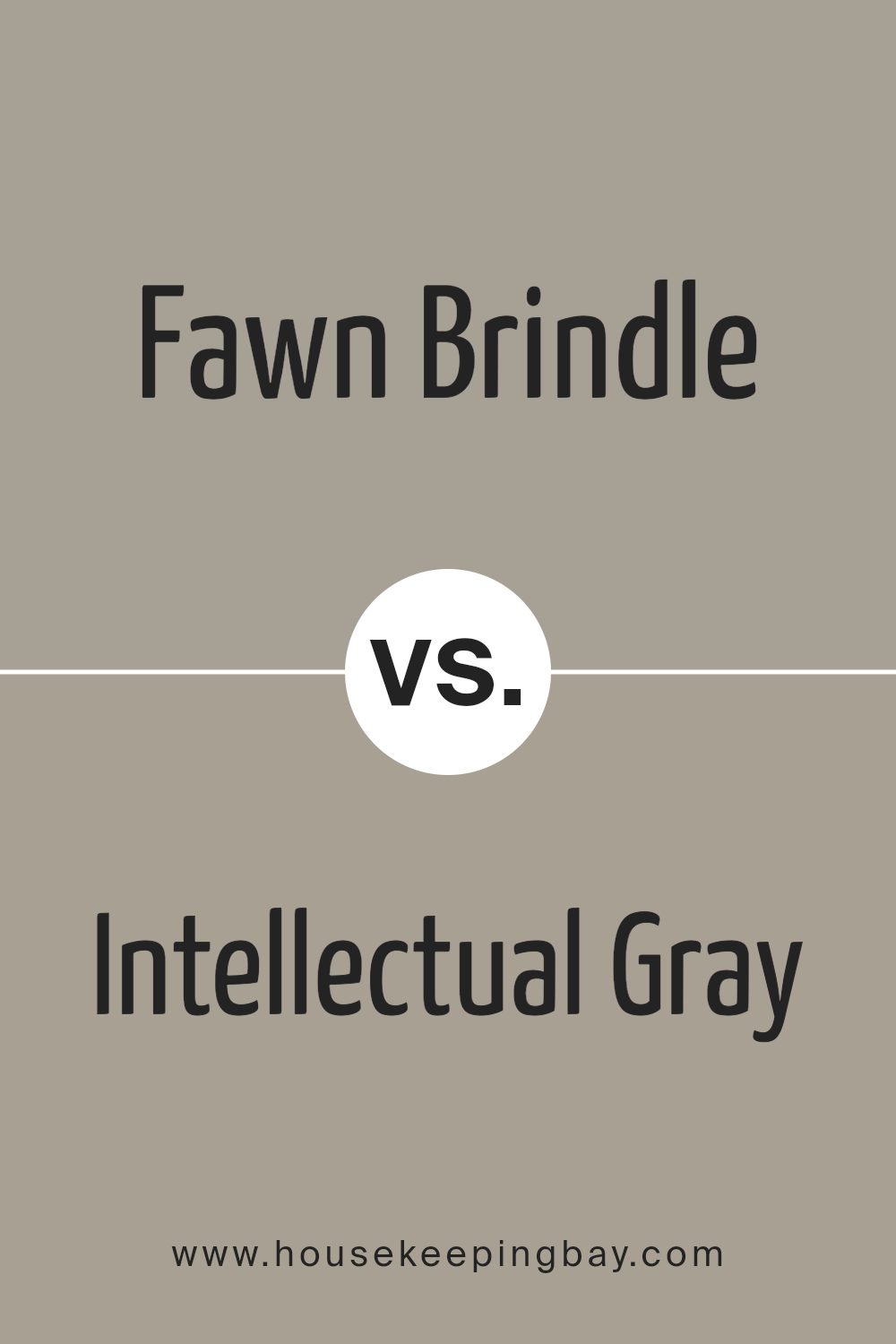
Fawn Brindle SW 7640 by Sherwin Williams vs Intellectual Gray SW 7045 by Sherwin Williams
Fawn Brindle SW 7640 and Intellectual Gray SW 7045, both from Sherwin Williams, offer unique appeals. Fawn Brindle is a warm, earthy color with subtle brown and green undertones. It evokes comfort and coziness, making it suitable for creating an inviting atmosphere in spaces like living rooms or bedrooms.
Intellectual Gray SW 7045, in contrast, possesses a cooler, neutral tone with a mix of gray and beige. This hue brings sophistication and calmness, fitting well in both modern and traditional settings. Intellectual Gray acts as a versatile backdrop, enhancing other colors and decor elements in a room.
While Fawn Brindle enriches spaces with warmth, Intellectual Gray provides a cooler, more understated look. Both colors work beautifully, depending on the desired ambiance. Fawn Brindle suits areas meant for relaxation and connection, whereas Intellectual Gray excels in spaces where a neutral, balanced environment is preferred.
You can see recommended paint color below:
housekeepingbay.com
Conclusion
In considering SW 7640 Fawn Brindle by Sherwin Williams, I find this color offers a unique blend of warmth and neutrality. It presents itself as a versatile choice, capable of complementing a variety of spaces and styles. Its muted, earthy tone brings a subtle richness that can add depth to any room without being overpowering.
This makes it an ideal backdrop for both contemporary and traditional decor. I appreciate how Fawn Brindle adapts well to different lighting conditions, maintaining its warm, natural hue throughout the day.
In bedrooms, it promotes a sense of calm and relaxation, while in living areas, it enhances an inviting atmosphere that might make one feel at ease and at home. It pairs well with other natural colors and materials, such as wood and stone, which can further accentuate its earthy undertones. Fawn Brindle’s understated elegance allows for creativity in accent piece selection, offering flexibility to play with bolder colors or textures within a space.
Overall, I believe Fawn Brindle makes a reliable choice for those seeking a dependable and charming color that contributes to a comforting, stylish environment. Whether working with existing decor or beginning anew, its adaptable nature can provide the perfect solution to creating cohesive and appealing surroundings.
housekeepingbay.com
Ever wished paint sampling was as easy as sticking a sticker? Guess what? Now it is! Discover Samplize's unique Peel & Stick samples. Get started now and say goodbye to the old messy way!
Get paint samples


