Ethereal Mood SW 7639 by Sherwin Williams
Calm Colors for a Peaceful, Cozy Home
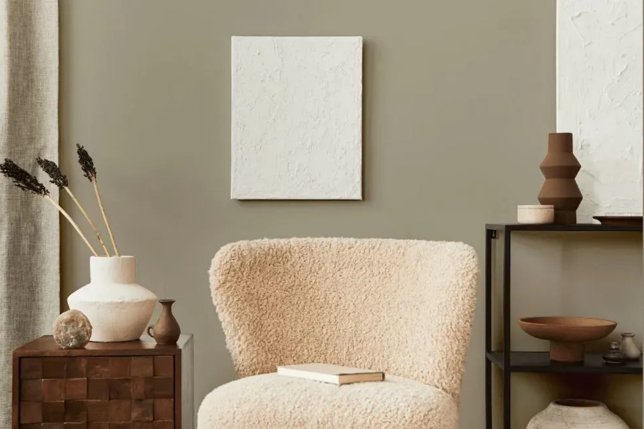
Choosing the perfect paint color can change how a room feels, and Sherwin-Williams’ SW 7639 Ethereal Mood might just be the shade you need. Imagine a space that feels serene and calming. Ethereal Mood is a soft, muted gray with beautiful undertones that can create a peaceful atmosphere in any room. Its neutral tone makes it a great choice for anyone looking to add a touch of elegance and calm.
The versatility of Ethereal Mood means it can work well in both large and small spaces. Whether you’re updating a cozy bedroom or refreshing a spacious living area, this color provides a subtle backdrop that pairs well with a variety of other colors and materials.
You might choose to highlight it with bold accents or keep everything in soft, gentle shades for a cohesive look.
What makes Ethereal Mood special is its ability to reflect light differently throughout the day. In the morning, it may appear slightly cooler, while in the afternoon, it could take on a warmer hue.
This dynamic quality ensures that your room will always feel fresh and inviting. It’s a shade that seamlessly combines simplicity and sophistication.
via plan-home.com
What Color Is Ethereal Mood SW 7639 by Sherwin Williams?
Table of Contents
Ethereal Mood SW 7639 by Sherwin Williams is a muted, soft gray with subtle blue undertones. This color exudes a serene and calming atmosphere, perfect for creating a peaceful ambiance in a room. Its versatility makes it a great choice for various interior styles.
In minimalist or modern spaces, Ethereal Mood can provide a clean backdrop that allows furniture and décor to stand out. When used in coastal-themed interiors, its cool undertones mimic the sky or sea, enhancing the overall theme.
It also suits Scandinavian designs, where its simplicity complements natural materials and uncluttered spaces.
Pairing Ethereal Mood with materials like light woods can amplify the warmth of the wood, balancing out the coolness of the paint. Using textures such as woven fabrics or soft cottons enhances its soft, relaxing feel.
Metal accents in silver or brushed nickel add a modern touch, while natural elements like stone or ceramic can give a rustic feel.
This color works well with whites, creams, and other neutrals to maintain a cohesive and soothing palette. It’s also a great backdrop for pops of color, like muted greens or soft blues, bringing in a touch of nature.
Overall, Ethereal Mood is versatile, making any space inviting and comfortable.
housekeepingbay.com
Is Ethereal Mood SW 7639 by Sherwin Williams Warm or Cool color?
Ethereal Mood SW 7639 by Sherwin Williams is a soft, muted gray with subtle undertones that bring a sense of calm to any room. This shade’s gentle tone helps create a cozy, inviting atmosphere in homes. It pairs well with other neutral shades or bolder colors, allowing for versatility in design.
When used on walls, Ethereal Mood acts as a grounding element, making spaces feel larger and airy. Its understated elegance makes it suitable for living rooms, bedrooms, or even kitchens. The color’s muted nature allows furniture and decor to stand out without clashing.
It works well with natural materials like wood and stone, creating a harmonious blend.
Additionally, Ethereal Mood adjusts beautifully to different lighting conditions. In natural daylight, it feels airy, while in the evening, it warms up, adding depth.
Whether in modern or traditional settings, Ethereal Mood offers a timeless backdrop that enhances the look and feel of any home.
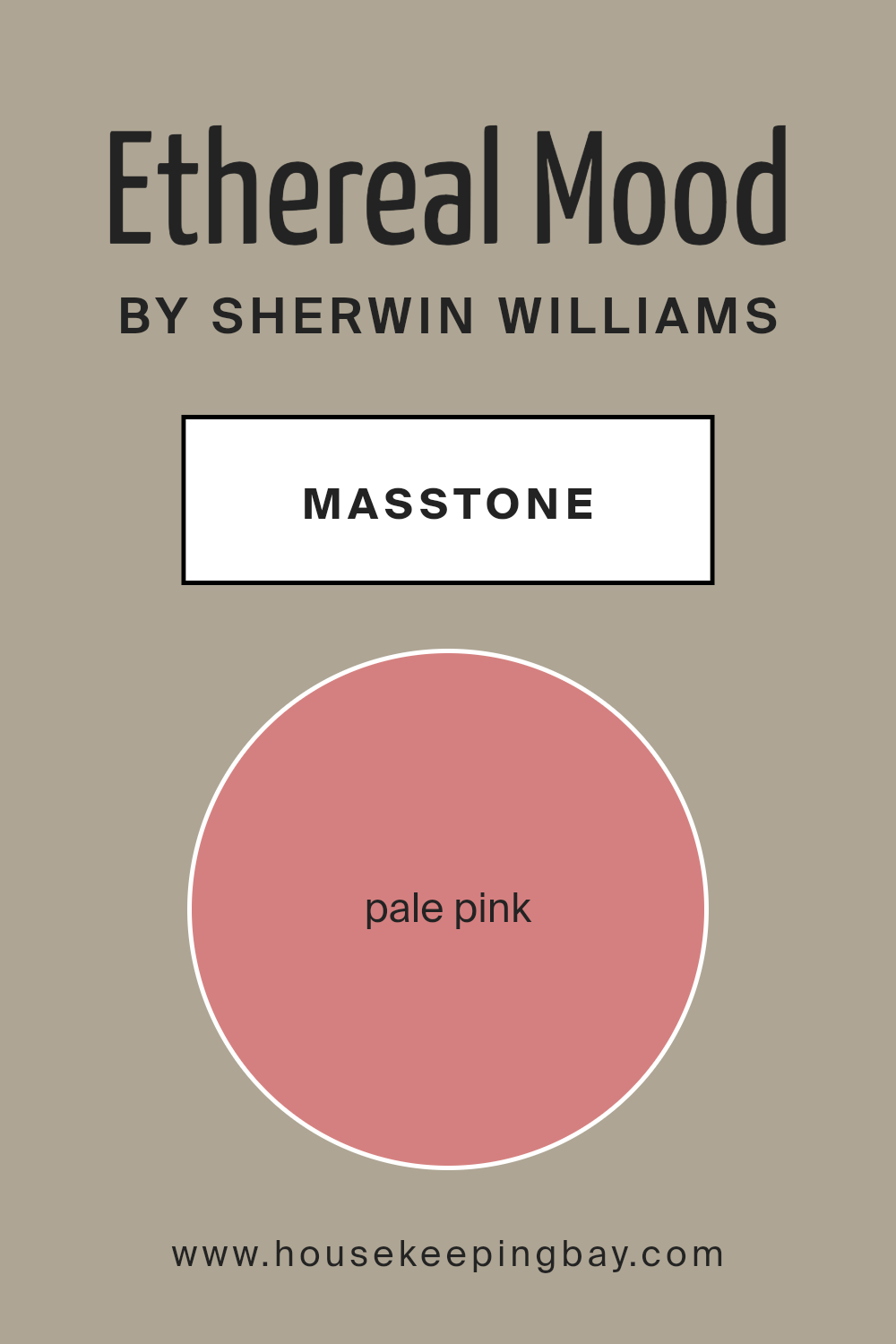
What is the Masstone of the Ethereal Mood SW 7639 by Sherwin Williams?
Ethereal Mood SW 7639 by Sherwin Williams is a pale pink with a masstone of #D58080. This gentle shade can bring a soft and inviting atmosphere into homes. The light pink hue provides warmth and a sense of comfort, making spaces feel cozy and welcoming. When used in living rooms or bedrooms, it creates a calm and soothing environment, perfect for relaxation.
This color works well with neutral shades like whites and grays, allowing for versatile design choices. It can also complement natural wood tones, enhancing the overall warmth of a room. In more vibrant settings, Ethereal Mood can be paired with bolder colors to add a subtle contrast.
This shade can brighten up small spaces, making them appear more open and airy. Its gentle tone fosters a sense of peace, which can positively influence the mood of those spending time in these spaces. Overall, Ethereal Mood offers a soft touch to any home.
housekeepingbay.com
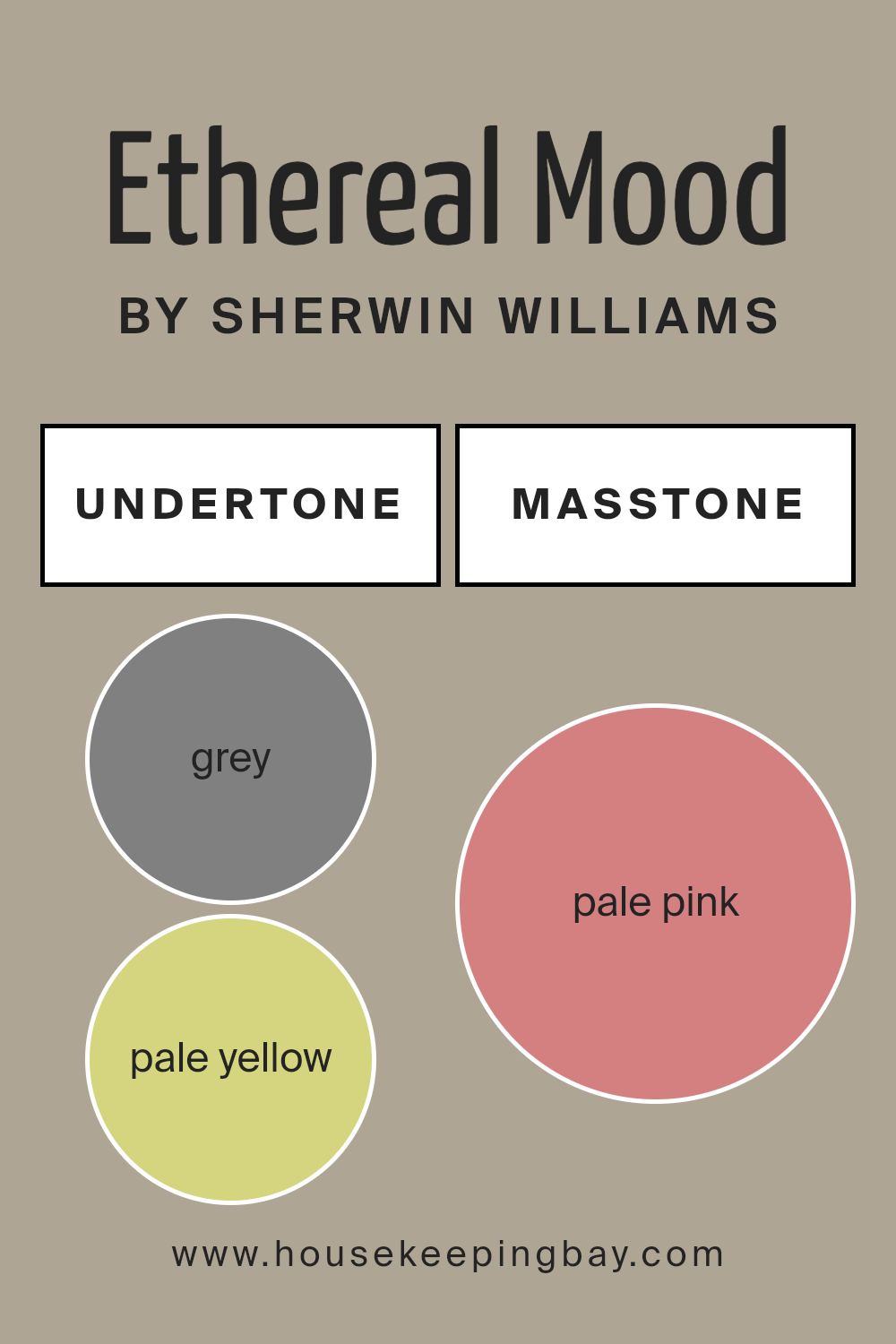
Undertones of Ethereal Mood SW 7639 by Sherwin Williams
Ethereal Mood SW 7639 by Sherwin Williams has a complex blend of undertones. These undertones change how we see the color, adding depth and variety. In general, undertones influence whether a color appears warmer or cooler, brighter or softer.
Ethereal Mood includes undertones of grey, pale yellow, mint, light purple, lilac, light gray, light blue, orange, olive, yellow, light green, pink, purple, fuchsia, violet, red, and brown. Each of these colors subtly contributes to Ethereal Mood’s final appearance.
When applied to interior walls, these undertones give the paint a unique character. The grey and light gray add neutrality and balance, while pale yellow and yellow bring warmth. Mint and light green add a hint of freshness. The subtle presence of pink, purple, fuchsia, and violet gives a slightly romantic touch, whereas orange and red contribute vibrant energy.
Colors like lilac and light blue add calmness. Olive and brown tones ground the color, providing an earthy quality.
Overall, Ethereal Mood SW 7639 appears both sophisticated and versatile. It can change its feel based on the room’s lighting and decor. In a room with bright light, its cooler undertones may stand out, giving a relaxing feel. In dim lighting, the warmer tones emerge, creating a welcoming space.
housekeepingbay.com
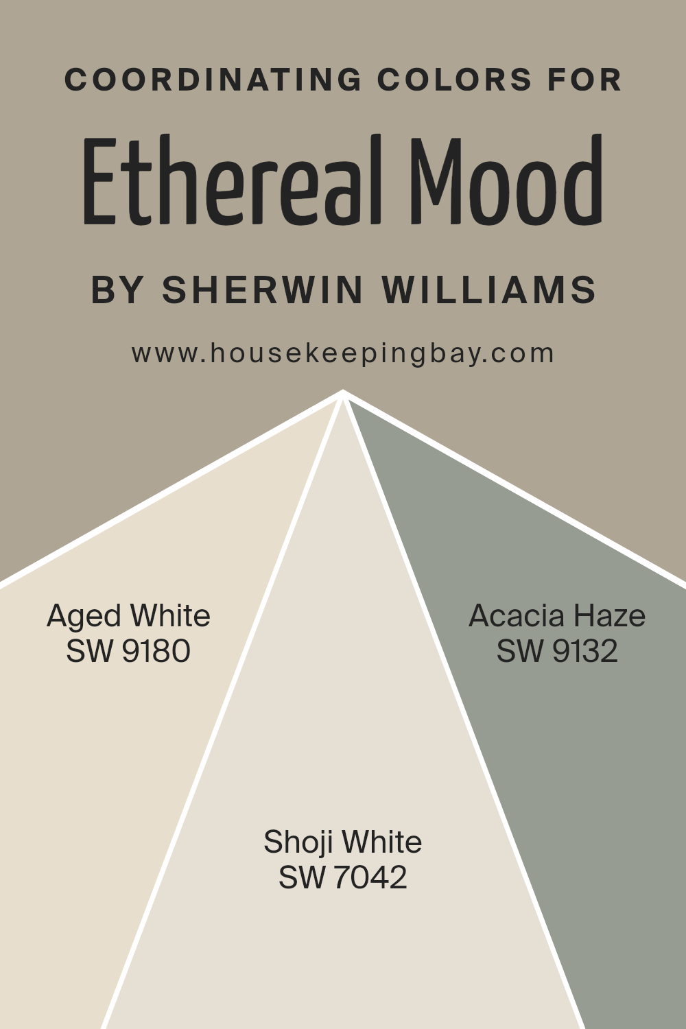
Coordinating Colors of Ethereal Mood SW 7639 by Sherwin Williams
Coordinating colors are hues that complement and enhance each other when used together in a space. These colors create a balanced and harmonious look, adding depth and interest to a room’s design. For those who appreciate the delicate elegance of Ethereal Mood SW 7639 by Sherwin Williams, a careful choice of coordinating colors can bring out its best qualities.
Ethereal Mood is a soft, light-toned color that exudes a sense of calm and serenity, serving as an excellent backdrop for more defined hues or accents.
Aged White SW 9180 is a warm, creamy off-white with just a hint of yellow, which adds a subtle richness to any setting without overwhelming it. It pairs beautifully with Ethereal Mood, creating a soft and inviting atmosphere.
Shoji White SW 7042 is a versatile neutral with a hint of gray, offering a clean and modern feel that complements the lighter shades perfectly. Lastly, Acacia Haze SW 9132 introduces a touch of coolness with its muted green undertones.
This color brings a sense of freshness and connects effortlessly with natural elements, enhancing the room’s overall harmony. Together, these coordinating colors create a cohesive and pleasing environment, where Ethereal Mood remains a gentle, soothing presence.
You can see recommended paint colors below:
housekeepingbay.com
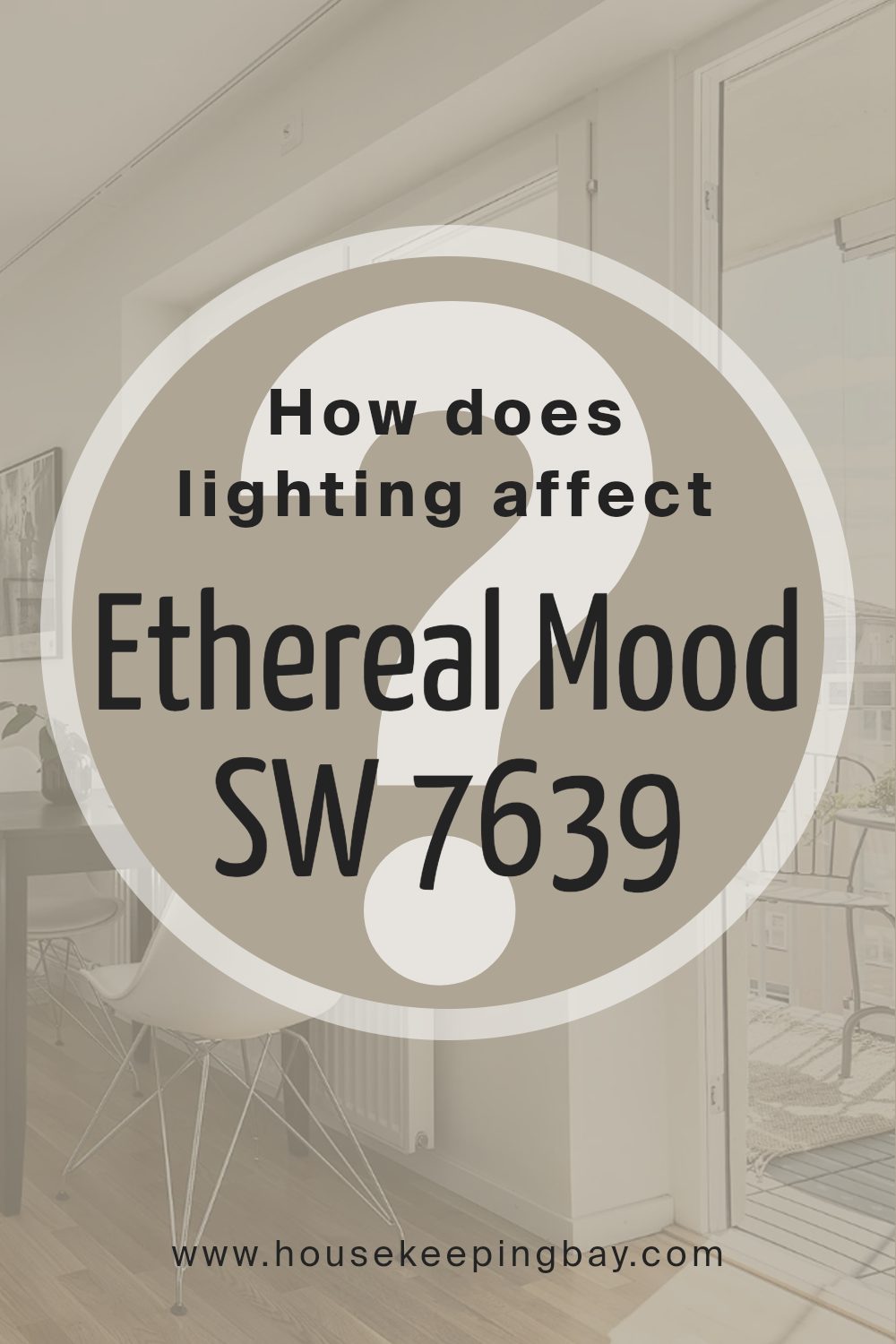
How Does Lighting Affect Ethereal Mood SW 7639 by Sherwin Williams?
Lighting plays a crucial role in how we perceive colors. The same color can look different under various lighting conditions due to the color temperature and intensity of the light source. Let’s discuss the color Ethereal Mood (SW 7639) by Sherwin Williams, a soft and muted gray with green undertones, and how it behaves under different lighting situations.
In natural light, Ethereal Mood tends to showcase its true colors. However, the orientation of the room affects how much natural light enters and the color’s appearance.
– North-facing rooms: These rooms receive cool, indirect sunlight, which can cause colors to appear cooler and more muted. Ethereal Mood might show more of its green undertones and appear slightly grayer.
– South-facing rooms: These rooms usually benefit from warm, direct sunlight throughout the day. Ethereal Mood will likely appear brighter and warmer, with its green undertone softening in the abundant light.
– East-facing rooms: Morning light is warm and soft, making Ethereal Mood look more inviting in the early hours. As the day progresses and the light fades, the color might appear cooler.
– West-facing rooms: Afternoon and evening light is warmer. Ethereal Mood will have a warmer cast in the later part of the day, enhancing its coziness and subtle green undertones.
In artificial lighting, the color will change based on the type of bulbs used:
- – Incandescent bulbs provide warm light, making Ethereal Mood appear warmer and possibly bringing out more of its subtle green.
- – LEDs vary. Cool LEDs might make the color look cooler and more muted, while warm LEDs can have a similar effect to incandescent bulbs, enhancing warmth.
- – Fluorescent lights often emit cooler light, potentially giving Ethereal Mood a bluer or grayer appearance, minimizing the warmth of its undertones.
Careful choice of lighting can help achieve the desired mood with Ethereal Mood in different settings.
housekeepingbay.com
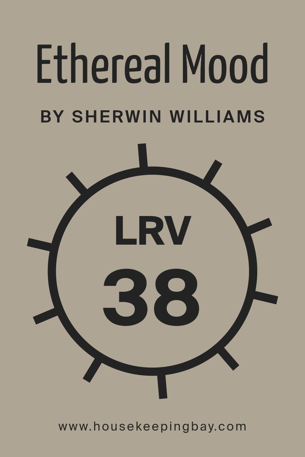
What is the LRV of Ethereal Mood SW 7639 by Sherwin Williams?
Light Reflectance Value, or LRV, is a scale that measures the amount of visible and usable light that reflects from a painted surface. It ranges from 0, which represents absolute black and reflects no light, to 100, which represents pure white and reflects all light.
This measurement helps determine how light or dark a color will appear once applied. Higher LRV values mean a color will reflect more light, making it appear brighter and more open, while lower values absorb more light, creating a cozier, more intimate feel.
For Ethereal Mood SW 7639, the LRV is 38.219. This means that the color will reflect a moderate amount of light. It’s neither too bright nor too dark. On walls, Ethereal Mood will present as a mid-tone shade that can create a sense of warmth and comfort without overpowering a space.
It will work well in rooms where you want a balanced atmosphere, neither too energizing nor too subdued. In spaces with plenty of natural light, it will appear slightly lighter and airy. However, in darker spaces, it may seem a bit richer or more saturated.
housekeepingbay.com
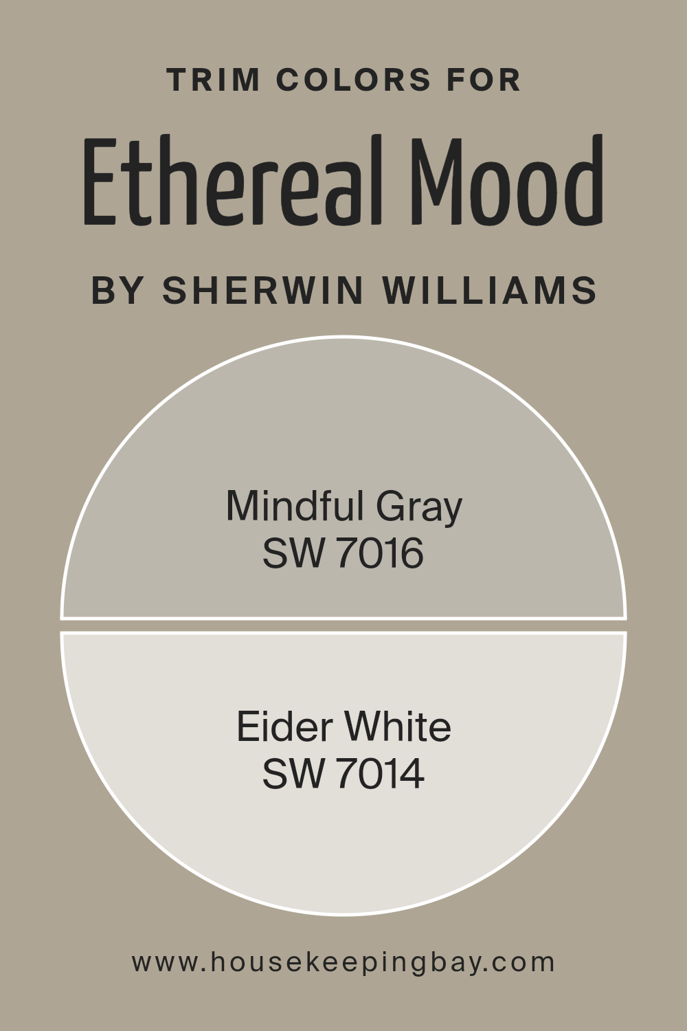
What are the Trim colors of Ethereal Mood SW 7639 by Sherwin Williams?
Trim colors play a crucial role in interior design, as they help define the space and highlight architectural details. When using Ethereal Mood SW 7639 by Sherwin Williams on your walls, choosing the right trim colors can enhance the overall look and feel of the room.
Mindful Gray SW 7016 and Eider White SW 7014 are excellent choices for trim colors alongside Ethereal Mood. Mindful Gray is a versatile, neutral gray with a slightly warm undertone, making it a perfect complement to the airy and soft vibe of Ethereal Mood.
Eider White offers a clean and light contrast with its gentle hint of gray, providing a crisp edge that frames the walls, adding an elegant touch to your space.
Selecting trim colors like Mindful Gray and Eider White brings balance and dimension to your home. Mindful Gray, with its subtleness, helps in creating a seamless transition between Ethereal Mood walls and the trims, offering a cohesive environment.
On the other hand, Eider White delivers a more pronounced contrast without being too stark, helping to outline the room’s features like doors, windows, and baseboards.
Both these colors work harmoniously with Ethereal Mood, ensuring that the room feels modern and sophisticated while maintaining a soothing ambiance.
In essence, these trim colors not only provide practical benefits in terms of space definition but also contribute significantly to the aesthetic appeal of your home.
You can see recommended paint colors below:
housekeepingbay.com
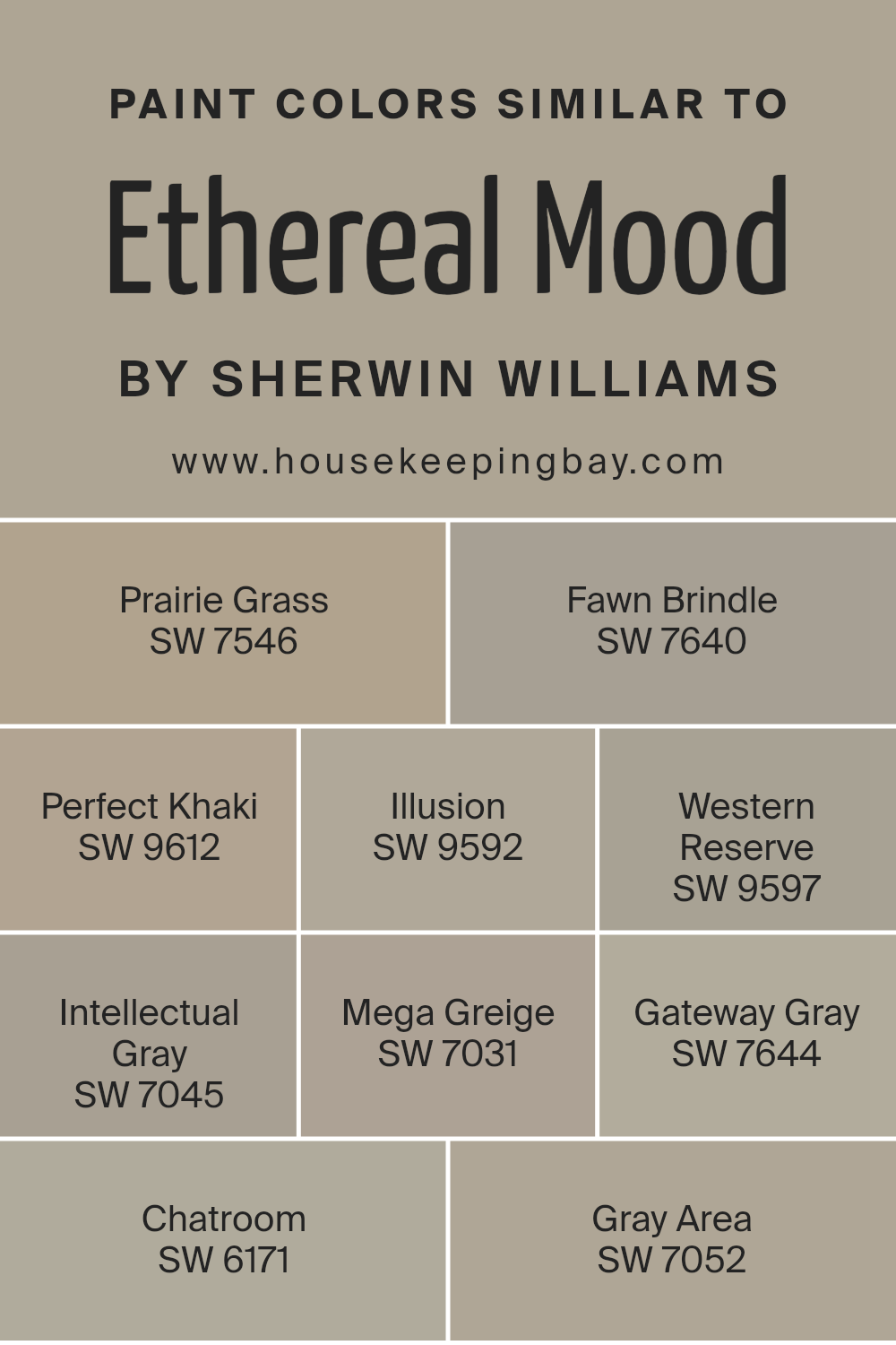
Colors Similar to Ethereal Mood SW 7639 by Sherwin Williams
Similar colors play a crucial role in creating a harmonious and balanced space. They work together by sharing undertones and complementing each other without clashing. Ethereal Mood SW 7639, a calming shade by Sherwin Williams, inspires a palette of colors that can subtly enhance and support its gentle presence.
For instance, Prairie Grass SW 7546 has warm, earthy notes that blend seamlessly, adding warmth and richness to a room. Fawn Brindle SW 7640, with its soft taupe appearance, provides a neutral backdrop that enhances other elements without overwhelming them.
Perfect Khaki SW 9612 brings in a touch of sophistication with its muted greenish-brown hue, while Illusion SW 9592 offers a whisper of gray, adding depth and dimension. Western Reserve SW 9597 offers a slightly darker, more dramatic take on gray, which can add a sense of elegance.
Intellectual Gray SW 7045 balances coolness with a touch of warmth. Mega Greige SW 7031, a deeper neutral, can ground a space with its timeless appeal.
Gateway Gray SW 7644 introduces a slightly more pronounced gray note, offering versatility and style. Finally, Chatroom SW 6171, a soft green, and Gray Area SW 7052 bring subtle color variations that add interest and character to any area without overpowering.
You can see recommended paint colors below:
- SW 7546 Prairie Grass
- SW 7640 Fawn Brindle
- SW 9612 Perfect Khaki
- SW 9592 Illusion
- SW 9597 Western Reserve
- SW 7045 Intellectual Gray
- SW 7031 Mega Greige
- SW 7644 Gateway Gray
- SW 6171 Chatroom
- SW 7052 Gray Area
housekeepingbay.com
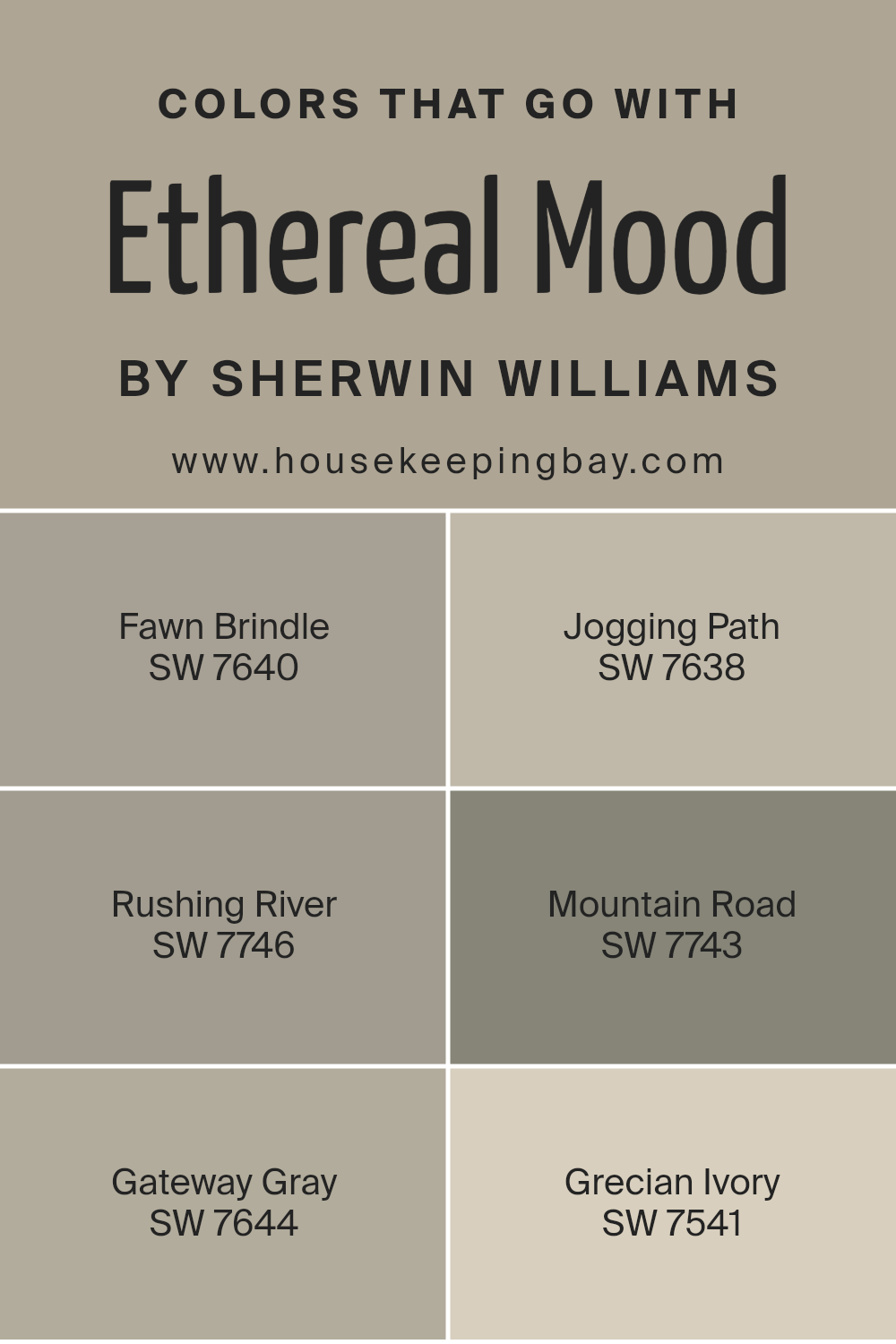
Colors that Go With Ethereal Mood SW 7639 by Sherwin Williams
Ethereal Mood SW 7639 by Sherwin Williams is a versatile and soft neutral color. It’s a gentle hue that gives rooms a serene and inviting atmosphere. Pairing it with colors such as Fawn Brindle SW 7640, Jogging Path SW 7638, and Rushing River SW 7746, enhances its soothing qualities.
Fawn Brindle is a warm, earthy tone that adds richness, while Jogging Path is a muted gray-green, giving a hint of nature and calmness, great for a harmonious combination. Rushing River, meanwhile, is a mid-tone green that provides a refreshing touch of natural vibrancy, working well to create a balanced and peaceful setting.
Mountain Road SW 7743 and Gateway Gray SW 7644 bring in depth and contrast. Mountain Road offers a deep, grounding greenness that adds depth and sophistication, perfect for accent walls or bold statements.
Gateway Gray is a cooler, subdued hue that pairs seamlessly with Ethereal Mood, creating a serene backdrop.
Lastly, Grecian Ivory SW 7541 is a light, creamy shade that adds warmth and brightness, helping spaces feel welcoming. Together, these colors complement Ethereal Mood, enhancing its subtle beauty while adding layers of interest and harmony to any space.
You can see recommended paint colors below:
- SW 7640 Fawn Brindle
- SW 7638 Jogging Path
- SW 7746 Rushing River
- SW 7743 Mountain Road
- SW 7644 Gateway Gray
- SW 7541 Grecian Ivory
housekeepingbay.com
How to Use Ethereal Mood SW 7639 by Sherwin Williams In Your Home?
Ethereal Mood SW 7639 by Sherwin Williams presents a soft, comforting gray hue that fits perfectly into any home. Its soothing nature creates a calm atmosphere, making rooms feel cozy and inviting. This versatile shade gently complements various styles, whether modern or traditional. It acts as a neutral backdrop, allowing furniture and decor details to shine.
In the living room, Ethereal Mood enhances relaxation, setting a peaceful tone for family gatherings. Paired with plush fabrics and warm lighting, it fosters a sense of warmth. In the bedroom, this shade encourages restful sleep, providing a serene space for unwinding at the end of the day.
For kitchens or bathrooms, Ethereal Mood offers a refreshing look. It pairs harmoniously with white cabinetry or soft wood tones, creating a neat and tidy appearance. This color works well with both cool and warm accents, making it flexible for any space within the home.
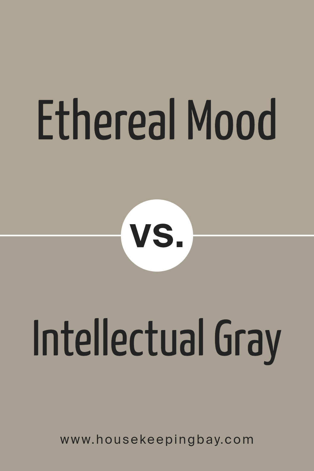
Ethereal Mood SW 7639 by Sherwin Williams vs Intellectual Gray SW 7045 by Sherwin Williams
Ethereal Mood SW 7639 by Sherwin Williams offers a soft, pale hue with a touch of warmth. This color tends to create a light and airy atmosphere, reminiscent of gentle sunlight mixing with a cool breeze. It’s subtle and can make a space feel open and inviting without overwhelming other elements in the room. It’s ideal for maintaining a serene and balanced look in any space.
Intellectual Gray SW 7045, in contrast, presents a deeper, more muted tone. This color carries more weight and sophistication, often associated with modern, elegant interiors.
Intellectual Gray leans towards a classic, grounded feel, perfect for adding depth and character. It works well in spaces where you want a bit more structure or a backdrop that emphasizes other colors or furnishings.
Both colors offer different moods: Ethereal Mood gives a light, fresh vibe, while Intellectual Gray offers a more serious, rich tone.
You can see recommended paint color below:
housekeepingbay.com
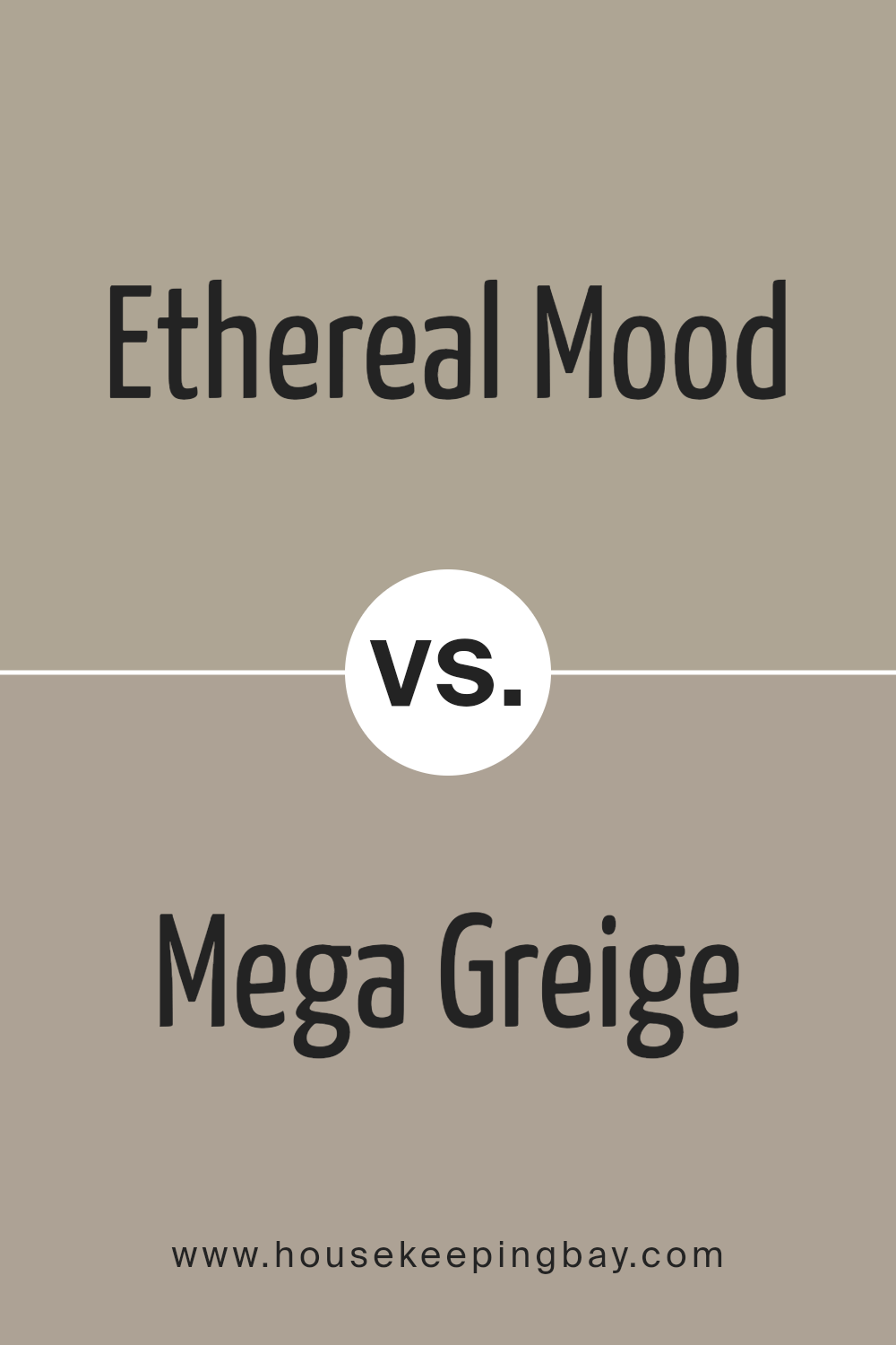
Ethereal Mood SW 7639 by Sherwin Williams vs Mega Greige SW 7031 by Sherwin Williams
Ethereal Mood SW 7639 is a gentle, light gray with a hint of warmth. It creates a soft and calming atmosphere, ideal for spaces aiming for a serene feel. Its subtlety allows it to complement a variety of decors without overpowering the room.
Mega Greige SW 7031, however, presents itself as a warmer and more robust greige. This shade sits between gray and beige, providing depth and richness. It offers a cozy and grounded vibe, making it suitable for living areas or rooms where comfort is key.
When considering the two, Ethereal Mood feels airy and light, perfect for brightening up spaces, while Mega Greige provides a warm, earthy backdrop. Ethereal Mood might suit modern, minimalist aesthetics, whereas Mega Greige caters to traditional or rustic themes. Both offer versatile backdrops but bring distinct feelings; one leans towards lightness, the other towards warmth and depth.
You can see recommended paint color below:
housekeepingbay.com
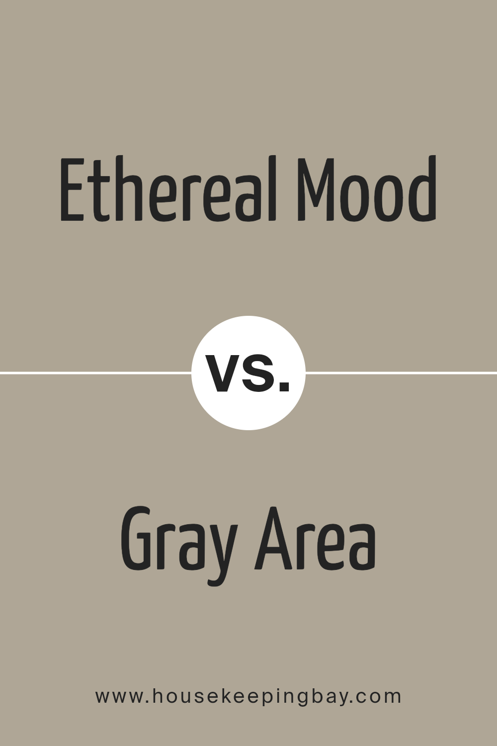
Ethereal Mood SW 7639 by Sherwin Williams vs Gray Area SW 7052 by Sherwin Williams
Ethereal Mood SW 7639 by Sherwin Williams is a soft, muted gray with a hint of warmth, offering a subtle and calming effect. It creates a cozy and inviting atmosphere, making it suitable for various spaces, from living rooms to bedrooms. The color has an earthy tone, lending a gentle touch without overwhelming a room.
Gray Area SW 7052, also by Sherwin Williams, presents a slightly cooler and more modern shade of gray. This color leans towards a neutral spectrum, providing a sleek and contemporary feel. It works well in spaces designed for a more industrial or modern look, often complementing metals and urban elements.
Both shades of gray bring their unique benefits. Ethereal Mood’s warmth makes it feel homier and more comforting, while Gray Area’s cooler tone lends a crisp and clean appearance. Deciding between them depends on the desired ambiance—warm and welcoming or cool and sleek.
You can see recommended paint color below:
- SW 7052 Gray Area
housekeepingbay.com
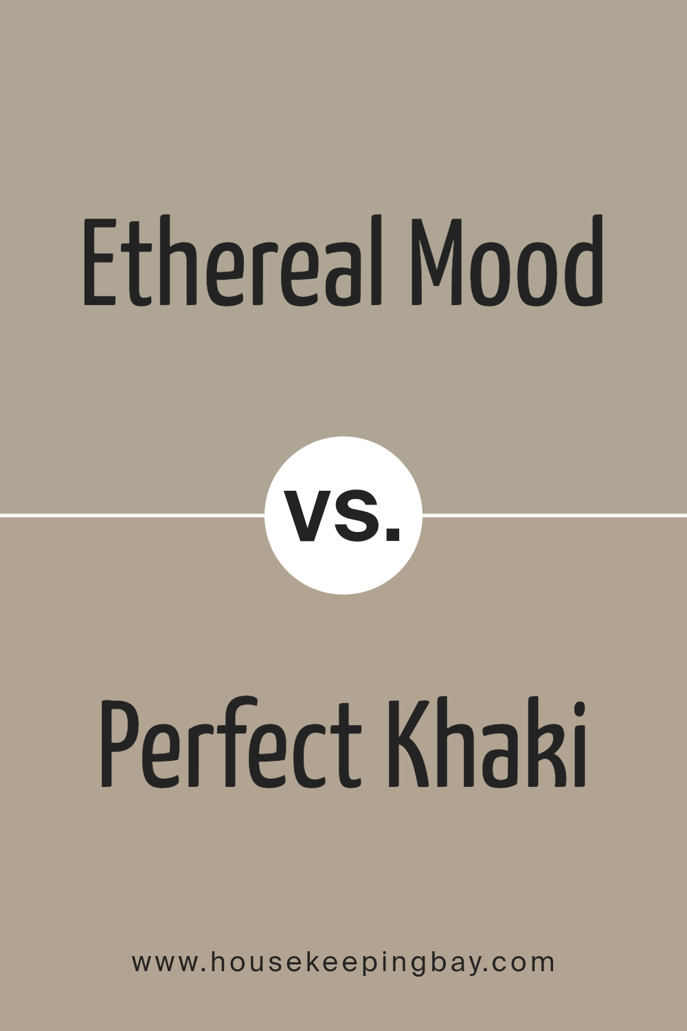
Ethereal Mood SW 7639 by Sherwin Williams vs Perfect Khaki SW 9612 by Sherwin Williams
Ethereal Mood (SW 7639) and Perfect Khaki (SW 9612) both belong to Sherwin Williams’ palette, yet they create different atmospheres. Ethereal Mood is a soft, muted shade of gray with slight undertones of blue, lending a calming and versatile vibe to any room. Its subtle hue works well for spaces seeking a serene backdrop, effortlessly pairing with both neutral and bold accents.
Meanwhile, Perfect Khaki presents a warm, earthy tone with a blend of beige and green undertones. It provides a grounded, inviting aura that works beautifully to add warmth to any environment. Perfect Khaki’s neutral characteristics allow it to complement various decor styles, making it a reliable choice for cozy, welcoming spaces.
While Ethereal Mood suggests a cooler, more understated atmosphere, Perfect Khaki offers comfort with its warm and friendly appeal, making both colors excellent choices depending on your desired ambiance.
You can see recommended paint color below:
housekeepingbay.com
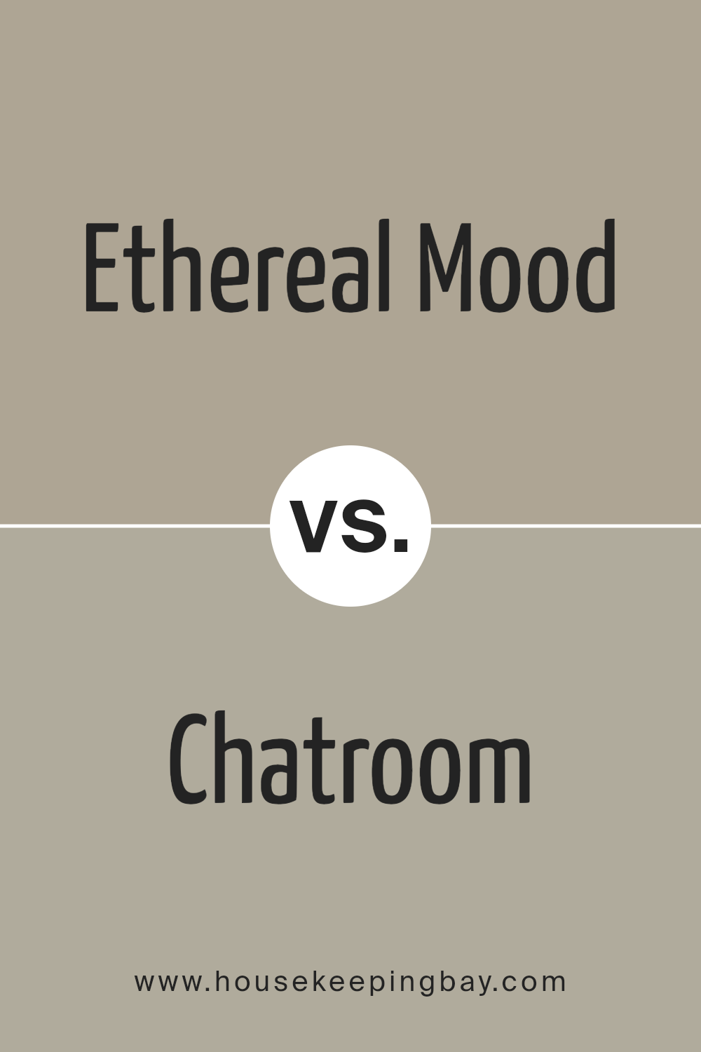
Ethereal Mood SW 7639 by Sherwin Williams vs Chatroom SW 6171 by Sherwin Williams
Ethereal Mood SW 7639 by Sherwin Williams brings a soft, muted feel to any space. It’s a gentle gray with a hint of warmth, making rooms feel cozy and inviting. Its versatility means it works well in various settings, from living rooms to bedrooms, adding a subtle backdrop that allows other elements to shine.
Chatroom SW 6171, in contrast, presents a more earthy tone. This color leans into green-gray, offering a slightly richer and more grounded aesthetic. It’s ideal for those who want a natural touch, reminiscent of serene outdoors.
This color can add depth to spaces like home offices or family rooms, where a calming yet slightly more vivid atmosphere is desired.
While both colors offer similar understated elegance, Ethereal Mood leans calming and neutral, whereas Chatroom introduces a touch of the green spectrum, making it feel a bit more dynamic and connected to nature.
You can see recommended paint color below:
housekeepingbay.com
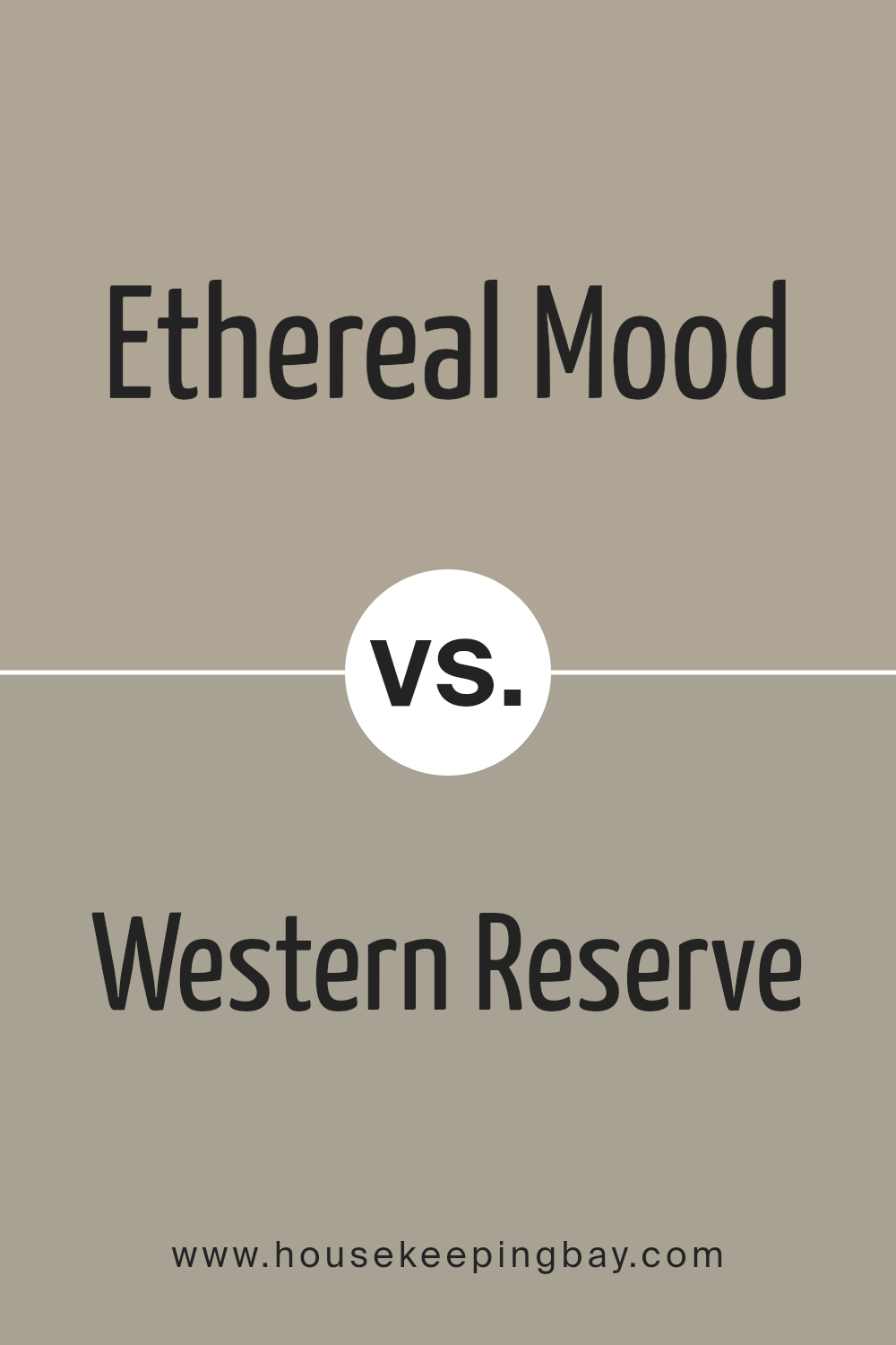
Ethereal Mood SW 7639 by Sherwin Williams vs Western Reserve SW 9597 by Sherwin Williams
Ethereal Mood SW 7639 is a subtle, soft gray with a hint of warmth. Its gentle tone creates a calm and relaxed atmosphere, making it a versatile choice for many spaces, from living rooms to bedrooms. This soothing shade can work well as a neutral backdrop, pairing seamlessly with both bold and muted accents.
Western Reserve SW 9597 offers a more pronounced, earthy gray. It combines a hint of brown, lending a sense of depth and sophistication. This rich color can ground a room, adding a sense of coziness. Perfect for spaces needing a touch of warmth and elegance, Western Reserve adds character without overwhelming.
While Ethereal Mood keeps things light and airy, Western Reserve brings warmth and depth. Both colors blend beautifully with natural materials like wood and stone. Ethereal Mood’s delicacy contrasts with Western Reserve’s rich, grounded presence, offering unique options for different moods within a home.
You can see recommended paint color below:
- SW 9597 Western Reserve
housekeepingbay.com
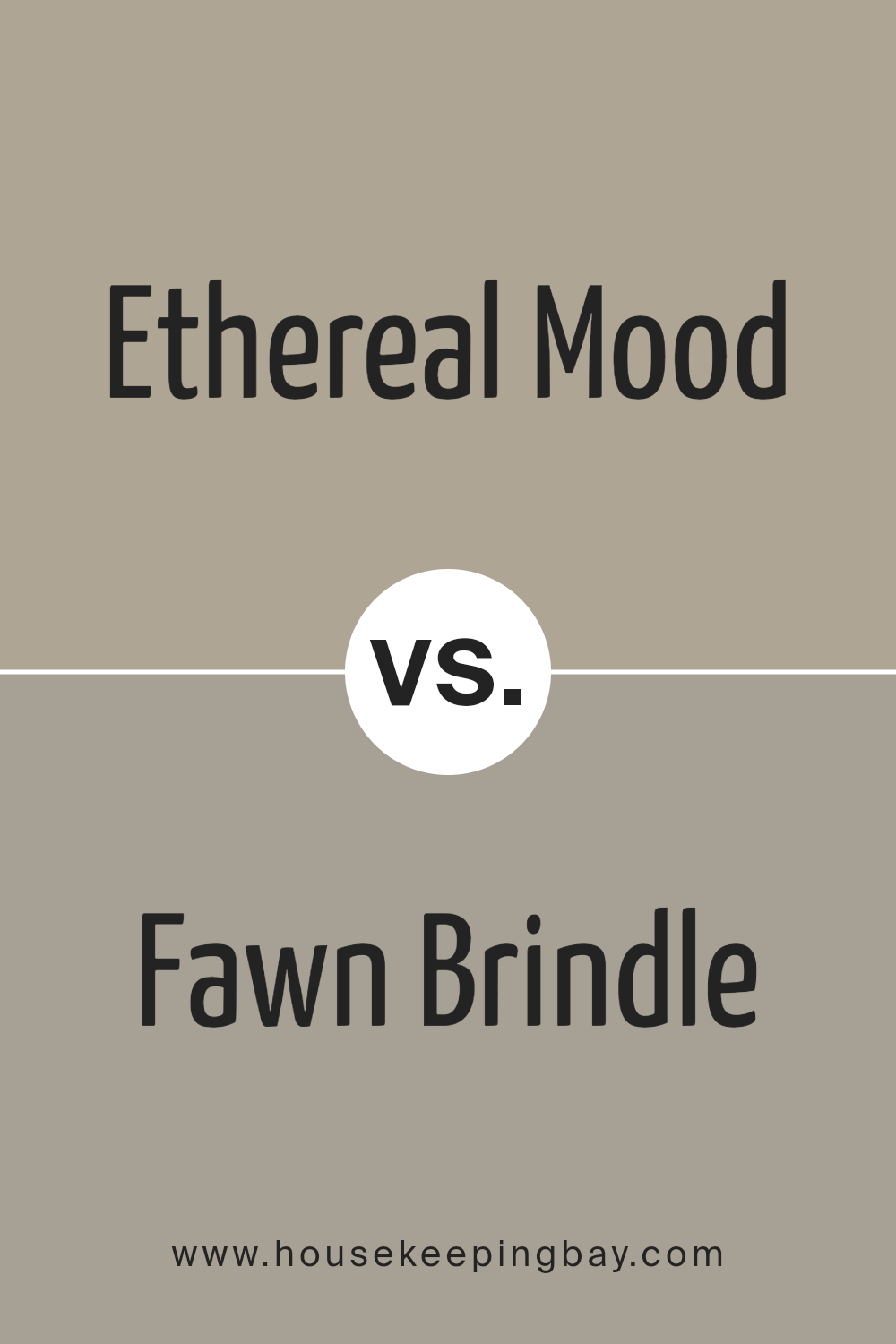
Ethereal Mood SW 7639 by Sherwin Williams vs Fawn Brindle SW 7640 by Sherwin Williams
Ethereal Mood SW 7639 and Fawn Brindle SW 7640, both by Sherwin Williams, are muted, earthy tones that add sophistication. Ethereal Mood is a soft, airy gray with hints of warmth. It offers a light, calming presence, making it great for spaces that need openness and brightness. Its gentle hue can create a sense of peace and subtle elegance, easily blending with various color palettes.
Fawn Brindle SW 7640, in contrast, leans toward a warm greige. It’s deeper and richer than Ethereal Mood, giving spaces a cozy, grounded feel. This color can enhance the warmth of a room, providing a solid backdrop that pairs well with natural materials like wood and stone.
While Ethereal Mood is bright and breezy, Fawn Brindle communicates a sense of warmth and depth. Choosing between them depends on the ambiance you want: light and airy with Ethereal Mood, or warm and inviting with Fawn Brindle. Both colors share a versatile, understated quality.
You can see recommended paint color below:
- SW 7640 Fawn Brindle
housekeepingbay.com
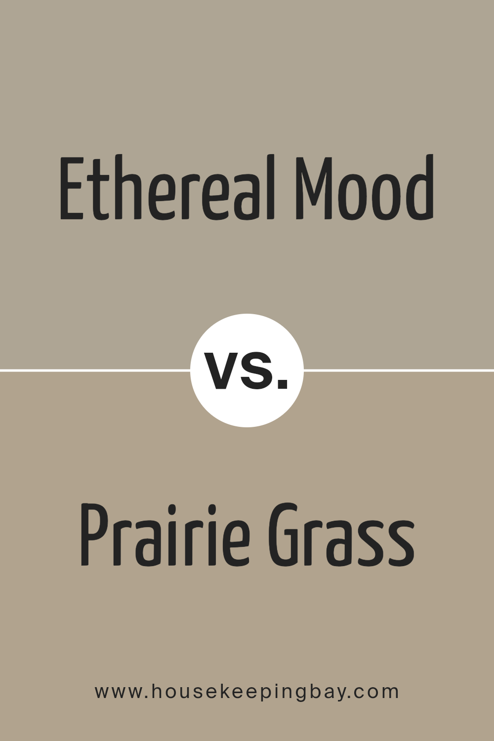
Ethereal Mood SW 7639 by Sherwin Williams vs Prairie Grass SW 7546 by Sherwin Williams
Ethereal Mood SW 7639 by Sherwin Williams is a soft, muted gray with subtle undertones, creating a calming and serene vibe. This color works well in spaces where you seek a peaceful and airy atmosphere, making it suitable for bedrooms or living areas. Its understated character allows it to pair nicely with both brighter accents and other neutrals.
Prairie Grass SW 7546 offers a warm, earthy tone reminiscent of natural landscapes. This color has a cozy, inviting quality that fits perfectly in spaces meant for relaxation and comfort, such as living rooms or dens. Its earthiness provides a grounding quality, complementing wood accents and organic textures.
While Ethereal Mood leans into the cool and ethereal, Prairie Grass exudes warmth and comfort. Ethereal Mood provides a fresh, airy feeling, whereas Prairie Grass evokes a sense of nature and warmth. Both colors shine in different settings, depending on the desired mood.
You can see recommended paint color below:
- SW 7546 Prairie Grass
housekeepingbay.com
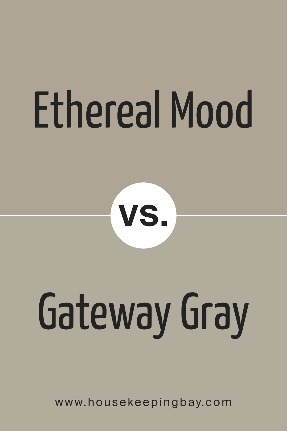
Ethereal Mood SW 7639 by Sherwin Williams vs Gateway Gray SW 7644 by Sherwin Williams
Ethereal Mood SW 7639 and Gateway Gray SW 7644 are two shades by Sherwin Williams, each with unique qualities. Ethereal Mood is a soft, warm gray with a hint of beige. This creates a cozy and inviting atmosphere, making it perfect for spaces like living rooms or bedrooms. It brings warmth but remains neutral, allowing other elements in the room to stand out.
Gateway Gray is cooler and slightly darker. It leans more towards a true gray, providing a more sophisticated and modern feel. Its depth creates a strong backdrop, ideal for accent walls or spaces that benefit from a bold touch. This gray pairs well with both light and dark accents, offering versatility.
While Ethereal Mood softens a room with its warmth, Gateway Gray adds a structured, contemporary edge. Both colors bring subtle elegance, suitable for different design goals, offering balance and style in any space.
You can see recommended paint color below:
- SW 7644 Gateway Gray
housekeepingbay.com
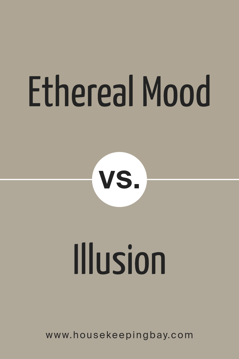
Ethereal Mood SW 7639 by Sherwin Williams vs Illusion SW 9592 by Sherwin Williams
Ethereal Mood SW 7639 and Illusion SW 9592 by Sherwin Williams are two distinct colors that can evoke different feelings in any space. Ethereal Mood is a soft, muted gray that carries subtle hints of warmth. It’s a versatile color, ideal for creating a calming and sophisticated environment. Its understated elegance makes it suitable for living rooms, bedrooms, or any space where a serene atmosphere is desired.
Illusion SW 9592, in contrast, is a light, airy pastel with a touch of pink. This color brings a sense of lightness and subtle whimsy, perfect for spaces aiming for a gentle, playful vibe. It pairs well with other pastels or can be used as a soft accent against neutral shades.
While Ethereal Mood leans towards a more classic, serene look, Illusion adds a touch of softness and cheerful warmth. Both colors can work beautifully depending on the overall mood and style you wish to achieve.
You can see recommended paint color below:
housekeepingbay.com
Conclusion
After spending some time with SW 7639 Ethereal Mood by Sherwin-Williams, I find myself feeling a deep connection to its unique qualities. The color brings a sense of calm and refinement to any space. Its muted tones create an inviting atmosphere that’s both soothing and sophisticated.
I love how it straddles the line between gray and beige, offering versatility that suits various design styles from modern to classic.
Using Ethereal Mood enhances a room’s natural light, making spaces feel airy and open without overwhelming them. It’s perfect for those who appreciate subtle elegance in their interiors. Whether on walls or as an accent, this shade offers a backdrop that complements a wide range of furnishings and decorative elements.
I’ve noticed that pairing it with warm woods and soft textiles emphasizes its warmth, adding depth and comfort.
What strikes me most is how Ethereal Mood brings everything together harmoniously, whether in a living room, bedroom, or even a serene office space. It turns any room into a gentle haven, encouraging relaxation and reflection. The balance it provides makes it a go-to choice for anyone looking for a color that will always feel welcoming and timeless.
In my opinion, it’s a beautiful way to create an inviting yet elegant environment.
housekeepingbay.com
Ever wished paint sampling was as easy as sticking a sticker? Guess what? Now it is! Discover Samplize's unique Peel & Stick samples. Get started now and say goodbye to the old messy way!
Get paint samples


