Perfect Khaki SW 9612 by Sherwin Williams
Unveil the Magic of Muted Elegance
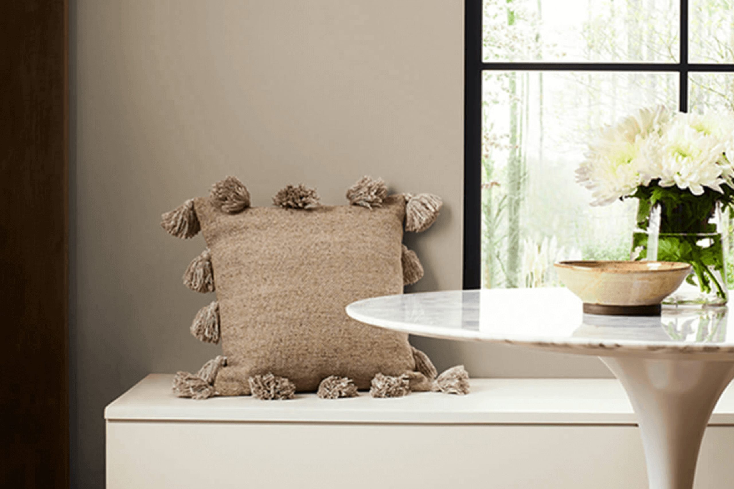
When you’re planning a room makeover, choosing the right color for the walls is crucial. One shade that you might consider is SW 9612 Perfect Khaki by Sherwin Williams. It’s a warm, inviting color that brings a sense of calm and coziness to any space.
Whether you’re updating your living room, bedroom, or even your kitchen, Perfect Khaki has a natural, understated elegance that pairs well with a variety of decor styles.
This color is particularly effective in spaces where you want to create a relaxed and welcoming atmosphere. It works beautifully with natural light, glowing warmly in the daytime, and remains soothing and gentle under artificial lighting at night.
If you have a busy home life, Perfect Khaki can offer a visual rest, harmonizing seamlessly with other colors and materials.
So, as you plan your next decorating project, consider SW 9612 Perfect Khaki for walls that need just the right touch of warmth and style. It’s a choice that can help make your space feel more like a true home.
via sherwin-williams.com
What Color Is Perfect Khaki SW 9612 by Sherwin Williams?
Perfect Khaki SW 9612 by Sherwin Williams is a versatile and warm neutral paint color. Its earthy tones provide a soothing background suitable for a variety of living spaces. This shade of khaki blends beautifully with natural elements and materials, making it an ideal choice for creating a cozy, welcoming environment.
In terms of interior styles, Perfect Khaki works exceptionally well with rustic, farmhouse, and traditional decor. Its understated elegance also fits seamlessly into contemporary settings, particularly when aiming for a soft, neutral palette.
The color lends itself to being paired with rich textures such as wood, leather, and linen, enhancing the tactile experience of a room.
Materials like terracotta, rattan, and jute also complement this color, reinforcing a connection to natural elements. For a harmonious look, combine it with soft whites or creamy colors for trim and ceiling to bring a light, airy feel to the interior. Contrast can be achieved with darker tones like charcoal or navy for accent features, adding depth and interest to the space.
Overall, Perfect Khaki is a flexible color choice that adapts well to various design aesthetics, helping to build a relaxing and inviting atmosphere in any home.
housekeepingbay.com
Is Perfect Khaki SW 9612 by Sherwin Williams Warm or Cool color?
Perfect Khaki SW 9612 by Sherwin Williams is a versatile neutral paint color that carries a warm and welcoming tone, ideal for various spaces in a home. Often described as a soft tan or light brown, Perfect Khaki provides a solid and soothing backdrop that complements many different decor styles and color schemes.
Since it is neither too dark nor too light, this color helps create a cozy atmosphere without making rooms feel smaller or darker. In living spaces, Perfect Khaki works well with natural light, highlighting the room’s features and furnishings without overwhelming the senses.
It is also suitable for bedrooms and home offices, where a calm and organized environment is often desired. Moreover, Perfect Khaki pairs beautifully with whites, offering contrast, and with bolder colors, it harmonizes without competing. Thus, it can adapt to both modern and traditional interior designs, adding warmth and creating a cohesive look throughout a home.
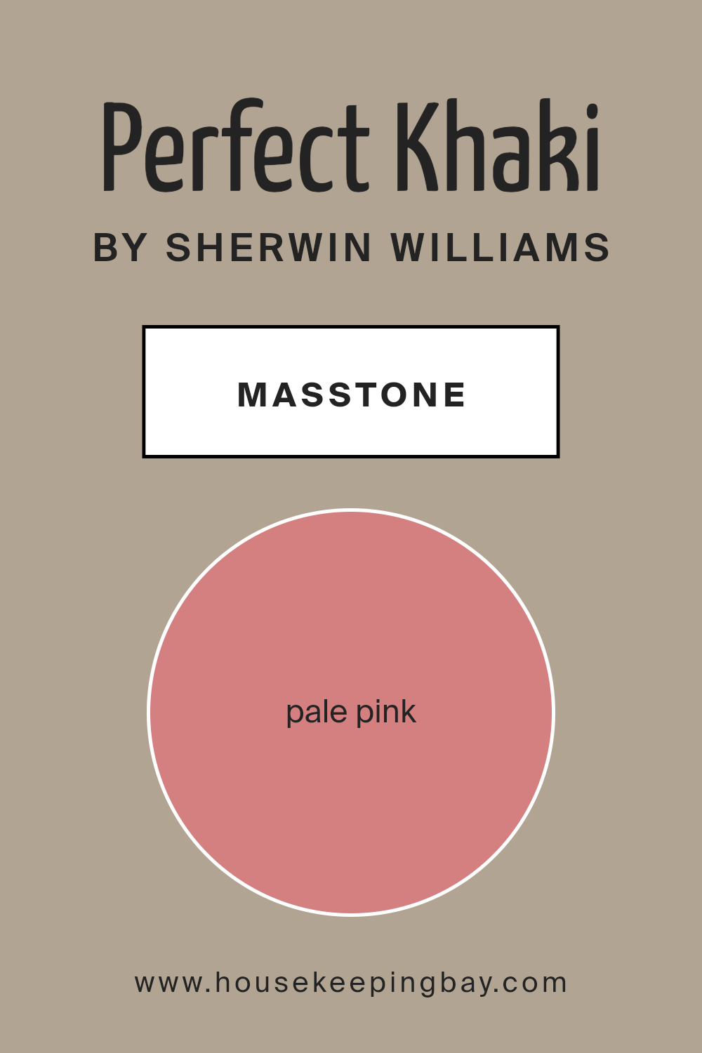
What is the Masstone of the Perfect Khaki SW 9612 by Sherwin Williams?
Perfect Khaki SW 9612 by Sherwin Williams has a masstone of Pale Pink (#D58080), a soft, warm shade that infuses spaces with a gentle and inviting atmosphere. This color is versatile, blending well with both modern and traditional decor. In homes, the mild pink hue adds a touch of subtle color without overwhelming the space, making it ideal for creating a cozy and comforting environment.
It works particularly well in bedrooms where a calming effect is desired, as well as in living rooms that benefit from a soft, welcoming tone. The brightness of Pale Pink allows it to reflect natural light beautifully, making rooms appear brighter and more spacious.
This color pairs well with neutral tones like whites, grays, and beiges, allowing homeowners to easily coordinate with existing furnishings and decor. Overall, Perfect Khaki’s subtle pink shade offers a fresh alternative to more common neutrals, bringing a unique yet understated charm to any room.
housekeepingbay.com
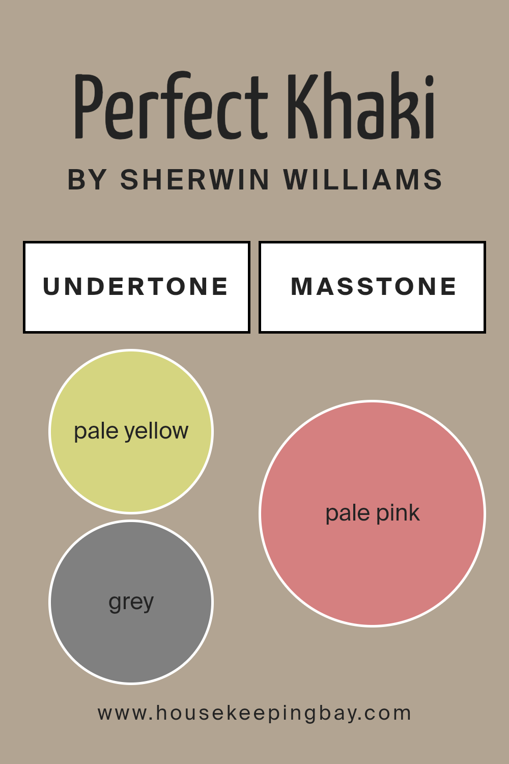
Undertones of Perfect Khaki SW 9612 by Sherwin Williams
Perfect Khaki SW 9612 by Sherwin Williams is a versatile color that can appear differently depending on its surrounding environment and lighting due to its complex blend of undertones. Undertones are subtle colors that lurk beneath the main hue, influencing how the primary color appears under various lighting conditions and when paired with different decor elements.
For Perfect Khaki SW 9612, its undertones range from pale yellow to light purple, which includes shades like grey, mint, lilac, light blue, orange, and yellow among others. These undertones play a crucial role in how this paint color behaves on interior walls.
When used in a room, Perfect Khaki can exude warmth if the lighting brings out its yellow and orange undertones, making the room feel cozy and welcoming. If the room has a lot of natural light, you might notice the mint or light green coming through, giving a more refreshed and calm atmospheric feel.
Indoor lighting, such as soft white bulbs, might accentuate the grey or light purple undertones, lending a more sophisticated and soft appearance.
The decor and other colors in the room can also pull different undertones from Perfect Khaki. For instance, pairing it with blues might highlight its grey or lilac tones, while greens could enhance its olive or mint undertones.
This adaptability makes Perfect Khaki SW 9612 a suitable choice for many different styles and settings, from traditional to modern and everything in between.
Being aware of these undertones will help in selecting complementary colors of furniture and decorations to achieve the desired effect in the space.
housekeepingbay.com
How Does Lighting Affect Perfect Khaki SW 9612 by Sherwin Williams?
Lighting plays a crucial role in how we perceive color. Different types of light can change how a color looks. Perfect Khaki SW 9612 by Sherwin Williams is a versatile color that can appear differently depending on the lighting it is under.
In artificial light, Perfect Khaki tends to look warmer and more inviting. The typically yellow or warm tones in most artificial lighting can enhance the beige and soft brown hues in Perfect Khaki, making it a cozy option for living spaces with lamps and overhead lights.
Natural light, depending on the time of day and weather, can alter the appearance of Perfect Khaki dramatically. In a room with ample natural light, this color can appear lighter and more neutral, showing its true khaki tone.
In rooms facing north, Perfect Khaki can look slightly cooler and more muted. North-facing rooms often receive less direct sunlight, which can make colors appear slightly grayer and more subdued. This can give Perfect Khaki a more understated and sophisticated look.
South-facing rooms, on the other hand, get a lot of light throughout the day. This exposure brings out the warmth and richness in Perfect Khaki, making it feel warmer and more vibrant. It’s an excellent choice for rooms that could use a cozy yet light touch.
East-facing rooms see most of their light in the morning when the sun casts a bright, warm glow. During these hours, Perfect Khaki will have a soft, warm tone, which slowly transitions to a lighter look as the natural light diminishes throughout the day.
West-facing rooms receive a lot of evening light, which can be quite warm. Perfect Khaki will look more vibrant and warmer in the afternoon and evening in these rooms, making spaces feel lively and cozy as the day winds down.
Overall, Perfect Khaki SW 9612 is a flexible color that adapts well to different lighting conditions, bringing warmth to artificial light and adapting uniquely to various natural light exposures.
housekeepingbay.com
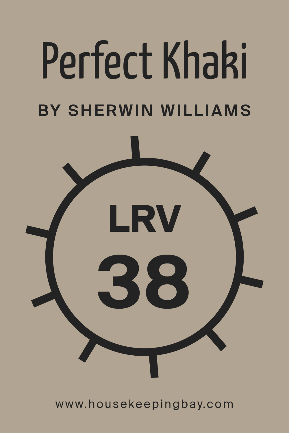
What is the LRV of Perfect Khaki SW 9612 by Sherwin Williams?
LRV, or Light Reflectance Value, is a measure that indicates how much light a paint color reflects or absorbs. It’s expressed as a percentage, ranging from 0% (absorbs all light, appearing very dark) to 100% (reflects all light, appearing very bright).
This value helps in deciding how a color will look in a specific setting. A higher LRV means the color will appear lighter and can make a room feel more open and airy. Conversely, a lower LRV can make a color appear richer and darker, which might make a space feel cozier or smaller.
Regarding the Perfect Khaki SW 6212 by Sherwin Williams with an LRV of 38.18, it reflects some light but not a lot, placing it on the darker end of the spectrum. This mid-range LRV will make the color look more substantial and denser on the walls. In rooms with lower natural light, it might appear even darker, enhancing a warm, intimate ambiance.
In well-lit spaces, the true richness of the khaki might show more clearly, offering a warm and inviting feel without overwhelming the senses with brightness. This makes it a versatile choice for many interior spaces.
housekeepingbay.com
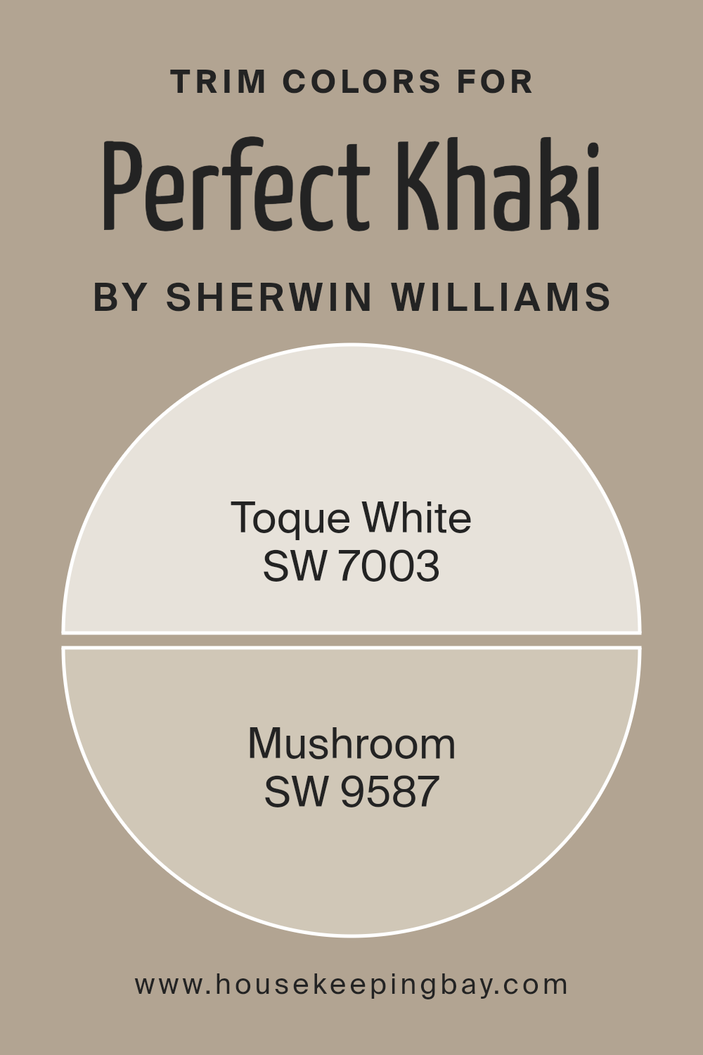
What are the Trim colors of Perfect Khaki SW 9612 by Sherwin Williams?
Trim colors are selected hues used to accentuate or contrast with the main paint color on walls, creating a finished look in a room. When considering Perfect Khaki SW 6162 by Sherwin Williams, choosing the right trim color is key to highlighting its warm, welcoming tone.
Trim colors like SW 7003 – Toque White and SW 9587 – Mushroom work beautifully with Perfect Khaki, providing subtle yet impactful visual boundaries that enhance architectural features and add depth to the space.
These colors help to define windows, doors, and baseboards, ensuring they stand out against the khaki backdrop, thus adding a layer of sophistication to the overall ambiance of the room.
Toque White SW 7003 is a soft, clean white that brings a crispness to any space. It acts as a refreshing counterbalance to the earthiness of Perfect Khaki, giving a lift to the room’s atmosphere without overpowering the primary color.
On the other hand, Mushroom SW 9587 offers a richer, earth-toned alternative that harmonizes naturally with Perfect Khaki.
This shade has a muted, organic feel that complements the khaki, seamlessly blending with the room’s scheme to enhance a cozy, understated elegance.
You can see recommended paint colors below:
housekeepingbay.com
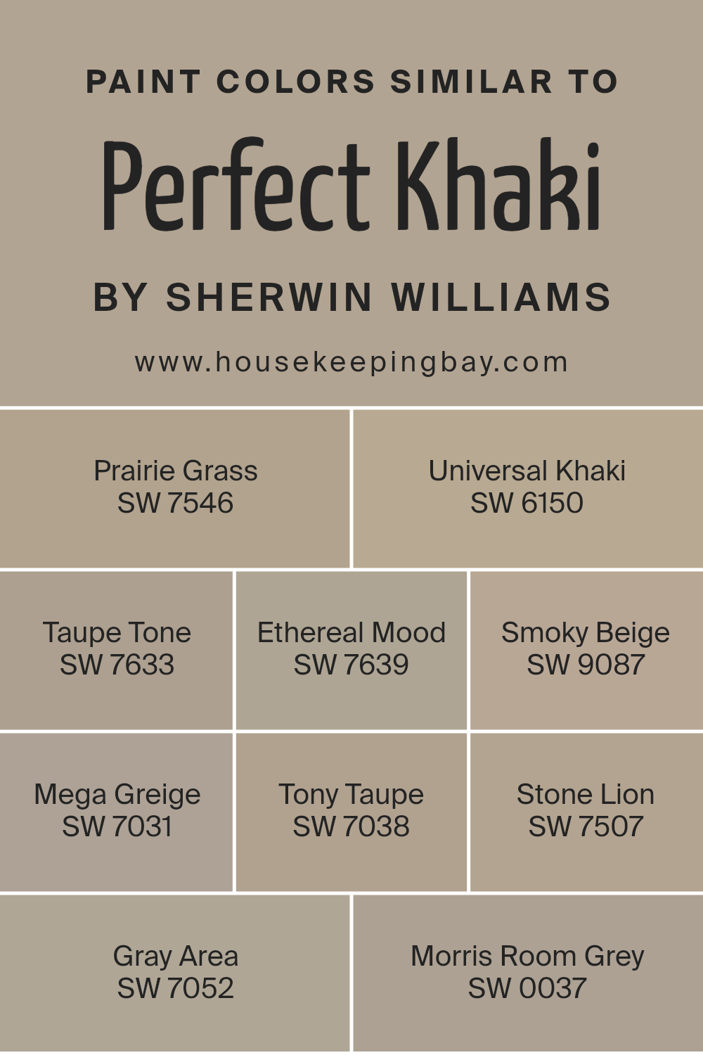
Colors Similar to Perfect Khaki SW 9612 by Sherwin Williams
Similar colors are crucial in designing spaces because they provide a cohesive and serene atmosphere, making the transition between walls and decor elements seamless. By using shades that are alike, one’s eye can move smoothly within the space, and it allows for a unified aesthetic that is pleasing. Colors like Perfect Khaki by Sherwin Williams and its analogous shades exemplify this utility well.
SW 7546 – Prairie Grass hints at nature with its warm green with subtle brown undertones, harmonizing with outdoor elements. SW 6150 – Universal Khaki is a versatile and gentle beige that pairs easily with various furnishings and styles. SW 7633 – Taupe Tone offers a rich, deeper taupe that adds a touch of sophistication to any space.
SW 7639 – Ethereal Mood is a soft gray that evokes a serene, calming feel. SW 9087 – Smoky Beige, as the name suggests, has a smoky tone that lends an elegant understatement to a room. SW 7031 – Mega Greige combines gray and beige to create a richer, fuller neutral that works well in spaces needing warmth. SW 7038 – Tony Taupe has a heavier gray influence, which makes it perfect for modern aesthetics.
SW 7507 – Stone Lion captures a stony color balance, blending beige and gray creatively. SW 7052 – Gray Area straddles the line between gray and blue, providing a cool, understated vibe. Lastly, SW 0037 – Morris Room Grey exhibits an almost historical charm with its deep, refined gray that pairs well with classical or modern decors.
Using these similar colors can achieve an effortless flow in any decorating scheme, simplifying design decisions while ensuring a polished look.
You can see recommended paint colors below:
- SW 7546 Prairie Grass
- SW 6150 Universal Khaki
- SW 7633 Taupe Tone
- SW 7639 Ethereal Mood
- SW 9087 Smoky Beige
- SW 7031 Mega Greige
- SW 7038 Tony Taupe
- SW 7507 Stone Lion
- SW 7052 Gray Area
- SW 0037 Morris Room Grey
housekeepingbay.com
How to Use Perfect Khaki SW 9612 by Sherwin Williams In Your Home?
Perfect Khaki SW 9612 by Sherwin Williams is a versatile paint color that offers a neutral backdrop with a warm, inviting tone. It’s a great choice for those looking to create a cozy and comfortable environment in their home without overpowering the space with bold colors.
Perfect Khaki works well in just about any room, whether it’s a living room, bedroom, or kitchen. Because of its subtle nature, it pairs easily with various décor styles and colors, allowing you to mix and match furniture and accessories without clashing.
For living rooms, Perfect Khaki can help create a relaxed atmosphere, making it a good color for walls where you want to chill and unwind. In bedrooms, its soothing nature can contribute to a restful space, ideal for a good night’s sleep. In kitchens or dining areas, this color can warm up the space, making it feel more welcoming. You can also use Perfect Khaki in hallways and entryways to craft a gentle introduction into your home’s interior.
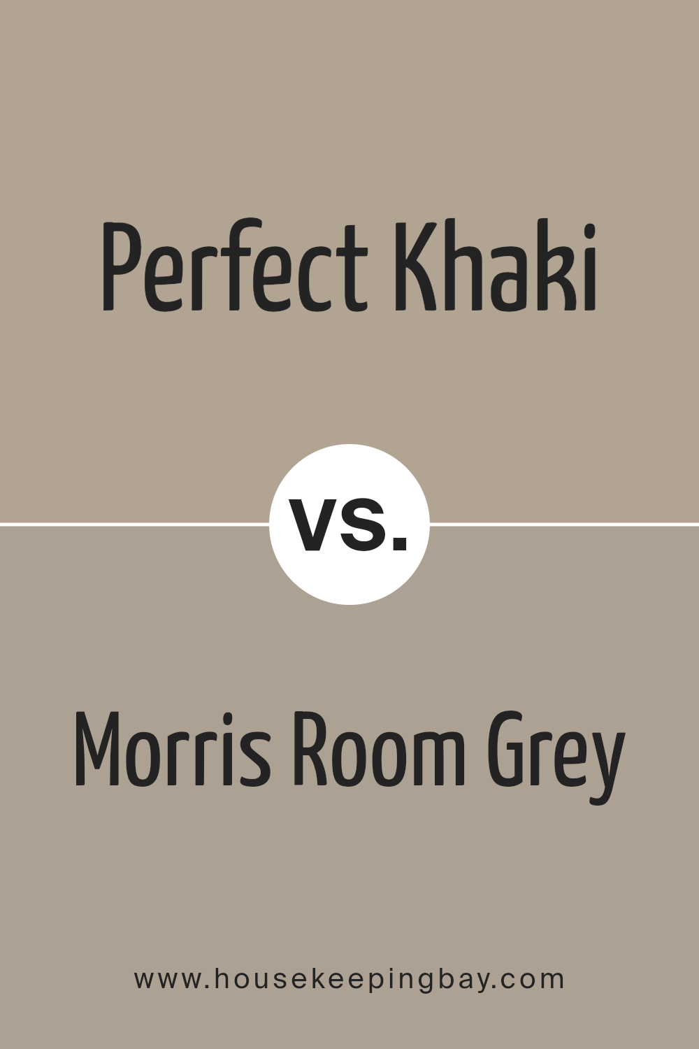
Perfect Khaki SW 9612 by Sherwin Williams vs Morris Room Grey SW 0037 by Sherwin Williams
Perfect Khaki SW 9612 by Sherwin Williams is a warm and versatile color that leans towards a soft brown with subtle hints of green. It creates a cozy and inviting atmosphere, making it suitable for living rooms or bedrooms where you want a sense of calm and comfort.
In contrast, Morris Room Grey SW 0037 is a muted grey that carries a more formal and refined tone. This color works well in spaces that aim for a classic or sophisticated look, such as home offices or dining areas. It pairs beautifully with both modern and traditional decor, providing a neutral backdrop that complements a wide range of accent colors.
Both colors are quite adaptable and can be used to enhance the aesthetic appeal of a space without overwhelming it. Perfect Khaki offers a touch of warmth, while Morris Room Grey gives a cooler, more understated elegance. Each has its own unique appeal, depending on the mood and style you wish to achieve in your room.
You can see recommended paint color below:
- SW 0037 Morris Room Grey
housekeepingbay.com
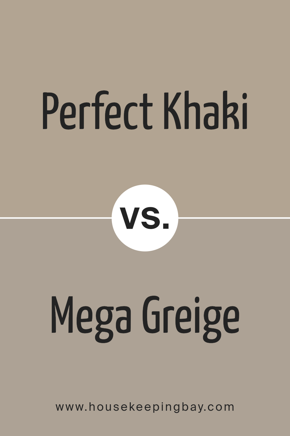
Perfect Khaki SW 9612 by Sherwin Williams vs Mega Greige SW 7031 by Sherwin Williams
Perfect Khaki SW 9612 by Sherwin Williams is a warm and welcoming neutral color with a yellow undertone. It creates a cozy and inviting atmosphere in any room, reflecting light nicely and making spaces appear more open and airy. This shade works well in living rooms or bedrooms, providing a calm and soft backdrop that pairs nicely with darker furniture or bright accents.
Mega Greige SW 7031, also by Sherwin Williams, leans more towards a gray-beige blend. This color has a more subdued, neutral undertone which makes it versatile in various lighting and design settings. Compared to Perfect Khaki, Mega Greige offers a cooler hue, giving spaces a sleek and modern look.
It is particularly effective in creating a sophisticated feel and can easily complement both contemporary and traditional décors.
Though both are neutral colors, Perfect Khaki brings warmth to a space, while Mega Greige offers a cooler, more understated elegance. Both colors support different aesthetic goals and adapt well across various room types and decorating styles.
You can see recommended paint color below:
housekeepingbay.com
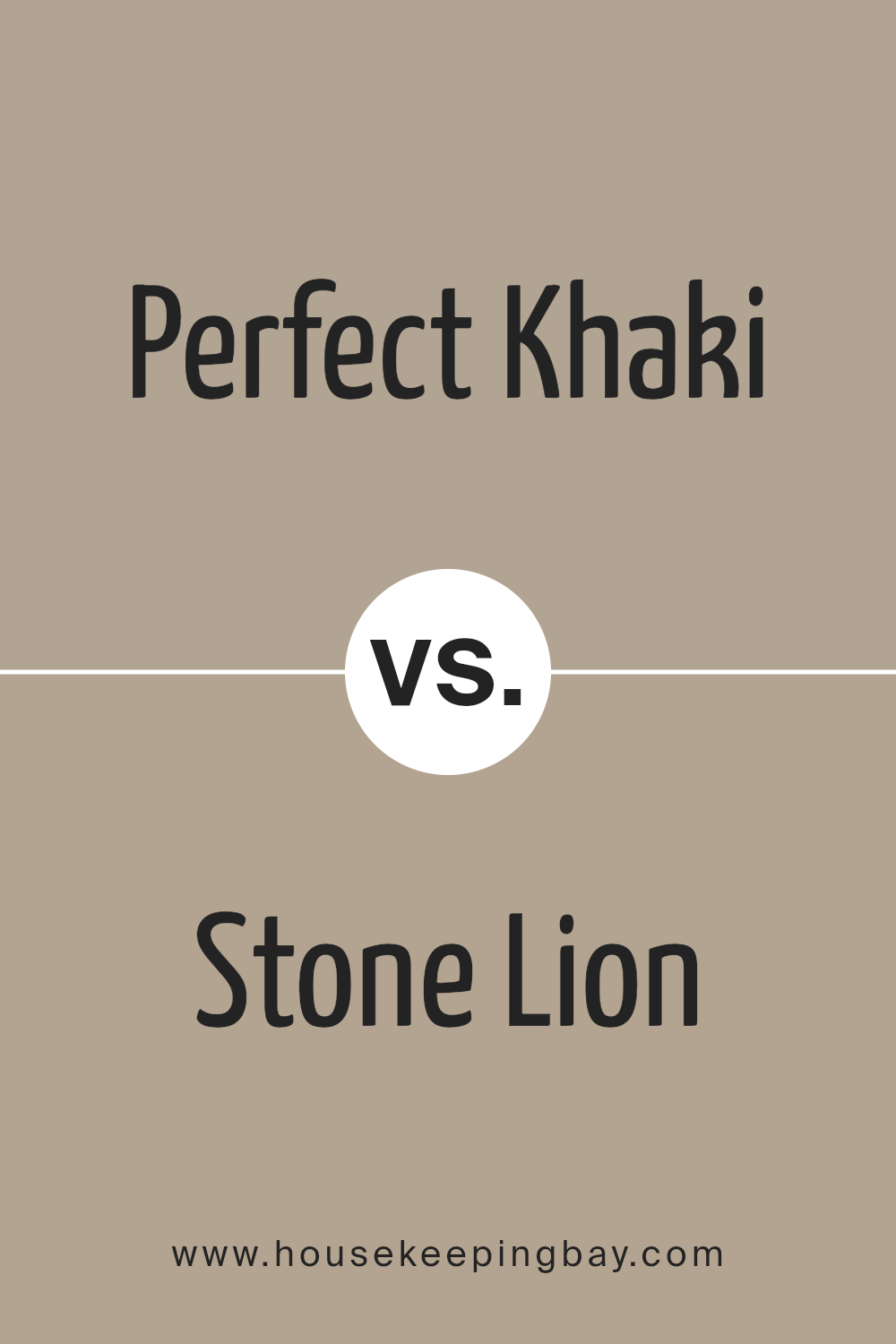
Perfect Khaki SW 9612 by Sherwin Williams vs Stone Lion SW 7507 by Sherwin Williams
Perfect Khaki SW 9612 and Stone Lion SW 7507, both from Sherwin Williams, offer subtle distinctions in their appeal and tone. Perfect Khaki presents as a lighter, warmer beige, bringing a softer and more airy feel to spaces. This color tends to brighten rooms while maintaining a cozy atmosphere. It pairs well with a wide range of decor, making it a versatile choice for many homes.
Stone Lion SW 7507, in contrast, leans towards a deeper, grayer beige. This shade adds a sense of sophistication and a more anchored, robust feel to an area. It’s particularly effective in spaces that aim for a grounded, serene environment.
The darker tone of Stone Lion makes it ideal for larger rooms, as it can make them feel more intimate.
Both colors reflect natural elements but do so with distinct undertones and depths, affecting their overall impact on a room’s aesthetic.
You can see recommended paint color below:
housekeepingbay.com
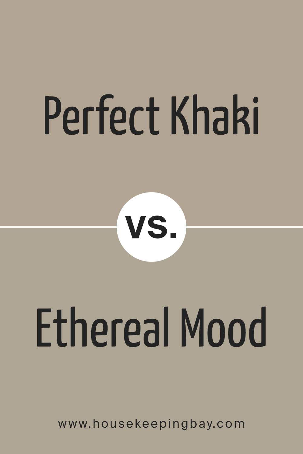
Perfect Khaki SW 9612 by Sherwin Williams vs Ethereal Mood SW 7639 by Sherwin Williams
“Perfect Khaki SW 9612” by Sherwin Williams is a warm and welcoming neutral shade, leaning towards a soft tan that adds a cozy, earthy feel to any room. It’s versatile and tends to blend well with various decor styles, making it a solid choice for areas where you want a relaxed but polished vibe.
In contrast, “Ethereal Mood SW 7639” veers into a cooler, more muted territory. This color presents a subtle mix of gray and green, offering a serene and sophisticated backdrop that works particularly well in spaces designed for calm and concentration, such as bedrooms or home offices.
While Perfect Khaki exudes warmth and an inviting atmosphere, Ethereal Mood provides a more understated, chic look. Both colors have their unique appeal and can significantly influence the mood and style of a space, depending on what you aim to achieve in your decorating project.
Whether you’re aiming for warmth with Perfect Khaki or a cooler aura with Ethereal Mood, both colors offer a stylish palette to beautify your home.
You can see recommended paint color below:
- SW 7639 Ethereal Mood
housekeepingbay.com
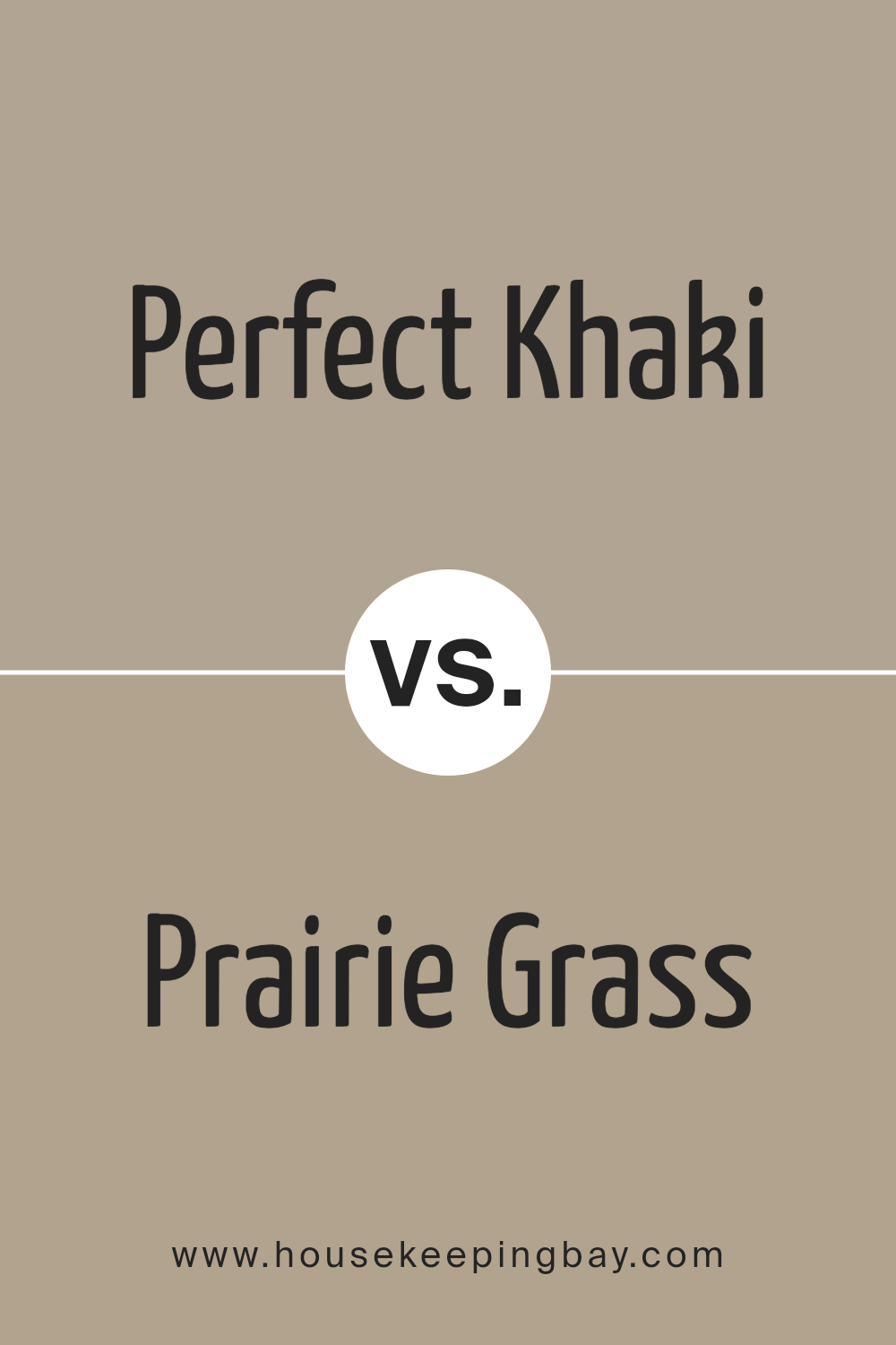
Perfect Khaki SW 9612 by Sherwin Williams vs Prairie Grass SW 7546 by Sherwin Williams
The main color, Perfect Khaki SW 9612, by Sherwin Williams, is a warm and soft beige with subtle brown undertones, providing a neutral backdrop suitable for various spaces. This color can create a cozy and inviting atmosphere, making it ideal for living rooms or bedrooms where a calming effect is desired. It pairs well with rich woods and other neutral tones, adding a subtle, elegant charm to any area.
Contrastingly, Prairie Grass SW 7546 is a richer, deeper beige with hints of green, giving it an earthy feel that brings nature’s colors indoors. This shade works particularly effectively in areas that benefit from a natural, grounding aesthetic, such as studies or dining rooms.
It complements botanical elements and organic materials, like stone or clay, enhancing the overall sense of comfort and warmth.
Both colors offer versatility and warmth, yet Prairie Grass provides a more distinctive, nature-inspired vibe while Perfect Khaki leans towards understated simplicity.
You can see recommended paint color below:
- SW 7546 Prairie Grass
housekeepingbay.com
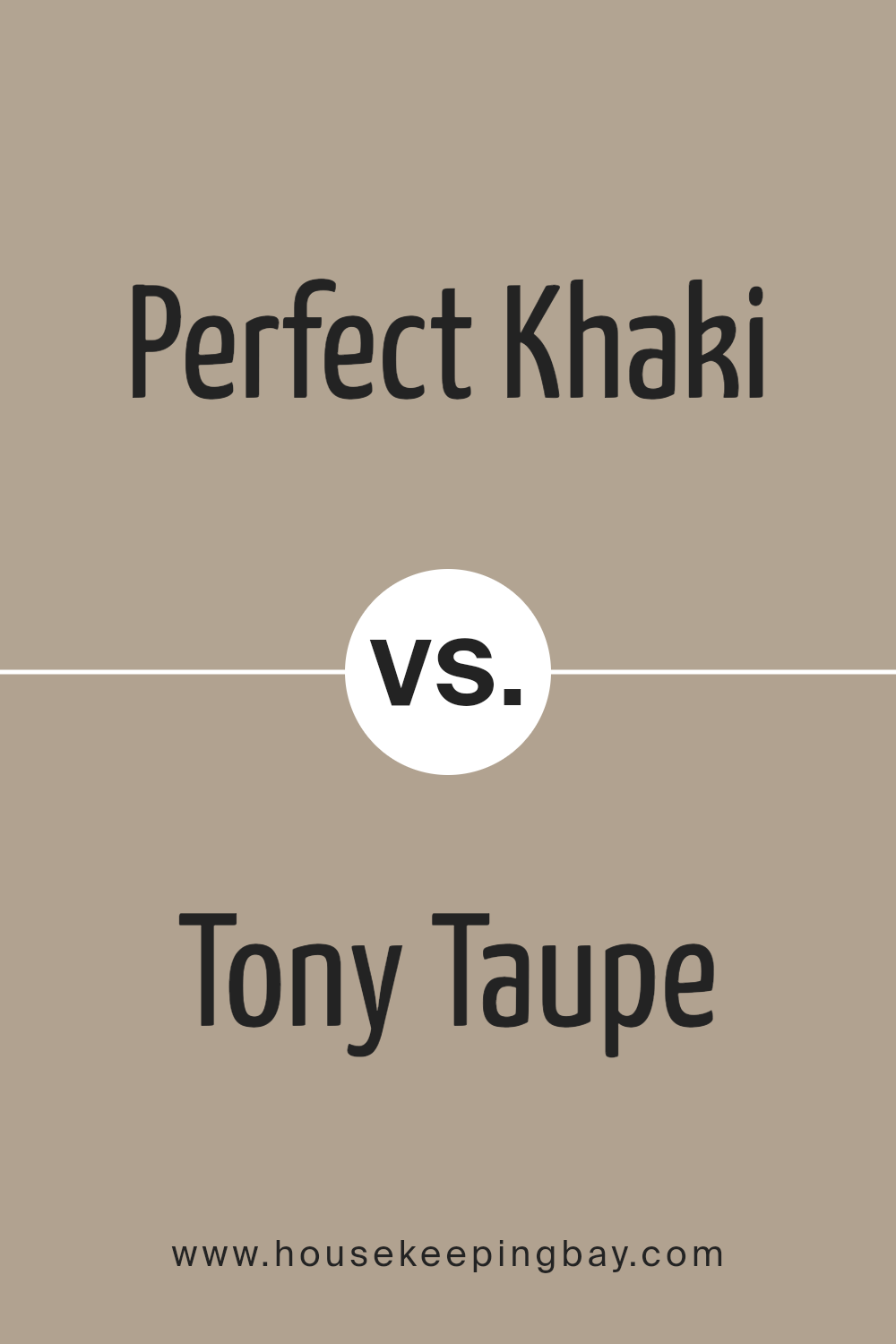
Perfect Khaki SW 9612 by Sherwin Williams vs Tony Taupe SW 7038 by Sherwin Williams
Perfect Khaki SW 9612 by Sherwin Williams is a light, soft beige color with a warm undertone, making it ideal for creating a cozy and inviting atmosphere in any room. It gives off a gentle, soothing vibe and works well in spaces that aim for a natural, understated look.
In contrast, Tony Taupe SW 7038 is a deeper, more grounded color, leaning towards a brownish-gray tone. This color can add a stronger, more pronounced sense of sophistication and warmth to a space.
While both colors share a neutrality that makes them versatile for various decor styles, Perfect Khaki tends to brighten rooms due to its lighter shade, whereas Tony Taupe provides richer depth, making it suitable for accent walls or larger areas.
Both colors pair well with natural materials and can complement a wide range of furnishings.
You can see recommended paint color below:
housekeepingbay.com
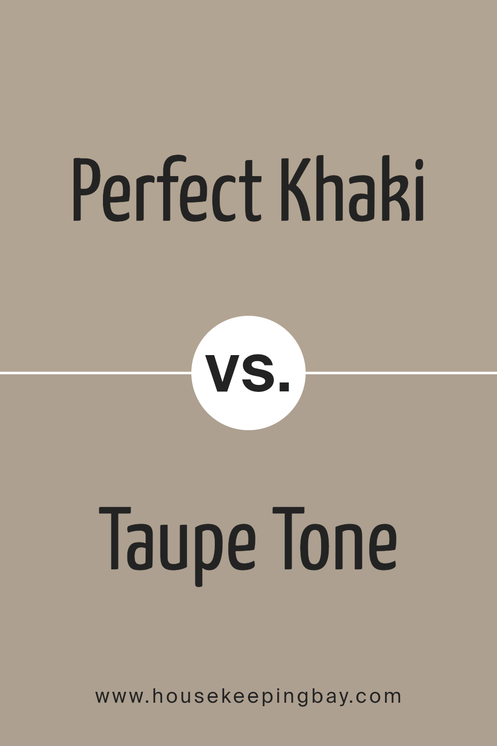
Perfect Khaki SW 9612 by Sherwin Williams vs Taupe Tone SW 7633 by Sherwin Williams
Perfect Khaki SW 9612 by Sherwin Williams is a light, muted beige with a warm base, giving it a cozy and inviting feel that’s ideal for living areas and bedrooms. It’s soft enough to serve as a neutral backdrop that can complement various decor styles and furniture colors. This color radiates a gentle, soothing ambiance without being overpowering.
Taupe Tone SW 7633, by contrast, leans slightly towards a deeper, gray-infused taupe. It offers a touch more sophistication and a contemporary feel, suitable for both modern and traditional spaces. This color can create a more defined and grounded look in a room, providing a subtle contrast against white trim or lighter furniture.
Both colors offer versatility and a calm, neutral palette for interior spaces. Where Perfect Khaki brings warmth, Taupe Tone introduces a more refined, cooler undercurrent. Each color works well in a range of lighting conditions, enhancing the space with their timeless appeal.
You can see recommended paint color below:
housekeepingbay.com
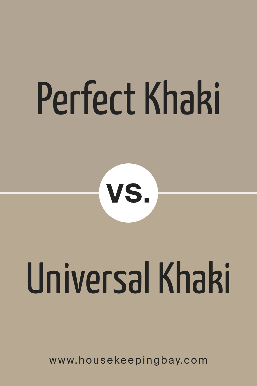
Perfect Khaki SW 9612 by Sherwin Williams vs Universal Khaki SW 6150 by Sherwin Williams
Perfect Khaki SW 9612 by Sherwin Williams is a lighter, softer shade which gives a room an airy and serene feeling. It blends well in spaces that aim for a subtle and calm atmosphere, ideal for creating a relaxed environment. Its lightness allows it to reflect more light, making it suitable for small or darker rooms to appear more spacious and brighter.
Universal Khaki SW 6150, by contrast, has a deeper, warmer tone that adds a cozy and comfortable feeling to any space. This color is better for those who prefer a more pronounced, yet still neutral background that can support a variety of decorating styles.
It’s particularly effective in larger or well-lit areas where its richness can stand out without overpowering the space.
Both colors present a neutral palette but serve different aesthetic purposes depending on the room’s lighting and size. Perfect Khaki is ideal for a gentle, light-enhancing effect, while Universal Khaki works great for adding warmth and depth.
You can see recommended paint color below:
- SW 6150 Universal Khaki
housekeepingbay.com
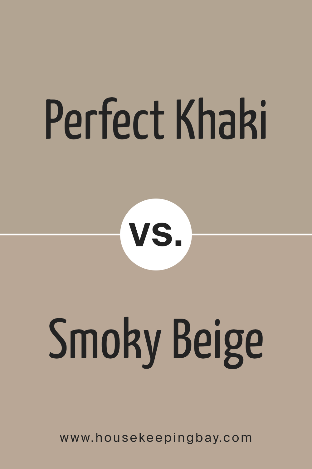
Perfect Khaki SW 9612 by Sherwin Williams vs Smoky Beige SW 9087 by Sherwin Williams
Perfect Khaki SW 9612 and Smoky Beige SW 9087, both by Sherwin Williams, showcase a warm, neutral palette yet carry distinct undertones that set them apart. Perfect Khaki is a light, warm beige with a yellow undertone, offering a soft and welcoming feel ideal for living spaces or bedrooms. It brightens a room while maintaining a cozy atmosphere.
Conversely, Smoky Beige is slightly darker and richer, with a gray undertone that provides a more grounded and subdued look. This color is excellent for areas where a sophisticated, neutral backdrop is desired, such as in studies or dining rooms.
Both colors are versatile and can be paired beautifully with a wide range of decor styles, from modern to rustic. However, the choice between them may depend on the desired mood and lighting of the space, with Perfect Khaki bringing a bit more warmth and Smoky Beige lending a subtle, polished air.
You can see recommended paint color below:
- SW 9087 Smoky Beige
housekeepingbay.com
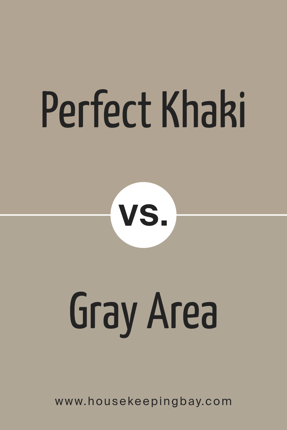
Perfect Khaki SW 9612 by Sherwin Williams vs Gray Area SW 7052 by Sherwin Williams
Perfect Khaki SW 9612 by Sherwin Williams is a warm, soft beige with a slightly earthy undertone. It provides a cozy vibe and tends to create a relaxing atmosphere in any room. This color works well in spaces where you want to foster a sense of comfort and calmness.
Gray Area SW 7052, also from Sherwin Williams, leans more towards a neutral, mid-tone gray. It has a modern feel to it and is versatile for various decorating styles. Gray Area can act as a subtle backdrop in a room, allowing other colors or decor elements to stand out more prominently.
Both colors offer a neutral palette, but Perfect Khaki brings warmth, ideal for living areas and bedrooms, while Gray Area offers a cooler tone that fits well in contemporary settings or spaces where a more formal look is desired. Each color enhances different moods and themes, depending on the effect you wish to achieve in your space.
You can see recommended paint color below:
- SW 7052 Gray Area
housekeepingbay.com
Conclusion
After looking into SW 9612 Perfect Khaki by Sherwin Williams, I find it truly lives up to its name as a versatile and appealing choice for any space. As one of the timeless shades, it offers a harmonious balance; not too dark or too light, making it just right for those seeking a cozy yet sophisticated ambiance in their room.
This color pairs wonderfully with a variety of decor styles and enhances other colors used in interior design. Its understated elegance ensures that it can adapt to both modern and traditional settings, creating a seamless look that is always pleasing to the eye.
For anyone updating their home or starting a fresh project, Perfect Khaki proves itself as a reliable, classic hue that can help achieve a beautiful, cohesive look effortlessly.
This investigation led me to appreciate its utility and aesthetic appeal, establishing it as a prime selection for anyone keen on creating a warm, inviting environment.
housekeepingbay.com
Ever wished paint sampling was as easy as sticking a sticker? Guess what? Now it is! Discover Samplize's unique Peel & Stick samples. Get started now and say goodbye to the old messy way!
Get paint samples


