Copen Blue SW 0068 by Sherwin Williams
A Soothing Splash of Serenity
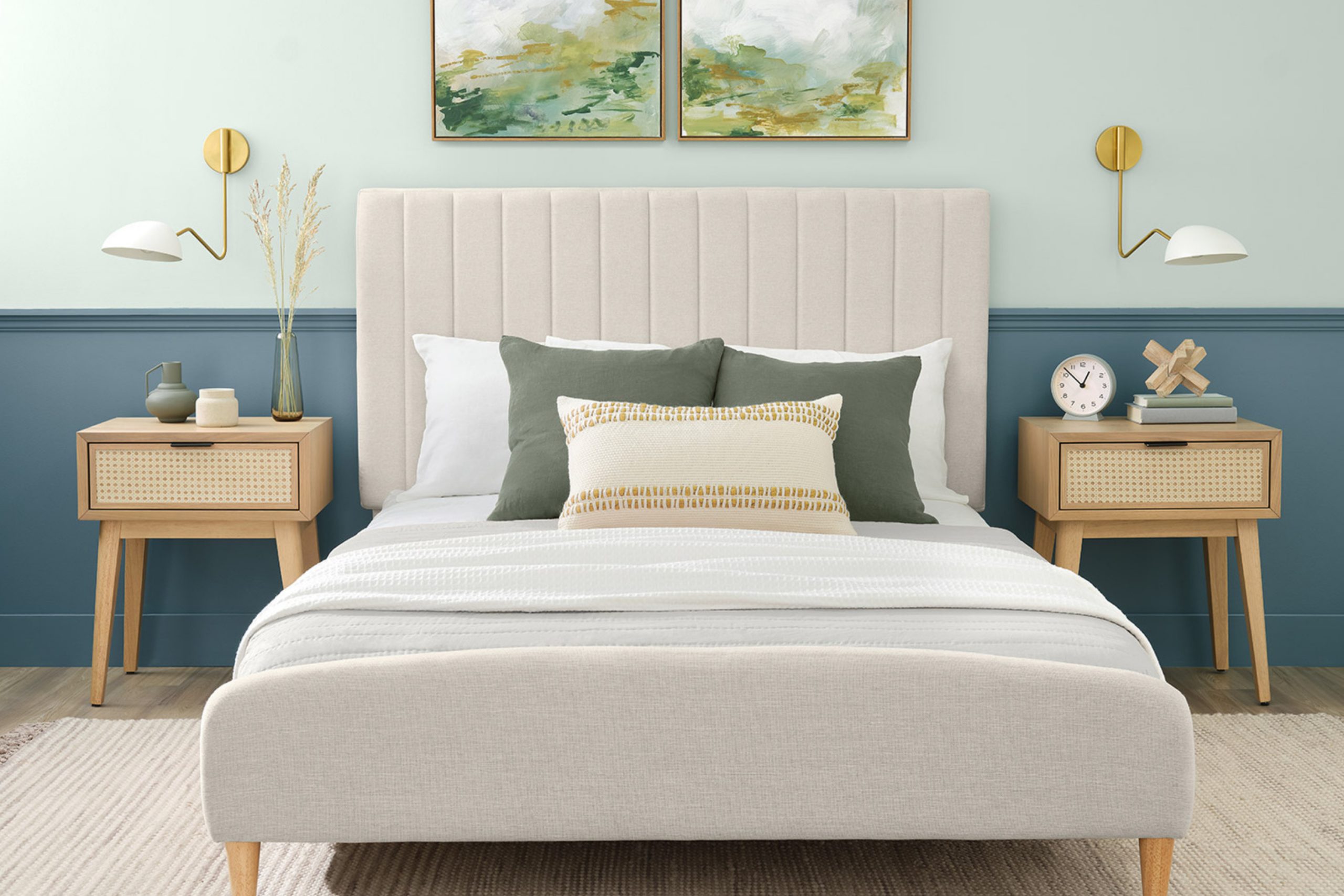
Let me introduce you to SW 0068 Copen Blue by Sherwin Williams. This shade is a soothing blue with a hint of gray that brings a calm and soft touch to any room. It’s perfect for creating a serene atmosphere, whether you want to refresh your living room, bedroom, or even your kitchen.
Copen Blue is not just any blue; it’s a unique blend that strikes a beautiful balance between coolness and soft, inviting warmth. It works wonderfully with white trim, adding just the right amount of contrast.
Moreover, it pairs nicely with natural elements like wood and metal, which means it can fit seamlessly into various decorating styles.
If you feel ready for a change, Copen Blue might be the perfect choice to bring a peaceful and gentle energy into your home. It’s a color that truly turns any room into a soothing escape while still keeping things chic and up-to-date.
Why not give it a try and see how it transforms your space?
via blog.sherwin-williams.com
What Color Is Copen Blue SW 0068 by Sherwin Williams?
Table of Contents
Copen Blue SW 0068 by Sherwin Williams is a soothing, mid-toned blue with subtle gray undertones, delivering a calm and serene vibe perfect for creating a refreshing atmosphere in any room. This versatile hue works beautifully in a range of interior styles, particularly shining in Coastal, Scandinavian, and Traditional designs due to its clean and crisp nature.
In Coastal-inspired interiors, Copen Blue mimics the peaceful essence of the seaside, pairing exquisitely with sandy beiges, soft whites, and natural wood finishes like distressed oak or walnut, enhancing a light, airy feel. Incorporating textures such as linen, jute, and light cotton also complements its maritime appeal.
For Scandinavian settings, this color supports the minimalistic and functional aesthetic of the style. Combine it with pale woods, such as birch or pine, and materials like wool or felt in neutral tones to maintain a cozy yet uncluttered look.
Traditional spaces benefit from Copen Blue through its affinity with richer wood tones like cherry or mahogany and elegant textiles such as velvet or silk, providing a touch of sophistication and depth.
Overall, Copen Blue SW 0068 is an adaptable choice, capable of harmonizing with a wide range of materials and textures to create inviting interiors.

housekeepingbay.com
Is Copen Blue SW 0068 by Sherwin Williams Warm or Cool color?
Copen Blue SW 0068 by Sherwin Williams is a soft, misty blue that brings a calming feel to any home space. This versatile shade pairs well with different decorating styles, from coastal to traditional. In rooms with ample natural light, Copen Blue looks airy and gentle, making the space seem larger and more open. In areas with less light, it adds a cozy, comforting vibe without making the room feel closed in.
This color is also quite flexible when it comes to color combinations. It works beautifully with whites and grays for a clean, crisp look, or with warm woods and creams for a more grounded, welcoming feel. In a bedroom, Copen Blue can help create a peaceful setting that’s ideal for relaxation.
It’s also fitting for bathrooms where you want to establish a soothing atmosphere. Budget-friendly, this paint can quickly refresh walls and help shift the mood of your interiors.
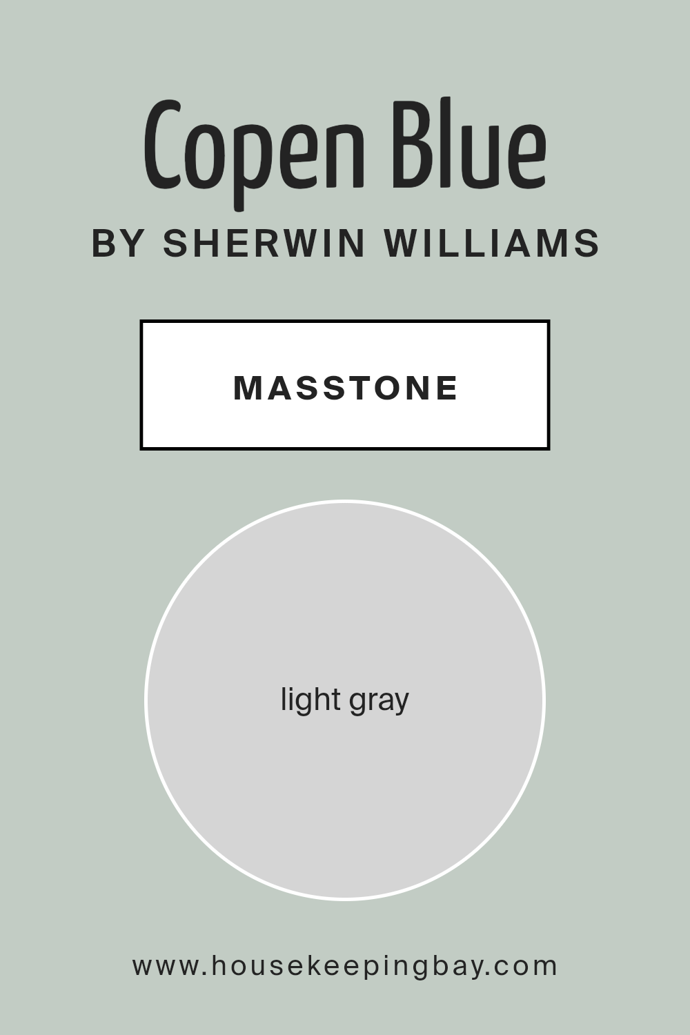
What is the Masstone of the Copen Blue SW 0068 by Sherwin Williams?
Copen Blue SW 0068 by Sherwin Williams has a masstone of light gray, which is depicted by the color code #D5D5D5. This soothing light gray tint gives it a gentle look and allows it to blend seamlessly into a variety of home environments.
Its neutrality makes it a versatile choice, acting almost like a canvas on which different decor styles and color palettes can shine. Whether your home features modern minimalism or cozy country aesthetics, Copen Blue can fit in without overwhelming the space.
This color can also help in making small rooms appear larger and brighter, as light tones naturally reflect more light. Its masstone does not overpower; instead, it provides a subtle background that enhances the feeling of space and light. Copen Blue is particularly effective in living areas and bedrooms where a calm atmosphere supports relaxation and peace.
It pairs beautifully with both bold colors to create contrasts or similar soft hues for a harmonious look.
housekeepingbay.com
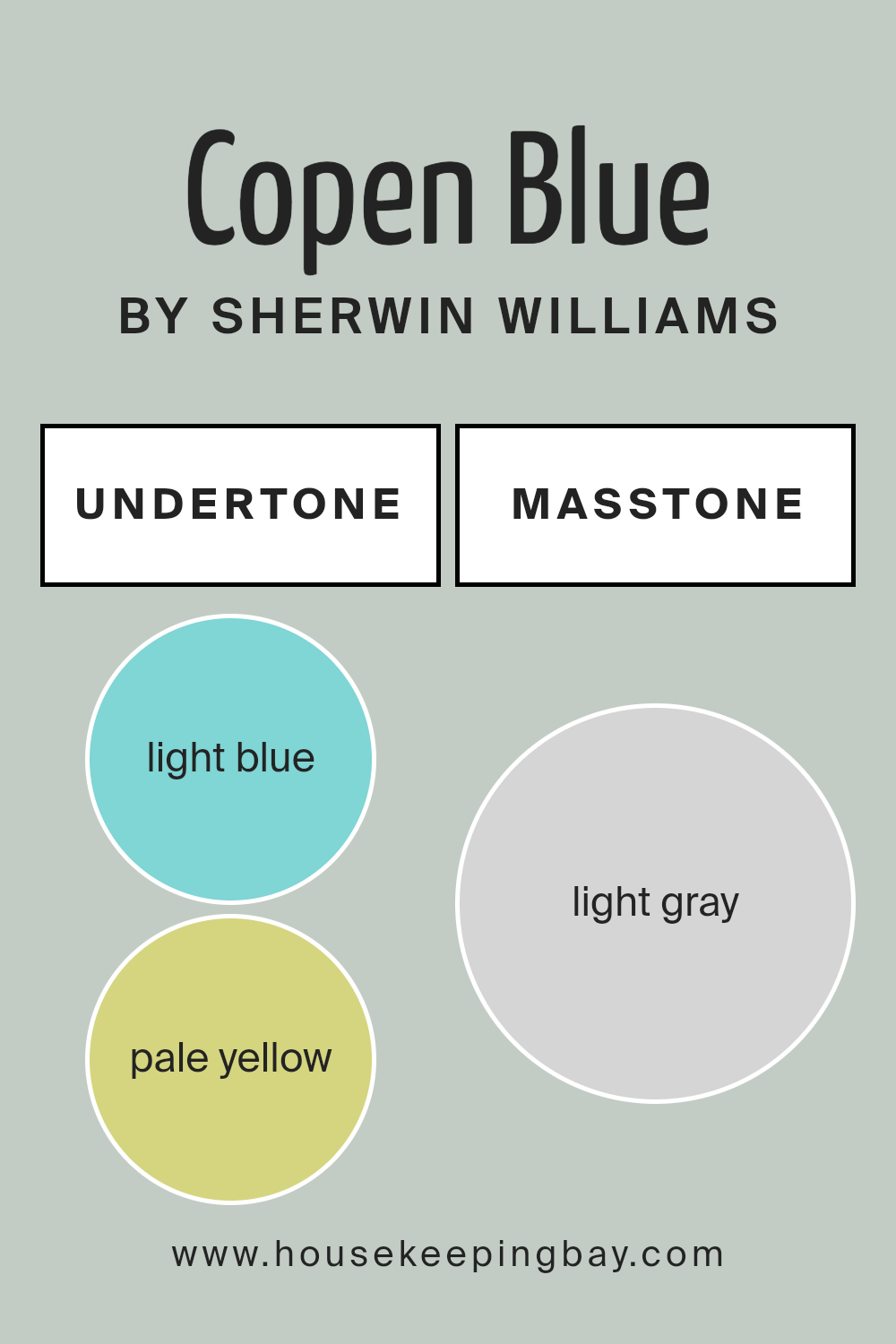
Undertones of Copen Blue SW 0068 by Sherwin Williams
Copen Blue SW 0068 by Sherwin Williams is a versatile paint color that brings a soothing atmosphere to any space. The undertones of a color are subtle hues that can influence the overall appearance of the paint once applied to walls. For Copen Blue, these undertones include light blue, pale yellow, light purple, mint, lilac, pale pink, and grey.
Each undertone contributes differently:
– Light Blue and Mint support the main blue tone, enhancing the feel of calmness.
– Pale Yellow and Pale Pink add a slight warmth, making the space feel more inviting.
– Light Purple and Lilac introduce a touch of softness, which can make large spaces feel more intimate.
– Grey moderates the vibrancy of the blue, ensuring it’s not too overpowering and adds a contemporary edge.
When applied to interior walls, Copen Blue along with its undertones can greatly affect the mood and visual size of the room. Lighter and warmer undertones can make the room feel more spacious and airy, while cooler undertones like mint and lilac can make it feel more enclosed and cozy.
The combination of these undertones in Copen Blue means it maintains a balance, making it suitable for various lighting conditions and complementary to many decor styles.
The versatility of this shade with its mixed undertones allows for flexibility in decorating, whether aiming for a soft, neutral look or pairing with bolder colors.
housekeepingbay.com
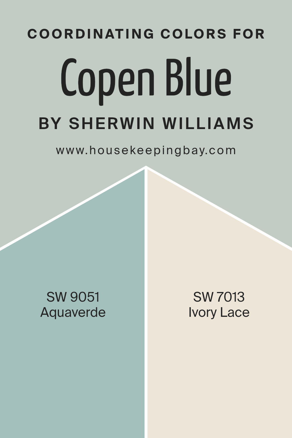
Coordinating Colors of Copen Blue SW 0068 by Sherwin Williams
Coordinating colors are chosen to complement the main color in a space, enhancing the overall aesthetic without overpowering it. When using Copen Blue SW 0068 by Sherwin Williams, a beautiful shade that brings a gentle calmness to any room, selecting the right coordinating colors is essential to create a balanced design.
Coordinating colors should harmonize with the main shade, either by being on the same color spectrum or by offering a pleasant contrast that adds depth and interest to the decor.
For Copen Blue, one effective coordinating color is Aquaverde SW 9051 by Sherwin Williams. This color is a soft, subtle green with a hint of aqua that can lighten the atmosphere when paired with the deeper blue of Copen Blue, providing a refreshing feel to the space.
Another excellent match is Ivory Lace SW 7013, a soft, warm white with a delicate touch.
Ivory Lace can act as a neutral backdrop, allowing Copen Blue to stand out while giving the room a bright and airy feel. Together, these coordinating colors create a serene and inviting environment that enhances the visual appeal and mood of a space.
You can see recommended paint colors below:
- SW 9051 Aquaverde
- SW 7013 Ivory Lace
housekeepingbay.com
How Does Lighting Affect Copen Blue SW 0068 by Sherwin Williams?
Lighting significantly alters how colors appear. Different light sources can change a color’s intensity and hue. For example, “Copen Blue SW 0068” by Sherwin Williams can look different under various lighting conditions. This shade, a soft, serene blue, subtly shifts depending on the light surroundings.
In artificial light, such as LED or incandescent bulbs, Copen Blue tends to appear slightly warmer, leaning towards a muted teal. Artificial light generally enhances the green undertone in the blue, giving it a cozy feel, ideal for living spaces aiming for a soothing ambiance.
Under natural light, Copen Blue appears truer to its original shade. Sunlight reveals its crisp, clean qualities, making the room feel airy and fresh. Natural light displays this paint color in its best form, showcasing its soothing and gentle blue tones.
In rooms facing north, natural light is cooler and more consistent but limited in brightness. Here, Copen Blue may look more subdued and shadowy, possibly reflecting a more profound, contemplative blue. This makes it suitable for bedrooms or study areas where a calmer, focused atmosphere is beneficial.
In south-facing rooms, abundant in bright, warm light for most of the day, Copen Blue lights up vibrantly. It can transform the room into a lively, refreshing space, perfect for kitchens or family rooms where a cheerful and inviting environment is desired.
For east-facing rooms, morning light can make Copen Blue look exceptionally bright and cheerful, gradually becoming softer and cooler as the day progresses. This naturally dynamic lighting works well in dining areas or breakfast nooks, offering an uplifting tone in the morning.
West-facing rooms receive intense evening light, which can make Copen Blue appear richer and more intense. Here, the paint might be ideal in living spaces used more during the afternoon or evening, enhancing relaxation after a long day.
Thus, Copen Blue’s versatility in different lighting and directions makes it a flexible choice for various home spaces.
housekeepingbay.com
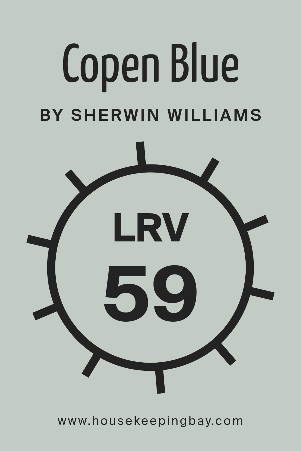
What is the LRV of Copen Blue SW 0068 by Sherwin Williams?
LRV stands for Light Reflectance Value, a measure used to indicate how much light a paint color will reflect back into a room. It is expressed on a scale from 0 to 100, where 0 is pure black, absorbing all light, and 100 is pure white, reflecting all light.
Colors with higher LRVs are typically used to make a space feel larger and brighter because they reflect more light. Conversely, colors with lower LRVs absorb more light, which can make a room feel cozier but smaller and darker.
For the color Copen Blue SW 0068 by Sherwin Williams, which has an LRV of 58.649, it is moderately reflective. This LRV suggests that while it won’t brighten a space as effectively as a color with a higher LRV, it will also not darken a room like colors with much lower LRVs.
Copen Blue will provide a balanced ambience, making it a versatile choice that can work well in spaces that receive a fair amount of natural light, enhancing the room’s overall feel without making it feel cramped or excessively bright.
housekeepingbay.com
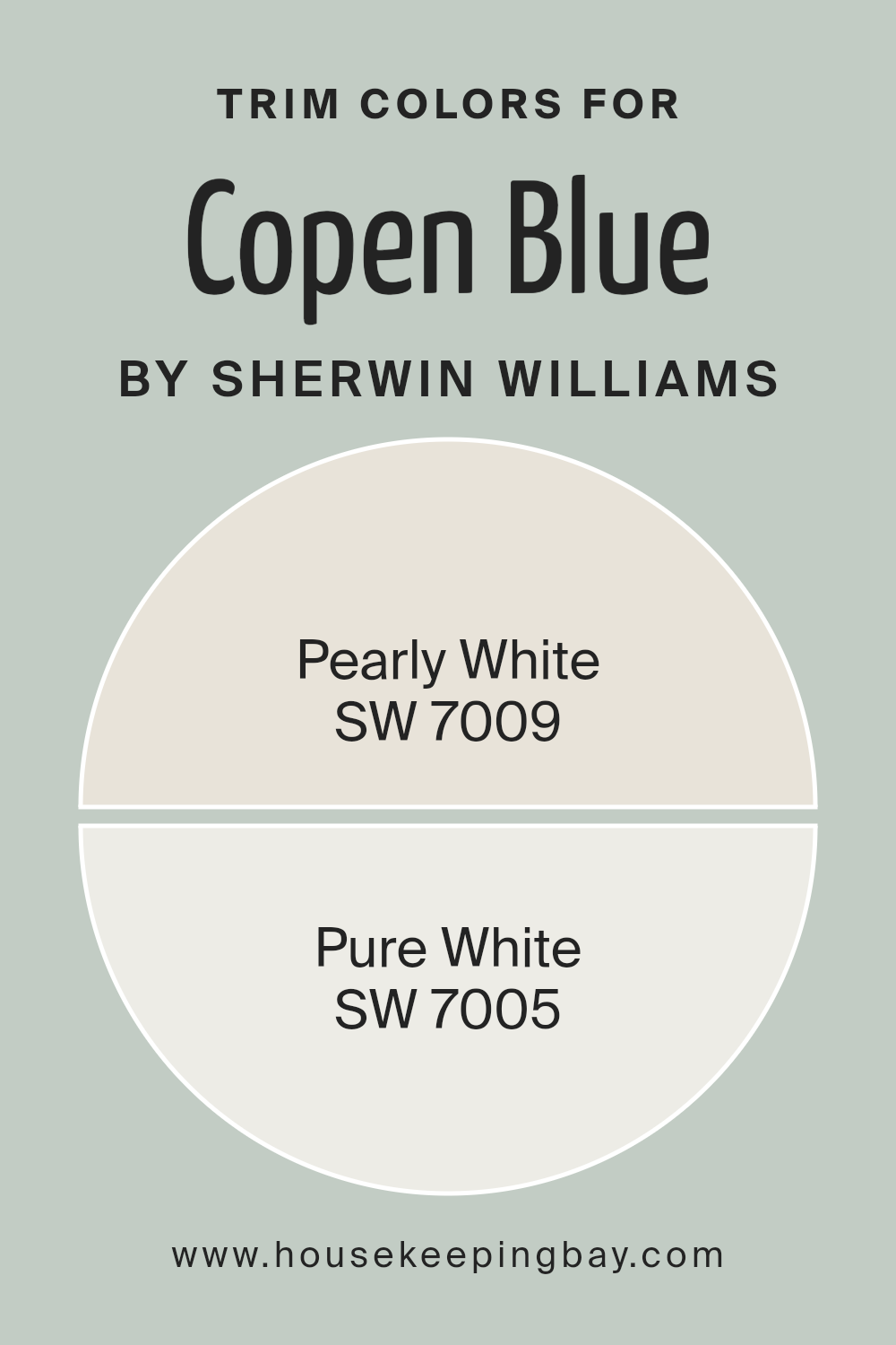
What are the Trim colors of Copen Blue SW 0068 by Sherwin Williams?
Trim colors are specific shades used on the architectural trim elements of a room, such as baseboards, moldings, doors, and window frames. They play a crucial role in defining and accentuating the overall look of a space, creating a visual boundary that can highlight the architectural features of a home.
When paired with a wall color like Copen Blue SW 0068 by Sherwin-Williams, selecting an appropriate trim color is essential to enhance the desired atmosphere without overwhelming the primary hue.
A light trim color can break up the space visually, adding a fresh and clean contrast that makes the wall color pop, providing a professional and polished finish.
Pearly White SW 7009 is a soft, muted white with a subtle pearl-like undertone that adds a gentle warmth to spaces, making it a perfect complement to the cooler tones of Copen Blue SW 0068. It helps to soften the transition between different surfaces, infusing a subtle coziness into the room.
On the other hand, Pure White SW 7005 is a brighter, more straightforward white that delivers a crisp and clear boundary against more vivid or darker colors like Copen Blue.
This shade is ideal for bringing a fresh clarity to the space, ensuring that the trim stands out distinctly, which helps in maintaining a clean and vibrant aesthetic.
You can see recommended paint colors below:
housekeepingbay.com
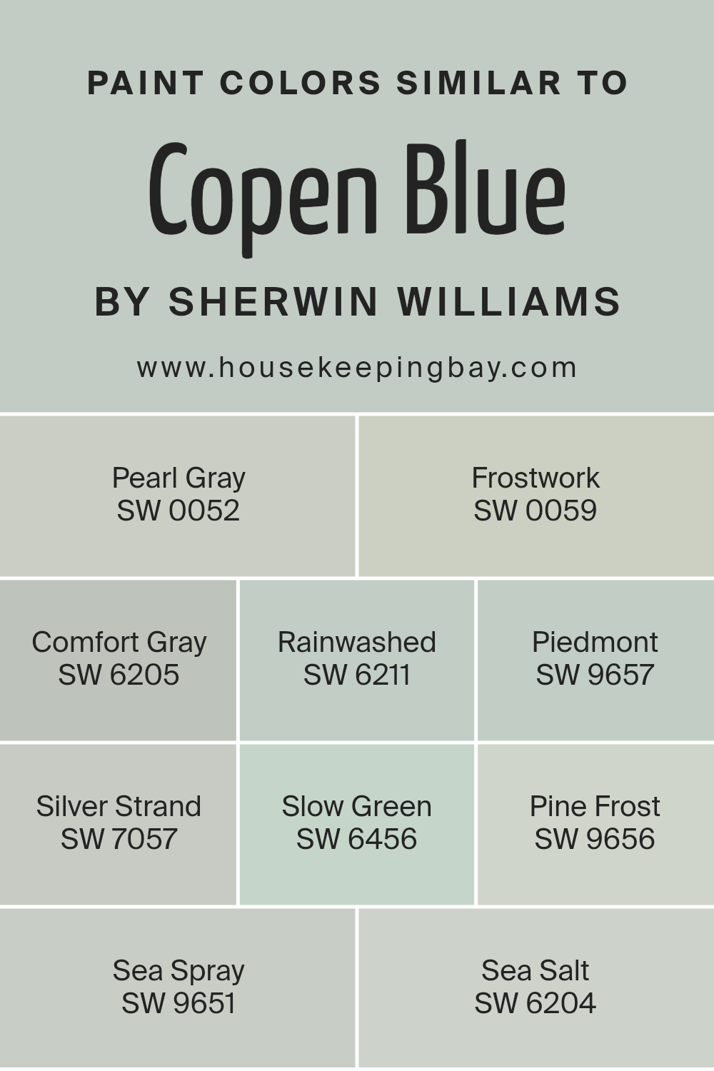
Colors Similar to Copen Blue SW 0068 by Sherwin Williams
Similar colors are essential in design because they create a cohesive and harmonious aesthetic, making spaces feel more connected and visually pleasing. When colors like those similar to Copen Blue by Sherwin Williams are used together, they have the ability to subtly enhance each other without overwhelming the senses. This palette predominantly involves hues that blend seamlessly, promoting a serene and inviting atmosphere.
For example, Sherwin Williams’ Pearl Gray is a muted, soft gray that offers a subtle backdrop, ideal for relaxed environments. Frostwork possesses a slightly lighter and airy feel, which pairs well with soft furnishings. Comfort Gray veers towards a greenish-gray, giving it a warm, earthy quality that is comforting and grounding.
Rainwashed has a hint of blue and green, reminiscent of a misty morning, perfect for creating a soothing space. Piedmont is a deeper tone that lends an element of sophistication, while Silver Strand blends gray with a splash of blue, resulting in a fresh and modern vibe. Slow Green is a gentle green with hints of gray, providing a natural, restful color for any room.
Further enhancing the green palette, Pine Frost offers a cooler touch, reminiscent of a frosty forest. Sea Spray is a light, bluish-green that whispers of coastal breezes and calm seas. Finally, Sea Salt is another soft blend of green and blue tones, embodying the lightness of ocean spray and enhancing a light, airy feel in interiors.
Using similar shades such as these can effectively create a space that feels both unified and refined, where each color supports and completes the overall aesthetic.
You can see recommended paint colors below:
- SW 0052 Pearl Gray
- SW 0059 Frostwork
- SW 6205 Comfort Gray
- SW 6211 Rainwashed
- SW 9657 Piedmont
- SW 7057 Silver Strand
- SW 6456 Slow Green
- SW 9656 Pine Frost
- SW 9651 Sea Spray
- SW 6204 Sea Salt
housekeepingbay.com
How to Use Copen Blue SW 0068 by Sherwin Williams In Your Home?
Copen Blue SW 0068 by Sherwin Williams is a soothing shade that leans toward a soft, pastel blue with hints of gray. This calming hue is ideal for creating a peaceful atmosphere in any space within your home. It pairs beautifully with both light and dark colors, allowing for versatile design choices.
Use Copen Blue in bedrooms to foster a restful environment, or apply it in bathrooms for a spa-like feel. This color also works well in living areas and kitchens where the goal is to create a serene, welcoming space. It complements natural elements like wood and stone, enhancing their natural beauty without overwhelming them.
For those looking to add a touch of subtle color without making a space feel too busy, Copen Blue is a perfect choice. It’s especially effective in homes with a coastal or Scandinavian theme, but its adaptability means it fits well within most design schemes. Consider using it on accent walls, cabinets, or even ceilings for a gentle pop of color.
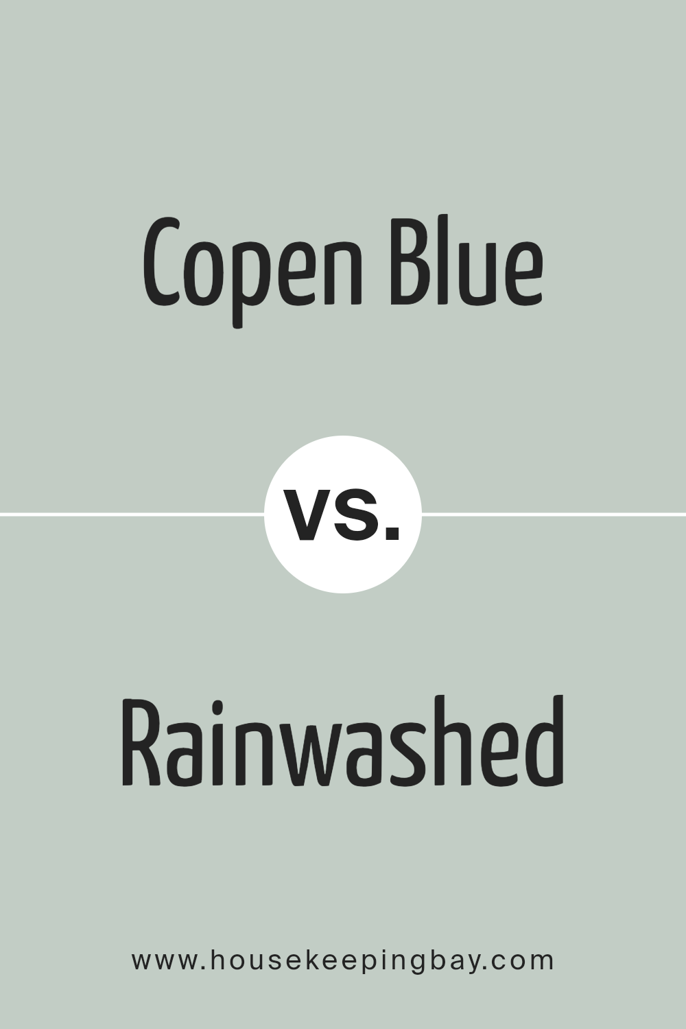
Copen Blue SW 0068 by Sherwin Williams vs Rainwashed SW 6211 by Sherwin Williams
Copen Blue SW 0068 by Sherwin Williams is a deep, grayish-blue tone that carries a hint of nostalgia and classic beauty. This color is ideal for spaces where you want to create a sense of calmness and steadiness. It pairs well with natural woods or crisp whites, offering a sophisticated and timeless ambiance.
Rainwashed SW 6211 by Sherwin Williams is lighter and leans towards a soft green with subtle blue undertones. The presence of green makes it soothing and perfect for bedrooms or bathrooms, giving a fresh and airy feel. This color works well with light creams or soft beige, enhancing a bright and open space.
Both colors offer unique aesthetics: Copen Blue creates a more anchored, serene environment, while Rainwashed offers a gentle uplift to any room. When choosing between them, consider the mood and functionality of the space. Rainwashed might be better for smaller, well-lit rooms, whereas Copen Blue suits larger or more formal areas.
You can see recommended paint color below:
housekeepingbay.com
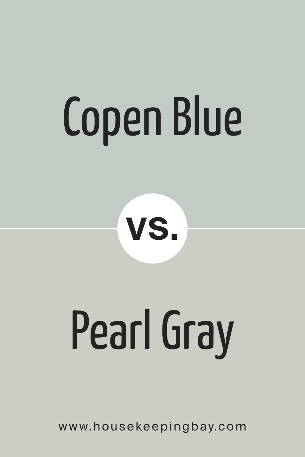
Copen Blue SW 0068 by Sherwin Williams vs Pearl Gray SW 0052 by Sherwin Williams
Copen Blue SW 0068 by Sherwin-Williams is a vibrant, soothing shade of blue that adds a refreshing touch to any space. It evokes feelings of calmness and can brighten rooms while maintaining a serene atmosphere. This color works well in areas where relaxation is key, such as bedrooms and bathrooms.
Pearl Gray SW 0052, also by Sherwin-Williams, is a neutral gray that offers a subtle, sophisticated backdrop. It’s versatile enough to match with various decor styles and can make other colors in a room pop. Being a lighter gray, it helps in making spaces seem larger and more open.
While Copen Blue is more about adding a splash of color, Pearl Gray is about creating a clean, minimalistic look. Both colors can be used effectively in different ways to enhance the aesthetic of a home.
You can see recommended paint color below:
- SW 0052 Pearl Gray
housekeepingbay.com
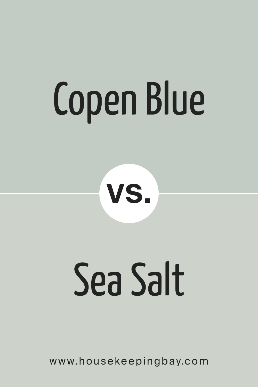
Copen Blue SW 0068 by Sherwin Williams vs Sea Salt SW 6204 by Sherwin Williams
Copen Blue SW 0068 by Sherwin Williams is a medium-to-deep shade of blue with subtle green undertones, giving it a calm and serene feel. It makes any space feel more cozy and inviting. This color works well in living areas or bedrooms where a soothing atmosphere is desired.
Sea Salt SW 6204, also by Sherwin Williams, is a much lighter color with a mix of gray and green tones. This color is perfect for creating a fresh, airy look in a room. It often appears more neutral and can adapt to various lighting conditions, reflecting a softer feel that is ideal for bathrooms and kitchens.
While Copen Blue is deeper and richer, making a bold statement, Sea Salt offers a subtle and clean appearance, enhancing spaces with a light and breezy touch. Their uses in home decor vary primarily based on their intensity and the mood one aims to set in the space.
You can see recommended paint color below:
housekeepingbay.com
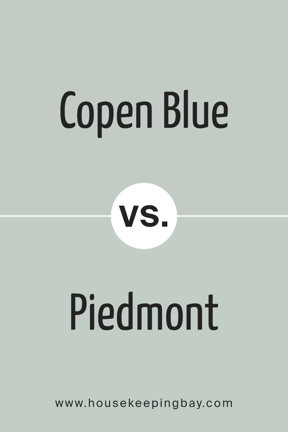
Copen Blue SW 0068 by Sherwin Williams vs Piedmont SW 9657 by Sherwin Williams
Copen Blue SW 0068 by Sherwin Williams is a soothing, mid-tone blue that has a noticeable gray undertone. It brings a calm and peaceful vibe to any space, ideal for creating a serene environment. This color works well in bedrooms or bathrooms where a relaxing atmosphere is often desired.
In contrast, Piedmont SW 9657 is a much lighter and softer shade. It has a delicate, airy quality, making it perfect for small rooms or spaces with limited natural light. Its subtle tones can help make a room feel larger and more open.
Both colors offer unique benefits, depending on what you want to achieve in a space. Copen Blue is stronger and more pronounced, suited for those who prefer a more defined color presence. Piedmont, being lighter, is excellent for those looking to add just a hint of color while maintaining a bright and spacious feeling.
You can see recommended paint color below:
- SW 9657 Piedmont
housekeepingbay.com
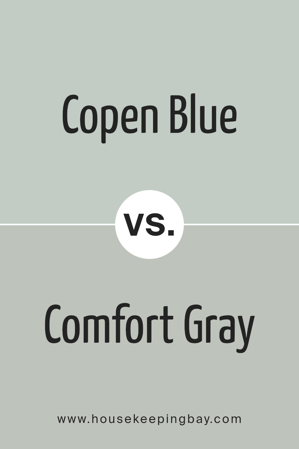
Copen Blue SW 0068 by Sherwin Williams vs Comfort Gray SW 6205 by Sherwin Williams
Copen Blue SW 0068 by Sherwin Williams is a soft, subdued shade of blue with a gentle, calming feel, ideal for creating a serene space. It has a clear blue quality that reminds you of a peaceful sky or a quiet, distant ocean, making it suitable for rooms where relaxation is key, such as bedrooms or bathrooms.
Comfort Gray SW 6205, despite its name, leans more towards a greenish-gray hue. It provides a neutral, soothing backdrop that pairs well with a wide range of colors but brings a warmer, earthier feel compared to Copen Blue. This color fits perfectly in spaces meant for unwinding or casual gatherings, offering a more organic, grounded atmosphere.
Both colors are versatile and muted, yet each establishes a different mood due to their distinct undertones. Copen Blue gives a fresher, crisper vibe while Comfort Gray offers a cozy, natural ambiance, making them excellent choices for creating tailored aesthetics in home decor.
You can see recommended paint color below:
housekeepingbay.com
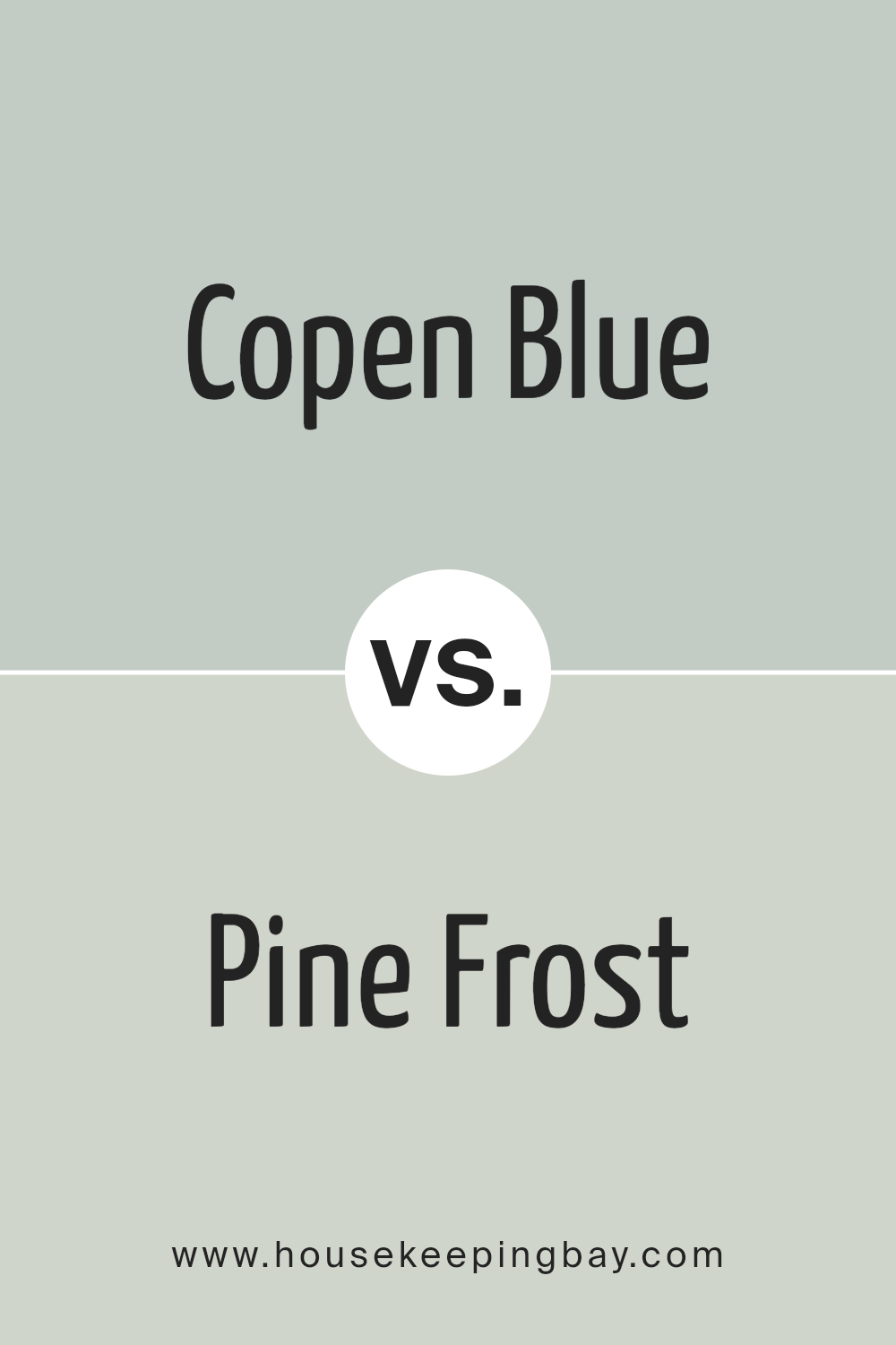
Copen Blue SW 0068 by Sherwin Williams vs Pine Frost SW 9656 by Sherwin Williams
Copen Blue SW 0068 by Sherwin Williams is a soothing, mid-tone blue with a slight touch of gray. This color brings a serene and calm atmosphere to any space, making it ideal for bedrooms or bathrooms where relaxation is key. Its muted quality ensures that it pairs well with both bright and soft color palettes, adding depth without overwhelming the senses.
Pine Frost SW 9656, also by Sherwin Williams, leans towards a cool, fresh green with hints of blue. This color reflects the hues of nature, specifically the greenery of pine trees dusted with frost. It’s particularly well-suited for spaces where a refreshing, invigorating vibe is desired, such as kitchens or living areas.
Its vibrant yet understated tone can easily complement natural materials like wood or stone.
Both colors provide a unique ambiance. Copen Blue offers a tranquil retreat, while Pine Frost injects a lively burst of nature-inspired freshness. Each works beautifully in its way to create distinctive yet harmonious environments.
You can see recommended paint color below:
housekeepingbay.com
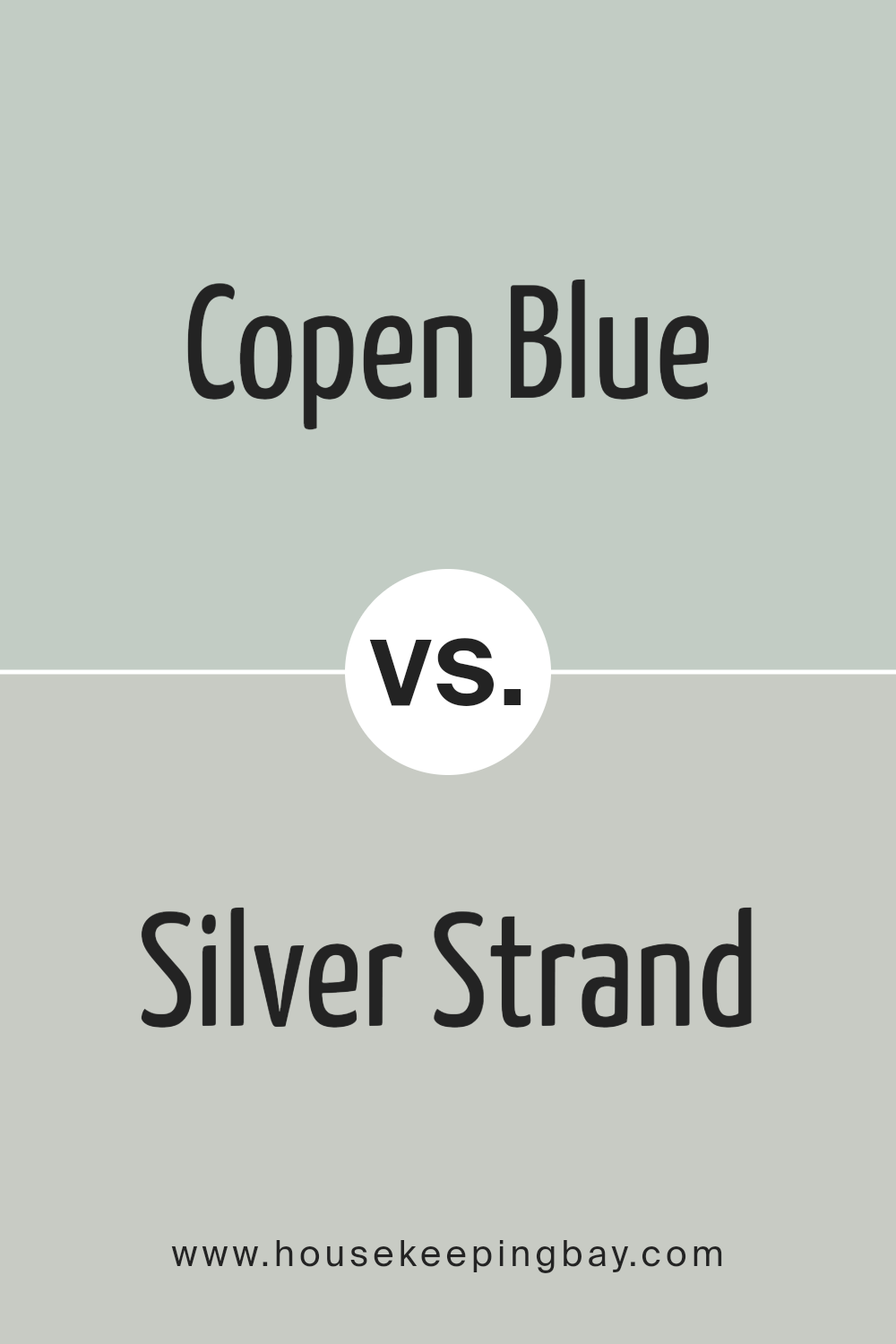
Copen Blue SW 0068 by Sherwin Williams vs Silver Strand SW 7057 by Sherwin Williams
Copen Blue SW 0068 by Sherwin Williams is a deeper, grayish-blue shade that brings a sense of calm and subtlety to spaces. It is the kind of color that works well in bedrooms or areas meant for relaxation because of its peaceful blue tone which isn’t too vibrant but provides enough color to evoke a serene atmosphere.
Silver Strand SW 7057, also by Sherwin Williams, leans more towards a lighter, gray-green hue. It offers a neutral backdrop with soft green undertones that make it highly adaptable in various settings, from kitchens to living rooms. This color is excellent for those looking to add a hint of color while keeping a room looking bright and airy.
Both colors share a soothing quality, but Copen Blue is more distinctly blue, potentially affecting the mood of a room more noticeably with its cooler, calming blue presence. Silver Strand, in contrast, tends more towards a neutral palette, making it easier to pair with various decor styles and colors.
You can see recommended paint color below:
housekeepingbay.com
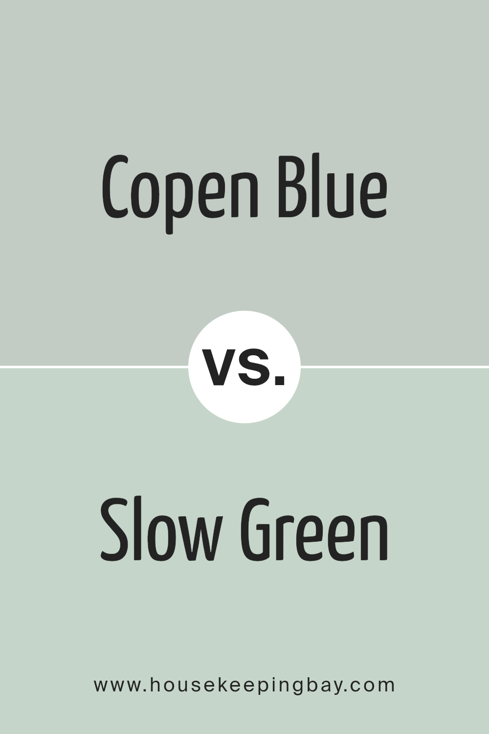
Copen Blue SW 0068 by Sherwin Williams vs Slow Green SW 6456 by Sherwin Williams
Copen Blue SW 0068 by Sherwin Williams is a soothing, medium-dark blue that carries a hint of gray. This color tends to lend a serene and calming presence to a space, making it ideal for bedrooms or quiet areas. Its muted quality allows it to pair well with brighter shades or stand confidently on its own.
Slow Green SW 6456, also by Sherwin Williams, is a soft, muted green with undertones that may appear slightly gray or sage in certain lighting. This color is perfect for creating a relaxed and cozy atmosphere in a room. It works well in spaces where you seek calmness and comfort, such as living rooms or reading nooks.
Both colors share a gentle mutedness, making them versatile for various decorating styles. While Copen Blue leans towards a cool tranquility, Slow Green brings a warm, earthy feel. They both offer a backdrop that supports a range of accent colors and interior themes, from modern minimalism to rustic charm.
These hues are particularly effective for those looking to create a peaceful retreat in their home.
You can see recommended paint color below:
housekeepingbay.com
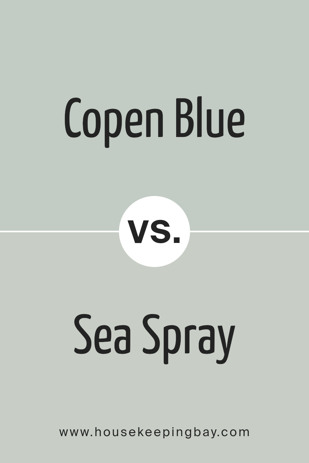
Copen Blue SW 0068 by Sherwin Williams vs Sea Spray SW 9651 by Sherwin Williams
Copen Blue SW 0068 by Sherwin Williams is a deep, soothing blue with a slightly gray undertone, giving it a serene and grounded feel. This color offers a classic, timeless look that is versatile enough to be used in a variety of spaces. It works well in both bright and dim lighting, adapting subtly to different environments.
Sea Spray SW 9651, also by Sherwin Williams, is a lighter and airier blue with green undertones. It gives a fresh and invigorating feel to any space, reminiscent of a gentle ocean breeze. This color suits spaces intended to feel open and breezy. The green undertones help in creating a soft, natural ambiance, making it ideal for bathrooms or bedrooms where a calm atmosphere is desirable.
In comparison, Copen Blue presents a more traditional blue shade, suitable for formal or cozy settings, while Sea Spray offers a lighter, fresh vibe, perfect for creating a relaxed, casual environment. Both colors provide distinct moods and atmospheres, making them suitable for different decorating styles and preferences.
You can see recommended paint color below:
housekeepingbay.com
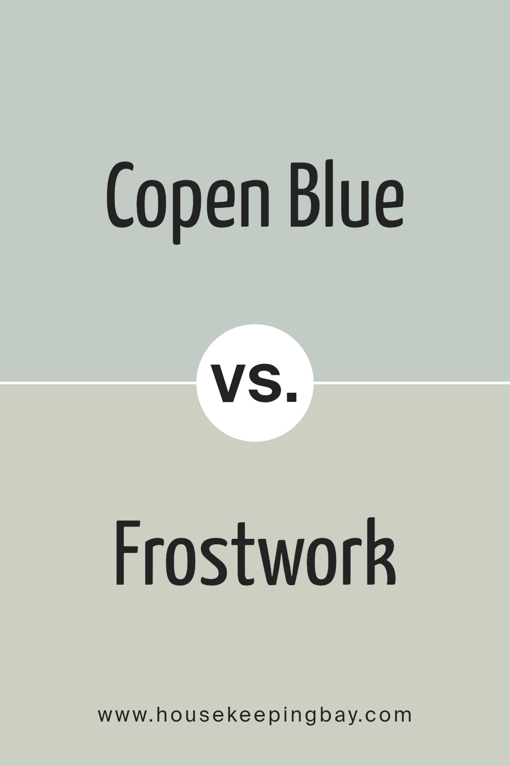
Copen Blue SW 0068 by Sherwin Williams vs Frostwork SW 0059 by Sherwin Williams
Copen Blue SW 0068 by Sherwin Williams is a soothing shade that leans towards a soft, muted blue with a slight gray undertone. It gives off a calm and serene feeling, making it ideal for spaces like bedrooms or bathrooms where you want to create a relaxing atmosphere. This color works well in well-lit areas as the natural light accentuates its gentle tones.
Frostwork SW 0059, also by Sherwin Williams, is lighter and has a more neutral appearance. It is almost a silvery light blue that can appear almost gray in certain lighting. This versatility makes Frostwork suitable for various spaces, aiding in brightening rooms that might lack natural sunlight, or complementing modern decor with its subtle and refined hue.
Both colors contribute to a peaceful ambiance, but Copen Blue adds more color presence with its depth, while Frostwork maintains a minimalist vibe with its lighter, more delicate touch. Each has its charm, depending on the mood and style you wish to achieve in your space.
You can see recommended paint color below:
- SW 0059 Frostwork
housekeepingbay.com
Conclusion
It fits beautifully in any room, offering a calm, serene vibe that’s not just appealing but also incredibly comforting. Whether I’m looking to create a peaceful bedroom escape or add a splash of subdued color to a lively living room, Copen Blue stands out as a perfect choice.
The soft nature of this hue complements various decor styles, from modern minimalist to shabby chic, making it easy for anyone to incorporate into their home. Moreover, Copen Blue’s adaptability extends beyond walls; it works wonderfully on cabinets and furniture too, providing that cohesive look many of us strive for.
For anyone considering a fresh paint job, I couldn’t recommend Copen Blue enough. It undoubtedly adds a subtle but impactful charm to any space it graces.
housekeepingbay.com
Ever wished paint sampling was as easy as sticking a sticker? Guess what? Now it is! Discover Samplize's unique Peel & Stick samples. Get started now and say goodbye to the old messy way!
Get paint samples


