Slow Green SW 6456 by Sherwin Williams
Embracing Calmness: A Journey Through Restful Hues
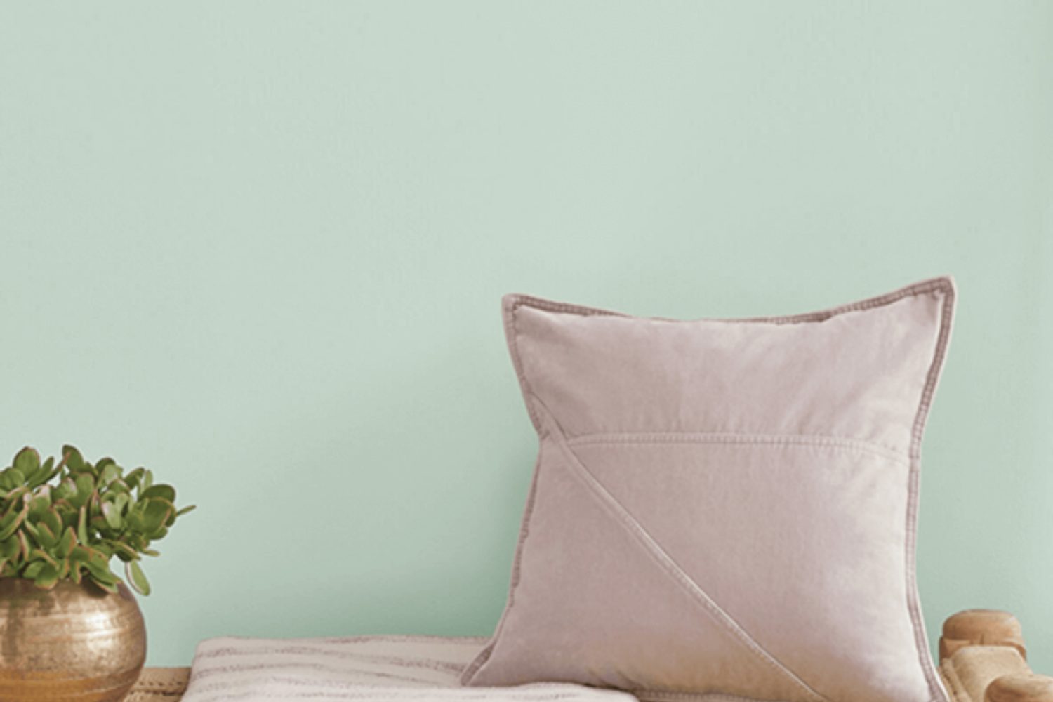
If you’re looking to refresh your space with a serene and tranquil vibe, SW 6456 Slow Green by Sherwin Williams could be just what you need. This color isn’t just any green—it’s a unique shade that brings a sense of calm and relaxation into any room. Imagine sitting in your living room, surrounded by a color that makes you feel connected to nature, without even stepping outside. Slow Green has this magic, turning your home into a peaceful sanctuary.
Choosing the right paint can sometimes feel overwhelming, but Slow Green offers a versatile option that works beautifully in many settings. Whether you’re updating a bedroom to become a more restful retreat, or giving your bathroom a spa-like feel, this color has the potential to transform your space. It pairs well with a wide range of decor styles, from minimalist and modern to rustic and traditional, making it a fantastic choice for anyone looking to create a soothing atmosphere in their home.
Moreover, if you’re concerned about whether this color will match your existing furniture or decor, you’ll find Slow Green to be quite accommodating. Its natural tone harmonizes with a variety of materials and colors, making it a stress-free addition to your color scheme. So, if you’re ready for a change, Slow Green could be the perfect way to freshen up your home with ease and style.
via Sherwin Williams
What Color Is Slow Green SW 6456 by Sherwin Williams?
Slow Green SW 6456 by Sherwin Williams is a unique and serene shade of green, reminiscent of the peacefulness found in a lush forest. This color embodies the tranquility of nature, bringing a refreshing and soothing atmosphere to any room. It has a balance of warmth and coolness, making it versatile for various interior styles.
Slow Green goes well with natural light, highlighting its vibrant yet calming qualities. It’s perfect for creating a cozy and relaxing space. In terms of interior styles, it fits beautifully with minimalist, Scandinavian, and rustic designs. This color encourages a sense of connection to the outdoors, making it ideal for living rooms, bedrooms, and home offices that benefit from a calm and grounding environment.
When it comes to pairing with materials and textures, Slow Green works fantastically with natural wood, which complements its earthy vibe. Think of oak or pine furniture that adds warmth to the space. It also pairs well with materials like linen and cotton in neutral tones, adding to the room’s serene and comfortable atmosphere. Metallic finishes, like brass or copper, can introduce a touch of elegance to the overall look. For a cohesive and nature-inspired space, incorporating elements like jute rugs or wicker baskets can enhance the room’s texture and depth.
housekeepingbay.com
Is Slow Green SW 6456 by Sherwin Williams Warm or Cool color?
Slow Green SW 6456 by Sherwin Williams is a gentle, soothing color that brings a touch of nature into your home. Imagine the calm feeling of a lush garden or a quiet forest; that’s the vibe Slow Green adds to a room. This color has a subtle, muted tone, making it perfect for creating a peaceful and relaxing space. It’s not too bright, but it has enough warmth to make a room feel cozy and inviting.
When you use Slow Green in your home, it can make small spaces seem larger and more open because of its light and airy feel. It’s great for bedrooms, living rooms, and even bathrooms, where you want to add a bit of serenity and calm. This color works well with natural materials like wood and stone, adding to its earthy, grounded feel. It also pairs nicely with both light and dark colors, offering flexibility in your decorating choices. Whether you’re looking for a main color for your walls or a complementary shade to accent your decor, Slow Green brings a refreshing and rejuvenating energy to your home.
What is the Masstone of the Slow Green SW 6456 by Sherwin Williams?
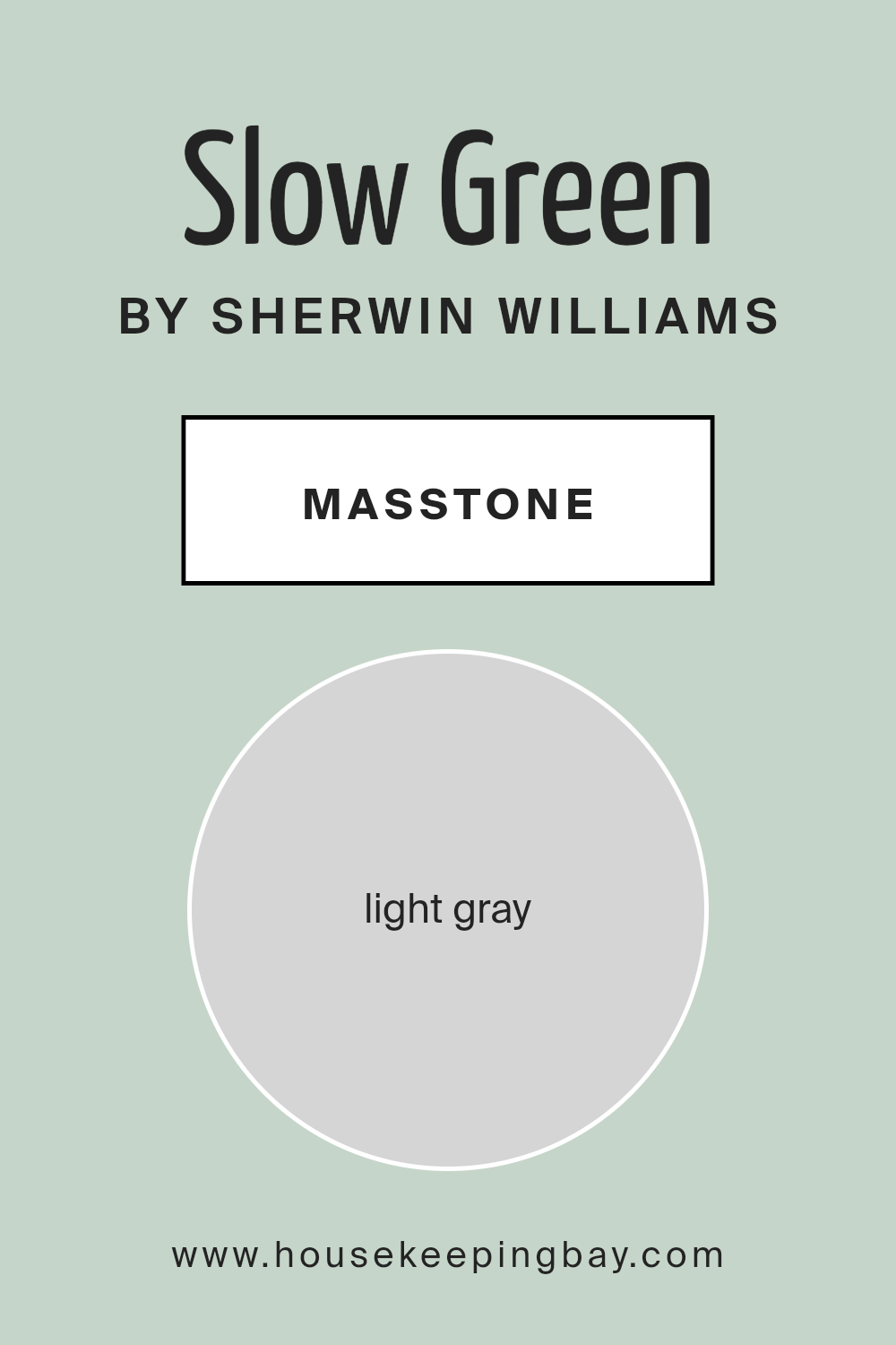
Slow Green SW 6456 by Sherwin Williams is a unique shade of light gray, tagged with the color code #D5D5D5. This masstone, or the color you see when the paint is applied in a thick layer, stands out because it’s not just a simple gray. Even though it’s named “Slow Green,” its base color is a soft, gentle gray that works wonders in homes for a couple of reasons.
Firstly, this light gray color brings a calm and peaceful vibe to any room. It’s like a gentle hug for your walls, making spaces feel more relaxed and cozy. Because it’s light and airy, it also helps small rooms look a bit bigger and more open, which is a neat trick if you’re trying to make the most out of a small space.
Moreover, Slow Green’s subtle hint of green gives it a touch of natural charm without overpowering the room. This means it can fit in well with a lot of different decor styles and color schemes. From modern minimalist to rustic farmhouse, it adds just the right amount of personality while keeping things versatile. This flexibility makes Slow Green a great choice for anyone looking to refresh their home with a color that’s easy to live with and loves many different looks.
housekeepingbay.com
Undertones of Slow Green SW 6456 by Sherwin Williams
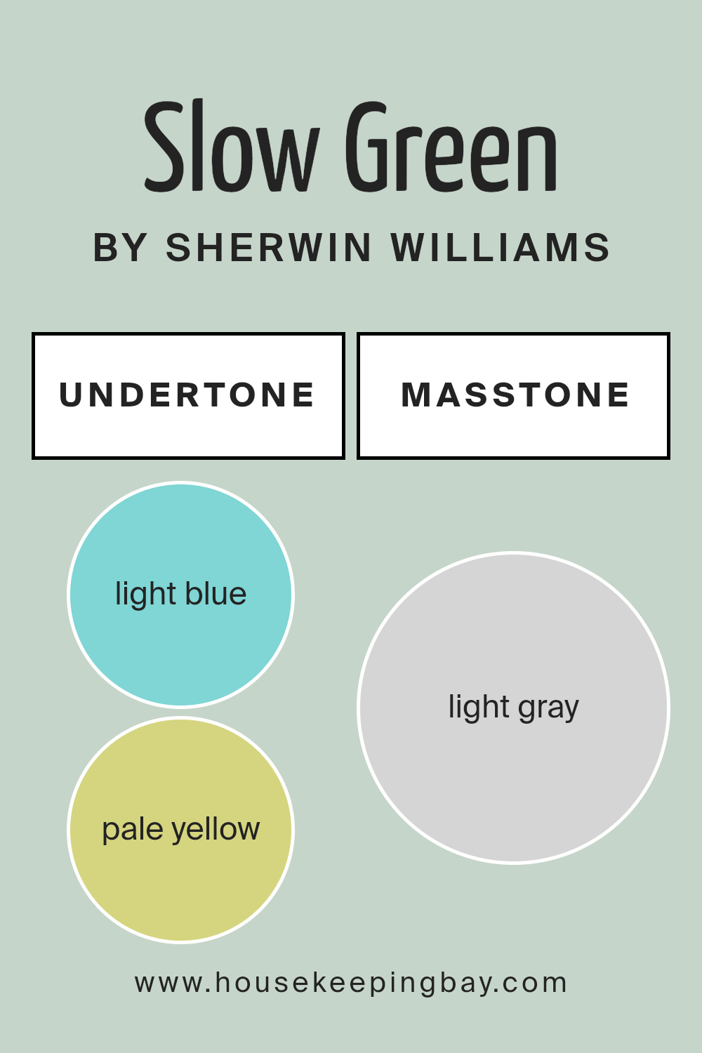
Slow Green SW 6456 by Sherwin Williams is a unique color because it has different undertones. Undertones are subtle colors that are mixed into the main color. They can change how the main color looks under various lighting conditions. The undertones of Slow Green include light blue, pale yellow, light purple, mint, lilac, pale pink, and grey. These undertones can make Slow Green look slightly different in each room, depending on the light and what other colors are around it.
The light blue undertone can make the color feel cool and refreshing, perfect for a calm and relaxing space. Pale yellow brings a touch of warmth, making the room feel inviting. Light purple adds a bit of depth and richness, which can make the space look more interesting. Mint undertone gives a fresh and lively vibe. Lilac can introduce a subtle touch of playfulness. Pale pink softens the look, making the area feel cozy. Lastly, grey can give Slow Green a more sophisticated and grounded appearance.
When you use Slow Green on interior walls, these undertones work together to make the room look dynamic and lively. Depending on the time of day and lighting, the walls may appear more blue, green, or even have hints of yellow. This makes Slow Green a versatile color, suitable for many different rooms and styles. It can help create a space that feels just right, whether you want it to be calming, cheerful, or cozy.
housekeepingbay.com
Coordinating Colors of Slow Green SW 6456 by Sherwin Williams
Coordinating colors are essentially a palette of hues that work harmoniously together to enhance the appearance and feel of a space. When you pick a primary color like Slow Green SW 6456 by Sherwin Williams, finding coordinating colors means selecting other shades that complement or contrast beautifully without clashing, creating a cohesive look throughout your room or home.
These coordinating hues can bring balance, depth, and character to your décor, allowing you to achieve a professional-looking design that feels both intentional and inviting.
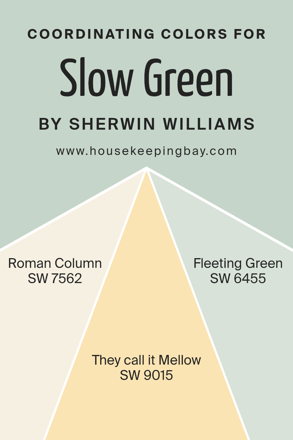
Among the colors that coordinate well with Slow Green SW 6456 are Roman Column SW 7562, They Call It Mellow SW 9015, and Fleeting Green SW 6455.
- Roman Column is a soft, creamy white that provides a light and airy feel, making it an ideal backdrop for the more defined tone of Slow Green, offering a calming and elegant contrast.
- They Call It Mellow is a warm, pale yellow that introduces a subtle burst of sunshine and cheerfulness into the space, pairing perfectly with the earthiness of Slow Green for a natural, soothing atmosphere.
- Fleeting Green, on the other hand, is a lighter, more subdued version of Slow Green, allowing for a gentle, layered approach to using greens in your décor, promoting a sense of harmony and continuity that’s both refreshing and serene.
Together, these colors present a versatile palette that can create a range of moods and styles, from relaxed and cozy to sophisticated and refined.
You can see recommended paint colors below:
- SW 7562 Roman Column
- SW 9015 They call it Mellow
- SW 6455 Fleeting Green
housekeepingbay.com
How Does Lighting Affect Slow Green SW 6456 by Sherwin Williams?
Lighting plays a crucial role in how we perceive colors. The color of a room can look different depending on the type of light it’s exposed to. Slow Green SW 6456 by Sherwin Williams is a great example to illustrate this.
- In artificial light, depending on the type of bulbs you use, Slow Green can look different. LED lights, which often have a cooler tone, might make Slow Green look a bit sharper and more vibrant. On the other hand, incandescent bulbs, which give off a warmer glow, can make the color appear softer and more subdued.
- Natural light brings another level of complexity to how Slow Green is seen. Natural lighting changes throughout the day and is also affected by the direction your room faces.
- In north-faced rooms, which usually get less direct sunlight, Slow Green can appear as a true, calm green, showcasing its depth without becoming too dark. This cooler, softer light enhances the cozy and serene quality of Slow Green.
- South-faced rooms are filled with bright, warm light for most of the day. Here, Slow Green can truly shine, looking lively and vibrant. The natural brightness accentuates the color’s energy, making it feel fresh and inviting.
- East-faced rooms get plenty of morning light, which is warm and soft. In these rooms, Slow Green will start the day with a gentle, cheerful glow, transitioning to a more muted tone as the day goes on and direct sunlight moves away.
- West-faced rooms receive intense evening light. Slow Green in these rooms can look very dynamic; it can appear warmer and more welcoming in the late afternoon and evening as it catches that golden sunlight.
Understanding how different types of light affect the color Slow Green SW 6456 can help you make informed decisions about using this color in your space, ensuring you achieve the desired effect in each room.
housekeepingbay.com
What is the LRV of Slow Green SW 6456 by Sherwin Williams?
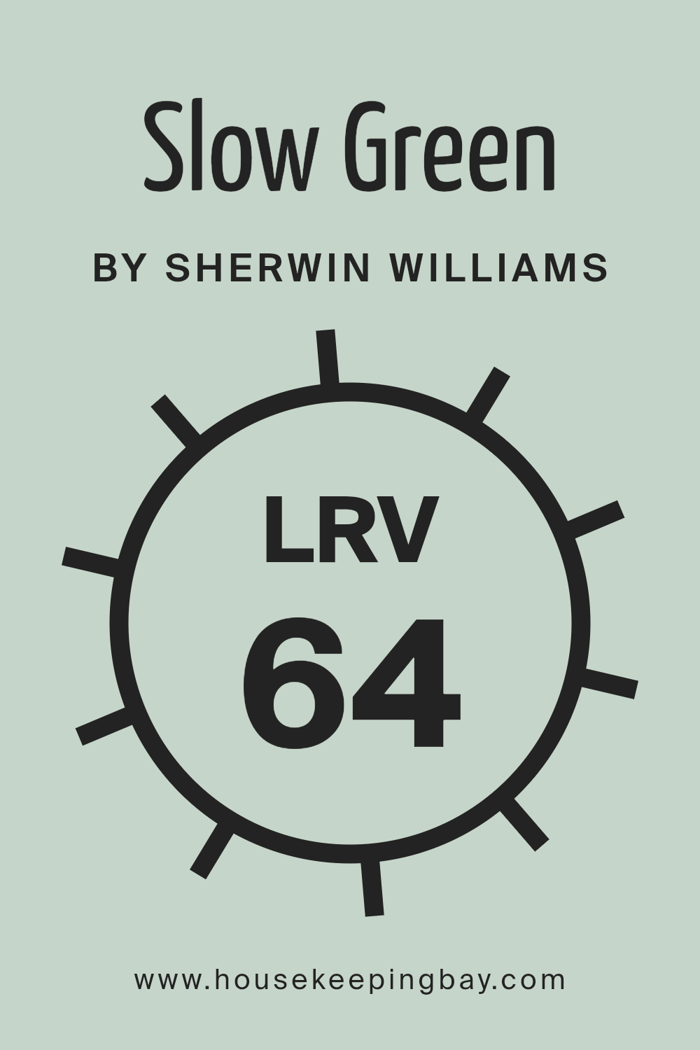
For Slow Green (SW 6456) by Sherwin Williams, with an LRV of 63.965, the color is on the lighter side, meaning it will reflect a decent amount of light. This makes it a good choice for making spaces feel airy and more spacious. Because of its LRV, Slow Green can brighten up a room, especially if it gets a lot of natural light.
However, in a room with less natural light, its impact might be more subdued but still brings a fresh and light feeling to the space. The LRV of this color tells us it’s versatile and can work well in many areas, adding a nice, gentle touch of color without making the space feel closed in.
housekeepingbay.com
What are the Trim colors of Slow Green SW 6456 by Sherwin Williams?
Trim colors are essential accents in home decoration that contrast or complement the main wall color, adding dimension and character to the space. In the context of Slow Green SW 6456 by Sherwin Williams, choosing the right trim color can enhance the cozy, serene vibe that Slow Green brings to a room. The trim acts as a frame, highlighting the wall’s features, and can even affect the perception of the room’s size and shape. The right trim color can pull a room together, making it feel intentionally designed and polished.
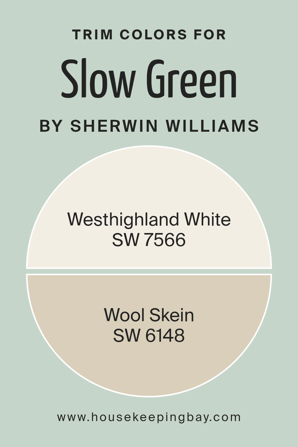
For a color like Slow Green SW 6456, Westhighland White SW 7566 is a brilliant choice for trim, offering a crisp, clean look that can make the green pop and the room feel more vibrant and fresh. It’s a pure, bright shade of white that reflects light, enhancing the room’s overall brightness and making the green appear more dynamic.
On the other hand, Wool Skein SW 6148 provides a softer contrast, a warm, neutral beige with subtle yellow undertones, offering a more subtle transition from wall to trim. This color can bring a sense of warmth and natural harmony to the space, complementing Slow Green by creating a soothing, cohesive palette.
You can see recommended paint colors below:
- SW 7566 Westhighland White
- SW 6148 Wool Skein
housekeepingbay.com
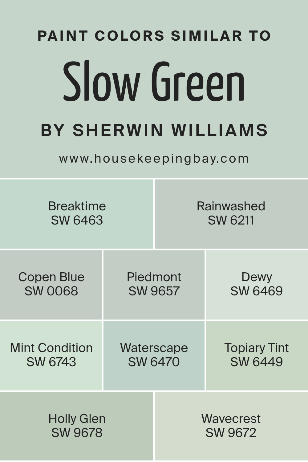
Colors Similar to Slow Green SW 6456 by Sherwin Williams
Choosing similar colors is vital because it ensures a cohesive and harmonious look in any space. Colors like Slow Green SW 6456 by Sherwin Williams and its akin tones bring about a seamless flow, allowing for a design that feels both put together and soothing. Colors that share a common hue or intensity can complement each other beautifully, creating a subtle yet impactful visual experience. This strategy is especially effective for achieving a specific mood or theme without overwhelming the senses.
- Starting with Breaktime SW 6463, this color offers a refreshing and revitalizing touch, akin to a peaceful pause in a serene green environment.
- Rainwashed SW 6211, on the other hand, whispers of tranquil skies after a gentle rain, bringing a sense of freshness and renewal.
- Copen Blue SW 0068 evokes the calmness of ocean depths in a soft, dreamy manner, whereas Piedmont SW 9657 introduces a more earthy, grounded feel reminiscent of a quiet forest floor.
- Dewy SW 6469 shines with a delicate light, embodying the early morning’s first dew drops.
- Mint Condition SW 6743 flashes a more vibrant green, injecting energy and a hint of playfulness into spaces.
- Waterscape SW 6470, with its cool and calming presence, is akin to a quiet lakeside retreat.
- Topiary Tint SW 6449 draws inspiration from the natural elegance of garden greens, offering a subtle connection to nature.
- Holly Glen SW 9678 adds a muted, sage wisdom to the palette, speaking of timeless elegance.
- Lastly, Wavecrest SW 9672 brings it all back to the soothing embrace of the sea, with a pale, serene blue that rounds out this collection of peaceful companions.
Together, these colors work in harmony, offering a range of options for creating tranquil and cohesive spaces.
You can see recommended paint colors below:
- SW 6463 Breaktime
- SW 6211 Rainwashed
- SW 0068 Copen Blue
- SW 9657 Piedmont
- SW 6469 Dewy
- SW 6743 Mint Condition
- SW 6470 Waterscape
- SW 6449 Topiary Tint
- SW 9678 Holly Glen
- SW 9672 Wavecrest
housekeepingbay.com
Colors that Go With Slow Green SW 6456 by Sherwin Williams
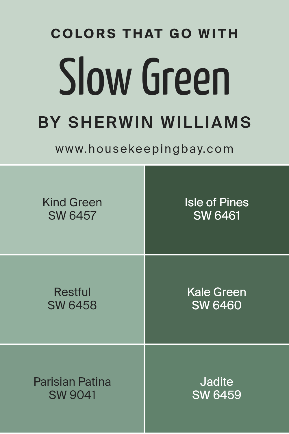
Choosing the right colors to pair with Slow Green SW 6456 by Sherwin Williams is essential for achieving a cohesive and appealing design. When coordinated wisely, these complementary shades can enhance the beauty of Slow Green, creating a space that feels balanced and harmoniously put together. The importance of these pairings lies in their ability to bring out the best in Slow Green, allowing it to shine without overwhelming a room. By selecting colors that go with Slow Green, like Kind Green, Isle of Pines, Restful, Kale Green, Parisian Patina, and Jadite, you set the stage for a visually soothing and naturally elegant environment.
Kind Green SW 6457 is a gentle hue that mirrors the softness of early spring foliage, making it a perfect companion for Slow Green, enhancing its earthy qualities without competing for attention. Isle of Pines SW 6461, with its deeper, forest-inspired tone, offers a bold contrast that can add depth and interest to spaces, highlighting the versatility of Slow Green.
Restful SW 6458 is a muted shade reminiscent of a tranquil sea, providing a calm backdrop that allows Slow Green to pop. Kale Green SW 6460 leans into the vibrant side of nature, injecting energy and liveliness into the mix. Parisian Patina SW 9041 carries a subtle sophistication with its unique blend of green and blue, perfect for adding a touch of elegance to the green palette. Lastly, Jadite SW 6459 offers a light, airy quality that echoes the freshness of morning dew, softly complementing the serene vibe of Slow Green. Together, these colors work in harmony to create spaces that are both inviting and stylish.
You can see recommended paint colors below:
- SW 6457 Kind Green
- SW 6461 Isle of Pines
- SW 6458 Restful
- SW 6460 Kale Green
- SW 9041 Parisian Patina
- SW 6459 Jadite
housekeepingbay.com
How to Use Slow Green SW 6456 by Sherwin Williams In Your Home?
Slow Green SW 6456 by Sherwin Williams is a calming color that brings a touch of nature into your home. Imagine the peacefulness of a quiet walk in the forest; that’s what Slow Green can offer. It’s a muted, soft green with hints of gray, making it super versatile for any part of your house.
You can use Slow Green in your bedroom to create a serene sanctuary that helps you unwind and sleep better. In the living room, it can make everyone feel relaxed and at ease, perfect for family time or hosting friends. If you have a home office, consider Slow Green for its walls. Its calming effect might boost your focus and creativity, making work or study times more productive.
It’s also great for bathrooms or kitchens for a refreshing vibe. Complement it with natural materials like wood or stone to enhance its beauty. Remember, Slow Green is all about bringing tranquility and nature’s touch into your space, making it feel like a cozy, peaceful haven.
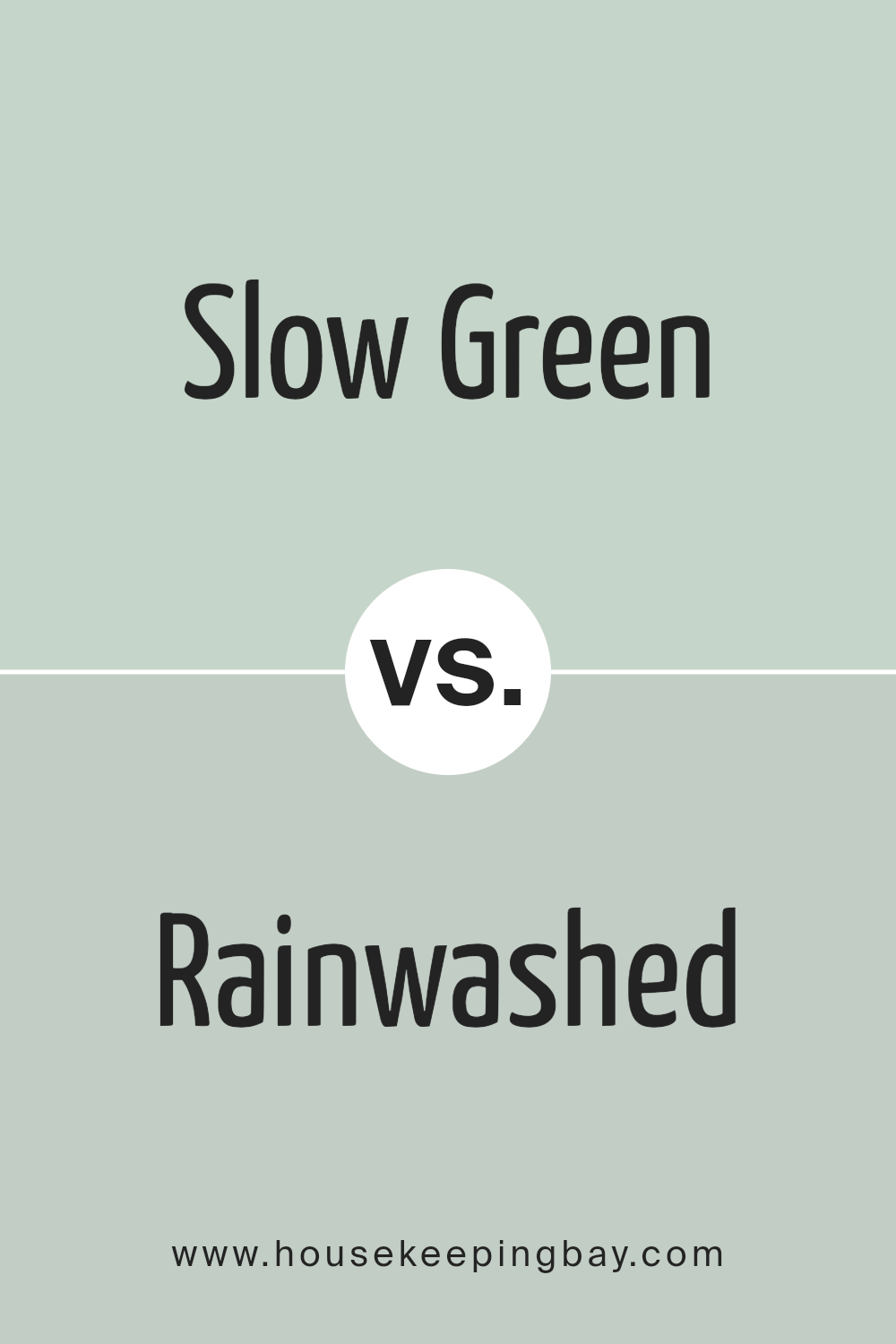
Slow Green SW 6456 by Sherwin Williams vs Rainwashed SW 6211 by Sherwin Williams
Slow Green SW 6456 and Rainwashed SW 6211 by Sherwin Williams are two distinct colors that offer different vibes for spaces. Slow Green is a soft, muted green with a hint of gray, giving it a calm and soothing feel. It’s a color that brings a touch of nature indoors, creating a relaxing atmosphere.
On the other hand, Rainwashed is a light, airy blue with green undertones. This color feels fresh and clean, like a gentle breeze or a soft morning sky. Rainwashed can make a room feel more spacious and bright. While Slow Green leans towards creating a cozy, serene space that feels grounded and peaceful, Rainwashed offers a refreshing and uplifting effect, ideal for creating a light and airy vibe. Both colors complement each other well and can work together to create a harmonious and tranquil environment.
You can see recommended paint color below:
housekeepingbay.com
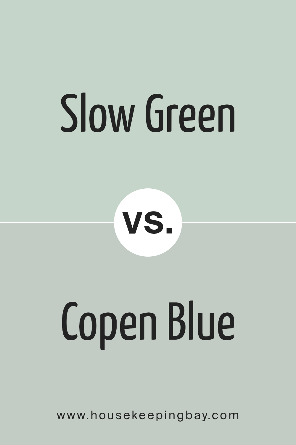
Slow Green SW 6456 by Sherwin Williams vs Copen Blue SW 0068 by Sherwin Williams
The color Slow Green SW 6456 by Sherwin Williams is a soft, soothing shade that suggests the peacefulness of a calm forest. It has a gentle, muted quality that makes it perfect for creating a restful and serene environment. On the other hand, Copen Blue SW 0068 is a light, airy blue with a hint of gray, evoking the feeling of a crisp, clear sky early in the morning.
While Slow Green brings the calm and freshness of nature indoors, Copen Blue offers a breath of fresh air and openness, resembling a wide, open sky. Both colors have their unique charm; Slow Green leans towards creating a cozy, snug atmosphere, and Copen Blue aims for a refreshing, liberating vibe. They can beautifully complement each other in a space, with Slow Green adding warmth and Copen Blue bringing a cool contrast.
You can see recommended paint color below:
- SW 0068 Copen Blue
housekeepingbay.com
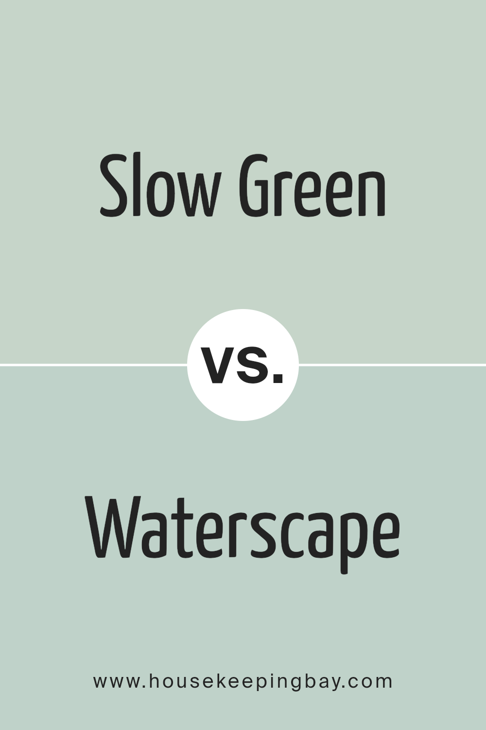
Slow Green SW 6456 by Sherwin Williams vs Waterscape SW 6470 by Sherwin Williams
Slow Green SW 6456 by Sherwin Williams is a soft, muted green that brings a sense of calm and relaxation to any space. It has a cozy and somewhat earthy tone that makes it perfect for creating a serene and inviting atmosphere. Think of it as a gentle hug from nature, bringing a touch of the outdoors into your home without overwhelming your senses.
On the other hand, Waterscape SW 6470 is a brighter, more vibrant shade. This color feels like a breath of fresh air, leaning towards a cooler, more refreshing tone. It has the power to brighten up a room while still providing a sense of peace and tranquility. Waterscape is like a gentle reminder of a clear, sunny day by the sea, with its light and airy vibe.
Comparing the two, Slow Green offers a more grounded, earthy feel, making it ideal for cozy spaces, while Waterscape brings a lively, refreshing touch, perfect for areas where you want to create an uplifting and energizing atmosphere.
You can see recommended paint color below:
housekeepingbay.com
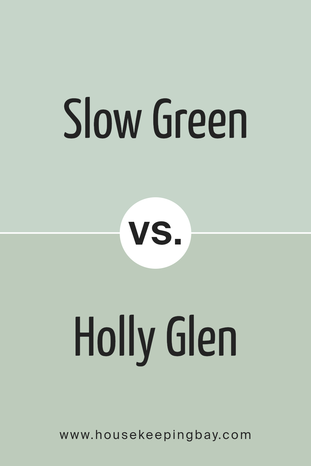
Slow Green SW 6456 by Sherwin Williams vs Holly Glen SW 9678 by Sherwin Williams
Slow Green SW 6456 by Sherwin Williams is a unique shade that brings a calm and soothing vibe into any space. It’s a soft, muted green with gray undertones, giving it a very serene and gentle appearance. This color is perfect for creating a relaxing atmosphere in rooms where you want to unwind and feel at peace.
On the other hand, Holly Glen SW 9678 is another green from Sherwin Williams, but it steps in with a different personality. Holly Glen leans more towards a vibrant and fresh feel, with a brighter and more lively green tone. This color is excellent for spaces where you want to add a burst of energy and freshness, making it ideal for kitchens, bathrooms, or any area that benefits from a cheerful and invigorating vibe.
In summary, Slow Green is all about calmness and tranquility, with its softer and more subdued hue, while Holly Glen offers a fresher and brighter option, perfect for energizing a space.
You can see recommended paint color below:
- SW 9678 Holly Glen
housekeepingbay.com
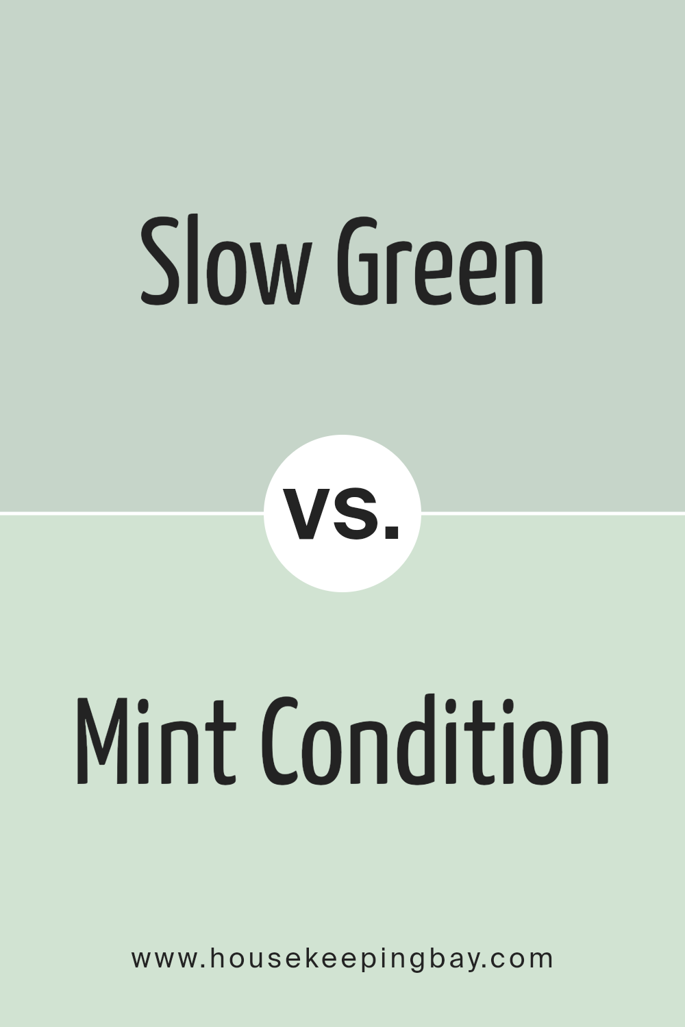
Slow Green SW 6456 by Sherwin Williams vs Mint Condition SW 6743 by Sherwin Williams
Slow Green SW 6456 by Sherwin Williams is a gentle, muted green with a touch of gray, giving it a soothing and peaceful look. It’s a color that feels like a deep breath of fresh air in a quiet forest, calming and grounding. On the other hand, Mint Condition SW 6743 is a brighter, more vibrant shade of green. It has a freshness to it, reminiscent of the lively spring days when everything is blooming. This color brings a sense of energy and rejuvenation to a space, making it feel lively and cheerful.
In comparing the two, Slow Green is more reserved and subtle, making it a great choice for creating a tranquil, serene space. Mint Condition, with its brighter and more energetic vibe, is perfect for spaces where you want to add a pop of color and vitality. Both colors offer unique qualities but cater to different moods and settings. Slow Green is about creating a calm retreat, while Mint Condition is about adding vibrancy and zest.
You can see recommended paint color below:
- SW 6743 Mint Condition
housekeepingbay.com
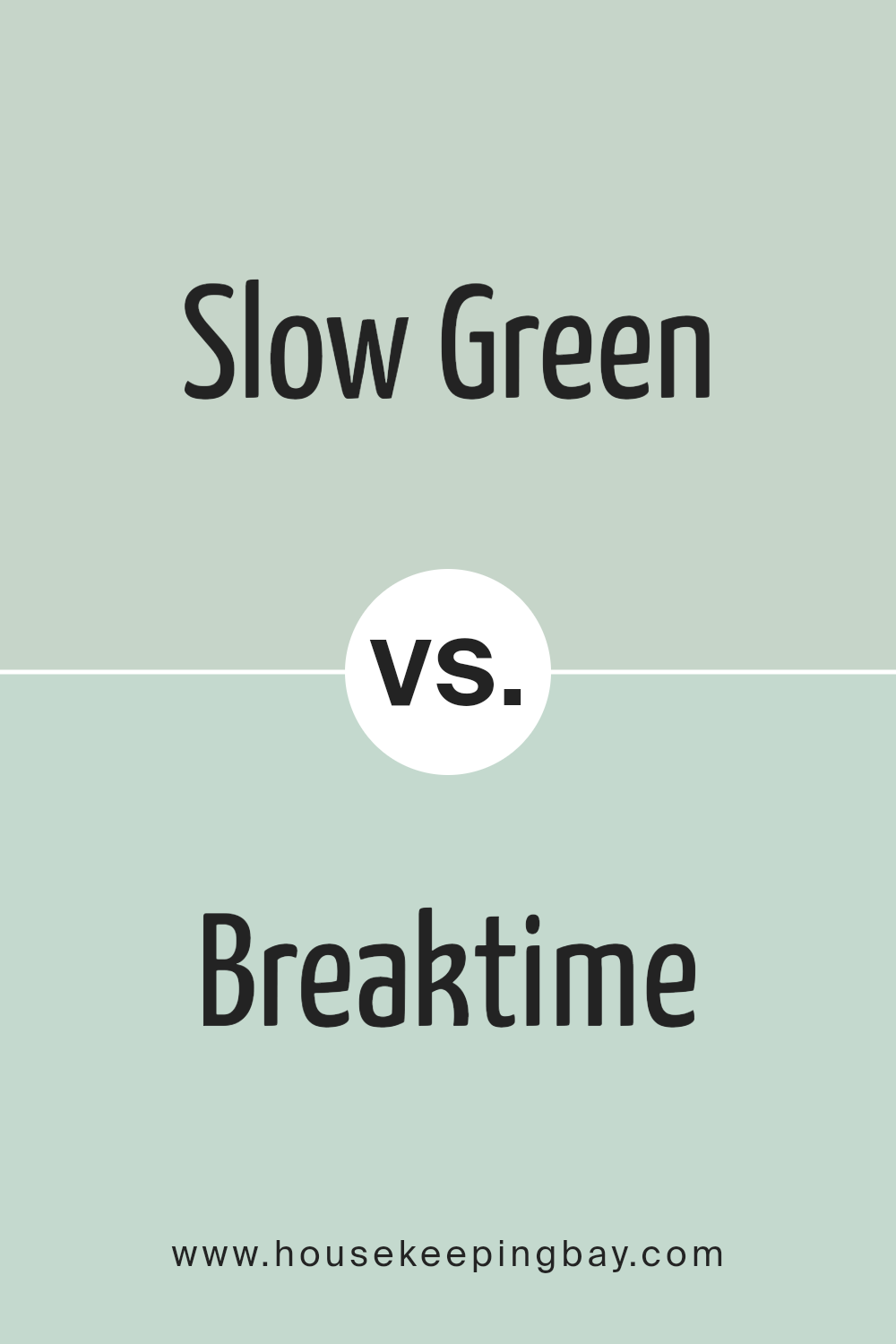
Slow Green SW 6456 by Sherwin Williams vs Breaktime SW 6463 by Sherwin Williams
Slow Green SW 6456 and Breaktime SW 6463 are both colors by Sherwin Williams, but they have their own unique vibes. Slow Green is a gentle, soft green that feels calm and soothing. It’s like looking at a peaceful meadow or the light green leaves of early spring. It’s a color that makes a room feel more relaxed and restful, perfect for creating a cozy space.
On the other hand, Breaktime SW 6463 is a brighter, more vibrant green. It’s like the color of fresh grass or the lively shades you see in a garden on a sunny day. Breaktime is more energetic and uplifting. It’s great for adding a pop of cheerful color to a space, making it feel fresh and lively.
While both colors are green, Slow Green is more about creating a soft, serene feeling, while Breaktime brings a touch of joy and vibrancy. Depending on what mood you want to set in your space, you might choose the gentle calm of Slow Green or the lively spark of Breaktime.
You can see recommended paint color below:
- SW 6463 Breaktime
housekeepingbay.com
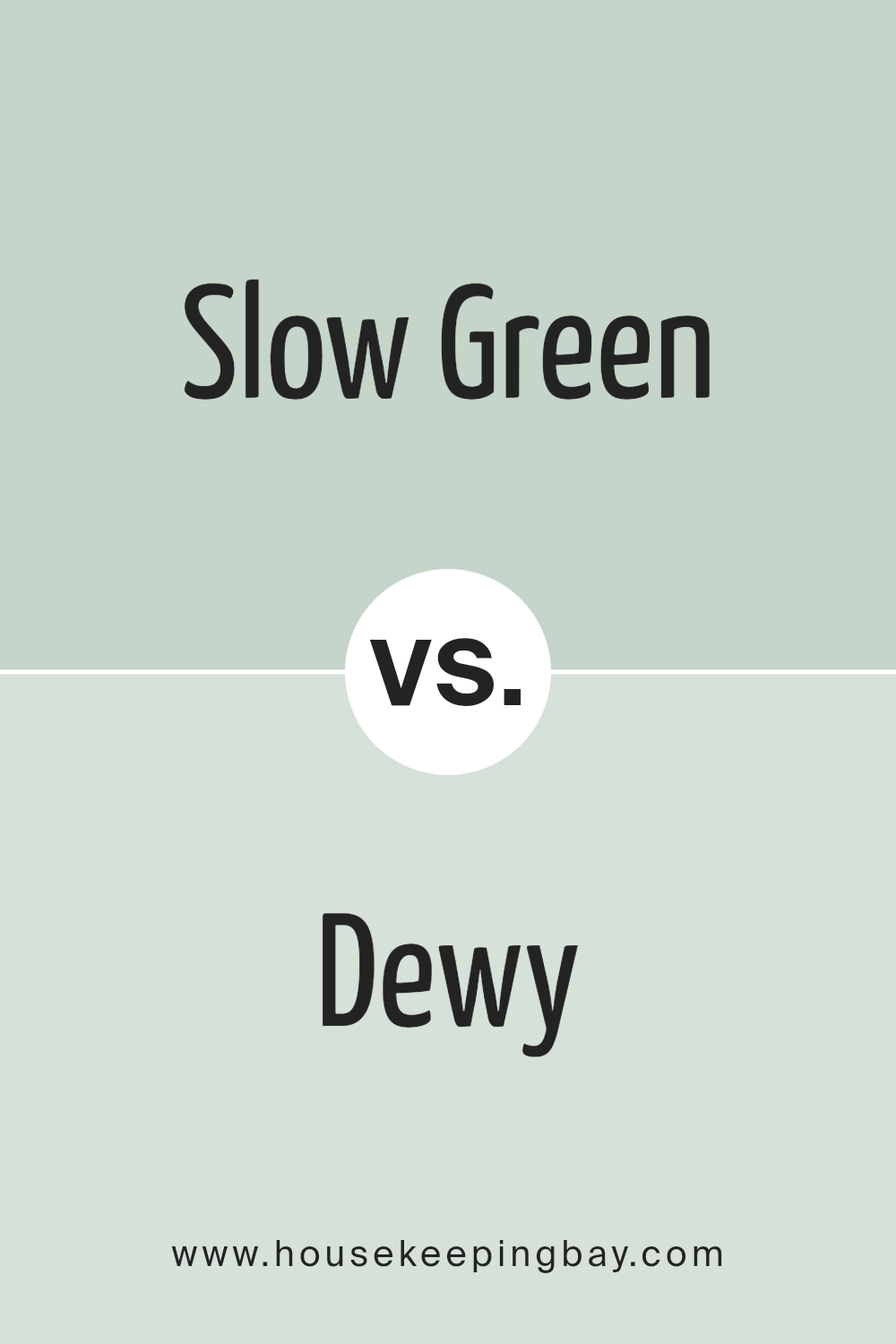
Slow Green SW 6456 by Sherwin Williams vs Dewy SW 6469 by Sherwin Williams
Slow Green SW 6456 by Sherwin Williams is a soft, subtle shade of green with a peaceful and calm essence. It brings a sense of tranquility to any space, making it perfect for areas where you want to relax or unwind. Its muted tones mean it doesn’t overpower a room but adds just enough color to create a serene atmosphere.
On the other hand, Dewy SW 6469 by Sherwin Williams is a brighter, more vibrant green. This color is fresher and lighter, giving a room an airy and open feel. It’s the kind of shade that can rejuvenate a space, making it feel lively and full of energy. While Slow Green leans towards a quieter feeling, Dewy offers a more energized vibe.
Both colors are greens from the same company but offer different moods for a space. Slow Green is about calmness and subtlety, while Dewy brings freshness and vibrancy. Depending on what feel you’re going for in a room, either color could be the right choice.
You can see recommended paint color below:
- SW 6469 Dewy
housekeepingbay.com
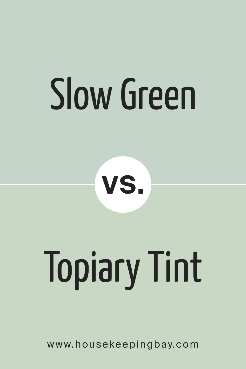
Slow Green SW 6456 by Sherwin Williams vs Topiary Tint SW 6449 by Sherwin Williams
Slow Green SW 6456 by Sherwin Williams is a cozy and soothing shade. It feels like a light, airy green that has a subtle coolness, making spaces feel fresh and comfortable. Picture the gentle hues of early spring foliage, a color that whispers relaxation and calm into any room it’s used in. It’s versatile, working equally well in a peaceful bedroom or a bright, sunny kitchen.
On the other hand, Topiary Tint SW 6449 by Sherwin Williams has a more vibrant personality. It’s like the lush, rich greens you see in a well-tended garden. This color is bolder and more playful, giving rooms a lively burst of energy. While Slow Green draws you into a tranquil embrace, Topiary Tint is all about bringing the vitality of nature indoors. It’s perfect for creating a focal point or adding a dash of cheerfulness to a space.
Though both are green, Slow Green leans towards a serene, subtle vibe, while Topiary Tint is more about vibrant liveliness. Each brings its own unique feel to a room, either by soothing senses or energizing spirits.
You can see recommended paint color below:
- SW 6449 Topiary Tint
housekeepingbay.com
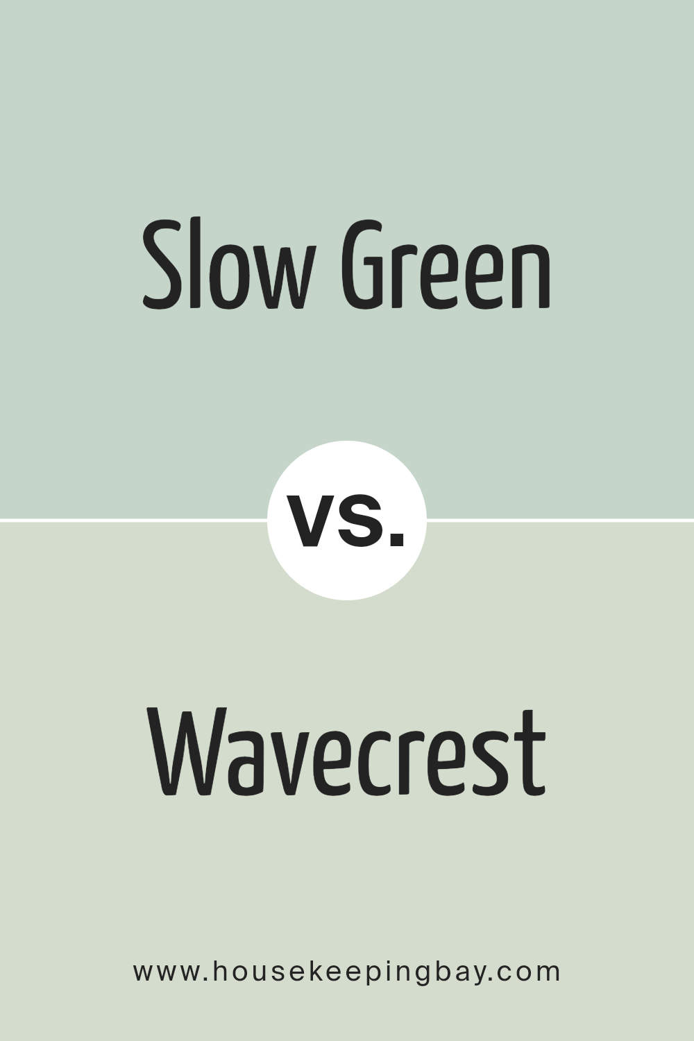
Slow Green SW 6456 by Sherwin Williams vs Wavecrest SW 9672 by Sherwin Williams
Slow Green SW 6456 by Sherwin Williams is a warm, earthy shade that brings to mind the natural calmness of a forest. It’s a cozy and inviting color that feels like a gentle hug from nature. Think of it as a backdrop that blends in smoothly with wooden furniture and plants, giving any room a touch of serenity and comfort.
On the other hand, Wavecrest SW 9672 is a cooler, lighter shade that feels fresh and airy. It’s like a breath of fresh air on a bright morning, making spaces feel open and clean. Wavecrest leans towards a serene beach vibe, offering a sense of calmness that’s subtle yet refreshing, perfect for creating a peaceful, tranquil atmosphere.
Both colors offer a sense of peace and tranquility but in different ways. Slow Green adds warmth and depth, creating a cozy, enveloping space, while Wavecrest offers lightness and freshness, opening up the room with a clean, soothing feel.
You can see recommended paint color below:
- SW 9672 Wavecrest
housekeepingbay.com
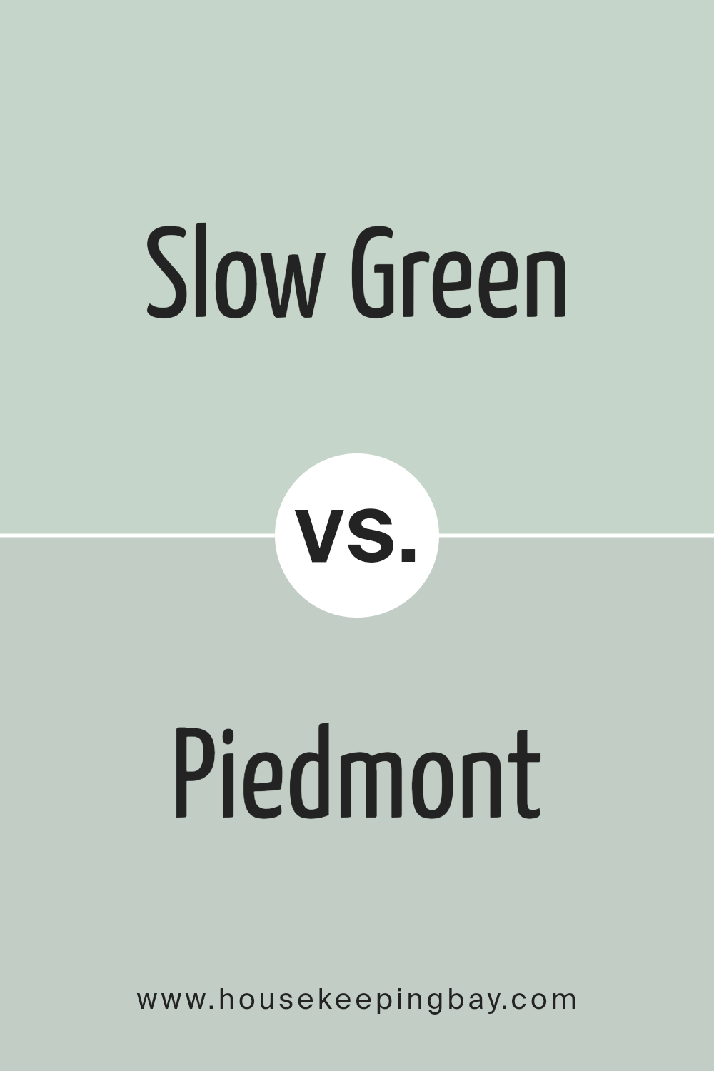
Slow Green SW 6456 by Sherwin Williams vs Piedmont SW 9657 by Sherwin Williams
Slow Green SW 6456 and Piedmont SW 9657 by Sherwin Williams are both unique colors, but they create very different vibes. Slow Green is a comforting, soft green that gives a space a peaceful and tranquil atmosphere. It’s like looking at a gentle, leafy branch in early spring, offering a touch of nature’s calm to any room.
On the other hand, Piedmont is a much lighter, nearly off-white color with just a whisper of green. It’s so subtle that in some lights, you might just think it’s a clean, soft white. This color is great for making a room feel brighter and more open, providing a neutral backdrop that’s easy to match with other colors.
While Slow Green brings a more noticeable hint of the outdoors and can make a statement even in its softness, Piedmont leans towards a minimalist, airy feel that enlarges a space and works well as a quiet backdrop. Both colors have their special charm, but they serve different purposes in decor with Slow Green adding color depth and Piedmont offering a light, almost ethereal touch.
You can see recommended paint color below:
- SW 9657 Piedmont
housekeepingbay.com
Conclusion
To sum things up, if you’re on the hunt for a paint color that brings a hint of nature and calmness into your space, SW 6456 Slow Green by Sherwin Williams could be a perfect choice. This unique shade of green is a game-changer for anyone looking to refresh their home with a vibe that’s both refreshing and relaxing. Whether you’re thinking about giving your living room a new splash of color, wanting to create a serene bedroom retreat, or even aiming to enhance your bathroom with a spa-like feel, Slow Green has got you covered.
What’s really fantastic about Slow Green is its versatility. It pairs wonderfully with a wide range of decor styles, from modern to rustic, making it a universal choice for various spaces and settings. Plus, it works beautifully with natural light, changing subtly throughout the day to create a dynamic and inviting atmosphere in your home.
Incorporating Slow Green into your home isn’t just about following a trend; it’s about creating a space that feels grounded, peaceful, and connected to the natural world. Whether you decide to use it as an accent wall or go all out with a full room transformation, Slow Green promises to breathe new life into your home, making it feel more welcoming and vibrant. So, if you’re ready for a change, consider giving your walls a touch of this lush, soothing green. It might just be the refresh your home needs.
housekeepingbay.com
Ever wished paint sampling was as easy as sticking a sticker? Guess what? Now it is! Discover Samplize's unique Peel & Stick samples. Get started now and say goodbye to the old messy way!
Get paint samples
