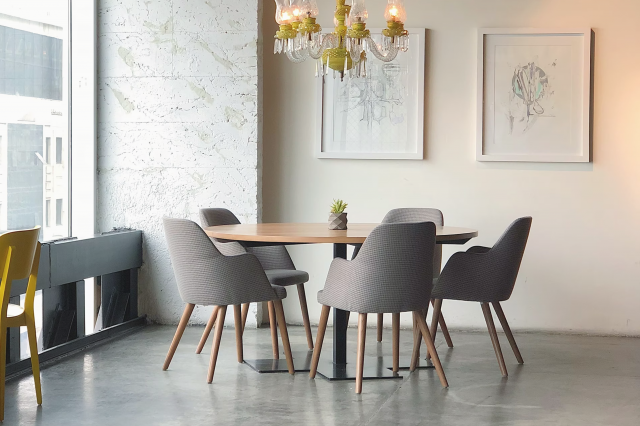
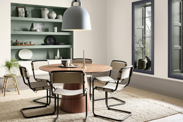
Burnt Cinnamon 2094-10 Paint Color by Benjamin Moore
This article explores the depth and versatility of BM Burnt Cinnamon 2094-10, a color that has captivated the world of interior design.
This article explores the depth and versatility of BM Burnt Cinnamon 2094-10, a color that has captivated the world of interior design. We delve into its hue, undertones, and compatibility with various styles, materials, and coordinating colors.
Understanding these aspects of Burnt Cinnamon 2094-10 helps homeowners and designers create spaces that are not only aesthetically pleasing but also resonant with warmth and sophistication.
via benjamin moore
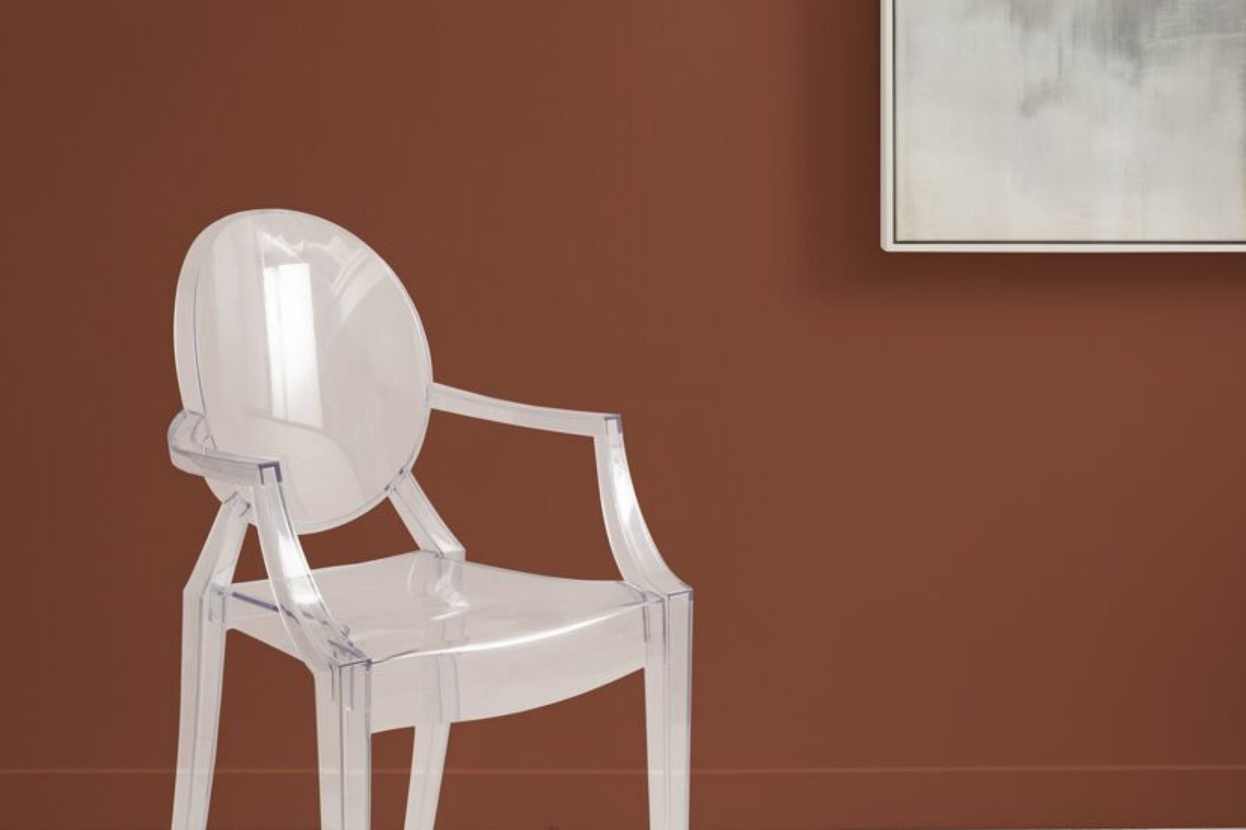
What Color Is Burnt Cinnamon 2094-10?
BM Burnt Cinnamon 2094-10 is a rich, deep color that embodies the warmth and earthiness of cinnamon with a hint of smokiness. This color brings to mind the comforting aroma and vibrant shades of spices, making it a perfect choice for creating an inviting and cozy atmosphere. It works exceptionally well in traditional, rustic, and even contemporary interior styles.
The color pairs beautifully with natural materials like wood, stone, and textured fabrics, enhancing the sense of warmth and comfort in any space.

housekeepingbay.com
Table of Contents
Is It a Warm Or Cool Color?
BM Burnt Cinnamon 2094-10 is undeniably a warm color. Its deep, reddish-brown tones evoke a sense of comfort and coziness, making it ideal for spaces where warmth is desired. This warm characteristic allows it to create an inviting and intimate atmosphere in homes, particularly in living rooms, dining areas, and bedrooms.
The color’s warmth is especially beneficial in spaces with cooler light, where it can add a sense of richness and depth.
Undertones of Burnt Cinnamon 2094-10
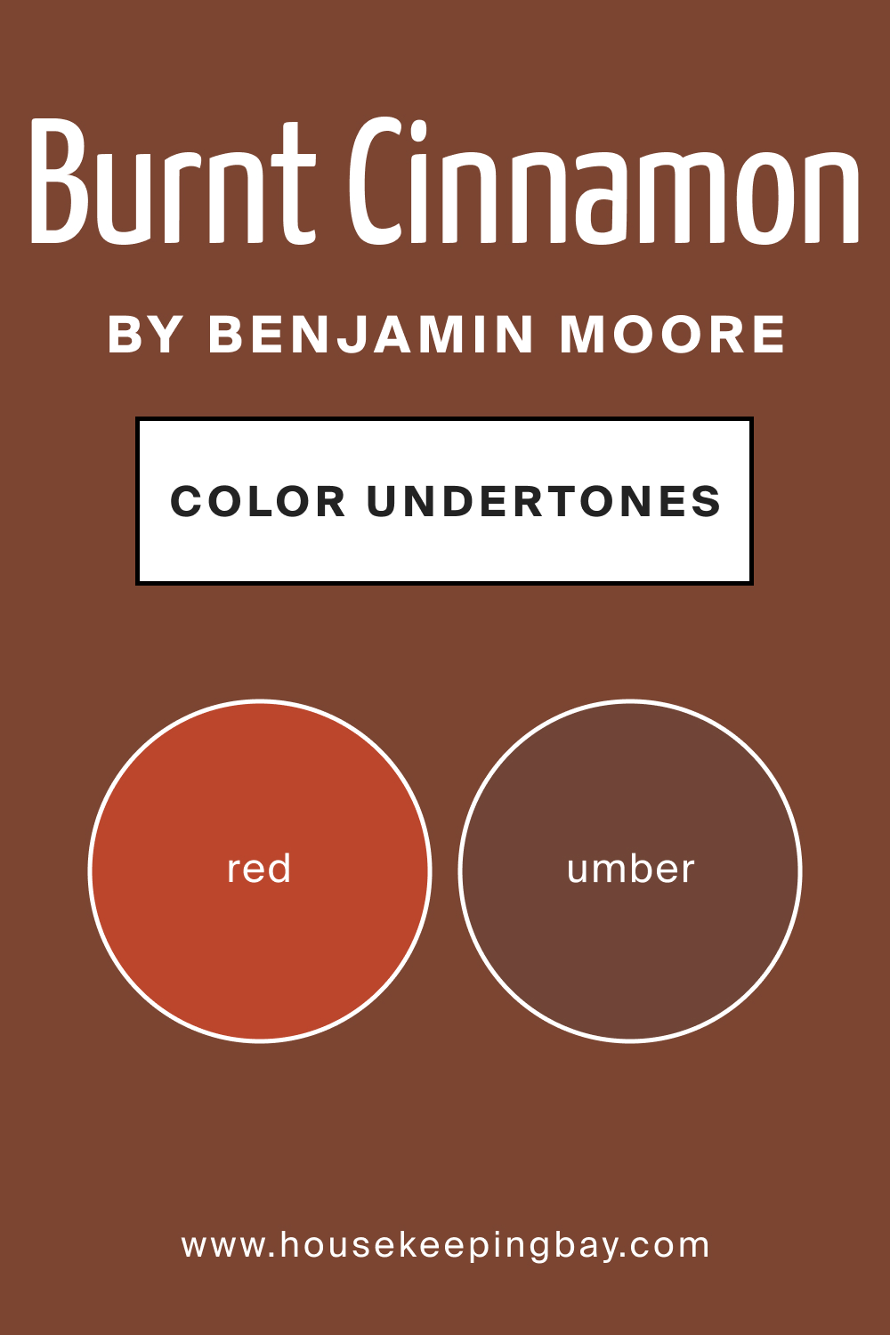
Burnt Cinnamon 2094-10 possesses subtle undertones that contribute to its dynamic character. These undertones, which include hints of deep red and a touch of umber, affect how the color is perceived under different lighting conditions. In natural daylight, the red undertones become more noticeable, giving the color a vibrant and lively appearance.
On interior walls, these undertones add a sense of depth and richness, making the color incredibly dynamic and engaging.
housekeepingbay.com
Coordinating Colors of Burnt Cinnamon 2094-10
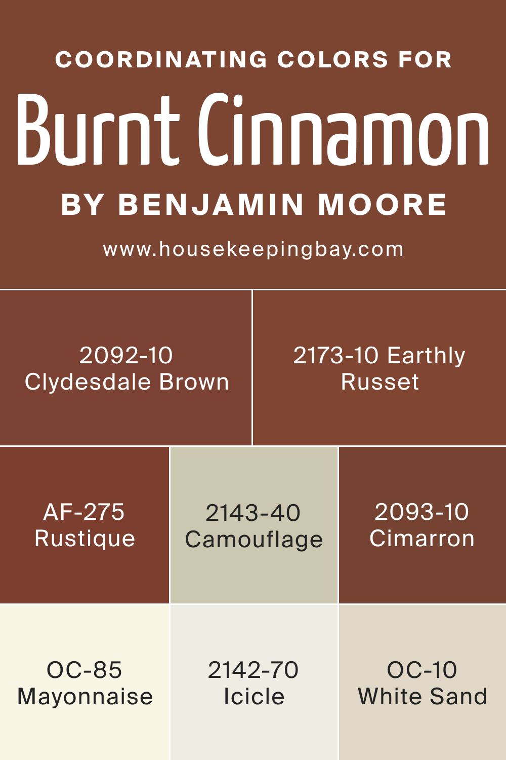
Coordinating colors are essential in creating a balanced and harmonious color scheme. BM Burnt Cinnamon 2094-10 pairs well with a variety of colors, including BM 2143-40 Camouflage (a muted, greenish-gray), OC-85 Mayonnaise (a soft, creamy white), BM 2142-70 Icicle (a crisp, clean light blue), and OC-10 White Sand (a warm, beige-toned white). Additional coordinating colors include:
- BM 2173-10 Earthly Russet – A robust, earthy red that complements the depth of Burnt Cinnamon 2094-10.
- BM 2093-10 Cimarron – A rich, warm terra cotta, offering a subtle contrast.
- BM 2092-10 Clydesdale Brown – A deep, grounding brown, echoing the warm tones of Burnt Cinnamon 2094-10.
- AF-275 Rustique – A bold, rustic orange, providing a lively and warm complement.
housekeepingbay.com
How Does Lighting Affect BM Burnt Cinnamon 2094-10?
Lighting significantly impacts how we perceive the color Burnt Cinnamon 2094-10. In natural light, this color takes on a vibrant, warm tone, with its red and brown hues becoming more pronounced. The effect of lighting changes throughout the day, with morning light accentuating its brightness and evening light bringing out its cozy, inviting qualities. In artificial lighting, its deeper brown tones may become more dominant, leaning towards a richer, more intimate feel.
In different room orientations, BM Burnt Cinnamon 2094-10 reacts uniquely. In north-facing rooms, which tend to have cooler, bluer light, this color can appear more subdued, emphasizing its deeper brown undertones. South-facing rooms, bathed in warm, yellow light, will highlight the color’s inherent warmth, making it appear more vibrant and dynamic.
East-facing rooms experience a similar effect in the morning light, while west-facing rooms will see a transformative effect in the evening as the light intensifies the color’s warmth and depth.
housekeepingbay.com
LRV of BM Burnt Cinnamon 2094-10
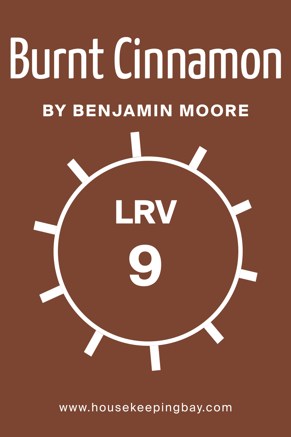
Light Reflectance Value (LRV) measures the percentage of light a paint color reflects. BM Burnt Cinnamon 2094-10, with an LRV of 9, is on the lower end of the scale, meaning it reflects a minimal amount of light. This lower LRV contributes to the color’s richness and depth, making it a bold and statement-making choice for walls.
In practical terms, this LRV means BM Burnt Cinnamon 2094-10 absorbs more light than it reflects. This characteristic can make small or poorly-lit rooms feel more intimate or even smaller.
However, in well-lit or larger spaces, this low LRV can contribute to creating a cozy, intimate atmosphere, making the color ideal for statement walls, cozy nooks, or as an accent color.
housekeepingbay.com
What is LRV? Read It Before You Choose Your Ideal Paint Color
Trim Colors of BM Burnt Cinnamon 2094-10
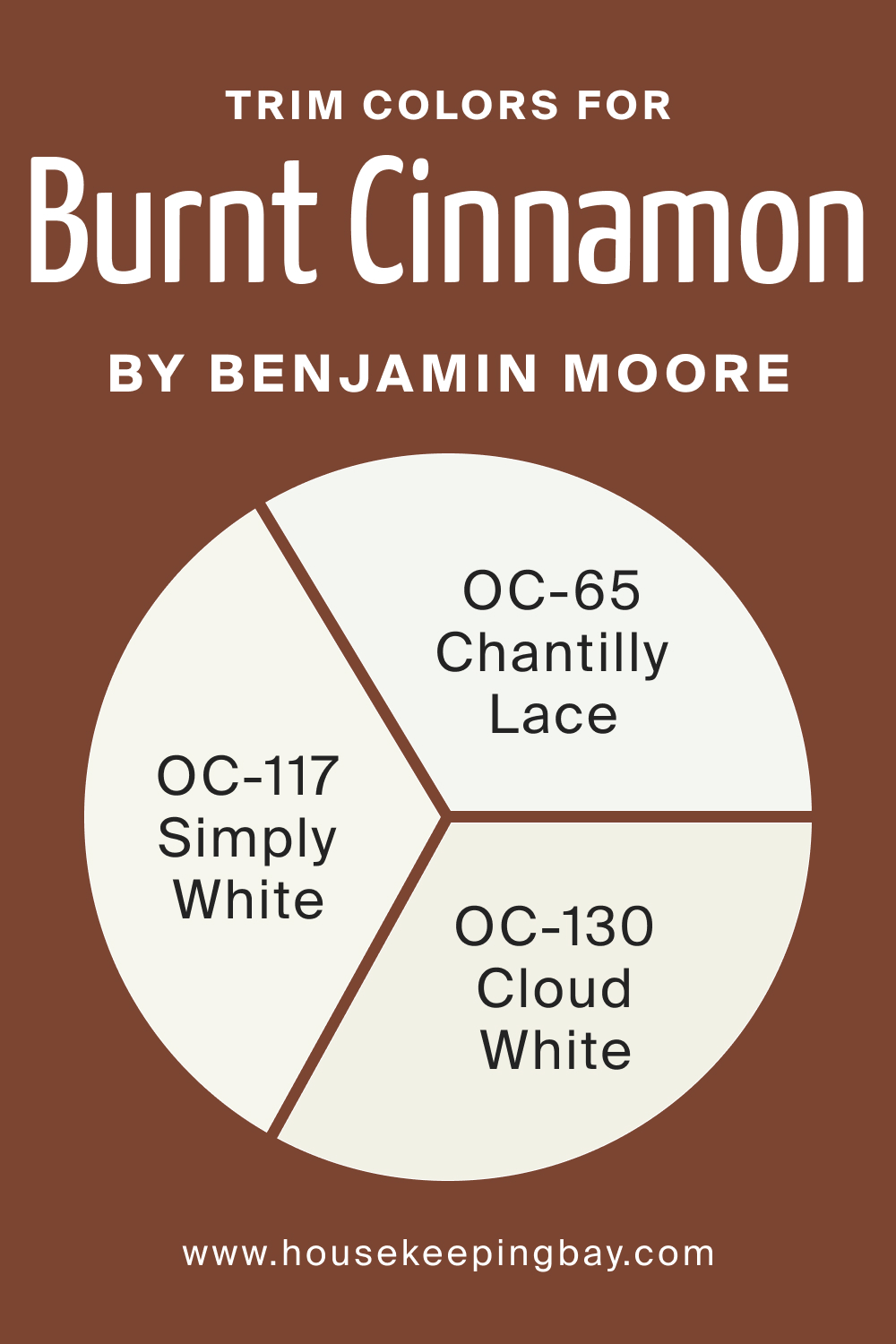
Trim colors, the shades used for door frames, moldings, and baseboards, play a significant role in interior design as they frame and define spaces. The right trim color can enhance the main wall color, creating a cohesive and polished look. For BM Burnt Cinnamon 2094-10, choosing the right shade of white trim can accentuate its warmth and depth.
Shades like OC-65 Chantilly Lace, a crisp, clean white, can provide a stark contrast that makes BM Burnt Cinnamon 2094-10 pop. OC-117 Simply White, with a slightly warmer tone, complements the cinnamon hues, creating a softer transition.
OC-130 Cloud White, with its creamy undertones, offers a balanced interplay between the trim and wall color, bridging the gap between stark contrast and harmonious blend.
housekeepingbay.com
Colors Similar to BM Burnt Cinnamon 2094-10
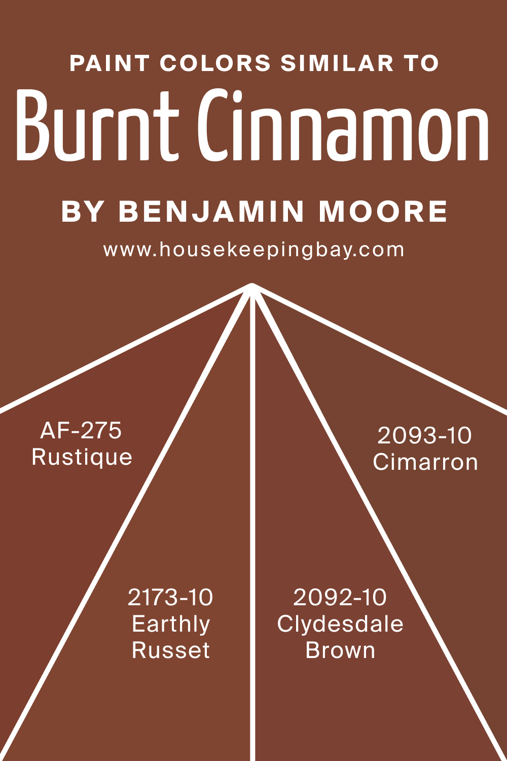
Knowing similar colors to BM Burnt Cinnamon 2094-10 is important for finding alternatives that fit specific design needs or personal preferences. BM 2173-10 Earthly Russet is a robust, earthy red, offering a similar depth but with more pronounced red undertones, providing an alternative with a slightly different hue.
BM 2093-10 Cimarron, a rich, warm terra cotta, offers a softer, more muted approach to the cinnamon shade, ideal for spaces seeking a gentler impact. BM 2092-10 Clydesdale Brown leans towards a darker, more grounding brown, echoing the warm tones of BM Burnt Cinnamon 2094-10 but with a more subdued red undertone.
AF-275 Rustique, a bold, rustic orange, provides a lively and warm complement, making it perfect for adding vibrancy and energy to a space.
housekeepingbay.com
Colors That Go With BM Burnt Cinnamon 2094-10
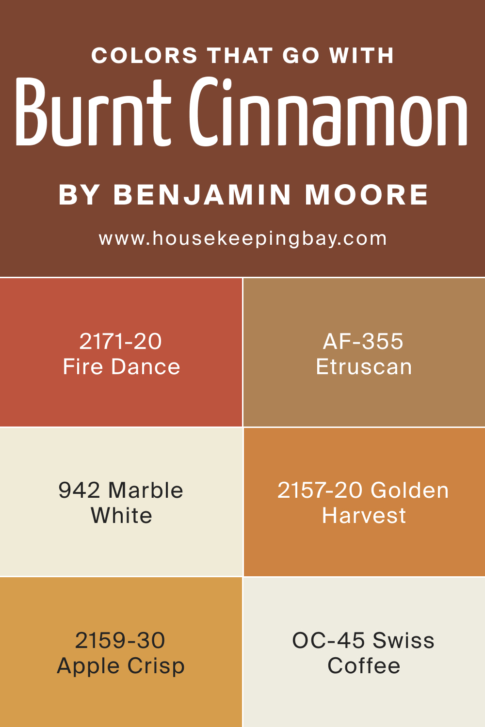
Selecting complementary colors is key in achieving a balanced and harmonious interior. Colors that pair well with BM Burnt Cinnamon 2094-10 create a cohesive color scheme that enhances the overall aesthetic of a room. OC-45 Swiss Coffee, a soft, off-white, offers a subtle contrast. AF-355 Etruscan, a muted, earthy red, echoes the warmth of Burnt Cinnamon 2094-10.
BM 942 Marble White, a warm white, provides a contemporary backdrop. BM 2159-30 Apple Crisp, a deep, rich red, adds a complementary warm hue. BM 2157-20 Golden Harvest, a vibrant, sunny yellow, brings brightness and contrast. BM 2171-20 Fire Dance, a fiery orange-red, creates a bold, dynamic pairing with Burnt Cinnamon 2094-10.
housekeepingbay.com
How to Use BM Burnt Cinnamon 2094-10 In Your Home?
BM Burnt Cinnamon 2094-10, with its deep, warm hues, is a versatile color that can be used in various rooms and interior design styles. It works exceptionally well in creating a cozy and inviting atmosphere in living rooms and bedrooms.
This color is also ideal for dining areas, where it adds a sense of warmth and sophistication. In terms of design styles, it fits seamlessly into rustic, traditional, and even contemporary themes when paired with the right accessories and furnishings.
In smaller doses, such as accent walls or decorative elements, BM Burnt Cinnamon 2094-10 can enhance kitchens and bathrooms, adding character without overwhelming the space. For exteriors, this color offers a welcoming and bold presence, especially when used on front doors or as trim.
How to Use BM Burnt Cinnamon 2094-10 in the Bedroom?
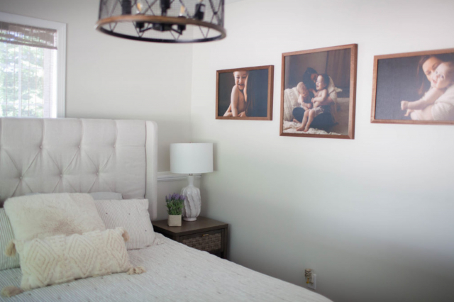
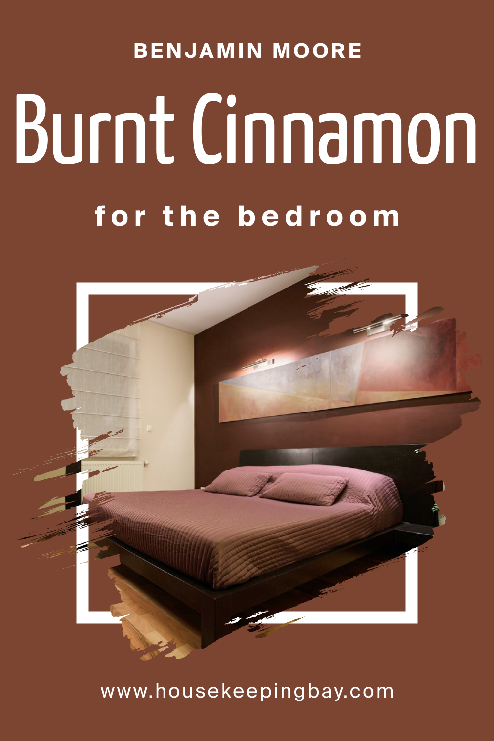
In the bedroom, BM Burnt Cinnamon 2094-10 can create a warm, inviting, and restful ambiance. This color is perfect for an accent wall behind the bed, offering a rich backdrop that complements both light and dark bedroom furniture. It pairs beautifully with soft, neutral bedding and natural textures like wood and wool, enhancing the room’s cozy feel.
For a harmonious look, balance its intensity with lighter shades on other walls and add layers of lighting to enhance its warmth. This color works well in bedrooms with ample natural light, where it can appear vibrant and lively, contributing to a comfortable and serene environment.
housekeepingbay.com
How to Use BM Burnt Cinnamon 2094-10 in the Bathroom?
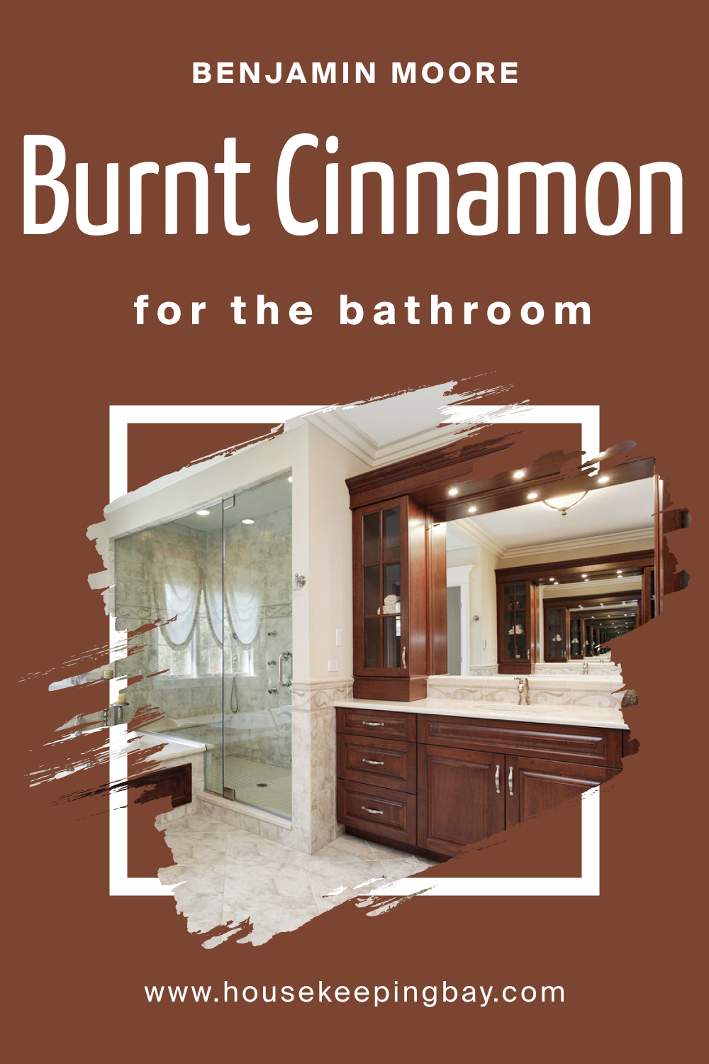
BM Burnt Cinnamon 2094-10 in the bathroom can add a touch of luxury and warmth. It’s particularly striking when used on a feature wall or for cabinetry, creating a focal point in the space. This color pairs well with natural elements like stone tiles or wooden accents, enhancing the bathroom’s spa-like feel. For a balanced aesthetic, use lighter tones in tiles, fixtures, and towels. Consider adding plants or greenery to complement the earthiness of the color. In smaller bathrooms, use BM Burnt Cinnamon 2094-10 sparingly to avoid making the space feel cramped, perhaps as an accent in niches or for decorative elements.
housekeepingbay.com
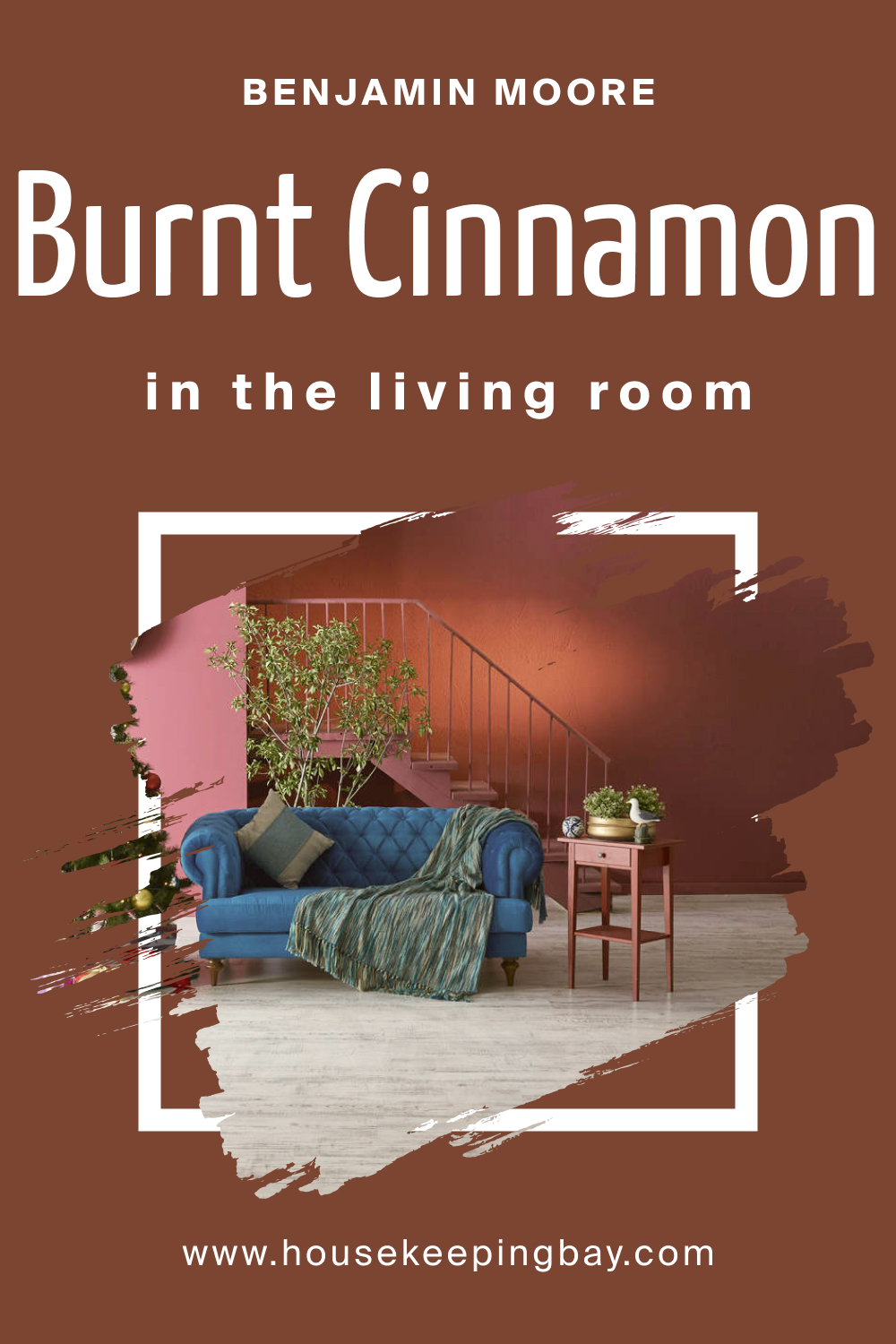
How to Use BM Burnt Cinnamon 2094-10 in the Living Room?
BM Burnt Cinnamon 2094-10 in the living room adds a sense of warmth and sophistication. It’s perfect for creating a striking feature wall, perhaps around a fireplace or a large window, where it can serve as a backdrop for artwork or a television. This color works well with a wide range of furniture styles and colors, from creamy whites to rich browns. It can also create a cozy reading nook or highlight architectural details.
To balance its depth, incorporate lighter colors in furniture, curtains, and rugs. Metallic accents, like in lighting fixtures or decorative items, can add a touch of elegance to the warm backdrop of BM Burnt Cinnamon 2094-10.
housekeepingbay.com
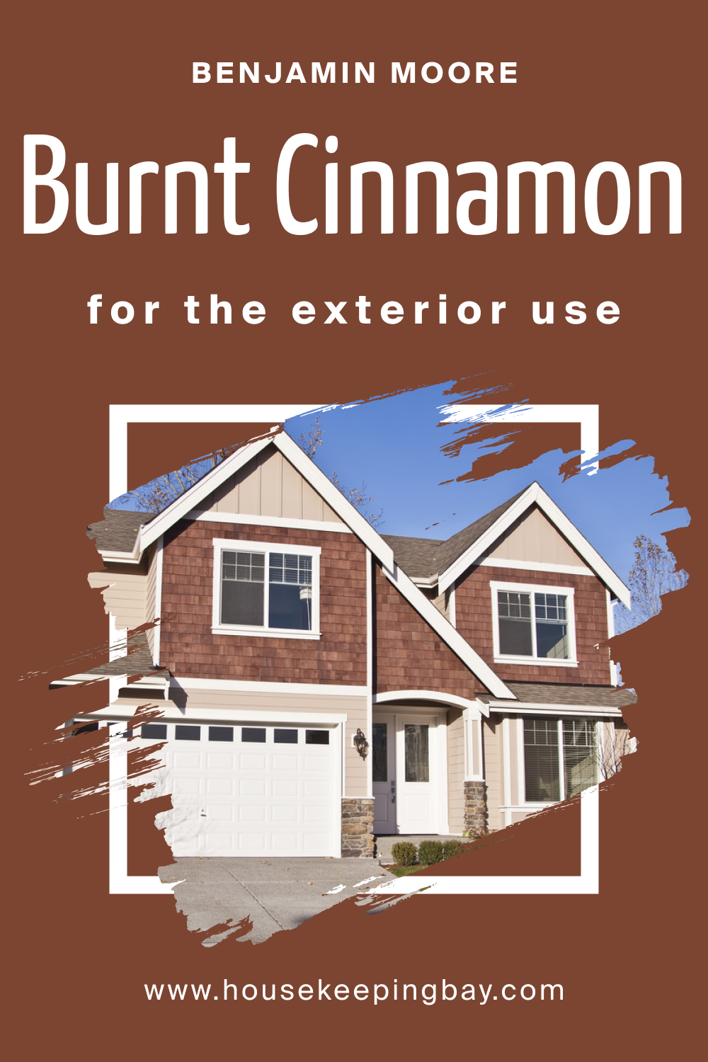
How to Use BM Burnt Cinnamon 2094-10 for an Exterior?
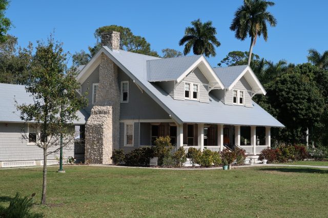
BM Burnt Cinnamon 2094-10 can make a bold statement when used on home exteriors. It’s particularly striking for front doors, shutters, or trim, providing a warm and welcoming presence. This color complements natural exterior elements like stone, brick, or wood, enhancing the home’s curb appeal. When used for siding, it creates a rich, inviting look that stands out in a neighborhood. For a balanced exterior color scheme, pair BM Burnt Cinnamon 2094-10 with lighter shades like beige or cream for the main walls or siding. This color is also excellent for highlighting architectural features or adding a touch of rustic charm to modern homes.
housekeepingbay.com
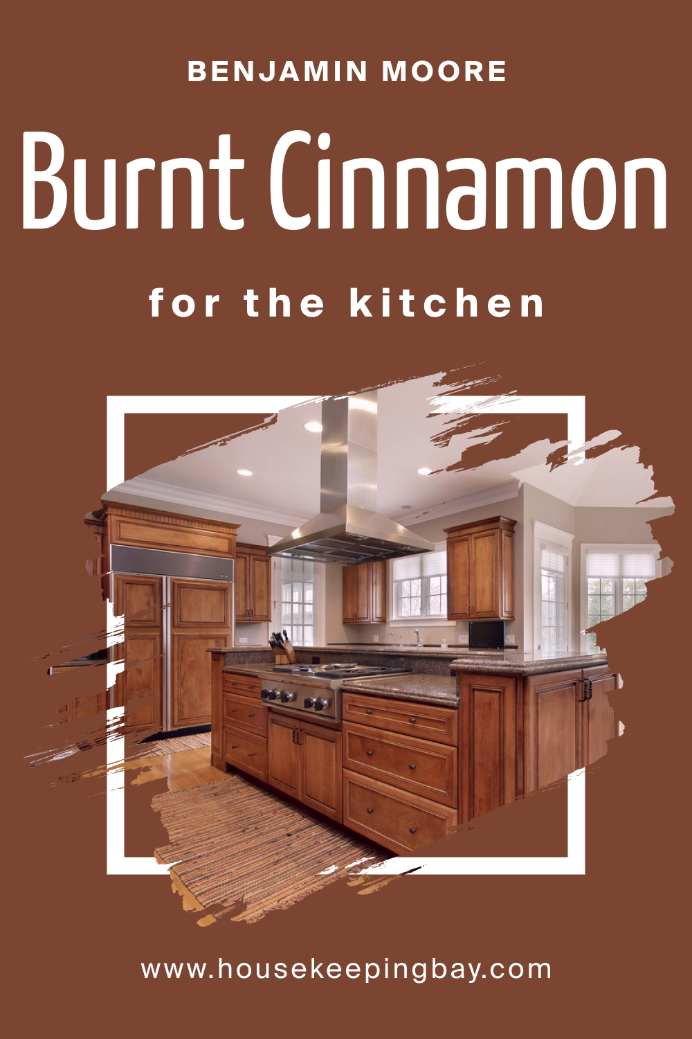
How to Use BM Burnt Cinnamon 2094-10 in the Kitchen?
In the kitchen, BM Burnt Cinnamon 2094-10 can create a warm and appetizing atmosphere. It’s ideal for an accent wall, especially in larger kitchens with good natural light. This color pairs beautifully with cream or white cabinetry, offering a striking contrast. It also complements wooden features, adding to the room’s warmth. For countertops and backsplashes, consider materials in lighter shades to balance the intensity of the color.
BM Burnt Cinnamon 2094-10 works well with both modern and traditional kitchen styles, adding character and depth. Incorporate warm lighting to enhance the cozy ambiance created by this rich hue.
housekeepingbay.com
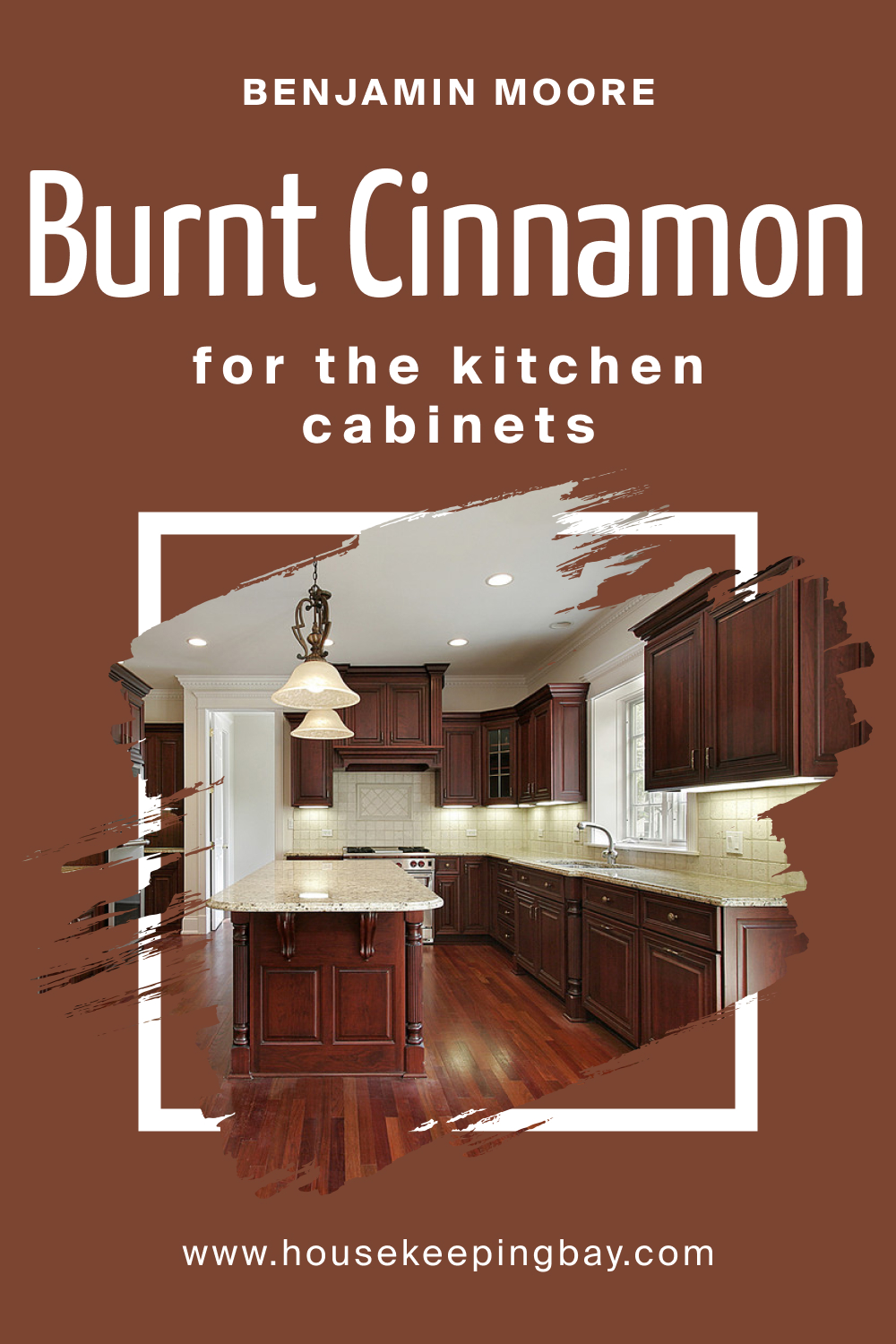
How to Use BM Burnt Cinnamon 2094-10 on the Kitchen Cabinets?
Using BM Burnt Cinnamon 2094-10 on kitchen cabinets can create a bold and stylish focal point. This color is particularly effective in kitchens with sufficient lighting, where it adds depth and warmth without overwhelming the space.
It pairs well with a variety of backsplash and countertop colors, especially in neutral or earthy tones. For a balanced look, consider lighter wall colors and open shelving in natural wood tones. Accessories and hardware in brushed nickel or stainless steel can complement the warm hue of the cabinets, adding a modern touch to the rustic charm.
When used on lower cabinets, BM Burnt Cinnamon 2094-10 can ground the space, while using it on upper cabinets creates a cozy, enveloping feel. This color is ideal for those seeking to add a unique and inviting touch to their kitchen.
housekeepingbay.com
Comparing BM Burnt Cinnamon 2094-10 With Other Colors
Comparing BM Burnt Cinnamon 2094-10 with other colors is essential for understanding its unique character and for creating effective color schemes. This comparison helps to visualize how Burnt Cinnamon 2094-10 interacts with different hues, providing insights into potential design applications. It aids in determining complementary colors, contrast levels, and the overall mood different combinations can create. Whether for interior or exterior design, such comparisons enable designers and homeowners to make informed choices, ensuring that the chosen colors harmonize well and achieve the desired aesthetic effect.
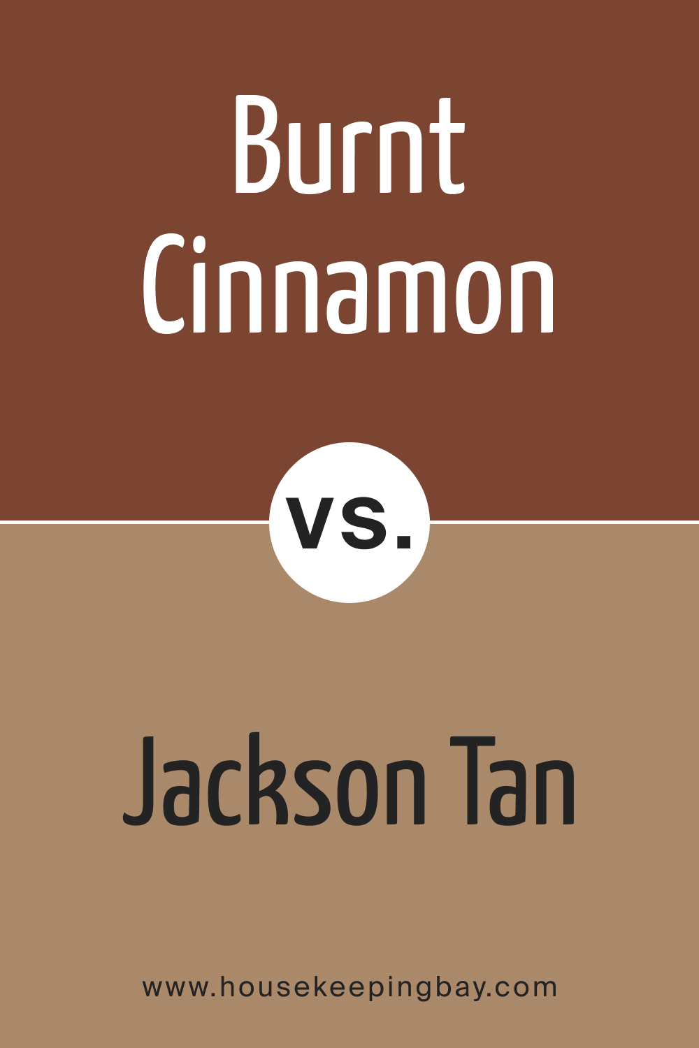
BM Burnt Cinnamon 2094-10 vs. HC-46 Jackson Tan
BM Burnt Cinnamon 2094-10 and HC-46 Jackson Tan both bring warmth to spaces, yet in distinct ways. While Burnt Cinnamon 2094-10 is a deep, rich cinnamon shade, Jackson Tan is a lighter, more subdued tan. Jackson Tan offers a softer approach, suitable for creating a neutral backdrop, whereas Burnt Cinnamon 2094-10 stands out with its boldness and depth.
In a color scheme, the two can work together to establish a warm, inviting atmosphere, with Jackson Tan balancing the intensity of Burnt Cinnamon 2094-10.
housekeepingbay.com
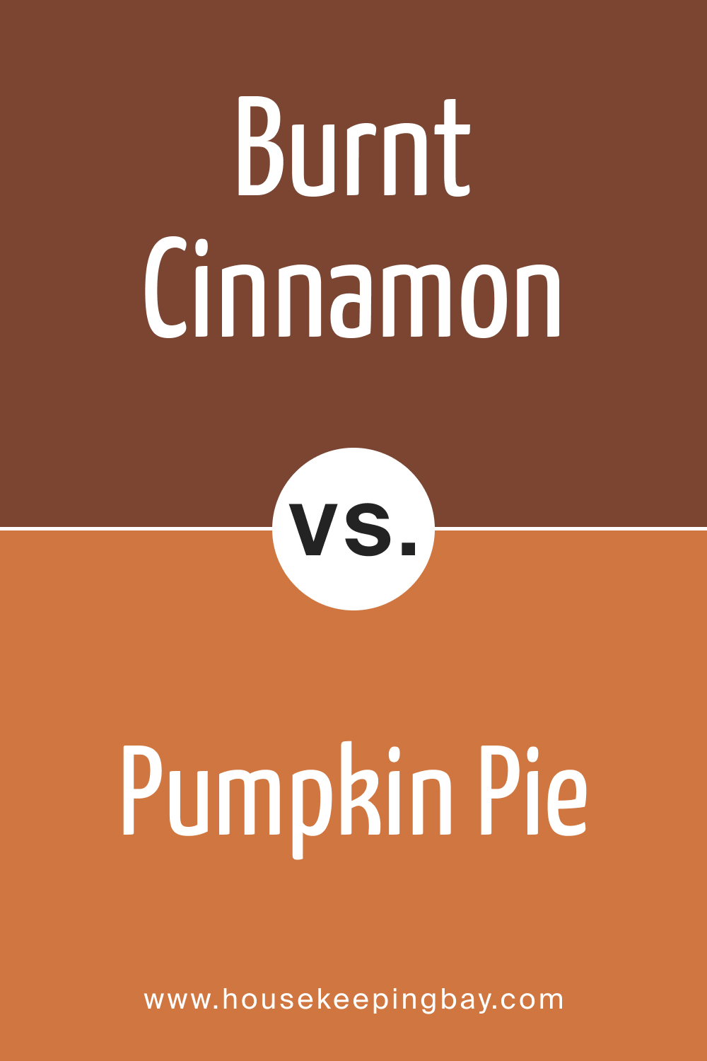
BM Burnt Cinnamon 2094-10 vs. BM 2167-20 Pumpkin Pie
Comparing BM Burnt Cinnamon 2094-10 with BM 2167-20 Pumpkin Pie highlights the differences in their warm, earthy qualities. Pumpkin Pie is a brighter, more vibrant orange, offering a lighter and more playful tone compared to the deeper and more sophisticated Burnt Cinnamon 2094-10.
In a space, Pumpkin Pie can inject energy and brightness, while Burnt Cinnamon 2094-10 provides a sense of depth and richness. Together, they can create a dynamic and inviting color palette, especially in autumn-themed decors.
housekeepingbay.com
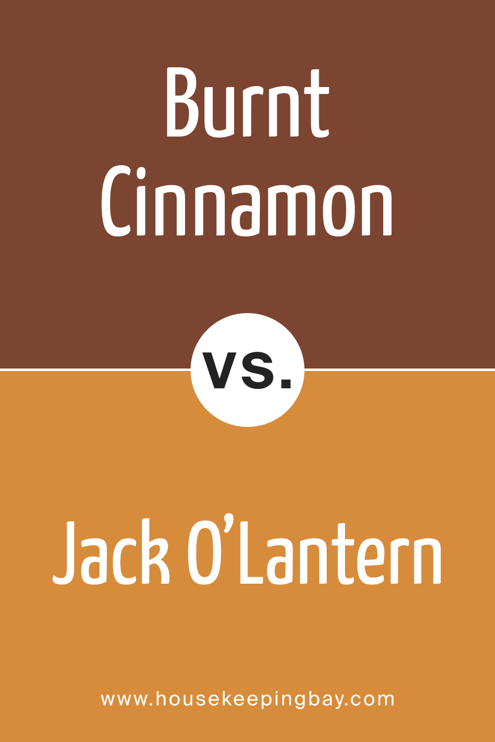
BM Burnt Cinnamon 2094-10 vs. BM 2156-30 Jack O’Lantern
BM Burnt Cinnamon 2094-10 and BM 2156-30 Jack O’Lantern vary significantly in their expression of warmth. Jack O’Lantern is a vivid, bold orange, much brighter and more energetic than the subdued, smoky warmth of Burnt Cinnamon 2094-10. While Jack O’Lantern is ideal for creating focal points and adding vibrancy, Burnt Cinnamon 2094-10 is better suited for establishing a cozy, enveloping ambiance. They could be paired for a complementary scheme that balances intensity with depth.
housekeepingbay.com
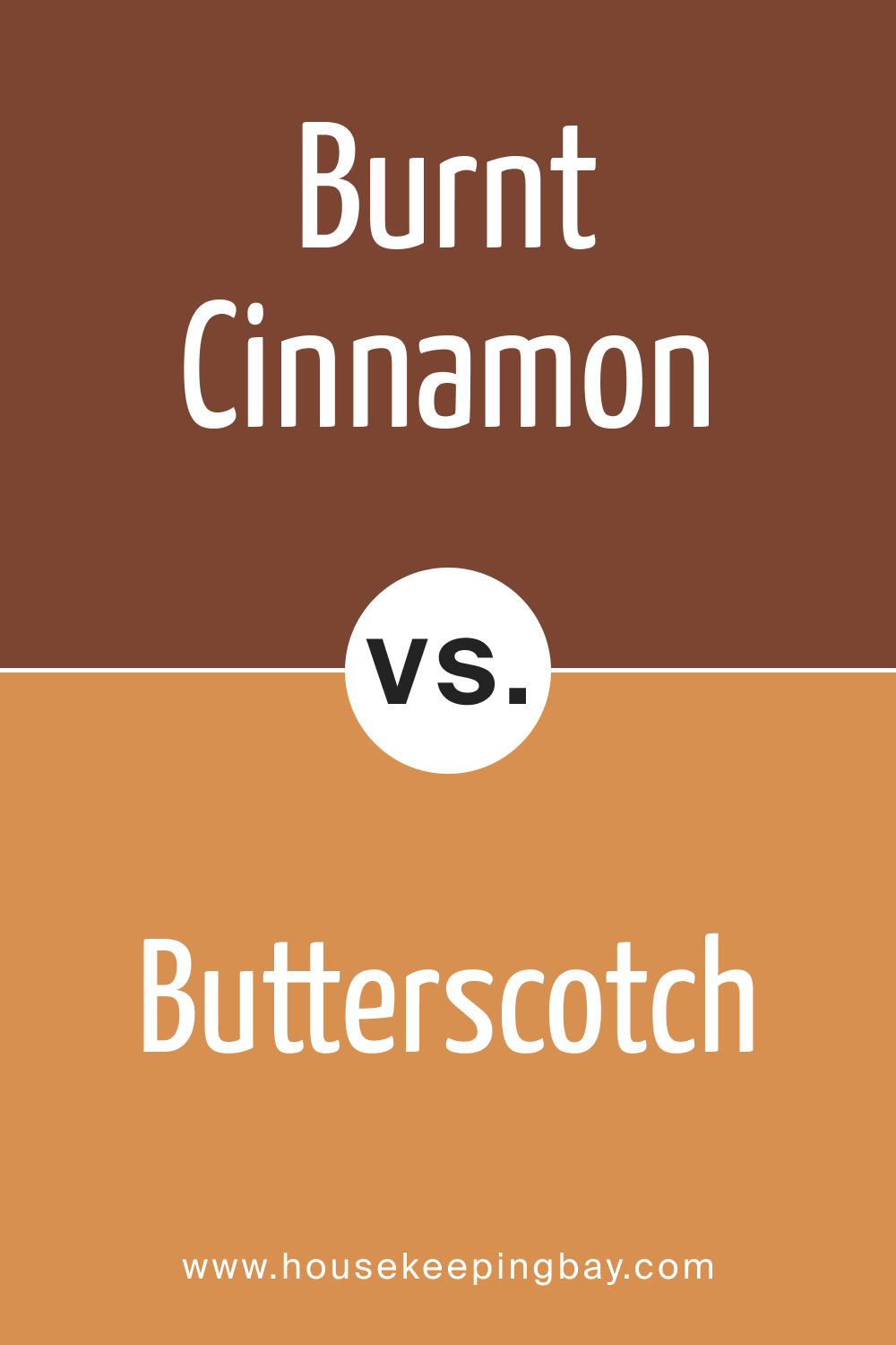
BM Burnt Cinnamon 2094-10 vs. BM 2157-30 Butterscotch
BM Burnt Cinnamon 2094-10 and BM 2157-30 Butterscotch illustrate the range within warm color palettes. Butterscotch is a creamy, lighter yellow-orange, offering a gentler and more muted contrast to the rich, deep tone of Burnt Cinnamon 2094-10. Butterscotch can serve as a softening element alongside the boldness of Burnt Cinnamon 2094-10, suitable for a space seeking balance between striking and soothing elements.
housekeepingbay.com
BM Burnt Cinnamon 2094-10 vs. BM 2168-10 Fall Harvest
BM Burnt Cinnamon 2094-10 compared to BM 2168-10 Fall Harvest showcases two variations of autumnal warmth. Fall Harvest is a robust, reddish-brown, echoing the earthy tones of Burnt Cinnamon 2094-10 but with a slightly more pronounced red undertone. Fall Harvest can complement the depth of Burnt Cinnamon 2094-10, creating a rich, harmonious look that’s ideal for spaces that celebrate the warmth and comfort of the fall season.

housekeepingbay.com
BM Burnt Cinnamon 2094-10 vs. BM 2019-10 Mardi Gras Gold
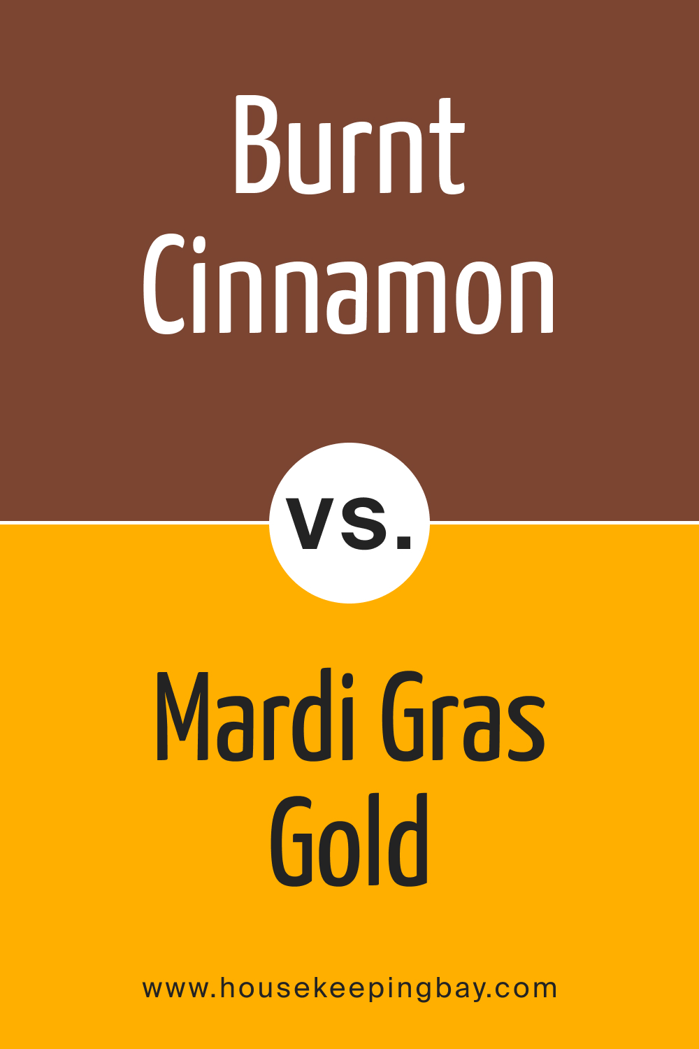
When comparing BM Burnt Cinnamon 2094-10 with BM 2019-10 Mardi Gras Gold , the contrast in their warmth and vibrancy becomes apparent. Mardi Gras Gold is a bright, bold yellow-gold, much more luminous and energetic than the muted, smoky warmth of Burnt Cinnamon 2094-10.
housekeepingbay.com
Mardi Gras Gold can introduce a lively, cheerful energy to a space, providing a striking contrast to the more grounded and serene presence of Burnt Cinnamon 2094-10. This combination can create an engaging and dynamic color palette, especially effective in eclectic or bohemian-style interiors.
housekeepingbay.com
Ever wished paint sampling was as easy as sticking a sticker? Guess what? Now it is! Discover Samplize's unique Peel & Stick samples. Get started now and say goodbye to the old messy way!
Get paint samples




Frequently Asked Questions
⭐What types of finishes are best suited for BM Burnt Cinnamon 2094-10?
BM Burnt Cinnamon 2094-10 is versatile and works well with a variety of finishes. A matte or eggshell finish accentuates its depth and richness, ideal for living rooms or bedrooms. For areas that require regular cleaning, like kitchens or bathrooms, a satin or semi-gloss finish is more practical due to its easier maintenance and durability.
⭐Can BM Burnt Cinnamon 2094-10 be used in small spaces?
Absolutely! While BM Burnt Cinnamon 2094-10 is a bold color, it can be effectively used in small spaces, especially as an accent wall, to add depth and character. Pairing it with lighter or neutral tones and using adequate lighting can prevent the room from feeling cramped.
⭐Is BM Burnt Cinnamon 2094-10 suitable for exterior use?
Yes, BM Burnt Cinnamon 2094-10 is an excellent choice for exteriors. Its warm, rich tone is perfect for front doors, shutters, or exterior accents, providing a welcoming and sophisticated curb appeal. It pairs well with a variety of exterior materials and colors.
⭐What are some coordinating colors for BM Burnt Cinnamon 2094-10?
BM Burnt Cinnamon 2094-10 pairs beautifully with a range of colors. Neutral tones like beige, cream, and light grey complement its warmth, while soft greens or blues can create a balanced and harmonious look. For a bold palette, consider pairing it with deep greens or rich reds.
⭐How does lighting affect the appearance of BM Burnt Cinnamon 2094-10?
Lighting significantly influences how BM Burnt Cinnamon 2094-10 is perceived. In natural daylight, the color appears warmer and more vibrant. Artificial lighting, depending on the type, can either enhance or mute its warmth. The color can appear differently in rooms with varying light exposures, looking richer in well-lit spaces and more subdued in areas with less natural light.

