Twilight Gray SW 0054 by Sherwin Williams
Unveiling Subtle Elegance: The Art of Neutral Tones
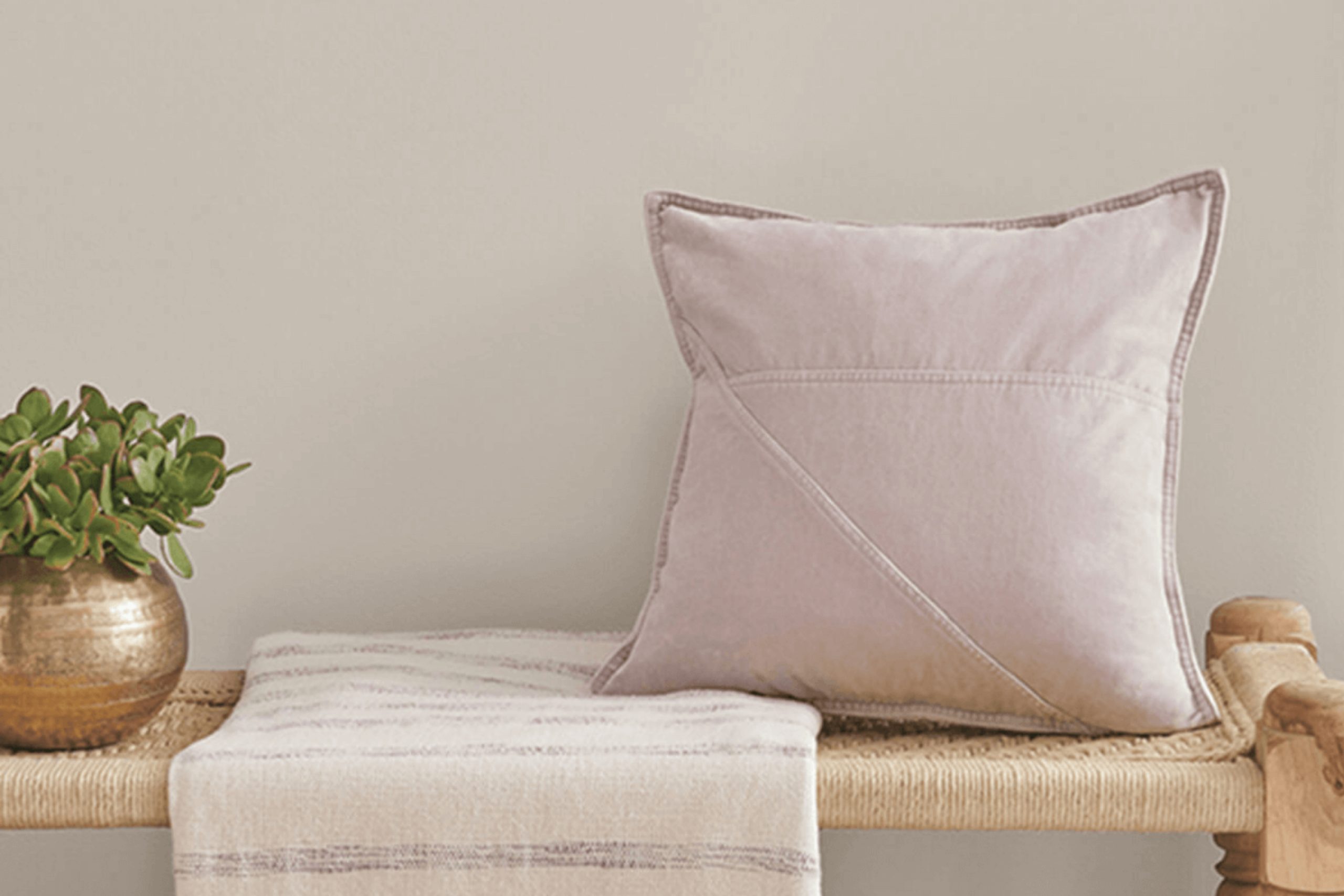
I recently had the chance to use SW 0054 Twilight Gray by Sherwin Williams for a little makeover project at my place, and I want to share my thoughts about it. This particular shade of gray is really versatile, capable of adding both elegance and a contemporary touch to any space. Using it in my living room, the walls now present a soft yet sophisticated backdrop that compliments any style of decor I pair with it.
What I like most about Twilight Gray is how it plays with light, morphing subtly between lighter and darker shades as the day progresses.
This quality adds a dynamic character to the room, keeping it interesting and lively. The paint itself, typical of Sherwin Williams products, was a joy to work with—smooth application with great coverage.
If you’re thinking about giving your home a fresh look or just refreshing a room or two, Twilight Gray is a color you might want to consider. It’s neutral enough to fit various decorating styles but distinctive enough to make a statement. Plus, it works wonderfully both as a main color and an accent.
via sherwin-williams.com
What Color Is Twilight Gray SW 0054 by Sherwin Williams?
Table of Contents
Twilight Gray SW 0054 by Sherwin Williams is a soothing medium gray shade that offers a balanced, versatile backdrop for any room. This enduring color has a classic appeal, making it a perfect choice for those looking to achieve a timeless look in their home.
Twilight Gray has a slightly cool undertone, which adds a clean and crisp edge to the spaces it graces.
Twilight Gray fits seamlessly within various interior styles, particularly modern, minimalist, and transitional decors. Its understated elegance supports a range of design aesthetics, from the sleek lines of contemporary furniture to the elegant curves of transitional pieces.
When considering materials and textures to pair with Twilight Gray, natural elements like wood, stone, and metal work exceptionally well. Textures such as linen, wool, and jute add a tactile dimension that complements the smoothness of the gray, providing a cozy, inviting environment.
For a harmonious color scheme, integrating shades of white, blue, or even soft pink can enhance the serene quality of Twilight Gray, creating a space that feels both sophisticated and welcoming. Whether used as a primary palette or an accent, Twilight Gray provides a solid foundation for styling a memorable, enchanting home.
housekeepingbay.com
Is Twilight Gray SW 0054 by Sherwin Williams Warm or Cool color?
Twilight Gray SW 0054 by Sherwin Williams is a versatile and soothing paint color that blends cool gray tones with hints of blue. This subtle mix makes it a perfect choice for creating a serene and inviting atmosphere in homes.
The color is particularly effective in rooms that receive a lot of natural light, as it reflects the light beautifully, making spaces feel larger and more open. Twilight Gray works well in modern and traditional settings, serving as a neutral backdrop that can be paired with a wide range of decor styles and colors.
Whether applied in a cozy bedroom or a spacious living room, it provides a gentle, calming presence without overwhelming the senses. Homeowners often choose this shade for its ability to balance a room’s aesthetics while retaining a fresh, clean look.
What is the Masstone of the Twilight Gray SW 0054 by Sherwin Williams?
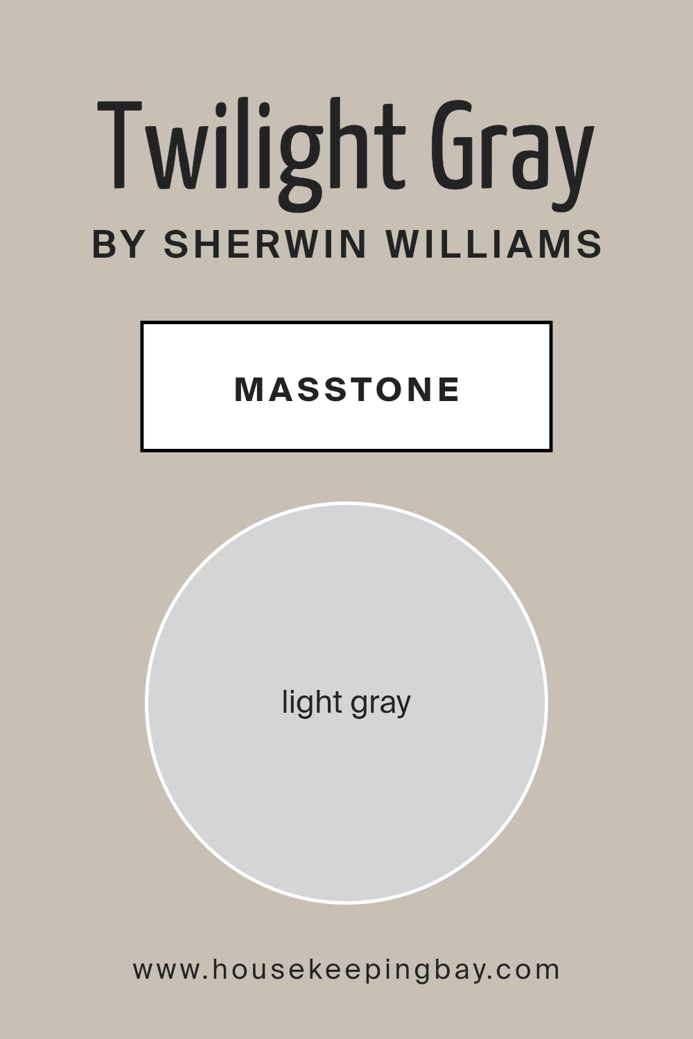
Twilight Gray SW 0054 by Sherwin Williams is a soothing light gray color, with the masstone identifier Light Gray (#D5D5D5). This color offers a subtle and neutral backdrop that works well in various spaces within a home.
Its light gray shade makes the room feel open and airy, providing a feeling of more space which is especially beneficial in smaller rooms or areas with limited natural light.
Since Twilight Gray is not overpowering, it pairs beautifully with a wide range of other colors, from bold and bright hues to softer tones. This versatility allows homeowners to use this color in living rooms, bedrooms, and even bathrooms, maintaining a coherent look throughout the house. Additionally, light gray walls can help highlight artwork, furniture, and other decor elements, making them pop against the neutral backdrop.
The simplicity and adaptability of Twilight Gray SW 0054 make it a popular choice for those looking to create a serene and welcoming environment in their homes.
housekeepingbay.com
Undertones of Twilight Gray SW 0054 by Sherwin Williams
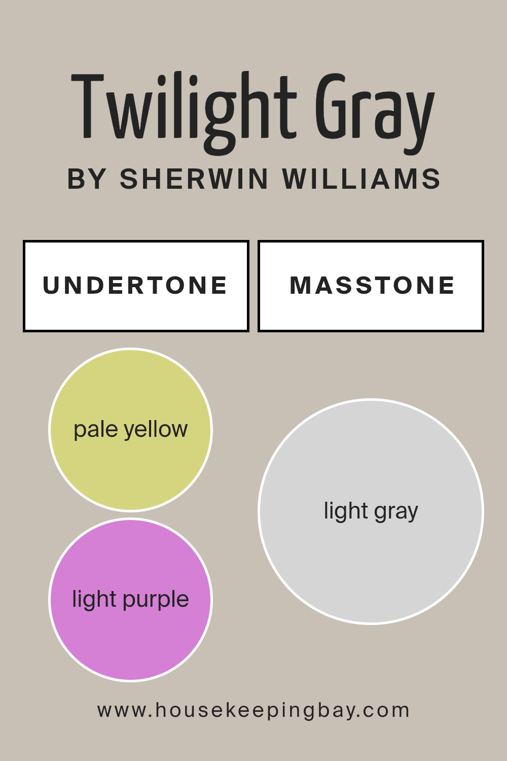
Twilight Gray SW 0054 by Sherwin Williams is a complex paint color due to its mix of subtle undertones. Undertones play a significant role in affecting how we perceive colors. They can subtly influence other colors near them and change appearance under different lighting conditions. Twilight Gray has a varied palette of undertones, including pale yellow, light purple, light blue, pale pink, mint, lilac, and gray.
Each undertone provides a different feel and can influence the overall mood of a room. Pale yellow adds a hint of warmth, making spaces feel more inviting, while light purple brings a soft, almost soothing quality. Light blue introduces a cool, calm touch, ideal for creating a serene environment.
Pale pink can give a gentle, nurturing atmosphere. Mint offers a fresh and clean look, enhancing feelings of renewal. Lilac can add a playful, creative flair, and the gray undertone helps in grounding the color, ensuring it doesn’t lean too much towards any one color spectrum.
When Twilight Gray is used on interior walls, these undertones can interact with furnishings and light, shifting the room’s aesthetics throughout the day. In bright sunlight, the yellow and blue undertones might become more pronounced, creating a livelier effect. In artificial light, the pink or purple might become more noticeable, providing a cozy, calm vibe.
This color, with its rich undertones, allows for versatile design options, fitting well in bedrooms, living rooms, or bathrooms.
housekeepingbay.com
Coordinating Colors of Twilight Gray SW 0054 by Sherwin Williams
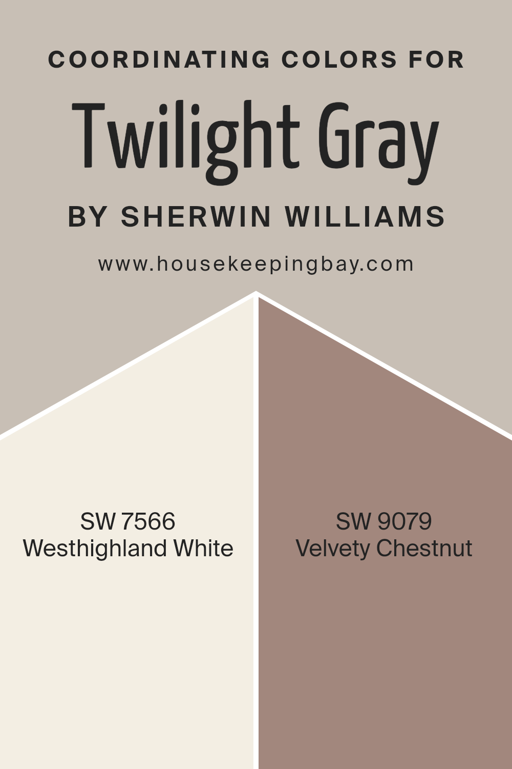
Coordinating colors are shades that complement each other and work well together in a design scheme, enhancing the overall aesthetic of a space. When paired correctly, these colors bring balance and harmony to a room, making it visually appealing.
For instance, Twilight Gray SW 0054 by Sherwin Williams can be beautifully complemented with shades like Westhighland White SW 7566 and Velvety Chestnut SW 9079. These coordinating colors help highlight the main hue while providing a stylish, well-rounded look.
Westhighland White SW 7566 is a warm and inviting off-white color that serves as an excellent background or accent color. It adds light and a sense of spaciousness to any room, making it feel more open and airy. On the other hand, Velvety Chestnut SW 9079 offers a deep, rich brown tone that conveys a sense of warmth and coziness, perfect for creating a welcoming and intimate atmosphere.
These colors can significantly enhance Twilight Gray by adding depth and contrast, which, consequently, creates an environment that feels harmonious and aesthetically pleasing.
You can see recommended paint colors below:
- SW 7566 Westhighland White
- SW 9079 Velvety Chestnut
housekeepingbay.com
How Does Lighting Affect Twilight Gray SW 0054 by Sherwin Williams?
Lighting plays a crucial role in how colors are perceived in a space. Different light sources can alter the appearance of colors, impacting the mood and aesthetic of a room. Twilight Gray SW 0054 by Sherwin Williams is a versatile color that reacts uniquely under varying lighting conditions.
- Artificial Light: Under artificial lighting, Twilight Gray can appear warmer, bringing out subtle brown undertones. In rooms lit with incandescent bulbs, this color might seem slightly more inviting and less stark, compared to its appearance in natural light.
- Natural Light: In natural daylight, Twilight Gray reflects a more true-to-swatch gray. The color is consistent and neutral, making it an excellent choice for spaces intended to have a modern and calm feel. Rooms with plenty of sunlight reveal the purest form of this gray, highlighting its clean and crisp qualities.
Room Orientation:
- North-Faced Rooms: Rooms facing north often receive less direct sunlight, which can make Twilight Gray appear cooler and slightly darker. This shade of gray might seem more slate-like in these conditions, potentially creating a soothing and subdued atmosphere.
- South-Faced Rooms: South-facing rooms benefit from abundant light most of the day, which can make Twilight Gray look lighter and more vibrant. The warmth of the sunlight enhances the gray, preventing it from appearing too cold or dull.
- East-Faced Rooms: In east-facing rooms, morning light can make Twilight Gray look soft and warm. As the day progresses and natural light decreases, the color may shift back towards a neutral or cooler gray by the evening.
- West-Faced Rooms: Twilight Gray in west-facing rooms can feel quite neutral during the morning and dramatically transform as the sunset approaches. The color warms up in the afternoon to evening light, making the room feel cozy and warmer.
Overall, Twilight Gray’s reaction to different lighting conditions makes it a flexible color choice, adapting to various environments and lighting scenarios, ensuring a balanced and harmonious aesthetic.
housekeepingbay.com
What is the LRV of Twilight Gray SW 0054 by Sherwin Williams?
LRV stands for Light Reflectance Value, which is a measurement that indicates how much light a paint color reflects or absorbs when applied to a surface. Measured on a scale from 0 to 100, an LRV of 0 means the color absorbs all light (black), and an LRV of 100 reflects all light (white).
This value helps in determining how light or dark a color will appear once painted on your walls. It is also an excellent tool for understanding how a color might change in appearance under different lighting conditions.
With an LRV of 52.746, Twilight Gray SW 0054 by Sherwin Williams is a medium shade that neither reflects nor absorbs light excessively. This balanced LRV means that Twilight Gray will offer a moderate level of brightness to any room. During the day, in natural light, this color will appear somewhat lighter, while at night or in lower lighting, it will present a richer and deeper tone.
The moderate LRV makes it a versatile color, suitable for spaces that don’t have an abundance of natural light but still need to maintain some brightness.

housekeepingbay.com
What are the Trim colors of Twilight Gray SW 0054 by Sherwin Williams?
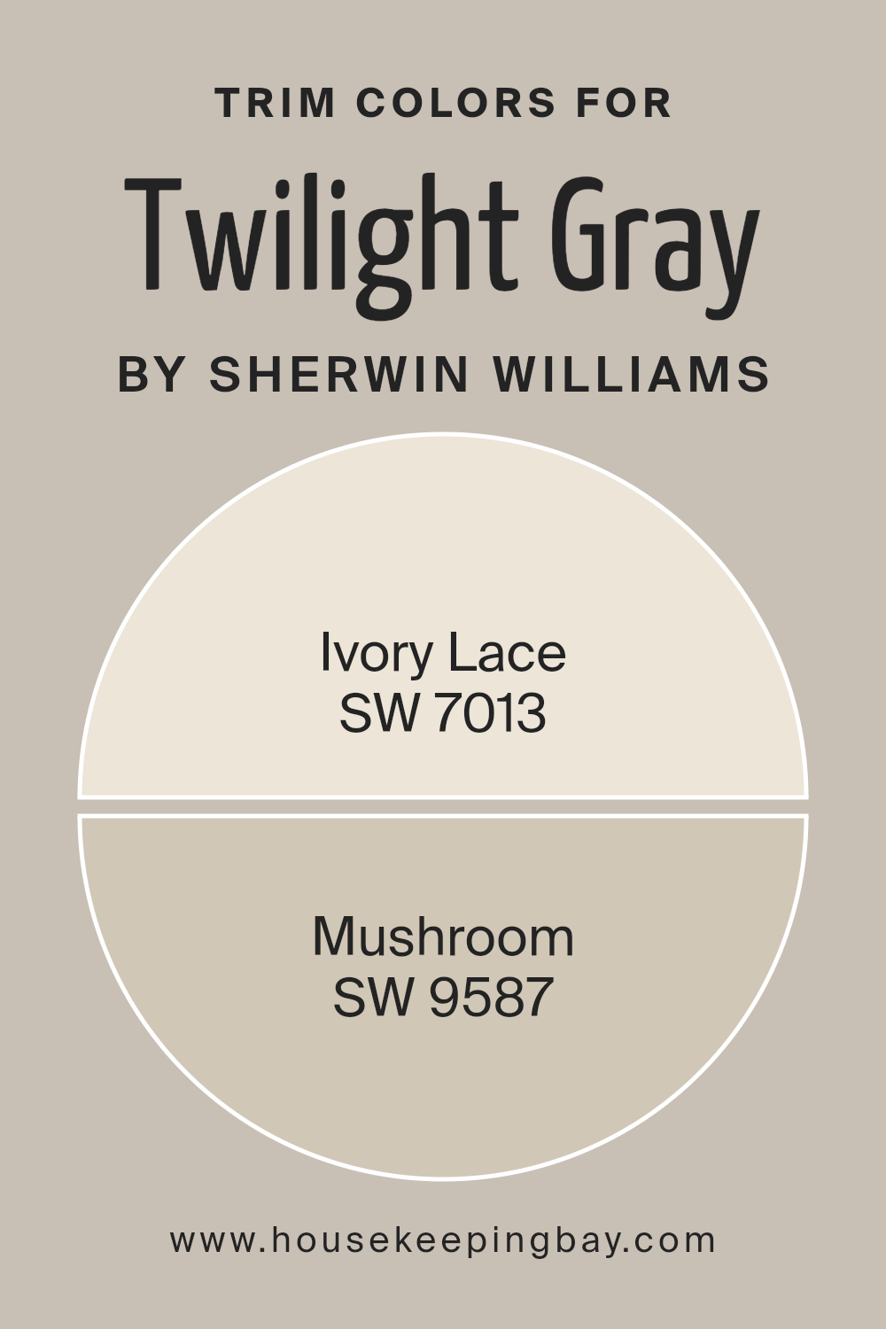
Trim colors are auxiliary hues that complement or contrast the main color on walls to enhance the overall design aesthetic of a room. When considering Twilight Gray SW 0054 by Sherwin Williams, choosing the right trim colors is key in creating a balanced, visually appealing space.
Trim colors such as Ivory Lace SW 7013 and Mushroom SW 9587 can beautifully outline door frames, windows, and moldings, giving a polished finish while aiding in defining the spatial dimensions and architectural details of the room.
Ivory Lace SW 7013 is a soft off-white color that provides a gentle contrast when paired with the darker, more subdued Twilight Gray, lending a light and airy feel to the space.
On the other hand, Mushroom SW 9587 offers a warmer, earth-toned alternative that gives depth to the room when used as a trim, ensuring the walls are accented in a way that enhances the gray tones without overwhelming them.
Using these colors as trims not only brings a cohesive look but also subtly frames and refines the space, making color a strategic element of room design.
You can see recommended paint colors below:
housekeepingbay.com
Colors Similar to Twilight Gray SW 0054 by Sherwin Williams
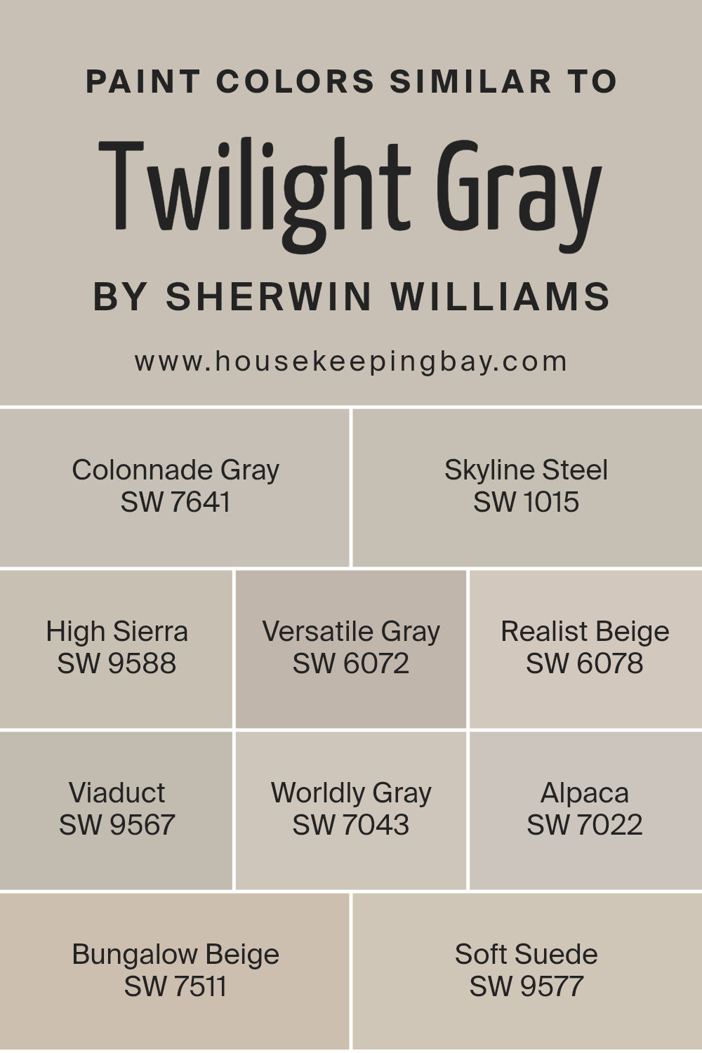
Similar colors are crucial in design because they help create a harmonious and cohesive look, providing a subtle yet impactful aesthetic continuity. When colors like Twilight Gray SW 0054 by Sherwin Williams are used alongside shades such as Colonnade Gray, Skyline Steel, High Sierra, and others, they produce a seamless transition across different surfaces and elements in a space. This technique can make smaller spaces appear larger and gives a sophisticated, unified appearance to interiors.
Colonnade Gray SW 7641 is a gentle gray with a touch of warm undertones, ideal for creating a soft, neutral backdrop. Skyline Steel SW 1015 offers a slightly metallic hint that reflects light beautifully, making it perfect for modern spaces.
High Sierra SW 9588 presents a deeper, bolder gray that adds depth and interest to any room. Versatile Gray SW 6072 and Worldly Gray SW 7043 both provide adaptable shades that complement various decor styles and colors.
Realist Beige SW 6078 and Bungalow Beige SW 7511 are warmer, inviting tones that bring a cozy feeling to any environment. Viaduct SW 9567 features a unique blend of gray with blue undertones, offering a refreshing twist to traditional grays.
Alpaca SW 7022 merges gray with subtle brown undertones for a rich, earthy texture. Lastly, Soft Suede SW 9577 rounds out the palette with its soft, velvety finish that adds a touch of luxury. All these similar colors let decorators and homeowners tie different elements and spaces together fluidly, enhancing the overall aesthetic appeal of homes or commercial spaces.
You can see recommended paint colors below:
- SW 7641 Colonnade Gray
- SW 1015 Skyline Steel
- SW 9588 High Sierra
- SW 6072 Versatile Gray
- SW 6078 Realist Beige
- SW 9567 Viaduct
- SW 7043 Worldly Gray
- SW 7022 Alpaca
- SW 7511 Bungalow Beige
- SW 9577 Soft Suede
housekeepingbay.com
How to Use Twilight Gray SW 0054 by Sherwin Williams In Your Home?
Twilight Gray SW 0054 by Sherwin Williams is a versatile paint color that suits various spaces in a home. This gray shade has subtle blue undertones, making it a great choice for creating a soothing atmosphere without being too bold. It is ideal for living rooms and bedrooms where a calm environment is preferred.
Homeowners can use Twilight Gray to paint all walls in a room for a cohesive look, or use it on an accent wall to complement lighter shades like whites or soft blues. This color also works well in kitchens and bathrooms when paired with white cabinetry or fixtures, offering a modern yet timeless appeal.
Furthermore, Twilight Gray can enhance the aesthetic of home offices or study areas, encouraging focus and serenity. It pairs well with natural wood tones and metallic accents, such as in frames or light fixtures, adding a touch of sophistication. Overall, Twilight Gray SW 0054 provides a flexible color foundation for decorating, enabling various style directions.
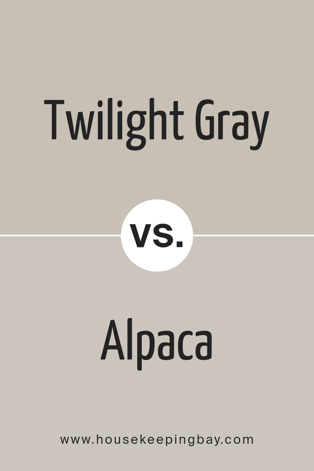
Twilight Gray SW 0054 by Sherwin Williams vs Alpaca SW 7022 by Sherwin Williams
Twilight Gray SW 0054 by Sherwin Williams is a deep, bold gray shade that offers a strong presence in any space. It carries a sense of sophistication and can create a dramatic backdrop for both contemporary and traditional designs. This color pairs well with bright accents or wood tones, adding depth and definition to rooms.
Alpaca SW 7022, also by Sherwin Williams, is much softer and leans towards a neutral beige-gray. It’s a versatile shade that provides a warm, inviting feel. Alpaca works well in spaces where a light, airy feel is desired, and it complements a wide range of decor styles from modern to rustic.
Both colors offer distinct vibes – Twilight Gray brings intensity and focus, perfect for feature walls or furniture pieces, while Alpaca offers a subtle elegance that can enhance the sense of space and light in a room. They could be used together to balance a room’s aesthetics, anchoring bold design choices with a calm, neutral base.
You can see recommended paint color below:
housekeepingbay.com
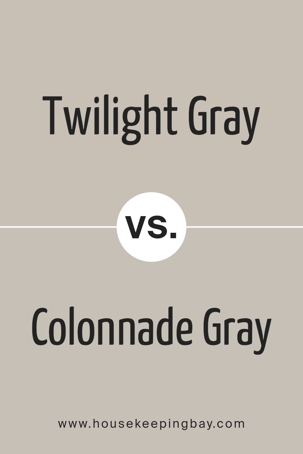
Twilight Gray SW 0054 by Sherwin Williams vs Colonnade Gray SW 7641 by Sherwin Williams
Twilight Gray SW 0054 by Sherwin Williams is a deep, rich gray that conveys a sense of sophistication and seriousness. It’s a versatile shade that pairs well with both bright accents and subtle tones, making it suitable for spaces where a formal or cozy atmosphere is desired.
Colonnade Gray SW 7641, in contrast, is a lighter, warm gray with a more neutral base. This color is ideal for creating a soothing environment, and its accessibility makes it perfect for modern living areas and offices that aim for a contemporary look.
While Twilight Gray offers a stronger statement and can make smaller spaces feel more enclosed, Colonnade Gray tends to open up areas and reflect more light, making it ideal for smaller or less brightly lit rooms. Both shades are from Sherwin Williams, ensuring quality and ease in application, but they serve different moods and functions within interior design.
You can see recommended paint color below:
housekeepingbay.com
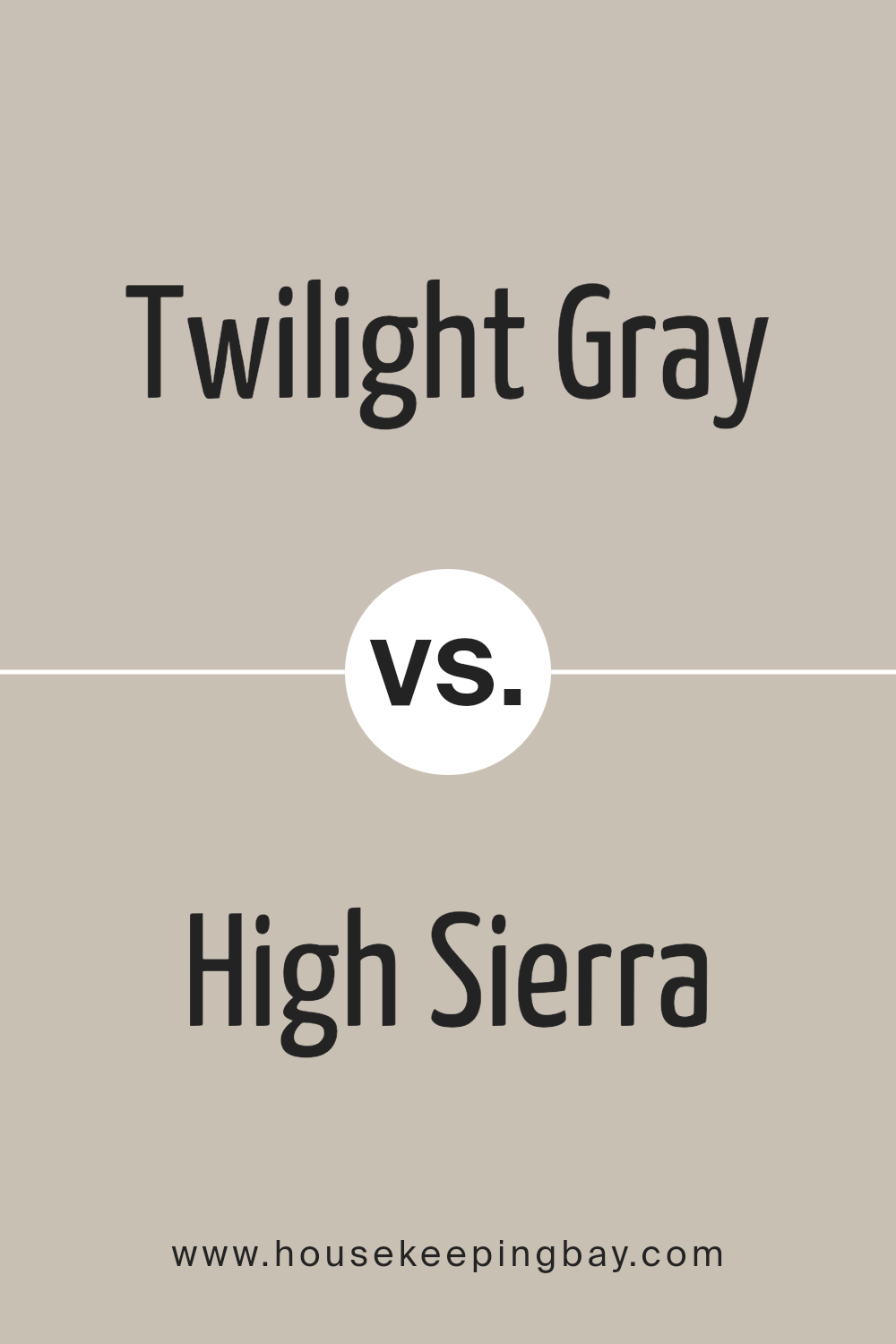
Twilight Gray SW 0054 by Sherwin Williams vs High Sierra SW 9588 by Sherwin Williams
Twilight Gray SW 0054 and High Sierra SW 9588 by Sherwin Williams are unique shades perfect for distinct decorative styles. Twilight Gray is a deep, cosy gray with a hint of blue, creating a calm and soothing atmosphere. It works well for a sophisticated look in a modern living room or bedroom.
High Sierra, a lighter, warmer gray, gives rooms an airy, more open feeling, suitable for spaces meant to feel relaxing and free.
While Twilight Gray adds a touch of drama and elegance, High Sierra keeps things light and neutral, perfect for minimalistic or contemporary spaces. Both colors pair beautifully with a range of other hues, yet each sets a very different mood. Thus, the choice between them depends on the desired ambiance and the specific room characteristics.
You can see recommended paint color below:
- SW 9588 High Sierra
housekeepingbay.com
Twilight Gray SW 0054 by Sherwin Williams vs Realist Beige SW 6078 by Sherwin Williams
Twilight Gray SW 0054 by Sherwin Williams is a deep, muted gray that gives a feeling of solidity and understated elegance. It’s versatile and pairs well in spaces that aim for a sophisticated, neutral backdrop. It works well in living areas or bedrooms where you want a calm, soothing atmosphere without being too dark or overpowering.
Realist Beige SW 6078, in contrast, is a warmer, light beige tone that offers a soft, inviting feel. This color is excellent for creating a cozy, welcoming environment. It’s particularly effective in rooms that get a lot of natural light, as the sunlight enhances the warmth of the hue.
Both Twilight Gray and Realist Beige work nicely together, where Twilight Gray adds depth and Realist Beige brings warmth, making spaces feel balanced and harmonious. These colors suit different preferences and room functionalities, making them practical choices for a variety of decorating styles.
You can see recommended paint color below:
- SW 6078 Realist Beige

housekeepingbay.com
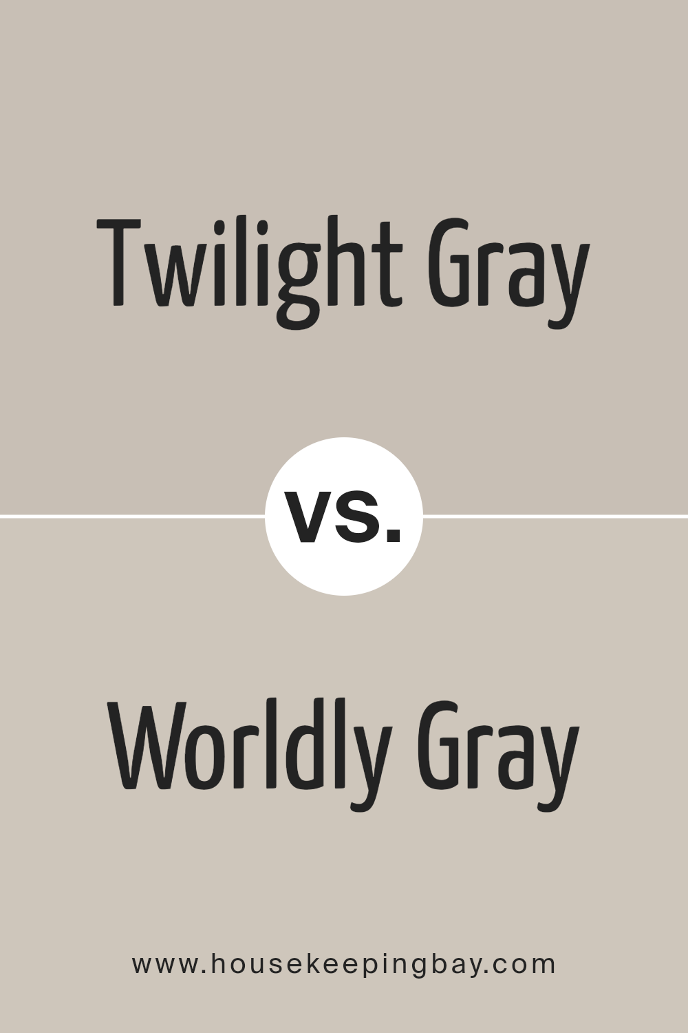
Twilight Gray SW 0054 by Sherwin Williams vs Worldly Gray SW 7043 by Sherwin Williams
Twilight Gray SW 0054 is a deep, cool gray that offers a bold and sophisticated look. It tends to bring a strong presence to a space, making it ideal for accent walls or areas where you want to make an impact. Being a darker gray, it also provides a striking contrast when paired with lighter colors, enhancing the overall drama in a room.
Worldly Gray SW 7043, in contrast, is a softer, warmer gray. It is very versatile and works well in various settings, whether you aim for a modern, minimalistic look or a more cozy, traditional style. This lighter shade can make small spaces appear bigger and brighter.
While both colors share a gray base, Twilight Gray leans more towards a cooler, more intense tone, whereas Worldly Gray offers a gentler, warmer appeal. Depending on the atmosphere you wish to achieve, each color serves different design needs — Twilight for depth and boldness, Worldly for lightness and warmth.
You can see recommended paint color below:
housekeepingbay.com
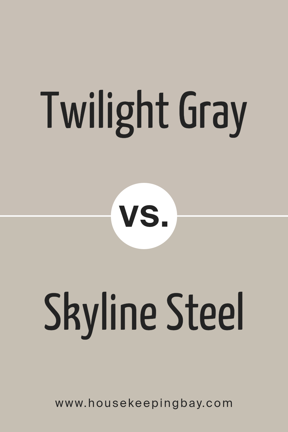
Twilight Gray SW 0054 by Sherwin Williams vs Skyline Steel SW 1015 by Sherwin Williams
Twilight Gray SW 0054 by Sherwin Williams is a deep, robust gray with subtle blue undertones, providing a strong and soothing presence. This color is particularly effective in spaces that seek to promote focus and calmness, such as bedrooms or home offices. It pairs well with both bright and soft contrasts, depending on the desired ambiance.
On the contrary, Skyline Steel SW 1015 is a lighter gray, leaning towards a silver-gray hue that exudes an airy and fresh feel. This lighter shade is versatile and ideal for creating a sense of space in smaller rooms or serving as a neutral backdrop in more vibrant decor schemes. It works effectively in living areas and kitchens where natural light emphasizes its subtle vibrancy.
Both colors, while distinctly gray, offer unique atmospheres; Twilight Gray is more about depth and serenity, while Skyline Steel enhances openness and brightness. Each brings a special mood to interiors, depending on what the decorator aims to achieve.
You can see recommended paint color below:
housekeepingbay.com
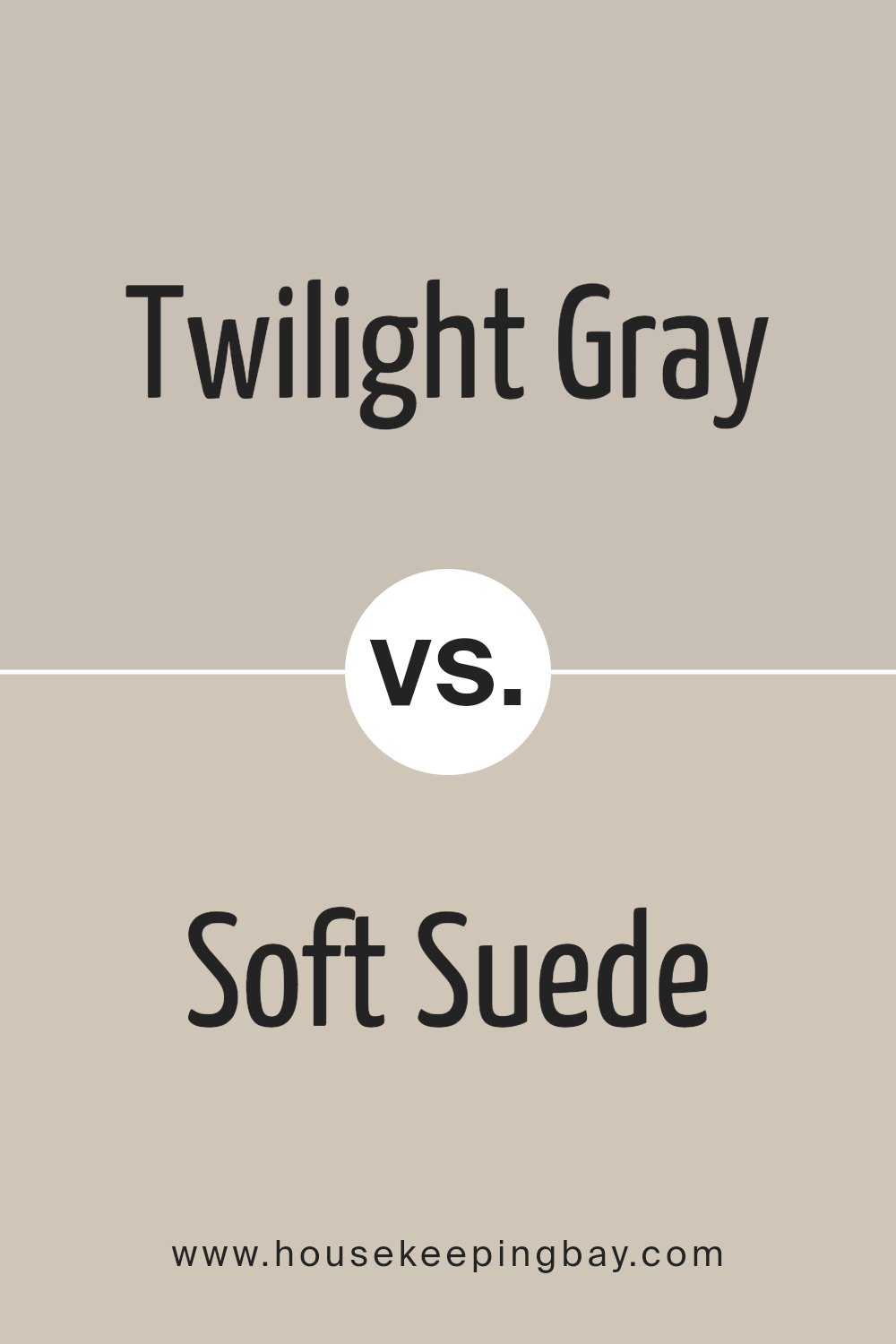
Twilight Gray SW 0054 by Sherwin Williams vs Soft Suede SW 9577 by Sherwin Williams
Twilight Gray SW 0054 and Soft Suede SW 9577 from Sherwin Williams are two distinct shades, each setting a unique mood. Twilight Gray is a deep, neutral gray that offers a sophisticated, classic look. It can act as a strong foundation color in a room, allowing for versatility in decor choices. This gray can easily complement vibrant colors or create a calm, neutral space when paired with similar tones.
Soft Suede SW 9577, in contrast, is a warm, inviting beige with a subtle hint of brown. It creates a cozy and comfortable atmosphere, making it ideal for living spaces and bedrooms where a soft, nurturing environment is desired. This color pairs well with rich textures and natural materials like wood and leather to enhance its earthy qualities.
While both colors provide a neutral palette, Twilight Gray leans towards a cooler, more formal aesthetic, whereas Soft Suede offers warmth and a casual elegance. Whether you choose one or the other depends greatly on the ambiance you wish to achieve in your space.
You can see recommended paint color below:
- SW 9577 Soft Suede
housekeepingbay.com
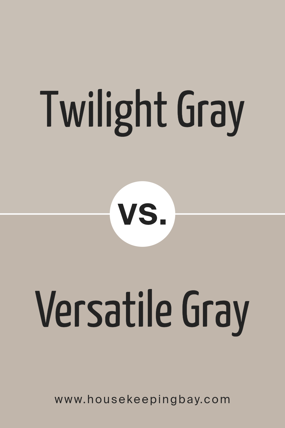
Twilight Gray SW 0054 by Sherwin Williams vs Versatile Gray SW 6072 by Sherwin Williams
Twilight Gray SW 0054 and Versatile Gray SW 6072 by Sherwin Williams are both appealing options for those looking to add a touch of gray to their spaces. Twilight Gray stands out with its deep, almost shadowy quality, making it a robust choice for adding a bit of drama or sophistication. It works well in areas where a strong, moody tone is desired to make a bold statement or create a cozy, secluded feel.
Versatile Gray SW 6072, true to its name, is more adaptable and light compared to Twilight Gray. It offers a softer, warmer approach that can fit seamlessly into many different decors and settings. This color is particularly effective in spaces where a calm, neutral background is needed to complement diverse design elements and color schemes.
Each color serves different purposes but both provide the flexibility to enhance the aesthetic of a room with their unique shades of gray. Whether you’re looking for depth and intensity or a gentle, soothing gray, these colors offer attractive options.
You can see recommended paint color below:
housekeepingbay.com
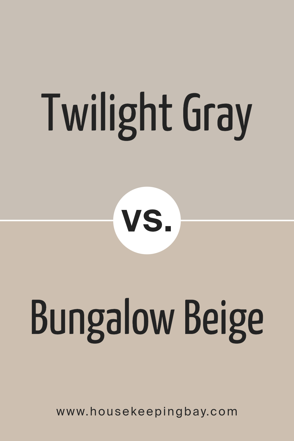
Twilight Gray SW 0054 by Sherwin Williams vs Bungalow Beige SW 7511 by Sherwin Williams
Twilight Gray SW 0054 by Sherwin Williams is a deep, muted gray with blue undertones, giving it a serene, subtle feel perfect for creating a calm atmosphere in any room. This color works well in spaces where you want a touch of sophistication without overwhelming the senses. It pairs beautifully with brighter colors as well as whites, creating a balanced look.
On the contrary, Bungalow Beige SW 7511 is a warm, inviting beige that evokes a sense of coziness and comfort. It is ideal for living areas or bedrooms where a soothing, neutral backdrop is desired. This shade complements a wide range of colors, from soft pastels to rich, dark hues, making it incredibly versatile for styling with other design elements.
While Twilight Gray offers a cooler, more reserved aesthetic, Bungalow Beige provides a warmer, welcoming vibe, making each suitable for different design preferences and room functionalities. Both shades are popular for their ability to create a polished look that remains timelessly appealing.
You can see recommended paint color below:
- SW 7511 Bungalow Beige
housekeepingbay.com
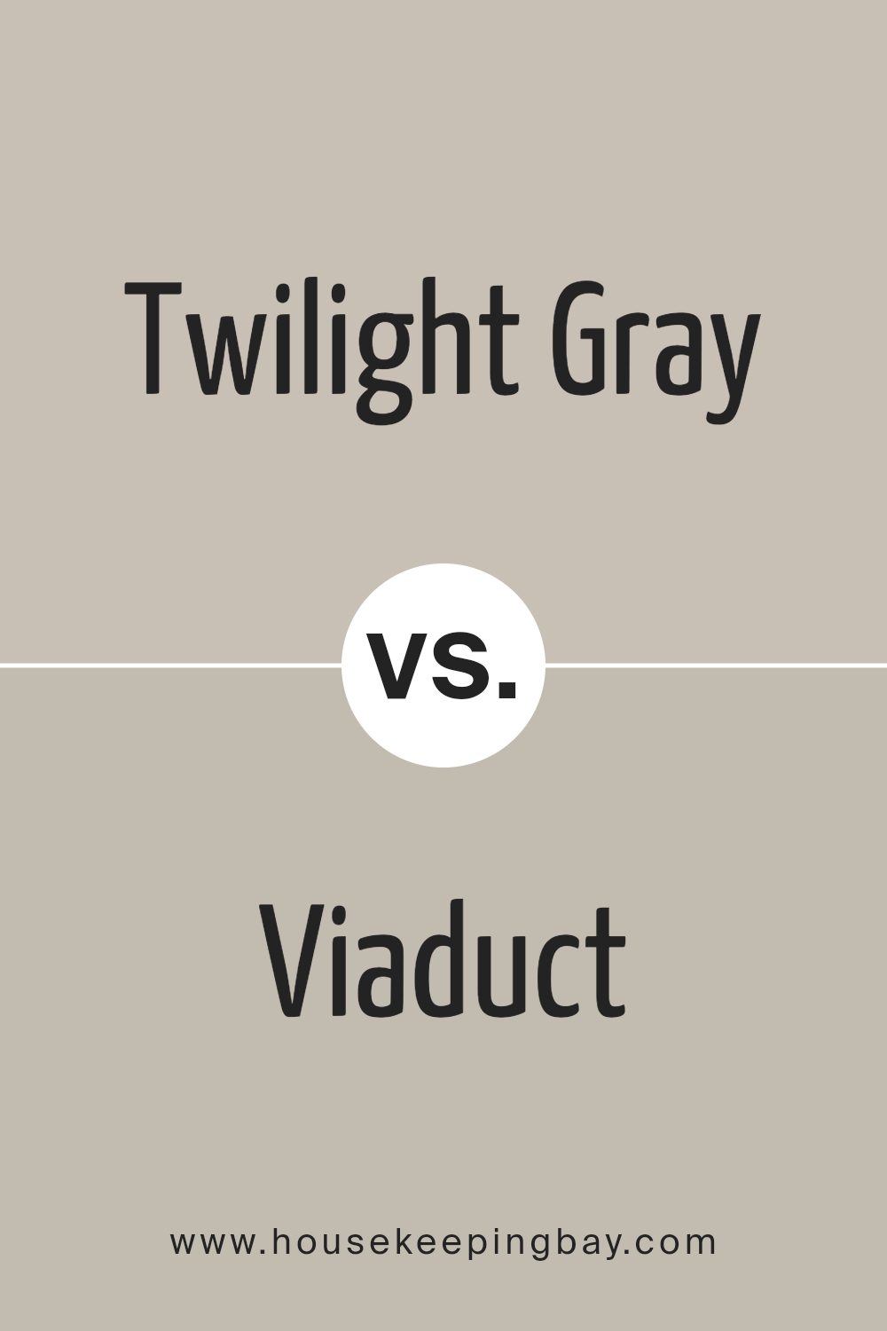
Twilight Gray SW 0054 by Sherwin Williams vs Viaduct SW 9567 by Sherwin Williams
Twilight Gray SW 0054 by Sherwin Williams is a warm, medium gray shade with subtle brown undertones that can create a cozy and inviting atmosphere in any space. This color is versatile enough to work well in living rooms, bedrooms, or offices, providing a soft, neutral backdrop that complements various decor styles and color schemes.
Viaduct SW 9567, in contrast, is a much darker shade of gray. It carries a striking presence due to its deep, almost charcoal-like tone. This color is ideal for making bold statements in spaces, perfect for accent walls or in areas where you want to add depth and a touch of drama.
Both colors offer unique attributes: Twilight Gray brings warmth and a lighter touch, making rooms feel airy, while Viaduct offers depth and a pronounced character, suited for more dramatic and focused visual impacts. This makes each suitable for different decorating needs and preferences, depending on the effect you wish to achieve in your space.
You can see recommended paint color below:
- SW 9567 Viaduct
housekeepingbay.com
Conclusion
In conclusion, if you’re considering giving your space a fresh update, SW 0054 Twilight Gray by Sherwin Williams is an excellent choice. This shade of gray provides a soothing yet sophisticated backdrop that allows for versatility in decorating.
Whether in a bustling family kitchen, a serene bedroom, or a professional office space, Twilight Gray adapts beautifully, complementing a wide range of decor styles and color palettes.
Its ability to act as a neutral base makes it particularly appealing; it supports bolder colors and patterns as effortlessly as it enhances subtle, minimalist aesthetics. For anyone looking to refresh their home or workspace, Twilight Gray offers a balanced blend of warmth and modernity, setting a perfect atmosphere for daily living and working.
So, if you’re ready for a change, this color might just be the perfect starting point for your next project.

housekeepingbay.com
Ever wished paint sampling was as easy as sticking a sticker? Guess what? Now it is! Discover Samplize's unique Peel & Stick samples. Get started now and say goodbye to the old messy way!
Get paint samples
