Silver Gray SW 0049 by Sherwin Williams
Your Guide to Sophisticated Neutrals
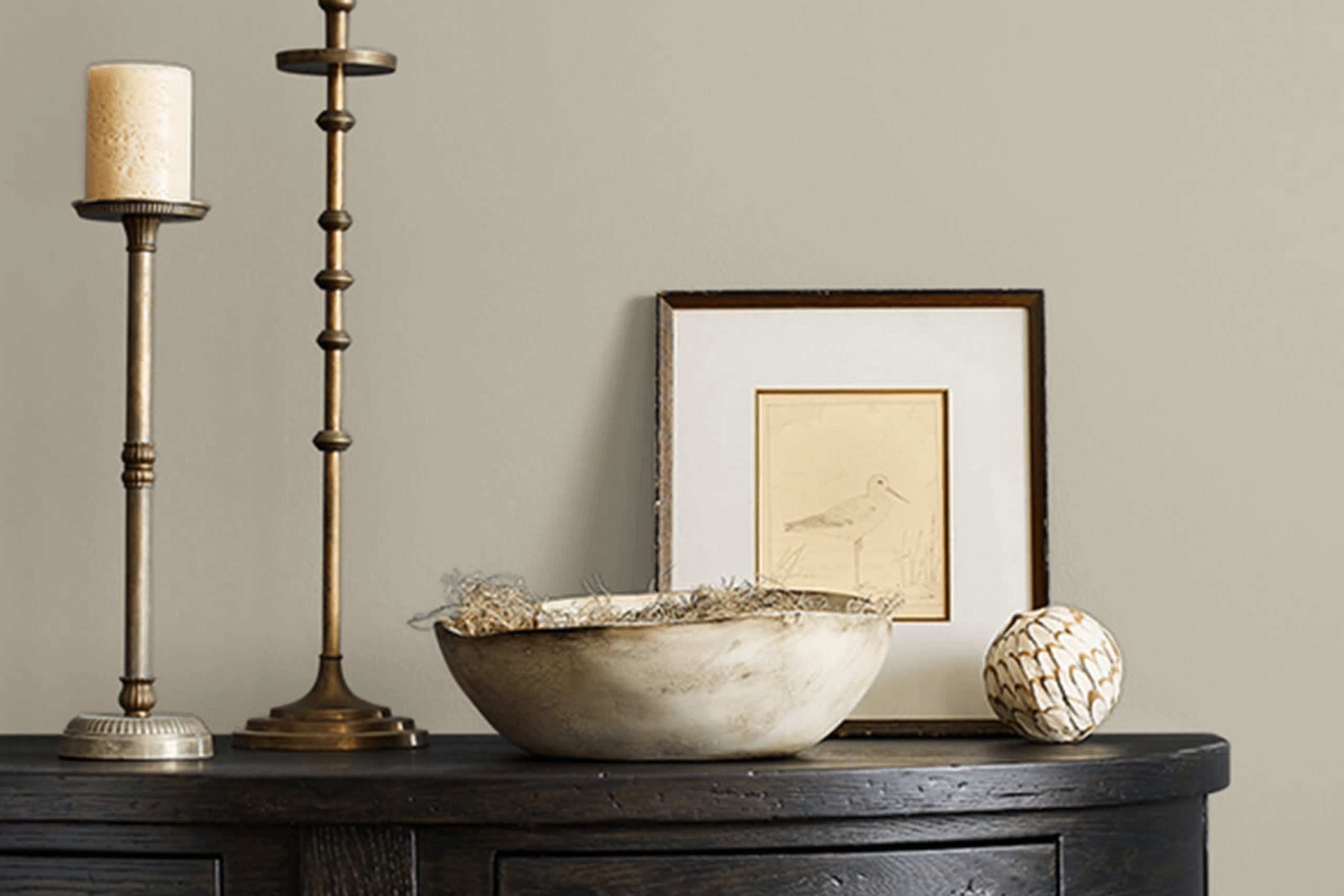
This shade strikes a wonderful balance by offering a subtle, neutral palette that can easily complement various decor styles and settings.
Whether you’re thinking about refreshing your living room, bedroom, or even your office space, Silver Gray stands out as a reliable choice that infuses sophistication without overwhelming the senses.
This color, with its muted tones, works beautifully in spaces that get plenty of natural light, as well as in those that rely on artificial lighting, making it a great all-rounder. It pairs well with both bold and subdued color schemes, allowing you the freedom to accessorize with different hues and textures according to your tastes.
If your aim is to create a calm and inviting atmosphere, Silver Gray might just be the perfect backdrop for you to start with.
via sherwin-williams.com
What Color Is Silver Gray SW 0049 by Sherwin Williams?
Silver Gray SW 0049 by Sherwin Williams is a sophisticated and muted shade of gray with subtle hints of blue and a metallic undertone, giving it an almost luminous quality. This color has a versatile and timeless appeal, suiting various settings from modern to transitional homes. Its light-reflective properties can help make smaller spaces appear larger and more open.
Silver Gray pairs exceptionally well with natural wood, adding warmth and rustic charm to its cool tones. It also complements metallic finishes like brushed nickel or chrome, enhancing its inherent shimmer and providing a sleek, contemporary feel.
For a soft, textured look, you can combine it with fabrics like linen or cotton in lighter shades, which will help create a soothing atmosphere.
This color can be beautifully integrated into interior styles such as Scandinavian due to its clean and understated elegance. It also works seamlessly within minimalist decor, providing a calm, cohesive backdrop that enhances simplicity and functionality.
In coastal-inspired interiors, Silver Gray can emulate the misty seaside mornings, mixing well with soft blues and sandy tans to evoke a serene, beachy vibe.
Overall, Sherwin Williams’ Silver Gray is a highly adaptable color that offers both beauty and practicality, making it suitable for various applications and styles.
housekeepingbay.com
Is Silver Gray SW 0049 by Sherwin Williams Warm or Cool color?
Silver Gray SW 0049 by Sherwin Williams is a versatile paint color that brings a gentle warmth to any space while maintaining a sense of soft sophistication. This shade is part of the Historic Color Collection and offers a timeless appeal, making it an excellent choice for both traditional and modern homes.
Silver Gray has a subtle blue undertone, which adds a hint of coolness to its overall warm gray appearance. This unique blend makes it adaptable to various lighting conditions, appearing more gray in bright light and more distinctly blue-gray under softer lighting.
In homes, Silver Gray works exceptionally well in spaces that need a calm and cohesive look. It’s ideal for living rooms, bedrooms, and even kitchens, where it pairs beautifully with white trim and cabinetry for a clean, fresh aesthetic. Additionally, because it is not too dark or too light, Silver Gray can help rooms feel more spacious and airy without feeling cold, which is often a challenge with cooler colors.
This color’s neutral yet distinctive character allows it to complement various decor styles and furnishings, making it a practical choice for any interior.
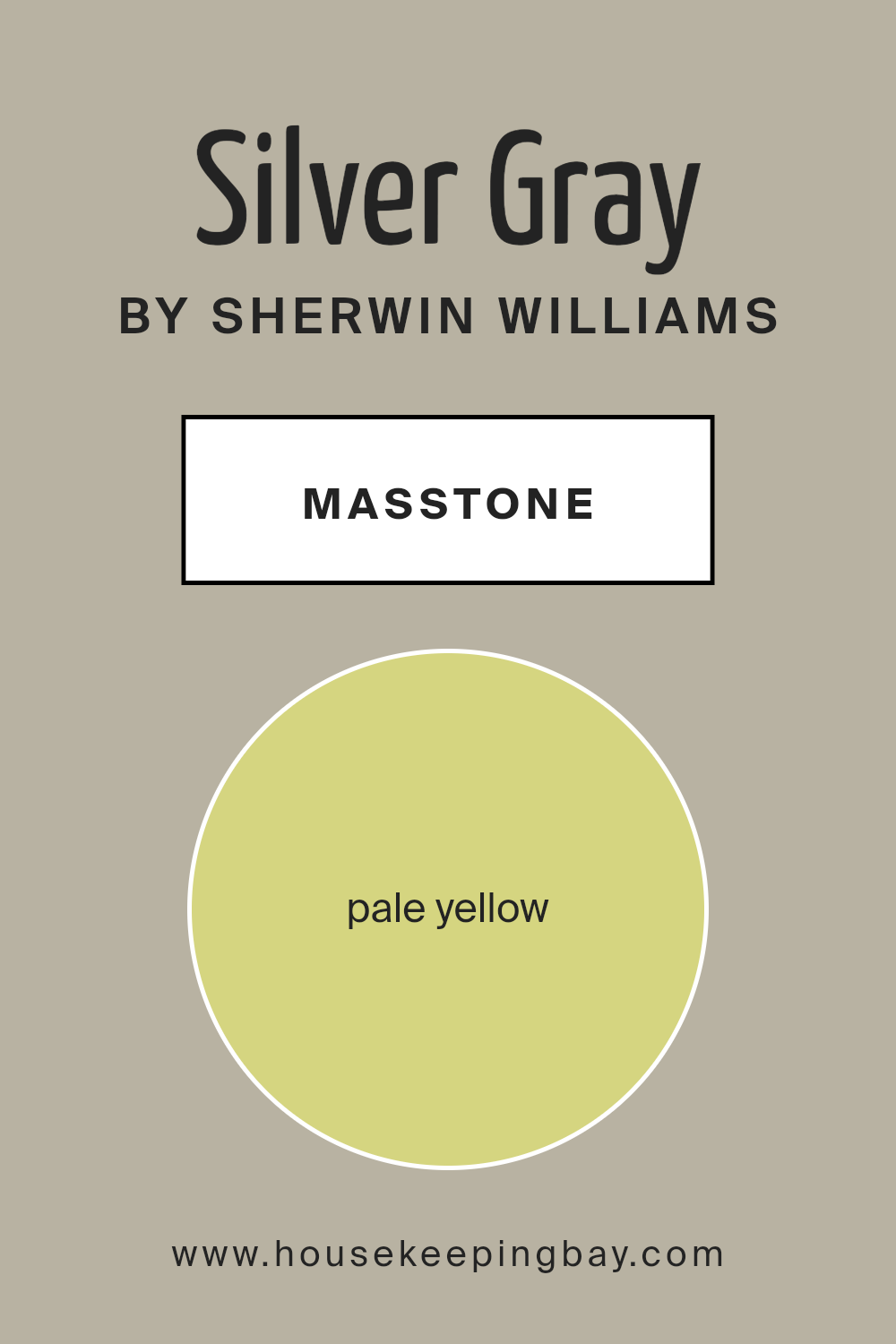
What is the Masstone of the Silver Gray SW 0049 by Sherwin Williams?
Silver Gray SW 0049 by Sherwin Williams has a masstone of Pale Yellow, identified by the color code #D5D580. This light, soft yellow has a gentle warmth that creates a cozy and inviting atmosphere in any living space. Being a subtle shade, Silver Gray works wonders in homes by offering a neutral backdrop that pairs well with various decor styles and colors.
It’s especially useful in smaller spaces where a lighter color is needed to make the area feel bigger and brighter.
This Sherwin Williams color can subtly enhance natural light in a room, making spaces feel more open and airy. Its pale yellow tone adds a touch of warmth without overpowering, making it an excellent choice for living rooms, kitchens, and bedrooms.
Silver Gray is versatile enough to serve as a base color for bold, contrasting furniture and accessories or to harmonize with softer, muted tones for a more cohesive look.
housekeepingbay.com
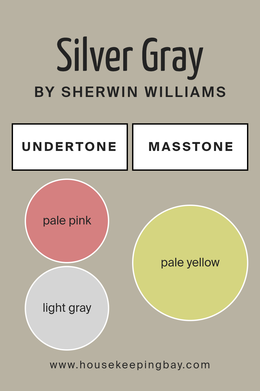
Undertones of Silver Gray SW 0049 by Sherwin Williams
Sherwin Williams’ Silver Gray SW 0049 is a complex color that varies in appearance depending on its surroundings, due to its diverse undertones. Understanding undertones, which are subtle hues mixed into the main color, is crucial when choosing paint colors, as they can significantly affect the overall look of a color in different lighting conditions and against various furnishings.
Silver Gray has a palette of undertones including pale pink, light gray, mint, light purple, grey, light blue, lilac, yellow, orange, light green, and olive. These undertones can make Silver Gray shift between warm and cool tones, which influences the mood and aesthetic of a room.
For example, the pale pink and light purple undertones bring a soft warmth that adds an inviting quality to the room. Contrastingly, the cooler mint and light blue undertones can make the color feel more refreshing and calming. The light gray and grey undertones help stabilize the color, ensuring it maintains some neutrality and flexibility, which makes it easier to match with various decor styles.
When applied to interior walls, Silver Gray acts like a chameleon. In a room with ample natural light, the cooler undertones might become more pronounced, giving the room a more airy and open feeling.
In artificial lighting, the warmer tones such as yellow or pale pink might dominate, creating a cozy and welcoming atmosphere.
Overall, the wide range of undertones in Silver Gray SW 0049 allows it to adapt seamlessly to various interior styles and themes, making it a versatile choice for many homes.
housekeepingbay.com
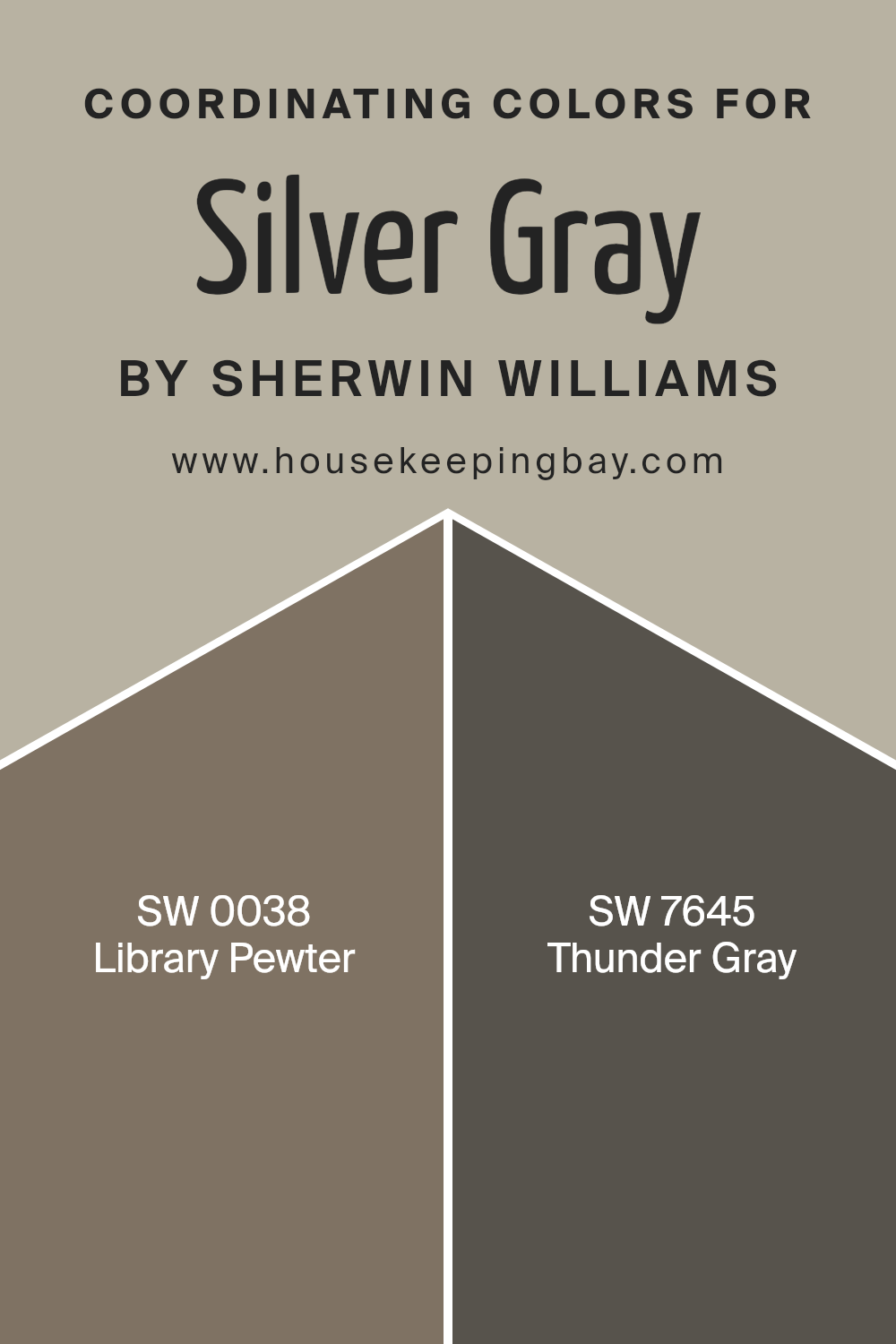
Coordinating Colors of Silver Gray SW 0049 by Sherwin Williams
Coordinating colors are shades that work well together on a color palette, achieving a harmonious look. When you choose coordinating colors for a primary shade, like Silver Gray SW 0049 by Sherwin Williams, you aim to create a balance that either contrasts or complements your main color.
For instance, selecting Library Pewter SW 0038 and Thunder Gray SW 7645 as coordinating colors ensures that the entire scheme flows smoothly without any abrupt visual breaks.
Library Pewter SW 0038 is a complex shade that leans towards a deep, dark gray with a muted, almost metallic undertone. It’s an excellent choice if you want to add depth and a sense of sophistication to your space. On the other hand, Thunder Gray SW 7645 is a medium gray that carries a warmer tone, offering a cozy and inviting feel.
This color can help soften the intensity of darker shades or enrich a predominantly light space, providing a balanced visual appeal. These shades, when used alongside Silver Gray, can create a serene and polished atmosphere in any room.
You can see recommended paint colors below:
- SW 0038 Library Pewter
- SW 7645 Thunder Gray
housekeepingbay.com
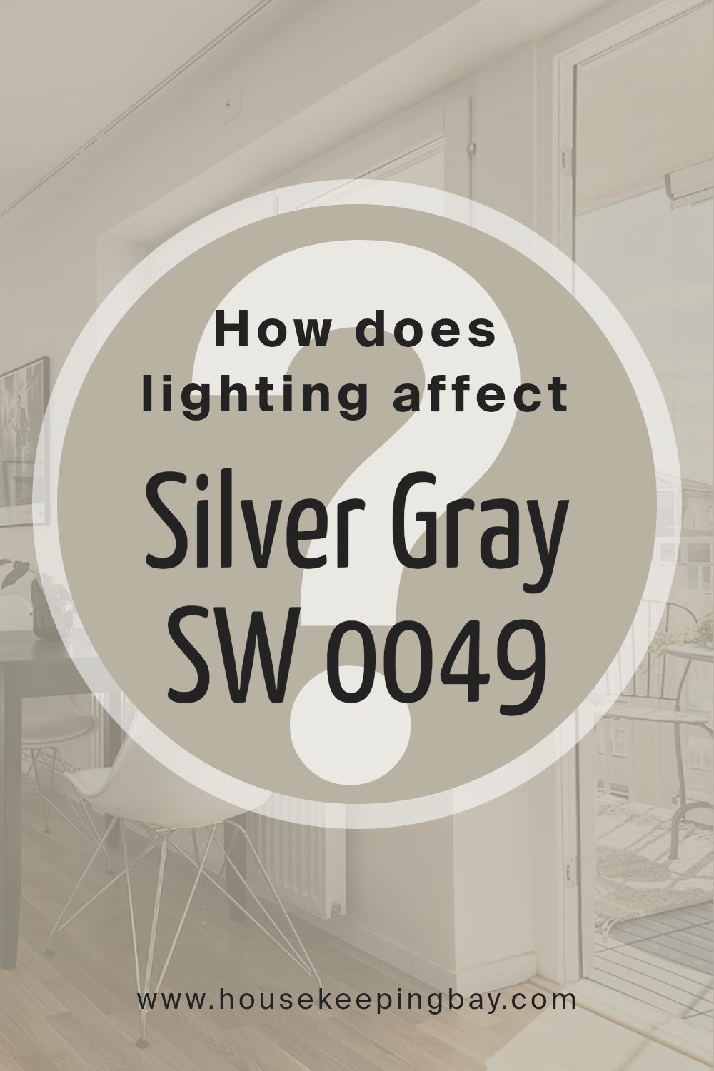
How Does Lighting Affect Silver Gray SW 0049 by Sherwin Williams?
Lighting plays a crucial role in how colors are perceived in a space. Different light sources can significantly alter the appearance of a color. For instance, Silver Gray SW 0049 by Sherwin Williams can look quite different under various lighting conditions.
In artificial light, especially warm-toned bulbs, Silver Gray tends to appear slightly warmer, bringing out more of its subtle beige undertones, which softens the overall look of the paint. In cooler, white light, like that from LED bulbs, Silver Gray can look more true to its name, exhibiting a cleaner and sharper gray hue.
When it comes to natural light, the orientation of a room strongly influences how Silver Gray will appear. In north-faced rooms, which receive less direct sunlight and tend to have cooler, softer light, Silver Gray can look a bit more muted and shadowy. This might make the color appear more uniform and smooth, yet slightly darker than in rooms with more sunlight.
South-faced rooms, receiving ample sunlight throughout the day, will light up Silver Gray beautifully, highlighting its vibrant gray qualities and making the room feel airy and open. The warmth and brightness of the sun can make the color feel lighter and more dynamic.
East-faced rooms get a lot of sunlight in the morning. Here, Silver Gray will have a bright, cheerful look in the morning, which transitions to a softer and cooler appearance as the day progresses. This change can create a versatile ambiance in the space, adapting from vibrant mornings to calm evenings.
Lastly, in west-faced rooms, where sunlight is more intense in the afternoons and evenings, Silver Gray can change from a subdued, soft gray in the morning to a more pronounced and warmer gray towards the evening.
This can make the room feel differently as the day goes by, from a cooler retreat in the morning to a cozy, warmer space in the evening.
housekeepingbay.com
What is the LRV of Silver Gray SW 0049 by Sherwin Williams?
LRV stands for Light Reflectance Value, which measures the percentage of light a paint color reflects from a surface. This number can range from 0 to 100, with 0 absorbing all light and appearing very dark, and 100 reflecting all light and appearing very bright.
The LRV helps determine how light or dark a color will look once it is applied to the walls of a room. It is crucial for understanding how a color will change under different lighting conditions, aiding in choosing the right paint for a specific space to achieve the desired effect.
The LRV of Silver Gray SW 0049 by Sherwin Williams is 44.517, which places it in the mid-range category for light reflection. This value indicates that Silver Gray is a moderately light color but has enough depth to add character to a space without overwhelming it with brightness. On walls, this LRV means Silver Gray will neither absorb most of the light nor reflect it intensely.
The color will appear lighter in well-lit rooms and a bit darker in areas with less light, making it a versatile choice for different lighting environments in a home or office.

housekeepingbay.com
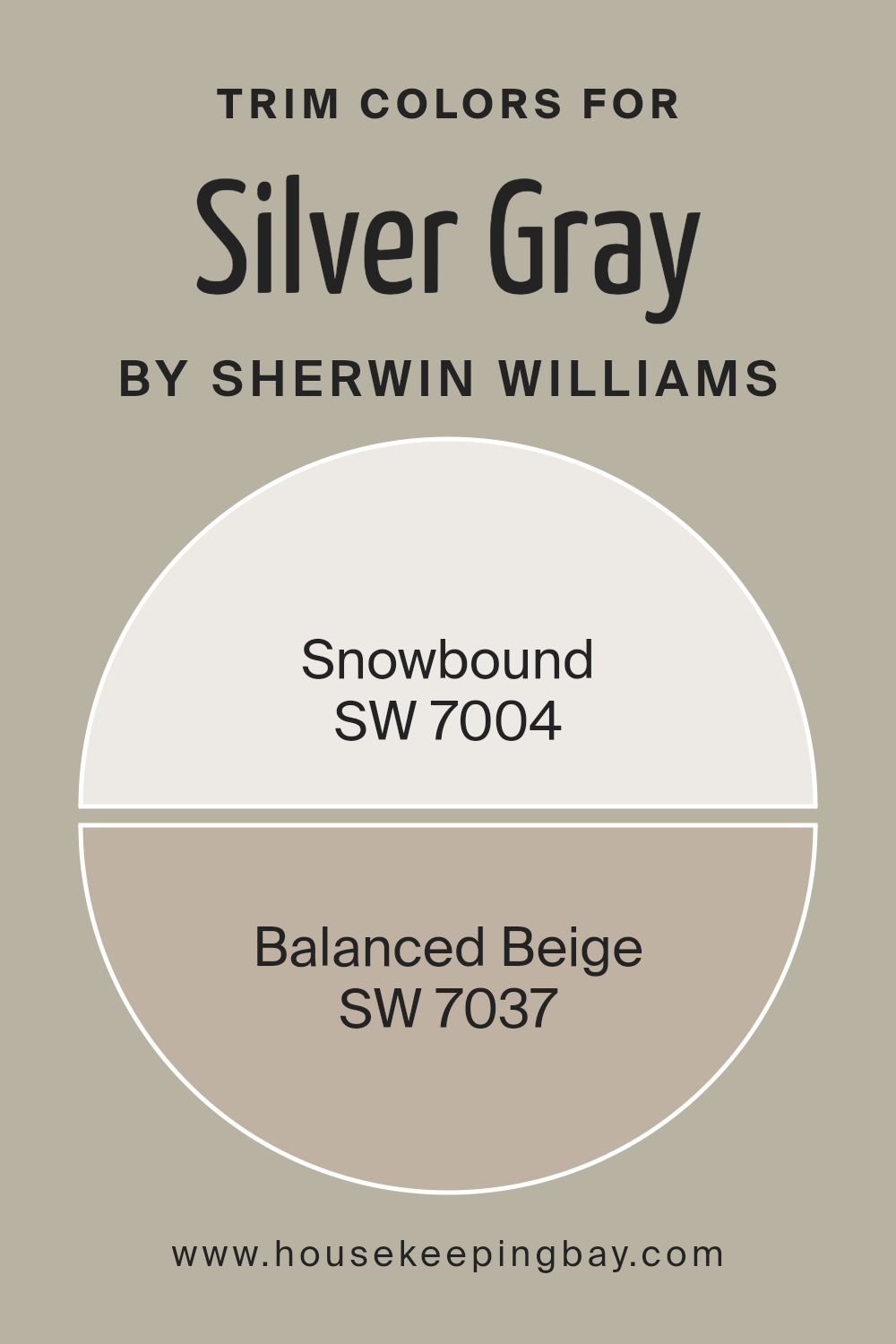
What are the Trim colors of Silver Gray SW 0049 by Sherwin Williams?
Trim colors refer to the hues used on the detailing and accents of walls or exteriors, like door frames, window frames, and skirting. They are significant because they accentuate and define the architectural features and overall aesthetics of a room or building.
When used with Silver Gray SW 0049 by Sherwin Williams, which is a gentle gray shade, selecting the right trim color can add depth and distinction to the spaces. SW 7004 Snowbound and SW 7037 Balanced Beige are excellent options for trim colors, as they offer a subtle yet impactful contrast that enhances the primary wall color’s beauty.
Snowbound SW 7004 is a soft, warm white with a slight gray undertone that gives it a refined and inviting appearance. This color is ideal for trims, adding a fresh and clean border that highlights and sharpens the coolness of Silver Gray. In contrast, Balanced Beige SW 7037 offers a warmer, neutral option with a soothing beige tone that complements the coolness of Silver Gray while adding a cozy, gentle contrast.
This color can add a layer of warmth to the room, making it more inviting without overwhelming the primary color’s subtle elegance.
You can see recommended paint colors below:
housekeepingbay.com
Colors Similar to Silver Gray SW 0049 by Sherwin Williams
Similar colors are essential in design and decoration because they create a harmonious and cohesive look. When colors closely relate to each other, like the variants of Silver Gray SW 0049 by Sherwin Williams, they help produce a seamless flow from room to room, enhancing the overall aesthetic without creating a jarring contrast.
These shades are especially useful in achieving a balanced, subtle, and refined environment.
Colors such as SW 9522 – Meander and SW 9517 – Outrigger share a softness with Silver Gray but bring a hint of warmth, making them ideal for cozy, inviting spaces. Techno Gray SW 6170 and Jogging Path SW 7638 lend a slightly more robust hue that works well in both modern and traditional settings.
Mindful Gray SW 7016 and Whisper SW 9591 provide a light, airy feel, excellent for creating a soothing atmosphere. Analytical Gray SW 7051 and Gateway Gray SW 7644 are deeper grays that offer sophisticated backdrops for contemporary interiors.
Chatroom SW 6171 and Pachyderm SW 9596 introduce an earthy touch to the palette, suitable for spaces that aim for a grounded and serene vibe. All these colors work together to support a design scheme focused on unity and subtle elegance.
You can see recommended paint colors below:
- SW 9522 Meander
- SW 9517 Outrigger
- SW 6170 Techno Gray
- SW 7638 Jogging Path
- SW 7016 Mindful Gray
- SW 9591 Whisper
- SW 7051 Analytical Gray
- SW 7644 Gateway Gray
- SW 6171 Chatroom
- SW 9596 Pachyderm
housekeepingbay.com
How to Use Silver Gray SW 0049 by Sherwin Williams In Your Home?
Silver Gray SW 0049 by Sherwin Williams is a soft, light gray paint color that can beautifully complement different areas in a home. Its gentle tones make it perfect for creating a calm and soothing atmosphere. Suitable for living rooms, bedrooms, and even bathrooms, this versatile color pairs well with both modern and traditional decor.
When used in smaller spaces such as a bathroom or hallway, Silver Gray can make the area feel more spacious. It’s also an excellent choice for a kitchen, providing a clean and fresh backdrop for cabinets and countertops.
For those looking to add a subtle contrast, you can pair Silver Gray with darker colors like navy blue or charcoal. This can add depth and interest to rooms. In bedrooms, combining Silver Gray with soft textiles and natural wood can create a cozy, peaceful environment, ideal for relaxation. Overall, Silver Gray SW 0049 is a practical and stylish choice for anyone looking to refresh their home with a new wall color.
Silver Gray SW 0049 by Sherwin Williams vs Whisper SW 9591 by Sherwin Williams
Silver Gray SW 0049 by Sherwin Williams is a rich, medium-depth gray that offers a classic and somewhat traditional aesthetic. It has a timeless quality, making it a versatile choice for spaces needing a touch of sophistication without being overly dark.
This color works well in various settings, from modern kitchens to cozy living rooms, providing a strong backdrop that complements both bright and subdued accent colors.
In contrast, Whisper SW 9591 is much lighter, almost nearing an off-white with a very subtle hint of gray. This color is ideal for creating a soft, airy feel in a room, enhancing the sense of space and light. Whisper is perfect for smaller rooms or areas with limited natural light, as it helps make the space appear larger and more open.
It pairs beautifully with both soft pastels and bold hues, allowing for flexibility in decor styles ranging from minimalist to eclectic.
Both colors offer their unique strengths, catering to different tastes and design needs, making them popular choices among homeowners.
You can see recommended paint color below:
- SW 9591 Whisper
housekeepingbay.com
Silver Gray SW 0049 by Sherwin Williams vs Meander SW 9522 by Sherwin Williams
Silver Gray SW 0049 by Sherwin Williams is a light, neutral gray with a slightly warm undertone, giving it a soft and approachable feel. It reflects light well, making spaces appear larger and more open, ideal for small rooms or areas with limited natural light.
Meander SW 9522 by Sherwin Williams, in contrast, is a deeper blue with gray undertones, providing a sense of calm and serenity. This color is more pronounced, offering a bolder statement in design yet maintaining a soothing atmosphere due to its mutedness.
While Silver Gray works well as a background hue, allowing other colors in decor or art to stand out, Meander can serve as an accent wall or in areas where a pop of color is desired without overwhelming the space. Both colors are versatile in their own way, fitting various decor styles from modern to traditional.
You can see recommended paint color below:
housekeepingbay.com
Silver Gray SW 0049 by Sherwin Williams vs Jogging Path SW 7638 by Sherwin Williams
Silver Gray SW 0049 by Sherwin Williams is a light, neutral gray with a subtle coolness, making it versatile for various spaces. Its understated tone provides a calm, refined backdrop suitable for minimalist or modern aesthetics. The color reflects light well, helping to make smaller spaces appear larger and more open.
Jogging Path SW 7638, contrastingly, is a warmer, mid-tone gray with hints of green, giving it a more earthy and comforting vibe. This color is excellent for creating a cozy environment and works well in areas that aim for a natural, soothing atmosphere. It pairs nicely with both wood tones and other natural elements.
While both colors share a basis in gray, Silver Gray lends itself to a sharper, more contemporary feel due to its cooler undertones, whereas Jogging Path provides a warmer, more inviting look thanks to its greenish hue. Each color offers unique opportunities for creating desirable living or working spaces depending on the desired ambiance.
You can see recommended paint color below:
housekeepingbay.com
Silver Gray SW 0049 by Sherwin Williams vs Chatroom SW 6171 by Sherwin Williams
Silver Gray SW 0049 by Sherwin Williams is a light, neutral gray that offers a clean and subtle vibe, ideal for spaces aiming for a minimalist aesthetic. It reflects light well, making it a great choice for smaller rooms or areas with limited natural light, as it can help make spaces appear larger and more open.
Chatroom SW 6171, also by Sherwin Williams, is darker and has a mix of gray and green tones, giving it a more earthy and cozy feel. This color can add warmth to a room and is suitable for areas where you want a more grounded, soothing atmosphere.
While Silver Gray is crisp and bright, making it perfect for a modern look, Chatroom provides a deeper, richer hue that works well in traditional or rustic settings. Both colors are versatile, but their impacts are quite distinct, depending on the mood or style you want to create in a space.
You can see recommended paint color below:
housekeepingbay.com
Silver Gray SW 0049 by Sherwin Williams vs Outrigger SW 9517 by Sherwin Williams
Silver Gray SW 0049 by Sherwin Williams is a light, airy gray with a balanced tone that can make spaces seem larger and more open. This color pairs well with both bright and dark hues, adding a sleek, modern touch to interiors. It reflects light effectively, which helps in brightening rooms and creating a welcoming atmosphere.
Outrigger SW 9517, by contrast, is a deeper, charcoal gray that brings sophistication and a sense of grounding to spaces. This shade offers a strong presence and can serve as a striking accent wall or a bold room color.
Due to its intensity, Outrigger can make a dramatic statement and is ideal for areas aimed to impress or provide a more intimate setting.
While both colors are grays, Silver Gray is preferable for creating a light, neutral backdrop, and Outrigger is best for adding depth and drama.
You can see recommended paint color below:
- SW 9517 Outrigger
housekeepingbay.com
Silver Gray SW 0049 by Sherwin Williams vs Gateway Gray SW 7644 by Sherwin Williams
Silver Gray SW 0049 and Gateway Gray SW 7644, both by Sherwin Williams, offer nuanced takes on gray. Silver Gray is lighter, presenting a soft, almost ethereal quality that can make small spaces seem larger and more open. Its subtle brightness is versatile, easily fitting into various decor styles from modern to classic.
Gateway Gray, in contrast, is a deeper hue, providing a strong, grounding presence. This shade is perfect for creating a cozy, sophisticated atmosphere in a room. It could serve well in larger spaces or as an accent wall to add depth and interest.
Both colors maintain a neutral base, making them easy to pair with a wide range of other colors. However, the lighter Silver Gray is better suited for those seeking a more airy, refreshing look, while Gateway Gray works well where a more solid, anchored aesthetic is desired.
Each brings its own unique mood to the environment, allowing for personalization of space according to individual taste and room function.
You can see recommended paint color below:
- SW 7644 Gateway Gray
housekeepingbay.com
Silver Gray SW 0049 by Sherwin Williams vs Pachyderm SW 9596 by Sherwin Williams
Silver Gray SW 0049 by Sherwin Williams is a light, neutral shade perfect for creating a soft, airy feel in any space. It reflects light beautifully, making rooms appear larger and more open. This color pairs well with both bright and dark accents, offering versatility in decor.
Pachyderm SW 9596, in contrast, is a deeper, taupe-like color that brings warmth and a sense of coziness to interiors. It can create a snug, inviting ambiance, particularly in living areas or bedrooms where comfort is a priority. Pachyderm works well with rich colors and textures, adding depth to a design scheme.
Both colors serve different design needs: Silver Gray is ideal for enhancing spaciousness and light, while Pachyderm is superb for establishing a cozy, grounded atmosphere. Depending on the mood you want to set, each color has its unique strengths for home decoration.
You can see recommended paint color below:
- SW 9596 Pachyderm
housekeepingbay.com
Silver Gray SW 0049 by Sherwin Williams vs Mindful Gray SW 7016 by Sherwin Williams
Silver Gray SW 0049 and Mindful Gray SW 7016, both by Sherwin Williams, display unique gray tones for indoor environments. Silver Gray expresses a lighter, more metallic shade, which can make small spaces appear larger and more open. It reflects light effectively, adding a subtle brightness to the room. This color is ideal for adding a fresh and airy feel to an interior.
In contrast, Mindful Gray offers a deeper, warmer tone of gray. Its earthy quality gives a cozy warmth to rooms, making it perfect for larger spaces that need a touch of intimacy. This shade suits various decor styles, particularly modern and transitional themes, where it adds depth without overpowering.
Both colors maintain neutrality, making them versatile for mixing and matching with other hues. However, Silver Gray works better in smaller, possibly darker spaces needing brightness, while Mindful Gray is excellent for creating a cozy, inviting atmosphere in larger rooms.
You can see recommended paint color below:
housekeepingbay.com
Silver Gray SW 0049 by Sherwin Williams vs Analytical Gray SW 7051 by Sherwin Williams
Silver Gray SW 0049 by Sherwin Williams is a light, gentle shade that gives a soft and airy feel to a space. This color beautifully reflects light, making it ideal for making smaller rooms appear larger and more open. Its subtle metallic undertones add a touch of sophistication without being overwhelming, making it versatile for various settings and decor styles.
Analytical Gray SW 7051, on the contrary, is a warmer, mid-tone gray. It offers a stronger presence due to its deeper and richer hue, providing a cozy, inviting atmosphere. This color works well in larger spaces or areas with ample natural light, as its depth can absorb light, creating a snug environment.
Both colors share a gray base but serve different purposes in interior design due to their varying intensities and undertones. Silver Gray works well where a light, reflective quality is desired, while Analytical Gray suits spaces that benefit from a warm, substantial color.
You can see recommended paint color below:
housekeepingbay.com
Silver Gray SW 0049 by Sherwin Williams vs Techno Gray SW 6170 by Sherwin Williams
Silver Gray SW 0049 by Sherwin Williams is a light, soothing gray that carries a hint of warmth, making it versatile for many spaces. It reflects light well, which can make small areas appear larger and more open. This color suits various decor styles, from modern to traditional, due to its subtle and understated nature.
Techno Gray SW 6170, also by Sherwin Williams, is darker and has more depth than Silver Gray. This shade leans towards a more mid-tone gray, providing a stronger presence in a room. It is particularly effective in creating a sophisticated, contemporary look.
While it can absorb more light, making it less ideal for tiny rooms, it is perfect for accent walls or larger spaces.
Both colors offer unique qualities: Silver Gray is preferable for creating a light, airy environment, whereas Techno Gray is excellent for adding a bold, modern touch. They can also complement each other well in different areas of a home or office.
You can see recommended paint color below:
housekeepingbay.com
Conclusion
As I look back on what I’ve discussed about SW 0049 Silver Gray by Sherwin Williams, I can honestly say this paint color is a versatile choice for anyone considering a refresh in their home or office. Its subtle elegance provides a perfect backdrop for both modern and classic interiors.
The blend of gray tones balances warmth and sophistication, making it an excellent candidate for creating a peaceful, yet chic atmosphere.
Whether you’re updating a bedroom or sprucing up a living space, Silver Gray works seamlessly with a wide range of decor styles and colors. It supports other colors, allowing furniture and artwork to stand out. Plus, its timeless quality means you won’t quickly tire of it, ensuring your space feels fresh and inviting for years to come.
From my perspective, opting for Silver Gray is a smart move for anyone looking for a reliable and stylish paint color that adapts well to various settings and complements many different decor elements.
Its enduring appeal and flexible nature make it a standout choice in the vast ocean of paint options available today. If you’re planning to refresh your space, considering Silver Gray could indeed be a wise decision.
housekeepingbay.com
Ever wished paint sampling was as easy as sticking a sticker? Guess what? Now it is! Discover Samplize's unique Peel & Stick samples. Get started now and say goodbye to the old messy way!
Get paint samples


