Grassland SW 6163 by Sherwin Williams
Bring Nature's Warmth into Your Home
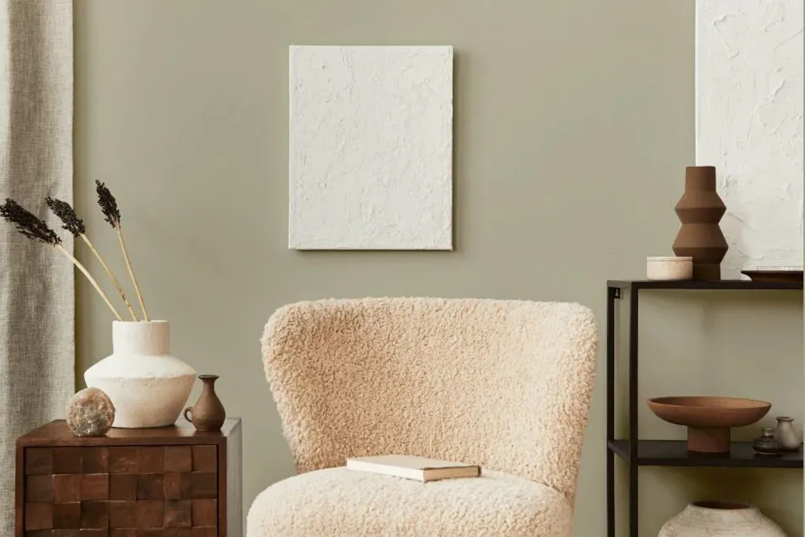
Think about walking through a peaceful meadow, surrounded by the gentle rustle of grasses and the calming hues of nature. That’s the feeling SW 6163 Grassland by Sherwin Williams brings to your space. This color blends the serenity of green with the grounded nature of earth tones, offering a perfect backdrop to enhance your home’s atmosphere.
It’s a shade that feels both refreshing and comforting, ideal for creating a space where you can relax and unwind.
Whether you’re planning to update a living room, bedroom, or even a cozy study nook, Grassland adapts beautifully.
Its subtle, earthy quality makes it easy to coordinate with a variety of colors and styles. Pair it with neutrals for a minimalist look or with deeper greens and blues for a more vibrant setting.
You can use Grassland to add a touch of nature indoors without overwhelming your senses. It works well with both natural and artificial lighting, providing an inviting and warm ambiance throughout the day. If you’re thinking about a new color that brings balance and calm to your life, SW 6163 Grassland is definitely worth considering as a choice that speaks of natural elegance and understated charm.
via plan-home.com
What Color Is Grassland SW 6163 by Sherwin Williams?
Table of Contents
Grassland SW 6163 by Sherwin Williams is a muted, earthy green with a touch of warmth. It brings to mind the gentle hues of natural landscapes, resembling the soft, rolling shades of grasslands. This color works beautifully in interiors needing a subtle touch of nature without overwhelming intensity. It’s perfect for creating a calming and cozy atmosphere, making it ideal for living rooms, bedrooms, or even kitchens.
In terms of style, Grassland pairs well with rustic, farmhouse, or Scandinavian interiors. Its earthy tones blend seamlessly with wooden elements, such as oak or pine, enhancing its organic appeal.
The color complements natural materials like rattan, jute, or linen, adding an effortless charm to spaces.
For textures, consider combining Grassland with woven textiles or soft, knitted throws to emphasize warmth. Metallic accents in brass or matte gold can add a touch of elegance, while ceramics or stone elements introduce subtle contrast and depth.
The gentle green of Grassland harmonizes effectively with whites, creams, or other soft neutrals, creating a balanced and serene space. Whether used on walls or as a soft accent, Grassland brings a sense of peace and nature into the home.
housekeepingbay.com
Is Grassland SW 6163 by Sherwin Williams Warm or Cool color?
Grassland SW 6163 by Sherwin Williams captures the essence of natural landscapes with its soft, muted green tone. This color provides a gentle, calm feeling, making it an excellent choice for various home spaces. Unlike brighter greens, Grassland offers a more subtle and sophisticated look, allowing it to complement a wide range of decor styles, from modern to traditional.
When used in living rooms or bedrooms, Grassland creates a soothing atmosphere that promotes relaxation. In kitchens or dining areas, it adds an inviting warmth.
The subdued nature of this green allows it to pair well with neutrals like beige, cream, and gray, as well as with natural materials such as wood and stone.
Grassland also works well with plants and other organic elements, enhancing a room’s connection to nature. Overall, its versatility and gentle vibe make Grassland SW 6163 a popular choice for creating comfortable and welcoming spaces in the home.
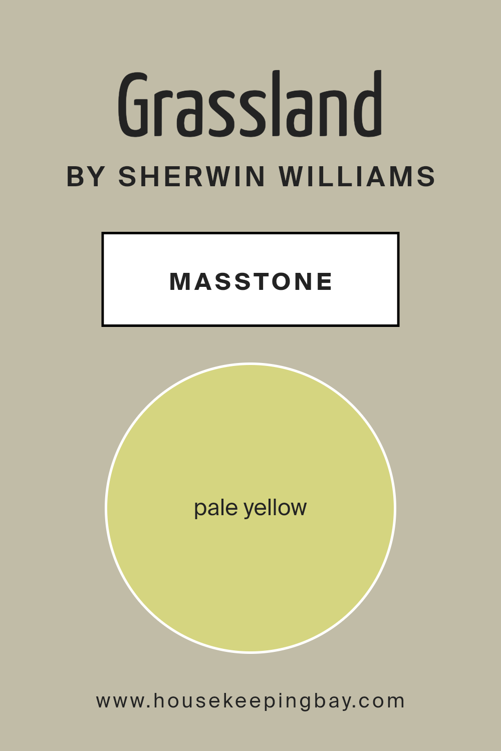
What is the Masstone of the Grassland SW 6163 by Sherwin Williams?
Grassland SW 6163 by Sherwin Williams is a soft, pale yellow color with a soothing, natural feel. Its delicate hue brings warmth and light into any room, making it ideal for both large and small spaces. This gentle shade can create an inviting atmosphere, perfect for living areas or bedrooms.
It works well as a backdrop, allowing furniture and decorative elements to stand out without overwhelming the space.
In a kitchen, Grassland can add a hint of sunshine, helping to create a cheerful, lively environment where people gather and enjoy meals. In a bathroom, it can contribute to a serene, fresh ambiance, providing a sense of cleanliness and calm.
When combined with whites or other neutrals, Grassland can produce a harmonious balance, while pairing it with greens or blues can bring out a more organic, nature-inspired feel. Versatile and subtle, this hue enhances the comfort and coziness of any home.
housekeepingbay.com
Undertones of Grassland SW 6163 by Sherwin Williams
Grassland SW 6163 by Sherwin Williams is a soft, muted green with a blend of interesting undertones. These undertones subtly influence how we perceive the color, giving it depth and richness. The light gray undertone adds a touch of elegance, making the paint feel calm and neutral.
The pale pink and light purple hint at warmth, providing a gentle and welcoming effect. Mint and light blue undertones bring a refreshing and airy vibe, creating a sense of openness in a space.
The presence of gray and lilac can make Grassland feel slightly sophisticated, hinting at a serene and peaceful atmosphere. Yellow and orange undertones introduce a cheerful energy, adding a bit of liveliness to the overall tone.
Light green reinforces the earthy, natural feel, making the room feel grounded and harmonious. Olive brings a touch of depth and maturity, making the color versatile across various styles.
When Grassland SW 6163 is applied to interior walls, these undertones can shape the mood of a room without overwhelming the senses.
Depending on the lighting and surrounding decor, Grassland can appear more like a soft neutral with a hint of character, subtly shifting its tone throughout the day.

housekeepingbay.com
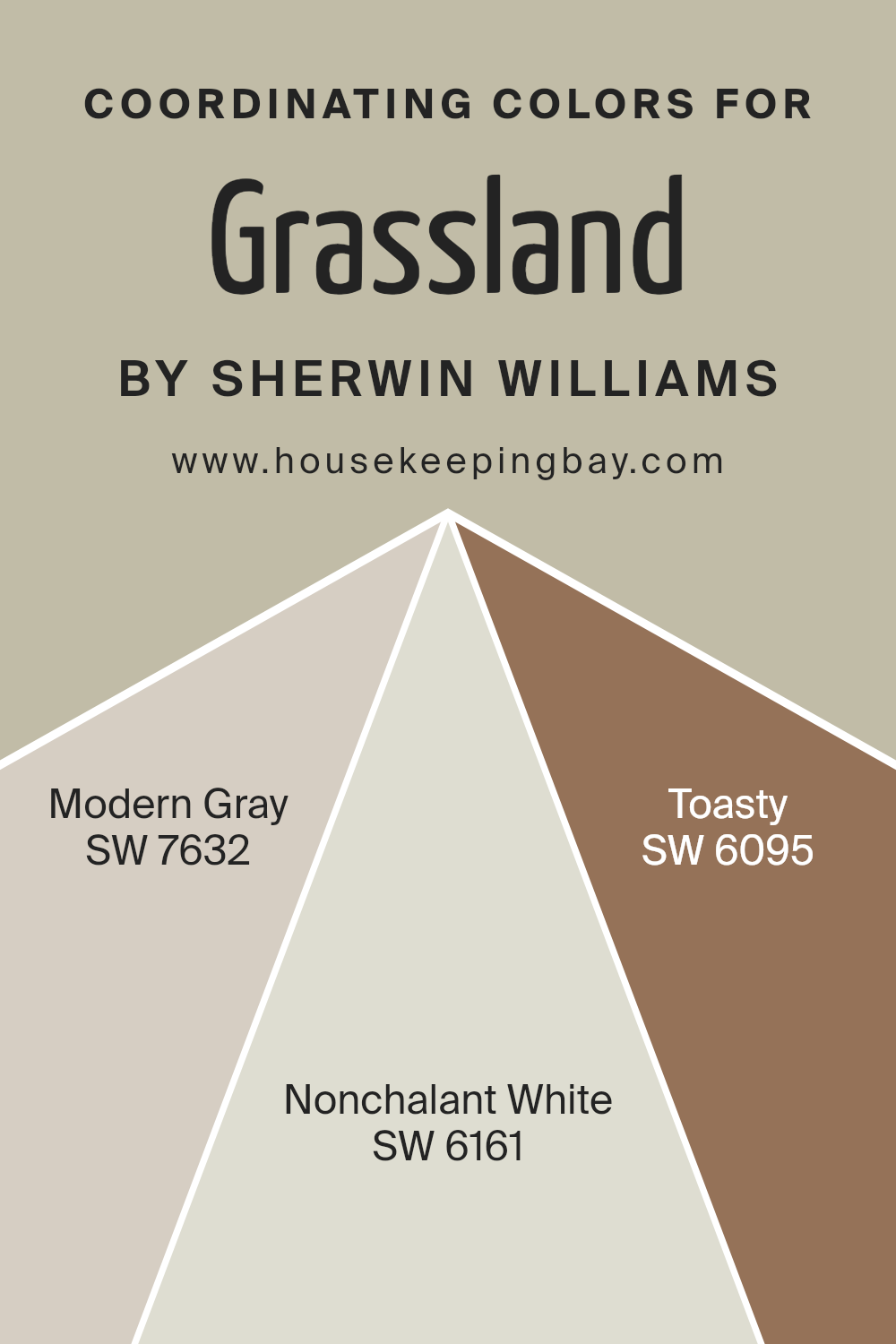
Coordinating Colors of Grassland SW 6163 by Sherwin Williams
Coordinating colors are hues that work well together, creating a pleasing sense of balance and harmony in a space. These colors complement each other by having a similar undertone or by contrasting in a way that feels comfortable to the eye.
When choosing coordinating colors for a particular shade like Sherwin Williams’ Grassland SW 6163, it’s important to pick colors that enhance its natural tones without clashing. Grassland is a soft green that brings a touch of nature indoors, creating a calming atmosphere.
Its best companions would be colors that have a subtle and soothing presence, blending seamlessly to create a cohesive look.
Modern Gray SW 7632 is a straightforward, neutral gray with a warm undertone. It provides a gentle backdrop that complements the natural feel of Grassland without overpowering it.
Nonchalant White SW 6161 offers a light and airy shade with just a hint of warmth. It provides balance by brightening the space while maintaining a sense of calm. Finally, Toasty SW 6095 brings in a cozy, earth-toned warmth that adds depth and richness. Together, these colors bridge natural tranquility with a welcoming, cohesive environment, making any space feel both inviting and well-pulled together.
You can see recommended paint colors below:
- SW 7632 Modern Gray
- SW 6161 Nonchalant White
- SW 6095 Toasty
housekeepingbay.com
How Does Lighting Affect Grassland SW 6163 by Sherwin Williams?
Lighting plays a crucial role in influencing how colors appear in a space. The color Grassland SW 6163 by Sherwin Williams is a soft, muted green. Depending on the type and direction of light hitting this color, it can change in appearance.
In artificial light, Grassland SW 6163 can appear warmer or cooler based on the bulb used. Incandescent bulbs, which emit a warm, yellowish light, often make this color appear slightly warmer and more yellow.
LED or fluorescent lights, which can vary from cool to warm tones, may make this green appear slightly more subdued or softer.
In natural light, the direction and time of day impact how this color is perceived. In north-facing rooms, which receive soft, indirect light throughout the day, Grassland might appear more muted and cooler. This can give the room a calming look, but the color might seem a bit dull if the room lacks sufficient light.
In south-facing rooms, which benefit from bright, direct sunlight for much of the day, this color may look vivid and warmer. The natural light can highlight the green tones, making the room feel bright and lively.
In east-facing rooms, which receive warm morning light, Grassland can take on a fresh, sunny appearance in the morning, transitioning to a cooler tone as the sun moves away.
Conversely, in west-facing rooms, Grassland might look more neutral or cooler in the morning but will warm up in the afternoon and evening as the sunlight becomes more direct and golden.
The perception of color depends significantly on these lighting conditions, so when choosing Grassland SW 6163, it’s vital to consider the room’s orientation and lighting to achieve the desired effect. Adjusting artificial lighting and decor can also help to tweak the room’s ambiance with this color.
housekeepingbay.com
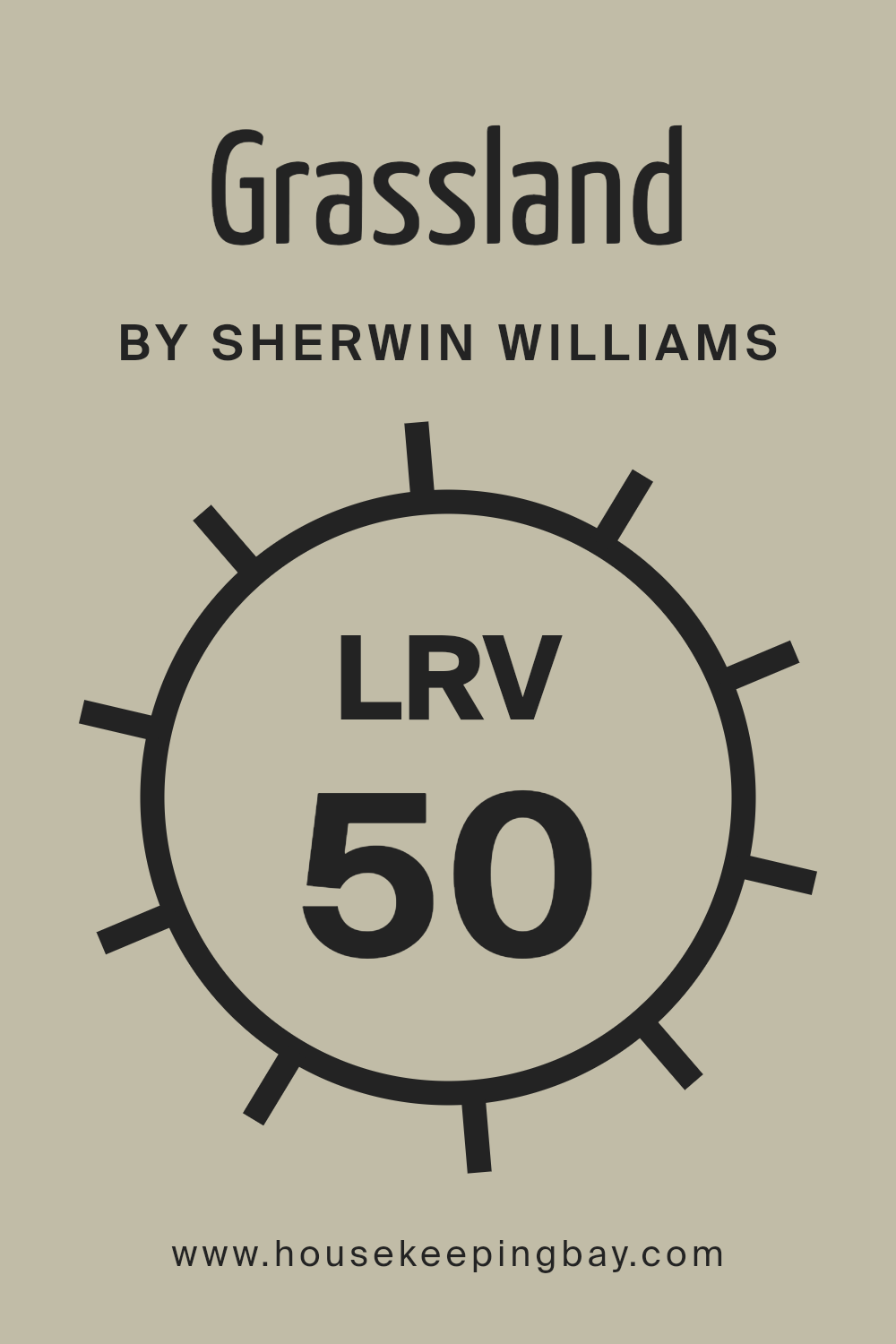
What is the LRV of Grassland SW 6163 by Sherwin Williams?
LRV, or Light Reflectance Value, is a measure that tells us how much light a paint color will reflect or absorb. It’s rated on a scale from 0 to 100, where 0 means the color absorbs all light (pure black), and 100 means the color reflects all light (pure white).
When you pick a color for your walls, its LRV helps you understand how bright or dark a room might feel once the paint is applied. A higher LRV means a color will make a space feel brighter and more open since it reflects more light, while a lower LRV means the color absorbs more light, making a room feel more intimate and cozy.
For Grassland SW 6163 by Sherwin Williams, the LRV is 50.108, right in the middle of the scale. This means it reflects about half the light hitting it. With this LRV, Grassland is a versatile choice that won’t overpower a space with brightness nor make it too dark.
It tends to balance nicely in a room, allowing other elements like furniture and decorations to play their roles without competing with the wall color.
In natural light, Grassland’s LRV allows the room to feel open and airy without becoming too intense. In spaces with less light, its balanced reflectance ensures the color retains warmth and forms a comfortable backdrop.
housekeepingbay.com
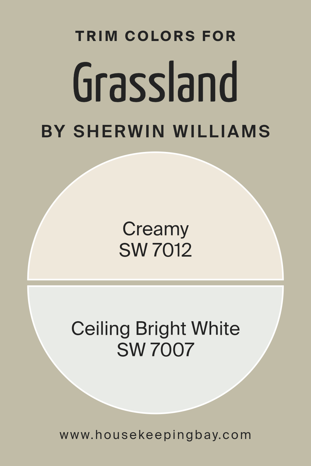
What are the Trim colors of Grassland SW 6163 by Sherwin Williams?
Trim colors help to define and highlight a room’s architectural features, such as doors, windows, and baseboards. For Grassland SW 6163 by Sherwin Williams, choosing the right trim colors is important as they can enhance the overall look and feel of a space.
Grassland is a soft green hue that evokes a sense of calm and nature. Using the right trim colors can complement and accentuate Grassland, bringing out its natural beauty and creating a harmonious environment. Creamy SW 7012 and Ceiling Bright White SW 7007 are excellent choices for trim colors with Grassland.
Creamy is a warm, inviting off-white that adds a touch of softness and coziness to any room. It pairs beautifully with Grassland by adding a subtle contrast that enhances the green without overwhelming it.
On the other hand, Ceiling Bright White offers a crisp, clean look that brings a sense of freshness and modernity to the space.
It’s a true white that helps highlight Grassland’s green tones, making them pop. The contrast provided by Ceiling Bright White can make the space feel open and airy, while the Creamy adds warmth.
Together, these trim colors can define the edges of the room, bringing structure and polish to the design.
Selecting the right trim colors is crucial for achieving balance in the room and ensuring that Grassland SW 6163 reaches its full aesthetic potential. By adding these complementary tones, the room’s character and atmosphere are enhanced, creating a cohesive and inviting space.
You can see recommended paint colors below:
housekeepingbay.com
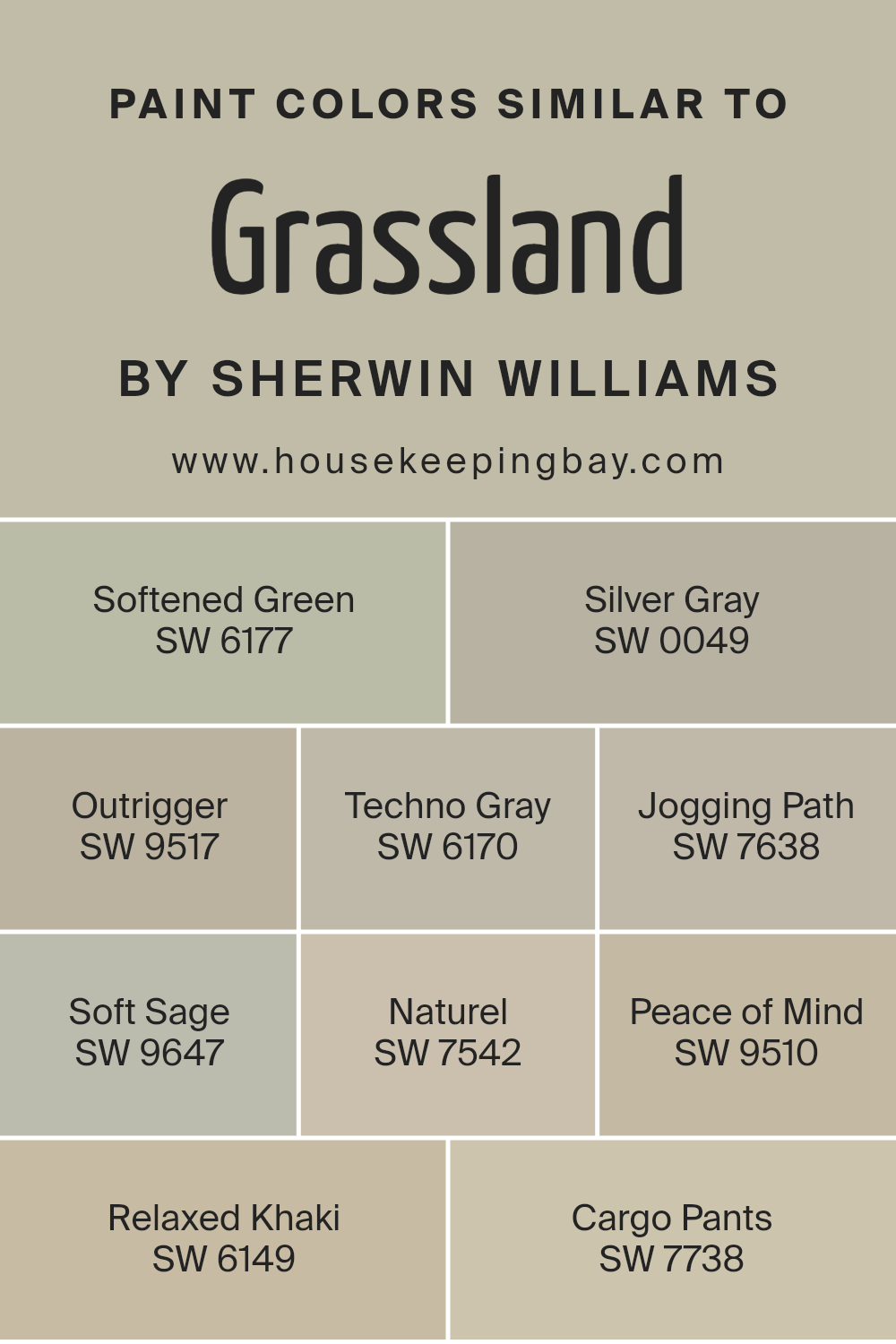
Colors Similar to Grassland SW 6163 by Sherwin Williams
Similar colors like those surrounding Sherwin Williams’ Grassland SW 6163 create a cohesive and harmonious environment. These shades can enhance the natural feeling in a space because they share common color traits. SW 6177 – Softened Green offers a gentle green with a hint of gray, adding a subtle freshness without overwhelming a room.
SW 0049 – Silver Gray adds a slightly cool, silvery tone, perfect for balancing warmer colors. SW 9517 – Outrigger brings in a deeper, more grounding hue that anchors lighter tones in a room. SW 6170 – Techno Gray presents a modern, sophisticated green-gray, adding a sleek touch to contemporary designs.
SW 7638 – Jogging Path is a muted color that captures the feel of an earthy trail, adding a grounded sensation to interiors.
Similarly, SW 9647 – Soft Sage provides a soft, calming touch with its muted green, reminiscent of the leaves of a sage plant.
SW 7542 – Naturel gently warms a space with its soft beige undertone, creating a cozy atmosphere. SW 9510 – Peace of Mind speaks to its name with tranquility, blending a soft gray with hints of blue or green for a restful ambiance. SW 6149 – Relaxed Khaki and SW 7738 – Cargo Pants offer versatile neutrals that support and complement the greens and grays, providing a backdrop that can be dressed up or down.
Together, these similar colors create an environment grounded in nature, providing a peaceful and cohesive aesthetic.
You can see recommended paint colors below:
- SW 6177 Softened Green
- SW 0049 Silver Gray
- SW 9517 Outrigger
- SW 6170 Techno Gray
- SW 7638 Jogging Path
- SW 9647 Soft Sage
- SW 7542 Naturel
- SW 9510 Peace of Mind
- SW 6149 Relaxed Khaki
- SW 7738 Cargo Pants
housekeepingbay.com
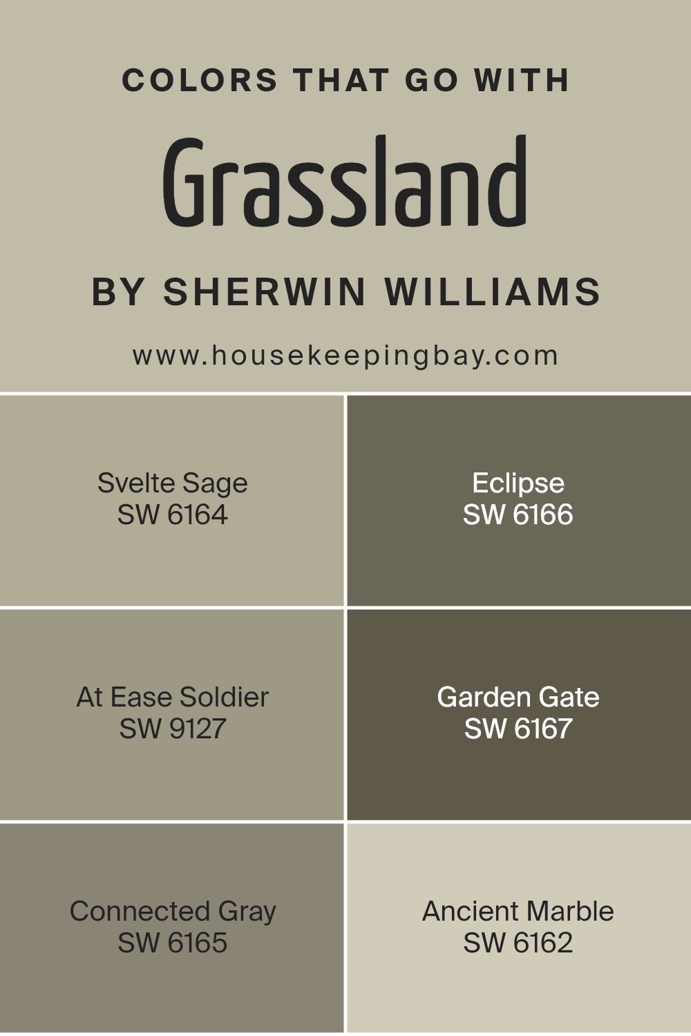
Colors that Go With Grassland SW 6163 by Sherwin Williams
Choosing the right colors to pair with Grassland SW 6163 by Sherwin-Williams is crucial for creating harmony in a space. Colors like Svelte Sage SW 6164 and Eclipse SW 6166 naturally complement Grassland, enhancing its soft, muted green tones. Svelte Sage offers a light and airy touch with its gentle green notes, perfect for enhancing a peaceful environment.
Eclipse, a deep charcoal hue, infuses a sense of depth and sophistication, grounding the space effectively. The subtle nature of Grassland finds a perfect ally in At Ease Soldier SW 9127, a muted green that echoes Earth’s calming tones while providing a supportive backdrop for vibrant decor elements.
Garden Gate SW 6167 adds a sense of richness to the palette; its deep green exudes quiet strength, harmonizing beautifully with Grassland’s subtle elegance. Connected Gray SW 6165 brings a coordinating neutral option; its balanced mix of gray and beige adds warmth without overwhelming the main color.
Then there’s Ancient Marble SW 6162, which ties everything together with its serene and understated creamy tone, gently reflecting natural light to keep spaces feeling open.
Together, these colors foster a sense of balance and flow, allowing Grassland to shine both in its own right and as part of a cohesive color story.
You can see recommended paint colors below:
- SW 6164 Svelte Sage
- SW 6166 Eclipse
- SW 9127 At Ease Soldier
- SW 6167 Garden Gate
- SW 6165 Connected Gray
- SW 6162 Ancient Marble
housekeepingbay.com
How to Use Grassland SW 6163 by Sherwin Williams In Your Home?
Grassland SW 6163 by Sherwin Williams is a soft, muted green paint that brings a touch of nature into any home. This color works beautifully in various rooms due to its calming and grounded feel. In a living room, it creates a cozy and inviting atmosphere when paired with neutral furniture and natural textures like wood or rattan.
In a kitchen, Grassland can add warmth and freshness, especially when combined with white cabinets and stainless steel appliances.
For bedrooms, this gentle green helps promote relaxation and peaceful sleep. It pairs well with soft linens and earth-toned accents, creating a serene retreat. Even in a bathroom, Grassland can add a spa-like vibe when used alongside plush towels and earth-colored tiles.
This versatile shade also complements outdoor spaces nicely, perfect for a sunroom or porch. Overall, Grassland SW 6163 provides a soothing backdrop that works well with various styles and decor.
Grassland SW 6163 by Sherwin Williams vs Cargo Pants SW 7738 by Sherwin Williams
Grassland SW 6163 and Cargo Pants SW 7738 both belong to the earthy color palette from Sherwin Williams, offering warmth and a sense of nature. Grassland SW 6163 is a soft, muted green shade that evokes the feeling of a calm meadow. It brings a touch of serenity to a space, making it suitable for living rooms or bedrooms where a peaceful atmosphere is desired.
Cargo Pants SW 7738, while also earthy, leans more towards a deeper khaki or olive tone. This color has a grounded and robust feel, adding strength and depth to a room. It works well in spaces where you want a bold but natural look, such as offices or dens.
Both colors pair nicely with neutral tones, but while Grassland feels lighter and airy, Cargo Pants offers a bolder, more grounded impression. Together, they create a harmonious balance of softness and strength.
You can see recommended paint color below:
- SW 7738 Cargo Pants
housekeepingbay.com
Grassland SW 6163 by Sherwin Williams vs Techno Gray SW 6170 by Sherwin Williams
Grassland SW 6163 and Techno Gray SW 6170, both from Sherwin Williams, offer unique vibes for spaces. Grassland is a warm, earthy green, reminiscent of lush fields. It provides a natural and calming atmosphere. This shade can infuse a room with a sense of nature, making it ideal for spaces meant for relaxation or focus.
Techno Gray, however, leans more toward a muted and sophisticated appearance. It possesses a subtle blend of green and gray, giving it a versatile character. This shade is great for those seeking a neutral backdrop that complements a variety of other colors and styles.
Its understated elegance makes rooms feel more balanced and cohesive.
While Grassland brings warmth and vitality, Techno Gray offers neutrality with a touch of modernity.
Choosing between these colors depends on whether you want to create a lively natural feel or a sleek, understated look in your space.
You can see recommended paint color below:
housekeepingbay.com
Grassland SW 6163 by Sherwin Williams vs Relaxed Khaki SW 6149 by Sherwin Williams
Grassland SW 6163 and Relaxed Khaki SW 6149, both from Sherwin Williams, offer distinct looks. Grassland SW 6163 resembles a soft, muted green. It brings a natural, calming vibe reminiscent of open fields or meadows. This makes it a great choice for those wanting a touch of nature inside the home.
Both colors adapt well in different lighting, but their personalities shine in separate ways.
Relaxed Khaki SW 6149 leans towards a warm, neutral beige. It provides a cozy and versatile backdrop that matches many styles. While Grassland gives a sense of freshness, Relaxed Khaki offers warmth and approachability.a
Grassland adds more color, while Relaxed Khaki keeps things subtle. In choosing between them, consider the mood you wish to create: Grassland for a bit of zest, and Relaxed Khaki for a steady, timeless feel. Both promise to bring a unique charm to any space.
You can see recommended paint color below:
housekeepingbay.com
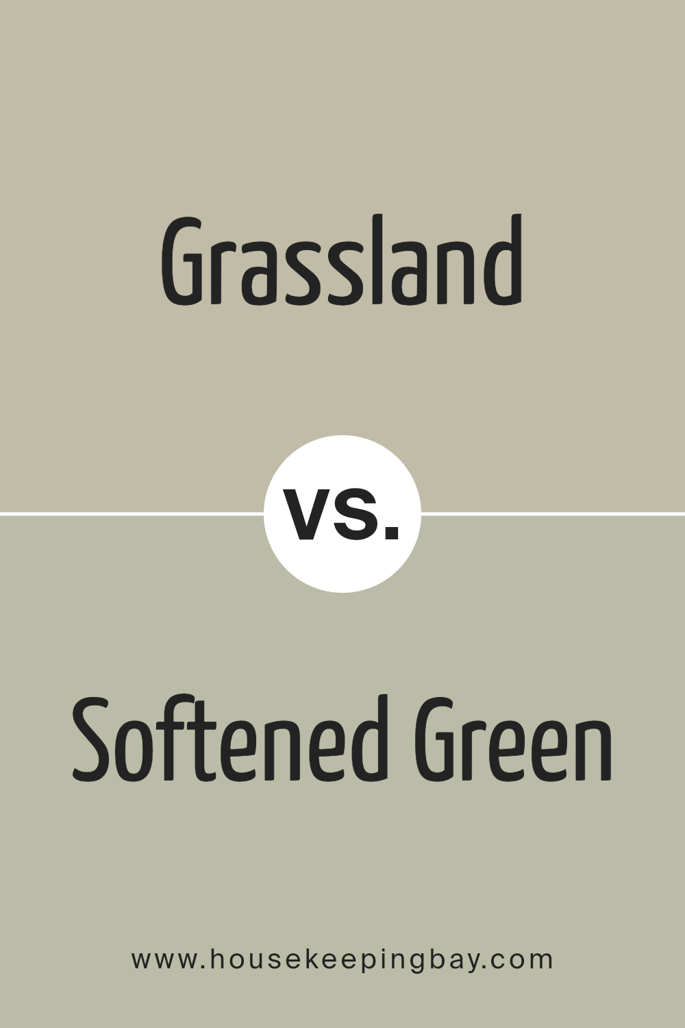
Grassland SW 6163 by Sherwin Williams vs Softened Green SW 6177 by Sherwin Williams
Grassland SW 6163 and Softened Green SW 6177, both from Sherwin Williams, present two takes on the green palette. Grassland SW 6163 sits as a more earthy, muted green, offering a grounded, natural feel. This color brings in a sense of warmth and coziness, making it suitable for living rooms or bedrooms seeking a calm mood. It’s a color that doesn’t overpower but complements other earthy tones well.
Softened Green SW 6177, meanwhile, appears lighter and slightly brighter. It carries subtle airy qualities, making it perfect for areas where you want to create a refreshing and light ambiance. Softened Green can suit kitchens or bathrooms, providing a gentle backdrop.
When comparing them, Grassland feels more reserved and intimate, while Softened Green offers a bit more lightness and openness. Both colors work well in neutral settings but provide different atmospheres: one more grounded, the other slightly more uplifting.
You can see recommended paint color below:
- SW 6177 Softened Green
housekeepingbay.com
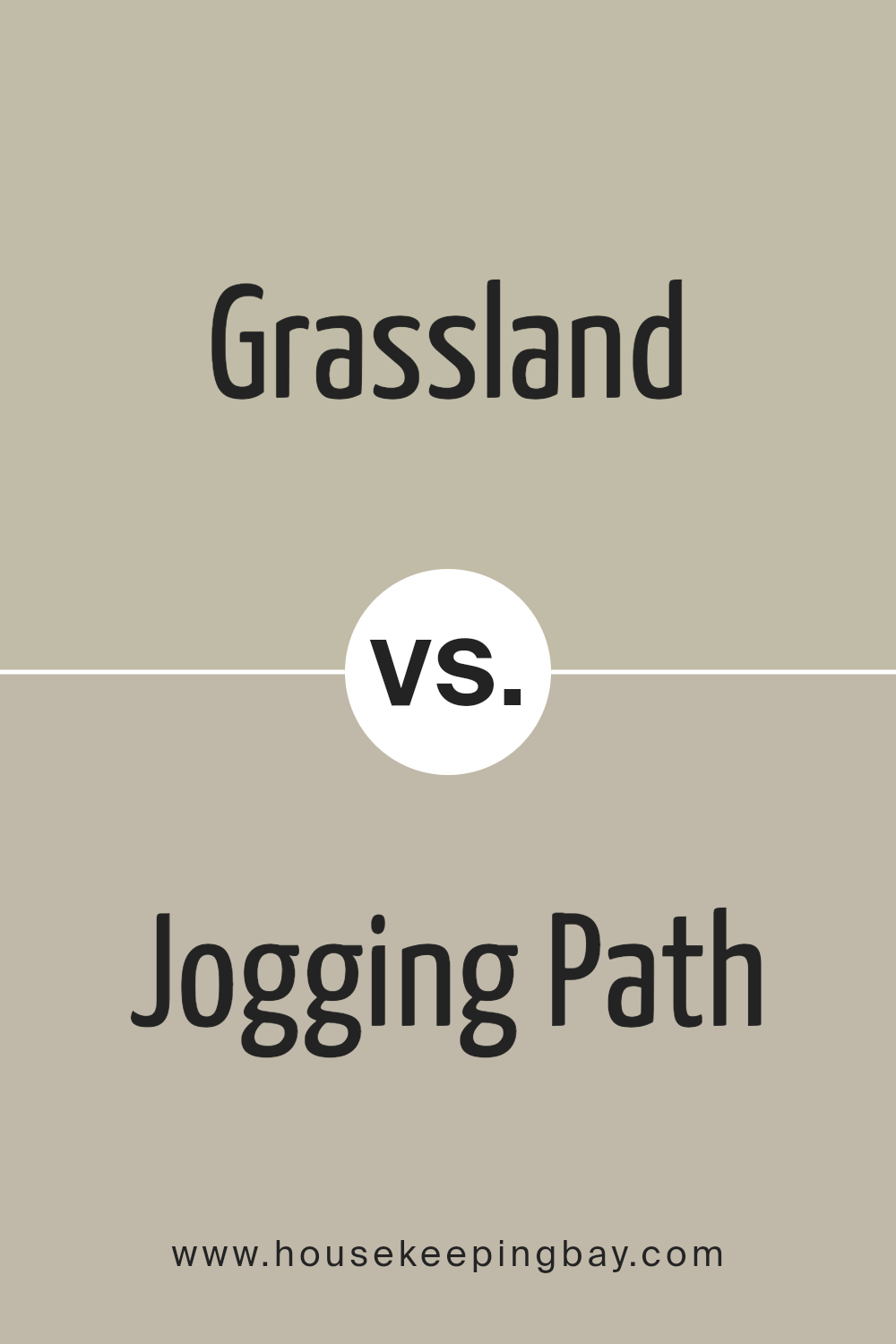
Grassland SW 6163 by Sherwin Williams vs Jogging Path SW 7638 by Sherwin Williams
Grassland SW 6163 by Sherwin-Williams is a warm, earthy green. It captures the essence of nature, giving spaces a natural and inviting feel. This color pairs well with natural materials like wood and stone, bringing a cozy and organic vibe to interiors. It’s an excellent choice for living rooms or bedrooms where a touch of calm and connection to the outdoors is desired.
Jogging Path SW 7638, in contrast, is a cooler, muted gray-green. It’s understated and versatile, fitting well in a variety of settings. This color provides a modern, sleek backdrop for spaces, making it suitable for kitchens, bathrooms, or hallways.
The coolness of Jogging Path brings a sense of serenity without overwhelming other design elements, allowing for more freedom in accent choices.
While both colors have green undertones, Grassland leans more towards warmth and nature, whereas Jogging Path offers a cool, modern approach.
You can see recommended paint color below:
housekeepingbay.com
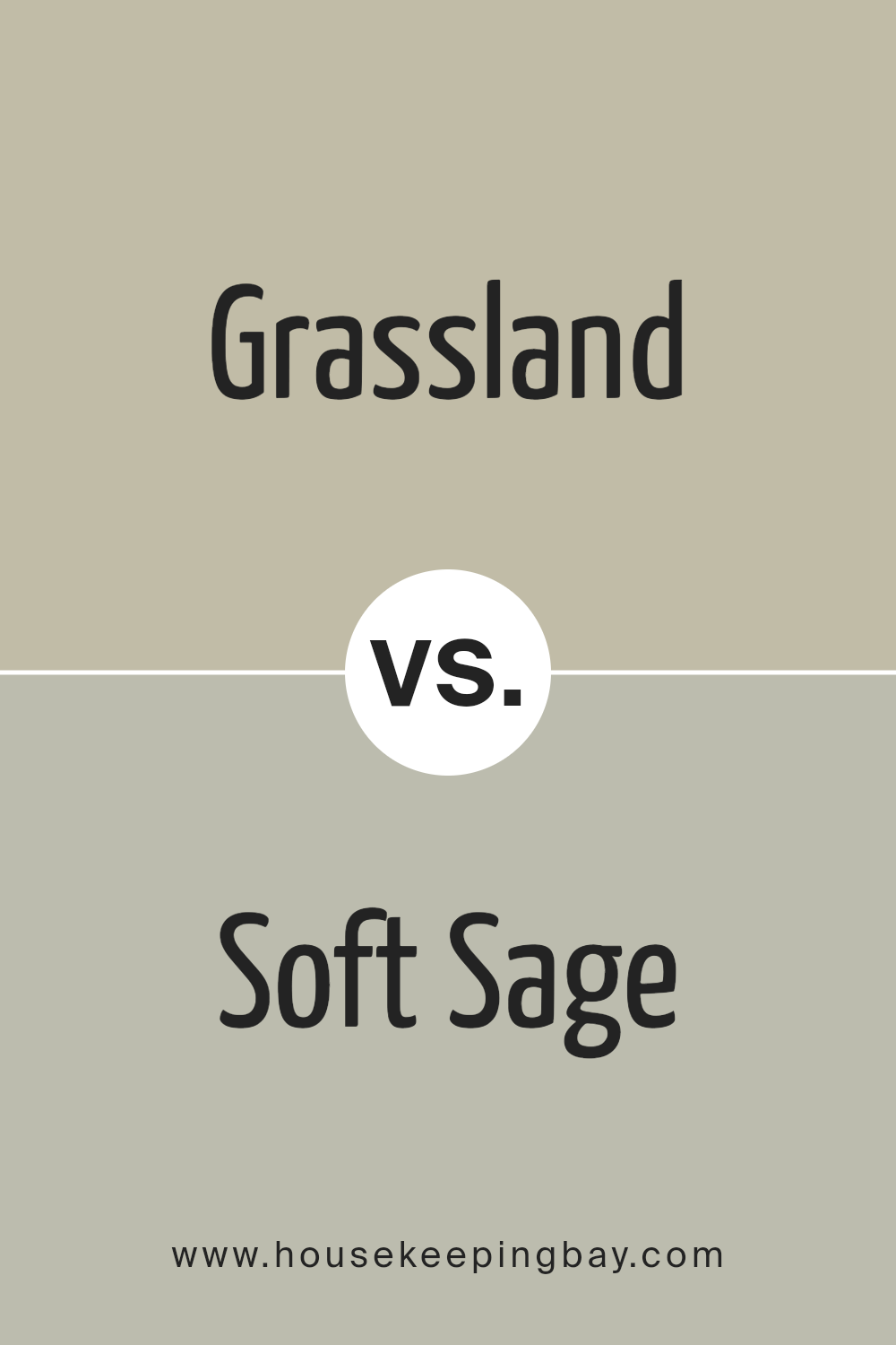
Grassland SW 6163 by Sherwin Williams vs Soft Sage SW 9647 by Sherwin Williams
Grassland SW 6163 and Soft Sage SW 9647 are both calming greens from Sherwin Williams, but they each have unique qualities. Grassland has a warm, earthy tone, bringing to mind open fields and serene landscapes. It has a slightly muted and natural quality, making it versatile for many spaces.
Soft Sage SW 9647, however, is a cooler, lighter green. It feels fresh and airy, like a gentle breeze. This color can make a room feel more open and spacious.
While both greens create a sense of peace and comfort, Grassland tends to offer a grounding effect with its warmth, whereas Soft Sage evokes a more refreshing, gentle vibe.
Choosing between the two depends on the mood you want to create: Grassland envelops with warmth and natural ease, while Soft Sage invites lightness and a soft, clean atmosphere to your space. Both pair well with neutral tones for a balanced look.
You can see recommended paint color below:
housekeepingbay.com
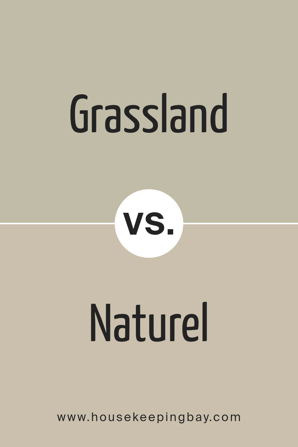
Grassland SW 6163 by Sherwin Williams vs Naturel SW 7542 by Sherwin Williams
Grassland SW 6163 and Naturel SW 7542 by Sherwin Williams offer distinct vibes for spaces. Grassland is a warm, earthy green with hints of yellow. It resembles fresh grass in sunlight, providing a lively yet soothing feel. This color thrives in areas that benefit from a touch of nature, creating a calm and welcoming atmosphere.
Naturel SW 7542, however, features a soft, muted beige with slight gray undertones. It exudes a neutral, timeless elegance, suitable for versatile uses. Its understated presence works well as a backdrop, allowing other design elements to shine.
While Grassland leans towards energizing, organic freshness, Naturel provides a foundation of understated sophistication. The former introduces a connection to nature, while the latter offers subtlety and flexibility, pairing easily with a variety of colors. Choosing between them depends on whether one seeks vibrancy or neutrality in their living spaces.
You can see recommended paint color below:
- SW 7542 Naturel
housekeepingbay.com
Grassland SW 6163 by Sherwin Williams vs Silver Gray SW 0049 by Sherwin Williams
Grassland SW 6163 by Sherwin Williams and Silver Gray SW 0049 present two distinct color choices. Grassland is a warm, earthy green reminiscent of lush pastures. It brings a sense of natural calm and can create a cozy, inviting atmosphere in any room. This color works well in living spaces, adding warmth and depth, and pairs beautifully with other natural tones like browns and tans.
Silver Gray, by contrast, offers a cooler, more subdued aesthetic. It is a soft, elegant gray that brings a sense of calm and sophistication. This versatile shade can make spaces feel open and airy.
Silver Gray pairs nicely with whites and bold colors, offering a neutral backdrop that highlights other design elements.
Both shades reflect nature but do so differently. Grassland conjures up fertile landscapes, while Silver Gray resembles serene, foggy mornings. Choosing between them depends on whether you seek warmth or a more restrained, cool elegance.
You can see recommended paint color below:
housekeepingbay.com
Grassland SW 6163 by Sherwin Williams vs Peace of Mind SW 9510 by Sherwin Williams
Grassland SW 6163 by Sherwin Williams and Peace of Mind SW 9510 offer two distinct vibes. Grassland is a warm, earthy color that brings thoughts of nature and open fields. It’s a muted, soft green with a touch of warmth, making spaces feel inviting and cozy. It works well in living rooms or bedrooms for a natural, grounded atmosphere.
Peace of Mind, however, is all about calm and balance. It’s a cooler shade of blue-green, evoking the peacefulness of a quiet morning by the sea. This color suits spaces meant for relaxation and contemplation, like bedrooms or bathrooms. It feels refreshing and brings a sense of cleanliness and airiness.
While Grassland lends itself to warmth and comfort, Peace of Mind leans towards serenity and freshness. Both can enhance a room’s character, yet they each create a different mood—one welcoming and cozy, the other soothing and clear.
You can see recommended paint color below:
- SW 9510 Peace of Mind

housekeepingbay.com
Grassland SW 6163 by Sherwin Williams vs Outrigger SW 9517 by Sherwin Williams
Grassland SW 6163 and Outrigger SW 9517 from Sherwin Williams each offer unique charm. Grassland presents a soft, muted green reminiscent of peaceful, natural surroundings. It evokes calmness and is ideal for creating a soothing atmosphere. This color can work well in relaxing spaces, pairing nicely with neutral tones.
Outrigger SW 9517, by contrast, is a deep, rich shade. It carries a stronger presence with its intense, earthy undertone. This color can add warmth and sophistication, making it suitable for spaces where you want to create a cozy, inviting environment.
It complements other deep colors and can provide an interesting contrast with lighter shades.
Together, Grassland and Outrigger can create a balanced color palette. Use Grassland for its gentle, calming effect, while employing Outrigger to add depth and structure. Both colors provide versatility, enabling you to craft personalized interiors that reflect your individual taste.
You can see recommended paint color below:
housekeepingbay.com
Conclusion
Choosing SW 6163 Grassland by Sherwin Williams can truly enhance your living space. This earthy, muted green brings a sense of calm and nature indoors. I find that it creates a peaceful atmosphere, making it perfect for areas where you want relaxation and comfort.
Grassland pairs well with various other colors. It complements natural materials like wood and stone, adding warmth and depth to any room. Soft neutrals and whites harmonize beautifully with it, providing a clean and balanced look.
Bold accents, such as rust or deep blue, create striking contrasts and visual interest.
The versatility of Grassland makes it suitable for many styles. Whether you prefer a rustic, modern, or traditional design, this color can fit seamlessly into your vision. It’s perfect for living rooms, bedrooms, and even kitchens, bringing a fresh, soothing vibe to each space.
I really appreciate how Grassland captures the essence of nature while maintaining a sophisticated feel. It’s a timeless choice that works well in both small and large spaces. Whether updating your entire home or just a single room, this color provides a great foundation for personalizing and enhancing your environment.
Overall, SW 6163 Grassland offers a wonderful balance of serenity and style, making it an excellent choice for anyone looking to refresh their home with a touch of nature-inspired elegance.
housekeepingbay.com
Ever wished paint sampling was as easy as sticking a sticker? Guess what? Now it is! Discover Samplize's unique Peel & Stick samples. Get started now and say goodbye to the old messy way!
Get paint samples


