Starry Night SW 6540 by Sherwin Williams
Exploring the Depth of Midnight Blues
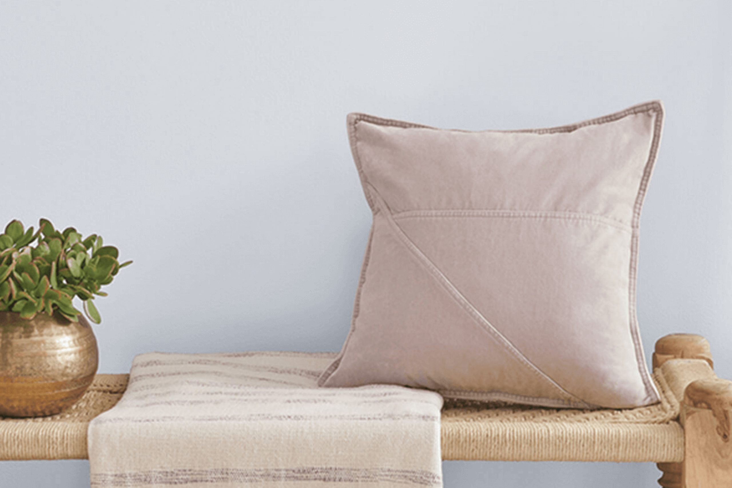
You might be thinking about refreshing your space with a new paint color, and SW 6540 Starry Night by Sherwin Williams could be just what you need. This shade lends itself beautifully to creating a cozy and inviting atmosphere in any room.
Ideal for those who appreciate a serene and subtle backdrop, Starry Night offers a unique blend of blue tones that can calm your mind and uplift your spirit.
Whether you’re revamping your bedroom, living area, or even a bathroom, this color can set the perfect mood.
Pairing it with light or dark furniture works equally well, allowing you flexibility in designing your space. What’s more, it complements various styles, from modern minimalism to rustic charm, effortlessly enhancing the overall aesthetic of your home.
via sherwin-williams.com
What Color Is Starry Night SW 6540 by Sherwin Williams?
Table of Contents
Starry Night SW 6540 by Sherwin Williams is a rich, deep blue hue that evokes the quiet beauty of an evening sky. This paint color carries a serene vibe that works extraordinarily well for creating a calming space. As a cool shade, it pairs seamlessly with warm tones and natural elements, helping balance out spaces that receive plenty of sunlight.
This shade can beautifully anchor a variety of interior styles. For a modern look, combine Starry Night with sleek, white furniture and metal accents like stainless steel or chrome. It also suits Scandinavian designs when matched with light woods, soft greys, and minimalist decor.
In more traditional or coastal settings, this color aligns well with sandy beiges, soft browns, and textures such as linen or cotton, enhancing the room’s overall cozy atmosphere.
Materials that complement Starry Night include dark woods which contrast nicely against the vibrant blue, creating a dynamic yet harmonious look. Textures like velvet or silk will add a touch of luxury to the environment, while smoother textures such as glass or polished metals provide a cleaner, more contemporary feel.
Whether used as an accent wall or throughout a whole room, Starry Night SW 6540 can elevate any space into a soothing and stylish area.

housekeepingbay.com
Is Starry Night SW 6540 by Sherwin Williams Warm or Cool color?
Starry Night SW 6540 by Sherwin Williams is a rich, deep blue paint color that can add a unique charm to any room in a home. This color is versatile and can be used in various spaces, from bedrooms to living rooms, depending on the desired atmosphere.
In bedrooms, Starry Night can create a calm, cozy environment conducive to relaxation and sleep. The boldness of this blue can make a room feel more intimate and snug, especially in rooms with ample natural light.
In living areas, using Starry Night on a feature wall can serve as a striking backdrop for artwork or furniture, adding depth to the overall aesthetic. This color pairs well with neutral tones like whites, grays, and creams, which help balance its intensity. Additionally, complementing it with metallic accents like gold or silver can enhance its luxurious feel.
Overall, Starry Night SW 6540 has the potential to bring a vibrant yet soothing dynamic into homes, making spaces feel more polished and thoughtfully designed.
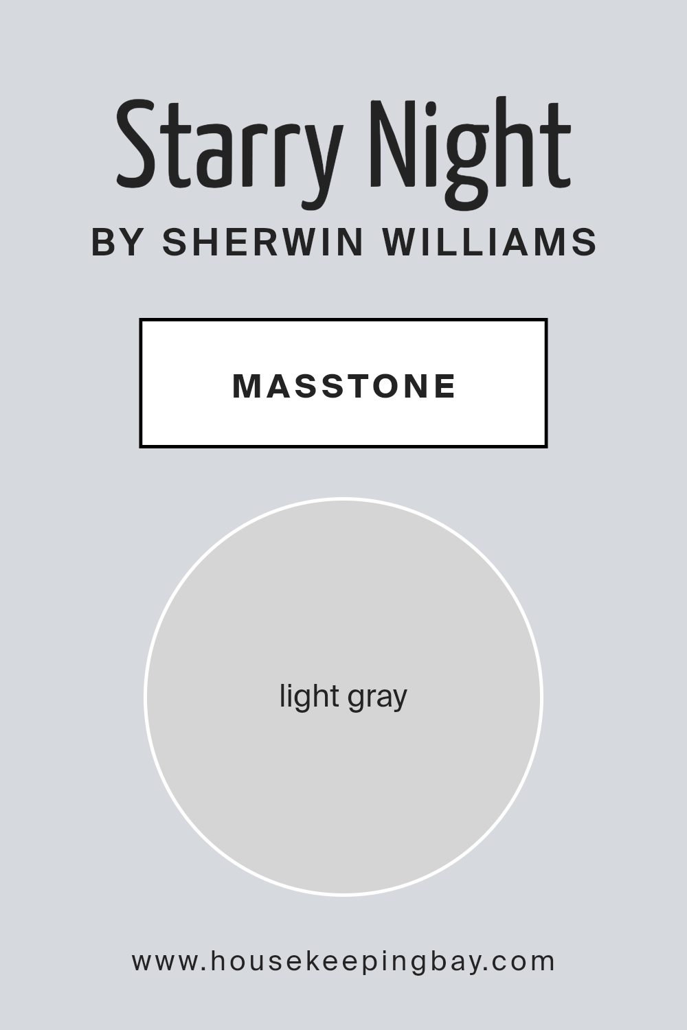
What is the Masstone of the Starry Night SW 6540 by Sherwin Williams?
Starry NightSW 6540 by Sherwin Williams has a masstone of light gray, coded as #D5D5D5. This subtle shade offers a soft, calming effect in any room, making it a popular choice for homeowners looking to create a peaceful and inviting space.
The light gray color acts as a neutral backdrop, allowing other colors and decor elements to shine without overwhelming the senses. Whether used in a bedroom, living room, or bathroom, Starry NightSW 6540 guarantees versatility.
It complements a wide range of colors, from vibrant hues to more muted tones. This adaptability makes it easy for homeowners to update their furnishings or decor without the need to repaint.
Additionally, the light gray hue helps to enhance natural light in a space, making rooms appear brighter and more airy.
This color works well in both large spaces and smaller rooms, offering a clean, fresh look that is consistently popular in home design.
housekeepingbay.com
Coordinating Colors of Starry Night SW 6540 by Sherwin Williams
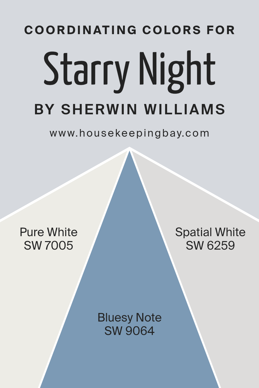
Coordinating colors are selected to work well together and highlight the best features of each other when used in a design. They can be used to create a harmonious overall look or add interesting contrasts in decor. For example, Starry Night SW 6540 by Sherwin Williams, a deep and rich blue, can be beautifully complemented by colors such as SW 7005 – Pure White, SW 9064 – Bluesy Note, and SW 6259 – Spatial White.
These colors help create a balanced and cohesive aesthetic that enhances spaces in different ways.
Pure White SW 7005 is a clean and crisp white that offers a fresh contrast to the intense blue of Starry Night, brightening spaces and adding a sense of openness. Bluesy Note SW 9064 is a darker blue that can provide a subtle depth when paired with Starry Night, offering a sophisticated blend of similar hues that are both soothing and appealing.
Spatial White SW 6259 is a softer, lighter hue compared to Pure White, delivering a subtle warmth and maintaining a soft backdrop that allows deeper colors like Starry Night to stand out more prominently.
These coordinating colors help achieve a well-rounded, visually appealing environment, allowing each hue to perform at its best.
You can see recommended paint colors below:
- SW 7005 Pure White
- SW 9064 Bluesy Note
- SW 6259 Spatial White
housekeepingbay.com
How Does Lighting Affect Starry Night SW 6540 by Sherwin Williams?
Lighting can greatly influence how colors appear in different environments. The choice of artificial or natural lighting can make the same color look different depending on the source and direction of the light.
Starry Night SW 6540 by Sherwin Williams is a vibrant shade which reacts uniquely under various lighting conditions. In artificial light, such as that from bulbs or LED lights, Starry Night tends to appear slightly more intense and vivid. This is because artificial light often provides consistent and direct illumination, which can enhance the depth of the color.
In natural light, the appearance of Starry Night can change throughout the day due to the varying intensity and angle of sunlight. In a north-faced room, which receives less direct sunlight, Starry Night may look more subdued and cooler, giving a calmer feeling to the room. The limited light can make the color appear slightly darker than it actually is.
Conversely, in a south-faced room, where sunlight is abundant for most of the day, Starry Night will look much brighter and more vibrant. The ample natural light brings out the richness of the color, making the room feel lively and dynamic.
In east-faced rooms, where sunlight is strongest in the morning, Starry Night will have a bright and cheerful appearance in the morning, gradually becoming softer as the day progresses. This transition could influence the mood in the room, starting with energy and moving towards a more relaxed atmosphere.
Finally, in west-faced rooms that receive intense sunlight in the late afternoon, Starry Night will undergo a transformation from a muted tone in the morning to a strikingly rich hue by evening, offering a refreshing change that keeps the space interesting.
Overall, the effect of lighting on the color Starry Night SW 6540 is significant, and considering the orientation of the room and the type of light it receives can help in achieving the desired impact and feel of the space.
housekeepingbay.com
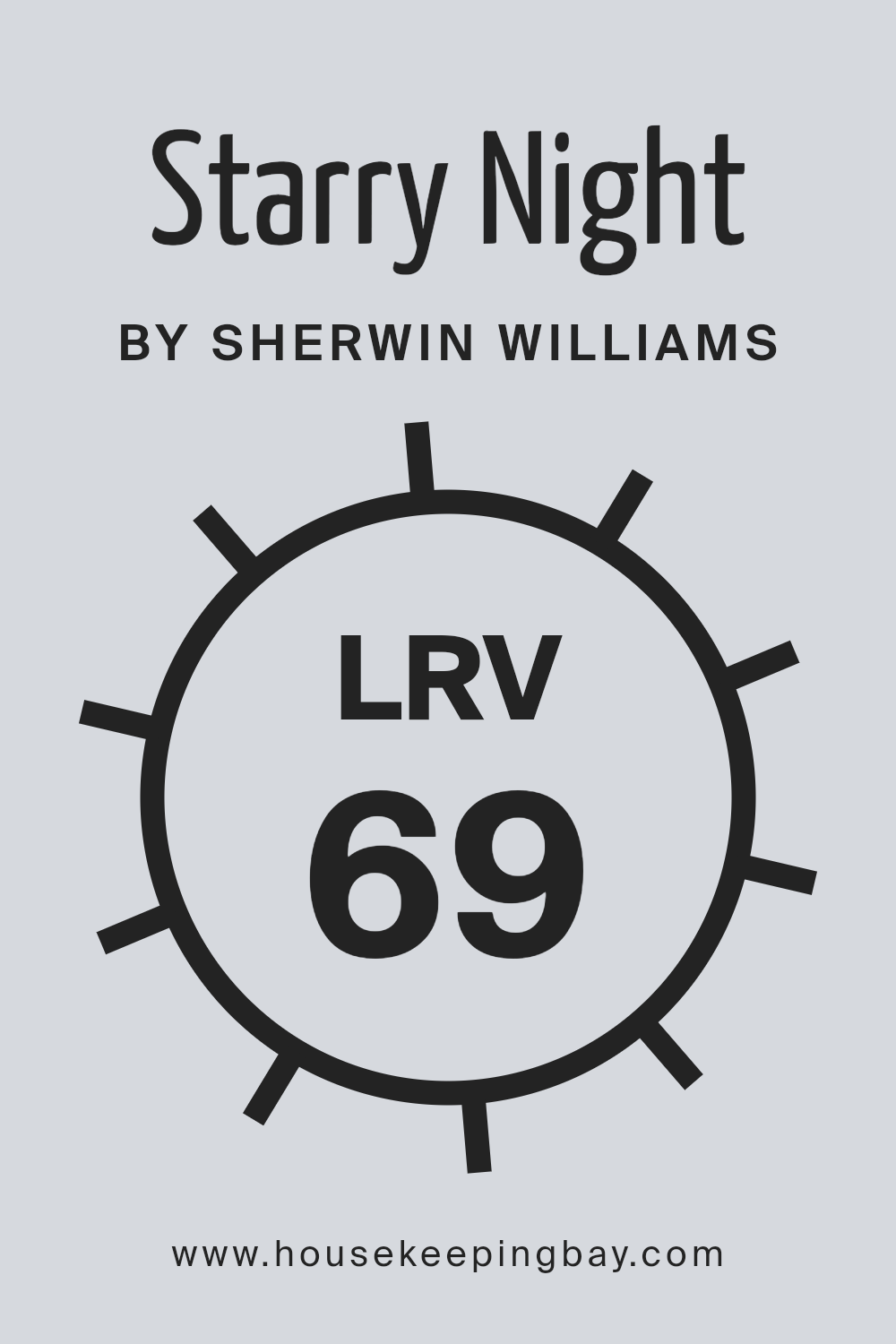
What is the LRV of Starry Night SW 6540 by Sherwin Williams?
LRV stands for Light Reflectance Value, which is a measure of how much light a paint color reflects or absorbs. Painted surfaces with a higher LRV reflect more light, making the space feel brighter, while those with a lower LRV absorb more light, which can make a room feel cozier but darker.
The LRV scale ranges from 0 (absorbs all light) to 100 (reflects all light). This metric is crucial when choosing paint colors, especially in spaces where natural lighting is limited or when trying to enhance the brightness of a room without adding more light sources.
Starry Night SW 6540 by Sherwin Williams, with an LRV of 69.065, reflects a substantial amount of light, making it a great choice for darker rooms or north-facing spaces that might lack natural sunlight. This means that Starry Night will help to make such spaces appear lighter and more open.
Since it’s close to 70 on the LRV scale, this color is versatile for various uses, whether to add a sense of spaciousness to a small room or to brighten a dim hallway, while still adding a pleasant hue to the walls.
housekeepingbay.com
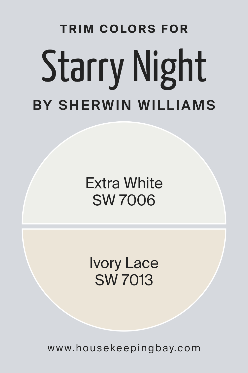
What are the Trim colors of Starry Night SW 6540 by Sherwin Williams?
Trim colors are selected to complement or contrast with the main wall color, creating a visually appealing look. For Starry Night SW 6540 by Sherwin Williams, which is a deep, vibrant shade, trim colors like SW 7006 – Extra White and SW 7013 – Ivory Lace are ideal because they provide a crisp or soft frame to the rich hue of the walls.
These lighter trim colors help to define the architectural details of a space, such as door frames, crown molding, and skirting boards, enhancing the room’s overall aesthetic and ensuring that the darker tones do not overwhelm the space.
Extra White SW 7006 is a very clean and bright white. It offers a sharp contrast that can make the deep tones of Starry Night pop, providing a fresh, clean look that can make smaller details stand out. Ivory Lace SW 7013, on the other hand, is a softer, warmer white with a touch of creaminess, offering a subtler contrast to deep blue shades.
It softens the transition between the wall color and trim, giving the space a cohesive yet highlighted appearance without being too stark.
You can see recommended paint colors below:
housekeepingbay.com
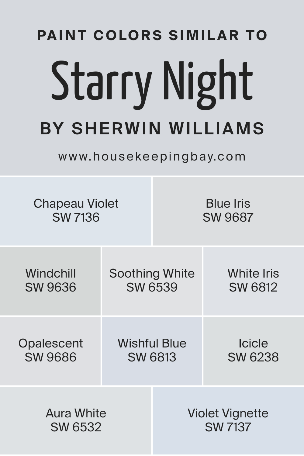
Colors Similar to Starry Night SW 6540 by Sherwin Williams
Similar colors play a crucial role in design by creating a harmonious and cohesive look. When colors like Starry Night SW 6540 by Sherwin Williams are used alongside their similar shades, they can subtly enhance each other, providing depth and continuity in a space.
For instance, Chapeau Violet SW 7136 and Violet Vignette SW 7137 offer a slightly muted, yet still lush violet tone that complements the more dynamic Starry Night. Blue Iris SW 9687 has rich, deep blue hues that echo the primary color’s intensity, supporting the main color without overshadowing it.
On the lighter side, Windchill SW 9636, Soothing White SW 6539, and Aura White SW 6532 bring in soft, airy whites that serve to lighten the overall palette, making the environment feel open and breathable. White Iris SW 6812 and Opalescent SW 9686 lend a touch of delicate, almost ethereal quality to the mix, interplaying well with the deeper blues and violets.
Wishful Blue SW 6813 and Icicle SW 6238, being light blues, seamlessly knit together the color scheme, ensuring that the spaces feel connected and finely balanced.
By integrating these similar colors, one can achieve a well-rounded and inviting atmosphere.
You can see recommended paint colors below:
- SW 7136 Chapeau Violet
- SW 9687 Blue Iris
- SW 9636 Windchill
- SW 6539 Soothing White
- SW 6812 White Iris
- SW 9686 Opalescent
- SW 6813 Wishful Blue
- SW 6238 Icicle
- SW 6532 Aura White
- SW 7137 Violet Vignette
housekeepingbay.com
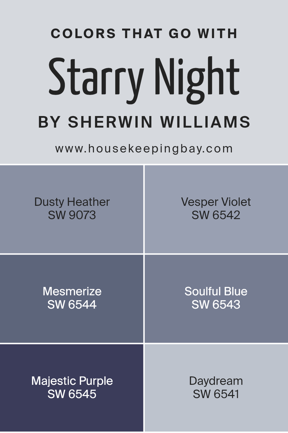
Colors that Go With Starry Night SW 6540 by Sherwin Williams
Selecting the right colors to complement Starry Night SW 6540 by Sherwin Williams is essential for creating a harmonious and aesthetically pleasing environment. The corresponding color palette includes shades that harmonize well with Starry Night, emphasizing its depth and enhancing the overall mood of a space.
Colors such as Soulful Blue and Majestic Purple add depth and richness, making them ideal for achieving a serene atmosphere. Meanwhile, colors like Dusty Heather and Daydream provide a soft contrast that can make Starry Night pop, adding visual interest without overwhelming the senses.
Understanding the nature of each color in this palette can help in deciding how best to utilize them. Dusty Heather is a gentle, understated gray with a touch of lavender, perfect for creating a soft, soothing backdrop. Vesper Violet offers a deeper, more introspective feel that works well in spaces designed for reflection or creativity.
Mesmerize, a vibrant and rich blue, brings energy and focus into a room, ideal for lively spaces. Soulful Blue, with its calming qualities, is excellent for bedrooms or bathrooms where relaxation is key. Majestic Purple is bold yet refined, suitable for accent walls or decor items that need to stand out.
Finally, Daydream provides a light and airy feel that can open up smaller spaces or bring a sense of calm to busy areas. These colors, used wisely, can greatly enhance the ambiance of any room and complement the boldness of Starry Night SW 6540 effectively.
You can see recommended paint colors below:
- SW 9073 Dusty Heather
- SW 6542 Vesper Violet
- SW 6544 Mesmerize
- SW 6543 Soulful Blue
- SW 6545 Majestic Purple
- SW 6541 Daydream
housekeepingbay.com
How to Use Starry Night SW 6540 by Sherwin Williams In Your Home?
Starry Night SW 6540 by Sherwin Williams is a vibrant shade of blue with a subtle hint of navy. This rich color can dramatically change the mood of any room in your home. Ideal for creating a cozy and inviting atmosphere, it is perfect for living rooms and bedrooms where a serene setting is desired.
When used on a feature wall, Starry Night can serve as a beautiful backdrop for light-colored furnishings or wood accents. This color also works well in bathrooms, providing a strong contrast to white fixtures and tiles, making the space feel more refined and stylish.
Additionally, pairing it with soft lighting can enhance the serene qualities of the color, making your home feel peaceful and calm. If you wish to add a pop of color without overwhelming a space, consider using Starry Night in alcoves or as part of a color scheme on kitchen cabinets for a more subtle, sophisticated look.
Starry Night SW 6540 by Sherwin Williams vs Chapeau Violet SW 7136 by Sherwin Williams
Starry Night SW 6540 by Sherwin Williams is a vibrant, dynamic blue shade, rich in depth and intensity. It takes its inspiration from the night sky, conveying a sense of depth and endless possibilities that suit spaces where a strong, bold character is desired. It works well as an accent wall or for creating a focal point in a room due to its striking hue.
In contrast, Chapeau Violet SW 7136 is a softened, grayish purple that offers a more subdued and sophisticated appearance. This color is very versatile, blending seamlessly with a variety of decor styles from modern to traditional.
It’s particularly effective in bedrooms or living areas where a calm, soothing atmosphere is sought after.
Both colors bring unique vibes to interiors: Starry Night injects energy and drama, while Chapeau Violet provides subtle elegance and calmness. Each has its place depending on the mood and function you want to achieve in the space.
You can see recommended paint color below:
- SW 7136 Chapeau Violet
housekeepingbay.com
Starry Night SW 6540 by Sherwin Williams vs Soothing White SW 6539 by Sherwin Williams
Starry Night SW 6540 by Sherwin Williams is a vibrant shade that leans towards a bold blue with hints of purple, making it a lively choice for spaces that aim to energize and create a dynamic ambiance. This color suits areas like living rooms or creative spaces where an injection of personality is desired.
In contrast, Soothing White SW 6539 captures a soft, serene off-white tone that provides a calm and subtle backdrop suitable for nearly any room. Its versatility means it harmonizes easily with various decor styles, from modern to classic. This color is ideal for creating a relaxed, airy feel, enhancing light in darker rooms or small spaces.
Both colors offer their unique impacts – Starry Night brings a daring splash of color, useful for accent walls or decor items, while Soothing White acts as a gentle base, perfect for overall wall color or trim, providing balance and a peaceful setting. ChatColor
You can see recommended paint color below:
- SW 6539 Soothing White
housekeepingbay.com
Starry Night SW 6540 by Sherwin Williams vs Violet Vignette SW 7137 by Sherwin Williams
Starry Night SW 6540 and Violet Vignette SW 7137, both by Sherwin Williams, offer distinct vibes for interior spaces. Starry Night is a deep, rich blue that can make a room feel cozy yet sophisticated. It pairs well with bright whites and grays for a classic look, or can be matched with vibrant colors for a more daring aesthetic.
Violet Vignette, in contrast, is a gentle purple that gives a soft and subtle feel to a space. It works beautifully in areas meant for relaxation such as bedrooms or reading nooks. This color is versatile enough to blend with light neutrals or can be used as a contrasting backdrop for darker furnishings.
Both colors provide unique opportunities for creating inviting atmospheres in a home. While Starry Night adds depth and drama, Violet Vignette offers a serene and calming environment. Depending on the mood you want to create, either color could be a perfect choice.
You can see recommended paint color below:
- SW 7137 Violet Vignette
housekeepingbay.com
Starry Night SW 6540 by Sherwin Williams vs Blue Iris SW 9687 by Sherwin Williams
Starry Night SW 6540 by Sherwin Williams is a vivid, deep blue hue with a vibrant energy that can add drama and intensity to any space. This color is perfect for making a bold statement, especially in areas where a strong, eye-catching look is desired.
In contrast, Blue Iris SW 9687 is a softer, muted blue with gray undertones, offering a serene and sophisticated vibe. It works well in spaces meant for relaxation and calm, such as bedrooms or bathrooms, where a more subdued atmosphere is preferred.
While Starry Night is rich and commanding, Blue Iris leans towards a gentler, more reserved aesthetic. Starry Night tends to stand out and dominate a color scheme, whereas Blue Iris blends more subtly with its surroundings, complementing other shades without overwhelming them. In summary, Starry Night suits bolder, more dramatic décor, while Blue Iris is ideal for creating a peaceful, refined environment.
You can see recommended paint color below:
housekeepingbay.com
Starry Night SW 6540 by Sherwin Williams vs White Iris SW 6812 by Sherwin Williams
Starry Night SW 6540 by Sherwin Williams is a vibrant and deep shade of blue that carries a lot of personality and boldness. It brings a sense of energy and prominence to a space, making it ideal for creating a focal point in a room. This color works well in spaces like living rooms or bedrooms where a touch of drama is desired.
In contrast, White Iris SW 6812 by Sherwin Williams is a soft and soothing lavender tone. It’s much lighter and has a gentle, calming effect, which makes it great for areas where you want to relax, such as bathrooms or bedrooms. White Iris can help make a small room feel bigger and brighter because of its light-reflective properties.
Both colors offer unique vibes; Starry Night adds depth and intensity, while White Iris provides a subtle and airy feel. They can work beautifully together, with Starry Night anchoring a space and White Iris adding a breath of freshness.
You can see recommended paint color below:
- SW 6812 White Iris
housekeepingbay.com
Starry Night SW 6540 by Sherwin Williams vs Aura White SW 6532 by Sherwin Williams
Starry Night SW 6540 by Sherwin Williams is a rich, deep blue that conveys a sense of sophistication and elegance. This color creates a strong visual impact and can make any space feel more intimate and cozy. It works well in areas where a bold, dramatic statement is desired, such as living rooms or dining areas.
Aura White SW 6532, on the contrary, is a light, airy white with a subtle hint of warmth. This color is versatile and lends a refreshing, clean look to any room. It is particularly effective in small spaces or rooms that lack natural light, as it can help make them appear brighter and larger.
While Starry Night offers a commanding presence with its vibrant depth, Aura White provides a neutral backdrop that can brighten and visually expand a space. Both colors serve distinct purposes and create different moods, making them useful for various design needs depending on the atmosphere you are trying to achieve.
You can see recommended paint color below:
- SW 6532 Aura White
housekeepingbay.com
Starry Night SW 6540 by Sherwin Williams vs Wishful Blue SW 6813 by Sherwin Williams
Starry Night SW 6540 and Wishful Blue SW 6813 by Sherwin Williams are both unique in their own ways. Starry Night is a deep, rich blue, resembling a clear night sky. This color is bold and could create a striking impact in any space, making it feel cozy and profound. This shade is versatile, fitting well in bedrooms, living rooms, or offices where a touch of sophistication is required.
In contrast, Wishful Blue is much lighter and airier. This pale, soft blue has a calming effect, perfect for creating a relaxed, serene ambiance. It’s ideal for spaces like bathrooms or bedrooms where you might want to promote a soothing environment.
Wishful Blue’s gentle tone pairs well with brighter or neutral colors, giving flexibility in decor choices.
Both colors offer distinct vibes – Starry Night calls for drama and depth, while Wishful Blue leans towards peacefulness and lightness. They could also complement each other well in a color scheme, balancing deep vibrancy with calm lightness.
You can see recommended paint color below:
housekeepingbay.com
Starry Night SW 6540 by Sherwin Williams vs Opalescent SW 9686 by Sherwin Williams
Starry Night SW 6540 by Sherwin Williams is a deep, vibrant blue that can add a bold touch to any space. It evokes the feeling of a clear, star-filled sky and can make a strong statement in a room. This color works well in bedrooms or living areas where you want to add depth and a touch of drama.
In contrast, Opalescent SW 9686 is much softer and subtler. It’s a light, airy color that leans towards pastel, giving spaces a calm and gentle ambiance. Suitable for areas where relaxation is key, such as bathrooms or bedrooms, Opalescent can make small rooms feel larger and more open.
While both colors come from Sherwin Williams, they serve different purposes due to their contrasting hues and intensities. Starry Night can create a focal point in a room, whereas Opalescent is ideal for creating a soothing background.
Depending on the desired impact, either color can enhance a space beautifully, yet differently.
You can see recommended paint color below:
housekeepingbay.com
Starry Night SW 6540 by Sherwin Williams vs Icicle SW 6238 by Sherwin Williams
Starry Night SW 6540 by Sherwin Williams is a deep, vivid blue that carries the intensity of a sky lit by stars. It’s a bold color that makes a statement, perfect for accent walls or furniture pieces that you want to stand out. The richness of Starry Night can add a sense of drama and sophistication to a space.
In contrast, Icicle SW 6238 is a light, airy gray with subtle blue undertones. This color is much more understated and versatile. It provides a fresh, clean look that can help smaller spaces appear larger and more open. Icicle is ideal for rooms that aim for a serene and soothing atmosphere, such as bedrooms and bathrooms.
While Starry Night creates a focal point and adds personality, Icicle offers a backdrop that blends seamlessly into a variety of decor styles, promoting a calm and relaxing environment. Both colors have their unique appeal depending on the mood and style you want to achieve in your space.
You can see recommended paint color below:
- SW 6238 Icicle
housekeepingbay.com
Starry Night SW 6540 by Sherwin Williams vs Windchill SW 9636 by Sherwin Williams
Starry Night SW 6540 by Sherwin Williams is a deep, rich blue with a touch of purple that gives it a vibrant and cozy feel. It’s great for creating a bold statement in spaces like living rooms or bedrooms, adding depth and a splash of color without overwhelming the area. This color works well with white trim or light furniture, which can help to soften its intensity.
In contrast, Windchill SW 9636 is a much lighter, airy blue with a crisp, clean appearance. It evokes a feeling of freshness and brightness, making it suitable for smaller or less brightly lit spaces to help them appear more open and inviting.
Windchill is perfect for bathrooms or kitchens, where it promotes a clean and calm atmosphere.
Both colors, Starry Night and Windchill, offer unique atmospheres; one is bold and moody, while the other feels fresh and serene. They could even complement each other in a single home, used in different rooms to achieve specific effects.
You can see recommended paint color below:
- SW 9636 Windchill

housekeepingbay.com
I particularly appreciate how the color can create a sense of peacefulness, making it a perfect choice for rooms where relaxation is essential, like bedrooms and bathrooms. Additionally, its adaptability in different lighting conditions is a significant advantage, ensuring that the space remains vibrant and inviting throughout the day.
Practicality also stands out with this shade; it pairs well with numerous textures and finishes, which aids in achieving a cohesive interior design without limiting creative expression.
Overall, SW 6540 Starry Night can help achieve a serene yet sophisticated atmosphere in any home setting, proving itself as a robust choice for those looking to refresh their living environments.

housekeepingbay.com
Ever wished paint sampling was as easy as sticking a sticker? Guess what? Now it is! Discover Samplize's unique Peel & Stick samples. Get started now and say goodbye to the old messy way!
Get paint samples


