31 Sage Green Paint Color by Sherwin Williams
Peaceful, Earthy Shades You’ll Actually Use
You know that feeling when you walk into a room and immediately exhale? That’s the kind of mood sage green creates. It’s soft, a little earthy, and doesn’t try too hard—just calm and grounded.
I’ve used sage green in everything from baby nurseries to open kitchens and even staged homes for sale. There’s something incredibly welcoming about it. Clients often say, “It just feels right,” and that’s exactly why it’s been one of my favorite go-to colors.
Sherwin-Williams has a wide range of sage greens—from soft and breezy to deep and dramatic. That’s what makes this color so flexible: it works whether you’re into modern minimalism, cozy cottages, or classic farmhouse vibes.
And honestly, I’ve had homes sell faster simply because we added sage green paint. Color changes emotions. And sage? It calms them.
housekeepingbay.com
What Makes Sage Green So Special?
Sage green isn’t just any green. It’s a muted, smoky mix of green and gray that sits right in that sweet spot between color and calm. It feels grounded, but not heavy. Fresh, but not loud. That’s exactly why it’s been trending so much in home design.
According to Sherwin-Williams, sage green typically blends subtle gray undertones with soft greens, often inspired by nature and herbs. It’s a color that doesn’t shout, but still makes a room feel intentional.
“Green is the color of balance, nature, and restoration,” says Karen Haller, color psychology expert. “It creates a sense of harmony that can lower stress levels.”
This is exactly what I’ve seen in my work. Sage green has helped my clients who feel overwhelmed by clutter, who want their home to feel more “put together,” or who just don’t know where to start with color. It brings clarity without being cold.
A Quick Stat You’ll Love:
A 2023 survey by Fixr.com showed that green was among the top 3 paint color trends for bedrooms and living rooms in the U.S.
Link to source
So when people ask me, “Is sage green going out of style?” I say: not anytime soon. It’s neutral with a twist—and those never really disappear.
Things to Know Before Picking a Sage Green
If I had a dollar for every time someone said, “This looked different in the store,” I could repaint half the houses in my neighborhood. Choosing sage green—like any color—is all about context. Here’s what I always remind my clients:
1. Light Changes Everything
Sage green can shift a lot depending on natural light.
- North-facing rooms make sage look cooler and more gray.
- South-facing rooms bring out the warmer, greener side.
- Artificial lighting (like yellow-toned bulbs) can make it look muddier or warmer.
Tip: Always test a large sample on your wall and check it at different times of day.
2. Warm or Cool? It Matters.
Sage green sits between warm and cool, but each shade leans one way.
- Cool sages (with blue-gray undertones) feel crisp and calm.
- Warm sages (with yellow or beige undertones) feel cozy and natural.
Here’s a simple way I explain it to clients:
If your floors or furniture are gray or black, go with a cooler sage.
If you’ve got wood, beige, or terracotta, warm sage is your friend.
3. Choose the Right Finish
I usually guide people like this:
- Matte or eggshell for walls (especially in bedrooms and living rooms).
- Satin for kitchens and bathrooms—it’s easier to clean.
- Semi-gloss or gloss for cabinets and trim to give a slight contrast.
Bonus tip: Sage green on trim instead of walls? Stunning. I’ve done it in a nursery once and the room had so much more character.
Paint might be just a coat on the wall, but choosing the right one makes the room feel finished, not just painted.
31 Best Sherwin-Williams Sage Green Paint Colors
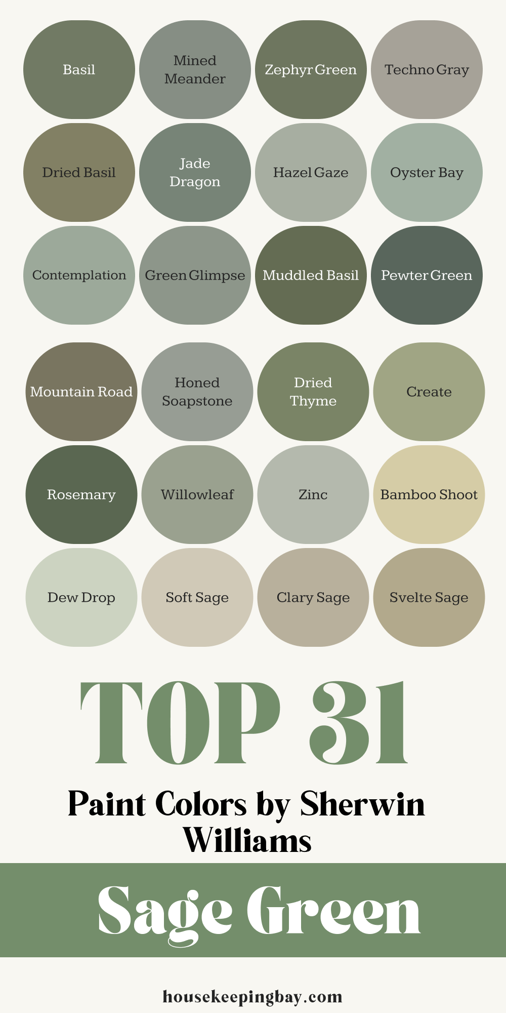
Light Sage Greens
Soft and breezy, perfect for small rooms, bedrooms, or anywhere you want to feel more open.
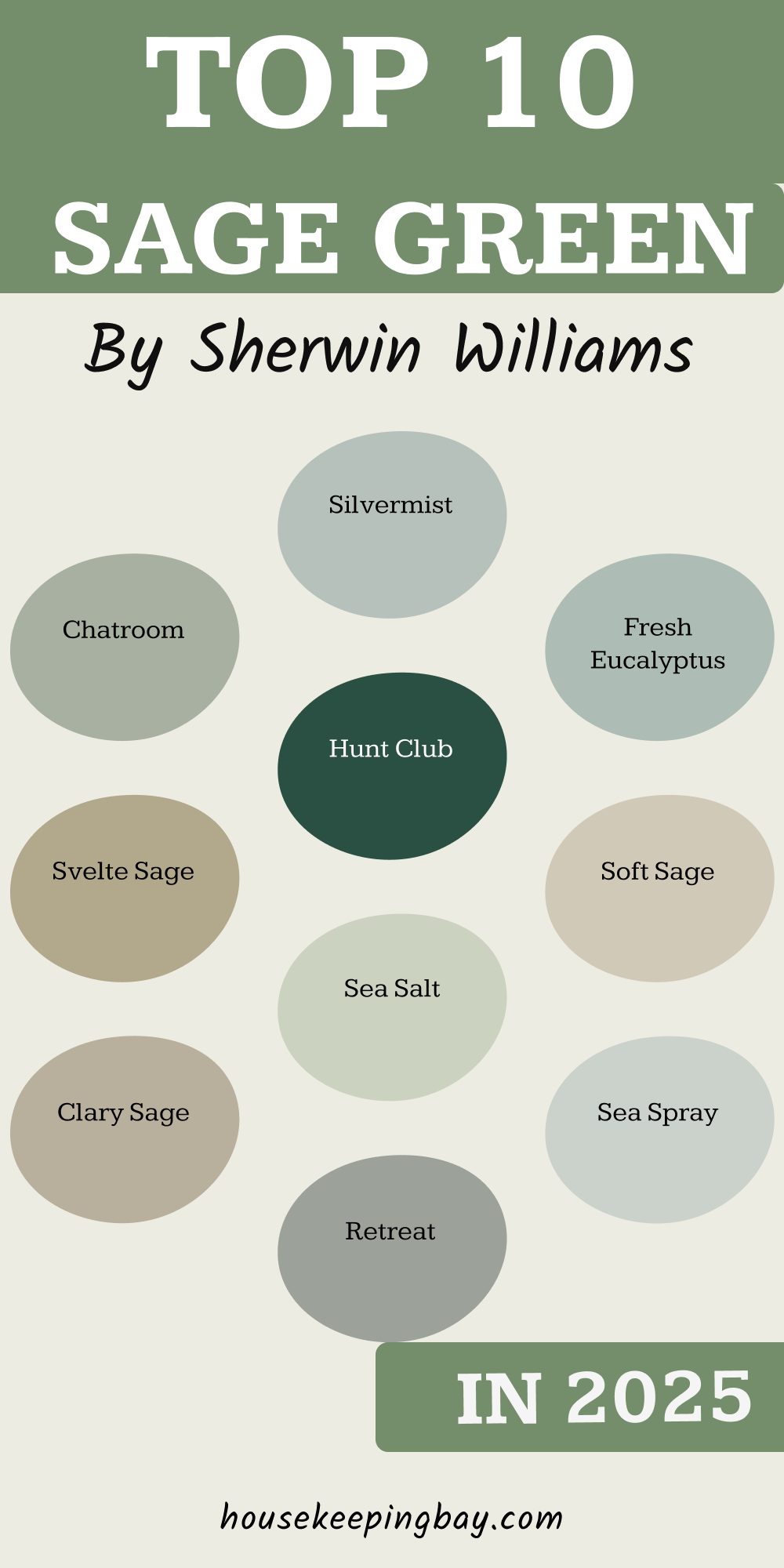
1. SW 9642 Silvermist
- Misty green with a cool undertone.
- Looks amazing in bathrooms or quiet reading corners.
- I used this in a guest room once—felt like a soft morning fog every time you walked in.
2. SW 6171 Chatroom
- A dusty light sage that’s not too warm or cold.
- Works well with natural materials like rattan, linen, and oak.
- Perfect for staging rental properties—it feels modern but easy.
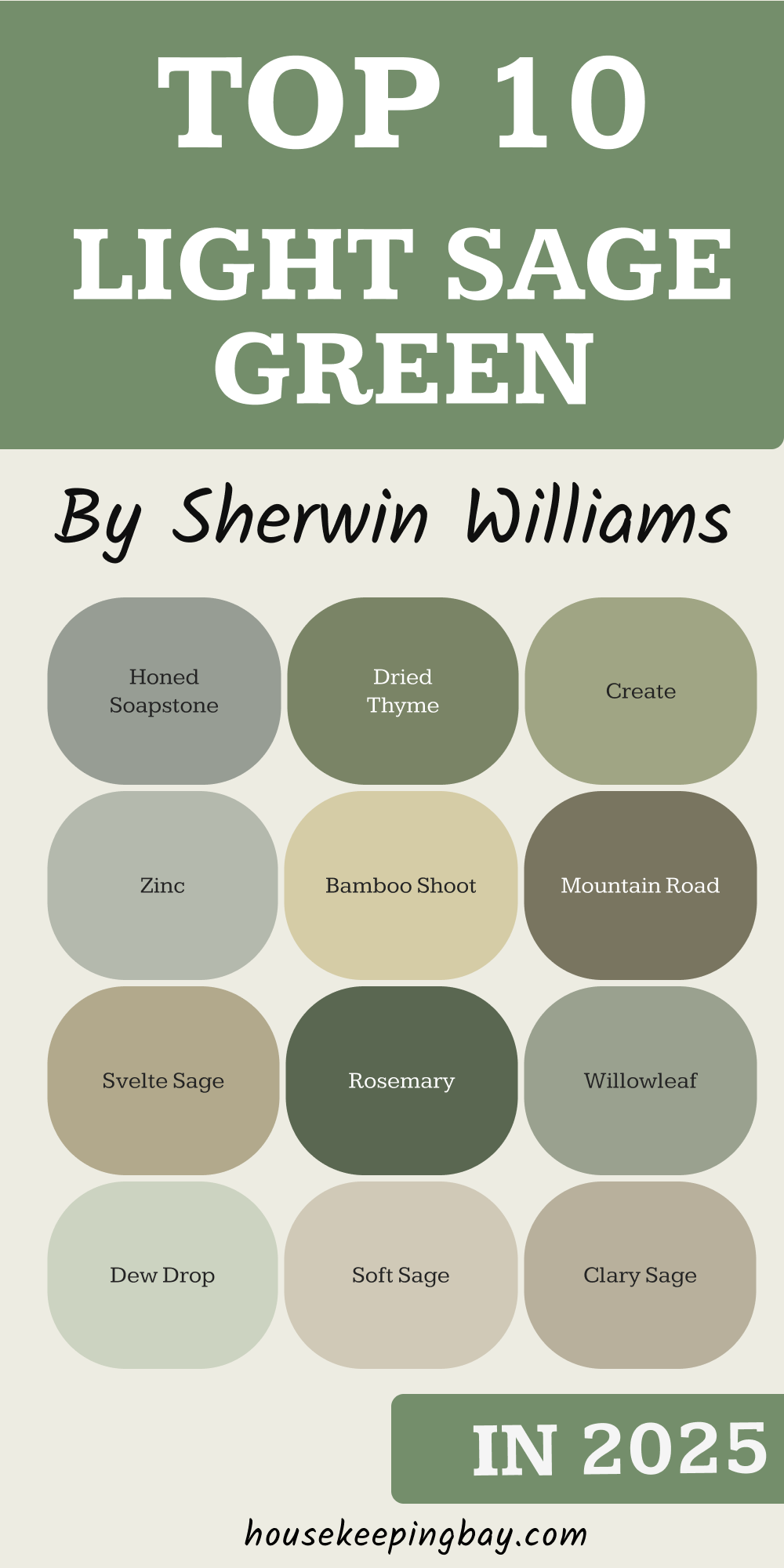
3. SW 6164 Svelte Sage
- Slightly warmer and more olive-toned.
- Looks beautiful with terracotta floors or warm white trim.
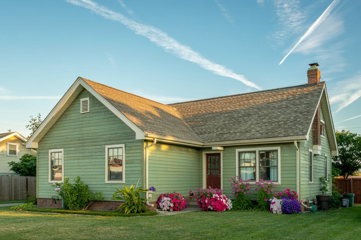
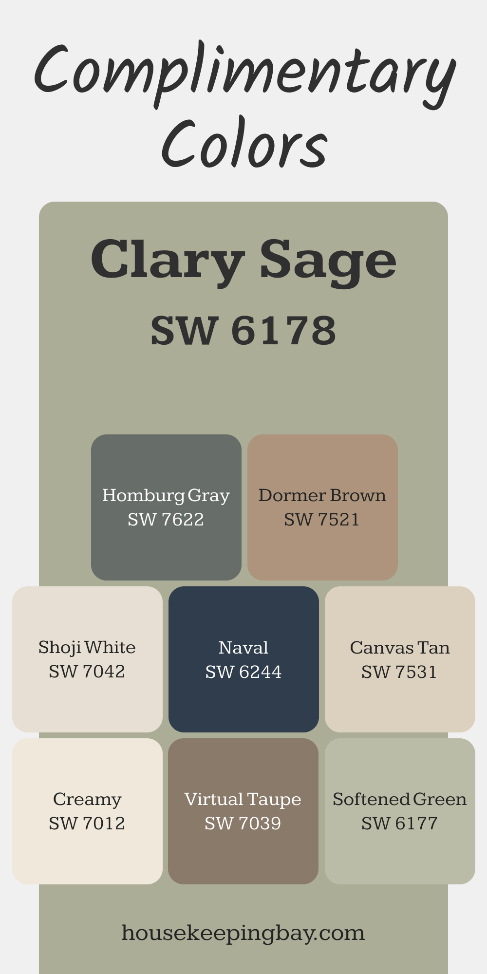
4. SW 6172 Clary Sage
- One of Sherwin-Williams’ most popular green tones.
- A soft herbal green that works just about everywhere.
via housekeepingbay.com
5. SW 9120 Retreat
- Muted with gray undertones, calm but never dull.
- I’ve seen this used beautifully in nurseries.
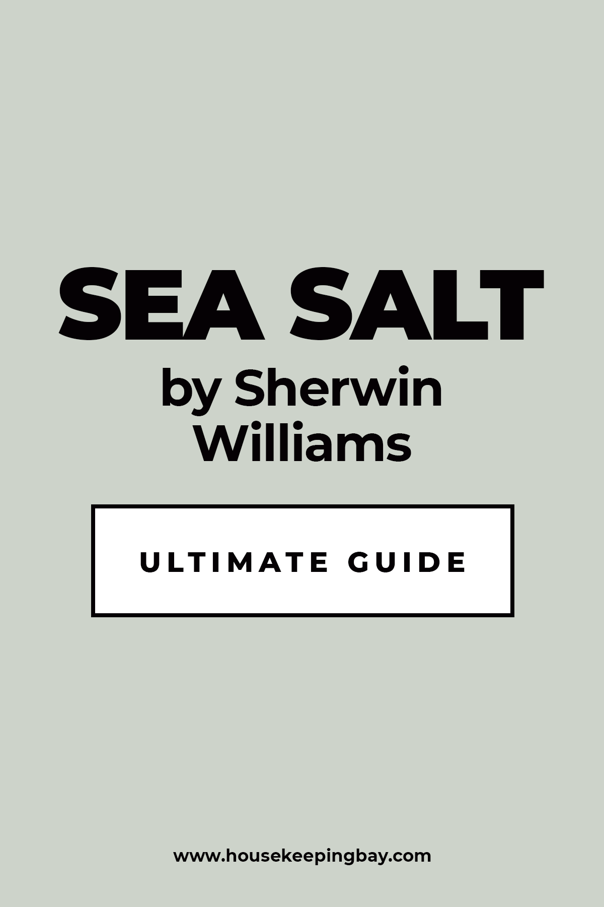
6. SW 6204 Sea Salt
- Technically more of a blue-green, but often reads as sage in bright rooms.
- Spa-like, great for bathrooms.
Housekeepingbay.com
7. SW 9651 Sea Spray
- A newer shade, slightly cooler and very light.
- Blends well with cool gray tiles and marble countertops.
8. SW 9647 Soft Sage
- Warm and creamy with a whisper of green.
- Works well in traditional kitchens with white or cream cabinets.
9. SW 9658 Fresh Eucalyptus
- Just a hint of minty green.
- I once used this on a ceiling with white walls—fresh and unique.
10. SW 6199 Rare Gray
- Sage-meets-gray. Neutral enough for an open floor plan.
- A great pick if you’re nervous about going too green.
housekeepingbay.com
Mid-Tone Sage Greens
A bit richer, great for accent walls, kitchens, dining rooms, or any spot where you want a little more presence.
11. SW 6208 Pewter Green
- Bold, but not overpowering.
- Looks amazing on lower kitchen cabinets or a built-in bookshelf.
- I’ve paired this with unlacquered brass hardware, and wow—it just works.
12. SW 7743 Mountain Road
- Deeper than your typical sage, with earthy brown undertones.
- Great for rustic or cabin-style homes.
13. SW 9126 Honed Soapstone
- A balanced green-gray that feels grown-up.
- I had a client use this in their home office—looked professional but still calming.
14. SW 6168 Dried Thyme
- Think of the herb: soft, faded, and cozy.
- Adds warmth to white or cream interiors.
15. SW 9646 Create
- A fresh, botanical tone without being too bright.
- Great for entryways or mudrooms.
16. SW 6187 Rosemary
- Stronger green, but still grounded.
- Ideal for kitchen islands or laundry rooms.

17. SW 9649 Willowleaf
- Balanced green-gray with a touch of warmth.
- I like this in bedrooms with layered linens and minimal decor.
18. SW 9654 Zinc
- A more modern sage, feels cooler and sleek.
- Works with black and white interiors really well.
19. SW 7735 Bamboo Shoot
- A slightly yellow sage—warmer than most.
- Looks beautiful with woven textures and clay pottery.
20. SW 9644 Dew Drop
- A gentle green that pairs easily with warm wood tones.
- I used this in a home that sold within 5 days—buyers loved how clean it felt.
These are the shades that I recommend when you want sage green to be seen, but not take over the room. Next, we’ll look at those deep, moody sage tones—the ones that make a space feel extra cozy and dramatic.
housekeepingbay.com
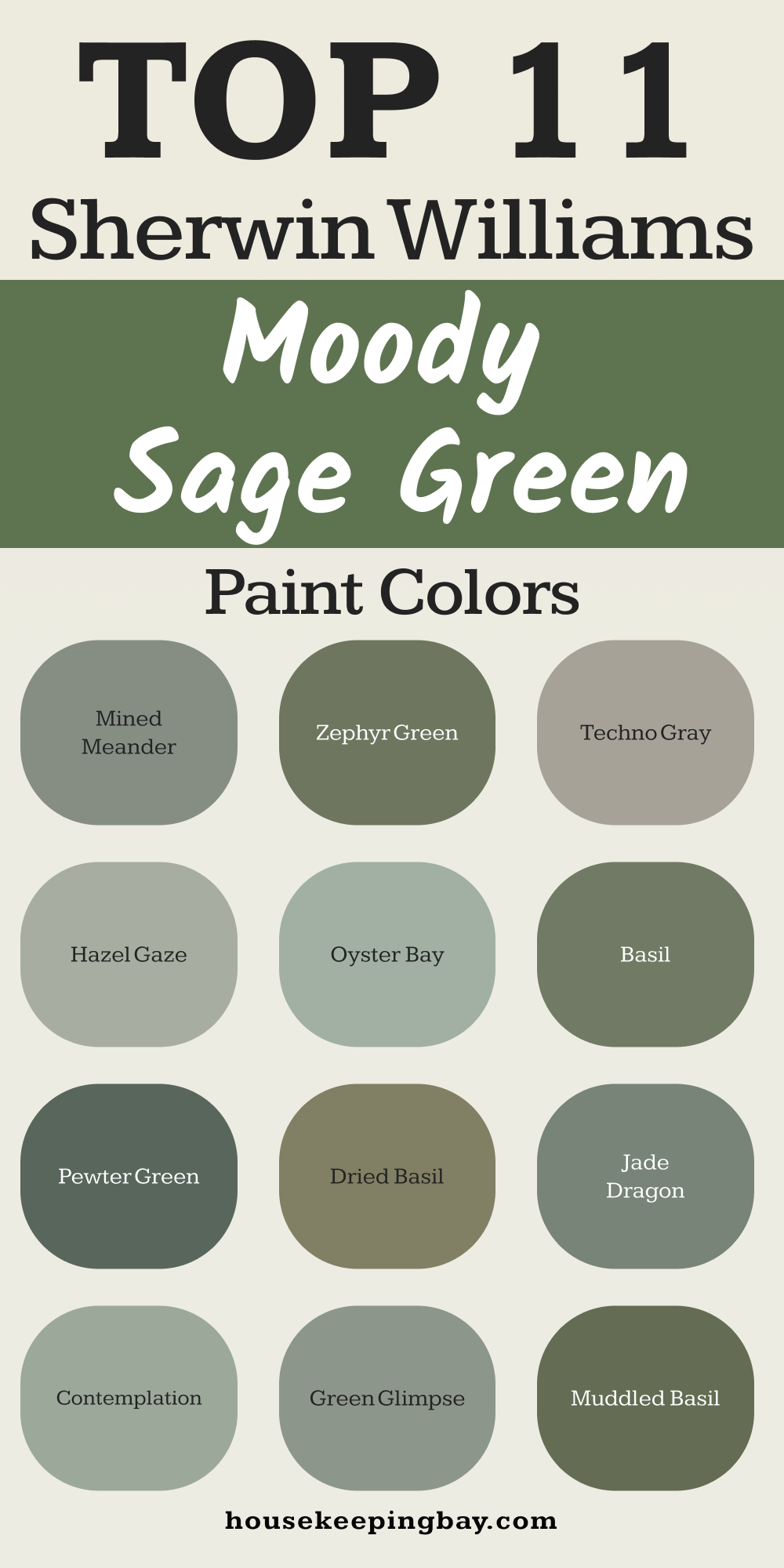
Deep & Moody Sage Greens
These are rich, earthy greens with serious style—perfect for accent walls, cabinetry, or creating a cocooning vibe.
21. SW 6194 Basil
- Bold, botanical, and dramatic.
- I love this on lower kitchen cabinets or a moody bedroom wall.
- Pairs beautifully with white oak and brass.

22. SW 6186 Dried Basil
- Slightly lighter than Basil, with a hint of olive.
- Warm and comforting, especially in dining rooms.
23. SW 9645 Mined Meander
- Dark with cool undertones—almost a charcoal green.
- Gorgeous for home libraries or a modern powder room.
24. SW 7744 Zephyr Green
- Deep but with a classic, almost vintage feel.
- I used this in a client’s stairwell—turned a bland space into a beautiful moment.
25. SW 6170 Techno Gray
- A moody gray-green, very subtle but strong.
- One of my favorite colors for staging living rooms with dark leather or linen.

26. SW 9123 Jade Dragon
- A bolder take on sage with a jade touch.
- Works really well with black accents and wood floors.
27. SW 9652 Hazel Gaze
- A darker version of Sea Spray—cool and grounded.
- Clients love this in windowless bathrooms where a little drama helps.
28. SW 6206 Oyster Bay
- Calm and rich, with strong gray undertones.
- One of the best colors if you want sage that still feels modern.
29. SW 9648 Contemplation
- Deeper, slightly cooler sage.
- I’ve used this in entryways to instantly create a peaceful feel.
30. SW 9643 Green Glimpse
- A moody, shadowy green that reads luxe.
- Perfect for a home office or media room.
31. SW 7745 Muddled Basil
- Deep and earthy with an almost smoky finish.
- If you want sage that feels grounded and strong—this is it.
housekeepingbay.com
Where to Use Sage Green in Your Home
Sage green works in almost every room—but picking the right shade for the right spot makes all the difference. I’ve worked in homes where just painting a door sage green made the whole place feel cozier. Here’s how I usually decide where it goes:
Bedrooms
Soft sage greens like SW 6172 Clary Sage or SW 9644 Dew Drop make bedrooms feel restful and calm. I often pair them with creamy bedding, light wood, and minimal decor.
If you want something a bit deeper for a cozier vibe, SW 6206 Oyster Bay is a dream
Bathrooms
This is where sage green really shines. Cool tones like SW 6204 Sea Salt or SW 9642 Silvermist look fresh with white tile or marble.
I once painted an entire powder room in SW 9643 Green Glimpse—even the ceiling. The result? A little jewel box that made everyone stop and stare.
Kitchens
Cabinets, islands, or full walls—sage green does it all.
For a modern kitchen, SW 6208 Pewter Green on lower cabinets with white uppers is stunning.
In more rustic or cottage styles, I lean toward SW 6187 Rosemary or SW 6164 Svelte Sage.
Kids’ Rooms and Nurseries
Kids need calm too. I’ve used SW 9120 Retreat in a nursery with natural wood furniture and cloud decals—it was adorable and not too “baby-ish,” so it could grow with the child.
Unexpected Spots That Make a Huge Impact
Here are some fun and surprisingly beautiful places I’ve added sage green:
- Interior doors: A medium sage like SW 6168 Dried Thyme adds just enough character.
- Ceilings: Light sage on the ceiling in a white room? Subtle magic.
- Built-ins: Try SW 7744 Zephyr Green inside a bookcase or pantry for depth.
A Real-World Example
One couple I worked with had a very open layout with little personality. We painted just the dining area in SW 7735 Bamboo Shoot, added simple linen curtains, and suddenly the whole space felt warm and defined. It’s like the walls finally belonged to the home.
How to Pair Sage Green with Other Colors & Materials
Once you’ve found your perfect sage green, the next step is making sure it plays nicely with everything else. Here’s what I usually recommend to clients—and use in my own projects.
Colors That Love Sage Green
- Warm Whites – Creamy tones like Sherwin-Williams Alabaster (SW 7008) or Greek Villa (SW 7551) soften sage beautifully.
- Blush & Dusty Rose – This combo is soft and modern without being sweet. Try a dusty pink pillow or rug.
- Terracotta & Rust – I’ve used terracotta planters or cushions with sage—it adds energy without clashing.
- Charcoal or Black – Especially with deeper sages, black accents add structure and contrast.
- Gold & Brass – Whether it’s hardware or lighting, warm metals bring out sage’s richness.
Materials That Match
- Natural Wood – Light oak, walnut, even bamboo all bring out the earthy side of sage.
- Linen & Cotton – These soft textures keep the look cozy, not cold.
- Rattan or Wicker – Great for accent chairs, mirrors, or storage—especially with lighter sage tones.
- Stone & Marble – For bathrooms or kitchens, sage green pairs like a dream with gray or white stone.
One Last Thing Before You Paint
Sage green isn’t just pretty—it’s peaceful, honest, and welcoming. It has a way of making a room feel lived-in without feeling tired. Over the years, I’ve seen it help homes sell faster, make renters feel grounded, and help overwhelmed clients breathe easier.
If I had to pick one go-to, it would be SW 6172 Clary Sage. It’s soft, flexible, and never disappoints—kind of like a good friend.
And remember: your home doesn’t have to be perfect. But when it feels right? That’s when it starts to feel like yours.
housekeepingbay.com
