Pristine OC-75 Paint Color by Benjamin Moore
A Comprehensive Insight to Discover the Color
In the vibrant world of interior design, paint colors are not just about hue; they define moods, perceptions, and the very ambiance of a room. Amongst the vast spectrum, Pristine OC-75, a shade from Benjamin Moore, has been recognized for its elegant subtlety and adaptability.
This article delves into the specifics of this color, analyzing its undertones, effects under different lighting, and how it harmonizes with other colors.
via benjamin moore
What Color Is Pristine OC-75?
Table of Contents
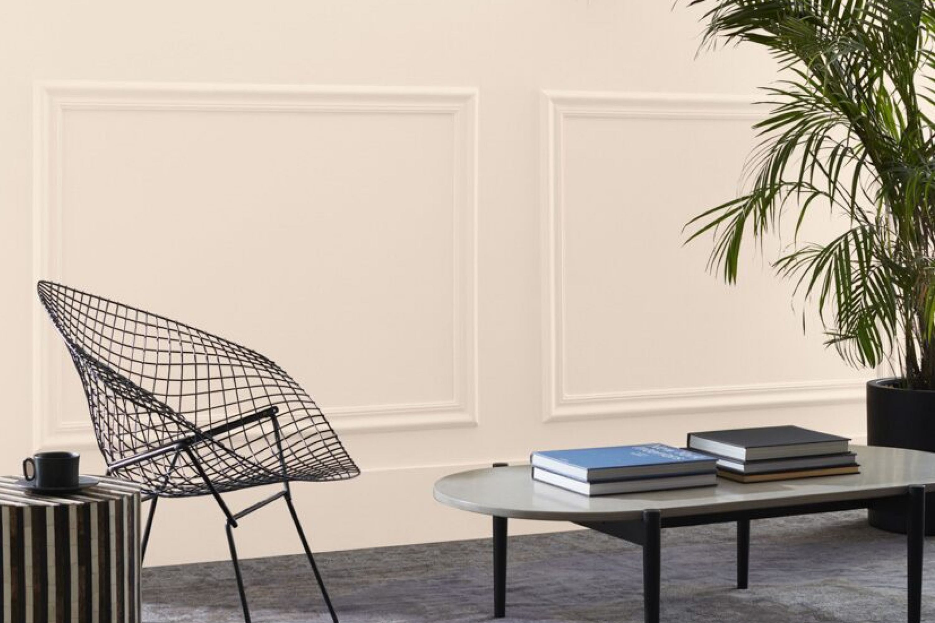
Pristine OC-75 is a sophisticated shade that lies on the lighter end of the neutral spectrum. It exudes a tranquil vibe and strikes a perfect balance, neither too stark nor too warm. Its muted undertones make it ideal for a range of interior styles from modern minimalist to classic.
With its adaptable nature, Pristine OC-75 pairs exquisitely with a plethora of materials such as sleek marble, rustic wood, or even reflective metals. Textures like matte, glossy, or even distressed finishes find a harmonious backdrop in this shade, allowing for versatile design possibilities.
housekeepingbay.com
Is It a Warm Or Cool Color?
Pristine OC-75 walks a delicate line between warm and cool, leaning slightly towards the cool spectrum. This semi-cool nature means that in homes, it can offer a refreshing and calming feel, making spaces seem larger and airier.
Its subtle coolness can balance out rooms that receive excessive warm lighting, ensuring that the ambiance remains comfortable and inviting.
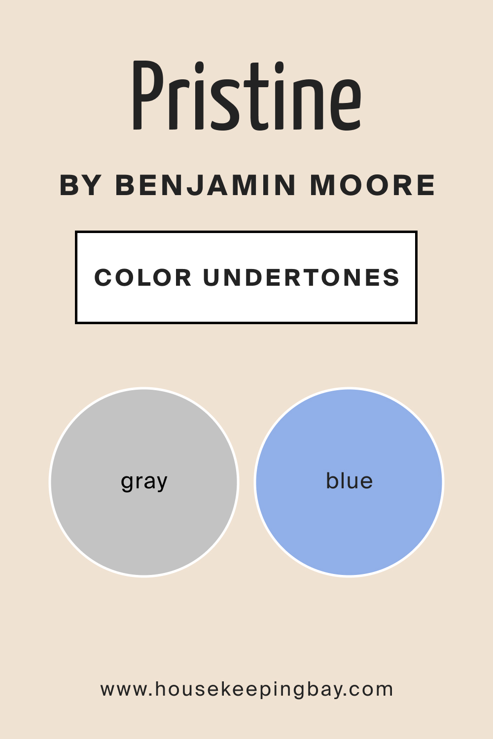
Undertones of Pristine OC-75
Every color has undertones, subtle hues within the primary color that influence how it is perceived. In the case of Pristine OC-75, it carries subtle undertones of gray and blue, adding depth and dimension. These undertones are particularly influential in determining how the color appears in relation to other shades in the room.
They can make the color seem cooler or warmer, depending on adjacent colors and the type of lighting in the space.
housekeepingbay.com
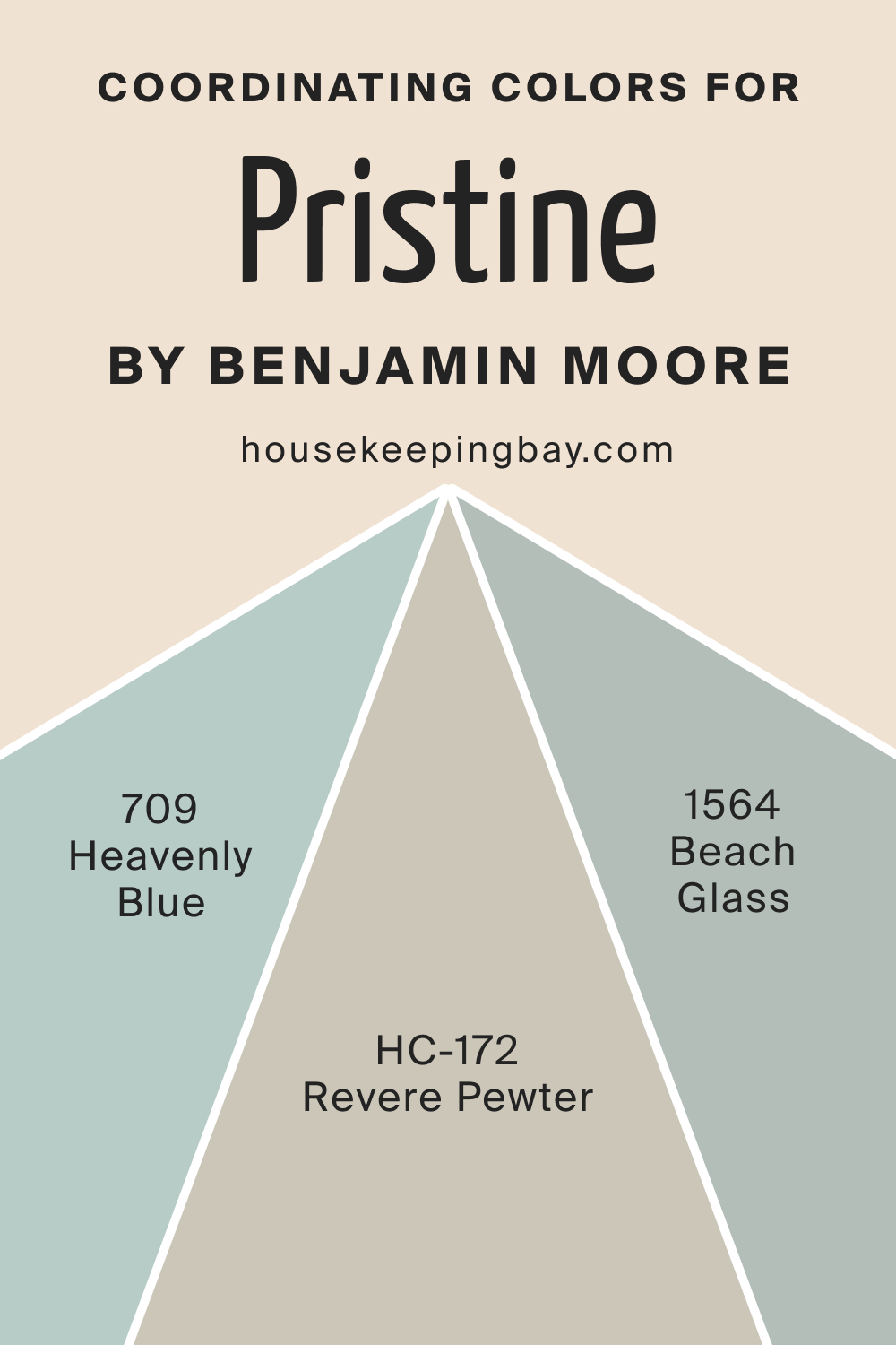
Coordinating Colors of Pristine OC-75
Coordinating colors serve to complement and enhance the primary shade, ensuring visual balance. For Pristine OC-75, several colors from Benjamin Moore’s palette fit the bill:
- Revere Pewter HC-172 : A light gray with warm undertones, providing a neutral backdrop.
- Heavenly Blue 709 : A gentle sky-blue, evoking freshness and calm.
- Beach Glass 1564 : A muted green-blue reminiscent of serene coastal vistas.
Additionally, colors like Silver Satin OC-26, Grey Owl 2137-60, and Wickham Gray HC-171 can also seamlessly blend with Pristine OC-75, offering varied design possibilities.
housekeepingbay.com
How Does Lighting Affect Pristine OC-75?
Lighting plays a pivotal role in color perception. In artificial light, especially tungsten, Pristine OC-75 may appear warmer due to the yellow undertones of the light source. Contrastingly, LED or fluorescent lighting might accentuate its cool undertones.
In natural light, this color is at its purest, reflecting calm neutrality. Its appearance shifts subtly with the direction of the room:
- North-facing rooms: Slightly cooler and muted.
- South-facing rooms: Brighter and warmer due to abundant sunlight.
- East-facing rooms: Warm and golden in the morning, transitioning to cooler in the afternoon.
- West-facing rooms: A cooler tint during mornings, turning warmer by evening.
housekeepingbay.com
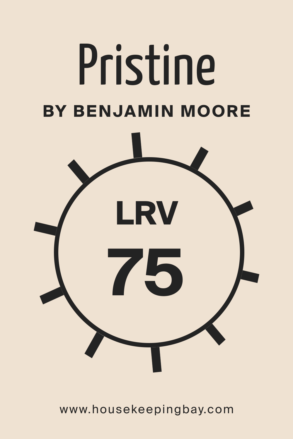
LRV of Pristine OC-75
LRV, or Light Reflectance Value, indicates the percentage of light a color reflects. With an LRV of 75, Pristine OC-75 is a high reflectance color, capable of making spaces appear larger and more luminous. LRV greatly influences perception; colors with high LRV values can amplify the brightness of a room, making them ideal for smaller spaces or rooms with limited natural light.
The LRV of Pristine OC-75 ensures that it remains consistent under various lighting, highlighting its versatility.
housekeepingbay.com
What is LRV? Read It Before You Choose Your Ideal Paint Color
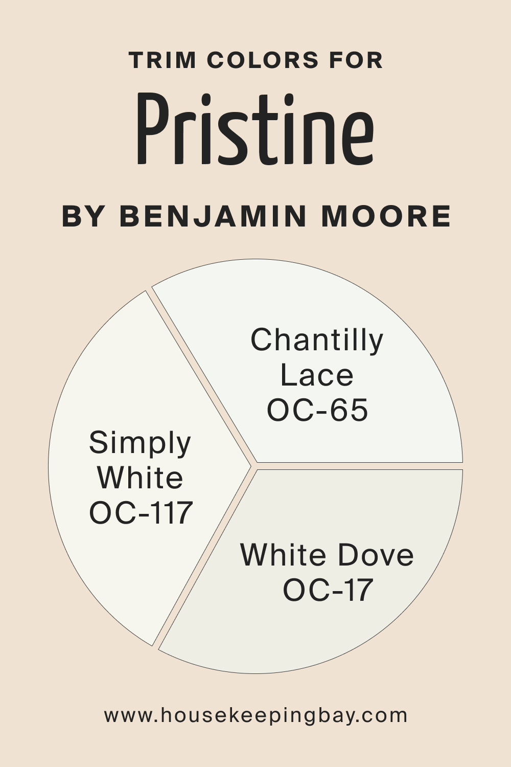
Trim Colors of Pristine OC-75
Trim colors are pivotal in defining architecture and enhancing room aesthetics. For Pristine OC-75, the ideal trim colors are shades of white that provide a clean and crisp boundary. Some Benjamin Moore recommendations are:
- White Dove OC-17 : A soft, warm white.
- Chantilly Lace OC-65 : A bright, clean white.
- Simply White OC-117 : A versatile, neutral white.
Trim colors can either create a subtle transition or a contrasting boundary. By selecting the appropriate shade of white, Pristine OC-75’s elegance can be further accentuated, ensuring a holistic and harmonious interior design.
housekeepingbay.com
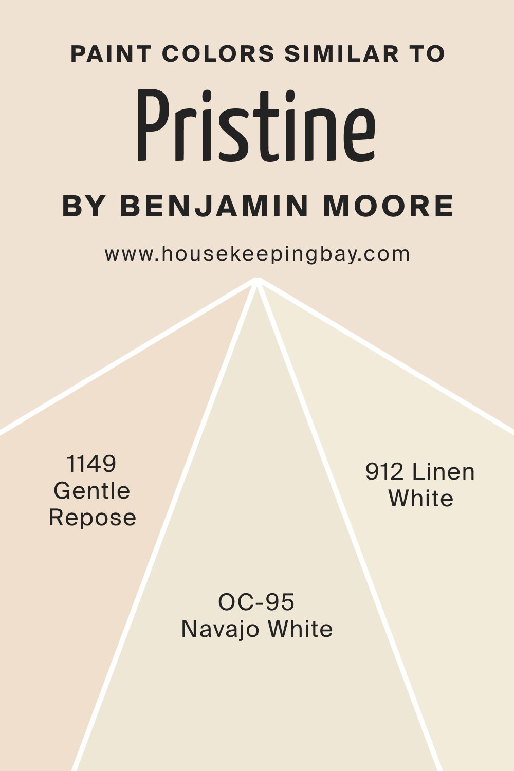
Colors Similar to Pristine OC-75
Knowing similar colors to a preferred shade is crucial in interior design, especially when aiming for a cohesive look or trying to match an existing color that may be discontinued or unavailable. It allows flexibility without compromising on the desired aesthetic.
Three colors from Benjamin Moore, which resemble Pristine OC-75, include:
- BM Gentle Repose 1149 : This color echoes a soft grayish hue with muted undertones, perfect for serene settings and minimalist designs. It carries the calmness of a misty morning, adaptable and timeless.
- BM Navajo White : A delicate off-white with slight yellow undertones, Navajo White exudes warmth and coziness, making it ideal for spaces aiming for a welcoming feel.
- BM Linen White : An inviting pale white with a touch of beige, Linen White provides an elegant backdrop, ensuring a fresh yet comfortable ambiance.
housekeepingbay.com
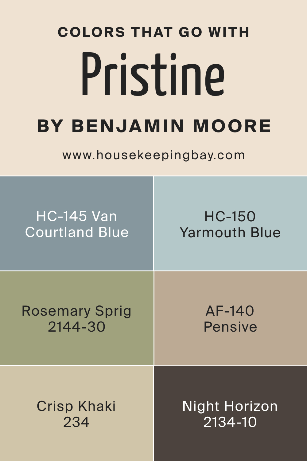
Colors That Go With Pristine OC-75
A harmonious color palette is the backbone of visually appealing interiors. Colors that complement each other enhance the overall aesthetic and create a balanced ambiance. The beauty of Pristine OC-75 lies in its versatility.
When paired with a variety of other colors, its neutral undertones can either recede to let the other shades shine or step forward to create a harmonious balance. Alongside Pristine OC-75, use colors like:
- HC-145 Van Courtland Blue , a rich, muted blue reminiscent of vintage charm
- AF-140 Pensive, a deeper, contemplative shade of gray
- BM Crisp Khaki 234 : Crisp Khaki exudes an earthy, grounded feel that contrasts beautifully with the light and airy vibes of Pristine OC-75. Together, they conjure images of sandy beaches meeting clear blue skies. In interiors, this pairing brings a balance of warmth and freshness, making spaces feel both cozy and open.
- BM Rosemary Spring 2144-30 V : Rosemary Spring is a vibrant green with depth reminiscent of lush foliage. When paired with the subtleness of Pristine OC-75, it creates a lively yet sophisticated palette. The muted backdrop of Pristine allows the vibrancy of Rosemary Spring to pop, giving spaces a touch of nature-inspired vivacity.
- BM Night Horizon 2134-10 : A deep, almost black shade, Night Horizon provides a stark contrast to Pristine OC-75. This pairing is dramatic and bold, where Pristine OC-75 softens the intensity of Night Horizon. In spaces, this duo offers depth and dimension, evoking a modern and edgy aesthetic.
- HC-150 Yarmouth Blue : Yarmouth Blue is a soft, watery blue that harmoniously aligns with Pristine OC-75. Both shades have a calming effect, and together they create a serene and tranquil ambiance reminiscent of a gentle coastal setting. In interiors, this combination is perfect for creating relaxing spaces that invoke feelings of peace and calm.
In essence, Pristine OC-75’s adaptability ensures that whether paired with earthy tones, vibrant hues, deep shades, or soft tints, the result is always aesthetically pleasing and harmonious.
housekeepingbay.com
How to Use Pristine OC-75 In Your Home?
Pristine OC-75 is a versatile shade, fitting seamlessly into various rooms and design styles. Its neutral undertone makes it apt for minimalist, contemporary, coastal, or even traditional styles. Whether it’s the muted elegance for a study or the calming backdrop for a nursery, Pristine OC-75’s adaptability is commendable.
How to Use Pristine OC-75 in the Bedroom?
For bedrooms, Pristine OC-75 offers a restful environment. Paired with soft linens, plush rugs, and subtle decor accents, it creates a sanctuary for relaxation, encouraging tranquility and restorative sleep.

housekeepingbay.com
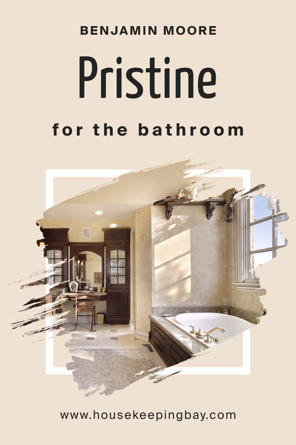
How to Use Pristine OC-75 in the Bathroom?
In bathrooms, Pristine OC-75 invokes a spa-like atmosphere. It complements natural elements like stone or wood and pairs well with metallic fixtures, ensuring a refreshing and modern aesthetic.
housekeepingbay.com
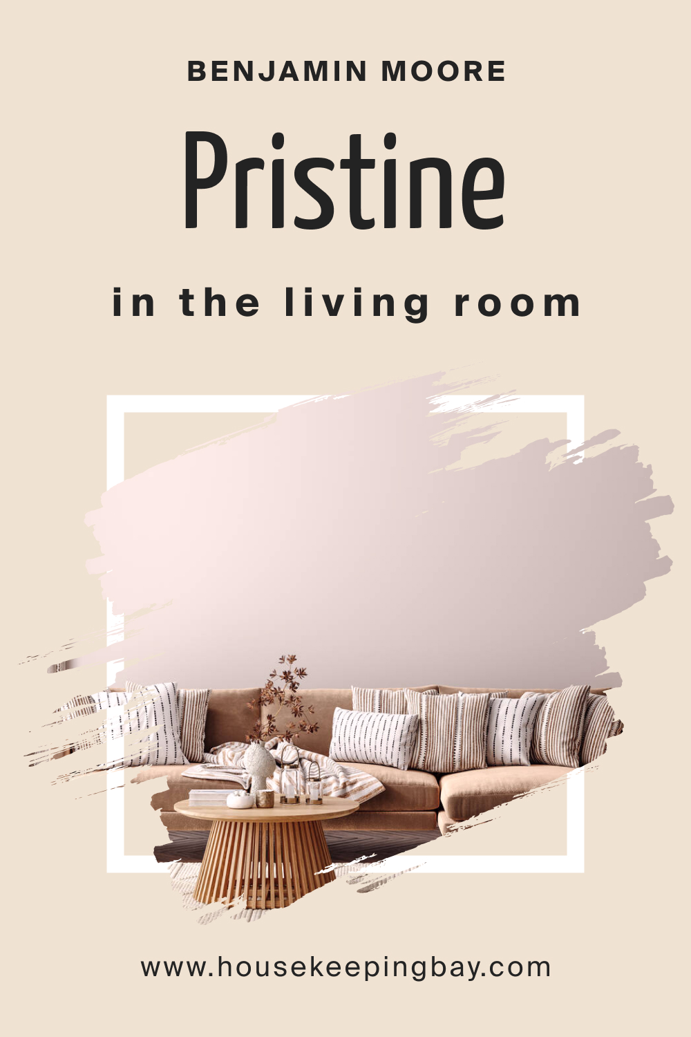
How to Use Pristine OC-75 in the Living Room?
For living rooms, Pristine OC-75 sets a neutral canvas. It accentuates colorful artwork, elegant furniture, and diverse textures, fostering a space that’s both lively and harmonious.
housekeepingbay.com
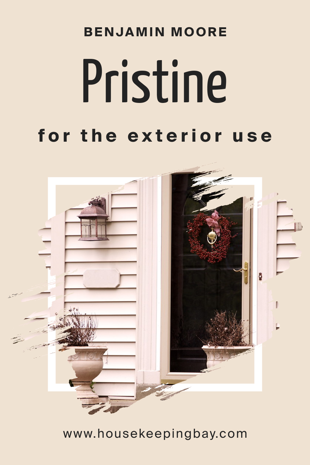
How to Use Pristine OC-75 for an Exterior?
On exteriors, Pristine OC-75 offers a sophisticated curb appeal. Whether on siding or as an accent, it stands resilient against changing seasons, offering a timeless facade.
housekeepingbay.com
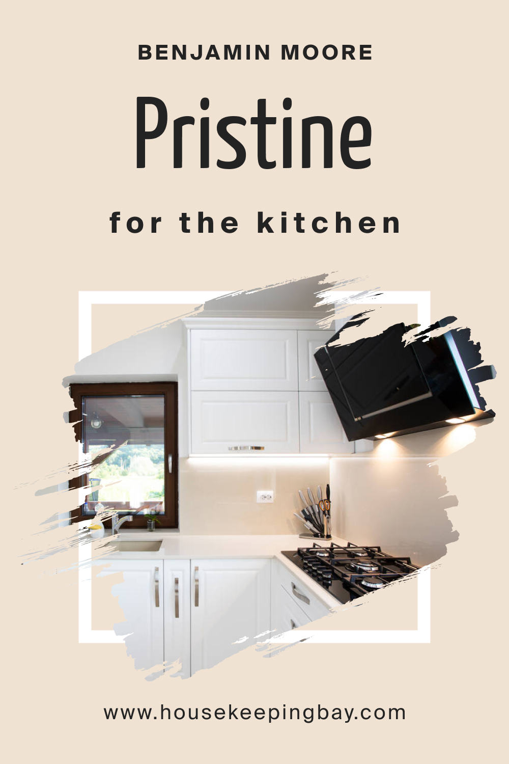
How to Use Pristine OC-75 in the Kitchen?
Pristine OC-75 in the kitchen results in a clean, airy environment. It enhances natural light, making the space feel expansive. Paired with wooden counters or metallic accents, it offers a modern yet warm feel.
housekeepingbay.com
Comparing Pristine OC-75 With Other Colors
Comparing different colors is vital in interior design and decoration. It not only aids in understanding the individual uniqueness of each color but also in discerning how they interact with each other. Such comparisons help in creating desired moods, evoking specific feelings, and defining spaces.
Colors, even if they are subtly different, can create distinct ambiances. By juxtaposing them, one can make informed decisions tailored to the specific needs and aesthetics of a space.
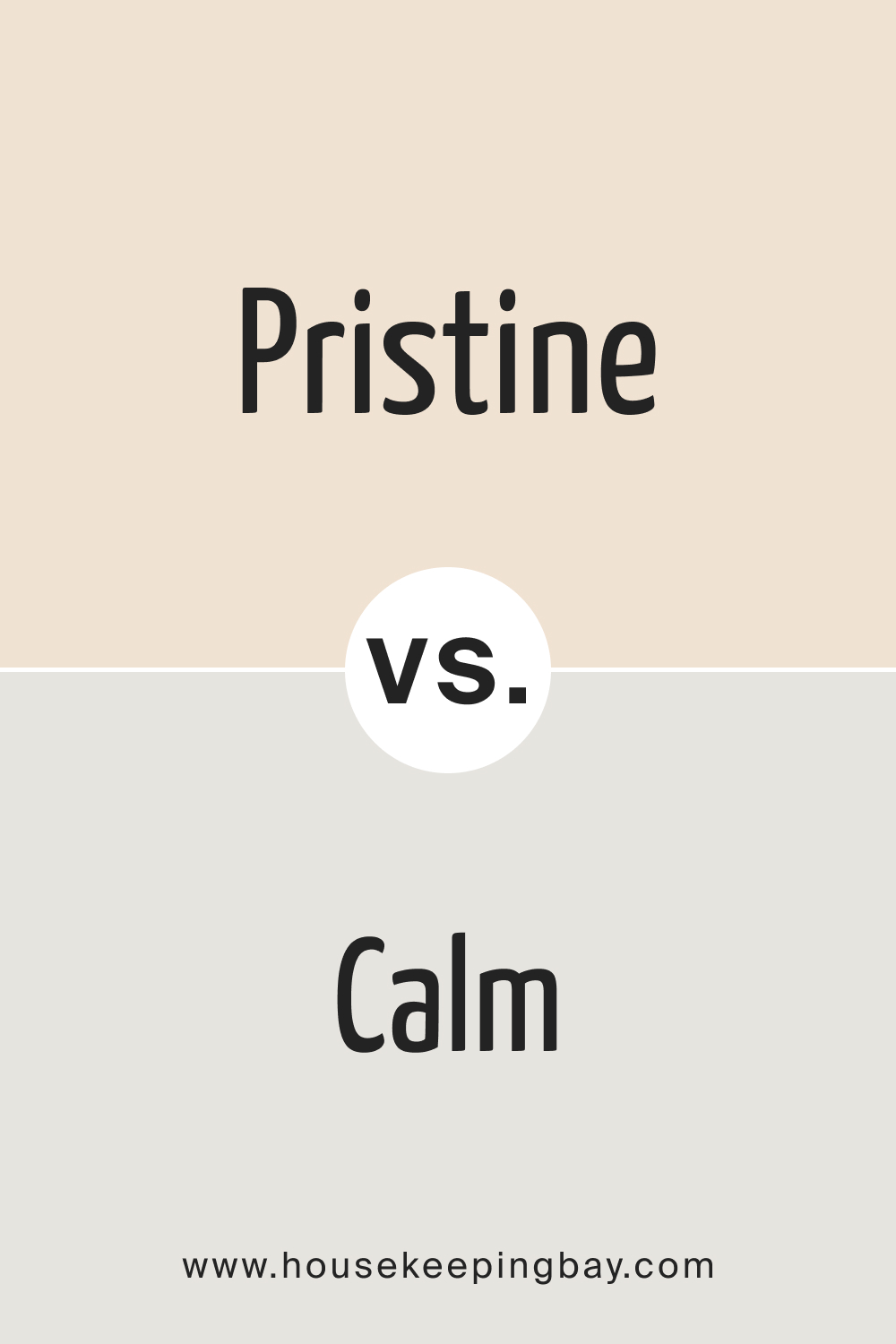
Pristine OC-75 vs. OC-22 Calm
While both Pristine OC-75 and OC-22 Calm reside in the neutral family, their nuances make a difference. Pristine has a gentle, airy quality, bringing a sense of spaciousness to rooms. Calm, true to its name, has a tranquil essence, introducing a soothing atmosphere, perfect for relaxation and meditation spaces.
housekeepingbay.com
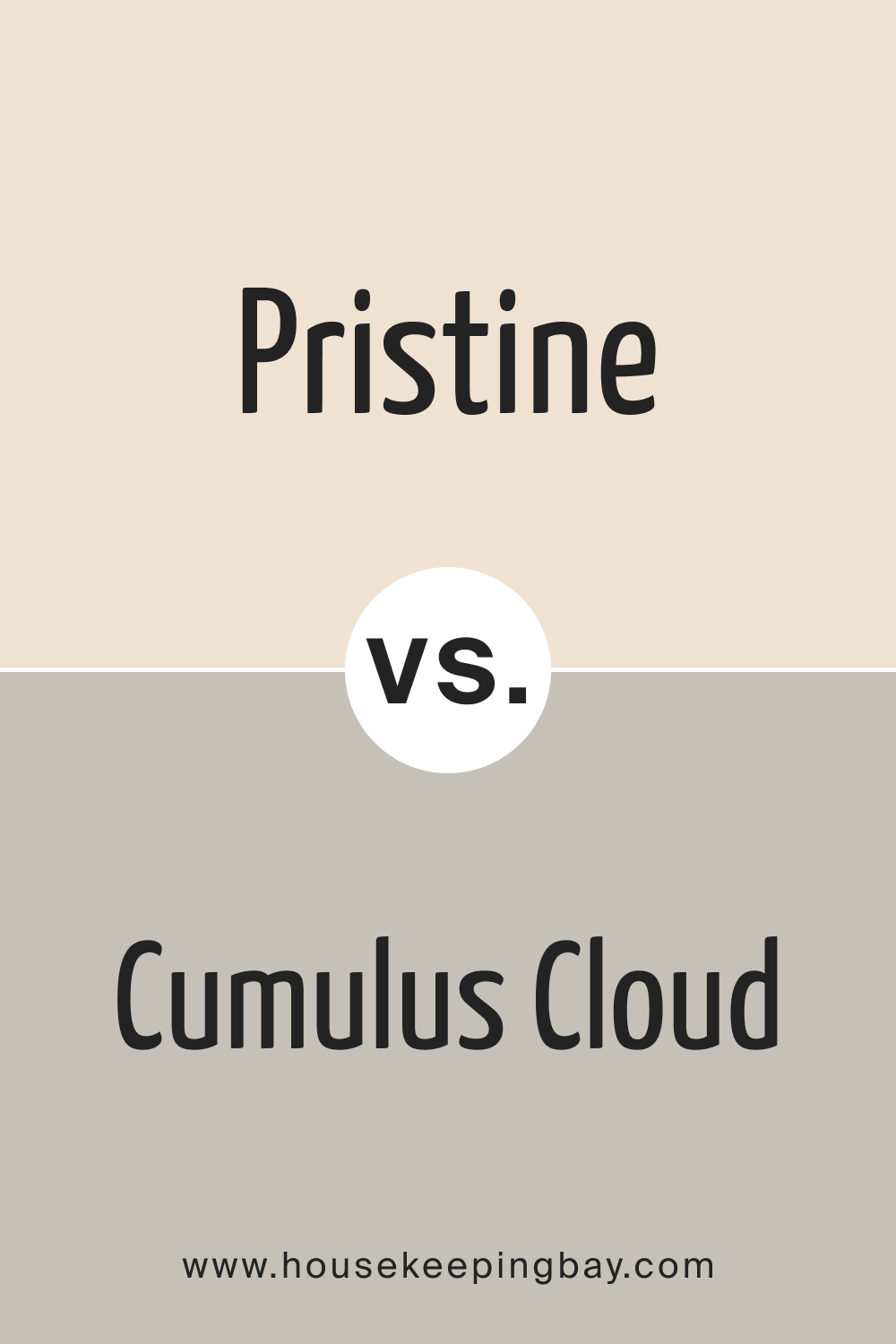
Pristine OC-75 vs. BM Cumulus Cloud 1550
Cumulus Cloud 1550 offers a slightly deeper, grayish hue, suggesting the overcast sky’s mystery and depth. In contrast, Pristine OC-75 is lighter and airier. When paired, they provide a balance, with Cumulus lending gravity and Pristine offering levity.
housekeepingbay.com
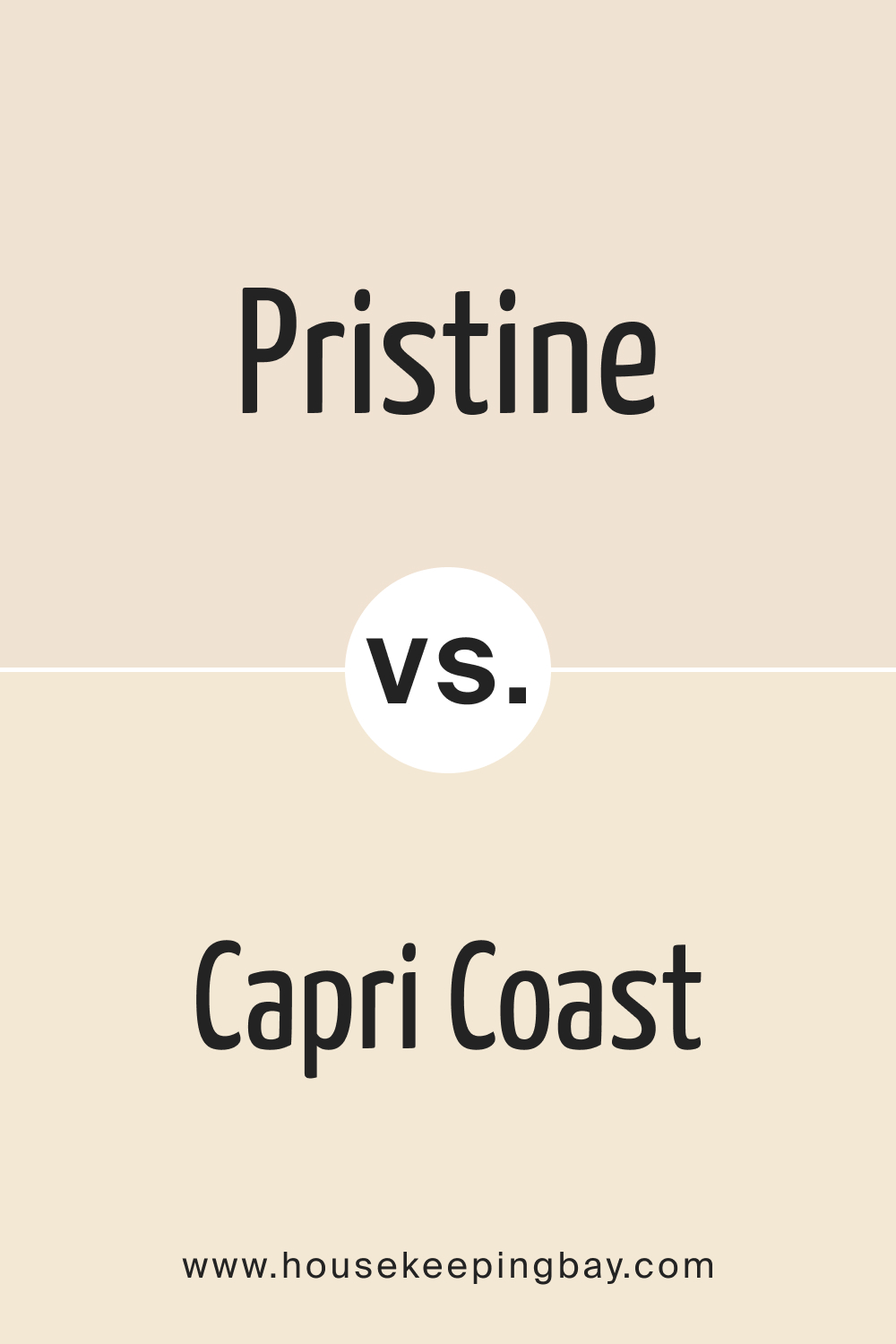
Pristine OC-75 vs. OC-87 Capri Coast
OC-87 Capri Coast exudes a coastal charm reminiscent of sandy shores. It’s warmer and earthier than Pristine OC-75. While Pristine offers an ethereal touch, Capri Coast grounds a space, making them a harmonious pair for a beach-inspired theme.
housekeepingbay.com
Pristine OC-75 vs. BM Ocean Air 2123-50
BM Ocean Air 2123-50 carries the freshness of a gentle sea breeze. It’s a soft blue that complements Pristine’s neutral vibe. Together, they can create a breezy, coastal feel, where Pristine amplifies the luminosity of Ocean Air.
housekeepingbay.com
Pristine OC-75 vs. BM Majestic Blue 2051-40
BM Majestic Blue 2051-40 is deep, rich, and evocative of clear night skies. This strong shade contrasts the light and delicate Pristine OC-75. In spaces, while Majestic Blue becomes a focal point, Pristine provides a calming counterpoint.
housekeepingbay.com
Pristine OC-75 vs. OC-86 White Blush
OC-86 White Blush is a delicate off-white with subtle pink undertones. It radiates warmth and femininity. Pristine OC-75, being neutral, balances out the soft warmth of White Blush, ensuring spaces feel fresh yet cozy.
housekeepingbay.com
Conclusion
The art of color comparison is akin to understanding the notes in music. Each has its tone, mood, and resonance. Pristine OC-75’s versatility is evident when juxtaposed against a palette of varied shades. Its ability to both harmonize and contrast ensures its rightful place in an array of design narratives.
housekeepingbay.com
Ever wished paint sampling was as easy as sticking a sticker? Guess what? Now it is! Discover Samplize's unique Peel & Stick samples. Get started now and say goodbye to the old messy way!
Get paint samples


Frequently Asked Questions
⭐What kind of undertones does Pristine OC-75 have?
Pristine OC-75 boasts subtle neutral undertones, making it a versatile choice that pairs harmoniously with a wide range of colors without being overpowering.
⭐Is Pristine OC-75 more suitable for interiors or exteriors?
While Pristine OC-75 is adaptable for both interiors and exteriors, its calming and neutral qualities make it especially popular for interior spaces like living rooms and bedrooms.
⭐How does Pristine OC-75 appear under different lighting conditions?
Lighting can influence how Pristine OC-75 is perceived. Under natural light, it appears bright and airy, while under artificial lighting, its subtle undertones may become more pronounced.
⭐What are the best trim colors to pair with Pristine OC-75?
Pristine OC-75 pairs beautifully with crisp whites or soft off-whites, enhancing its neutral charm and ensuring a seamless flow in the decor.
⭐Is Pristine OC-75 a warm or cool shade?
Pristine OC-75 leans more towards the neutral spectrum, making it neither distinctly warm nor cool. Its balanced undertone makes it a favorite for varied design aesthetics.