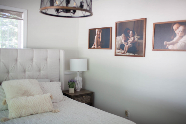
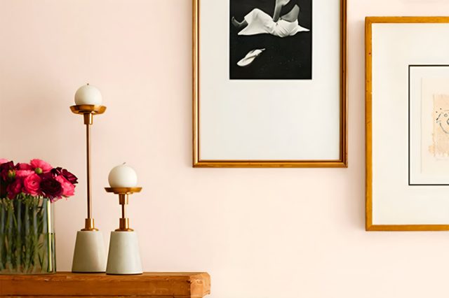
Nutshell SW 6040 by Sherwin Williams
Warm Neutrals: Transforming Spaces with Earthy Elegance
The article on SW 6040 Nutshell by Sherwin Williams is your handy guide to understanding everything about this unique paint color. Nutshell is a versatile shade that belongs to a family of warm neutrals, perfect for creating cozy and inviting spaces.
Whether you’re tnhinking about painting a room, a piece of furniture, or adding subtle accents to your home, Nutshell offers a timeless appeal that works well in a variety of settings.
In this article, we’ll explore the characteristics of the SW 6040 Nutshell color, providing you with insights on how it looks in different lighting conditions and what color palettes it pairs well with.
We’ll also share practical tips on applying this color in your decorating projects and offer inspiration on how to integrate it seamlessly into your home decor.
From living rooms to bedrooms and beyond, discover how Nutshell can transform your space into a warm haven.
Whether you’re a seasoned decorator or just starting out on your home improvement journey, this article aims to give you all the information you need about SW 6040 Nutshell.
Get ready to find out how this beautiful shade can enhance your home and create a welcoming atmosphere for everyone who steps inside.
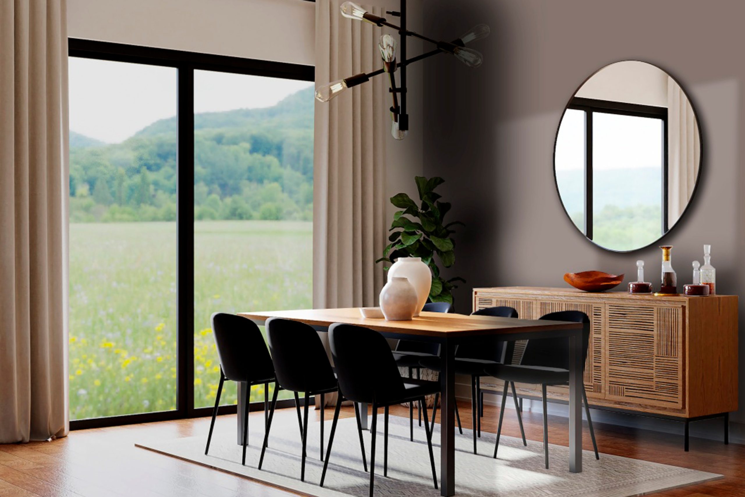
via sherwin-williams.com
What Color Is Nutshell SW 6040 by Sherwin Williams?
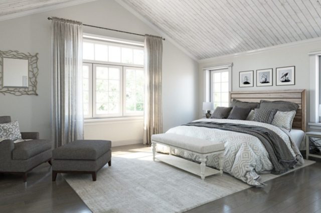
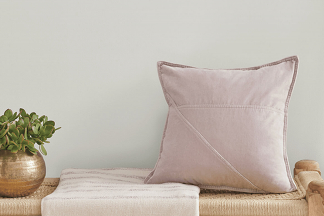
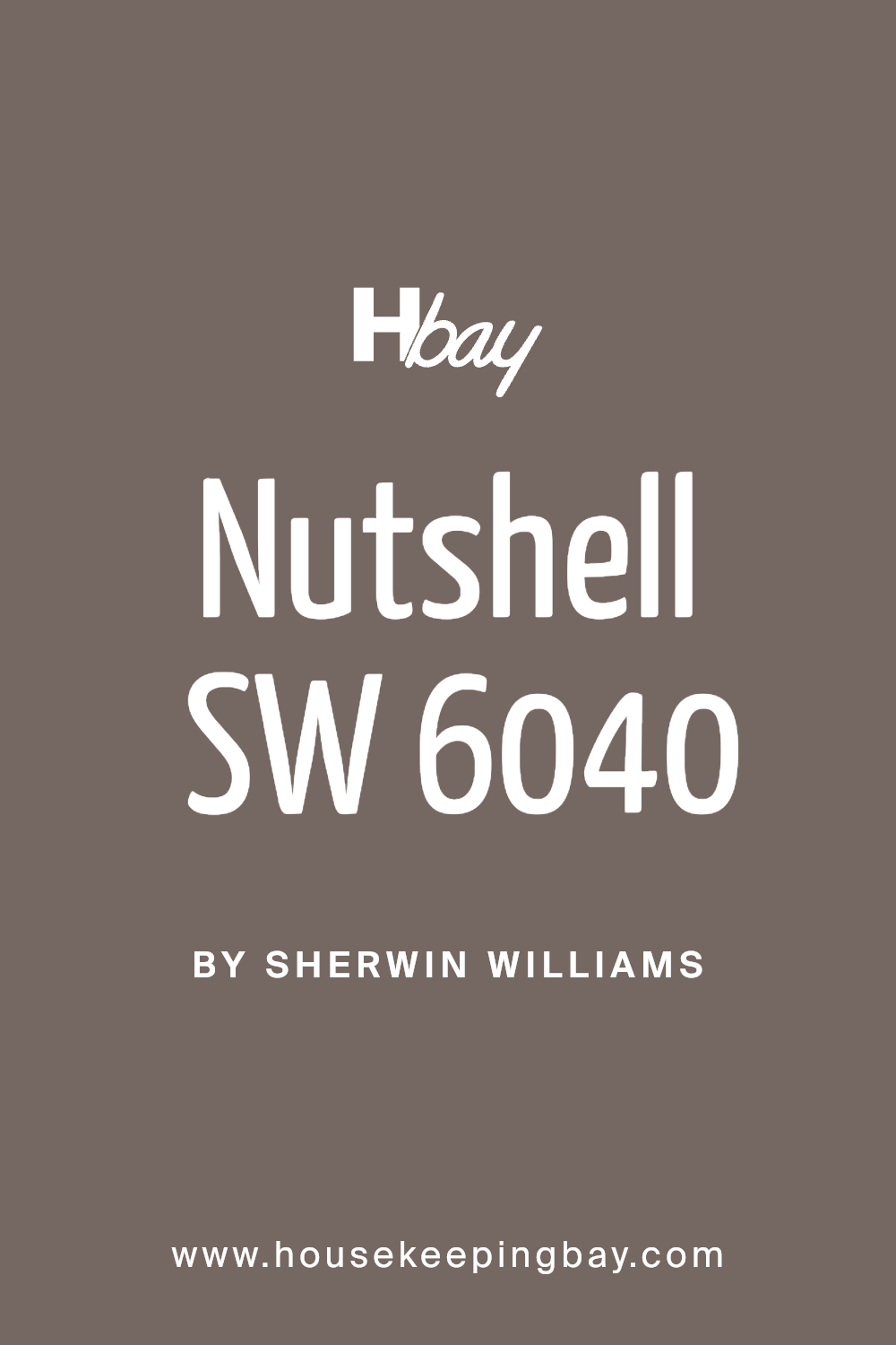
Nutshell SW 6040 by Sherwin Williams is a warm, earthy hue that evokes a sense of calm and coziness, perfect for creating inviting spaces. This particular color is reminiscent of the natural tones found in a nutshell, with a subtle richness that adds depth and character to any room.
It’s a versatile shade that can tie together various elements in a space, making it an excellent choice for those looking to add a touch of warmth to their interiors.
Nutshell works exceptionally well in interior styles that lean towards the rustic, farmhouse, or even traditional, where its earthy qualities can be highlighted.
However, it’s not limited to these and can effortlessly blend into more modern or minimalist decor by adding a layer of warmth and complexity that keeps the space from feeling too cold or impersonal.
When it comes to pairing materials and textures, Nutshell stands out. It goes hand in hand with natural wood, from light oak to darker walnut, enhancing the warm undertones of the wood.
Leather is another material that pairs beautifully with this color, adding to the richness and depth of the space.
Textures like woven fabrics, knits, and even smooth, matte finishes complement Nutshell, contributing to a cozy, layered look.
This color is an excellent backdrop for metal accents in brass or gold, which can add a touch of elegance and brightness to the warmth of Nutshell.
housekeepingbay.com
Table of Contents
Is Nutshell SW 6040 by Sherwin Williams Warm or Cool color?
Nutshell SW 6040 by Sherwin Williams is a rich, welcoming paint color that brings warmth to any home. This shade is a cozy brown with hints of softness, making it perfect for creating a snug and inviting atmosphere.
When used in homes, Nutshell has the power to transform spaces into comfortable retreats where you can relax. It works well in living rooms, bedrooms, or any area where you want to add a touch of coziness.
One of the great things about Nutshell is its versatility. It pairs beautifully with a wide range of colors, from creamy whites to soft pastels, allowing for various decorating styles.
Whether you’re going for a rustic look or a more modern vibe, Nutshell can fit seamlessly into your vision. The color also has a way of making large, open spaces feel more intimate, while giving smaller rooms a more spacious feel.
Plus, its natural tone helps in blending with furniture and accessories, making it easy to create a harmonious interior design.
What is the Masstone of the Nutshell SW 6040 by Sherwin Williams?
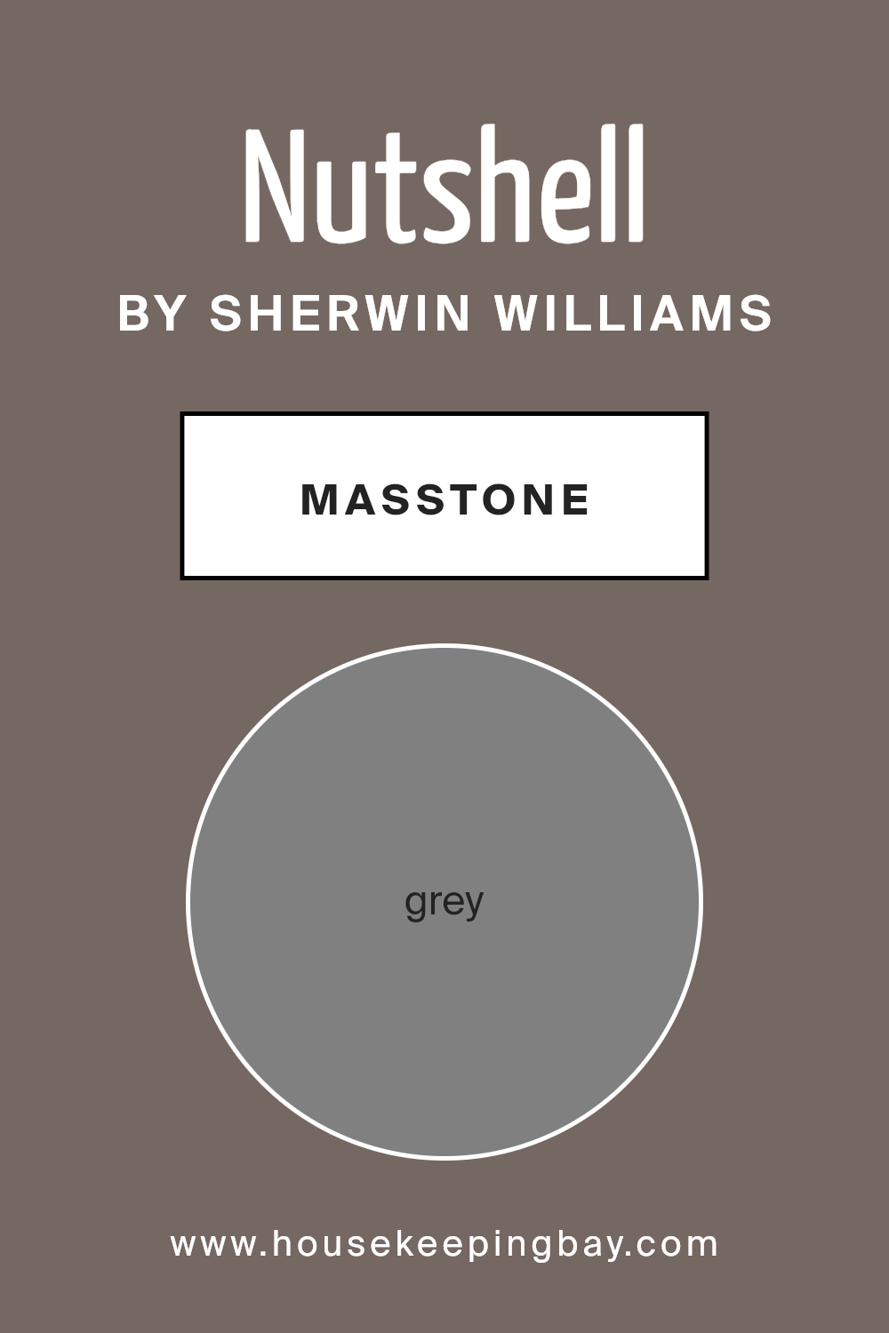
NutshellSW 6040 by Sherwin Williams has a masstone, meaning its purest form, which is Grey (#808080). This particular shade of grey is very versatile, making it an excellent choice for homes.
It’s a color that can fit into any room, whether it’s a cozy bedroom or a sleek modern kitchen.
The grey masstone allows it to act as a neutral backdrop, meaning it can pair easily with other colors.
Whether you’re wanting to add bright pops of color with accessories or keep things minimal and understated, this grey won’t clash or overpower your other design elements.
It’s like a chameleon, adapting and enhancing the space without demanding the spotlight.
In rooms with lots of natural light, NutshellSW 6040 can appear softer and add to the feeling of space.
In darker rooms, it can give depth and sophistication. This makes it a smart choice for anyone wanting to create a home that feels both stylish and welcoming without too much fuss.
housekeepingbay.com
Undertones of Nutshell SW 6040 by Sherwin Williams
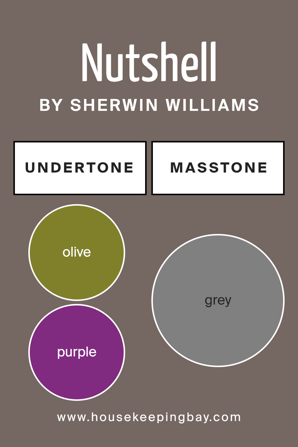
NutshellSW 6040 by Sherwin Williams is a color that comes with interesting undertones of olive (#80802B) and purple (#802B80). These undertones are like secret ingredients that add a unique flavor to the main color.
Think of the color you see as the main dish and undertones as special spices.
They can change how we perceive the color, making it look different depending on the light and what’s around it.
In the case of Nutshell, olive undertones add a touch of nature and warmth. It’s like bringing a bit of the outdoors inside, making spaces feel cozy and inviting.
On the other hand, purple undertones add a hint of depth and luxury. It’s a subtle touch, but it gives the color a rich, sophisticated vibe.
When Nutshell is used on interior walls, these undertones play with the light and the other colors in the room. In natural light, the olive might make the color appear more earthy and grounded.
In artificial light, the purple might come through, adding a layer of elegance. This means the color can look slightly different at various times of the day or in different settings, making your room feel dynamic and interesting.
Because of these undertones, Nutshell is versatile and can create a range of atmospheres, from relaxing and calming to stylish and refined.
housekeepingbay.com
Coordinating Colors of Nutshell SW 6040 by Sherwin Williams
Coordinating colors are hues chosen to complement or enhance each other, often bringing balance and harmony to a space. When used together, these colors enhance the overall aesthetic and mood of a room.
For instance, Nutshell SW 6040 by Sherwin Williams serves as a versatile base, and pairing it with the right colors can elevate the look and feel of your decor.
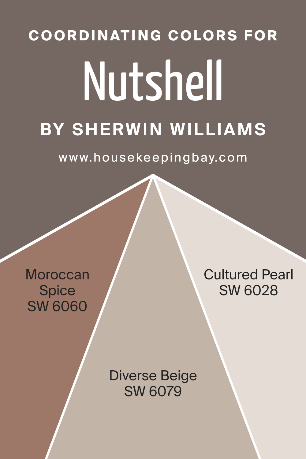
Coordinating colors, such as SW 6060 – Moroccan Spice, SW 6079 – Diverse Beige, and SW 6028 – Cultured Pearl, have been selected to complement Nutshell, creating a cohesive and visually pleasing palette.
SW 6060 – Moroccan Spice is a warm, inviting shade that adds depth and energy to spaces. It’s a bold color that works well with Nutshell, offering a striking contrast that can make a room feel more dynamic and vibrant.
On the other hand, SW 6079 – Diverse Beige is a softer, neutral shade that brings a sense of calm and versatility. It pairs beautifully with Nutshell, providing a subtle contrast that enhances the warmth of the room without overwhelming it.
Finally, SW 6028 – Cultured Pearl is a gentle, luminous color that introduces light and airiness, creating an open, serene atmosphere.
When used alongside Nutshell, it adds a layer of sophistication and refreshment, making the space feel inviting and well-balanced.
You can see recommended paint colors below:
- SW 6060 Moroccan Spice
- SW 6079 Diverse Beige
- SW 6028 Cultured Pearl
housekeepingbay.com
How Does Lighting Affect Nutshell SW 6040 by Sherwin Williams?
Lighting plays a major role in how we perceive colors. The color of a room can change throughout the day or depend on the light sources we use.
Let’s take a specific color as an example, NutshellSW 6040 by Sherwin Williams, and see how it is affected by different lighting conditions.
In artificial light, NutshellSW 6040, a warm, inviting tone, can look quite different depending on the type of bulb used. With warm, yellow-toned bulbs, this color will seem cozier and richer, enhancing its warm qualities.
If cool, white bulbs are used, the same color might lose some of its warmth and appear slightly more neutral or cooler than it does in natural daylight.
Natural light has a significant impact on how colors look, and it changes depending on the time of day and the room’s orientation. In north-facing rooms, which receive indirect, cooler light throughout the day, NutshellSW 6040 might look more muted and less warm.
This is because north light is generally softer and can make colors appear slightly more shadowed and subdued.
In south-facing rooms, where sunlight is direct and warmer for most of the day, NutshellSW 6040 will shine in all its glory. The warm light enhances the warmth of the paint color, making the room feel brighter and more welcoming.
This color in a south-facing room can truly create a cozy and vibrant atmosphere.
East-facing rooms get bright, warm light in the morning and softer light as the day progresses. Here, NutshellSW 6040 will start the day looking vibrant and warm, slowly transitioning to a softer version of itself by the afternoon.
This room orientation offers a unique experience of the color changing mood with the time of day.
West-facing rooms experience the opposite. They get softer, cooler light in the morning, which shifts to warmer, intense light by the evening.
In these rooms, NutshellSW 6040 will appear more neutral and subdued in the morning, but as the sun sets, it’ll glow warmly, creating a cozy and inviting space.
So, the magic of NutshellSW 6040, like any color, varies widely with the light it’s paired with, showcasing its chameleon-like ability to adapt and change mood based on its surroundings.
housekeepingbay.com
What is the LRV of Nutshell SW 6040 by Sherwin Williams?
LRV stands for Light Reflectance Value, which is a measure of the amount of visible light that a color reflects when light hits it. The scale runs from 0 to 100, with 0 being completely black (absorbing all light) and 100 being pure white (reflecting all light).
LRV is important because it helps you understand how light or dark a color will look on your walls once it’s applied. The higher the LRV, the lighter the color will appear, making spaces feel more open and airy.
Conversely, colors with lower LRV can make a room feel cozier but smaller.
The LRV of Nutshell SW 6040 by Sherwin Williams is 14.417, which means it’s on the darker end of the spectrum. In practical terms, this color will absorb more light than it reflects, contributing to a richer, more intimate atmosphere in a room.
It’s best suited for spaces where you want to create a snug and inviting ambience, or where you plan to use lighting creatively to enhance the depth of the color.
However, using it in a small, dimly lit room might make the space feel even smaller and darker, so it’s wise to consider the room’s natural light and size when thinking about using this color.

housekeepingbay.com
What is LRV? Read It Before You Choose Your Ideal Paint Color
What are the Trim colors of Nutshell SW 6040 by Sherwin Williams?
Trim colors are specialized hues selected to accentuate, frame, or highlight the architectural details and design elements of a space.
When paired with a primary wall color, such as Nutshell SW 6040 by Sherwin-Williams, trim colors have the power to enhance the overall aesthetics of a room.
They play a crucial role in defining spaces, creating visual interest, and tying together the color scheme of a home’s interior or exterior.
Selecting the right trim color can make the difference between a space that looks finished and cohesive and one that feels lacking in dimension or contrast.
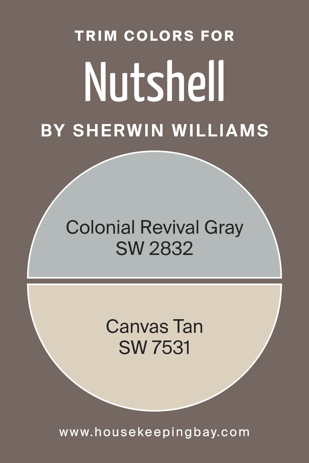
For Nutshell SW 6040, a warm, inviting neutral, two excellent trim choices are SW 2832 – Colonial Revival Gray and SW 7531 – Canvas Tan.
Colonial Revival Gray is a subtle and sophisticated gray that provides a soft yet distinct boundary against Nutshell, enriching the space with a touch of elegance and understated charm.
On the other hand, Canvas Tan is a light, creamy tan that offers a smooth transition from Nutshell, adding warmth and a harmonious contrast without overwhelming the primary color.
Both trim colors enrich the environment, providing depth and character to the living space while complementing the primary palette’s natural warmth and richness.
You can see recommended paint colors below:
- SW 2832 Colonial Revival Gray
- SW 7531 Canvas Tan
housekeepingbay.com
Colors Similar to Nutshell SW 6040 by Sherwin Williams
Choosing colors that are similar to each other, like those related to Nutshell SW 6040 by Sherwin Williams, is essential for creating a harmonious and pleasing look in any space.
When colors are within the same family or have similar tones, they naturally work together, making a room feel balanced and put together.
This approach can add depth to a design scheme without overwhelming the senses with too much contrast.
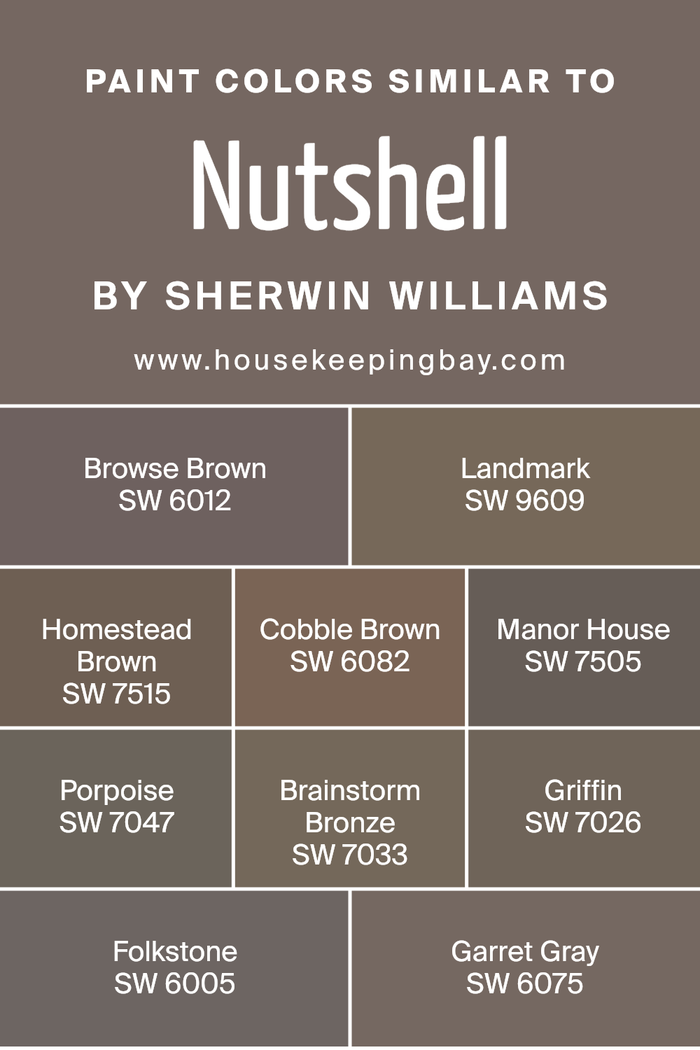
For instance, by picking shades like Browse Brown, Landrop, Homestead Brown, and Cobble Brown, you’re able to achieve a warm and inviting atmosphere.
These colors, along with Manor House, Porpoise, Brainstorm Bronze, Griffin, Folkstone, and Garret Gray, share a comforting earthiness that ties a space together with a sophisticated and cohesive look.
Browse Brown offers a cozy, deep warmth, reminiscent of earth and autumn warmth, perfect for creating a snug ambiance. Landmark is a subtly rich hue that adds elegance without overpowering a space.
Homestead Brown has a solid, grounded presence, offering a classical touch. Cobble Brown brings a softer, lighter touch, akin to the gentle shades of nature.
Manor House stands out with a classic elegance, its depth adding a sense of history and solidity. Porpoise finds a balance between gray and brown, offering a modern twist on neutral themes.
Brainstorm Bronze sparkles with a slight metallic undertone, bringing a unique light play into the mix. Griffin’s muted, understated elegance makes it a versatile backdrop.
Folkstone offers a balanced gray that pairs well with both cool and warm hues, and Garret Gray, slightly warmer, works to create a space that’s both sophisticated and welcoming.
Together, these colors represent a palette that can bring any room to life with their shared warmth and versatility.
You can see recommended paint colors below:
- SW 6012 Browse Brown
- SW 9609 Landmark
- SW 7515 Homestead Brown
- SW 6082 Cobble Brown
- SW 7505 Manor House
- SW 7047 Porpoise
- SW 7033 Brainstorm Bronze
- SW 7026 Griffin
- SW 6005 Folkstone
- SW 6075 Garret Gray
housekeepingbay.com
How to Use Nutshell SW 6040 by Sherwin Williams In Your Home?
Nutshell SW 6040 by Sherwin Williams is a warm and welcoming paint color that adds a touch of earthiness to any room in your home. Think of it as a hug from nature, bringing in coziness and comfort with its rich, nutty tone.
It’s perfect for those looking to create a serene and inviting atmosphere.
You can use Nutshell in various ways in your home. It works wonderfully in living rooms or bedrooms, creating a snug and cozy vibe that makes you want to curl up with a good book.
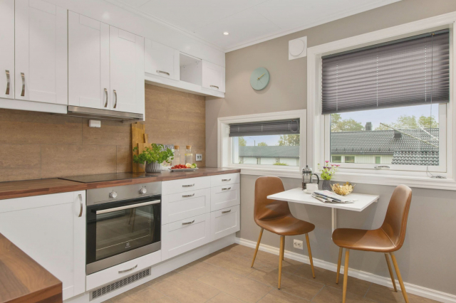
In the kitchen or dining area, this color adds a sense of warmth and hospitality, making meals more inviting.
It’s also an excellent choice for a home office, where its calming effect can help to boost focus and productivity.
Whether you paint an accent wall or decide to use it throughout a room, Nutshell SW 6040 easily pairs with a wide range of decor, from rustic to modern, adding a touch of timeless charm to your space.
Nutshell SW 6040 by Sherwin Williams vs Griffin SW 7026 by Sherwin Williams
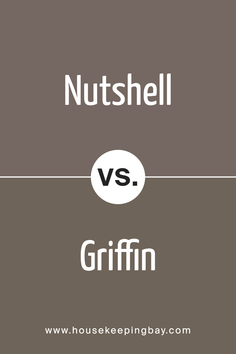
Nutshell SW 6040 by Sherwin Williams and Griffin SW 7026 by Sherwin Williams are two distinct colors that bring their own unique vibes to spaces.
Nutshell is a warm, inviting brown that feels cozy and comfortable, much like the feeling you get when you’re wrapped in a soft blanket. It has a welcoming aura, perfect for creating a snug and relaxing environment in any room.
On the other hand, Griffin is a cool, neutral gray that leans towards a sophisticated look. It offers a calm and collected ambiance, making it ideal for spaces that aim for a sleek and modern feel.
This color works well in a variety of settings, adding a touch of elegance without overpowering the room.
Despite their differences, both colors share an ability to transform spaces. Nutshell adds warmth and richness, while Griffin brings a refined and contemporary edge.
Depending on what you want your space to convey, either color can significantly enhance the room’s aesthetics and mood.
You can see recommended paint color below:
- SW 7026 Griffin
housekeepingbay.com
Nutshell SW 6040 by Sherwin Williams vs Manor House SW 7505 by Sherwin Williams
Nutshell SW 6040 and Manor House SW 7505, both from Sherwin Williams, offer warm and inviting tones, but they have their distinct differences.
Nutshell is like a gentle hug from a cozy, soft brown with a whisper of gray – it’s a color that feels like a warm, welcoming embrace without being too dark or overpowering.
On the other hand, Manor House stands a bit prouder with a stronger, deeper brown that hints at an elegant, stately feel. This color can make a room feel grounded and sophisticated with its richer, more luxurious brown tones.
Both colors create a sense of comfort and warmth, making them perfect for spaces where you want to relax and unwind.
While Nutshell might lend itself to a softer, more understated look, Manor House makes a bolder statement, offering a sense of richness and depth to the space.
Choosing between them depends on how deep and luxurious versus soft and comforting you want your space to feel.
You can see recommended paint color below:
- SW 7505 Manor House

housekeepingbay.com
Nutshell SW 6040 by Sherwin Williams vs Brainstorm Bronze SW 7033 by Sherwin Williams
Nutshell SW 6040 and Brainstorm Bronze SW 7033, both by Sherwin Williams, are unique colors that bring their own special vibe to spaces. Nutshell is a gentle, cozy brown with a soft, welcoming feel to it.
It has a lightness that makes it easy to pair with a variety of decor styles, adding a warm, earthy touch without overpowering a room.
On the other hand, Brainstorm Bronze is a darker, deeper shade. It has a richness that feels both sophisticated and strong. This color creates a bold statement and lends an air of elegance and stability to spaces.
It’s the kind of color that can anchor a room, providing a striking contrast to lighter hues or materials.
Both colors offer a sense of warmth, but where Nutshell is more subdued and versatile, Brainstorm Bronze demands attention and sets a mood of confidence and depth.
Choosing between them depends on the ambiance you want to create: Nutshell for a light, airy feel, and Brainstorm Bronze for a dramatic, impactful presence.
You can see recommended paint color below:

housekeepingbay.com
Nutshell SW 6040 by Sherwin Williams vs Landmark SW 9609 by Sherwin Williams
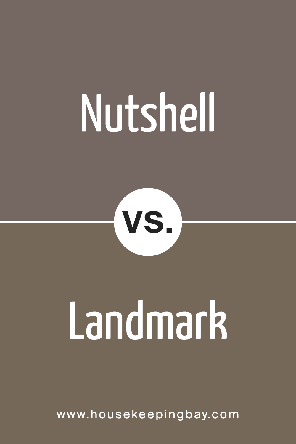
Nutshell SW 6040 by Sherwin Williams and Landmark SW 9609 are two distinct colors with their unique appeal. Nutshell is a warm, deep beige that feels cozy and comforting.
It’s a versatile color, fitting well in spaces aiming for a soft, welcoming vibe. Think of it as a hug in the form of paint—it makes rooms feel like a safe, snug spot.
On the other hand, Landmark is a darker, richer hue that leans more towards a profound, earthy brown. It carries a strong presence, adding depth and sophistication to a room.
While Nutshell brightens spaces with its lighter tone, Landmark offers a grounding effect, anchoring rooms with its solidity.
Both colors can beautifully transform a space, but your choice depends on the mood you want to set: Nutshell for a lighter, airy feel, or Landmark for a bold, statement look.
You can see recommended paint color below:
- SW 9609 Landmark
housekeepingbay.com
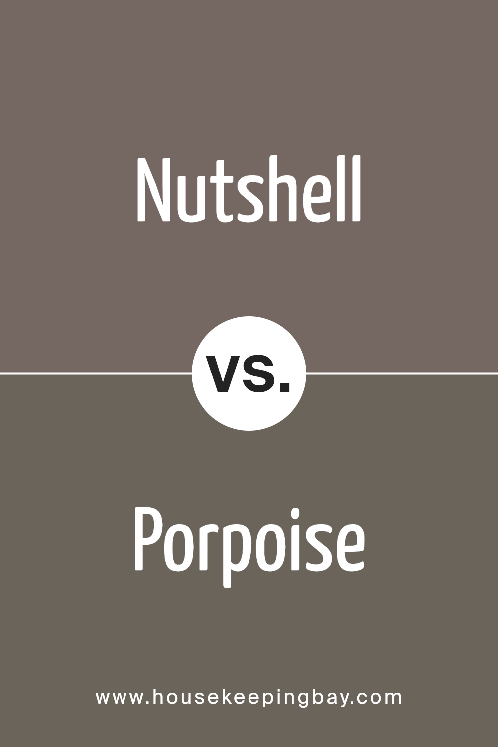
Nutshell SW 6040 by Sherwin Williams vs Porpoise SW 7047 by Sherwin Williams
Nutshell SW 6040 and Porpoise SW 7047, both from Sherwin Williams, are unique in their own ways. Nutshell stands out as a warm, welcoming shade, almost like a cozy, light brown that you might find comforting.
It’s the kind of color that could make a room feel snug and inviting, suitable for spaces where you want to relax.
On the other hand, Porpoise SW 7047 is cooler and more like a soft, versatile gray with a touch of warmth. It’s not too dark or too light but sits perfectly in the middle.
This makes it great for creating a modern, understated look that can fit in almost any room without overpowering other elements.
While Nutshell brings warmth and a hint of nature indoors, Porpoise offers a contemporary vibe that’s both stylish and adaptable.
Choosing between them depends on the atmosphere you want to create; Nutshell is about warmth and comfort, whereas Porpoise leans more towards a sleek, neutral aesthetic.
You can see recommended paint color below:
- SW 7047 Porpoise
housekeepingbay.com
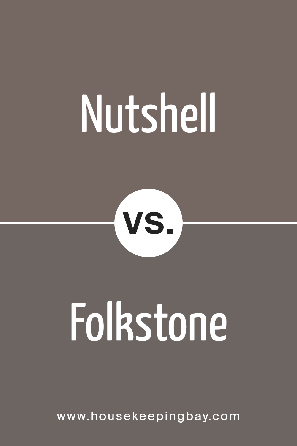
Nutshell SW 6040 by Sherwin Williams vs Folkstone SW 6005 by Sherwin Williams
The main color, Nutshell SW 6040 by Sherwin Williams, and the second color, Folkstone SW 6005, have their unique vibes. Nutshell is a warm, cozy kind of tan.
It’s like the feeling of getting a hug from a room. It’s not too dark or too light, making it perfect for spaces where you want to feel relaxed and at ease.
On the other hand, Folkstone is a cool gray shade. It’s the kind of color that makes a room look sleek and modern without trying too hard. It’s fairly neutral, so it goes well with lots of other colors, making it a good choice for a base color in a home.
When you put these two colors side by side, Nutshell brings warmth and a welcoming feel, while Folkstone offers a chic and contemporary vibe. Choosing between them comes down to the atmosphere you want to create.
Do you prefer a room that feels like a warm embrace or a space that’s stylish and modern? Nutshell lights up a room with its warmth, while Folkstone gives it a refined, sophisticated edge.
You can see recommended paint color below:
- SW 6005 Folkstone
housekeepingbay.com
Nutshell SW 6040 by Sherwin Williams vs Browse Brown SW 6012 by Sherwin Williams
Nutshell SW 6040 by Sherwin-Williams and Browse Brown SW 6012 by Sherwin-Williams are two warm, cozy colors that give off a welcoming vibe, but they have some differences. Nutshell is a bit lighter and can give a room a softer, more open feeling.
It’s like the gentle color of the outer shell of a nut, not too dark but with a comforting, earthy tone. This makes it great for spaces where you want a touch of warmth without making the room feel smaller.
On the other hand, Browse Brown is deeper and richer, closer to the color of dark chocolate. It has a stronger presence and can make a room feel more snug and enclosed.
This color is perfect for creating a cozy corner or for accent walls where you want to make a statement with a deeper, more intense brown.
Both colors work well in spaces that aim for a warm, inviting atmosphere, but your choice depends on how light or dark you want the room to feel.
Nutshell is the go-to for a lighter, airier feel, while Browse Brown is best when aiming for a snug, enveloping vibe.
You can see recommended paint color below:
- SW 6012 Browse Brown

housekeepingbay.com
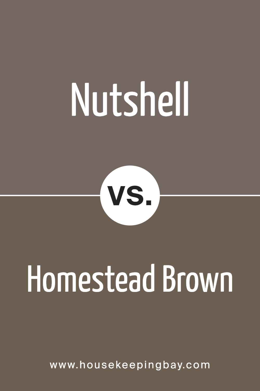
Nutshell SW 6040 by Sherwin Williams vs Homestead Brown SW 7515 by Sherwin Williams
Nutshell SW 6040 and Homestead Brown SW 7515 by Sherwin Williams are two beautiful shades that offer unique vibes for any space. Nutshell is a light, warm brown tone that feels cozy and inviting. It’s like the color of a soft, sandy beach or a delicate almond shell.
This color is perfect for creating a light and airy room that still feels grounded and comforting.
On the other hand, Homestead Brown SW 7515 is a deeper, richer brown. It reminds one of the earthy tones of tree bark or fertile soil. This color provides a strong sense of warmth and solidity, making any room feel snug and secure.
It’s an excellent choice for those who want to add depth and a traditional touch to their space.
While both colors share a brown base, Nutshell is lighter and softer, making spaces feel open and relaxed. Homestead Brown, with its darker, deeper hue, offers a more intimate and cozy atmosphere.
Depending on the mood you want to create, both colors have their unique strengths and can transform a room in their way.
You can see recommended paint color below:
- SW 7515 Homestead Brown
housekeepingbay.com
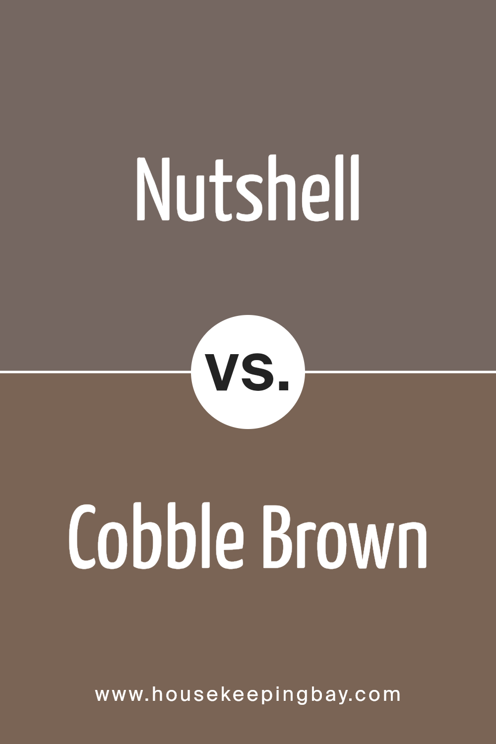
Nutshell SW 6040 by Sherwin Williams vs Cobble Brown SW 6082 by Sherwin Williams
Nutshell SW 6040 and Cobble Brown SW 6082 by Sherwin Williams are two different, yet related, shades of brown. Nutshell is a lighter, warmer shade that brings to mind the soft, welcoming color of a natural walnut shell.
It has a cozy and comforting feel, making it perfect for creating a snug and inviting atmosphere in any space.
On the other hand, Cobble Brown SW 6082 is a deeper, richer brown. It reminds you of the earthy tones of a well-worn cobblestone path.
This color is more intense and has a stronger presence, offering a sense of stability and grounding in a room. It’s great for adding depth and sophistication.
Both colors are versatile and can complement a wide range of decor styles. However, Nutshell’s lighter hue works better in smaller rooms or spaces where you want to create an open, airy feel.
Cobble Brown, being darker, is ideal for larger spaces or accent walls where you want to make a bold statement.
You can see recommended paint color below:
- SW 6082 Cobble Brown
housekeepingbay.com
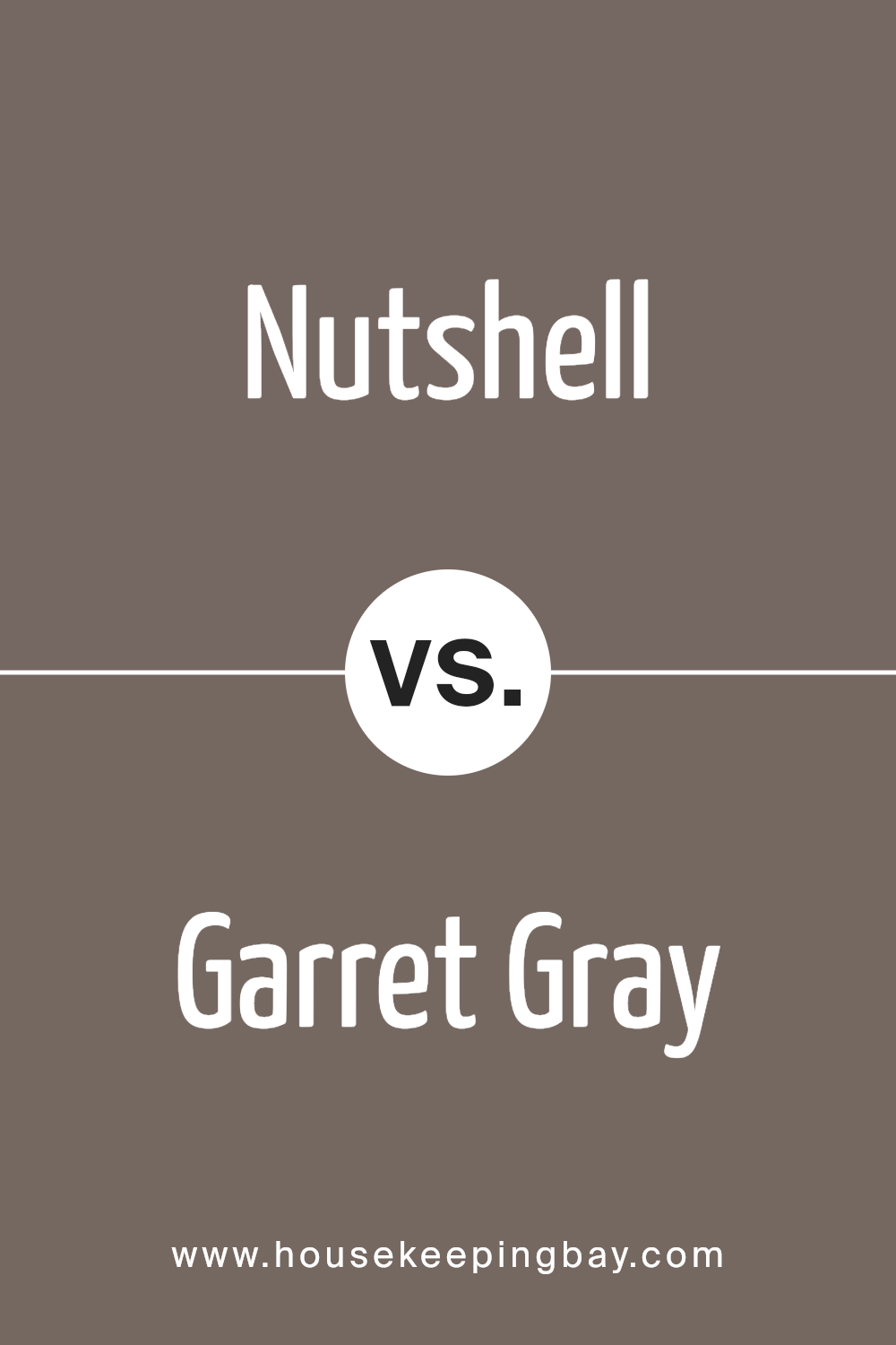
Nutshell SW 6040 by Sherwin Williams vs Garret Gray SW 6075 by Sherwin Williams
Nutshell SW 6040 by Sherwin Williams is a warm, cozy brown color. It gives off a comforting, earthy vibe that can make any space feel more inviting. Its rich tones can remind one of autumn leaves or a classic wooden finish, perfect for creating a homely atmosphere.
On the other hand, Garret Gray SW 6075 by Sherwin Williams is a cooler, more subtle gray. It carries an understated elegance, ideal for a modern and sleek look.
Unlike the warmth of Nutshell, Garret Gray brings a calm and collected feel to spaces, acting as a great backdrop for vibrant accents or as a standalone color for a minimalist design.
Both colors offer unique qualities: Nutshell adds warmth and richness, while Garret Gray provides a serene and sophisticated touch. Depending on the mood you want to set for your room, both options have their distinct charm.
Nutshell might suit those looking for a cozy, earth-toned ambiance, while Garret Gray is perfect for a more refined and chic atmosphere.
You can see recommended paint color below:
- SW 6075 Garret Gray
housekeepingbay.com
Conclusion
In summary, Nutshell SW 6040 by Sherwin Williams is a paint color that has garnered popularity due to its unique shade and versatility. This color is characterized by its warm, earthy tones that can add a cozy and inviting atmosphere to any space.
Its adaptability allows it to fit seamlessly into various decor styles, from modern to rustic, making it a favorite among homeowners and interior designers alike.
Whether used as a statement wall or to complement other colors, Nutshell SW 6040 brings a welcoming and comfortable vibe to rooms.
Moreover, the durability and high-quality finish of Nutshell SW 6040 make it a practical choice for both residential and commercial spaces. The paint’s ability to withstand daily wear and tear while maintaining its rich color has been praised.
Its ease of application and coverage ensures a hassle-free painting experience, further enhancing its appeal.
All in all, Nutshell SW 6040 by Sherwin Williams stands out as a top choice for those looking to add warmth and character to their interiors with a reliable and stylish paint option.
housekeepingbay.com
Ever wished paint sampling was as easy as sticking a sticker? Guess what? Now it is! Discover Samplize's unique Peel & Stick samples. Get started now and say goodbye to the old messy way!
Get paint samples
