Night Out SW 9560 by Sherwin Williams
Create Your Dream Space with Midnight Hues
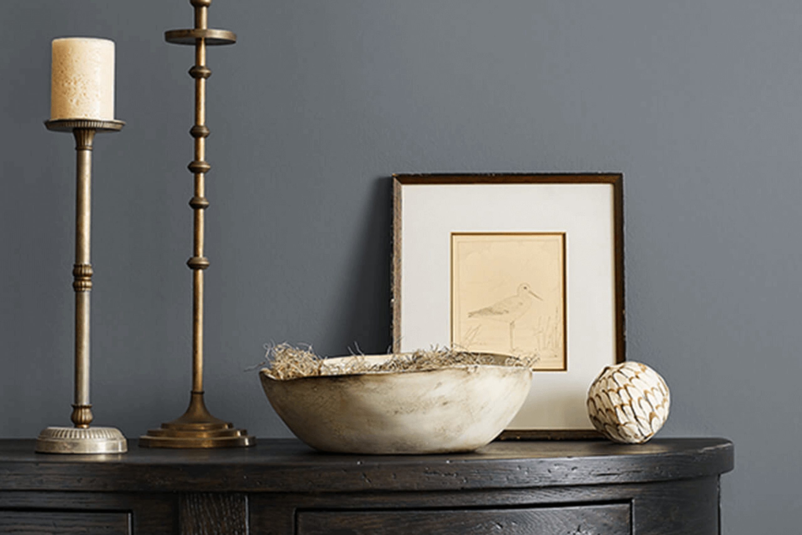
Looking to refresh your space with a touch of bold elegance? SW 9560 Night Out by Sherwin Williams might be the perfect choice for you. This rich, deep shade of blue offers a dramatic flair, bringing a sense of depth and sophistication to any room. Imagine the walls of your living room or bedroom wrapped in this beautiful color, providing a striking backdrop for art, furniture, and decorative accents.
Whether you want to create an intimate setting or add a sense of mystery and intrigue to a larger space, this shade is sure to make a statement. Pair it with metallic accents or lighter colors to enhance its impact and create a balance.
You can also consider using it as an accent wall to draw the eye and add dimension without overwhelming your space.
Think about the message you want your room to convey. SW 9560 Night Out can evoke feelings of calm and confidence, making it a great choice for both contemporary and traditional styles.
Consider the lighting in your space, too; this shade can look different under various lighting conditions, offering versatility without being overpowering. Let SW 9560 Night Out transform your home into a place that reflects your personal style with its bold yet elegant character.
via sherwin-williams.com
What Color Is Night Out SW 9560 by Sherwin Williams?
Table of Contents
Night Out SW 9560 by Sherwin Williams is a rich, deep shade that falls in the blue family. This color adds a touch of sophistication and elegance to any room. Its dark tone makes it ideal for creating a cozy, intimate atmosphere in spaces like bedrooms, living rooms, or dining areas. This hue works exceptionally well within modern, contemporary, and industrial interior styles. Its depth adds contrast when paired with lighter colors or metallic accents.
For modern spaces, Night Out serves as a perfect backdrop, allowing sleek furniture and lines to stand out. In more industrial settings, it complements raw materials such as exposed brick, concrete, and metals.
This color pairs beautifully with natural wood, bringing warmth and balance to the room. Combining it with soft furnishings like plush velvet or wool creates a luxurious feel, adding to its cozy appeal.
When thinking about decor elements, Night Out enhances bold art pieces and statement lighting fixtures.
It also works well with neutral accessories, such as beige or cream, which helps prevent the space from feeling too dark. In summary, Night Out SW 9560 offers a versatile and elegant choice for those looking to add depth and character to their home interiors.
housekeepingbay.com
Is Night Out SW 9560 by Sherwin Williams Warm or Cool color?
Night Out SW 9560 by Sherwin Williams is a deep, rich shade that brings warmth and sophistication to any home. This color has an intense, dark tone with subtle hints of deep blue and charcoal, creating a cozy and inviting atmosphere. In living rooms or bedrooms, Night Out can inject a sense of comfort and calmness, making these spaces feel like a personal retreat.
When used on accent walls, Night Out provides a dramatic backdrop that enhances lighter furnishings and décor, allowing them to stand out more vividly. The color’s depth lends itself well to modern and classic styles alike, pairing beautifully with metallic finishes and natural wood tones.
In well-lit spaces, Night Out maintains its elegance without overpowering the room, offering a perfect balance between boldness and subtlety. Overall, this color is an excellent choice for those looking to add elegance and warmth to their home interiors.
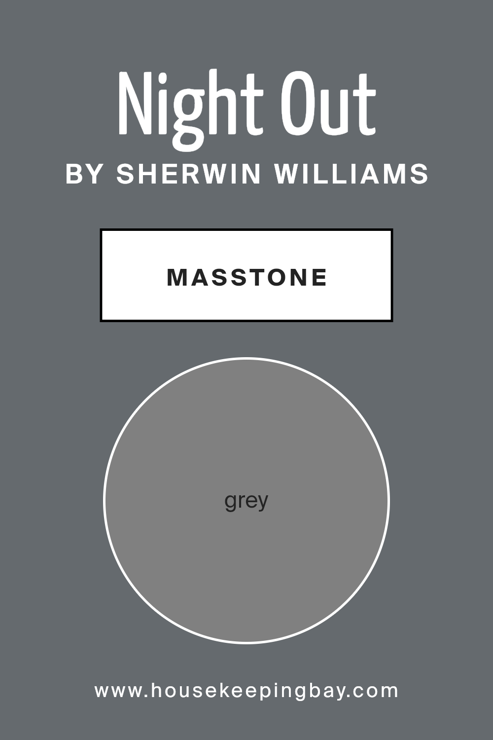
What is the Masstone of the Night Out SW 9560 by Sherwin Williams?
Night Out SW 9560 by Sherwin Williams is a rich, encompassing shade of gray. Its masstone, a solid gray (#808080), makes it versatile and adaptable for various home settings. Gray is known for its neutrality and sophistication, which makes it an excellent choice in interior design.
This color works well in homes by providing a balanced backdrop that complements both bold and subtle decor elements. It creates a calm and serene atmosphere, making it ideal for living rooms, bedrooms, or any space where relaxation is key.
The neutral nature of Night Out allows it to pair beautifully with a range of other colors, from vibrant accents to soft neutrals.
In spaces with ample natural light, this gray can look lighter and more refreshing, while in dimmer spaces, it takes on a cozier and warmer tone.
This flexibility makes Night Out a practical and stylish option for any home environment.
housekeepingbay.com
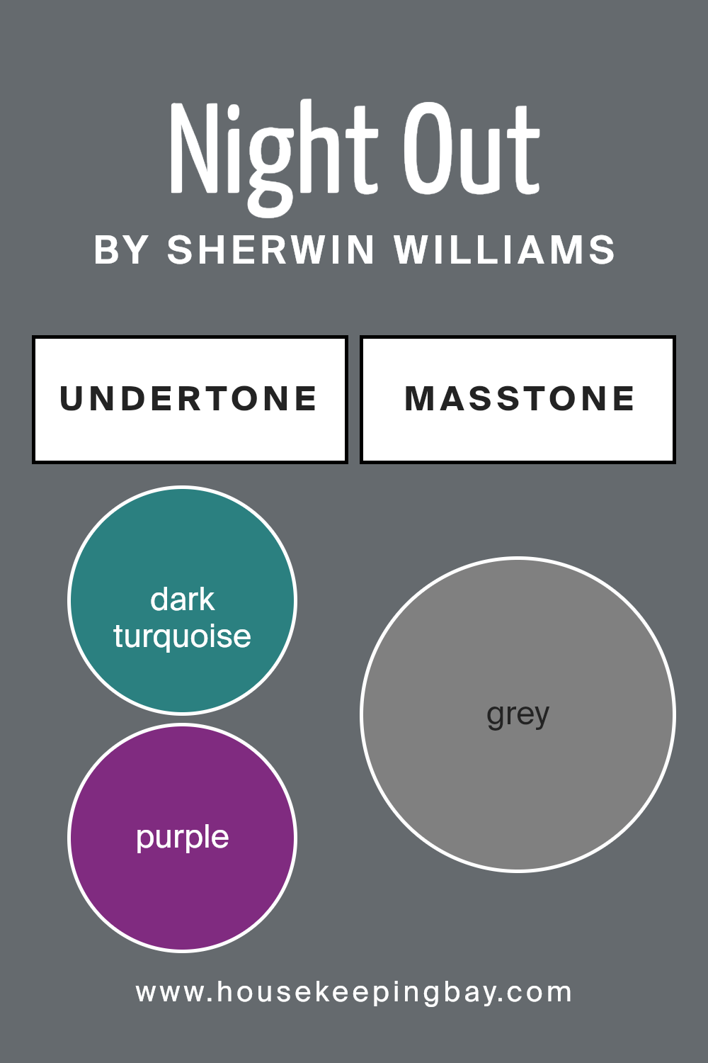
Undertones of Night Out SW 9560 by Sherwin Williams
Night Out SW 9560 by Sherwin Williams has a complex palette of undertones, giving it a unique and intriguing appearance. When looking at this color, you might notice hints of dark turquoise, purple, and navy. These cooler undertones create a feeling of depth and richness, making the color appear both moody and sophisticated. The addition of olive and dark green undertones adds warmth and earthiness, grounding the color and adding balance.
On interior walls, these undertones can shift the perception of a space depending on the lighting and surrounding decor. In natural or warm lighting, the brown and dark green undertones might become more prominent, giving the paint a cozy, welcoming vibe.
Under cooler or artificial light, the navy and purple undertones might show more, creating a feeling of elegance and mystery.
The interplay of these undertones ensures that Night Out can adapt to different settings. For instance, in a living room with lots of plants, the green and olive undertones might harmonize beautifully with the greenery.
In a room with metallic or glass elements, the blues and purples can highlight cool sophistication. Overall, Night Out SW 9560’s diverse undertones make it versatile, allowing it to contribute to various moods and atmospheres in any interior space.
housekeepingbay.com
How Does Lighting Affect Night Out SW 9560 by Sherwin Williams?
Lighting plays a significant role in how colors appear in a space. Different light sources can change how a color looks to the eye, making it essential to consider when choosing paint. Sherwin Williams’ Night OutSW 9560 is a deep, rich hue that can vary greatly depending on the light it is exposed to.
In artificial light, Night Out can appear warmer or cooler. Incandescent lights, which tend to be warmer, can make the color feel cozy and inviting, often emphasizing any underlying warm tones.
Fluorescent lights, which lean cooler, might give Night Out a slightly more blue or gray tint, depending on the specific bulb used.
In natural light, the orientation of a room significantly impacts how a color like Night Out presents itself. North-facing rooms, which receive consistent but cooler light, can make Night Out look slightly more muted and grayish. This cooler light can enhance any blue undertones in the color, giving it a more subdued appearance.
South-facing rooms benefit from warm, bright light throughout the day. This can bring out the warmer tones in Night Out, making the color appear more vibrant and rich. Such light tends to enhance the depth of the color, making it a great background for lively or warm decor.
East-facing rooms have the crisp, clear light of the morning sun, which can make Night Out look brighter and slightly lighter in the morning. By the afternoon, as the light grows softer, the color might take on a more neutral appearance.
West-facing rooms receive warm, golden light in the afternoon and evening. This type of light can create a dramatic effect with Night Out, enhancing its richness and making the room feel inviting as the day progresses.
Understanding how Night Out behaves under different lighting conditions can help in creating the desired atmosphere in any space.
housekeepingbay.com
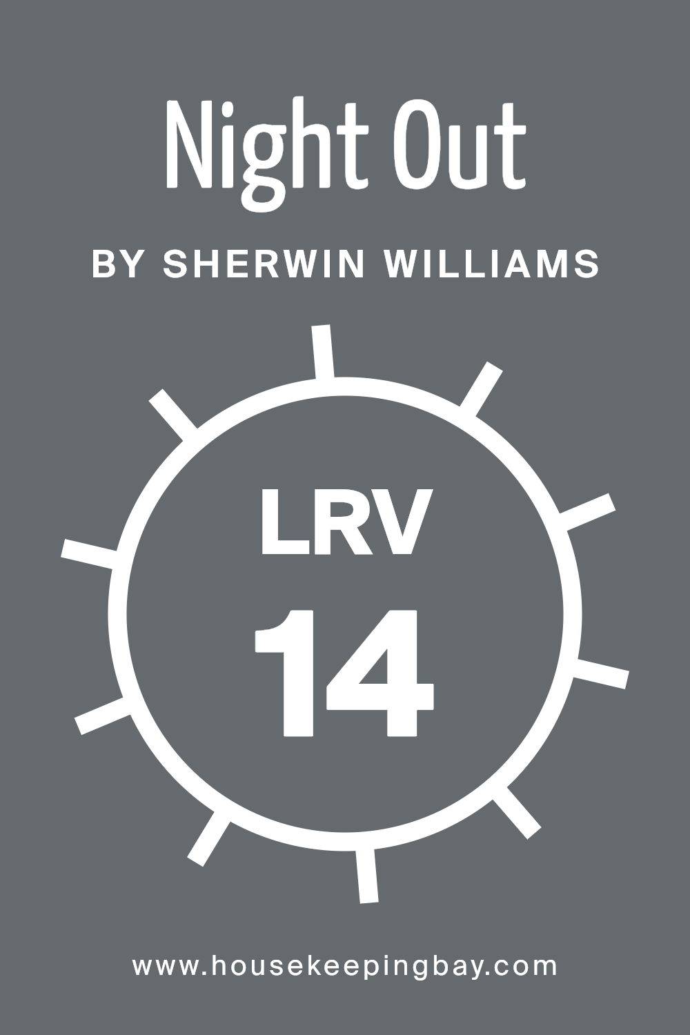
What is the LRV of Night Out SW 9560 by Sherwin Williams?
The term LRV stands for Light Reflectance Value, and it’s a scale from 0 to 100 that measures how much light a color reflects. A color with an LRV of 0 is completely black and absorbs all light, reflecting none, while a color with an LRV of 100 is pure white and reflects all light.
The LRV helps people understand how bright or dark a paint color will appear when actually applied to walls. A lower LRV means the color will absorb more light and feel darker, whereas a higher LRV means the color will reflect more light and seem brighter.
This measurement is crucial for choosing paint, especially in rooms where lighting varies, because it helps in predicting how the color will behave in different conditions.
For Sherwin Williams’ Night Out (SW 9560), the LRV of 14.119 tells us that this color absorbs most of the light that hits it and reflects very little back.
So, it will appear quite dark and rich on the walls. This means if you apply it in a room with limited natural light, the room may feel more closed in or cozier, depending on your perspective. Conversely, in a well-lit area, it will not appear as dark but still contributes a deep, moody ambiance.
Understanding this LRV helps in planning where to best use the color for the desired effect, ensuring it meets your expectations for the mood and feel of the space.
housekeepingbay.com
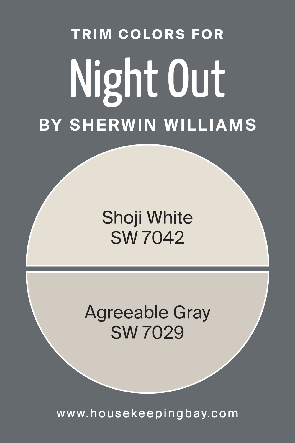
What are the Trim colors of Night Out SW 9560 by Sherwin Williams?
Trim colors refer to the colors used on the edges or borders of walls, doors, windows, and other architectural features. They highlight and define spaces, enhancing the overall look of a room or building. Trim colors add contrast, create visual interest, and can make rooms appear larger or more cohesive.
For a color like Night Out SW 9560 by Sherwin Williams, which typically serves as a darker, bolder statement color for walls, choosing the right trim colors is crucial. Using Shoji White SW 7042 as a trim color offers a soft, warm touch that pairs well with darker hues, creating an inviting atmosphere.
Shoji White carries a hint of creaminess, which can soften the strong impact of Night Out and balance the overall look of the room. It adds a touch of elegance while maintaining a calm and cozy vibe that doesn’t overpower the primary color.
On the other hand, Agreeable Gray SW 7029, as a trim choice, provides a modern and versatile contrast to Night Out.
It is known for its warm gray tones with a hint of beige, making it a popular neutral that works with various color schemes.
As a trim color, it adds depth and sophistication, enhancing Night Out’s boldness without overshadowing its charm. Agreeable Gray’s adaptability allows it to seamlessly blend into many environments, providing a subtle yet distinct separation from the main wall color.
Both Shoji White and Agreeable Gray offer unique qualities that complement Night Out, ensuring the trim not only highlights the main color beautifully but also contributes to the overall cohesion and style of the space.
You can see recommended paint colors below:
housekeepingbay.com
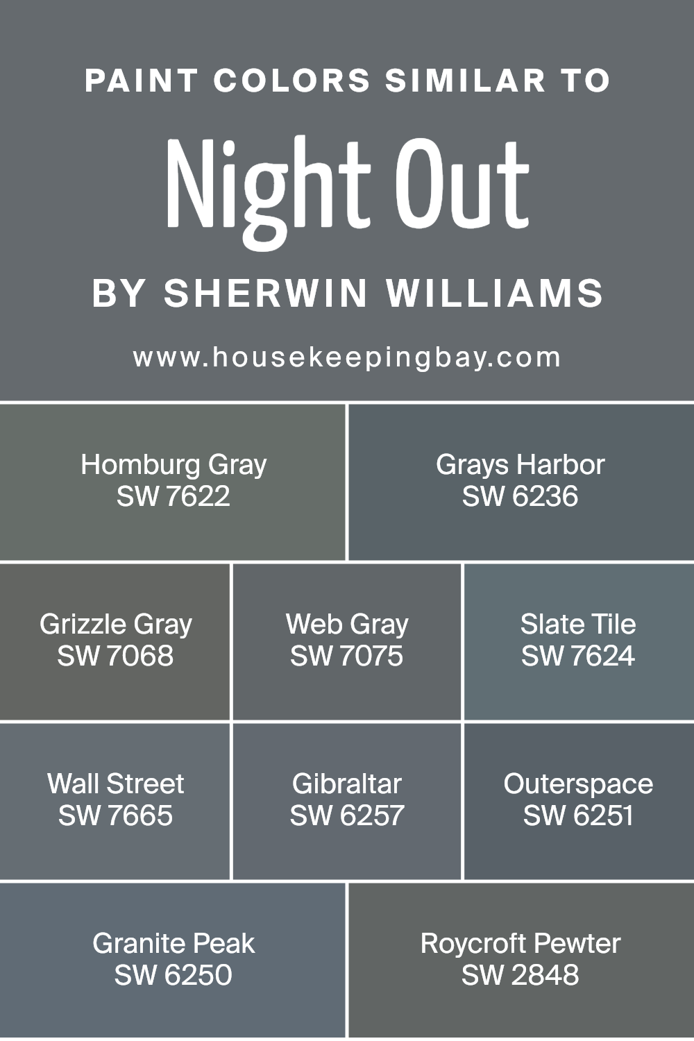
Colors Similar to Night Out SW 9560 by Sherwin Williams
Similar colors play a crucial role in achieving a harmonious and balanced look in design. For instance, the colors that coordinate with Sherwin Williams’ Night Out SW 9560, such as Homburg Gray and Grays Harbor, bring depth and sophistication.
Homburg Gray offers a moody and rich tone, perfect for creating an elegant environment. Grays Harbor, on the other hand, adds a slightly blue undertone, creating a calming and soothing atmosphere.
Grizzle Gray provides versatility; its deep gray hue fits well in both modern and traditional spaces. Web Gray is a balanced blend of cool and warm tones, ideal for creating a sleek and stylish look.
Continuing with Slate Tile, this color offers a strong slate-like appearance, adding character and intrigue to any area.
Wall Street presents a solid, dependable gray that is great for grounding lighter color palettes. Gibraltar’s deep color provides a sense of stability and is highly adaptable to various design themes. Outerspace can bring an unexpected and dynamic element with its dark, almost black, undertone that complements lighter hues.
Granite Peak evokes strength and grandeur, with a hint of blue that adds interest. Finally, Roycroft Pewter contributes a timeless feel with its slightly greenish cast, perfect for those who appreciate vintage charm.
These hues work together to create a seamless flow, enhancing any space’s allure.
You can see recommended paint colors below:
- SW 7622 Homburg Gray
- SW 6236 Grays Harbor
- SW 7068 Grizzle Gray
- SW 7075 Web Gray
- SW 7624 Slate Tile
- SW 7665 Wall Street
- SW 6257 Gibraltar
- SW 6251 Outerspace
- SW 6250 Granite Peak
- SW 2848 Roycroft Pewter
housekeepingbay.com
How to Use Night Out SW 9560 by Sherwin Williams In Your Home?
Night Out SW 9560 by Sherwin Williams is a deep, rich blue color that adds depth and sophistication to any space. This versatile shade creates a welcoming and cozy atmosphere, making it perfect for a living room or bedroom. Pair it with light furniture and accessories for a balanced look, where the walls become a striking backdrop, highlighting other design elements.
Consider using Night Out for an accent wall. This approach provides visual interest without overwhelming the entire room. In a dining area, it enhances the room’s mood, creating an intimate setting ideal for gatherings.
When combined with neutral tones, it crafts a modern and elegant environment.
For those aiming for a bolder look, use this color throughout a smaller room, such as a study or powder room. It lends character and wraps the space in a warm embrace. Accessories like gold or brass enhance its elegance, adding a touch of luxury.
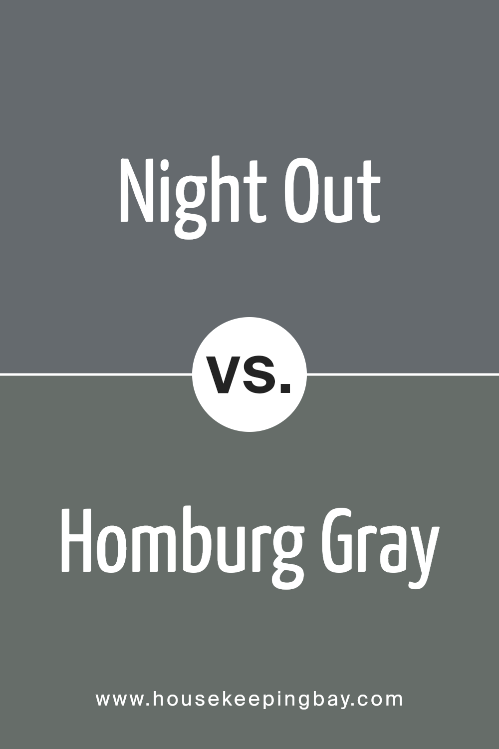
Night Out SW 9560 by Sherwin Williams vs Homburg Gray SW 7622 by Sherwin Williams
Night Out SW 9560 by Sherwin Williams is a deep, rich shade with a mysterious and cozy feel. It’s a dark hue that can create a sense of intimacy and warmth in a room. This color is ideal for making spaces feel more enclosed and comfortable, often used in living rooms or bedrooms to add depth and a comforting atmosphere.
Homburg Gray SW 7622, also by Sherwin Williams, is a medium-dark gray with cool undertones. It has a more grounded and balanced look, making it versatile for various spaces. Unlike Night Out, Homburg Gray is less about warmth and more about providing a neutral backdrop that complements other colors and decor elements.
While Night Out is perfect for adding drama and coziness, Homburg Gray acts more as a supportive color that enhances surroundings without overtaking them. Both colors add sophistication but serve different stylistic purposes in home design.
You can see recommended paint color below:
housekeepingbay.com
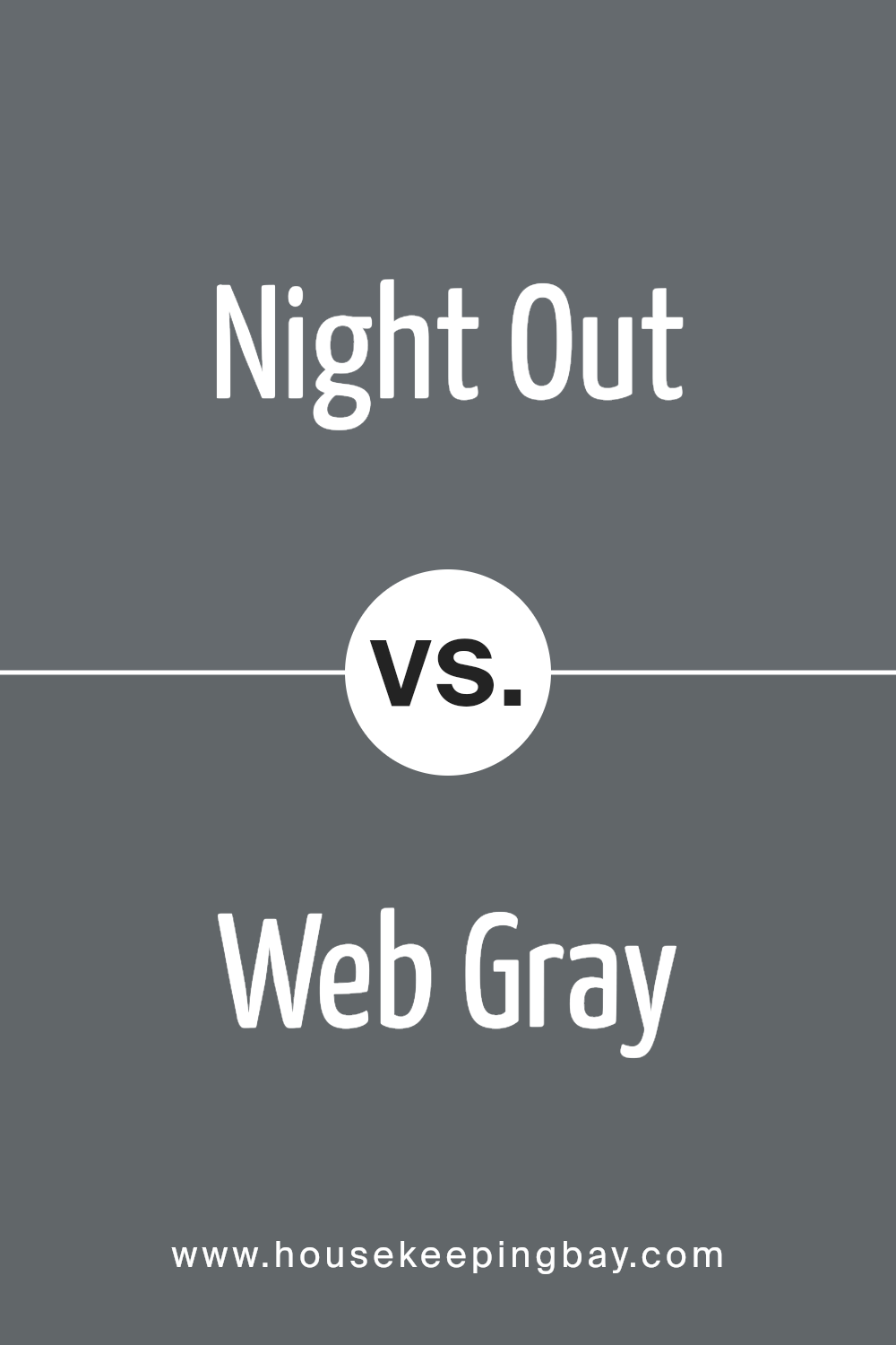
Night Out SW 9560 by Sherwin Williams vs Web Gray SW 7075 by Sherwin Williams
Night Out SW 9560 by Sherwin Williams and Web Gray SW 7075 by Sherwin Williams are both unique shades, each bringing their character to a space. Night Out is a rich, deep blue with hints of dark gray, creating a cozy, intimate atmosphere. It pairs well with lighter accents, adding depth to a room without overwhelming it.
Web Gray, however, is a cool, neutral gray, leaning towards a medium-dark tone. It offers a more traditional look, versatile enough to complement various styles and colors.
While Night Out brings warmth and intensity, Web Gray provides a more understated, sophisticated backdrop. Both shades can work across a variety of settings, from modern to classic.
Night Out suits bold, statement-making spaces, whereas Web Gray fits areas that aim for calmness and balance.
Together or separate, they enhance environments, allowing different moods depending on the desired effect.
You can see recommended paint color below:
housekeepingbay.com
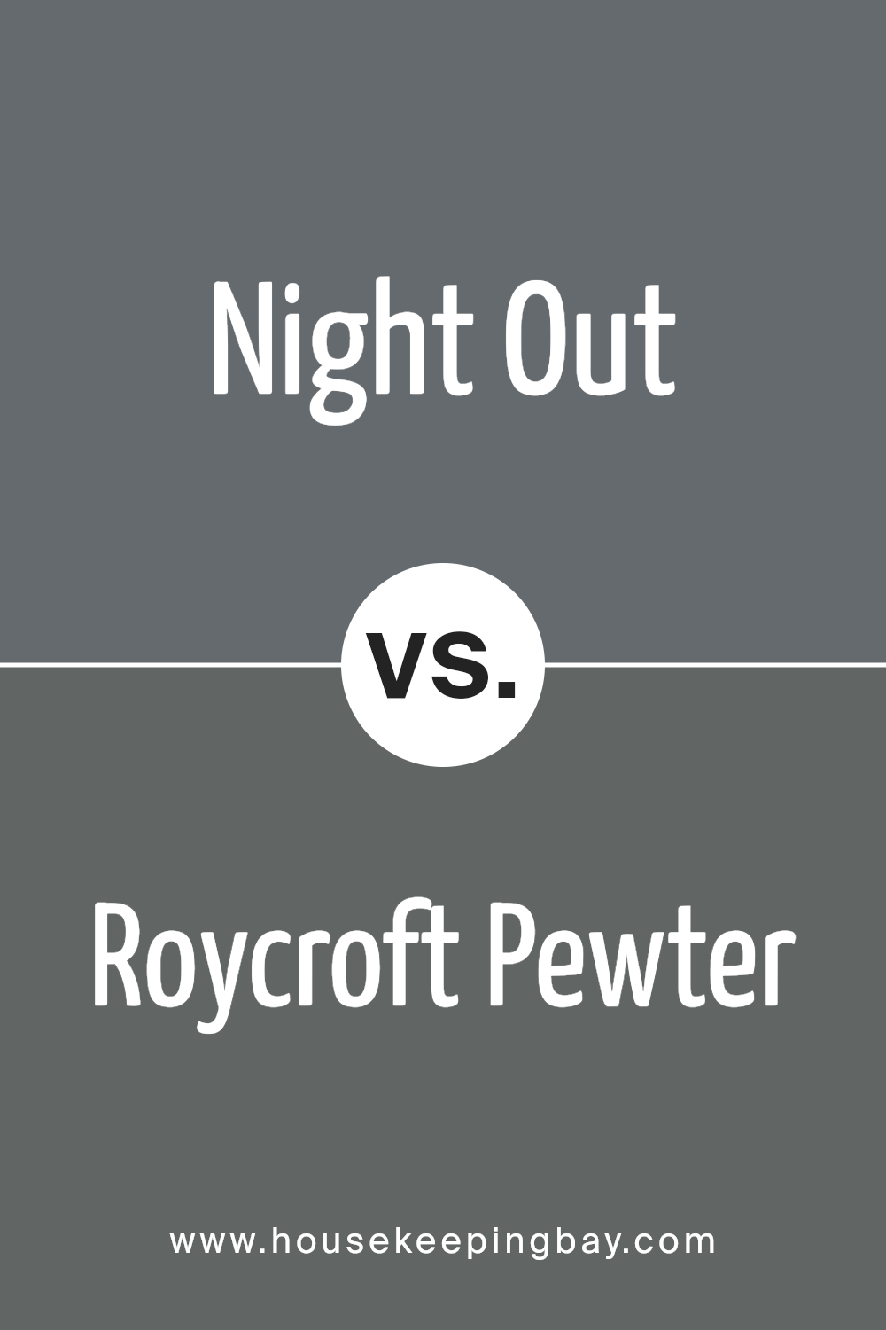
Night Out SW 9560 by Sherwin Williams vs Roycroft Pewter SW 2848 by Sherwin Williams
Night Out SW 9560 by Sherwin Williams is a deep, moody shade with a cool, bluish undertone. It creates a bold, sophisticated atmosphere. This color tends to bring a sense of drama to a room, making it perfect for feature walls or cozy spaces like a study. Its dark hue can add depth and make other elements in the room stand out.
Roycroft Pewter SW 2848, in contrast, is a more muted, earthy tone with a warmer gray base. While still strong, it feels more grounded and classic. This color works well in traditional settings or for creating a calm, soothing environment.
It pairs beautifully with wood tones and natural materials, offering a more subtle backdrop compared to Night Out.
Both colors can define a space, but Night Out injects intensity and modern flair, whereas Roycroft Pewter tends to evoke warmth and timelessness.
Their distinct personalities suit different design goals.
You can see recommended paint color below:
- SW 2848 Roycroft Pewter
housekeepingbay.com
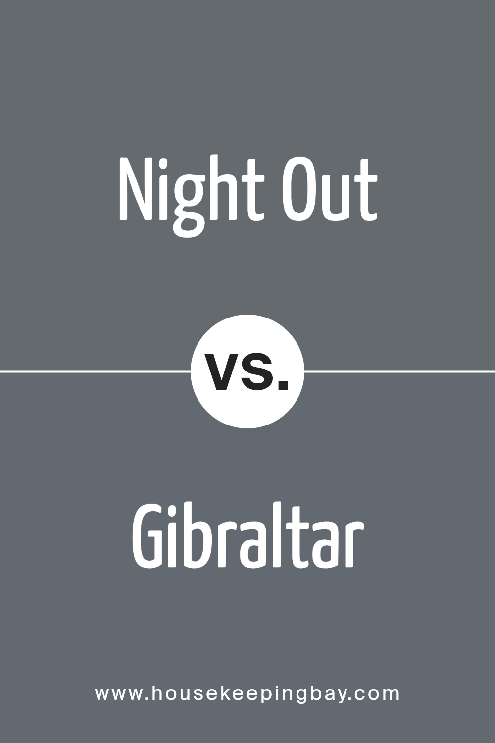
Night Out SW 9560 by Sherwin Williams vs Gibraltar SW 6257 by Sherwin Williams
Night Out SW 9560 and Gibraltar SW 6257 are two shades by Sherwin Williams that both carry deep, sophisticated tones. Night Out is a dramatic, dark navy shade with subtle undertones that create an intense, cozy atmosphere. This deep hue works well in spaces aiming for a bold, elegant look, providing a rich backdrop that pairs beautifully with metals and wood tones.
Gibraltar, in contrast, is a cool, slate-gray with blue undertones. It’s slightly lighter than Night Out, offering more versatility across different spaces. Gibraltar feels calming and modern, ideal for those seeking a balance of color and neutrality.
It brings a soft, stylish vibe to rooms without overpowering them.
Both colors suit contemporary and classic styles but cater to different moods. Night Out is perfect for intimate, luxurious settings, whereas Gibraltar offers a sleek, refined look.
While both are rich, Night Out strikes a balance between mystery and warmth, while Gibraltar leans towards a cooler, serene ambiance.
You can see recommended paint color below:
- SW 6257 Gibraltar
housekeepingbay.com
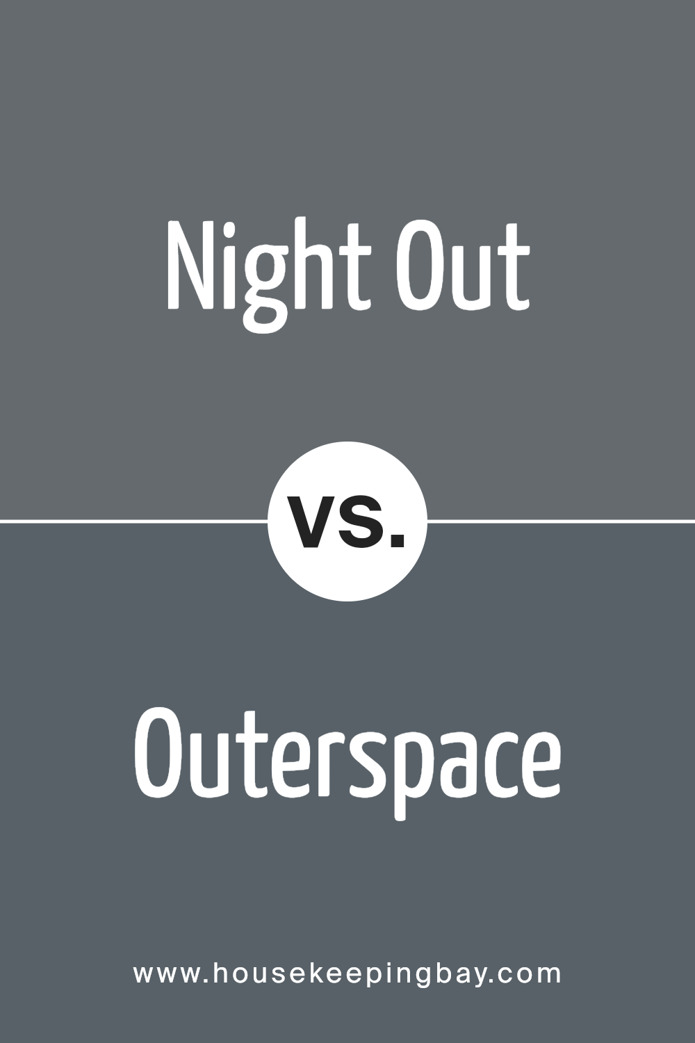
Night Out SW 9560 by Sherwin Williams vs Outerspace SW 6251 by Sherwin Williams
Night Out SW 9560 and Outerspace SW 6251, both by Sherwin Williams, offer distinct vibes for any space. Night Out is a deep, inky blue, almost bordering on black. It creates a cozy, enveloping atmosphere, perfect for a dramatic or intimate setting. The richness of this color brings a sophisticated feel, ideal for bedrooms or dining rooms if warmth is desired.
Outerspace SW 6251, while also a dark hue, leans more towards a stormy blue-gray. It has a cooler undertone, making it feel more expansive and airy compared to Night Out. This shade suits modern interiors or spaces where a calm, balanced ambiance is preferred, like offices or living rooms.
Both colors possess a depth that makes them statement choices, yet Outerspace provides a bit more versatility due to its gray tones. Night Out draws you in with its dark allure, tailoring spaces for comfort and depth.
You can see recommended paint color below:
housekeepingbay.com
Night Out SW 9560 by Sherwin Williams vs Wall Street SW 7665 by Sherwin Williams
Night Out SW 9560 and Wall Street SW 7665 by Sherwin Williams each offer a distinct feel. Night Out SW 9560, a deep blue with subtle hints of gray, creates a bold, sophisticated atmosphere. Its darker tone can make a space feel cozy and intimate, perfect for areas where you want a sense of calm, like a bedroom or study.
In contrast, Wall Street SW 7665, a medium gray with blue undertones, provides a more neutral backdrop. Its lighter shade suits many settings, adding a touch of modernity while maintaining a classic appeal.
This color works well in living rooms or kitchens, where it can enhance natural light and offer a versatile canvas for various accents and decor styles.
Both colors have their unique characteristics, making them suitable for different environments and personal tastes.
Whether you prefer the depth of Night Out or the adaptability of Wall Street, each can play a key role in setting your desired mood.
You can see recommended paint color below:

housekeepingbay.com
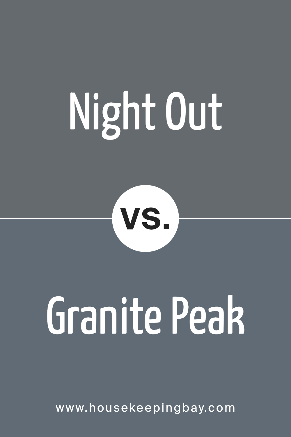
Night Out SW 9560 by Sherwin Williams vs Granite Peak SW 6250 by Sherwin Williams
Night Out SW 9560 and Granite Peak SW 6250 from Sherwin Williams offer unique color experiences. Night Out is a dark, deep teal blue that feels rich and cozy. It brings a sense of elegance and can anchor a room with sophistication. Its darker hue allows for creating a moody and intimate atmosphere, making it ideal for accent walls or areas where a calm, enveloping effect is desired.
Granite Peak SW 6250, meanwhile, presents a softer, muted gray-blue. This color strikes a balance between boldness and subtlety, making it versatile for various settings. It has an airy, calming quality, offering a more neutral backdrop without overwhelming the space.
Granite Peak can introduce a peaceful vibe without losing character, suitable for larger areas or where a serene environment is appreciated.
While both colors belong to the blue family, Night Out leans darker and more dramatic, whereas Granite Peak offers a lighter, more adaptable feel.
You can see recommended paint color below:
housekeepingbay.com
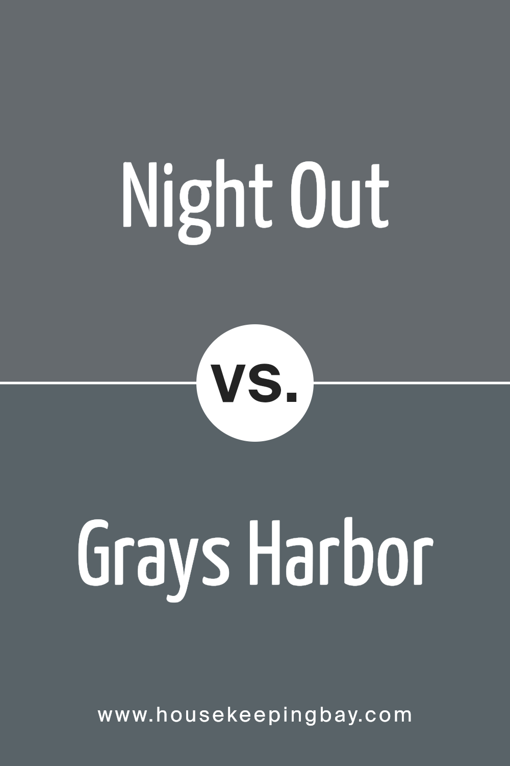
Night Out SW 9560 by Sherwin Williams vs Grays Harbor SW 6236 by Sherwin Williams
Night Out SW 9560 by Sherwin Williams presents as a deep, moody shade with hints of almost black and blue. It’s rich, providing a bold atmosphere, perfect for spaces seeking to feel intimate or dramatic. This color can create a cozy, enveloping ambiance, making it ideal for a modern living room or an elegant dining space.
Grays Harbor SW 6236, meanwhile, offers a softer, neutral tone with a mix of gray and subtle blue. This versatile shade feels calm and balanced, suitable for areas meant to feel welcoming and light. It pairs well with various color palettes, allowing flexibility in design choices.
Comparing the two, Night Out is more intense and creates a more theatrical feel, while Grays Harbor leans towards a tranquil, understated look. Both offer unique qualities, but each sets a distinct mood in a room, whether aiming for dramatic intensity or gentle harmony.
You can see recommended paint color below:
housekeepingbay.com
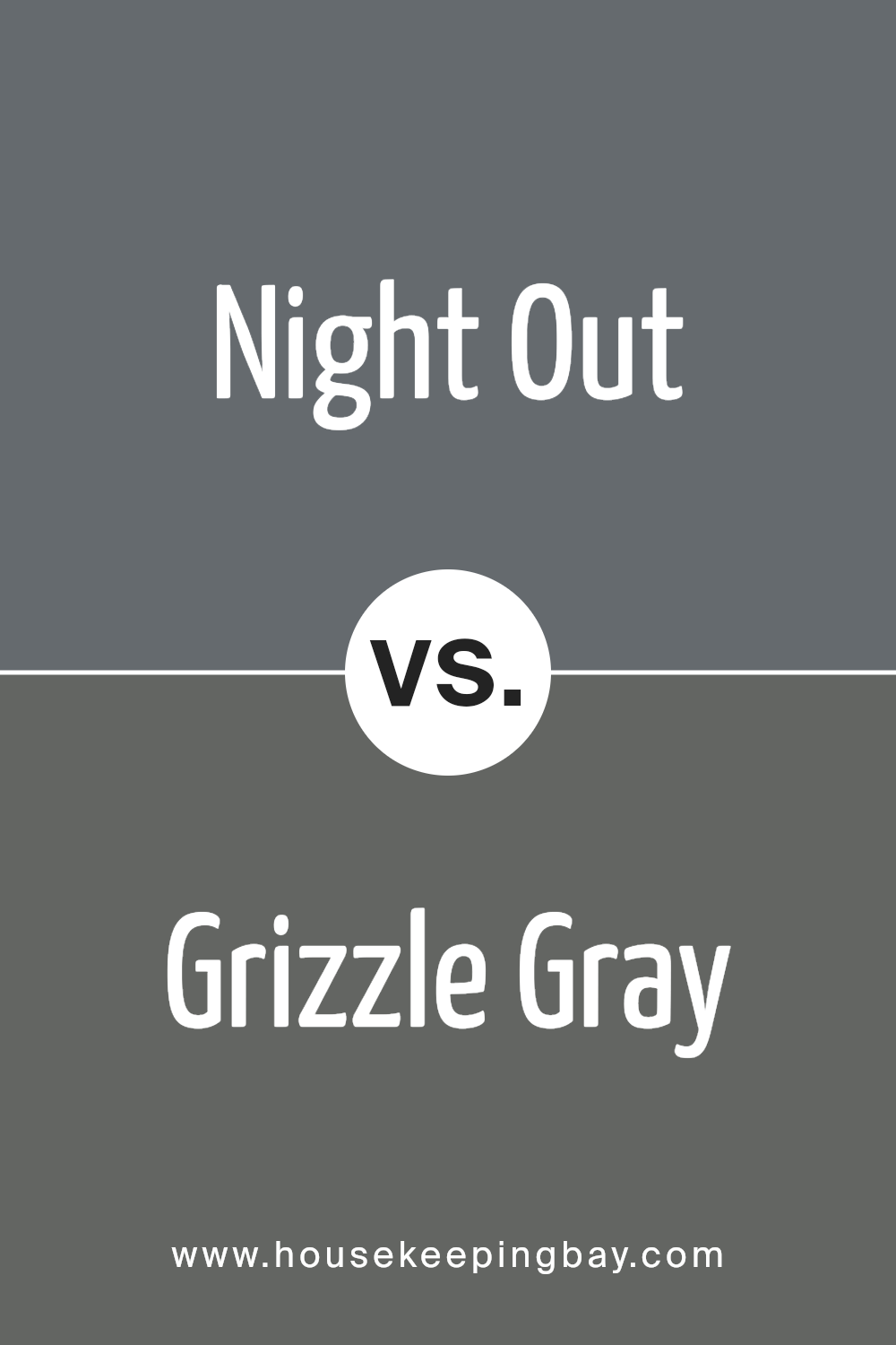
Night Out SW 9560 by Sherwin Williams vs Grizzle Gray SW 7068 by Sherwin Williams
Night Out SW 9560 and Grizzle Gray SW 7068 are both rich paints by Sherwin Williams, yet they offer different moods. Night Out SW 9560 presents as a dark, rich blue with hints of gray. This color might remind one of a quiet evening sky. It’s sophisticated, offering a dramatic flair to any space.
Grizzle Gray SW 7068, meanwhile, is a solid, medium-to-dark gray with slight green undertones. It feels earthy and stable, adding a grounded touch to rooms.
While Night Out leans towards a more cozy and enveloping atmosphere, Grizzle Gray provides a more muted and versatile backdrop. Both colors can easily pair with other accent shades.
A deep blue like Night Out works well with warm metallics or light neutrals, while Grizzle Gray fits beautifully with wood tones or brighter bursts of color. Their distinct qualities give you varied options for any design project.
You can see recommended paint color below:
- SW 7068 Grizzle Gray
housekeepingbay.com
Night Out SW 9560 by Sherwin Williams vs Slate Tile SW 7624 by Sherwin Williams
Night Out SW 9560 by Sherwin Williams is a deep, dark blue with a touch of mystery. It feels almost like a midnight sky with a hint of charcoal, making it a perfect backdrop for a cozy, intimate setting. Its rich tone adds depth to any room, especially when used in spaces meant for relaxation or entertainment.
Slate Tile SW 7624, also by Sherwin Williams, is a more muted blue-gray. It feels cooler and more grounded. This shade offers a sense of calm and works well in spaces where you want a soft, elegant look without drawing too much attention.
Its gray undertones make it versatile and easy to pair with various other colors.
In comparison, Night Out is bolder and more dramatic, making a statement. Slate Tile offers a more subdued and soothing presence.
Both colors, while different in intensity, can add a unique touch to home decor.
You can see recommended paint color below:
- SW 7624 Slate Tile
housekeepingbay.com
Conclusion
SW 9560 Night Out by Sherwin Williams offers a rich, deep hue that brings a sense of sophistication and warmth to any space. When I first considered using this color, its blend of depth and versatility immediately caught my attention. Whether applied in a living room, bedroom, or even a feature wall, it adds a layer of elegance that feels both modern and timeless.
I find that this shade works exceptionally well with neutral tones, providing a bold contrast that isn’t overwhelming. It not only complements other design elements but also stands on its own—creating a focal point that elevates the entire room.
I appreciate how Night Out reflects light differently based on its surroundings. In low lighting, it appears cozy and inviting, while in brighter settings, its vibrant undertones reveal themselves. The color has an understated charm that pleases the eye without becoming overpowering.
Ultimately, SW 9560 Night Out proves that selecting the right paint color can enhance the ambience of any interior. By choosing this shade, I’ve found a way to express a style that’s both unique and refined, aligning perfectly with my vision for a welcoming and stylish home.
housekeepingbay.com
Ever wished paint sampling was as easy as sticking a sticker? Guess what? Now it is! Discover Samplize's unique Peel & Stick samples. Get started now and say goodbye to the old messy way!
Get paint samples


