Neptune Green 658 Paint Color by Benjamin Moore
The world of interior design and décor is constantly evolving, with colors taking center stage in setting the mood and tone of any space.
The world of interior design and décor is constantly evolving, with colors taking center stage in setting the mood and tone of any space. One such color, which has been making waves in recent times, is Neptune Green 658.
This article aims to uncover the nuances of this shade, helping homeowners and designers understand its beauty and potential.
via plan home
What Color Is Neptune Green 658?
Neptune Green 658 is a sophisticated shade of green, reminiscent of the serene depths of ocean waters and the verdant foliage of a dense forest. It strikes a balance between being vibrant and soothing, making it a versatile pick for various interior styles. When used in minimalist or Scandinavian interiors, this shade introduces an unexpected pop of color without being overpowering.
Its depth and richness blend seamlessly with natural materials like wood and stone, while pairing well with metallic textures, creating a juxtaposition of nature and luxury.
housekeepingbay.com
Table of Contents
Is It a Warm Or Cool Color?
Neptune Green 658 leans towards the cool spectrum of colors. This characteristic grants homes a serene, calming ambiance, especially when the hue graces the walls. Cool colors, by nature, recede visually, allowing rooms to appear more spacious and airy. Thus, Neptune Green 658 works wonders in homes, especially those seeking a touch of tranquility.
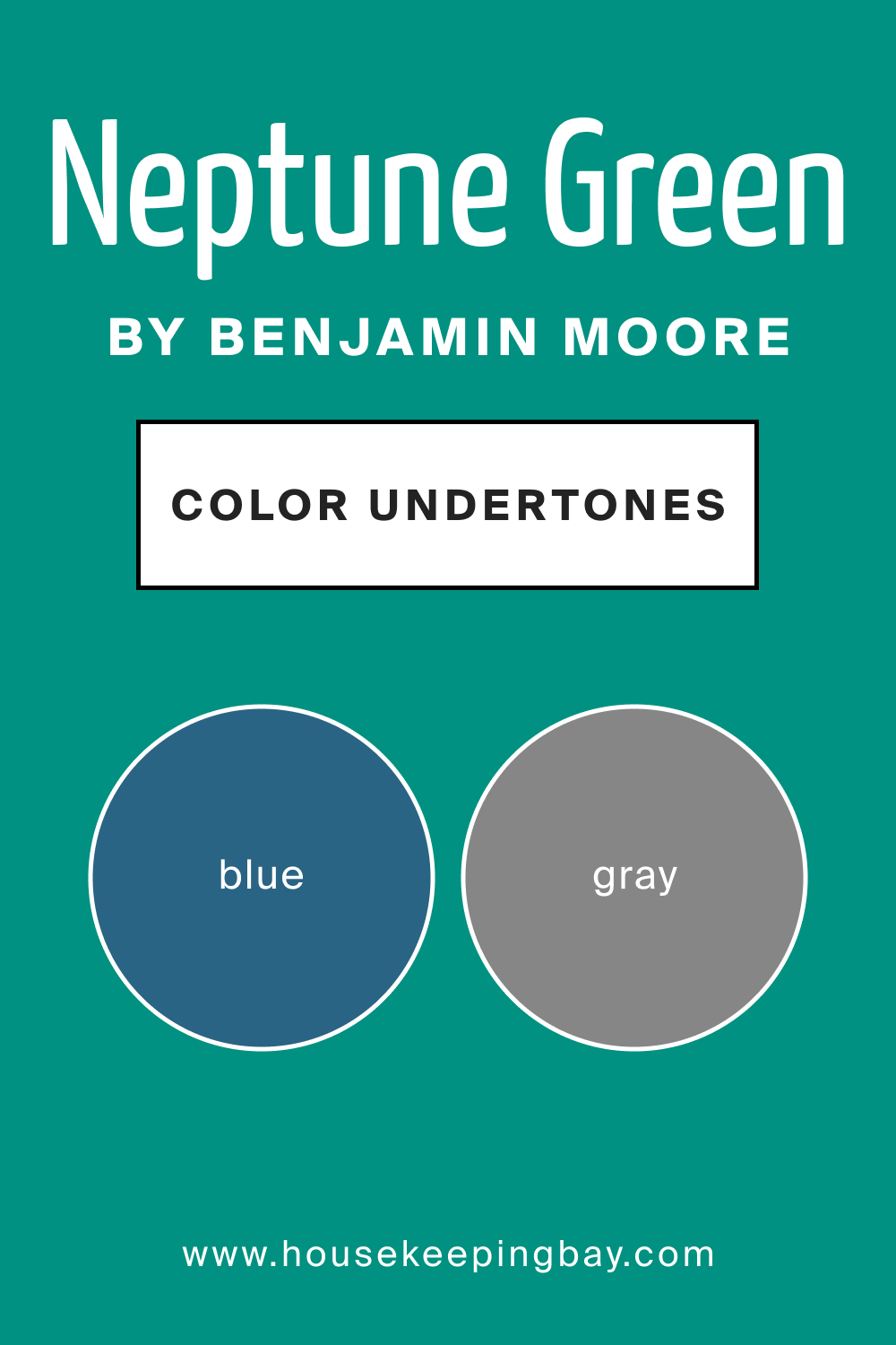
Undertones of Neptune Green 658
All colors have undertones, subtle hints of other colors that affect their overall appearance. Neptune Green 658 boasts undertones of blue and gray. These undertones influence how we perceive the color, often making it appear cooler or warmer based on lighting and adjacent colors. On interior walls, especially, the undertones can either make the color pop or become more subdued, based on the surrounding elements.
housekeepingbay.com
Coordinating Colors of Neptune Green 658
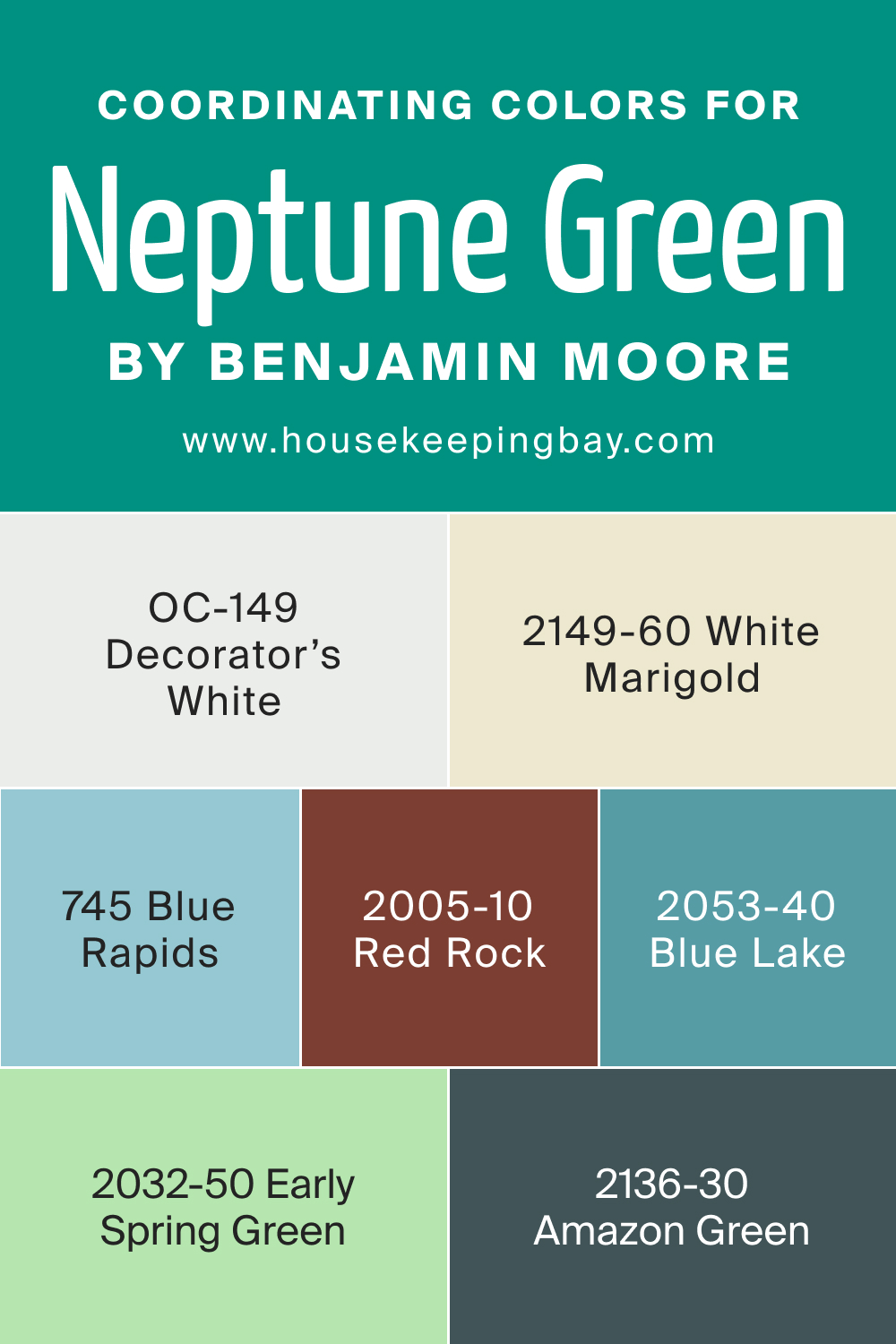
Coordinating colors are those that complement and elevate the primary color, creating harmony in design. For Neptune Green 658, the coordinating colors include OC-149 Decorator’s White, a pristine, clear white; BM 2149-60 White Marigold, a subtle, creamy shade; BM 2136-30 Amazon Green, a deeper, jungle-inspired green; and BM 745 Blue Rapids, a refreshing aquatic blue.
Other colors that coordinate well are BM 2005-10 Red Rock, BM 2032-50 Early Spring Green, and BM 2053-40 Blue Lake, each bringing their unique touch to the palette.
housekeepingbay.com
How Does Lighting Affect Neptune Green 658?
Lighting plays a pivotal role in determining how we perceive colors. Under artificial lighting, Neptune Green 658 can appear more saturated, while natural light can either amplify its cool undertones or give it a warmer glow based on the time of day. North-faced rooms tend to cast a cooler, bluish light, enhancing the shade’s blue undertones. South-faced rooms, flooded with sunlight, can give it a slightly warmer appearance.
East-facing rooms, with the gentle morning light, might render Neptune Green 658 softer and mellow, while west-facing rooms under the evening sun can make it appear richer.
housekeepingbay.com
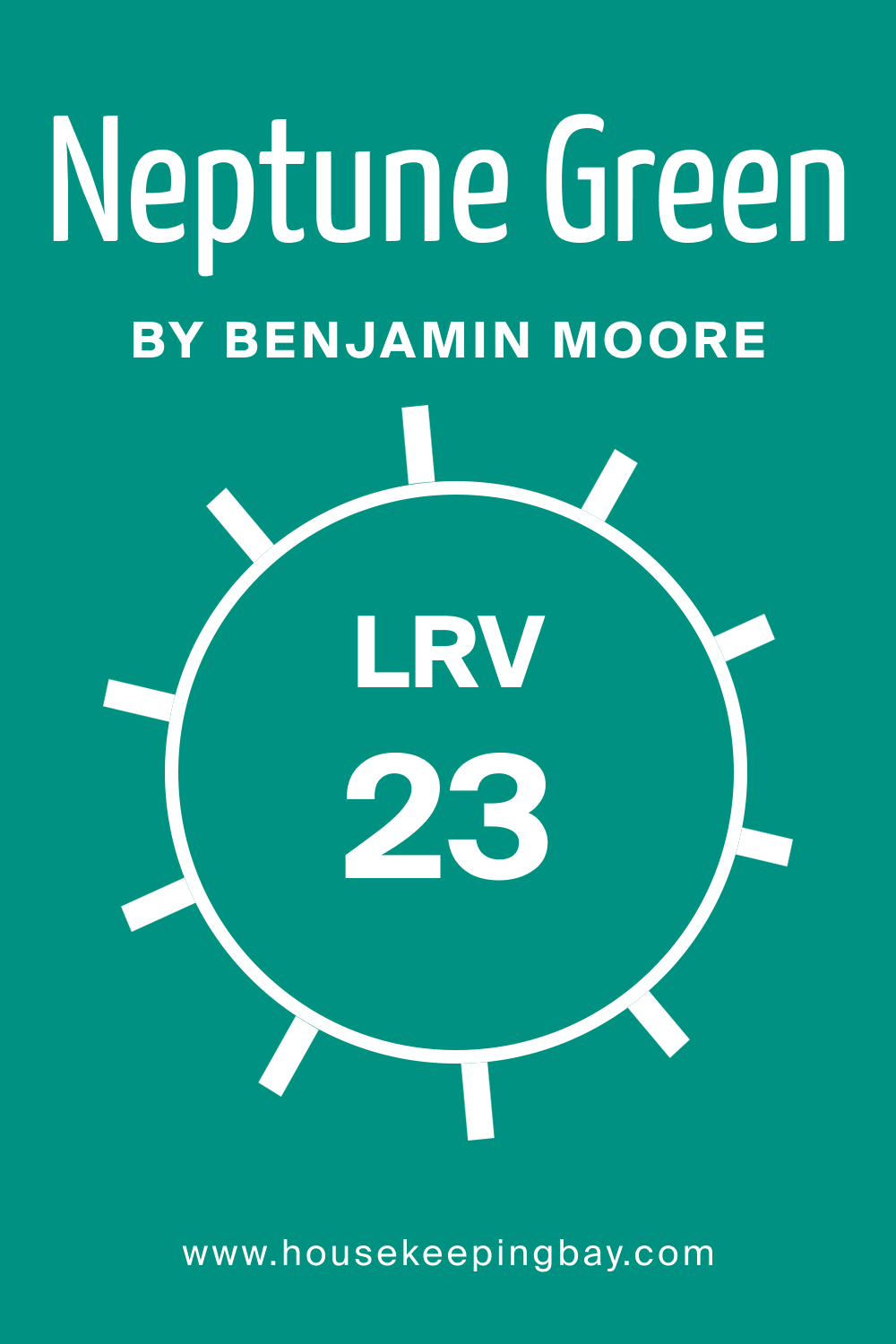
LRV of Neptune Green 658
LRV, or Light Reflectance Value, measures how much light a color reflects. With an LRV of 23, Neptune Green 658 is on the lower spectrum, meaning it absorbs more light than it reflects. This makes the color appear deeper and richer on walls. A lower LRV often translates to a more intimate, cozy feel, making Neptune Green 658 ideal for spaces where a more enveloped, comforting atmosphere is desired.
housekeepingbay.com
What is LRV? Read It Before You Choose Your Ideal Paint Color
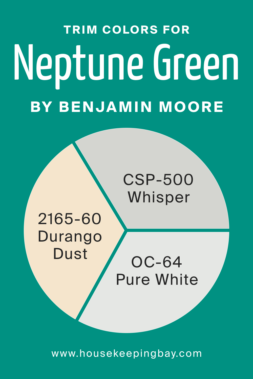
Trim Colors of Neptune Green 658
Trim colors serve to frame and accentuate wall colors, and when chosen correctly, they elevate the overall aesthetic. For Neptune Green 658, shades of white from the same brand, such as OC-64 Pure White, CSP-500 Whisper, and BM 2165-60 Durango Dust, work wonders, giving the room a crisp, well-defined finish.
housekeepingbay.com
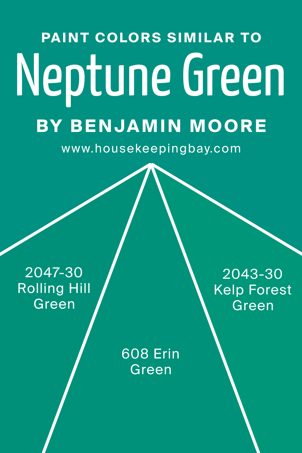
Colors Similar to Neptune Green 658
Understanding similar colors is essential when fine-tuning design choices. For those in love with Neptune Green 658, similar shades like BM 2047-30 Rolling Hill Green, a lush meadow green; BM 608 Erin Green, a lively spring-inspired hue; and BM 2043-30 Kelp Forest Green, a deep seaweed shade, provide alternatives.
BM 665 Gulf Shores stands out as a coastal-inspired green with hints of blue.
housekeepingbay.com
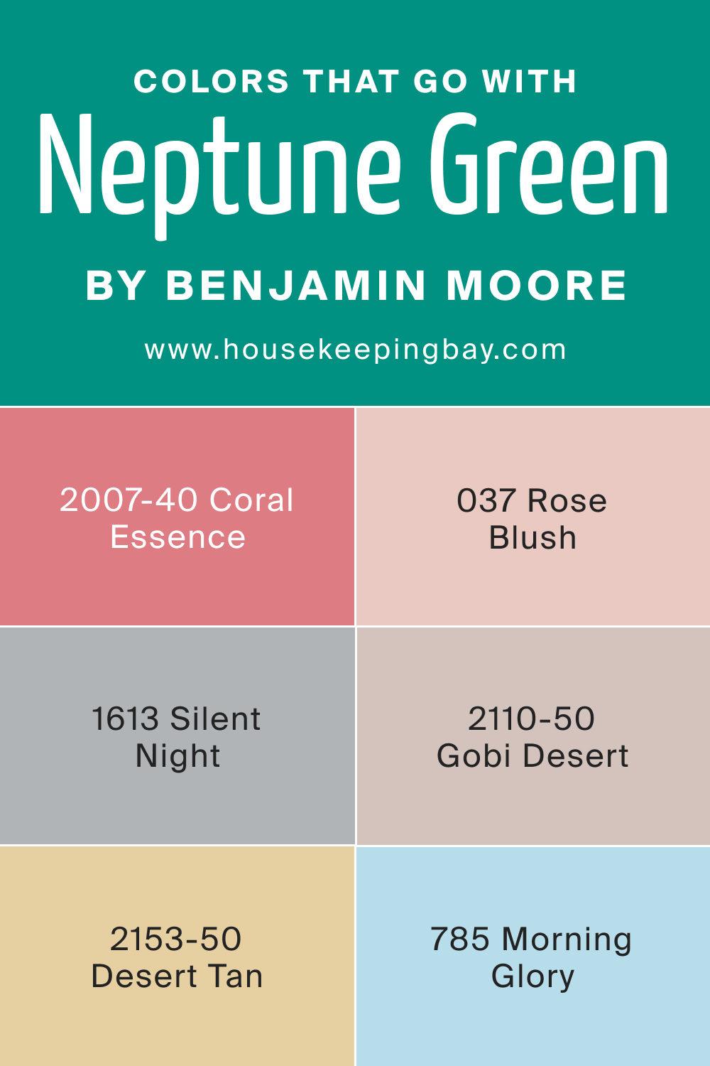
Colors That Go With Neptune Green 658
Pairing the right colors in a room creates cohesion and aesthetic appeal. Neptune Green 658 pairs harmoniously with colors from Benjamin Moore, such as BM 2007-40 Coral Essence, BM 037 Rose Blush, BM 1613 Silent Night, BM 2110-50 Gobi Desert, BM 2153-50 Desert Tan, and BM 785 Morning Glory. Each of these colors, with their unique tones and personalities, complements and contrasts Neptune Green 658 in just the right way, ensuring a well-rounded palette for any room.
housekeepingbay.com
How to Use Neptune Green 658 In Your Home?
Neptune Green 658 is a versatile hue that can grace multiple rooms, infusing a touch of nature indoors. It’s perfect for living rooms, bedrooms, bathrooms, and even the exterior. Its cool undertones make it a fit for modern, Scandinavian, coastal, and even bohemian interior design styles.
The depth of this color makes spaces feel inviting and connected to the natural world.
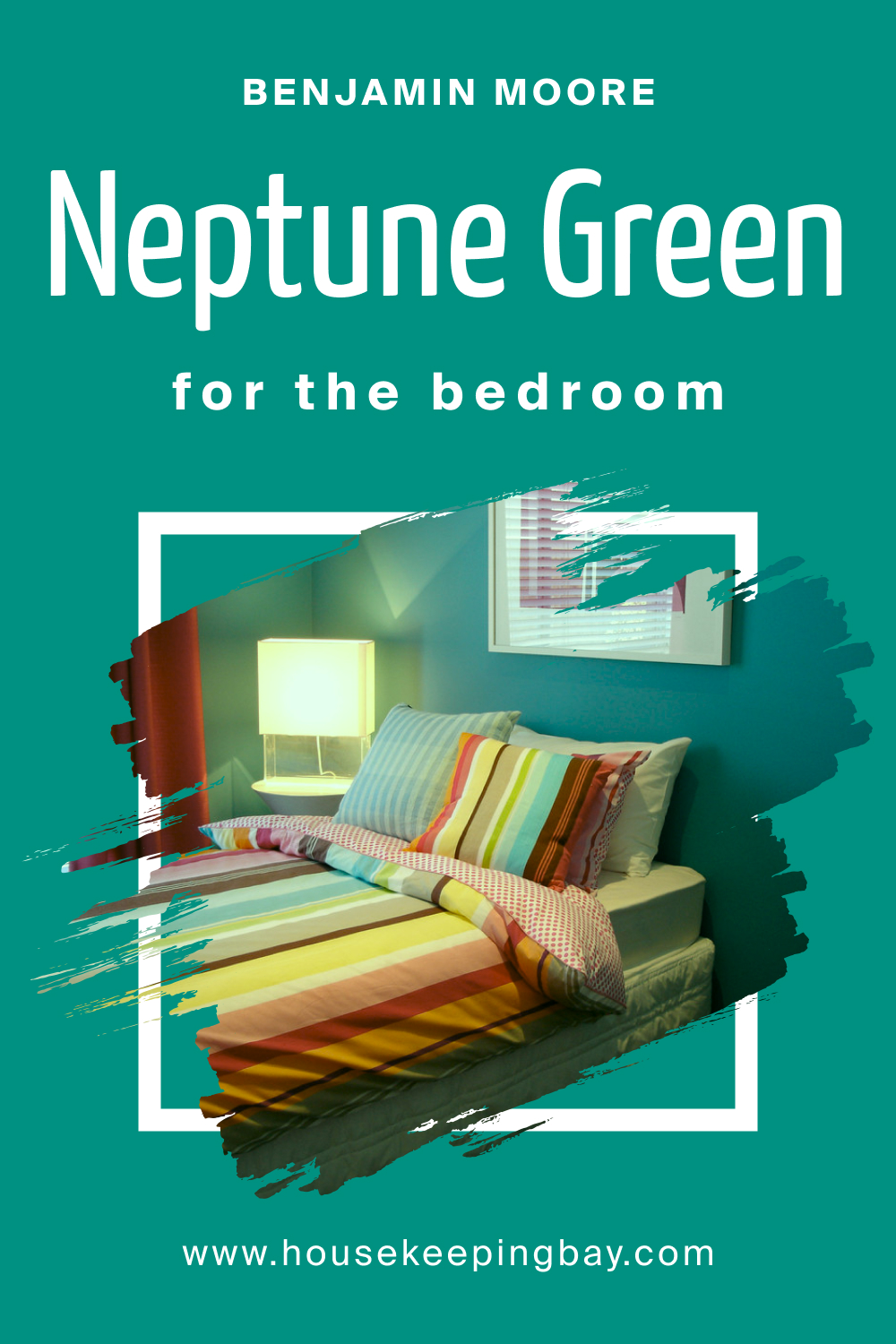
How to Use Neptune Green 658 in the Bedroom?
In the bedroom, Neptune Green 658 creates a tranquil retreat, reflecting the calming shades of nature. Use it on the main wall behind the bed for a focal point, or envelop the entire room for a cocooning effect. Paired with light linens, natural wood, and muted gold accents, it paves the way for restful nights and serene mornings.
housekeepingbay.com
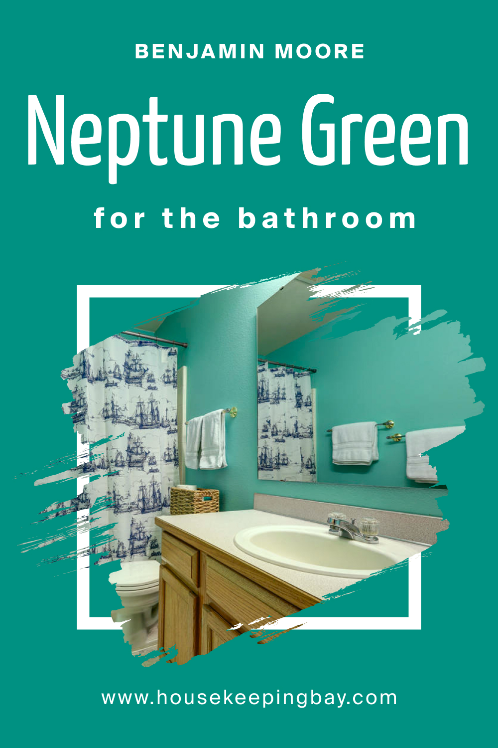
How to Use Neptune Green 658 in the Bathroom?
The bathroom becomes a refreshing oasis with Neptune Green 658. Think of it as a spa-inspired touch, evoking the calming effects of seawater and forest foliage. Complement with white fixtures, marble countertops, and brushed metal finishes. Plants like ferns or orchids can enhance the natural feel, making each bath a rejuvenating experience.
housekeepingbay.com
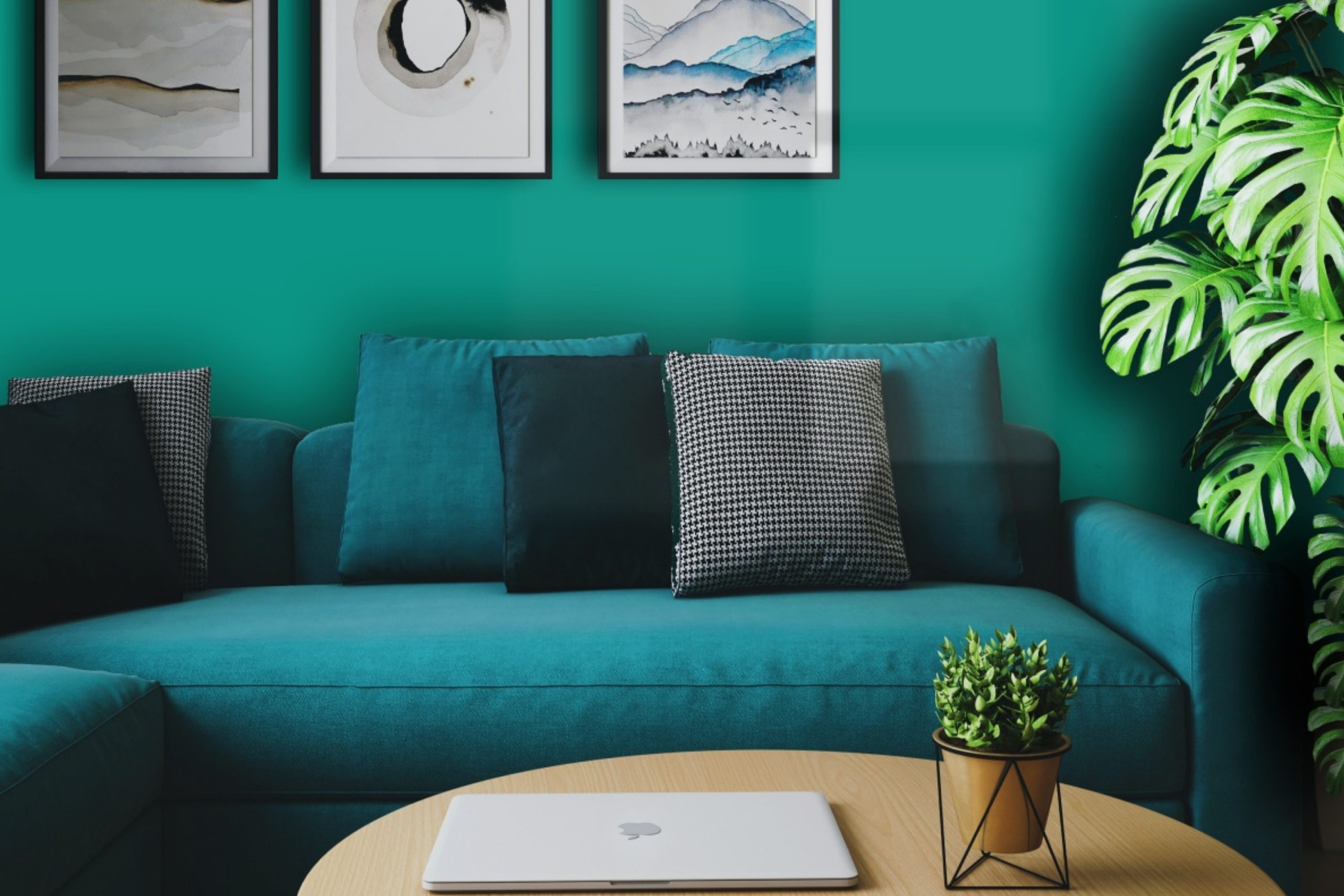
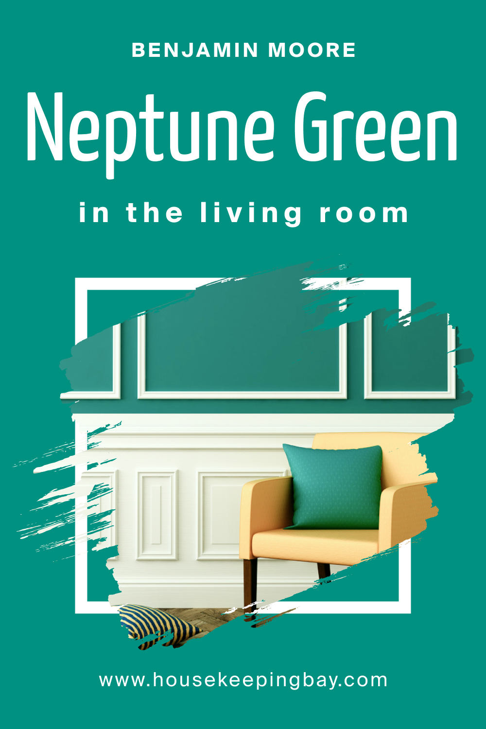
How to Use Neptune Green 658 in the Living Room?
For a living room, Neptune Green 658 adds sophistication and depth. It beautifully contrasts with light-colored sofas and dark wooden furniture, creating a space that’s both lively and relaxing. Accent with throws and cushions in coordinating colors, and incorporate indoor plants for a living room that feels both modern and cozy.
housekeepingbay.com
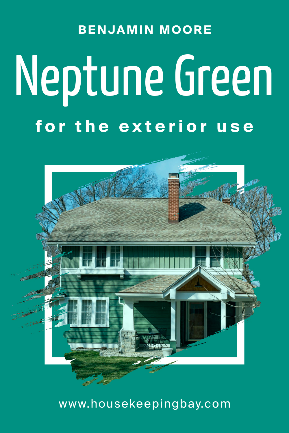
How to Use Neptune Green 658 for an Exterior?
Neptune Green 658 on the exterior bridges the home with its surroundings. Especially fitting for homes nestled in green landscapes or coastal areas, this color exudes elegance. White trims, wooden accents, or stone pathways can enhance its beauty, making your home a standout yet harmonious part of the neighborhood.
housekeepingbay.com
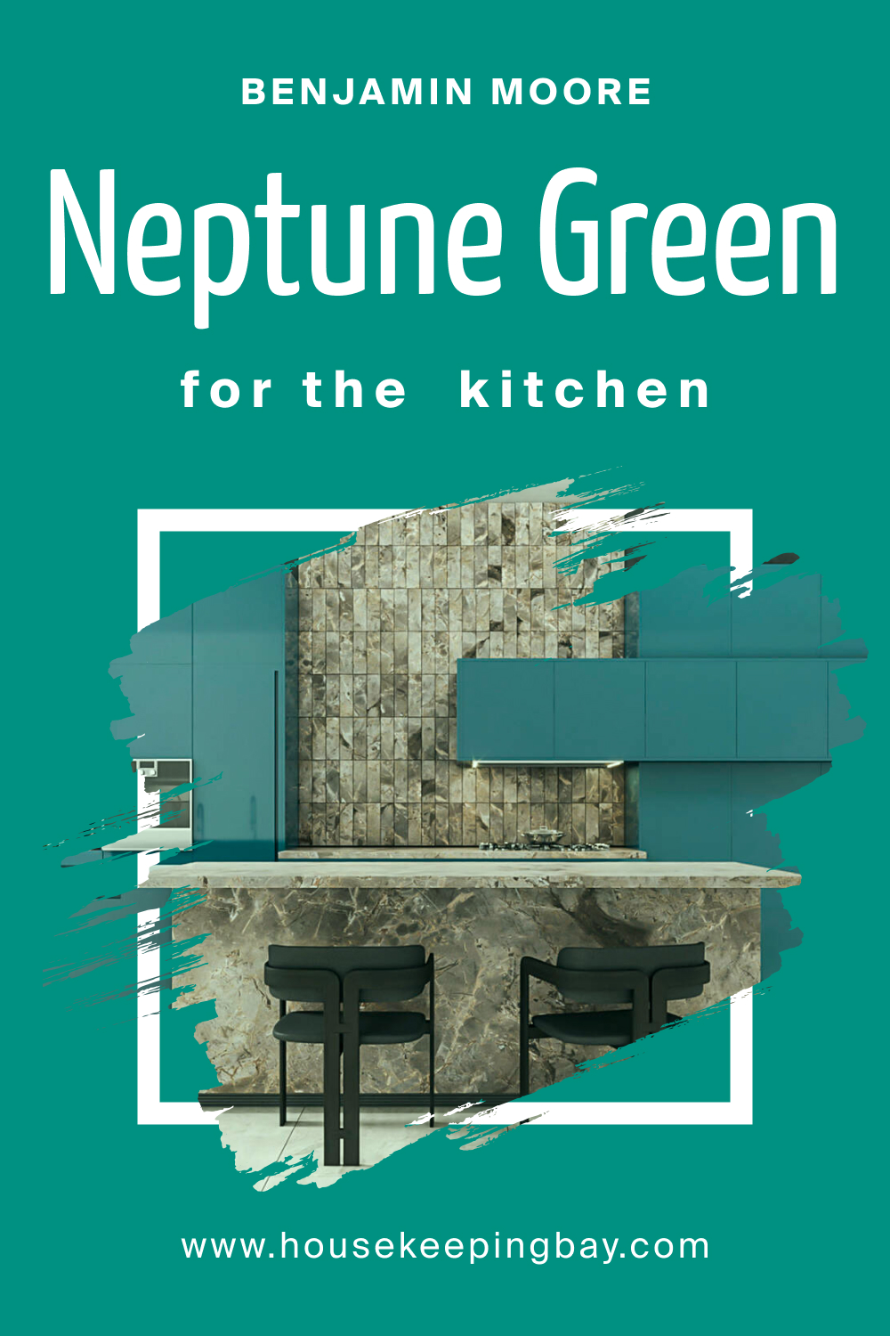
How to Use Neptune Green 658 in the Kitchen?
The kitchen, often the heart of the home, takes a refreshing twist with Neptune Green 658. Use it on walls to provide a calming backdrop against which both modern appliances and rustic kitchenware shine. Paired with white or marble countertops and open wooden shelving, it evokes a fresh, farm-to-table ambiance.
housekeepingbay.com
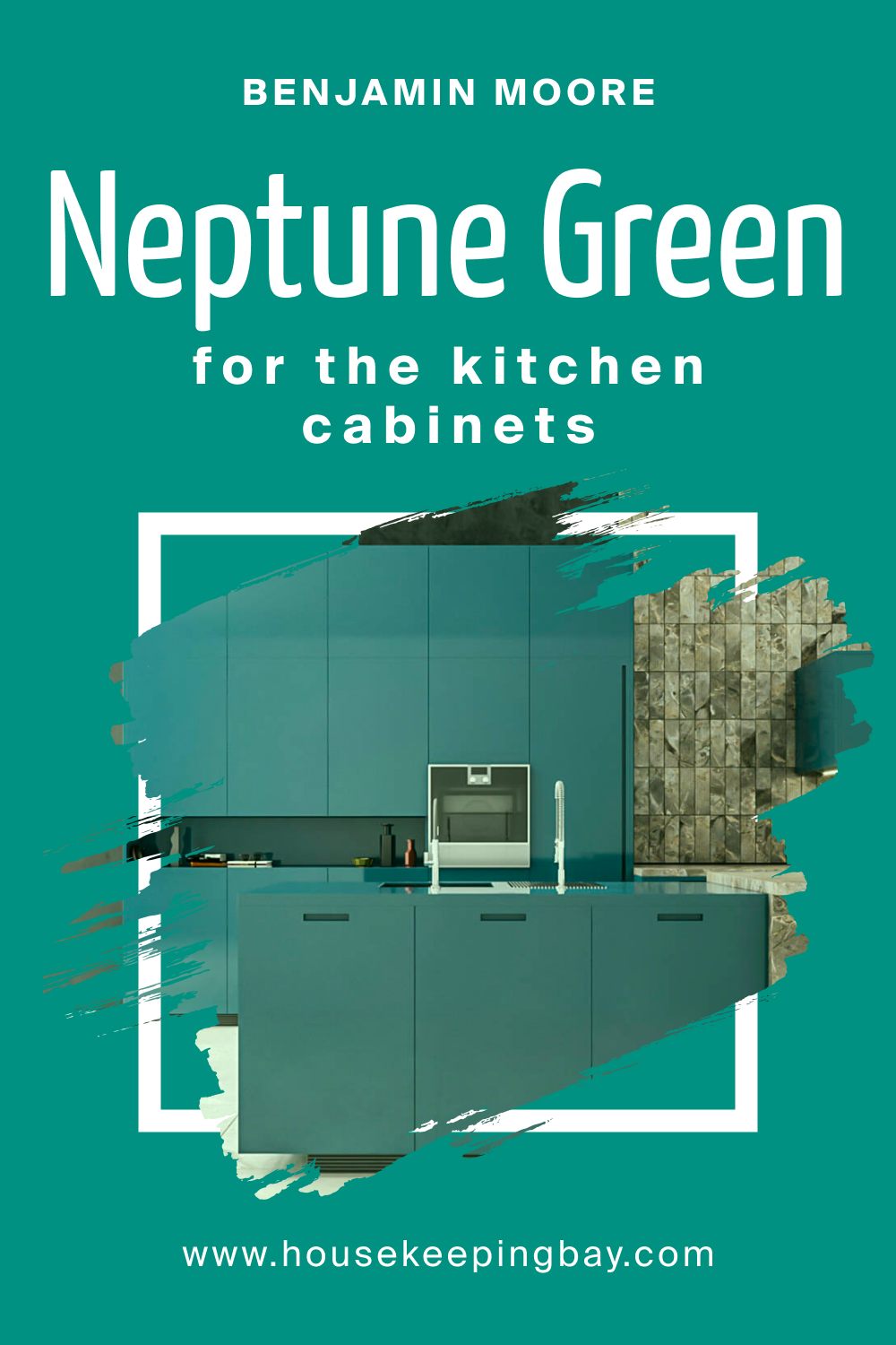
How to Use Neptune Green 658 on the Kitchen Cabinets?
Revamp your kitchen cabinets with Neptune Green 658 for an instant uplift. This color, especially when paired with gold or brass handles, offers a contemporary yet timeless look. Set against a light backsplash, these cabinets become the kitchen’s focal point, exuding charm and elevating the culinary experience.
housekeepingbay.com
Comparing Neptune Green 658 With Other Colors
Comparing colors is crucial in interior design because it helps in determining the ambiance and mood of a space. While a color may seem perfect when viewed in isolation, it might not evoke the desired effect when juxtaposed with other hues. Comparisons allow for an understanding of undertones, depth, and the overall feel a color imparts.
It aids in making informed decisions to ensure the coherence and aesthetic appeal of a room. By comparing Neptune Green 658 with six other colors, we gain a better grasp of its versatility and suitability for various settings.
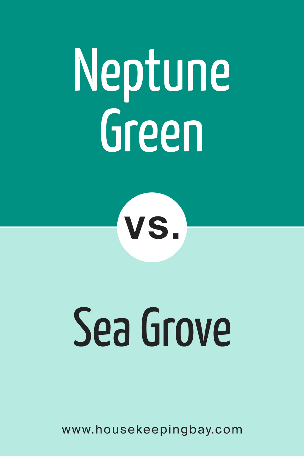
Neptune Green 658 vs. BM 653 Sea Grove
Sea Grove offers a softer, muted presence compared to the deep allure of Neptune Green 658. While Neptune Green exudes depth reminiscent of forest foliage, Sea Grove leans towards the pale hues of beach glass, offering a subtler coastal vibe.
housekeepingbay.com
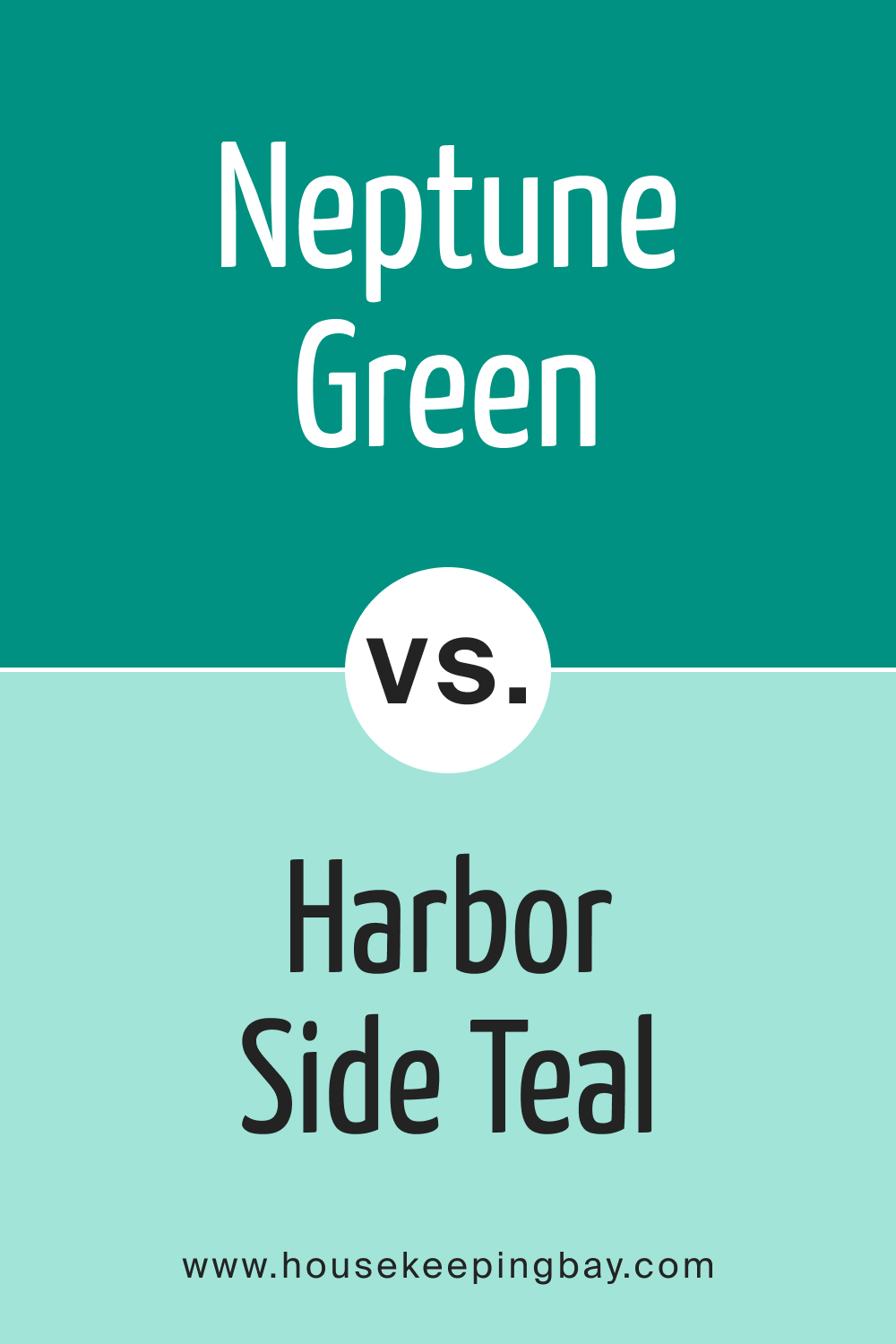
Neptune Green 658 vs. BM 654 Harbor Side Teal
Harbor Side Teal , as the name suggests, has stronger blue undertones than Neptune Green 658. While both colors are reminiscent of the sea, Harbor Side Teal plunges into deeper oceanic shades, while Neptune Green remains anchored in the coastal shallows with its greenish touch.
housekeepingbay.com
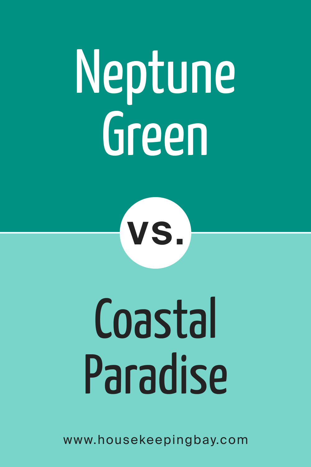
Neptune Green 658 vs. BM 655 Coastal Paradise
Coastal Paradise takes one straight to the serene beaches of a tropical island. It’s brighter and lighter compared to Neptune Green 658. While Neptune Green might evoke a dense coastal forest, Coastal Paradise is the clear lagoon surrounding it.
housekeepingbay.com
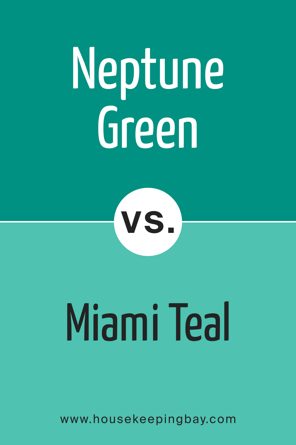
Neptune Green 658 vs. BM 656 Miami Teal
Miami Teal carries the vibrancy and life of its namesake city. It’s bolder and more vibrant than Neptune Green 658. Where Neptune Green offers calmness, Miami Teal demands attention, reminiscent of the lively beaches and nightlife of Miami.
housekeepingbay.com
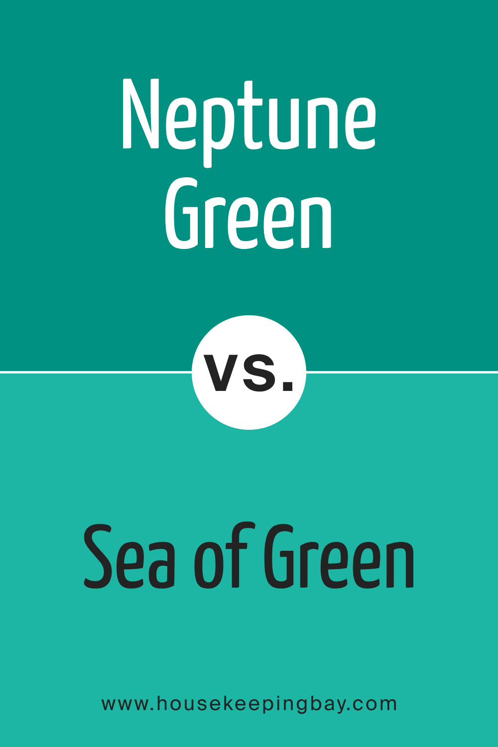
Neptune Green 658 vs. BM 657 Sea of Green
Sea of Green straddles the line between green and blue, closely rivalling Neptune Green 658 in depth. The two are akin to different shades of deep forest foliage, with Sea of Green having a slightly cooler tone due to its bluish lean.
housekeepingbay.com
Neptune Green 658 vs. BM 652 Caribbean Breeze
Caribbean Breeze is a refreshing, light hue, echoing the gentle breezes of its namesake region. It’s the gentle whisper to Neptune Green 658’s profound statement. While both colors are undeniably coastal, Caribbean Breeze offers a softer, airier presence.
housekeepingbay.com
Conclusion
Colors, while individualistic in their beauty, derive much of their essence from the company they keep. Neptune Green 658, when compared to a spectrum of other hues, reveals its unique strength and depth. It stands as a testament to the importance of comparison in the realm of design. By understanding each color’s nuances, designers and homeowners can craft spaces that resonate with emotion, mood, and purpose.
Neptune Green 658, with its depth and versatility, proves to be a shade that can seamlessly adapt, complement, and transform.
housekeepingbay.com
Ever wished paint sampling was as easy as sticking a sticker? Guess what? Now it is! Discover Samplize's unique Peel & Stick samples. Get started now and say goodbye to the old messy way!
Get paint samples


Frequently Asked Questions
⭐What kind of undertones does Neptune Green 658 have?
Neptune Green 658 boasts cool undertones with a slight hint of blue. This gives it a calming and refreshing appeal, making it perfect for creating tranquil spaces.
⭐Is Neptune Green 658 suitable for exteriors?
Absolutely! Neptune Green 658 bridges the home with its surroundings, making it especially fitting for homes in green landscapes or coastal areas. It provides an elegant exterior presence.
⭐What are the best trim colors for Neptune Green 658?
Neptune Green 658 pairs beautifully with shades of white, especially cooler whites. This provides a crisp, contrasting boundary, enhancing the beauty of the paint color.
⭐How does Neptune Green 658 react to different lighting conditions?
In natural light, Neptune Green 658 reflects a true, vibrant color. In artificial lighting, especially warmer lights, its green-blue undertones can become more pronounced. The color also takes on different shades depending on the direction of the room – appearing cooler in north-faced rooms and warmer in south-faced spaces.
⭐Can Neptune Green 658 be used in kitchens or bathrooms?
Certainly! In kitchens, Neptune Green 658 provides a refreshing backdrop, and in bathrooms, it evokes a spa-like tranquility. It's versatile enough to be used across various rooms with different functionalities.


