March Wind SW 7668 by Sherwin Williams – The Color That Plays It Cool and Keeps It Calm
The Effortless Gray You Didn’t Know You Needed
March Wind SW 7668—now this is a color with some attitude. It’s like that one friend who’s always calm and collected but can throw out a sharp comment when needed. It’s a soft gray, sure, but there’s a little mystery to it. It’s not just your run-of-the-mill neutral, it’s got this cool undertone that gives it a fresh, almost moody vibe.
I once used it in a client’s living room where they had these big windows—natural light hitting March Wind? Gorgeous. It stayed soft but never too cold. Paired it with warm woods, and bam! Instant coziness. But, you know, I’ve also seen it in modern kitchens with black fixtures, and it held its own. Versatile but with a little edge. You could practically feel the breeze.
And trust me, it’s not one of those grays that’ll make your space feel like a cave—unless you’re into that, then hey, go nuts. But if you’re looking for something that doesn’t steal the show but knows how to command attention when you need it to? March Wind’s your guy.

housekeepingbay.com
Warm or cool? Where does this color really fall
Table of Contents
It’s definitely a cool gray. But don’t expect it to be icy – it’s more like a cloudy day where the breeze feels just right. Not too warm, not too stark. You won’t find any warmth here, but that’s exactly what makes it perfect when you want a fresh, modern look without feeling like you’re stuck in a freezer.
Pair it with crisp whites or bold blacks for that sleek, stylish vibe. Throw in a pop of color if you’re feeling fancy, but trust me, March Wind is already doing the heavy lifting. It’s got that “I’ve got my life together” energy but without trying too hard. Keep it cool, keep it classy, and let March Wind work its magic.
What’s the true tone hiding in March Wind?
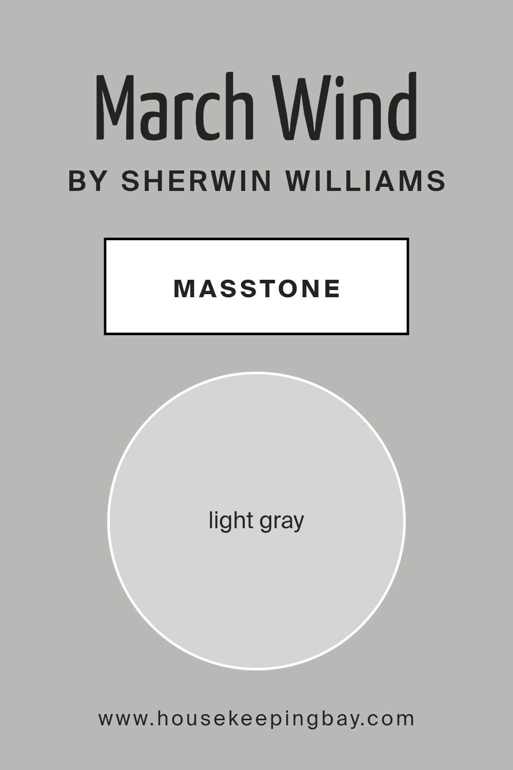
March Wind SW 7668 has a true gray masstone. It’s a light, neutral gray without any strong undertones jumping out to surprise you. No weird blues or greens creeping in – just a solid, reliable gray that stays pretty even in most lighting. It’s got that “cool, calm, collected” thing going on without leaning too cold or harsh.
Perfect for when you want a light gray that doesn’t mess around or get too complicated. It’s a straightforward choice – almost like the paint version of your favorite comfy sweater. Always there for you, never trying to steal the spotlight.
housekeepingbay.com
The subtle undertones you need to know
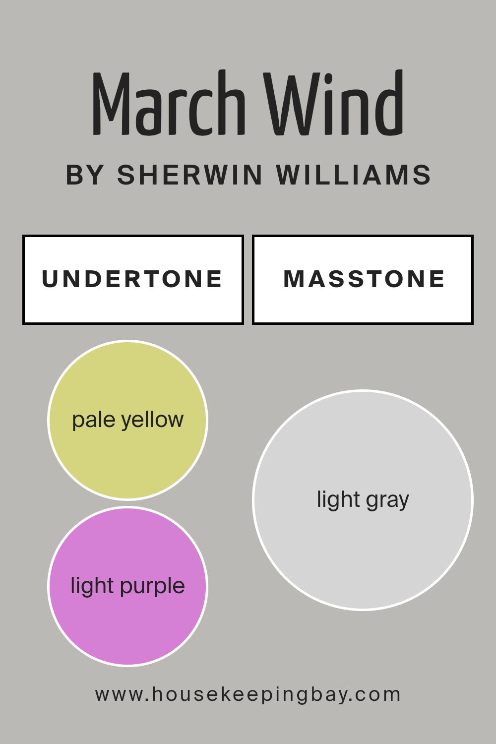
March Wind SW 7668 brings a light gray masstone, but those undertones are where the magic happens. It’s not your typical gray – it’s got a subtle mix of pale yellow and a whisper of purple lurking underneath.
Depending on your lighting, you might catch a glimpse of those undertones, especially in cooler or dim rooms where that purple can sneak in. But don’t worry, it’s not screaming lavender or anything, just a soft shift that adds depth and makes this gray feel anything but flat. Yellow keeps it balanced, so you’re not diving into icy gray territory either.
housekeepingbay.com
Perfect color pairings that make March Wind shine
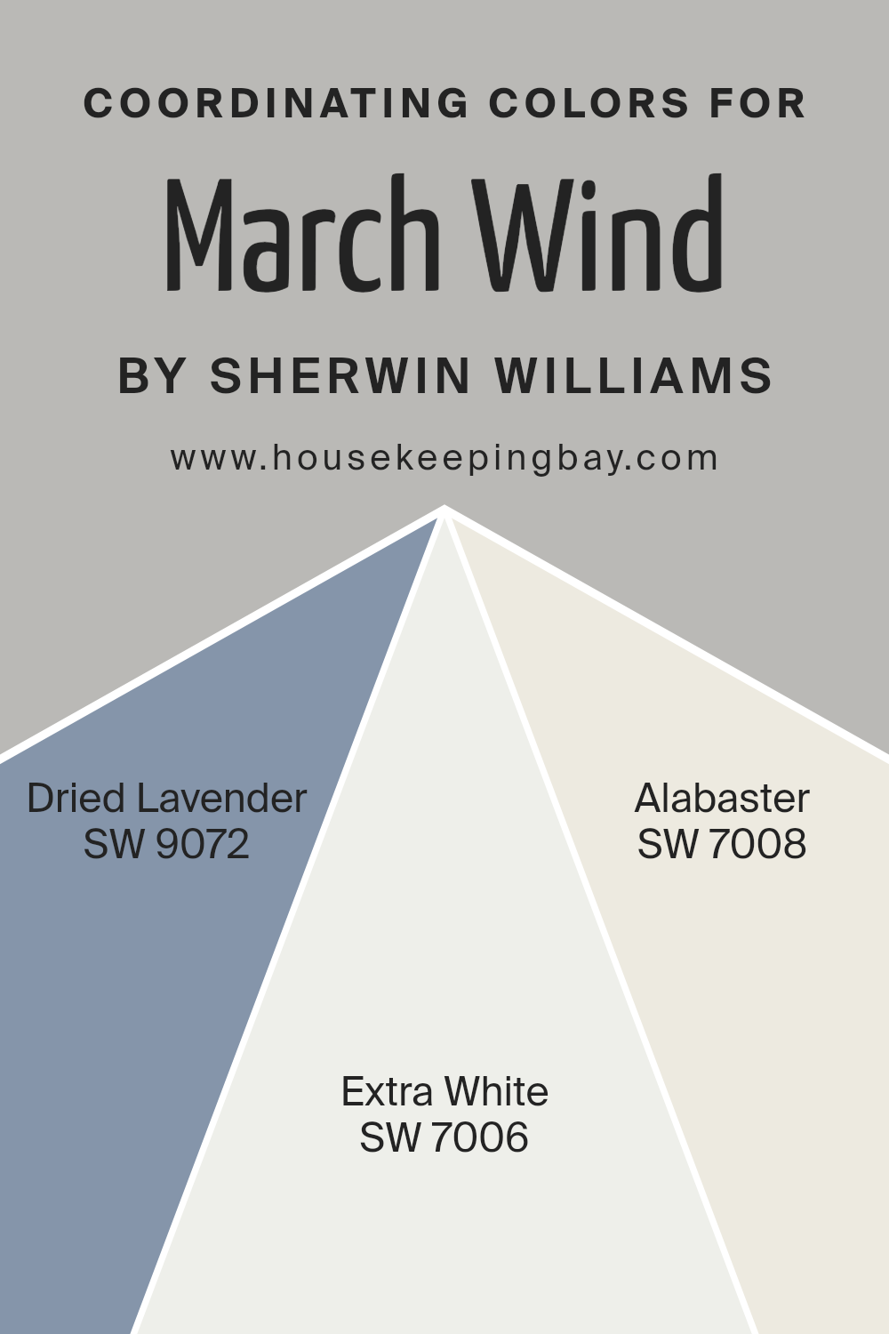
March Wind SW 7668 plays so nicely with a few specific colors, and I’m loving the combo you’re working with here! Pairing it with SW 9072 Dried Lavender? That’s a dreamy match. Dried Lavender adds this soft, muted purple that totally vibes with the subtle undertones in March Wind. It’s like they were made to chill together.
Now, SW 7006 Extra White brings in that crisp, clean contrast. It’s perfect for trim or ceilings if you want to keep things sharp and fresh without stealing the show from March Wind. It gives everything a nice, modern edge.
And SW 7008 Alabaster? Oh, that’s the cozy, creamy white that warms everything up a bit. If you want a softer look that still feels bright but more inviting, Alabaster is your best friend. It’s like the perfect hug to March Wind’s cool sophistication.
This palette brings together a fresh, balanced, and inviting space—perfect mix of calm and crisp with just a touch of softness.
housekeepingbay.com
How lighting changes everything with March Wind
March Wind SW 7668 – let me tell you, this color is sneaky. You think you’re getting this perfect, cool gray, but just wait until the lighting changes. In natural light, especially that crisp morning light, it can feel light, breezy, and totally neutral. Then, BAM—afternoon hits, and suddenly it’s like, “Hi, I’m a greige now!” Seriously. It picks up these warmer tones that I swear weren’t there earlier.
Now, if you throw some artificial light at it, especially those warm bulbs, good luck. It can go almost beige on you! I’m not saying it’s a chameleon, but you gotta watch it. Fluorescents? Oh, it’s like, “Wait, am I cool-toned or warm-toned? Let’s just keep everyone guessing.” 😂
Bottom line: March Wind is not just another gray—it’s got personality. You’ve got to keep an eye on it, because what you see in the store might not be what you get at home at 4 PM. Trust me, test it in every corner of your room. Don’t say I didn’t warn you!

housekeepingbay.com
The magic number – what’s the LRV on this one?
Let me tell you, it’s got an LRV of 49. Not too dark, not too light—just that perfect middle ground that works in almost any space. It’s one of those gray shades that doesn’t scream at you but whispers sophistication. It’s like the paint equivalent of wearing your favorite cozy sweater on a breezy day. You know it’s gray, but is it warm? Is it cool? Honestly, it’s a chameleon!
I love how it plays with natural light—sometimes it leans a bit stormy, other times it’s the softest of grays. Toss it on a wall, and pair it with crisp whites or deep navy, and you’ve got yourself a room that feels effortlessly classy. Want something that can handle a little chaos in the space without looking like a mess? March Wind is your friend.

housekeepingbay.com
Trim colors that keep it sharp and fresh
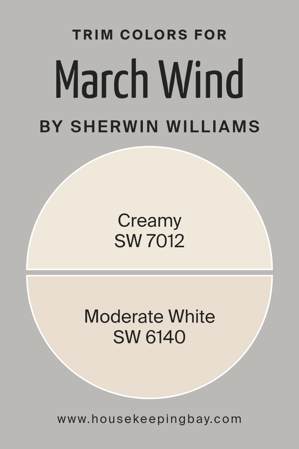
March Wind SW 7668 is one of those soft grays that just works—like, really works. It’s not too cold, not too warm, just sitting there in the perfect middle. Now, for trim, let’s talk about Sherwin Williams Creamy (SW 7012). This one? It’s like your favorite vanilla ice cream but for your walls. Creamy’s soft warmth brings out the subtle depth of March Wind without being too yellow or stealing the spotlight. You want a room that feels cozy but not grandma’s house cozy? This is your go-to pairing.
Now, if you’re in the “I don’t do creamy” camp, Moderate White (SW 6140) is a perfect choice. It’s neutral, calm, a bit more grown-up—kind of like the friend who knows when to stop at one glass of wine. It’s got just enough warmth to keep things from getting too sterile but without saying, “Hey, I’m here to party.”
I’ve seen these trims with March Wind in everything from sleek modern spaces to that perfectly “lived-in” vibe. Trust me, it’s one of those combos you won’t regret. Want to feel like you’ve got your life together? Go with Creamy. Need something a little more chill? Moderate White is your pal.
housekeepingbay.com
Looking for a similar vibe? Let’s explore your options
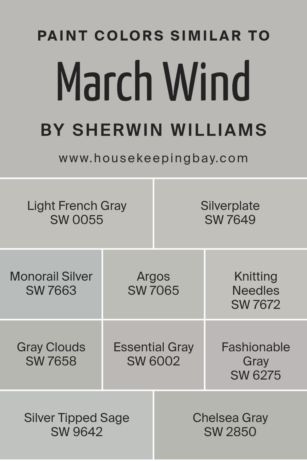
Okay, let’s talk about some colors that are cousins to March Wind SW 7668. You know, the ones that hang out at the family reunion, look kinda the same, but with their own twist.
Light French Gray SW 0055 – If March Wind is the laid-back neutral, Light French Gray is the cooler sibling that’s all about that classic, timeless look. It’s a bit more “let’s keep it crisp,” but they definitely come from the same gene pool.
Silverplate SW 7649 – Now this one is like March Wind, but with a little extra edge. It’s got that cool gray vibe but feels slightly more industrial. Think modern loft, exposed brick, minimal clutter—yeah, you get it.
Monorail Silver SW 7663 – This one’s like if March Wind had a few more espresso shots in the morning. A bit deeper, a little more grounded, but still totally chill. If you want to stay in the same lane but crave a touch more drama, here’s your pick.
Argos SW 7065 – Argos is that friend who always looks put together. Not as warm as March Wind, a bit sharper, but still super easygoing. You could dress it up, or down—it’s versatile.
Knitting Needles SW 7672 – If you want to lean into the cooler grays, Knitting Needles is the way to go. It’s got that sleek, modern flair but doesn’t feel icy. It’s like March Wind’s more serious, sophisticated cousin.
Gray Clouds SW 7658 – Here’s your soft, dreamy version of March Wind. Gray Clouds is just a touch lighter, perfect for when you want a space to feel airy but still grounded in that neutral territory.
Essential Gray SW 6002 – Essential Gray’s like the Zen version of March Wind. A little warmer, a little more relaxing, like a spa day for your walls. You can’t go wrong with this if you’re craving some calm.
Fashionable Gray SW 6275 – This one’s the trendy cousin. A hint of mauve in the undertone, just enough to keep things interesting without straying too far from the gray family.
Silver Tipped Sage SW 9642 – For when you want that barely-there green undertone, Silver Tipped Sage is your color. It’s still in the gray family but adds just enough nature to keep things fresh.
Chelsea Gray SW 2850 – Now, Chelsea Gray is like the dark, mysterious cousin who shows up at the party looking sleek and sophisticated. Definitely a deeper shade, but still playing in that neutral zone with March Wind.
There you go! A whole family reunion of grays, each with its own personality, but all related enough to keep things cool and neutral.
housekeepingbay.com
Best colors to pair with March Wind for the perfect balance
March Wind SW 7668 is one of those colors that feels like a total game-changer. It’s this soft, slightly cool gray, but it’s got just enough warmth to not feel too cold. It’s like the color equivalent of that perfect breeze on a spring day — subtle, refreshing, but not trying to blow you away (pun absolutely intended).
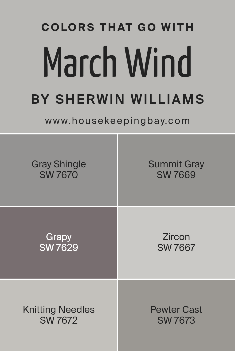
Now, pairing it? Easy. Let’s talk Gray Shingle SW 7670 — it’s like March Wind’s moody cousin, a little darker, a little more serious. They look incredible together, especially when you want to add depth without going overboard. Summit Gray SW 7669? A shade lighter, just a bit softer. Like the cloud to March Wind’s breeze, they’re a duo that’s subtle but strong.
Then there’s Grapy SW 7629. Grapy is the wildcard — it’s deep, purpley, and makes everything around it feel instantly more sophisticated. Not for the faint of heart, but if you’re going bold, do it right.
Zircon SW 7667 is the cool, icy gray that just chills everything out. It’s like the crisp note that keeps the whole palette from feeling too heavy.
Oh, and Knitting Needles SW 7672? It’s perfect. Soft, warm gray but not too warm. Knitting Needles feels like wrapping yourself in your favorite cozy sweater. Pewter Cast SW 7673 is the dramatic friend you bring in when you need to dial it up just a bit. It’s deeper, moodier, but still plays nice with all the others.
Trust me, these colors know how to vibe together!
housekeepingbay.com
Chelsea Gray vs. March Wind – which one steals the spotlight?
Now, Chelsea Gray? Oh boy. This one has weight. It’s richer, deeper, and just screams, “Look at me, I’m sophisticated!” It’s a little warmer than March Wind, making it perfect if you want to add some cozy without stepping into beige territory. I’d use Chelsea Gray on cabinetry or doors if you want to make a bold statement without being too in-your-face. Pair it with gold hardware, and bam—your room is officially a Pinterest dream.
So, which one? If you’re feeling more subtle and breezy, March Wind. But if you want that “I mean business” gray, Chelsea Gray’s your pick. Either way, you can’t go wrong—just depends on what kind of gray mood you’re in!

housekeepingbay.com
Light French Gray or March Wind – same family, different feels
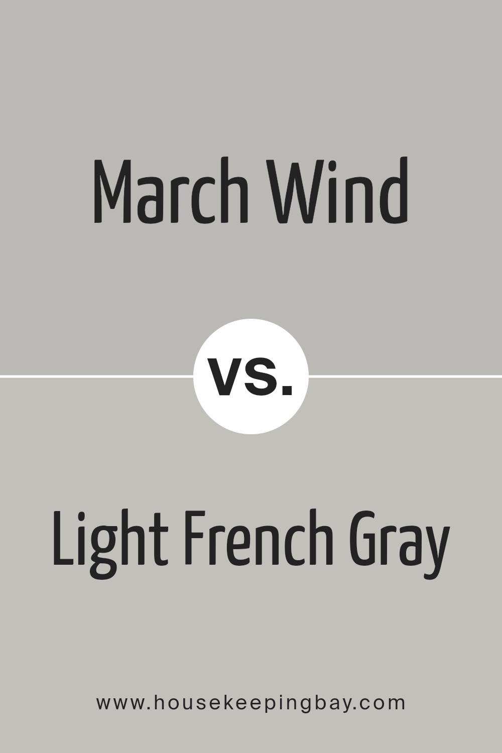
Light French Gray SW 0055 is like the cool cousin who’s always effortlessly chic, never too loud but always present. It’s a soft, neutral gray with just enough warmth to keep it from feeling cold or sterile, and that’s what I love about it. You get this perfectly balanced gray without it dipping into baby blue territory (because nobody asked for that surprise).
And let’s be real—it’s that kind of color that works with everything. I mean, toss it on your walls next to white trim? Boom. Classic. Want to pair it with a moody accent color? It’s still holding its own, giving off those laid-back “I got this” vibes without trying too hard. It’s neutral, but not the boring kind of neutral, you know?
It’s perfect for those spaces where you want some elegance without making a big, loud statement. It’s subtle, sophisticated, but doesn’t scream for attention—more like that friend who always looks put together without making a big fuss about it. Yeah, that one.
housekeepingbay.com
Going head-to-head: Essential Gray or March Wind
Essential Gray SW 6002, huh? You know, it’s one of those grays that likes to play it cool, but not too cool. It’s that perfect neutral that doesn’t scream, “Look at me, I’m gray!” but more like, “Hey, I’m chill, I go with everything.” And you know what? It does. Warm or cool lighting? Doesn’t matter. It sits right in that cozy middle ground.
It’s a little like that friend who’s always up for anything—whether it’s pairing with whites, beiges, or even a bold color pop, Essential Gray just works. It’s not trying to steal the show, but it subtly holds things together. Pair it with natural woods, add some metallic accents, and you’ve got a room that feels relaxed, but still has that quiet elegance.
Honestly, it’s a color that doesn’t ask for much but delivers plenty. You can throw it in a living room, bedroom, or even the hallway. It’s versatile without being boring. And hey, sometimes you need a gray that doesn’t have all those complicated undertones.

housekeepingbay.com
Sage meets silver – which way does your palette lean?
Silver Tipped Sage SW 9642 is that soothing green-gray that makes you want to curl up with a book, or maybe a cup of tea, or—let’s be honest—a glass of wine. It’s soft, like a whisper of color, not screaming “look at me” but definitely getting noticed. Think of it as the color equivalent of that friend who’s quietly hilarious but never has to try.
It’s like the perfect backdrop for your more… dramatic pieces. Got a statement sofa? This sage lets it shine without stealing the spotlight. I once saw it in a living room with these chunky wooden shelves, and it was chef’s kiss. It pairs so well with natural materials—wood, stone, even rattan. But don’t think it’s just for the earthy types; it’s also stunning with modern metals like matte black or brushed nickel.
I’ll say this though: It’s sneaky. Sometimes it leans more gray, other times more green, depending on the light. Like, “Wait, was that always the color of this wall?”—I live for that kind of mystery. If you’re into calm, quiet spaces that still feel stylish, Silver Tipped Sage gets it done, effortlessly.

housekeepingbay.com
Silverplate vs. March Wind – time to choose your sleek shade
Silverplate SW 7649—now we’re talking! It’s one of those grays that’s smooth, cool, and just the right amount of moody without being over the top. Think of it like that friend who shows up to a casual hangout looking effortlessly chic. It’s got a soft undertone of blue, but don’t worry, it’s subtle. Your walls won’t suddenly turn into the ocean or anything, but you’ll get that cool, crisp vibe.
Here’s the thing with Silverplate: it’s neutral, but not too neutral. You can pair it with whites, blacks, or even those muted greens I know you love. It’s basically the skinny jeans of paint colors—versatile, goes with everything, and never really out of style. Honestly, I’ve used this color in a room with lots of natural light, and it looks so sophisticated. Throw in some wood accents? Chef’s kiss.
Plus, it doesn’t have any of that “purpley surprise” undertone nonsense that some grays like to pull. You know what I’m talking about—those grays that look great until the sun hits them, and suddenly your living room is straight out of a Barney episode. Silverplate’s not about that life. It stays calm, cool, and collected, no drama here.
Perfect for a modern look without making it feel like an IKEA showroom.

housekeepingbay.com
Argos or March Wind – which gray really grabs you?
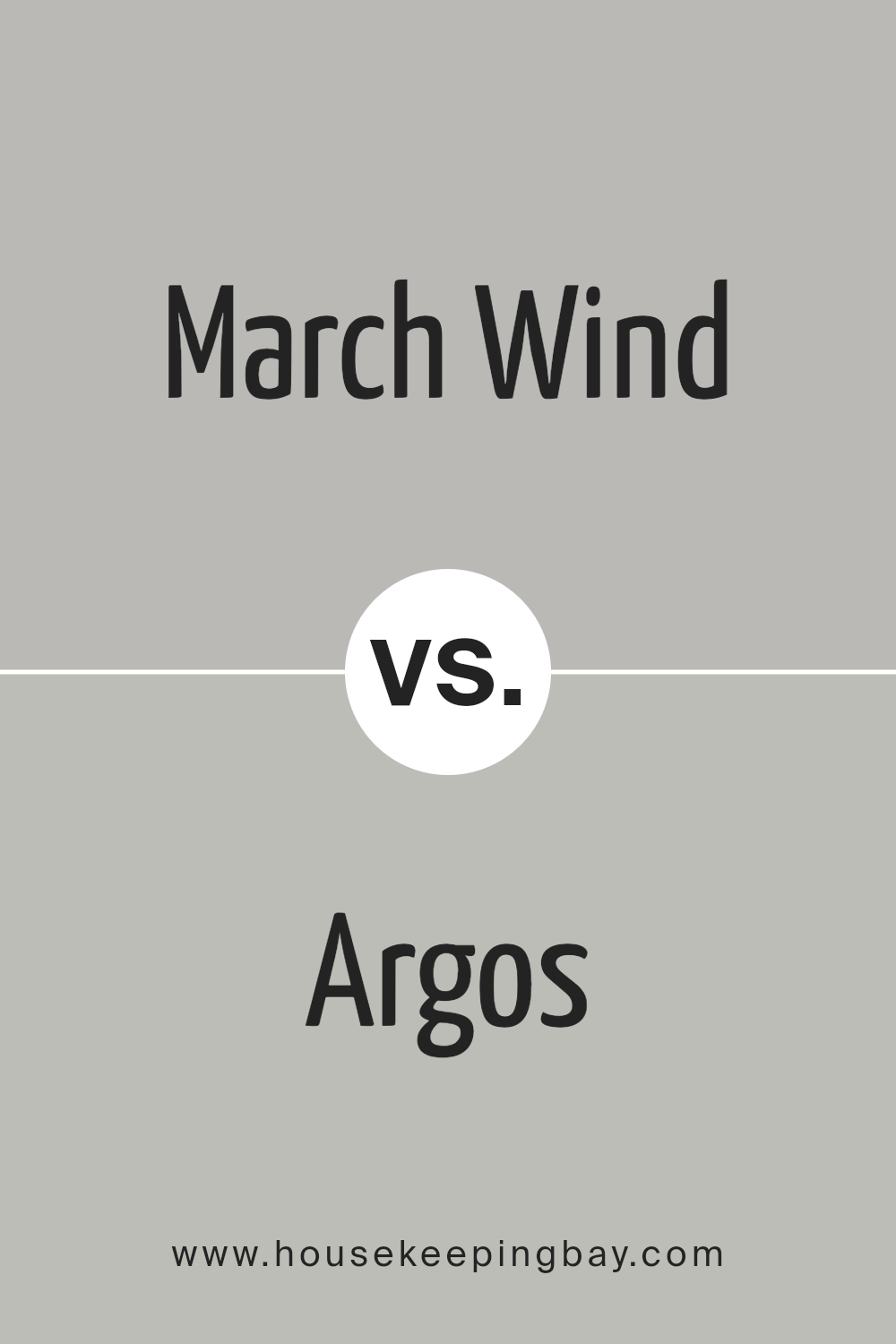
Argos SW 7065 – you know I love this one! It’s a cool, neutral gray that doesn’t get fussy with weird undertones, unlike some grays that pretend to be neutral but then sneak in a little blue or purple when you least expect it. No drama here!
Argos? It’s that friend who shows up looking effortlessly chic, making you wonder why you ever bothered with anything else. It plays well with whites and blacks but also gets along famously with wood tones, and don’t even get me started on how it shines with metals—brushed nickel, matte black? Yes, please.
Now, about using it in a room. You know how some grays feel cold and a bit too industrial? Not this one! It has just enough warmth to keep your space from feeling like a concrete jungle. And if you’re into modern, minimalist vibes? Argos will have you feeling like you’re walking into a stylish loft, not a hospital hallway.
Would I pick it over you-know-who? That depends. If I’m going for something super cool-toned, maybe not. But if I want that perfect balance of cozy and sleek, Argos is totally my go-to. Seriously, it’s a gray without the “gray-day” vibes, and that’s a win in my book!
housekeepingbay.com
My Final Thoughts on March Wind SW 7668 – The One Gray to Rule Them All
March Wind SW 7668… what a color. It’s not too cold, not too warm—it’s that neutral you’ve been looking for but didn’t know it. One minute, it’s this soft, serene gray, and then BAM—next to white trim or dark accents, it turns into something chic, modern, and just so right.
I had this in my guest room once (before I inevitably changed it, because… me), and let me tell you, people loved it. They didn’t know what they were looking at, but they knew they liked it. One friend even said it was like living inside a cloud, and I was like, “Exactly.”
Oh, and it doesn’t clash with anything. Need it with wood tones? Done. Cool metals? Nailed it. It’s basically your best friend who looks good in every situation and doesn’t mind if you’re having an off day. Perfect for walls, trim, ceilings… heck, even the dog’s bed. Ok, maybe not the dog’s bed—but you get it.
Trust me, March Wind is the gray that’s never going to leave you feeling flat. It’s just… always a little better than you expect. And that’s rare, right?

housekeepingbay.com
