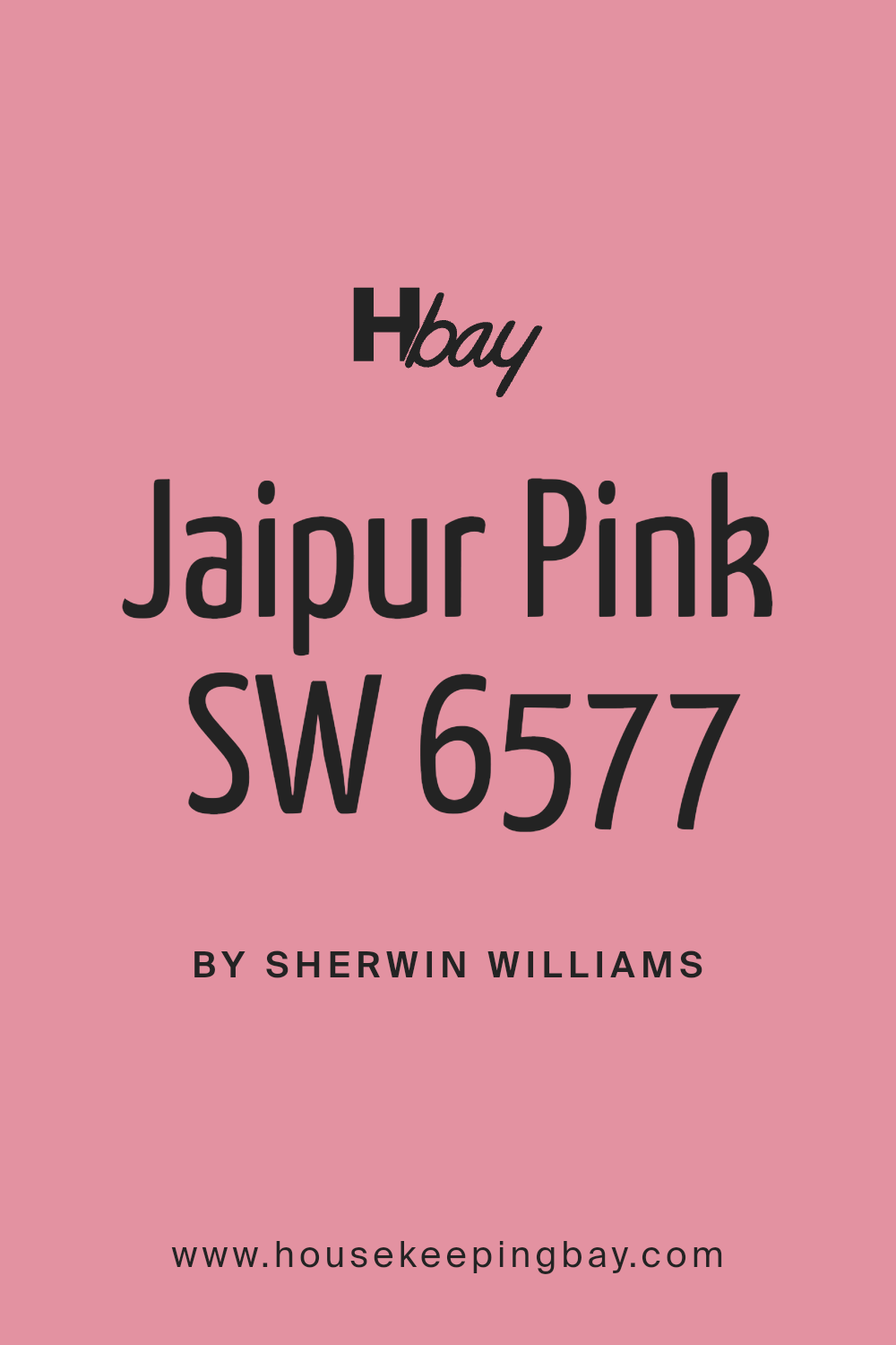
Jaipur Pink SW 6577 by Sherwin Williams
Brighten Your Space with Playful Pink
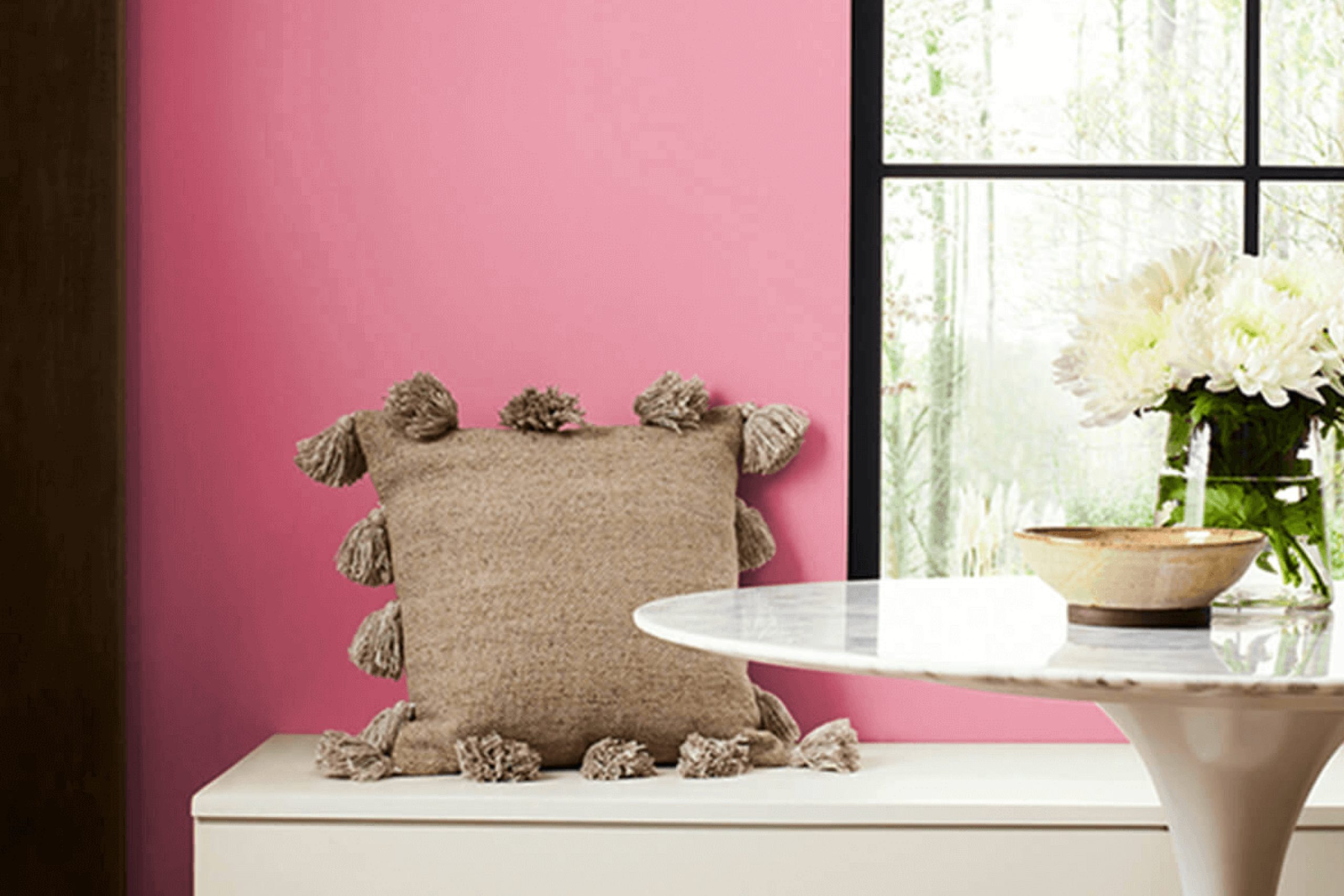
If you’re interested in adding a bright and warm touch to your space, consider SW 6577 Jaipur Pink by Sherwin Williams. This cheerful shade of pink brings a lively pop of color, perfect for creating a welcoming and energetic atmosphere.
Whether you’re thinking about refreshing a bedroom or sprucing up your living room, Jaipur Pink can do wonders. It pairs wonderfully with soft whites or deeper hues like charcoal gray, offering numerous styling options.
Plus, it looks fantastic in natural light, giving rooms a soft, glowing appearance that can make your home feel more inviting. If you’re ready for a change, Jaipur Pink could be the perfect choice for your next painting project.
via sherwin-williams.com
What Color Is Jaipur Pink SW 6577 by Sherwin Williams?
Jaipur Pink SW 6577 by Sherwin Williams is a vibrant, warm pink hue that adds a cheerful pop of color to any space. This particular shade of pink has a slight coral undertone, making it feel inviting and lively without being overpowering. It’s a color that radiates positivity and warmth, suitable for a variety of decorating styles.
Jaipur Pink works exceptionally well in bohemian and eclectic interiors, where its playful nature can be paired with a range of rich patterns and textures. It also fits beautifully in contemporary spaces that favor bold colors to create a fresh, modern look. For a softer approach, pairing it with shabby chic decor creates a nostalgic, cozy feel.
This color pairs wonderfully with natural materials such as light woods, rattan, and wicker, adding an earthy balance to its vibrancy. Jaipur Pink also goes well with matte metals like brushed brass or copper, which complement its warm undertones. For textures, consider velvets and silks to introduce a touch of luxury, or linens for a more casual, laid-back vibe.
In terms of pairing with other colors, Jaipur Pink sits nicely alongside neutral tones such as whites, creams, and light greys, which help to calm its intensity while allowing it to remain the focal point of the room. For a dynamic contrast, teal or deep blue can create a more dramatic effect, enhancing the overall energy of the space.
housekeepingbay.com
Is Jaipur Pink SW 6577 by Sherwin Williams Warm or Cool color?
Jaipur Pink SW 6577 by Sherwin Williams is a vibrant, cheerful shade of pink that adds a lively touch to any room. This color is perfect for adding a pop of brightness and a sense of joy to spaces that might otherwise feel bland or dull.
Jaipur Pink works well in a variety of settings, like bedrooms, bathrooms, or even as an accent wall in a living room. Its bold tone pairs nicely with neutral colors like whites, greys, and beiges, which helps balance its intensity. This makes it a versatile choice for those looking to inject some personality into their home without overwhelming the space.
Additionally, Jaipur Pink can inspire creativity and warmth, making it a great option for craft rooms or children’s play areas. Using this color can also make smaller spaces seem more inviting and energized, which can alter the overall feel of your home to be more welcoming and lively.
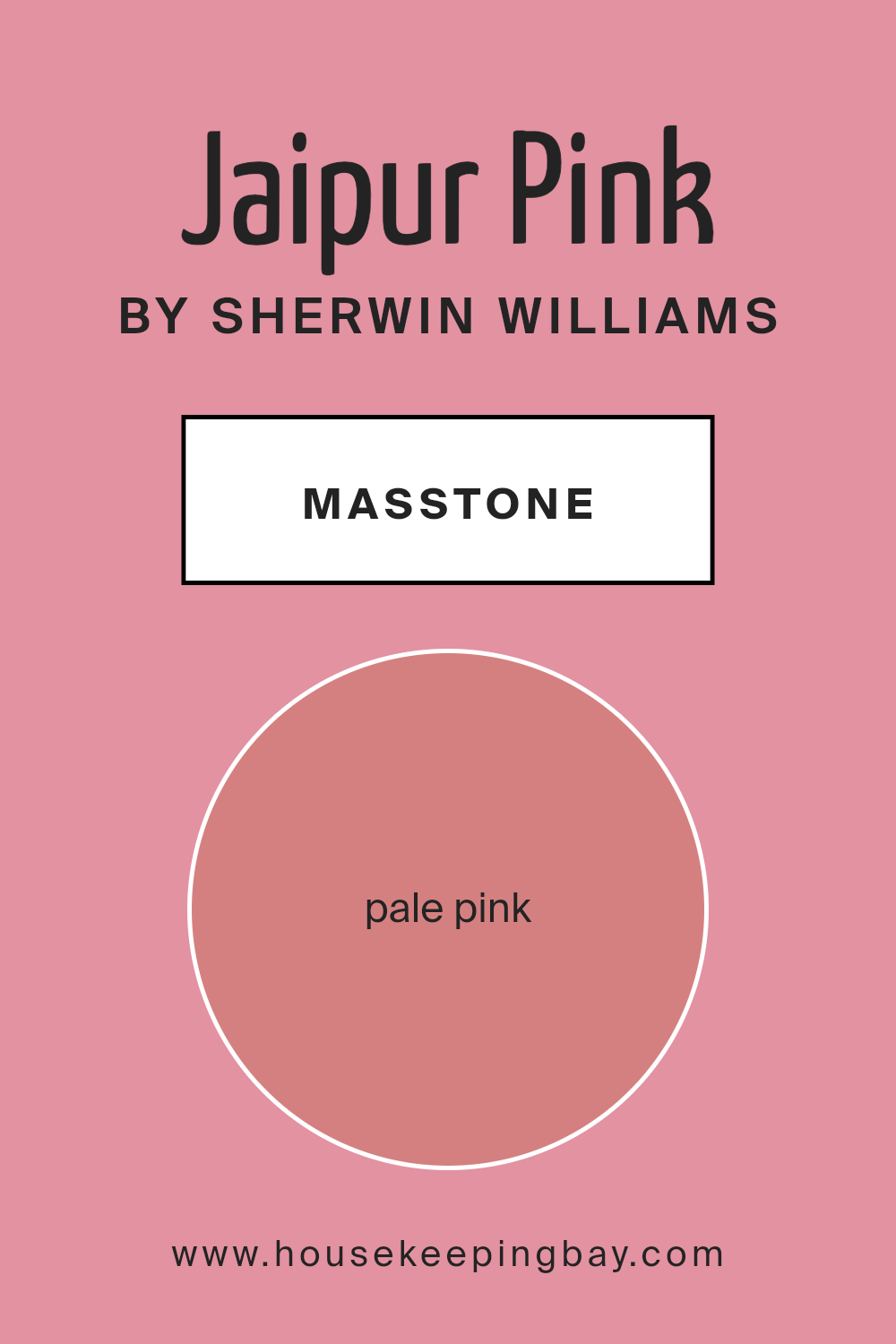
What is the Masstone of the Jaipur Pink SW 6577 by Sherwin Williams?
Jaipur Pink SW 6577 by Sherwin Williams, featuring a masstone of pale pink (#D58080), adds a gentle touch of warmth and softness to any room. This shade of pink, subtle and muted, is versatile and works well in various settings within a home. It’s not an overpowering color, which makes it ideal for creating a calm and cozy atmosphere.
Using Jaipur Pink in bedrooms can help create a nurturing, soothing space conducive to relaxation and rest. In living areas, this color can make the space feel welcoming and comfortable, perfect for gatherings or quiet evenings. This pale pink is also effective in bathrooms where it can provide a light, clean look without the starkness that sometimes comes with pure white.
Furthermore, it pairs beautifully with a wide range of colors. Rich, dark hues like navy or charcoal can bring out its subtle warmth, while lighter tones like whites and creams can maintain a space’s airy feel. Overall, Jaipur Pink is excellent for anyone looking to introduce a gentle pop of color to their home without overwhelming the senses.
housekeepingbay.com
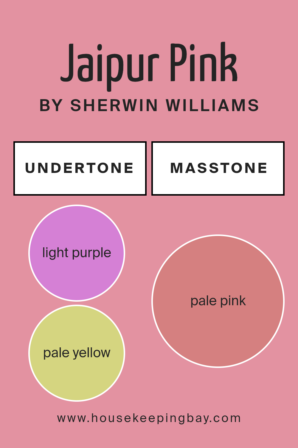
Undertones of Jaipur Pink SW 6577 by Sherwin Williams
Jaipur Pink SW 6577 by Sherwin Williams is a dynamic paint color with a broad spectrum of undertones that influence how it appears in different settings. Undertones are subtle colors that lurk beneath the surface color and can significantly impact the overall hue when viewed under varying light conditions or when paired with different decor elements.
The undertones of Jaipur Pink include light purple, pale yellow, light gray, grey, pink, lilac, fuchsia, orange, mint, light blue, yellow, purple, violet, olive, red, light green, and brown. These undertones can make the pink appear warmer, cooler, or more neutral depending on adjacent colors and lighting.
In an interior setting, the pink may lean towards a soft blush when coordinated with light gray or mint, creating a soothing atmosphere. With undertones like orange or yellow, Jaipur Pink can feel warmer and more inviting, perfect for living rooms or dining areas. Conversely, pairings with blue or violet undertones might draw out a cooler, more serene side of the pink, ideal for bedrooms or bathrooms. Understanding these undertones is crucial when choosing decor, as they can either complement or clash with furnishings, flooring, and other elements.
Proper lighting also plays a critical role. Natural daylight can reveal different undertones compared to artificial lighting, thereby shifting the mood and impact of the color. Thus, when opting for Jaipur Pink, consider the room’s lighting and the surrounding colors to fully harness the complexity of its undertones.
housekeepingbay.com
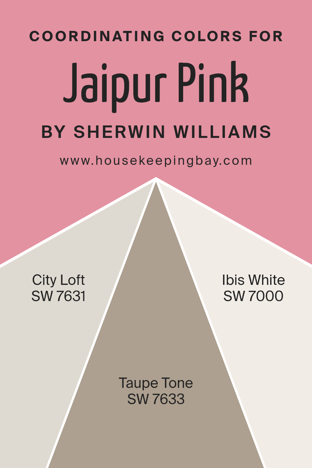
Coordinating Colors of Jaipur Pink SW 6577 by Sherwin Williams
Coordinating colors are shades that complement a primary color, in this case, Jaipur Pink SW 6577 by Sherwin Williams. These colors effectively balance or enhance the main hue, allowing for a harmonious and appealing color scheme in an interior space. When selected thoughtfully, coordinating colors can create visual depth and set the mood or tone of a room.
For instance, SW 7631 City Loft offers a gentle, light gray that pairs beautifully with the soft warmth of Jaipur Pink, providing a subtle contrast that can make the pink stand out without overwhelming the senses. SW 7633 Taupe Tone is a deeper, warmer gray that gives a rich backdrop, enhancing the vibrancy of pink while adding sophistication to the overall decor.
Lastly, SW 7000 Ibis White is a clean and fresh white that can act as an excellent counterbalance, offering a crisp edge to the softer pink, ensuring the space feels airy and well-lit. These three colors work together to support the dominant Jaipur Pink, ensuring design coherence and aesthetic appeal.
You can see recommended paint colors below:
housekeepingbay.com
How Does Lighting Affect Jaipur Pink SW 6577 by Sherwin Williams?
Lighting has a significant impact on how we perceive colors because the type and quality of light can change the way a color appears. Different lighting conditions can make colors look brighter, duller, warmer, or cooler. Take the color Jaipur Pink SW 6577 by Sherwin Williams, for example. This is a vibrant pink that responds distinctly to various lighting environments.
Under artificial light, such as LEDs or incandescent bulbs, Jaipur Pink tends to look warmer and richer, making it a cozy choice for spaces that rely on artificial illumination. The warmth of artificial lighting brings out the depth in this pink shade, enhancing its inviting quality.
In natural light, the appearance of Jaipur Pink can vary throughout the day. Under the clear, bright light of a sunny day, this color will appear more vivid and true to its palette, showing off its bright pink nature. However, under cloudier or softer natural light conditions, it might take on a slightly softer, more muted tone.
Room orientation affects how Jaipur Pink behaves. In north-facing rooms, which generally receive cooler, indirect light, Jaipur Pink might appear slightly more subdued and less vibrant. This cooler light can slightly mute the vibrancy of the pink, though it remains pleasantly soft.
In south-facing rooms, which are bathed in abundant direct sunlight for most of the day, Jaipur Pink looks exceptionally lively and bright. The ample natural light intensifies the color, making it appear vivacious and energetic.
East-facing rooms get the morning sun, which is a gentle, warm light. In these conditions, Jaipur Pink will look soft and warm early in the day, creating a calming atmosphere. As the light changes, so will the intensity of the pink.
West-facing rooms experience the strongest sunlight in the late afternoon, when the sun is setting. During this time, the light has a golden quality that can make Jaipur Pink appear exceptionally warm and glowing, enhancing its depth and richness as the day progresses.
Understanding these interactions between light and color can help in making informed decisions about paint colors and room orientations for desired effects.
housekeepingbay.com
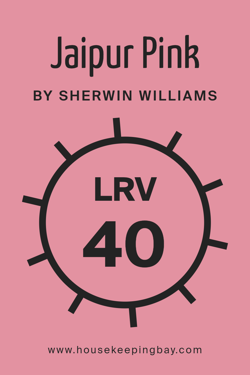
What is the LRV of Jaipur Pink SW 6577 by Sherwin Williams?
LRV stands for Light Reflectance Value, a measure indicating how much light a paint color reflects back into the room as opposed to absorbing it. This value ranges from 0 to 100, where 0 absorbs all light and 100 reflects all light. The LRV is essential when picking paints because it helps predict how light or dark a color will appear once it’s on your walls.
A higher LRV means the color will look lighter and can make a room feel more open and airy. Conversely, a lower LRV will make a color appear darker, which might make a space feel smaller or more enclosed.
For the Sherwin Williams color Jaipur Pink SW 6577, which has an LRV of 39.557, the color is in the middle range and will neither reflect light as brightly as lighter colors nor absorb light like darker tones. With this level of LRV, Jaipur Pink will contribute a cozy warmth to the room without making it feel congested.
It’s a versatile shade that can balance well in spaces that receive either ample natural light or are more reliant on artificial lighting, maintaining a consistent appearance throughout different times of the day.
housekeepingbay.com
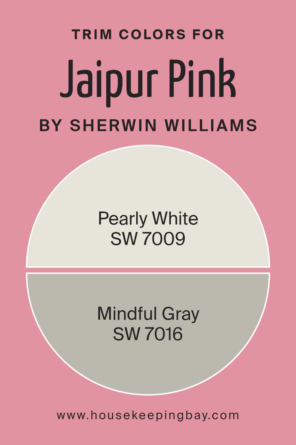
What are the Trim colors of Jaipur Pink SW 6577 by Sherwin Williams?
Trim colors are the accents used on architectural features like door frames, moldings, and window casings, which highlight and complement the main colors of a room or exterior. When using Jaipur Pink SW 6577 by Sherwin Williams, a vibrant and lively shade, selecting the right trim colors is crucial.
These trim colors can help balance the vibrancy of Jaipur Pink by providing a subtle contrast that frames and defines spaces effectively. SW 7009 – Pearly White and SW 7016 – Mindful Gray are excellent options as they can help maintain the warmth and welcoming nature of Jaipur Pink while adding a sophisticated touch.
Pearly White SW 7009 is a soft, warm white with a creamy feel that pairs beautifully with Jaipur Pink. It has a gentle aura that softens the brighter hue, lending an airy and light appearance to any room, making spaces feel more open and calming.
On the other hand, Mindful Gray SW 7016 offers a neutral gray tone that brings a modern and balancing effect when used alongside the more assertive Jaipur Pink. It provides a subtle contrast that is neither too stark nor overwhelming, facilitating a cohesive look that anchors the vibrant pink in a contemporary setting. These choices ensure that Jaipur Pink stands out as a thoughtful and sophisticated focal point in any space.
You can see recommended paint colors below:
housekeepingbay.com
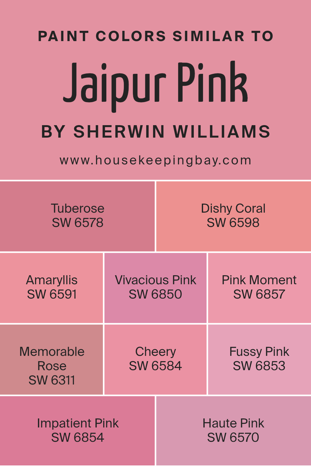
Colors Similar to Jaipur Pink SW 6577 by Sherwin Williams
Similar colors, like those found in the palette of Jaipur Pink SW 6577 by Sherwin Williams, are essential in designing spaces that feel harmonious and cohesive. These shades share underlying tones, which allows for a smooth visual transition from one color to another, fostering a serene and aesthetically pleasing environment. By using variations of a primary hue, designers can create depth and interest, allowing for personalization of space while maintaining a unified look.
SW 6578 – Tuberose, and SW 6598 – Dishy Coral, for example, add a vibrant but soothing touch with their soft, floral-inspired reds, enriching environments with warmth. SW 6591 – Amaryllis and SW 6850 – Vivacious Pink both offer a punchy, more pronounced pink that brings energy to a room without overwhelming.
For those looking for something a bit calmer, SW 6857 – Pink Moment and SW 6311 – Memorable Rose provide muted, nostalgic pink touches that suggest comfort and softness. For spaces in need of a cheery boost, SW 6584 – Cheery presents a lively and bright hue. SW 6853 – Fussy Pink and SW 6854 – Impatient Pink lean towards playful and spirited options, ideal for dynamic or creative spaces. Lastly, SW 6570 – Haute Pink serves as a bold, definitive splash of color, perfect for making a striking statement in any area.
You can see recommended paint colors below:
- SW 6578 Tuberose
- SW 6598 Dishy Coral
- SW 6591 Amaryllis
- SW 6850 Vivacious Pink
- SW 6857 Pink Moment
- SW 6311 Memorable Rose
- SW 6584 Cheery
- SW 6853 Fussy Pink
- SW 6854 Impatient Pink
- SW 6570 Haute Pink
housekeepingbay.com
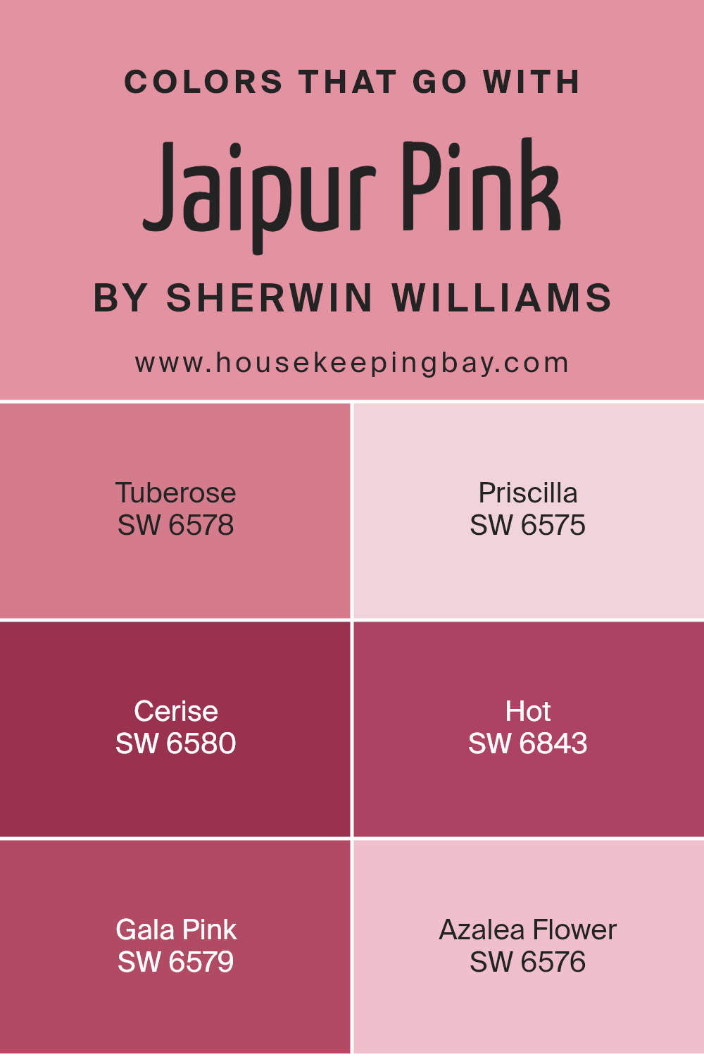
Colors that Go With Jaipur Pink SW 6577 by Sherwin Williams
Choosing complementary colors for Jaipur Pink SW 6577 by Sherwin Williams is essential as it helps in creating a harmonious and pleasing decor. Well-coordinated colors enhance the aesthetics of a space, making it more appealing and visually balanced. Different shades and tones can add depth and bring life to a room when paired correctly with Jaipur Pink, a vibrant and lively shade. Colors like SW 6578 – Tuberose, SW 6575 – Priscilla, and others offer various options for design schemes, from bold and energetic to soft and soothing.
SW 6578 – Tuberose is a deep, romantic pink that adds a touch of drama and sophistication to any palette. It can make a space feel warm and cozy while still keeping a touch of flair. SW 6575 – Priscilla, on the other hand, is a lighter pink that provides a soft, airy feel, ideal for creating a soothing atmosphere.
SW 6580 – Cerise has a more pronounced pink hue that can make a bold statement and energize a room. SW 6843 – Hot is a vivid pink that brings an energetic punch, perfect for accent walls or decorative accessories. SW 6579 – Gala Pink offers a muted alternative that blends well without overwhelming, and SW 6576 – Azalea Flower is a playful, yet subtle pink, suitable for spaces that aim for a gentle, inviting vibe. Combining these colors with Jaipur Pink can result in a delightful visual experience, enhancing every corner of a space.
You can see recommended paint colors below:
- SW 6578 Tuberose
- SW 6575 Priscilla
- SW 6580 Cerise
- SW 6843 Hot
- SW 6579 Gala Pink
- SW 6576 Azalea Flower
housekeepingbay.com
How to Use Jaipur Pink SW 6577 by Sherwin Williams In Your Home?
Jaipur Pink SW 6577 by Sherwin Williams is a vibrant and cheerful paint color that adds a splash of personality to any space. This shade of pink has a playful yet sophisticated appeal, making it perfect for creating a statement in your home. You can use Jaipur Pink in various ways, such as painting an accent wall to inject some color into a neutral room or fully committing to its boldness by painting an entire room.
For those who prefer subtle hints of color, consider using Jaipur Pink for smaller decorative elements like window frames or the backs of shelves and cabinets. This approach allows the color to pop without overwhelming the space. Jaipur Pink also pairs well with a range of complementary colors, such as soft grays, deep blues, and crisp whites, which help balance its intensity.
Ideal for bedrooms, nurseries, or creative spaces, Jaipur Pink creates a lively and inviting atmosphere. It can also rejuvenate older furniture pieces, giving them a fresh, modern look with just a few coats of paint.
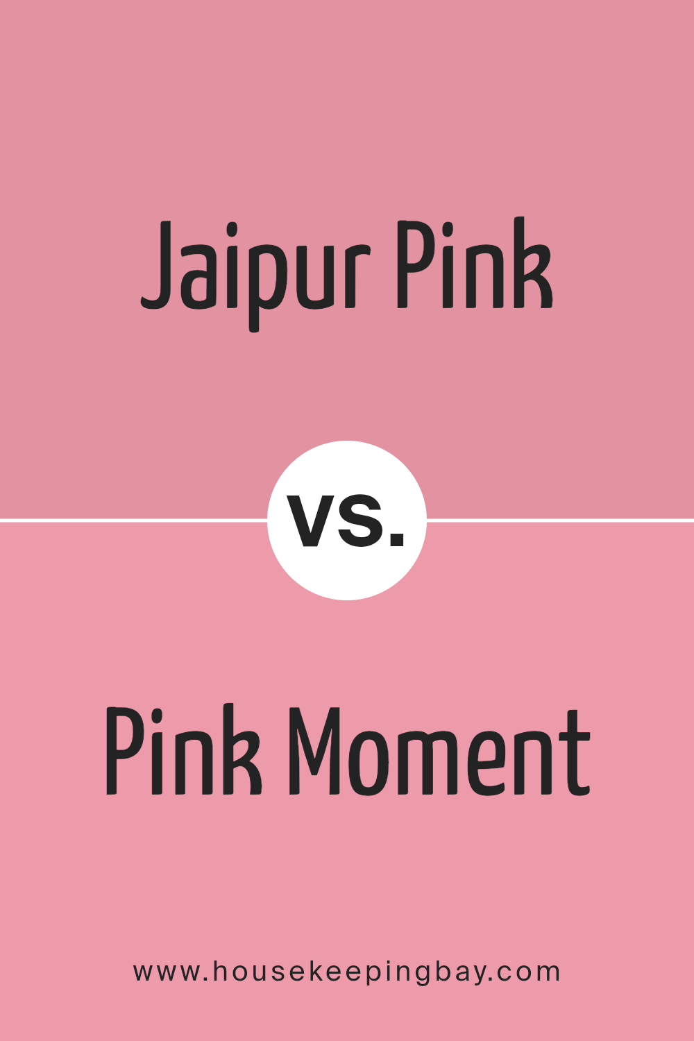
Jaipur Pink SW 6577 by Sherwin Williams vs Pink Moment SW 6857 by Sherwin Williams
Jaipur Pink SW 6577 by Sherwin Williams is a soft, muted coral with a welcoming warmth, ideal for creating a cozy and inviting atmosphere in any space. Its subtle undertone balances between red and orange, lending a gentle vibrancy that is not overwhelming. This color works well in living areas or bedrooms where a calming, but cheerful ambiance is desired.
In contrast, Pink Moment SW 6857 is a bold, vibrant pink that commands attention. This shade is deeper and more saturated, making it perfect for spaces intended to make a strong visual impact. It’s particularly suitable for accent walls or as part of a color scheme in creative or playful environments.
Both colors offer distinct personalities: Jaipur Pink is understated and warm, excellent for soothing settings, while Pink Moment delivers energy and cheerfulness, ideal for dynamic, lively interiors. The choice between them depends on the desired effect and mood for the room.
You can see recommended paint color below:
- SW 6857 Pink Moment
housekeepingbay.com
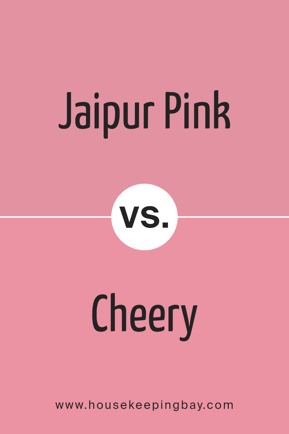
Jaipur Pink SW 6577 by Sherwin Williams vs Cheery SW 6584 by Sherwin Williams
Jaipur Pink SW 6577 by Sherwin Williams is a soft, muted pink with a peaceful, soothing quality. It gives rooms a gentle, inviting atmosphere. This shade works well in spaces meant for relaxation like bedrooms or living areas, providing a subtle backdrop that’s easy to complement with various decor styles.
Contrastingly, Cheery SW 6584 is a vibrant, energetic pink with a much bolder presence. It’s more intense and has an upbeat vibe, ideal for areas where activity and enthusiasm are desired, such as playrooms or creative spaces. This color stands out more and can really energize a room, especially when used as an accent wall.
Both colors offer distinct vibes and uses in home decor, with Jaipur Pink bringing calmness and Cheery adding vivacity. Each color fulfills different design needs while celebrating the versatility of pink hues.
You can see recommended paint color below:
- SW 6584 Cheery
housekeepingbay.com
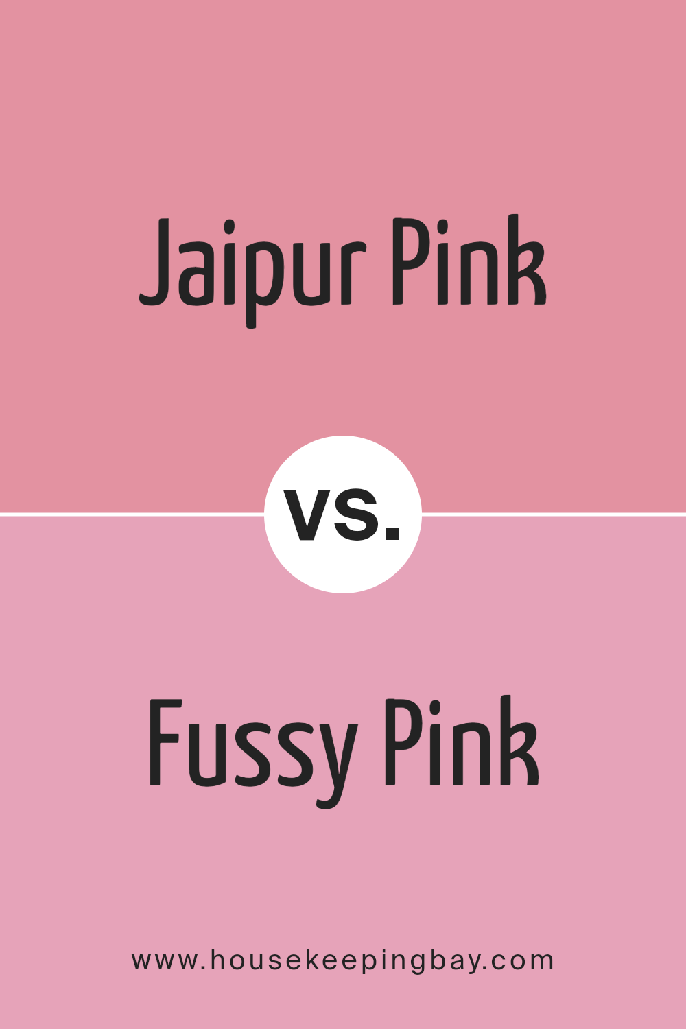
Jaipur Pink SW 6577 by Sherwin Williams vs Fussy Pink SW 6853 by Sherwin Williams
Jaipur Pink SW 6577 by Sherwin Williams is a soft, muted shade that brings a gentle warmth to any space. Its subdued tone makes it ideal for environments where you want to create a soothing and inviting atmosphere. This color is versatile and pairs well with neutrals, providing a subtle backdrop that doesn’t overpower the room’s other design elements.
Fussy Pink SW 6853, also by Sherwin Williams, is noticeably brighter and more vibrant. This color has a playful and cheerful character, which makes it perfect for areas that benefit from a pop of energy. Because of its intensity, Fussy Pink stands out more and is a great choice for accent walls or decorative elements that you want to highlight.
Both colors offer distinct vibes – Jaipur Pink for a calm, serene setting, and Fussy Pink for an energetic, cheerful space. Their uses depend greatly on the mood you’re aiming to achieve in your decor.
You can see recommended paint color below:
- SW 6853 Fussy Pink
housekeepingbay.com
Jaipur Pink SW 6577 by Sherwin Williams vs Haute Pink SW 6570 by Sherwin Williams
Jaipur Pink SW 6577 by Sherwin Williams is a gentle hue with a soft, understated vibe. It has a calming effect, perfect for spaces intended to relax, like bedrooms or living areas. This color brings warmth and a subtle elegance, easily blending with neutral tones and materials.
In contrast, Haute Pink SW 6570 by Sherwin Williams is much bolder and more vibrant. It stands out, making a statement ideal for areas where you want to add a pop of color or create a focal point. This shade is louder and can energize a room, suitable for creative spaces or accent walls to inject a fun element.
Both colors reflect different moods and purposes. Jaipur Pink adds a serene touch, while Haute Pink brings vibrancy and excitement. Depending on the ambiance one wishes to achieve, each offers distinct advantages. Ultimately, your choice should align with the atmosphere and function of the room.
You can see recommended paint color below:
- SW 6570 Haute Pink

housekeepingbay.com
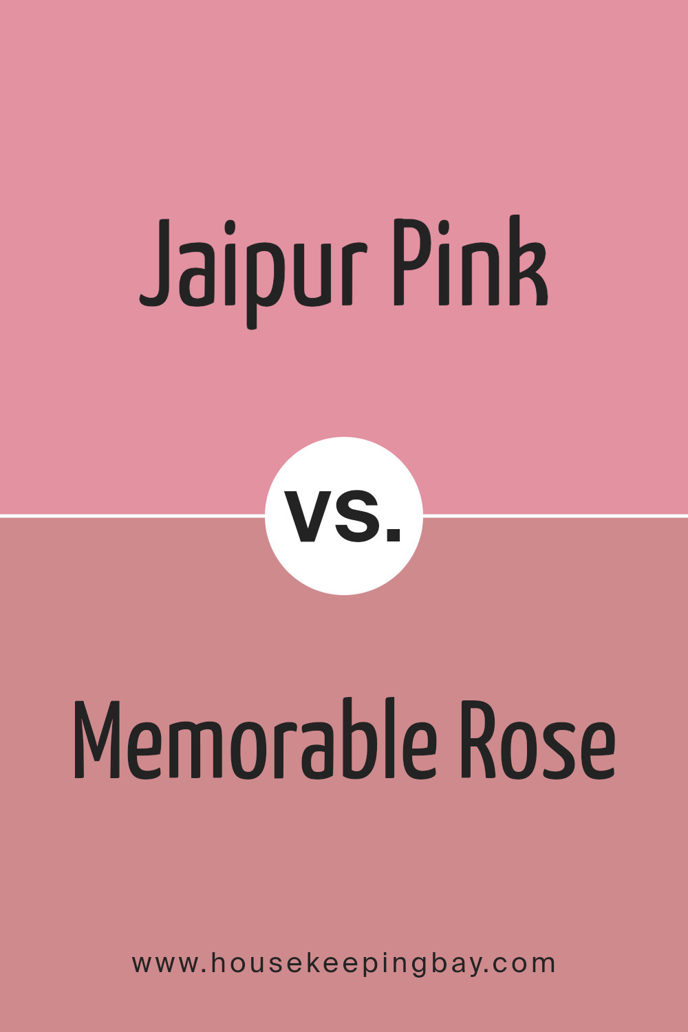
Jaipur Pink SW 6577 by Sherwin Williams vs Memorable Rose SW 6311 by Sherwin Williams
Jaipur Pink SW 6577 by Sherwin Williams features a vibrant, energetic shade of pink. This bold pink has a youthful charm and stands out in any room, making it a great choice for spaces where you want to add a playful, yet sophisticated touch. It pairs well with neutral tones, providing a pop of color that isn’t too overwhelming.
Memorable Rose SW 6311, meanwhile, offers a softer, more subdued hue. This color leans more towards a dusty rose, creating a sense of warmth and comfort. It’s perfect for areas where a calming, gentle ambiance is desired. Unlike the brighter Jaipur Pink, Memorable Rose works seamlessly in more traditional settings due to its muted, classic appeal.
While both colors represent variations of pink, Jaipur Pink is more striking and dynamic, whereas Memorable Rose is subtle and soothing. Each brings a distinct vibe to a space, with Jaipur Pink injecting energy and Memorable Rose promoting a relaxed atmosphere.
You can see recommended paint color below:
- SW 6311 Memorable Rose
housekeepingbay.com
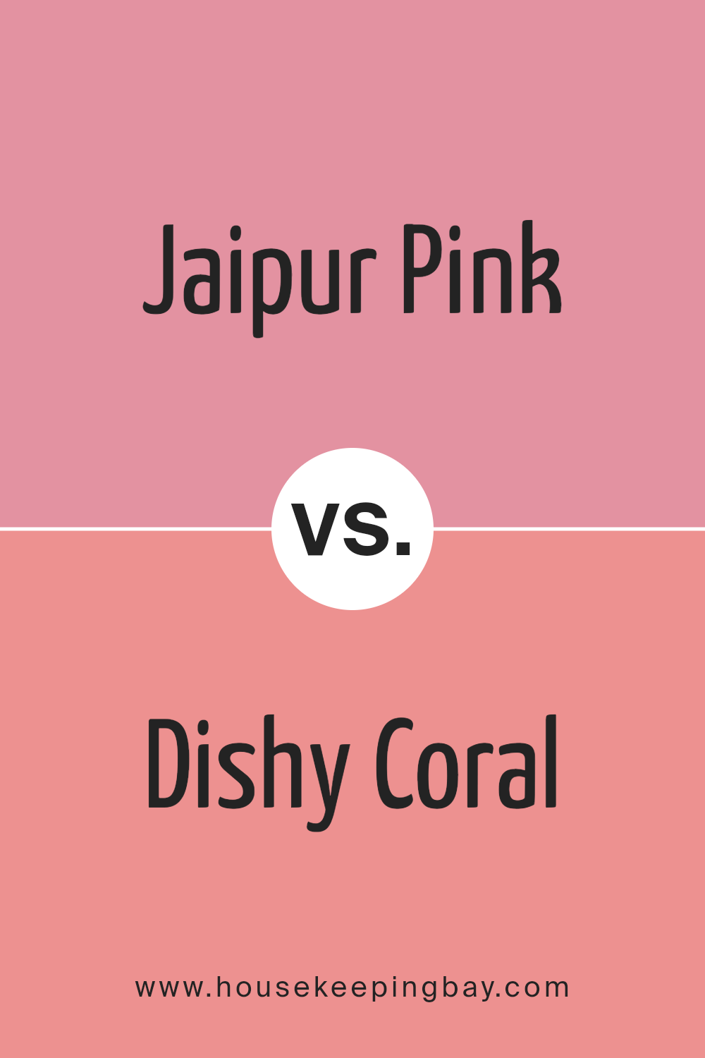
Jaipur Pink SW 6577 by Sherwin Williams vs Dishy Coral SW 6598 by Sherwin Williams
Jaipur Pink SW 6577 by Sherwin Williams is a gentle hue, resembling the soft petals of a spring flower. It offers a subtle, soothing vibes, making it ideal for creating a cozy and inviting atmosphere in living spaces or bedrooms. Its pastel tone is versatile and pairs well with other soft colors for a harmonious look.
In contrast, Dishy Coral SW 6598 is a lively and vibrant color that exudes warmth and energy. This bolder shade is perfect for spaces where you want to add a dynamic and cheerful touch. It works well in kitchens, dining areas, or anywhere you wish to stimulate conversation and enthusiasm.
Both colors reflect distinct moods and can be used effectively depending on the ambiance you wish to achieve in your room. While Jaipur Pink leans towards calmness and softness, Dishy Coral punches up the vibrancy and excitement.
You can see recommended paint color below:
- SW 6598 Dishy Coral
housekeepingbay.com
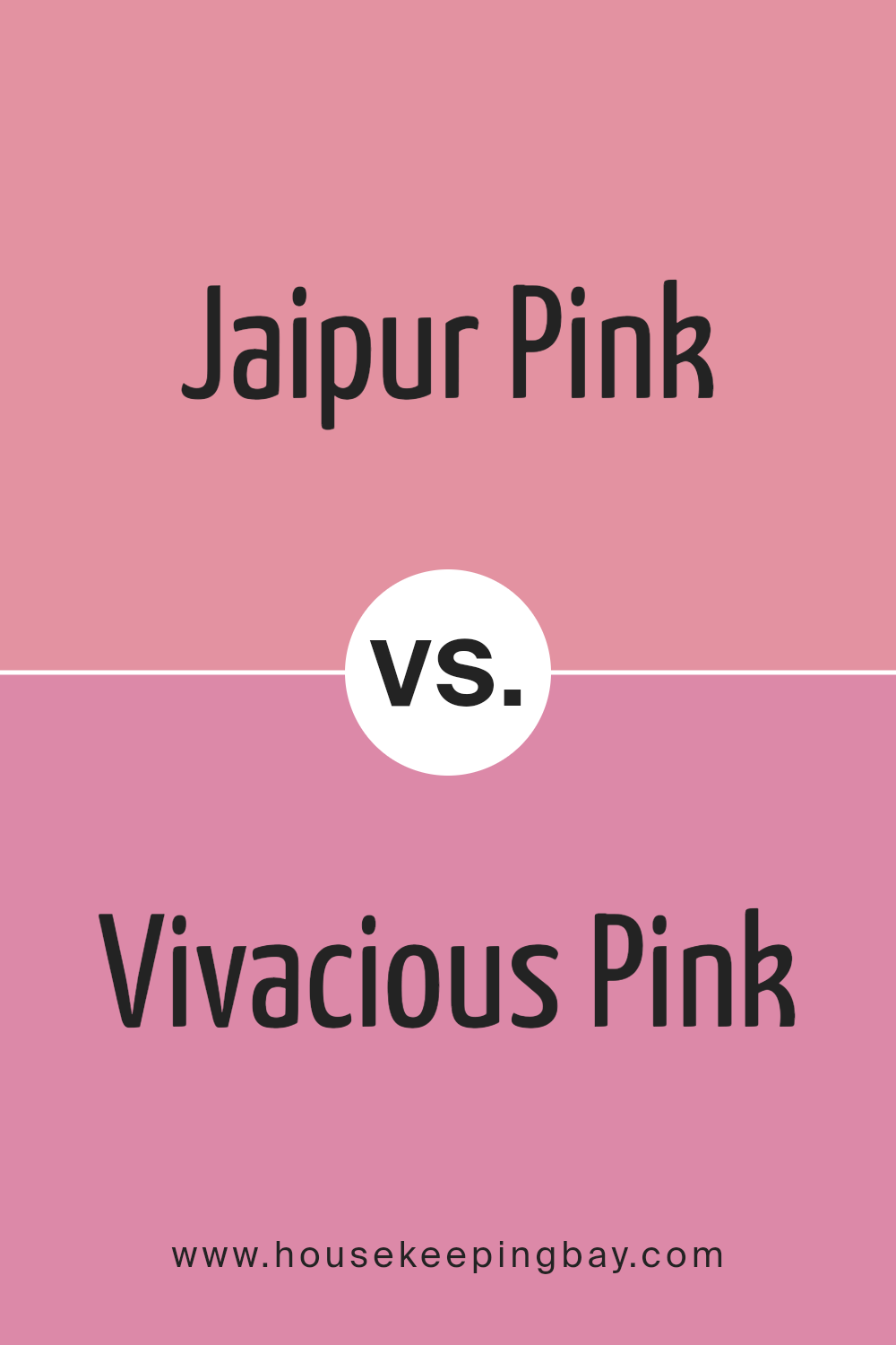
Jaipur Pink SW 6577 by Sherwin Williams vs Vivacious Pink SW 6850 by Sherwin Williams
Jaipur Pink SW 6577 by Sherwin Williams is a soft, muted shade of pink with a touch of warmth that gives it a cozy yet sophisticated vibe. It’s ideal for creating inviting spaces. This color adds a subtle hint of color without overpowering the room, making it perfect for living areas and bedrooms where a touch of softness is desired.
On a different note, Vivacious Pink SW 6850 is bolder and brighter. It stands out with its vivid, intense pink hue that can inject energy and a playful vibe into any space. This color works best in areas where you want to make a strong visual impact, like an accent wall or a children’s room, because it’s very striking.
Both colors offer distinctive charms: Jaipur Pink for its gentle, understated elegance, and Vivacious Pink for its lively, eye-catching appeal. Depending on your room’s intended atmosphere, you can choose the calmness of Jaipur Pink or the dynamic energy of Vivacious Pink.
You can see recommended paint color below:
- SW 6850 Vivacious Pink
housekeepingbay.com
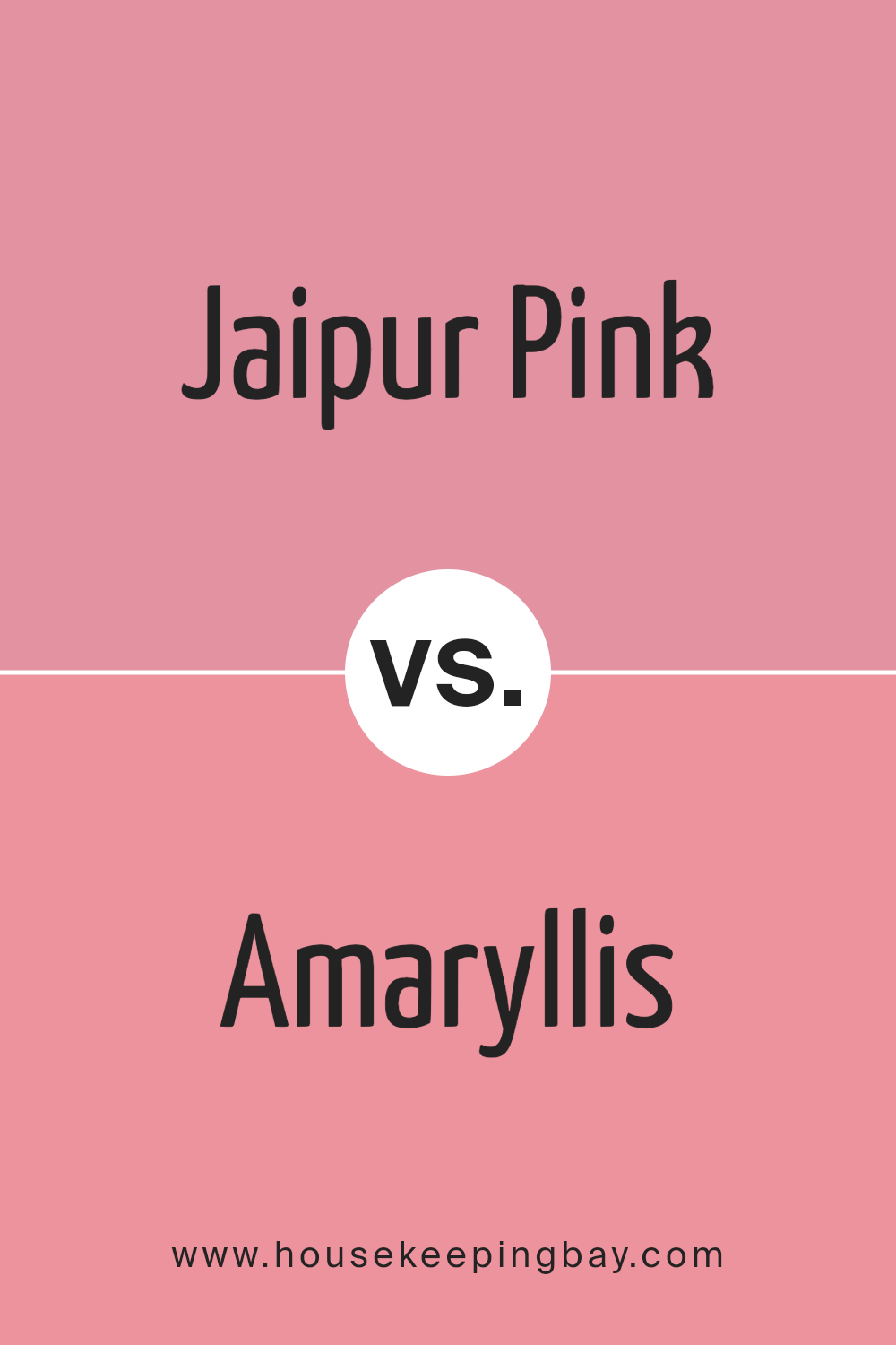
Jaipur Pink SW 6577 by Sherwin Williams vs Amaryllis SW 6591 by Sherwin Williams
Jaipur Pink SW 6577 by Sherwin Williams is a soft, muted pink with a subtle peach undertone that gives it a warm and cozy feel. This color is perfect for spaces where you want to create a soothing and inviting atmosphere. Its gentle hue works well in living rooms, bedrooms, or any area designed for relaxation.
In contrast, Amaryllis SW 6591 is a bold and vibrant pink. It is much brighter and has a more pronounced red influence, making it a lively choice that can add a pop of color to any space. Amaryllis is ideal for accent walls, decorative elements, or in areas where a playful, energetic vibe is desired.
Both colors offer unique possibilities for interior design, depending on the mood and function of your space. Jaipur Pink is better suited for softer, quieter designs, while Amaryllis stands out in dynamic, lively environments.
You can see recommended paint color below:
- SW 6591 Amaryllis
housekeepingbay.com
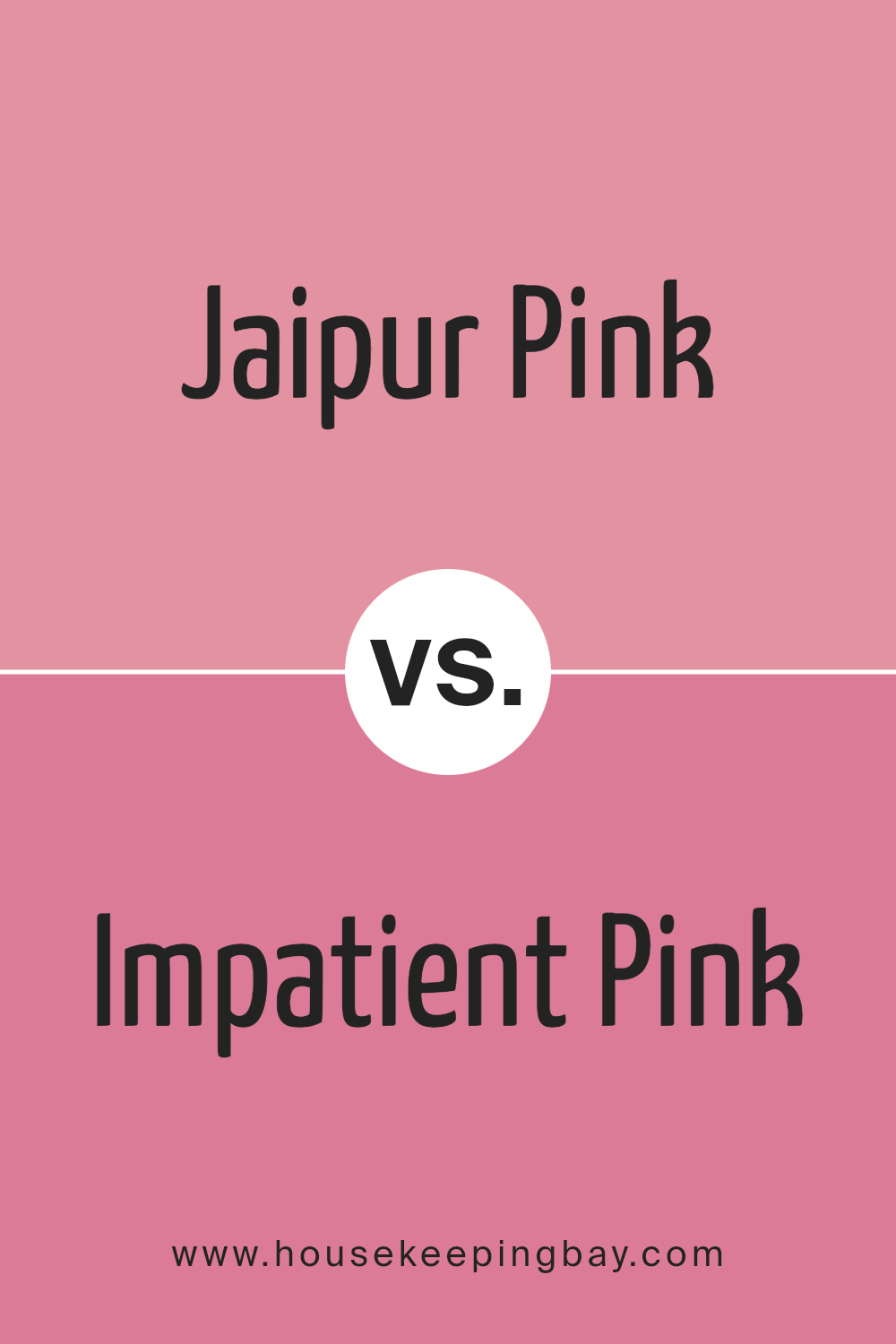
Jaipur Pink SW 6577 by Sherwin Williams vs Impatient Pink SW 6854 by Sherwin Williams
Jaipur Pink SW 6577 and Impatient Pink SW 6854 are both vibrant shades by Sherwin Williams, but they carry distinct vibes. Jaipur Pink has a soft, muted tone that feels soothing and sophisticated. It’s a color that blends well in spaces aiming for a gentle, inviting ambiance. This hue suits both modern and traditional decor, making it a versatile choice for many homes.
In contrast, Impatient Pink SW 6854 is a much brighter and bolder shade. It stands out more prominently and adds a lively burst of energy to any space. This color is perfect for areas needing a playful touch or where one wishes to make a strong, cheerful statement.
Therefore, while both are shades of pink, Jaipur Pink is subtler and more subdued, suitable for creating a relaxed feel. Impatient Pink, being vivid and dynamic, works well in spaces that benefit from a pop of intense color.
You can see recommended paint color below:
- SW 6854 Impatient Pink
housekeepingbay.com
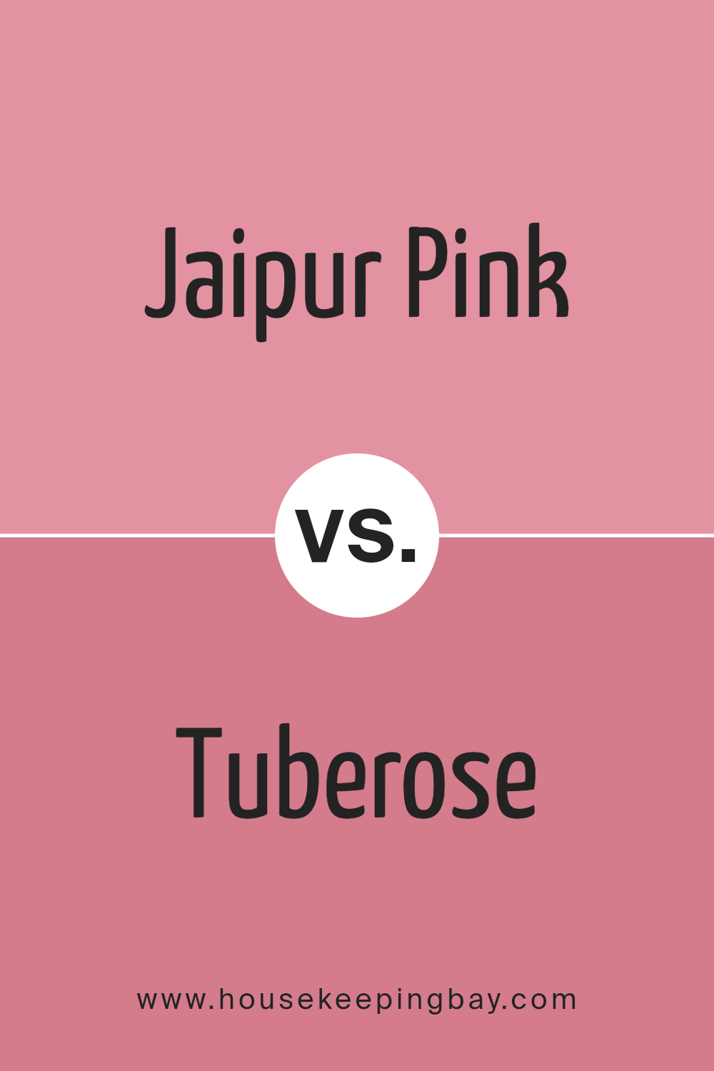
Jaipur Pink SW 6577 by Sherwin Williams vs Tuberose SW 6578 by Sherwin Williams
Jaipur Pink SW 6577 by Sherwin Williams is a vibrant, soft pink hue that conveys a sense of freshness and youthfulness. It’s light enough to make small rooms feel airier and more spacious, yet it has enough saturation to add character. This color works wonderfully in spaces that aim for a gentle, yet cheerful ambiance, such as nurseries or cozy reading nooks.
In contrast, Tuberose SW 6578 is a deeper, more intense shade that leans closer to coral than its counterpart Jaipur Pink. It provides a warm and inviting feel, suitable for making a bolder statement in a room. Tuberose can be ideal for energizing a space, like a dining area or a kitchen, where a splash of warmth can make the environment more welcoming.
Both colors offer unique vibes —Jaipur Pink is subtler and soothing, ideal for calm spaces, while Tuberose is lively and vibrant, perfect for areas where you want a burst of energy. The choice between them depends on the mood and functionality you want to bring to your room.
You can see recommended paint color below:
- SW 6578 Tuberose
housekeepingbay.com
Conclusion
After reviewing Sherwin Williams’ SW 6577 Jaipur Pink, I find this color stands out beautifully for anyone aiming to add a cheerful pop to their space. Its warm, soft pink hue has a pleasant versatility, fitting splendidly into a variety of decorating themes, from shabby chic to modern minimalist. Jaipur Pink can effectively enhance the visual appeal of a room without overwhelming the senses, making it a fantastic choice for bedrooms, bathrooms, and even living areas where a touch of gentleness is desired.
While testing this color, I noted how it pairs wonderfully with soft whites or subtle greys, creating a subtle yet inviting palette. For those feeling slightly more adventurous, matching Jaipur Pink with darker shades like navy or charcoal can produce a sophisticated contrast that really makes the walls stand out.
Beyond aesthetics, the application of the paint was smooth and the coverage was excellent, requiring only a couple of coats to achieve a consistent finish. Its lasting durability also assures that the walls will maintain their soothing effect for years to come.
Overall, Jaipur Pink by Sherwin Williams is a versatile and inviting color that can breathe new life into a room without demanding drastic changes to existing decor. It impressed me with its ability to uplift a space while remaining tastefully understated.
housekeepingbay.com
