Cerise SW 6580 by Sherwin Williams
A Splash of Color for Your Space
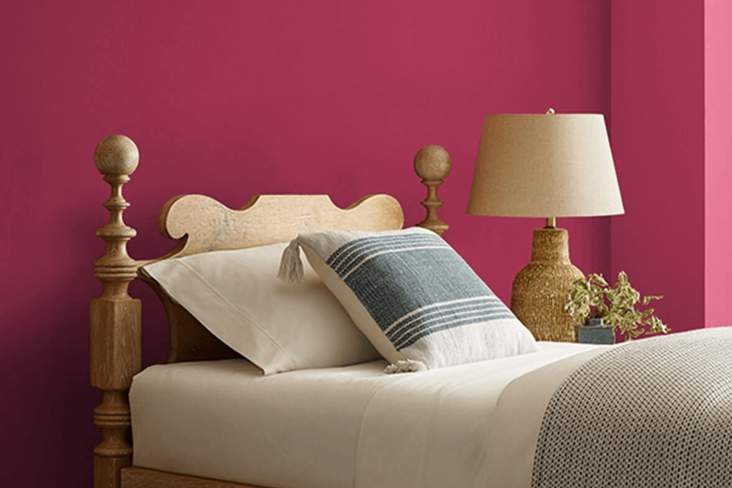
Picture a shade that captures the vitality of a fresh cherry, with a unique blend of pink and red tones. Cerise is bold without being overwhelming, making it perfect for those who want to make a statement.
When you choose Cerise, you’re adding a touch of warmth and excitement to your home. It works well in both modern and traditional settings, offering a fresh twist on a classic color. Whether you’re painting an accent wall or an entire room, Cerise infuses a lively spirit that can uplift any atmosphere.
In natural light, this color has a warm and inviting presence, while under artificial lighting, it maintains its rich, lively character. Pair it with neutral tones like whites, grays, or even soft browns to create a balanced look. Or, if you’re feeling bold, combine it with deeper shades for a more dramatic effect.
Whether you’re updating a living room, a dining area, or even a creative space like an art studio, Cerise provides a backdrop that encourages creativity and joy. Consider it a step towards infusing your environment with personality and charm.
via sherwin-williams.com
What Color Is Cerise SW 6580 by Sherwin Williams?
Table of Contents
Cerise SW 6580 by Sherwin Williams is a vibrant and energetic hue, blending bright red with hints of pink. This bold color is full of personality, adding a lively touch to any space it graces. Its cheerful nature makes it ideal for rooms that aim to inspire creativity and excitement, such as playrooms, home offices, or artistic studios.
Cerise works beautifully in eclectic and modern interior styles, where bold choices and creativity shine. It pairs well with clean lines and simple furnishings, offering a pop of color that stands out without overwhelming the room.
In a contemporary setting, Cerise can create a striking contrast against neutral tones like whites, grays, or soft beiges.
For materials, consider using Cerise alongside natural elements like light wood, which balances its vibrancy with warmth. Metal accents, such as brushed steel or matte black, can add an industrial edge, further enhancing the modern feel.
Soft textures, such as plush throws or velvet cushions, complement Cerise by introducing a touch of comfort, making spaces feel inviting and warm.
Cerise’s lively presence makes it a versatile choice for those looking to add a touch of energy and flair to their interiors, effortlessly energizing any room.
housekeepingbay.com
Is Cerise SW 6580 by Sherwin Williams Warm or Cool color?
CeriseSW 6580 by Sherwin Williams is a warm, vibrant shade of pink that can add lively energy to any room. When used in a home, this color can create a cheerful and inviting atmosphere. Its bright and rich tone can make smaller spaces feel cozy, while adding a pop of color to larger areas.
CeriseSW 6580 works well in rooms where you want to encourage a cheerful mood, like a living room or bedroom. It pairs beautifully with neutral colors like whites and grays, helping to balance its intensity. Additionally, it can complement natural elements such as wooden accents.
This color choice can also serve as an accent wall, drawing attention and adding interest without overwhelming the space. CeriseSW 6580 is versatile and can be incorporated through accessories like cushions or artwork if painting entire walls feel too bold. Overall, it’s an excellent option for those wanting a lively and welcoming home.
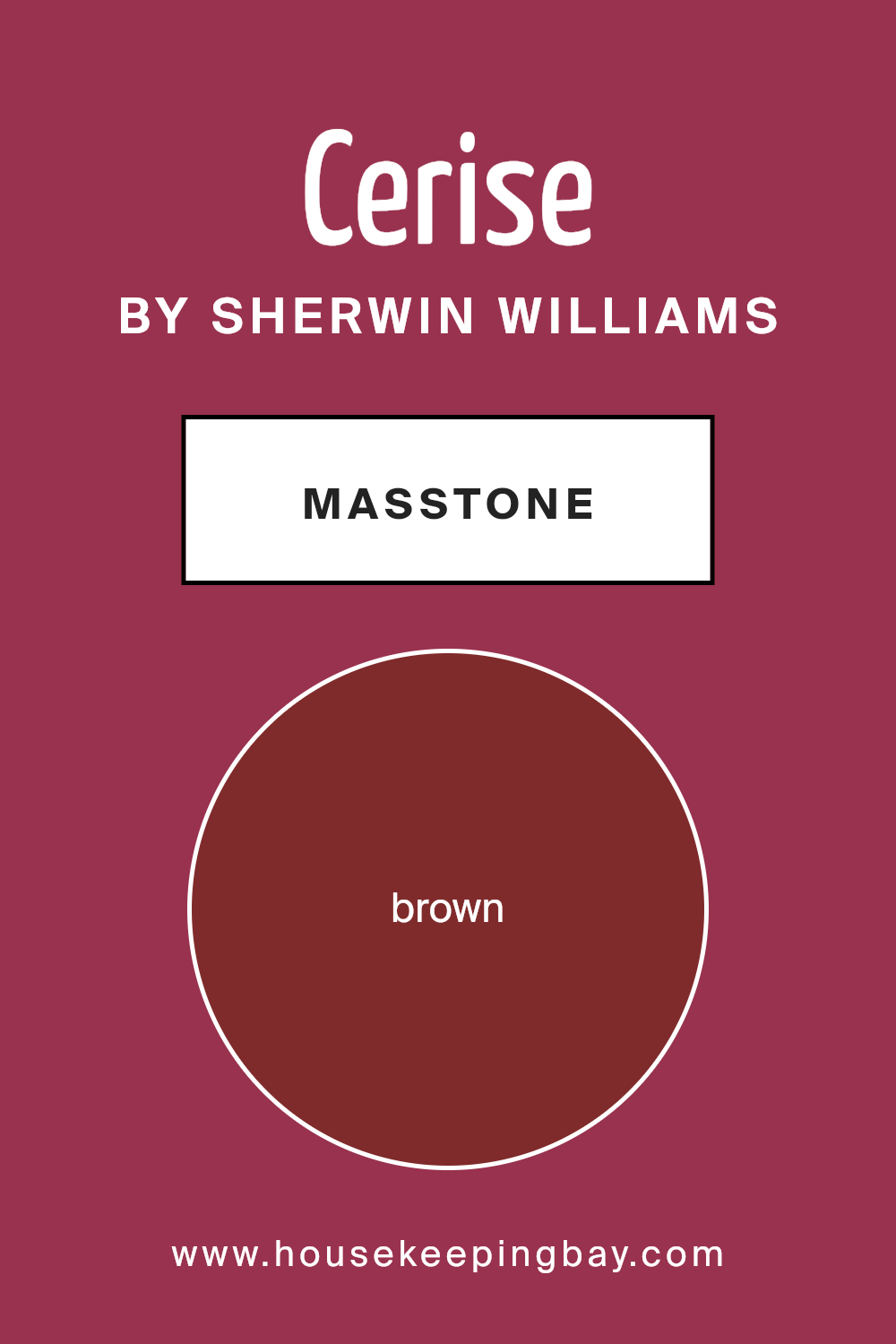
What is the Masstone of the Cerise SW 6580 by Sherwin Williams?
CeriseSW 6580 by Sherwin Williams is a warm, inviting color with a rich brown base that gives it depth. This hue works beautifully in homes because it creates a cozy and welcoming atmosphere. The brown undertone adds a touch of earthiness, which can make rooms feel grounded and stable.
Using Cerise in living spaces or bedrooms can bring a sense of warmth and comfort. It’s a versatile color that complements both classic and modern styles. When paired with neutral tones like cream, beige, or soft gray, it stands out without being overpowering.
In larger spaces, Cerise can serve as an accent wall, which can add visual interest and make your room feel intimate. In smaller rooms, it can wrap the space in its warm glow, making it feel charming and snug. Suitable for any room, Cerise adapts to different lighting, showing off its gentle warmth and inviting character.
housekeepingbay.com
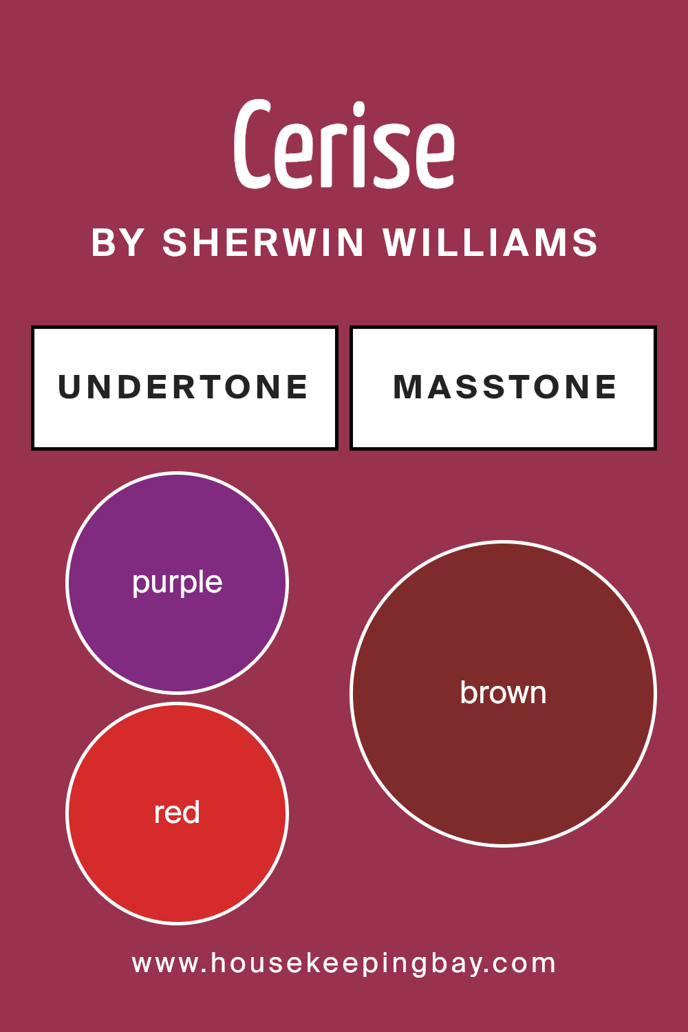
Undertones of Cerise SW 6580 by Sherwin Williams
Cerise SW 6580 by Sherwin Williams is a vibrant color with a mix of undertones that influence how it appears. Undertones are subtle hints of color mixed into the main color, affecting its overall look. When you examine Cerise SW 6580, you will notice that it has purple, red, and pink undertones. These make the color feel warm, lively, and energetic. The purple hints can give a touch of mystery, while the red adds warmth and strength. Pink undertones often bring a playful and cheerful feel.
Other undertones like olive, grey, orange, and navy add depth and complexity. Olive and dark green can calm down the brightness, while the grey and dark grey add a hint of balance and neutrality.
The navy undertone can provide a grounding effect, making the color less overwhelming. Pale pink and orange make it feel soft and inviting.
When you use Cerise SW 6580 on interior walls, these undertones will significantly impact the room’s atmosphere. The mix of warm and cool undertones makes it a dynamic option. It can create a lively space perfect for social areas or a cozy, intimate atmosphere suitable for relaxation. The undertones help adjust the paint’s mood to fit different environments.
housekeepingbay.com
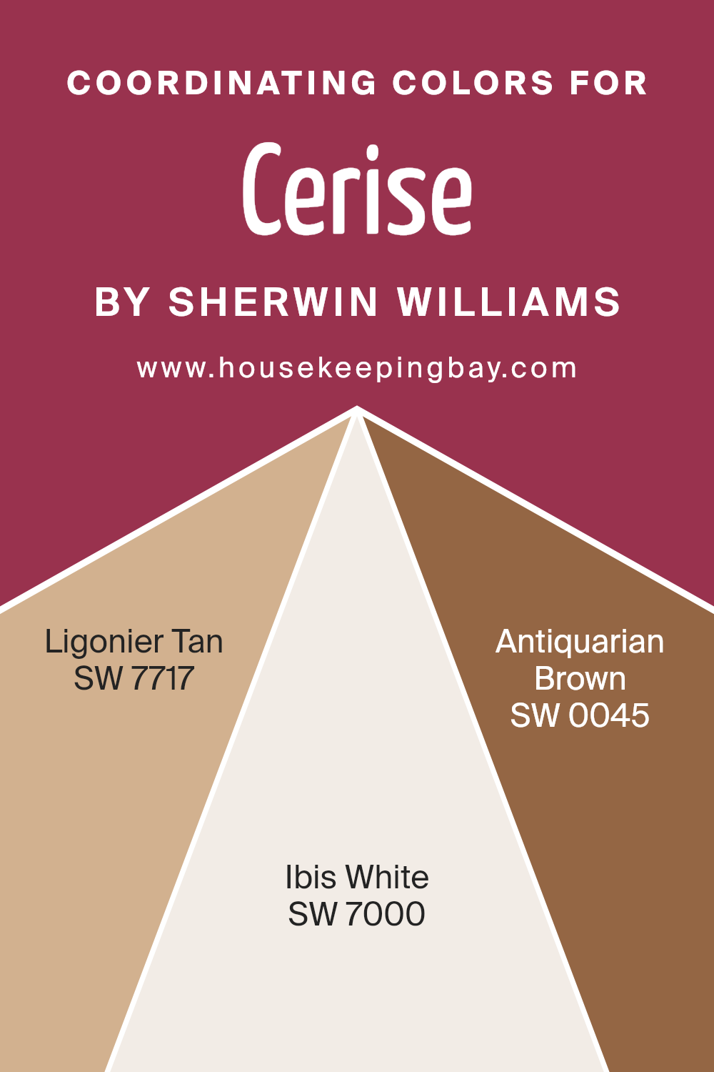
Coordinating Colors of Cerise SW 6580 by Sherwin Williams
Coordinating colors are hues that complement each other and work together harmoniously in a space, creating a balanced and visually appealing environment. They are carefully selected based on how they interact with a primary color, like Cerise SW 6580 by Sherwin Williams, to enhance its vibrancy or soften its intensity.
Coordinating colors consider not only hue but also saturation and value to maintain a pleasing contrast or unity. SW 7717 – Ligonier Tan is one coordinating color that pairs well with Cerise.
It has a warm, earthy tone that grounds the boldness of Cerise, creating a cozy and welcoming atmosphere. Its neutrality makes it adaptable to various settings, from living rooms to bedrooms.
Another excellent coordinating color is SW 7000 – Ibis White. This soft, neutral white brings a brightness and lightness to spaces, making it an ideal choice for trim or ceilings that can balance the intensity of Cerise.
It helps open up a room, giving it an airy feel. SW 0045 – Antiquarian Brown adds depth and richness with its deep, warm brown tones. This color offers a sophisticated touch and creates a sense of warmth and intimacy when used alongside Cerise. Combining these colors allows for a dynamic yet harmonious space where each hue complements the others while standing out individually.
You can see recommended paint colors below:
- SW 7717 Ligonier Tan
- SW 7000 Ibis White
- SW 0045 Antiquarian Brown
housekeepingbay.com
How Does Lighting Affect Cerise SW 6580 by Sherwin Williams?
Lighting plays a key role in how we see colors. The color Cerise SW 6580 by Sherwin Williams is a vibrant pink hue with red undertones. How this color appears can change significantly depending on the lighting.
In artificial light, Cerise SW 6580 can look different depending on whether the light is warm or cool. Warm artificial lights, like incandescent bulbs, might make the color appear warmer and give it a more reddish-pink tone. Cool artificial lights, such as fluorescent lights, can give it a cooler, slightly bluer look.
Natural light shifts throughout the day and changes how a color looks. In north-facing rooms, where the light is softer and cooler, Cerise SW 6580 might appear more muted or slightly bluer due to the lack of direct sunlight. This can make the color feel a bit subdued but still pleasant.
In south-facing rooms, abundant sunlight can bring out the intensity of Cerise SW 6580, showcasing its vibrant pink and red tones. The color might appear more lively and rich because of the strong, direct midday sun.
East-facing rooms get morning light, which is bright but not as intense as midday sun. In the mornings, this light can make Cerise SW 6580 look fresh and bright. In the afternoons, as the sunlight fades, the color might shift to a softer tone.
West-facing rooms have warm afternoon and evening light. This warm light can enhance the red undertones in Cerise SW 6580, giving the color a warm, glowing appearance as the day ends. The change in light throughout the day can make the color seem more dynamic.
In summary, Cerise SW 6580 can shift in appearance based on light conditions, with each type of lighting adding different dimensions to this beautiful shade.

housekeepingbay.com
What is the LRV of Cerise SW 6580 by Sherwin Williams?
LRV stands for Light Reflectance Value, which is a measurement used to indicate how much light a paint color will reflect or absorb. The scale ranges from 0 to 100, where 0 means the color absorbs all light (like deep black), and 100 means it reflects all light (like pure white).
This measurement helps us understand how bright or dark a color might look once it’s painted on a wall. Higher LRV values mean more light is reflected, making a space feel brighter and more open. Lower LRV values mean more light is absorbed, usually giving rooms a cozier, more intimate feel due to their darker appearance.
For Cerise SW 6580 by Sherwin Williams, which has an LRV of 9.648, this means it is a very dark color. It will absorb most of the light that hits it, making any room painted in this shade feel warm and intimate.
This can be great for creating a cozy atmosphere or adding depth to a particular area. However, using it in large quantities in small rooms might make the space feel smaller and more enclosed.
It’s important to balance dark colors with lighter elements in a room, such as bright trim or furniture, to ensure the space doesn’t become too overwhelming or dark.

housekeepingbay.com
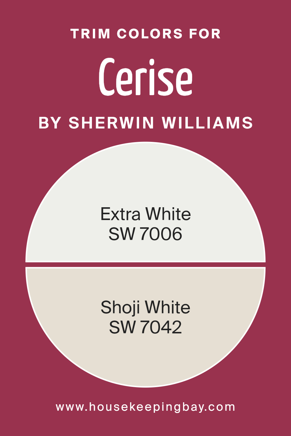
What are the Trim colors of Cerise SW 6580 by Sherwin Williams?
Trim colors are the shades used to outline and contrast the primary wall color within a room or exterior of a house. They add definition and enhance the overall look by creating a visual boundary between the walls and other elements like doors, baseboards, and window frames.
For Cerise SW 6580 by Sherwin Williams, a deep, bold shade of pinkish-red, choosing the right trim color can make all the difference.
Using trim colors helps highlight this vibrant hue while keeping the space harmonious and visually appealing. Trim colors can either complement the main color by being subtle and neutral or provide a stark contrast to make both the wall color and the architectural elements stand out more.
Using SW 7006 – Extra White or SW 7042 – Shoji White as trim colors with Cerise can be quite effective.
SW 7006 – Extra White is a crisp, clean white that feels fresh and brightens the room, offering a sharp, classic contrast against the energetic Cerise. On the other hand, SW 7042 – Shoji White is a softer white with a subtle hint of warmth, which gently complements Cerise while maintaining a cohesive and inviting atmosphere.
Both choices ensure the bold character of Cerise gets the attention it deserves, while the trim colors frame it gracefully, adding to the space’s overall design and balance.
You can see recommended paint colors below:
housekeepingbay.com
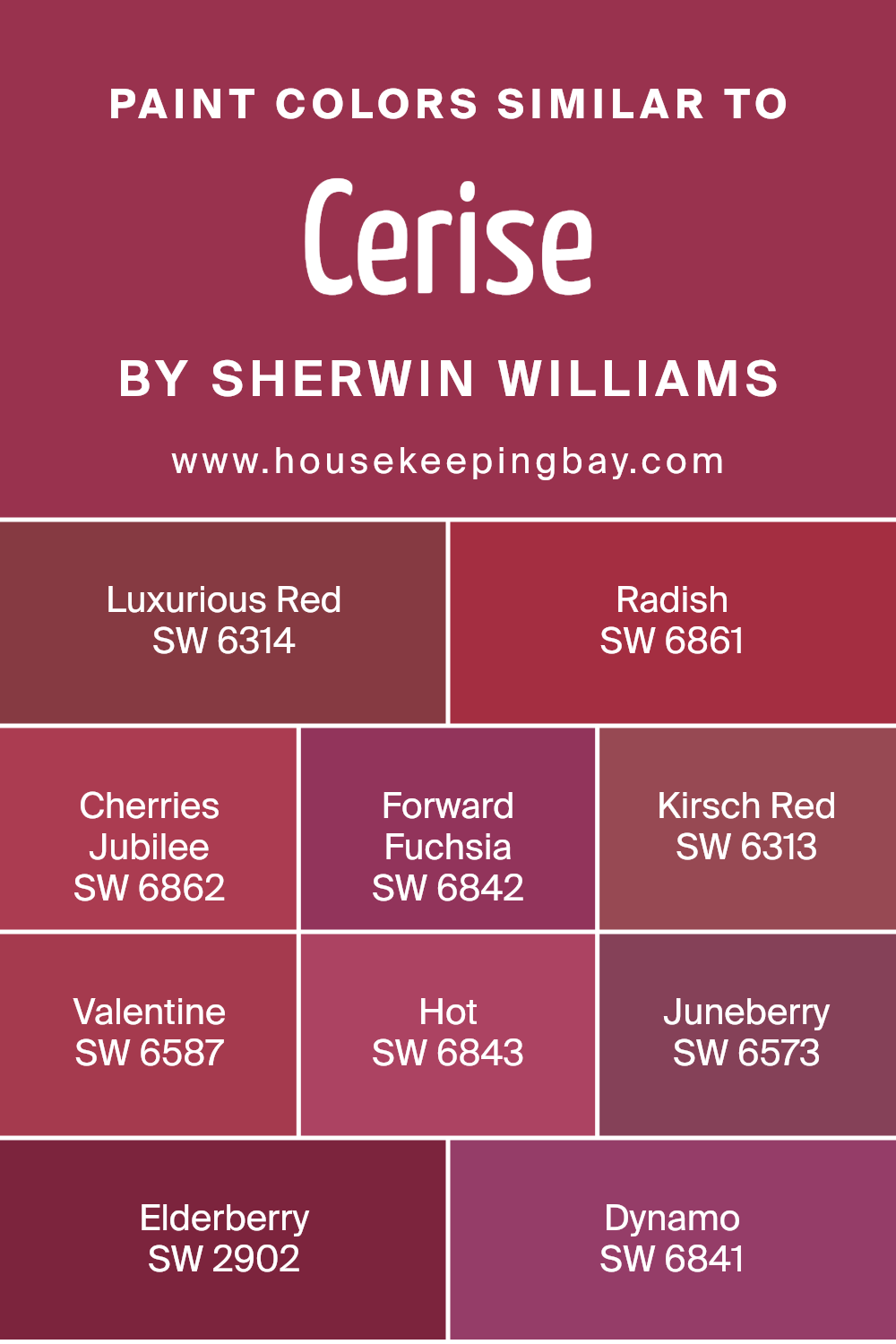
Colors Similar to Cerise SW 6580 by Sherwin Williams
Similar colors play a key role in creating a harmonious and cohesive design. When used together, they provide balance and unity, making a space feel more pleasant and inviting. Colors that are close to each other on the color wheel, like the ones similar to Cerise SW 6580 by Sherwin Williams, naturally blend well and enhance the overall aesthetic.
Using these tones helps create a soothing atmosphere because the eye easily transitions across them. These similar hues can stir emotions, set moods, and influence feelings through their subtle changes in tone and shade.
Luxurious Red SW 6314 is a rich, deep red that brings warmth and a sense of opulence.
Radish SW 6861 offers a more vibrant approach, with its lively and spirited presence.
Cherries Jubilee SW 6862 carries a sweet and inviting charm, reminiscent of dessert treats. Forward Fuchsia SW 6842 bursts with energy, making it an excellent choice for creating a lively space.
Kirsch Red SW 6313 is slightly darker, adding depth and sophistication. Valentine SW 6587 has a romantic and tender feel, ideal for cozy settings.
Hot SW 6843 introduces a powerful pink that demands attention. Juneberry SW 6573 takes a muted approach, offering an elegant berry tone. Elderberry SW 2902 sits comfortably with its subdued, dark shade. Finally, Dynamo SW 6841 provides a striking and bold finish.
You can see recommended paint colors below:
- SW 6314 Luxurious Red
- SW 6861 Radish
- SW 6862 Cherries Jubilee
- SW 6842 Forward Fuchsia
- SW 6313 Kirsch Red
- SW 6587 Valentine
- SW 6843 Hot
- SW 6573 Juneberry
- SW 2902 Elderberry
- SW 6841 Dynamo
housekeepingbay.com
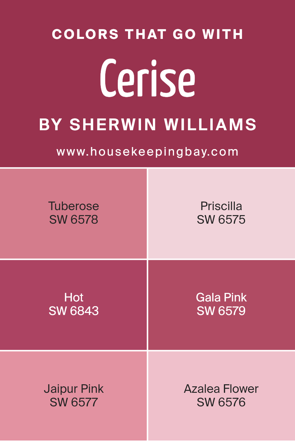
Colors that Go With Cerise SW 6580 by Sherwin Williams
Colors that pair with Cerise SW 6580 by Sherwin Williams are vital because they bring harmony and balance to a space, helping to achieve the desired aesthetic. Cerise is a bold, playful shade of pink that can dominate a room if not paired correctly. Colors such as Tuberose, Priscilla, Hot, Gala Pink, Jaipur Pink, and Azalea Flower complement Cerise beautifully, allowing each hue to shine while creating a cohesive look.
Tuberose, a soft pinkish-white, provides a gentle contrast that softens the vibrancy of Cerise and adds a touch of calm. Priscilla, with its muted rosy pink tones, adds warmth while maintaining the lively character of the palette.
Hot offers an energetic punch with its vivid fuchsia shade, enhancing the dynamic quality of Cerise. Gala Pink is a fresh, light pink that perfectly balances the stronger colors with a hint of sweetness.
Jaipur Pink brings a rich, deep pink tone that adds depth and sophistication, grounding the brighter elements. Lastly, Azalea Flower is a cheerful pink that lightens up the combination, adding a youthful, energetic feel.
When these colors come together, they create a beautiful, lively environment that feels both inviting and thoughtfully coordinated, making any space with Cerise a delightful and harmonious setting.
You can see recommended paint colors below:
- SW 6578 Tuberose
- SW 6575 Priscilla
- SW 6843 Hot
- SW 6579 Gala Pink
- SW 6577 Jaipur Pink
- SW 6576 Azalea Flower
housekeepingbay.com
How to Use Cerise SW 6580 by Sherwin Williams In Your Home?
Cerise SW 6580 by Sherwin Williams is a vibrant, bold color that can bring energy and warmth to any room. With its rich, deep pink hue, it makes a striking statement and works well in various spaces within a home. Consider using it as an accent wall in a living room to add a splash of personality and excitement.
This color pairs beautifully with neutral tones like white, beige, or gray, allowing it to pop without overwhelming the space.
In a bedroom, Cerise can create a cozy and inviting atmosphere. Pair it with soft textiles and warm lighting to foster a welcoming environment. In a child’s room, this lively color can inspire creativity and joy. When incorporated in home decor, Cerise can add flair to furniture pieces or decorative accessories like cushions and rugs. Overall, Cerise SW 6580 by Sherwin Williams can make any space feel lively and full of character.
Cerise SW 6580 by Sherwin Williams vs Dynamo SW 6841 by Sherwin Williams
Cerise SW 6580 and Dynamo SW 6841 are both vibrant pink shades by Sherwin Williams, yet they offer different personalities. Cerise, a bold and lively pink, leans slightly towards a redder tone, creating a sense of energy and excitement. It’s perfect for adding a punch of color to any room without overwhelming it.
Dynamo SW 6841, however, is a bright and more vivid pink, with hints of magenta. This color is even more energetic and vibrant than Cerise, making it ideal for spaces where you want to encourage creativity and fun. Dynamo can turn a feature wall into a central piece, sparking conversation and interest.
Both colors can energize a space, but Cerise offers a slightly warmer, richer vibe, while Dynamo feels more youthful and dynamic. Depending on the desired atmosphere, either color can effectively infuse a room with personality and charm.
You can see recommended paint color below:
- SW 6841 Dynamo
housekeepingbay.com
Cerise SW 6580 by Sherwin Williams vs Juneberry SW 6573 by Sherwin Williams
Cerise SW 6580 and Juneberry SW 6573, both by Sherwin Williams, offer distinct shades of pink, each with its own charm. Cerise is a vibrant red-pink, bringing energy and warmth to a space. It’s lively and can evoke a playful, cheerful atmosphere. This color suits areas like living rooms or creative spaces where you want to encourage liveliness and interaction.
Juneberry, while also a pink, leans towards a deeper, richer tone, almost berry-like. It carries more depth and can feel more dramatic and sophisticated. It works well in more intimate settings like dining rooms or bedrooms, where a cozy and inviting ambiance is desired.
Both colors are pink-based but serve different moods. Cerise brings brightness and cheer, while Juneberry offers depth and elegance. Choosing between them depends on the desired feel of your space—whether you want it vibrant and energetic or cozy and rich.
You can see recommended paint color below:
- SW 6573 Juneberry

housekeepingbay.com
Cerise SW 6580 by Sherwin Williams vs Hot SW 6843 by Sherwin Williams
Cerise SW 6580 and Hot SW 6843 by Sherwin Williams both deliver vivid shades of pink, yet they express distinct vibes. Cerise SW 6580 presents a deeper, richer pink, resembling a ripe cherry or berry. It carries a bold presence, ideal for making an impactful statement in a room. This color can evoke warmth and create a cozy atmosphere, making spaces feel more inviting.
Meanwhile, Hot SW 6843 exudes an energetic and lively vibe with its brighter, more vibrant pink. This shade feels playful and uplifting, suitable for spaces that wish to radiate happiness and enthusiasm. While Cerise tends toward elegance and depth, Hot showcases enthusiasm and cheerfulness.
Both colors, though vibrant, can transform interiors differently. Cerise leans toward a sophisticated intensity, while Hot adds zest and fun. Choosing between them depends on whether the goal is to create a serene yet strong ambiance or an exuberant and joyful environment.
You can see recommended paint color below:
- SW 6843 Hot

housekeepingbay.com
Cerise SW 6580 by Sherwin Williams vs Cherries Jubilee SW 6862 by Sherwin Williams
Cerise SW 6580 and Cherries Jubilee SW 6862 by Sherwin Williams are two vibrant shades of red, each bringing its own character to spaces. Cerise SW 6580 offers a slightly softer red, infused with undertones that give it a warm, approachable feel. It can add a cozy, inviting vibe to a room, making spaces feel lively yet comfortable.
Cherries Jubilee SW 6862 is a bolder red, with a brighter and more intense appearance. It captures attention more dramatically, adding a dynamic energy to any environment. This color works well in spaces where you want to make a strong impression or create a focal point.
Both colors share a red base, but Cerise leans warmer, while Cherries Jubilee stands out for its brightness. Deciding between them depends on whether you’re seeking a softer warmth or a more vibrant pop of color.
You can see recommended paint color below:
- SW 6862 Cherries Jubilee

housekeepingbay.com
Cerise SW 6580 by Sherwin Williams vs Radish SW 6861 by Sherwin Williams
Cerise SW 6580 and Radish SW 6861, both by Sherwin Williams, offer vibrant takes on reddish hues, yet they present distinct characters. Cerise SW 6580 appears as a soft red with hints of pink, creating a warm and inviting ambiance. It evokes a gentle, cheerful feel that suits spaces needing a touch of playful yet sophisticated color.
Radish SW 6861, meanwhile, showcases a deeper, more intense red with hints of magenta. Its bold, dynamic nature makes it an excellent choice for a statement wall or accent pieces, adding a burst of energy and excitement.
While Cerise adds warmth and lightness, Radish demands attention with its rich, powerful presence. Decorators might select Cerise for subtlety and charm, and Radish for bold impact. Both colors bring unique flair, allowing flexibility depending on the mood and style desired in a room.
You can see recommended paint color below:
- SW 6861 Radish

housekeepingbay.com
Cerise SW 6580 by Sherwin Williams vs Luxurious Red SW 6314 by Sherwin Williams
Cerise SW 6580 and Luxurious Red SW 6314 from Sherwin Williams are two different shades of red, each bringing unique qualities. Cerise SW 6580 presents a bold, lively pinkish-red. It feels vibrant and energetic, making it ideal for spaces needing a punch of color. This shade works well in creative environments or areas where you want to foster an upbeat atmosphere.
Luxurious Red SW 6314 exudes a deep, dark red, offering a classic and sophisticated look. It feels rich and opulent, perfect for cozy settings or elegant dining rooms. This shade can create a warm, inviting atmosphere, enhancing the timeless appeal of any room.
While both colors stem from the red family, Cerise leans towards a brighter, more spirited palette, whereas Luxurious Red offers a deeper, more refined tone. Choosing between these depends greatly on the mood and style you wish to achieve within a space.
You can see recommended paint color below:
- SW 6314 Luxurious Red
housekeepingbay.com
Cerise SW 6580 by Sherwin Williams vs Elderberry SW 2902 by Sherwin Williams
Cerise SW 6580 by Sherwin Williams and Elderberry SW 2902 by Sherwin Williams both belong to the red-purple family. Cerise SW 6580 is a vibrant, bold color that leans more towards a bright pink-red tone. It’s lively and energetic, perfect for adding a pop of color to a space. This shade is often used to create a cheerful and dynamic atmosphere.
Elderberry SW 2902, however, offers a deeper, richer hue. It has a muted, subdued quality, introducing more purple and black undertones, resulting in a color that feels more sophisticated and mellow. This can create a sense of coziness and warmth, functioning well in spaces where a calm, inviting environment is desired.
In summary, Cerise imparts energy and brightness, making it ideal for lively areas, while Elderberry provides depth and elegance, suiting spaces where one might seek a peaceful or intimate feel. Both colors enhance environments uniquely, using shades that express distinct moods.
You can see recommended paint color below:
- SW 2902 Elderberry
housekeepingbay.com
Cerise SW 6580 by Sherwin Williams vs Forward Fuchsia SW 6842 by Sherwin Williams
Cerise SW 6580 and Forward Fuchsia SW 6842, both by Sherwin Williams, offer vibrant shades of pink, each with its character. Cerise SW 6580 leans towards a deeper, more mature pink. It carries a slightly muted tone, making it versatile for various settings. This color could work well in living rooms or bedrooms, providing a warm, welcoming vibe without overwhelming the space.
In contrast, Forward Fuchsia SW 6842 bursts with energy and brightness. This is a bolder, more playful pink, likely to draw attention wherever it’s used. Ideal for accent walls or playful areas such as children’s rooms or creative spaces, it injects a lively feel.
While Cerise projects sophistication and depth, Forward Fuchsia champions enthusiasm and vibrancy. Both require thoughtful pairing with other colors; Cerise pairs well with earthy or neutral tones, while Forward Fuchsia flourishes alongside equally vibrant shades or crisp whites.
You can see recommended paint color below:

housekeepingbay.com
Cerise SW 6580 by Sherwin Williams vs Valentine SW 6587 by Sherwin Williams
Cerise SW 6580 and Valentine SW 6587 by Sherwin Williams can immediately alter the feel of a room with their vibrant hues. Cerise is a deep, rich pink with hints of red that brings energy and warmth. It’s like a burst of enthusiasm, energizing spaces with its lively shade. This color can create a bold statement and add a lively touch to any area, making it ideal for accent walls or lively workspaces.
Valentine SW 6587, while also a pink shade, leans slightly towards a softer, more pastel vibe. It’s less intense than Cerise, giving off a gentle, welcoming aura. This color can make spaces feel cozy and inviting, suitable for bedrooms or living areas where relaxation is key.
Both colors add their own unique flair, with Cerise providing a punchy vibrance and Valentine offering a softer, more comforting palette. Together, they can complement each other beautifully, balancing boldness with subtlety.
You can see recommended paint color below:
- SW 6587 Valentine

housekeepingbay.com
Cerise SW 6580 by Sherwin Williams vs Kirsch Red SW 6313 by Sherwin Williams
Cerise SW 6580 and Kirsch Red SW 6313 by Sherwin Williams both bring vibrant energy but offer unique vibes. Cerise is a lively, cheerful pink with a hint of red. It feels warm and inviting, perfect for adding a playful or sweet touch to any room. Imagine a bright, joyful splash that can lift moods and energize spaces without overwhelming them.
Kirsch Red, however, stands as a bold, deep red hue. It carries a classic, dramatic presence, ideal for making a powerful statement. This color works well when you want to instill warmth and intensity in a space, projecting strength and sophistication.
While Cerise offers lighthearted charm, Kirsch Red speaks more to elegance and depth. Both colors, though they share warmth, cater to different aesthetics—Cerise for those leaning toward fun and vibrancy, and Kirsch Red for those desiring a rich, bold environment. Both can transform spaces, making them feel custom and expressive.
You can see recommended paint color below:
- SW 6313 Kirsch Red
housekeepingbay.com
Conclusion
SW 6580 Cerise by Sherwin Williams is more than a paint color; it’s a statement. As I reflect on its bold charm, it strikes me as a choice that demands attention while balancing sophistication with vibrancy. This color brings energy and warmth to any space, offering an opportunity to redefine a room’s personality.
When considering its application, I find that Cerise works beautifully on accent walls, adding a dramatic touch without overwhelming. It’s versatile enough to work with various styles, whether modern or traditional, and pairs well with both neutral tones and other vibrant hues.
Whether used in a living room to create a lively gathering space or in a bedroom to invigorate one’s personal retreat, Cerise has a way of drawing people in.
I appreciate how it can uplift an area, making it feel inviting and full of life. Sherwin Williams’ Cerise allows for creativity, encouraging experimentation with design elements.
Its ability to enhance any room with both its depth and brightness makes it a worthwhile consideration for someone ready to reinvent their home interior. Choosing Cerise means opting for a balance of boldness and beauty, bringing a much-needed pop of color into any environment.

housekeepingbay.com
Ever wished paint sampling was as easy as sticking a sticker? Guess what? Now it is! Discover Samplize's unique Peel & Stick samples. Get started now and say goodbye to the old messy way!
Get paint samples


