Izmir Purple SW 6825 by Sherwin Williams
A Rich Hue for Bold Living Spaces
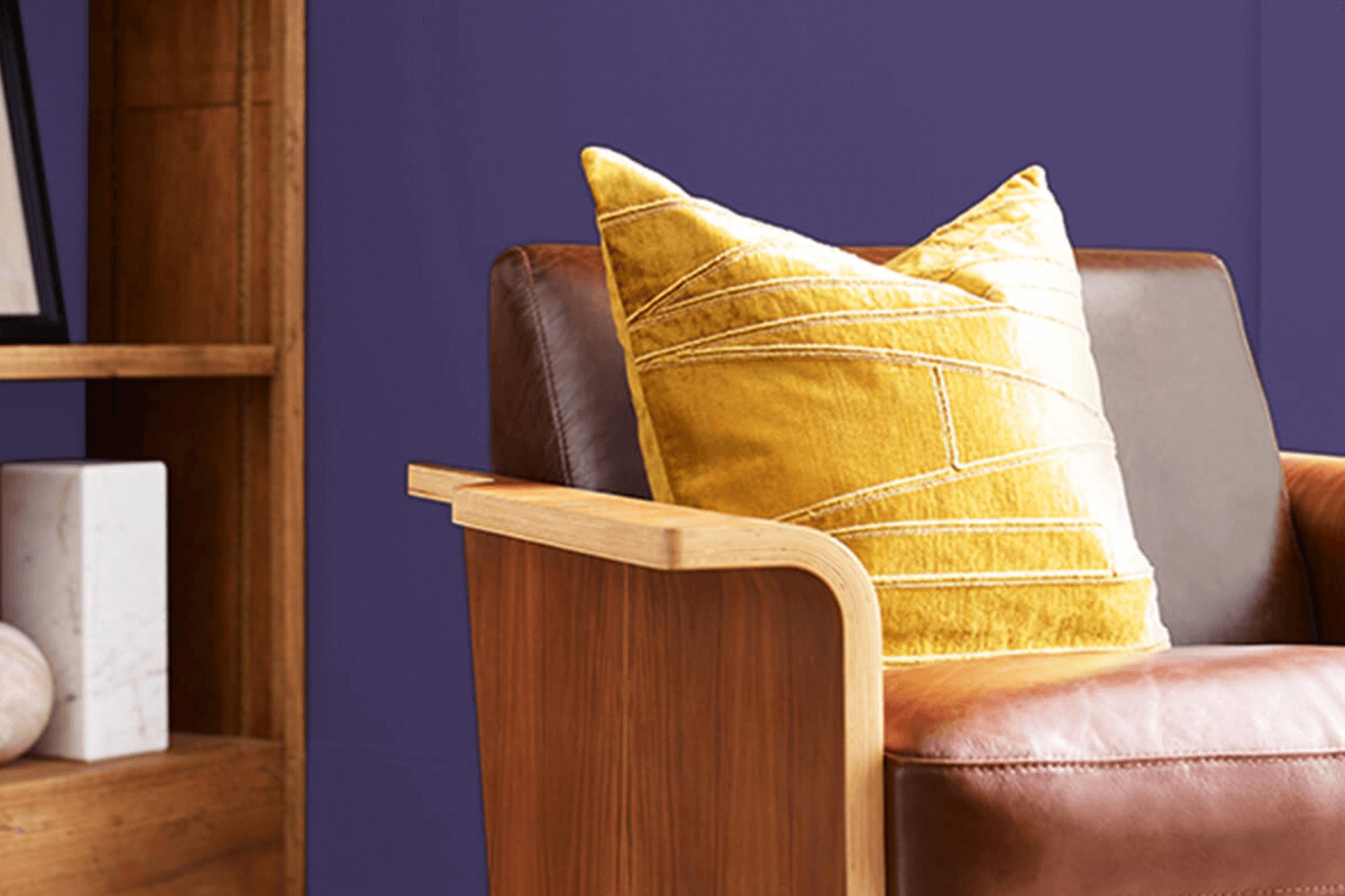
Think about a color that brings a sense of calm and sophistication to your space. That’s what SW 6825 Izmir Purple by Sherwin Williams does. It adds a touch of elegance to any room without overpowering other elements. It’s a beautiful balance between rich and subtle, making it a perfect choice for a variety of settings.
When you think of purple, you might envision vibrant hues that are bold and commanding. Izmir Purple, however, offers a softer take. It’s understated yet full of depth, which allows it to complement different styles, whether modern, traditional, or somewhere in between.
It can be a fantastic choice for a living room wall, a bedroom accent, or even a hallway that needs a bit of character.
Izmir Purple can also serve as a great backdrop. It pairs wonderfully with both lighter and darker colors, creating an inviting and cohesive atmosphere. Picture it against whites, creams, or even deeper blues and grays.
Choosing the right color for your home can shape the entire mood of a room. Izmir Purple is your trusted ally in crafting spaces that are not just house interiors but personal havens of comfort and style.
via sherwin-williams.com
What Color Is Izmir Purple SW 6825 by Sherwin Williams?
Table of Contents
Izmir Purple SW 6825 by Sherwin Williams is a rich, vibrant shade of purple that commands attention. It has a deep, bold hue that brings warmth and character to any space. This color is perfect for those who wish to add a touch of luxury and sophistication to their interiors.
Izmir Purple works especially well in modern and eclectic interior styles, giving them a dramatic and elegant flair. It can also complement traditional or bohemian settings, where its richness adds depth and interest.
In contemporary spaces, Izmir Purple makes for an eye-catching accent wall, while in more classic rooms, it’s ideal for upholstery or decorative pieces.
For materials, Izmir Purple pairs beautifully with velvet, which enhances its luxurious nature. Combining it with gold or brass accents creates a regal look, ideal for living rooms or dining areas. Natural materials like wood provide a nice contrast, balancing the purple’s intensity.
Textures such as soft wool throws or plush rugs work well, adding comfort and warmth to the room.
Metallic accessories, like silver or gold picture frames, can help accentuate Izmir Purple while providing a reflective quality.
Overall, this color brings a sense of elegance and richness, enhancing both cozy and upscale settings.

housekeepingbay.com
Is Izmir Purple SW 6825 by Sherwin Williams Warm or Cool color?
Izmir Purple SW 6825 by Sherwin-Williams is a rich, vibrant color that brings personality to any home. This shade of purple has a warm undertone, making it feel inviting and cozy. Used in living rooms, it adds a touch of elegance and luxury. In a bedroom, it creates a soothing atmosphere, helping one relax after a long day.
Izmir Purple works beautifully with neutral colors like whites, grays, or beige, allowing it to pop without overwhelming a space.
When combined with metallic accents, such as gold or silver, rooms appear more sophisticated and chic.
It also pairs well with natural wood tones, adding warmth and comfort to interiors. This color is ideal for those who like bold yet elegant choices for their home design.
Whether on walls, furniture, or accent pieces, Izmir Purple offers a versatile option for different design styles, from modern to traditional.
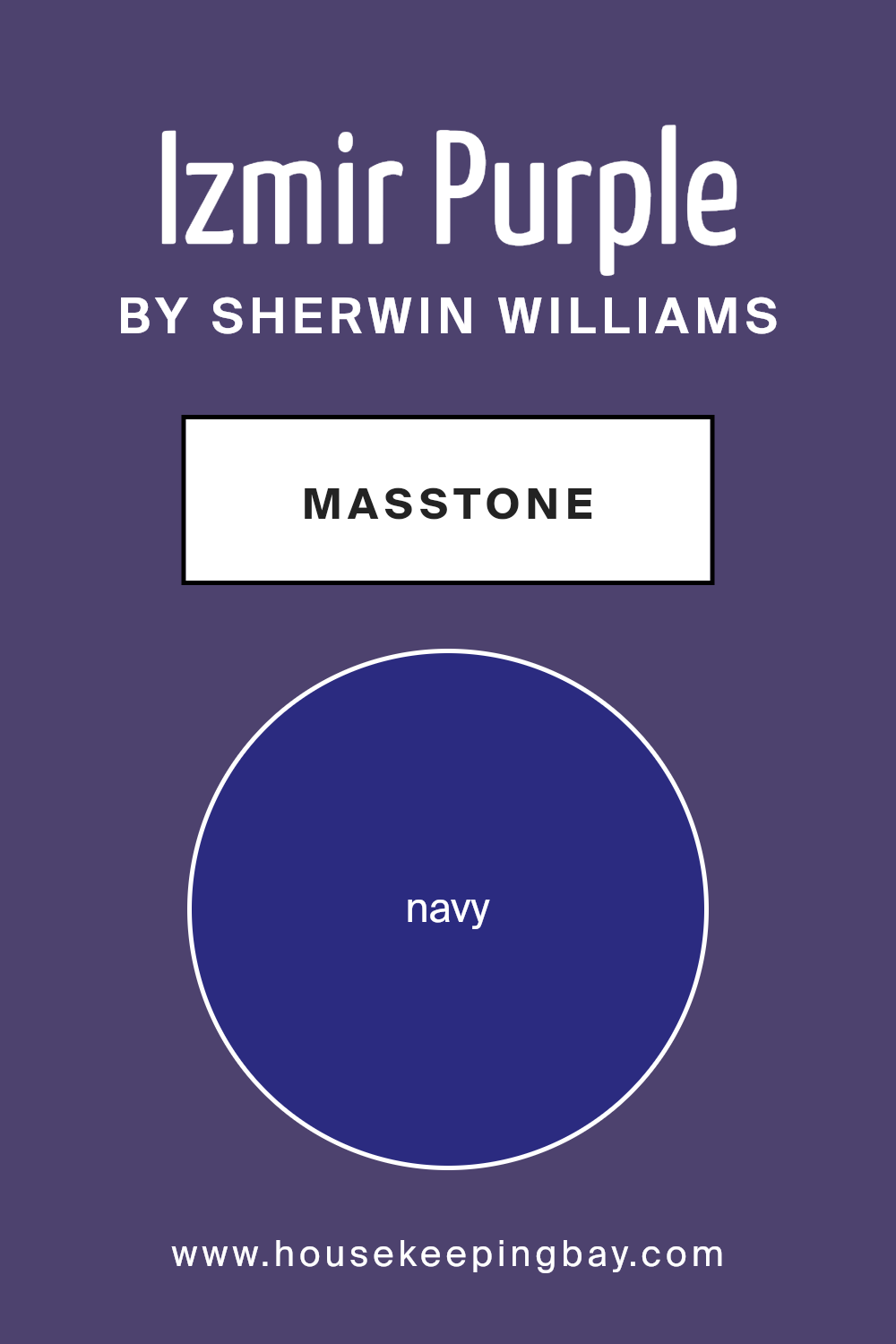
What is the Masstone of the Izmir Purple SW 6825 by Sherwin Williams?
Izmir Purple SW 6825 by Sherwin Williams has a rich, deep color that is close to navy (#2B2B80). This masstone gives Izmir Purple a strong, solid look, making it versatile for home settings. In living rooms, this shade can add a sophisticated and cozy feel, offering a warm contrast to lighter furniture and decor.
In a bedroom, it can create a calm, restful atmosphere, perfect for relaxation. This color works beautifully with neutral tones like whites and grays, adding depth and personality to the space without overwhelming it.
For those feeling adventurous, pairing Izmir Purple with metallic accents adds a touch of luxury, while wooden elements bring out its natural elegance. Its bold nature makes it a strong choice as an accent wall or in smaller spaces like home offices, where it adds focus without feeling too heavy.
Overall, Izmir Purple offers comforting relaxation and sophisticated charm in any home.
housekeepingbay.com
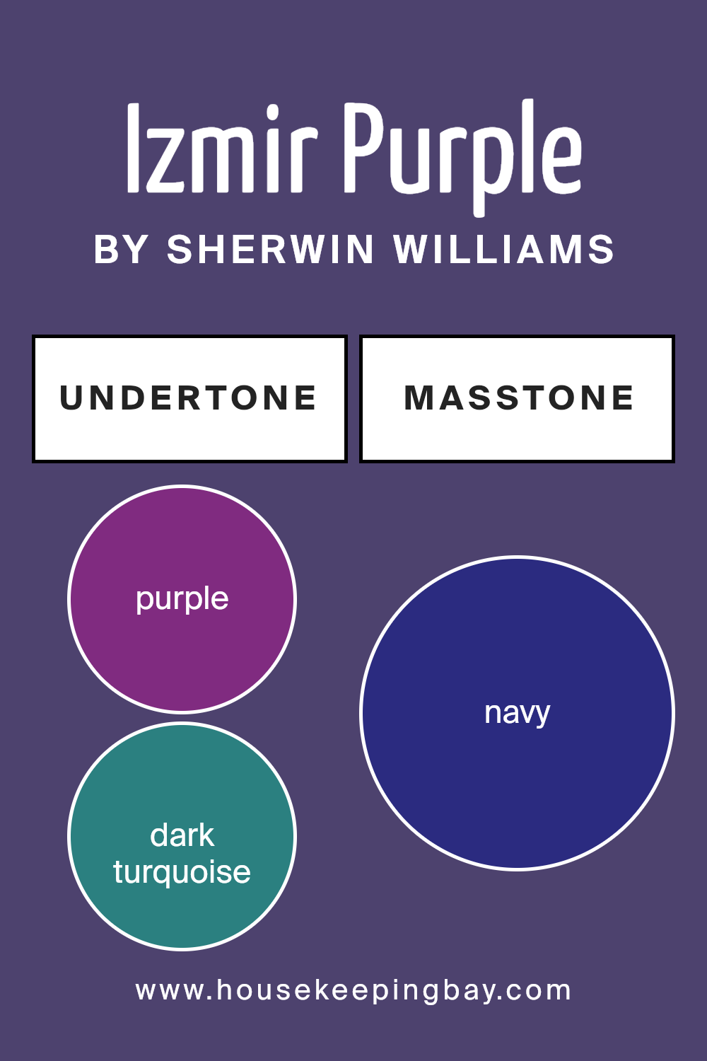
Undertones of Izmir Purple SW 6825 by Sherwin Williams
Izmir Purple SW 6825 by Sherwin Williams is a vibrant shade that carries a complex mix of undertones. These hidden hues can influence how the primary color is perceived in different lighting conditions. The undertones of Purple, Dark Turquoise, Dark Grey, Grey, Brown, Dark Green, Olive, Dark Blue, Violet, Blue, and Lilac blend beneath the surface. When combined, they modify the main purple shade, creating a rich tapestry of hues.
These undertones alter how we see the color. For instance, Dark Turquoise and Dark Green can make the purple seem cooler, while Brown and Violet may add warmth.
Dark Grey provides depth, making the color feel more grounded. In bright light, the blue and lilac tones might become more prominent, giving the walls a slightly cooler appearance. During the evening, the warmer browns and olive undertones may come through more, offering a cozier vibe.
For interior walls, this means Izmir Purple can look different throughout the day. Morning light might accentuate its cooler aspects, while the warm evening glow could highlight its rich, comforting purples.
It’s versatile, ensuring it offers various moods across a single day. This makes it an intriguing choice for those looking for a dynamic wall color.
housekeepingbay.com
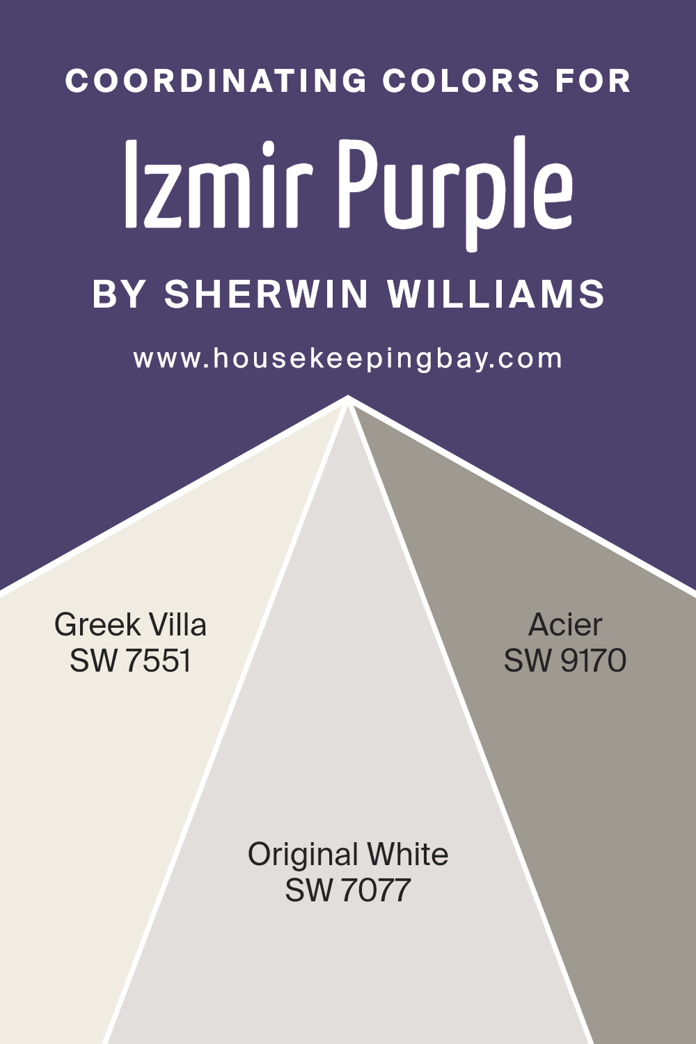
Coordinating Colors of Izmir Purple SW 6825 by Sherwin Williams
Coordinating colors are shades that complement each other when used together in design, creating a harmonious and appealing look. When paired with Izmir Purple SW 6825 by Sherwin Williams, three particular colors enhance its rich and vibrant tone, adding balance and contrast to any space.
SW 7551 – Greek Villa is a soft, creamy white that brings warmth and a subtle glow, ensuring a clean and classic backdrop against the boldness of Izmir Purple. Its understated elegance can make other colors stand out without overpowering them, making it a versatile choice for trims or larger areas.
SW 7077 – Original White offers a slightly cooler white with minimal undertones, providing a clean and crisp contrast to the lively Izmir Purple. It has a pure and fresh quality that gives spaces an airy and open feel, complementing both modern and traditional styles effortlessly.
SW 9170 – Acier is a sophisticated mid-tone gray that provides depth with its neutral yet strong presence.
This shade grounds the vibrant purple, balancing the color palette by adding a touch of quiet strength. Together, these colors create a thoughtful and cohesive design, each bringing out the best in Izmir Purple while ensuring a well-rounded look for any room.
You can see recommended paint colors below:
- SW 7551 Greek Villa
- SW 7077 Original White
- SW 9170 Acier
housekeepingbay.com
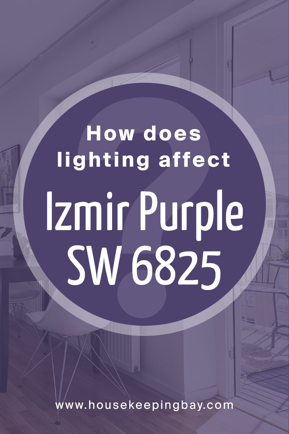
How Does Lighting Affect Izmir Purple SW 6825 by Sherwin Williams?
Lighting plays a big role in how we see colors. Different kinds of light can change how a color looks to our eyes. Izmir Purple SW 6825 by Sherwin Williams is a rich purple shade. How it appears can vary depending on the light source.
In natural light, colors generally look more true. Sunlight can be warm or cool, depending on the time of day and the direction a room faces. In artificial light, which can be warmer (more yellow) or cooler (more blue), colors might look slightly different.
Warm artificial light can make Izmir Purple appear cozier, giving it a softer, more inviting feel. Cool artificial light might make the purple appear more vibrant or intense.
Let’s talk about how Izmir Purple looks in rooms facing different directions:
- 1. North-Faced Rooms: These rooms get cooler, indirect light throughout the day. Izmir Purple might look a bit more muted or even slightly blue-ish in these spaces. It could also feel a bit darker, especially since north-facing rooms do not get direct sunlight.
- 2. South-Faced Rooms: These rooms have bright, warm light for most of the day. Izmir Purple may look warmer and more vibrant here. The richness of the purple will stand out and feel more lively.
- 3. East-Faced Rooms: In these rooms, the morning light is warm and soft. Izmir Purple will look warm and glowing in the morning, but by afternoon, as the light fades, it might take on a more subtle tone.
- 4. West-Faced Rooms: These rooms experience direct sunlight in the late afternoon. Izmir Purple may look warmer and more intense in the evening. In the morning, the color may feel cooler and less saturated due to softer light.
Overall, Izmir Purple can transform a room’s mood, influenced directly by the lighting conditions present.
housekeepingbay.com
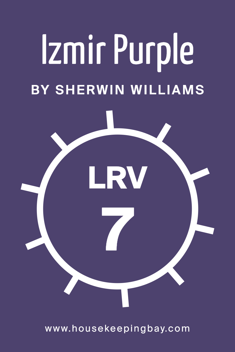
What is the LRV of Izmir Purple SW 6825 by Sherwin Williams?
LRV stands for Light Reflectance Value, a measure of how much light a color reflects and absorbs. It’s a scale from 0 to 100, where 0 means the color absorbs all light (like black) and 100 means it reflects all light (like white). The higher the LRV, the more light the color will reflect, making rooms feel brighter and more open.
Conversely, a low LRV means the color will absorb more light, giving spaces a dimmer or cozier feel. LRV helps in choosing colors based on the lighting conditions of the room. For instance, in areas with less natural light, a color with a higher LRV can help make the space feel more inviting and open.
Izmir Purple by Sherwin Williams has an LRV of 6.558, which is quite low on the scale. This means it absorbs most of the light and reflects very little. As a result, this color will appear deep and rich on the walls, creating a warm and intimate atmosphere.
It’s particularly effective in spaces where you want to evoke a sense of coziness or drama.
In large, well-lit rooms, Izmir Purple can add a touch of elegance and make the walls seem to recede slightly, adding depth.
However, in rooms with limited light, this shade might make the space feel smaller or more confined, so it’s important to balance it with good lighting or use it as an accent for best results.
housekeepingbay.com
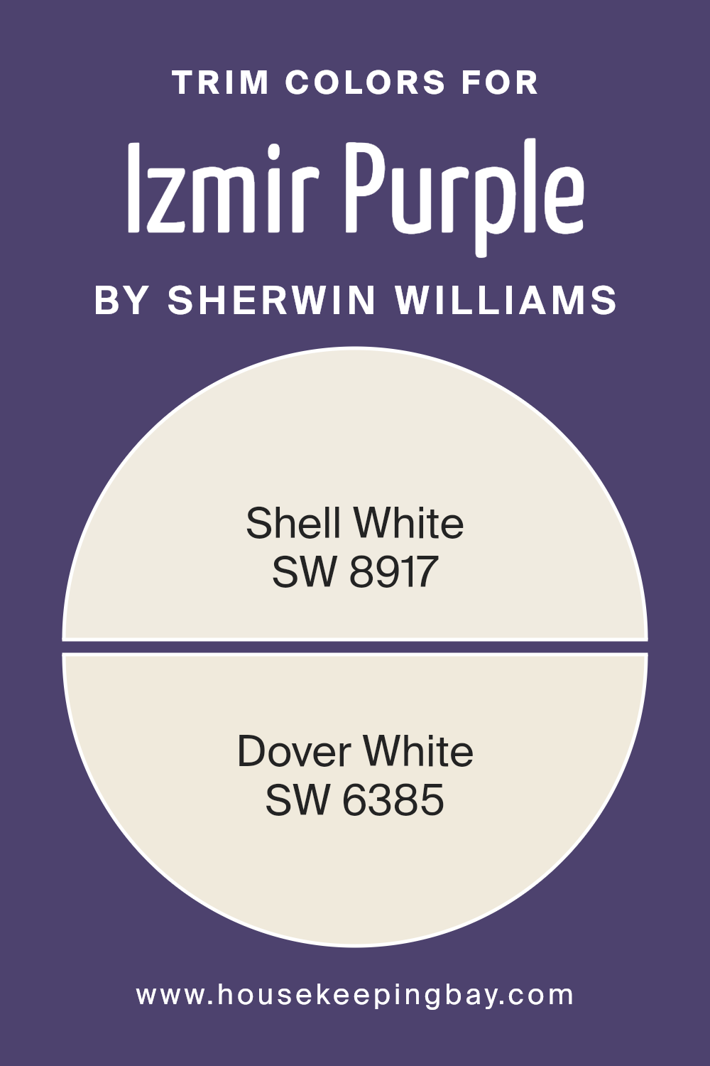
What are the Trim colors of Izmir Purple SW 6825 by Sherwin Williams?
Trim colors are paint colors used to create borders and accents on walls, doors, windows, and baseboards. These colors highlight architectural features and enhance the overall appeal of a space by providing contrast or complementing the main wall color.
For the rich, vibrant hue of Izmir Purple SW 6825 by Sherwin-Williams, using well-chosen trim colors can significantly impact the room’s feel and mood. Specifically, Shell White SW 8917 and Dover White SW 6385 serve as ideal trim colors.
Their ability to subtly frame the bold purple of Izmir Purple offers a harmonious and sophisticated look. By doing so, these whites bring balance and refinement to a room where Izmir Purple dominates.
Shell White SW 8917 is a warm, creamy white that exudes a cozy and inviting feel. Its subtle warmth pairs perfectly with the boldness of Izmir Purple, providing a gentle contrast that allows the purple hue to stand out without overpowering the space.
Meanwhile, Dover White SW 6385 is a soft, buttery white that brings a gentle glow to the room. Its versatility and classic vibe make it an excellent backdrop or trim option, offering a clean and timeless finish.
Both whites work uniquely in their ways to maintain elegance and style while enhancing the dynamic nature of Izmir Purple SW 6825, making them ideal choices for those looking to add a touch of sophistication to any room.
You can see recommended paint colors below:
housekeepingbay.com
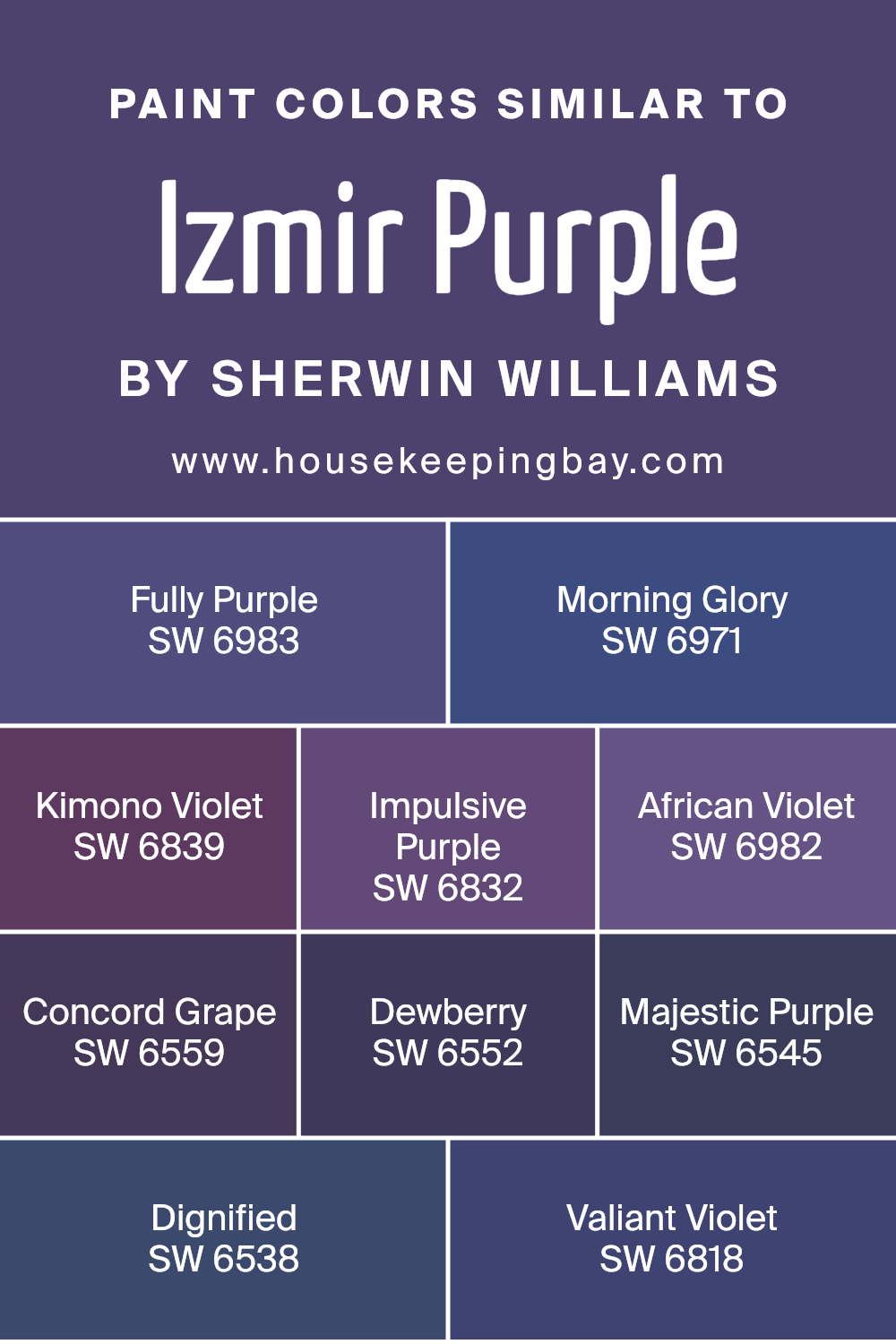
Colors Similar to Izmir Purple SW 6825 by Sherwin Williams
Similar colors play an important role in design and aesthetics because they create harmony and balance. When you look at colors that are closely related, such as those close to Izmir Purple SW 6825, they naturally feel like they belong together.
They share qualities that can evoke a sense of calm or create subtle yet impactful differences when used together. When designing a room or choosing a color palette, using similar colors ensures a cohesive look that is pleasing to the eye.
Imagine using colors like SW 6983 – Fully Purple, which has a rich depth, or SW 6971 – Morning Glory that brings a light, airy feel.
SW 6839 – Kimono Violet offers a sophisticated tone, while SW 6832 – Impulsive Purple stands out with its vibrant hue. SW 6982 – African Violet brings warmth and comfort, and SW 6559 – Concord Grape adds a bold statement.
You might like the gentle nature of SW 6552 – Dewberry, or the royal touch of SW 6545 – Majestic Purple.
SW 6538 – Dignified feels both strong and calm, and SW 6818 – Valiant Violet offers a noble presence.
Each of these colors has its own personality, but together, they create a palette that feels unified and seamless.
You can see recommended paint colors below:
- SW 6983 Fully Purple
- SW 6971 Morning Glory
- SW 6839 Kimono Violet
- SW 6832 Impulsive Purple
- SW 6982 African Violet
- SW 6559 Concord Grape
- SW 6552 Dewberry
- SW 6545 Majestic Purple
- SW 6538 Dignified
- SW 6818 Valiant Violet
housekeepingbay.com
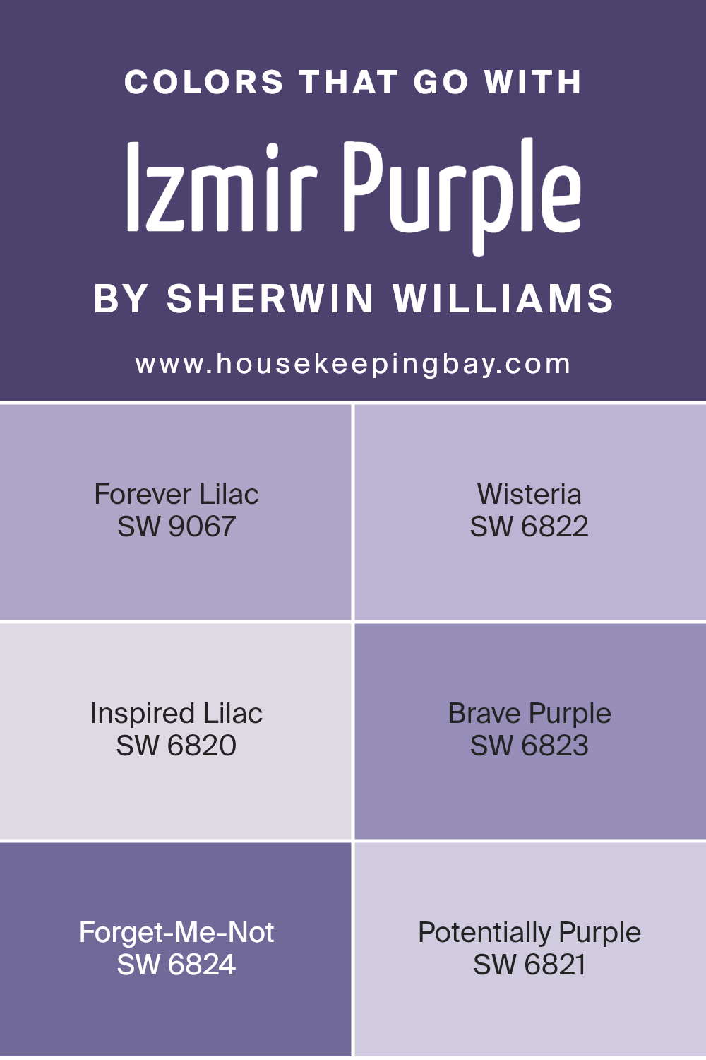
Colors that Go With Izmir Purple SW 6825 by Sherwin Williams
Choosing colors that complement Izmir Purple SW 6825 by Sherwin Williams is crucial for creating a cohesive and harmonious space. Each color interacts with Izmir Purple in a unique way, bringing out its best features and creating a balanced atmosphere.
For example, Forever Lilac SW 9067 is a soft, light lavender that provides a gentle contrast, keeping the mood light and airy. Wisteria SW 6822 is a muted purple with gray undertones, offering a subtle sophistication that pairs well with Izmir Purple’s vibrancy.
These shades work together to offer both depth and continuity.
Inspired Lilac SW 6820 brings warmth to the palette with its rosy tint, ensuring the room feels inviting and cozy. Brave Purple SW 6823, with its deep and rich hue, adds drama and depth, making a bold statement when paired with Izmir Purple.
Forget-Me-Not SW 6824 introduces a touch of brightness, with its cheerful light blue that complements purples beautifully. Potentially Purple SW 6821 rounds out the selection with a medium purple tone that bridges the gap between light and dark shades, ensuring smooth transitions within the space.
Together, these colors create a dynamic and welcoming environment, highlighting the versatility of Izmir Purple.
You can see recommended paint colors below:
- SW 9067 Forever Lilac
- SW 6822 Wisteria
- SW 6820 Inspired Lilac
- SW 6823 Brave Purple
- SW 6824 Forget-Me-Not
- SW 6821 Potentially Purple
housekeepingbay.com
How to Use Izmir Purple SW 6825 by Sherwin Williams In Your Home?
Izmir Purple SW 6825 by Sherwin Williams offers a rich and elegant hue that can bring a fresh look to any home. This shade of purple provides warmth and adds depth to interior spaces. You might consider applying it in areas like the living room or study to create a cozy atmosphere.
Pairing Izmir Purple with soft creams or gentle greys can help balance the boldness of the color, resulting in a harmonious setting. For those wanting a touch of luxury, adding gold or brass accents can enhance the room’s warmth.
Additionally, using this color in a bedroom can set a calm and soothing mood, ideal for relaxation. It also works well in creative spaces, encouraging inspiration and creativity. Overall, Izmir Purple presents a versatile choice, suitable for those wanting to add character and elegance to their living environment without overwhelming the space.
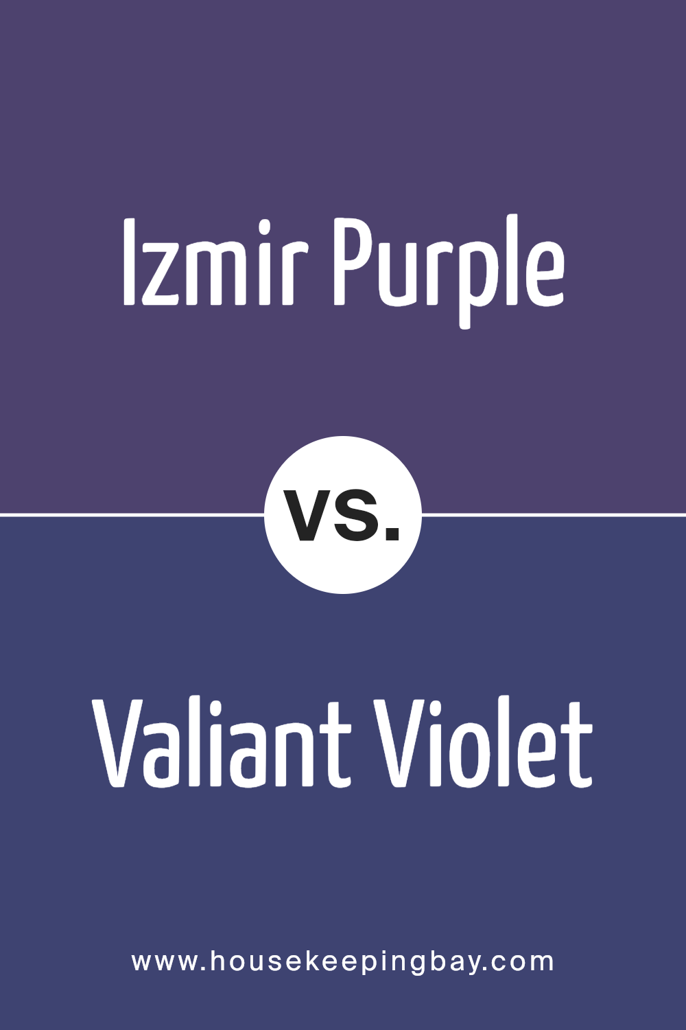
Izmir Purple SW 6825 by Sherwin Williams vs Valiant Violet SW 6818 by Sherwin Williams
Izmir Purple SW 6825 by Sherwin Williams is a bold, deep purple. It tends toward a darker hue, making it feel luxurious and rich. It’s often used to make a strong statement in spaces, offering a sense of elegance and depth without overwhelming other elements in a room.
Valiant Violet SW 6818, also by Sherwin Williams, is a lighter, more vibrant shade of purple. This color is brighter and more lively compared to Izmir Purple. It brings energy and charm to a space, making it suitable for areas where a playful and fresh atmosphere is desired.
When comparing these two shades, Izmir Purple offers a more subdued and sophisticated vibe, while Valiant Violet brings a lively and spirited feel. Both have their unique appeal; Izmir Purple is ideal for creating a dramatic ambiance, whereas Valiant Violet is perfect for a vibrant and cheerful look.
You can see recommended paint color below:
- SW 6818 Valiant Violet
housekeepingbay.com
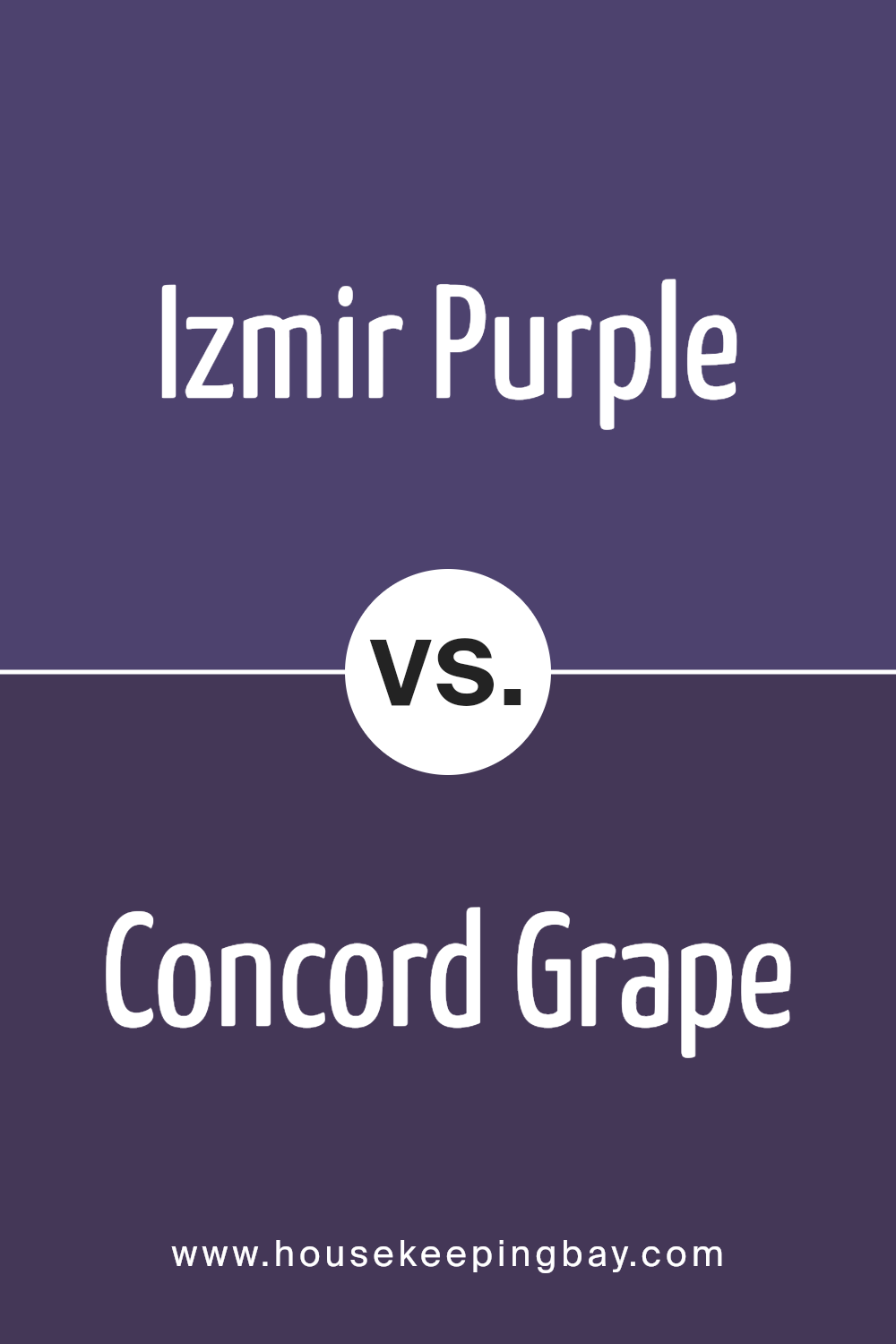
Izmir Purple SW 6825 by Sherwin Williams vs Concord Grape SW 6559 by Sherwin Williams
Izmir Purple SW 6825 by Sherwin Williams and Concord Grape SW 6559 offer distinct shades of purple. Izmir Purple is a vibrant and lively hue, bringing energy and boldness to a space. It has a dynamic quality, perfect for adding a pop of color or making a strong statement in a room. Its brightness can invigorate and stimulate, creating an exciting atmosphere.
Concord Grape, in contrast, is a deeper, more subdued purple. It carries a sophisticated and rich tone, evoking a sense of warmth and coziness. This shade feels more mature and grounding, ideal for spaces where you want to promote relaxation and comfort.
Concord Grape can add depth to a room, making it feel welcoming and elegant.
Both offer unique vibes—Izmir Purple excites, while Concord Grape calms. Choosing between them depends on whether you want an energetic uplift or a soothing retreat. Each can transform spaces, setting different moods and tones.
You can see recommended paint color below:
- SW 6559 Concord Grape
housekeepingbay.com
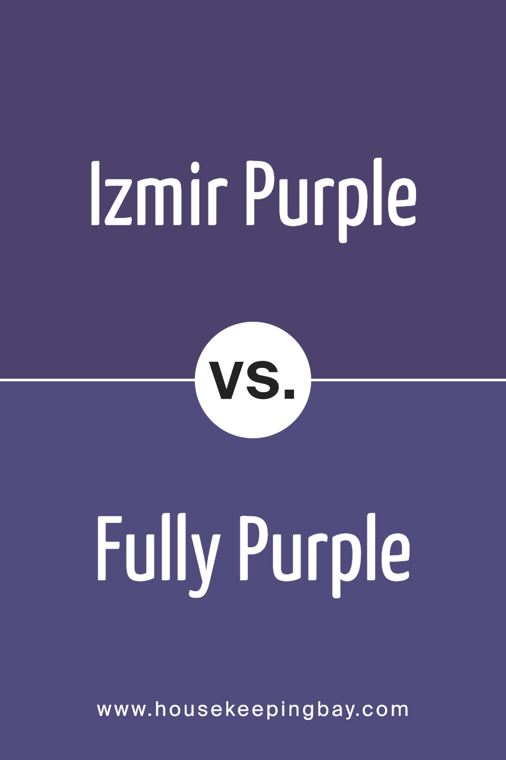
Izmir Purple SW 6825 by Sherwin Williams vs Fully Purple SW 6983 by Sherwin Williams
Izmir Purple SW 6825 and Fully Purple SW 6983 are two shades of purple by Sherwin Williams, each offering unique qualities. Izmir Purple is a vibrant hue with a lively, energetic vibe. It leans towards a more reddish-purple tone, giving spaces a warm, inviting feel. Perfect for adding a burst of color, it can make rooms feel cozy yet dynamic.
Fully Purple, meanwhile, is a deeper, more muted shade, leaning towards a classic, regal purple. It offers a sense of richness and depth, ideal for creating a more sophisticated and calming environment.
This color works well in settings where a touch of elegance is desired, providing a more subdued and tranquil atmosphere.
Both colors add personality, yet they do so with different intensities and moods. Izmir Purple energizes and enlivens, whereas Fully Purple provides a serene, luxurious backdrop. Each has its place depending on the desired ambiance.
You can see recommended paint color below:
- SW 6983 Fully Purple
housekeepingbay.com
Izmir Purple SW 6825 by Sherwin Williams vs Impulsive Purple SW 6832 by Sherwin Williams
Izmir Purple SW 6825 and Impulsive Purple SW 6832, both by Sherwin Williams, offer unique vibes. Izmir Purple has a deep, rich tone, giving a space a warm, cozy feel. It’s a shade that leans towards a luxurious, elegant look, perfect for creating an inviting atmosphere.
Impulsive Purple, meanwhile, has a brighter, more energetic hue. It’s playful and vibrant, adding excitement to any room. While Izmir Purple can create a calm backdrop, Impulsive Purple stands out with its lively appearance.
When choosing between them, consider the mood you want. Izmir suits quiet settings, like a bedroom or study, where tranquility is key. Impulsive fits in lively areas, such as a playroom or creative space, where energy is welcome. Both purples have charm in their ways, making unique statements in their environments, yet they serve different purposes.
You can see recommended paint color below:
- SW 6832 Impulsive Purple

housekeepingbay.com
Izmir Purple SW 6825 by Sherwin Williams vs Majestic Purple SW 6545 by Sherwin Williams
Izmir Purple SW 6825 by Sherwin Williams is a dynamic shade that brings a sense of vibrancy and energy to any space. It’s a bold and bright hue with reddish undertones, perfect for adding an eye-catching element. This color works well in spaces needing a pop of color and pairs nicely with neutral shades to balance its intensity.
Majestic Purple SW 6545, also by Sherwin Williams, is a deeper, more subdued purple. It carries a sense of richness and sophistication, with blue undertones that give it a cooler feel.
This color is suitable for creating a calm and elegant atmosphere, making it ideal for bedrooms or living rooms.
While Izmir Purple is lively and bold, Majestic Purple offers a more relaxed and luxurious vibe.
Both colors are distinct, with Izmir being more on the playful side, and Majestic offering a more understated elegance.
You can see recommended paint color below:
housekeepingbay.com
Izmir Purple SW 6825 by Sherwin Williams vs African Violet SW 6982 by Sherwin Williams
Izmir Purple (SW 6825) and African Violet (SW 6982) by Sherwin Williams are both beautiful shades of purple, yet they offer distinct vibes. Izmir Purple is a vibrant and bold color, full of energy and richness. It brings a lively and dynamic feel to any room, making it a great choice for those who enjoy a splash of strong color in their space.
African Violet, however, leans towards a deeper and more subtle tone. It offers a softer, more muted purple that feels cozy and comforting. This color is perfect for creating a calm and relaxing environment, making it suitable for places like bedrooms or reading nooks.
When choosing between them, consider the mood you want to create. Izmir Purple adds dramatic flair, suitable for accent walls or creative areas.
African Violet provides a gentle, soothing backdrop, ideal for spaces requiring a touch of peace and quiet. Both colors add personality, but their impact differs significantly.
You can see recommended paint color below:
- SW 6982 African Violet
housekeepingbay.com
Izmir Purple SW 6825 by Sherwin Williams vs Morning Glory SW 6971 by Sherwin Williams
Izmir Purple SW 6825 by Sherwin Williams is a rich, vibrant shade of purple. It exudes intensity and warmth, making spaces feel cozy and dramatic. This color is perfect for creating bold statements, often adding a touch of luxury and depth to any area. Its deep, saturated tone makes it ideal for accent walls or focal points.
Morning Glory SW 6971, also by Sherwin Williams, offers a lighter, cheerful shade of blue. It reflects a sense of calmness and openness. This soft color brightens rooms, creating a refreshing atmosphere. Its lighter tone makes it suitable for spaces needing an airy, serene feel.
While Izmir Purple provides a sense of richness and depth, Morning Glory brings freshness and lightness. Together, they form a striking combination, with the deep purple adding drama and the gentle blue providing contrast and balance, making them a harmonious pairing in interior design.
You can see recommended paint color below:
- SW 6971 Morning Glory
housekeepingbay.com
Izmir Purple SW 6825 by Sherwin Williams vs Kimono Violet SW 6839 by Sherwin Williams
Izmir Purple SW 6825 and Kimono Violet SW 6839, both by Sherwin Williams, bring unique vibes to a space. Izmir Purple stands out with its intense, vibrant tone, creating an energetic and bold atmosphere. It grabs attention and works well in areas where a lively mood is desired, like a statement wall or a lively living room.
Kimono Violet, in contrast, offers a more subdued and softer appearance. Although still rich, it leans toward a more calming feel, suitable for bedrooms or cozy corners. Its softer nature provides a sense of warmth and comfort without overwhelming a space.
When comparing them, Izmir Purple is brighter and more dynamic, while Kimono Violet gives a gentler, more relaxed vibe. Both can add depth but suit different moods and purposes in home design. Choose Izmir Purple for impact and Kimono Violet for a calming touch.
You can see recommended paint color below:
- SW 6839 Kimono Violet
housekeepingbay.com
Izmir Purple SW 6825 by Sherwin Williams vs Dignified SW 6538 by Sherwin Williams
Izmir Purple SW 6825 by Sherwin Williams is a vibrant and bold shade of purple that can bring energy and personality to a space. It has a striking presence, making it a good choice for an accent wall or a room where you want to create a lively atmosphere. This color works well in creative spaces or areas designed for entertainment.
Dignified SW 6538, in contrast, is a deep, rich blue with a more subdued and classic feel. It exudes elegance and sophistication, creating a calming backdrop for a variety of settings. Ideal for bedrooms or living rooms, this color can provide a sense of comfort and warmth while maintaining a timeless appeal.
While Izmir Purple demands attention and adds vibrancy, Dignified offers a more grounded and reassuring presence. Together, these colors can complement each other if used thoughtfully, balancing the exuberance of purple with the depth of blue.
You can see recommended paint color below:
- SW 6538 Dignified
housekeepingbay.com
Izmir Purple SW 6825 by Sherwin Williams vs Dewberry SW 6552 by Sherwin Williams
Izmir Purple SW 6825 and Dewberry SW 6552 are two beautiful shades of purple by Sherwin Williams. Izmir Purple is a vibrant and bold hue, bursting with energy and confidence. It instantly catches the eye and adds a lively touch to any space. This shade works well in areas where you want to create excitement, like a living room or an accent wall.
Dewberry, on the other hand, offers a softer approach. It’s a deep, rich purple but carries a slightly muted tone compared to the bright Izmir Purple. Dewberry brings a sense of calm sophistication, making it perfect for more relaxed settings like bedrooms or cozy reading nooks.
Both colors add elegance to a room but do so in different ways. Izmir Purple’s bright vivacity contrasts with the more subdued grace of Dewberry, allowing each to fit different moods and spaces. Choose based on the atmosphere you want to create.
You can see recommended paint color below:
- SW 6552 Dewberry
housekeepingbay.com
Conclusion
Izmir Purple by Sherwin-Williams stands as a remarkable shade that adds a unique charm to any space. Its rich, deep tones create a sense of warmth and sophistication. When I see Izmir Purple, I feel it brings an element of elegance and depth, making rooms feel cozy yet refined.
Whether used as an accent wall or throughout a room, this color demands attention in a subtle yet powerful way.
In practical terms, Izmir Purple pairs well with both light and dark accents, allowing various design possibilities. White trim can make it pop, while deeper hues can add a dramatic flair. It’s a versatile choice for anyone looking to add a bold, yet tasteful touch to their home or office.
Personally, I find it perfect for creating a comforting atmosphere without overwhelming the senses.
In everyday use, Izmir Purple can enrich a setting, offering a distinct backdrop that complements both modern and classic decor. I appreciate how it can transform a bland area into a lively, engaging space.
Overall, Sherwin-Williams’ Izmir Purple represents a confident choice for those wanting a striking yet approachable color.
housekeepingbay.com
Ever wished paint sampling was as easy as sticking a sticker? Guess what? Now it is! Discover Samplize's unique Peel & Stick samples. Get started now and say goodbye to the old messy way!
Get paint samples


