Brave Purple SW 6823 by Sherwin Williams
Embracing the Boldness of Purple: A Vibrant Transformation
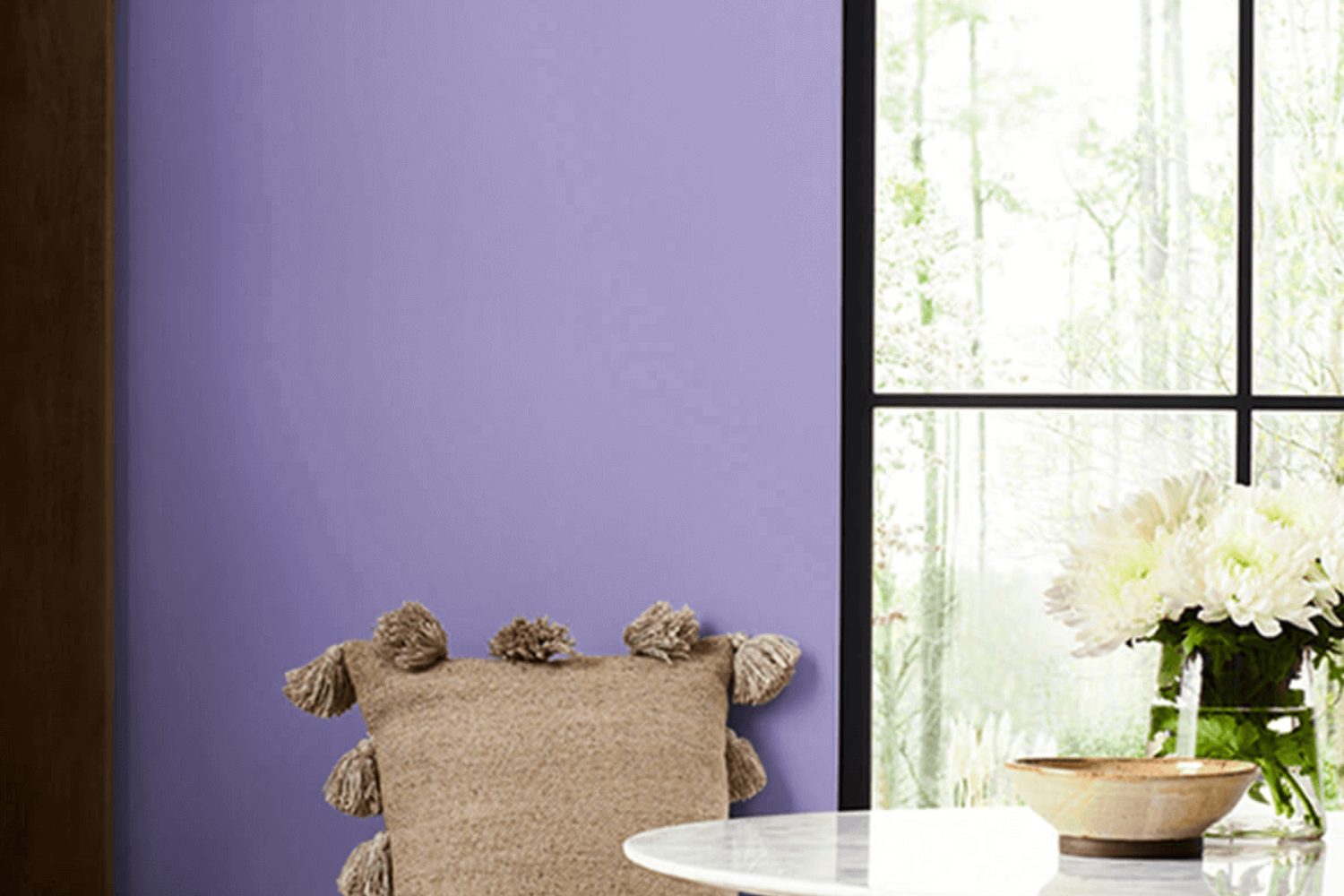
Welcome to the world of SW 6823 Brave Purple by Sherwin Williams, a paint color that’s as unique and vibrant as you are. When you think about adding a splash of color to your space, it’s all about finding that perfect shade that reflects your personality and style. Brave Purple is not just any ordinary color; it’s a statement. With its rich, deep tones, it brings a sense of creativity and sophistication to any room.
Choosing the right color for your space can sometimes feel overwhelming, but with Brave Purple, you’ll find that it has the power to transform your room into a cozy, inviting space. Whether you’re updating your living room, bedroom, or even adding some flair to your kitchen, this shade has a versatility that works wonders in various settings.
Imagine how this bold color could elevate your home décor, adding depth and drama in a way that few other colors can. It goes beyond the ordinary, offering something truly special for your home. If you’re someone who loves to make a statement and isn’t afraid to show off your style, Brave Purple is the way to go.
Let’s explore how this unique shade can inspire your next home decorating project and how it adapts to different spaces and lighting conditions, creating a stunning visual impact that’s sure to impress.
by Sherwin Williams
What Color Is Brave Purple SW 6823 by Sherwin Williams?
Brave Purple SW 6823 by Sherwin Williams is a vibrant shade that combines the mystery of deep purple with a hint of playful boldness. This color has the unique ability to add both warmth and depth to any space. Its richness makes it a perfect choice for those looking to add a statement to their interiors without overwhelming the senses.
Brave Purple works wonders in various interior styles, particularly well in modern, contemporary, and even bohemian decor. In modern settings, it adds a pop of color that brings life to minimalist designs. For a contemporary space, it introduces a luxurious feel, especially when used on accent walls or in decorative accessories. In bohemian-styled rooms, it complements the eclectic mix of patterns and colors, contributing to the overall vibrant and cozy atmosphere.
Pairing Brave Purple with the right materials and textures can significantly enhance its beauty. It goes exceptionally well with natural wood, adding warmth and grounding the boldness of the purple. Metals like gold or brass bring out its luxurious side, making the space feel more elegant. Soft textures like velvet or silk in complementary shades create a rich, layered look that is both inviting and sophisticated. This color also pairs nicely with neutral tones, such as creams or greys, balancing its intensity with a softer background, making it versatile for various applications.
housekeepingbay.com
Is Brave Purple SW 6823 by Sherwin Williams Warm or Cool color?
Brave Purple SW 6823 by Sherin Williams is a bold and vibrant color that really stands out. This shade of purple can add a pop of color and bring life to any room in a house. It’s perfect for people who want to add a bit of fun and personality to their space without going overboard. When used in a home, Brave Purple can make a statement whether it’s painted on all walls of a room or just used as an accent.
This color works well in spaces where you spend a lot of your time and want to feel inspired, like a home office or a living room. It can also add a luxurious touch to bedrooms when paired with the right decor and lighting. However, because it’s so bold, it’s important to balance it with neutral colors like white, grey, or beige to not overwhelm the space.
Overall, Brave Purple can create a lively and dynamic environment in a home, making it perfect for anyone looking to add a touch of excitement to their living spaces.
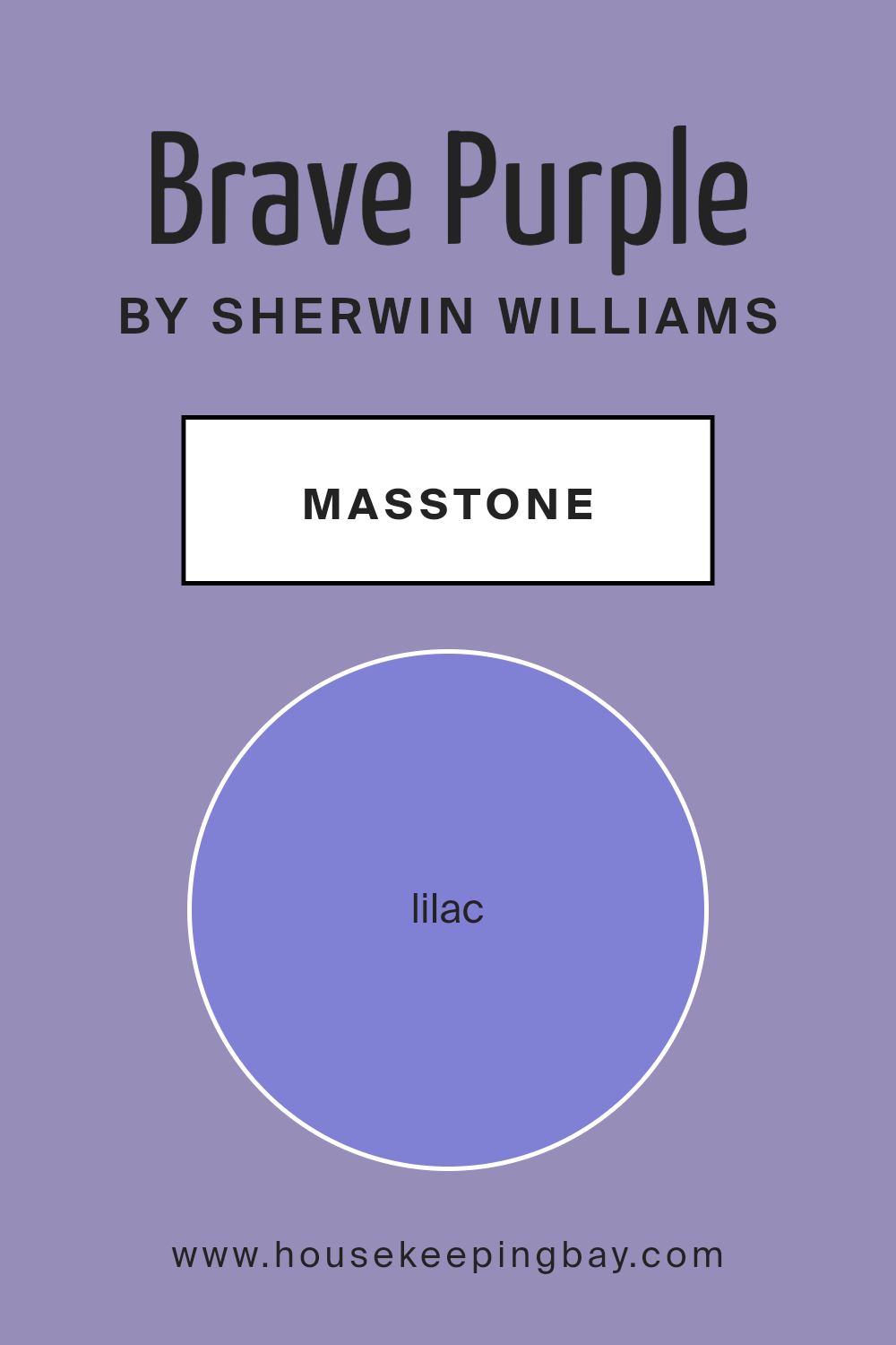
What is the Masstone of the Brave Purple SW 6823 by Sherwin Williams?
Brave Purple SW 6823 by Sherwin Williams has a masstone or main color tone of Lilac, coded as #8080D5. This means the color has a gentle, soft purple hue, resembling the delicate petals of a lilac flower. When it comes to using Brave Purple in homes, this unique shade of purple brings a calm and soothing vibe to any room. Because it’s not too bright or overwhelming, it can work beautifully in bedrooms to create a peaceful retreat or in living spaces to add a touch of soft elegance.
The lilac tone of Brave Purple is versatile; it pairs well with light neutrals like whites and creams for a fresh, airy feel or with darker greys and blacks for a more dramatic and sophisticated look. Its ability to blend seamlessly with different styles and preferences makes it a popular choice for those looking to refresh their home with a pop of color that’s not too bold but still adds personality. Whether used for an entire room or as an accent, Brave Purple can create a sense of warmth and comfort, making any space more inviting.
housekeepingbay.com
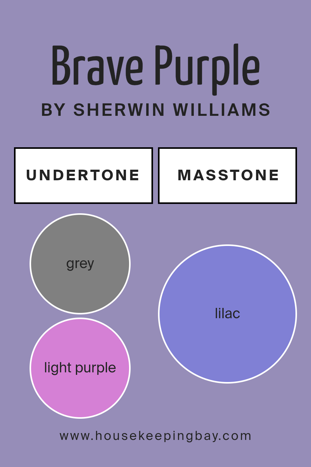
Undertones of Brave Purple SW 6823 by Sherwin Williams
Brave Purple SW 6823 by Sherwin Williams is a fascinating color because it carries a mix of many different undertones. The undertones are like secret ingredients that change how we see the color. Think of it like adding spices to a dish; depending on what you add, it can taste entirely different.
This color has undertones such as grey, which can make it look cool and sophisticated. Light purple gives it a softer, more gentle vibe, while light blue adds a fresh, calming effect. Pale pink makes it warmer and more welcoming. Mint introduces a hint of freshness, and light gray smooths everything out, making it more neutral. Violet deepens the hue, adding richness.
Pale yellow brings a subtle cheerfulness, and blue gives it a crisp, sharp edge. Then, there’s purple, which reinforces the depth of the color, making it more intense. Fuchsia punches it up with a playful liveliness, and dark turquoise adds a mysterious charm. Pink makes the color feel more feminine and tender.
Turquoise and light turquoise lend an energizing and refreshing feel. Dark blue and navy give it a stronger, more authoritative look.
When Brave Purple is used on interior walls, these undertones all work together to create a dynamic look. It means the color can look slightly different in various lights and times of day. In bright sunlight, it might appear more vibrant, with its light purple and pale pink undertones shining through. In softer, dimmer light, the darker tones like violet and navy might stand out more, giving the room a cozier feel. This makes Brave Purple a versatile color that can fit many moods and settings, making any room feel more lively, elegant, or soothing, depending on its surrounding elements and the light it’s under.
housekeepingbay.com
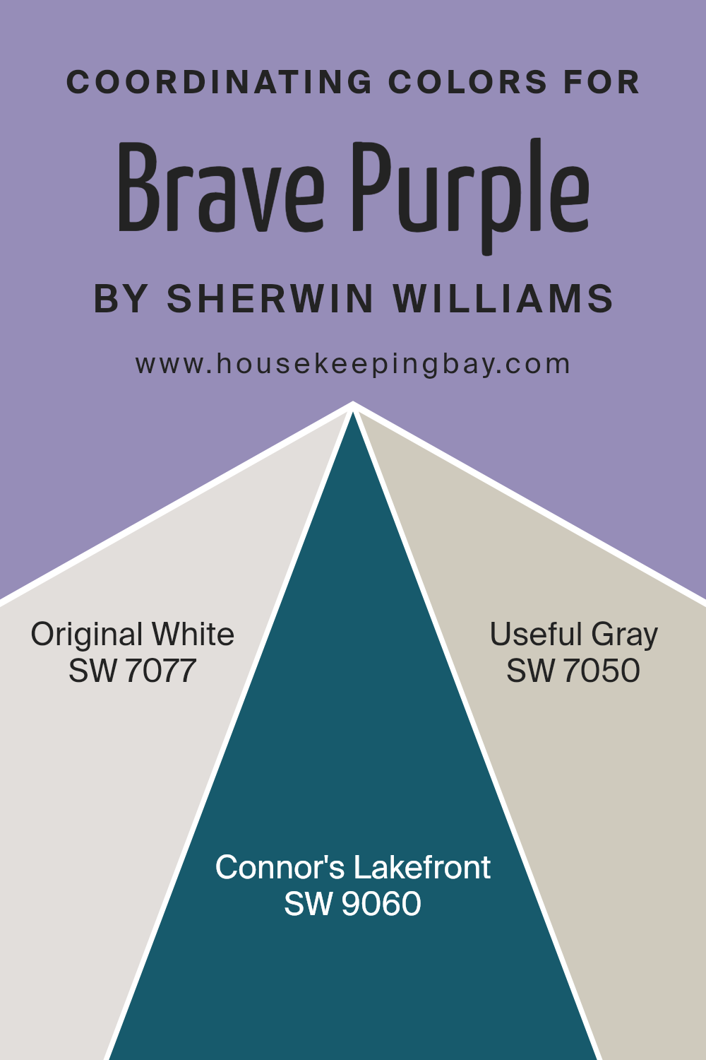
Coordinating Colors of Brave Purple SW 6823 by Sherwin Williams
Coordinating colors are colors that harmonize well with a primary color, creating a cohesive and appealing look. When used together, these colors enhance the overall aesthetic of a space, ensuring that one color doesn’t overpower the others but instead, they complement each other, bringing balance and visual interest to the design. For Brave Purple SW 6823 by Sherwin-Williams, a vibrant and bold color, finding the right coordinating colors is essential to soften its intensity or to bring out its richness without overwhelming the senses.
Original White SW 7077 is a classic and versatile color that provides a clean backdrop, allowing Brave Purple to stand out without clashing. It’s like a blank canvas that makes the purple pop while refreshing the space with its simplicity and brightness. Connor’s Lakefront SW 9060 is a serene and soft blue that adds a calming effect to the dynamic Brave Purple, ensuring the combination subtly invites a sense of tranquility and openness into the room. Useful Gray SW 7050 is a neutral gray that bridges the gap between the boldness of Brave Purple and the calming nature of Connor’s Lakefront, creating a sophisticated and harmonious palette. This gray offers a solid foundation that complements the energy of Brave Purple while integrating seamlessly with the rest of the coordinating colors, resulting in a balanced and inviting space.
You can see recommended paint colors below:
- SW 7077 Original White
- SW 9060 Connor’s Lakefront
- SW 7050 Useful Gray
housekeepingbay.com
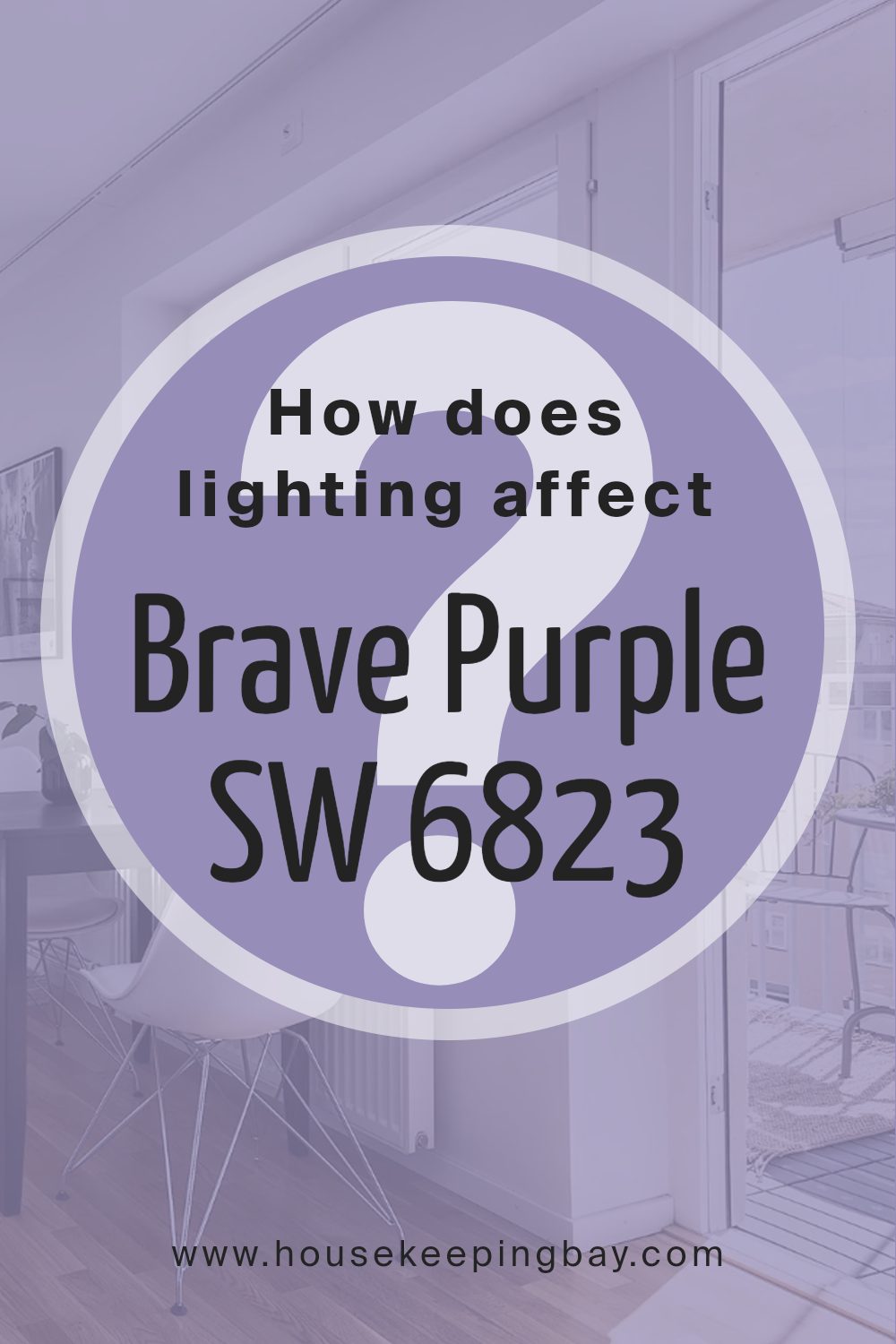
How Does Lighting Affect Brave Purple SW 6823 by Sherwin Williams?
How lighting changes the way we see color is pretty fascinating. Colors don’t exactly change, but how we see them can, depending on the type of light they’re under. Let’s explore this using the color Brave Purple SW 6823 by Sherwin Williams as a case study.
- In artificial light, Brave Purple can look very different depending on which bulbs you’re using. If the bulbs have a warm tone, the purple might seem softer and richer, adding a cozy vibe to the room. If the bulbs are cooler, resembling daylight, the purple might appear brighter and more vibrant, making the space feel lively.
- Under natural light, the way Brave Purple looks can shift throughout the day. Morning light is generally softer, making the purple seem gentle and welcoming. As the day goes on, with the sun at its peak, the color can look much more vivid because of the brighter and stronger light. Towards the evening, as the natural light fades, the purple may gain a deep, luxurious quality.
Room direction plays a big role too. North-faced rooms might make Brave Purple look cooler and slightly more muted since they get less direct sunlight. Without the warmth of direct light, colors in these rooms can appear a bit shadowy.
- South-faced rooms get a lot of light, and here, Brave Purple can truly shine. The consistent, bright light brings out the warmth in the color, making it feel inviting and dynamic.
- East-faced rooms catch the morning sun, so Brave Purple will start the day looking soft and warm, then become more subdued as the day goes on and the natural light moves away. It’s a cool to warm transition which can highlight different undertones at different times.
In west-faced rooms, the situation flips. Here, the color will have a muted tone during the morning and become warm and vibrant come afternoon and evening as the sun sets, bathing the room in warm light.
Lighting really does affect how we perceive color, turning a single paint choice like Brave Purple into a versatile option that can adapt and change in appearance across different conditions and times of day.
housekeepingbay.com
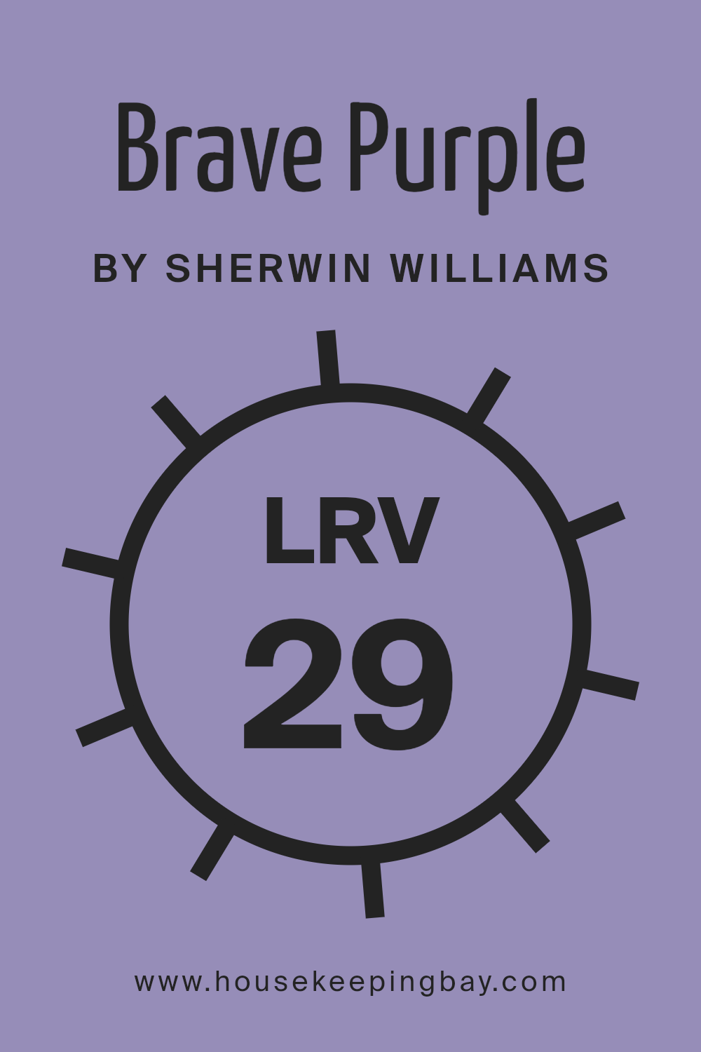
What is the LRV of Brave Purple SW 6823 by Sherwin Williams?
For the color Brave Purple (SW 6823) by Sherwin Williams, with an LRV of 28.933, it’s on the darker side of the scale. This means it won’t reflect a lot of light, creating a more intimate and enveloping feel in a room. This can be perfect for creating a statement wall or adding depth to a space, but it’s important to consider the lighting in your room. In rooms with less natural light, Brave Purple may appear even darker, enhancing its richness and depth. To balance its effect, consider pairing it with lighter colors or using it in a room that gets plenty of natural light.
housekeepingbay.com
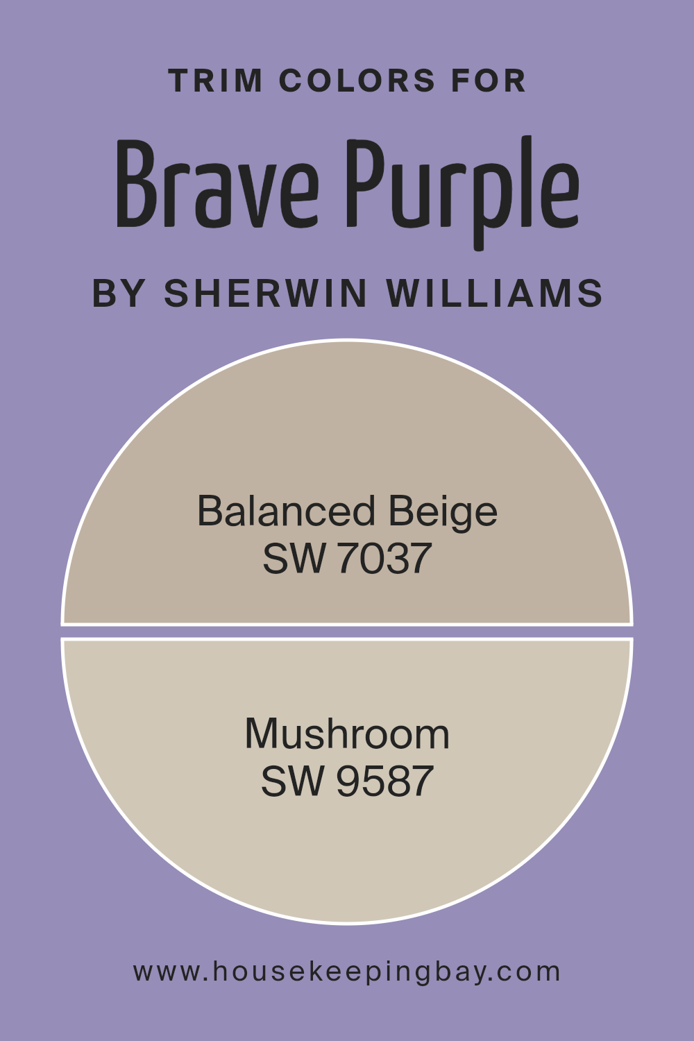
What are the Trim colors of Brave Purple SW 6823 by Sherwin Williams?
Trim colors play a significant role in defining the visual appeal and overall aesthetics of a space, especially when paired with a bold color like Brave Purple SW 6823 by Sherwin-Williams. These colors, used for elements such as door frames, window frames, and skirting boards, act as a frame to the wall colors, enhancing the architectural features of a room. Choosing the right trim color can either subtly complement the primary wall color, adding a sophisticated finishing touch, or create a striking contrast that highlights the unique characteristics of the space. Balanced Beige SW 7037 and Mushroom SW 9587 are excellent choices for trims when working with Brave Purple, as they bring warmth and neutrality that can soften the intensity of the purple, providing a harmonious balance that enriches the overall atmosphere of the room.
Balanced Beige SW 7037 is a warm and inviting neutral that offers a soft, understated elegance as a trim color. Its natural, earthy tones can help to ground the vividness of Brave Purple, ensuring the space feels welcoming and comfortable. On the other hand, Mushroom SW 9587, with its rich, deeper tone, offers a more pronounced contrast to Brave Purple, creating a dynamic and visually interesting space. The depth of Mushroom can complement the boldness of Brave Purple, tying the room together in a way that is both stylish and cohesive. Together, these trim colors provide versatile options for finishing a room in a way that feels intentional and polished, making the choice of trim color an important aspect of interior design.
You can see recommended paint colors below:
- SW 7037 Balanced Beige
- SW 9587 Mushroom
housekeepingbay.com
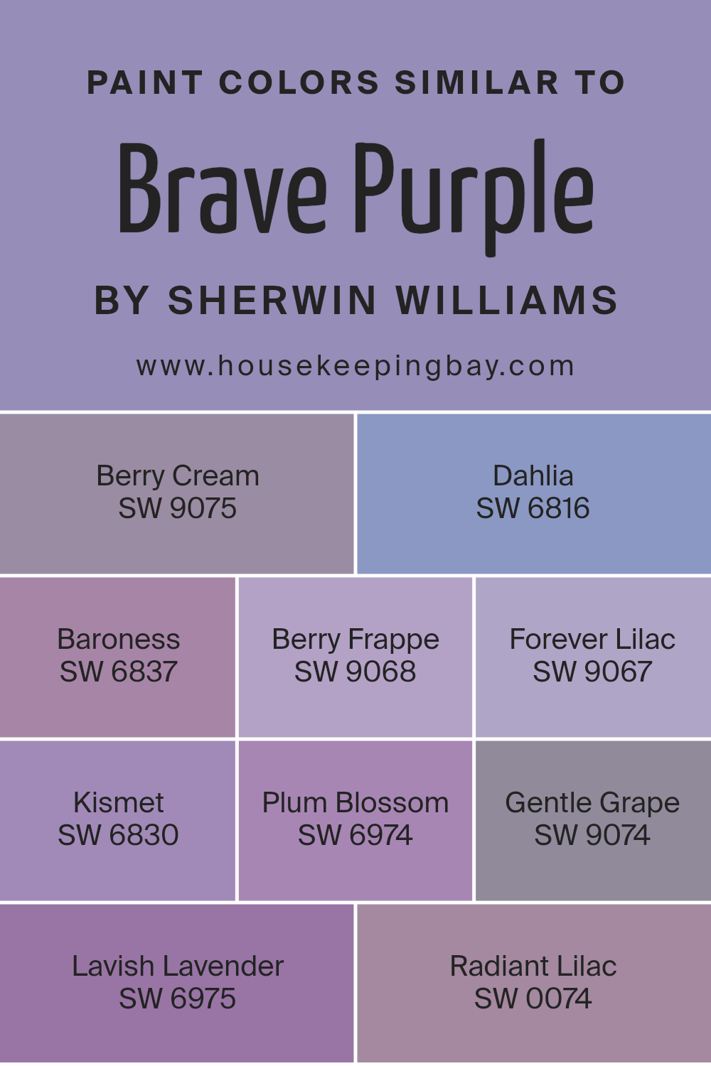
Colors Similar to Brave Purple SW 6823 by Sherwin Williams
Similar colors are crucial in design because they create a harmonious and balanced look, making spaces feel unified and pleasing to the eye. These colors work well together because they share common hues, making it easy to mix and match them without clashing. For instance, colors similar to Brave Purple by Sherwin Williams, such as Berry Cream, Dahlia, Baroness, Berry Frappe, Forever Lilac, Kismet, Plum Blossom, Gentle Grape, Lavish Lavender, and Radiant Lilac, all share a purple undertone that ties them together beautifully.
Berry Cream offers a softer, more muted tone, providing a gentle and cozy feel, perfect for creating a comforting space. Dahlia, on the other hand, has a rich depth that brings warmth and sophistication to any room. Baroness introduces a majestic vibe with its deep tones, while Berry Frappe adds a subtle, playful touch. Forever Lilac leans towards a more subdued elegance, offering a hint of softness. Kismet strikes a balance between bold and serene, making it a versatile choice. Plum Blossom and Gentle Grape offer variations of purple with a floral inspiration, adding a fresh and welcoming atmosphere. Lavish Lavender and Radiant Lilac, each with their unique charm, range from vibrant to soft, providing options for different moods and settings. Together, these colors showcase the power of similar hues in creating spaces that are both dynamic and cohesive.
You can see recommended paint colors below:
- SW 9075 Berry Cream
- SW 6816 Dahlia
- SW 6837 Baroness
- SW 9068 Berry Frappe
- SW 9067 Forever Lilac
- SW 6830 Kismet
- SW 6974 Plum Blossom
- SW 9074 Gentle Grape
- SW 6975 Lavish Lavender
- SW 0074 Radiant Lilac
housekeepingbay.com
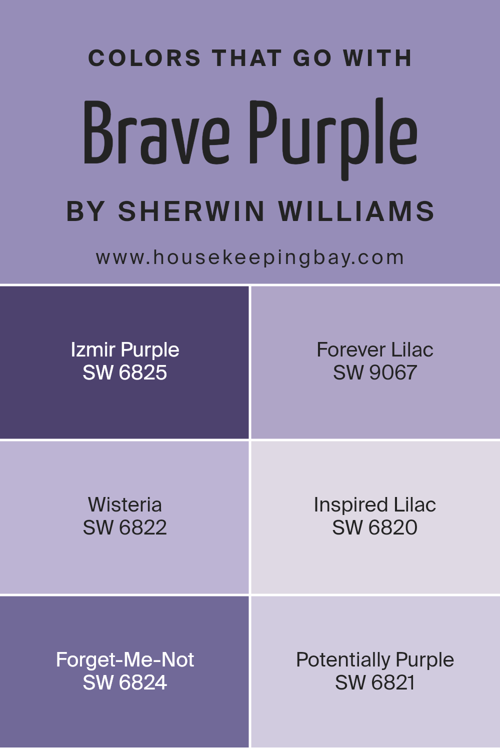
Colors that Go With Brave Purple SW 6823 by Sherwin Williams
Selecting colors that complement Brave Purple SW 6823 by Sherwin Williams is key to creating an inviting and harmonious space. The right combination enhances the depth and beauty of Brave Purple, allowing it to stand out without overwhelming the senses. Colors that go well with it, like Izmir Purple, Forever Lilac, Wisteria, Inspired Lilac, Forget-Me-Not, and Potentially Purple, work together to build a cohesive look. These shades have their unique charm, yet they share a common ability to support and enrich the primary color’s boldness.
Izmir Purple adds a sense of sophistication and mystery, blending well with Brave Purple to create a luxurious feel. Forever Lilac, with its lighter and more airy presence, brings a soft, serene balance to the mix, preventing the palette from becoming too heavy. Wisteria injects a subtle hint of whimsy and freshness, keeping the atmosphere light and inviting. Inspired Lilac offers a muted alternative that harmonizes with Brave Purple, providing a gentle transition between the more intense and softer tones. Forget-Me-Not introduces a playful contrast with its slightly more upbeat and cheerful vibe. Lastly, Potentially Purple ties everything together, offering a mid-tone that bridges gaps between the lighter and darker shades, ensuring the palette remains cohesive. Together, these colors create a versatile and dynamic scheme that enhances the visual appeal of any space, making it important to consider their impact when decorating with Brave Purple.
You can see recommended paint colors below:
- SW 6825 Izmir Purple
- SW 9067 Forever Lilac
- SW 6822 Wisteria
- SW 6820 Inspired Lilac
- SW 6824 Forget-Me-Not
- SW 6821 Potentially Purple
housekeepingbay.com
How to Use Brave Purple SW 6823 by Sherwin Williams In Your Home?
Brave Purple SW 6823 by Sherwin Williams is a bold and beautiful paint color that can bring a unique charm to your home. If you want to add a splash of personality to your space, this shade of purple is a great choice. It’s vibrant enough to make a statement but still has a warmth that makes it welcoming.
You can use Brave Purple in several ways around your home. For a striking look, paint an accent wall in your living room or bedroom. This not only draws attention but also creates a focal point in the room. If you’re not ready to commit to painting a large area, consider using it for smaller projects, like painting a piece of furniture or the back of a bookshelf. This adds a pop of color without overwhelming the space.
In rooms where you want to inspire creativity, like a home office or craft room, Brave Purple can stimulate the imagination. It works well when paired with light neutrals or warm wood tones, balancing its intensity and making it more versatile. With Brave Purple, you can easily transform any room into a more dynamic and stylish space.
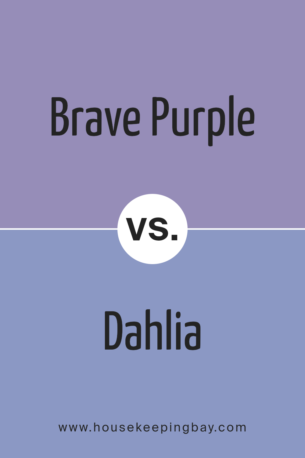
Brave Purple SW 6823 by Sherwin Williams vs Dahlia SW 6816 by Sherwin Williams
Brave Purple SW 6823 and Dahlia SW 6816 by Sherwin Williams are two vibrant colors that really stand out. Brave Purple is a deep, bold purple that adds a strong and striking vibe to any space. It has a rich tone that’s perfect for creating a statement wall or for adding depth to your décor. On the other hand, Dahlia SW 6816 is a brighter, more playful purple. It leans more towards a lively, energetic feel, making spaces cheerful and inviting. While Brave Purple brings in a sense of mystery and sophistication, Dahlia injects fun and brightness, ideal for sparking creativity. Think of Brave Purple as a royal cloak, deep and full of drama, and Dahlia as a blooming flower, light and joyful. Although both are purples, their distinct shades can change the mood of a room, from serious and luxurious with Brave Purple to fresh and vibrant with Dahlia.
You can see recommended paint color below:
- SW 6816 Dahlia
housekeepingbay.com
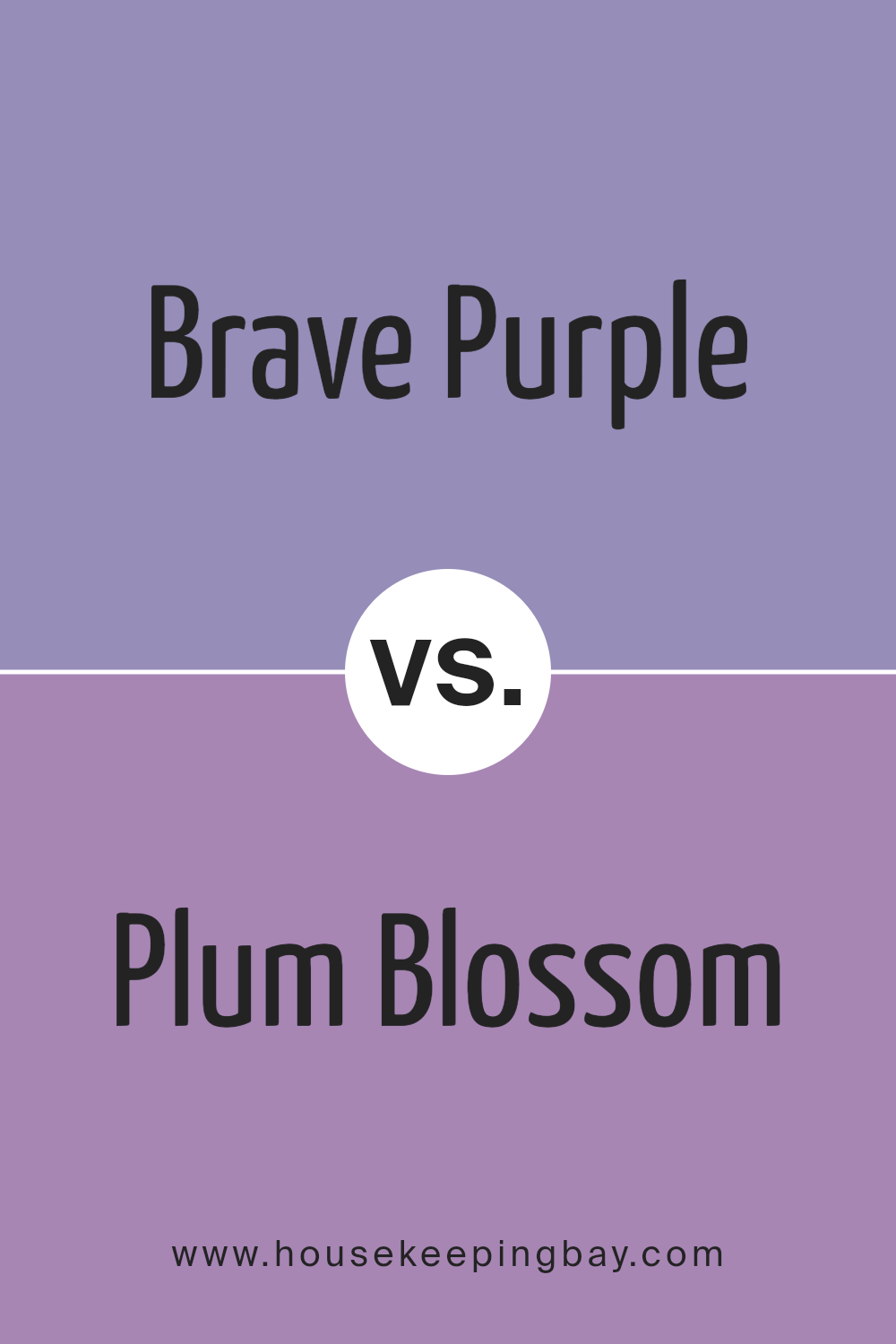
Brave Purple SW 6823 by Sherwin Williams vs Plum Blossom SW 6974 by Sherwin Williams
Brave Purple SW 6823 and Plum Blossom SW 6974 are two colors from Sherwin Williams. Brave Purple is a strong and bold color. It’s like a deep purple that can make any space feel more cozy and powerful. It’s the kind of purple you might see in a royal room or a fancy evening event. On the other hand, Plum Blossom SW 6974 is lighter and softer. It’s more like the gentle purple you’d see in spring flowers. Even though it’s also purple, it has a pinkish touch that makes it feel warmer and more welcoming.
When you compare them, Brave Purple is darker and more intense, perfect for making a statement in a room. Plum Blossom is softer and lighter, great for a space that needs a gentle pop of color without overwhelming it. They both bring their own unique vibes to a space, with Brave Purple leaning more towards magic and mystery, while Plum Blossom offers a touch of sweetness and softness.
You can see recommended paint color below:
- SW 6974 Plum Blossom
housekeepingbay.com
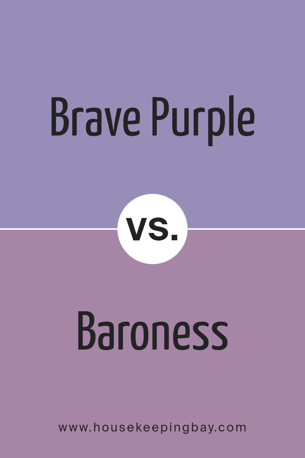
Brave Purple SW 6823 by Sherwin Williams vs Baroness SW 6837 by Sherwin Williams
Brave Purple and Baroness, both from Sherwin Williams, offer unique takes on purple. Brave Purple is a bold, vibrant hue that stands out. It’s the kind of color that adds a punch of personality to any space, making it lively and energetic. On the other hand, Baroness leans towards a softer, more subdued side of purple. It has a gentleness to it that brings a calm and soothing vibe to any room. While Brave Purple is more about making a statement, Baroness is about creating a serene backdrop. Both colors showcase the versatility of purple, but they cater to different moods and settings. Brave Purple is perfect for someone looking to inject excitement and vibrancy into their space, whereas Baroness suits those aiming for a more relaxed and tranquil environment.
You can see recommended paint color below:
- SW 6837 Baroness
housekeepingbay.com
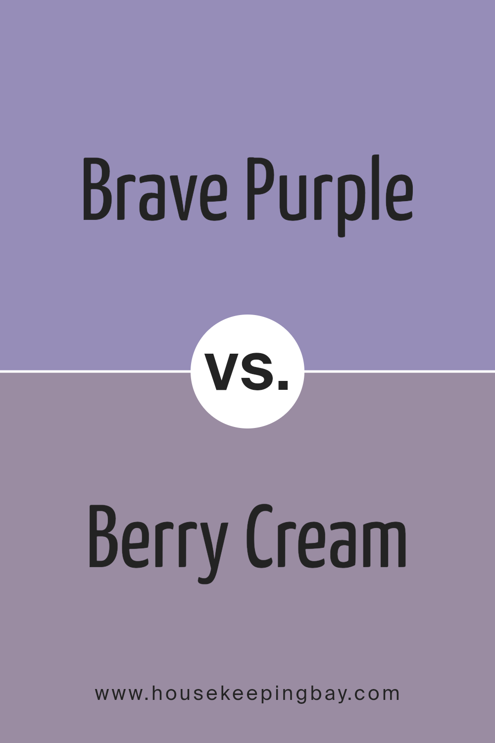
Brave Purple SW 6823 by Sherwin Williams vs Berry Cream SW 9075 by Sherwin Williams
Brave Purple SW 6823 by Sherwin Williams is a bold and striking color. It’s a deep purple that stands out and brings a rich, strong vibe to any space. It’s the kind of color that makes a statement and can turn a simple room into a dramatic and stylish area. On the other hand, Berry Cream SW 9075 is much softer and gentler. It’s a light, creamy color with just a hint of berry pink. It’s very soothing and calming, making it perfect for creating a relaxed and welcoming environment. While Brave Purple is all about making a bold impact, Berry Cream is about softness and creating a light, airy feel. Both colors are beautiful in their own right, but they serve very different purposes. Brave Purple is great for adding depth and drama, whereas Berry Cream is ideal for creating a peaceful and serene space.
You can see recommended paint color below:
- SW 9075 Berry Cream
housekeepingbay.com
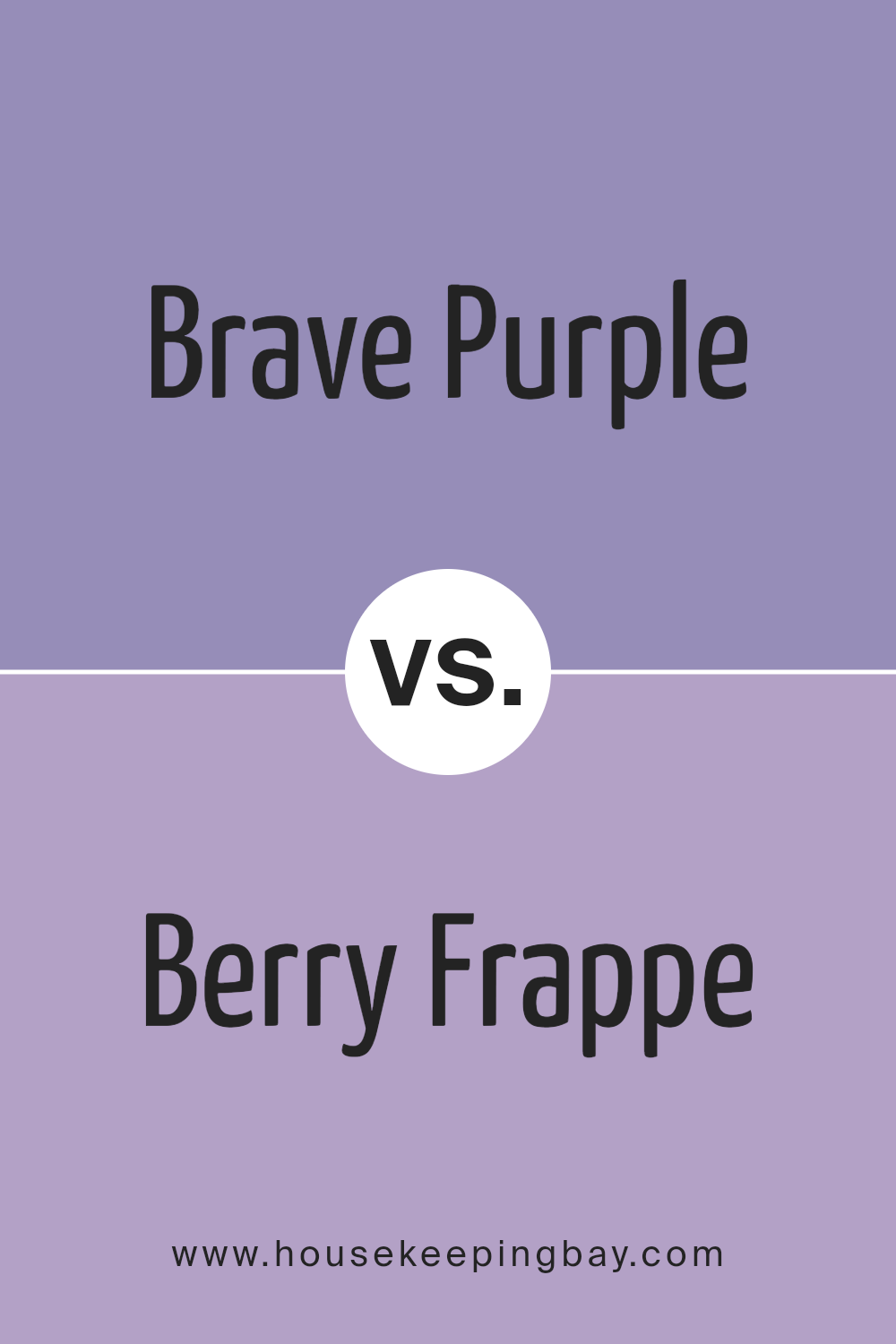
Brave Purple SW 6823 by Sherwin Williams vs Berry Frappe SW 9068 by Sherwin Williams
Brave Purple SW 6823 by Sherwin Williams is a bold and vibrant shade of purple. It’s a color that stands out and makes a statement. It’s great for spaces where you want to add a punch of energy and personality. On the other hand, Berry Frappe SW 9068 is a much softer, serene hue. It’s a mix of purple and pink, resulting in a gentle, calming color. It’s perfect for creating a soothing and relaxing environment, ideal for bedrooms or quiet areas. While Brave Purple is more about making a strong impact, Berry Frappe offers a more subdued and tender vibe. Both colors are beautiful in their own way, but they serve different purposes depending on the mood you want to create. Brave Purple demands attention, whereas Berry Frappe whispers for it, providing a more laid-back and tranquil atmosphere.
You can see recommended paint color below:
- SW 9068 Berry Frappe
housekeepingbay.com
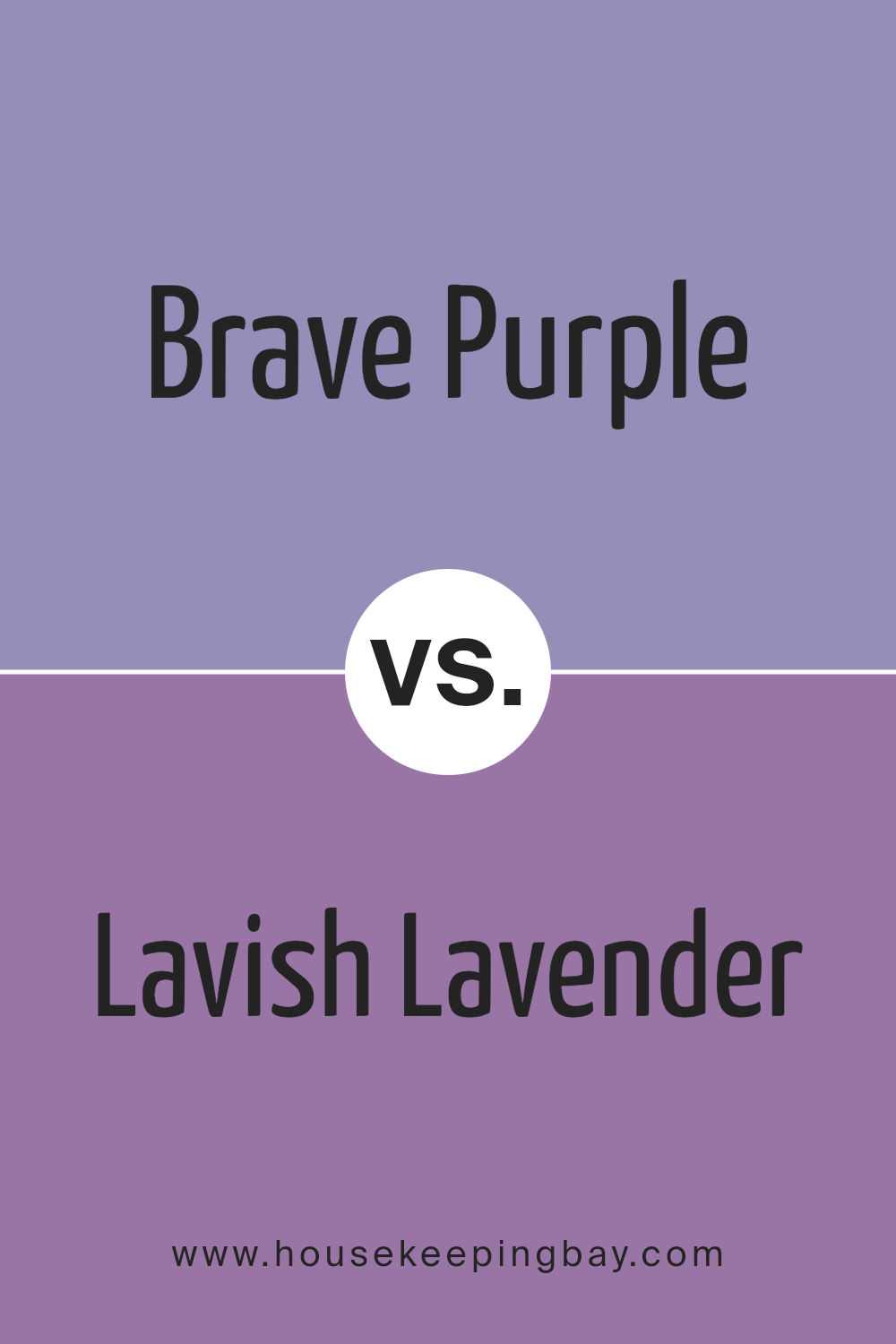
Brave Purple SW 6823 by Sherwin Williams vs Lavish Lavender SW 6975 by Sherwin Williams
Brave Purple and Lavish Lavender by Sherwin Williams are both unique colors, but they have their own special qualities. Brave Purple is a bold and strong color. It stands out and can give a rich and striking feeling to any space. It’s the kind of purple that makes a statement, whether on a feature wall or as an accent in home decor. On the other hand, Lavish Lavender has a softer, more serene vibe. It’s lighter and brings a calm and soothing feel to a room. Lavish Lavender works great for creating a relaxing atmosphere, like in bedrooms or bathrooms, where you want to unwind. While both colors share a purple base, Brave Purple leans towards a deeper, more intense hue, and Lavish Lavender offers a gentler, more delicate touch. They can both make spaces beautiful in their own way, depending on the mood you want to set.
You can see recommended paint color below:
- SW 6975 Lavish Lavender
housekeepingbay.com
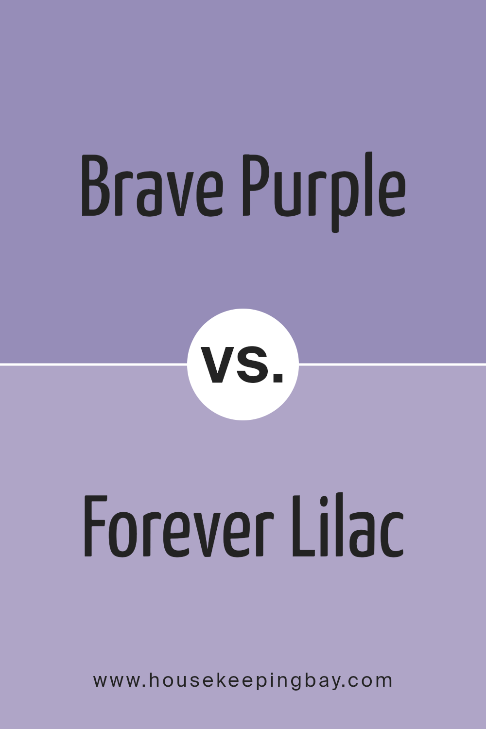
Brave Purple SW 6823 by Sherwin Williams vs Forever Lilac SW 9067 by Sherwin Williams
Brave Purple SW 6823 by Sherwin Williams and Forever Lilac SW 9067 by Sherwin Williams are two beautiful colors that offer different vibes for your space. Brave Purple is a bold, deep purple that stands out. It’s the kind of color that makes a statement, perfect for creating a focal point in a room. On the other hand, Forever Lilac is softer and more subtle. It’s a gentle, soothing shade of lilac that brings a calm and serene feeling to any space. While Brave Purple is powerful and can dominate a space with its richness, Forever Lilac is more about adding a touch of softness and elegance. If you’re looking to add drama and impact, Brave Purple is the way to go. However, if you’re after a peaceful and graceful ambiance, Forever Lilac will beautifully serve that purpose. Both colors offer unique possibilities depending on what mood or theme you want to achieve in your decorating project.
You can see recommended paint color below:
- SW 9067 Forever Lilac
housekeepingbay.com
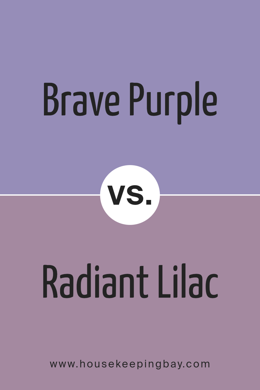
Brave Purple SW 6823 by Sherwin Williams vs Radiant Lilac SW 0074 by Sherwin Williams
Brave Purple SW 6823 by Sherwin Williams is a bold and striking color. It’s a deep, rich purple with a dramatic flair, great for making a strong statement in a room. On the other hand, Radiant Lilac SW 0074 is a much lighter, softer purple. It carries a gentle, soothing vibe, perfect for creating a calm and relaxing atmosphere in spaces like bedrooms or bathrooms. While Brave Purple leans towards a more vibrant, intense look, Radiant Lilac offers a more delicate and airy feel. These differences make Brave Purple ideal for accent walls or decor pieces when you want to add a punch of color, and Radiant Lilac is better suited for larger wall areas or rooms where a sense of peace and serenity is desired. Each color has its unique charm, offering different ways to add personality and mood to your space.
You can see recommended paint color below:
- SW 0074 Radiant Lilac
housekeepingbay.com
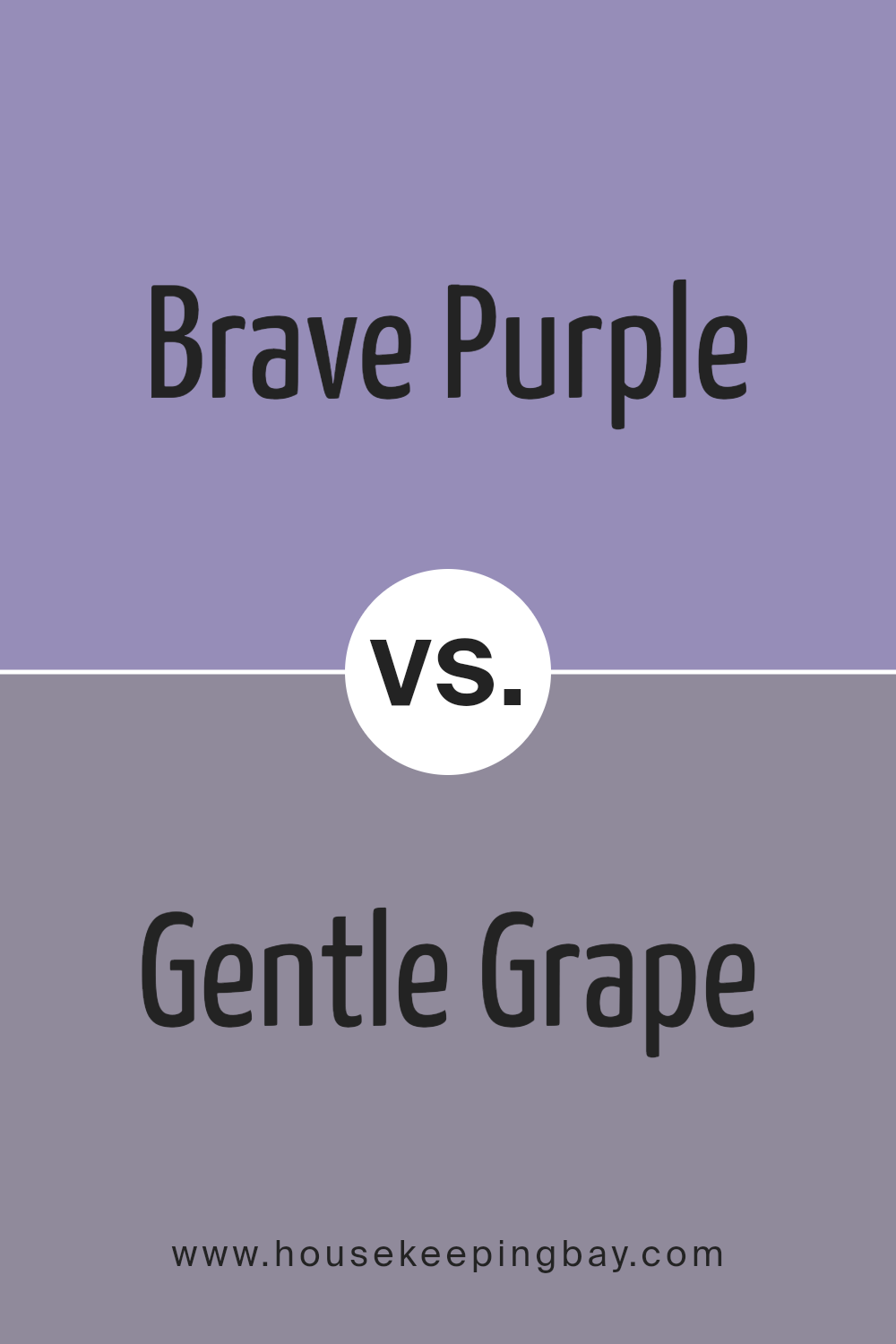
Brave Purple SW 6823 by Sherwin Williams vs Gentle Grape SW 9074 by Sherwin Williams
Brave Purple SW 6823 by Sherwin Williams and Gentle Grape SW 9074 by Sherwin Williams are both unique shades of purple, however, they offer distinctly different vibes. Brave Purple is a bold and vivid color. It commands attention and adds a strong, energetic feel to a space. This makes it a great choice for an accent wall or a room where you want to make a statement.
On the other hand, Gentle Grape has a softer, more soothing tone. It’s a subtler purple, which gives it a more calming and relaxing feel. This color is perfect for bedrooms or other areas where you want to create a peaceful and serene atmosphere.
In comparison, while both colors share a purple base, Brave Purple is deeper and more intense, creating a dramatic effect. Gentle Grape, being lighter and softer, offers a more understated elegance. Each color serves a different purpose, depending on the mood you want to invoke in your space.
You can see recommended paint color below:
- SW 9074 Gentle Grape
housekeepingbay.com
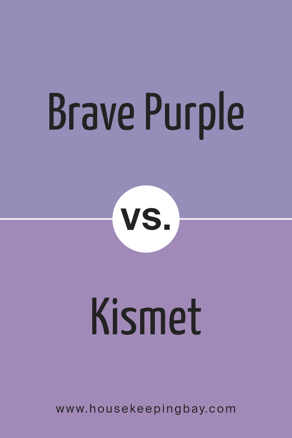
Brave Purple SW 6823 by Sherwin Williams vs Kismet SW 6830 by Sherwin Williams
Brave Purple SW 6823 from Sherwin Williams is a strong and bold purple color. It’s the kind of purple that stands out because it’s deep and has a confident vibe. Imagine a color that can make a statement in a room, that’s Brave Purple. It’s the sort of color you might choose if you want to add a pop of richness to your space.
On the other hand, Kismet SW 6830, also by Sherwin Williams, is quite different. Kismet is more of a light and airy pinkish-purple. It’s softer and has a calming effect, making it perfect for spaces where you want to relax. Think of Kismet as a gentle hug in the form of color. It’s not as bold as Brave Purple, but it creates a peaceful and soothing atmosphere.
Both colors are beautiful in their own ways. Brave Purple brings energy and boldness, while Kismet offers tranquility and softness. Depending on what feeling you want in a room, either color could be a great choice.
You can see recommended paint color below:
- SW 6830 Kismet
housekeepingbay.com
Conclusion
In conclusion, Sherwin Williams SW 6823, Brave Purple, stands out as a vibrant and bold paint choice that can significantly transform any space. If you’re looking to add a touch of drama or create a focal point in your room, this shade of purple is an excellent pick. Its rich hue brings warmth and depth, making it perfect for accent walls, cozy reading nooks, or even full rooms if you’re feeling adventurous. Remember, lighting plays a huge role in how Brave Purple looks in your space; under natural light, it reveals its brightness and vivacity, whereas, in artificial lighting, it tends to offer more warmth. Pairing it with complementary colors or neutral tones can balance its intensity, making it versatile for various design styles. Whether you’re updating a single piece of furniture or transforming an entire room, Brave Purple by Sherwin Williams offers a unique opportunity to personalize your space with confidence and style. You’ll be amazed at how this stunning shade can bring energy and personality to your home.
housekeepingbay.com
Ever wished paint sampling was as easy as sticking a sticker? Guess what? Now it is! Discover Samplize's unique Peel & Stick samples. Get started now and say goodbye to the old messy way!
Get paint samples


