Icelandic SW 6526 by Sherwin Williams
Cool Tones for a Relaxed Space
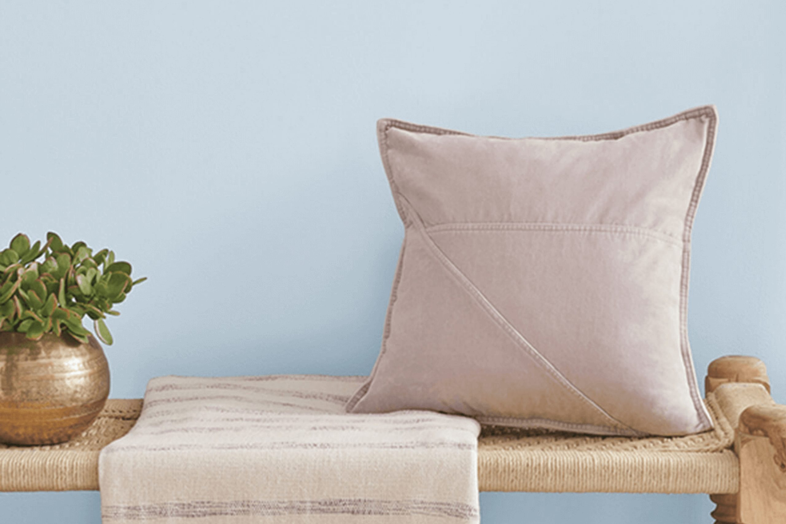
When choosing the right paint color for a room, SW 6526 Icelandic by Sherwin Williams is a great option. It captures the essence of soft, cool blues reminiscent of icy landscapes, creating a peaceful ambiance in your home. This hue can make your space feel brighter and more open without overpowering it.
You might appreciate how Icelandic pairs well with various styles and decors. Whether you prefer a modern, minimalist look or a cozy, traditional setting, this color can seamlessly tie it all together.
It’s versatile enough to serve as a main wall color or as an accent, depending on how bold you want to be.
Think about how Icelandic complements natural materials. Wood, stone, and even metal details can look more vivid and stylish against its subtle blue backdrop.
It’s also a calming choice for bedrooms or bathrooms, creating a serene retreat from the everyday hustle.
If you’re interested in playing with light in your home, Icelandic responds well to both natural and artificial lighting.
It shifts slightly in tone, offering a dynamic living environment throughout the day. You’ll find it soothing yet refreshing—a perfect balance for almost any space. It’s a color that invites you to sit back and relax, making a house feel more like a home.
via benjaminmoore.com
What Color Is Icelandic SW 6526 by Sherwin Williams?
Table of Contents
Icelandic SW 6526 by Sherwin Williams is a soft, enchanting light blue, almost whispering the gentle hues of an ice-laden landscape. This serene color gives a cool and calm feeling, making it a great choice for creating restful spaces. Its subtle nature allows it to shine without overpowering a room, bringing a delicate touch.
In terms of interior styles, Icelandic works beautifully in coastal, modern, or Scandinavian themes. Its light tone blends seamlessly with other neutrals, making it perfect for minimalistic settings. In a coastal interior, pair it with sandy beiges and crisp whites to mimic a seaside retreat.
In a modern or Scandinavian room, combine it with muted grays and natural wood tones to emphasize simplicity and function.
Materials that complement Icelandic include light, airy fabrics like linen and cotton, which enhance its soft quality. For textures, consider pairing it with raw or bleached wood to maintain a natural aesthetic.
Adding some metallics, like brushed nickel or matte silver, can bring a sleek element to the space, while soft wool throws or a plush area rug provide comforting layers.
Icelandic’s gentle hue makes it an ideal backdrop, allowing other design elements to shine.

housekeepingbay.com
Is Icelandic SW 6526 by Sherwin Williams Warm or Cool color?
IcelandicSW 6526 by Sherwin Williams presents a cool, calming shade of pale blue. This color creates a sense of freshness and openness within any room. It mimics clear skies and reflects a serene environment, helping to make spaces feel more open and larger than they are. Use Icelandic in bedrooms to promote relaxation or in living rooms for a light, airy atmosphere.
It complements modern and minimalist decor, blending well with whites, grays, and natural wooden tones, enhancing the overall harmony of the space. In kitchens, it can add a splash of gentle color without overwhelming the senses. Add accents like soft textiles or plants to balance and complete the look.
It suits bathrooms due to its clean, crisp look, creating a pleasant environment. This versatile shade has a subtle charm, making homes feel peaceful and inviting without overpowering other elements in the decor.
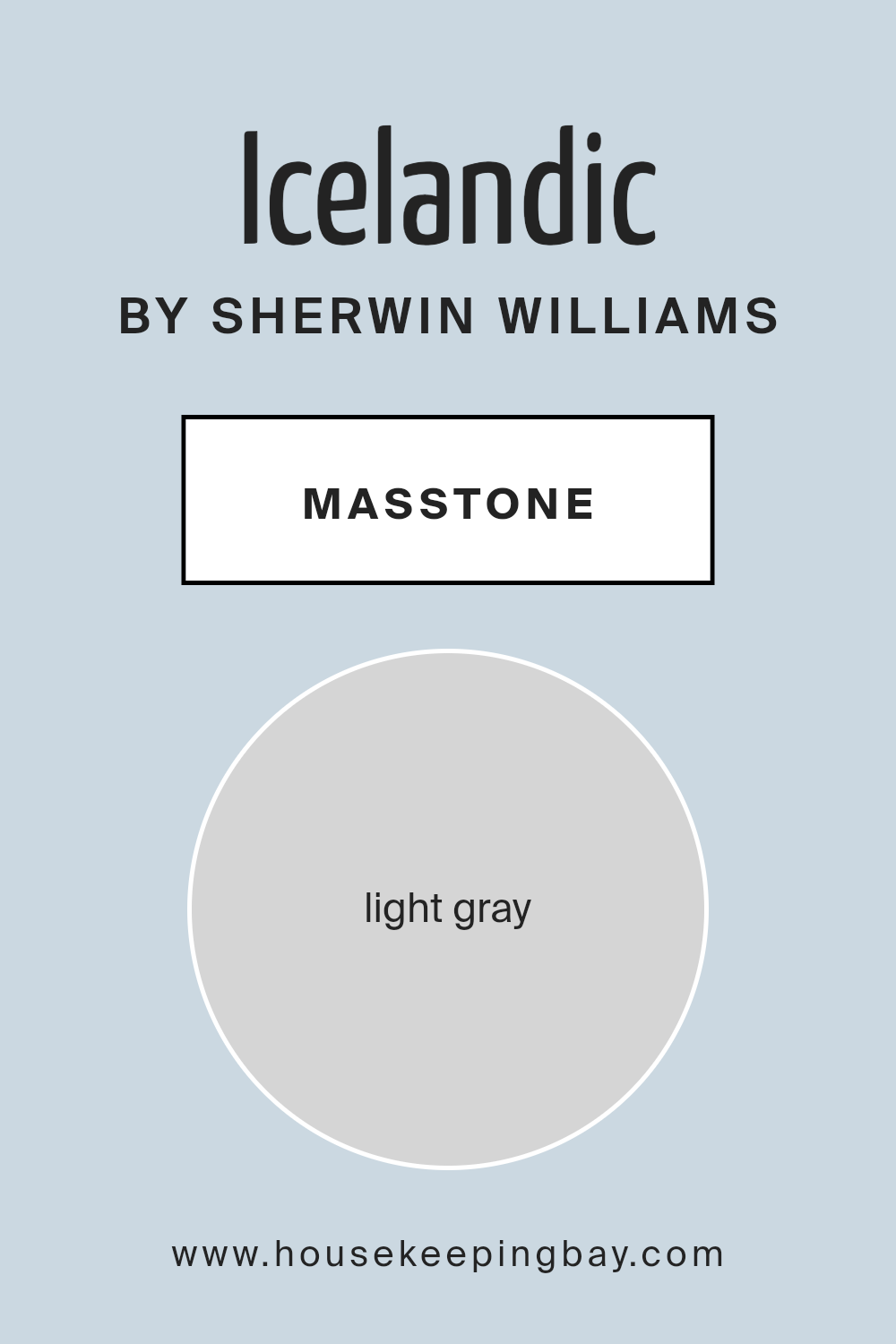
What is the Masstone of the Icelandic SW 6526 by Sherwin Williams?
Icelandic SW 6526 by Sherwin Williams has a masstone of light gray, identified by the color code #D5D5D5. This shade is soft and neutral, making it a versatile choice for homes. Its gentle gray tone helps create calm and serene environments, which is ideal for living rooms, bedrooms, and offices.
Light gray can reflect light well, allowing rooms to feel brighter and more open, especially in smaller spaces.
This color also complements various design styles, from modern to traditional, and pairs well with different textures and materials like wood, metal, and glass. Light gray can be used on walls as a backdrop, letting furniture and decor stand out. It matches easily with other colors, allowing for creative and bold accents.
With its simple elegance, Icelandic SW 6526 creates a balanced and welcoming atmosphere in any room it’s used.
housekeepingbay.com
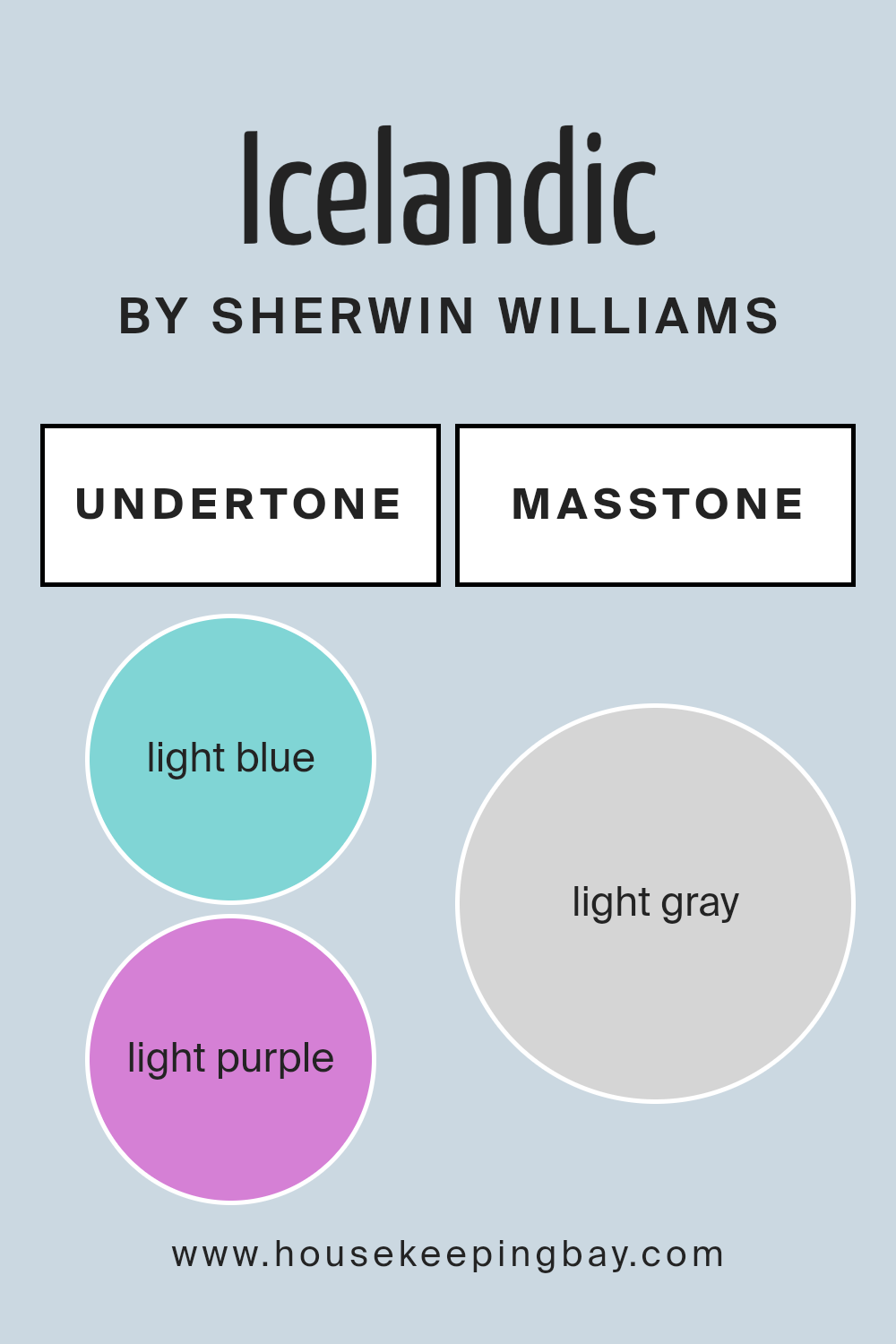
Undertones of Icelandic SW 6526 by Sherwin Williams
Icelandic SW 6526 by Sherwin Williams is a pale, icy shade of blue. Undertones have a major role in how we perceive a color. They’re the subtle hues that lie beneath the main color, adding depth and complexity. For Icelandic SW 6526, undertones like light blue, light purple, pale yellow, lilac, mint, pale pink, and grey influence its appearance.
The light blue undertone supports the main hue, enhancing the color’s cool and refreshing feel. Light purple and lilac add a slight hint of warmth, making the blue feel more inviting rather than sterile.
When pale yellow comes into play, it softens the color, introducing a bit of warmth and cheerfulness without turning the shade too warm. The mint undertone adds freshness, ensuring the color stays vibrant. Pale pink brings a gentle warmth which makes the blue feel less cold and more balanced.
The grey undertone ensures the color remains sophisticated and mellow.
In interior spaces, Icelandic SW 6526 appears serene and rejuvenating. The combination of these undertones allows it to work well in various lighting conditions, sometimes leaning cooler or warmer according to the surrounding elements.
It fits beautifully in bedrooms or bathrooms where a calming atmosphere enriches relaxation.
housekeepingbay.com
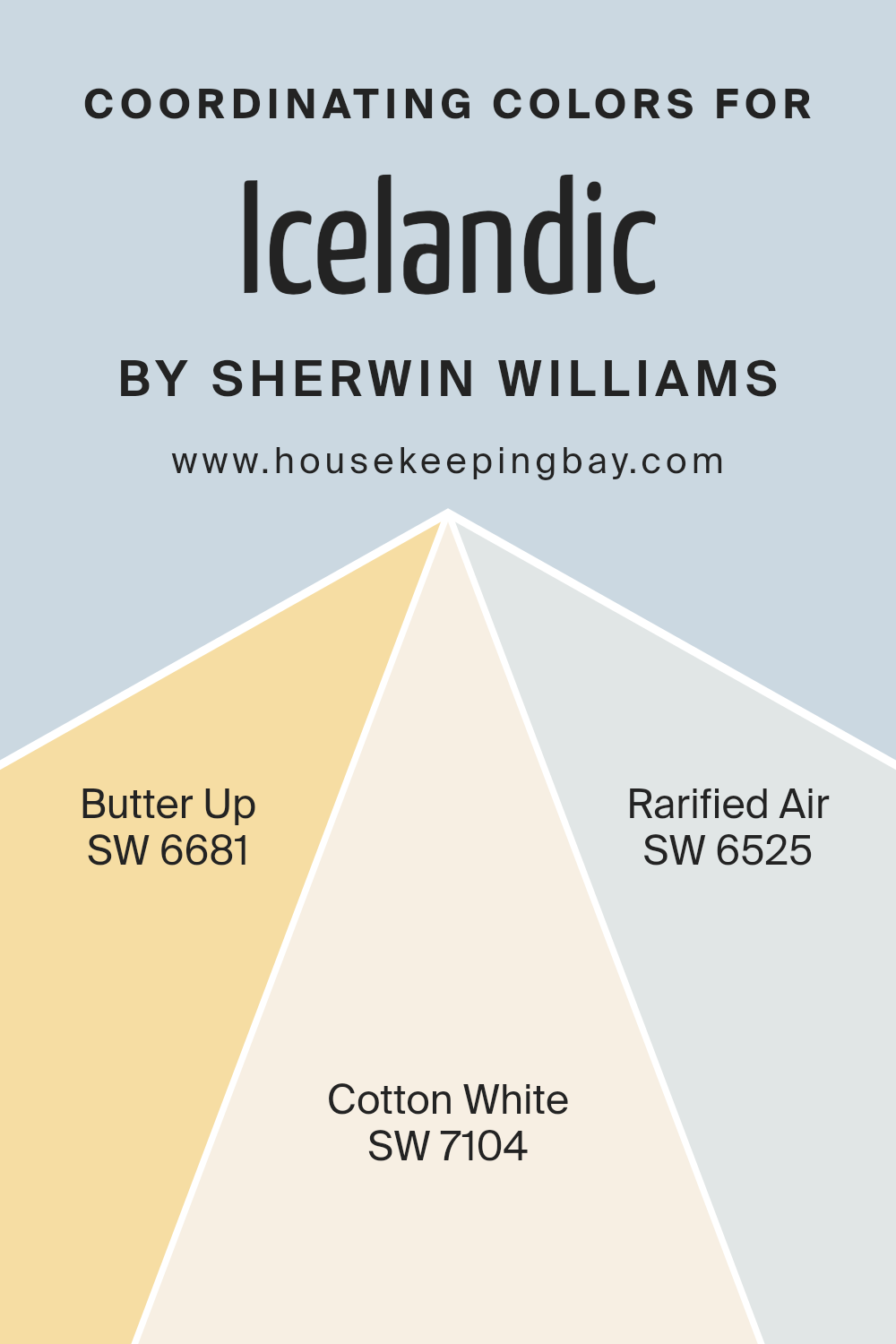
Coordinating Colors of Icelandic SW 6526 by Sherwin Williams
Coordinating colors are groups of colors that complement each other and create a cohesive look when combined in a space. They work together by balancing hues and tones, enhancing the overall aesthetic without clashing. When selecting coordinating colors, it’s important to choose shades that harmonize and bring out the best in the main color.
For Icelandic SW 6526 by Sherwin Williams, three coordinating colors can help create a soothing and inviting space: SW 6681 – Butter Up, SW 7104 – Cotton White, and SW 6525 – Rarified Air.
Butter Up SW 6681 is a warm and cheerful yellow that adds a touch of sunshine to any room. It has a gentle brightness that can lift spirits and create a cozy atmosphere. Cotton White SW 7104 is a clean, soft white that offers a fresh backdrop without being too harsh or sterile. It complements other colors by adding lightness and simplicity to a palette.
Rarified Air SW 6525 is a delicate, airy blue that evokes a sense of calm and openness. It pairs beautifully with Icelandic, adding a cool contrast and depth.
Together, these colors can create a harmonious look that feels both refreshing and inviting.
You can see recommended paint colors below:
- SW 6681 Butter Up
- SW 7104 Cotton White
- SW 6525 Rarified Air
housekeepingbay.com
How Does Lighting Affect Icelandic SW 6526 by Sherwin Williams?
Lighting significantly influences how we perceive colors. Natural light and artificial light can drastically change the appearance of a color. Sherwin Williams’ Icelandic SW 6526 is a soft, cool blue with a hint of gray. The color variations due to lighting should be considered when choosing paint for your home.
In natural light, Icelandic SW 6526 reveals its true undertones. The color appears light and airy because natural light showcases the blue-gray mix more transparently. However, the quality of natural light depends on the room’s direction.
North-facing rooms usually have cooler and dimmer light, which enhances the blue and gray tones of Icelandic. This can make the space feel cooler and more relaxing. In these rooms, the color might look slightly more muted.
South-facing rooms have warm, bright light throughout the day. This abundant light can make Icelandic SW 6526 appear lighter, and any gray tones might become less noticeable, highlighting the blue more.
East-facing rooms get morning sunlight, which is warm and soft. In these rooms, Icelandic SW 6526 can appear slightly warmer in the morning. As the day progresses and the sun moves, the room will look cooler and the blue tones will stand out.
West-facing rooms have warm light in the late afternoon and evening. Here, Icelandic might shift, feeling warmer and more welcoming later in the day.
Under artificial lighting, the appearance of Icelandic SW 6526 depends on the type of bulbs used. Incandescent and warm LED lights add a slight warmth, softening the color. Cool white LEDs or fluorescents can intensify the blue tones, making the space feel cooler.
Understanding these lighting effects helps when choosing Icelandic SW 6526 for any room, ensuring the desired mood and atmosphere.
housekeepingbay.com
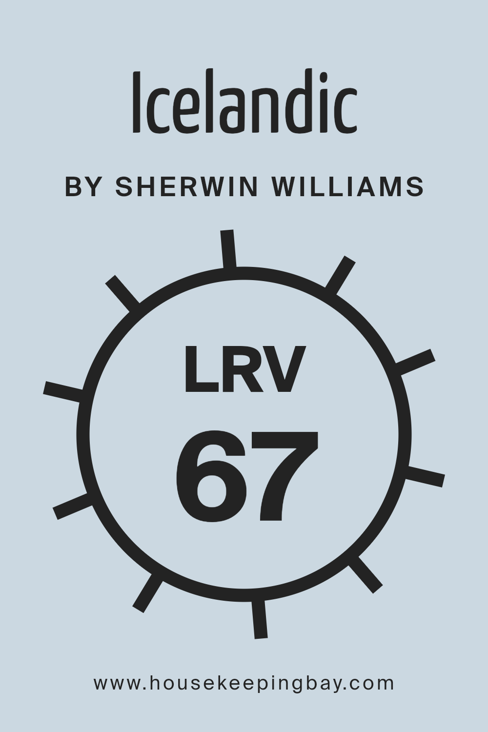
What is the LRV of Icelandic SW 6526 by Sherwin Williams?
LRV, or Light Reflectance Value, is a measure of how much light a paint color reflects. It’s a scale from 0 to 100, where 0 means the color absorbs all light, appearing very dark, and 100 means it reflects all light, appearing very bright
When you choose a paint color, its LRV can influence how the color appears in a room based on the lighting and other colors around it.
A higher LRV can make a space feel larger and more open because it reflects more light, while a lower LRV can create a cozier, more enclosed feeling.
For Icelandic SW 6526 by Sherwin Williams, with an LRV of 67.482, the color will reflect a significant amount of light.
This means it will appear light and airy on walls, contributing to a bright and open atmosphere in a room.
With this LRV, Icelandic will help illuminate a space, making it feel spacious and inviting.
In rooms with abundant natural light, this color will amplify the brightness, whereas in dimmer spaces, it will still hold its gentle, soft tone.
This makes it a versatile choice for different settings throughout the home, enhancing light reflection without overwhelming the senses.
housekeepingbay.com
What are the Trim colors of Icelandic SW 6526 by Sherwin Williams?
Trim colors are essential accents in home design that can make a significant difference in the overall look and feel of a space. They help define and separate different areas or features within a room, providing a frame that highlights the main color applied on the walls.
For a color like Icelandic SW 6526 by Sherwin Williams, which is a soft and airy blue, choosing the right trim colors can enhance its cool tones and create a welcoming atmosphere.
Trim colors provide contrast or complement the main color, allowing the style to feel more cohesive and refined. Balanced Beige SW 7037 and Canvas Tan SW 7531 are both ideal choices as trim colors to achieve this complementary effect with Icelandic.
Balanced Beige SW 7037 is a warm, light beige with subtle gray undertones, offering a subdued yet sophisticated touch that blends well with a cooler wall color like Icelandic.
Its neutral quality helps in mellowing the starkness of blue while adding a comforting warmth. On the other hand, Canvas Tan SW 7531 is a soft, creamy tan, exuding a sense of relaxed elegance and versatility. It is a slightly lighter shade than Balanced Beige and provides a harmonious contrast with Icelandic, while maintaining an understated look. Both trim colors work well to underscore the airy qualities of Icelandic, helping create spaces that feel open and inviting.
You can see recommended paint colors below:

housekeepingbay.com
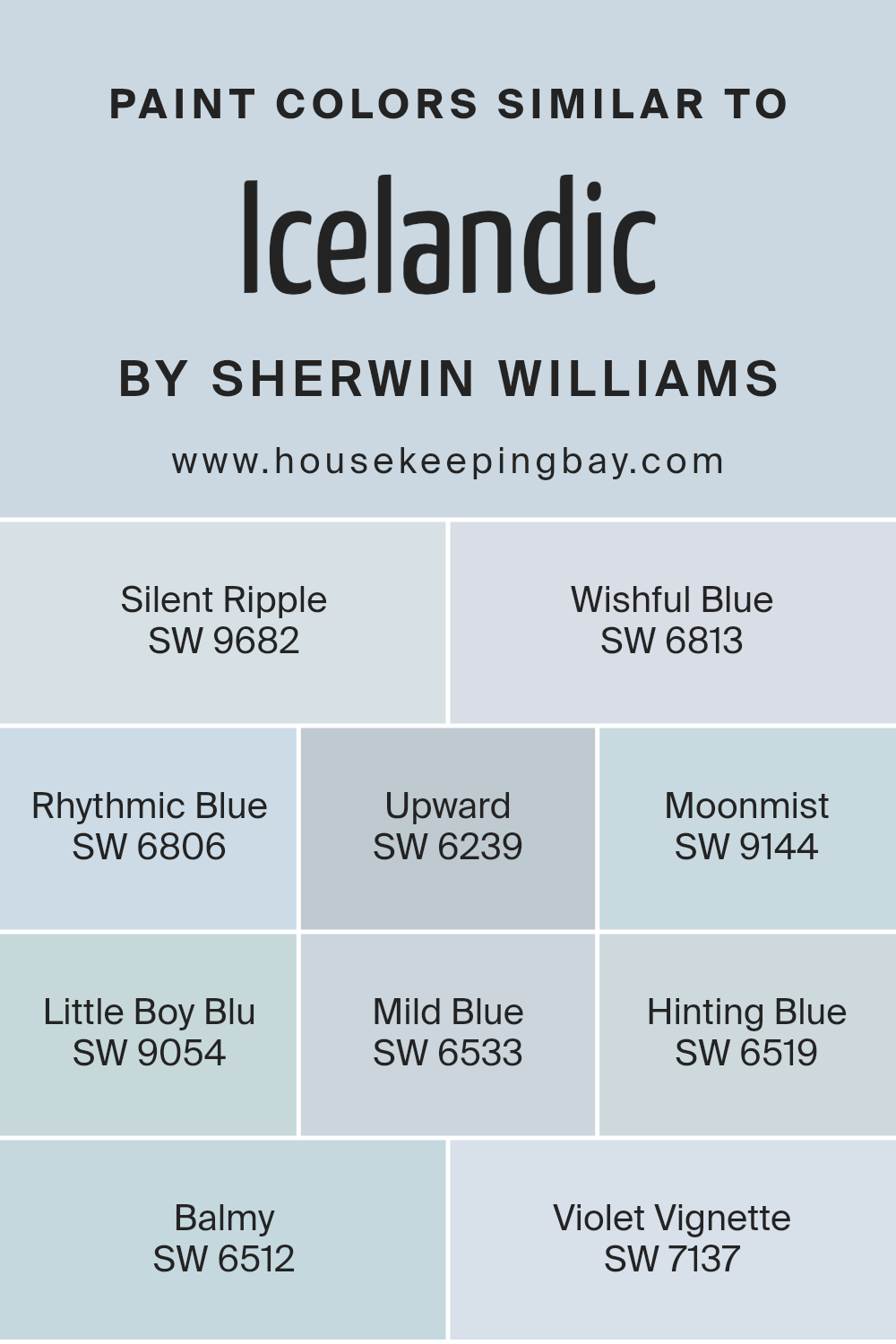
Colors Similar to Icelandic SW 6526 by Sherwin Williams
Similar colors play a crucial role in design and decorating as they create a sense of harmony and cohesion within a space. When colors share comparable shades or undertones, they work together to produce a calming and unified look. These colors, though not identical, provide a smooth transition from one hue to another, which is pleasing to the eye.
In the case of Icelandic, similar tones can amplify its serene and peaceful vibe, making a room feel more balanced. Colors like SW 9682 – Silent Ripple bring gentle whispers of color, while SW 6813 – Wishful Blue adds a touch of dreamy softness.
SW 6806 – Rhythmic Blue offers a fresh and airy feel akin to an open sky, and SW 6239 – Upward has a light, uplifting quality. SW 9144 – Moonmist carries a subtle, misty ambiance that can evoke a feeling of calm. On the other hand, SW 9054 – Little Boy Blu presents a playful and lighthearted shade.
SW 6533 – Mild Blue rests comfortably between calmness and clarity, while SW 6519 – Hinting Blue provides a soothing hint of color without overwhelming.
SW 6512 – Balmy has an easygoing and restful vibe, while SW 7137 – Violet Vignette adds a gentle touch of violet that softens the overall palette. Together, these colors can make any space feel welcoming and well-coordinated.
You can see recommended paint colors below:
- SW 9682 Silent Ripple
- SW 6813 Wishful Blue
- SW 6806 Rhythmic Blue
- SW 6239 Upward
- SW 9144 Moonmist
- SW 9054 Little Boy Blu
- SW 6533 Mild Blue
- SW 6519 Hinting Blue
- SW 6512 Balmy
- SW 7137 Violet Vignette
housekeepingbay.com
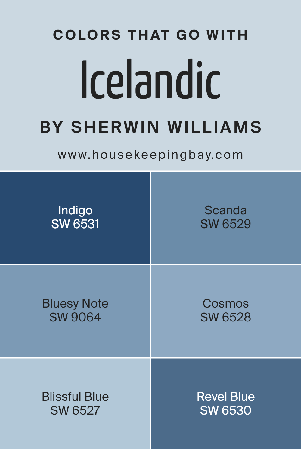
Colors that Go With Icelandic SW 6526 by Sherwin Williams
Choosing the right colors to complement Icelandic SW 6526 by Sherwin Williams is important because it enhances the overall aesthetic and mood of a space. These colors create harmony and can influence how a room feels. SW 6531 – Indigo is a deep, rich blue that adds depth and sophistication, offering a nice contrast to the lighter Icelandic tone.
SW 6529 – Scanda brings in a light, airy blue, which pairs well with Icelandic’s soft hue, adding a touch of freshness and calmness. The key to using these companion colors is finding the right balance to maintain a cohesive look.
Incorporating SW 9064 – Bluesy Note, a muted blue-gray, brings a soothing and refined feel, bridging the gap between light and dark.
SW 6528 – Cosmos offers a slightly cooler, misty blue that can make a space feel serene and peaceful.
SW 6527 – Blissful Blue introduces a gentle, pastel blue that complements Icelandic’s ethereal vibe, while SW 6530 – Revel Blue, a more robust blue, can add energy and vibrancy without being overwhelming. By using these shades with Icelandic SW 6526, you ensure a balanced and visually appealing environment that’s both welcoming and comforting.
You can see recommended paint colors below:
- SW 6531 Indigo
- SW 6529 Scanda
- SW 9064 Bluesy Note
- SW 6528 Cosmos
- SW 6527 Blissful Blue
- SW 6530 Revel Blue
housekeepingbay.com
How to Use Icelandic SW 6526 by Sherwin Williams In Your Home?
Icelandic SW 6526 by Sherwin Williams is a soft, cool blue that brings a sense of calm and gentleness to any room. It’s a versatile color that works well in various spaces throughout the home. In a bedroom, Icelandic can create a soothing atmosphere, perfect for unwinding after a busy day. Pair it with crisp white linens and light-colored furniture for a fresh look.
In the living room, this gentle blue adds a touch of elegance. Consider accenting it with silver or gray decor pieces to enhance its serene quality. For a more dynamic vibe, add splashes of darker blue or green through cushions and artwork.
In the bathroom, Icelandic creates a spa-like environment. Combine it with natural wood tones and soft towels to enhance its relaxing effect. This color also complements kitchen or dining areas, where it can be matched with white cabinets and light countertops for an airy feel.
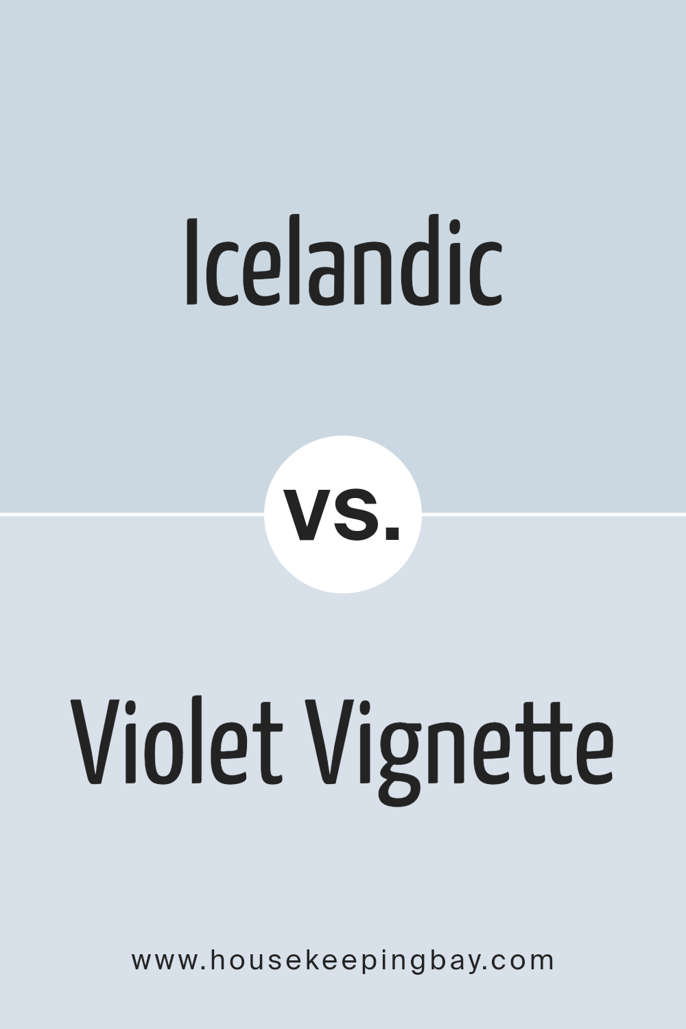
Icelandic SW 6526 by Sherwin Williams vs Violet Vignette SW 7137 by Sherwin Williams
Icelandic SW 6526, a soft, serene blue by Sherwin Williams, brings to mind crisp, cool air and the beauty of northern skies. It’s a refreshing color, light and airy, and works well in spaces where you want a peaceful atmosphere. Think of it as bringing a touch of calmness to a room without overwhelming it.
Violet Vignette SW 7137, also by Sherwin Williams, is a gentle shade of purple with a hint of warmth. This color feels comforting and has a subtle depth, adding elegance to any space. It’s perfect for those who enjoy a pop of color without being too bold or intense.
When comparing these two colors, Icelandic focuses more on openness and lightness, while Violet Vignette offers a cozy, welcoming feel. Both colors can beautify interiors but convey distinct moods, making them suitable for different styles and experiences.
You can see recommended paint color below:
- SW 7137 Violet Vignette
housekeepingbay.com
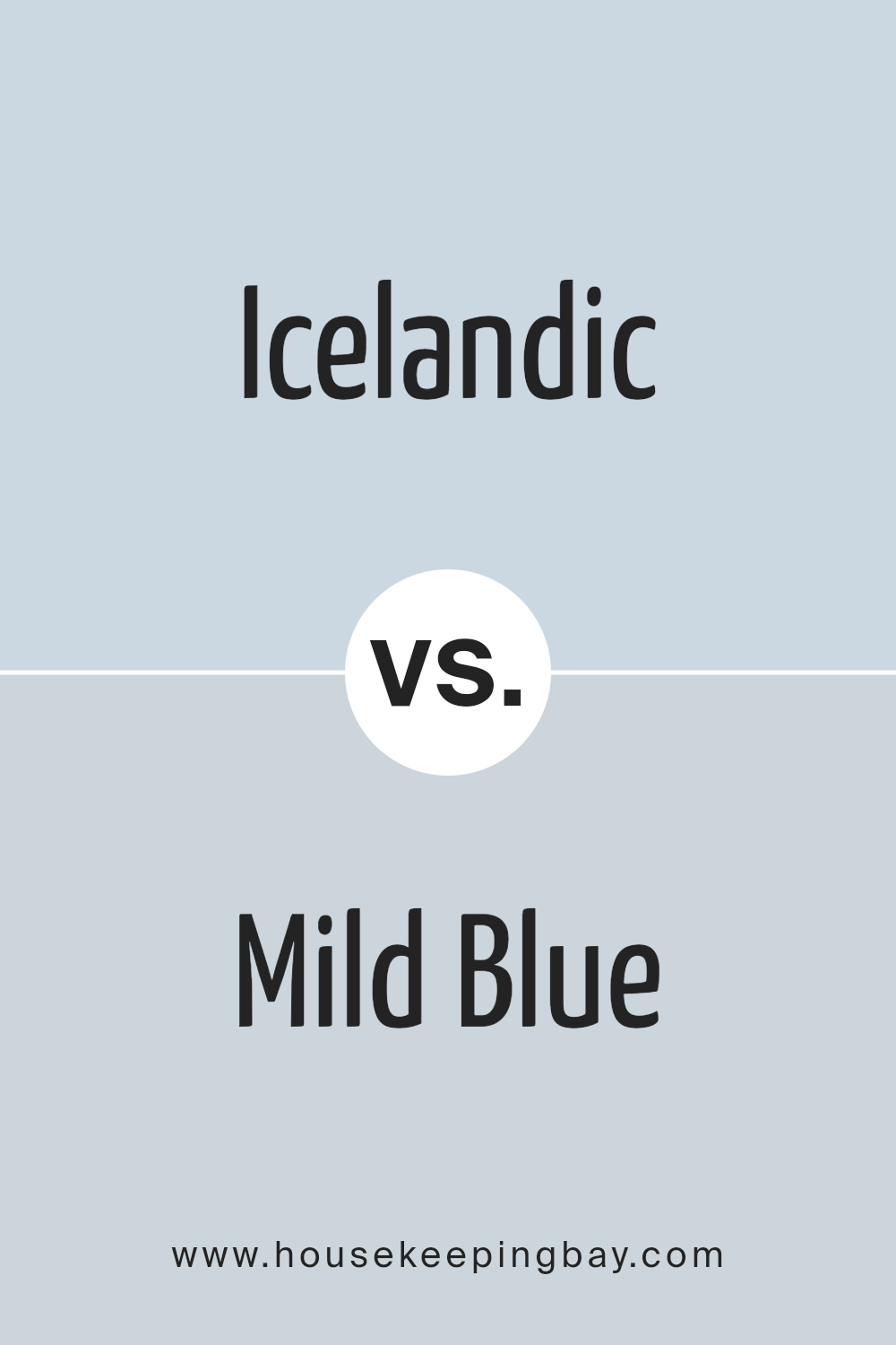
Icelandic SW 6526 by Sherwin Williams vs Mild Blue SW 6533 by Sherwin Williams
Icelandic SW 6526 and Mild Blue SW 6533, both by Sherwin Williams, are soothing colors that bring different atmospheres to a space. Icelandic SW 6526 is a light, airy blue with a hint of gray, giving it a fresh, crisp feel. It is often associated with cool mornings or driftwood, lending a soft and peaceful vibe to interiors.
Mild Blue SW 6533 is a bit deeper and warmer than Icelandic. It offers a subdued, powdery blue tone. Mild Blue can feel more cozy and inviting, reminiscent of the afternoon sky or a faded denim. Where Icelandic brightens and opens spaces, Mild Blue tends to create a more intimate and serene setting.
Both colors work well in various rooms but bring different energies. Icelandic refreshes spaces, while Mild Blue adds comfort and warmth. Each color offers versatility, making them suitable for both modern and classic decor styles.
You can see recommended paint color below:
housekeepingbay.com
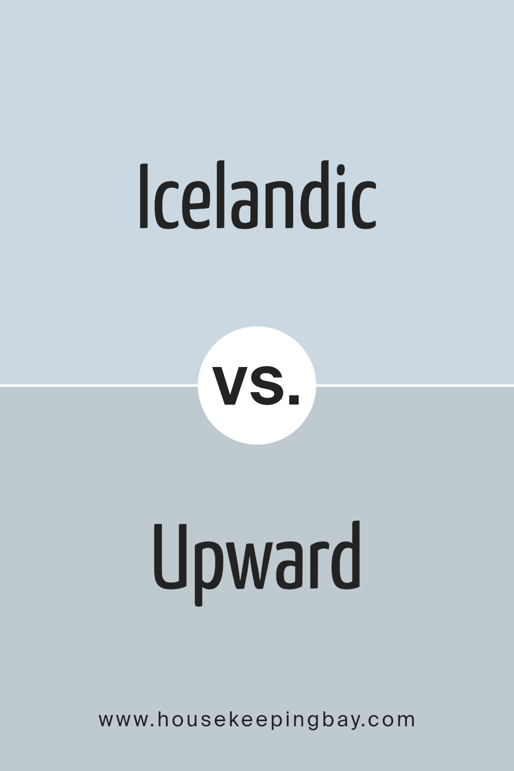
Icelandic SW 6526 by Sherwin Williams vs Upward SW 6239 by Sherwin Williams
Icelandic SW 6526 and Upward SW 6239, both from Sherwin Williams, offer refreshing shades of blue, yet each carries a unique feel. Icelandic is a light, cool blue with a slight hint of gray, evoking a sense of calm and openness, perfect for creating a peaceful and airy space. It works well in rooms where you want to maximize natural light and evoke a serene atmosphere.
Upward SW 6239 is a bit deeper with a stronger presence. This shade balances blue with a touch more depth, which gives it a more grounded and stable vibe. It fits well in spaces where you want to invite a soothing yet slightly richer tone.
While both colors share blue undertones, Icelandic feels softer and more ethereal, whereas Upward offers a more substantial, comforting presence. Both are versatile and work great in any room, but their subtle differences allow you to choose one that best suits the mood you wish to create.
You can see recommended paint color below:
housekeepingbay.com
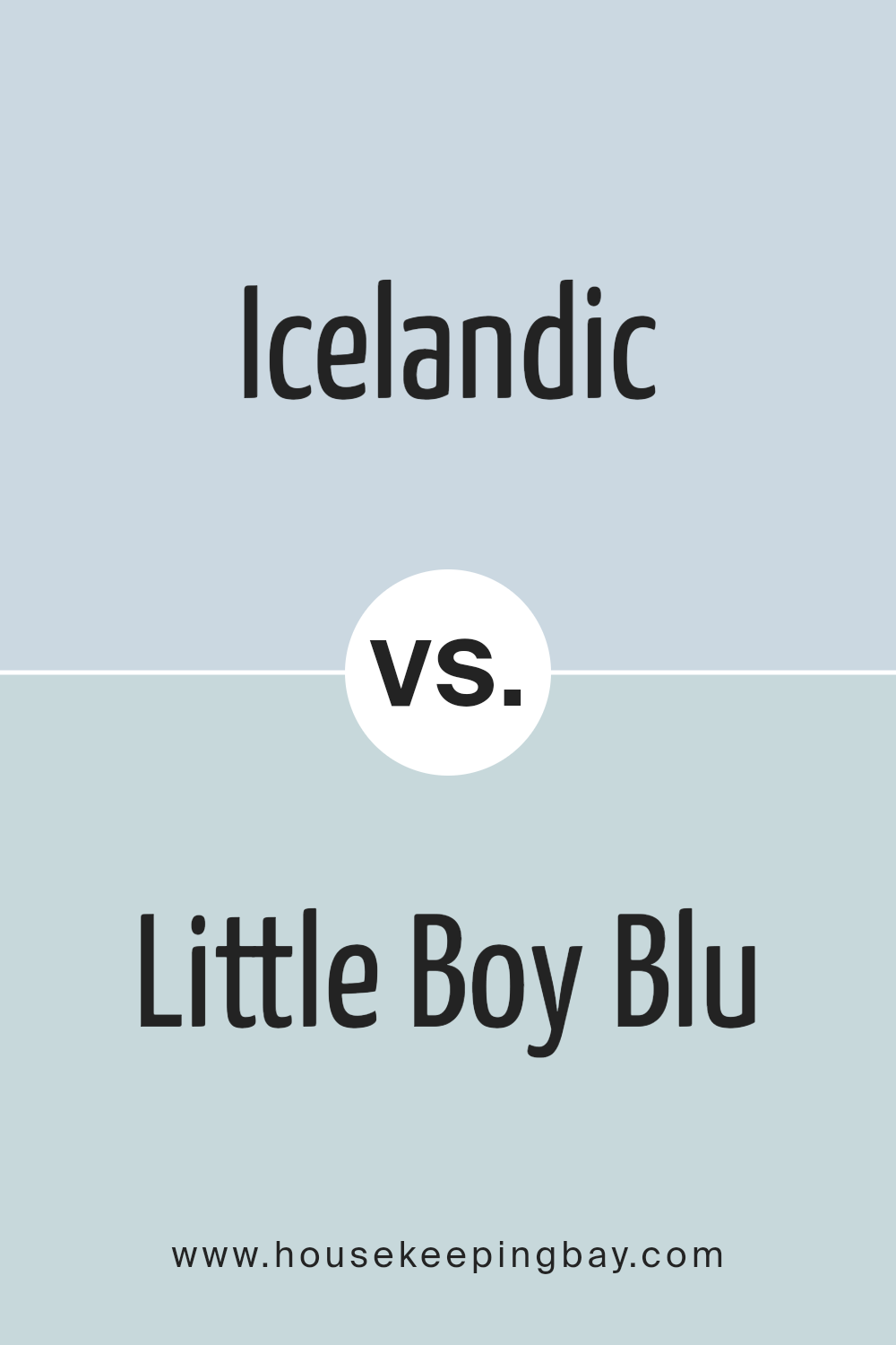
Icelandic SW 6526 by Sherwin Williams vs Little Boy Blu SW 9054 by Sherwin Williams
Icelandic SW 6526 and Little Boy Blu SW 9054 are both soothing shades of blue from Sherwin Williams, but they have distinct characteristics. Icelandic is a soft, muted blue with hints of gray. It feels calm and gentle, providing a serene atmosphere. This color works well in spaces where you want a sense of peace and relaxation.
Little Boy Blu is a brighter, more vibrant blue. It has a cheerful and fresh feel, making it ideal for areas where you want to create an energy boost.
While Icelandic leans toward the cooler side, Little Boy Blu feels warmer and more inviting due to its vividness
Both colors can be used in various settings, but Icelandic suits minimalistic and contemporary designs, while Little Boy Blu adds a playful touch. Your choice depends on whether you prefer a softer, calming space or a lively, energetic environment.
You can see recommended paint color below:
- SW 9054 Little Boy Blu
housekeepingbay.com
Icelandic SW 6526 by Sherwin Williams vs Hinting Blue SW 6519 by Sherwin Williams
Icelandic SW 6526 by Sherwin Williams is a soft, icy blue that evokes a sense of calm and coolness. It’s light and airy, almost reminiscent of a clear sky on a brisk winter day. This color works well in spaces where you want to create a peaceful and refreshing atmosphere. It’s subtle enough to be used as a main wall color without overwhelming a room.
Hinting Blue SW 6519, also by Sherwin Williams, offers a slightly deeper tone. It has a bit more depth and richness compared to Icelandic, bringing a touch of warmth while still maintaining cool blue undertones.
This makes it more versatile, as it can complement both warm and cool color schemes. It’s ideal for adding a bit more color to a space without going too bold.
Both colors have a calming effect, but Icelandic feels lighter and more delicate, while Hinting Blue adds a bit more character to a room.
You can see recommended paint color below:
- SW 6519 Hinting Blue

housekeepingbay.com
Icelandic SW 6526 by Sherwin Williams vs Wishful Blue SW 6813 by Sherwin Williams
Icelandic SW 6526 and Wishful Blue SW 6813 by Sherwin Williams are two soft, calming blues that bring different vibes. Icelandic is a cool, frosty blue with a hint of gray, making it calming and modern. Its subtle tone feels fresh and airy, perfect for spaces needing a light and breezy touch.
Wishful Blue, however, has a slightly warmer and more energetic presence. It leans towards a periwinkle shade with subtle purple undertones. This gives it a dreamy quality that adds a gentle touch to spaces, suitable for creating a cozy and inviting atmosphere.
While Icelandic delivers a crisp, clean look, ideal for minimalist settings, Wishful Blue brings a touch of whimsy and warmth. Icelandic suits modern or coastal designs, offering a serene background. Wishful Blue works well in creative or relaxing spaces, adding warmth. Both colors enhance spaces with peaceful charm, but their undertones create different moods.
You can see recommended paint color below:

housekeepingbay.com
Icelandic SW 6526 by Sherwin Williams vs Rhythmic Blue SW 6806 by Sherwin Williams
Icelandic SW 6526 by Sherwin Williams is a soft, muted blue-gray. It gives off a calm and relaxing vibe, perfect for spaces where you want a soothing atmosphere. Its subtle tone makes it versatile and easy to pair with other colors and decor styles. It works well in bedrooms, bathrooms, and any area needing a peaceful touch.
Rhythmic Blue SW 6806, also by Sherwin Williams, is a brighter and more vibrant shade of blue. It has a playful and lively feel, adding energy to a space. This color can make rooms feel more dynamic and cheerful, making it a good choice for living rooms, playrooms, or kitchens.
In summary, Icelandic is the go-to for calmness and simplicity, while Rhythmic Blue injects energy and liveliness. Both colors provide different moods, with Icelandic perfect for relaxation and Rhythmic Blue for vibrancy.
You can see recommended paint color below:
- SW 6806 Rhythmic Blue
housekeepingbay.com
Icelandic SW 6526 by Sherwin Williams vs Silent Ripple SW 9682 by Sherwin Williams
Icelandic SW 6526 by Sherwin Williams exudes a light, airy feel with its soft, cool blue tone. It brings a sense of calm and openness to a space, making rooms feel larger and inviting. The hue is fresh, reminiscent of clear skies and gentle breezes, which adds a serene ambiance to interiors.
Silent Ripple SW 9682, while still in the blue family, diverges with a more muted, grayed tint compared to Icelandic. This soft blue-gray shade offers a sophisticated and subtle backdrop, lending rooms an understated elegance. It can create a cozy, comfortable atmosphere, suitable for living areas where relaxation is key.
When comparing these colors, Icelandic feels more youthful and vibrant, infusing spaces with energy. In contrast, Silent Ripple provides depth and maturity, evoking a soothing environment. Choosing between them comes down to the desired mood: energetic and fresh with Icelandic, or calm and refined with Silent Ripple.
You can see recommended paint color below:
housekeepingbay.com
Icelandic SW 6526 by Sherwin Williams vs Balmy SW 6512 by Sherwin Williams
Icelandic SW 6526 and Balmy SW 6512, both from Sherwin Williams, are shades of blue that offer different vibes in a space. Icelandic is a soft, muted blue with a hint of gray, creating a calm and relaxed atmosphere. It’s perfect for areas where a gentle and comforting environment is desired, like a bedroom or a living room.
Balmy SW 6512, contrastingly, leans more towards a true blue with a slightly lighter, airy feel. This color brings more energy and freshness to a room, making it well-suited for spaces like kitchens or bathrooms where a more invigorating ambiance is appropriate.
While Icelandic is subtle and restful, lending itself to a serene setting, Balmy adds a touch of brightness and openness, ideal for uplifting a space. Both colors harmonize well with neutral tones, but Icelandic might pair better with soft grays, while Balmy can complement white and other brighter shades effectively.
You can see recommended paint color below:
- SW 6512 Balmy
housekeepingbay.com
Icelandic SW 6526 by Sherwin Williams vs Moonmist SW 9144 by Sherwin Williams
Icelandic SW 6526 and Moonmist SW 9144 by Sherwin Williams both fall under a calming and cool color palette, but they each bring their own unique qualities to a space. Icelandic SW 6526 is a soft, icy blue with hints of gray, evoking the serene ambiance of a quiet winter day. It feels light and airy, offering freshness to any room without overwhelming the senses.
Moonmist SW 9144, however, leans towards a muted green with undertones of gray, reminiscent of a misty morning in a lush garden.
This shade provides a sense of calm and grounding, making it ideal for creating a peaceful environment. While Icelandic promotes a breezy and open feel, perfect for coastal themes, Moonmist offers subtlety and depth, making it suitable for spaces where relaxation and a connection to nature are desired. Both colors promote relaxation but do so with their individual touches of blue and green.
You can see recommended paint color below:
- SW 9144 Moonmist
housekeepingbay.com
Conclusion
When I think about SW 6526 Icelandic by Sherwin Williams, I’m struck by its unique ability to bring a sense of calm and freshness into any space. This color, with its soothing shades, reminds me of serene landscapes and wide open skies. It feels like a breath of fresh air, helping to create a peaceful and relaxing atmosphere in the home.
In every room, it feels like the walls exhale tranquility, making it an ideal choice for both personal retreats and lively communal areas. Whether used as a primary wall color or as an accent, it offers endless versatility.
It pairs beautifully with both neutral tones and rich, vibrant colors, allowing for diverse design expressions.
I find it works well in spaces where relaxation and reflection are key, such as bedrooms or living rooms. This shade has a way of bringing harmony to a room, making it feel more inviting and warm.
It strikes a balance between being soft and robust, making it suitable for both modern and traditional designs.
Overall, SW 6526 Icelandic is impressive for its simplicity and depth, making it a great choice for those wanting to create a calming and elegant environment. It’s a color that speaks softly, yet it leaves a strong impression, turning any room into a haven.
housekeepingbay.com
Ever wished paint sampling was as easy as sticking a sticker? Guess what? Now it is! Discover Samplize's unique Peel & Stick samples. Get started now and say goodbye to the old messy way!
Get paint samples


