Silent Ripple SW 9682 by Sherwin Williams
Calm and Comfort in Soft Shades
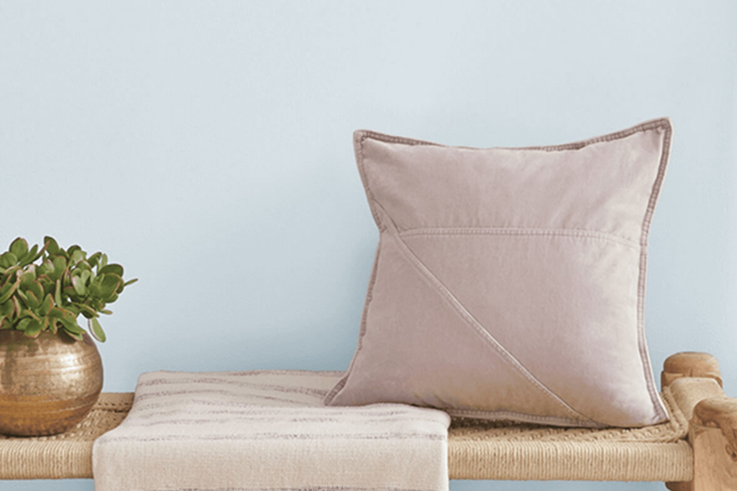
When you’re thinking about refreshing a space with a new coat of paint, color choice is crucial. SW 9682 Silent Ripple from Sherwin Williams offers a unique hue that brings a serene and peaceful atmosphere to any room. This color, part of their 2023 collection, stands out for its subtle blend of blues and grays, making it an excellent choice for creating a calm and inviting environment.
Whether you want to update your living room, bedroom, or even a bathroom, Silent Ripple provides a soft backdrop that complements a wide range of decor styles and personal tastes.
Moreover, the color’s soothing tones can help you achieve a more restful space, perfect for areas where relaxation is key. It pairs beautifully with both light and dark furniture, enhancing wood elements and brightening spaces that lack natural light.
If you need a color that will support various interior transitions through different styles and seasons, Silent Ripple could be the perfect fit for your next painting project.
via sherwin-williams.com
What Color Is Silent Ripple SW 9682 by Sherwin Williams?
Table of Contents
Silent Ripple SW 9682 by Sherwin Williams is a soft, muted teal shade that exudes a serene and soothing vibe. This color has a balance of blue and green tones, making it versatile and refreshing, with just enough depth to add character to any space without being overpowering.
This color is particularly effective in interior styles that prioritize calm and relaxation, such as coastal, Scandinavian, and modern minimalist designs. Its understated elegance also makes it a good match for contemporary and transitional spaces, where it can serve as a gentle pop of color amid neutral tones.
Silent Ripple pairs well with natural materials like light woods, which can help to enhance its airy and fresh feel. Linen and cotton fabrics in white or soft beige tones work beautifully with this color, maintaining a light and breezy aesthetic. Also, incorporating elements such as rattan or wicker can reinforce a laid-back, beachy vibe that complements Silent Ripple’s teal hues.
For a more polished look, pairing Silent Ripple with brushed metals like nickel or chrome can create a crisp, modern finish. Overall, this color works exceptionally well with elements that echo its subtle and peaceful qualities, making it a solid choice for creating a soothing and stylish interior.
housekeepingbay.com
Is Silent Ripple SW 9682 by Sherwin Williams Warm or Cool color?
Silent Ripple SW 9682 by Sherwin Williams is a subtle and serene shade perfect for creating a calm atmosphere in any room. This color is versatile, blending smoothly with various styles and decor elements, making it a great choice for walls in living rooms, bedrooms, or even bathrooms.
Silent Ripple has a soothing effect, bringing a sense of peace to spaces, which is ideal for areas where you want to relax or unwind.
The soft nature of this color helps in making small rooms appear larger, as it doesn’t overwhelm the senses. Silent Ripple works well in natural light, showcasing different shades throughout the day, which adds to its charm and appeal. It pairs beautifully with soft whites, earthy tones, and even vibrant colors, providing flexibility in designing schemes.
This adaptability makes Silent Ripple SW 9682 a wise option for those looking to refresh their home’s look without dramatic changes.
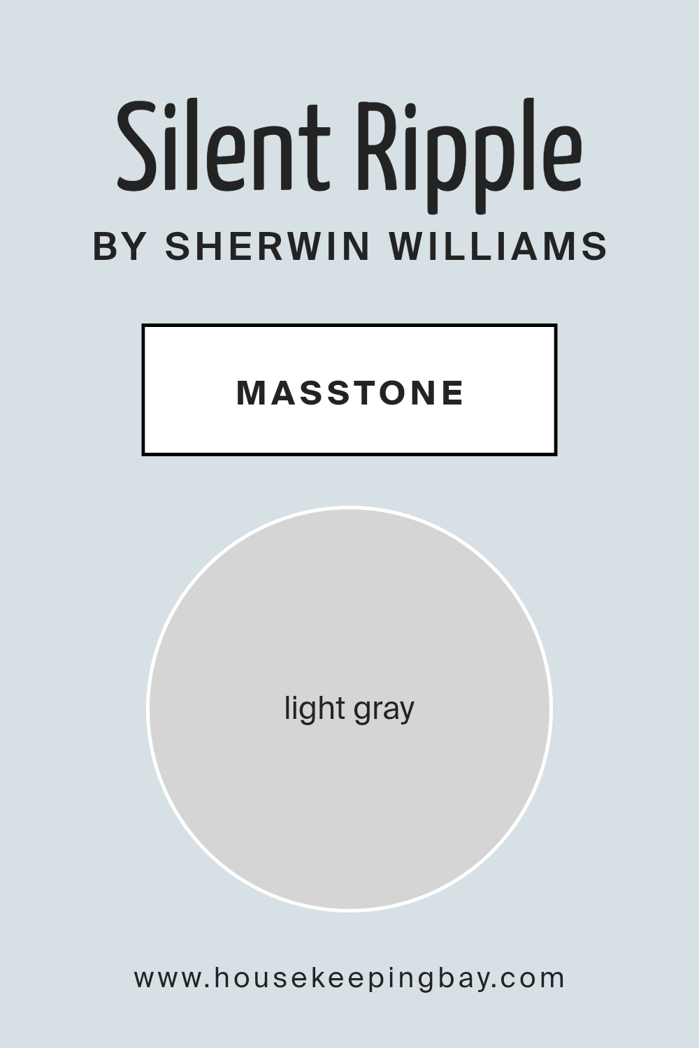
What is the Masstone of the Silent Ripple SW 9682 by Sherwin Williams?
Silent Ripple SW 9682 by Sherwin Williams has a masstone, or main color, of light gray (#D5D5D5). This subtle and soft shade suits a variety of spaces in a home because of its neutral and calm nature. Being a light gray, Silent Ripple SW 9682 creates a clean and fresh look. It works exceptionally well in areas that aim for a modern and minimalist feel.
This color also helps small rooms appear bigger and brighter as it reflects light well. In spaces that have a lot of natural light, the gray can look even lighter and more airy, contributing to a relaxed atmosphere. Conversely, in rooms with less light, it maintains its gentle and soothing presence without making the space feel dark or cramped.
Furthermore, light gray walls serve as a versatile backdrop, allowing for flexibility in decorating. Furnishings and accents in bright or bold colors will pop against Silent Ripple SW 9682, giving homeowners the freedom to personalize their decor easily. It’s also easy to match with other shades, which helps in creating a cohesive look throughout the house.
housekeepingbay.com
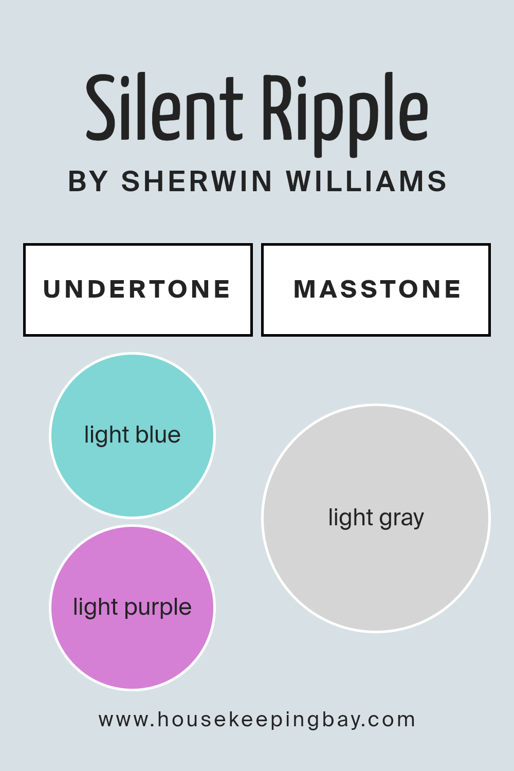
Undertones of Silent Ripple SW 9682 by Sherwin Williams
Silent Ripple SW 9682 by Sherwin Williams is a unique color that holds various undertones, making it a versatile choice for interior walls. The undertones of a paint color are like subtle hints of other colors mixed into the main color. These undertones can shift how we perceive the main color depending on lighting, surrounding elements, and room size.
This specific paint carries undertones of light blue, light purple, pale yellow, lilac, mint, pale pink, and grey. Each of these undertones contributes to the overall appearance and feel of the paint once applied to walls.
For instance, light blue and mint undertones can give a cooler, calming effect, making a room feel more open and airy. In contrast, pale yellow and pale pink can add a subtle warmth, making a space feel more inviting.
Grey and lilac undertones in Silent Ripple make it flexible in various lighting conditions, preventing the color from looking washed out or overly bright. When used in interior walls, these undertones can subtly influence mood and aesthetic.
A room with lots of natural light might highlight the cooler mint and light blue undertones, while artificial lighting could enhance the warmth of lilac and pale pink, creating a cozy atmosphere.
Overall, Silent Ripple SW 9682 offers a complex blend of undertones that can suit many decor styles and preferences, adapting to different environments and lighting situations. This makes it an adaptable choice for many living spaces.
housekeepingbay.com
How Does Lighting Affect Silent Ripple SW 9682 by Sherwin Williams?
Light plays a pivotal role in how colors appear in different environments. The color Silent Ripple SW 9682 by Sherwin Williams offers a subtle example of this. In artificial light, this pale blue-green shade can appear slightly more subdued, taking on a cozier and softer hue. This makes it a suitable choice for creating a calming atmosphere in areas lit by warm bulbs.
In natural light, Silent Ripple SW 9682 reflects light vibrantly, showing off more of its blue undertones, giving a fresh and airy feel. This characteristic makes it perfect for bringing a sense of openness and lightness to any space.
The orientation of a room significantly influences how this color displays. In north-facing rooms, which receive less direct sunlight and can often have a cooler light, Silent Ripple SW 9682 may appear more muted, with its green undertones becoming slightly more pronounced, giving a serene and soothing appearance.
Conversely, in south-facing rooms that enjoy abundant light, this color looks brighter and more vibrant, leaning more into its blue hues, which enhances its ability to make spaces feel lively. This makes it ideally suited for living spaces that benefit from an energetic yet soothing palette.
Rooms facing east receive intense morning light. Here, Silent Ripple SW 9682 will appear brightest in the morning, offering a refreshing start to the day as the color comes alive with a crisp, energizing quality.
West-facing rooms bathe in evening light, which could cast a golden glow on Silent Ripple SW 9682, softening it to a tranquil hue that’s perfect for relaxing in the evenings.
Overall, Silent Ripple SW 9682’s ability to adapt its appearance based on lighting conditions and room orientation makes it a versatile color choice for many interior spaces.
housekeepingbay.com
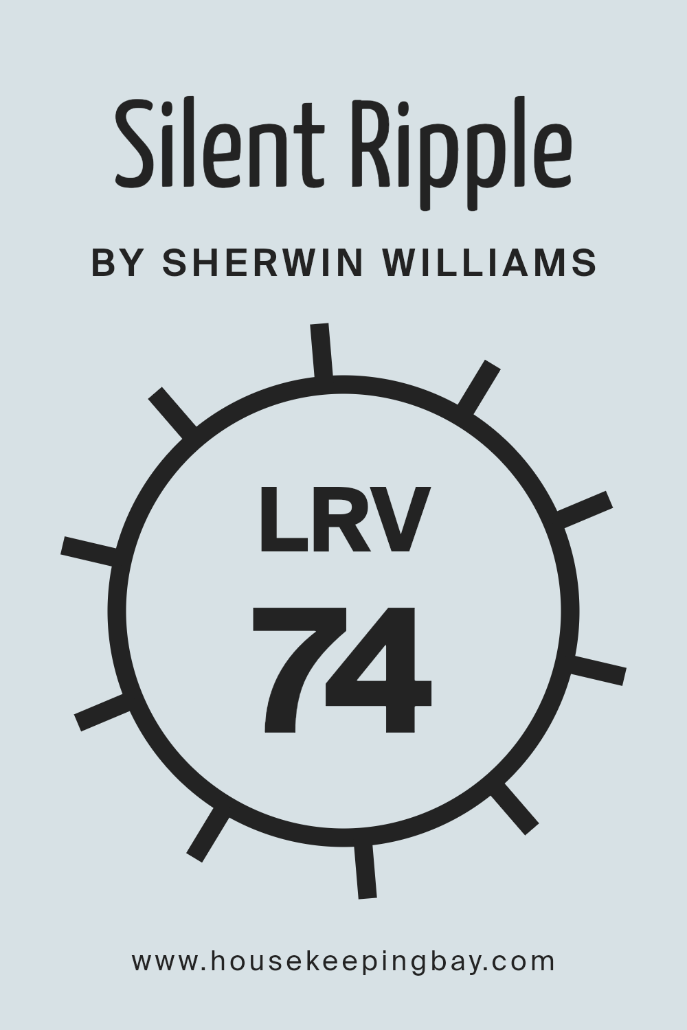
What is the LRV of Silent Ripple SW 9682 by Sherwin Williams?
LRV, or Light Reflectance Value, measures the amount of visible and usable light that a color reflects or absorbs. On a scale from 0 to 100, a score of 0 indicates that a color absorbs all light, appearing very dark, while a score of 100 reflects all light, appearing very bright.
This rating is vital when selecting paint colors because it helps determine how light or dark a color will look in a specific environment. A higher LRV can make a room feel more open and airier, while a lower LRV can make a room feel smaller and cozier.
For the color Silent Ripple SW 9682 by Sherwin Williams, which has an LRV of 73.724, it reflects a substantial amount of light. This high LRV means that the color will appear lighter on your walls, especially in well-lit rooms, and can help in making a space feel larger and more illuminated.
Since Silent Ripple has a fairly high LRV, it is a great choice for spaces without a lot of natural light or for areas you want to feel more spacious and inviting without using stark white.
housekeepingbay.com
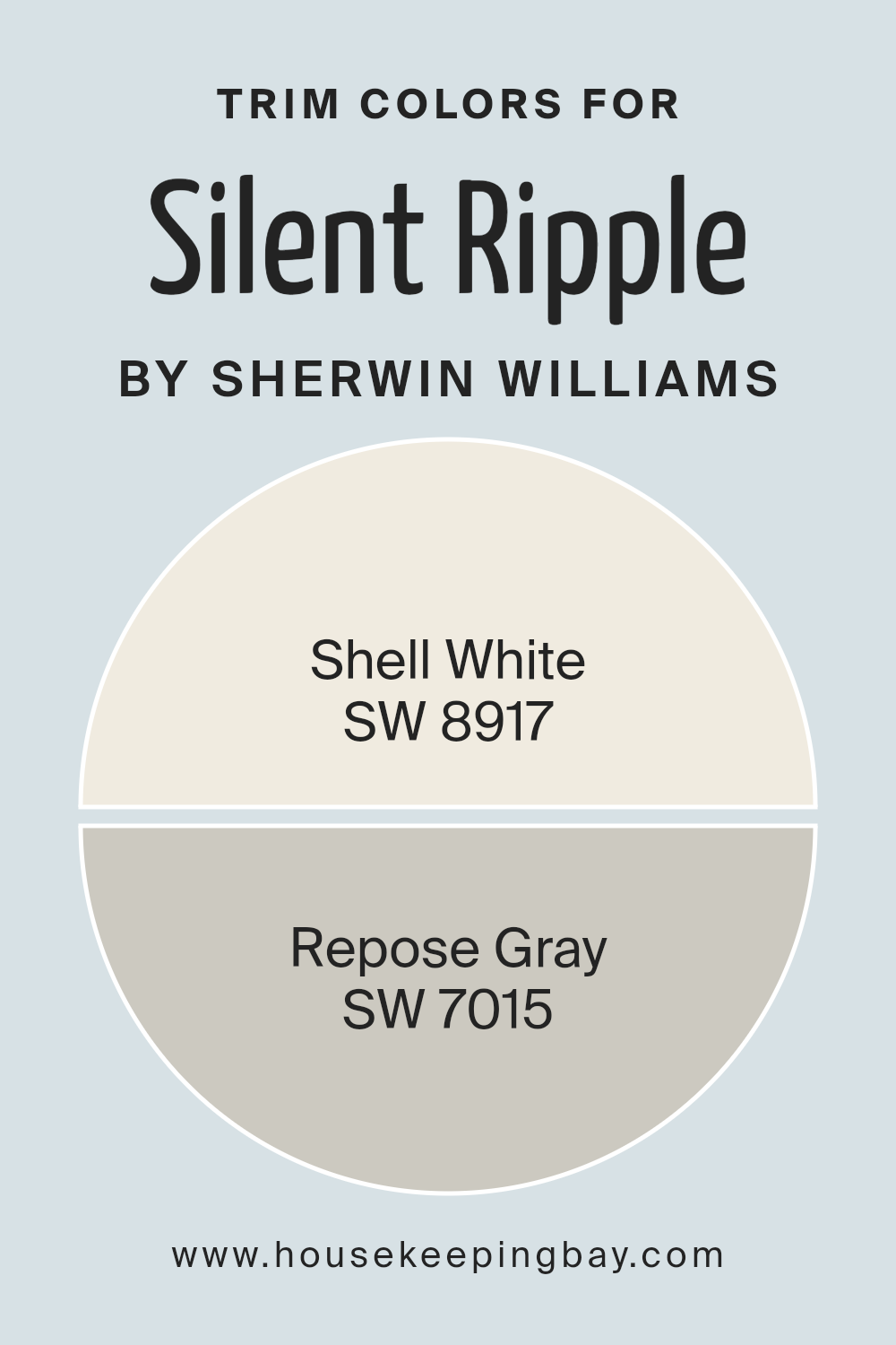
What are the Trim colors of Silent Ripple SW 9682 by Sherwin Williams?
Trim colors, like SW 8917 – Shell White and SW 7015 – Repose Gray by Sherwin Williams, play a crucial role in defining the visual appeal and coherence of a space when used with a primary color such as Silent Ripple SW 9682.
These trim colors serve as a frame for the walls, highlighting architectural details and enhancing the overall color scheme. Choosing the right trim colors can visually expand or define spaces within a home or building, adding contrast and interest or seamlessly blending with the main hue for a more subtle effect.
Shell White is a soft, warm white that offers a gentle contrast, making it a perfect companion for the vibrant yet serene Silent Ripple SW 9682. It has the flexibility to soften edges and create a smooth transition between wall colors and ceiling or flooring.
Repose Gray, on the other hand, is a versatile light gray that adds a touch of sophistication and a modern twist when used as a trim.
Its neutral tone complements the coolness of Silent Ripple SW 9682, ensuring that the main color stands out without overwhelming the senses, thus providing a peaceful and cohesive look.
You can see recommended paint colors below:
- SW 8917 Shell White
- SW 7015 Repose Gray
housekeepingbay.com
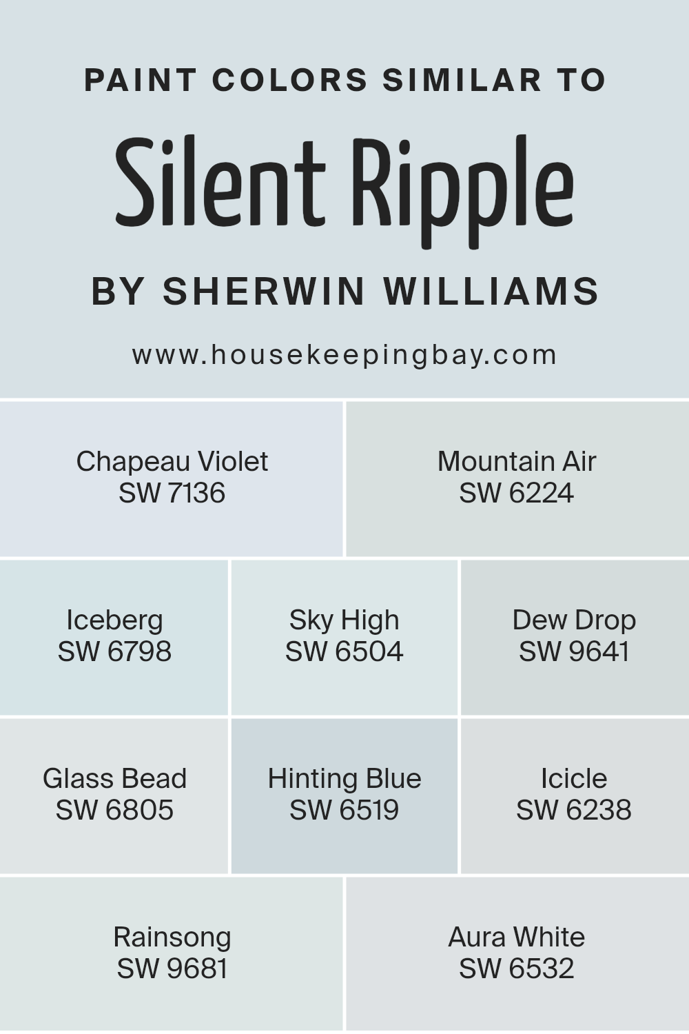
Colors Similar to Silent Ripple SW 9682 by Sherwin Williams
Similar colors, such as those related to Sherwin Williams’ Silent Ripple SW 9682, play a vital role in maintaining harmony and consistency in design. By using shades like Chapeau Violet SW 7136, a deep muted purple, or Mountain Air SW 6224, which offers a fresh subtle gray, designers can create a soothing atmosphere that feels unified and cohesive.
Utilizing colors like Iceberg SW 6798, a very light blue with elements of gray, and Sky High SW 6504, a soft airy blue, helps to achieve a serene and balanced visual experience. Additionally, lighter tones such as Dew Drop SW 9641 integrate well by providing a hint of misty green that complements the overall theme.
Furthering this palette, Glass Bead SW 6805 imparts a pale sky blue, blending effortlessly with neighboring hues like Hinting Blue SW 6519, a soft gray-blue that adds a touch of calm. Icicle SW 6238 offers a cool, faded blue, contributing to the freshness of the palette, while Rainsong SW 9681 presents a delicate whisper of gray, underpinning the other colors.
Finally, Aura White SW 6532 acts as a clean, clear white, essential for creating a bright and open feel, supportive of the other similar shades in the collection.
These colors together foster a space that is visually peaceful and harmoniously aligned, suitable for creating environments where calmness and consistency are desired.
You can see recommended paint colors below:
- SW 7136 Chapeau Violet
- SW 6224 Mountain Air
- SW 6798 Iceberg
- SW 6504 Sky High
- SW 9641 Dew Drop
- SW 6805 Glass Bead
- SW 6519 Hinting Blue
- SW 6238 Icicle
- SW 9681 Rainsong
- SW 6532 Aura White
housekeepingbay.com
How to Use Silent Ripple SW 9682 by Sherwin Williams In Your Home?
Silent Ripple SW 9682 by Sherwin Williams is a gentle blue paint color with hints of gray that can add a peaceful, serene vibe to any room in your home. This color works great for bedrooms or bathrooms where creating a calm, soothing atmosphere is key. Its soft blue shade pairs well with light or dark furnishings, allowing for versatility in decorating styles.
Using Silent Ripple in a small space like a bathroom can make the room feel larger and more open. In a bedroom, it can help in setting a relaxing mood, helping you wind down after a busy day. You might also consider using it in a home office where a calm environment may aid in maintaining focus.
Moreover, Silent Ripple can act as a complementary background for artwork or shelves with decorative items, as it doesn’t overpower other colors. Its neutrality and light tone provide a fresh, clean look, perfect for modern homes looking to achieve a simple yet elegant interior.
Silent Ripple SW 9682 by Sherwin Williams vs Icicle SW 6238 by Sherwin Williams
Silent Ripple SW 9682 by Sherwin Williams is a soothing, olive-green shade with a touch of earthiness that gives it a subtle, natural appeal, perfect for creating a cozy and inviting atmosphere in a room. This color works well in spaces where you want to add a sense of warmth and comfort, such as living rooms or bedrooms. It pairs nicely with natural materials like wood and stone.
In contrast, Icicle SW 6238 by Sherwin Williams is a cool, light blue-gray hue that imparts a clean and airy feel to any space. This color is ideal for achieving a serene and calm environment, making it excellent for bathrooms, kitchens, or small spaces that benefit from a sense of openness and light. Icicle’s crisp tone can help make a room feel more spacious and refreshing.
Both colors offer unique vibes—Silent Ripple adds warmth while Icicle introduces a refreshing coolness, making them suitable for different purposes and tastes in interior design.
You can see recommended paint color below:
- SW 6238 Icicle
housekeepingbay.com
Silent Ripple SW 9682 by Sherwin Williams vs Iceberg SW 6798 by Sherwin Williams
Silent Ripple SW 9682 by Sherwin Williams is a soft, pastel blue that suggests a gentle, calming presence, ideal for creating a peaceful atmosphere in any space. This versatile shade pairs well with both light and dark colors, making it easy to integrate into many design styles.
Contrastingly, Iceberg SW 6798 is a brighter, more vivid blue. This color has a more youthful and energetic vibe, providing a refreshing punch that can liven up a room or serve as an eye-catching accent piece. Its vibrancy makes it perfect for areas that benefit from a bit of extra energy, like bathrooms or kids’ rooms.
Both colors are in the blue family yet serve different moods and purposes. Silent Ripple is more subdued and soothing, suitable for relaxation areas, while Iceberg stands out more and infuses spaces with liveliness and fun. Their differing tones mean they cater to distinct aesthetic preferences and use cases in home decor.
You can see recommended paint color below:
- SW 6798 Iceberg
housekeepingbay.com
Silent Ripple SW 9682 by Sherwin Williams vs Glass Bead SW 6805 by Sherwin Williams
Silent Ripple SW 9682 by Sherwin Williams is a subtle, soft blue shade that gives a calming effect, perfect for creating a serene space. It reflects the beauty of a gentle water body and works well in areas where relaxation is key, like bedrooms or bathrooms. This color pairs nicely with light woods and minimalist decor to maintain a peaceful ambiance.
In contrast, Glass Bead SW 6805 is a cheerful, vibrant green that adds a pop of freshness to any room. It resembles the lively color of spring foliage and is ideal for energizing spaces such as kitchens or playrooms. Glass Bead can be accentuated with bright whites and other vivid colors for a more dynamic environment.
Both colors offer unique vibes – Silent Ripple induces calmness and tranquility, while Glass Bead brings energy and brightness. Depending on the mood you want to set, each color has its merits for transforming a space with its distinctive character.
You can see recommended paint color below:
- SW 6805 Glass Bead
housekeepingbay.com
Silent Ripple SW 9682 by Sherwin Williams vs Dew Drop SW 9641 by Sherwin Williams
Silent Ripple SW 9682 by Sherwin Williams is a subdued hue resembling the calm, gentle waters of a serene lake, offering a sense of peacefulness and softness. This color’s muted teal tones can help create a soothing ambiance, suitable for spaces meant to relax and soothe, like bedrooms or cozy reading areas.
In contrast, Dew Drop SW 9641 presents a lighter, more airy feel reminiscent of early morning mist or the faintest hint of watercolor. It’s a soft pastel green that brings brightness and freshness to any room, which can make smaller spaces appear larger and more open. This color works well in bathrooms, kitchens, and other areas where a clean, fresh look is desirable.
Both colors promote a peaceful atmosphere but vary in intensity and depth. While Silent Ripple provides depth and a touch of moodiness, Dew Drop offers a clear, uplifting quality ideal for creating an inviting and rejuvenating space.
You can see recommended paint color below:
- SW 9641 Dew Drop
housekeepingbay.com
Silent Ripple SW 9682 by Sherwin Williams vs Aura White SW 6532 by Sherwin Williams
Silent Ripple SW 9682 by Sherwin Williams is a soft and soothing blue that offers a subtle, serene backdrop to any room. It carries a cool tone that could make spaces feel fresher and more open, providing a calming effect that’s ideal for bedrooms or bathrooms. This color often pairs well with light woods and minimalist decor for a modern aesthetic.
In contrast, Aura White SW 6532 is a muted teal with a noticeable hint of gray. It’s a versatile option that adds a touch of color while still maintaining a neutral and approachable vibe. Aura White can serve as a distinctive yet subtle base in a space, lending itself well to being accessorized with bolder colors and textures.
Perfect for communal areas like living rooms or kitchens, it encourages a warm and inviting atmosphere.
Both colors showcase different moods and themes. Silent Ripple is primarily about creating a tranquil, cool space, while Aura White provides a neutral foundation with more warmth, blending well in various settings.
You can see recommended paint color below:
- SW 6532 Aura White
housekeepingbay.com
Silent Ripple SW 9682 by Sherwin Williams vs Mountain Air SW 6224 by Sherwin Williams
Silent Ripple SW 9682 and Mountain Air SW 6224 by Sherwin Williams are both gentle and subtle colors, yet they carry distinct vibes. Silent Ripple is a soft, pale blue with a hint of gray, creating a serene and calming atmosphere in any room. It’s a color that pairs well with minimalist or modern decor, giving a clean and open feel to spaces.
Mountain Air SW 6224 is lighter, leaning towards a fresh, airy blue with just a touch of gray. This color is excellent for brightening up a space and instilling a peaceful, refreshing mood. It’s particularly effective in areas that aim for a relaxed ambiance, like bedrooms or bathrooms.
While both colors promote calmness and are versatile, Silent Ripple offers a cooler, more muted tone, which might be preferable in a contemporary setting.
Mountain Air, being slightly brighter, is ideal for bringing a sense of light and space into smaller or dimly lit rooms.
The choice between the two would depend on the desired effect and room usage.
You can see recommended paint color below:
- SW 6224 Mountain Air
housekeepingbay.com
Silent Ripple SW 9682 by Sherwin Williams vs Chapeau Violet SW 7136 by Sherwin Williams
Silent Ripple SW 9682 by Sherwin Williams is a soft, muted green color with a serene vibe, perfect for creating a calming atmosphere in any space. It reflects nature and can bring a sense of freshness and peace to a room, making it ideal for bedrooms and bathrooms where relaxation is key.
In contrast, Chapeau Violet SW 7136 is a deep, rich purple that gives off a feeling of luxury and depth. This color is excellent for adding a touch of elegance and sophistication to an area. It works well in living spaces or dining rooms where a bit of drama and intensity is desired.
Both colors offer unique aesthetic qualities but serve different purposes based on the mood and tone you want to set in a space. Silent Ripple can lighten up a room, while Chapeau Violet can make it feel more enclosed and cozy.
You can see recommended paint color below:
- SW 7136 Chapeau Violet
housekeepingbay.com
Silent Ripple SW 9682 by Sherwin Williams vs Hinting Blue SW 6519 by Sherwin Williams
Silent Ripple SW 9682 by Sherwin Williams is a soft, muted gray with a hint of blue, creating a subtle, soothing atmosphere. Its gentle hue is ideal for spaces where calmness is key, such as bedrooms or quiet work areas. This color has a flexibility that allows it to blend smoothly with various decor styles and other paint colors, making it a versatile choice for any home.
In contrast, Hinting Blue SW 6519 is a clearer, brighter shade of blue with a refreshing vibe. It’s slightly more vibrant than Silent Ripple, which brings a more energetic feel to a room. Ideal for bathrooms or kitchens, Hinting Blue adds a splash of cheerfulness without overwhelming the senses.
This color pairs well with crisp whites and soft neutrals for a clean, inviting look.
Together, these two colors complement each other; Silent Ripple offering subdued tones and Hinting Blue bringing vitality to a space.
You can see recommended paint color below:
- SW 6519 Hinting Blue
housekeepingbay.com
Silent Ripple SW 9682 by Sherwin Williams vs Sky High SW 6504 by Sherwin Williams
Silent Ripple SW 9682 by Sherwin Williams is a soft, muted green with a subtle gray undertone, giving it a serene and grounding presence. This color is versatile, working well in spaces meant for relaxation such as bedrooms or living areas, where a calm atmosphere is desired. Its understated quality allows it to blend smoothly with various decor styles, from modern to traditional.
Sky High SW 6504, in contrast, is a vibrant and cheerful light blue. It has an airy feel, perfect for brightening up a room or creating a refreshing vibe. This shade works particularly well in small spaces or bathrooms, where it can make the area seem more expansive and welcoming.
Its brighter tone can also stimulate a feeling of freshness and energy, ideal for spaces used during the day.
Both colors offer unique moods and can be chosen based on the ambience you want to achieve in your space.
You can see recommended paint color below:
- SW 6504 Sky High
housekeepingbay.com
Silent Ripple SW 9682 by Sherwin Williams vs Rainsong SW 9681 by Sherwin Williams
Silent Ripple SW 9682 by Sherwin Williams is a gentle blue with gray undertones, giving it a soft and muted appearance. It’s ideal for creating a serene and peaceful atmosphere in any room. This color tends to blend well with natural light, providing a calming effect.
Rainsong SW 9681, also by Sherwin Williams, is a shade lighter than Silent Ripple. It leans more towards a pure gray, although it still retains a hint of blue. This color is perfect for those who prefer a cooler tone, promoting a clean and crisp look in spaces.
Both colors are soothing and can work beautifully in a modern or traditional setting. However, Silent Ripple, with its slightly deeper hue, might be better suited for larger rooms or walls that need a bit of warmth. Rainsong, with its lighter and airier feel, is excellent for smaller rooms or spaces that aim to feel more open and bright. Together, these colors complement each other well and can be used to create a refined aesthetic in any home.
You can see recommended paint color below:
- SW 9681 Rainsong
housekeepingbay.com
Conclusion
Sherwin Williams’ SW 9682 Silent Ripple is a prime choice for anyone looking to add a subtle yet impactful touch of color to their space. The gentle gray tone blends seamlessly with various decor styles, offering versatility and a timeless quality that homeowners will appreciate.
Its ability to evoke calmness and create a soothing atmosphere makes it perfect for bedrooms and living areas where relaxation is key.
Additionally, the durability and quality of Sherwin Williams paints mean that not only is the color aesthetically pleasing, but it’s also practical for both high-traffic areas and quieter corners of the home.
Whether used as a primary hue or an accent, Silent Ripple can harmonize with bright colors or soft neutrals, providing a cohesive look throughout any interior.
For those updating their home or perhaps giving a room a fresh new look, SW 9682 Silent Ripple is a wise pick. It allows for creative freedom while ensuring the finished product is both beautiful and enduring.
If you value a restful, inviting environment, this shade is thoroughly recommended.

housekeepingbay.com
Ever wished paint sampling was as easy as sticking a sticker? Guess what? Now it is! Discover Samplize's unique Peel & Stick samples. Get started now and say goodbye to the old messy way!
Get paint samples


