Going to the Chapel 1527 Paint Color by Benjamin Moore
In the vast palette of Benjamin Moore colors, BM Going to the Chapel 1527 emerges as a timeless and sophisticated choice for interior spaces.
In the vast palette of Benjamin Moore colors, BM Going to the Chapel 1527 emerges as a timeless and sophisticated choice for interior spaces. This soft and muted hue holds a unique charm that transcends trends, offering a versatile canvas for various design aesthetics.
This article delves into the intricacies of Going to the Chapel 1527, exploring its specific characteristics, warmth or coolness, undertones, and a curated palette of coordinating colors that can elevate the ambiance of any home.
via tarkett
What Color Is BM Going to the Chapel 1527?
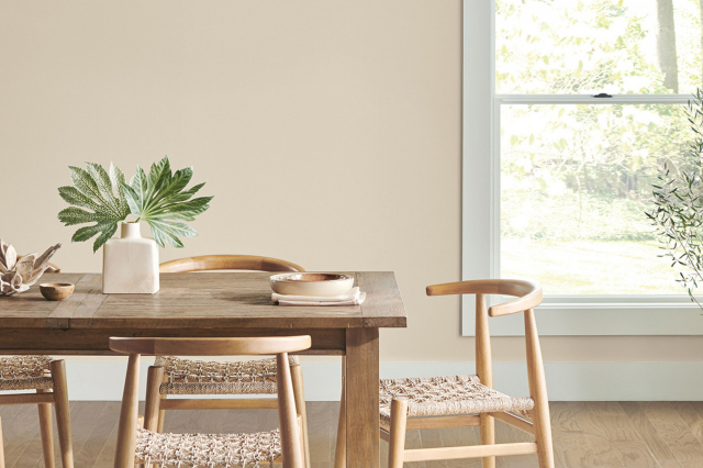
BM Going to the Chapel 1527 is a delicate and serene color that sits elegantly between taupe and gray. Its muted, neutral nature allows it to effortlessly blend into a variety of interior styles, making it a staple in both traditional and contemporary settings. This sophisticated color brings a sense of calm and sophistication to any room it graces, acting as a perfect backdrop for both bold and understated design elements.
This versatile hue works harmoniously with materials such as light-colored woods, brushed metals, and natural textiles. The muted elegance of Going to the Chapel 1527 complements the warmth of wooden surfaces, while its neutral undertones provide a clean and modern aesthetic when paired with metallic finishes. Textures like linen, wool, and velvet enhance the tactile richness of spaces adorned with this sophisticated color.
housekeepingbay.com
Table of Contents
Is It a Warm or Cool Color?
BM Going to the Chapel 1527 leans towards the warmer spectrum of neutrals. This subtle warmth imparts a comforting and inviting feel to the color, making it an excellent choice for creating cozy and welcoming interiors. The warmth of Going to the Chapel 1527 adds a touch of sophistication without being too overpowering. In homes, this warmth fosters a sense of comfort and tranquility, creating a space where inhabitants feel instantly at ease.
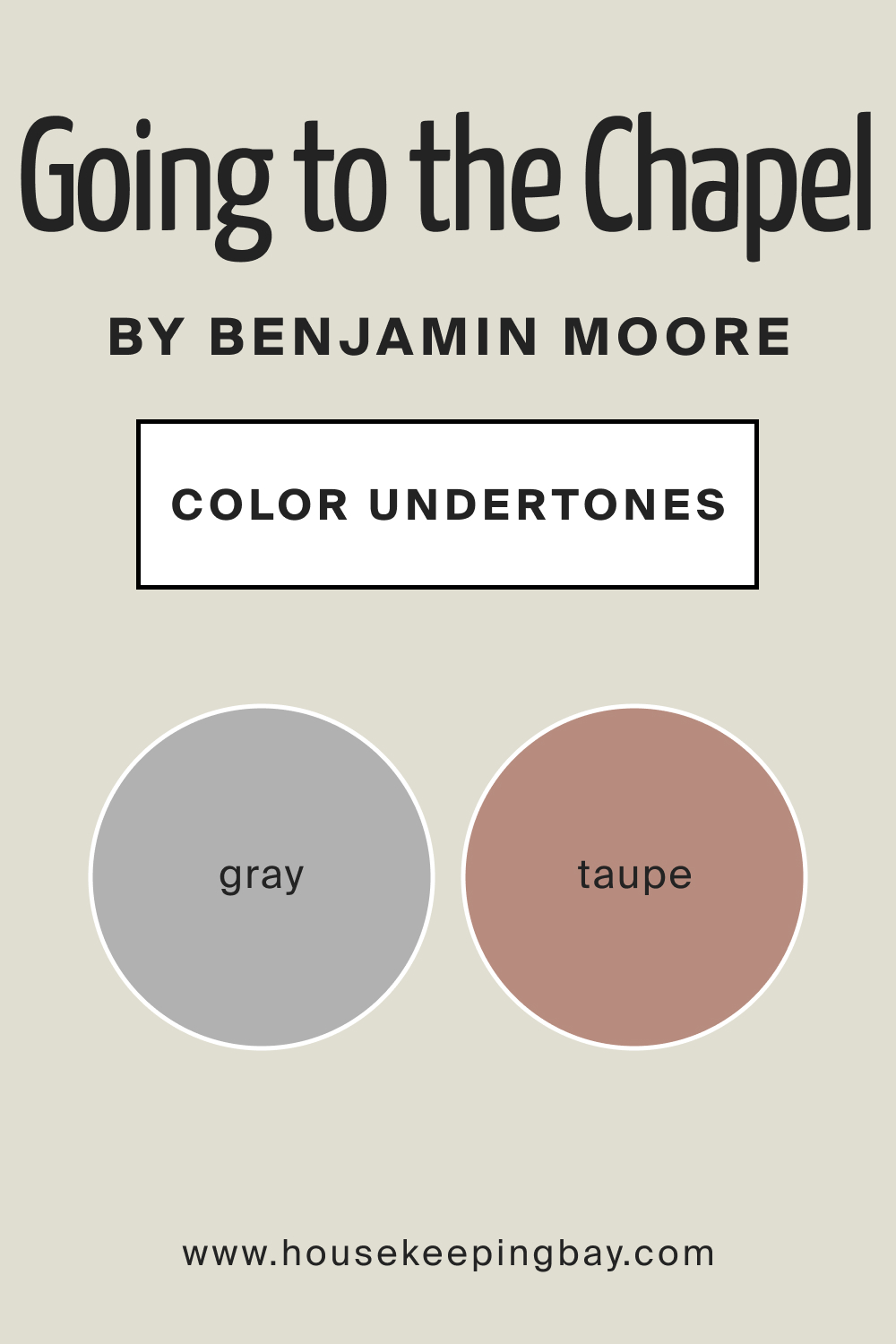
Undertones of BM Going to the Chapel 1527
The undertones of Going to the Chapel 1527 are a delicate dance between taupe and gray. These undertones play a crucial role in shaping the overall perception of the color. In natural light, the taupe undertones may become more pronounced, imparting a sense of warmth and coziness. Artificial lighting, on the other hand, might highlight the gray undertones, creating a more subdued and sophisticated atmosphere.
Understanding these undertones is key to achieving the desired ambiance in a space adorned with Going to the Chapel 1527.
housekeepingbay.com
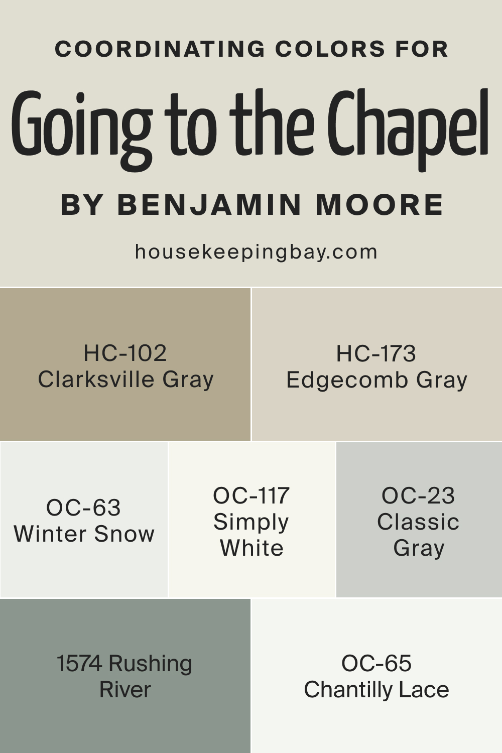
Coordinating Colors of BM Going to the Chapel 1527
Coordinating colors play a vital role in creating a cohesive and visually pleasing color palette for interior spaces. Going to the Chapel 1527 pairs seamlessly with OC-117 Simply White, a classic and clean white that enhances the muted elegance of the main color. Chantilly Lace OC-65 offers a warm white option, adding a touch of warmth to the palette. BM 1574 Rushing River introduces a subtle grayish-blue accent, creating depth and interest. HC-102 Clarksville Gray, with its warm gray undertones, complements the main color and adds a sophisticated touch.
Additional Coordinating Colors
- OC-23 Classic Gray : A versatile and timeless gray with warm undertones, perfect for creating a balanced and elegant color scheme.
- HC-173 Edgecomb Gray : A soft and neutral greige that harmonizes effortlessly with Going to the Chapel 1527, creating a cohesive and sophisticated look.
- OC-63 Winterwood : A cool gray with subtle green undertones, providing a refreshing and modern contrast to the warm tones of the main color.
housekeepingbay.com
How Does Lighting Affect BM Going to the Chapel 1527?
Lighting has a profound impact on how we perceive colors, and BM Going to the Chapel 1527 is no exception. In natural light, this color takes on different nuances depending on the orientation of the room. In north-facing rooms, the color appears slightly cooler, enhancing its sophisticated undertones. South-facing rooms bathe Going to the Chapel 1527 in warm sunlight, emphasizing its warmth and creating a welcoming atmosphere.
East-facing rooms benefit from soft morning light, revealing the color’s subtleties, while west-facing rooms enjoy a deeper, more dramatic effect in the afternoon glow. In artificial light, the color maintains its elegance, adapting to the quality and intensity of the lighting source. The subtle taupe and gray undertones shine through, creating a calming and timeless ambiance.
housekeepingbay.com
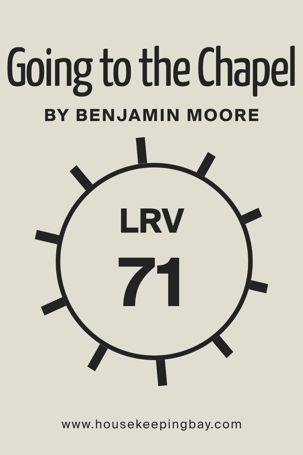
LRV of BM Going to the Chapel 1527: Understanding Light Reflectance Value (LRV)
Light Reflectance Value (LRV) is a numerical scale that measures the amount of light a color reflects. With an LRV of 71, Going to the Chapel 1527 falls into the category of light colors that reflect a significant amount of light. High LRV values indicate a brighter appearance on walls, contributing to an airy and open feeling. This makes Going to the Chapel 1527 an excellent choice for spaces where maximizing light is crucial, such as small rooms or those with limited natural light.
The high LRV ensures that this color maintains its subtle elegance while brightening and visually expanding the space.
housekeepingbay.com
What is LRV? Read It Before You Choose Your Ideal Paint Color
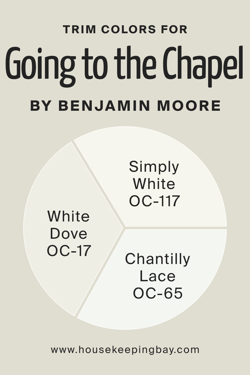
Trim Colors of BM Going to the Chapel 1527
Trim colors are essential for framing and enhancing the main color. For Going to the Chapel 1527, consider BM Simply White OC-117, Chantilly Lace OC-65, and White Dove OC-17. Simply White offers a clean and classic look, Chantilly Lace provides a warm white option, and White Dove adds a touch of warmth and depth. These trim colors work cohesively to create a polished and harmonious aesthetic, enhancing the overall elegance of Going to the Chapel 1527.
housekeepingbay.com
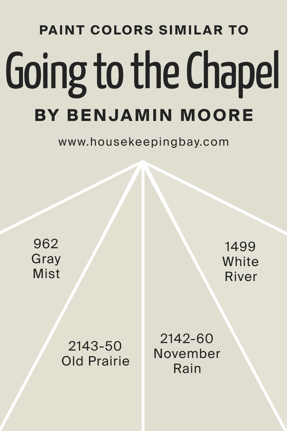
Colors Similar to BM Going to the Chapel 1527
Knowing similar colors expands the design palette. BM November Rain 2142-60, Old Prairie 2143-50, Gray Mist 962, and White River 1499 share the muted sophistication of Going to the Chapel 1527. November Rain introduces a hint of green, Old Prairie offers warmth, Gray Mist brings a neutral touch, and White River adds a crisp freshness.
housekeepingbay.com
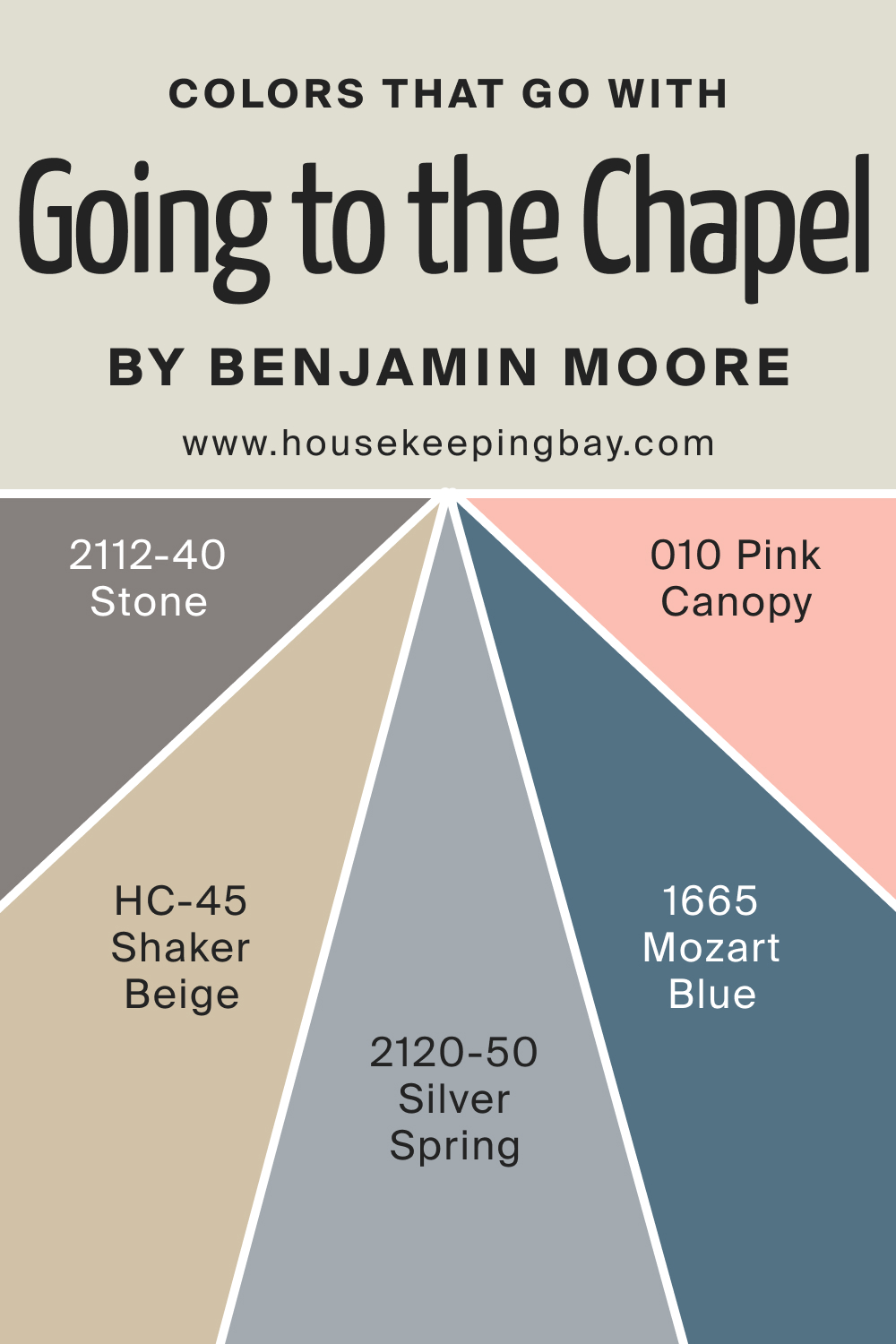
Colors That Go With BM Going to the Chapel 1527
Harmonizing colors in a room is crucial for a cohesive design. BM Stone 2112-40, Silver Spring 2120-50, Mozart Blue 1665, Shaker Beige HC-45, and Pink Canopy 010 complement Going to the Chapel 1527 beautifully. Stone adds depth, Silver Spring brings a touch of coolness, Mozart Blue introduces a muted contrast, Shaker Beige offers warmth, and Pink Canopy provides a subtle pop of color. Together, these colors create a balanced and visually pleasing environment, enhancing the overall aesthetic of a space adorned with Going to the Chapel 1527.
housekeepingbay.com
How to Use BM Going to the Chapel 1527 In Your Home?
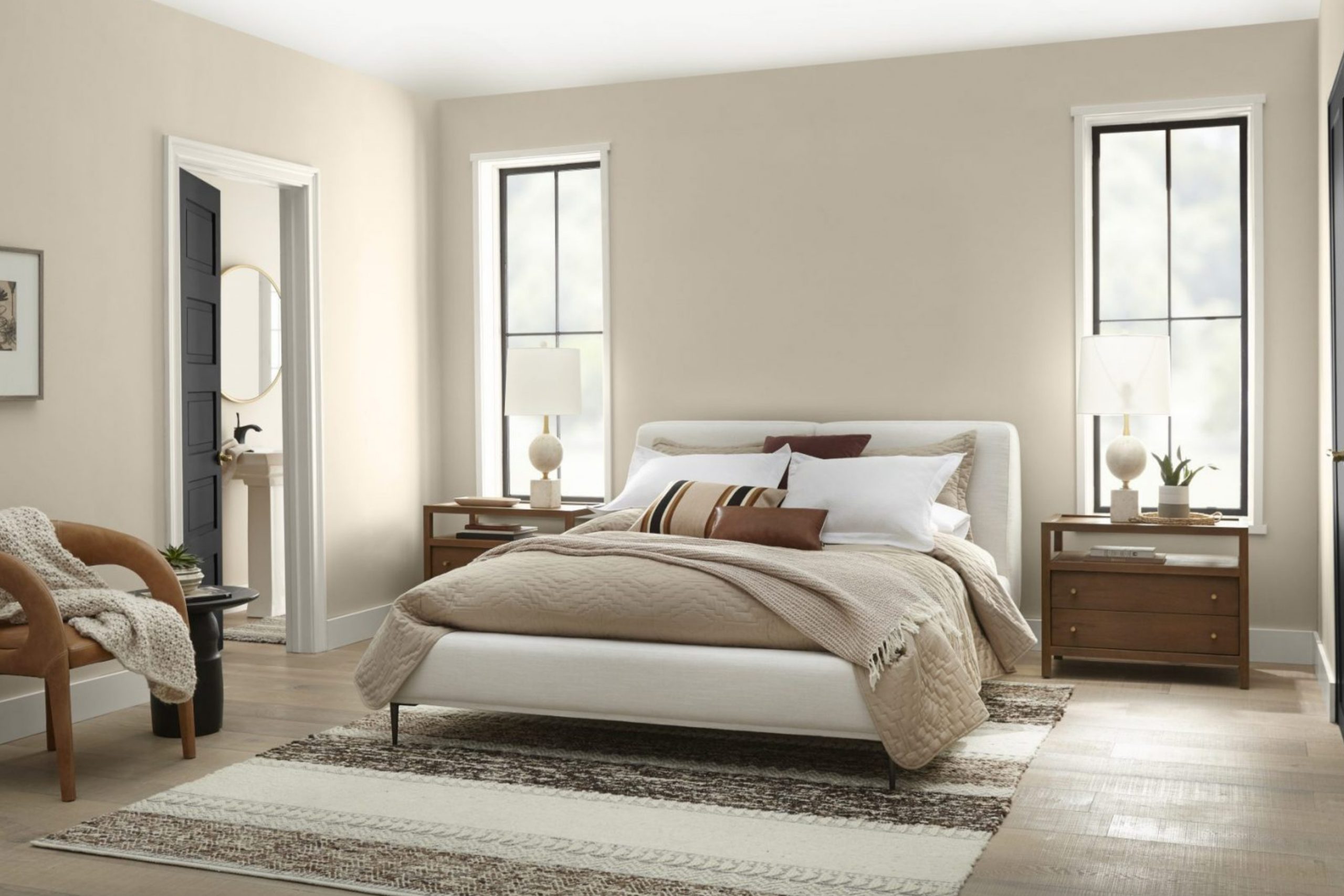
BM Going to the Chapel 1527, with its sophisticated and neutral charm, is a versatile choice for various rooms and design styles. It thrives in bedrooms, bathrooms, living rooms, and kitchens, seamlessly adapting to diverse interior aesthetics. This soft taupe-gray hue complements both traditional and contemporary design, making it a timeless and elegant option for creating serene and welcoming spaces.
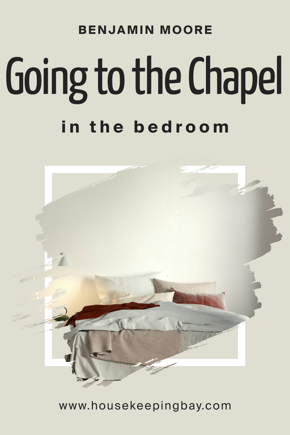
BM Going to the Chapel 1527 In the Bedroom
Transform your bedroom into a serene retreat by incorporating BM Going to the Chapel 1527. The muted elegance of this color fosters a calming atmosphere, perfect for promoting relaxation and tranquility. Pair it with soft textiles, such as neutral bedding and plush rugs, to create a cozy haven.
housekeepingbay.com
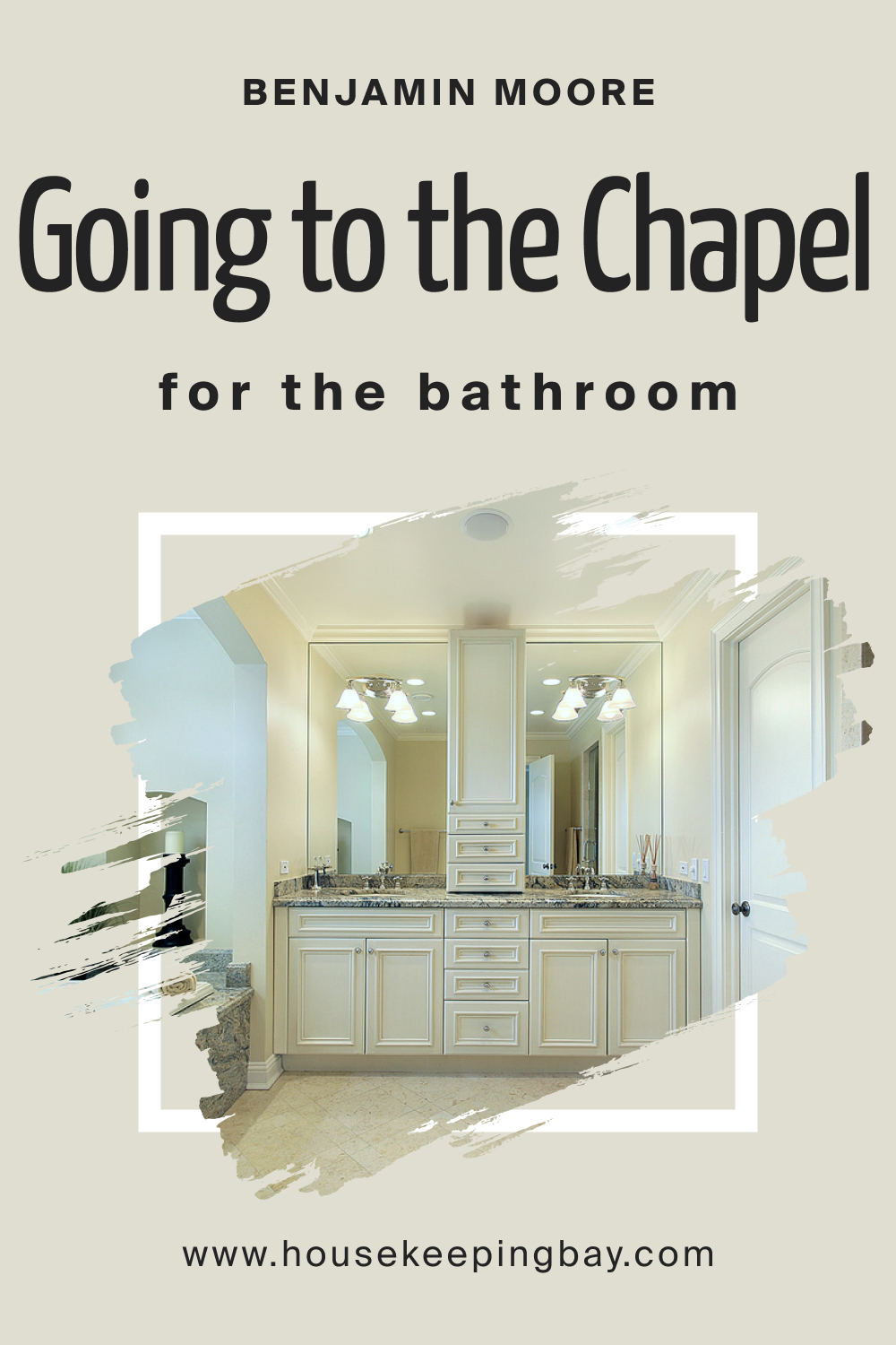
BM Going to the Chapel 1527 In the Bathroom
In the bathroom, Going to the Chapel 1527 exudes sophistication and warmth. Its neutral tones create a spa-like ambiance, enhancing the sense of relaxation. Consider using this color on walls or as an accent to complement crisp white fixtures and natural materials for a timeless and refreshing look.
housekeepingbay.com
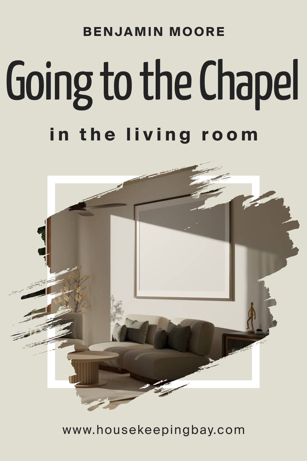
BM Going to the Chapel 1527 In the Living Room
Elevate your living room’s sophistication by embracing BM Going to the Chapel 1527. This color provides a neutral backdrop that allows for versatile furniture and decor choices. Pair it with plush fabrics and metallic accents for a balanced and inviting living space.
housekeepingbay.com
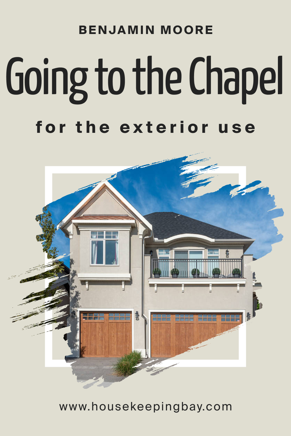
BM Going to the Chapel 1527 For an Exterior
Extend the elegance of Going to the Chapel 1527 to your home’s exterior. Whether used as the main color or as an accent, it creates a timeless and welcoming facade. Pair it with crisp white trim and natural materials for a classic and sophisticated curb appeal.
housekeepingbay.com
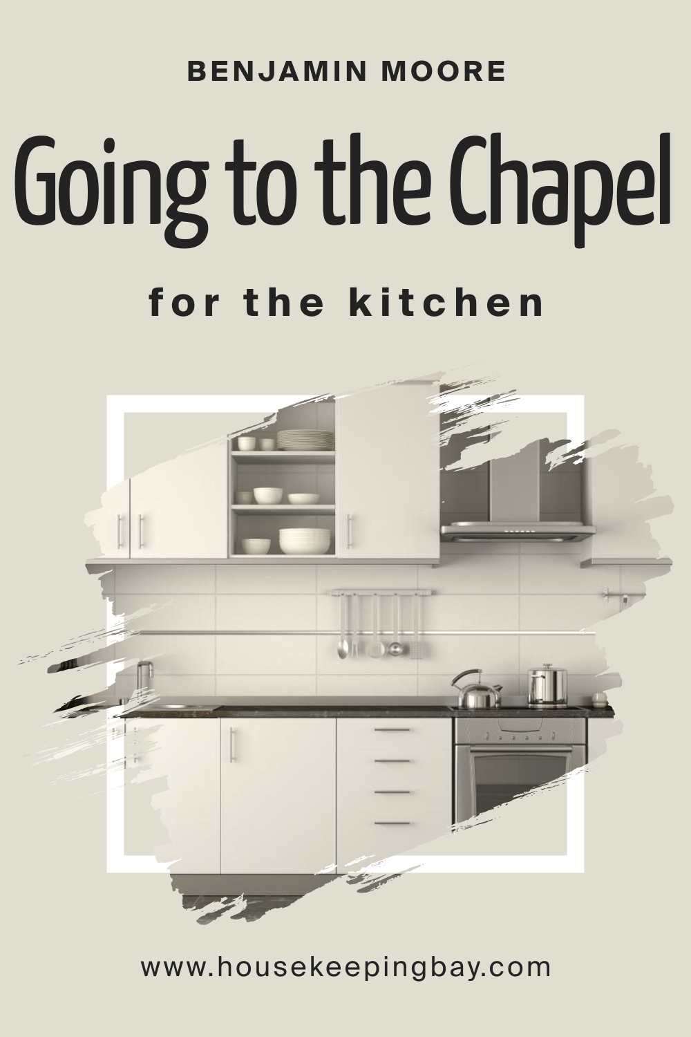
BM Going to the Chapel 1527 In the Kitchen
In the kitchen, Going to the Chapel 1527 introduces a touch of sophistication. Use it on walls or cabinets to create a warm and inviting atmosphere. This neutral hue pairs well with a variety of countertop materials, from granite to marble, offering versatility in design.
housekeepingbay.com
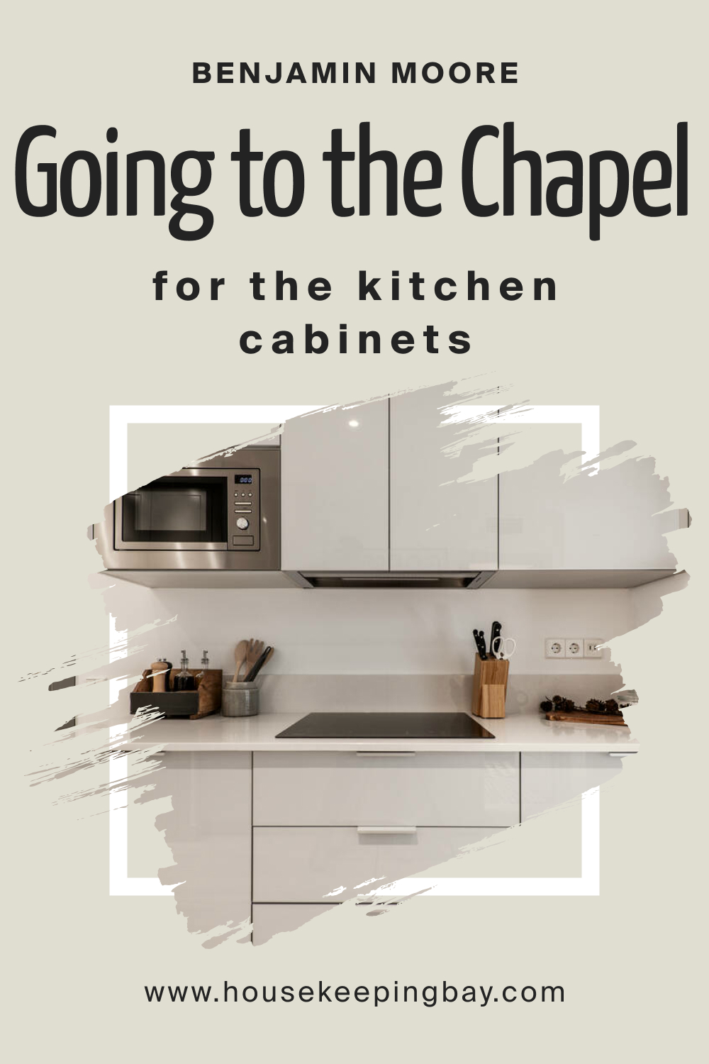
BM Going to the Chapel 1527 On Kitchen Cabinets
Transform your kitchen cabinets with BM Going to the Chapel 1527 for a refined and elegant look. The soft taupe-gray tone adds depth and sophistication, creating a timeless and inviting kitchen. Pair it with light-colored countertops and stainless steel appliances for a harmonious and balanced aesthetic.
housekeepingbay.com
Comparing BM Going to the Chapel 1527 With Other Colors
Understanding the dynamics between different colors is paramount in achieving a harmonious and visually appealing design. Comparisons offer insights into the nuances of each shade, allowing individuals to make informed decisions about their interior color palettes. BM Going to the Chapel 1527, with its muted elegance, becomes a central point of analysis in juxtaposition with other colors.
This exploration not only assists in choosing the right color for specific spaces but also contributes to creating a cohesive and balanced aesthetic throughout the home.
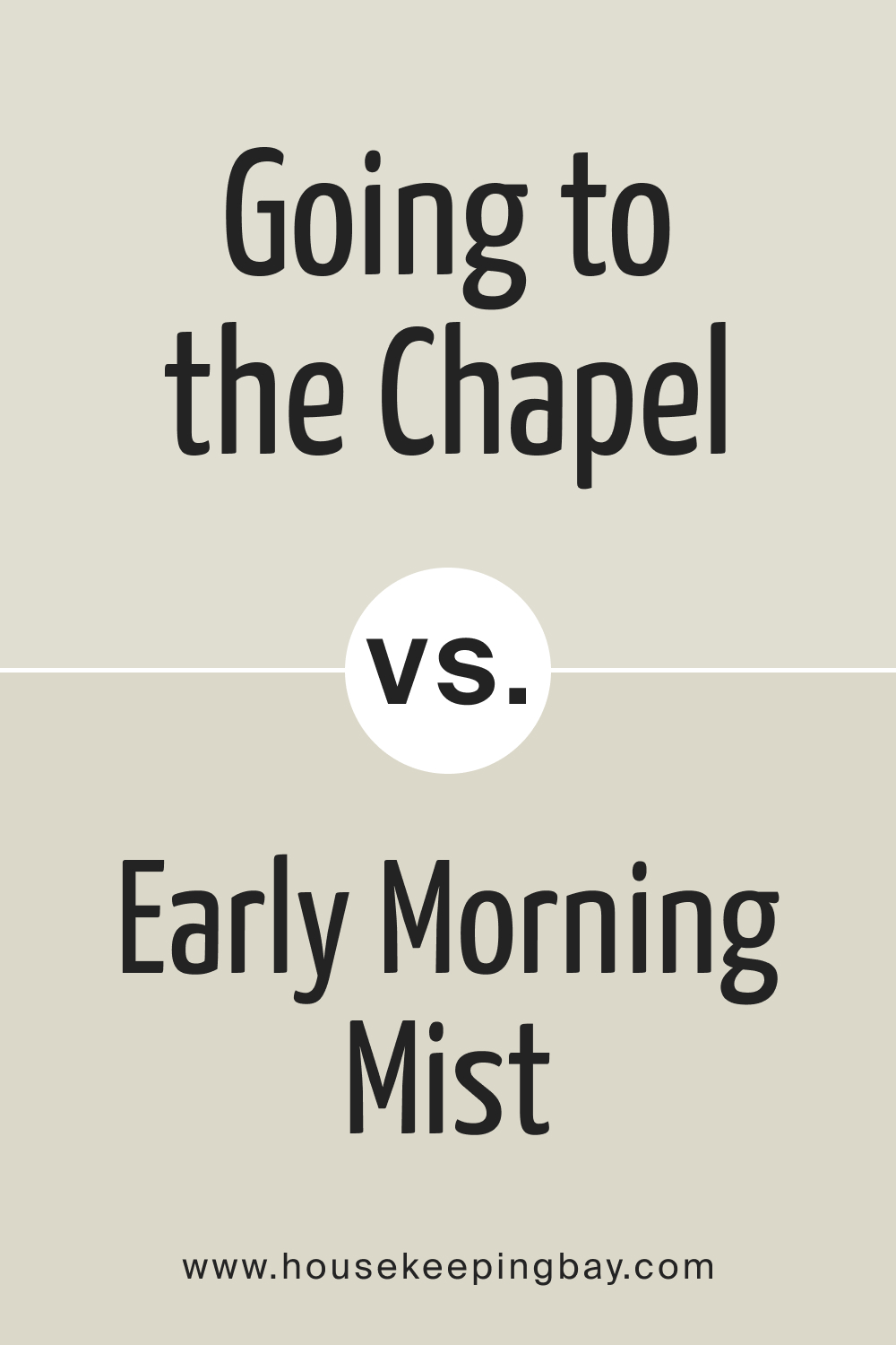
BM Going to the Chapel 1527 vs. BM 1528 Early Morning Mist
While both colors share a soft and muted quality, Going to the Chapel 1527 leans more towards taupe, providing a warmer and cozier atmosphere. In contrast, Early Morning Mist tends towards a cooler gray, offering a crisper and more contemporary feel. Choosing between them depends on the desired level of warmth and the overall ambiance intended for the space.
housekeepingbay.com
BM Going to the Chapel 1527 vs. BM 1529 Stingray
Stingray and Going to the Chapel 1527 both embody muted sophistication but with subtle distinctions. While Going to the Chapel leans towards taupe-gray, Stingray introduces deeper green undertones. Going to the Chapel 1527 imparts a timeless elegance, making it versatile for various design styles, while Stingray adds a touch of nature, ideal for those seeking a slightly bolder and earthier presence.
housekeepingbay.com
BM Going to the Chapel 1527 vs. BM 1530 Senora Gray
Senora Gray , with its cooler undertones, offers a more pronounced gray appearance compared to the subtlety of Going to the Chapel 1527. Going to the Chapel’s warmer taupe-gray undertones contribute to a cozier ambiance, making it an excellent choice for spaces where warmth is desired. Senora Gray, on the other hand, creates a more modern and sleek aesthetic, especially in rooms with ample natural light.
housekeepingbay.com
BM Going to the Chapel 1527 vs. BM 1531 Victoria Garden
Victoria Garden introduces a delicate green undertone compared to Gоing to the Chapel 1527, enhancing its muted sophistication. While Going to the Chapel 1527 is versatile and timeless, Victoria Garden brings a subtle touch of nature. Choosing between them depends on the desired level of greenery and the overall design theme of the space.
housekeepingbay.com
BM Going to the Chapel 1527 vs. BM 1532 Majestic Sage
Majestic Sage , with its deeper green-gray tones, creates a more pronounced and rich appearance compared to the subtlety of Going to the Chapel 1527. Going to the Chapel maintains a more versatile and adaptable character, suitable for a variety of design styles, while Majestic Sage demands attention, making it an ideal choice for those looking to make a bolder statement with a darker, more intense hue.
housekeepingbay.com
BM Going to the Chapel 1527 vs. BM 1533 Bayleaf
Bayleaf introduces warmer undertones compared to Going to the Chapel 1527, creating a richer and more earthy feel. While Going to the Chapel maintains its muted elegance, Bayleaf adds a touch of warmth, making it an excellent choice for spaces seeking a cozier atmosphere. The choice between them depends on the desired level of warmth and the overall color palette of the room.
housekeepingbay.com
Conclusion
Comparing BM Going to the Chapel 1527 with other colors allows for a nuanced understanding of its unique qualities and characteristics. While each color possesses its own charm, Going to the Chapel 1527 stands out for its timeless elegance and versatility. Whether paired with cooler grays, earthy greens, or deeper tones, Going to the Chapel 1527 adapts gracefully, contributing to a cohesive and refined aesthetic in any interior space.
The art of color comparison serves as a guide, enabling individuals to curate a harmonious palette that resonates with their design vision and preferences.
housekeepingbay.com
Ever wished paint sampling was as easy as sticking a sticker? Guess what? Now it is! Discover Samplize's unique Peel & Stick samples. Get started now and say goodbye to the old messy way!
Get paint samples


Frequently Asked Questions
⭐Can BM Going to the Chapel 1527 be used in a small room?
Absolutely! The neutral and muted nature of Going to the Chapel 1527 makes it an excellent choice for small rooms. It adds a sense of depth without overpowering the space, creating a cozy and sophisticated ambiance
⭐Does Going to the Chapel 1527 work well with dark furniture?
Yes, it does! Going to the Chapel 1527's taupe-gray undertones make it versatile and adaptable. It pairs beautifully with dark furniture, adding a touch of elegance and creating a harmonious look.
⭐Can I use Going to the Chapel 1527 in a modern-style kitchen?
Certainly! Going to the Chapel 1527 complements modern kitchens with its muted and sophisticated tones. It acts as a versatile backdrop, allowing for various design elements and finishes.
⭐What accent colors go well with Going to the Chapel 1527?
The neutral nature of Going to the Chapel 1527 allows for a wide range of accent colors. Consider muted greens, blues, or even warmer earthy tones for a balanced and cohesive look.
⭐Is Going to the Chapel 1527 suitable for exterior use?
Absolutely! Going to the Chapel 1527 can be a stunning choice for exteriors, providing a timeless and welcoming appearance. Pair it with crisp white trim for a classic curb appeal.