Deep Sea Dive SW 7618 by Sherwin Williams
Refresh Your Space with a Splash of Rich Teal
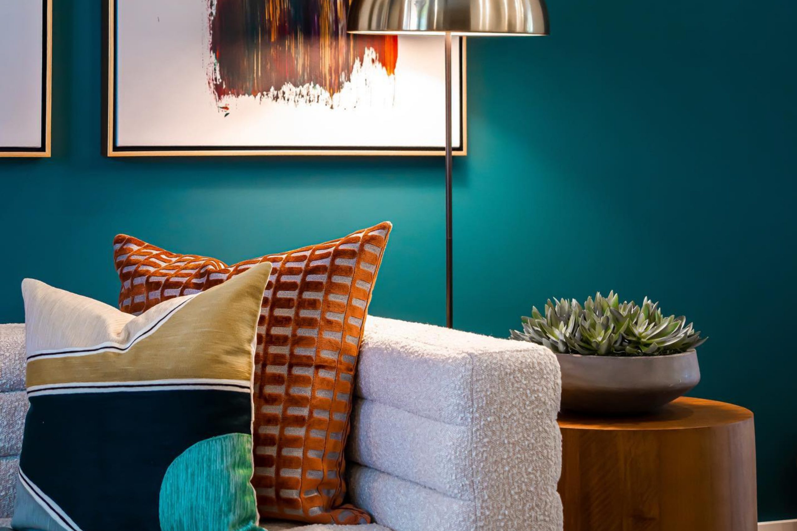
Just think about wrapping your walls in the rich, soothing hue of the ocean’s depths. That’s what you get with Sherwin Williams’ SW 7618 Deep Sea Dive. This color brings a sense of calm and sophistication to any room. With its deep blue-green tone, it offers a feeling of elegance and carries an air of mystery and tranquility.
Bring in an element of nature with Deep Sea Dive. Its bold yet calming shade pairs well with a variety of styles, from modern minimalism to classic elegance. You can complement it with lighter shades for contrast or incorporate metallic accents to enhance its beauty.
Deep Sea Dive isn’t just a color—it’s a mood. It offers more than just visual appeal; it creates an atmosphere. Whether in a bedroom for relaxation or a living area for a cozy feel, it has the power to change the space’s energy. Its ability to fit into both large and small spaces makes it a favorite for those wanting to make a statement with color without overwhelming the room.
Take a moment to consider how Deep Sea Dive can transform a simple room into a peaceful retreat. Whether you’re repainting a single wall or an entire room, it offers a change that pleases the eye and calms the mind.
via interiorsbycolor.com
What Color Is Deep Sea Dive SW 7618 by Sherwin Williams?
Table of Contents
Deep Sea Dive SW 7618 by Sherwin Williams is a rich, deep blue-green color. This shade exudes a sense of calm and depth, making it perfect for creating a cozy and inviting space. It works particularly well in rooms where you want to evoke a serene or intimate atmosphere, such as bedrooms, living rooms, or reading nooks.
In terms of interior styles, Deep Sea Dive complements modern and coastal themes exceptionally well. Its deep tone pairs nicely with crisp whites, soft neutrals, and even metallic accents. For a modern style, pair it with sleek, minimalist furniture, and use some metallic elements like brushed nickel or chrome for contrast.
In a coastal setting, it works beautifully with natural fibers and light wood tones, reflecting the soothing hues of the ocean.
For textures, consider using natural materials like rattan, linen, or jute alongside this color. Velvet or plush fabrics also provide a luxurious touch when paired with Deep Sea Dive, creating a balanced mix of comfort and style. Incorporating warm wood finishes can soften the depth of this color, making it more approachable.
Whether in a small accent wall or throughout a larger space, Deep Sea Dive offers a versatile backdrop for various design elements.

housekeepingbay.com
Is Deep Sea Dive SW 7618 by Sherwin Williams Warm or Cool color?
Deep Sea Dive SW 7618 by Sherwin Williams brings a rich, deep blue into home spaces. This color has a sophisticated and calming presence. It creates a moody, cozy feel that can make rooms feel more intimate. When used in a living room, it can make the space feel warm and inviting, perfect for relaxation or small gatherings. In a bedroom, this shade helps create a peaceful atmosphere, enhancing restful sleep.
While Deep Sea Dive is a bold color, it pairs well with lighter accents, such as whites and soft grays, which can add balance. Wooden furniture and natural textures also complement this tone, emphasizing its warmth. In kitchens or dining areas, it can add a touch of elegance and charm, making meals more enjoyable.
This shade’s adaptability allows homeowners to add style and depth with little effort, enhancing the overall aesthetic of interiors.
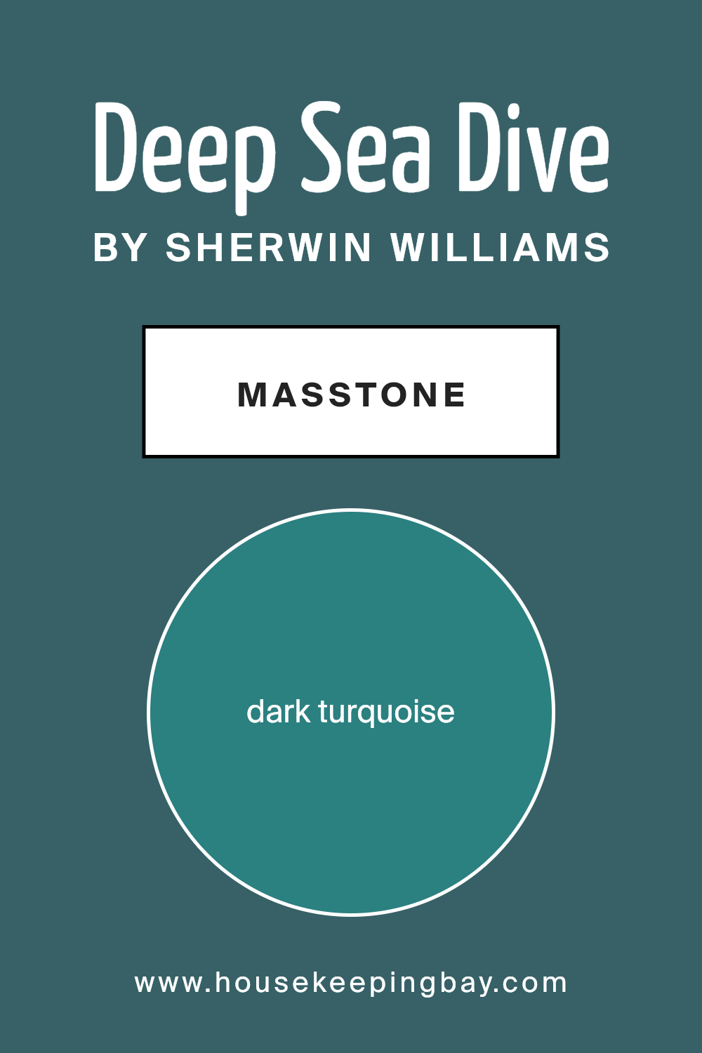
What is the Masstone of the Deep Sea Dive SW 7618 by Sherwin Williams?
Deep Sea Dive SW 7618 by Sherwin Williams is a rich, dark turquoise color that brings a soothing and calming presence to any space. Its deep blue-green hue creates an inviting and cozy atmosphere, perfect for rooms where relaxation is key. When used in a living room or bedroom, Deep Sea Dive can make the space feel calm and serene, helping people unwind after a busy day.
In bedrooms, this color encourages restful sleep by promoting a peaceful environment. Its dark nature makes it ideal for accent walls, bringing depth and a touch of elegance.
Pairing it with neutral colors such as whites or creams can help balance its intensity, allowing it to stand out without overwhelming the space.
In bathrooms, Deep Sea Dive adds a spa-like feel, creating a personal retreat. This color works well with natural textures and materials, like wood and stone, enhancing its earthy qualities and adding warmth to the room.
housekeepingbay.com
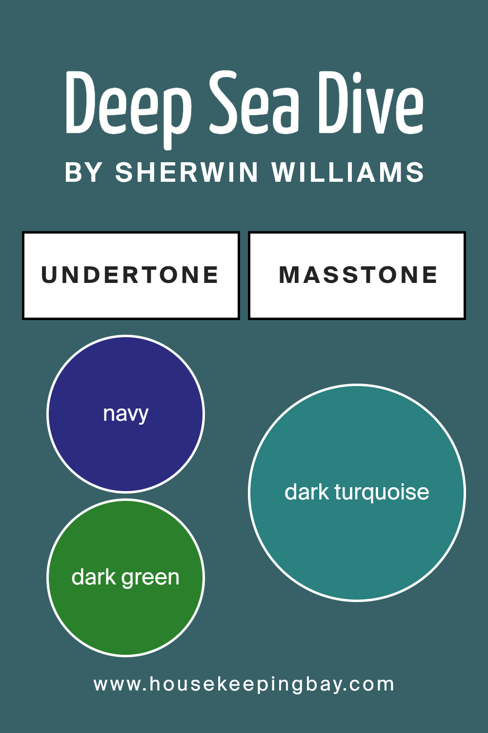
Undertones of Deep Sea Dive SW 7618 by Sherwin Williams
Deep Sea Dive SW 7618 by Sherwin Williams has a complex blend of undertones that contribute to its rich and compelling nature. The primary color appears as a deep teal, a harmonious mix of blue and green. The navy and dark green undertones create a depth that makes the color feel both stable and interesting. Hints of dark grey and grey cool down the intensity, easing the boldness of the teal. This contrast helps the color maintain a sophisticated and mellow presence on walls.
Undertones like dark blue and blue add a soothing, expansive sense to the color, reminiscent of vast ocean depths, where the color name finds its inspiration. The slight presence of purple, violet, and lilac adds a subtle richness, giving the hue an almost mysterious or thoughtful edge.
The olive and brown undertones counterbalance any overwhelming vibrancy, grounding it with just a touch of earthiness.
When used on interior walls, Deep Sea Dive SW 7618 can change substantially based on lighting and surrounding decor. In well-lit spaces, the green and mint undertones may appear, showcasing a lively side.
In dimmer lighting, the navy, dark blue, and dark grey undertones dominate, yielding a more intimate and cozy atmosphere.
housekeepingbay.com
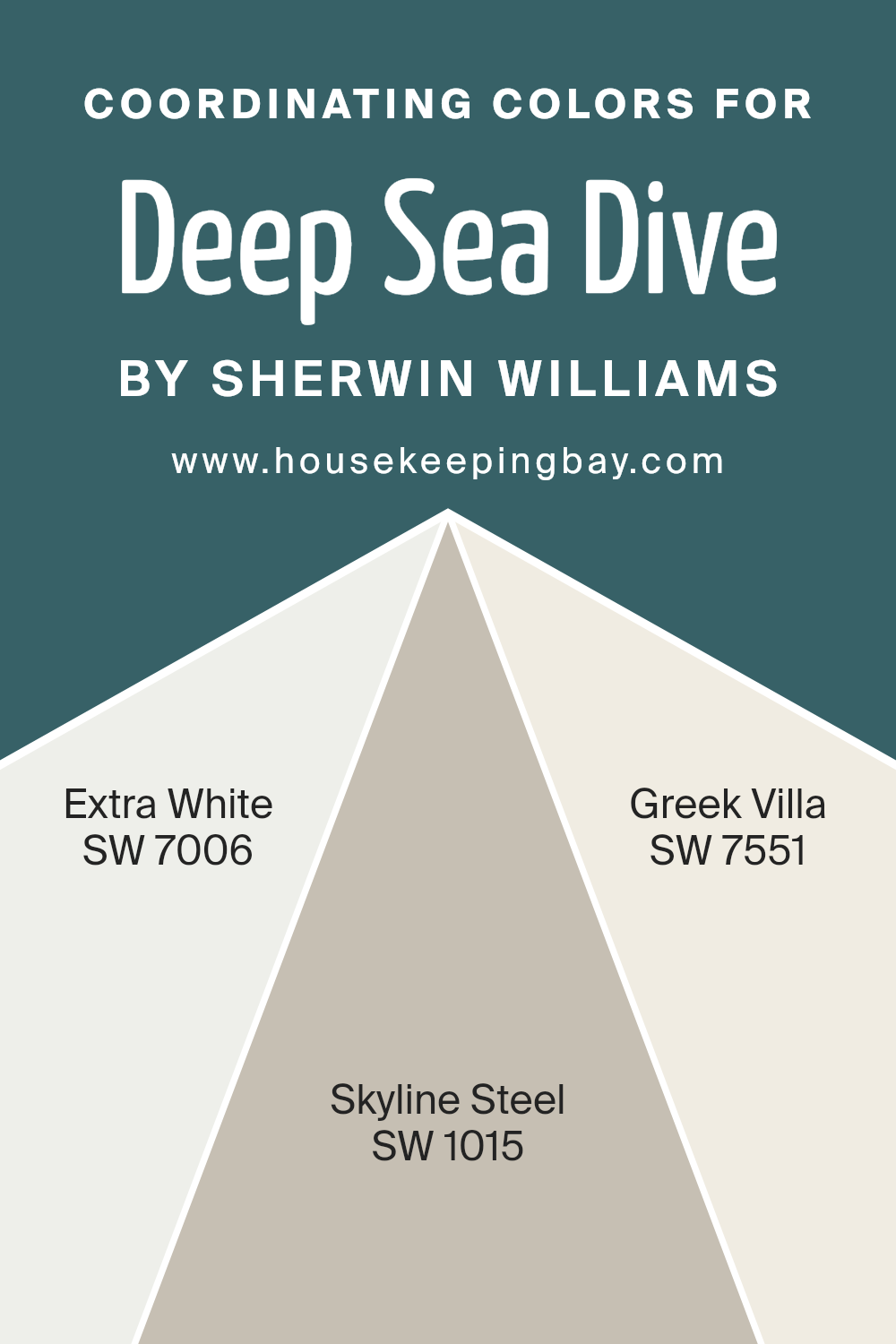
Coordinating Colors of Deep Sea Dive SW 7618 by Sherwin Williams
Coordinating colors are hues that harmonize well together, creating a cohesive and visually pleasing aesthetic. They work by grouping colors that complement each other in tone, brightness, or saturation. When paired with a bold color like Sherwin Williams’ Deep Sea Dive SW 7618, these coordinating shades can create a balanced and inviting space.
Deep Sea Dive is a rich, deep teal that conveys depth and sophistication, so pairing it with the right colors is crucial for achieving a harmonious look.
SW 7006 – Extra White is a crisp, clean white that adds brightness and clarity, making it an excellent contrast to the dark tones of Deep Sea Dive. Its pure simplicity can lighten up a space, providing a fresh feel. SW 1015 – Skyline Steel is a versatile gray that brings a calming, neutral balance. It subtly blends with the teal while offering a sleek backdrop.
Finally, SW 7551 – Greek Villa is a soft, warm white with buttery undertones that can add a touch of coziness and elegance, enhancing the overall ambiance without overpowering the main color.
Together, these coordinating colors work to maintain a stylish and cohesive environment, whether in a living room, bedroom, or any area in need of a sophisticated touch.
You can see recommended paint colors below:
housekeepingbay.com
How Does Lighting Affect Deep Sea Dive SW 7618 by Sherwin Williams?
Lighting plays a major role in how we perceive colors. Light can change the way a color looks in a room. This change happens because different light sources have different color temperatures, which are measured in Kelvins (K). For example, sunlight during the middle of the day has a color temperature of about 5500K, often described as “daylight”. In contrast, incandescent bulbs usually have a much warmer color temperature, around 2700K, which tends to give everything a yellowish hue.
The paint color Deep Sea Dive SW 7618 by Sherwin Williams interacts differently with various lighting conditions. In natural light, this color appears more vibrant and true to its intended hue. In artificial lighting, like incandescent or LED lights, the color can shift. Under warm artificial light, it might appear cozier and a bit darker.
With cooler artificial lighting, like daylight bulbs, the color may hold its original depth better.
In a north-facing room, where the light is typically cooler and indirect, Deep Sea Dive SW 7618 can look a bit more muted and even slightly grayer. The lack of direct sunlight can make the color feel calmer, and possibly more subdued.
In contrast, a south-facing room, which gets strong, warm light, especially in the afternoon, will allow Deep Sea Dive to look richer and more vibrant. The intense sunlight can bring out the deep tones in the color.
East-facing rooms receive warm morning light and cool light later in the day. In the morning, Deep Sea Dive may seem more lively, taking on a brighter, more energetic hue. As the day progresses, it might become softer and more relaxed. In west-facing rooms, light is cooler in the morning and much warmer in the afternoon.
So, in the mornings, the color could seem more muted, and later on, it gains warmth, becoming cozier and more inviting.
Lighting influences the mood and appearance of Deep Sea Dive SW 7618, altering its look throughout the day.
housekeepingbay.com
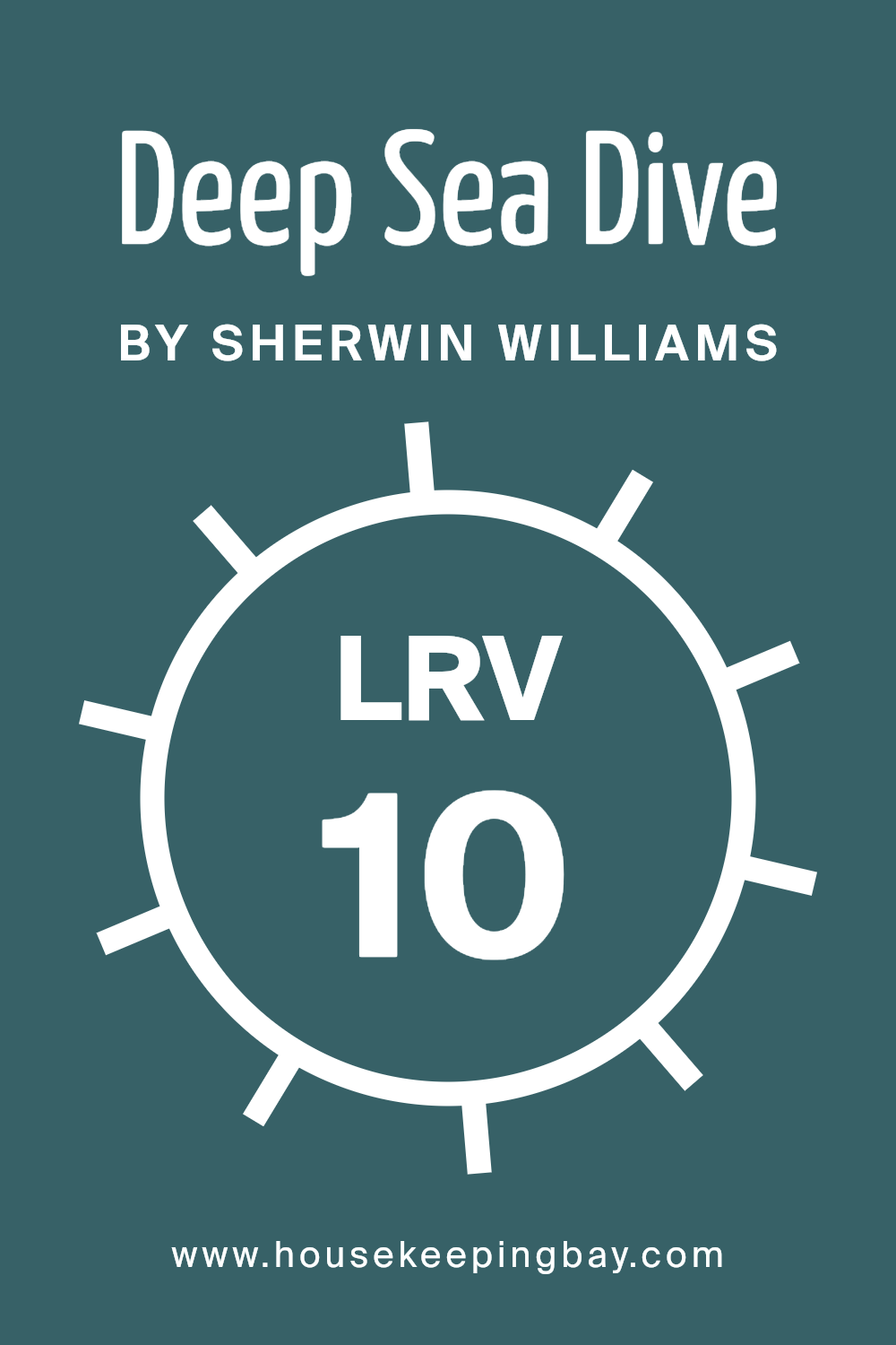
What is the LRV of Deep Sea Dive SW 7618 by Sherwin Williams?
LRV stands for Light Reflectance Value. It’s a measure of the percentage of light a paint color reflects. The scale runs from 0 to 100. A lower LRV means the color absorbs more light, resulting in a darker appearance. Conversely, a higher LRV means the color reflects more light and appears lighter.
In the context of paint, understanding the LRV helps in predicting how a color will look on walls under different lighting conditions. It’s particularly useful for deciding whether a color will make a room feel spacious or cozy.
Rooms with little natural light might feel gloomy if walls are painted with low LRV colors, whereas high LRV colors can make spaces feel bright and open.
Deep Sea Dive SW 7618 by Sherwin Williams has an LRV of 10.269. This indicates that it’s a dark color, reflecting only a small amount of light. On a wall, this deep hue will create a cozy, intimate atmosphere. It might be a great choice for a room where you desire a sense of warmth and depth.
Since it absorbs more light, it’s ideal for spaces where you want to add a dramatic touch or in areas that receive abundant natural light, balancing the brightness. However, in small or dimly lit rooms, it may make the space feel smaller or more enclosed unless paired with lighter accents and adequate lighting.
housekeepingbay.com
What are the Trim colors of Deep Sea Dive SW 7618 by Sherwin Williams?
Trim colors are the accents that outline and define a space, much like a picture frame enhances a photograph. In the case of Deep Sea Dive SW 7618 by Sherwin Williams, thoughtful trim colors like SW 6385 – Dover White and SW 7029 – Agreeable Gray play an essential role. These trims create a balance by highlighting architectural features such as doors, windows, and moldings, adding a crisp distinction against the deep, rich blue-green of Deep Sea Dive.
Trim colors also support the main hue, making it stand out and adding depth to the overall appearance of a room. Dover White, in particular, provides a soft, warm contrast with its creamy undertones, creating a sense of warmth that eases the boldness of Deep Sea Dive.
Agreeable Gray, on the other hand, is a versatile, neutral shade that complements the boldness of Deep Sea Dive while adding a subtle depth. It is a warm, soft gray with beige undertones that blend well with various colors, bringing a harmonious feel to the color palette.
This pairing not only frames and enhances the primary color but also impacts the mood and style of a room, offering a balanced ambiance.
Dover White and Agreeable Gray serve as more than mere boundaries; they play a critical role in enhancing the aesthetic and cohesive flow of a space, making the overall design feel complete and thoughtfully curated.
You can see recommended paint colors below:

housekeepingbay.com
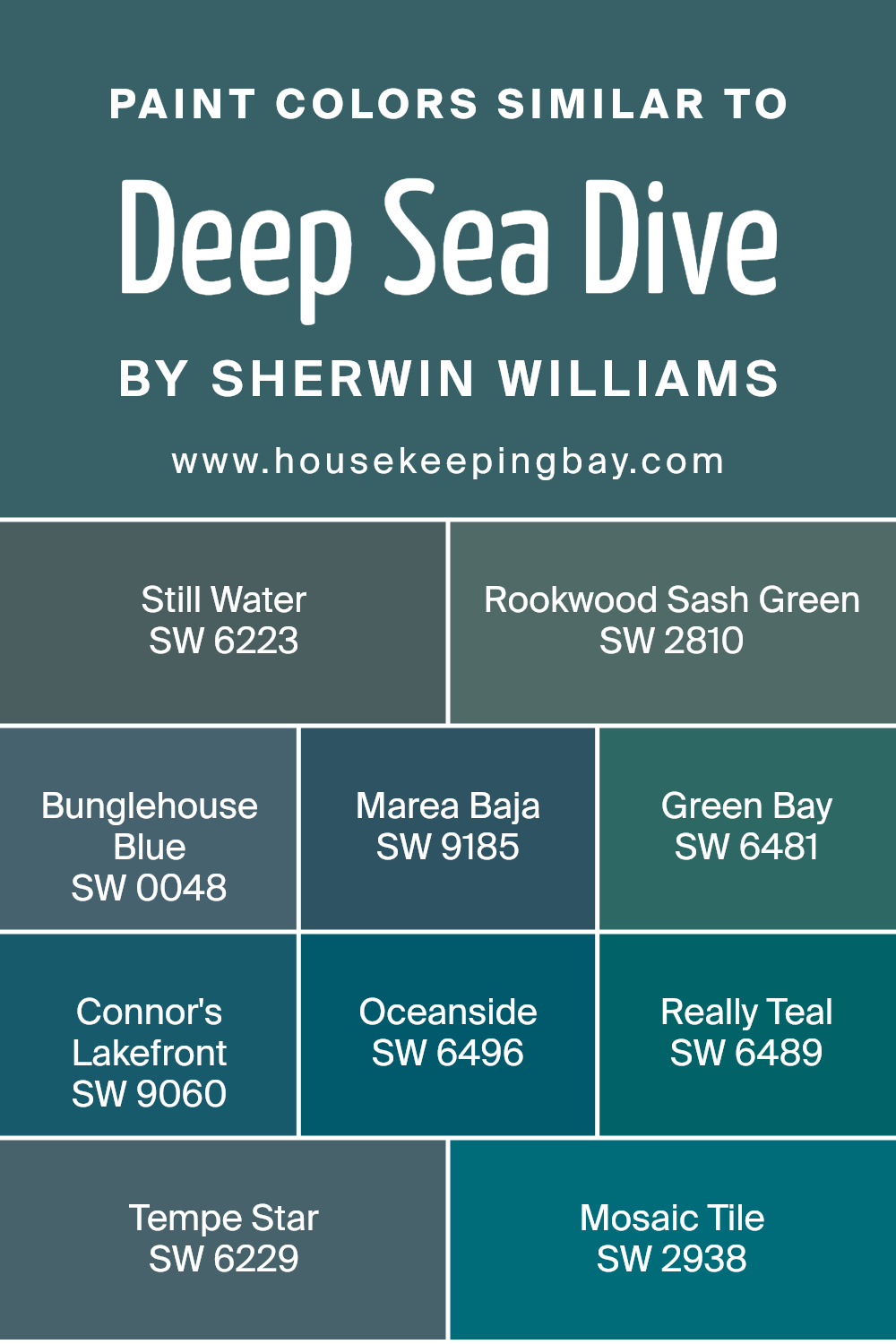
Colors Similar to Deep Sea Dive SW 7618 by Sherwin Williams
Similar colors play a vital role in design and decoration, as they offer a harmonious and cohesive look. Deep Sea Dive by Sherwin Williams is a rich, complex color, and its similar shades each bring their unique personality while maintaining a cohesive vibe. Take Still Water, a deep, serene green that exudes calmness and warmth.
Rookwood Sash Green stands out with its timeless feel, reminiscent of classic, historical homes. Bunglehouse Blue adds a hint of vintage flair. Marea Baja offers a muted, earthy tone, grounding spaces with its subtle warmth. Green Bay, with its lush, vibrant shade, gives an energizing freshness.
Moving on, Connor’s Lakefront is a darker, more sophisticated teal that adds depth and character. Oceanside captivates with its bold, striking presence, reminiscent of lively coastal getaways.
Really Teal, as the name hints, brings a bright and cheerful energy. Tempe Star, with its deep, starry blue, evokes a sense of mystery and intrigue.
Mosaic Tile is lively, with a delightful balance of green and blue. Together, these colors create a palette offering balance and variation, linking spaces with their subtle echoes of Deep Sea Dive, making them perfect for those who appreciate both unity and individuality in their color schemes.
You can see recommended paint colors below:
- SW 6223 Still Water
- SW 2810 Rookwood Sash Green
- SW 0048 Bunglehouse Blue
- SW 9185 Marea Baja
- SW 6481 Green Bay
- SW 9060 Connor’s Lakefront
- SW 6496 Oceanside
- SW 6489 Really Teal
- SW 6229 Tempe Star
- SW 2938 Mosaic Tile
housekeepingbay.com
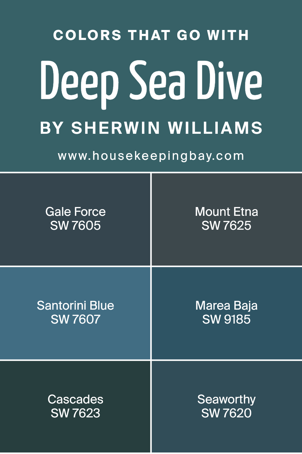
Colors that Go With Deep Sea Dive SW 7618 by Sherwin Williams
Colors that pair well with Deep Sea Dive SW 7618 by Sherwin Williams play a crucial role in creating a harmonious and balanced space. Deep Sea Dive is a rich, deep teal that can bring a sense of depth and sophistication to a room. However, to avoid making the space feel too dark, it’s important to incorporate complementary tones.
SW 7605 – Gale Force is a strong, dark blue with a hint of gray that can anchor a room and add elegance. SW 7625 – Mount Etna offers a deep, greenish-blue that brings an earthy and calming effect, perfect for adding a touch of nature.
SW 7607 – Santorini Blue is a calming, medium-toned blue that can lighten and bring a breath of fresh air into the space. SW 9185 – Marea Baja, with its muted olive-green, adds warmth and balances the coolness of Deep Sea Dive. SW 7623 – Cascades introduces a rich, forest green that blends well with the deeper teal tones, adding layers of interest.
Lastly, SW 7620 – Seaworthy, with its strong navy shade, provides a classic touch that complements the rich hues of Deep Sea Dive.
Together, these colors create a cohesive and inviting environment, enhancing each other to form a beautiful palette.
You can see recommended paint colors below:
- SW 7605 Gale Force
- SW 7625 Mount Etna
- SW 7607 Santorini Blue
- SW 9185 Marea Baja
- SW 7623 Cascades
- SW 7620 Seaworthy
housekeepingbay.com
How to Use Deep Sea Dive SW 7618 by Sherwin Williams In Your Home?
Deep Sea Dive SW 7618 by Sherwin Williams is a rich, deep blue that adds a cozy and calming feel to any space. This color works well in various rooms within a home. For instance, it can be used as an accent wall in a living room. Paired with lighter furniture or white trim, it creates a stylish contrast.
In a bedroom, this shade can craft a serene atmosphere, perfect for unwinding. Use soft linens and complementary shades like grays or creams for a balanced look. In a study or home office, Deep Sea Dive offers a focused environment, encouraging concentration.
For those who like nautical themes, this color pairs excellently with white and navy elements, such as striped pillows or rope accents. Even in a bathroom, this hue can make the space feel like a peaceful retreat when paired with silver fixtures. Overall, Deep Sea Dive offers a versatile choice for adding depth and character to any area.
Deep Sea Dive SW 7618 by Sherwin Williams vs Mosaic Tile SW 2938 by Sherwin Williams
Deep Sea Dive SW 7618 by Sherwin Williams is a rich, dark teal color. It has a serene, deep-sea feel, with a mix of blue and green undertones, creating a soothing atmosphere. This color can make a room feel cozy and intimate, adding depth and mystery.
Mosaic Tile SW 2938, in contrast, is a lighter, brighter shade of teal. It carries a fresher vibe, with more pronounced green tones. This color is lively and can energize a space, adding a cheerful and refreshing touch.
Comparing these two colors, Deep Sea Dive feels more muted and calming, offering a sense of warmth and comfort. Mosaic Tile provides a more vibrant, fresh ambiance, lifting the mood of any room. Both colors share their teal essence but express different emotional qualities, allowing for diverse styling choices in interior designs.
You can see recommended paint color below:
- SW 2938 Mosaic Tile

housekeepingbay.com
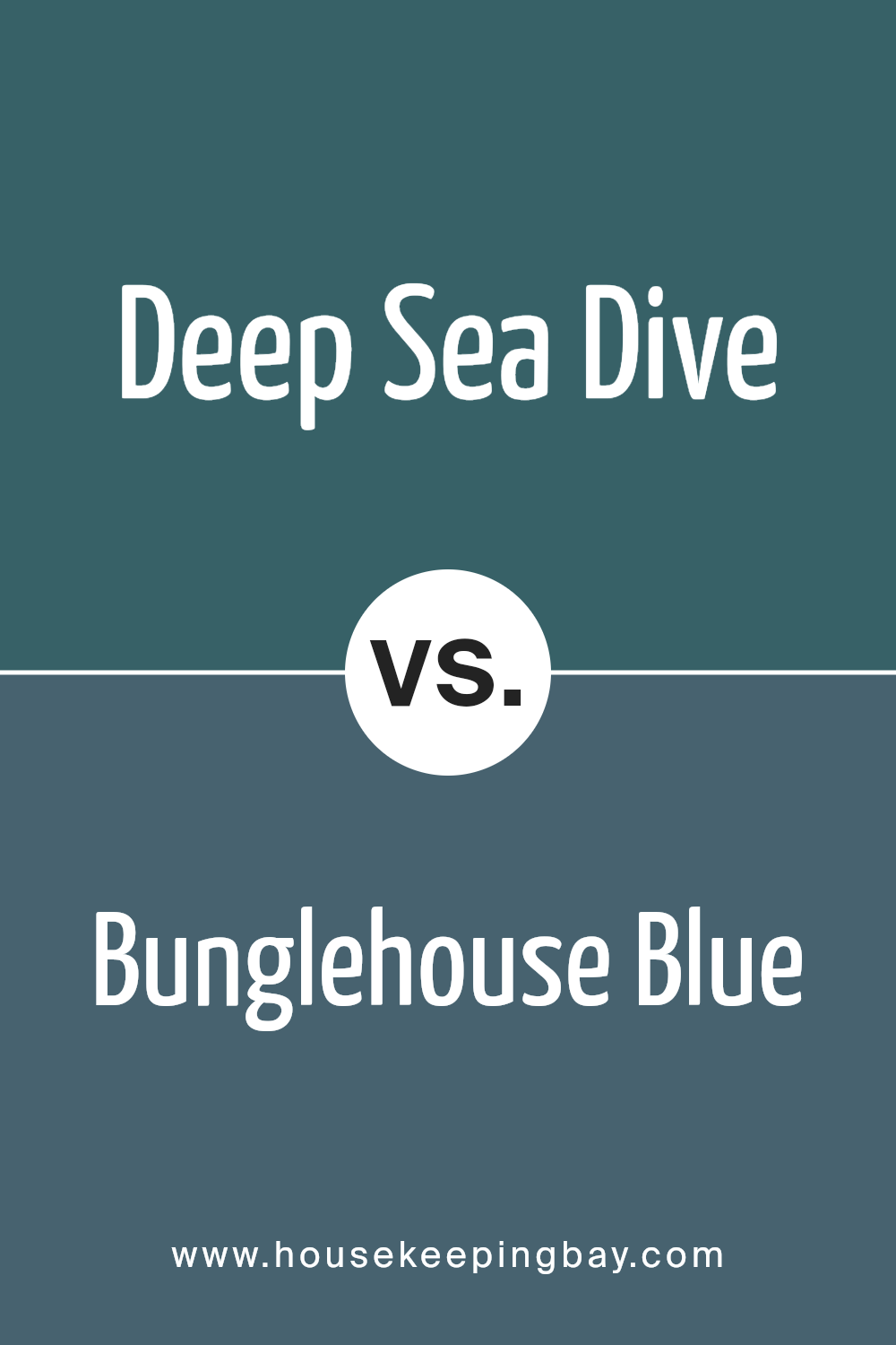
Deep Sea Dive SW 7618 by Sherwin Williams vs Bunglehouse Blue SW 0048 by Sherwin Williams
Deep Sea Dive SW 7618 by Sherwin Williams is a rich, intense blue with hints of green, invoking thoughts of ocean depths. It has a moody, immersive quality and works well for creating a cozy, sophisticated atmosphere. Its depth makes it perfect for accent walls or spaces where you want to create an intimate setting.
Bunglehouse Blue SW 0048, meanwhile, offers a softer, more muted blue tone. This color, tinged with gray, feels more subdued and historical. It lends itself to spaces where you want to add a calm and relaxed feel without being overpowering.
While Deep Sea Dive is vibrant and bold, commanding attention, Bunglehouse Blue opts for a quieter presence that whispers elegance. Both colors share a blue base but offer different moods: one bold and daring, the other subtle and serene. When selecting one, consider the mood you wish to evoke.
You can see recommended paint color below:
- SW 0048 Bunglehouse Blue
housekeepingbay.com
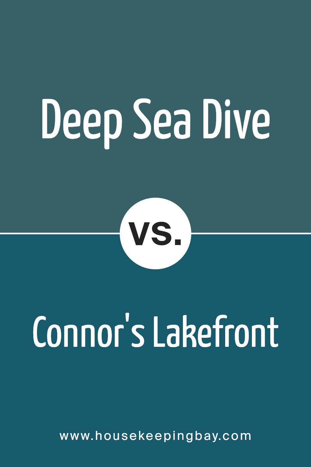
Deep Sea Dive SW 7618 by Sherwin Williams vs Connor’s Lakefront SW 9060 by Sherwin Williams
Deep Sea Dive SW 7618 and Connor’s Lakefront SW 9060, both by Sherwin Williams, offer distinct vibes for different spaces. Deep Sea Dive is a rich, intense teal with deep blue and green undertones, giving rooms a moody, cozy feeling. It suits spaces wanting a bold, dramatic effect, adding depth and warmth.
Connor’s Lakefront, however, is a soft, subdued blue-green, leaning towards gray. It offers a lighter, airy touch, bringing a calm and soothing presence. This color works well in places needing a relaxed, peaceful atmosphere, ideal for creating serene bedrooms or calming living areas.
While both colors include blue-green tones, Deep Sea Dive’s intensity contrasts with Connor’s Lakefront’s gentleness. Choosing between them depends on wanting either a striking, bold look or a softer, tranquil feel in the space. Each color enhances environments in unique ways, catering to different moods and styles.
You can see recommended paint color below:
- SW 9060 Connor’s Lakefront
housekeepingbay.com
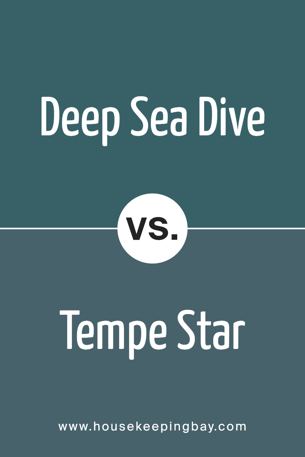
Deep Sea Dive SW 7618 by Sherwin Williams vs Tempe Star SW 6229 by Sherwin Williams
Deep Sea Dive SW 7618 by Sherwin Williams is a rich, deep blue with hints of green. It feels bold and powerful, creating a strong presence in any room. This color reminds one of deep ocean waters, offering a sense of mystery and depth.
Tempe Star SW 6229, also by Sherwin Williams, is a different shade of blue. It leans more towards teal, with a noticeable green undertone. This adds warmth to the blue, making it more approachable and versatile.
When compared, Deep Sea Dive appears darker and more intense, whereas Tempe Star offers a lighter, softer feel. While both are shades of blue, Deep Sea Dive brings a dramatic flair, suitable for accent walls or areas needing a touch of grandeur.
Tempe Star, however, works well in spaces that seek a relaxed and inviting atmosphere. Each color has its unique charm, with Deep Sea Dive providing a bold touch and Tempe Star offering warmth.
You can see recommended paint color below:
housekeepingbay.com
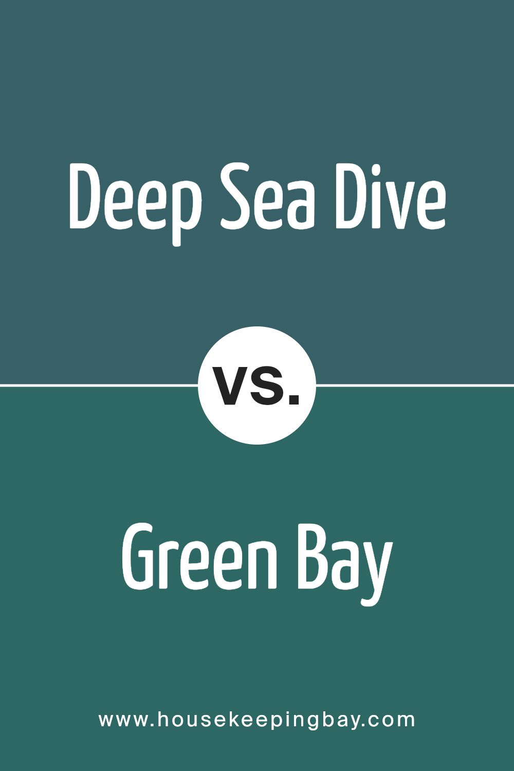
Deep Sea Dive SW 7618 by Sherwin Williams vs Green Bay SW 6481 by Sherwin Williams
Deep Sea Dive SW 7618 by Sherwin Williams is a rich, calming shade of dark blue with green undertones, bringing a sense of depth and mystery. It’s often associated with calming ocean depths, making it ideal for creating a cozy, serene environment. This color works particularly well in spaces where relaxation is key, like bedrooms or living rooms.
Green Bay SW 6481, also by Sherwin Williams, is a vibrant, energetic teal. It mixes the calmness of blue with the refreshing, lively quality of green. Green Bay can energize a space, making it perfect for areas where you need a pop of color or a boost of creativity, like kitchens or home offices.
While Deep Sea Dive creates a comforting and soothing atmosphere, Green Bay adds excitement and freshness. Both colors, though sharing blue and green elements, serve distinct purposes: calm sophistication versus lively boldness. Choosing between them depends on the desired mood of the room.
You can see recommended paint color below:
housekeepingbay.com
Deep Sea Dive SW 7618 by Sherwin Williams vs Rookwood Sash Green SW 2810 by Sherwin Williams
Deep Sea Dive SW 7618 and Rookwood Sash Green SW 2810 by Sherwin Williams are two rich, bold colors but differ in tone and mood. Deep Sea Dive offers a deep, dark blue with green undertones, creating a sense of calm and depth. This shade resembles the mysterious ocean depths, providing a sophisticated and contemporary feel. This color works beautifully in modern living spaces or bedrooms, adding an elegant, cool touch.
Rookwood Sash Green is a more traditional, warm green with earthy undertones. This shade feels rooted in nature and history, bringing warmth and a classic vibe to interiors. It is well-suited for older homes or spaces aiming for a vintage or heritage look.
Whereas Deep Sea Dive feels more modern and serene, Rookwood Sash Green exudes comfort and nostalgia. Both colors provide strong character to spaces, but their differing undertones and moods lead to diverse design directions.
You can see recommended paint color below:
- SW 2810 Rookwood Sash Green
housekeepingbay.com
Deep Sea Dive SW 7618 by Sherwin Williams vs Still Water SW 6223 by Sherwin Williams
Deep Sea Dive SW 7618 and Still Water SW 6223 are rich, inviting shades. Deep Sea Dive is a deeper teal, evoking the mystery and depth of the ocean. It’s bold and makes a dramatic statement, perfect for adding a touch of elegance to a space. Utilizing this color can create a cozy, intimate environment.
Still Water, however, offers a slightly lighter blue-green hue with hints of gray. This color brings a calm and soothing atmosphere. It’s versatile, working well in various settings from bathrooms to living rooms.
Both colors fall in the cool spectrum, promoting a relaxing vibe. Deep Sea Dive leans more towards a strong, moody aesthetic, while Still Water carries a gentler, serene tone. Together, they can complement each other, providing balance and contrast, as Deep Sea Dive’s depth pairs beautifully with the refreshing quality of Still Water.
You can see recommended paint color below:
- SW 6223 Still Water
housekeepingbay.com
Deep Sea Dive SW 7618 by Sherwin Williams vs Really Teal SW 6489 by Sherwin Williams
Deep Sea Dive SW 7618 by Sherwin Williams presents a rich, dark blue-green hue, evoking the mysterious depths of the ocean. Its profound bluish tones create a sophisticated atmosphere, making spaces feel both cozy and formal. Ideal for feature walls or intimate rooms, this color invites introspective moods and a sense of calm.
Really Teal SW 6489, meanwhile, offers a lighter, vibrant blue-green shade. It’s lively and inviting, perfect for adding energy to any room. This shade brings a splash of fun without overwhelming a space, making it great for accent walls or playful, creative areas.
Both colors share a blue-green base, yet Deep Sea Dive leans towards a muted, darker palette, while Really Teal shines with its bright, spirited nature. Choosing Deep Sea Dive often results in a room that feels elegant and serene, whereas Really Teal invigorates with its boldness and cheer.
You can see recommended paint color below:
- SW 6489 Really Teal
housekeepingbay.com
Deep Sea Dive SW 7618 by Sherwin Williams vs Marea Baja SW 9185 by Sherwin Williams
Deep Sea Dive SW 7618 by Sherwin Williams is a rich and dark teal with a more subdued and cooler tone, evoking a sense of calm and sophisticated depth. Its deep hue can suggest the profound tranquility of the ocean depths, creating a soothing and serene atmosphere. It pairs well with lighter accents and neutral tones, making it versatile for both modern and classic designs.
Marea Baja SW 9185, meanwhile, offers a warm, muddy green hue, reminiscent of earthy elements and natural settings. It has an inviting quality that can make spaces feel cozy and intimate, instead of the cooler and more aloof notes of Deep Sea Dive.
Marea Baja works well in rustic or organic-themed spaces, complementing wood tones and natural materials.
While both colors bring elements of nature indoors, Deep Sea Dive leans more towards cool, oceanic themes, whereas Marea Baja introduces a warmer, earthier feel. Both can create unique moods, depending on their use in design.
You can see recommended paint color below:
- SW 9185 Marea Baja
housekeepingbay.com
Deep Sea Dive SW 7618 by Sherwin Williams vs Oceanside SW 6496 by Sherwin Williams
Deep Sea Dive SW 7618 by Sherwin Williams and Oceanside SW 6496 are two rich, bold blues, each offering unique qualities. Deep Sea Dive sits closer to a deep, moody blue-green, giving off a sophisticated and calming vibe. Its darker tone can add depth to a space, making rooms feel intimate and cozy.
Oceanside, in contrast, presents a more vivid and dynamic blue-green. Its vibrant shade incorporates a mix of green and teal, resulting in a lively and energizing color. This brightness can create a cheerful atmosphere, and its striking appearance makes it suitable for accent walls or statement pieces.
While both colors incorporate blue and green hues, the intensity and depth vary. Deep Sea Dive leans toward a subtle elegance, perfect for creating a serene space, while Oceanside bursts with energy and character, suitable for adding a refreshing touch to any room.
You can see recommended paint color below:
- SW 6496 Oceanside
housekeepingbay.com
Wrapping up my thoughts on SW 7618 Deep Sea Dive by Sherwin Williams, I find myself drawn to its rich, deep hue. This color has a remarkable ability to create a calm and inviting atmosphere in any room. Whether used in a living space, bedroom, or office, it adds a sense of depth and sophistication.
In my own experience, using this shade allows me to achieve an elegant and comforting environment. It pairs well with a range of other colors, both lighter and muted, which means I can easily adjust the mood of a space by tweaking accents and decorations.
The versatility of Deep Sea Dive cannot be overstated. It can stand as a dramatic centerpiece or subtly complement other colors. Its deep nature has an innate ability to make a room feel cozy, yet spacious, which is perfect for both larger, airy spaces and smaller, more intimate ones.
By choosing SW 7618 Deep Sea Dive, I’m not just picking a paint color—I’m bringing a sense of peace and elegance into my surroundings.
It offers enduring appeal and helps create a space that feels both modern and timeless. This color is a valuable tool in crafting an atmosphere that reflects my personal taste and style.
housekeepingbay.com
Ever wished paint sampling was as easy as sticking a sticker? Guess what? Now it is! Discover Samplize's unique Peel & Stick samples. Get started now and say goodbye to the old messy way!
Get paint samples


