Green Bay SW 6481 by Sherwin Williams
Invigorate Your Space with Vibrant Blue-Green Tones
Have you heard about SW 6481 Green Bay by Sherwin Williams? It’s not just any green; it has a vibrant energy that can bring a lively yet cozy atmosphere into a space.
When you think about repainting, it’s good to know more about how a color can affect the mood and style of your home. Green Bay, with its distinctive hue, stands out for creating an inviting and dynamic environment.
Whether you’re keen to refresh your living room, bedroom, or an office space, this color could offer the aesthetic boost you are searching for.
So, if you feel your spaces could use a touch of personality, consider how SW 6481 Green Bay might enhance the look and feel of your interiors.
Wondering how it matches with furnishings or achieves the ambiance you desire? Keep reading as we delve into its styling possibilities and practical applications.
via sherwin-williams.com
What Color Is Green Bay SW 6481 by Sherwin Williams?
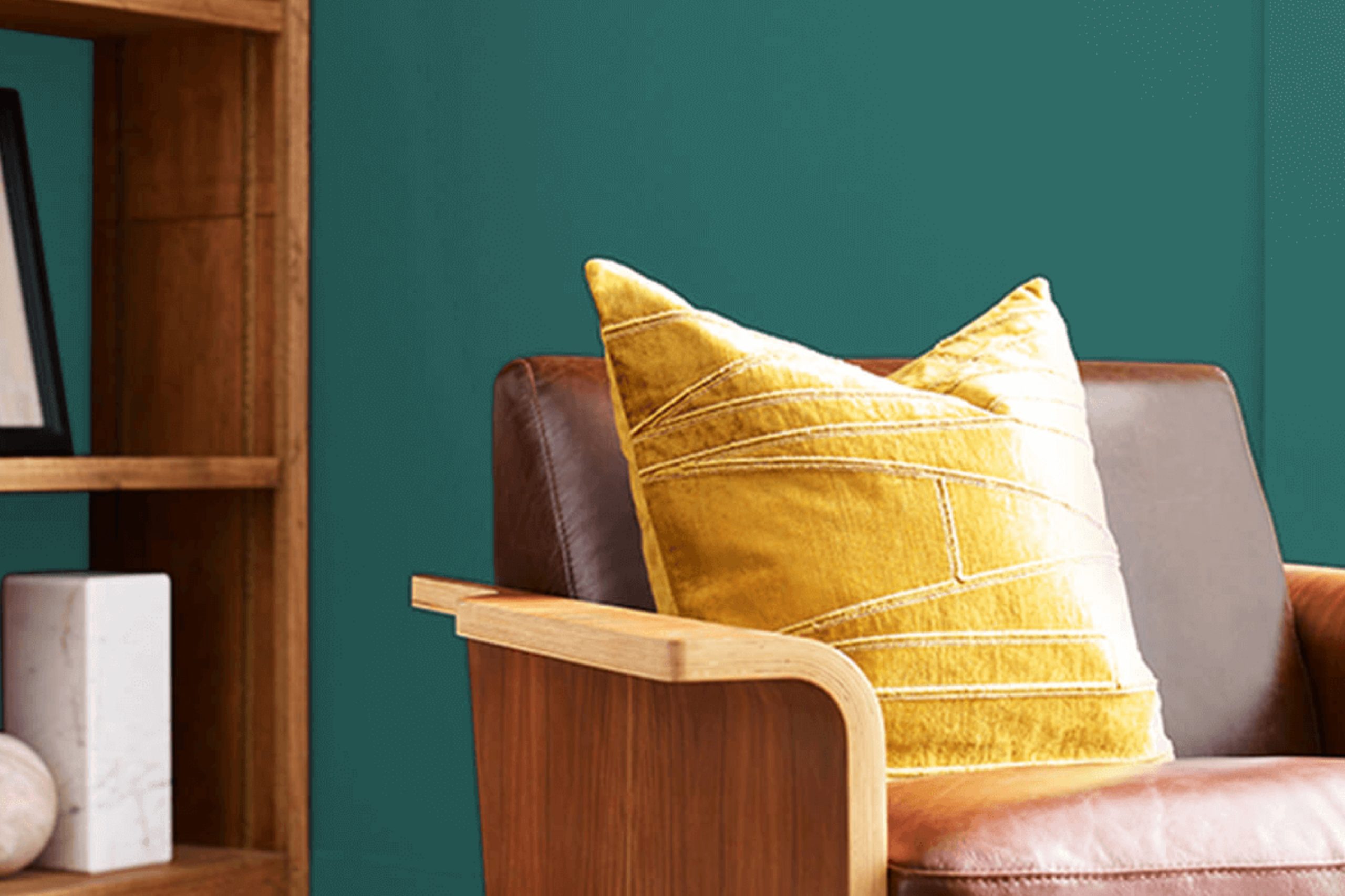
Green Bay SW 6481 by Sherwin Williams is a vibrant, deep shade of green with hints of teal that can add richness and depth to any space. This color is intense yet soothing, bringing a touch of nature indoors with its resemblance to forest hues and ocean depths. Its versatility makes it suitable for a variety of interior styles, particularly modern, coastal, and eclectic aesthetics.
For modern interiors, Green Bay works well as an accent wall or in accessories, lending a chic pop of color against neutral backgrounds. In coastal settings, it pairs beautifully with sandy tones and crisp whites, echoing the natural palette of the seashore and blending seamlessly with natural light.
When used in eclectic decor, it can harmonize disparate elements with its dynamic yet harmonious vibe.
Materials that pair well with Green Bay include natural wood, which complements its earthy undertones, and metallic finishes like brass or copper, which provide a striking contrast. Texturally, linen and coarse cotton fabrics maintain the naturalistic feel, while velvet or silk can add a layer of luxury and refinement.
When using Green Bay SW 6481, consider balancing its intensity with lighter tones and natural materials, ensuring a well-rounded and inviting atmosphere in any room.

housekeepingbay.com
Is Green Bay SW 6481 by Sherwin Williams Warm or Cool color?
Green Bay SW 6481 by Sherwin Williams is a vibrant, deep shade of green that can make a bold statement in any home. This color has a lively yet calming effect, making it a great choice for rooms where you want to add a touch of nature-inspired serenity without using a muted palette.
Green Bay works well in spaces that receive a lot of natural light, as the brightness highlights the depth of the color, giving rooms a rich and cozy feel.
In larger rooms, such as living rooms or open spaces, Green Bay can be used on all walls to create an immersive environment. In smaller spaces, consider using it on an accent wall to prevent the color from overwhelming the room. This shade pairs beautifully with natural wood tones, creams, and whites, offering numerous decorating options.
It also complements metallic finishes like gold or brass, adding a touch of luxury to the space. Whether aiming for a modern or rustic look, Green Bay SW 6481 provides flexibility and warmth to home interiors.
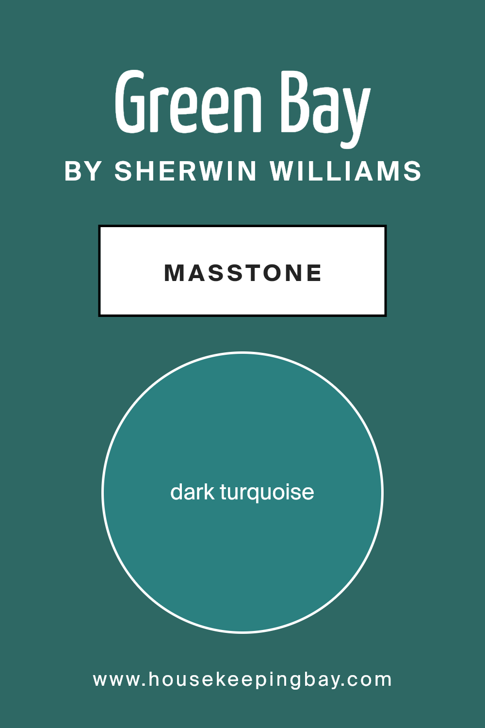
What is the Masstone of the Green Bay SW 6481 by Sherwin Williams?
Green Bay SW 6481 by Sherwin Williams is a dark turquoise color with a masstone similar to hex code #2B8080. This deep and serene shade of blue-green brings a soothing yet vibrant atmosphere to any room in a home. When used in interior spaces, Green Bay creates a cozy backdrop that feels both comforting and fresh.
It’s a versatile color that works well in various settings such as living rooms, bedrooms, and bathrooms, as it provides a natural balance between warmth and coolness.
Because of its richer undertones, Green Bay can also help to make larger rooms feel more intimate and grounded. This color pairs beautifully with both light and dark furniture, offering numerous styling options. Light wood tones and creamy whites, for example, stand out against the dark turquoise, creating a breezy and airy feel.
Alternatively, pairing it with darker woods or rich textures can create a more sophisticated and lush environment. Thus, Green Bay SW 6481 offers a flexible palette that can adapt to different tastes and styles, making it a popular choice for homeowners looking to add personality and depth to their spaces.
housekeepingbay.com
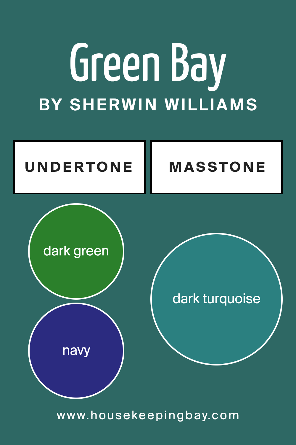
Undertones of Green Bay SW 6481 by Sherwin Williams
Green Bay SW 6481 by Sherwin Williams is a complex color with a variety of undertones that subtly influence its appearance in different lighting conditions. An undertone is a hint of another color that resides within the main hue. These hints can affect how we perceive the main color, sometimes making it look cooler or warmer depending on the surrounding light and adjacent colors.
For Green Bay SW 6481, undertones such as dark green, navy, and dark grey give it a deep, rich base that can appear almost neutral in dim light. When placed in a room, this dark base helps the color stand out as a bold choice, yet it maintains a certain softness due to the complexity of its undertones.
The cooler undertones like navy, grey, and dark blue add a calm, soothing quality to the color, making it ideal for spaces where you want a sense of stability and calm, such as bedrooms or offices. On the other hand, warmer undertones such as olive, brown, and light green can make the color feel more welcoming and earthy, suitable for living rooms or studies.
When using Green Bay SW 6481 on interior walls, these undertones will interact with the room’s lighting, furnishings, and other colors. For example, in natural light, the green or turquoise undertones might become more prominent, giving the room a fresh, lively look.
In artificial light, darker undertones like navy or dark grey might be enhanced, creating a more enclosed, cozy atmosphere.
This versatility makes Green Bay SW 6481 a fascinating paint choice for those who wish to bring a touch of nature and depth into their home while maintaining a sophisticated color scheme.
housekeepingbay.com
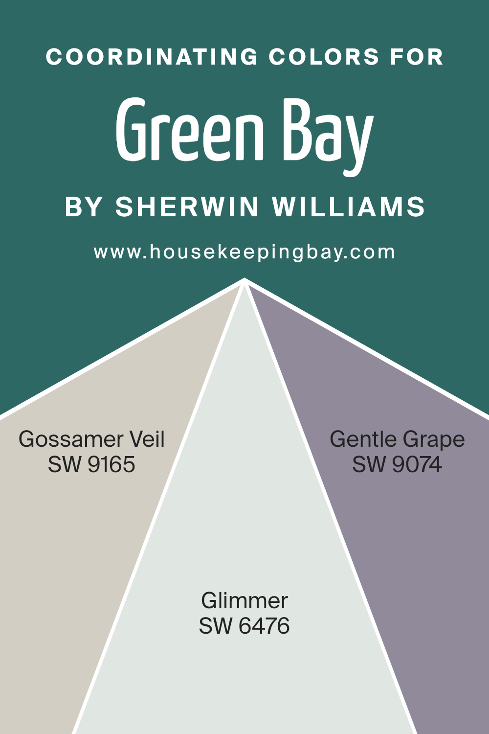
Coordinating Colors of Green Bay SW 6481 by Sherwin Williams
Coordinating colors are chosen to complement a primary color, enhancing the overall aesthetic of a color scheme in a room or on a design palette. When working with Green Bay SW 6481, a vivacious shade of green by Sherwin Williams, finding the right coordinating colors helps balance its intensity.
Coordinating colors, like SW 9165 – Gossamer Veil, SW 6476 – Glimmer, and SW 9074 – Gentle Grape, are key to achieving a harmonious look that is pleasing to the eye and brings together the elements of the space or design seamlessly.
Gossamer Veil SW 9165 is a soft neutral shade that provides a subtle backdrop, making it a soothing counterpart to the bolder Green Bay. This color is versatile and can serve as a calming base that allows other colors to stand out.
Glimmer SW 6476 is a light aqua that offers a hint of freshness and light, adding a touch of brightness without overwhelming the core green hue.
Finally, Gentle Grape SW 9074 is a muted purple that introduces a touch of depth and sophistication, creating an appealing contrast that enriches the overall palette without clashing.
You can see recommended paint colors below:
- SW 9165 Gossamer Veil
- SW 6476 Glimmer
- SW 9074 Gentle Grape
housekeepingbay.com
How Does Lighting Affect Green Bay SW 6481 by Sherwin Williams?
Lighting plays a crucial role in how we perceive colors. A color like Green Bay SW 6481 by Sherwin Williams can appear differently depending on the type and quality of light in a room. The quality of light affects how we see colors because it alters the intensity and hue.
In artificial light, Green Bay SW 6481 appears warmer and richer. Incandescent bulbs, which emit a yellowish hue, enhance green’s yellower tones, making it look cozier and more subdued. Fluorescent lighting, on the other hand, could give it a slightly bluish tint, making the green sharper and more vibrant.
In natural light, this color changes as the day progresses. Morning light in an east-facing room shows Green Bay SW 6481 as bright and fresh, owing to the bluish quality of early daylight. As the sun moves, the intensity reduces, giving a soft and subtle appearance by midday.
In a room facing north, which receives less direct sunlight and more shadow, Green Bay SW 6481 can appear more muted and cooler. This might make the room feel calm and soothing, especially if it’s used as a background color. The subdued natural light emphasizes the darker tones in this shade of green, making the room feel more enclosed yet cozy.
In south-facing rooms, where light is abundant throughout the day, this color stays vibrant and lively. The direct exposure to sunlight can make Green Bay SW 6481 look lighter and more energetic, which is perfect for living spaces or any area where you spend a lot of time during the day.
Lastly, in west-facing rooms, the color experiences a transformation in the late afternoon and evening as the setting sun casts a golden glow. This can make Green Bay SW 6481 look softer and slightly golden, creating a relaxing atmosphere as the day winds down.
Therefore, choosing this specific shade of green from Sherwin Williams requires consideration of the room’s orientation and the type of light it receives to fully harness its potential in interior settings.

housekeepingbay.com
What is the LRV of Green Bay SW 6481 by Sherwin Williams?
LRV stands for Light Reflectance Value, a measure that indicates the percentage of light a paint color reflects from or absorbs into a surface. This number ranges from 0, which is pure black and absorbs all light, to 100, reflecting all light much like pure white.
Understanding LRV helps in selecting the right paint for a room based on how bright or dark you want it to feel. Higher LRV colors make a room look lighter and can make a small space feel larger, while lower LRV colors tend to make rooms look cozier and are better for large spacious rooms where you want to create a sense of intimacy.
The LRV of Green Bay SW 6481 is 11.406, which means it is on the darker end of the spectrum, reflecting just over 11% of light. This low LRV suggests that Green Bay will absorb more light than it reflects, resulting in a rich, deep hue on the walls. This characteristic is excellent for adding depth and drama to a space or accentuating a room with sufficient natural or artificial lighting.
However, in a dimly lit or smaller space, using a color with such a low LRV might make the area feel smaller and darker.
Therefore, it’s ideal for use in well-lit or larger spaces where the strong character of the color can be fully appreciated without making the room feel too enclosed.

housekeepingbay.com
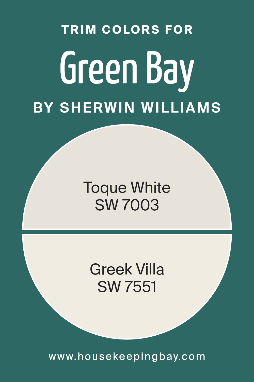
What are the Trim colors of Green Bay SW 6481 by Sherwin Williams?
Trim colors are the hues used for the detailing and accents on walls, door frames, baseboards, and other architectural elements in a space. Choosing the right trim color can significantly enhance the visual appeal of a room by creating a pleasing contrast with the wall color or by subtly complementing the overall color scheme.
For example, when pairing trim colors with a distinct shade like Green Bay SW 6481 by Sherwin-Williams, a thoughtful selection of trim color is vital to either subtly blend or make a clean, striking delineation with the rich, vibrant walls.
Toque White SW 7003 is a soft, warm white with a slight creamy feeling, making it a versatile choice for trim that softly offsets the brightness of Green Bay SW 6481 without competing for attention. Its understated quality ensures that it can blend seamlessly with various décor choices, adding a gentle polish to the overall aesthetic.
On the other hand, Greek Villa SW 7551 is a slightly off-white with subtle beige undertones, offering a warmer, more inviting finish compared to cooler whites. This color for trim provides a smooth, cohesive look when used against the cooler, bold tones of Green Bay SW 6481, creating a welcoming atmosphere in any room.
You can see recommended paint colors below:
housekeepingbay.com
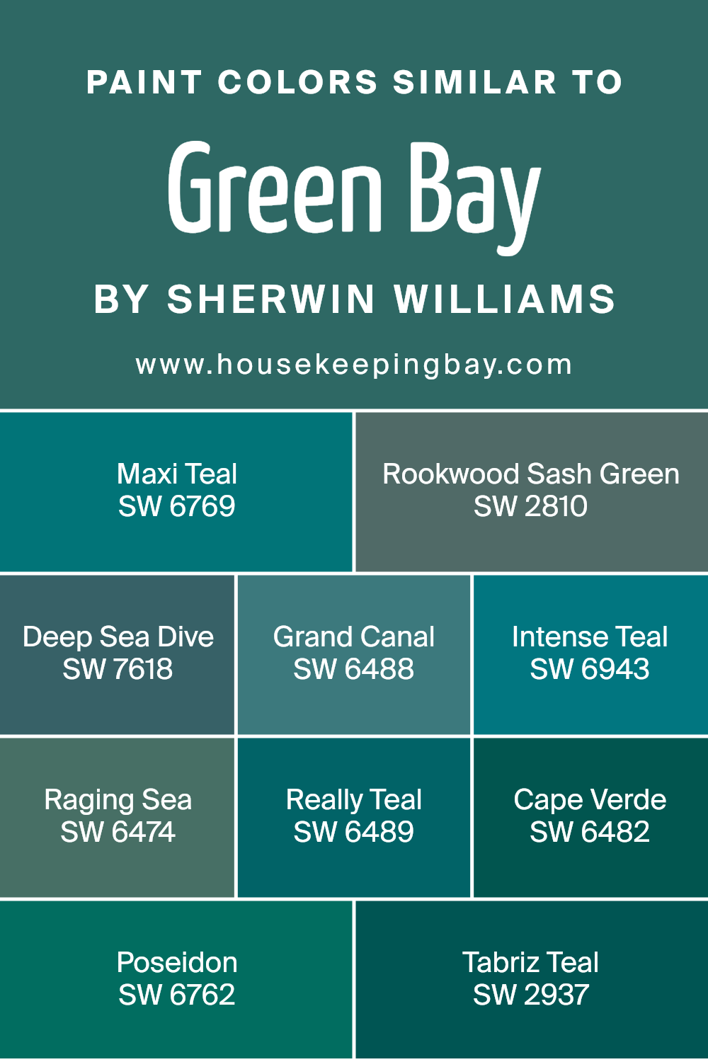
Colors Similar to Green Bay SW 6481 by Sherwin Williams
Similar colors play a significant role in design by creating a harmonious atmosphere and seamless transitions between spaces. When colors such as those similar to Green BaySW 6481 by Sherwin Williams are used together, they can enhance the visual coherence of a space, making it appear more unified and restful.
These shades, which range from deep teals to rich greens, allow for subtle variations within a color palette while keeping the overall aesthetic consistent. This approach can make smaller spaces feel larger or give divided spaces a more connected feel.
Maxi Teal SW 6769 presents a vivid teal that breathes life into any area with its lively hue. Rookwood Sash Green SW 2810 offers a dusky, forest green that adds depth and sophistication. Deep Sea Dive SW 7618 trends towards a dark aquatic blue, bringing a sense of depth and mystery to the environment.
Grand Canal SW 6488 captures the essence of deep waters with its intense blue-green tone. Intense Teal SW 6943 strikes a balance with energetic flair, perfect for injecting vibrancy. Raging Sea SW 6474, another marine-inspired shade, has a slightly more subdued but equally impactful teal-green blend, fostering a subdued yet dynamic space.
Really Teal SW 6489 is rich and bold, perfect for impactful accent walls. Cape Verde SW 6482 combines earthy green with a hint of blue, evoking images of natural landscapes. Poseidon SW 6762 sways more into the realms of a deep, pure teal, reminiscent of oceanic depths.
Lastly, Tabriz Teal SW 2937 weaves a slight gray undertone into its teal base, providing a sophisticated muted alternative suitable for peaceful settings. Collectively, these colors create environments that seamlessly exude a sense of continuity and coziness while allowing for unique expressions in different spaces.
You can see recommended paint colors below:
- SW 6769 Maxi Teal
- SW 2810 Rookwood Sash Green
- SW 7618 Deep Sea Dive
- SW 6488 Grand Canal
- SW 6943 Intense Teal
- SW 6474 Raging Sea
- SW 6489 Really Teal
- SW 6482 Cape Verde
- SW 6762 Poseidon
- SW 2937 Tabriz Teal
housekeepingbay.com
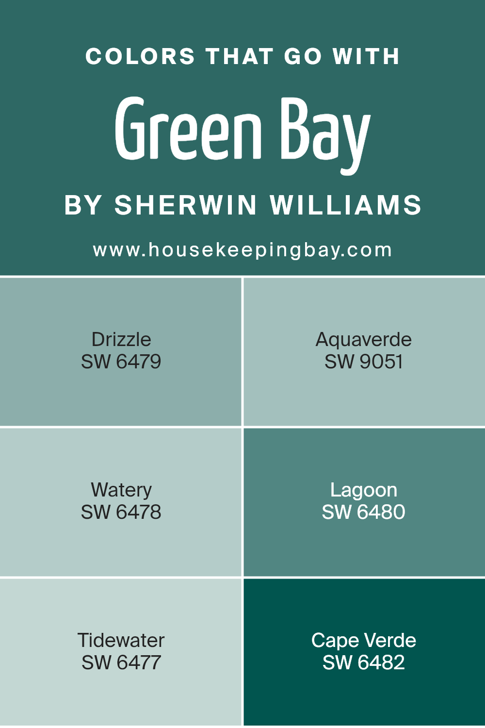
Colors that Go With Green Bay SW 6481 by Sherwin Williams
Understanding the importance of complementary colors when it comes to decorating with Green Bay SW 6481 by Sherwin Williams is key for achieving a harmonious look in any space. The colors that pair well with Green Bay, such as Drizzle, Aquaverde, Watery, Lagoon, Tidewater, and Cape Verde, contribute to creating a cohesive atmosphere where every tone supports and enhances the others.
These hues share a certain quality that ties them together, allowing them to interact seamlessly for an aesthetically pleasing environment.
Drizzle SW 6479 is a soft, light gray that offers a subtle contrast to the deeper tones of Green Bay, making it a great choice for balance in a room. Aquaverde SW 9051 has a hint of aqua, infusing a sense of freshness and light when used alongside the more grounded Green Bay.
Watery SW 6478 brings in a splash of blue that mirrors the calming effect of clear skies, perfect for a relaxed feel. Lagoon SW 6480 is a deeper blue-green, adding a bit of intensity and depth to spaces, complementing Green Bay’s richness.
Tidewater SW 6477 mixes green and blue in a light, breezy hue that reminds one of a gentle sea breeze, ideal for softening the overall look. Lastly, Cape Verde SW 6482 offers a darker, lush green that reinforces the natural vibe when paired with Green Bay, creating a look full of depth and character. Together, these colors maintain a seamless aesthetic flow, enhancing each other and the space they occupy.
You can see recommended paint colors below:
- SW 6479 Drizzle
- SW 9051 Aquaverde
- SW 6478 Watery
- SW 6480 Lagoon
- SW 6477 Tidewater
- SW 6482 Cape Verde
housekeepingbay.com
How to Use Green Bay SW 6481 by Sherwin Williams In Your Home?
Green Bay SW 6481 by Sherwin Williams is a vibrant, rich green hue that brings a lively splash of color to any room. It’s perfect for those looking to add some personality and cheer to their space. This paint color works well in many areas of a home. In a kitchen or dining room, Green Bay can create a fresh, welcoming environment, complementing white cabinets or contrasting nicely with wood finishes.
In a living room, applying Green Bay on one accent wall can be a simple way to introduce color without overwhelming the space. It pairs nicely with neutral furnishings, allowing them to pop against the energetic backdrop.
For bedrooms, using Green Bay can make the room feel cozy and inviting, which is great for resting and relaxing.
Additionally, this color can be used in smaller doses, such as on a bookshelf or a piece of furniture, offering a touch of vibrancy without the commitment of painting a whole wall. This flexibility makes Green Bay SW 6481 a versatile choice for adding life and energy to your home.
Green Bay SW 6481 by Sherwin Williams vs Really Teal SW 6489 by Sherwin Williams
Green Bay SW 6481 and Really Teal SW 6489 by Sherwin Williams are both vibrant colors, but they have different vibes. Green Bay is a lighter, more subtle shade of green. It creates a calm and soothing atmosphere, ideal for spaces where you want to relax, like bedrooms or living rooms.
In contrast, Really Teal is a bolder, darker shade that combines elements of blue and green. This color is punchier and can add a dynamic feel to a space, making it great for areas meant for creativity and energy, such as home offices or accent walls.
Both colors can freshen up a room, but the choice depends on the mood you want to set. Green Bay brings softness and serenity, while Really Teal adds depth and excitement.
You can see recommended paint color below:
- SW 6489 Really Teal

housekeepingbay.com
Green Bay SW 6481 by Sherwin Williams vs Grand Canal SW 6488 by Sherwin Williams
Green Bay SW 6481 by Sherwin Williams is a vibrant shade of green with a playful and cheerful vibe. It tends to brighten spaces and injects a sense of freshness, akin to the early days of spring or lush, well-kept gardens. This color can make a room feel more alive and energetic, perfect for spaces that aim for a lively and inviting atmosphere.
In contrast, Grand Canal SW 6488, another Sherwin Williams color, has a deeper, more refined green hue. This color suggests richness and depth, reminiscent of deep waters or a dense forest canopy. It’s excellent for creating a more serene and cozy environment, ideal for areas where calm and focus are desired, like studies or bedrooms.
Both colors offer unique charms and can dramatically shift the atmosphere of a room based on their particular tones and what feelings they evoke. Green Bay is brighter and more dynamic, while Grand Canal feels more sophisticated and subdued.
You can see recommended paint color below:
- SW 6488 Grand Canal

housekeepingbay.com
Green Bay SW 6481 by Sherwin Williams vs Intense Teal SW 6943 by Sherwin Williams
Green Bay SW 6481 by Sherwin Williams is a vibrant shade of green that feels fresh and lively. This color brings a touch of nature into any space, making rooms feel welcoming and energetic. It’s ideal for areas where you want to add a sense of growth and renewal, like kitchens or living rooms.
Intense Teal SW 6943, also by Sherwin Williams, is a deeper and more dramatic color. As the name suggests, it has a strong presence of blue mixed with green, giving it a rich, sophisticated vibe. This shade works well in spaces designed for focus and contemplation, such as studies or bedrooms.
While Green Bay is lighter and tends to energize a space, Intense Teal offers depth and a moody ambiance. Both colors can be used effectively to create distinct moods in your home, depending on what atmosphere you wish to achieve.
You can see recommended paint color below:
- SW 6943 Intense Teal

housekeepingbay.com
Green Bay SW 6481 by Sherwin Williams vs Tabriz Teal SW 2937 by Sherwin Williams
Green Bay SW 6481 by Sherwin Williams is a vibrant, lively shade of green. It carries a freshness that reminds one of springtime and natural growth, making it a great choice for spaces meant to feel alive and rejuvenating. This color is bright enough to add energy to a room but balanced enough not to overwhelm the senses.
In contrast, Tabriz Teal SW 2937 offers a deeper, more subdued hue, combining the calm of blue with a touch of green’s vibrancy. This color can create a more soothing and relaxing atmosphere, ideal for places where calm and concentration are desired. It works well in bedrooms or offices where a touch of sophistication combined with comfort is needed.
Both colors bring unique vibes to spaces, with Green Bay being more about vitality and Tabriz Teal about calm sophistication. These colors can effectively define moods and themes in different rooms depending on what feelings you want to evoke.
You can see recommended paint color below:
- SW 2937 Tabriz Teal

housekeepingbay.com
Green Bay SW 6481 by Sherwin Williams vs Cape Verde SW 6482 by Sherwin Williams
Green Bay SW 6481 by Sherwin Williams is a vibrant, bold shade of teal that can energize a space, making it perfect for areas where you want a lively atmosphere. The rich, deep tone of Green Bay is eye-catching and can dominate a room, creating a focal point.
In contrast, Cape Verde SW 6482 offers a more subdued experience. Though similar to Green Bay as it stays within the teal family, Cape Verde is slightly lighter and less intense. This makes it a better choice for those looking for a hint of color without overwhelming a space. Cape Verde’s softer hue provides a calming effect, suitable for areas where relaxation is key.
Both colors are excellent options but serve different purposes based on the mood and tone you wish to set in a room. Whether choosing the dynamic impact of Green Bay or the gentle ambiance of Cape Verde, both paints enrich their environments distinctly.
You can see recommended paint color below:
- SW 6482 Cape Verde

housekeepingbay.com
Green Bay SW 6481 by Sherwin Williams vs Maxi Teal SW 6769 by Sherwin Williams
Green Bay SW 6481 by Sherwin Williams is a deep green shade that offers a calm and cozy vibe, perfectly suited for spaces where relaxation is key. This color pairs well with natural elements and neutral tones, making it a great choice for living areas or bedrooms where a serene atmosphere is desired.
Maxi Teal SW 6769, however, is a bolder, more vibrant teal that brings energy and brightness to any room. Its more pronounced blue undertones give it a fresh and lively look, making it ideal for accent walls or spaces that benefit from a splash of color, like bathrooms or kitchens.
Both colors offer distinct moods and can dramatically influence the feel of a space. Green Bay is more subdued and natural, while Maxi Teal is dynamic and cheerful. Depending on the room’s function and the ambiance you want to create, one might suit better than the other.
You can see recommended paint color below:
- SW 6769 Maxi Teal

housekeepingbay.com
Green Bay SW 6481 by Sherwin Williams vs Raging Sea SW 6474 by Sherwin Williams
Green Bay SW 6481 by Sherwin Williams is a vibrant, lively shade of green. It’s a refreshing color that evokes the lushness of nature and has a youthful charm that can brighten up spaces in need of a vivacious touch. This color works well in areas where energy and positivity are desired, such as playrooms or creative workspaces.
In contrast, Raging Sea SW 6474 by Sherwin Williams, presents a deeper, more subdued tone that resembles the dark waters of the ocean. Its richness adds a sense of sophistication and can create a feeling of calmness and focus, making it suitable for places like bedrooms or offices where a peaceful atmosphere is beneficial.
Both colors offer unique atmospheres: Green Bay injects freshness and vibrancy, while Raging Sea provides depth and calm, allowing you to choose based on the mood you wish to induce in a room.
You can see recommended paint color below:
- SW 6474 Raging Sea

housekeepingbay.com
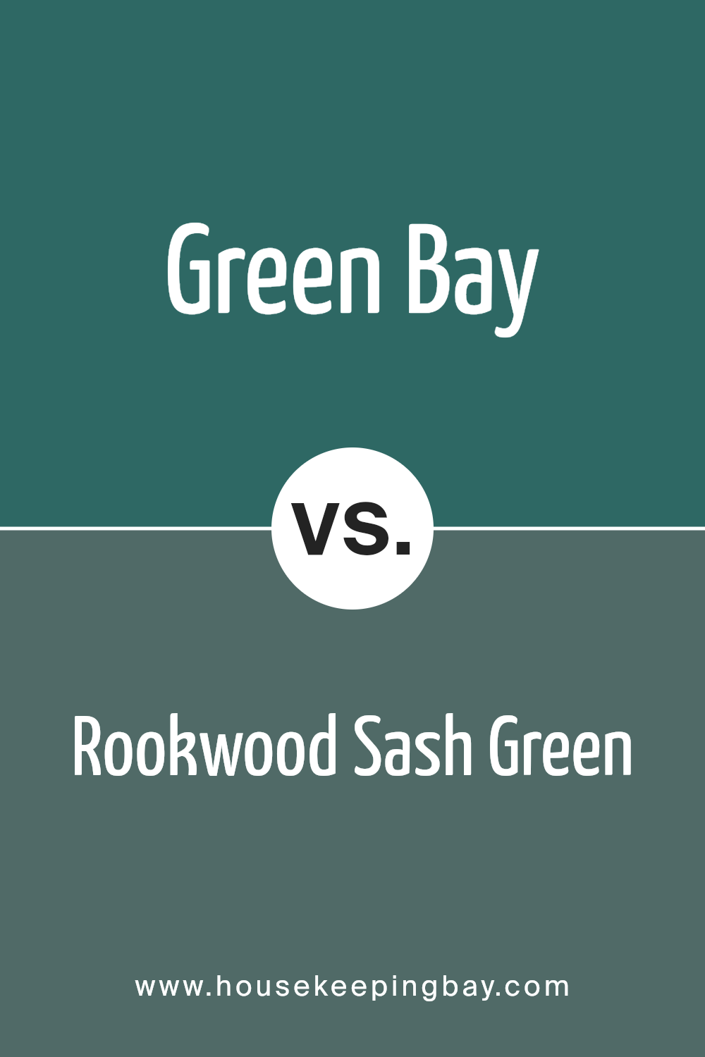
Green Bay SW 6481 by Sherwin Williams vs Rookwood Sash Green SW 2810 by Sherwin Williams
Green Bay SW 6481 by Sherwin Williams is a vibrant, lively shade of green. It exudes freshness and is reminiscent of lush, leafy environments, making it fantastic for spaces that aim to feel energetic and invigorating. Its brighter tone makes it very suited to areas that benefit from a pop of color such as playrooms or creative spaces.
In contrast, Rookwood Sash Green SW 2810 by Sherwin Williams offers a much deeper, more subdued green. This color has an earthy quality, giving it a sophisticated and traditional feel. Due to its darker and richer tone, Rookwood Sash Green is ideal for creating a cozy and grounding atmosphere, suitable for elegant dining rooms or studies.
Both colors offer distinct vibes: Green Bay brings cheer and vibrancy, perfect for more casual or spirited rooms, while Rookwood Sash Green provides a sense of refinement and calm, great for more formal or restful spaces.
You can see recommended paint color below:
- SW 2810 Rookwood Sash Green
housekeepingbay.com
Green Bay SW 6481 by Sherwin Williams vs Deep Sea Dive SW 7618 by Sherwin Williams
Green Bay SW 6481 by Sherwin Williams is a vibrant, lively shade of green. This color brings a fresh and energetic vibe to spaces, reminiscent of lush foliage in spring. It’s ideal for rooms or areas where you want to inject vitality and a sense of growth.
Deep Sea Dive SW 7618 by Sherwin Williams, in contrast, is a deep, rich turquoise. This shade offers a more reserved but equally impactful presence, suggesting the calm depths of the ocean. It suits spaces that aim for a sophisticated and serene atmosphere.
Both colors are bold and can create striking effects in a room. Green Bay tends to brighten and enliven a space, making it feel more open and inviting. Deep Sea Dive, with its darker tones, often works well in creating focal points or accent walls, providing a sense of depth and intrigue.
Whether you choose Green Bay for its cheerful energy or Deep Sea Dive for its composed charm, each color has a strong personality that significantly influences the mood and style of a room.
You can see recommended paint color below:
- SW 7618 Deep Sea Dive

housekeepingbay.com
Green Bay SW 6481 by Sherwin Williams vs Poseidon SW 6762 by Sherwin Williams
Green Bay SW 6481 by Sherwin Williams is a vibrant, lively green that brings a fresh and energizing vibe to spaces. It resembles lush greenery and can make a room feel more alive and bright. This color is perfect for places where you want to introduce a natural, outdoorsy feel without overwhelming the senses.
Poseidon SW 6762, also by Sherwin Williams, leans towards a deep, rich teal that mimics the ocean’s depths. This shade is darker and more intense, providing a sense of sophistication and depth. It works well in spaces that aim for a more dramatic or luxurious feel.
Both colors offer unique atmospheres: Green Bay adds brightness and a lively spirit, while Poseidon offers a deeper, more contemplative mood. Depending on the mood you want to achieve, each color can significantly alter the perception of a space.
These hues from Sherwin Williams truly offer versatile options for different design needs.
You can see recommended paint color below:
- SW 6762 Poseidon

housekeepingbay.com
I particularly appreciate how well SW 6481 Green Bay pairs with both neutral and bold color palettes, allowing for flexibility in design schemes.
For those considering a fresh look for their home or office, this color could serve as a striking focal point or a subtle complement to existing decor, depending on application techniques and accompanying colors.
Furthermore, the durability and coverage offered by Sherwin Williams paints, including SW 6481 Green Bay, assure long-lasting results that maintain their integrity over time. This reassurance is vital for those investing time and resources into home improvement projects.
In conclusion, SW 6481 Green Bay is more than just paint; it’s a smart choice for anyone looking to update their space with a touch of nature-inspired vitality.
Its adaptability and aesthetic appeal, backed by the quality of Sherwin Williams, make it a standout option worthy of consideration for your next renovation project.

housekeepingbay.com
Ever wished paint sampling was as easy as sticking a sticker? Guess what? Now it is! Discover Samplize's unique Peel & Stick samples. Get started now and say goodbye to the old messy way!
Get paint samples


