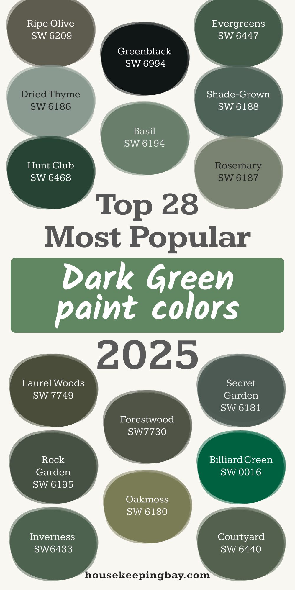
28 Dark Green Paint Colors by Sherwin-Williams
Find the perfect dark green paint color for your next project
When I think about creating a cozy and rich feeling in a home, my mind always goes straight to dark green. There’s something about it that makes a room feel more alive, almost like it’s giving you a hug every time you step inside. It reminds me of forests, old libraries, and classic homes with deep leather chairs and warm wood floors.
Dark green paints are having a moment, but honestly, they never really go out of style. People love them because they bring comfort, depth, and a sense of nature into a space. And they work everywhere—from modern homes to more traditional ones.
If you’re thinking about adding some deep green to your life, you’re definitely not alone.
According to a 2024 trend report by Houzz, over 35% of homeowners who remodeled their living rooms chose deep, bold colors instead of neutrals.
I’m excited to share with you my favorite dark green colors from Sherwin-Williams—and some ideas on how you can use them beautifully in your home!
housekeepingbay.com
Why Choose Sherwin-Williams for Dark Green Paint?
I’ve worked with a lot of paint brands over the years, but Sherwin-Williams is the one I trust the most when I’m picking a dark green. Their colors always feel rich, true, and reliable once they’re up on the wall. No weird surprises. No patchiness. Just the exact deep green you dream about.
What I really appreciate is their formulas—they offer beautiful finishes that stand up to real life. You know, pets running around, kids with sticky hands, moving furniture… real life. Plus, their color options are so well-thought-out that even their darkest greens have a softness to them. It’s not just “dark for the sake of dark”—it’s full of character.
And I’m not the only one who feels this way. In a 2023 J.D. Power Paint Satisfaction Study, Sherwin-Williams was ranked #1 in customer satisfaction among interior paints (source).
If you want a paint that looks gorgeous and lasts, this is the brand to trust—especially when it comes to the deep, moody greens.

housekeepingbay.com
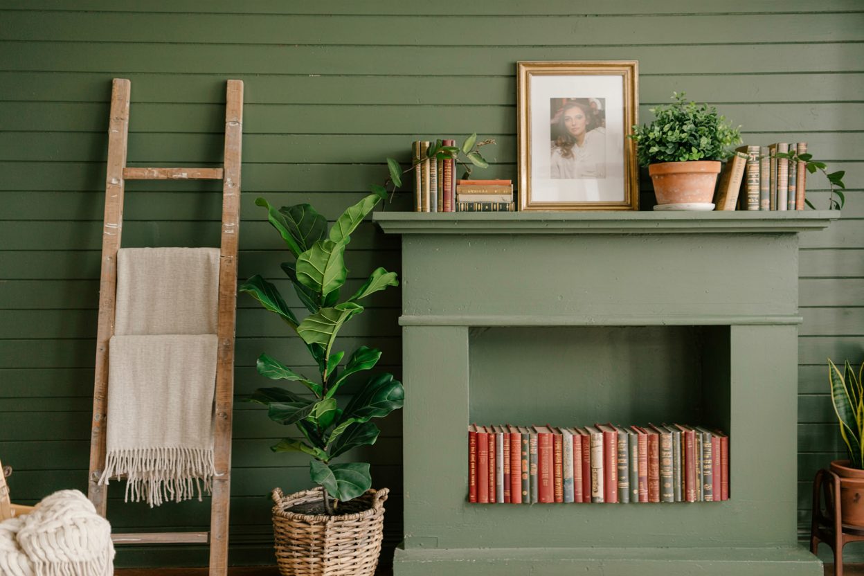
Best Tips for Using Dark Green in Your Home
Before you pick up a paintbrush, let me share a few things I’ve learned the hard way. Dark green is stunning, but using it the right way can make all the difference between a room feeling warm and one feeling a little too heavy.
Where Dark Green Works Best
-
Accent Walls: Sometimes a full room of dark green can feel too much. I love it on one wall behind a bed or sofa.
-
Cabinetry: Dark green kitchen cabinets are one of my favorite tricks. They make the space feel rich and grounded.
-
Powder Rooms: These small spaces are perfect for bold colors. A dark green powder room always feels like a hidden little gem.
-
Home Offices: Dark green helps with focus and calmness—perfect for a workspace.
Mistakes to Avoid
-
Skipping Good Lighting: Dark greens can feel too heavy if your room doesn’t get much natural light. Add extra lamps or lighter curtains.
-
Choosing the Wrong Undertone: Some dark greens lean blue, some lean yellow. Always test a sample on your wall before you commit.
-
Forgetting the Ceiling and Trim: Sometimes painting the ceiling or trim a soft white helps the green feel fresh and not boxed in.
-
Overloading the Room: If you use dark green walls, try lighter furniture and plenty of texture to balance the depth.
“Paint is the most powerful tool for changing a room. But without the right lighting and textures, even the prettiest color can fall flat.” — Nate Berkus
28 Stunning Dark Green Paint Colors by Sherwin-Williams
I picked these colors because they each bring something special. Some are cozy, some are dramatic, and some feel like a breath of fresh air. I’ll also share my quick thoughts on how or where I love to use them!
1. Ripe Olive (SW 6209)
Feels deep and earthy. Perfect for a cozy library or a quiet bedroom.
2. Greenblack (SW 6994)
Almost black but with a hint of green. Amazing for kitchen islands.
3. Evergreens (SW 6447)
A fresh dark green with a little warmth. Great for mudrooms and entryways.
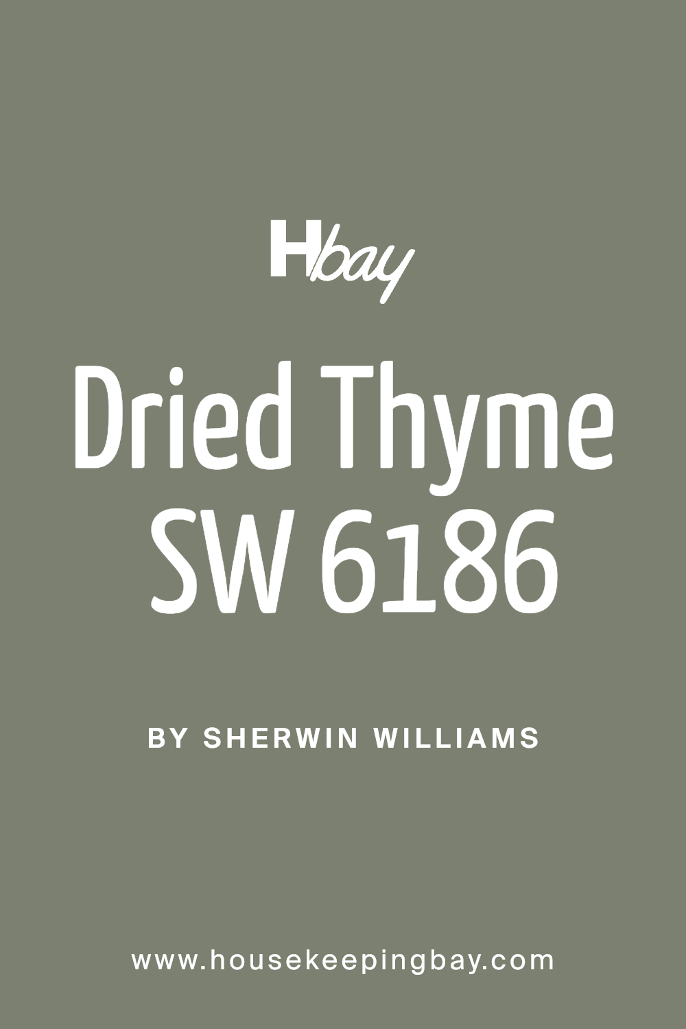
4. Dried Thyme (SW 6186)
Soft and herby. I love it for office spaces to encourage focus.
5. Basil (SW 6194)
Rich and lively. Works wonders for dining rooms.
6. Shade-Grown (SW 6188)
Deep and calming. Perfect for a master bedroom wall.
7. Hunt Club (SW 6468)
Strong and bold. Beautiful for kitchen cabinets.
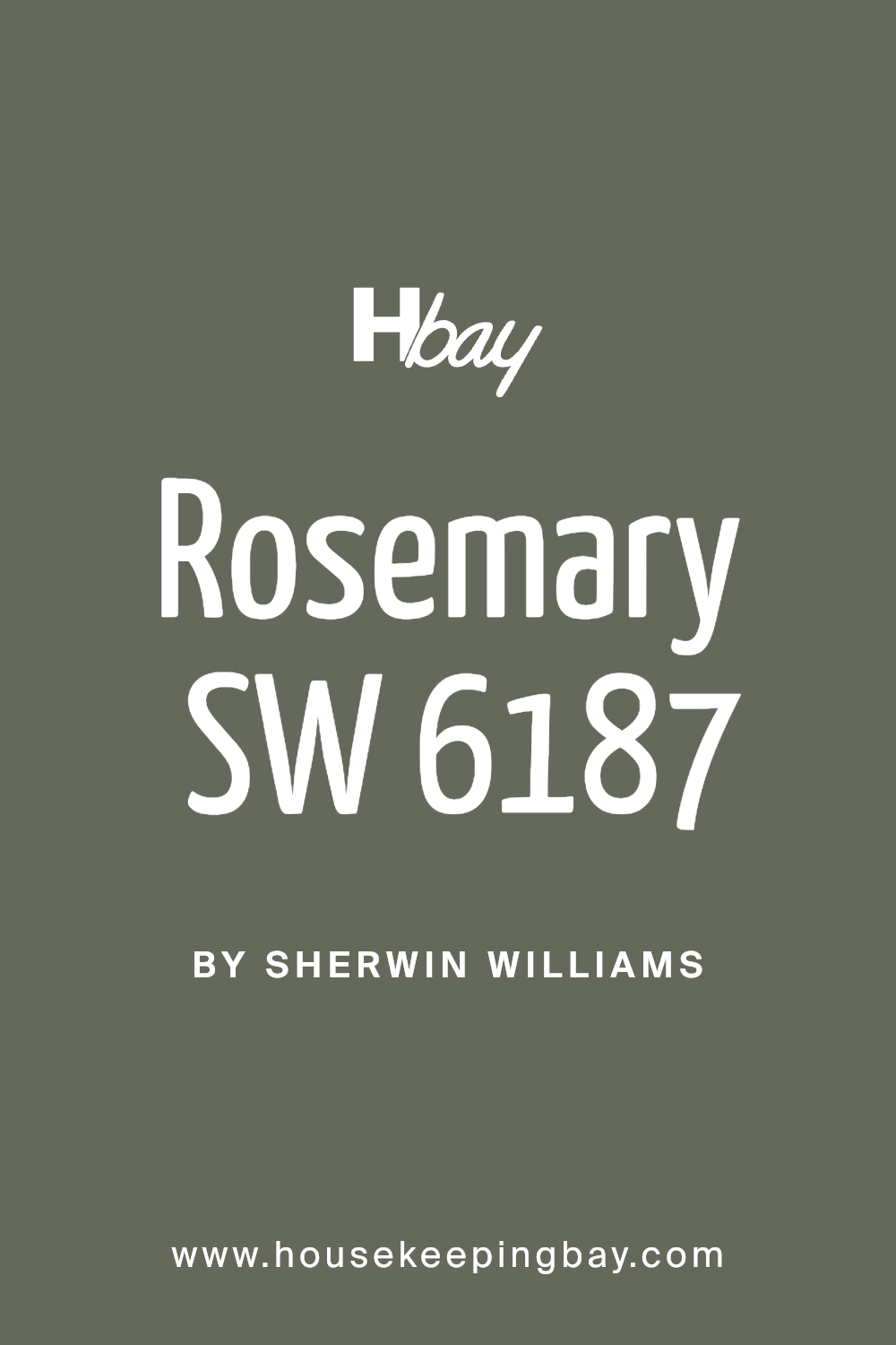
8. Rosemary (SW 6187)
Softer but still deep. It looks incredible in a farmhouse-style kitchen.
9. Pewter Green (SW 6208)
Leans a little gray. Wonderful for bathrooms.
10. Laurel Woods (SW 7749)
A deep green with a slight brown touch. Lovely for rustic homes.
11. Forestwood (SW 7730)
Dark but still vibrant. Gorgeous in entryways with white trim.
12. Secret Garden (SW 6181)
A classic garden green. Try it on patio doors!
13. Rock Garden (SW 6195)
Mysterious and cool. Amazing for living rooms.
14. Billiard Green (SW 0016)
A real true green. Fun for a game room.
15. Inverness (SW 6433)
A jewel-toned dark green. Looks luxurious on walls and cabinets.
16. Oakmoss (SW 6180)
Warm and inviting. Works beautifully with brass hardware.

17. Courtyard (SW 6440)
A little lighter but still rich. I like it for sunrooms.
18. Succulent (SW 9650)
Modern and slightly muted. Perfect for minimalist homes.
19. Jasper (SW 6216)
Very deep and moody. Great for a romantic bedroom.
20. Talipot Palm (SW 6726)
Earthy and alive. I used it once for a guest bathroom and loved it!
21. Cloverfields (SW 7734)
Soft green, very pretty with neutral fabrics.
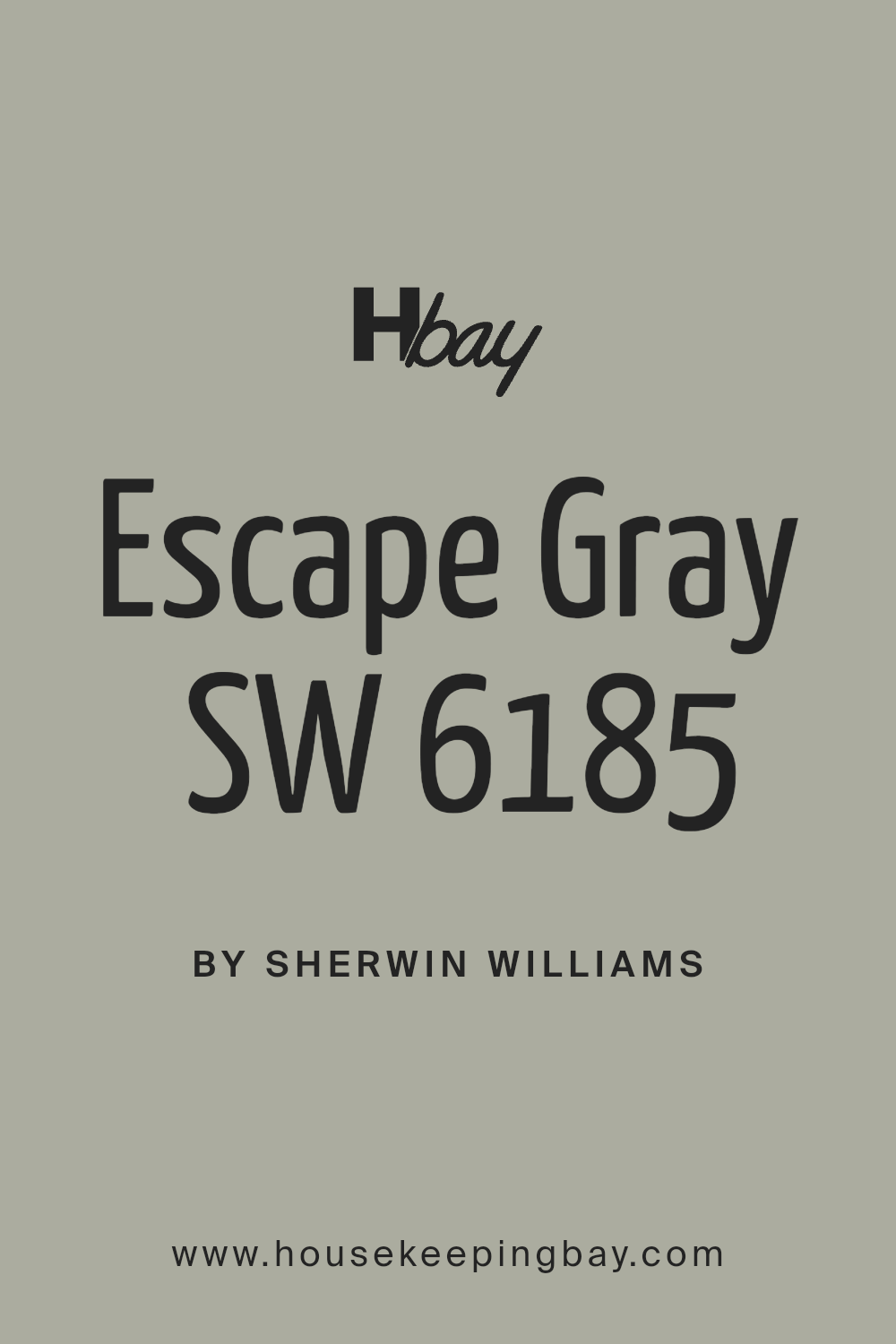
22. Escape Gray (SW 6185)
Has a lot of gray in it. Works great if you’re afraid to go too dark.
23. Relentless Olive (SW 6425)
Bold but not too bright. Fantastic for exterior doors.
24. Pressed Olive (SW 9127)
Very muted and sophisticated. Great for a reading nook.
25. Sage (SW 2860)
Classic and calming. Good for whole-house color in small cottages.
26. Oyster Bay (SW 6206)
Soft green with a misty feel. Nice for bedrooms with lots of natural light.
27. Retreat (SW 6207)
Muted and peaceful. It feels like a cozy sweater on the walls.
28. Acacia Haze (SW 9132)
Dusty green with a lot of character. Lovely for living rooms.

housekeepingbay.com
Tip: Always test a paint sample in your room before committing. Lighting changes everything!
Bonus: How to Pair Dark Green Colors
I get asked all the time, “What goes with dark green?”
Honestly, it’s easier than you think. Dark green plays well with a lot of colors and materials, but picking the right partners can really bring out its beauty.
Best Neutrals to Pair with Dark Green
-
Warm Whites (like Sherwin-Williams Alabaster SW 7008)
Softens the boldness and keeps things cozy. -
Light Grays (like Agreeable Gray SW 7029)
Gives a clean, modern look without feeling cold. -
Soft Beiges (like Accessible Beige SW 7036)
Adds warmth and creates a welcoming space.
Best Accent Colors
-
Blush Pink: Adds a sweet, unexpected pop without being too loud.
-
Mustard Yellow: Works beautifully in pillows or small accessories.
-
Navy Blue: Deep on deep! Perfect for bold looks with depth.
Best Materials to Match
-
Natural Wood: Think oak, walnut, and pine. Brings out the earthy feel.
-
Brass Fixtures: Gold-toned metals sparkle against dark greens.
-
Woven Textures: Baskets, linen curtains, and jute rugs keep it feeling fresh and natural.
“Dark colors do not make a room look smaller — that’s a myth. They can actually make a room feel larger and more interesting.” — Emily Henderson
My Final Thoughts
If you’ve been thinking about bringing dark green into your home, I say — trust your gut.
These shades are powerful but in a very comforting way. They remind us of nature, of rich old stories, of beautiful places that make us feel safe and inspired.
When you pick the right shade and pair it with the right textures and accents, dark green doesn’t just sit on the walls. It wraps your room in warmth and character.
One thing I always tell my clients: don’t be afraid of deeper colors. According to a Sherwin-Williams 2024 Color Psychology Report, 74% of homeowners said darker paint colors made their rooms feel more inviting
Dark green can be bold, but it’s also timeless. It’s not just a trend. It’s a feeling — and if it feels right to you, it is right.
So pick a color that speaks to you, grab a brush, and create a home that feels like it was meant just for you.