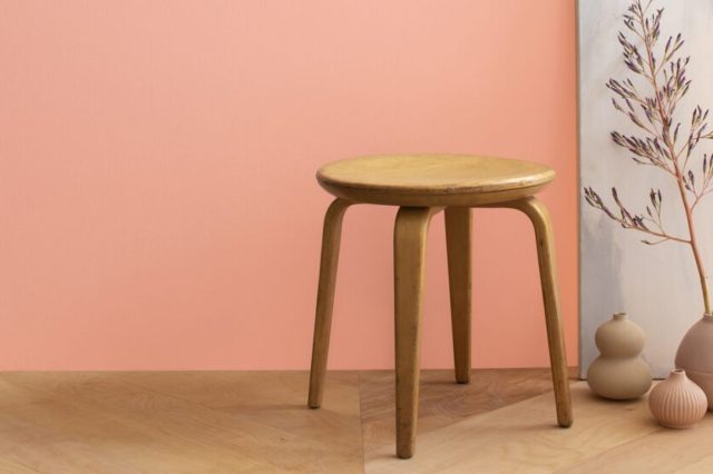
Cotton Candy SW 9692 by Sherwin Williams
Sweet Whispers of Whimsy: A Hue That Charms
SW 9692, better known as Cotton Candy by Sherwin Williams, is a paint shade that instantly brings a burst of joy and whimsy to any space. Imagine the soft, playful color of cotton candy you enjoyed as a child; that’s precisely what this paint encapsulates.
Its light, airy hue makes it a perfect choice for adding a touch of sweetness to bedrooms, playrooms, or any area that could use a lift.Cotton Candy by Sherwin Williams is not just a paint color; it’s a mood enhancer.
This delightful shade is versatile enough to work well in a variety of settings, from modern to more traditional spaces, proving that a little playfulness can go a long way in interior design.
Whether you’re looking to brighten up a room or add a soft backdrop for bolder decor elements, Cotton Candy provides a flexible foundation.
Choosing the right paint color can sometimes feel overwhelming, but Cotton Candy makes it easy. It’s a color that pairs nicely with numerous styles and textures, making it a stress-free choice for anyone looking to refresh their home.
If you’re considering a makeover for your space, consider the charming, cheerful vibe of SW 9692 Cotton Candy by Sherwin Williams. It just might be the perfect pick to liven up your living environment.
via sherwin-williams.com
What Color Is Cotton Candy SW 9692 by Sherwin Williams?
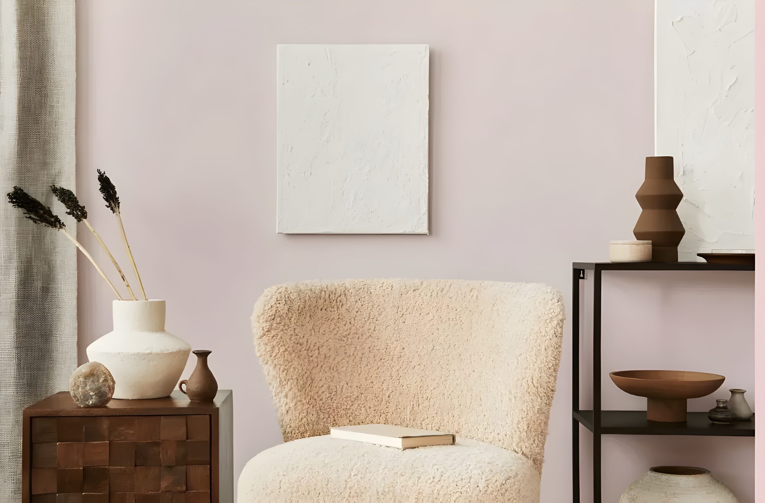
The color Cotton Candy SW 9692 by Sherwin Williams is a soft, playful hue that closely resembles the sweet, fluffy treat it’s named after. It has a light, airy feel, making it a perfect choice for adding a touch of whimsy and cheerfulness to any space.
This gentle pink shade has a warm undertone, making it welcoming and versatile for various interior styles.
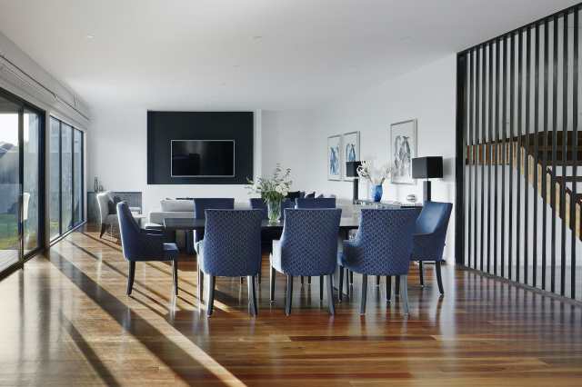
Cotton Candy SW 9692 is ideal for rooms aiming for a relaxed, happy vibe. It works exceptionally well in children’s bedrooms, creating a dreamy, fairy-tale atmosphere.
It’s also a great choice for adding a subtle pop of color to more neutral spaces like living rooms or bathrooms, providing a hint of warmth without overwhelming the senses.
This color blends harmoniously with interior styles that favor softness and femininity, such as shabby chic, Scandinavian, and contemporary minimalist.
The key is in pairing it with materials and textures that complement its subtlety and warmth. Natural wood, wicker, and light, breezy fabrics like cotton and linen enhance its softness.
For a more modern twist, materials such as brushed gold or copper accents, glass, and smooth, matte finishes can add a refined edge to the airy quality of Cotton Candy SW 9692.
Overall, Cotton Candy SW 9692 by Sherwin Williams invites a playful yet sophisticated palette, perfect for creating spaces that feel both comforting and stylish.
housekeepingbay.com
Table of Contents
Is Cotton Candy SW 9692 by Sherwin Williams Warm or Cool color?
Cotton Candy SW 9692 by Sherwin Williams is a paint color that brings a soft and playful vibe into any home. This color is like a gentle whisper of pink that can make rooms feel light, airy, and cheerful.
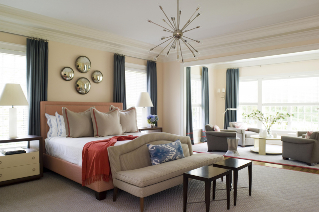
When used on walls, it adds a subtle splash of color that’s not overwhelming, making it perfect for creating a calm and inviting space. It’s especially great for bedrooms and nurseries, where you want to foster a comforting and nurturing atmosphere.
Since Cotton Candy SW 9692 is a soft hue, it pairs well with many other colors. It goes beautifully with whites and creams, adding a touch of warmth to these neutral palettes.
For a more dynamic look, pairing it with bold colors like navy or deep green can add an interesting contrast. Also, incorporating this color through accessories or furniture can freshen up a room without the commitment of painting entire walls.
In homes, Cotton Candy SW 9692 works wonderfully by brightening up spaces and adding a sense of playfulness without going over the top. It’s perfect for anyone looking to introduce color into their home in a subtle, yet impactful way.
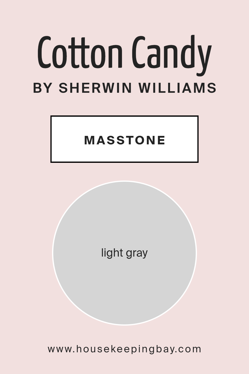
What is the Masstone of the Cotton Candy SW 9692 by Sherwin Williams?
Cotton CandySW 9692 by Sherwin Williams has a masstone, or main color, that is light gray (#D5D5D5). This shade is really soft and gentle, kind of like the color of clouds on a sunny day.
When you use this color in homes, it brings in a sense of calm and makes spaces feel open and airy. Because it’s such a light color, it helps small rooms look bigger and brighter.
It’s like a quiet friend that goes well with almost any other color, so you can mix it with bright colors for a fun look or keep things chill with other soft shades. It’s also really good for creating a modern vibe that’s cozy and inviting.
Whether you’re painting a whole room or just an accent wall, Cotton CandySW 9692 adds a touch of freshness without overwhelming the space.
It’s perfect for living rooms, bedrooms, or even bathrooms, giving them a clean and uplifting atmosphere. Plus, it’s super easy to match with furniture and decorations, making it a great choice for anyone looking to freshen up their home.
housekeepingbay.com
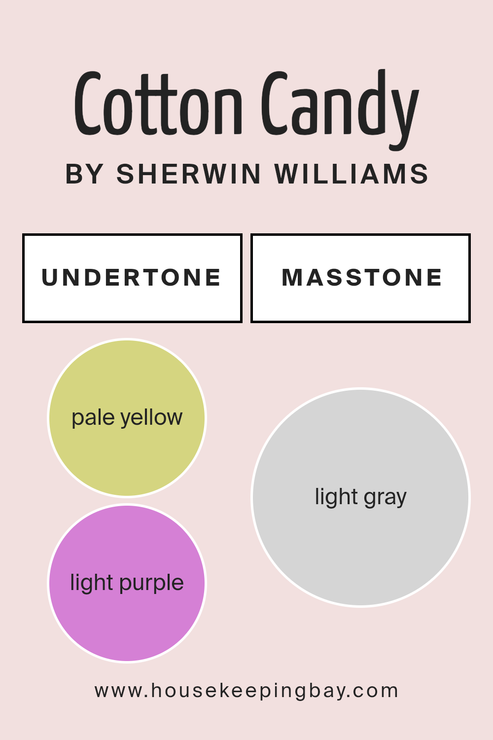
Undertones of Cotton Candy SW 9692 by Sherwin Williams
Cotton Candy SW 9692 by Sherwin Williams is a unique color that has some interesting undertones hidden beneath its surface. Specifically, it contains hints of pale yellow and light purple.
These undertones play a significant role in how we perceive the color, adding depth and dimension that might not be immediately obvious at first glance.
Understanding undertones can greatly influence how we see a color in different settings. For example, in bright sunlight, the pale yellow undertone might make Cotton Candy appear slightly warmer, adding a subtle glow to a room.
Conversely, in dimmer, artificial light, the light purple undertone might become more apparent, giving the color a cooler, softer feel.
This complexity is what makes choosing paint colors both challenging and exciting, as the same color can look different depending on the lighting and surroundings.
When applied to interior walls, the undertones of Cotton Candy SW 9692 can significantly impact the ambiance of a space. Rooms with plenty of natural light might highlight the pale yellow undertone, creating a welcoming and cozy atmosphere.
On the other hand, spaces with less natural light can bring out the light purple undertone, lending a calm and tranquil vibe to the room.
This interplay of undertones means that Cotton Candy is a versatile choice, capable of creating a range of moods depending on the space it’s used in and the lighting conditions present.
housekeepingbay.com
How Does Lighting Affect Cotton Candy SW 9692 by Sherwin Williams?
Lighting plays a crucial role in how we perceive colors. The same color can look quite different under various lighting conditions.
A fascinating example of this phenomenon is the color Cotton CandySW 9692 by Sherwin Williams. This color has a soft, gentle hue that can transform significantly with changes in light.
Under artificial lighting, such as LED or fluorescent lights, Cotton CandySW 9692 might seem slightly more vibrant. Artificial light, especially if it’s on the cooler spectrum, can make this color pop a bit more, bringing out its playful, lively personality.
In a room with warm artificial lighting, Cotton CandySW 9692 could appear softer and more soothing, leaning towards a cozy feeling that’s perfect for relaxing.
Natural light has its own unique impact on Cotton CandySW 9692. In rooms that face North and receive less direct sunlight, this color can look more muted and subtle.
North-facing rooms often have cooler, more even light throughout the day, which can make Cotton CandySW 9692 appear slightly paler or even give it a cooler tone, emphasizing its delicate nuances.
In South-facing rooms, which get plenty of bright, warm sunlight throughout the day, Cotton CandySW 9692 can truly shine. The natural light can intensify the warmth of the color, making it feel more vibrant and energetic.
This can create an inviting and cheerful space, perfect for areas where you spend a lot of time during the day.
East-facing rooms receive bright sunlight in the morning, which can make Cotton CandySW 9692 look particularly lively and fresh at the start of the day. As the day progresses and the natural light fades, the color may take on a more subdued, gentle appearance.
West-facing rooms offer a reverse scenario from east-facing ones, with softer light in the morning leading to bolder, more dramatic lighting in the afternoon and evening.
In these rooms, Cotton CandySW 9692 can transition from looking soft and understated in the morning to more dynamic and rich in the golden light of the setting sun.
Thus, lighting—whether it’s from the sun or a bulb—dramatically affects how we see and feel about the color Cotton CandySW 9692. Its appearance and mood can shift dramatically, making it a versatile choice for different rooms and settings.
housekeepingbay.com
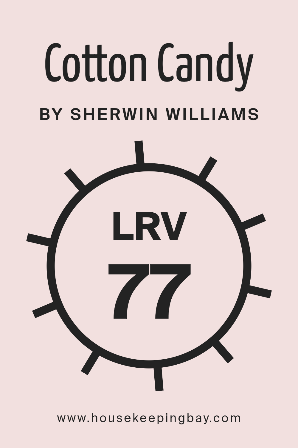
What is the LRV of Cotton Candy SW 9692 by Sherwin Williams?
LRV stands for Light Reflectance Value, which is a number that tells you how much light a color will reflect or absorb when it’s painted on a wall.
This value is on a scale from 0 to 100, where 0 means the color absorbs all light (like pure black) and 100 means it reflects all light (like pure white).
The higher the LRV, the more light that color will reflect, making the room feel brighter and often larger. On the other hand, colors with a low LRV can make a space feel cozier but smaller and dimmer because they absorb more light.
Regarding the color Cotton Candy SW 9692 by Sherwin Williams, which has an LRV of 77.427, it’s a light-reflecting color. This means it’s pretty bright and can make rooms feel airy and spacious.
When you paint your walls with this color, it will bounce a lot of natural and artificial light around the room, enhancing brightness. This makes it a great choice for spaces you want to feel open and welcoming, or for darker rooms that could use a boost in light.
However, it’s important to consider how much light your room gets and what mood you want to achieve, as this high LRV color might impact the ambiance you’re striving for.
housekeepingbay.com
What is LRV? Read It Before You Choose Your Ideal Paint Color
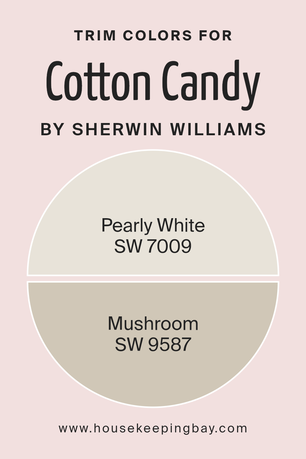
What are the Trim colors of Cotton Candy SW 9692 by Sherwin Williams?
Trim colors are hues selected to complement the main color of a space, used for detailing around doors, windows, and baseboards to add definition and character.
For a whimsical shade like Cotton Candy SW 9692 by Sherwin-Williams, choosing the right trim colors is crucial to subtly balance its vividness without overwhelming the senses.
The trim acts as a frame, drawing the eye to architectural features and ensuring that the room’s color palette feels cohesive and consciously designed.
Properly chosen trim colors can enhance the lightness of a room, create visual harmony, or introduce an element of contrast that highlights the unique character of the main color.
SW 7009 – Pearly White, with its soft, warm undertones, offers a subtle contrast to the bright cheerfulness of Cotton Candy, ensuring the space feels airy and uplifted.
This muted shade has the versatility to blend seamlessly with various decor styles, gently enhancing the playful nature of the pink without competing for attention.
On the other hand, SW 9587 – Mushroom, brings a grounding earthiness to the mix, adding depth and a touch of sophistication.
Its natural, muted tone is ideal for bringing a comfortable, cozy feel to a room, tempering the vivacity of Cotton Candy with a whisper of maturity and warmth.
Together, these trim colors offer a balanced approach to decorating, ensuring the space remains inviting and balanced.
You can see recommended paint colors below:
housekeepingbay.com
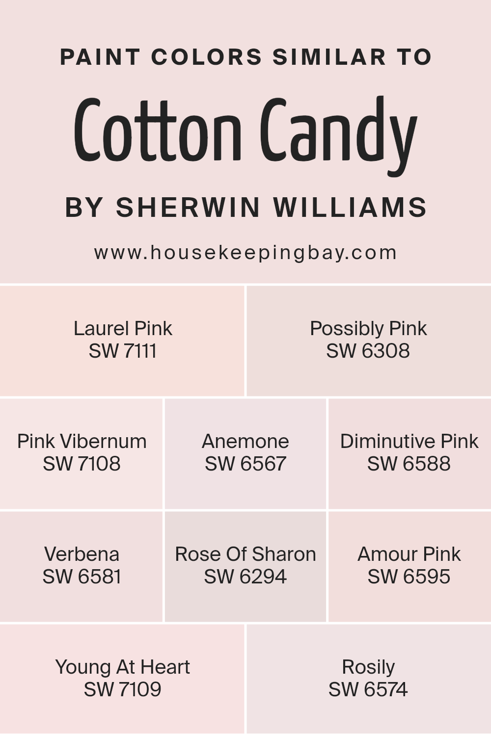
Colors Similar to Cotton Candy SW 9692 by Sherwin Williams
Similar colors play a vital role in design and aesthetics because they create harmony and a sense of balance.
When we think about similar colors to Cotton Candy SW 9692 by Sherwin Williams, we’re looking at hues that share a common warmth and softness, bringing a cohesive and pleasant visual experience.
These colors, ranging from the gentle touch of Laurel Pink SW 7111 to the subtle vibes of Young At Heart SW 7109, work together by providing variations in intensity and saturation while maintaining a unified theme. This approach allows for depth and complexity in design without overwhelming the senses.
Laurel Pink offers a whisper-soft pink that brings a touch of elegance without overpowering a space, while Possibly Pink adds a slightly more pronounced pink hue that brightens rooms with a playful yet subtle charm.
Pink Viburnum introduces a deeper, more floral pink that recalls the beauty of a garden in bloom, whereas Anemone steps into the realm of liveliness with its bubbly and uplifting spirit.
Diminutive Pink and Verbena present lighter, almost ethereal options for spaces that aim for a delicate touch. Rose Of Sharon and Amour Pink go bolder, embracing the full spectrum of pink with a vibrant and heartwarming presence.
Finally, Young At Heart and Rosily balance the collection by grounding the palette with their rich yet understated elegance, ensuring that any space can achieve a harmonious blend of serenity and vitality.
Together, these colors offer endless possibilities for creating spaces that are both inviting and expressive.
You can see recommended paint colors below:
- SW 7111 Laurel Pink
- SW 6308 Possibly Pink
- SW 7108 Pink Vibernum
- SW 6567 Anemone
- SW 6588 Diminutive Pink
- SW 6581 Verbena
- SW 6294 Rose Of Sharon
- SW 6595 Amour Pink
- SW 7109 Young At Heart
- SW 6574 Rosily
housekeepingbay.com
How to Use Cotton Candy SW 9692 by Sherwin Williams In Your Home?
Cotton Candy SW 9692 by Sherwin Williams is a lovely, light pink paint that adds a soft touch of sweetness to any room. This color is perfect for creating a cozy and welcoming space in your home.
You can use it in a variety of ways to freshen up your living areas. For example, painting a bedroom wall with Cotton Candy can create a calming retreat for relaxation. It’s also great for a child’s room, adding a playful yet gentle vibe.
In addition to bedrooms, consider using it in a bathroom for a charming and serene feel. Another idea is to paint a piece of furniture, like a bookshelf or a desk, for a subtle pop of color that brings warmth into the room.
Cotton Candy SW 9692 works well with white trims and soft neutrals, making it versatile for pairing with various decor styles.
Whether you’re updating a single room or looking for a fresh color scheme throughout your home, Cotton Candy can add a delightful touch without overwhelming your spaces.
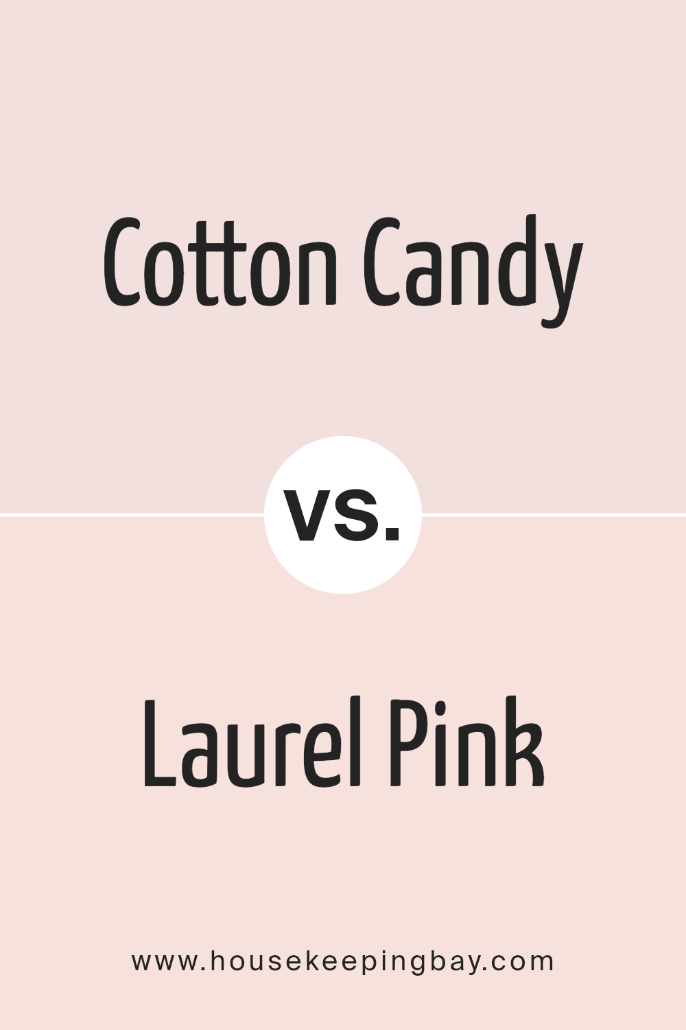
Cotton Candy SW 9692 by Sherwin Williams vs Laurel Pink SW 7111 by Sherwin Williams
Cotton Candy SW 9692 by Sherwin Williams is a light, playful pink that brings to mind the sweet, fluffy treat often seen at fairs. It’s a soft, cheerful color that can brighten up any space, making it feel more open and welcoming.
This shade leans towards a more muted, pastel tone, offering a gentle pop of color without overwhelming a room.
On the other hand, Laurel Pink SW 7111 by Sherwin Williams is a bit deeper and more subdued than Cotton Candy. It’s still in the pink family but has hints of peach or coral, giving it a warmer, more sophisticated vibe.
This color can create a cozy, inviting atmosphere in a room, perfect for someone looking for a pink with a bit more depth and maturity.
Both colors are beautiful in their own right. Cotton Candy is ideal for spaces aiming for a light, airy feel, while Laurel Pink suits areas that want a touch of warmth and sophistication.
You can see recommended paint color below:
- SW 7111 Laurel Pink
housekeepingbay.com
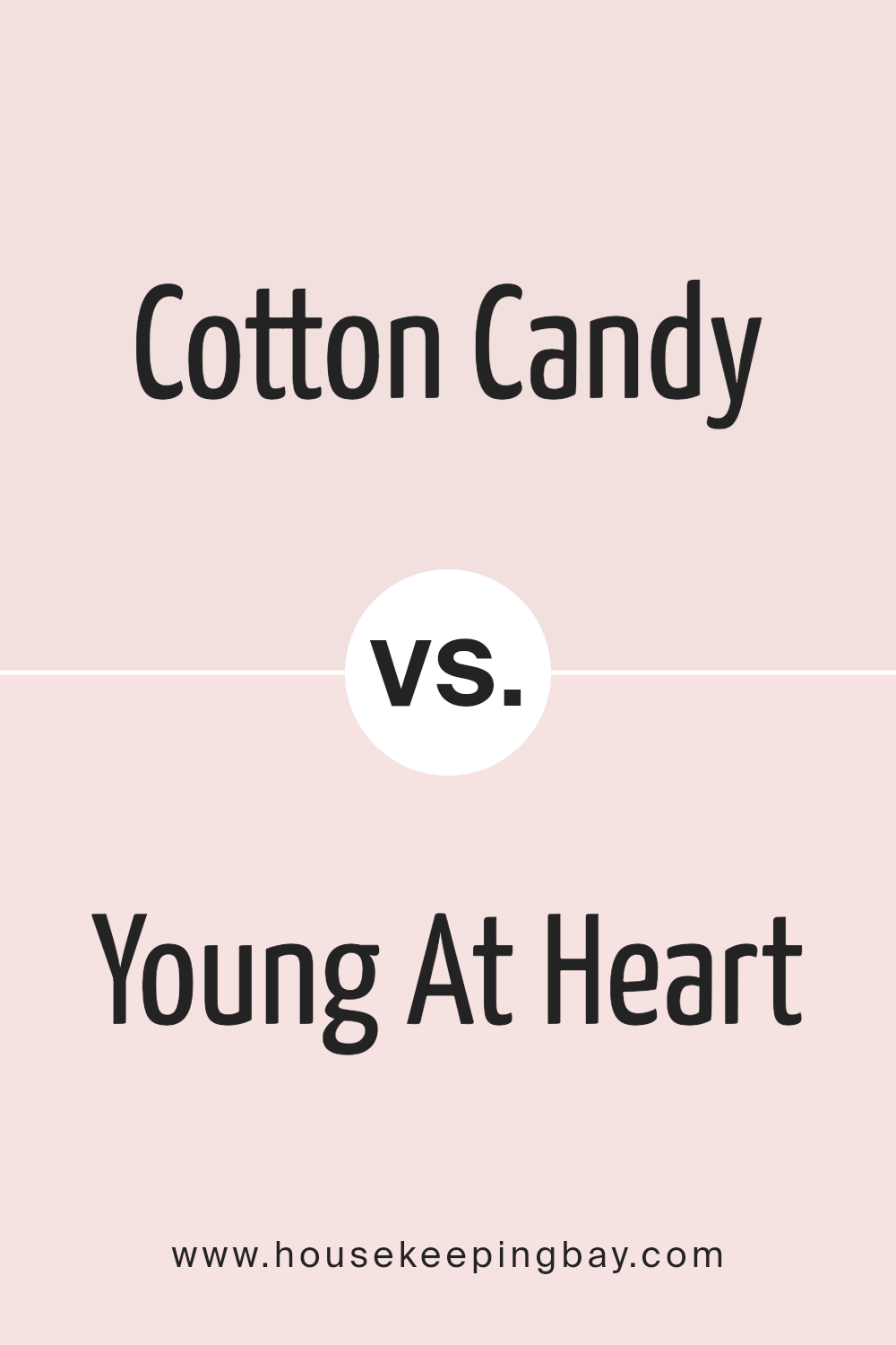
Cotton Candy SW 9692 by Sherwin Williams vs Young At Heart SW 7109 by Sherwin Williams
Cotton Candy SW 9692 by Sherwin Williams and Young At Heart SW 7109 are two interesting colors.
Cotton Candy is a soft, light pink that reminds you of the sweet, fluffy treat you enjoy at fairs. It’s gentle and brings a feeling of calm and happiness to a room. It’s like a hug from your favorite cozy blanket.
On the other hand, Young At Heart is also a pink, but it has a bit more punch to it. It’s vibrant and playful, making spaces feel alive and full of energy. This color can light up a room and make it fun, just right for places where you want smiles and laughter.
Both colors are in the pink family but have their own personalities. Cotton Candy is more about softness and comfort, perfect for quiet spaces or a peaceful vibe.
Young At Heart is bolder and more outgoing, great for creating lively, cheerful spaces. They offer two different takes on pink, each with its charm and best uses.
You can see recommended paint color below:
- SW 7109 Young At Heart
housekeepingbay.com
Cotton Candy SW 9692 by Sherwin Williams vs Rose Of Sharon SW 6294 by Sherwin Williams
Cotton Candy SW 9692 by Sherwin Williams is a light, playful pink that feels airy and soft. It’s like the sweet, fluffy candy it’s named after. This color has a gentle vibe, making it perfect for creating a soothing and cheerful space.
It’s great for rooms where you want to relax and feel uplifted, such as bedrooms and bathrooms.
On the other hand, Rose Of Sharon SW 6294 is a richer, deeper pink with a warm undertone. This color is bolder and makes more of a statement. It brings to mind the vibrant petals of a Rose of Sharon flower.
If you’re looking to add a pop of color or create a focal point in a room, this could be the perfect choice. It works well in spaces where you want to add warmth and energy.
While both colors are in the pink family, Cotton Candy is softer and more muted, ideal for a light and airy feel, whereas Rose Of Sharon offers a more intense and warm experience, perfect for making an impact.
You can see recommended paint color below:
- SW 6294 Rose Of Sharon
housekeepingbay.com
Cotton Candy SW 9692 by Sherwin Williams vs Rosily SW 6574 by Sherwin Williams
Cotton Candy SW 9692 from Sherwin-Williams is a light, playful pink. It’s soft and has the gentle feel of actual cotton candy you’d enjoy at a fair. This color is refreshing and brings a sweet ambiance to any space, making it feel open and airy.
On the other hand, Rosily SW 6574, also by Sherwin-Williams, is a deeper, more vibrant shade of pink. It’s bolder and adds a warm, inviting touch to rooms.
While still in the pink family, it has a richness that Cotton Candy lacks, offering a cozier and slightly more sophisticated feel.
Comparing the two, Cotton Candy is best for creating a light, whimsical feel, perfect for a nursery or a relaxing reading nook.
Rosily, with its deeper tone, is great for adding a pop of color without overwhelming a space, suitable for living rooms or bedrooms where a touch of warmth is desired.
Both colors have their unique charm, depending on the mood you’re aiming to create.
You can see recommended paint color below:
- SW 6574 Rosily
housekeepingbay.com
Cotton Candy SW 9692 by Sherwin Williams vs Amour Pink SW 6595 by Sherwin Williams
Cotton Candy SW 9692 by Sherwin Williams is a soft, light pink color that feels airy and sweet, just like the sugary treat it’s named after. It has a delicate vibe, making it perfect for creating a soothing and inviting space.
Think of it as a gentle hug from your favorite cozy blanket. This color is great for adding a touch of whimsy and warmth to rooms without overwhelming them with too much brightness.
On the other hand, Amour Pink SW 6595 is a bit richer and deeper than Cotton Candy. It has a more pronounced pink hue that stands out, adding a bubbly and lively feel to any room.
While it’s still in the pink family, Amour Pink brings a bit more energy and playfulness. It’s like the difference between a soft, comforting smile and a cheerful, hearty laugh.
In summary, while both colors share the joyous qualities of pink, Cotton Candy is lighter and more subdued, offering a whisper of color.
Amour Pink, however, delivers a more vibrant and spirited dose of pink, making spaces feel lively and dynamic.
You can see recommended paint color below:
- SW 6595 Amour Pink
housekeepingbay.com
Cotton Candy SW 9692 by Sherwin Williams vs Pink Vibernum SW 7108 by Sherwin Williams
Cotton Candy SW 9692 by Sherwin Williams and Pink Viburnum SW 7108 by Sherwin Williams are two lovely shades, but they have their own unique appeal.
Cotton Candy is a soft, pale pink that feels very light and airy. It’s like the delicate color of the sky at sunrise, gentle and soothing. This color is great for creating a calming, peaceful space that’s still cheerful and inviting.
On the other hand, Pink Viburnum is a more vibrant, lively pink. It’s got a bit more energy and punch, making it perfect for adding a pop of color to a room without overwhelming it.
This shade is bolder and can make a statement, yet it’s still soft enough to blend well with other colors.
In simple terms, if you’re looking for something subtle and gentle, Cotton Candy is the go-to. It’s perfect for a serene and tranquil vibe.
But if you want something that stands out a bit more and brings liveliness to a space, Pink Viburnum is the better choice. Both colors offer a beautiful pink palette, but their effects are quite different based on their intensity and depth.
You can see recommended paint color below:
- SW 7108 Pink Vibernum
housekeepingbay.com
Cotton Candy SW 9692 by Sherwin Williams vs Anemone SW 6567 by Sherwin Williams
Cotton Candy SW 9692 by Sherwin Williams is a light, airy pink that feels soft and sweet, just like its namesake.
It’s a gentle color that adds a touch of warmth and brightness to a room without being too bold or overwhelming. It’s perfect for creating a cozy and comforting atmosphere in spaces like bedrooms or nurseries.
On the other hand, Anemone SW 6567 is a deeper, bolder color. It’s a vibrant turquoise that packs a punch and brings energy into a space.
Unlike Cotton Candy, Anemone is more about making a statement and adding a splash of dynamic color to an area. It works well in spaces where you want to inspire creativity and uplift the mood.
Both colors are beautiful in their own right. Cotton Candy offers a whisper of softness and sweetness, ideal for calming spaces. Anemone stands out more, bringing vibrancy and a sense of adventure to a room.
Depending on what vibe you’re aiming for, either color could be a great choice.
You can see recommended paint color below:
- SW 6567 Anemone
housekeepingbay.com
Cotton Candy SW 9692 by Sherwin Williams vs Verbena SW 6581 by Sherwin Williams
Cotton Candy SW 9692 by Sherwin Williams and Verbena SW 6581 by Sherwin Williams are two unique colors. Cotton Candy is a soft, pale pink that feels light and airy, kind of like the actual cotton candy treat.
It brings a gentle, soothing vibe to any room, perfect for creating a calm and relaxing space. On the other hand, Verbena is a vibrant, bright lavender color.
It’s lively and has a bit more energy compared to Cotton Candy, making it great for areas where you want a pop of color or to add a playful touch.
While Cotton Candy is more about serenity and a soft, sweet atmosphere, Verbena stands out with its vividness, adding a cheerful and dynamic feeling wherever it’s used.
If you’re deciding between the two, think about what mood you want to create. For a quieter, more peaceful setting, Cotton Candy is the way to go. But if you’re after something more stimulating and joyful, Verbena will certainly do the trick.
You can see recommended paint color below:
- SW 6581 Verbena
housekeepingbay.com
Cotton Candy SW 9692 by Sherwin Williams vs Diminutive Pink SW 6588 by Sherwin Williams
Cotton Candy SW 9692 by Sherwin-Williams is a soft, playful pink that brings a gentle and soothing vibe to any space. It’s like the light, fluffy cotton candy at a fair – sweet and inviting.
This color works great in rooms where you want to add a touch of warmth without overwhelming the space with too bold of a color.
On the other hand, Diminutive Pink SW 6588 by Sherwin-Williams is a more subtle, understated pink. It’s a quieter shade that leans towards a soft, almost neutral pink.
This means it’s really versatile and can fit in almost anywhere, adding a whisper of color without demanding too much attention.
While both colors share a pink base, Cotton Candy is noticeably the brighter and more playful of the two.
In contrast, Diminutive Pink is quieter and more reserved, making it easier to blend into a wider variety of decor styles. Both colors offer their own unique charm, depending on the mood you’re aiming to create.
You can see recommended paint color below:
- SW 6588 Diminutive Pink
housekeepingbay.com
Cotton Candy SW 9692 by Sherwin Williams vs Possibly Pink SW 6308 by Sherwin Williams
Cotton Candy SW 9692 by Sherwin Williams and Possibly Pink SW 6308 by Sherwin Williams are two beautiful shades that are quite distinct from each other.
Cotton Candy is a light, airy pink that feels very soft and soothing. It’s the kind of color that makes a room feel gentle and welcoming, perfect for creating a calm atmosphere.
On the other hand, Possibly Pink is a bit more robust in its pinkness. It’s a warmer, more noticeable shade that gives off a cozy vibe. It’s richer and can add a pop of color without overwhelming a space.
This color works well in areas where you want a bit more warmth and personality.
Both colors bring their own unique feel to a space. Cotton Candy is ideal for those looking for a subtle, soft touch. Possibly Pink suits those who prefer their pinks with a bit more depth and warmth.
Whether for a bedroom, living area, or nursery, each color offers its own charm.
You can see recommended paint color below:
- SW 6308 Possibly Pink
housekeepingbay.com
Conclusion
Sherwin Williams’ Cotton Candy SW 9692 is a delightful shade that brings a playful and light-hearted vibe to any space. This color, reminiscent of the sweet treat often found at fairs, has the ability to brighten rooms and add a touch of whimsy to the decor.
Its soft, pastel hue makes it a perfect choice for creating a soothing atmosphere in bedrooms or adding a gentle pop of color in living areas.
Cotton Candy SW 9692 is versatile and works well with a wide range of color palettes, making it a friendly option for those looking to refresh their home’s look.
One of the outstanding qualities of Cotton Candy SW 9692 is its ability to infuse energy into a room without overwhelming it.
This color is especially appealing in spaces meant for relaxation or creativity, offering just the right balance of warmth and lightness to inspire and comfort.
Whether it’s used as a main wall color or as an accent, Cotton Candy SW 9692 guarantees to lift the spirits and add a playful touch to any interior design scheme.
Its effectiveness in creating a welcoming and fun space makes it a go-to color for anyone wanting to add a little joy to their home.
housekeepingbay.com
Ever wished paint sampling was as easy as sticking a sticker? Guess what? Now it is! Discover Samplize's unique Peel & Stick samples. Get started now and say goodbye to the old messy way!
Get paint samples