Cinnamon Slate 2113-40 by Benjamin Moore
Unveiling Warmth in Every Brushstroke
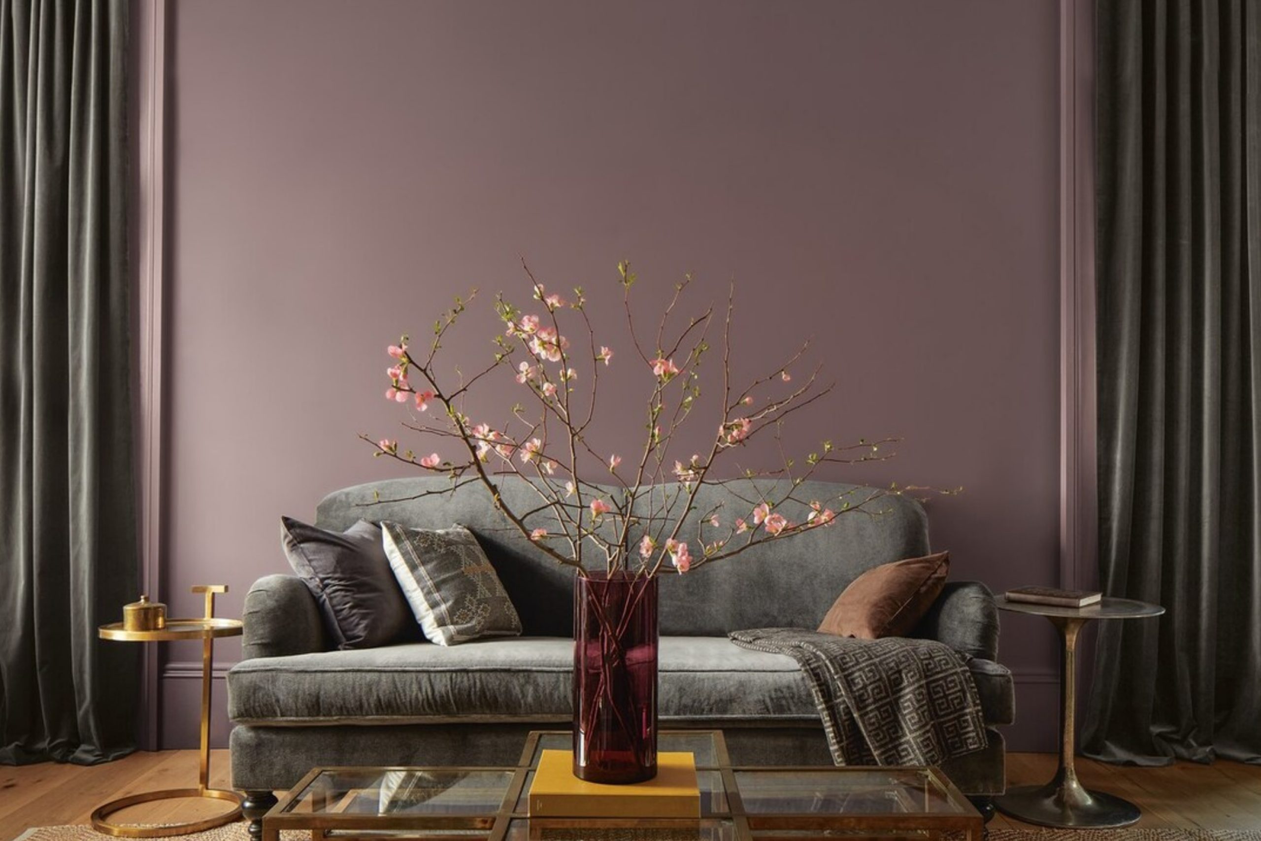
Are you looking for a fresh color to spruce up your space? Consider 2113-40 Cinnamon Slate by Benjamin Moore. This unique shade blends the warmth of cinnamon with the subtle coolness of slate, creating a balanced and inviting atmosphere in any room.
Cinnamon Slate is versatile enough to work in a variety of spaces, whether you want to add a cozy touch to your living room or a sophisticated splash to your bedroom.
The beauty of Cinnamon Slate lies in its ability to enhance the surroundings without overwhelming them.
It pairs well with both light and dark furniture, making it easy for you to mix and match your existing decor. Additionally, this color works beautifully in different lighting conditions, providing a soothing backdrop that shifts subtly from day to night.
If you’re thinking of giving your walls a new look, Cinnamon Slate offers a refreshing alternative to the usual choices. It’s a great way to add a bit of personality and charm to your home without going too bold. Whether you’re painting a feature wall or refreshing the entire room, Cinnamon Slate could be the perfect choice for you.
via newswire.ca
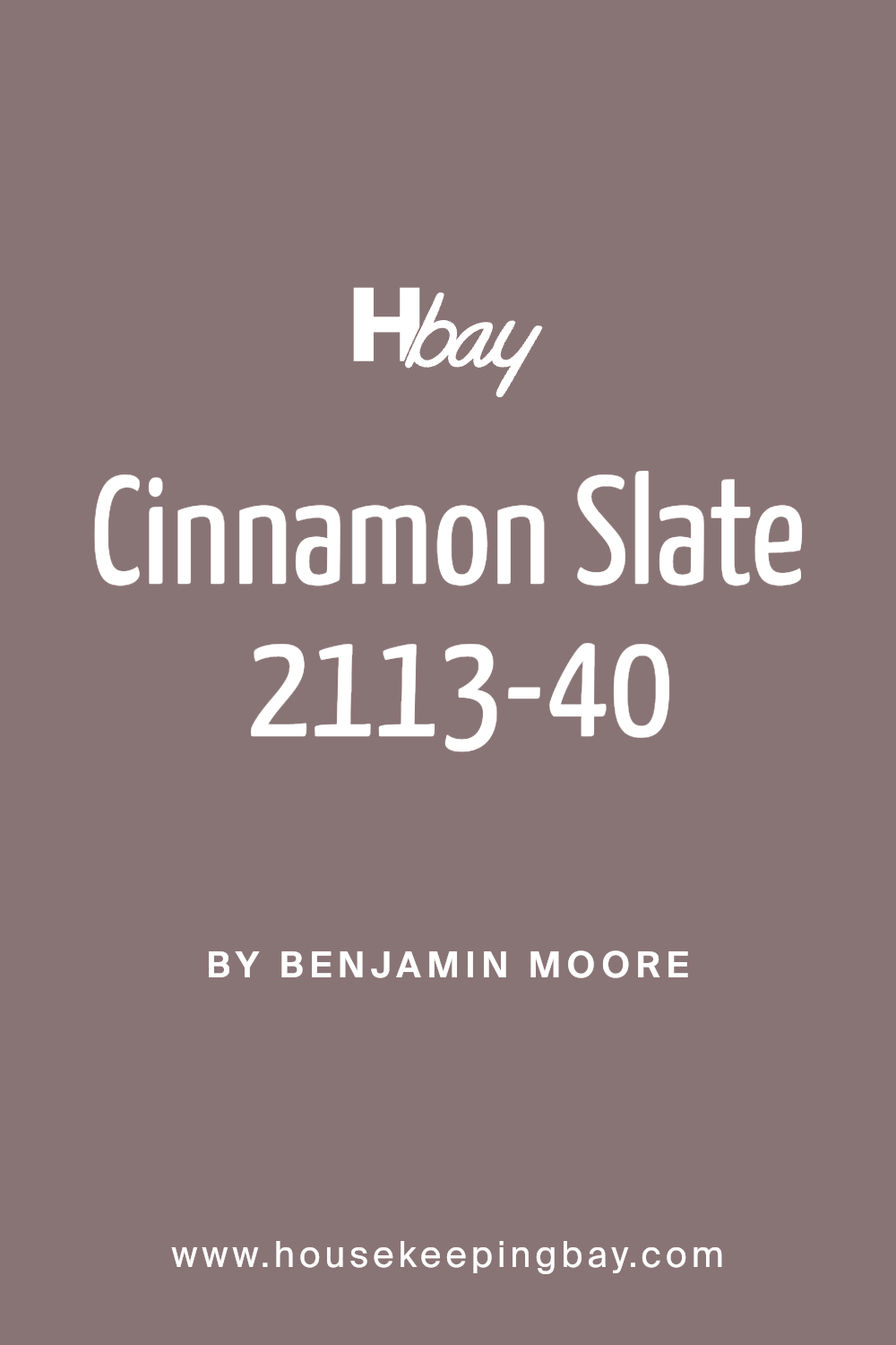
What Color Is Cinnamon Slate 2113-40 by Benjamin Moore?
Cinnamon Slate 2113-40 by Benjamin Moore is a rich, warm color that melds reddish-brown tones with a hint of gray, creating a cozy and inviting atmosphere. This versatile shade is well-suited for various interior styles, particularly rustic, traditional, and modern farmhouse designs. Its earthiness brings warmth to spaces, making it ideal for living rooms, dining areas, and bedrooms where comfort is key.
Cinnamon Slate pairs excellently with natural materials such as wood, leather, and linen, enhancing the texture and depth of the room. Wood elements, from oak to walnut, complement its warmth, creating a seamless aesthetic flow. Leather furniture in dark or caramel tones can also synergize well with this color, providing a luxurious yet grounded look.
Soft furnishings like linen curtains or chunky wool throws in neutral shades like cream or beige can soften the intensity of Cinnamon Slate, balancing the overall feel of the interior.
For those interested in a more dynamic contrast, metallic accents in copper or bronze can introduce an elegant touch, highlighting the sophisticated undertones of this hue. Overall, Cinnamon Slate is highly adaptable, enriching a space with its hearty, inviting essence.
housekeepingbay.com
Is Cinnamon Slate 2113-40 by Benjamin Moore Warm or Cool color?
Cinnamon Slate 2113-40 by Benjamin Moore is a warm and inviting paint color. Its rich, deep hue is somewhere between brown and red, giving it a cozy feel that is perfect for creating a welcoming atmosphere in any room.
This versatile color can add depth and warmth to spaces such as living rooms, dining areas, and bedrooms, making them feel more inviting and comfortable.
Additionally, Cinnamon Slate works well with a variety of decor styles, from rustic to modern, as it pairs nicely with both light and dark furnishings, enhancing the overall aesthetic without overwhelming the space.
It also serves as a beautiful accent wall color that can harmonize with softer, neutral tones, providing a subtle contrast that highlights specific areas within a home.
Ideal for anyone looking to add a touch of warmth and sophistication to their interiors, Cinnamon Slate offers a balance of richness and versatility that enhances the home environment.
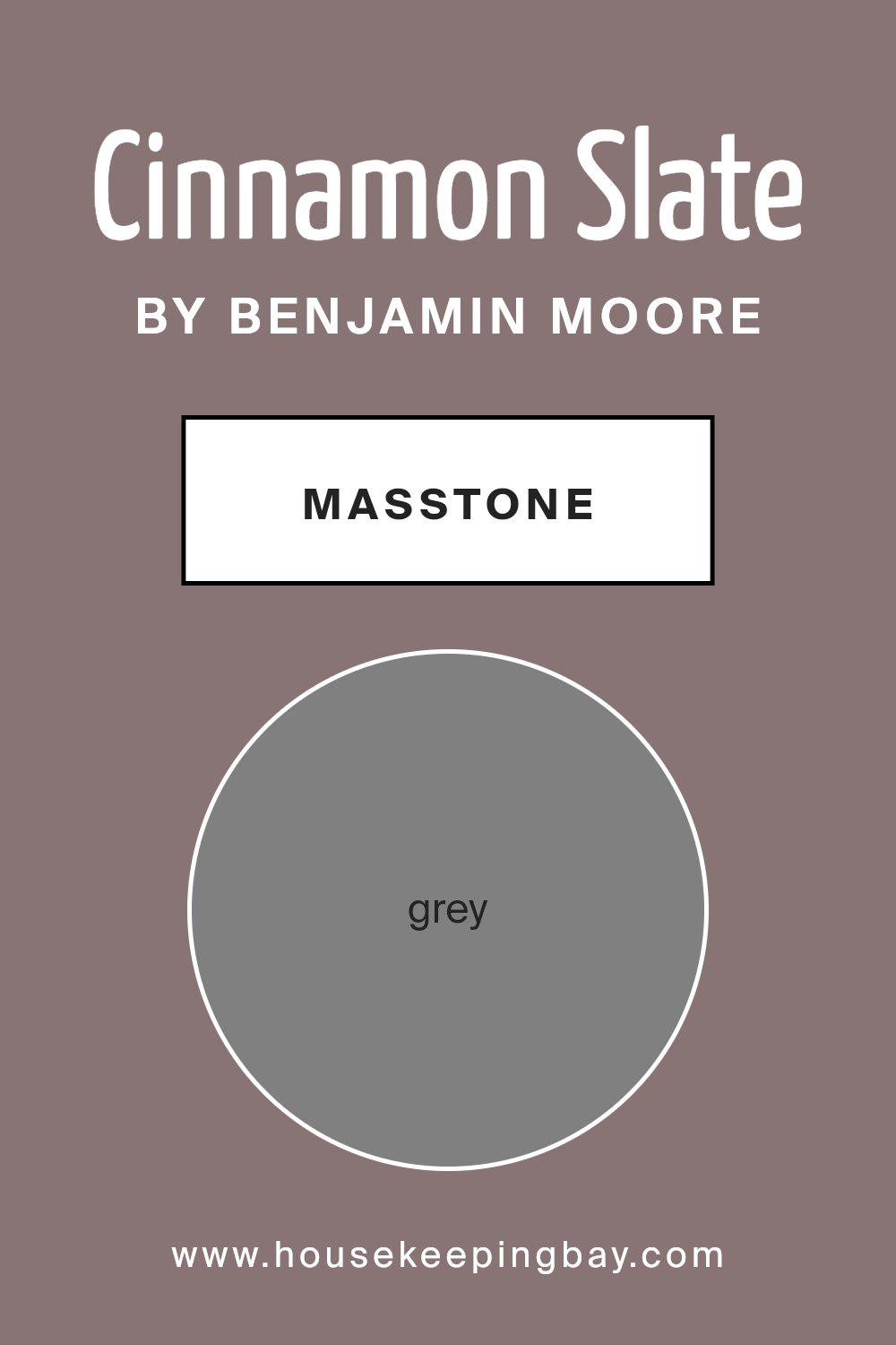
What is the Masstone of the Cinnamon Slate 2113-40 by Benjamin Moore?
Cinnamon Slate 2113-40 by Benjamin Moore is an intriguing paint shade, displaying a masstone of Grey (#808080). This particular hue of grey offers a versatile and balanced tone, perfect for home interiors. Because it sits neutrally in the color spectrum, Cinnamon Slate blends seamlessly with a wide array of decor styles and colors.
Whether you are aiming for a modern minimalist look or a cozy, traditional feel, this grey can serve as an excellent backdrop.
In rooms with limited natural light, Cinnamon Slate can generate a sense of calm and continuity, making the space appear larger and more open. In well-lit spaces, the same color adds a touch of sophistication and understated elegance.
Its adaptability comes in handy when choosing furnishings, as it pairs effortlessly with bright colors or soft pastels, enhancing other hues without overpowering them. Homes benefit from this grey as it creates a peaceful, yet stylish atmosphere.
housekeepingbay.com
Undertones of Cinnamon Slate 2113-40 by Benjamin Moore
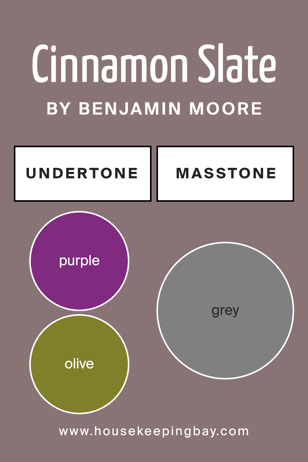
Cinnamon Slate 2113-40 by Benjamin Moore is a unique color with a complex mix of undertones influencing how it appears in different lighting and surroundings. Understanding undertones is vital as they subtly influence the perceived color, affecting the mood and atmosphere in a space.
The undertones in Cinnamon Slate – ranging from purple and olive to pink and various shades of blue and green – make it a versatile color. For instance, the purple (#802B80) and lilac (#8080D5) undertones can give a slightly regal feel to the color, which can be soothing in a bedroom.
The olive (#80802B) and dark green (#2B802B) undertones bring an earthiness, making it suited for spaces that aim to have a natural feel, like a study or den.
On interior walls, the effect of these undertones can differ based on the room’s lighting and other decor elements. In a room with abundant natural light, lighter undertones like pale pink (#D58080) and mint (#80D580) might become more dominant, softening the overall look of the walls and giving the room a fresher appearance.
Conversely, in a room with less light, darker undertones like brown (#802B2B) and dark grey (#2B2B2B) might stand out, providing a stronger, more anchored feel.
It is important to test the paint in different areas of the room at different times of the day to see how the color and its undertones behave. This way, you can be sure how the paint will interact with elements like furniture and flooring, ensuring the room achieves the desired effect.
housekeepingbay.com
Coordinating Colors of Cinnamon Slate 2113-40 by Benjamin Moore
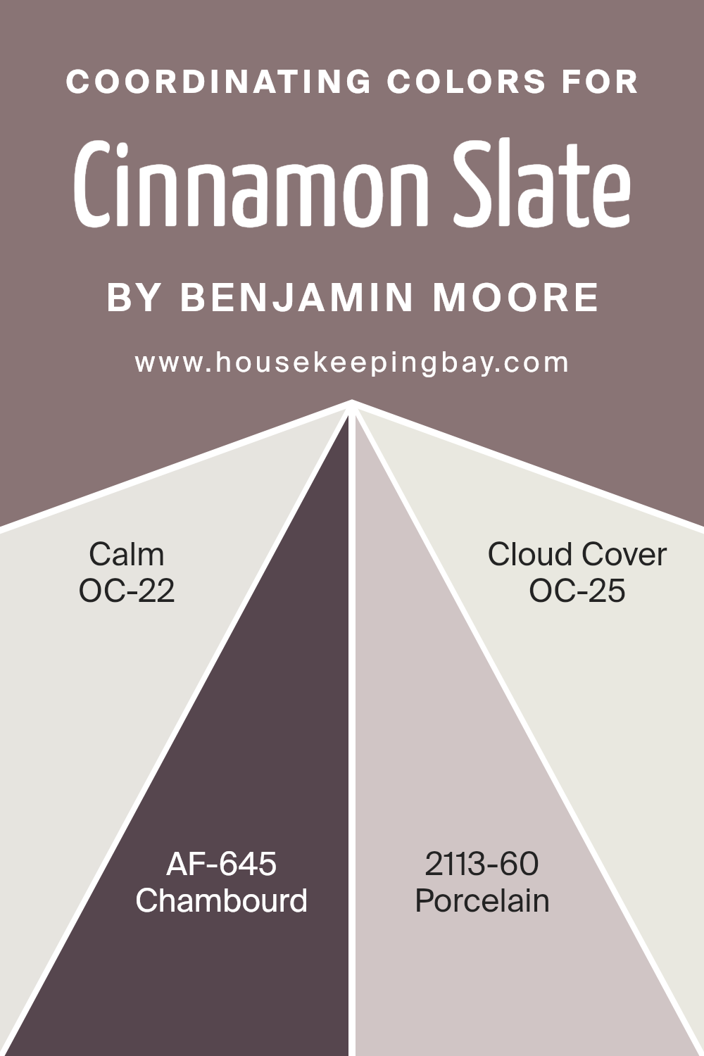
Coordinating colors are selected to harmonize within a color scheme, enhancing the overall aesthetic of a space without overpowering the main color. For Cinnamon Slate 2113-40 by Benjamin Moore, a rich and warm hue, the chosen coordinating colors are meant to support and complement this distinctive shade.
OC-22 Calm is a subtle off-white that offers a gentle contrast, providing a serene backdrop that allows Cinnamon Slate to stand out. AF-645 Chambourd, in contrast, is a deep, muted plum that adds depth and sophistication to the palette, pairing well with the earthiness of Cinnamon Slate.
Porcelain 2113-60 serves as a light and airy counterpart, giving a fresh, clean look that enhances the space’s openness and light. Lastly, OC-25 Cloud Cover is a soft, pale gray that acts as a neutral base, ensuring that the richer tones in Cinnamon Slate and Chambourd feel grounded and balanced. Together, these colors work to create a cohesive and inviting color scheme.
You can see recommended paint colors below:
- OC-22 Calm
- AF-645 Chambourd
- 2113-60 Porcelain
- OC-25 Cloud Cover
housekeepingbay.com
Whole House Color Palette for Cinnamon Slate

housekeepingbay.com
- Balboa Mist (OC-27) – A soft, neutral gray with warm undertones, perfect for main walls in open areas. It provides a subtle background that complements bolder colors without overpowering them.
- Revere Pewter (HC-172) – A versatile light gray with a warm, almost greige quality, making it an ideal foundation color in hallways or high-traffic spaces for a welcoming, neutral base.
- Edgecomb Gray (HC-173) – A lighter greige with warm, sandy undertones, ideal for smaller rooms or spaces that need an airy, open feel. It’s perfect for keeping rooms neutral yet inviting.
- Smoked Oyster (2109-40) – This smoky mauve-gray has an earthy sophistication, adding depth to dining rooms or bedrooms while enhancing the richness of Cinnamon Slate.
- Nantucket Gray (HC-111) – An earthy green-gray that feels natural and calming, bringing a touch of nature indoors. This color adds harmony in areas like offices or reading nooks.
- White Dove (OC-17) – A soft, warm white that works perfectly for trim, ceilings, and cabinetry. It offers a clean contrast, making other colors stand out while keeping the palette cohesive.
How to Combine These Colors Throughout the Home
Living Areas
Use Balboa Mist, Revere Pewter, or Edgecomb Gray as the main wall color in open spaces like living rooms and entryways. Each provides a warm, inviting foundation, with Edgecomb Gray offering a lighter option if you want an airy feel. Add Cinnamon Slate as an accent wall or in furnishings for a pop of warmth that anchors the space.
Dining Room and Bedrooms
For cozy, intimate spaces, Smoked Oyster and Cinnamon Slate create a beautiful pairing. Use Smoked Oyster on walls for an elegant feel and bring in Cinnamon Slate through accents like throw pillows, rugs, or art.
15 Best bedroom paint colors for the relaxing bedroom – Check The Guide
Home Office or Cozy Nook
Nantucket Gray is an ideal choice for a home office or reading nook, where it brings a touch of the outdoors in. It pairs beautifully with Cinnamon Slate and complements other warm tones for a grounded, calming environment.
Trim, Doors, and Ceilings
White Dove provides the perfect clean and soft contrast for trim, doors, and ceilings throughout the home. Its subtle warmth frames each color, giving a crisp outline that keeps rooms feeling fresh and bright.
With this palette, you get a cozy, cohesive flow from room to room, balancing warm tones and soft neutrals for a grounded and inviting home.
How Does Lighting Affect Cinnamon Slate 2113-40 by Benjamin Moore?
Lighting plays a pivotal role in how we see and perceive colors. Different types of light can significantly alter how a color appears in a space. When considering a specific paint color, such as Cinnamon Slate 2113-40 by Benjamin Moore, understanding its interaction with light is crucial for achieving the desired effect in a room.
Artificial Light versus Natural Light
Artificial light, depending on its type (warm, cool, or neutral), can change how Cinnamon Slate appears in an interior setting. Under warm artificial lighting, this color will likely become cozier and richer, highlighting its warm undertones. Under cool LED or fluorescent light, however, Cinnamon Slate might look slightly muted, with its vibrant, earthy qualities less pronounced.
In natural light, Cinnamon Slate changes throughout the day. Morning light, which is usually softer and cooler, can make it look more subdued. As the day progresses and the light becomes warmer and brighter, the color can appear more vivid and dynamic.
The orientation of a room also plays a significant role in how Cinnamon Slate is perceived:
- – North-Faced Rooms: These rooms receive less direct sunlight, meaning Cinnamon Slate might appear consistently more muted and cooler. The color remains subtle and soft, creating a calm, soothing atmosphere.
- – South-Faced Rooms: South-facing rooms benefit from ample sunlight, making Cinnamon Slate look warmer and brighter. The color is dynamic throughout the day, shifting in intensity and warmth as the sunlight changes.
- – East-Faced Rooms: In rooms facing east, Cinnamon Slate will be influenced by the morning sun, which brings out the warmer tones in the paint during the early part of the day. As the day progresses, and the natural light decreases, the color may look more subdued.
- – West-Faced Rooms: In these rooms, the late afternoon and evening light can make Cinnamon Slate appear much warmer and more intense. As sunset approaches, the reddish and orange hues within the color can become more pronounced, creating a cozy, inviting feel.
In summary, Cinnamon Slate’s perception is heavily influenced by both the type of light and the room’s orientation. By considering these factors, one can optimize the appearance of this color in any interior space.
housekeepingbay.com
What is the LRV of Cinnamon Slate 2113-40 by Benjamin Moore?
LRV stands for Light Reflectance Value, which is a measure used to indicate how much light a paint color reflects or absorbs when applied to a surface. It is expressed on a scale from 0, which is complete absorption of light (total black), to 100, which reflects all light (pure white).
LRV helps in selecting colors that will work well in a particular space based on the available lighting. A higher LRV value means the color will look lighter and make a room feel more open and airy, whereas a lower LRV makes the color appear darker which can create a cozier or more subdued ambiance.
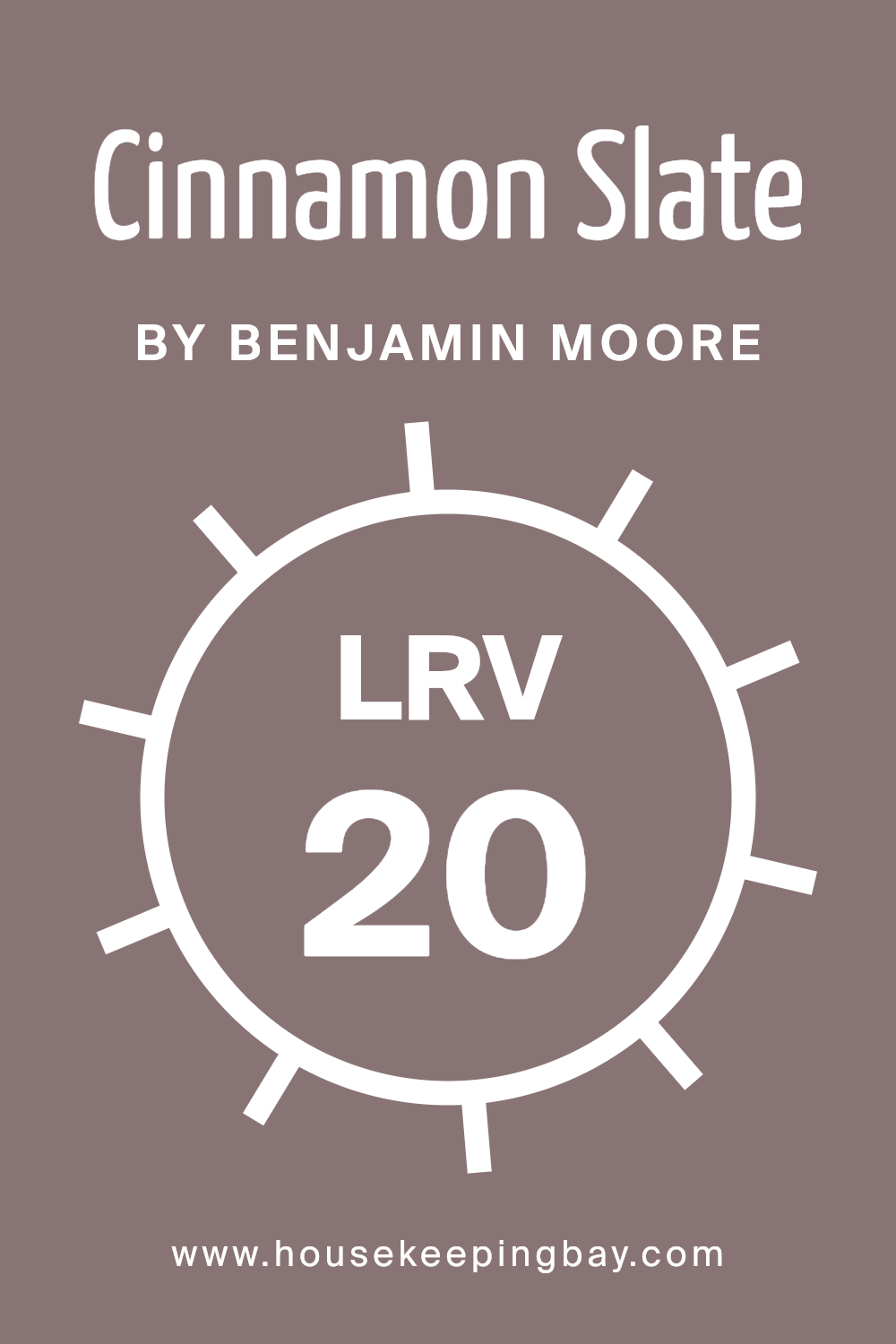
The LRV of Cinnamon Slate 2113-40 by Benjamin Moore is 19.71, which means it is on the darker side of the scale. This low LRV indicates that Cinnamon Slate will absorb more light than it reflects, giving it a rich, deep hue.
In rooms with limited natural light, this color may appear almost like a deep grey or brown, emphasizing a somber, sophisticated tone. To prevent it from making a room feel smaller or overly dark, it’s best used with good lighting or in a space that complements such dark tones with lighter, contrasting colors or decor elements.
housekeepingbay.com
What are the Trim colors of Cinnamon Slate 2113-40 by Benjamin Moore?
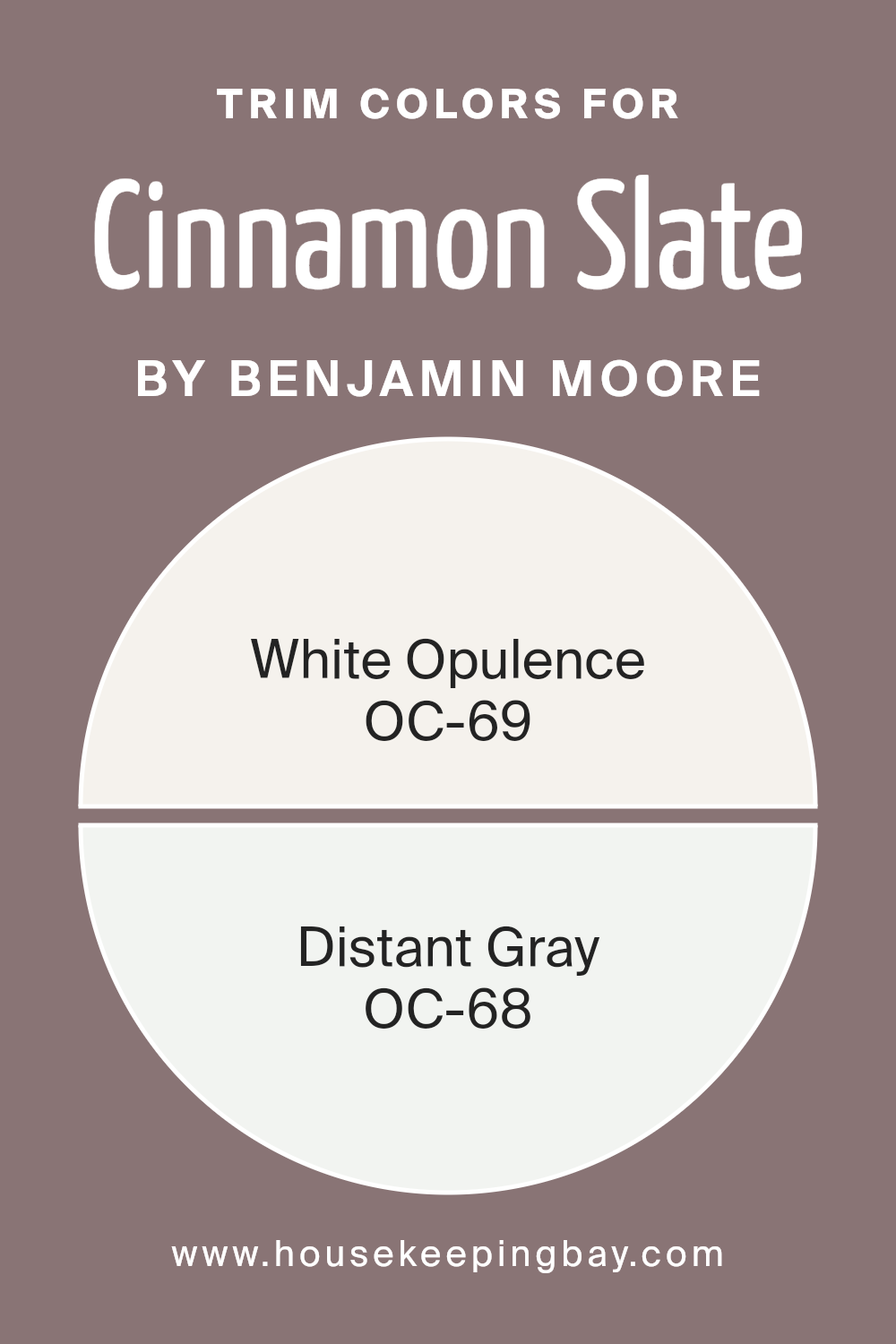
Trim colors are specific shades used to highlight the architectural details and edges of rooms, such as door frames, window sills, and baseboards. For a dynamic color like Cinnamon Slate 2113-40 by Benjamin Moore, choosing the right trim color can significantly enhance the overall aesthetic of the space.
Using trim colors like OC-69 – White Opulence and OC-68 – Distant Gray, both lighter tones, provides a sharp, clean contrast against the deeper, rich hue of Cinnamon Slate, making the walls visually pop and giving the room a refined and polished appearance.
White Opulence OC-69 is a crisp, serene white that brings a fresh and airy feel to any room. It reflects light beautifully, making spaces appear more luminous and open. On the other hand, Distant Gray OC-68 offers a subtle touch of neutrality with its light gray tone. It is soft enough to blend well with various decor styles, yet distinct enough to define space and enhance architectural features without overwhelming the primary color, Cinnamon Slate. Together, these trim colors complement the cinnamon warmth of the walls, ensuring the space remains balanced and harmoniously decorated.
You can see recommended paint colors below:
- OC-69 White Opulence
- OC-68 Distant Gray
housekeepingbay.com
Colors Similar to Cinnamon Slate 2113-40 by Benjamin Moore
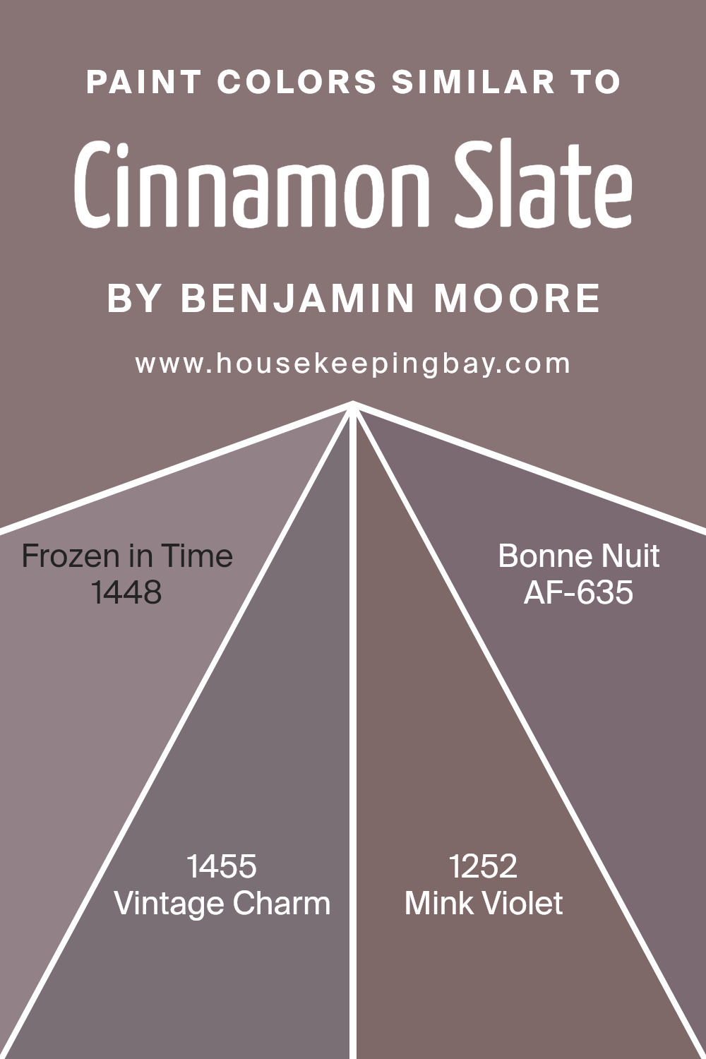
Similar colors play a crucial role in the world of design, providing a harmonious appearance and soothing visual flow. When colors like Cinnamon Slate by Benjamin Moore are paired with shades such as Frozen in Time, Vintage Charm, Mink Violet, and Bonne Nuit, they create a cohesive space that comfortably ties the elements of a room together.
This cohesiveness is beneficial for achieving an overall aesthetic that feels planned and pleasing to the eye. Using colors in the same family can also amplify the sense of unity and continuity in spaces that are open or have multiple functions.
Frozen in Time is a gentle hue, almost like a whisper of gray that offers a fresh and airy feel to any room. Vintage Charm has a slightly dusty rose undertone that exudes a soft, nostalgic feel, perfect for spaces that aim for a comforting atmosphere.
Mink Violet brings a deeper, yet subtle sophistication with its understated purple tinge, adding a layer of warmth without overwhelming the senses. Lastly, Bonne Nuit moves closer to the intensity of a night sky, providing a soothing dark accent that harmonizes beautifully with lighter tones.
Each of these colors supports the others by building upon the serene and homely atmosphere set by Cinnamon Slate, proving that a well-thought palette can truly enhance the environment.
You can see recommended paint colors below:
- 1448 Frozen in Time
- 1455 Vintage Charm
- 1252 Mink Violet
- AF-635 Bonne Nuit
housekeepingbay.com
Colors that Go With Cinnamon Slate 2113-40 by Benjamin Moore
Choosing the right complementary colors for Cinnamon Slate 2113-40 by Benjamin Moore is crucial as it ensures that your space feels harmonious and pleasantly coordinated. The correct combination can enhance the mood and style of a room, making it more inviting.
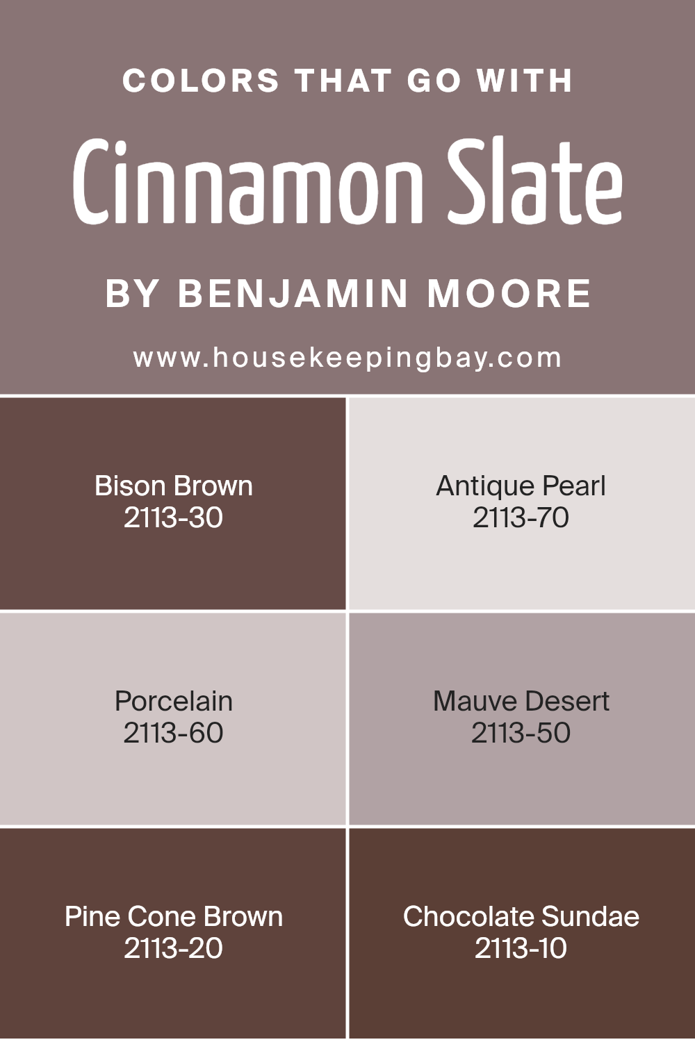
Cinnamon Slate is a robust color, reminiscent of earthy tones with a hint of deep red. When paired with appropriate complementary colors like Bison Brown, Antique Pearl, Porcelain, Mauve Desert, Pine Cone Brown, and Chocolate Sundae, each option brings out unique elements of the main hue, allowing for a creative and personalized aesthetic feel.
Bison Brown 2113-30 is a deep, dark brown that provides a strong grounding effect, making it perfect for accent walls or furniture to add depth to your space. Antique Pearl 2113-70 offers a gentle contrast with its soft, near-white tone that can help lighten a room’s ambiance while still connecting with the warm undertones of Cinnamon Slate.
Porcelain 2113-60 is another lighter shade that provides a clean, calm background, allowing more vibrant colors to pop without clashing. Mauve Desert 2113-50 has a subtle pink hue, bringing a touch of softness and warmth, ideal for creating a cozy, welcoming environment.
Pine Cone Brown 2113-20 is richer and more intense, ideal for making a bold statement or highlighting architectural features. Lastly, Chocolate Sundae 2113-10, with its rich brown mixed with red undertones, complements Cinnamon Slate by reinforcing the warmth of the room, perfect for an elegant, sophisticated look. Pairing these colors thoughtfully will make any space feel thoughtfully designed and comfortable.
You can see recommended paint colors below:
- 2113-30 Bison Brown
- 2113-70 Antique Pearl
- 2113-60 Porcelain
- 2113-50 Mauve Desert
- 2113-20 Pine Cone Brown
- 2113-10 Chocolate Sundae
housekeepingbay.com
How to Use Cinnamon Slate 2113-40 by Benjamin Moore In Your Home?
Cinnamon Slate 2113-40 by Benjamin Moore is a warm and inviting paint color that adds a cozy feeling to any room. This shade is a blend of rich brown with hints of red, making it perfect for creating a comfortable and welcoming atmosphere. You can use Cinnamon Slate in your living room or dining area to foster a sense of warmth, making these spaces perfect for family gatherings or relaxing evenings.
In smaller rooms like a bathroom or hallway, this color works well because it can make the area feel more spacious and less closed in. This versatility also allows for use in a bedroom where it can help in creating a soothing environment conducive to rest.
Pair Cinnamon Slate with light-colored furniture and decor to provide a nice contrast, or with darker wood tones to enhance a rustic feel. It’s a great choice for anyone looking to refresh their home with a natural, earthy vibe.
Cinnamon Slate 2113-40 by Benjamin Moore vs Frozen in Time 1448 by Benjamin Moore
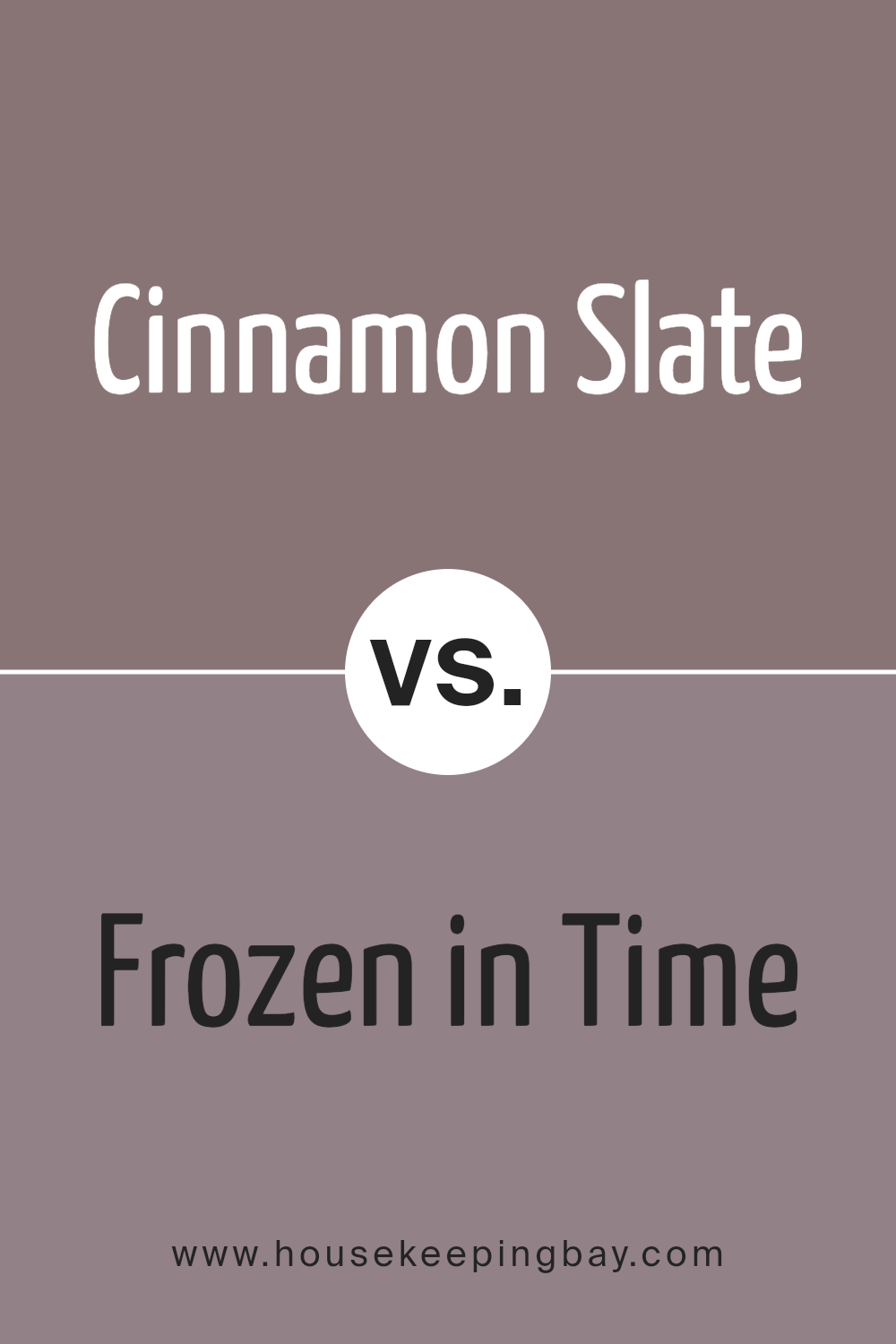
Cinnamon Slate 2113-40 by Benjamin Moore is a rich, warm brown with red undertones, creating a cozy and inviting atmosphere. This color suits traditional spaces well but can also add depth and warmth to modern settings. It pairs effectively with soft creams or vibrant teals for a balanced look.
Frozen in Time 1448 by Benjamin Moore, contrasts as a cool, pale gray with slight blue undertones giving off a calm, soothing vibe. It works excellently in rooms aiming for a serene and airy aesthetic. Ideal for smaller spaces, it helps make areas appear larger.
While Cinnamon Slate brings warmth and depth, Frozen in Time offers a light, refreshing feel, making each color unique in setting tone and mood in interior spaces. These colors cater to different tastes and purposes, but both can enhance a home’s beauty through strategic use.
You can see recommended paint color below:
- 1448 Frozen in Time
housekeepingbay.com
Cinnamon Slate 2113-40 by Benjamin Moore vs Bonne Nuit AF-635 by Benjamin Moore
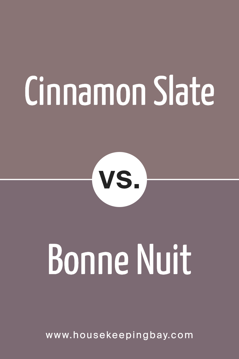
Cinnamon Slate 2113-40 by Benjamin Moore is a rich, warm shade that combines the earthy tones of cinnamon with the muted subtlety of slate. This color brings a cozy and inviting atmosphere to any space, making it ideal for living rooms or dining areas where a sense of welcoming is key.
Bonne Nuit AF-635, also by Benjamin Moore, leans towards a deep, mysterious navy blue. This color provides a strong, sophisticated presence, often used in bedrooms or spaces designed for relaxation and reflection. It offers a classic elegance and can make a room feel more grounded and secure.
Both colors hold their distinct appeal; Cinnamon Slate warms a room with earthy vibrancy, while Bonne Nuit adds depth and a hint of formality. The choice between them depends significantly on the mood and function of the space you are decorating. Combining both could also work well, with Bonne Nuit anchoring the space and Cinnamon Slate adding warm accents.
You can see recommended paint color below:
- AF-635 Bonne Nuit
housekeepingbay.com
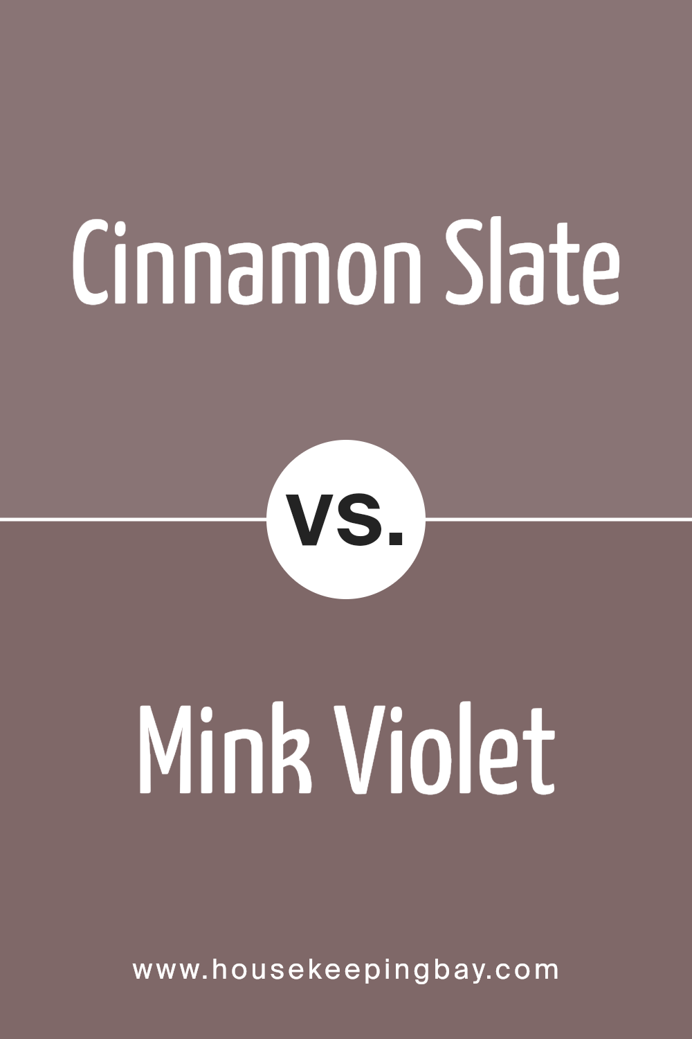
Cinnamon Slate 2113-40 by Benjamin Moore vs Mink Violet 1252 by Benjamin Moore
Cinnamon Slate 2113-40 by Benjamin Moore is a rich, deep brown with red undertones, resembling the warm and enticing spice it’s named after. This color brings a cozy and comforting atmosphere to any space, making it ideal for living rooms or dining areas. It pairs well with natural textures and materials, enhancing a rustic or traditional decor style.
Mink Violet 1252 by Benjamin Moore, however, is a subtle, soft purple with hints of gray. This color offers a soothing and gentle aesthetic, perfect for creating a peaceful and inviting environment in bedrooms or bathrooms. It complements metallic accents and light woods, lending itself well to more modern and minimalist designs.
Both colors provide unique vibes: Cinnamon Slate emits warmth and earthiness, while Mink Violet offers a more delicate and serene ambiance. When choosing between them, consider the mood and functionality of the room, along with existing decor and personal preferences.
You can see recommended paint color below:
- 1252 Mink Violet
housekeepingbay.com
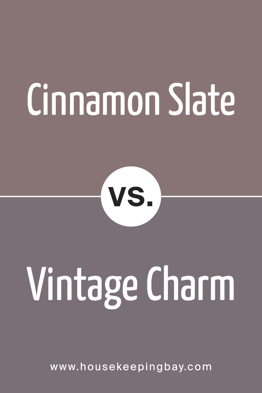
Cinnamon Slate 2113-40 by Benjamin Moore vs Vintage Charm 1455 by Benjamin Moore
Cinnamon Slate 2113-40 by Benjamin Moore is a rich, deep tone that brings warmth and a cozy feel to any space. It has a strong presence due to its deep red and brown tones, making it a great choice for areas where a comforting and inviting atmosphere is desired. This color fits well in living rooms, dining areas, or any place where you want to add a touch of sophistication.
In contrast, Vintage Charm 1455 by Benjamin Moore is lighter and leans more towards a soft, subtle gray with hints of blue. This color is very versatile and gives a room a gentle, airy feel, making it perfect for bedrooms or spaces where a calm and soft environment is preferred. It works well in settings that aim for a clean and open look.
Both colors offer distinct moods and can significantly influence the atmosphere of a room based on your color choice. Cinnamon Slate tends to create a more enveloping and warm space, while Vintage Charm opens up a room with its lighter, soothing tones.
You can see recommended paint color below:
- 1455 Vintage Charm
housekeepingbay.com
Conclusion
In wrapping up thoughts on Benjamin Moore’s 2113-40 Cinnamon Slate, it’s clear this shade stands as a robust choice for anyone aiming to add a sense of warmth and sophistication to their space.
The rich, deep cinnamon hue can make a room feel cozy yet refined, suitable for living areas or bedrooms where a calming atmosphere is paramount. It pairs well with a variety of decor styles, from rustic to contemporary, making it a versatile option for your home renovation projects.
Using Cinnamon Slate can also help create a focal point in a room, whether it’s through a feature wall or by incorporating it in furniture accents. The color’s adaptable nature means it complements both dark and light colors, offering room for creative expression in your decorating schemes.
Finally, if you’re looking to introduce a powerful yet not overwhelming element of color, Benjamin Moore’s 2113-40 Cinnamon Slate is an excellent choice. It upholds a balance between vibrancy and subtlety, ensuring that the space retains a welcoming feel while adding a touch of personality.
Whether updating a single room or reimagining your entire home, consider this color for a chic, cohesive look.
housekeepingbay.com
