Butternut SW 6389 by Sherwin Williams
A Warm Welcome Harnessing Yellow's Cozy Charm
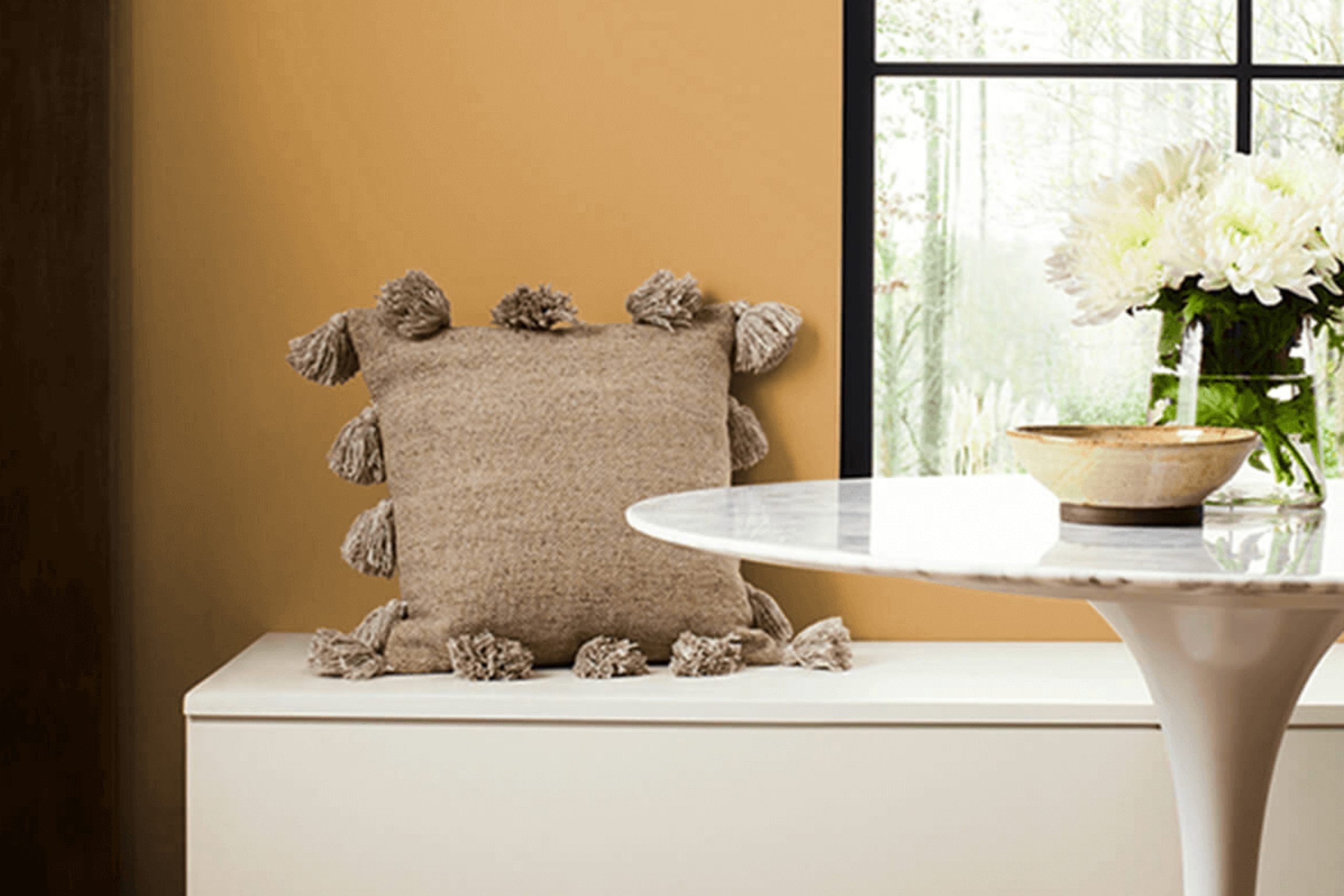
Are you thinking about refreshing a room or perhaps adding a cozy, warm vibe to your space? SW 6389 Butternut by Sherwin Williams might just be the perfect color for you. This paint offers a rich, golden hue that reminds you of autumn leaves or a cozy fireside. It’s warm and inviting, making it a great choice for living rooms, dining areas, or anywhere you want to add a touch of warmth.
Using Butternut can also add a sense of cheerfulness and energy to a room due to its bright, sunny color. It pairs well with a wide range of tones from dark browns to creamy whites, which means you can integrate it easily with your existing decor or plan a new palette around it.
Plus, it’s not too bright, maintaining a soft, approachable character that enriches your living space without overwhelming it.
Whatever room you decide to paint, SW 6389 Butternut can help create a comfy, inviting atmosphere that makes everyone feel right at home. Whether you’re aiming to refresh a single room or update your entire home, consider this shade for a touch of cozy elegance.
via sherwin-williams.com
What Color Is Butternut SW 6389 by Sherwin Williams?
Butternut SW 6389 by Sherwin Williams is a warm, inviting shade of yellow with a golden, earthy depth. This rich hue exudes a cozy, comforting vibe, making it ideal for spaces where a touch of warmth is desired without overwhelming brightness.
The color brings to mind the softness of autumn harvests or the golden glow of afternoon sunlight, perfect for creating an intimate and welcoming atmosphere.
Given its soothing yet cheerful appeal, Butternut fits beautifully into classic, rustic, or country-style interiors. The color pairs exceptionally well with natural materials such as wood, enhancing the grains and texture of wooden furniture or flooring with its golden tones. It also marries well with textiles like linen or wool, adding a layer of warmth to the tactile quality of these fabrics.
In a room, Butternut can be utilized on walls to generate a soft background, or as an accent color to uplift neutral schemes of white, beige, or gray. When used in accessories like cushions or curtains, it complements darker greens, deep blues, or rich browns, creating a balanced and harmonious look in the home.
This color is a versatile choice, capable of infusing spaces with a relaxed yet sophisticated charm.

housekeepingbay.com
Is Butternut SW 6389 by Sherwin Williams Warm or Cool color?
Butternut SW 6389 by Sherwin Williams is a warm, inviting yellow with a golden undertone that brings a cozy and cheerful atmosphere to any home. This shade is part of Sherwin Williams’ Suburban Modern palette, aimed at recreating the charming vibrancy of mid-20th-century color schemes. When used in living spaces, Butternut makes rooms feel more open and welcoming, an ideal backdrop for family gatherings or entertaining friends.
The color works well in kitchens and dining areas, where it enhances the natural light and creates a pleasant, sociable environment. It’s also effective in small spaces or north-facing rooms lacking sunlight, as it helps brighten the area with its inherent glow.
Butternut pairs beautifully with neutrals like whites or grays, enhancing these colors without overwhelming them. It can also be used alongside deep blues or rich browns for a bold contrast that adds character to the decor. Being versatile, Butternut SW 6389 enhances various design aesthetics, from retro to contemporary, making it a smart choice for those looking to refresh their home environment.
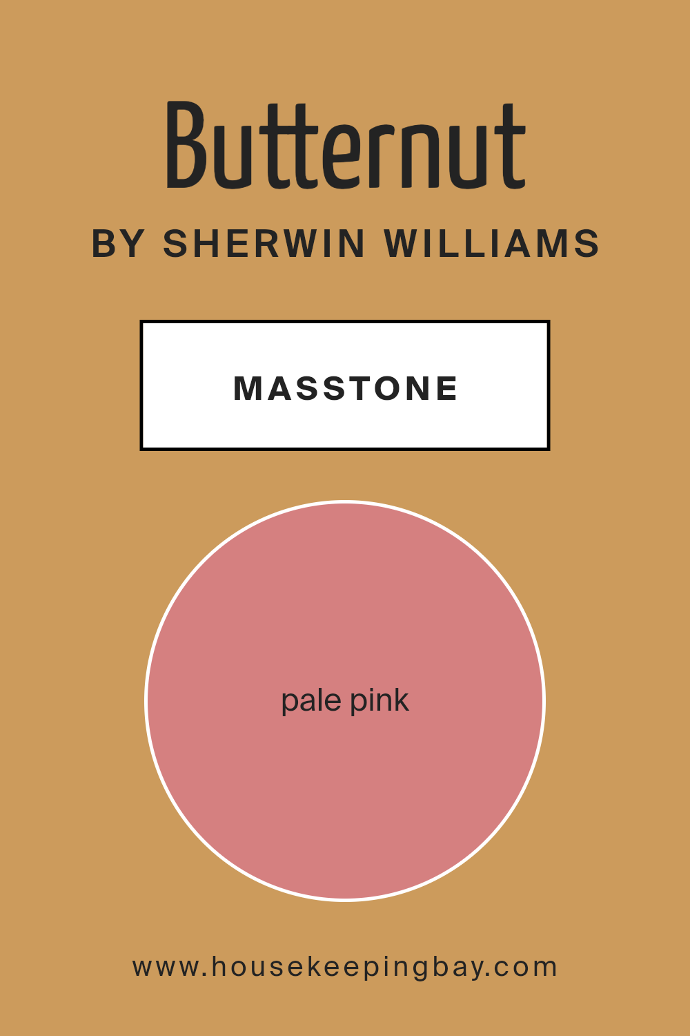
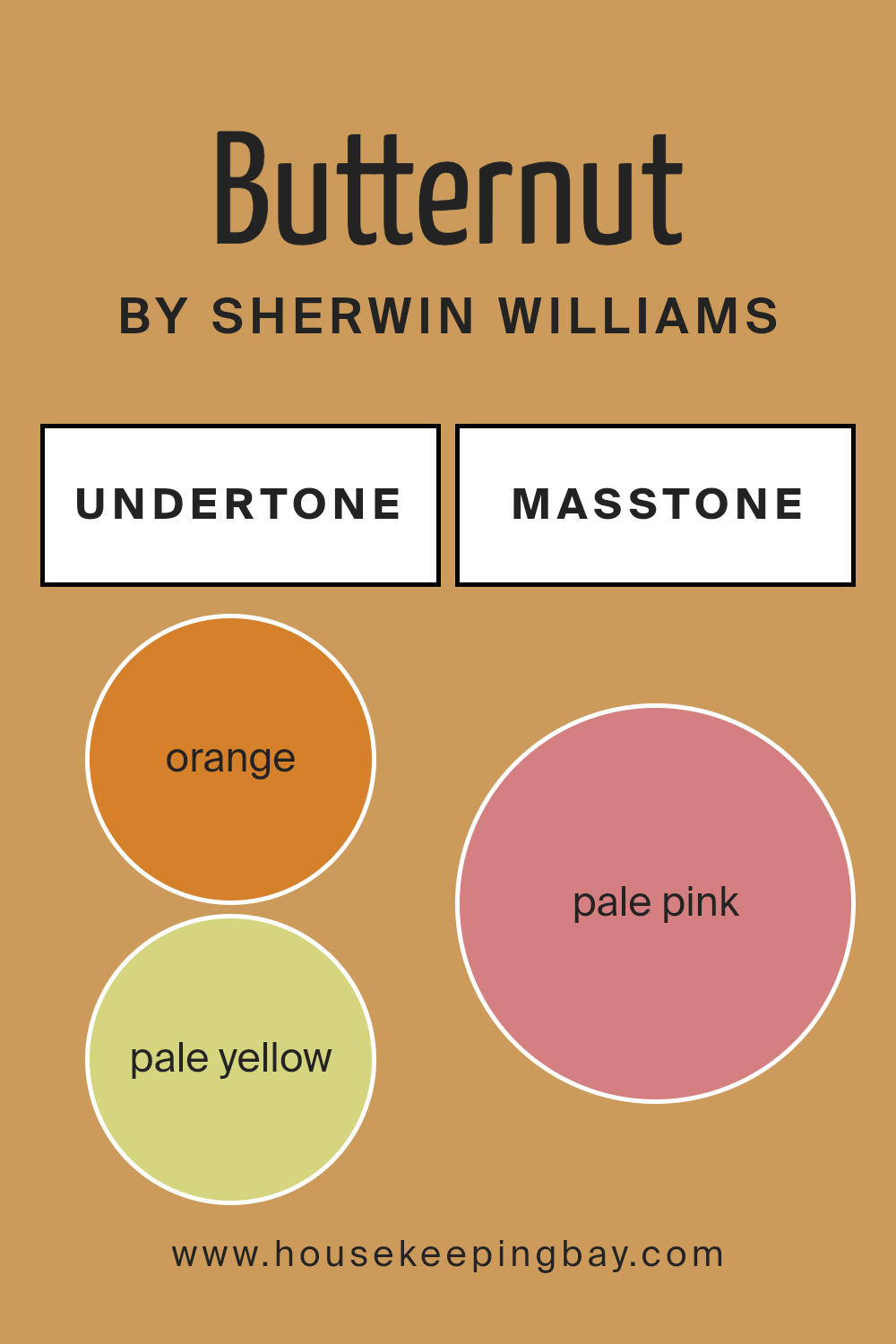
What is the Masstone of the Butternut SW 6389 by Sherwin Williams?
ButternutSW 6389 by Sherwin Williams, with its masstone of Pale Pink (#D58080), offers a gentle and warm hue that can significantly influence the atmosphere in any home. This color is soft and light, helping to create a welcoming and cozy environment.
It is excellent for rooms where relaxation and comfort are priorities, like bedrooms or living areas. The subtle pink shade can also make the space feel more open and airy, which is especially useful in smaller rooms that might otherwise feel cramped.
Moreover, Pale Pink is versatile enough to work well with a variety of decor styles and accompanying colors. It pairs beautifully with neutrals like whites, beiges, or grays, giving a fresh, contemporary look. Additionally, it can act as a soothing backdrop to vibrant colors and bold patterns, balancing out more lively design elements and providing a sense of serenity and warmth.
Using ButternutSW 6389 in a home can bring a refreshing and light-hearted vibe, making spaces more enjoyable and inviting.
housekeepingbay.com
Undertones of Butternut SW 6389 by Sherwin Williams
ButternutSW 6389 by Sherwin Williams is a rich, warm paint color that brings a cozy atmosphere to any room. This color has a variety of undertones that significantly influence how it appears in different lighting conditions and settings.
Undertones are the underlying hues that can subtly or dramatically change the way a primary color looks. For instance, orange, yellow, and red undertones in ButternutSW 6389 add warmth, making it a welcoming color for living spaces. On the flip side, gray and brown undertones can mute this warmth slightly, ensuring the color remains sophisticated and not overly vibrant.
When used on interior walls, ButternutSW 6389’s undertones interact with the room’s light sources. In natural light, the orange and yellow undertones can make the walls seem brighter and more cheerful, while artificial lighting can enhance the gray or brown, creating a more subdued and cozy feel. This versatility makes ButternutSW 6389 a great choice for common areas, bedrooms, or any space that benefits from a warm, inviting atmosphere.
Additionally, accessories and decorations in the room can also interact with these undertones. For example, pairing this color with blues or greens can offset the warmth slightly, providing a balanced visual appeal. Overall, the diversity of its undertones allows ButternutSW 6389 to adapt uniquely to different interior designs and moods.
housekeepingbay.com
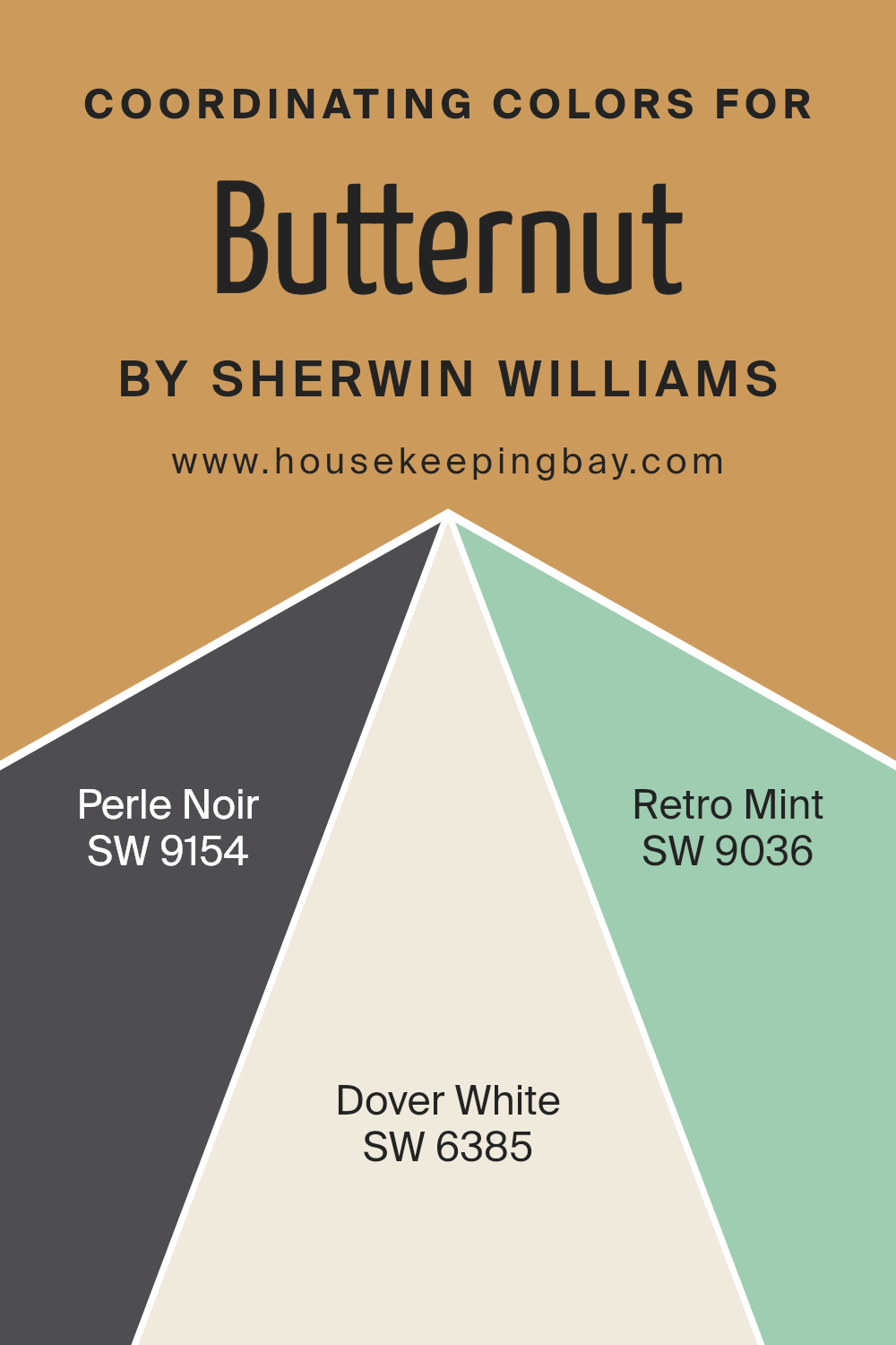
Coordinating Colors of Butternut SW 6389 by Sherwin Williams
Coordinating colors are colors that complement each other and create a harmonious look when used together in decor or design. They are chosen based on their ability to balance out and enhance the primary color used, in this case, Butternut SW 6389 by Sherwin Williams.
The use of coordinating colors can greatly affect the mood and style of a space, ensuring that all elements in a room work together seamlessly.
One of the coordinating colors is Perle Noir SW 9154, a deep, almost black color with a hint of elegance. This shade adds a sophisticated contrast to the softer, warmer tones of Butternut. Another coordinating color is Dover White SW 6385, which is a soft, creamy white.
It helps to brighten and lift the environment, providing a crisp backdrop that makes the rich tones of Butternut stand out. Lastly, Retro Mint SW 9036 offers a fresh, vintage-inspired green that adds a playful splash of color, contrasting nicely with the earthy hue of Butternut.
Together, these colors create a balanced and appealing color scheme that enhances the space.
You can see recommended paint colors below:
- SW 9154 Perle Noir
- SW 6385 Dover White
- SW 9036 Retro Mint
housekeepingbay.com
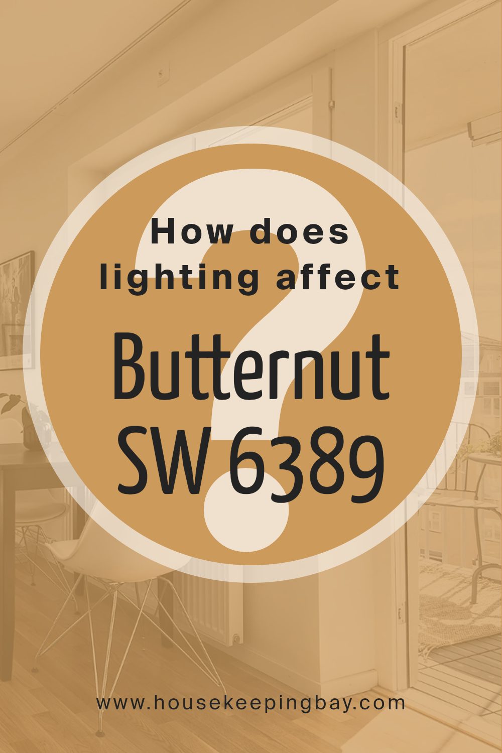
How Does Lighting Affect Butternut SW 6389 by Sherwin Williams?
Lighting plays a crucial role in how we perceive colors. Different light sources can change the appearance of a color in various settings. This concept is important when considering paint selections for your home, such as ButternutSW 6389 by Sherwin Williams.
ButternutSW 6389 is a warm, muted orange. In natural light, this color appears vibrant and can bring a cozy, welcoming feel to any space. However, under artificial light, such as LED or fluorescent lighting, ButternutSW 6389 may shift slightly in hue.
Under cool white bulbs, it might look less vibrant, while under warm light, the cozy qualities of the color are enhanced, making it feel richer and deeper.
Room orientation also impacts how ButternutSW 6389 looks:
– North-facing rooms: These rooms get less direct sunlight and can make ButternutSW 6389 appear more subdued and slightly darker. This might make the room feel smaller or cooler, which is something to consider if aiming for a cozy atmosphere.
– South-facing rooms: With more exposure to direct sunlight, ButternutSW 6389 will look very warm and bright in south-facing rooms. This enhances the paint’s natural vibrancy and can make the space feel lively and energetic.
– East-facing rooms: In the morning, east-facing rooms are filled with soft, warm light, which brings out the richness of ButternutSW 6389. As the day progresses and natural light diminishes, the color may appear softer and more muted.
– West-facing rooms: Light in west-facing rooms is cooler in the morning but ends the day with a warm glow. ButternutSW 6389 will have a dimmer appearance in the morning but become warmly illuminated by sunset, enhancing its cozy attributes.
Understanding how different types of light affect this particular shade can help you decide which room and lighting conditions are best to achieve the desired effect with ButternutSW 6389.
housekeepingbay.com
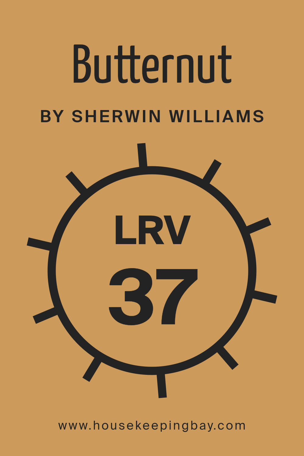
What is the LRV of Butternut SW 6389 by Sherwin Williams?
LRV stands for Light Reflectance Value, a measure that indicates how much light a paint color reflects or absorbs. This value ranges from 0 to 100, with 0 being completely black and absorbing all light, and 100 being pure white, reflecting all light.
Understanding LRV helps in choosing the right paint color for your space depending on how bright or dark you want the room to be. High LRV colors make a room feel lighter and more open as they reflect more light, while low LRV colors can make a space feel cozier and more enclosed by absorbing more light.
ButternutSW 6389 by Sherwin Williams, with an LRV of 37.066, falls into the darker end of the spectrum. It means this color will absorb more light than it reflects, which could make a small room feel smaller or more intimate. This quality can be particularly advantageous in large, open spaces or rooms with lots of natural light, where using a lower LRV color can add depth and warmth.
When using ButternutSW 6389, it’s a good idea to balance it with lighter colors or good lighting to avoid making the space feel too confined.
housekeepingbay.com
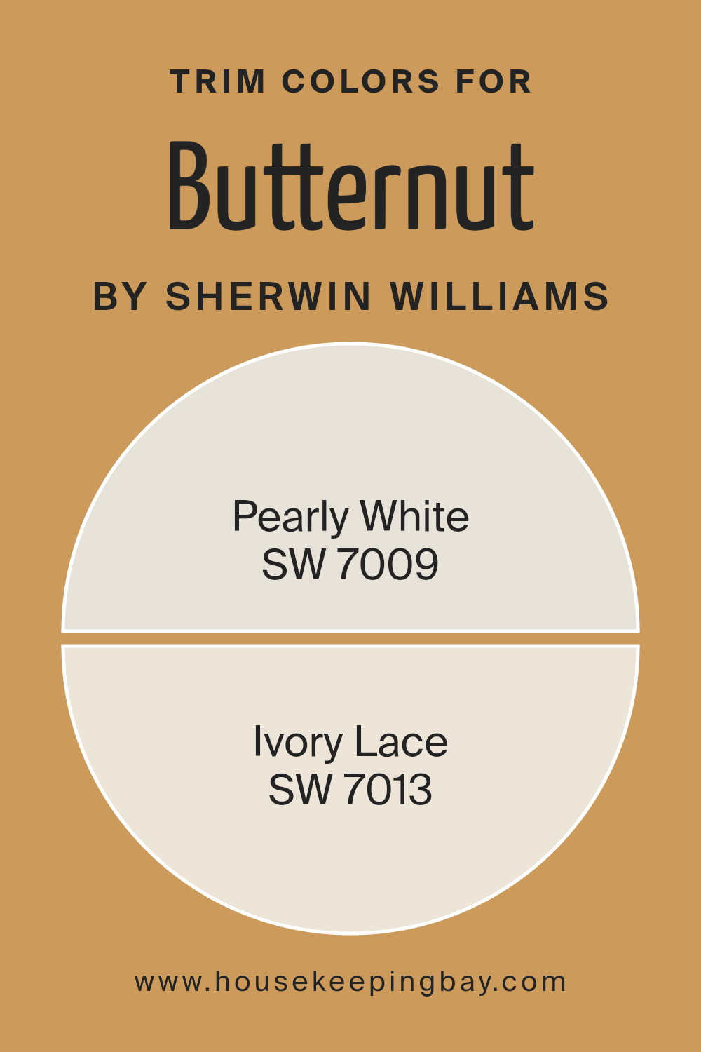
What are the Trim colors of Butternut SW 6389 by Sherwin Williams?
Trim colors are specific shades used to highlight or accentuate the architectural features of a room, such as baseboards, moldings, door frames, and window sills. Selecting the right trim color can significantly enhance the overall appearance of a space.
For instance, Butternut SW 6389 by Sherwin Williams is a warm, inviting hue that creates a cozy atmosphere.
Pairing it with appropriate trim colors like SW 7009 – Pearly White and SW 7013 – Ivory Lace can help define and subtly complement the strong character of Butternut, ensuring that wall colors and trims harmoniously blend while maintaining enough contrast to create visually appealing depth and structure.
Pearly White SW 7009 is a soft, muted white with a gentle hint of warmth that makes it ideal for creating a seamless transition between the robust tone of Butternut and the trim, allowing the space to feel unified and airy.
On the other hand, Ivory Lace SW 7013, offers a slightly richer and creamier approach than Pearly White, which enriches the welcoming quality of Butternut without overpowering it, adding a touch of sophistication and softness to the overall color scheme.
Both trim colors support the main hue in creating a balanced and inviting atmosphere in any room.
You can see recommended paint colors below:
housekeepingbay.com
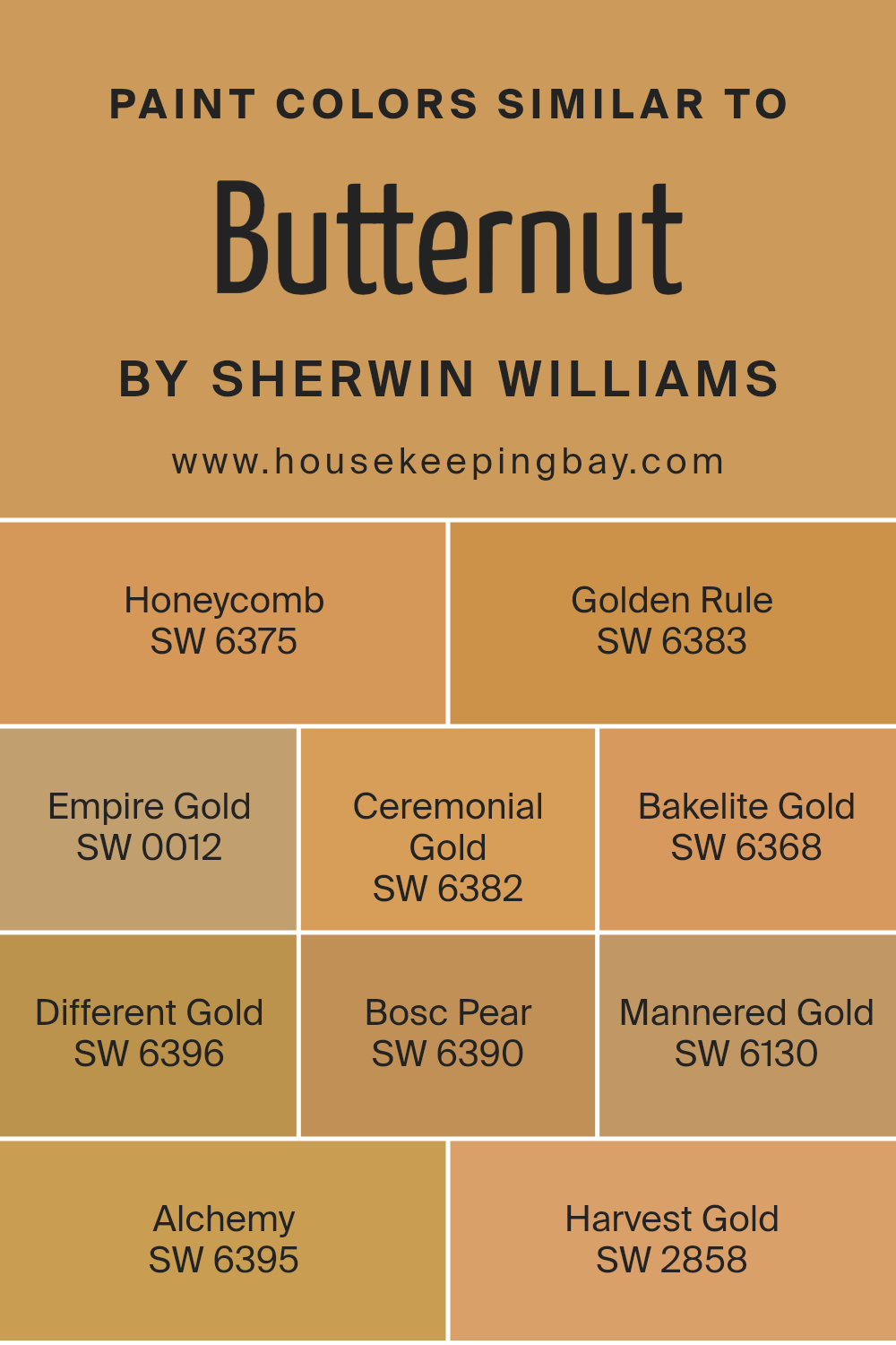
Colors Similar to Butternut SW 6389 by Sherwin Williams
Using similar colors in design can be essential for creating a harmonious and cohesive look. Colors that resemble one another, like the variations of Butternut SW 6389 by Sherwin Williams, offer seamless transitions in spaces, ensuring that elements blend comfortably without harsh contrasts.
This continuity can also make small spaces appear larger and more inviting, as the eye moves easily around the room without abrupt color stops. These similar tones can be used for different purposes: some for highlighting features, others for creating depth or warmth in a room.
For instance, Honeycomb SW 6375 is a warm, muted yellow that gives a cozy, subdued ambiance, perfect for a comforting space. Golden Rule SW 6383 has a brighter, sunny feel that’s cheerful and invigorating, ideal for areas where you want to promote energy and activity.
Empire Gold SW 0012 offers a rich, deep yellow that imparts a sense of elegance and sophistication. Ceremonial Gold SW 6382 provides a regal, slightly bronzed hue, reflecting a traditional aesthetic. Bakelite Gold SW 6368 is reminiscent of vintage yellow, great for adding a touch of retro flair.
Different Gold SW 6396 is slightly more modern with its crisp, clear presence, offering a contemporary twist. Bosc Pear SW 6390 has an earthy, olive tone, perfect for nature-inspired themes. Mannered Gold SW 6130 filters in a classic antiquity vibe, suitable for classic and elegant settings.
Alchemy SW 6395 strikes a balance with a soft, muted gold that works beautifully in calm, serene environments. Lastly, Harvest Gold SW 2858 taps into a nostalgic feel, evoking memories and a sense of timelessness. These colors provide versatile options for enhancing any interior with either a splash of vibrancy or a subtle hint of sophistication.
You can see recommended paint colors below:
- SW 6375 Honeycomb
- SW 6383 Golden Rule
- SW 0012 Empire Gold
- SW 6382 Ceremonial Gold
- SW 6368 Bakelite Gold
- SW 6396 Different Gold
- SW 6390 Bosc Pear
- SW 6130 Mannered Gold
- SW 6395 Alchemy
- SW 2858 Harvest Gold
housekeepingbay.com
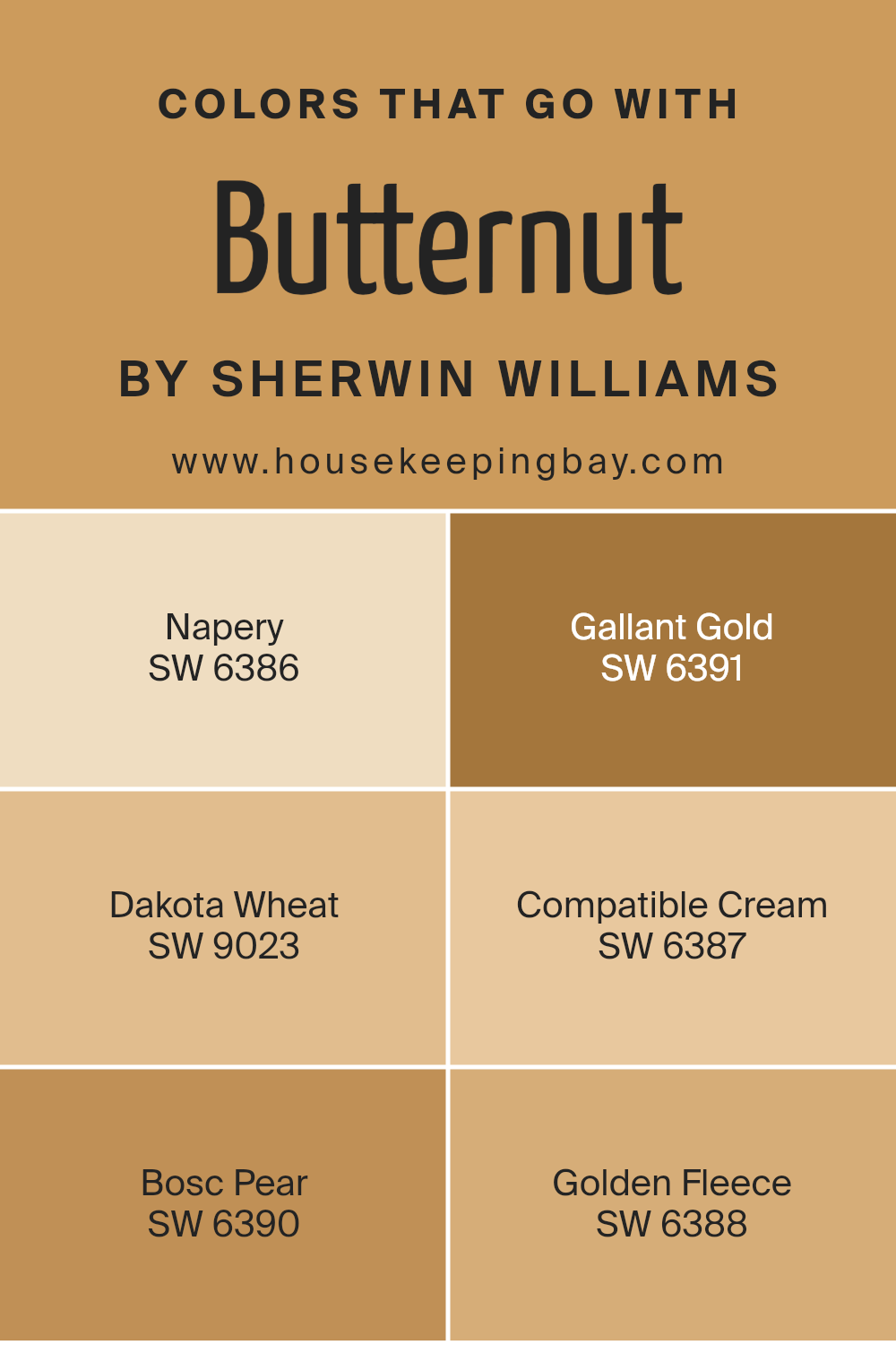
Colors that Go With Butternut SW 6389 by Sherwin Williams
Choosing the right colors to complement Butternut SW 6389 by Sherwin Williams is crucial as it helps create a seamless and harmonious look in any space. These complementary colors are designed to enhance the warm, inviting hue of Butternut, making the room feel cozy and well-coordinated. When these colors blend well, they provide a visually appealing atmosphere that is both welcoming and comforting.
For instance, Napery SW 6386 offers a softer, muted yellow that works beautifully to balance the richness of Butternut without overpowering it. Gallant Gold SW 6391, with its deeper yellow tone, adds a touch of elegance and a slightly more sophisticated edge to the ambience.
Dakota Wheat SW 9023, a richer, deeper, beige-like color, pairs nicely, lending a subtle contrast that highlights Butternut’s vibrant personality. With Compatible Cream SW 6387, you get a lighter backdrop that allows Butternut to stand out, perfect for a fresh and airy feel.
Bosc Pear SW 6390 introduces a slightly greenish tint that brings a natural, earthy quality to the palette, ideal for spaces that aim for a splash of vitality.
Finally, Golden Fleece SW 6388, a serene, gentle yellow, offers a calm and soothing presence that complements the strength of Butternut without competing for attention.
You can see recommended paint colors below:
- SW 6386 Napery
- SW 6391 Gallant Gold
- SW 9023 Dakota Wheat
- SW 6387 Compatible Cream
- SW 6390 Bosc Pear
- SW 6388 Golden Fleece
housekeepingbay.com
How to Use Butternut SW 6389 by Sherwin Williams In Your Home?
Butternut SW 6389 by Sherwin Williams is a warm, inviting mustard yellow paint color that adds a cozy feel to any room. Its earthy tone works well in spaces where you want to create a welcoming atmosphere, such as living rooms or dining areas. This shade pairs beautifully with dark wood furniture, adding a rustic charm, or with white trim for a cheerful, contrasting look.
For those looking to introduce a bit of cheer into their kitchen, Butternut can light up the space when used on cabinets or as an accent wall. In bedrooms, this color can be used on one wall to bring warmth, coordinated with soft, neutral bedding to keep the room from feeling overwhelming.
Additionally, Butternut can be useful in a home office, where its soothing nature promotes focus and creativity without being too bright. Curtains, cushions, and other decor elements in this color can also help tie a room together if used sparingly.
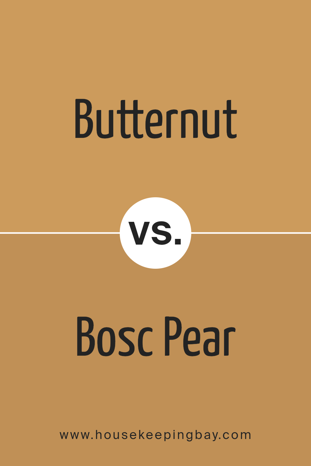
Butternut SW 6389 by Sherwin Williams vs Bosc Pear SW 6390 by Sherwin Williams
Butternut SW 6389 and Bosc Pear SW 6390, both from Sherwin Williams, are closely related colors that create subtly different atmospheres in a space. Butternut SW 6389 is a warm, muted yellow with a cozy feel, perfect for brightening up spaces while maintaining a soft ambiance. It resembles the creamy part of a freshly cut butternut squash. This color works well in living rooms or bedrooms where you want a soothing, yet cheerful vibe.
In contrast, Bosc Pear SW 6390 shifts slightly towards a more golden-brown hue, reminiscent of the skin of a ripe Bosc pear. This color is a bit deeper and richer, offering a more grounded and earthy feel. It’s ideal for areas where you want a touch of warmth but with a more mature, refined palette.
Both colors pair well with neutrals and can be used to create a comforting and inviting environment. Choosing between them depends on the specific mood and character you want to convey in your room.
You can see recommended paint color below:
housekeepingbay.com
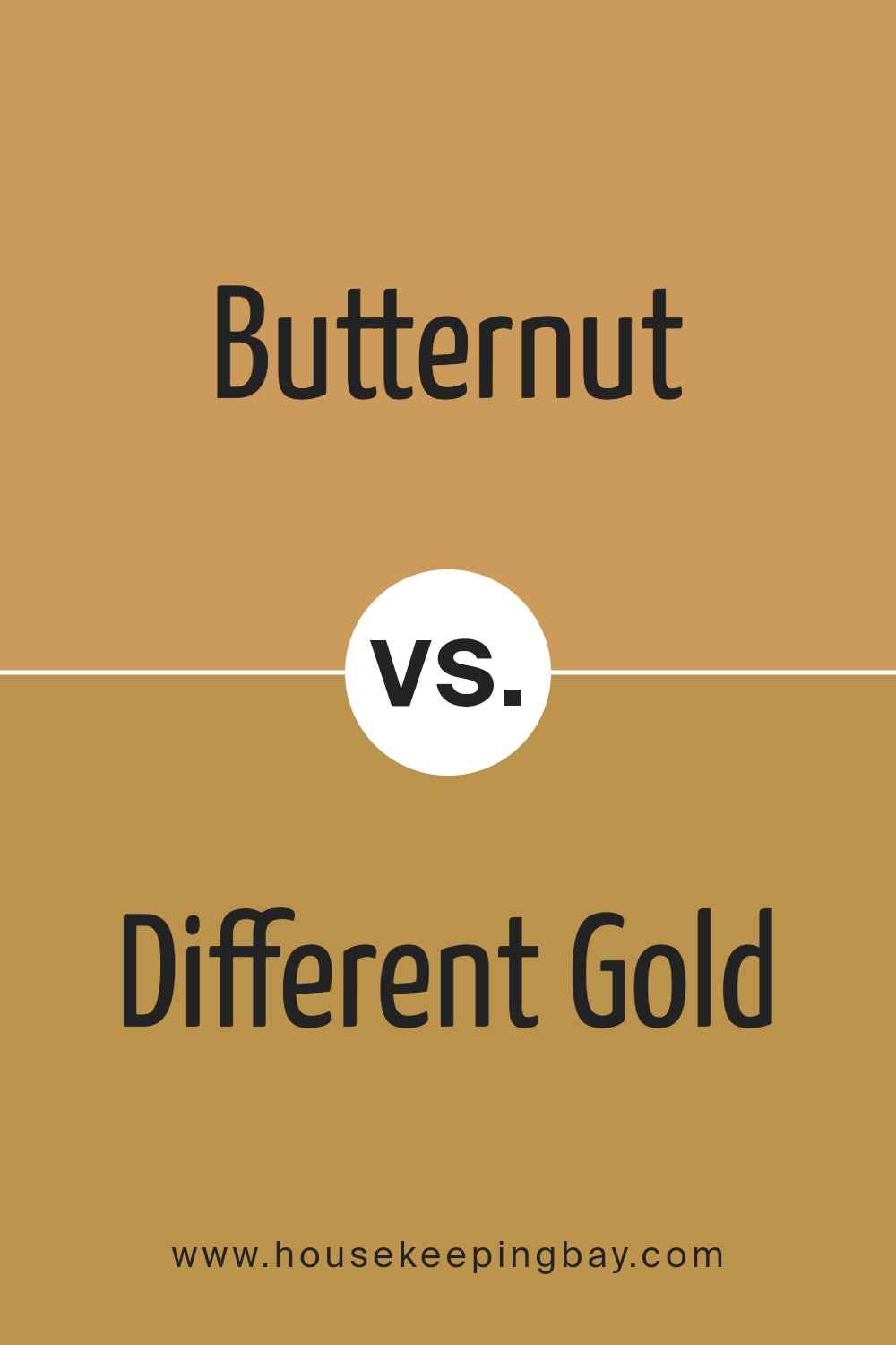
Butternut SW 6389 by Sherwin Williams vs Different Gold SW 6396 by Sherwin Williams
Butternut SW 6389 by Sherwin Williams is a warm, deep yellow with a cozy, inviting feel, closely resembling the creamy shade of butternut squash. Its richness makes it perfect for living rooms or dining areas, where its welcoming tone can create a sunny and cheerful atmosphere.
In contrast, Different Gold SW 6396 is also a warm hue but with a brighter, more vibrant golden tone. It tends to stand out more than Butternut, making it suitable for spaces that benefit from a bold, cheerful pop of color, like kitchens or children’s play areas.
While Butternut offers a subdued and soft aura, Different Gold provides a lively and energizing feel, great for spaces used for active engagement. Both colors share a warmth that enhances spaces yet satisfy different aesthetic needs and moods. They work well together in a complementary scheme, each bringing out the best in the other without overwhelming.
You can see recommended paint color below:
housekeepingbay.com
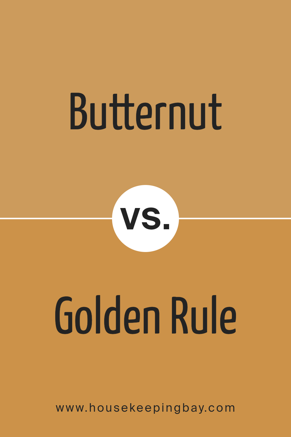
Butternut SW 6389 by Sherwin Williams vs Golden Rule SW 6383 by Sherwin Williams
Butternut SW 6389 by Sherwin Williams is a warm, inviting yellow with a soft and creamy touch, making spaces feel cozy and cheerful. It’s light enough to brighten a room without overwhelming it with color, ideal for creating a gentle and welcoming atmosphere in living spaces or kitchens.
Golden Rule SW 6383, also by Sherwin Williams, is bolder and more vibrant. This shade of yellow has a richer, more golden tone that adds a sense of energy and warmth to any area. It works well in spaces where you want to make a strong impression, such as dining areas or as an accent wall.
Both colors bring warmth, but Butternut’s subtler hue offers a softer approach, while Golden Rule’s deeper gold adds drama and warmth more intensely. Each color would suit different moods and settings depending on what feeling you want to achieve in the space.
You can see recommended paint color below:
housekeepingbay.com
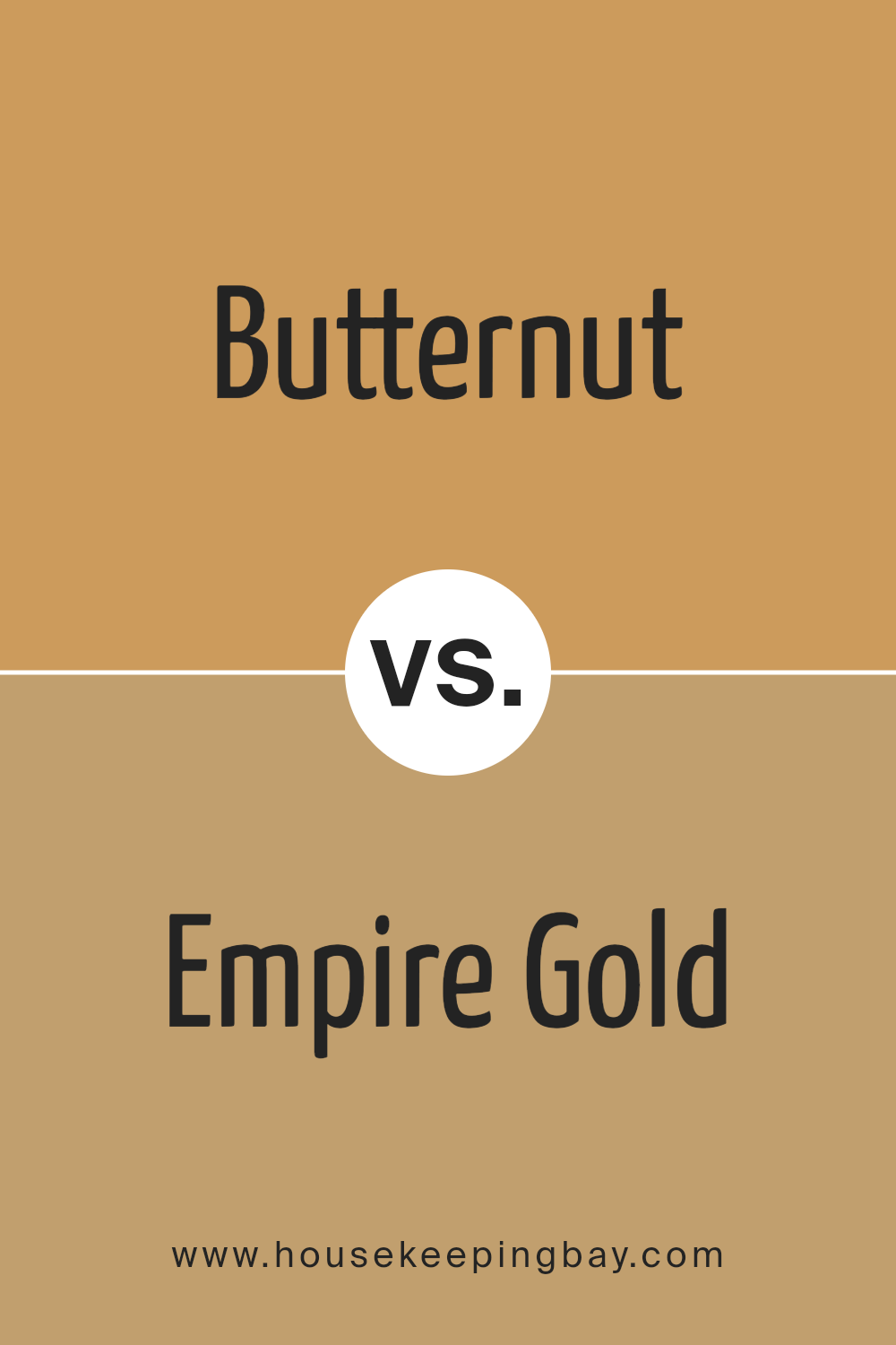
Butternut SW 6389 by Sherwin Williams vs Empire Gold SW 0012 by Sherwin Williams
Butternut SW 6389 by Sherwin Williams is a warm, inviting yellow with a gentle dose of orange, giving it a cozy, nurturing feel that’s perfect for creating a welcoming space. This shade is ideal for living rooms or kitchens where you want to promote a sense of comfort and warmth.
In contrast, Empire Gold SW 0012 by Sherwin Williams is a bolder, deeper yellow. It has a more pronounced golden hue that radiates richness and luxury. This color works well in spaces that aim for a sophisticated yet energetic atmosphere, such as dining areas or entryways.
Both colors are from the yellow family, but Butternut leans towards a softer, muted tone whereas Empire Gold offers more intensity and vibrancy. Depending on the mood and style you want to achieve, each color has its unique appeal: Butternut for a soft, soothing environment, and Empire Gold for a lively, opulent setting.
You can see recommended paint color below:
- SW 0012 Empire Gold
housekeepingbay.com
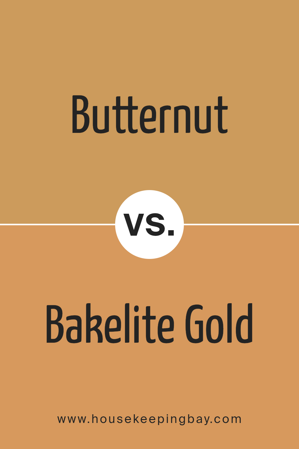
Butternut SW 6389 by Sherwin Williams vs Bakelite Gold SW 6368 by Sherwin Williams
Butternut SW 6389 by Sherwin Williams is a warm, inviting shade that closely resembles the pale, creamy aspect of butternut squash. It offers a subtle, comforting presence, ideal for creating a cozy and welcoming space. This color works well in living areas or bedrooms where a light, airy feel is desired.
In contrast, Bakelite Gold SW 6368 by Sherwin Williams is a deeper, rich yellow with a hint of mustard. It can add a vivid burst of energy to a room, making it perfect for spaces that benefit from a dynamic and cheerful ambiance. Bakelite Gold can also help in areas that require visual warmth and vigor, such as kitchens or dining rooms.
Both colors lend themselves well to a variety of decor styles but serve different purposes based on their intensity and depth. While Butternut is softer and more muted, Bakelite Gold is bolder and more assertive.
You can see recommended paint color below:
- SW 6368 Bakelite Gold
housekeepingbay.com
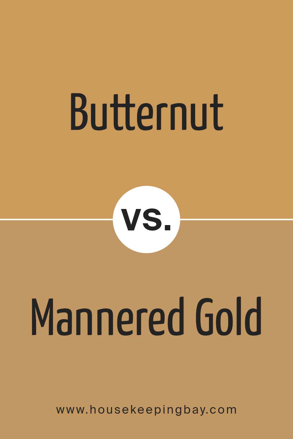
Butternut SW 6389 by Sherwin Williams vs Mannered Gold SW 6130 by Sherwin Williams
Butternut SW 6389 by Sherwin Williams is a warm, muted yellow with orange undertones, giving it a cozy and inviting feel. This color is bright enough to add cheerfulness to a space but soft enough to maintain a soothing atmosphere. It works well in living rooms and kitchens where warmth is desired.
Mannered Gold SW 6130, also by Sherwin Williams, is a richer, deeper shade of yellow. It has a hint of brown that makes it more subdued compared to Butternut. This color best suits areas that need a sophisticated yet warm touch, such as dining rooms or entryways.
Both colors offer warmth, but Butternut is lighter and brighter, making smaller spaces feel larger. Mannered Gold, with its depth, creates a more intimate and formal ambiance. Their uses depend on the desired mood and function of the room. Each brings its unique touch to interiors, enhancing spaces with their distinct yet harmonious yellow tones.
You can see recommended paint color below:
housekeepingbay.com
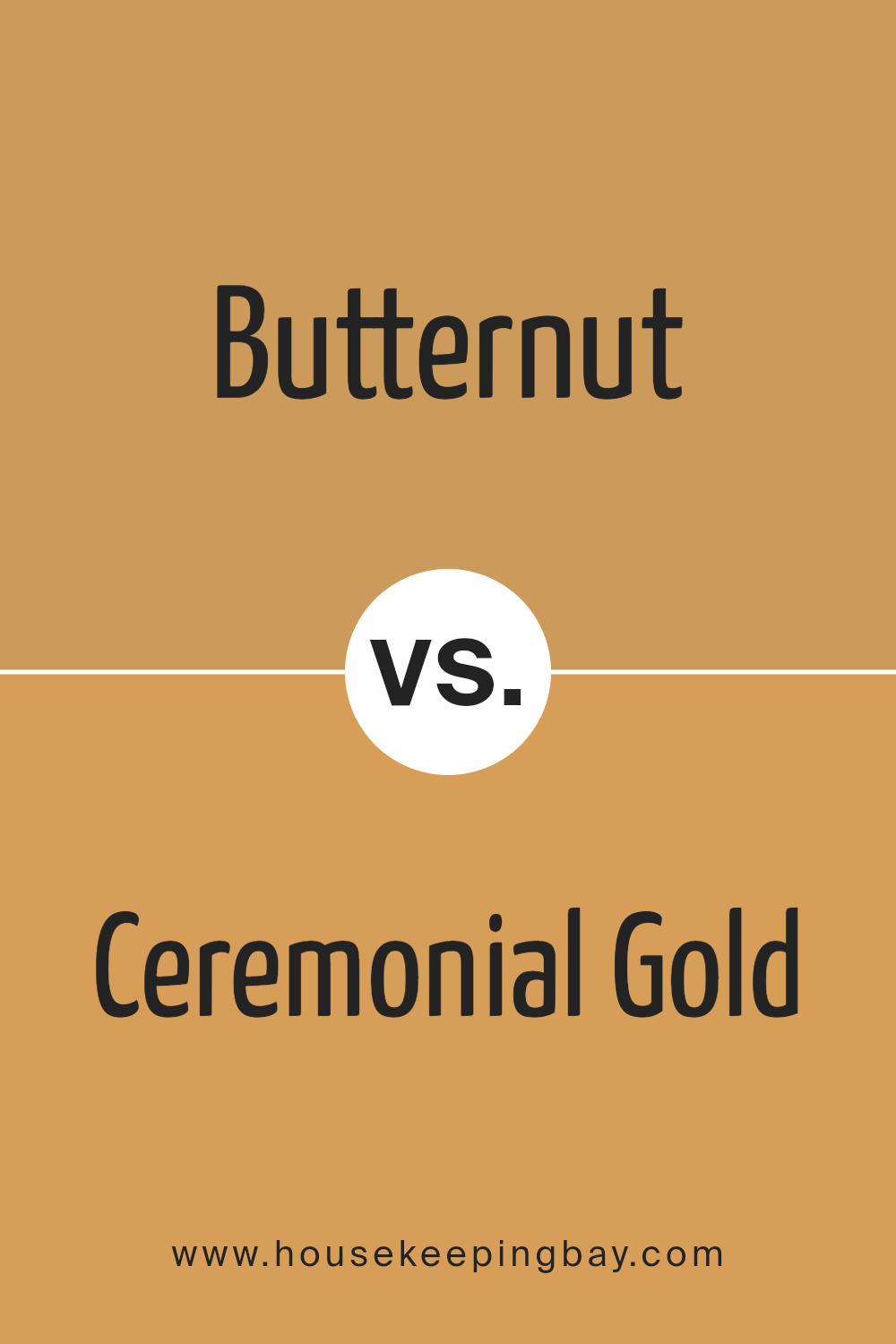
Butternut SW 6389 by Sherwin Williams vs Ceremonial Gold SW 6382 by Sherwin Williams
Butternut SW 6389 by Sherwin Williams is a warm, creamy yellow color that has a soothing presence ideal for creating a cozy, inviting atmosphere. It reminds one of a soft, earthy tone found in rich butterscotch, which pairs well with rustic décor and natural elements like wood and stone.
Ceremonial Gold SW 6382, also by Sherwin Williams, is a deeper, more saturated hue than Butternut. This color exudes a more traditional golden shade that is vibrant and rich, making it perfect for spaces where a bold, yet refined statement is desired. It has an air of elegance and sophistication, suitable for accents or main walls in a dining room or entryway.
Both colors add warmth and personality to spaces, yet the choice between them depends on the desired impact and room usage. Butternut is subtler and blends effortlessly, while Ceremonial Gold stands out and demands attention.
You can see recommended paint color below:
- SW 6382 Ceremonial Gold
housekeepingbay.com
Butternut SW 6389 by Sherwin Williams vs Alchemy SW 6395 by Sherwin Williams
Butternut SW 6389 by Sherwin Williams is a warm, inviting shade that brings to mind the gentle tones of autumn. It has a rich, golden hue that resembles the inside of a butternut squash. This color suits spaces where you want to create a cozy and welcoming atmosphere, like living rooms or dining areas.
Alchemy SW 6395, also by Sherwin Williams, is a deeper, more intense color. It leans towards a sophisticated green with hints of gray, offering a more grounded and calming presence in a room. It’s perfect for spaces that aim for a more serious or focused ambiance, such as home offices or libraries.
These two colors offer distinct vibes. Butternut SW 6389 brightens a space with its cheerful warmth, while Alchemy SW 6395 provides a more muted and serene backdrop. Both colors can complement each other well in the same home, used in different rooms according to the atmosphere you wish to achieve.
You can see recommended paint color below:
- SW 6395 Alchemy
housekeepingbay.com
Butternut SW 6389 by Sherwin Williams vs Harvest Gold SW 2858 by Sherwin Williams
Butternut SW 6389 by Sherwin Williams is a warm, creamy yellow that brings a cozy and comforting atmosphere to any space. It’s reminiscent of a soft buttercream, which makes it perfect for creating a welcoming and gentle environment in homes, particularly in living rooms or kitchens. This color pairs well with natural wood tones and other earthy hues.
Harvest Gold SW 2858, also by Sherwin Williams, is a deeper, richer yellow with a golden brown undertone. It provides a more vibrant and striking look, which can add a sense of cheer and energy to a room. This shade is ideal for adding a pop of color in spaces that need a bit more life and is often used in areas that benefit from extra warmth, like dining areas or entryways.
While both colors share a yellow base, Butternut is lighter and softer, making spaces feel airy and relaxed, whereas Harvest Gold is bolder and can make a strong style statement with its deeper tones.
You can see recommended paint color below:
- SW 2858 Harvest Gold
housekeepingbay.com
Butternut SW 6389 by Sherwin Williams vs Honeycomb SW 6375 by Sherwin Williams
Butternut SW 6389 and Honeycomb SW 6375, both by Sherwin Williams, are warm, inviting shades, yet they present distinct tones. Butternut SW 6389 appears as a rich, creamy yellow, resembling the pale golden hue of butternut squash. This color offers a cheerful brightness that can make spaces feel cozy and welcoming.
Conversely, Honeycomb SW 6375 leans towards a deeper, more saturated golden-yellow. It mirrors the natural color of honey, providing a vibrant and energetic vibe that can energize a room. This shade can add a sense of warmth and vitality, particularly well-suited for areas that benefit from a lively atmosphere.
Both colors work well in spaces that aim for a warm ambiance, but the choice between them could depend on the desired intensity and mood. Butternut’s lighter, softer yellow is excellent for a gentle, subtle background, while Honeycomb’s richer gold is perfect for making a bolder statement.
You can see recommended paint color below:
housekeepingbay.com
Conclusion
Concluding my thoughts on SW 6389 Butternut by Sherwin Williams, I must say it’s a paint color that truly stands out for its warm, inviting hue. Butternut offers a cozy ambiance that makes it perfect for spaces where comfort and warmth are prioritized. It complements a variety of decor styles, from rustic to modern, adapting seamlessly to enhance the aesthetic of any room.
This shade affords a unique versatility that works wonderfully in living rooms, dining areas, and even bedrooms, providing a soothing backdrop that enhances the overall appeal of your home. Pairing it with the right accents and furniture can really bring out its beauty and depth, making your space feel more welcoming.
Moreover, Butternut’s durability and high-quality finish, typical of Sherwin Williams products, mean that it not only adds visual warmth but also ensures longevity and resistance to the wear and tear of daily life. This makes it a practical choice as much as a stylish one.
Using Butternut in your home can revive and refresh your living space, giving it a new lease on life with its rich, creamy presence. It’s a color that I find personal satisfaction in recommending for anyone looking to inject a touch of warmth into their home decor.
housekeepingbay.com
Ever wished paint sampling was as easy as sticking a sticker? Guess what? Now it is! Discover Samplize's unique Peel & Stick samples. Get started now and say goodbye to the old messy way!
Get paint samples


