Napery SW 6386 by Sherwin Williams
Warmth in Every Space
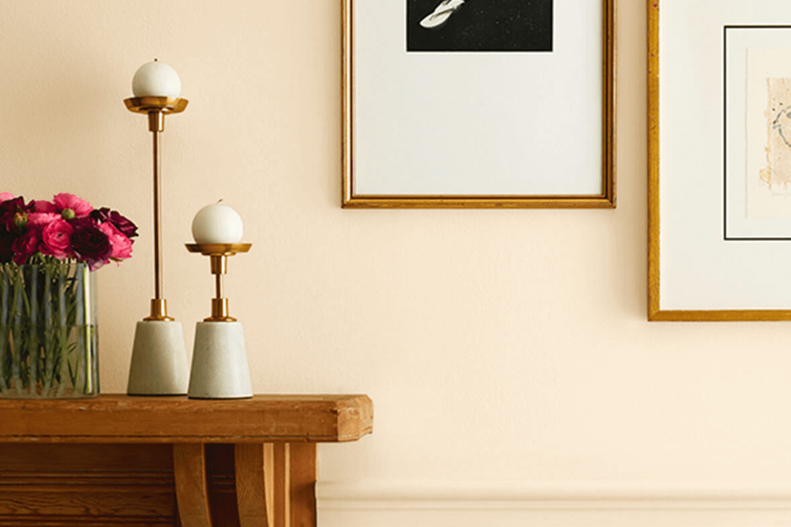
If you’re thinking about giving your space a fresh, welcoming update, consider the soothing appeal of SW 6386 Napery by Sherwin Williams. This warm, soft hue brings a calm and cozy feel to any room, offering a versatile backdrop that complements a wide range of decor styles.
Napery is a gentle yellow that can brighten up spaces without overwhelming them, making it perfect for creating a relaxed and inviting atmosphere.
Whether you are updating your living room, bedroom, or kitchen, this color provides a cheerful canvas that encourages creativity with your interior design.
It’s a particularly good choice if you want to make small spaces feel larger and more open. So, if you’re ready to refresh your home’s look, Napery might be the perfect shade to bring new life into your environment.
sherwin-williams.com
What Color Is Napery SW 6386 by Sherwin Williams?
Napery SW 6386 by Sherwin Williams is a warm shade of beige that offers a subtle hint of sunshine to any space. This color is versatile, almost acting like a neutral, yet it retains a freshness that comes from its yellow undertones. Its light and airy feel makes it an excellent choice for creating a welcoming and cozy environment.
Napery is particularly effective in styles such as modern farmhouse, traditional, and coastal. These interior designs often rely on a palette that supports a light, natural atmosphere, and Napery fits in seamlessly.
In modern farmhouse and traditional settings, it complements the natural materials like wood in furniture and flooring, enhancing the homey feel. In coastal designs, it works beautifully with whites and soft blues, evoking a beachy, relaxed feel.
For materials, Napery pairs well with a variety of textures. Linen fabric in furniture or window treatments goes perfectly with its soft tone. It also matches well with other natural textures like rattan and sisal, which add to its earthy appeal. In addition, soft, plush textiles like woolen throws or cotton rugs can be paired with this color to create layers of texture that make a room feel inviting and comfortable.
Overall, Napery SW 6386 is a great choice for anyone looking to add warmth to their space without overwhelming it with color. It’s easy to match and works across different styles and materials, making it a flexible option for various interior design projects.
housekeepingbay.com
Is Napery SW 6386 by Sherwin Williams Warm or Cool color?
Napery SW 6386 by Sherwin Williams is a warm, neutral paint color that brings a cozy and inviting feel to any room in a home. This shade of beige has a slightly golden undertone, which makes it great for spaces where a soft, welcoming ambiance is desired. It pairs well with a wide range of decor styles and colors, from bold and dramatic to light and airy, making it versatile for use in various rooms.
In living rooms, Napery can create a calm backdrop that allows furniture and art to stand out. In bedrooms, its warm tones help promote a relaxing environment, perfect for unwinding at the end of the day. Kitchens also benefit from Napery, as it complements wood cabinets and stone countertops beautifully.
Because of its neutrality, Napery helps small spaces appear larger and more open, while also adding warmth to larger, colder-feeling rooms. It’s a practical choice for both walls and trim, providing a seamless look throughout the home. Overall, Napery SW 6386 is an excellent choice for those looking to add a touch of warmth to their living space without overwhelming it with color.
What is the Masstone of the Napery SW 6386 by Sherwin Williams?
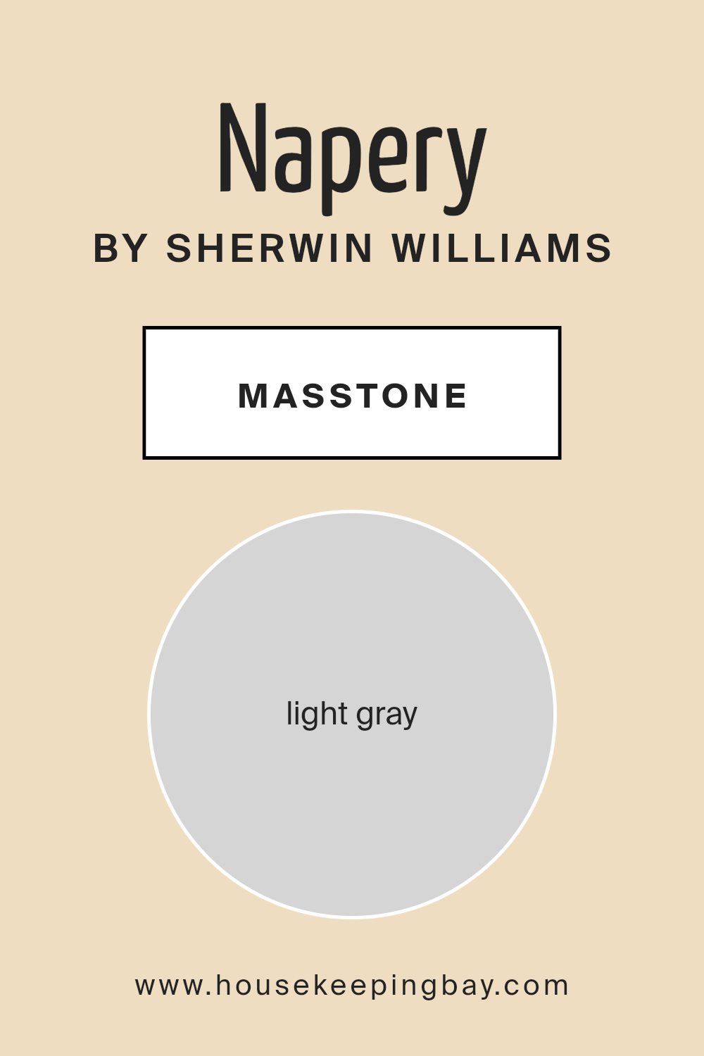
NaperySW 6386 by Sherwin Williams has a masstone of light gray, a color noted for its versatility and calming effect. When used in homes, this gentle shade of gray offers a neutral backdrop that can make spaces feel larger and more open. Its light tone doesn’t dominate but rather complements other elements in the room, such as furniture and artwork. This makes it an excellent choice for walls, creating an understated yet elegant atmosphere.
Light gray works well in high-traffic areas of a home like living rooms or hallways, where it minimizes the appearance of scuffs or smudges, ensuring spaces look clean and well-maintained. In bedrooms, its soothing nature can help create a relaxing environment, conducive to rest.
What’s more, light gray adapts seamlessly to different styles and themes, whether the decor leans towards contemporary, minimalist, or even rustic. It’s truly a functional color that fits effortlessly into any home setting.
housekeepingbay.com
Undertones of Napery SW 6386 by Sherwin Williams
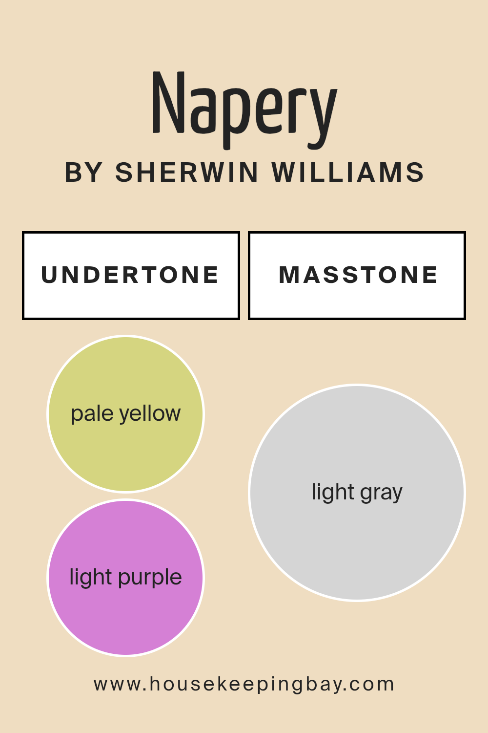
NaperySW 6386 by Sherwin Williams is a nuanced color that reveals a sophisticated array of undertones, making it versatile and adaptable for different spaces. Undertones are subtle colors that lurk beneath the surface of the main color, affecting how it looks under various lighting conditions and when paired with other colors.
For NaperySW 6386, undertones include pale yellow, light purple, light blue, pale pink, mint, lilac, and grey. These undertones contribute to the paint’s complexity and can shift its appearance depending on light exposure and surrounding elements.
For instance, the pale yellow undertone adds a warm glow, making a room feel cozy and inviting. Light purple and lilac bring a gentle, soothing quality, which can soften the look of the space.
Light blue and mint undertones offer a hint of freshness, potentially enhancing the feeling of airiness in a room. Pale pink can add a touch of softness and warmth, ideal for creating a comforting atmosphere. Grey undertones provide a grounded, neutral base that helps balance the brighter elements.
When used on interior walls, NaperySW 6386 can create diverse effects. In natural daylight, the paint might lean towards its cooler undertones like light blue or mint, giving the room a crisp, serene vibe. In artificial lighting, the warmer tones like pale yellow or pink might become more dominant, enveloping the space in a cozy warmth. The presence of grey helps moderate the intensity of both warm and cool tones, ensuring the color remains balanced and pleasing under different lighting scenarios.
Overall, the undertones of NaperySW 6386 offer flexibility in design, making it suitable for various interior styles and preferences.
housekeepingbay.com
Coordinating Colors of Napery SW 6386 by Sherwin Williams
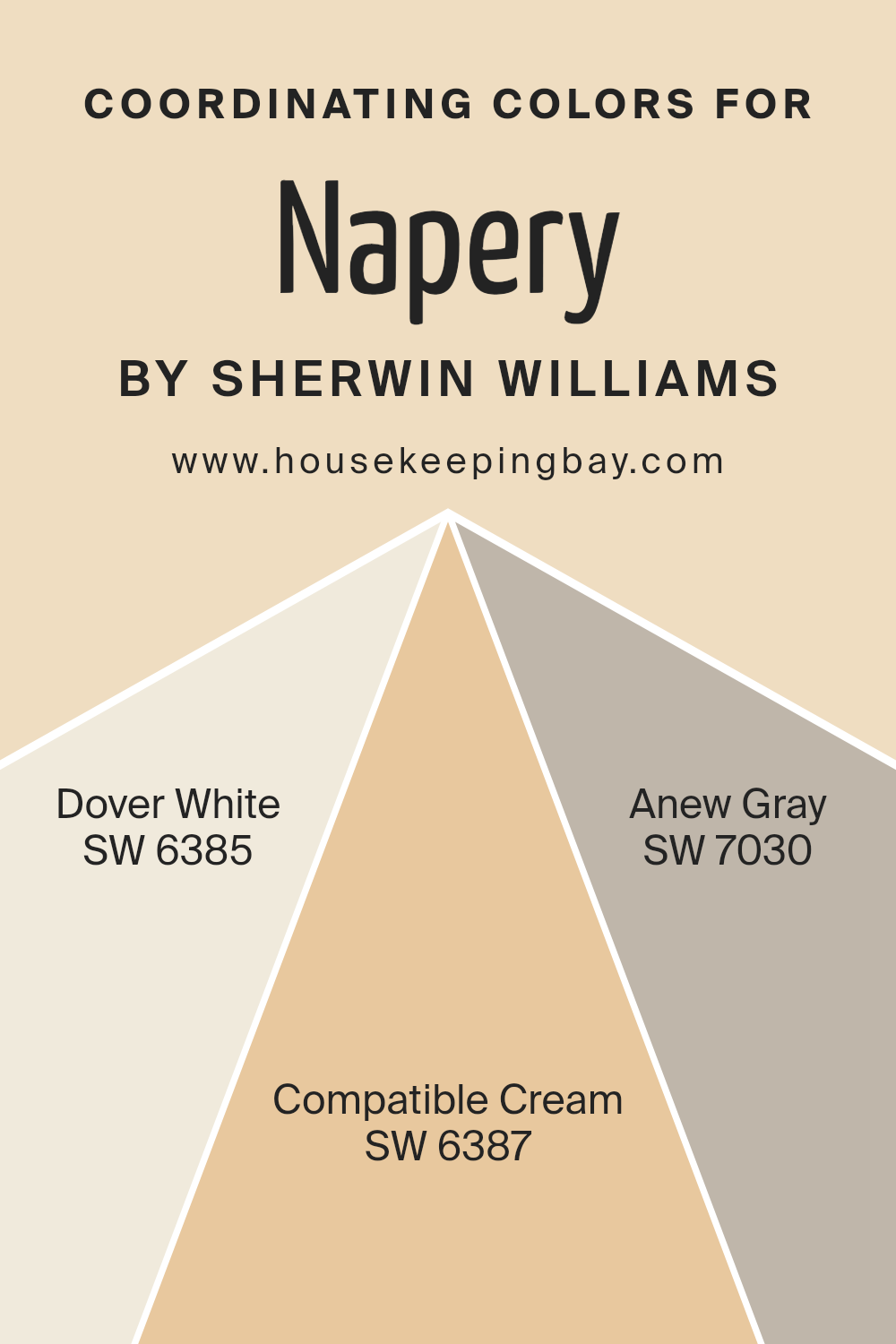
Coordinating colors are those that complement each other and work well together in a design, enhancing the overall aesthetic without overpowering any single element. For instance, if you consider Napery by Sherwin Williams, its coordinating colors such as Dover White, Compatible Cream, and Anew Gray, are picked to create a harmonious and pleasing color scheme that can be applied across various elements in a room, from walls to trim to accent features.
These colors have been specifically chosen due to their ability to support the primary color (Napery), providing subtle variations that enrich the decor without creating a stark contrast.
Dover White SW 6385 is a soft, warm white with a touch of creaminess, making it a versatile and inviting choice for trim or base walls that want a gentle, yet bright presence. On a slightly deeper note, Compatible Cream SW 6387 offers a more pronounced hue, a creamy color that’s rich and warm, perfect for creating a cozy and comforting atmosphere in spaces seeking a bit of depth.
Lastly, Anew Gray SW 7030 brings a balanced medium gray that leans neither too cool nor too warm, making it an excellent choice for accent walls or larger areas that require a neutral, yet contemporary backdrop. These colors together ensure a seamless flow and subtle transition throughout the space.
You can see recommended paint colors below:
- SW 6385 Dover White
- SW 6387 Compatible Cream
- SW 7030 Anew Gray
housekeepingbay.com
How Does Lighting Affect Napery SW 6386 by Sherwin Williams?
Lighting plays a crucial role in how we perceive colors. The type and intensity of light can significantly influence how a specific color looks in a space. Napery SW 6386 by Sherwin Williams, a warm neutral tone, varies in appearance under different lighting conditions.
- Natural Light: When illuminated by natural light, Napery takes on a fresh and inviting look. In a north-facing room, which receives cooler, indirect light, this shade tends to appear more muted and can have a slight grayish undertone. This cooler light emphasizes the beige aspects of Napery, creating a calm, soft feel.
- In a south-facing room, where the light is warmer and more direct, Napery looks warmer and more vibrant. The golden undertones of the paint come alive, enhancing the room’s coziness. This makes south-facing rooms feel airy and lively.
- Artificial Light: Under artificial lighting, Napery’s appearance shifts based on the type of bulbs used. With incandescent bulbs, which emit a warm glow, Napery will appear more golden and rich. This enhances the warmth of the room, making it feel welcoming. Fluorescent lighting, however, typically casts a cooler tone, causing Napery to look more neutral and subdued.
- East and West-Facing Rooms: In east-facing rooms, Napery benefits from the bright, warm light of the morning sun, making the color appear soft and warm early in the day. Later, as less direct light fills the room, it maintains a balanced and neutral warmth.
West-facing rooms enjoy a similar transformation but in reverse; the color appears neutral during the morning and grows warmer and more inviting as sunlight intensifies towards the evening.
This dynamic change makes Napery a versatile choice, adapting beautifully across different rooms and varying lighting conditions, enhancing the environment in which it is used.
housekeepingbay.com
What is the LRV of Napery SW 6386 by Sherwin Williams?
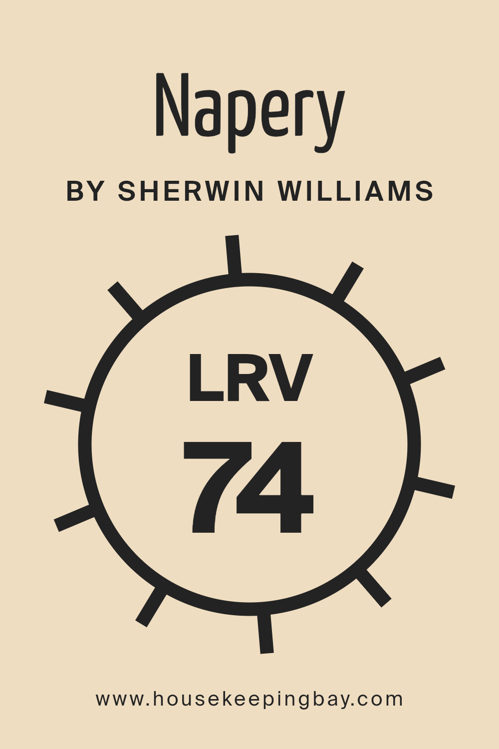
LRV stands for Light Reflectance Value, a measure indicating how much light a paint color reflects or absorbs. The scale runs from 0 to 100, where 0 absorbs all light (appears black), and 100 reflects all light (appears white). This value helps in choosing paint colors for your space by predicting how light or dark a color will look on the walls. Paint with a higher LRV makes a room feel brighter and more open because it reflects more light back into the room.
The color Napery SW 6386 by Sherwin Williams has an LRV of 73.755, which means it is quite light and will reflect a good amount of light. This property makes Napery a good choice for spaces where you want to enhance natural light, possibly making the room feel more airy and spacious.
Since it doesn’t absorb much light, it won’t darken a room but rather adds a soft, warm tone to the walls, keeping the space light and inviting.
housekeepingbay.com
What are the Trim colors of Napery SW 6386 by Sherwin Williams?
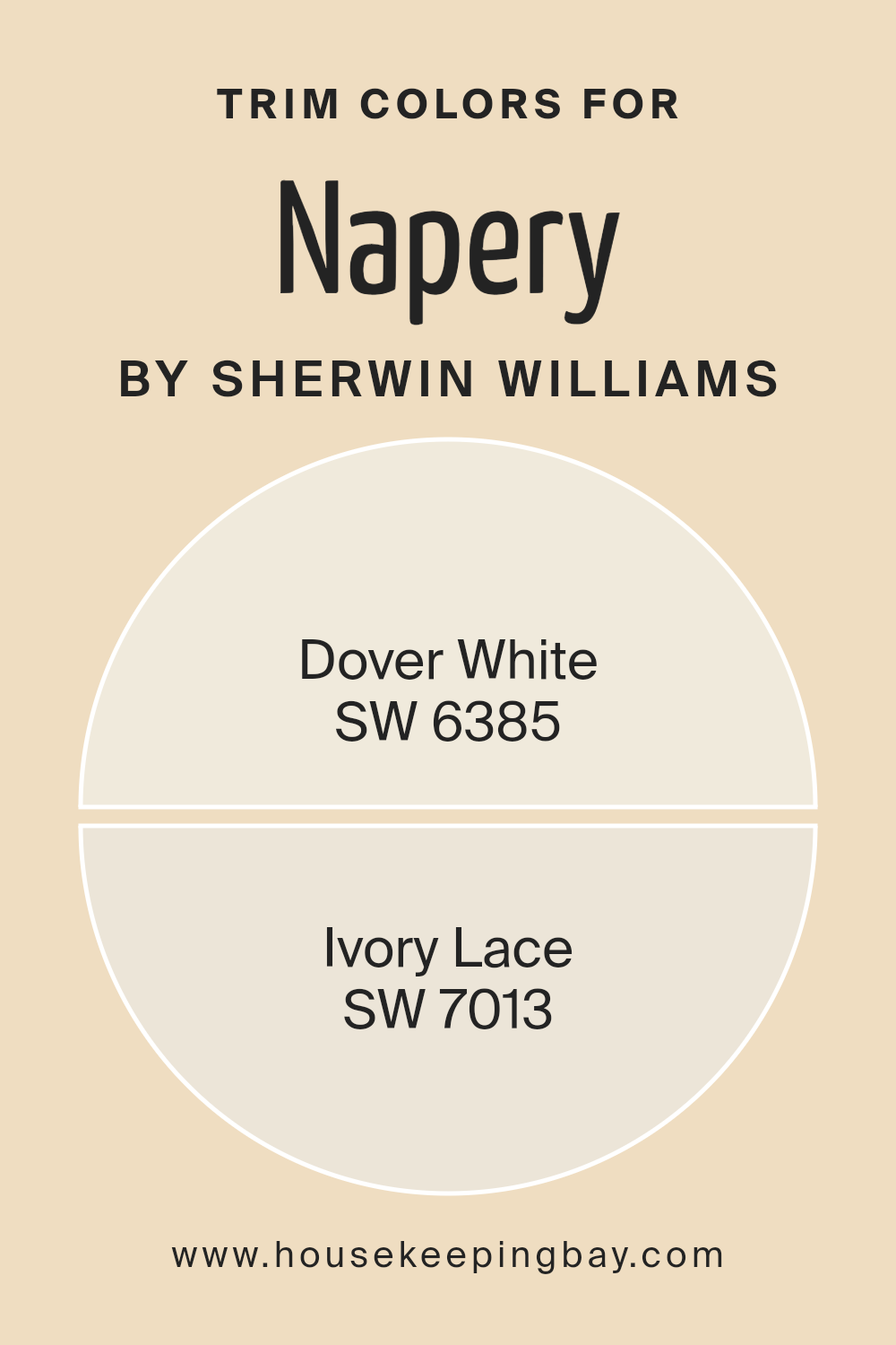
Trim colors are specific shades chosen for painting details such as door frames, baseboards, crown moldings, and window trims to complement or contrast the main wall colors. In the context of NaperySW 6386 by Sherwin Williams, selecting appropriate trim colors enhances the overall appearance of a space, highlighting architectural details and creating a cohesive look.
When paired with Napery, a neutral yet inviting hue, trim colors like Dover White SW 6385 and Ivory Lace SW 7013 are crucial as they subtly define and refine the edges and features of a room without overpowering the main color, thereby ensuring that the walls are beautifully framed and visually appealing.
Dover White SW 6385 is a warm, creamy white that offers a soft backdrop to Napery, making it ideal for a trim that provides a gentle contrast without starkness, lending a soothing and cohesive feel to spaces.
Ivory Lace SW 7013, slightly richer and deeper than Dover White, provides a touch of understated elegance, giving a room a more layered and sophisticated look when used as a trim color. Together, both colors support the main hue by adding depth and character to the design scheme.
You can see recommended paint colors below:
housekeepingbay.com
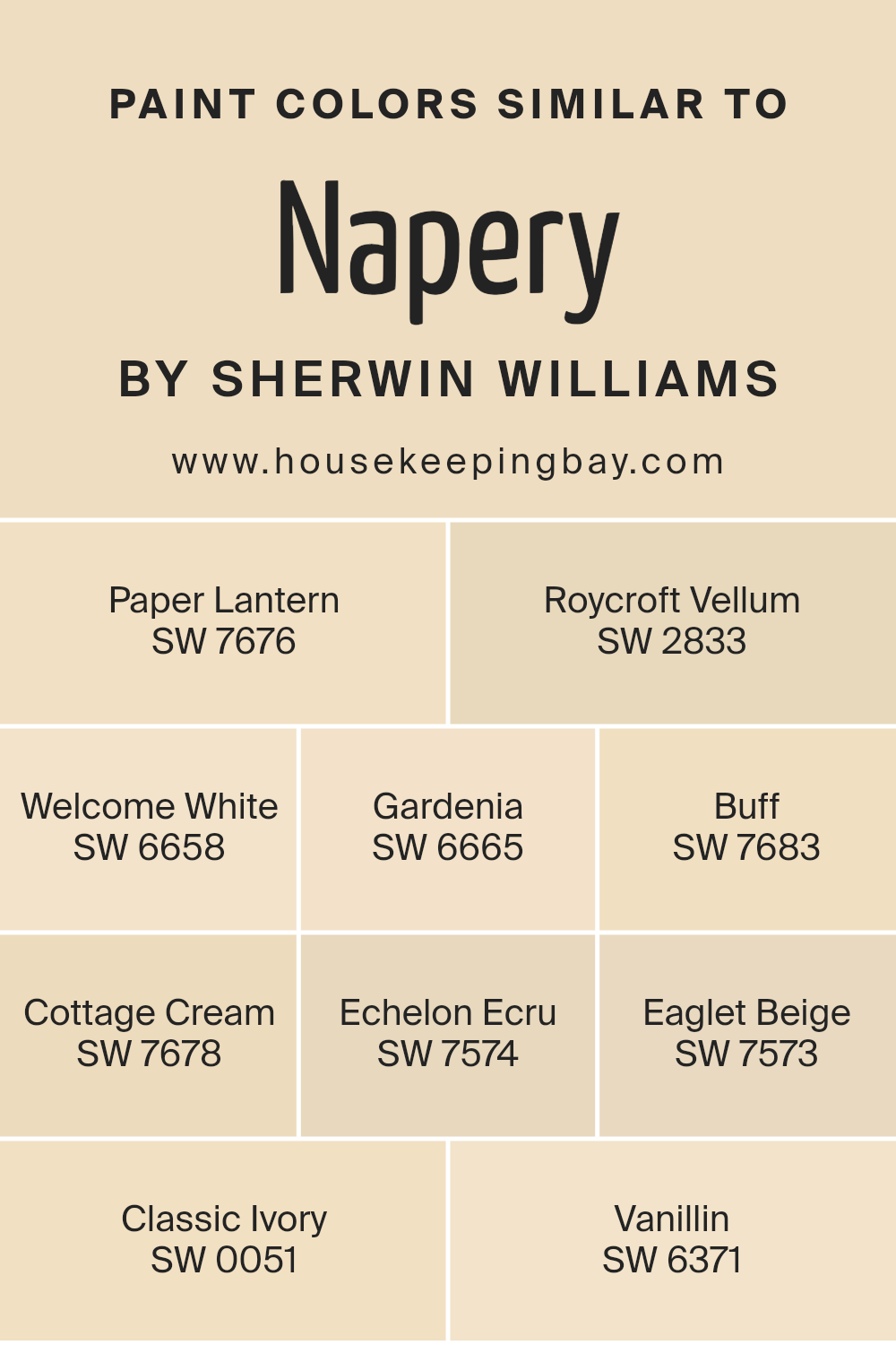
Colors Similar to Napery SW 6386 by Sherwin Williams
Similar colors play a crucial role in design by creating a sense of continuity and harmony. When colors like those similar to Napery SW 6386 by Sherwin Williams are used together, they can produce a subtle yet cohesive look, perfect for spaces seeking a unified aesthetic without stark contrasts.
These shades, gentle and closely related in tone, work well to enhance each other without overpowering the space. For instance, applying a combination of closely related hues can make small rooms seem larger and more open, while providing a sophisticated backdrop that allows other elements like furniture and decor to stand out.
In the palette akin to Napery SW 6386, each color has its unique character yet shares common undertones that help in achieving a fluid visual flow. Paper Lantern SW 7676 softly glows with a creamy warmth, ideal for inviting and comforting environments. Roycroft Vellum SW 2833 lends an earthy, muted elegance that pairs well with natural materials like wood and stone. Welcome White SW 6658 offers a fresh, clean look, acting as a versatile base for any setting.
Gardenia SW 6665 exudes a subtle floral undertone that brightens up spaces gracefully. Buff SW 7683 provides a neutral ground, adaptable and understated, while Cottage Cream SW 7678 radiates a mild, welcoming feel perfect for cozy areas.
Echelon Ecru SW 7574 carries a stately presence, suggesting refinement and classic taste. Eaglet Beige SW 7573 supports an array of decorative choices with its reliable, soft beige tone. Classic Ivory SW 0051 creates a light, airy feeling that expands spaces visually.
Finally, Vanillin SW 6371 adds a hint of creamy sweetness, rounding out this collection with a touch of soft elegance, proving just how impactful similar shades can be when thoughtfully applied together.
You can see recommended paint colors below:
- SW 7676 Paper Lantern
- SW 2833 Roycroft Vellum
- SW 6658 Welcome White
- SW 6665 Gardenia
- SW 7683 Buff
- SW 7678 Cottage Cream
- SW 7574 Echelon Ecru
- SW 7573 Eaglet Beige
- SW 0051 Classic Ivory
- SW 6371 Vanillin
housekeepingbay.com
Colors that Go With Napery SW 6386 by Sherwin Williams
Selecting complementary colors for Napery SW 6386 by Sherwin Williams is important because they help create a seamless and appealing aesthetic in a space. These colors work by either contrasting or enhancing the primary shade, making the overall design feel cohesive and thoughtfully curated.
For example, Gallant Gold SW 6391 lends a rich, golden hue that brings warmth to rooms, pairing splendidly with the soft neutrality of Napery for a classic look. Meanwhile, Dakota Wheat SW 9023 offers a subdued, earthy tone that matches well with Napery’s lightness, ideal for those seeking a subtle yet welcoming atmosphere.
Compatible Cream SW 6387 is slightly richer than Napery, providing a gentle contrast that is pleasing to the eye and perfect for creating a soft, serene vibe in a living or dining area. Bosc Pear SW 6390 introduces a slightly yellower tint, offering a fresh and gentle pop of color that enhances spaces without overwhelming them. Butternut SW 6389 has a deeper, more saturated tone that can add a dimension of coziness and comfort to any room when paired with Napery.
Lastly, Golden Fleece SW 6388 is similar to Butternut but lighter, providing a cheerful brightness that can open up smaller spaces or rooms with limited natural light. By combining these tones thoughtfully with Napery SW 6386, you can craft spaces that feel both harmonious and stylish.
You can see recommended paint colors below:
- SW 6391 Gallant Gold
- SW 9023 Dakota Wheat
- SW 6387 Compatible Cream
- SW 6390 Bosc Pear
- SW 6389 Butternut
- SW 6388 Golden Fleece

housekeepingbay.com
How to Use Napery SW 6386 by Sherwin Williams In Your Home?
Napery SW 6386 by Sherwin Williams is a warm, inviting shade of yellow that can brighten any space in your home. This cheerful color works especially well in kitchens and dining areas where it adds a sunny, welcoming atmosphere.
You can use Napery on walls to create a cozy vibe or on cabinets for a fresh, updated look. Furthermore, Napery pairs beautifully with a range of other colors. For a classic feel, you can combine it with soft whites and natural wood tones. If you want a bit of contrast, try pairing it with cool blues or greens.
Because of its versatile nature, Napery is easy to incorporate into various decorating styles, whether your home is more traditional or leans towards a modern aesthetic. Applying a coat of Napery paint is an affordable way to refresh your home’s interior and bring warmth to your daily surroundings.
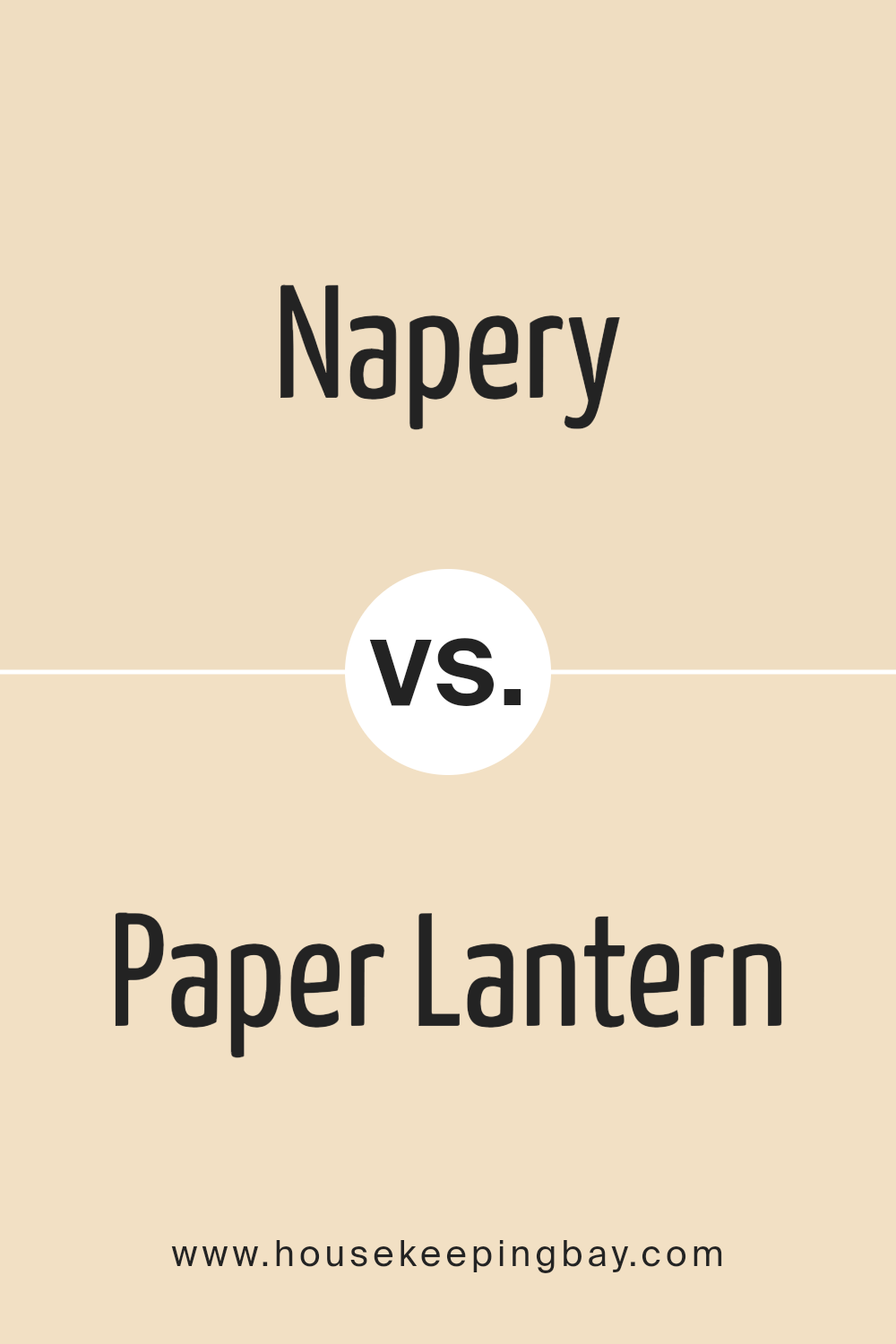
Napery SW 6386 by Sherwin Williams vs Paper Lantern SW 7676 by Sherwin Williams
Napery SW 6386 by Sherwin Williams is a warm beige color with a soothing, gentle hue that brings a cozy feel to any space. It pairs well with various decor styles and enhances the sense of comfort in a room. In contrast, Paper Lantern SW 7676, also by Sherwin Williams, is lighter and has a cleaner, crisper feel.
This color is neutral yet fresh, making it ideal for spaces that aim for a bright and airy atmosphere. While Napery adds a touch of warmth making spaces feel homely and inviting, Paper Lantern offers a more straightforward, luminous appeal that can make smaller rooms appear larger.
Both colors are versatile, but their impact on a room’s ambiance can vary significantly depending on the furniture and accessories used.
You can see recommended paint color below:
- SW 7676 Paper Lantern
housekeepingbay.com
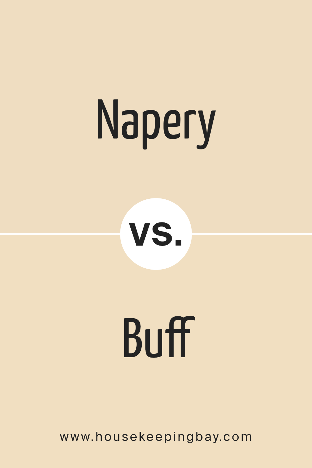
Napery SW 6386 by Sherwin Williams vs Buff SW 7683 by Sherwin Williams
Napery SW 6386 and Buff SW 7683 by Sherwin Williams are both warm, inviting paint colors but each has unique characteristics. Napery is a soft, muted yellow with a sunny feel that brightens up any room. It reflects light well, making spaces appear larger and more open. This color works great in kitchens or living rooms where a cheerful ambiance is desired.
Buff, on the contrary, is a deeper, richer tone resembling classic beige. It offers a cozy warmth that feels comforting and grounded, ideal for bedrooms or dens where a relaxing atmosphere is key. Buff also pairs well with a wide range of other colors, providing flexibility in decor choices.
While both colors promote a warm aesthetic, Napery leans towards a lighter, yellowish hue, and Buff towards a solid, earthy beige. Each brings its own flavor to a space, making them suitable for different purposes depending on the desired mood and style.
You can see recommended paint color below:
- SW 7683 Buff
housekeepingbay.com
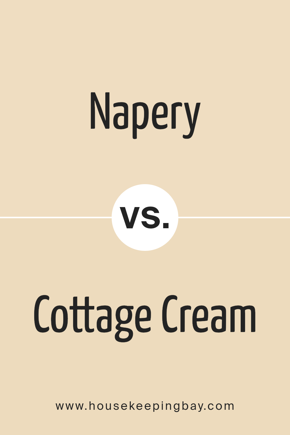
Napery SW 6386 by Sherwin Williams vs Cottage Cream SW 7678 by Sherwin Williams
Napery SW 6386 and Cottage Cream SW 7678, both from Sherwin Williams, offer warm, inviting hues, but with noticeable differences. Napery SW 6386 features a soft, light beige tone that exudes a sense of calm and neutrality. It is versatile and serves as an excellent background color for rooms, helping other elements to stand out without overpowering them.
Cottage Cream SW 7678, contrastingly, has a creamier, slightly richer yellow undertone. This color brings a cheerful warmth to spaces, making them feel cozy and bright. It works exceptionally well in spaces that aim to feel snug and welcoming.
Both colors can enhance various decor styles, but Napery’s subtler beige may appeal to those seeking a minimalistic or more subdued aesthetic, while Cottage Cream’s richer tone fits spaces that desire a touch of warmth and brightness. Depending on the room’s purpose and the desired atmosphere, each color offers unique benefits to match different decorating goals.
You can see recommended paint color below:
- SW 7678 Cottage Cream
housekeepingbay.com
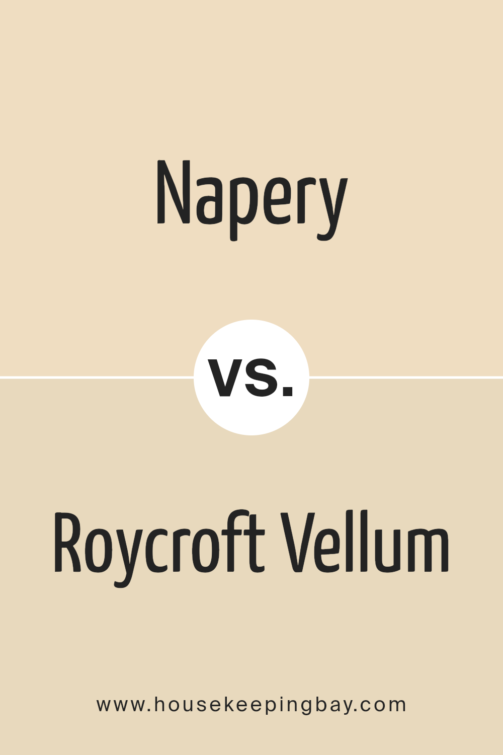
Napery SW 6386 by Sherwin Williams vs Roycroft Vellum SW 2833 by Sherwin Williams
Napery SW 6386 by Sherwin Williams is a soft, warm beige with hints of yellow, creating a cozy and welcoming atmosphere in any space. It reflects light well, making it a great choice for making small rooms appear larger and brighter.
On the contrary, Roycroft Vellum SW 2833 is a richer, deeper tan with undertones of brown and olive, lending it a more grounded and earthy feel. This color is ideal for adding warmth and sophistication to any area, particularly suited for creating a calming and secure environment.
While Napery offers a lighter, more airy vibe, ideal for casual and relaxed settings, Roycroft Vellum provides a stronger presence that works well in traditional or formal spaces. Both colors are versatile, but the choice between them depends largely on the mood and style you want to achieve in your decorating project.
You can see recommended paint color below:
- SW 2833 Roycroft Vellum
housekeepingbay.com
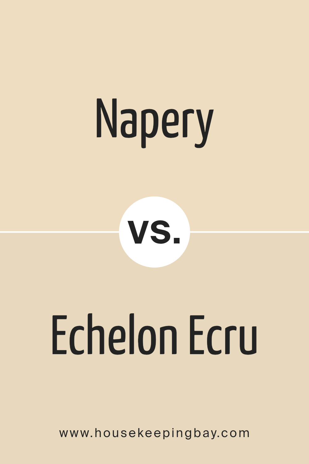
Napery SW 6386 by Sherwin Williams vs Echelon Ecru SW 7574 by Sherwin Williams
Napery SW 6386 and Echelon Ecru SW 7574, both by Sherwin Williams, are subtle and soft, ideal for creating warm, inviting spaces. Napery has a slightly more yellow undertone, giving it a sunny and cheerful feel. It’s perfect for rooms that need a touch of brightness, like kitchens or living rooms.
Echelon Ecru, meanwhile, leans towards a neutral beige, with a hint of gray, evoking a more refined and sophisticated atmosphere. This color works beautifully in areas where a calm and soothing backdrop is desired, such as bedrooms or offices.
While both colors are versatile, Napery’s brighter tone injects more energy into a room, whereas Echelon Ecru offers a cooler, more muted elegance. Deciding between them depends on your desired aesthetic and the specific mood you wish to achieve in your space.
You can see recommended paint color below:
housekeepingbay.com
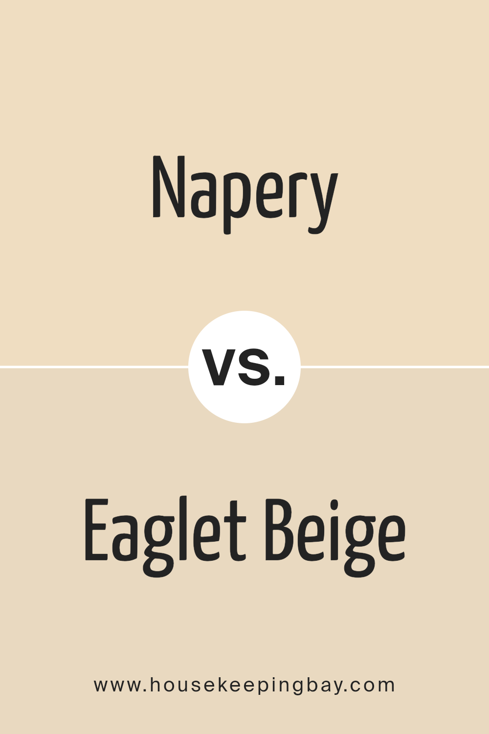
Napery SW 6386 by Sherwin Williams vs Eaglet Beige SW 7573 by Sherwin Williams
Napery SW 6386 by Sherwin Williams is a warm, soft beige that gives a cozy and inviting vibe to any space. It has a gentle brightness that makes rooms feel more open and airy. This color works well in areas where you want to create a relaxed and comfortable atmosphere, like living rooms or bedrooms.
Eaglet Beige SW 7573, also by Sherwin Williams, is slightly deeper and richer than Napery. It carries a hint of gray, which adds a sophisticated touch to its overall beige tone. This makes Eaglet Beige a great choice for spaces that require a bit of elegance without being too bold or overpowering.
Both colors are versatile and can blend well with various decor styles and color schemes. However, Napery, with its lighter tone, might be better suited for smaller or darker rooms to help them appear more spacious. Eaglet Beige, with its richer depth, is ideal for adding warmth and a sense of refined comfort to larger or well-lit areas.
You can see recommended paint color below:
housekeepingbay.com
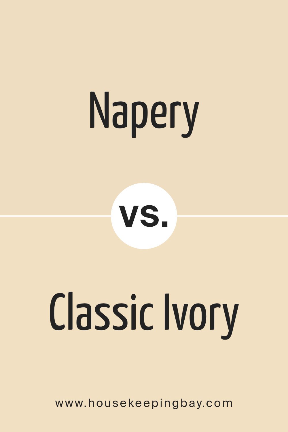
Napery SW 6386 by Sherwin Williams vs Classic Ivory SW 0051 by Sherwin Williams
Napery SW 6386 by Sherwin Williams is a warm, soft beige that brings a cozy and inviting atmosphere to any space. It has a welcoming aura, suitable for rooms where you want a calm, soothing vibe. This color pairs well with natural materials and earth tones, enhancing a rustic or traditional decor style effectively.
Classic Ivory SW 0051 by Sherwin Williams, meanwhile, is a lighter and more neutral shade. It offers a subtle elegance and can serve as a fresh, clean backdrop in any room. It’s particularly great for spaces that aim to feel more open and airy. This color works well in modern and minimalist interiors, as it provides a crisp, unobtrusive foundation.
Both colors offer versatility and warmth but differ in their intensity and application. Napery, with its richer hue, gives off a more pronounced warmth, while Classic Ivory is excellent for creating a bright, spacious feel.
You can see recommended paint color below:
- SW 0051 Classic Ivory
housekeepingbay.com
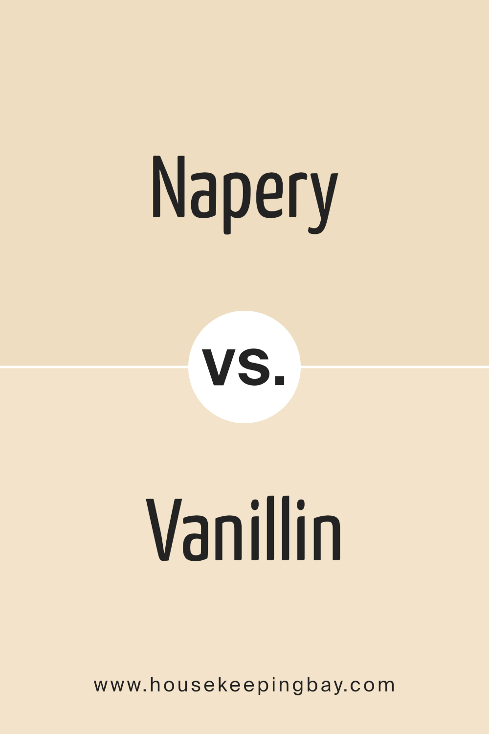
Napery SW 6386 by Sherwin Williams vs Vanillin SW 6371 by Sherwin Williams
Napery SW 6386 and Vanillin SW 6371 by Sherwin Williams are two beautiful colors with subtle differences. Napery SW 6386 is a soft, muted yellow that brings warmth to any space, resembling the gentle color of linen.
It provides a cozy, inviting atmosphere, ideal for living rooms or bedrooms where you want to create a serene setting. Vanillin SW 6371, however, leans more towards a creamy off-white with a hint of yellow, similar to the color of vanilla.
It’s light and airy, making it perfect for spaces that you want to feel more open and bright. Both colors work well in various styles of decor, adding subtle elegance without overwhelming the senses. Their muted tones pair easily with other colors, allowing for versatile color schemes in interior design. Whether you’re going for a warm embrace or a gentle highlight, both Napery and Vanillin offer lovely options.
You can see recommended paint color below:
- SW 6371 Vanillin
housekeepingbay.com
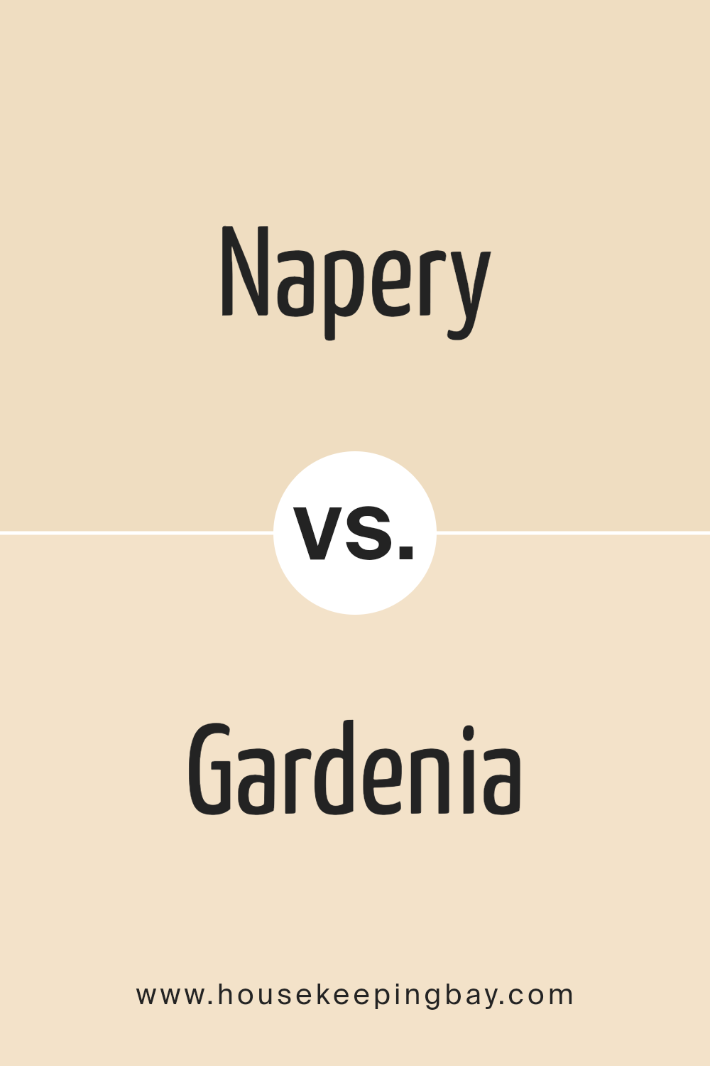
Napery SW 6386 by Sherwin Williams vs Gardenia SW 6665 by Sherwin Williams
Napery SW 6386 by Sherwin Williams is a soft, subdued shade of yellow that brings a warm and welcoming feel to any space. It resembles the natural color of linen and can create a cozy, calming atmosphere, making it great for living rooms or bedrooms where comfort is key.
Gardenia SW 6665, also by Sherwin Williams, is a vibrant yellow with a slightly more energetic presence compared to Napery. This color is reminiscent of the bright and cheerful tone of gardenia flowers. It’s perfect for spaces where you want to add a splash of brightness, such as a kitchen or a children’s play area.
Both colors add warmth to their environments but in different ways. Napery’s muted tone is more versatile and easier to blend with various decor styles. Gardenia’s bolder hue works well when you want to make a statement or energize a room. Whether you choose Napery for its subtle charm or Gardenia for its lively punch, both colors will make spaces feel inviting.
You can see recommended paint color below:
- SW 6665 Gardenia
housekeepingbay.com
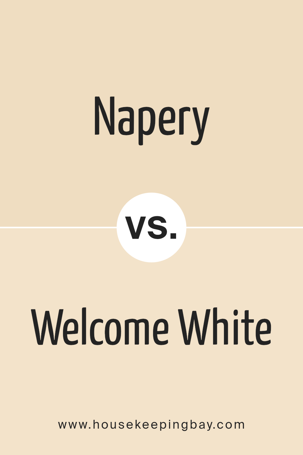
Napery SW 6386 by Sherwin Williams vs Welcome White SW 6658 by Sherwin Williams
Napery SW 6386 by Sherwin Williams is a warm beige color that gives off a cozy and inviting feel. It’s subtle enough to serve as a neutral backdrop in any room, making spaces feel more open and relaxed. This color works well in living areas and bedrooms where a gentle, soothing presence is desired.
Welcome White SW 6658 by Sherwin Williams, in contrast, is a bright, clean white. It offers a crisp look that can help make small spaces appear larger and more illuminated. Welcome White is ideal for creating a fresh and airy environment. It’s particularly effective in kitchens and bathrooms, where it can help enhance natural light.
While both colors are designed to create welcoming interiors, Napery’s warm tones provide a soft, comforting ambiance, whereas Welcome White offers a sharp, clear setting that can rejuvenate a space. Depending on your design goals and the atmosphere you want to achieve, each color has its unique strengths.
You can see recommended paint color below:
- SW 6658 Welcome White
housekeepingbay.com
Conclusion
In conclusion, choosing SW 6386 Napery by Sherwin Williams offers numerous benefits for home improvement endeavors. This color exudes a warm and inviting ambiance that makes it a favored choice for spaces aimed at relaxation and comfort.
Whether you’re looking to refresh a single room or planning a widespread renovation, Napery’s versatile hue pairs effortlessly with various decors, enhancing both traditional and modern aesthetics. Its ability to reflect light beautifully can also make small spaces appear larger and more open.
For anyone seeking a reliable and appealing paint option, SW 6386 Napery stands out as a solid option that consistently delivers quality results. With its serene vibe and adaptability, this color can significantly contribute to creating a pleasant atmosphere in any part of your home, faithfully serving your vision for a stylish, welcoming space.
housekeepingbay.com
