Warm Pewter SW 9572 by Sherwin Williams
A Cozy Shade of Sophistication
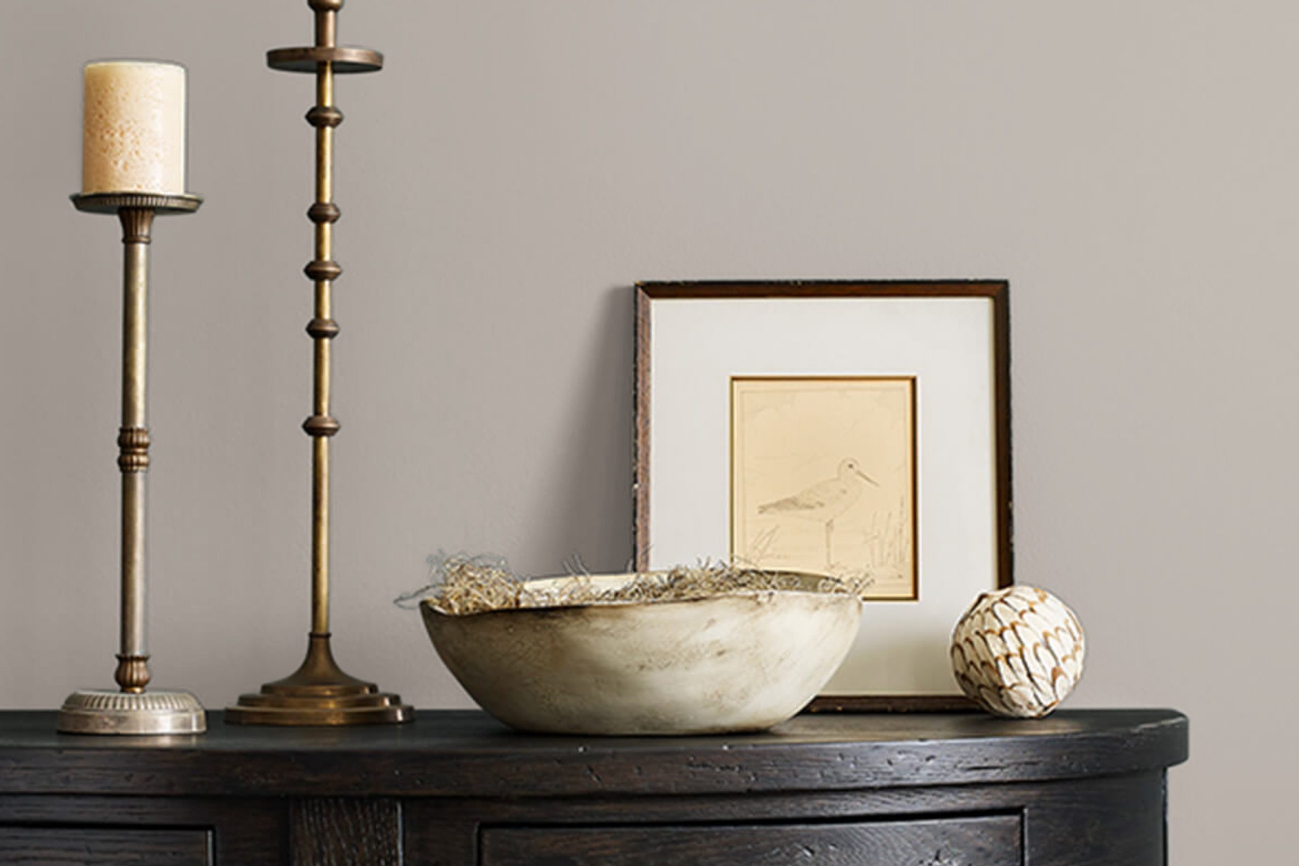
You might be considering a new paint color for your space and wondering what SW 9572 Warm Pewter by Sherwin Williams has to offer. This shade stands out as a soothing, soft gray that brings a sense of calm to any room. It fits perfectly whether you aim to refresh your living room, bedroom, or even your office.
Warm Pewter isn’t just another gray; it has a unique quality that allows it to blend seamlessly with various decor styles and color palettes. It works well in spaces that receive a lot of natural light, as well as in darker rooms where it can add depth and warmth.
This color can be a backdrop for vibrant colors or a stand-alone shade creating a minimalist look.
Choosing the right gray can sometimes be tricky, but Warm Pewter offers just enough warmth to make your space feel welcoming without the starkness that some grays have. It pairs well with white trim for a crisp look, or with dark woods for a more traditional feel.
No matter your style, SW 9572 Warm Pewter could be a great choice to freshen up your walls while keeping things chic and simple.
via sherwin-williams.com
What Color Is Warm Pewter SW 9572 by Sherwin Williams?
Table of Contents
Warm Pewter (SW 9572) by Sherwin Williams is a versatile paint color that offers a rich blend of gray and brown, creating a cozy and inviting atmosphere. This soothing hue evokes the natural elements of stone and wood, making it perfect for creating a grounded, peaceful environment. It’s a medium-to-dark shade that works well in spaces needing depth and warmth without being too overpowering.
Warm Pewter is ideally suited for a variety of interior styles, particularly rustic, modern farmhouse, and contemporary designs. Its neutral character allows it to blend seamlessly with a wide range of color palettes, serving as either a compelling focal point or a subtle background shade.
Materials that pair well with Warm Pewter include natural wood, which complements its earthy tones, and textured fabrics such as wool or linen, adding to the tactile quality of the space. Leather furniture and metallic accents in bronze or copper can also enhance the warmth of the color, creating a rich, harmonious look.
For those looking to add a touch of elegance, incorporating velvet drapes or a plush area rug would work beautifully against the muted richness of Warm Pewter.
housekeepingbay.com
Is Warm Pewter SW 9572 by Sherwin Williams Warm or Cool color?
Warm Pewter SW 9572 by Sherwin Williams is a versatile paint color that brings a balanced blend of warmth and modernity to any space. This shade is a deep, muted gray with brown undertones, making it perfect for creating a cozy yet sophisticated atmosphere in homes.
Its neutral quality allows it to pair well with various decor styles, from rustic to contemporary.
When used in small rooms, Warm Pewter can make the space feel more intimate and inviting. In larger areas, it serves as a solid, grounding backdrop that enhances other elements in the room. This color works exceptionally well with natural light, subtly shifting tones throughout the day, adding depth and interest to the walls.
Moreover, Warm Pewter’s adaptability extends to its compatibility with a wide range of colors, from soft pastels to bold, vibrant shades. It’s particularly effective in providing contrast when used alongside brighter or lighter colors, helping to balance out the overall aesthetic of a home.
Thus, it proves to be an ideal choice for homeowners looking to add a touch of elegance without overwhelming a room’s character.
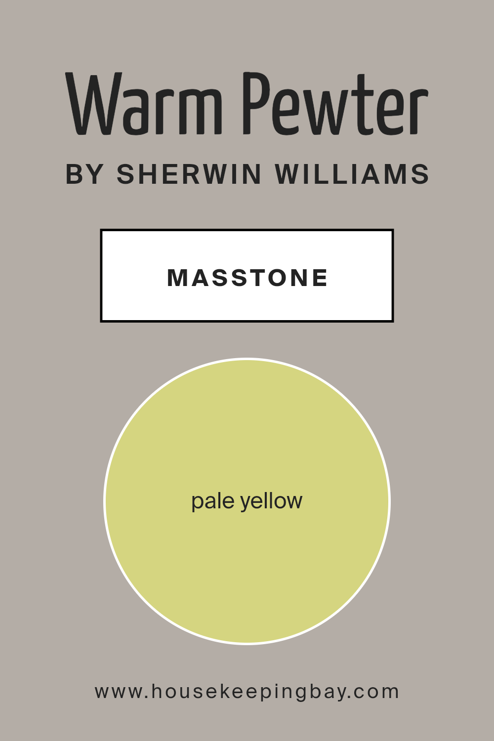
What is the Masstone of the Warm Pewter SW 9572 by Sherwin Williams?
Warm Pewter SW 9572 by Sherwin Williams, with its masstone of Pale Yellow (#D5D580), is a subtle and inviting hue that brings a light and airy feel to any home. This shade of pale yellow works especially well in creating a cozy, welcoming ambiance without overwhelming the senses. It’s particularly effective in smaller or dimly lit rooms, where its gentle brightness can make the space appear larger and more open.
This color’s softness allows it to blend harmoniously with a wide range of decor styles and other colors, from neutral earth tones to more vibrant shades. It provides a calming background that doesn’t dominate but supports a variety of design elements.
Warm Pewter can be used in living rooms, bedrooms, and kitchens, enhancing natural light and contributing to a relaxed environment.
Because of its understated charm, Warm Pewter is also an excellent choice for those looking to refresh their home’s look without making drastic changes. It’s versatile, easy to live with, and adds just enough warmth to create a welcoming atmosphere.
housekeepingbay.com
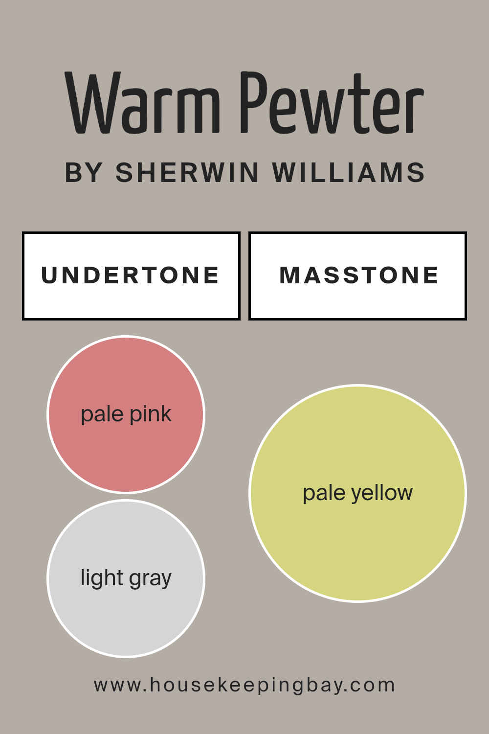
Undertones of Warm Pewter SW 9572 by Sherwin Williams
Warm Pewter SW 9572 by Sherwin Williams is a versatile paint color with a rich array of undertones that subtly influence how it appears in different settings. This color includes undertones like pale pink, light gray, light purple, mint, grey, light blue, lilac, yellow, orange, light green, and olive. Each undertone can shift the main hue’s perception depending on lighting and surrounding colors.
Undertones play a crucial role in visual perception. They can make a color appear cooler or warmer and impact how the color blends with furnishings and other architectural elements. For example, pale pink and lilac undertones in Warm Pewter might give a soft, gentle vibe to a room, while the presence of gray or olive might anchor the space with a touch of seriousness.
When used on interior walls, Warm Pewter SW 9572 can either cool down or warm up the room depending on the light exposure and other colors used in the room decor. In natural light, the lighter undertones like mint and light blue might become more prominent, giving the space a fresh and airy feel. In artificial lighting, darker undertones like olive or grey might dominate, creating a more grounded, cozy atmosphere.
Choosing decor and accessories that complement or contrast these undertones can greatly affect the overall ambiance of the room. For instance, pairing this color with soft metallics or warm wood tones can enhance its complexity, making the space look sophisticated and well-coordinated.
housekeepingbay.com
How Does Lighting Affect Warm Pewter SW 9572 by Sherwin Williams?
Lighting has a significant impact on how we perceive colors. The type of light and the direction it comes from can dramatically alter the appearance of a color. Let’s take the color Warm Pewter SW 9572 by Sherwin Williams, for example, and see how different lighting conditions affect its appearance.
In artificial light, such as that from LED or incandescent bulbs, the color Warm Pewter may appear slightly different depending on the color temperature of the light. Under warm artificial light, Warm Pewter tends to look softer and cozier, making it feel more inviting.
Cooler artificial lighting can bring out more of the gray undertones in the paint, giving it a more neutral or stark appearance.
In natural light, the color’s true character is more likely to show. However, the orientation of the room plays a significant role. In a north-faced room, where light is cooler and more consistent throughout the day, Warm Pewter might appear more muted and even slightly bluer. This might make the room feel calm but could also make it seem a bit cooler, temperature-wise.
For south-faced rooms, which receive a substantial amount of warm, bright sunlight, Warm Pewter can look warmer and more vibrant. The warm sunlight enhances the beige undertones of the paint, making the room feel warm and welcoming.
In east-faced rooms, where the morning light is bright and warm, Warm Pewter will start the day looking lively and vibrant. As the day progresses and the natural light fades, the color might appear softer and more subdued.
In west-faced rooms, the color will behave somewhat inversely to east-facing rooms. Morning light will show Warm Pewter in its more muted state, and as the sunlight becomes more intense in the afternoons and evenings, the warmth in the color will become more pronounced and inviting.
Understanding how lighting affects color can help in choosing the right paint for a specific room, ensuring the color behaves as desired throughout the day.
housekeepingbay.com
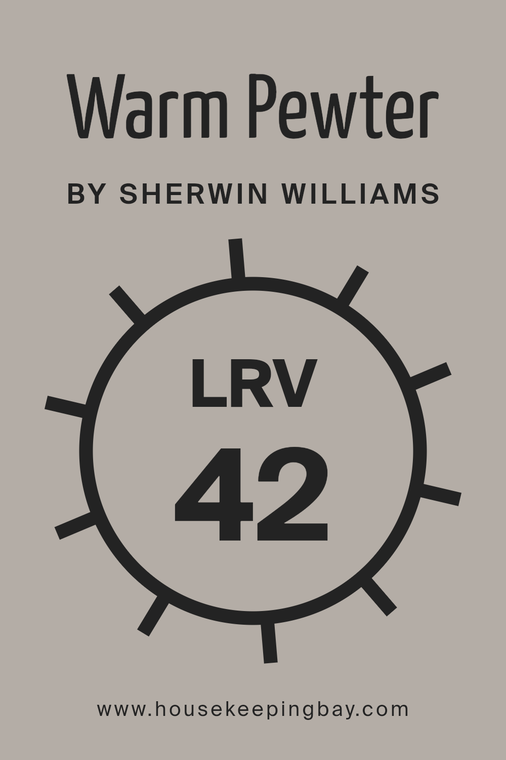
What is the LRV of Warm Pewter SW 9572 by Sherwin Williams?
LRV stands for Light Reflectance Value, which measures the percentage of light a paint color reflects. This number can range from 0 (absorbs all light) to 100 (reflects all light). Colors with a high LRV make a room feel brighter and larger by reflecting more light.
On the other hand, lower LRV colors tend to absorb light, making a space feel cozier but potentially darker.
Considering Warm Pewter SW 9572 by Sherwin Williams has an LRV of 42.42, it is in the mid-range of reflectivity. This means that it neither reflects as much light as lighter colors nor absorbs light like darker shades. In an average room, Warm Pewter will bring a balanced ambiance, not too bright but not overly dark.
It is versatile enough to work in various lighting situations, from rooms with ample natural light to those with limited light sources, maintaining a consistent look without significant shifts in perception.
housekeepingbay.com
What are the Trim colors of Warm Pewter SW 9572 by Sherwin Williams?
Trim colors are the shades applied to the detailing elements of a room such as baseboards, moldings, casings, and the edges around windows and doors. Selecting the right trim color is crucial because it frames and defines the space, providing a subtle contrast that enhances the overall aesthetics of the walls.
When painted in Warm Pewter SW 9572 by Sherwin Williams, a soft and rich neutral with earthy undertones, trim colors can either highlight its sophisticated tones or offer a gentle backdrop that allows the main color to stand out.
For Warm Pewter, using a trim color like Ivory Lace SW 7013 or Repose Gray SW 7015 can significantly affect the room’s ambiance. Ivory Lace is a soft, warm off-white, providing a smooth and soothing contrast that highlights the deeper tones of Warm Pewter, giving a clean and inviting finish to any room.
On the other hand, Repose Gray is a light to mid-tone gray with a balancing act between warm and cool undertones. It offers a more harmonized transition between the trim and Warm Pewter, maintaining a cohesive but distinct separation that subtly complements the walls.
Together, both trim options help in finely defining the spaces without causing a stark contrast, effectively enhancing the overarching design.
You can see recommended paint colors below:
- SW 7013 Ivory Lace
- SW 7015 Repose Gray

housekeepingbay.com
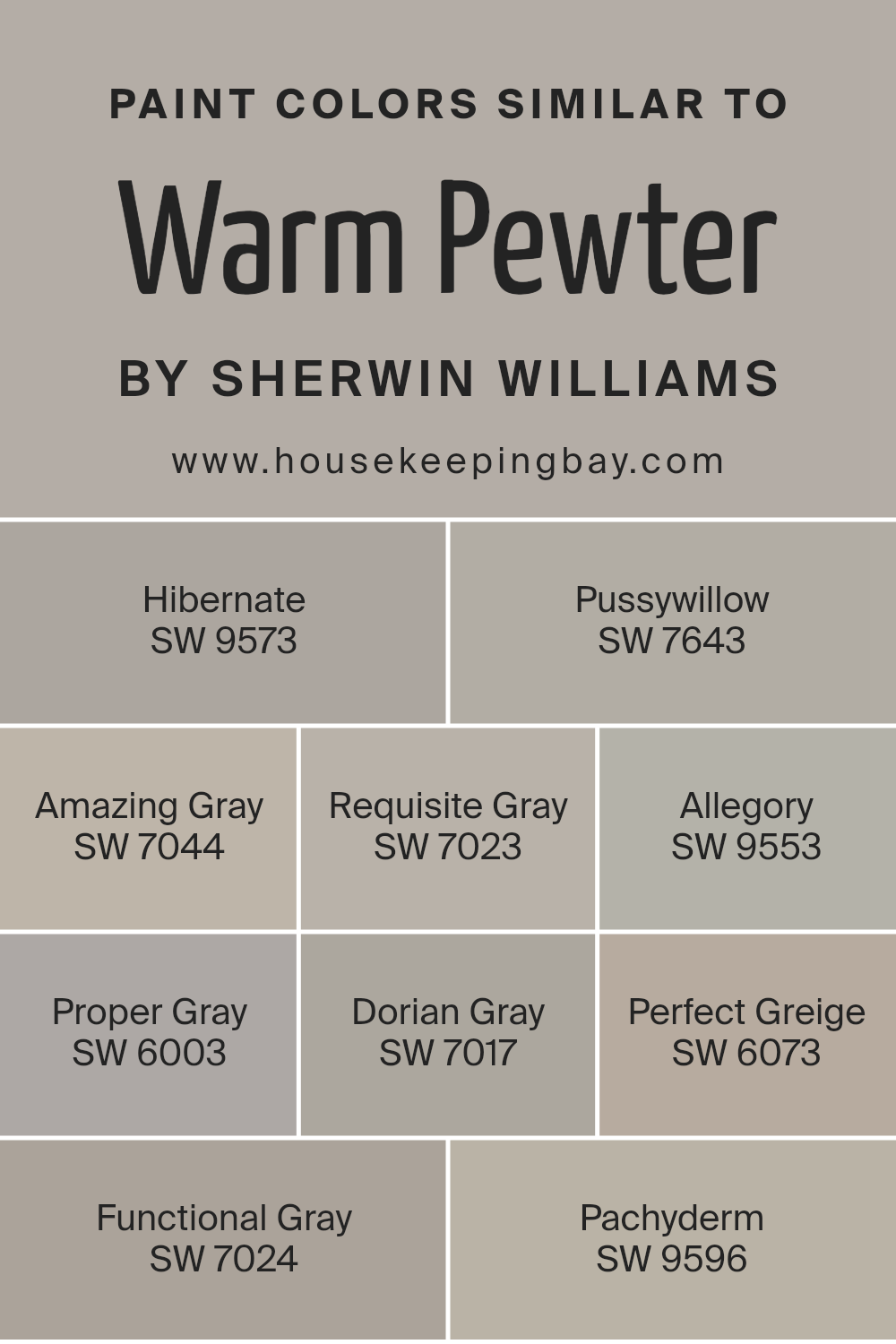
Colors Similar to Warm Pewter SW 9572 by Sherwin Williams
Similar colors, such as those closely related to Warm Pewter SW 9572 by Sherwin Williams, are important in design for creating a harmonious and cohesive look. They help achieve a balanced aesthetic without sharp contrasts, facilitating a gentle transition between spaces or elements within a room.
These shades can be paired effortlessly, making room decoration more accessible and less intimidating for non-professionals.
SW 9573 Hibernate leans towards a deep and cozy grey that subtly enriches a space without overwhelming it. SW 7643 Pussywillow is a soft, muted gray that offers a fresh and clean appearance, ideal for calming environments. SW 7044 Amazing Gray has a slightly warmer tone, providing a welcoming feel to any room.
SW 7023 Requisite Gray balances between gray and beige, giving a perfect blend for those who prefer neutral yet inviting interiors. SW 9553 Allegory, another gentle gray, gives a minimalist vibe that pairs well with modern decor. SW 6003 Proper Gray stands out slightly more with its definitive gray shade that suits a professional or sleek setting.
SW 7017 Dorian Gray offers a bolder gray that can serve as a strong foundation in a space. SW 6073 Perfect Greige combines gray and beige, creating a seamless transition for mixed palettes. SW 7024 Functional Gray is practical for those looking to maintain a classic, understated elegance.
Lastly, SW 9596 Pachyderm, a rich and deep gray, adds subtle sophistication and depth to interiors, making it versatile for various applications. Each color, while sharing similarities, holds unique qualities to enhance different themes and styles in decor.
You can see recommended paint colors below:
- SW 9573 Hibernate
- SW 7643 Pussywillow
- SW 7044 Amazing Gray
- SW 7023 Requisite Gray
- SW 9553 Allegory
- SW 6003 Proper Gray
- SW 7017 Dorian Gray
- SW 6073 Perfect Greige
- SW 7024 Functional Gray
- SW 9596 Pachyderm
housekeepingbay.com
How to Use Warm Pewter SW 9572 by Sherwin Williams In Your Home?
Warm Pewter SW 9572 by Sherwin Williams is a versatile paint color that suits various spaces in a home. Its rich, deep grey tone with warm undertones makes it an excellent choice for creating a cozy and inviting atmosphere. This shade pairs well with white trim for a clean, classic look, or with vibrant colors for a more dynamic contrast.
Homeowners can use Warm Pewter in living rooms and bedrooms to establish a calm, soothing environment, ideal for relaxation after a busy day. In kitchens or dining areas, it serves as a sophisticated backdrop that complements stainless steel appliances and wooden furniture beautifully.
For those looking to refresh their home office or study, Warm Pewter provides a focused ambiance without being too stark, helping to maintain productivity. Entryways painted in this color welcome guests with a feeling of warmth, making a good initial impression.
Whatever the application, Warm Pewter SW 9572 offers flexibility and style, enhancing the overall appeal of your home while remaining effortlessly chic.
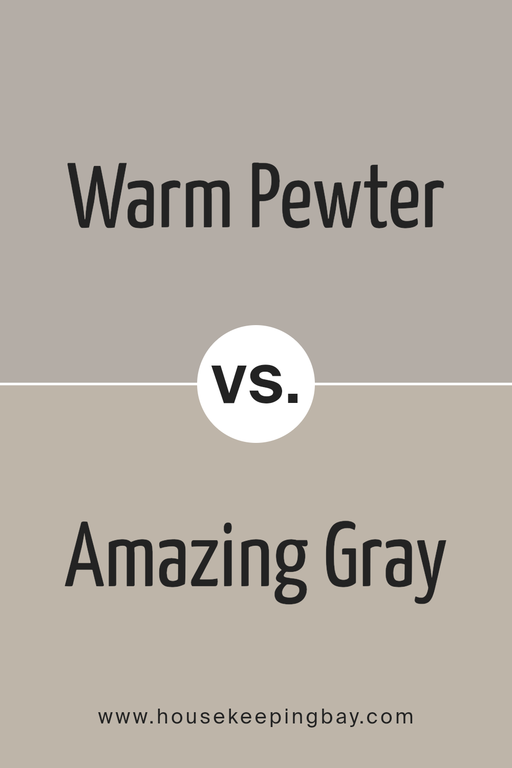
Warm Pewter SW 9572 by Sherwin Williams vs Amazing Gray SW 7044 by Sherwin Williams
Warm Pewter SW 9572 and Amazing Gray SW 7044 are both subtle gray hues from Sherwin Williams, each creating a unique atmosphere. Warm Pewter offers a slightly cooler, almost silvery tone, making it perfect for spaces where a modern yet understated elegance is desired.
It pairs well with bold colors, serving as a quiet backdrop that allows other elements to shine. In contrast, Amazing Gray is a warmer shade, bringing a cozy, inviting quality to rooms. It works beautifully in areas that benefit from a sense of warmth, such as living rooms or bedrooms, blending well with soft, earthy colors.
While both colors are versatile, Warm Pewter leans towards a more contemporary feel, and Amazing Gray towards a more traditional look, making each ideal for different styles and preferences.
You can see recommended paint color below:
housekeepingbay.com
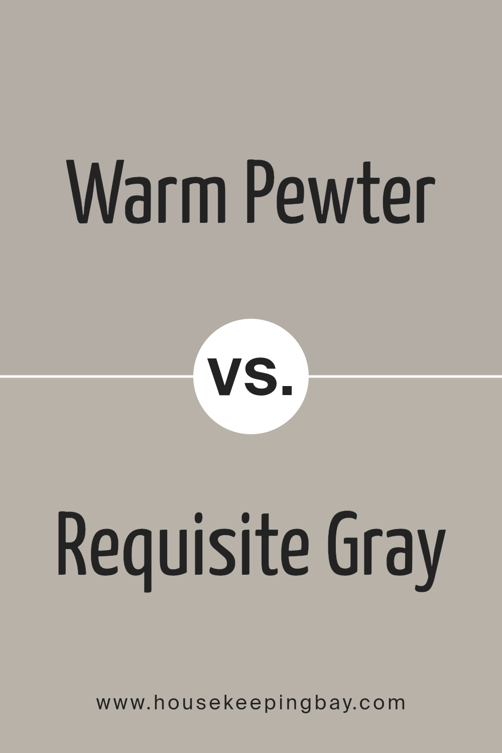
Warm Pewter SW 9572 by Sherwin Williams vs Requisite Gray SW 7023 by Sherwin Williams
Warm Pewter SW 9572 by Sherwin Williams and Requisite Gray SW 7023 also by Sherwin Williams are both gray shades but with different tones and moods. Warm Pewter offers a cozier feel, thanks to its gentle brown undertones. This makes it quite inviting and perfect for living spaces or bedrooms where a softer ambiance is desired.
Requisite Gray, in contrast, displays cooler, more balanced gray tones. It leans slightly towards a classic gray, making it incredibly versatile for various spaces, from modern kitchens to home offices. It provides a neutral backdrop, which can be styled easily with various color accents.
Both colors are suitable for interior walls and reflect light differently based on their undertones. Warm Pewter can create a snug, warm atmosphere, whereas Requisite Gray offers a cleaner, more straightforward look. When choosing between them, consider the overall mood and style of the room along with how much natural light the space receives.
You can see recommended paint color below:
- SW 7023 Requisite Gray
housekeepingbay.com
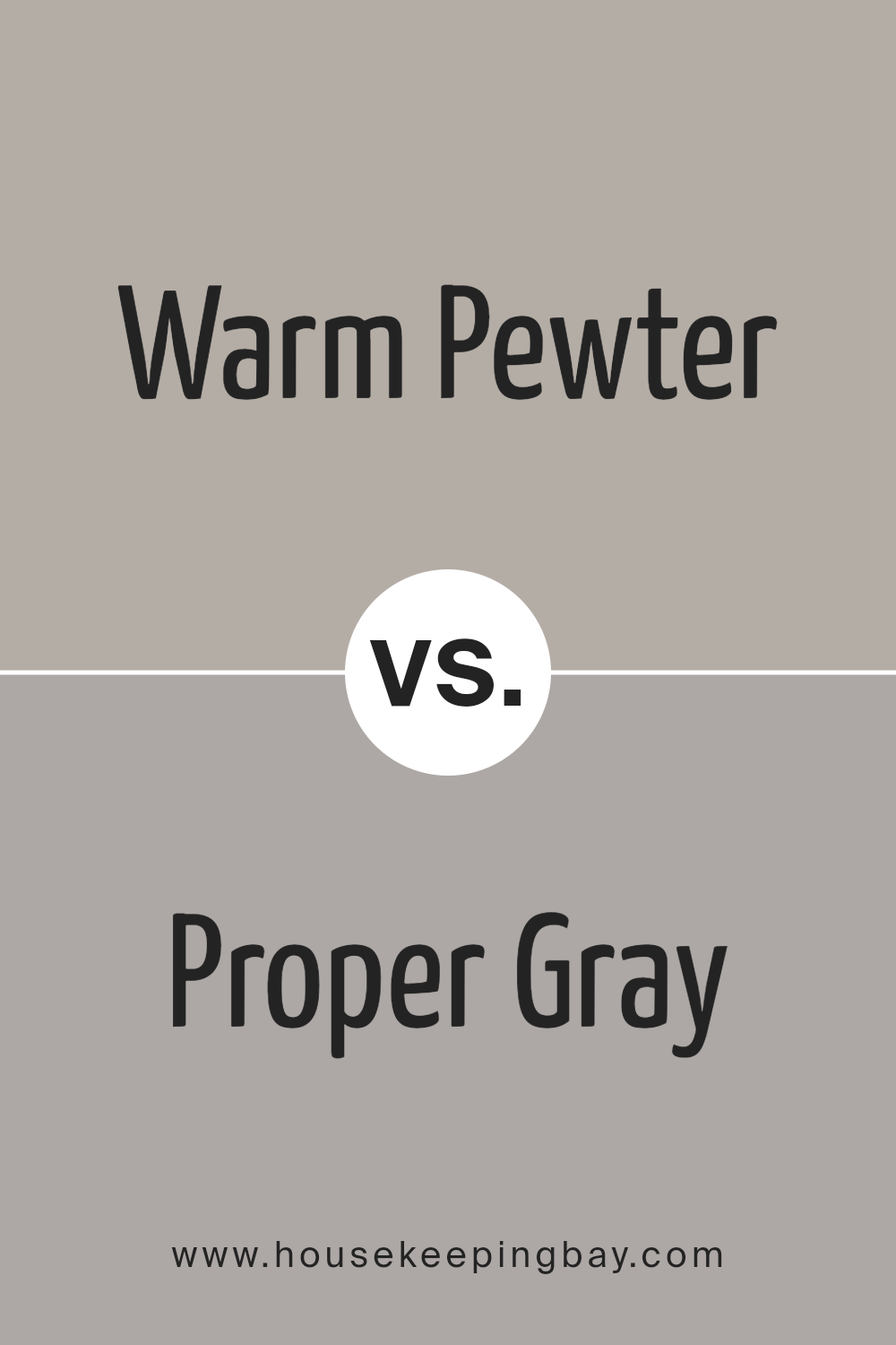
Warm Pewter SW 9572 by Sherwin Williams vs Proper Gray SW 6003 by Sherwin Williams
Warm Pewter SW 9572 and Proper Gray SW 6003, both by Sherwin Williams, are popular shades of gray, each with its unique personality. Warm Pewter, as the name suggests, has a warm undertone that makes it feel inviting and cozy. It’s a versatile color that works well in living rooms or bedrooms, adding a subtle warmth to the space.
On the contrary, Proper Gray SW 6003 leans towards a cooler tone. It’s more neutral compared to Warm Pewter, providing a sharp, modern look. This color is excellent for spaces that aim for a more formal or contemporary feel. It pairs well with bold and bright colors, making it an ideal backdrop for art or furniture.
Overall, choosing between Warm Pewter and Proper Gray depends on the mood and style you want to achieve. Warm Pewter brings warmth and coziness, while Proper Gray offers a cleaner, more crisp environment.
You can see recommended paint color below:
- SW 6003 Proper Gray
housekeepingbay.com
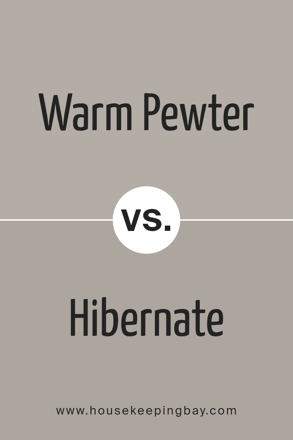
Warm Pewter SW 9572 by Sherwin Williams vs Hibernate SW 9573 by Sherwin Williams
Warm Pewter SW 9572 and Hibernate SW 9573 by Sherwin Williams are both subtle, soothing colors that can easily enhance any living space with a gentle aesthetic. Warm Pewter is a soft gray with warm undertones that makes it very adaptable and accommodating for various decor styles. This color is perfect for creating a cozy, inviting ambiance in rooms that need a touch of warmth without overpowering other elements.
Hibernate, slightly deeper, leans towards a taupe shade. It carries hints of brown which contribute to a more robust character without being too dark. Hibernate works well in areas where you want a bit more definition or to create a focal point while maintaining a neutral backdrop.
Both colors offer elegance and are particularly effective in spaces that aim for a serene, understated look. They complement each other well, with Warm Pewter providing a lighter backdrop and Hibernate adding depth and interest. Ideal for modern living, these colors maintain a chic, contemporary vibe.
You can see recommended paint color below:
housekeepingbay.com
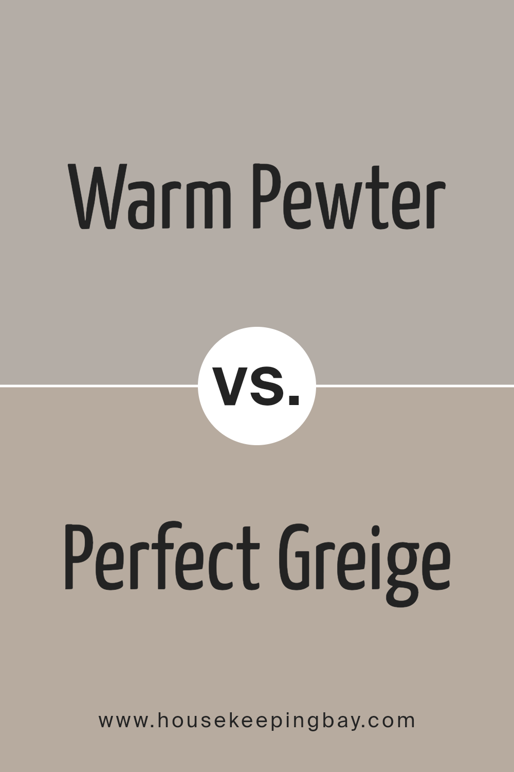
Warm Pewter SW 9572 by Sherwin Williams vs Perfect Greige SW 6073 by Sherwin Williams
Warm Pewter SW 9572 by Sherwin Williams is a soft, muted hue with a blend of beige and gray, leaning slightly more towards beige. It produces a cozy, welcoming feel, ideal for living spaces or bedrooms where a gentle, comforting atmosphere is desired. This color works beautifully in natural light, giving rooms an airy and open feel.
In contrast, Perfect Greige SW 6073 is a balanced mix of gray and beige, but it trends closer to gray compared to Warm Pewter. This shade brings a modern and neutral backdrop to any space, making it very versatile for both residential and commercial settings. It pairs well with a wide array of accent colors, from bold to pastel, thus facilitating a variety of styling options.
Both colors serve well for creating refined interiors but vary slightly in tone. Warm Pewter offers a warmer touch, enhancing spaces with a soft, inviting vibe, while Perfect Greige offers a crisp, contemporary foundation, providing a backdrop that complements various decor styles.
You can see recommended paint color below:
housekeepingbay.com
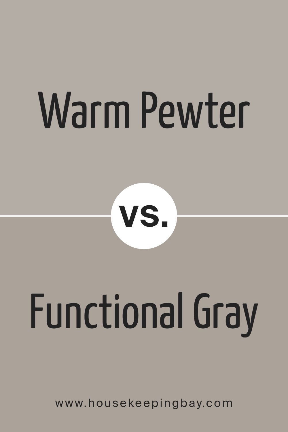
Warm Pewter SW 9572 by Sherwin Williams vs Functional Gray SW 7024 by Sherwin Williams
Warm Pewter SW 9572 by Sherwin Williams is a soft, muted beige with gray undertones giving it a cozy, inviting feel. It’s perfect for spaces where a neutral backdrop that blends well with various decor styles is needed. This color tends to bring a sense of calmness and warmth to any room, making it ideal for living areas and bedrooms.
Functional Gray SW 7024, also by Sherwin Williams, is a slightly darker gray shade that pulls more towards a true gray. It provides a contemporary look, suitable for modern spaces or as an accent color against brighter hues. Functional Gray works well in areas that require a bit of sophistication without overwhelming the space with too dark of a color.
Both colors offer versatility and a neutral palette. Warm Pewter leans towards a warmer tone, making spaces feel cozy, while Functional Gray offers a crisper feel, suitable for a more modern aesthetic. They are both great options depending on the desired atmosphere and interior design style.
You can see recommended paint color below:
- SW 7024 Functional Gray
housekeepingbay.com
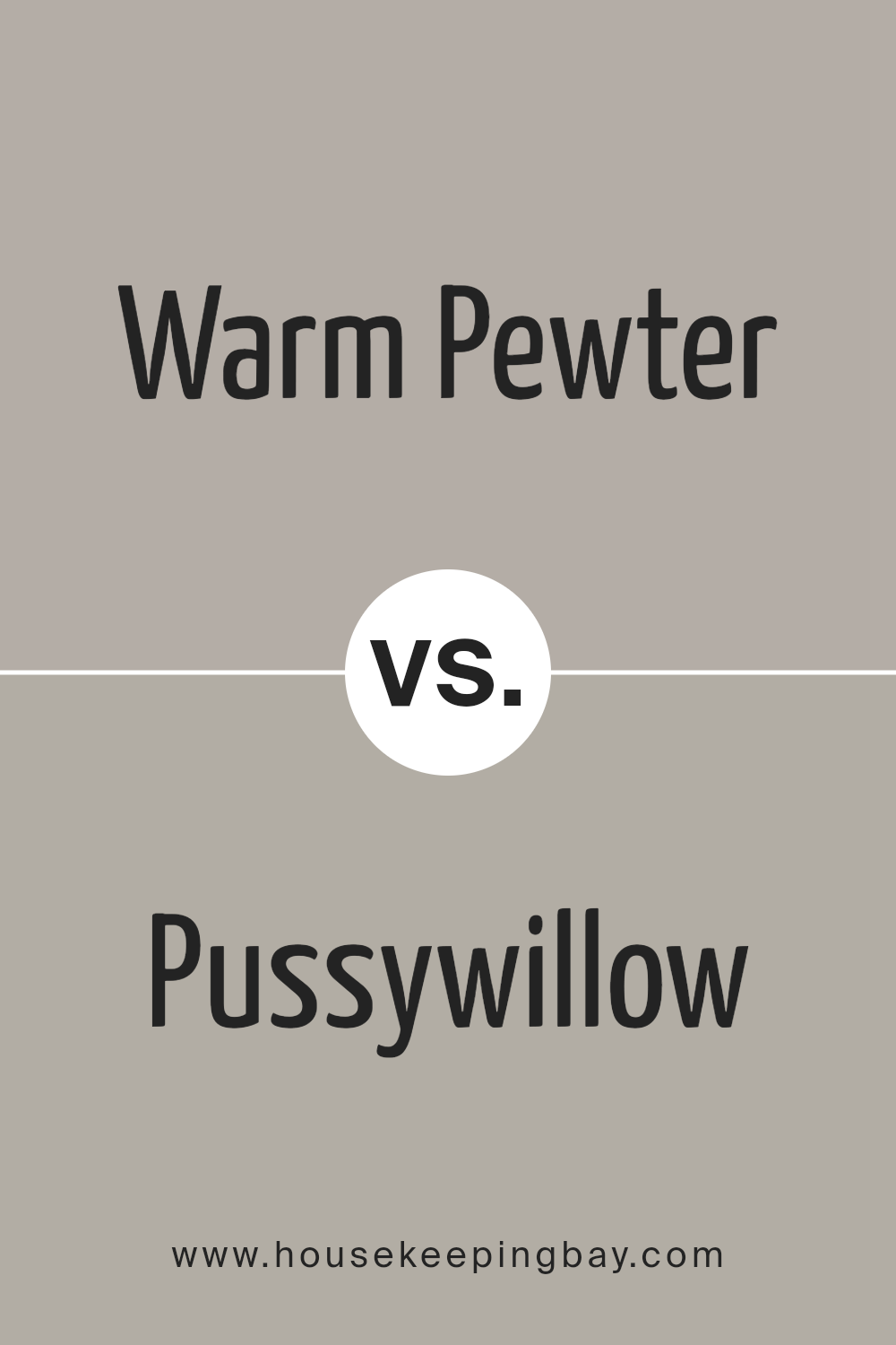
Warm Pewter SW 9572 by Sherwin Williams vs Pussywillow SW 7643 by Sherwin Williams
Warm Pewter SW 9572 and Pussywillow SW 7643, both by Sherwin Williams, present subtle yet distinct tones for any room. Warm Pewter is a soft gray with earthy, taupe undertones, emitting a cozy and inviting feel. It pairs well with vibrant colors or wood finishes, providing a grounding effect that complements various decor styles.
Conversely, Pussywillow is a cooler, light gray shade with slight blue undertones, offering a fresh and modern look. This color works exceptionally well in spaces that aim for a clean and contemporary vibe, and it contrasts beautifully with both dark and bright accents.
While Warm Pewter gives a warm, nurturing ambiance, Pussywillow leans more towards a sleek, neutral backdrop suitable for minimalistic or Scandinavian designs. Depending on the room’s purpose and the desired atmosphere, either color could enhance the interior with its unique charm.
You can see recommended paint color below:
housekeepingbay.com
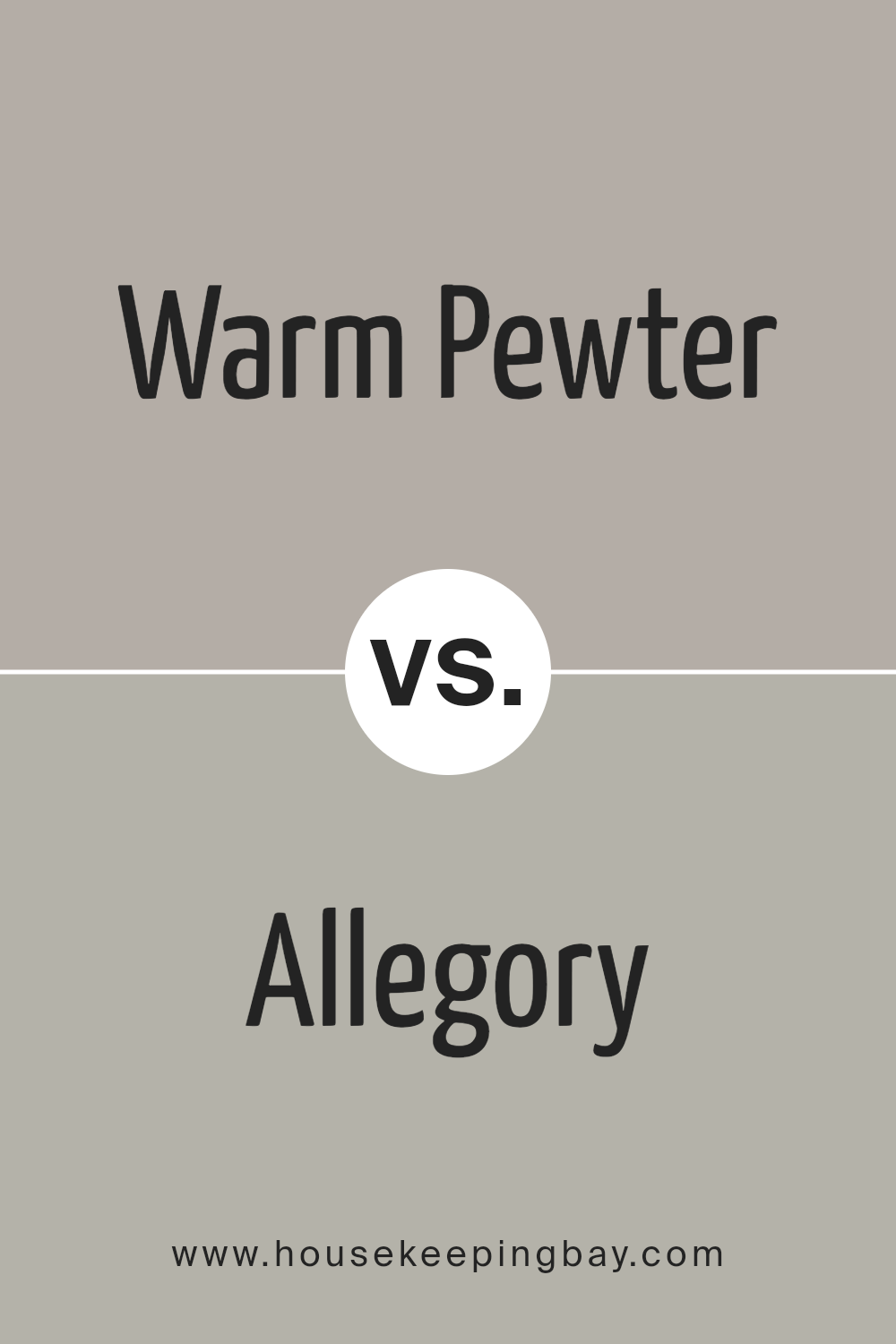
Warm Pewter SW 9572 by Sherwin Williams vs Allegory SW 9553 by Sherwin Williams
Warm Pewter SW 9572 by Sherwin Williams is a soft, nuanced gray with a warm undertone, giving it a cozy and inviting feel. This color works well in spaces that need a touch of warmth without overwhelming the area with a strong hue. It pairs beautifully with a wide range of decor, making it versatile for different interior styles.
Allegory SW 9553, also by Sherwin Williams, is a lighter and slightly cooler tone compared to Warm Pewter. It presents a subtle hint of blue, which adds a fresh and airy quality to the environment. Allegory is ideal for smaller rooms or spaces that need to feel more open and bright.
Both colors offer unique attributes: Warm Pewter adds warmth while Allegory gives a sense of openness. They can function well together in a color scheme, as both bring their own strengths while maintaining harmony in the overall design.
You can see recommended paint color below:
housekeepingbay.com
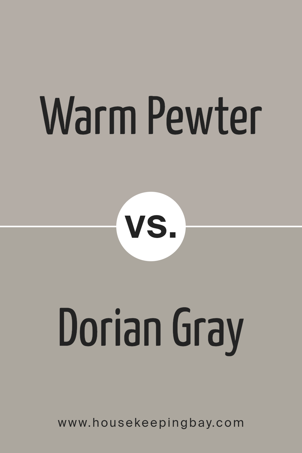
Warm Pewter SW 9572 by Sherwin Williams vs Dorian Gray SW 7017 by Sherwin Williams
Warm Pewter SW 9572 and Dorian Gray SW 7017 by Sherwin Williams are both neutral colors, but they present different tones and moods for interior spaces. Warm Pewter is a lighter shade, offering a soft, soothing feel with its blend of beige and gray. This color often makes rooms appear more spacious and airy, ideal for creating a relaxed environment.
Conversely, Dorian Gray is a darker gray that brings a stronger, more pronounced presence to a room. This color is excellent for adding depth and sophistication, making it suitable for accent walls or furniture pieces to create visual interest.
While Warm Pewter works well in spaces needing brightness and a touch of warmth, Dorian Gray is better suited for areas where a bold, yet grounded effect is desired. Both colors are versatile and coordinate well with various decor styles, supporting a range of aesthetic preferences.
You can see recommended paint color below:
housekeepingbay.com
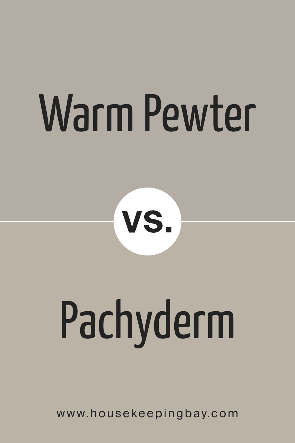
Warm Pewter SW 9572 by Sherwin Williams vs Pachyderm SW 9596 by Sherwin Williams
Warm Pewter SW 9572 and Pachyderm SW 9596 by Sherwin Williams are two distinctive shades, each bringing their own unique character to a space. Warm Pewter is a soft, light grey with a warm undertone, making it very adaptable and comfortable for most interior spaces. It gives a soothing, clean look that pairs well with a variety of decor styles, from modern to rustic.
Pachyderm SW 9596, in contrast, is a darker, more pronounced grey with elements of deep taupe. It’s a bolder choice, ideal for creating dramatic accents in a room. This color works well in areas where you want to make a statement, like on a feature wall or cabinetry.
Both colors are versatile in their own right. Warm Pewter can make a room feel larger and more open due to its lighter tone, while Pachyderm adds depth and sophistication with its richer hue. Depending on what type of ambiance you want to create, either color offers a great foundation for your decorating projects.
You can see recommended paint color below:
housekeepingbay.com
Conclusion
It is a truly versatile shade, it holds the ability to blend seamlessly into various decor styles, suiting everything from modern minimalism to rustic charm.
Its soft, warm undertones provide a cozy, inviting atmosphere that enhances any space it graces.
The coverage quality and durability of the paint make it a practical choice for both homeowners and professionals. Whether it’s revamping a living room or giving a bedroom a fresh look, Warm Pewter offers reliability and a timeless aesthetic.
Considering these attributes, it stands out as a top choice for those looking to make a subtle yet impactful change in their environment. It provides an ideal backdrop for both bold and soft color palettes, allowing for flexibility in interior design choices.
Overall, Warm Pewter by Sherwin Williams is more than just a can of paint; it’s a step towards creating a space that feels like home, reflecting personal style while maintaining a balance of warmth and sophistication. I find it well worth considering for anyone planning a new painting project.
housekeepingbay.com
Ever wished paint sampling was as easy as sticking a sticker? Guess what? Now it is! Discover Samplize's unique Peel & Stick samples. Get started now and say goodbye to the old messy way!
Get paint samples


