Hibernate SW 9573 by Sherwin Williams
Inspiring Shades of Serenity
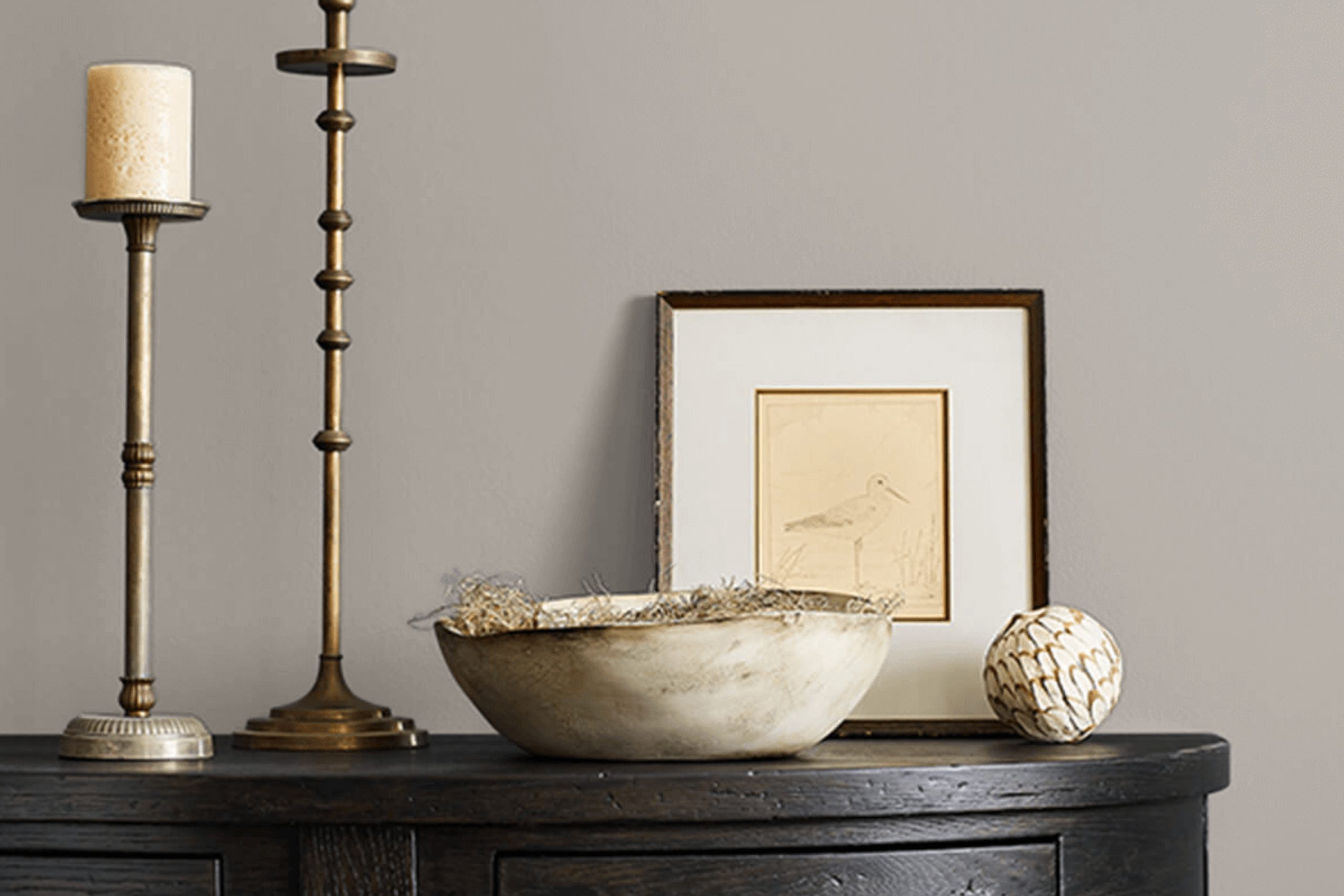
SW 9573 Hibernate is not just another neutral shade; it brings a warm, earthy tone to any room it graces. This color stands out because it offers a comforting presence, making your space feel more welcoming and cozy.
Whether you’re thinking about refreshing your living room, bedroom, or even the kitchen, Hibernate’s rich depth provides a wonderful backdrop to a wide range of decor styles, from contemporary to rustic. Moreover, it pairs beautifully with a variety of furnishings and finishes, helping you create a cohesive look with ease.
Aside from its aesthetic appeal, Sherwin Williams’ paint also meets high standards of quality, ensuring both durability and good coverage, so you can enjoy your new look for years without worries about early wear or frequent touch-ups.
Next time you’re ready to update your home’s look, consider SW 9573 Hibernate for a change that is as practical as it is pleasant. I have found this shade to be a reliable choice for bringing renewed warmth and refinement to any space.
via sherwin-williams.com
What Color Is Hibernate SW 9573 by Sherwin Williams?
Table of Contents
HibernateSW 9573 by Sherwin Williams is a deep, rich brown that conveys warmth and sophistication. This hue has undertones that balance between a cozy cocoa and a robust espresso, making it versatile for various design uses.
Perfect for creating a grounded and inviting atmosphere, this color works exceptionally well in traditional, rustic, or modern farmhouse interiors. Its depth adds character to spaces and can serve as a strong foundation for both neutral and bold color schemes.
In terms of materials, Hibernate pairs beautifully with natural elements such as wood, leather, and woven textiles. These materials complement the earthy essence of the color, enhancing the overall sense of comfort in a room. Wooden furniture with a natural finish or leather accessories can integrate seamlessly with walls painted in Hibernate, promoting a seamless aesthetic flow.
For textures, consider soft, plush fabrics like velvet or wool in lighter shades to create contrast and add a layer of tactile appeal. This color also supports the use of heavy textiles, such as thick blankets or textured drapes, which contribute to a cozy, enveloping feel.
Hibernate is flexible enough to adapt to both minimal and richly decorated spaces, always providing a backdrop that highlights decor without overwhelming it.
housekeepingbay.com
Is Hibernate SW 9573 by Sherwin Williams Warm or Cool color?
HibernateSW 9573 by Sherwin Williams is a soothing light blue-gray hue, perfect for creating a calm and cozy atmosphere in any room. Its muted tones make it a versatile choice that works well with various decor styles, from modern minimalism to rustic charm. When applied to walls, Hibernate contributes to a serene ambiance, essential for spaces meant for relaxation such as bedrooms and living rooms.
The softness of HibernateSW 9573 allows it to blend seamlessly with other colors. It pairs beautifully with lighter whites and creams for a subtle and airy feel, or with darker blues and grays to add a bit of contrast while keeping the mood peaceful.
This color also reflects natural light effectively, making it an excellent option for smaller spaces or areas with limited sunlight, helping to make them appear brighter and more spacious.
Overall, HibernateSW 9573 by Sherwin Williams enhances the home by adding a gentle touch of color that promotes a restful environment. Its ability to adapt and complement various design elements makes it a smart choice for anyone looking to refresh their space.
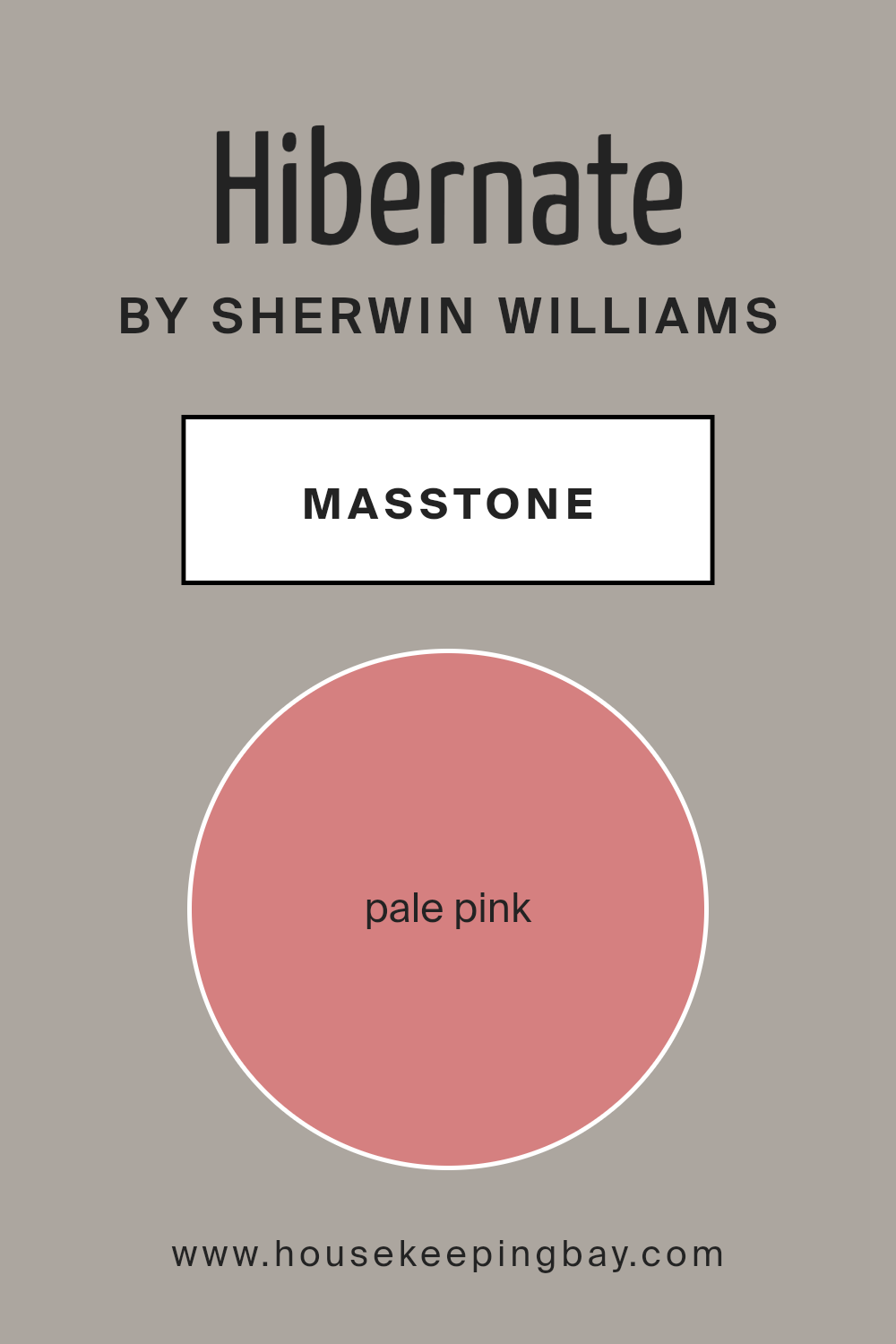
What is the Masstone of the Hibernate SW 9573 by Sherwin Williams?
HibernateSW 9573 by Sherwin Williams flaunts a masstone of Pale Pink, with a soft and gentle appeal, making it a perfect choice for creating a cozy and inviting atmosphere in homes. This particular shade of pink, with its light and subdued tone, imparts a subtle warmth without overwhelming the space. Its ability to reflect light gently enhances the feeling of spaciousness, making it ideal for smaller rooms or areas with limited natural light.
The Pale Pink masstone of HibernateSW 9573 allows it to blend seamlessly with various decor styles, from modern minimalistic to classic vintage. It pairs beautifully with soft whites, grays, and other light neutrals, which helps in creating a balanced and harmonious look.
This color also works well in bedrooms and living areas, where a soothing palette is often desired to foster a relaxing environment.
Overall, the calming effect of this Pale Pink masstone can turn any house into a home by adding a touch of softness and warmth to the living spaces.
housekeepingbay.com
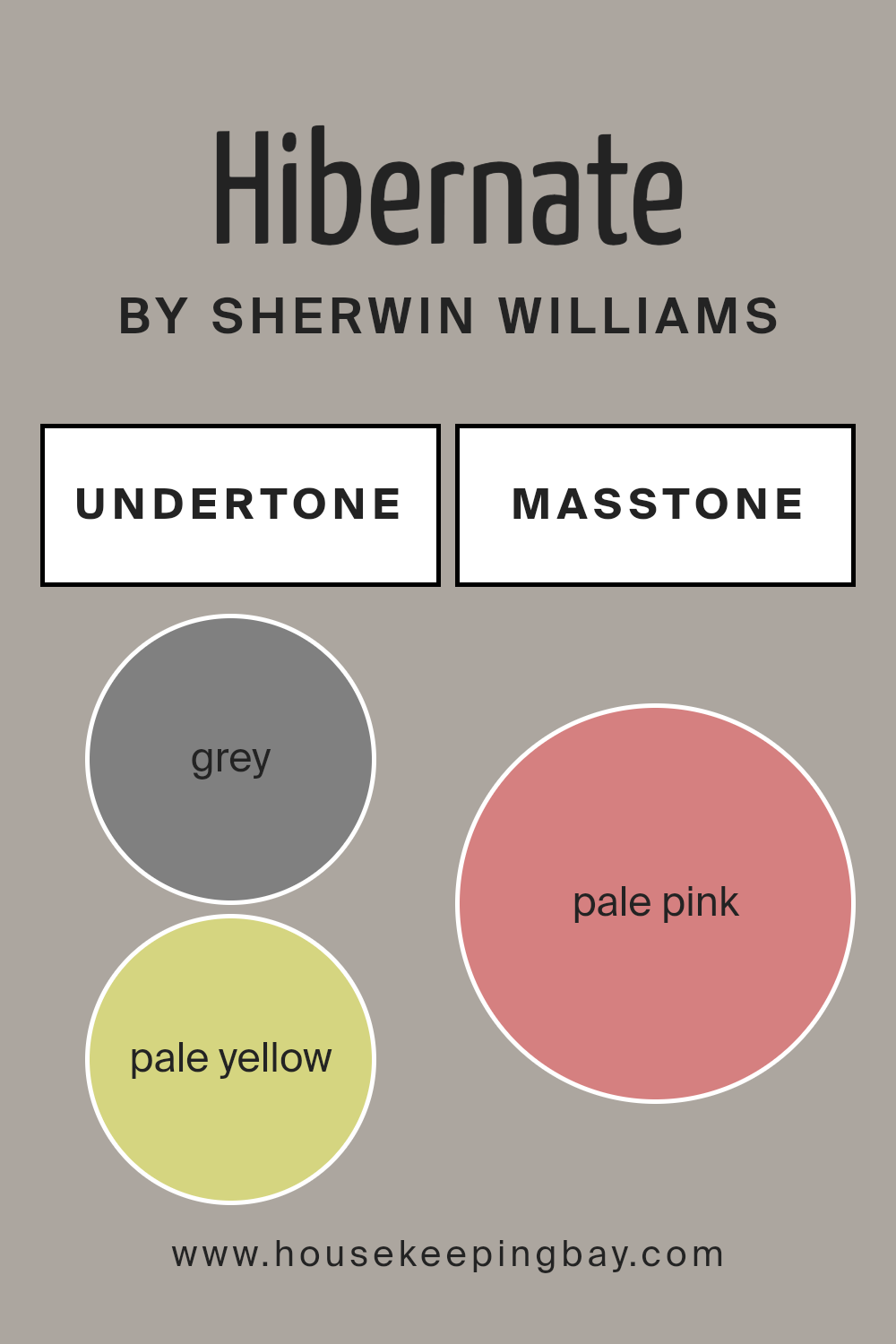
Undertones of Hibernate SW 9573 by Sherwin Williams
HibernateSW 9573 by Sherwin Williams is a complex paint color with a variety of undertones that influence its appearance in different lighting conditions and settings. Undertones are subtle hues mixed into the main color which can change how it looks on your walls.
This specific color includes grey, pale yellow, mint, light purple, lilac, light gray, light blue, orange, olive, yellow, light green, pink, purple, fuchsia, violet, red, and brown.
In a room, these undertones interact with natural and artificial light, shifting the main color’s appearance throughout the day. For instance, on a sunny day, the pale yellow and light green undertones might make the walls look brighter and more vibrant. In artificial light, the grey or light purple might become more noticeable, giving the room a softer, subdued feel.
This wide range of undertones makes HibernateSW 9573 a versatile color choice for interior walls. It can pull in elements from various decor items and furniture colors. For example, a room with natural wooden furniture might highlight the brown and orange undertones, creating a warm, cozy atmosphere.
Alternatively, metallic or modern furniture could bring out the grey and violet undertones for a more sophisticated, contemporary look.
Understanding these undertones helps you predict how the color will react in your specific interior setting, allowing you to achieve the desired atmosphere in your home.
housekeepingbay.com
How Does Lighting Affect Hibernate SW 9573 by Sherwin Williams?
Lighting plays a crucial role in how we perceive colors. The light source can drastically change how a color looks, whether it’s under natural sunlight, fluorescent, or LED lights. Each type of light can make colors appear differently, due to their varying wavelengths and intensities.
Take the color HibernateSW 9573 by Sherwin Williams, for example. This shade, under artificial light, such as LED or fluorescent lighting, can look warmer and deeper. Artificial light tends to highlight the warmer undertones in colors, making HibernateSW 9573 appear cozy and inviting in indoor environments.
In natural light, however, colors can look vastly different. Natural sunlight exposes the true essence of the paint color throughout the day. HibernateSW 9573 will shift its appearance from a soft, muted hue in the dim morning light, to a more vibrant and richer tone under the bright, midday sun, and back to a softer version as the sun sets.
The orientation of rooms also affects how HibernateSW 9573 is perceived:
1. North-Faced Rooms: North-facing rooms get less direct sunlight, which can make colors appear cooler and somewhat shadowy. HibernateSW 9573 might look more subdued and slightly paler in these rooms.
2. South-Faced Rooms: These rooms benefit from abundant sunlight most of the day, making HibernateSW 9573 look brighter and more true to its original shade. The color can feel warm and inviting.
3. East-Faced Rooms: Morning light is warm and yellow, making HibernateSW 9573 appear softer in the morning and gradually turning it neutral or slightly cooler as the day progresses.
4. West-Faced Rooms: Evening light brings warmth and a red hue, making HibernateSW 9573 appear much warmer and richer in the afternoon and evening.
Understanding how different light sources and room orientations affect the appearance of colors like HibernateSW 9573 can help in making more informed decisions about paint colors for your home or any design space.
housekeepingbay.com
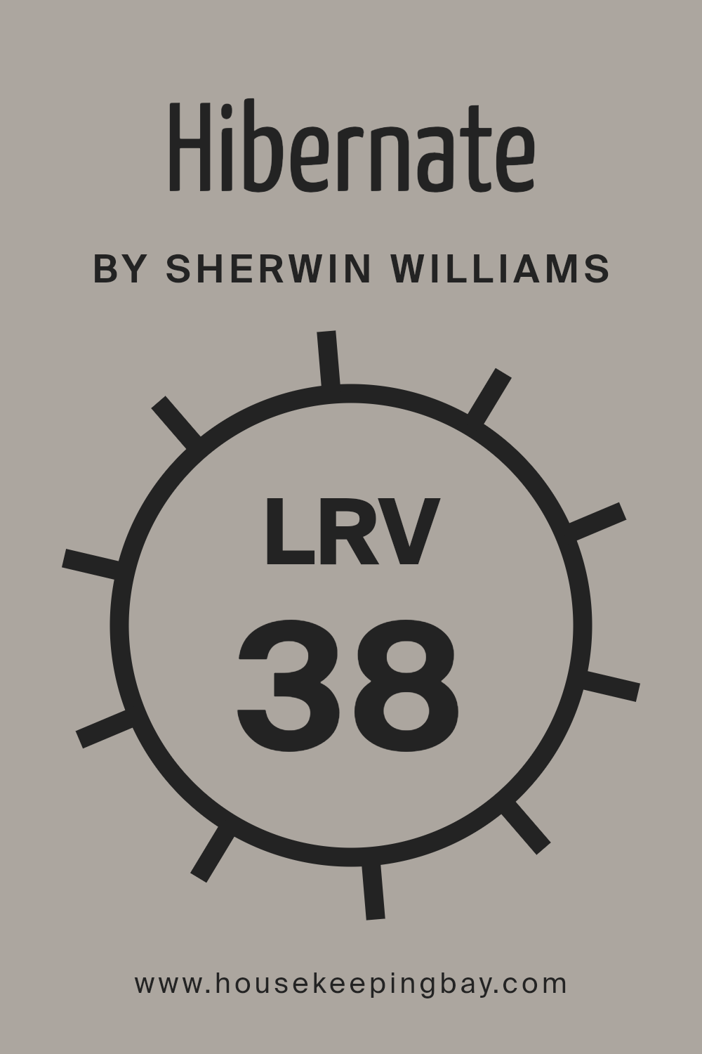
What is the LRV of Hibernate SW 9573 by Sherwin Williams?
LRV stands for Light Reflectance Value, a measurement that tells you how much light a paint color will reflect when it’s on your walls. It ranges from 0 to 100, where 0 absorbs all light and 100 reflects all light.
This value is crucial because it helps homeowners and designers choose the right paint colors for specific rooms and lighting conditions. Higher LRV colors make rooms feel brighter and larger, while lower LRV colors can make spaces appear cozier and more enclosed.
For HibernateSW 9573 by Sherwin Williams, with an LRV of 38.463, it is on the darker side of the scale. This means the color doesn’t reflect a lot of light, which can make a room feel smaller or more intimate. In rooms with less natural light, HibernateSW 9573 might make the space feel a bit more enclosed but rich in color depth.
In well-lit areas or spaces with large windows, this color can add a warm, sophisticated touch without overly darkening the room. This LRV value is something to consider, especially if you’re aiming for a balance of coziness and depth in room aesthetics.
housekeepingbay.com
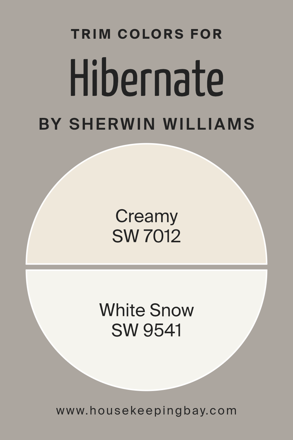
What are the Trim colors of Hibernate SW 9573 by Sherwin Williams?
Trim colors are specific shades used to highlight or outline distinctive features in architectural elements such as doors, window frames, skirting boards, and moldings. In the case of HibernateSW 9573 by Sherwin Williams, selecting the right trim colors can significantly enhance the primary hue by creating a neat, compelling contrast or a gentle, harmonious transition between walls and architectural details.
Suitable trim colors like SW 7012 – Creamy and SW 9541 – White Snow can accentuate the depth of HibernateSW 9573, making features stand out or elegantly blend into the overall aesthetic of a room.
SW 7012 – Creamy has a soft, rich tone that offers a soothing warmth, ideal for creating a subtle, inviting outline against the darker HibernateSW 9573. It gives off a gentle, welcoming vibe, perfect for spaces aiming for a cozy atmosphere.
On the other hand, SW 9541 – White Snow brings a fresh, crisp boundary, providing a bold contrast that can make the wall color pop with clarity and brightness. This shade is excellent for adding vibrancy and crispness, helping to define the spaces distinctly and attractively.
You can see recommended paint colors below:
housekeepingbay.com
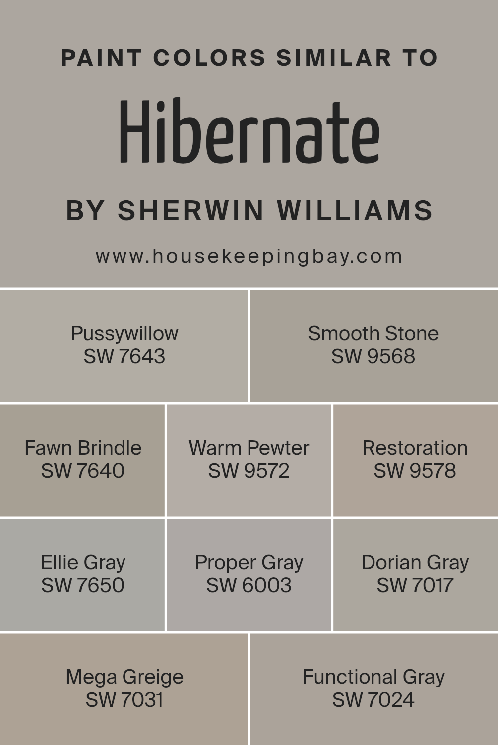
Colors Similar to Hibernate SW 9573 by Sherwin Williams
Using similar colors in interior design, like those related to HibernateSW 9573 by Sherwin Williams, helps create a cohesive and soothing ambiance. Color consistency can visually expand a space, making it feel larger and more open while providing a uniform aesthetic throughout a room or home.
Colors such as SW 7643 – Pussywillow and SW 9568 – Smooth Stone demonstrate this by offering subtle variations on gray, providing a subtle backdrop that complements a wide range of decor styles without overwhelming the senses.
SW 7640 – Fawn Brindle and SW 9572 – Warm Pewter are excellent for adding a touch of warmth to a space without straying too far from neutral tones, which works well in areas where you want a hint of coziness. SW 9578 – Restoration and SW 7650 – Ellie Gray play on cooler tones that pair beautifully with modern and minimalist furnishings.
For a sophisticated edge, SW 6003 – Proper Gray and SW 7017 – Dorian Gray offer deeper color contrasts, ideal for accent walls or furniture pieces.
Lastly, SW 7031 – Mega Greige and SW 7024 – Functional Gray blend gray with beige, creating a complex, enriching color that adapts flexibly to various lighting types, enhancing any room’s aesthetic appeal with a rich, organic feel.
You can see recommended paint colors below:
- SW 7643 Pussywillow
- SW 9568 Smooth Stone
- SW 7640 Fawn Brindle
- SW 9572 Warm Pewter
- SW 9578 Restoration
- SW 7650 Ellie Gray
- SW 6003 Proper Gray
- SW 7017 Dorian Gray
- SW 7031 Mega Greige
- SW 7024 Functional Gray
housekeepingbay.com
How to Use Hibernate SW 9573 by Sherwin Williams In Your Home?
Hibernate SW 9573 by Sherwin Williams is a soothing and versatile gray paint color with deep blue undertones. It creates a peaceful and comforting atmosphere in any room, making it perfect for bedrooms and living areas where relaxation is key. This color pairs well with soft whites and muted tones, allowing for a cohesive look throughout your home.
Using Hibernate can enhance the sense of calm in your space. In a bedroom, it sets a serene backdrop for sleep and relaxation. Living rooms painted with Hibernate become cozy retreats for family gatherings or unwinding after a long day.
Additionally, it’s excellent for bathrooms where a spa-like vibe is desired.
It’s also practical; gray tones like Hibernate are known for their ability to blend with various decors, making this color a smart choice for those updating their space without major overhauls. Apply it as a primary color scheme or as an accent to revitalize your walls.
Hibernate SW 9573 by Sherwin Williams vs Restoration SW 9578 by Sherwin Williams
Hibernate SW 9573 by Sherwin Williams is a rich, deep brown shade with warm, earthy undertones that create a cozy and inviting atmosphere. This color suggests stability and warmth, making it ideal for living areas or bedrooms where comfort is a priority.
In contrast, Restoration SW 9578 is a much lighter, beige color that provides a clean and bright look. With its subtle gray undertones, it offers a neutral backdrop suitable for various spaces, promoting a calm and peaceful environment.
While Hibernate creates a snug, intimate vibe through its darker tone, Restoration leans towards a more open and airy feel with its lighter hue. Each paint color can significantly affect the mood and visual size of a room, with Hibernate potentially making large spaces feel more gathered and Restoration helping smaller rooms appear larger. Both colors are flexible and can beautifully complement a wide range of décor styles.
You can see recommended paint color below:
- SW 9578 Restoration
housekeepingbay.com
Hibernate SW 9573 by Sherwin Williams vs Dorian Gray SW 7017 by Sherwin Williams
Hibernate SW 9573 by Sherwin Williams is a deep, rich brown with subtle gray undertones that can give any space a cozy and inviting feel. It’s perfect for creating a warm, sophisticated atmosphere where relaxation is key. This hue pairs well with soft lighting and lush textiles to enhance its comforting qualities.
In contrast, Dorian Gray SW 7017 is a lighter, more versatile gray that maintains a balance between warm and cool tones. This makes it an excellent choice for modern and transitional interiors. Dorian Gray’s level of neutrality makes it easy to coordinate with various colors and design elements, lending itself well to both contemporary and traditional spaces.
Both colors offer unique attributes: Hibernate SW 9573 brings warmth and depth, making it perfect for intimate spaces, while Dorian Gray SW 7017 serves as a neutral backdrop that complements a wider range of decorative styles.
You can see recommended paint color below:
housekeepingbay.com
Hibernate SW 9573 by Sherwin Williams vs Smooth Stone SW 9568 by Sherwin Williams
Hibernate SW 9573 by Sherwin Williams is a rich, deep gray with a brown undertone, giving it a warm and cozy feel. This color is perfect for creating a soothing, muted atmosphere in a room. It pairs well with soft lighting and natural materials, making spaces feel more inviting and snug.
On the contrary, Smooth Stone SW 9568 is a lighter gray that leans towards a neutral palette. It’s much softer and can help make a small room appear larger and more open. Smooth Stone offers a fresh and clean look, ideal for modern and minimalist decor styles.
Both colors are versatile and can complement a variety of decor elements, but Hibernate lends itself to a more traditional, warm setting while Smooth Stone is better suited for contemporary, airy spaces.
You can see recommended paint color below:
- SW 9568 Smooth Stone
housekeepingbay.com
Hibernate SW 9573 by Sherwin Williams vs Functional Gray SW 7024 by Sherwin Williams
Hibernate SW 9573 and Functional Gray SW 7024 by Sherwin Williams are both neutral hues, each creating distinct atmosphere in spaces. Hibernate is a deeper, cozy blue with an almost naval quality, perfect for creating a serene, soothing environment.
It works well in bedrooms or any space where calming effect is desired. Functional Gray, a mid-tone gray, offers a more versatile backdrop suitable for any room. Its balance between warm and cool tones ensures it pairs well with a wide range of decor styles and colors, from modern to traditional.
While Hibernate sets a more specific mood due to its richer, darker shade, Functional Gray serves as a practical choice for its adaptability and subtly sophisticated appearance. Both colors are great candidates for those looking to achieve a chic, timeless interior.
You can see recommended paint color below:
- SW 7024 Functional Gray
housekeepingbay.com
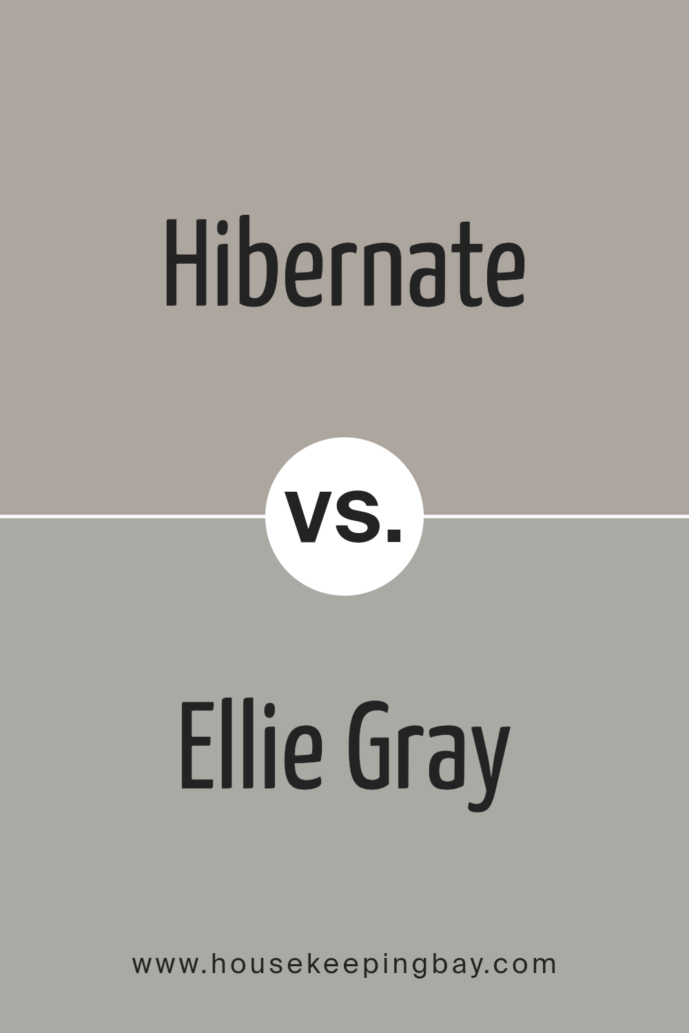
Hibernate SW 9573 by Sherwin Williams vs Ellie Gray SW 7650 by Sherwin Williams
Hibernate SW 9573 by Sherwin Williams is a deep, warm gray with hints of brown. This color provides a cozy, soothing atmosphere to any room, making it ideal for spaces where you want to relax, such as bedrooms or living rooms. The richness of Hibernate adds a touch of sophistication and can help make large rooms feel more intimate and inviting.
Ellie Gray SW 7650, also by Sherwin Williams, is a lighter shade of gray with a more neutral tone. This color is versatile and fresh, suitable for various settings, from modern kitchens to home offices.
It reflects more light, giving a room a more open and airy feel, and pairs well with both bright and subdued accent colors.
Both colors offer unique benefits, with Hibernate bringing warmth and intimacy to spaces, while Ellie Gray provides a neutral backdrop that adapts easily to different decor styles and color schemes.
You can see recommended paint color below:
housekeepingbay.com
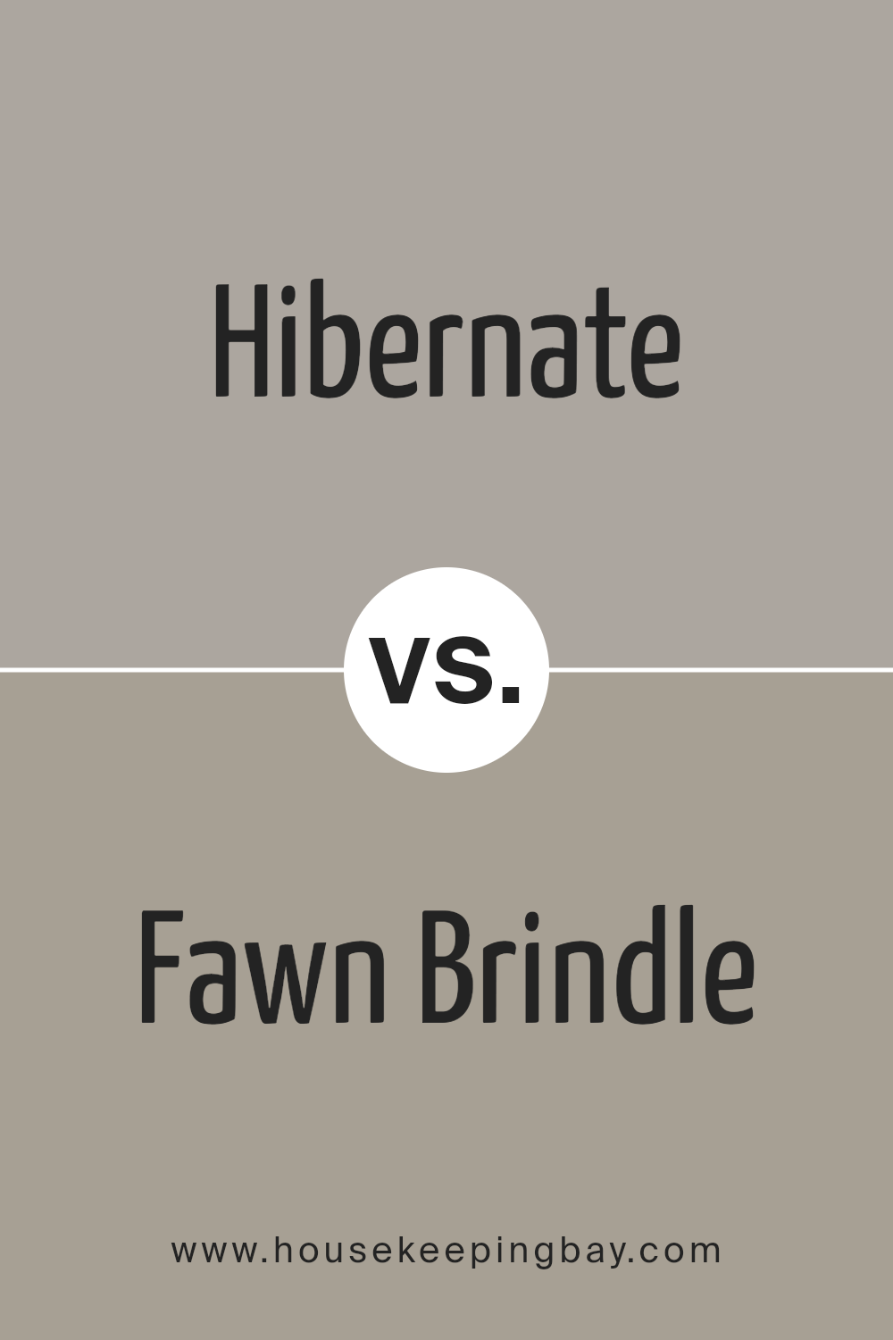
Hibernate SW 9573 by Sherwin Williams vs Fawn Brindle SW 7640 by Sherwin Williams
Hibernate SW 9573 by Sherwin Williams is a deep, rich brown that gives a warm and cozy feel, perfect for quiet, intimate spaces. It works well in areas where you want to create a snug, secure ambiance, like living rooms or bedrooms. This darker shade can make large rooms feel more inviting or give a small room a luxurious touch.
Fawn Brindle SW 7640 is a softer, more neutral grey-brown. This color is versatile and understated, making it ideal for various rooms and styles. It creates a calm, soothing atmosphere without overwhelming a space. Fawn Brindle can serve as an excellent background for brighter colors or work harmoniously with other neutrals for a subtle look.
Both colors offer unique possibilities for interior spaces, with Hibernate leaning towards a bolder, cozier feel, and Fawn Brindle providing a gentle, flexible backdrop.
You can see recommended paint color below:
- SW 7640 Fawn Brindle
housekeepingbay.com
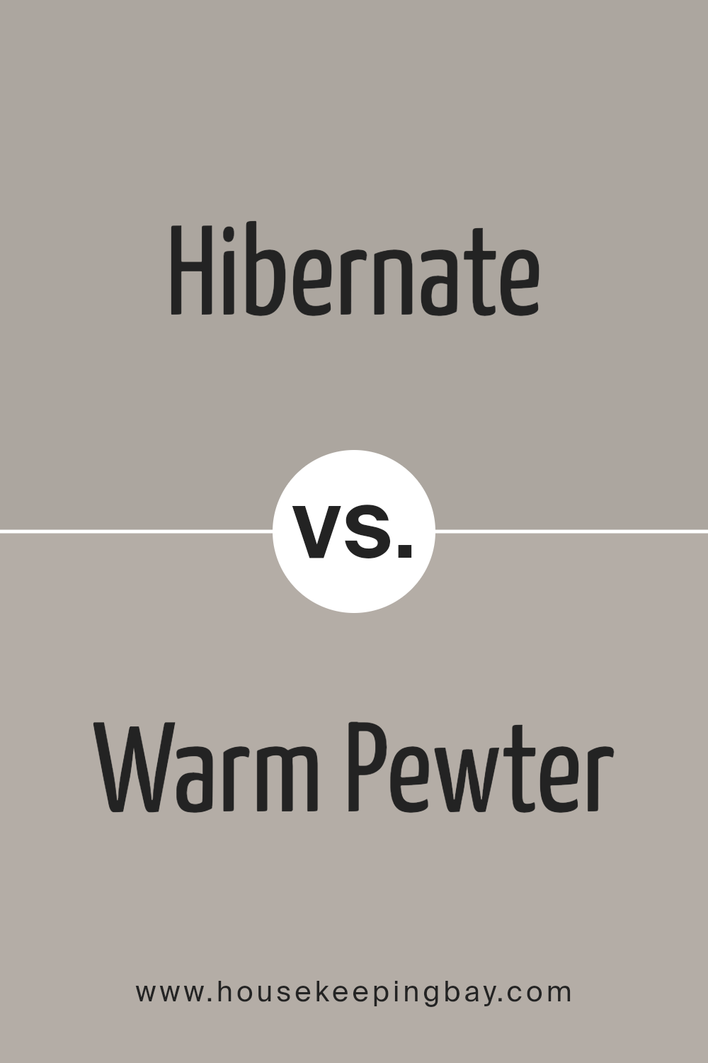
Hibernate SW 9573 by Sherwin Williams vs Warm Pewter SW 9572 by Sherwin Williams
Hibernate SW 9573 and Warm Pewter SW 9572, both from Sherwin Williams, offer subtle yet distinct tones for your space. Hibernate SW 9573 is a deeper, shaded color, leaning towards a cozy, almost dusky quality that suggests warmth and comfort, making it ideal for spaces where a soothing atmosphere is desired. This tone can give a room a sense of quiet and relaxation, perfect for living areas or bedrooms.
In contrast, Warm Pewter SW 9572 is lighter, featuring a soft, welcoming gray that has the versatility to fit into a variety of decorating styles. This color reflects more light, which helps in making smaller spaces appear larger and more open.
Its gentler hue is excellent for areas where you want to maintain a neutral palette but with a bit more brightness.
Both colors provide unique opportunities to create inviting interiors but cater to different aesthetic needs and room functionalities.
You can see recommended paint color below:
- SW 9572 Warm Pewter
housekeepingbay.com
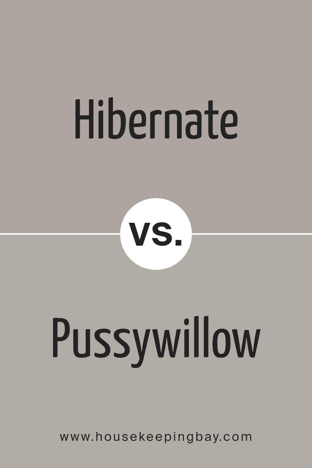
Hibernate SW 9573 by Sherwin Williams vs Pussywillow SW 7643 by Sherwin Williams
Hibernate SW 9573 by Sherwin Williams is a rich, deep gray with blue undertones, offering a cozy and serene feel, ideal for spaces where warmth and calm are desired. Its darker tone makes it well-suited for creating a focal point or accentuating smaller details in a room.
Compared to Hibernate, Pussywillow SW 7643 is a lighter, mid-tone gray with subtle earthy undertones, giving it a versatile quality. Pussywillow works well in various settings, from modern to traditional, providing a neutral backdrop that complements a wide range of décor styles.
Due to its lighter shade, it can make rooms feel more open and airy than Hibernate. Both colors support a soothing atmosphere, yet each brings its unique character to interiors – Hibernate with a hint of boldness and drama, and Pussywillow with a gentle and adaptable presence.
You can see recommended paint color below:
housekeepingbay.com
Hibernate SW 9573 by Sherwin Williams vs Mega Greige SW 7031 by Sherwin Williams
Hibernate SW 9573 by Sherwin Williams is a deep, soothing gray shade with a hint of brown, giving it a warm and cozy feel. It’s perfect for creating a snug and inviting atmosphere in spaces like living rooms or bedrooms where relaxation is key. This color tends to make a room feel more intimate and can serve as a beautiful backdrop for both modern and rustic decor.
Mega Greige SW 7031, also by Sherwin Williams, is lighter compared to Hibernate. It’s a blend of gray and beige, known as greige, which makes it incredibly versatile. Mega Greige offers a perfect balance, neither too dark nor too light, making it ideal for almost any room.
It’s especially good for areas that need a neutral background that still offers some warmth.
Overall, while both colors provide a sense of warmth, Hibernate is darker and cozier, making it great for a more enclosed, intimate feel. Mega Greige, being lighter, works well in a variety of spaces, providing flexibility and a touch of warmth without overpowering the room.
You can see recommended paint color below:
housekeepingbay.com
Hibernate SW 9573 by Sherwin Williams vs Proper Gray SW 6003 by Sherwin Williams
Hibernate SW 9573 and Proper Gray SW 6003 by Sherwin Williams are both unique gray shades, each offering a distinctive ambiance. Hibernate is a deeper, warmer gray that brings a cozy and inviting feel to spaces, making it suitable for rooms where comfort is key, like living rooms or bedrooms. Its richness can make a room feel snug and sheltered, perfect for creating a restful environment.
In contrast, Proper Gray SW 6003 is a lighter, cooler gray that has a more neutral and versatile appeal. This color works well in areas that need a clean and contemporary look, such as bathrooms, kitchens, or modern living spaces. It reflects more light, giving a sense of openness and airiness, which can make smaller areas appear larger.
These two colors could complement each other in a space where balance between warmth and modernity is desired. Hibernate could serve as an accent wall color with Proper Gray on surrounding walls, merging depth with lightness effectively.
You can see recommended paint color below:
- SW 6003 Proper Gray
housekeepingbay.com
Conclusion
Hibernate is more than just paint; it’s a gentle nudge towards a cozier, more serene home environment.
The warm, earthy tones are versatile, pairing well with a variety of decor styles and materials. Whether you’re looking to refresh a living area or add depth to your bedroom walls, Hibernate provides a solid foundation for any design plan.
For those considering a new paint project, the qualities of Hibernate suggest a multitude of possibilities. It works well in spaces that benefit from a calm and collected ambiance, like studies or bedrooms, yet it’s robust enough for social areas such as the dining room or kitchen.
Additionally, its adaptability with lighting changes throughout the day adds an ever-evolving character to rooms that engage different moods and settings.
My own experience and the feedback I’ve gathered show that SW 9573 Hibernate can indeed redefine an interior. It invites warmth and offers a soothing presence, qualities that are always welcome in my home. So, for anyone considering a color that supports relaxation and adds aesthetic value, I recommend considering what Hibernate has to offer.
All in all, this color seamlessly integrates with both modern and traditional homes, guaranteeing an appealing and comfortable atmosphere.
housekeepingbay.com
Ever wished paint sampling was as easy as sticking a sticker? Guess what? Now it is! Discover Samplize's unique Peel & Stick samples. Get started now and say goodbye to the old messy way!
Get paint samples


