Viaduct SW 9567 by Sherwin Williams
A Journey Through Cool, Reflective Tones
When you’re looking to refresh your space with a new paint color, consider SW 9567 Viaduct by Sherwin Williams. This shade is a unique blend that can add a subtle yet noticeable transformation to any room. Viaduct can fit beautifully into various design schemes, whether you’re aiming for a modern, minimalist look or something softer and more traditional.
It’s a versatile color that works well in living areas, bedrooms, and even kitchens, providing a neutral backdrop that complements a wide range of furnishings and decor.
You might appreciate how Viaduct balances between being impactful and understated. It’s an excellent choice if you want a color that doesn’t overpower your space but still offers character and mood. Using Viaduct can give your room a fresh look, making it feel updated and more inviting without the need for overwhelming changes.
If you are planning a home makeover or simply want to refresh a single room, SW 9567 Viaduct offers a lovely option to consider.
sherwin-williams.com
What Color Is Viaduct SW 9567 by Sherwin Williams?
Viaduct SW 9567 by Sherwin Williams is a profound, saturated gray with blue undertones, bringing a sense of sophistication and depth to any space. This color balances between being impactful and subtle, making it highly versatile for various interior design applications. It pairs beautifully with natural elements and materials, such as wood and stone, highlighting their textures without overpowering them.
Viaduct works exceptionally well in contemporary and minimalist styles. Its cool tone complements the clean lines and simplicity of modern decor, providing a chic, monochromatic backdrop. In industrial settings, this color can enhance the raw, unfinished look prevalent in such designs, pairing nicely with concrete and metallic finishes.
This shade also thrives in coastal and Scandinavian interiors due to its cool and calming presence. It can brighten rooms while maintaining a cozy atmosphere when combined with soft textiles like wool or linen and lighter woods such as birch or ash.
Using this color, you can create a cohesive look by combining it with other neutrals or introduce pops of color like mustard or teal for a more dynamic space. Whether used in large areas or as an accent, Viaduct SW 9567 helps create a refined and welcoming environment.
housekeepingbay.com
Is Viaduct SW 9567 by Sherwin Williams Warm or Cool color?
ViaductSW 9567 by Sherwin Williams is a versatile gray paint color with cool undertones. This shade is particularly useful in creating a calm and soothing atmosphere in any room. Its strength lies in its ability to act as a neutral backdrop, making it suitable for various design styles from modern to traditional.
ViaductSW 9567 pairs well with brighter colors, allowing accent pieces in vibrant hues to stand out, or it can be coordinated with other neutral tones for a more subdued look.
This color is perfect for spaces that need a touch of sophistication without overwhelming the senses. It works well in living rooms, bedrooms, and even kitchens, providing a clean and fresh appearance. The cool undertones of ViaductSW 9567 can also help to visually enlarge a space, making it an excellent choice for small rooms or areas with limited natural light.
In sum, ViaductSW 9567 is a practical, stylish option for anyone looking to refresh their home.
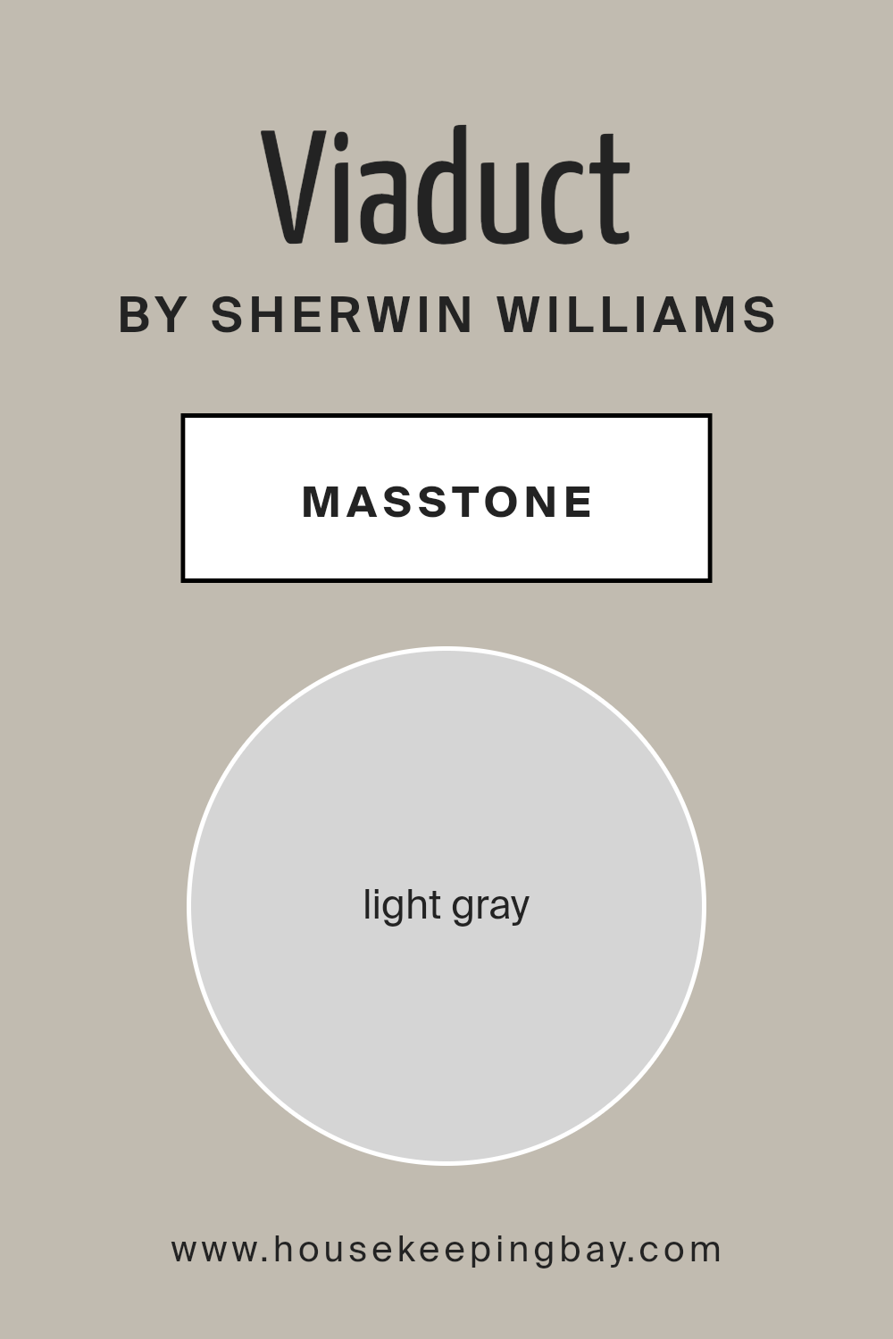
What is the Masstone of the Viaduct SW 9567 by Sherwin Williams?
ViaductSW 9567 by Sherwin Williams is a soothing light gray color with a masstone that resembles #D5D5D5. This light gray hue offers a versatile and calming backdrop for any room in a house. It is a color that doesn’t overpower or demand attention, making it perfect for creating a relaxed and peaceful environment.
Because it’s so neutral, ViaductSW 9567 can pair easily with other colors, whether you want to add bold accents or keep everything subtle. It works exceptionally well in spaces where you want to promote rest and focus, such as bedrooms or home offices.
The light gray can also make small rooms appear larger and more open, adding a sense of space without using stark white. Furthermore, ViaductSW 9567 reflects light gently, helping to brighten rooms that might not get a lot of natural sunlight. In essence, this color is ideal for anyone looking to give their home a fresh, serene look without going too bright or too dark.
housekeepingbay.com
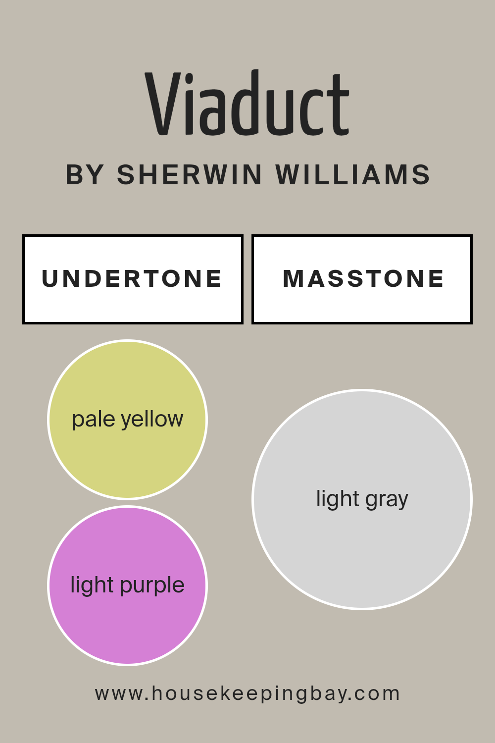
Undertones of Viaduct SW 9567 by Sherwin Williams
ViaductSW 9567 by Sherwin Williams is a versatile color that carries a mix of subtle undertones, including pale yellow, light purple, light blue, pale pink, mint, lilac, and grey. These undertones play a crucial role in how the color appears in different lighting conditions and settings.
Undertones are the hint of colors that are mixed into the main hue, influencing how we perceive the main color. For example, a grey with a blue undertone will seem cooler, while a grey with a pink undertone may appear warmer. This complexity can drastically alter the appearance of a room depending on the light sources and surrounding colors.
When applied to interior walls, ViaductSW 9567’s undertones can subtly influence the atmosphere of the room. The pale yellow and mint undertones can make a space feel airy and fresh, ideal for creating a relaxed vibe. The light blue and lilac undertones provide a hint of coolness, which can be calming — making the color a good choice for bedrooms or bathrooms.
Meanwhile, the pale pink and grey undertones keep the color grounded, ensuring the wall hue remains sophisticated and not overly bright. This makes ViaductSW 9567 a flexible option for various rooms, from dynamic living spaces to serene personal areas.
This color’s ability to pair well with many decor styles and its complex undertones make it a functional choice for adding subtle character to any interior space.
housekeepingbay.com
How Does Lighting Affect Viaduct SW 9567 by Sherwin Williams?
Lighting significantly influences how colors appear in a room. Different light sources can change the perception of colors, making them look different at various times of the day or in different settings.
ViaductSW 9567 by Sherwin Williams is a perfect example to analyze. In artificial light, which typically has either a yellow or white tone depending on the bulb used, ViaductSW 9567 can appear slightly different. Yellowish, warm artificial light tends to soften and warm up this color, making it cozier and slightly muted.
White light, or cool artificial light, can make ViaductSW 9567 look more vibrant and bring out any subtle undertones in the paint.
Natural light, on the other hand, plays with ViaductSW 9567 differently over the course of a day. Morning light is usually softer and can make the color appear vivid and fresh. As the day progresses and the natural light becomes stronger, the color can look more pronounced and dynamic. By the evening, as natural light fades, the color may return to a softer, more muted appearance.
Room orientation also affects how ViaductSW 9567 is perceived:
– North-faced rooms: These rooms get less direct sunlight and can make ViaductSW 9567 appear cooler and more shadowy.
– South-faced rooms: These get a lot of sunlight, making ViaductSW 9567 look brighter and more true to its original color throughout most of the day.
– East-faced rooms: Morning light in these rooms can make ViaductSW 9567 look very lively and warm early in the day, fading as the light diminishes.
– West-faced rooms: Evening sunlight in these rooms can cast a warm glow, making ViaductSW 9567 appear warmer and richer later in the day.
Understanding these dynamics can help in deciding where and how to use this particular color effectively in interior spaces.
housekeepingbay.com
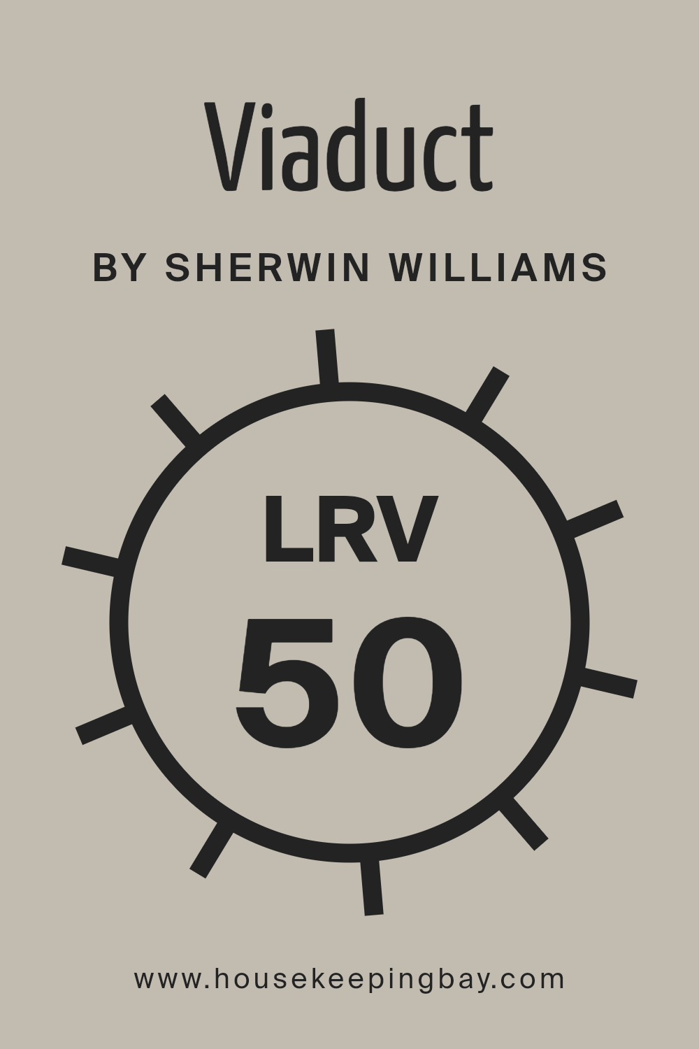
What is the LRV of Viaduct SW 9567 by Sherwin Williams?
LRV stands for Light Reflectance Value, a measure indicating the percentage of light a paint color reflects back into a room, ranging from 0% which absorbs all light to 100% which reflects all light. This value is crucial when deciding on a paint color because it impacts the brightness of a room.
A higher LRV can make a room feel more open and airy, while a lower LRV can give a room a cozier or more enclosed feel. Choosing the right LRV can help in making a space appear larger or smaller, influencing the atmosphere and mood.
With an LRV of 50.169, ViaductSW 9567 by Sherwin Williams is right in the middle of the scale, meaning it neither reflects an excessive amount of light nor absorbs too much. This balance makes it a versatile color that can work well in various lighting conditions, maintaining its true color under different light sources.
This makes ViaductSW 9567 a good choice for rooms that serve multiple purposes or have variable lighting throughout the day. It creates a neutral backdrop that can be easily accented with both dark and light furnishing, providing flexibility in decorating styles.
housekeepingbay.com
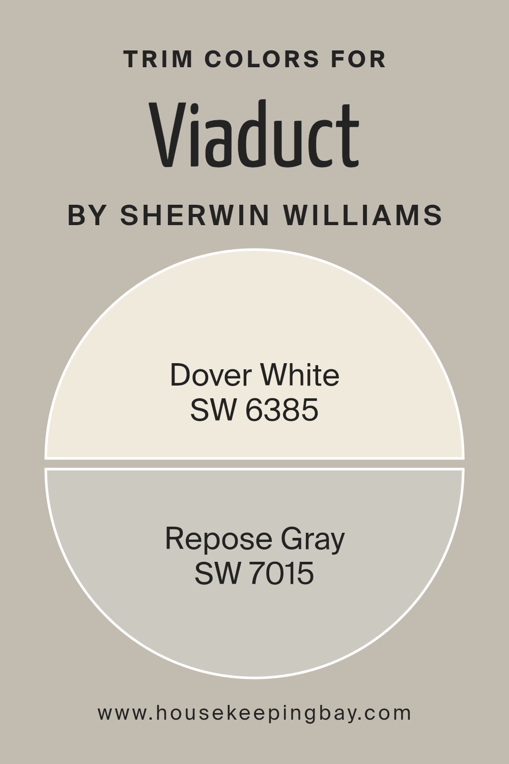
What are the Trim colors of Viaduct SW 9567 by Sherwin Williams?
Trim colors are specific shades used to accentuate or highlight the borders and edges of different surfaces in architecture, such as windows, doors, baseboards, and moldings. For ViaductSW 9567 by Sherwin-Williams, choosing the right trim colors is crucial as it helps to define the space and enhance the main color’s aesthetic impact.
The use of trim colors like SW 6385 – Dover White and SW 7015 – Repose Gray can help to subtly contrast or complement the dominant hue, thereby defining the lines and shapes of the architectural elements more clearly. This strategy not only adds visual interest but also contributes to a cohesive color scheme that enriches the overall ambiance of a room or exterior.
Dover White SW 6385 is a soft, warm white with a creamy undertone that provides a gentle contrast against deeper wall colors like ViaductSW 9567, making it ideal for creating a light and airy feel. It works particularly well in spaces that benefit from a touch of warmth to soften modern angles and lines.
Repose Gray SW 7015, on the other hand, is a neutral gray with a warm taupe undertone that offers flexibility and sophistication. This color is versatile enough to complement a wide range of palettes and styles, making it perfect for creating a seamless transition between different elements in a room or on an exterior.
You can see recommended paint colors below:
- SW 6385 Dover White
- SW 7015 Repose Gray
housekeepingbay.com
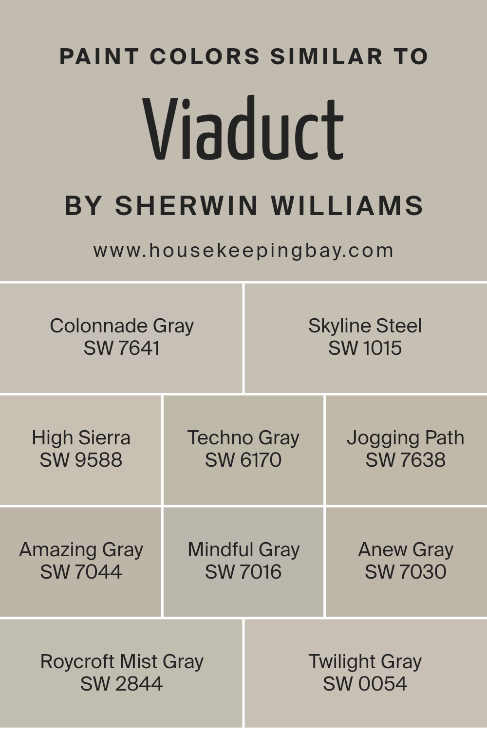
Colors Similar to Viaduct SW 9567 by Sherwin Williams
Similar colors play a crucial role in interior design by creating a harmonious and visually appealing environment. They allow for a cohesive look while offering a subtle differentiation that adds depth and complexity to spaces.
When working with shades like those similar to Viaduct SW 9567 by Sherwin Williams, designers can achieve a balanced atmosphere that gently ties different elements together.
These shades, which range from warm grays to muted hues, provide flexibility in design, making it easier to integrate furniture and decor without overwhelming the space. The use of similar colors also aids in crafting transitions between different rooms, creating a seamless flow throughout the home.
SW 7641 – Colonnade Gray offers a classic gray tone that exudes a refined yet inviting feel. SW 1015 – Skyline Steel, a bit lighter, provides a soft backdrop ideal for modern interiors. SW 9588 – High Sierra introduces a deeper hue, reminiscent of mountain stones, perfect for adding a bit of drama.
SW 6170 – Techno Gray has a futuristic edge, suitable for contemporary spaces. SW 7638 – Jogging Path is a warm gray, excellent for creating a cozy and inviting atmosphere. SW 7044 – Amazing Gray, true to its name, brings a versatile and stylish gray that works well in most settings.
SW 7016 – Mindful Gray is thoughtful in its medium depth, promoting a balanced environment. SW 7030 – Anew Gray, slightly warmer, offers a refreshing nuance to neutral schemes. SW 2844 – Roycroft Mist Gray provides a historical charm that echoes traditional elegance.
Finally, SW 0054 – Twilight Gray wraps up the palette with a deeper, moodier gray that’s perfect for accentuating key areas. Each of these shades uses its distinct characteristics to enhance the overall aesthetic, maintaining harmony while providing just enough contrast.
You can see recommended paint colors below:
- SW 7641 Colonnade Gray
- SW 1015 Skyline Steel
- SW 9588 High Sierra
- SW 6170 Techno Gray
- SW 7638 Jogging Path
- SW 7044 Amazing Gray
- SW 7016 Mindful Gray
- SW 7030 Anew Gray
- SW 2844 Roycroft Mist Gray
- SW 0054 Twilight Gray
housekeepingbay.com
How to Use Viaduct SW 9567 by Sherwin Williams In Your Home?
Viaduct SW 9567 by Sherwin Williams is a unique shade of paint that brings a calm, modern feel to any space. This color is a refreshing gray with soft blue undertones that give it a soothing presence, making it perfect for creating a peaceful atmosphere in your home.
You can use Viaduct SW 9567 in various rooms. It works wonderfully in living rooms and bedrooms where you want to establish a serene ambience. This color pairs well with white trim and natural wood elements, enhancing its cool tones.
In the bathroom, applying Viaduct can make the space feel bigger and more open, like a personal spa. For those working from home, painting an office this color can help maintain focus and reduce stress.
Furthermore, Viaduct is versatile enough for exterior use. It can give your home’s façade a fresh and inviting look that stands out in your neighborhood. By combining Viaduct SW 9567 with the right decor elements, you can refresh any room without overpowering it.
Viaduct SW 9567 by Sherwin Williams vs Anew Gray SW 7030 by Sherwin Williams
Viaduct SW 9567 by Sherwin Williams is a vibrant teal color that adds a lively splash to any space. It’s a versatile shade that can make a room feel energetic and inviting. Anew Gray SW 7030, also by Sherwin Williams, is a softer neutral gray that provides a calming, subdued backdrop, ideal for a more relaxed environment.
While Viaduct brings a pop of color, Anew Gray serves as a gentle foundation, allowing other elements in the room to stand out. Together, these colors could complement each other well in a space, with Viaduct adding interest and Anew Gray providing balance.
Each has its own charm; Viaduct injects personality and boldness, whereas Anew Gray offers a timeless, soothing presence. Depending on your room’s purpose and desired atmosphere, either could be a great choice.
You can see recommended paint color below:
housekeepingbay.com
Viaduct SW 9567 by Sherwin Williams vs Twilight Gray SW 0054 by Sherwin Williams
Viaduct SW 9567 by Sherwin Williams is a creamy beige shade that offers a light and airy feel to any room, pairing well with brighter colors and soft decor. It’s ideal for creating a cozy and welcoming atmosphere. Comparatively, Twilight Gray SW 0054 is a deeper, muted gray color that gives a more sophisticated and grounded feeling.
This color works well in modern spaces and complements metallic accents and dark wood. Both Viaduct and Twilight Gray provide unique aesthetic effects: Viaduct lightens spaces, while Twilight Gray adds solemnity and depth.
Each color can be used in various settings, depending on the desired mood and style. Viaduct suits spaces needing a gentle warmth, whereas Twilight Gray is perfect for those seeking a strong, dramatic touch.
You can see recommended paint color below:
housekeepingbay.com
Viaduct SW 9567 by Sherwin Williams vs Techno Gray SW 6170 by Sherwin Williams
Viaduct SW 9567 by Sherwin Williams is a soft, cool gray with subtle blue undertones. This color has a calming effect, making it perfect for spaces where you want to relax, such as bedrooms or living rooms. It pairs nicely with soft whites or pastel colors, creating a gentle and inviting atmosphere.
Techno Gray SW 6170, by contrast, is a deeper, more pronounced gray. It has a stronger presence due to its darker tone, which makes it ideal for creating a sophisticated look in areas such as offices or dining rooms. While still versatile, Techno Gray offers a more dramatic appeal compared to the lighter, breezier Viaduct.
Both colors work well in modern decor schemes and can be accented with bolder colors or metallic finishes for added interest. However, Viaduct is better suited for creating a serene space, while Techno Gray provides a bold backdrop.
You can see recommended paint color below:
- SW 6170 Techno Gray
housekeepingbay.com
Viaduct SW 9567 by Sherwin Williams vs Colonnade Gray SW 7641 by Sherwin Williams
Viaduct SW 9567 by Sherwin Williams is a light blue-gray color, reminiscent of a soft, serene sky, while Colonnade Gray SW 7641 veers more towards a warm, neutral gray with beige undertones. Viaduct casts a fresher, cooler tone that might be suitable for creating a calming, peaceful ambiance in spaces like bedrooms or bathrooms.
In contrast, Colonnade Gray, with its warmer, inviting hue, works well in living areas or entryways where a cozy, welcoming feel is desirable. Both colors reflect light differently; Viaduct might feel airier in a well-lit room, whereas Colonnade can add depth and warmth.
Considering their tones, Viaduct offers a more modern, crisp look, while Colonnade provides a classic, timeless appeal. Your choice between the two would depend largely on the mood you wish to set and the existing colors in the decor.
You can see recommended paint color below:
housekeepingbay.com
Viaduct SW 9567 by Sherwin Williams vs Amazing Gray SW 7044 by Sherwin Williams
Viaduct SW 9567 by Sherwin Williams is a light gray shade with cool undertones, giving it a crisp and airy feel. This color works well in modern and minimalist spaces because of its clean and subtle appearance. It has a refreshing quality that makes small rooms appear larger and more open.
In contrast, Amazing Gray SW 7044 is a warmer shade of gray compared to Viaduct. It offers a cozy feeling due to its earthy undertone, making it ideal for creating a welcoming and comfortable ambiance in living areas and bedrooms. This color pairs beautifully with wood finishes and natural elements, enhancing a rustic or traditional style home.
Both colors are versatile and can suit various decors, but while Viaduct brings a cool freshness, Amazing Gray provides a warm embrace, impacting the overall mood and stylistic expression of a space.
You can see recommended paint color below:
housekeepingbay.com
Viaduct SW 9567 by Sherwin Williams vs High Sierra SW 9588 by Sherwin Williams
Viaduct SW 9567 and High Sierra SW 9588 by Sherwin Williams are both unique colors that can set different moods in a space. Viaduct is a deep blue-gray that gives off a strong, serene vibe, perfect for creating a soothing and sophisticated atmosphere in rooms. It’s ideal for areas where calm and focus are required, like bedrooms or offices.
Contrastingly, High Sierra is a darker shade, leaning more towards a true gray. This color can give a room a more grounded, solid feel, making it great for modern living spaces and for those who prefer a more understated elegance. Its versatility also means it pairs well with a variety of decor styles and other colors, from bright whites to bold hues.
In summary, while both Viaduct and High Sierra provide a base for a range of aesthetic preferences, Viaduct sways towards a cooler, tranquil feeling, whereas High Sierra offers a more neutral, robust presence.
You can see recommended paint color below:
- SW 9588 High Sierra
housekeepingbay.com
Viaduct SW 9567 by Sherwin Williams vs Roycroft Mist Gray SW 2844 by Sherwin Williams
Viaduct SW 9567 by Sherwin Williams is a vibrant shade of blue with a clear, striking presence. It has a refreshing quality that makes it perfect for spaces needing a lively touch. This color is ideal for accent walls or furniture pieces where you want to add a pop of color or create a focal point.
Roycroft Mist Gray SW 2844, by contrast, is a gentle gray that offers a more subdued and classic look. It’s a versatile color that works well in various settings, aiding in creating a calm and composed atmosphere. This shade pairs nicely with a wide range of other colors, making it a solid choice for main walls or entire rooms.
Both colors serve different purposes in interior design. Viaduct is bold and energetic, great for adding vibrance, while Roycroft Mist Gray is soft and soothing, excellent for achieving a relaxed feel. Depending on the mood or style you aim to achieve, either color can enhance your space significantly.
You can see recommended paint color below:
housekeepingbay.com
Viaduct SW 9567 by Sherwin Williams vs Mindful Gray SW 7016 by Sherwin Williams
Viaduct SW 9567 by Sherwin Williams is a deep slate blue that brings a sense of calm and sophistication to any space. This color is perfect for making a statement in areas like living rooms or dining areas, as it adds a rich, moody atmosphere. It works well with both dark and light accents, adding versatility to your decorating options.
Mindful Gray SW 7016, also by Sherwin Williams, differs significantly as it is a soft, warm gray shade. This neutral color is subtle and soothing, making it suitable for almost any room in your home. It pairs beautifully with a wide range of colors, offering a more flexible palette that can adapt to various decor styles from modern to classic.
Both colors provide unique atmospheres: Viaduct’s boldness creates a focal point, whereas Mindful Gray offers a gentle backdrop that complements various aesthetics. Depending on what vibe you want to achieve, each color provides distinct advantages for interior spaces.
You can see recommended paint color below:
housekeepingbay.com
Viaduct SW 9567 by Sherwin Williams vs Jogging Path SW 7638 by Sherwin Williams
Viaduct SW 9567 by Sherwin Williams is a rich blue shade that offers a feeling of serenity and calm. It’s a deeper color that can add a touch of sophistication and depth to any space. If you’re looking to create a peaceful retreat or add an anchor of bold color to your room, Viaduct is an excellent choice.
Jogging Path SW 7638, in contrast, belongs to the neutral family with its warm, grayish-taupe tone. This color is versatile and subdued, making it easy to combine with various decor styles and other colors. It’s ideal for those looking for a soft, inviting backdrop that brings warmth to a space without overpowering it.
When comparing the two, Viaduct brings depth and a distinct presence due to its darker, more saturated hue, while Jogging Path offers a lighter, adaptable look that works well in numerous settings for a comforting feel.
You can see recommended paint color below:

housekeepingbay.com
Viaduct SW 9567 by Sherwin Williams vs Skyline Steel SW 1015 by Sherwin Williams
The main color, Viaduct SW 9567 by Sherwin Williams, presents as a cool, neutral gray with a modern feel, perfectly suited for spaces that aim for a subtle and contemporary look. This color reflects a minimalist aesthetic, offering a clean backdrop for both bright and muted accents within a room’s decor. Its versatility allows it to be a good choice for various areas, be they living rooms or home offices.
In contrast, Skyline Steel SW 1015 is a lighter gray that carries a warmer undertone, making spaces feel cozy yet equally modern. This color can brighten up a room more effectively than Viaduct, providing a soft warmth that pairs well with a wide range of decorating styles, from casual to elegant.
Both colors are sophisticated and can effectively contribute to a space that feels both inviting and stylish. Choosing between them depends largely on the desired mood and lighting of the space, with Viaduct offering a stronger, cooler statement and Skyline Steel bringing a lighter, warmer touch.
You can see recommended paint color below:
housekeepingbay.com
Conclusion
In conclusion, SW 9567 Viaduct by Sherwin Williams is the perfect choice if you’re thinking about giving your space a fresh new look. This paint offers versatility that complements various interior themes from classic elegance to modern simplicity.
Its unique shade presents a serene yet sophisticated atmosphere, making it ideal for rooms where you want to unwind or focus. Not only does it hold up well over time, but it also applies smoothly, ensuring professional results even if you decide to apply it yourself.
Whether you’re refreshing your living room, bedroom, or office, this color can help you create a more inviting and comfortable environment. Remember that choosing the right color can greatly influence the mood and personality of any room.
With SW 9567 Viaduct, you can achieve a subtle statement that enriches your living space without overwhelming it. This makes it an excellent option for anyone aiming to update their home’s aesthetic with a sense of sophistication and calm.
housekeepingbay.com
Ever wished paint sampling was as easy as sticking a sticker? Guess what? Now it is! Discover Samplize's unique Peel & Stick samples. Get started now and say goodbye to the old messy way!
Get paint samples


