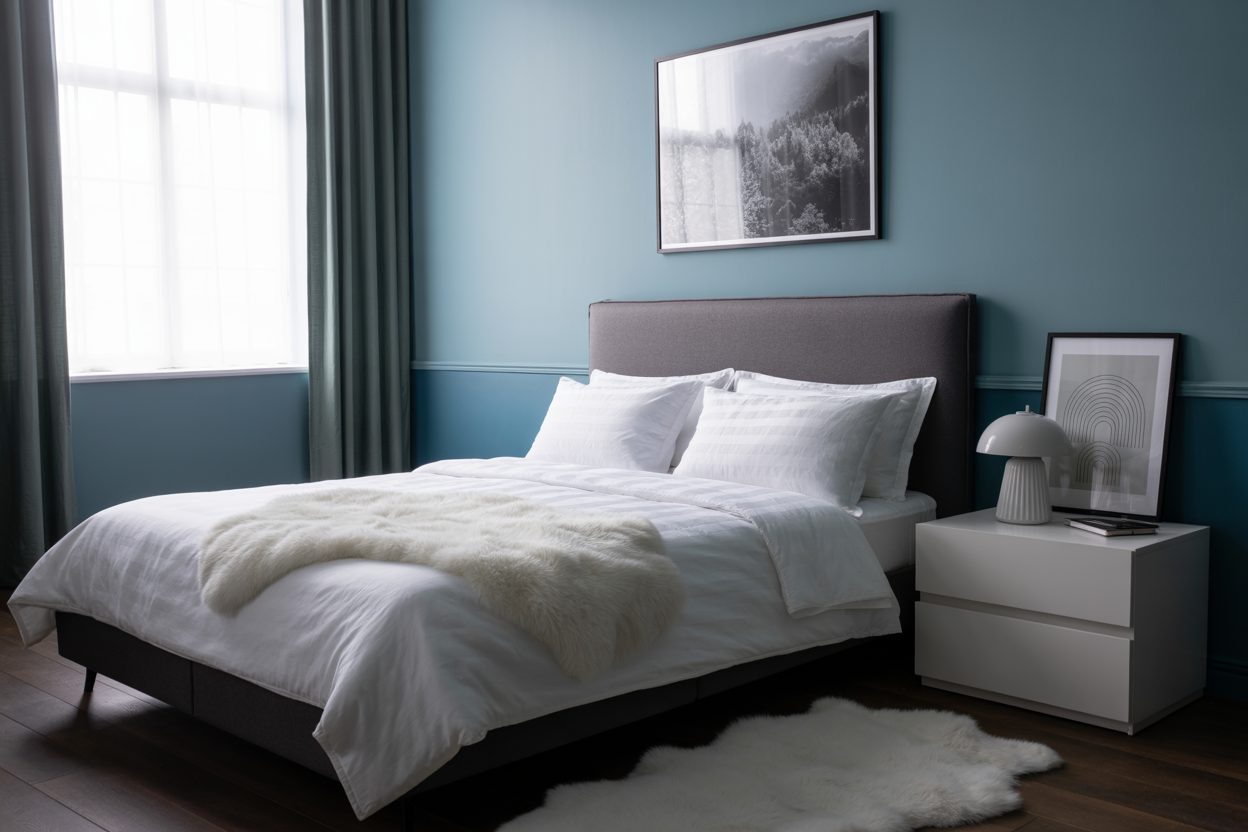
21 Trendy Dusty Blue Paint Color in 2025
When Everything Feels Too Loud, Dusty Blue Feels Just Right
I’ve worked with dozens of homes this year, and one color keeps showing up in my clients’ final choices: dusty blue. It’s not loud. It’s not flat. It brings a kind of calm that doesn’t make the room feel sleepy. That’s a hard balance to find, and I think that’s why it’s having its moment right now.
Dusty blue carries this lived-in look. It’s soft, but not washed out. Pairs just as easily with linen and white oak as it does with black metal or tan leather. And it works whether you’re staging a home for sale or settling into your forever kitchen.
I always say: color is about how you want to feel when you walk into the room. And lately, people are craving calm, not cold. Fresh, not sterile. Dusty blue delivers.

housekeepingbay.com
Why Dusty Blue is a Big Deal in 2025
I’ve seen trends come and go, but this year, dusty blue is not just a passing wave—it’s being picked for everything from nursery walls to kitchen cabinets. And it makes sense.
1. It’s Calming Without Being Boring
Blue, in general, is known to bring a sense of peace. According to a report from Verywell Mind, blue hues can reduce stress and slow heart rates source. But dusty blue steps it up by adding a hint of gray or soft taupe. That makes it easier to live with every day.
My clients often say, “I want something peaceful, but not baby blue.” This is exactly where dusty blue shines.
2. Paint Brands Are Backing It
Sherwin-Williams picked a dusty-toned blue called Upward (SW 6239) as their Color of the Year for 2024, and it’s still hot in 2025. Benjamin Moore and Behr also have close cousins in their latest trend palettes.
According to a Sherwin-Williams trend forecast, homeowners are choosing more grounded and comforting tones after years of minimalism and stark whites. The numbers support it: blue paint sales rose 17% in 2024 compared to the year before, according to Home Innovation Research Labs source.
3. It’s a Color That Works Across Styles
Dusty blue blends into a Scandinavian kitchen, but can also pop in a transitional bathroom. I’ve even used it in a rustic farmhouse entryway, and it looked just right. Whether you’re a fan of mid-century or leaning into modern farmhouse, dusty blue doesn’t clash—it cooperates.
How to Pick the Right Shade of Dusty Blue
Not every dusty blue is going to feel the same once it’s on your walls. I’ve had clients fall in love with a swatch, then get frustrated when the paint looks totally different in their room. That’s why this part matters.
What Makes a Blue “Dusty”?
It’s all about the gray undertone. True dusty blues aren’t bright like sky blue or deep like navy. They’ve got a little shadow in them — just enough to make the color feel calm and soft.
You’ll notice:
- Some lean cooler, with hints of slate or steel.
- Others lean warmer, with a touch of violet or taupe.
Here’s a trick I always use with my clients: Hold the swatch next to something true gray and something pure white. If the blue starts to look a little green or a little purple, you’ve got your undertone.
Test in Real Light—Always
I cannot say this enough: buy the sample. Put it on a few parts of the wall—not just one. Paint reacts differently in:
- Morning vs evening light
- Rooms with warm vs cool bulbs
- North- vs south-facing windows
And yes, sometimes what looked “dusty blue” at the store will feel almost teal at home. That’s why testing is key.
Let’s get into the fun part — my favorite dusty blue paints this year. I picked these after trying dozens of swatches in real homes, under real lighting. I grouped them by mood and room type, so it’s easier for you to find one that fits.
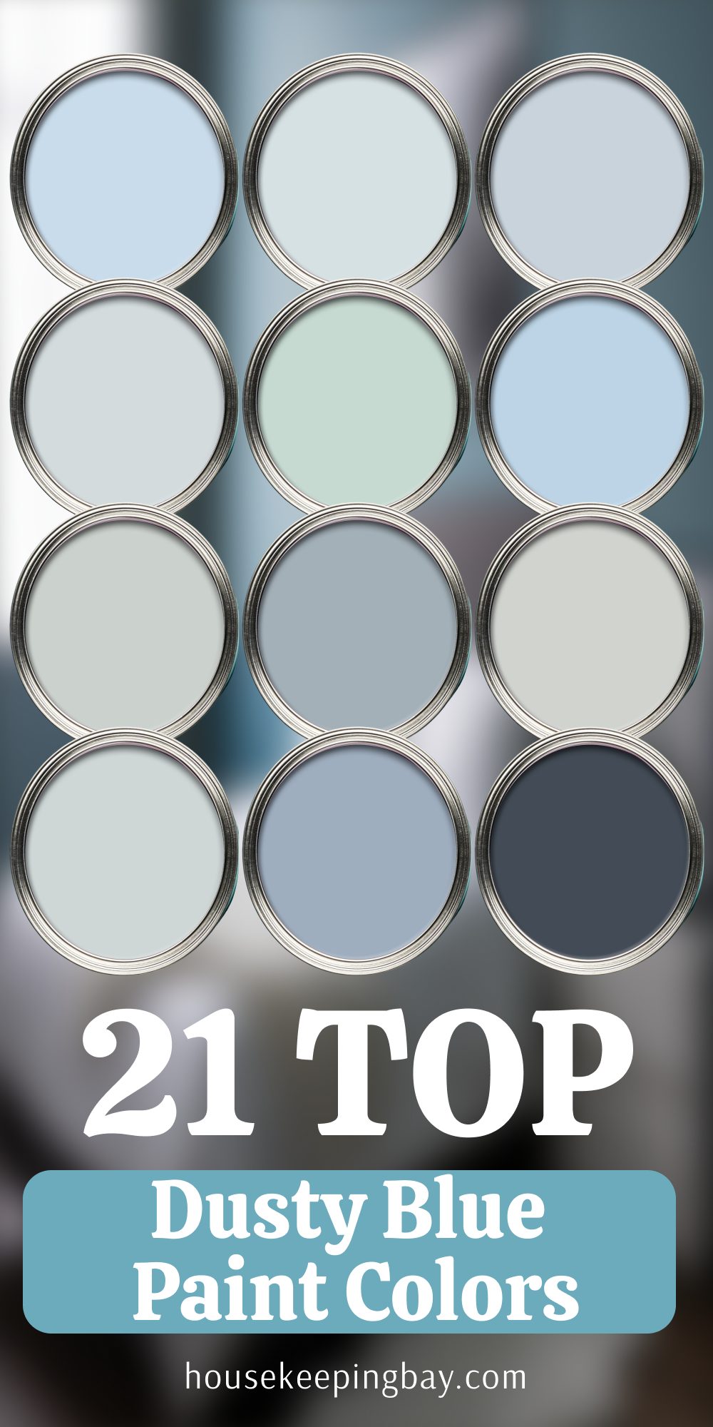
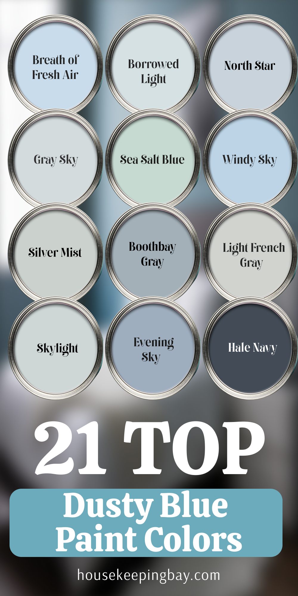
My Top 21 Dusty Blue Paint Picks of 2025
Soft & Subtle Dusty Blues
These are the ones I use when someone says, “I want it peaceful, but not gray.” Perfect for bedrooms, nurseries, or anywhere you want a gentle feel.
- Breath of Fresh Air – Benjamin Moore
Light, airy, almost like a whisper of blue. Great with white trim. - Borrowed Light – Farrow & Ball
Slightly vintage feel. Works beautifully in small rooms with good light. - North Star – Sherwin-Williams
Has a tiny bit of lavender undertone. Looks soft and clean. - Gray Sky – Benjamin Moore
This one leans more toward blue-gray. Perfect for a calm office space. - Sea Salt Blue – Valspar
Gentle on the eyes, feels like a spa wall without being cliché.
Balanced Neutrals with Blue Tones
If you want a wall color that isn’t “too blue,” these are your friends. These shades work in kitchens, dining rooms, or even entryways.
- Windy Sky – Benjamin Moore
Almost a blue-beige. I’ve used it with rattan and oak furniture—it fits like a glove. - Silver Mist – Sherwin-Williams
Light changes this one a lot. Morning feels cooler, evening gets cozy. - Boothbay Gray – Benjamin Moore
One of my all-time favorites. Technically a gray, but has a clear dusty blue personality. - Light French Gray – Sherwin-Williams
More muted, perfect for hallways and stairwells. - Skylight – Farrow & Ball
Looks expensive. Works well with warm metals like brass. - Evening Sky – Behr
A solid neutral with just enough depth to make it interesting.
Bolder Dusty Blues
These are the statement makers. I use these on cabinets, furniture, or even accent walls when I want people to stop and say “what color is that?”
- Hale Navy – Benjamin Moore
Deep and rich. Works on a kitchen island or a library wall. - Pewter Blue – Valspar
Feels historic. I’ve used this in a mudroom with white shiplap—stunning. - Charcoal Blue – Sherwin-Williams
Dusty but dramatic. Great with matte black fixtures. - Blue Note – Benjamin Moore
Leans toward navy, but still keeps a cloudy softness. - Down Pipe Blue – Farrow & Ball
This one almost looks like stormy weather. Looks amazing with dark wood. - Storm Cloud – Sherwin-Williams
A moody tone, but not gloomy. Great for a dining room. - Adirondack Blue – Behr
Slightly rustic. Works with black, wood, or leather. - Stone Blue – Farrow & Ball
Historic, but in a cozy way. A great match for traditional homes. - Still Water – Sherwin-Williams
Deep, calm, and pairs well with warm neutral fabrics. - Gentleman’s Gray – Benjamin Moore
A rich, inky blue with green undertones. Bold, but still earthy.

housekeepingbay.com
How and Where to Use Dusty Blue Paint
I’ve painted bedrooms, kitchens, entryways, even ceilings with dusty blue. What matters is knowing how to use it without overdoing it. Here’s what works best in my experience.
Where It Works Best
1. Bedrooms
Dusty blue is made for resting. It calms the room, softens the light, and plays well with cozy textures like knit throws, linen bedding, and warm-toned wood.
My tip: Try a warm-toned dusty blue with white curtains and a wood headboard. That’s the recipe for a room people want to nap in.
2. Living Rooms
Use it on one main wall behind the sofa. It helps define the room, especially in open layouts. I usually pair it with tan leather, cream rugs, and a lot of warm lighting.
3. Kitchens and Cabinets
This is my secret weapon for adding personality without being trendy. A dusty blue kitchen island with soft brass handles? That’s a showstopper.
4. Bathrooms
Because bathrooms are often full of white tile, dusty blue adds balance and depth. Use a mid-tone dusty blue on the walls with matte black fixtures.
5. Entryways and Hallways
Just a hint of blue here can make the space feel curated. I use softer tones that look nice in changing daylight.
What Colors Go With Dusty Blue
This color plays well with a lot of others—but some really shine next to it:
- Creamy Whites – Not stark white. Think antique white, ivory, or warm linen.
- Soft Tans or Taupe – Like Belgian linen, natural stone, or warm beige.
- Olive Green or Sage – Dusty blue and green together feel natural and rich.
- Matte Black or Bronze – For contrast. Especially good with hardware and fixtures.
- Brass or Gold – Adds warmth and elegance.
What I Keep Repeating to My Clients
If there’s one thing I’ve learned after walking through hundreds of homes, it’s this: color is a feeling first, and a design choice second. Dusty blue is trending right now, yes—but more importantly, it feels right. It helps people breathe a little easier. It helps a house feel less staged, more lived-in.
You don’t have to cover every wall with it. Sometimes a pop on a door or cabinet is all you need. What matters is that it brings a sense of comfort to the space. And these days, that’s what most people are really looking for.
As Leatrice Eiseman, executive director of the Pantone Color Institute, said:
“Color is a powerful communication tool. It can influence mood and even physiological reactions.” So if you’re staring at color samples and feeling overwhelmed, start with one that makes you feel calm—but still interested. Dusty blue might be that one for you.

housekeepingbay.com
