Solitary Slate SW 9598 by Sherwin Williams
A Calm Shade for Contemporary Spaces
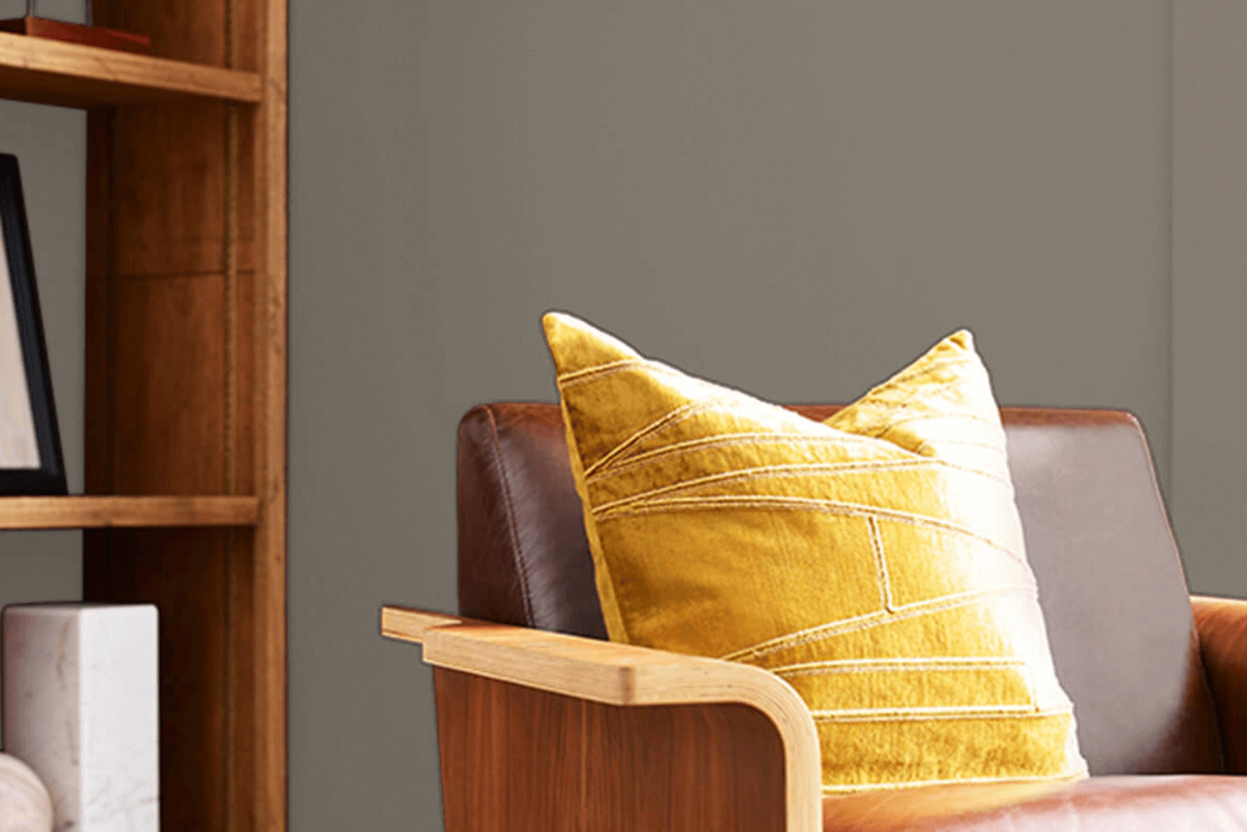
Choosing the right paint color for your home can be challenging, with so many options available. Solitary Slate by Sherwin Williams might be the perfect choice for you if you appreciate a sophisticated yet calming feel. Imagine a color that brings a balance of peacefulness and elegance to any room.
Solitary Slate offers a subtle mix of gray and blue, creating a serene atmosphere without overwhelming the senses. It’s like having a quiet corner in a bustling world.
You might find Solitary Slate perfect for the living room where everyone gathers, or perhaps a bedroom that serves as your personal retreat. Its muted tone allows for flexibility in décor, working harmoniously with various styles and color palettes.
Pair it with whites and creams for a classic look, or add splashes of vibrant color for a modern twist. The beauty of Solitary Slate lies in its adaptability, making it suitable for any project scope, big or small.
Whether you want to refresh a single wall or revamp an entire space, Solitary Slate can serve as an ideal backdrop for your creativity. Let the calming influence of this color invite a sense of relaxation and subtle elegance into your home, creating a sanctuary that reflects your personal taste and style.
via sherwin-williams.com/
What Color Is Solitary Slate SW 9598 by Sherwin Williams?
Table of Contents
Solitary Slate (SW 9598) by Sherwin Williams is a sophisticated gray with subtle blue undertones. This color brings a sense of calm and balance to spaces. Its cool hue works beautifully in modern, minimalist settings, where simplicity and elegance are priorities. The soft nature complements Scandinavian styles, marrying effortlessly with clean lines and modest decor.
For traditional interiors, this color provides a modern twist, creating contrast when paired with classic moldings and wooden furniture. Coastal styles warmly welcome Solitary Slate, blending with ocean-inspired elements without overwhelming the natural aesthetic.
Pairing with materials is straightforward. Soft textures like wool and linen highlight the color’s soothing qualities. When matched with natural wood accents, it creates a cozy, welcoming environment. Use polished metal or glass for a sleek, contemporary look. Stone surfaces, whether marble or granite, work beautifully, enhancing the color’s cool tone.
Textures such as rattan or matte finishes add depth, while leather can provide contrast and luxury.
An ideal choice for bedrooms, living rooms, or even home offices, Solitary Slate offers a versatile backdrop, presenting opportunities for various decor styles while ensuring a timeless charm.
housekeepingbay.com
Is Solitary Slate SW 9598 by Sherwin Williams Warm or Cool color?
Solitary Slate SW 9598 by Sherwin Williams is a rich and calming color choice for homes. This deep gray tone brings a sense of warmth and sophistication to any room. It pairs well with both modern and traditional furnishings, allowing for versatile design options. In living rooms, Solitary Slate creates a cozy atmosphere, making it an ideal backdrop for gatherings and relaxation.
The muted shade also contributes to an elegant feel in bedrooms, promoting relaxation and restfulness. Bathrooms and kitchens benefit from a clean, polished look with this classic hue. Solitary Slate works harmoniously with whites, creams, and natural wood tones, enhancing the overall aesthetic.
It also allows for bold accents, such as vibrant artworks or decorative pieces, to pop without overwhelming the space. Whether used as a dominant wall color or as a tasteful accent, Solitary Slate provides homes with an inviting and stylish environment.
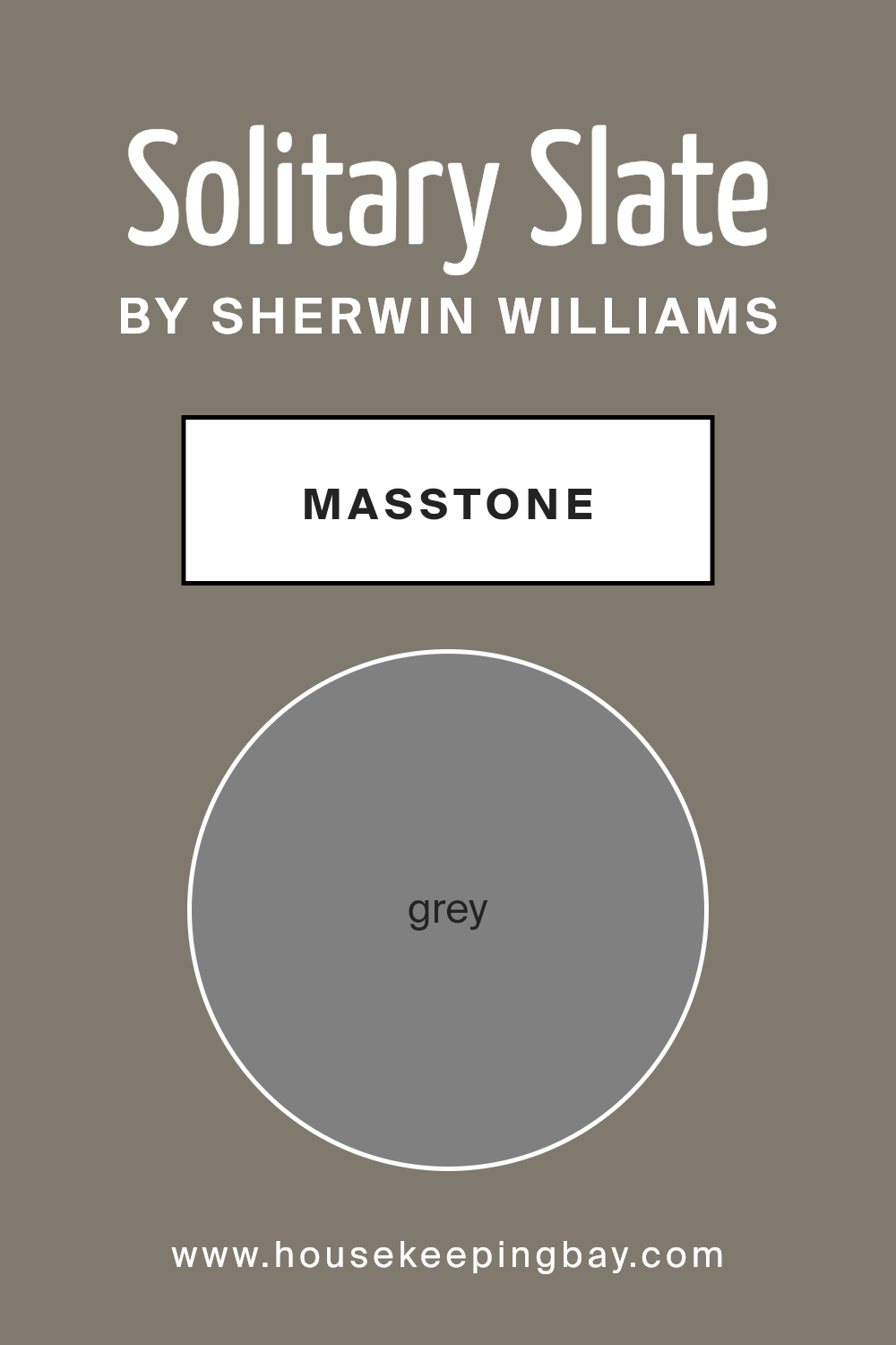
What is the Masstone of the Solitary Slate SW 9598 by Sherwin Williams?
Solitary Slate SW 9598 by Sherwin Williams is a lovely grey color. Its masstone, or main color, is a true grey, represented by the code #808080. This neutral tone makes it very versatile for use in homes.
Grey is a balanced color that can convey a sense of calmness and stability. It doesn’t overpower a room, allowing other elements to stand out. When using Solitary Slate, it works well in various settings, whether it’s a living room, bedroom, or office space.
Its cool undertones pair nicely with both warm and cool accents, making it easy to change decor styles without needing to repaint.
Because it’s neutral, it also coordinates well with other colors. You can match it with whites and creams for a soft look, or combine it with brighter colors for more contrast. Its adaptability makes Solitary Slate a great choice for creating a timeless, elegant space in homes.
housekeepingbay.com
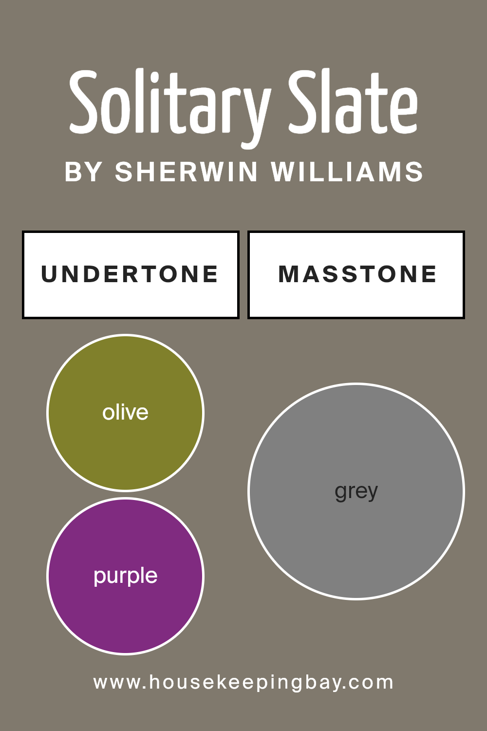
Undertones of Solitary Slate SW 9598 by Sherwin Williams
Solitary Slate SW 9598 by Sherwin Williams is a complex color with various undertones, impacting how it appears on walls. Undertones are the subtle hues beneath the main color, influencing the color’s perception depending on light and surrounding elements.
The diverse undertones in Solitary Slate include olive, purple, pale pink, and dark turquoise. These add depth to the color, giving it a rich and layered appearance. The olive and dark green undertones create a natural and calming vibe, while purple and violet add a touch of sophistication.
Pale pink and light purple make the color feel softer and more inviting. The presence of light gray and dark gray undertones adds neutrality, balancing the stronger hues.
On interior walls, Solitary Slate can take different tones based on lighting and decor. In natural light, the greens and blues may become more pronounced, offering a serene atmosphere.
In dimmer settings, the darker shades like navy, dark blue, and dark gray might make spaces feel cozier.
Light blue and mint undertones can brighten a room, adding freshness. The brown and red undertones add warmth, making spaces feel welcoming.
Understanding these undertones helps in selecting complementary decor, ensuring that the overall feel of the room matches the desired mood. Whether aiming for calmness or energy, Solitary Slate can adapt beautifully.
housekeepingbay.com
How Does Lighting Affect Solitary Slate SW 9598 by Sherwin Williams?
Lighting plays a crucial role in how we perceive colors, and this holds true for any paint color, including Solitary Slate SW 9598 by Sherwin Williams. This particular color, a light to medium gray with subtle blue undertones, can appear quite different depending on the type of light it is exposed to.
In natural light, the color appears cooler and more crisp. During the day, especially in north-facing rooms where the light is soft and indirect, Solitary Slate might appear more muted and refined.
North-facing rooms usually have cooler lighting, enhancing the gray and blue tones of this color. This creates a calm and soothing atmosphere.
In south-facing rooms, Solitary Slate can look somewhat warmer due to the direct sunlight throughout the day. The bright light can bring out more of the gray, making it feel more balanced and slightly soft. This results in a cozy and welcoming feel.
East-facing rooms get bright, warm light in the morning but cooler light later in the day. In mornings, Solitary Slate may show a slightly warmer side due to the early sunlight, making it feel more inviting. As the day progresses, it will start to look cooler and more neutral.
West-facing rooms receive warm, golden light in the afternoon and evening. During these times, Solitary Slate can appear softer and warmer, complementing the setting sun’s hues. At other times, it may look closer to its true gray shade.
In artificial light, such as incandescent bulbs, Solitary Slate may take on a warmer hue, making it appear cozier and more intimate. Under LED or fluorescent lights, the color can maintain more of its cool gray-blue tones, appearing clean and modern.
Thus, understanding the effect of lighting helps in setting the desired mood and achieving the right look for any space with this color.
housekeepingbay.com
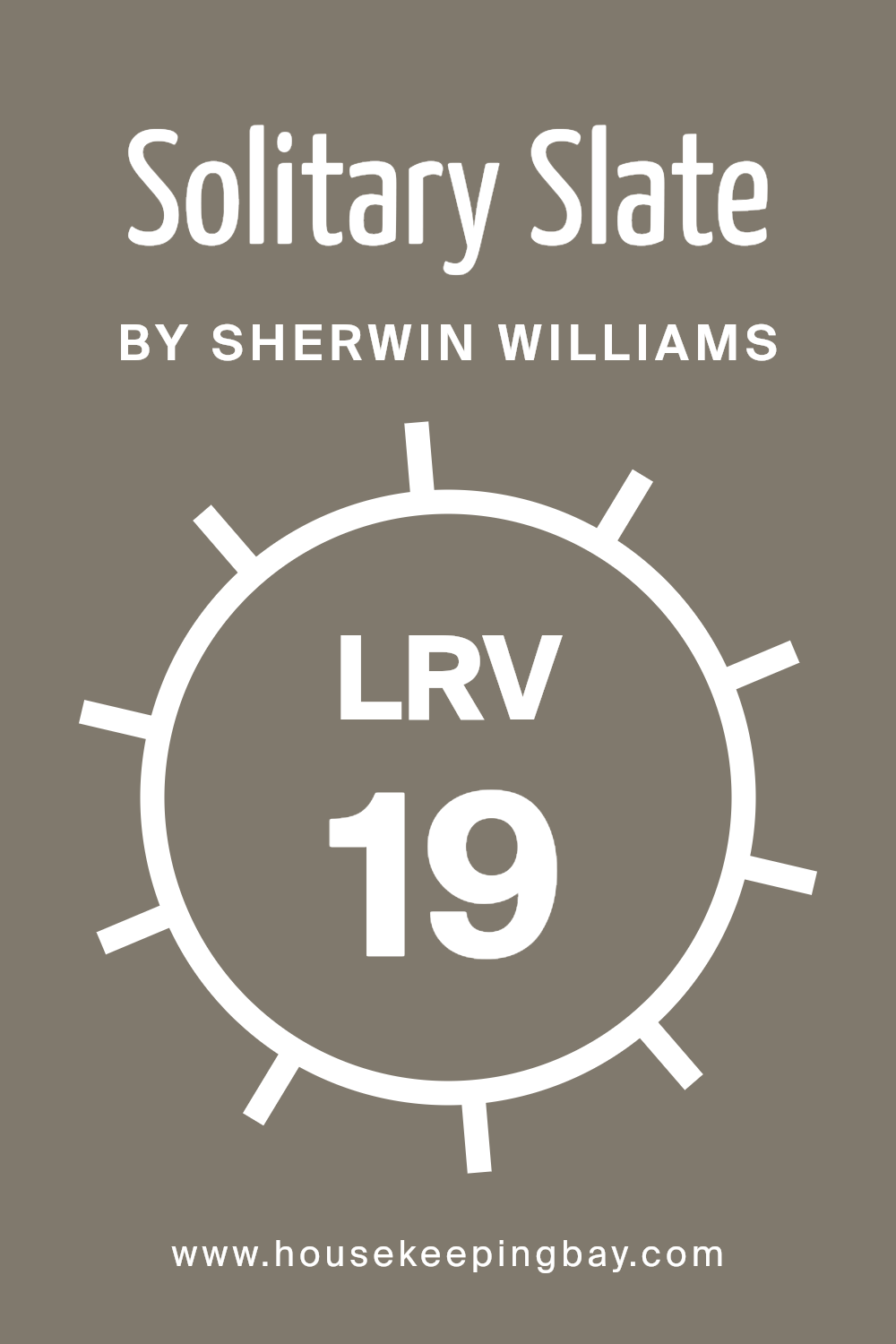
What is the LRV of Solitary Slate SW 9598 by Sherwin Williams?
Light Reflectance Value, or LRV, is a measure of how much light a paint color reflects or absorbs. This value is represented on a scale from 0 to 100, where 0 is pure black, which absorbs all light, and 100 is pure white, which reflects all light.
When you choose a paint with a low LRV, it means the color will absorb more light and make the space feel darker. Conversely, a high LRV indicates the color will reflect more light, making the area seem brighter.
Understanding the LRV is crucial when selecting paint for your walls because it helps you predict how the color will interact with the lighting in your space.
Solitary Slate SW 9598 from Sherwin Williams has an LRV of 19.474, meaning it is a relatively dark color. This value suggests that the paint will absorb a significant amount of light, potentially making a room feel more intimate and cozier. In a space with ample natural light, this color can provide a rich and grounded ambiance.
However, in a room with limited light, it might make the area seem smaller and more enclosed. If you’re looking to create a more dramatic or cozy atmosphere, Solitary Slate could be an excellent choice because of its low LRV.
housekeepingbay.com
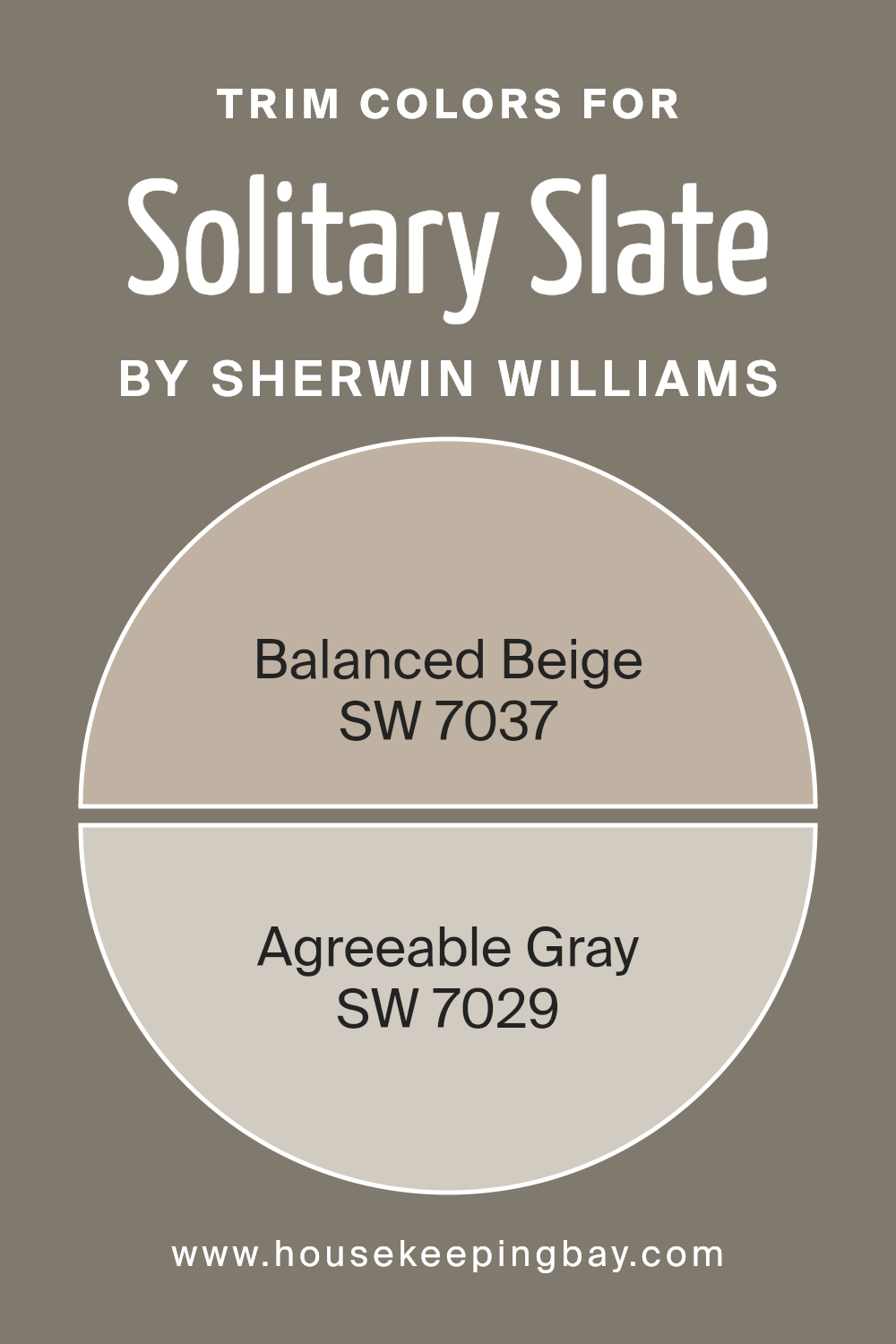
What are the Trim colors of Solitary Slate SW 9598 by Sherwin Williams?
Trim colors are the additional colors used to outline or frame the primary color on walls, doors, and other structures. These colors play a crucial role in enhancing and defining a room’s overall look, offering contrast or complement to the main color. Selecting the right trim color can highlight architectural features, add depth, and create a sense of balance within a space.
For Solitary Slate SW 9598 by Sherwin Williams, trim colors like Balanced Beige and Agreeable Gray can make a significant impact due to their versatile and neutral characteristics. Solitary Slate is a strong, earthy shade that may require softer trim colors to balance its intensity, making the room feel cohesive and well thought out.
Balanced Beige SW 7037 is a warm, inviting shade that adds a sense of comfort and subtlety. It fits in perfectly with Solitary Slate, providing a smooth transition without overshadowing the primary color. On the other hand, Agreeable Gray SW 7029 is a soft, neutral gray with a touch of warmth, making it very adaptable.
It offers a modern yet timeless look that can soften the boldness of Solitary Slate, creating an overall harmonious appearance.
By utilizing these two colors as trim for the Solitary Slate, one can achieve a sophisticated and serene environment without overwhelming the senses.
You can see recommended paint colors below:
housekeepingbay.com
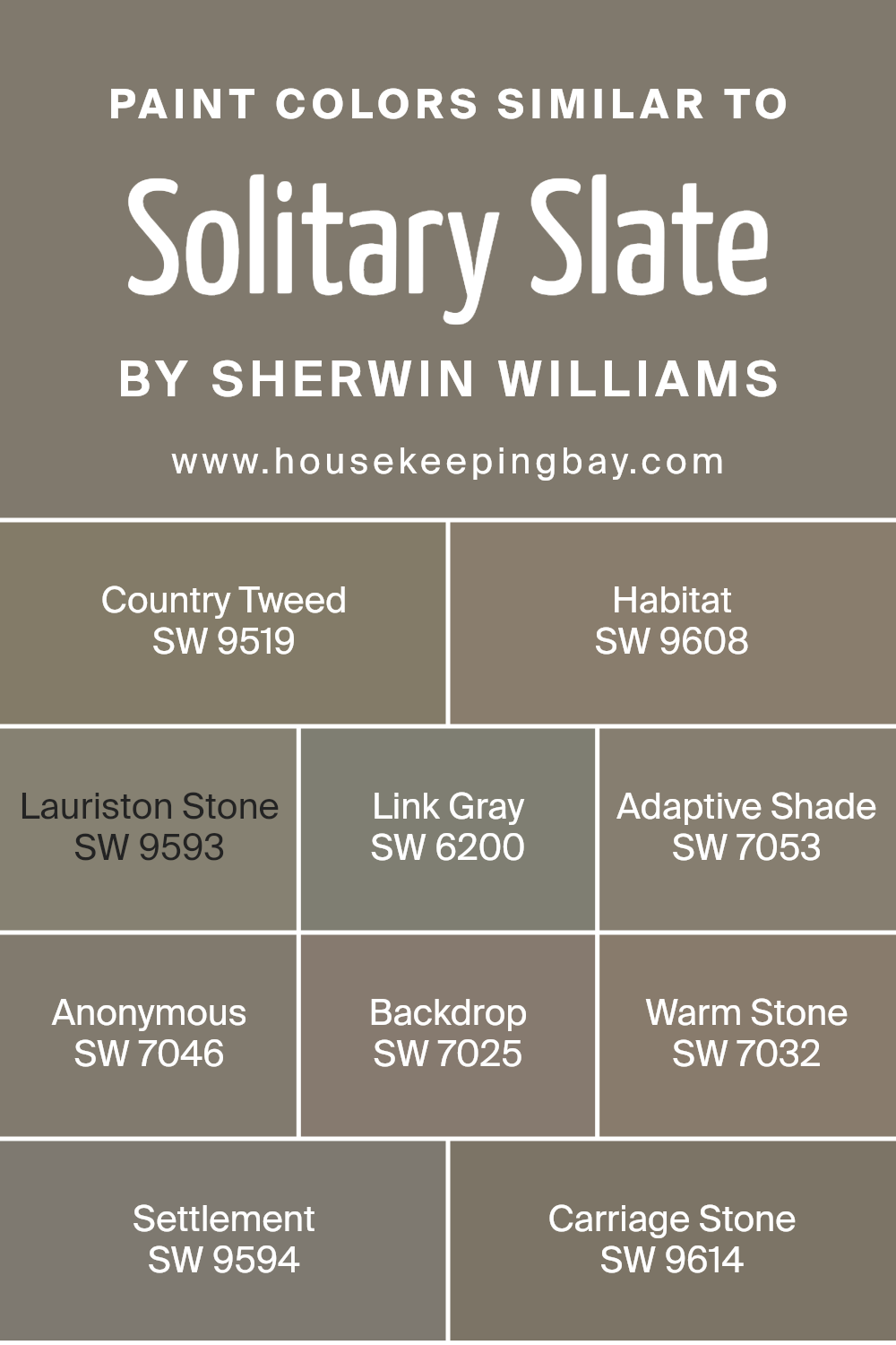
Colors Similar to Solitary Slate SW 9598 by Sherwin Williams
Similar colors are important in design because they create a sense of harmony and unity. By using shades that belong to the same color family, you can achieve a cohesive and pleasing look that is easy on the eyes. Solitary Slate, a subtle gray with earthy undertones, pairs well with colors like Country Tweed, a warm beige that brings a touch of coziness.
Habitat offers a gentle warmth with its soft tan tone, creating a welcoming vibe. Lauriston Stone adds depth with its rich and muted brown hue. Link Gray, a versatile mid-tone gray, brings balance to any color scheme, while Adaptive Shade offers a deeper gray option with hints of warmth.
Anonymous offers a sophisticated gray with a mere whisper of green undertones, perfect for adding depth without overwhelming a space. Backdrop, a soft and muted brown, serves as a neutral base that complements other colors. Warm Stone is a rich taupe that adds elegance with its subtle warmth.
Settlement features a more grounded, earthy brown that adds stability to any palette.
Finally, Carriage Stone, with its deep grayish-brown tone, lends an air of refinement. Altogether, these similar colors work seamlessly, offering a range of choices that maintain a coherent and pleasing aesthetic.
You can see recommended paint colors below:
- SW 9519 Country Tweed
- SW 9608 Habitat
- SW 9593 Lauriston Stone
- SW 6200 Link Gray
- SW 7053 Adaptive Shade
- SW 7046 Anonymous
- SW 7025 Backdrop
- SW 7032 Warm Stone
- SW 9594 Settlement
- SW 9614 Carriage Stone
housekeepingbay.com
How to Use Solitary Slate SW 9598 by Sherwin Williams In Your Home?
Solitary Slate SW 9598 by Sherwin Williams is a calm gray-blue paint color that works well in various spaces. This shade can fit into many rooms, offering a sense of serenity. It can become an excellent choice for bedrooms, where its soft hue helps create a restful atmosphere. In a living room, it offers a neutral backdrop that allows furniture and decor items to stand out.
For those with accent walls or small spaces, painting a wall or cabinet with this color gives a modern look. Solitary Slate complements wood and metallic finishes well, making it versatile for kitchens and bathrooms too.
In homes with open floor plans, this shade helps unify different areas. To make a room feel bright and inviting, pair Solitary Slate with light-colored trims and furnishings. It works well with greens, whites, and soft beige tones, adding charm and warmth to any area without overpowering it.
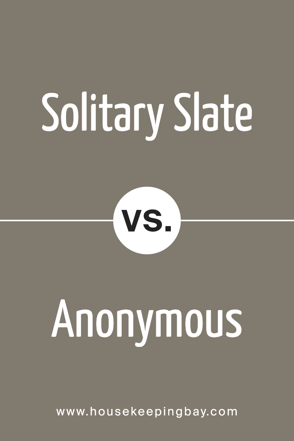
Solitary Slate SW 9598 by Sherwin Williams vs Anonymous SW 7046 by Sherwin Williams
Solitary Slate SW 9598 by Sherwin Williams and Anonymous SW 7046 also by Sherwin Williams show two distinct shades of gray. Solitary Slate presents a cooler and lighter gray with subtle blue undertones, offering a crisp and airy feel often associated with modern, minimalist designs.
This color works well in spaces where a sense of calmness and openness is desired, such as living rooms or bedrooms.
Anonymous, SW 7046, boasts a deeper and warmer gray with more brownish undertones. This gives it a more grounded and earthy appearance, making it suitable for creating cozy and inviting environments like libraries or dens.
While Solitary Slate enhances brightness and light reflection in a room, Anonymous leans toward adding sophistication and depth without overwhelming a space.
Both colors serve different moods and styles while maintaining the versatile nature of gray, allowing them to complement various design elements and personal tastes.
You can see recommended paint color below:
housekeepingbay.com
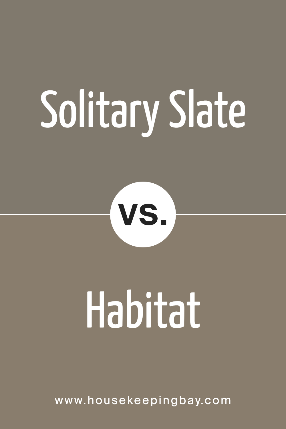
Solitary Slate SW 9598 by Sherwin Williams vs Habitat SW 9608 by Sherwin Williams
Solitary Slate SW 9598 by Sherwin Williams is a cool, muted gray with a hint of blue. It creates a calm, understated backdrop suitable for modern or minimalist designs. Its subtle blue undertone offers a fresh feel, making spaces appear open and airy. Ideal for living rooms or offices, it pairs well with crisp whites, dark woods, and metallic accents.
Habitat SW 9608, however, is a warm, earthy green. It brings a touch of nature into a space, creating a cozy and inviting atmosphere. This color works well in areas where comfort and relaxation are key, such as bedrooms or reading nooks.
It complements natural materials like wood and stone, and pairs nicely with neutral tones and soft textures.
Both colors offer distinct moods: Solitary Slate presents calm sophistication, while Habitat introduces warmth and nature. Whether aiming for a modern or earthy vibe, either can set the desired tone.
You can see recommended paint color below:
- SW 9608 Habitat
housekeepingbay.com
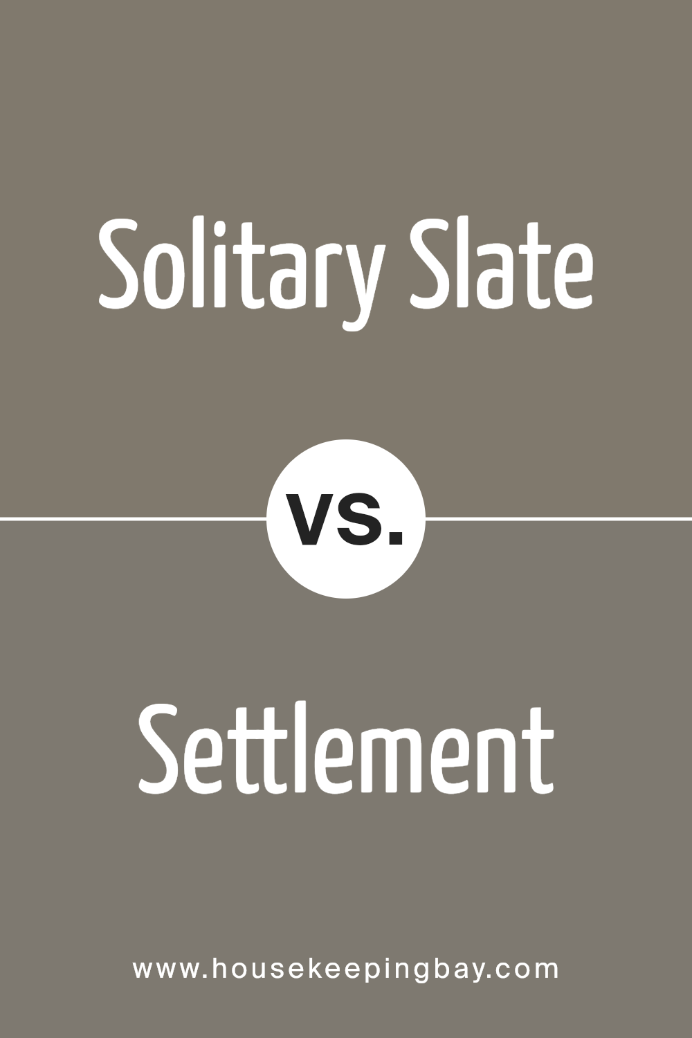
Solitary Slate SW 9598 by Sherwin Williams vs Settlement SW 9594 by Sherwin Williams
Solitary Slate SW 9598 and Settlement SW 9594, both by Sherwin Williams, offer distinct characteristics, though they share some similarities. Solitary Slate is a deep and calming shade of grey, exuding sophistication and elegance. It works well for creating a grounded and refined space, especially in living rooms or home offices.
Settlement SW 9594, while also a grey tone, tends to be slightly warmer. This warmth makes it inviting and comfortable, ideal for family rooms or bedrooms where coziness is desired. It has a hint of brown, which softens the overall feel, making spaces appear welcoming and relaxed.
In summary, Solitary Slate is more formal and cool, perfect for modern or minimalist aesthetics, while Settlement provides warmth and coziness, suitable for spaces that need a touch of softness. Both colors can be versatile, but each brings a unique atmosphere to a room.
You can see recommended paint color below:
- SW 9594 Settlement
housekeepingbay.com
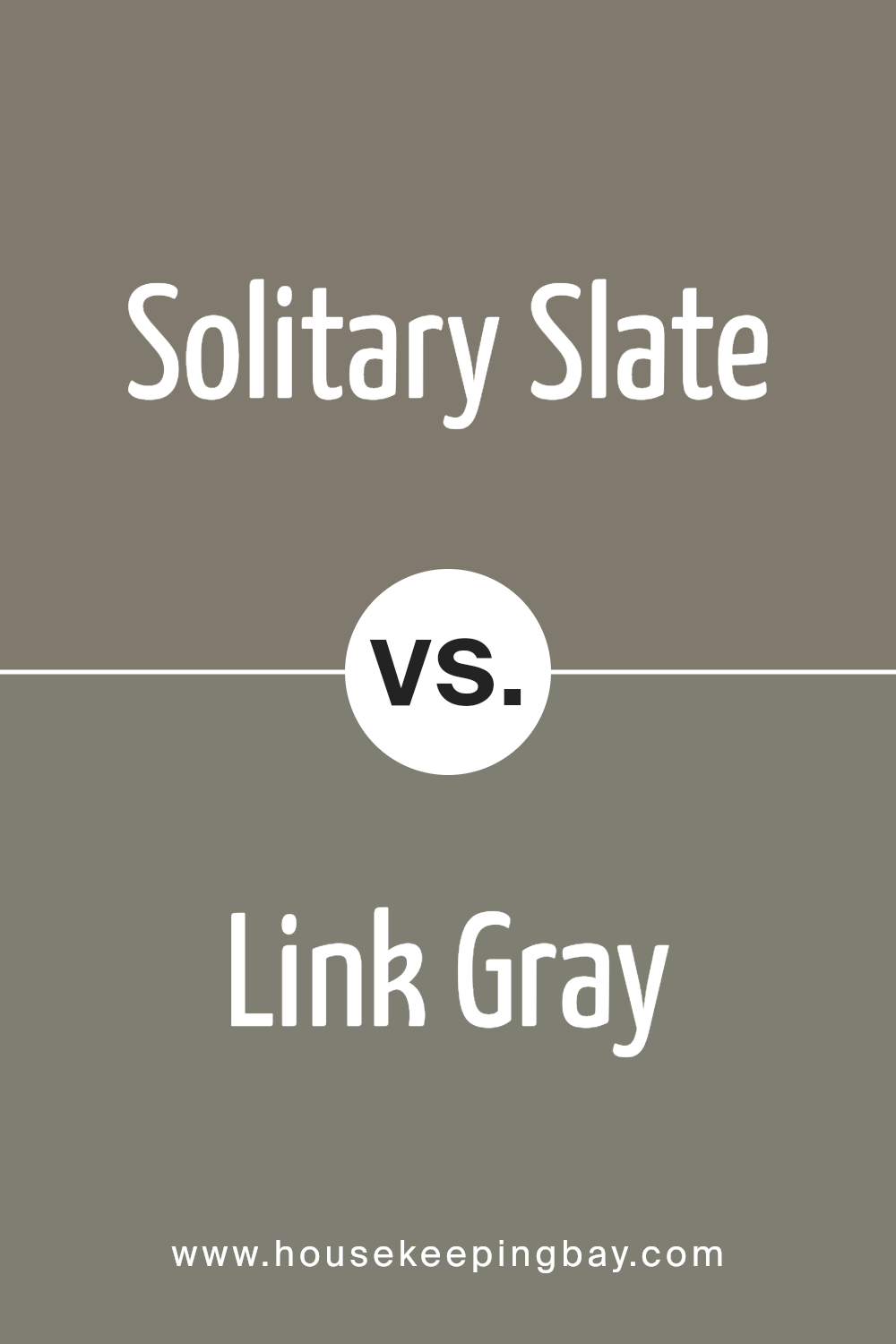
Solitary Slate SW 9598 by Sherwin Williams vs Link Gray SW 6200 by Sherwin Williams
Solitary Slate SW 9598 and Link Gray SW 6200 by Sherwin Williams are two elegant shades that evoke different moods. Solitary Slate is a deep, rich color that brings to mind a sense of calm and depth. It’s a moody shade, perfect for creating a cozy and intimate atmosphere in any room. This color works well in spaces where you want a touch of drama without overpowering the decor.
Link Gray, in contrast, is a lighter and softer shade of gray. It has a pleasant, neutral tone that complements a variety of color palettes. Link Gray can make rooms feel open and airy, making it a versatile choice for many styles, from modern to classic.
It’s an excellent backdrop, letting other colors in the room shine, while still providing a subtle and sophisticated touch.
Together, these colors reflect different aesthetics: Solitary Slate offers boldness and richness, while Link Gray provides softness and versatility.
You can see recommended paint color below:
- SW 6200 Link Gray
housekeepingbay.com
Solitary Slate SW 9598 by Sherwin Williams vs Backdrop SW 7025 by Sherwin Williams
Solitary Slate SW 9598 by Sherwin Williams is a profound, muted blue-gray that creates a calm and sophisticated atmosphere. It offers a sense of stability and works well in spaces where you desire a serene environment. It’s a bit darker, adding depth without feeling overbearing.
Backdrop SW 7025, also by Sherwin Williams, presents a warm, versatile greige tone. It strikes a balance between gray and beige, making it a popular choice for minimalist and modern designs. This color brings warmth and comfort, enhancing various decor styles.
Both colors share a neutral quality but differ in their emotional impact. Solitary Slate carries a coolness perfect for relaxation, while Backdrop’s warmth provides coziness. They work beautifully together in a palette, with Solitary Slate accenting cooler areas and Backdrop adding a touch of warmth to living spaces. Both lend elegance, each imparting a unique mood.
You can see recommended paint color below:
housekeepingbay.com
Solitary Slate SW 9598 by Sherwin Williams vs Lauriston Stone SW 9593 by Sherwin Williams
Solitary Slate SW 9598 and Lauriston Stone SW 9593 by Sherwin Williams both offer rich, earthy tones, yet they each bring their unique character to any space. Solitary Slate is a darker, more intense grey with blue undertones. It provides a strong, sophisticated feel, making it suitable for spaces where you want a cozy, intimate atmosphere. This color works well with both traditional and modern decor.
Lauriston Stone, by contrast, carries a lighter, warmer hue with hints of beige. This color feels more welcoming and natural, adding warmth and a sense of openness. It can be a great choice for rooms where you want to promote comfort and relaxation.
Lauriston Stone pairs well with whites and other light neutrals for a bright, airy effect.
Combining these colors offers a nice balance—using Solitary Slate for accent walls or furniture makes a bold statement, while Lauriston Stone keeps the overall vibe inviting.
You can see recommended paint color below:
- SW 9593 Lauriston Stone
housekeepingbay.com
Solitary Slate SW 9598 by Sherwin Williams vs Warm Stone SW 7032 by Sherwin Williams
Solitary Slate SW 9598 and Warm Stone SW 7032 both offer unique tones suitable for various spaces, yet they differ in mood and effect. Solitary Slate is a muted gray-blue, creating a cool, calming atmosphere. Perfect for bedrooms or offices, this color brings a sense of serenity without being cold. It pairs well with whites and other soft hues, complementing contemporary or minimalist designs.
In contrast, Warm Stone is a taupe with a cozy undertone. This versatile color exudes warmth, making it ideal for living rooms or kitchens where comfort is key. Its balanced nature can enhance wood tones and earthy elements, fostering an inviting ambiance.
While Solitary Slate lends a sleek, sophisticated vibe, Warm Stone enriches spaces with soothing warmth. Both can be used as backdrops or accent walls, but each provides a distinct experience.
Choosing between them depends on whether you seek cool serenity or warm coziness.
You can see recommended paint color below:
housekeepingbay.com
Solitary Slate SW 9598 by Sherwin Williams vs Country Tweed SW 9519 by Sherwin Williams
Solitary Slate SW 9598 and Country Tweed SW 9519 both offer distinct moods and appeal. Solitary Slate SW 9598, a medium gray shade, provides a modern, calm backdrop, lending spaces a clean, sophisticated appearance. Its neutral tone adapts well to various design elements, allowing other colors or textures to stand out while maintaining its subtle elegance.
Country Tweed SW 9519 brings warmth, a cozy touch. This earthy, muted green-brown shade evokes natural, welcoming feels. Ideal for creating inviting spaces, it pairs nicely with wood accents, enhancing the rustic charm.
When used together, Solitary Slate’s cool neutrality contrasts and complements Country Tweed’s warmth, achieving a balanced look. Solitary Slate suits contemporary styles, offering a chic, streamlined look, while Country Tweed adds depth, making rooms feel more inviting.
Each has unique strengths: Solitary Slate for its versatility and crispness, Country Tweed for warmth and natural comfort. Both colors create harmonious, appealing spaces.
You can see recommended paint color below:
- SW 9519 Country Tweed
housekeepingbay.com
Solitary Slate SW 9598 by Sherwin Williams vs Carriage Stone SW 9614 by Sherwin Williams
Solitary Slate SW 9598 by Sherwin Williams is a cool, muted gray with subtle blue undertones. It provides a calming and sophisticated backdrop, making it ideal for modern spaces. Its understated elegance works well in areas aiming for a serene atmosphere. Solitary Slate can pair nicely with whites or lighter grays for a clean, sleek look.
Carriage Stone SW 9614, however, is a warm, earthy gray with hints of beige, creating a cozy and inviting feel. This color is versatile, harmonizing with other warm tones and natural materials like wood. It works well in spaces where a comfortable, welcoming environment is desired.
While Solitary Slate leans towards a more modern and minimalist style, Carriage Stone offers warmth and approachability. Both colors are adaptable and can complement various design elements, yet each brings its unique vibe to a room: Solitary Slate exudes the calmness of a quiet evening, while Carriage Stone envelops you in the warmth of a quaint cottage.
You can see recommended paint color below:
- SW 9614 Carriage Stone
housekeepingbay.com
Solitary Slate SW 9598 by Sherwin Williams vs Adaptive Shade SW 7053 by Sherwin Williams
Solitary Slate SW 9598 and Adaptive Shade SW 7053, both from Sherwin Williams, offer unique traits for home interiors. Solitary Slate is a deep, muted gray-blue. It feels cozy, bringing a soothing, grounded vibe to spaces. This color works well in areas where a calming atmosphere is desired, like bedrooms or reading nooks.
Adaptive Shade SW 7053 presents a warm, taupe-gray mixture. It feels welcoming and versatile, fitting easily with diverse styles and color schemes. Adaptive Shade complements both modern and traditional decor, making it suitable for living rooms or dining areas.
While Solitary Slate leans into cool undertones, Adaptive Shade brings warmth. This difference affects how each color interacts with light and other elements in a room.
Solitary Slate may emphasize a crisp, serene space, whereas Adaptive Shade offers a gentle, inviting backdrop.
Both colors enhance room aesthetics through their distinct yet versatile nature.
You can see recommended paint color below:
housekeepingbay.com
Conclusion
Solitary Slate by Sherwin Williams impresses me as a sophisticated and deep color. Its rich, muted tone provides a versatile backdrop that can enhance any space, whether modern or classic. I find it strikes a perfect balance between boldness and subtlety, making it suitable for those who want a color that’s both strong and inviting.
For me, Solitary Slate’s appeal lies in its ability to create warmth without overwhelming the senses. It pairs beautifully with both light and dark accents, offering a wide range of possibilities for interior design.
This color works well in living rooms for a cozy atmosphere or in bedrooms for a soothing retreat.
Additionally, I appreciate how Solitary Slate adapts to different lighting conditions, revealing various undertones throughout the day. In bright rooms, it offers a gentle, sophisticated charm, while in dimmer spaces, it provides a comforting cocoon-like feel.
Overall, Solitary Slate serves as a reliable choice for anyone looking to add depth and character to their home. Its versatility and elegance make it a timeless option that can complement any style. I see this color as an invitation to create spaces that feel both personal and welcoming.
housekeepingbay.com
Ever wished paint sampling was as easy as sticking a sticker? Guess what? Now it is! Discover Samplize's unique Peel & Stick samples. Get started now and say goodbye to the old messy way!
Get paint samples


