Pink Shadow SW 0070 by Sherwin Williams
Blush Hues for Chic Interiors
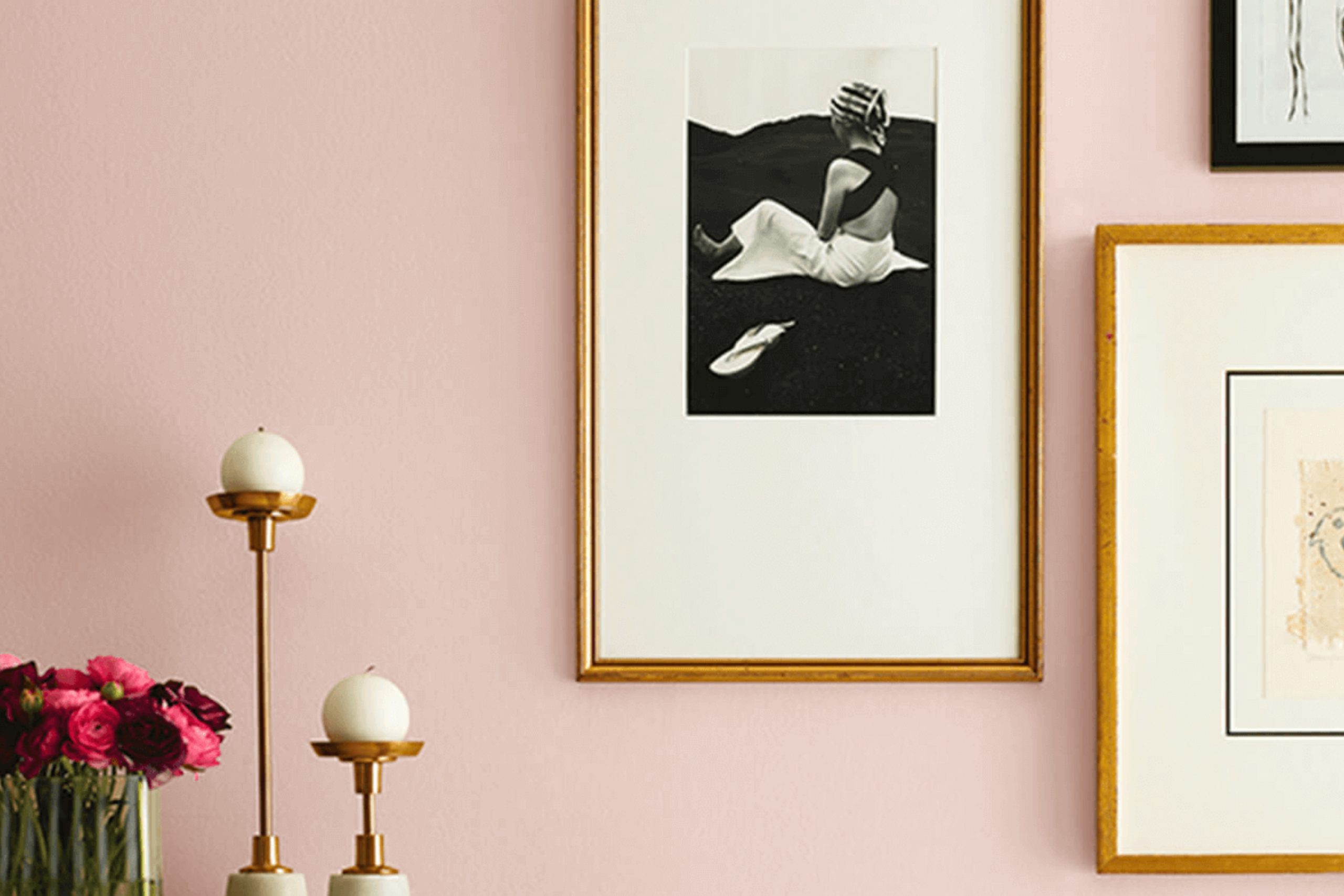
Whar do you think about walking into a room and feeling instantly at ease, as if a gentle sunset has poured its warmth across the walls. That’s the charm of SW 0070 Pink Shadow by Sherwin Williams. This color brings a sense of calm and subtle beauty to any space. It’s not overpowering, yet it leaves an impression.
Pink Shadow is a hue that combines soft pink with a hint of gray, creating a shade that is both refreshing and soothing. It pairs well with a variety of other colors, offering you flexibility in your decorating choices.
Whether you’re painting a bedroom, a living room, or even an office, this color adds a touch of elegance without being too bold.
Visualize it complementing natural materials like wood and stone or sitting comfortably alongside clean, white trim. It’s a color that whispers rather than shouts, letting you create a peaceful environment that encourages relaxation and comfort.
If you’re searching for something that works across different settings, whether modern or classic, Pink Shadow might just be the perfect choice.
You can let your spaces reflect a sense of understated charm with this gentle, inviting hue.
via sherwin-williams.com
What Color Is Pink Shadow SW 0070 by Sherwin Williams?
Pink Shadow SW 0070 from Sherwin Williams is a soft, muted pink that brings a gentle warmth to any space. It’s neither too bold nor too faint, making it a versatile choice for different settings. The color evokes a sense of calm and comfort, reminiscent of a delicate blush.
In terms of interior styles, Pink Shadow works well with both contemporary and traditional designs. In minimalist spaces, it adds a touch of warmth without overpowering the clean lines. In more classic settings, it complements rich woods and detailed moldings.
Pairing Pink Shadow with various materials and textures can create interesting visual contrasts. It works beautifully with natural materials like light wood and stone, adding softness to their more rugged textures. Metallic finishes such as gold or brass can bring a bit of glamour, while soft textiles like linen, cotton, or velvet enhance its cozy appeal.
For accessories, consider using natural fibers like jute or rattan, which blend seamlessly with the color’s understated warmth. Crisp white trim can make walls painted in Pink Shadow stand out, while darker accents like charcoal or navy can add depth.
Overall, it’s a versatile hue that brings subtle sophistication to many different interiors.
housekeepingbay.com
Is Pink Shadow SW 0070 by Sherwin Williams Warm or Cool color?
Pink Shadow SW 0070 by Sherwin Williams offers a soft, delicate hue that adds warmth and gentleness to any room. Its pale pink tone creates a welcoming and airy atmosphere, making spaces feel larger and more inviting. This color is versatile, working well in various settings like living rooms, bedrooms, and nurseries.
When paired with white or neutral accents, Pink Shadow provides a clean, fresh look. Combining it with metallic elements can add a touch of elegance. Its calming presence makes it especially suitable for spaces meant for relaxation, such as bedrooms or reading nooks.
The color reflects light beautifully, enhancing brightness in areas with natural sunlight.
Pink Shadow SW 0070 brings a subtle touch of color without overwhelming the senses, making it a popular choice for those looking to add a hint of color while maintaining a serene and pleasant environment in their home.
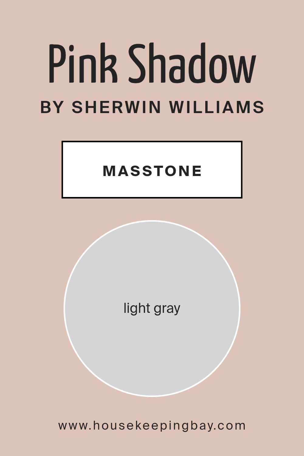
What is the Masstone of the Pink Shadow SW 0070 by Sherwin Williams?
Pink Shadow SW 0070 by Sherwin Williams is a soft and subtle color. Its masstone, light gray (#D5D5D5), plays a big role in how this color feels in a room. The light gray base gives the pink a softer, more muted tone, making it gentle and relaxing.
In homes, this color works well because it creates a calm and peaceful atmosphere. The touch of pink adds warmth and coziness, making spaces feel more inviting. It’s a versatile choice, ideal for bedrooms or living rooms where you want a sense of comfort.
The light gray masstone also helps the color blend easily with other shades. It pairs nicely with whites and other neutrals, creating a harmonious look. Pink Shadow can also complement darker grays or earthy tones for a balanced design. Overall, this color is a lovely choice for a welcoming and serene home environment.
housekeepingbay.com
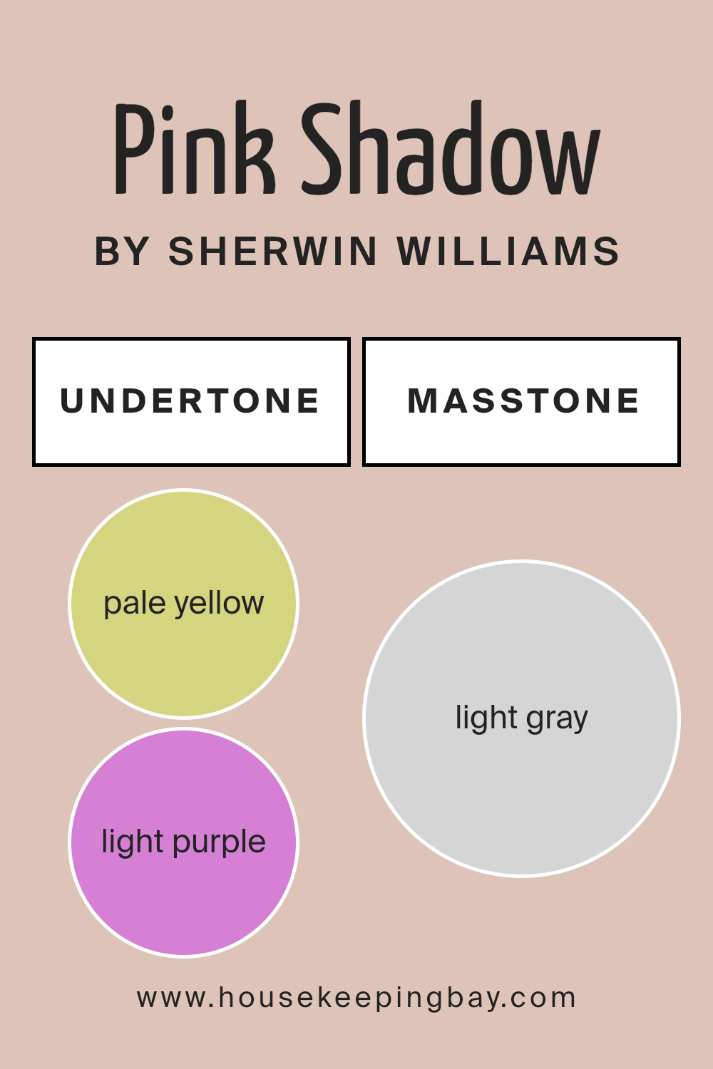
Undertones of Pink Shadow SW 0070 by Sherwin Williams
Pink Shadow SW 0070 by Sherwin Williams presents a delightful blend of undertones that subtly influence how we perceive this color. At its core, it boasts a soft pink, but the various undertones infuse complexity and depth.
The pale yellow (#D5D580) gives the color warmth, making spaces feel more inviting and comfortable. This warmth counterbalances the cooler undertones like light blue (#80D5D5) and light purple (#D580D5), lending the color a sense of balance and neutrality.
Pale pink (#D58080) enriches the base color, enhancing its gentle quality. The mint (#80D580) and lilac (#8080D5) tones introduce a fresh, airy feeling, perfect for adding lightness to any room.
Grey (#808080) undertones introduce a muted quality, providing sophistication and calming influence, ensuring the color doesn’t overwhelm. These undertones work together to create a versatile shade well-suited for interior walls.
When applied in a room, Pink Shadow can adapt based on lighting and surrounding decor, appearing warmer or cooler, depending on the environment.
This versatility makes it an excellent option for various styles, adding subtle elegance without overpowering other elements in the space.
Overall, the intricate undertones of Pink Shadow shape a pleasant, adaptable color that enhances interior walls with understated charm and warmth.
housekeepingbay.com
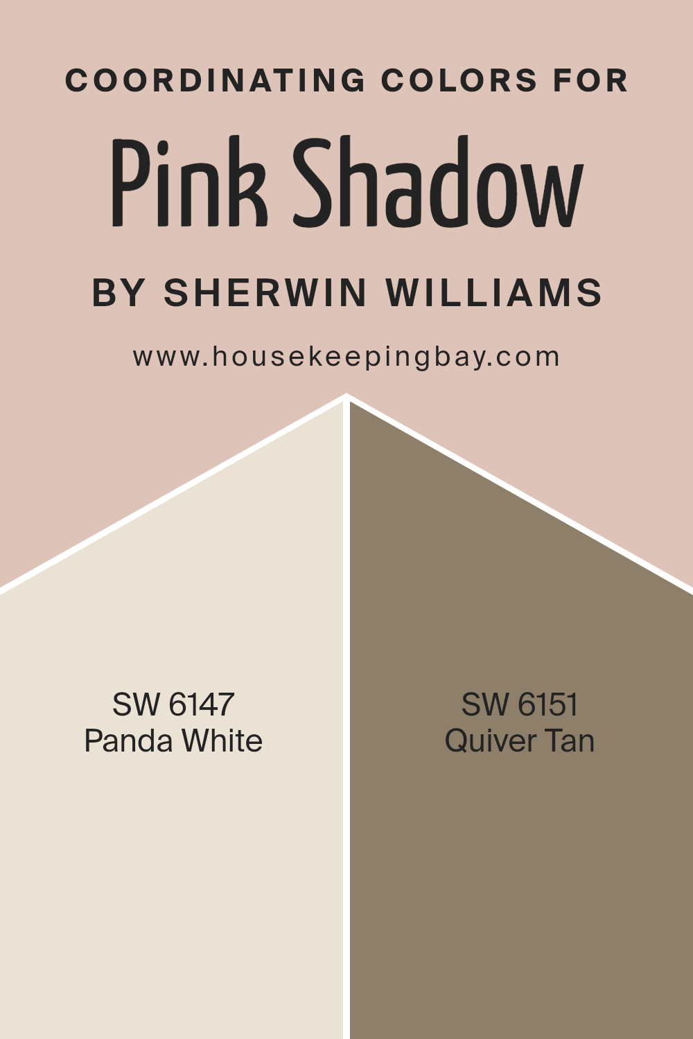
Coordinating Colors of Pink Shadow SW 0070 by Sherwin Williams
Coordinating colors are those that work well together to create a harmonious look. When selecting coordinating colors for Pink Shadow SW 0070 by Sherwin Williams, consider using SW 6147 – Panda White and SW 6151 – Quiver Tan.
These colors complement Pink Shadow beautifully by enhancing its soft, warm undertones and bringing balance to the overall palette.
Panda White is a light, warm neutral with subtle beige undertones. It provides a versatile backdrop that pairs seamlessly with the delicate tones of Pink Shadow, making spaces feel inviting and gentle. Quiver Tan, on the other hand, offers a rich, earthy hue that grounds the airy feel of Pink Shadow.
It adds depth and character, creating an overall cohesive look that enhances the beauty of the pink shade. Together, these colors create a pleasing aesthetic suitable for any room, making spaces feel connected and unified.
You can see recommended paint colors below:
- SW 6147 Panda White
- SW 6151 Quiver Tan
housekeepingbay.com
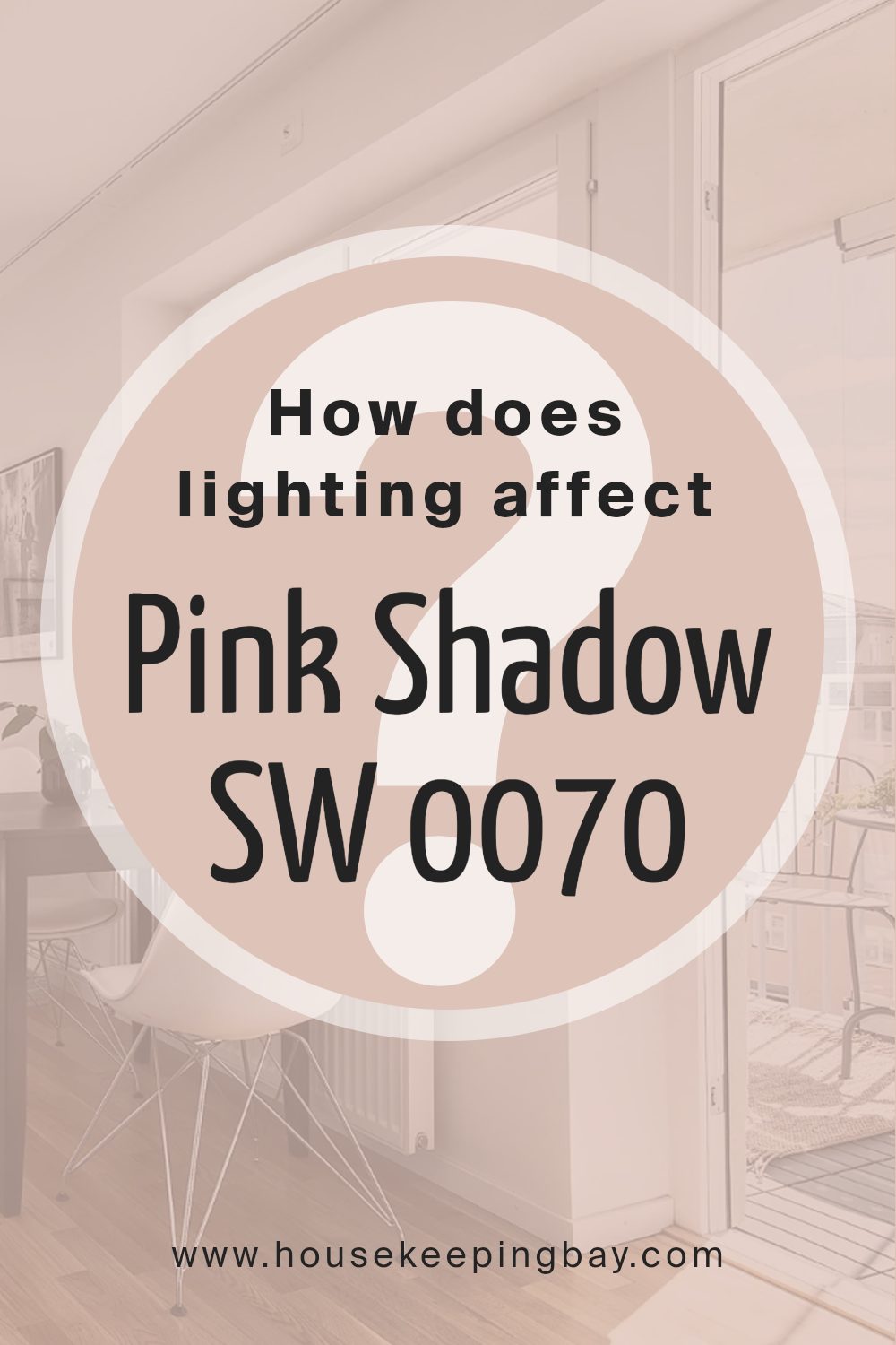
How Does Lighting Affect Pink Shadow SW 0070 by Sherwin Williams?
Lighting has a significant impact on how colors appear. The type, direction, and intensity of light can change our perception of colors, sometimes drastically. The Sherwin Williams color Pink Shadow SW 0070 provides a good example of how colors behave under different lighting conditions.
In natural light, Pink Shadow can appear soft and muted. The time of day and direction the room faces will further alter its appearance. In a north-facing room, natural light—often cooler and softer—tends to bring out a slightly bluer tint in colors.
Thus, Pink Shadow might look a bit cooler and subdued. In contrast, south-facing rooms receive abundant, warm light most of the day, which can make Pink Shadow seem more vibrant and warmer. This room positioning enhances the softer, pinkish hues in the color.
East-facing rooms get bright, morning light that is warm and soft, so Pink Shadow will look warm and inviting at the start of the day. Later in the day, as the sunlight fades, the room may take on a cooler tone, and the walls may seem more muted.
West-facing rooms experience the opposite: they receive strong afternoon and evening light, which can make Pink Shadow appear a bit richer and more intense during those times, especially as the day turns to dusk.
When it comes to artificial lighting, Pink Shadow can change depending on the bulb type. With incandescent or warm LED lights, the color appears warmer and cozier due to the yellow undertones in these lights.
Cool LED or fluorescent lights, which emit more blue tones, may make the pink appear cooler, sometimes even duller.
In conclusion, Pink Shadow SW 0070 can shift in tone and intensity based on lighting conditions. The room’s orientation and the light source both play integral roles in how this color is perceived on walls.
housekeepingbay.com
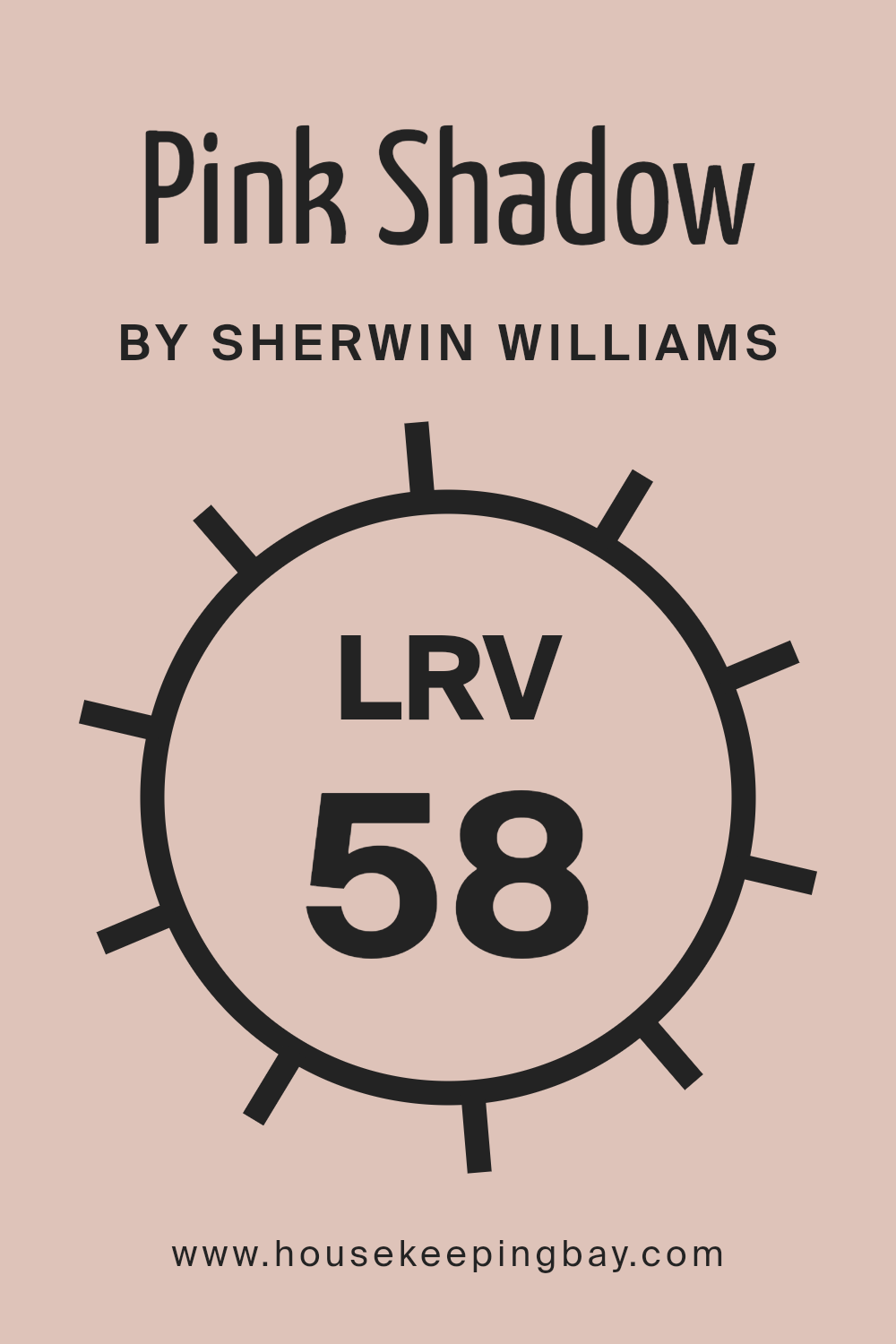
What is the LRV of Pink Shadow SW 0070 by Sherwin Williams?
LRV, or Light Reflectance Value, measures the amount of visible light a color reflects. It’s expressed as a percentage between 0 and 100. A color with an LRV of 0 is completely black, reflecting no light, while a color with an LRV of 100 is pure white, reflecting all light.
This value plays an important role in how colors appear in a room. Colors with higher LRV numbers will make a space feel brighter and more open because they reflect more light, while colors with lower LRV numbers absorb more light, making a room feel warmer and cozier.
Pink Shadow SW 0070 has an LRV of 58.27, which means it reflects a moderate amount of light. This makes it versatile, working well in different lighting conditions. In a room with lots of natural light, Pink Shadow will reflect enough light to keep the space feeling airy and comfortable.
However, in smaller or darker spaces, this shade won’t overpower the area but will still add enough brightness to keep the room lively.
With its balanced LRV, Pink Shadow maintains its soft, subtle pink hue, preventing it from feeling too intense or overwhelming in a room.
housekeepingbay.com
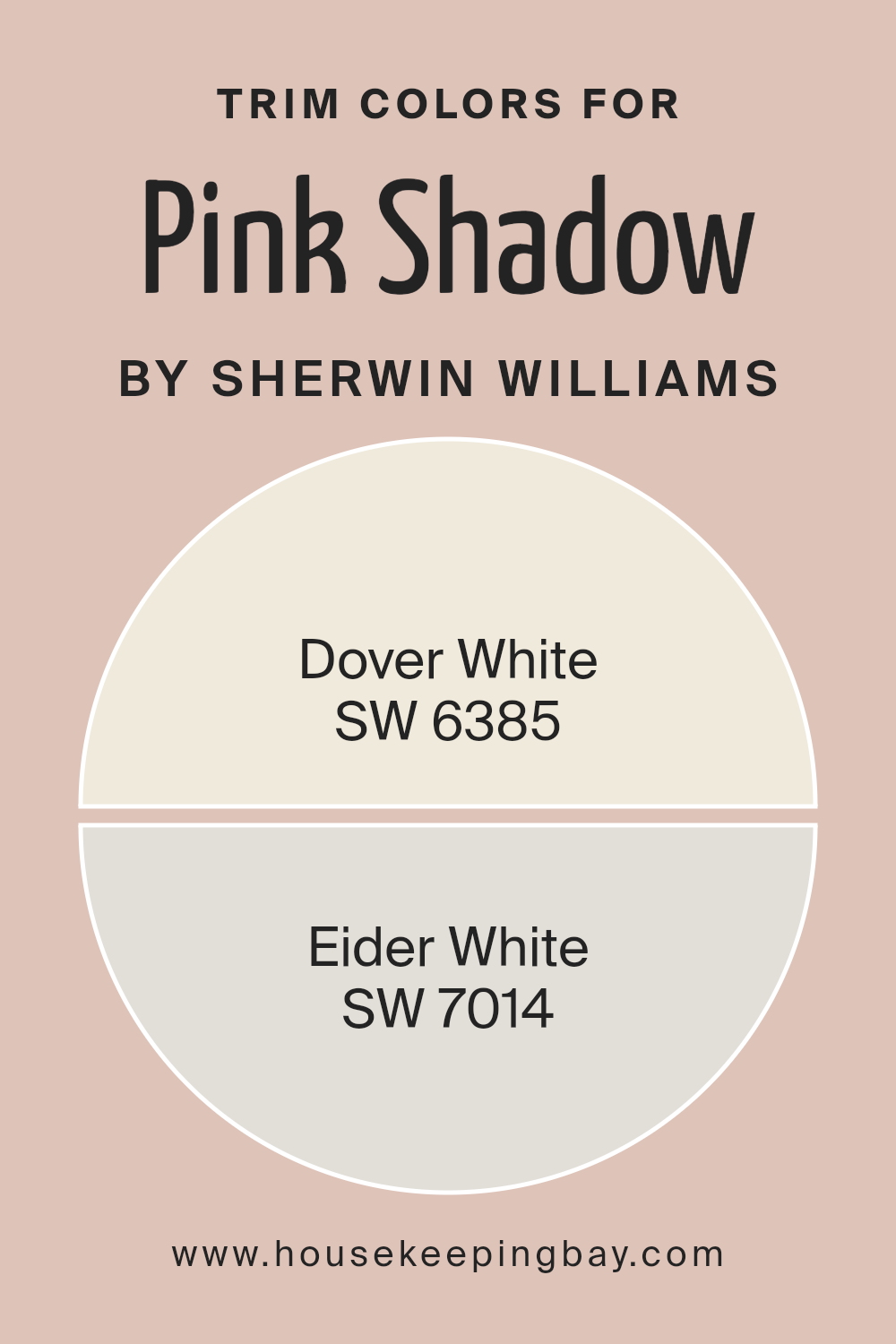
What are the Trim colors of Pink Shadow SW 0070 by Sherwin Williams?
Trim colors are the shades used on the edges or borders of walls, door frames, and window sills to enhance the main wall color. Choosing the right trim color for a room painted in Pink Shadow SW 0070 by Sherwin Williams can greatly impact the overall appearance and feel of the space.
The subtle pink hue of Pink Shadow can be beautifully complemented by different trim colors, which add contrast and depth, making the room look well put together. Trim colors help to define spaces and bring a crisp, finished look to the interiors.
In this context, the selection of appropriate trim colors can help highlight the interiors’ grace and charm.
Dover White SW 6385 serves as an excellent choice for a trim color due to its warm and creamy tone. It creates a soft contrast with Pink Shadow, adding warmth and brightness. Eider White SW 7014, on the other hand, offers a cooler, more neutral option.
Its gray undertones work to subtly frame the pink, providing a modern and balanced look. Both of these trim colors not only enhance the Pink Shadow walls but also offer different atmospheres.
Dover White would give a cozier feel, while Eider White adds a modern edge.
You can see recommended paint colors below:
housekeepingbay.com
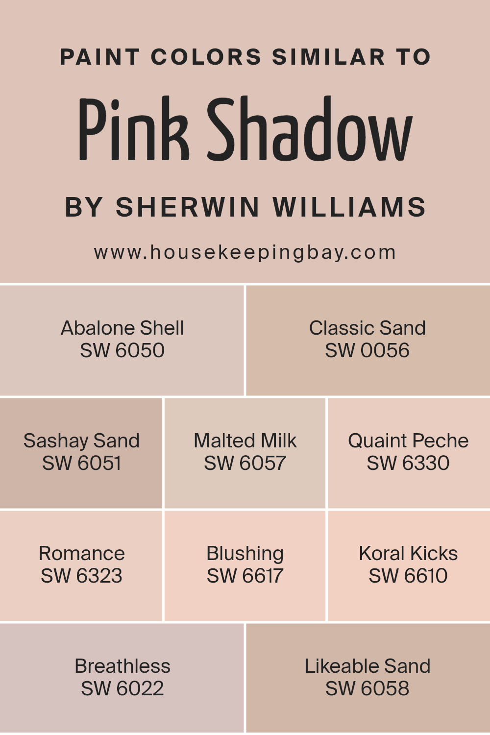
Colors Similar to Pink Shadow SW 0070 by Sherwin Williams
Similar colors are important because they help create a harmonious and cohesive atmosphere in a space. When colors share undertones or have similar hues, they naturally complement each other, creating a more unified look. These colors can be used to create layers, depth, and continuity in both interior and exterior design.
For example, Abalone Shell is a soft, warm neutral that pairs well with other gentle tones. Classic Sand offers a timeless beige that provides a grounding base. Sashay Sand, with its light, earthy undertones, adds warmth without being overpowering. Malted Milk, a creamy beige, brings a cozy feel.
Quaint Peche is a delicate peach, offering a hint of color with subtlety.
Romance brings a soft pink hue that adds a touch of sweetness. Blushing captures a rosy warmth that feels inviting and cheerful. Koral Kicks, with its coral undertone, adds a splash of lively color. Breathless is a pale pink that creates a sense of lightness and openness.
Likeable Sand combines beige with a whisper of pink, making it versatile for various settings. These colors, similar to Pink Shadow by Sherwin Williams, work together effortlessly, allowing for a beautiful and balanced environment. Each color has its own character, but they all belong to the same gentle family, creating a soothing and unified palette.
You can see recommended paint colors below:
- SW 6050 Abalone Shell
- SW 0056 Classic Sand
- SW 6051 Sashay Sand
- SW 6057 Malted Milk
- SW 6330 Quaint Peche
- SW 6323 Romance
- SW 6617 Blushing
- SW 6610 Koral Kicks
- SW 6022 Breathless
- SW 6058 Likeable Sand
housekeepingbay.com
How to Use Pink Shadow SW 0070 by Sherwin Williams In Your Home?
Pink Shadow SW 0070 by Sherwin Williams offers a soft, soothing pink shade that works beautifully in various spaces. Incorporate this color into a bedroom to create a gentle, calm atmosphere ideal for relaxation. As an accent wall, it harmonizes well with neutral tones, adding a touch of warmth and coziness without overwhelming the space.
In a living room, Pink Shadow provides a unique backdrop for art and decor, allowing other colors to pop while maintaining a cohesive, elegant look. Pair it with light gray or beige furniture for a balanced, inviting environment.
In bathrooms, it introduces a hint of softness, making mornings brighter and more cheerful.
For kid’s rooms, this pink hue adds a playful yet not too intense tone, complementing both modern and classic styles. Pink Shadow brings subtle charm to any room, enhancing comfort while remaining versatile and stylish.
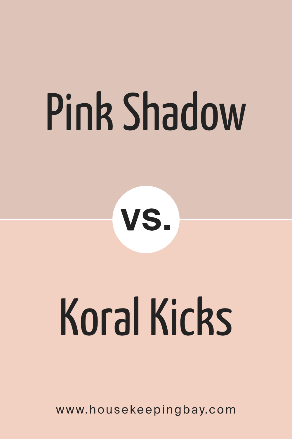
Pink Shadow SW 0070 by Sherwin Williams vs Koral Kicks SW 6610 by Sherwin Williams
Pink Shadow SW 0070 and Koral Kicks SW 6610 by Sherwin Williams each offer distinct vibes and personalities. Pink Shadow is a soft, muted pink that feels gentle and subtle, making spaces feel cozy and warm. It has an understated elegance, perfect for creating a calming atmosphere in bedrooms or living spaces. Its quiet charm allows it to blend well with neutrals and pastels.
Koral Kicks, meanwhile, is a bold, lively coral. It has a vibrant energy that stands out, bringing enthusiasm and cheer into any room. This color works well in spaces where energy and creativity are desired, such as playrooms or kitchens.
Pairing well with whites or lighter warm tones, it creates a fresh and lively setting.
While Pink Shadow whispers comfort and simplicity, Koral Kicks shouts fun and excitement. Each color adds its unique flair, transforming spaces with distinct moods, whether seeking calm or energy.
You can see recommended paint color below:
housekeepingbay.com
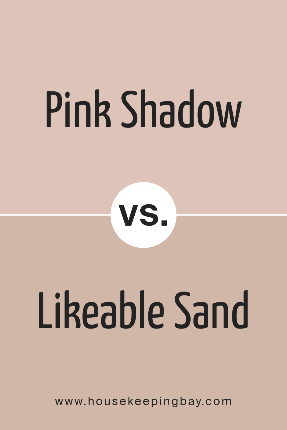
Pink Shadow SW 0070 by Sherwin Williams vs Likeable Sand SW 6058 by Sherwin Williams
Pink Shadow SW 0070 by Sherwin Williams presents a delicate blend of pink with a subtle undertone that lends a soft, airy feel to any space. Its light hue makes rooms feel open and inviting. This color adds a gentle warmth without overwhelming, which suits living rooms, bedrooms, and nurseries, offering a sense of calm and relaxation. It pairs beautifully with neutral tones and fresh whites.
Likeable Sand SW 6058, also by Sherwin Williams, takes a different approach with its warm, earthy beige. This comforting color invokes a sense of coziness and grounded stability. With a hint of rosy undertones, Likeable Sand offers depth and versatility.
Ideal for larger spaces like kitchens and family rooms, it creates an inviting atmosphere that balances well with wood accents and rich tones.
Pink Shadow brings light and freshness, while Likeable Sand offers warmth and coziness. Both colors provide a welcoming environment but feature distinct moods and applications.
You can see recommended paint color below:
- SW 6058 Likeable Sand
housekeepingbay.com
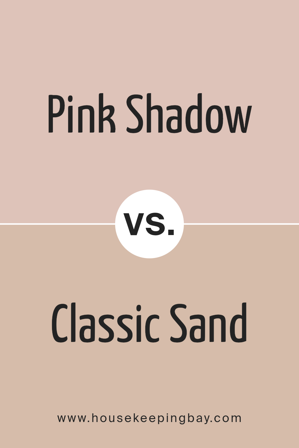
Pink Shadow SW 0070 by Sherwin Williams vs Classic Sand SW 0056 by Sherwin Williams
Pink Shadow SW 0070 by Sherwin Williams is a soft and muted pink. It radiates warmth and comfort, creating a sense of coziness in any space. The color is subtle, not overpowering, making rooms feel inviting and gentle. It’s a versatile choice, suitable for bedrooms or living areas where relaxation is key.
Classic Sand SW 0056 offers a different feel. This color is a light, sandy beige that echoes the feel of natural sand. It’s neutral, which means it pairs easily with many other colors and materials. Classic Sand can brighten up a room without making it feel cold.
Both colors bring their own charm, with Pink Shadow adding a touch of warmth and Classic Sand providing neutrality and balance. Together, they can create a harmonious and cohesive look, with Pink Shadow bringing warmth to spaces where Classic Sand offers a calm, neutral backdrop.
You can see recommended paint color below:
- SW 0056 Classic Sand
housekeepingbay.com
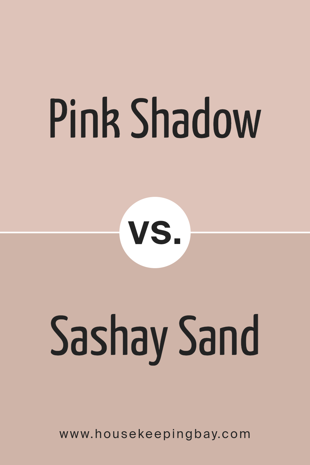
Pink Shadow SW 0070 by Sherwin Williams vs Sashay Sand SW 6051 by Sherwin Williams
Pink Shadow SW 0070 by Sherwin Williams and Sashay Sand SW 6051 both bring warmth and softness, yet they shine in different ways. Pink Shadow is a gentle shade with a hint of purplish undertones, making it feel romantic and soothing. It’s perfect for spaces where you want to create a calming and cozy atmosphere.
Sashay Sand, on the other side, leans more towards a beige tone with a touch of pink. It’s versatile and works well in living rooms, kitchens, or bedrooms where you want a neutral but warm backdrop.
While Pink Shadow has a more pronounced pink hue, Sashay Sand remains subtle with its sand-like quality.
Both colors are excellent choices, depending on whether you want a room to feel like a quiet oasis with Pink Shadow or a warm, inviting space with Sashay Sand. Either color adds a gentle, welcoming touch to any room.
You can see recommended paint color below:
housekeepingbay.com
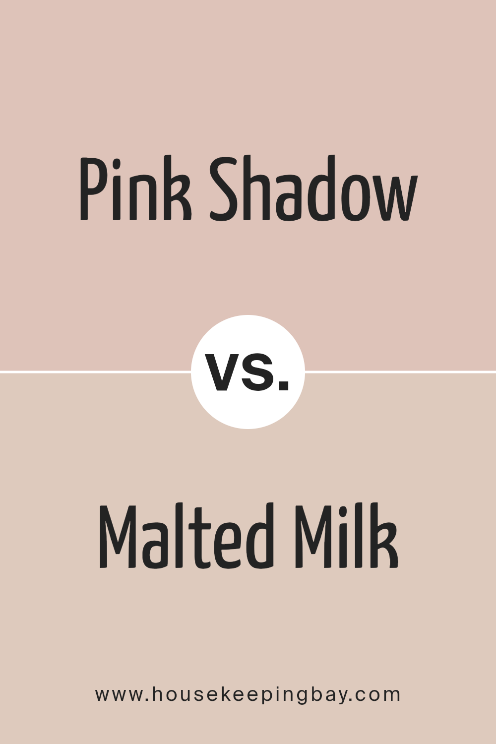
Pink Shadow SW 0070 by Sherwin Williams vs Malted Milk SW 6057 by Sherwin Williams
Pink Shadow SW 0070 by Sherwin Williams and Malted Milk SW 6057 offer distinct personalities for any space. Pink Shadow is a soft, muted pink with a delicate, serene presence. It evokes warmth and subtle elegance, making it a good choice for creating a cozy and inviting atmosphere in places like bedrooms or living rooms.
Malted Milk SW 6057, contrastingly, is a warm beige with creamy undertones. It’s gentle and versatile, providing a neutral backdrop that pairs well with other colors. This shade offers a sense of comfort and works well in various settings, whether in kitchens, bathrooms, or hallways.
While Pink Shadow brings a gentle touch of color, Malted Milk leans more neutral and understated. Their soft hues offer flexibility in design, allowing them to complement or highlight different elements in a room without overwhelming. Both colors provide a warm vibe but achieve it with their unique tones and depth.
You can see recommended paint color below:
- SW 6057 Malted Milk
housekeepingbay.com
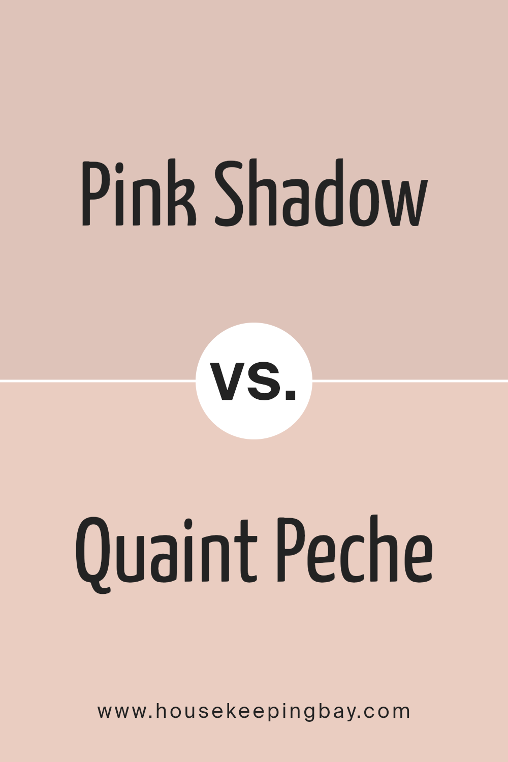
Pink Shadow SW 0070 by Sherwin Williams vs Quaint Peche SW 6330 by Sherwin Williams
Pink Shadow SW 0070 and Quaint Peche SW 6330, both by Sherwin Williams, offer charming yet distinct hues suitable for different settings. Pink Shadow is a soft, muted shade, exuding a gentle, calm vibe. It leans towards a subtle, dusty pink, making it perfect for creating cozy, warm spaces without being overpowering.
Quaint Peche, however, carries a slightly different tone. It has a warm, peachy undertone, imparting a cheerful, fresh feeling. This color can brighten a room and is ideal for spaces where you want a lively, inviting atmosphere.
While Pink Shadow provides a serene and soft backdrop, Quaint Peche brings in a sense of warmth with a hint of playfulness. Both colors work well in living areas, bedrooms, or any space where you wish to introduce comfort and warmth. Combining them in a complementary palette could yield stylish, harmonious interiors with contrasting vibes.
You can see recommended paint color below:
- SW 6330 Quaint Peche
housekeepingbay.com
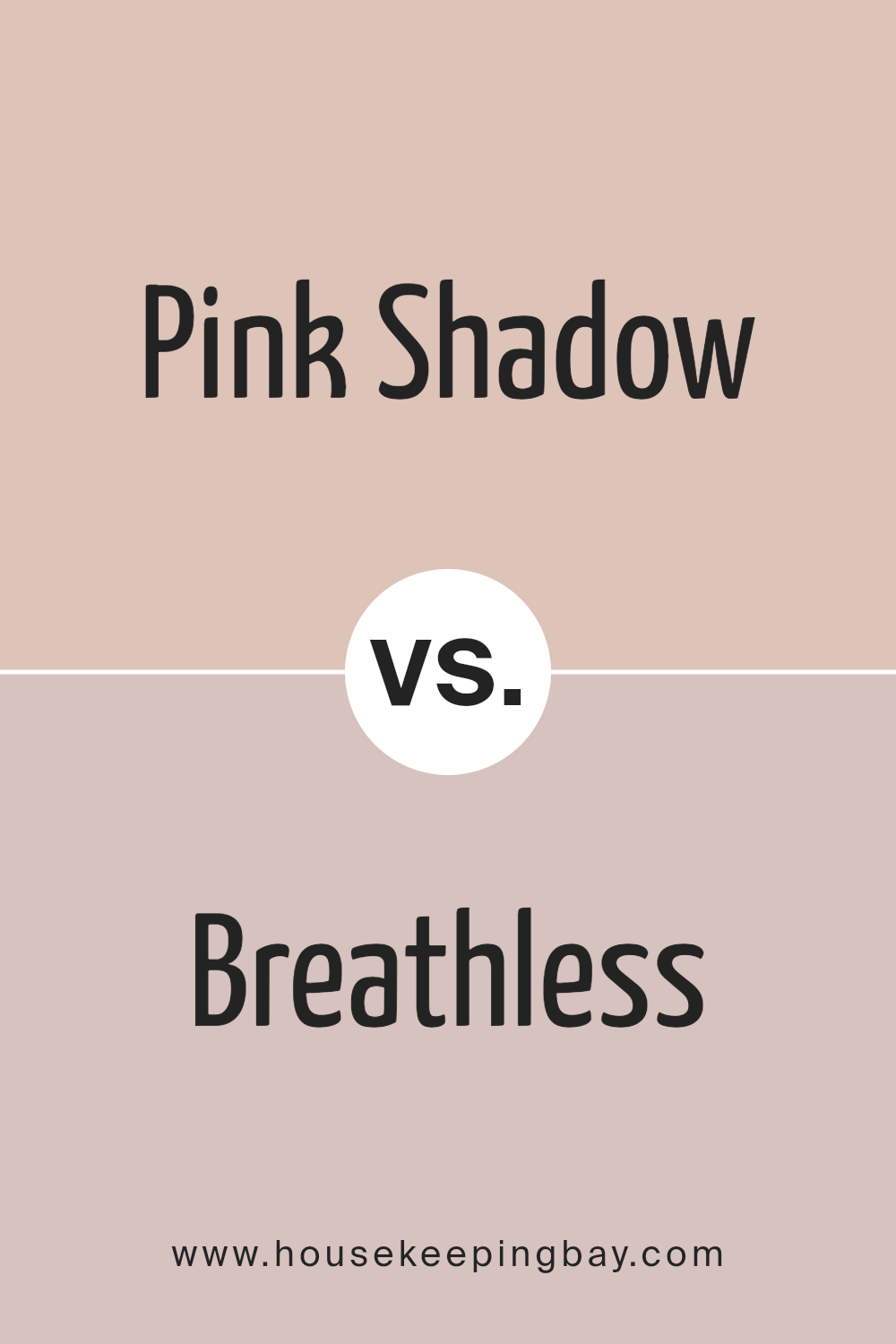
Pink Shadow SW 0070 by Sherwin Williams vs Breathless SW 6022 by Sherwin Williams
Pink Shadow SW 0070 and Breathless SW 6022 are both charming colors by Sherwin Williams, each bringing its own unique feel. Pink Shadow is a soft, elegant pink with a subtle warm undertone. It creates a comforting and gentle atmosphere. This color can add a touch of romance and calm to any room, making it ideal for bedrooms or living spaces where relaxation is desired.
Breathless is another light pink shade, but it leans towards a cooler tone with a hint of gray. It feels more muted and sophisticated, offering a modern twist to the classic pink. Breathless can make spaces feel airy and refined, perfect for those seeking a delicate balance of warmth and neutrality.
While both colors belong to the pink family, Pink Shadow gives more warmth and charm, whereas Breathless provides a cooler, more subdued elegance, allowing you to tailor the mood of your space according to your preference.
You can see recommended paint color below:
- SW 6022 Breathless
housekeepingbay.com
Pink Shadow SW 0070 by Sherwin Williams vs Romance SW 6323 by Sherwin Williams
Pink Shadow SW 0070 and Romance SW 6323 by Sherwin Williams both fall under the pink color family, yet they present distinct moods and applications. Pink Shadow is a muted, soft hue that carries a subtle gray undertone. It feels calm and understated, making it ideal for spaces that need a gentle touch, like a bedroom or a nursery.
Romance SW 6323, however, offers a more vibrant and richer pink. This color exudes warmth and energy, making it suitable for living spaces where you want to create a lively and inviting atmosphere.
Romance’s brighter tone can add a playful or romantic element to a room, perfect for adding personality and charm.
Both colors can effectively complement various design styles, but their differences lie in intensity and mood. Pink Shadow lends itself to a serene environment, while Romance can invigorate a space with its bolder presence. Choosing between them depends on the desired ambiance.
You can see recommended paint color below:
- SW 6323 Romance
housekeepingbay.com
Pink Shadow SW 0070 by Sherwin Williams vs Abalone Shell SW 6050 by Sherwin Williams
Pink Shadow SW 0070 by Sherwin Williams is a light, soft pink that provides a gentle, cheerful feel. It has a warm tone that can add a touch of subtle elegance to a room without being too bold or overwhelming. This color suggests a cozy and inviting atmosphere, perfect for spaces where you want to promote comfort and warmth.
Abalone Shell SW 6050, also by Sherwin Williams, has a more neutral and understated appearance. It leans towards a beige or taupe hue with slight hints of warmth, making it versatile and suitable for many interior styles.
This color provides a subtle backdrop that works well in a variety of settings, offering a sense of calm and balance.
While Pink Shadow is more playful and inviting, Abalone Shell offers a neutral base that can easily complement a wide range of other colors and designs. Both colors serve to create distinct moods and aesthetics within a space.
You can see recommended paint color below:
- SW 6050 Abalone Shell
housekeepingbay.com
Pink Shadow SW 0070 by Sherwin Williams vs Blushing SW 6617 by Sherwin Williams
Pink Shadow SW 0070 and Blushing SW 6617 by Sherwin Williams both belong to the pink family, yet they have distinct personalities. Pink Shadow tends to be a softer, muted pink with a touch of gray, providing a gentle and subtle feel. This color is perfect for creating a calming and quiet atmosphere, making it suitable for bedrooms or spaces where a soft ambiance is preferred.
In contrast, Blushing SW 6617 is a lively, bright pink with a hint of warmth. It brings energy and cheerfulness to a room, making it ideal for playful spaces like a kid’s room or a vibrant accent wall. This shade has more intensity, adding a sense of warmth and joy.
Both colors are harmonious in their own right, offering different moods. Pink Shadow is like a whisper, while Blushing is more like a cheerful conversation, providing versatility depending on the mood you wish to set.
You can see recommended paint color below:
- SW 6617 Blushing
housekeepingbay.com
Conclusion
SW 0070 Pink Shadow by Sherwin Williams is an incredibly versatile shade that brings warmth and charm into any space. In my experience, it strikes the perfect balance between soft and sophisticated. The muted rose tones blend beautifully in various settings, making it suitable for both modern and traditional designs.
This color works well in living rooms and bedrooms, offering a cozy atmosphere that encourages relaxation. It pairs wonderfully with neutral tones like grays and beiges, but also complements deeper colors such as navy or emerald.
Pink Shadow can be an excellent backdrop for a more minimalist décor, while also highlighting vibrant accents and patterns for those who prefer a bolder style.
When I painted my space with Pink Shadow, I noticed how well it captures light, transitioning elegantly through different times of the day. Mornings felt refreshing, and evenings had a more intimate and calming vibe.
This adaptability creates an inviting environment that feels personal and unique.
Choosing a color can be a bold yet rewarding step, and Pink Shadow never disappoints. It’s a shade that brings out the best in other colors and also stands strong on its own.
Whether I’m entertaining guests or enjoying a quiet evening, I find Pink Shadow offers exactly what I need. It’s a choice I recommend for anyone looking to refresh their space elegantly and timelessly.
housekeepingbay.com
Ever wished paint sampling was as easy as sticking a sticker? Guess what? Now it is! Discover Samplize's unique Peel & Stick samples. Get started now and say goodbye to the old messy way!
Get paint samples


