Koral Kicks SW 6610 by Sherwin Williams
Unleashing the Power of Bold Coral Tones
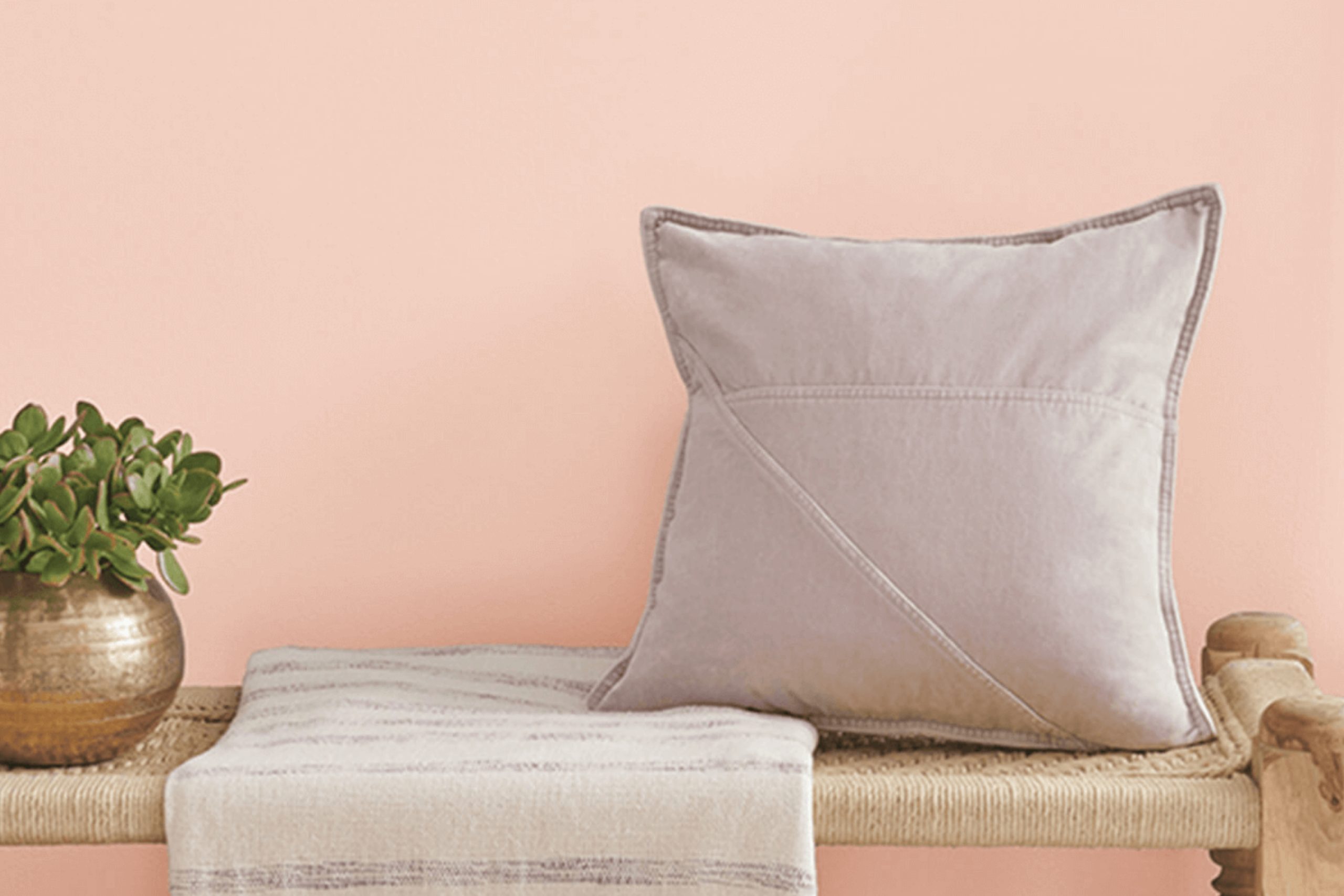
Let me introduce you to SW 6610 Koral Kicks by Sherwin Williams, a vibrant and energetic paint color that might be exactly what you need to liven up your home. Koral Kicks brings a cheerful vibe with its bright, inviting hue that can instantly make a room feel more welcoming and lively.
Choosing the right paint color can sometimes be tricky, but Koral Kicks is perfect if you want a shade that combines energy with sophistication. It works wonderfully in spaces that need a touch of brightness, such as living rooms, kitchens, or even on an accent wall that you want to highlight.
This color isn’t just pretty to look at; it also creates a warm, positive atmosphere that makes everyone feel right at home.
Think about where you can see this color in your own home. Whether you’re refreshing a tired-looking space or just want to inject some new life into a room, Koral Kicks could be your go-to solution. It’s easy to match with modern decorations and styles, making it a hassle-free choice for your next renovation project.
So, why not give Koral Kicks a try and see how it can transform your space with its vibrant charm?
via sherwin-williams.com
What Color Is Koral Kicks SW 6610 by Sherwin Williams?
Koral Kicks SW 6610 by Sherwin Williams is a vibrant, energetic shade of coral that adds a fresh pop of color to any space. This hue has a playful yet sophisticated appeal, making it perfect for those who wish to add some warmth and cheer to their decor. Its balanced intensity allows it to be versatile, suitable for a variety of decorating styles.
Particularly, it shines in coastal, tropical, and modern interiors where its lively vibe complements light fabrics and breezy designs.
Koral Kicks pairs exceptionally well with natural materials like light woods, wicker, and bamboo, enhancing their organic feel. In spaces with a lot of natural light, this color looks airy and dynamic, further emphasizing its lively character.
For textiles, Koral Kicks works well with linens and cottons, maintaining a soft, approachable environment. It also harmonizes beautifully with metallic accents such as brass and copper, which add a touch of refinement to the energetic coral.
In terms of application, Koral Kicks is ideal for accent walls, decorative accessories, and even furniture pieces that become focal points within a room. It can also be successfully used in bathrooms and kitchens for a cheerful splash of color.
This shade is not only stylish but also versatile, capable of invigorating any space with its spirited charm.
housekeepingbay.com
Is Koral Kicks SW 6610 by Sherwin Williams Warm or Cool color?
Sherwin Williams’ Koral Kicks SW 6610 is a vibrant, energetic shade of coral that brings warmth and cheerfulness into any room. This lively color works well in spaces aimed at sparking creativity and enthusiasm, making it perfect for offices, kitchens, or children’s playrooms.
Because of its bright and inviting nature, Koral Kicks can help make smaller or dimly lit rooms appear more open and airy, infusing a sense of lightness. However, since it is a bold color, it’s wise to balance it with neutral tones like white, gray, or light wood finishes to keep the environment from feeling overwhelming.
Koral Kicks pairs beautifully with soft furnishings and decor elements, using subtle hints of the color in curtains, cushions, or artwork to create a cohesive yet subtly dynamic aesthetic. Perfect for those looking to add a pop of color, this shade can lively up a home while maintaining a sense of warmth and welcome.
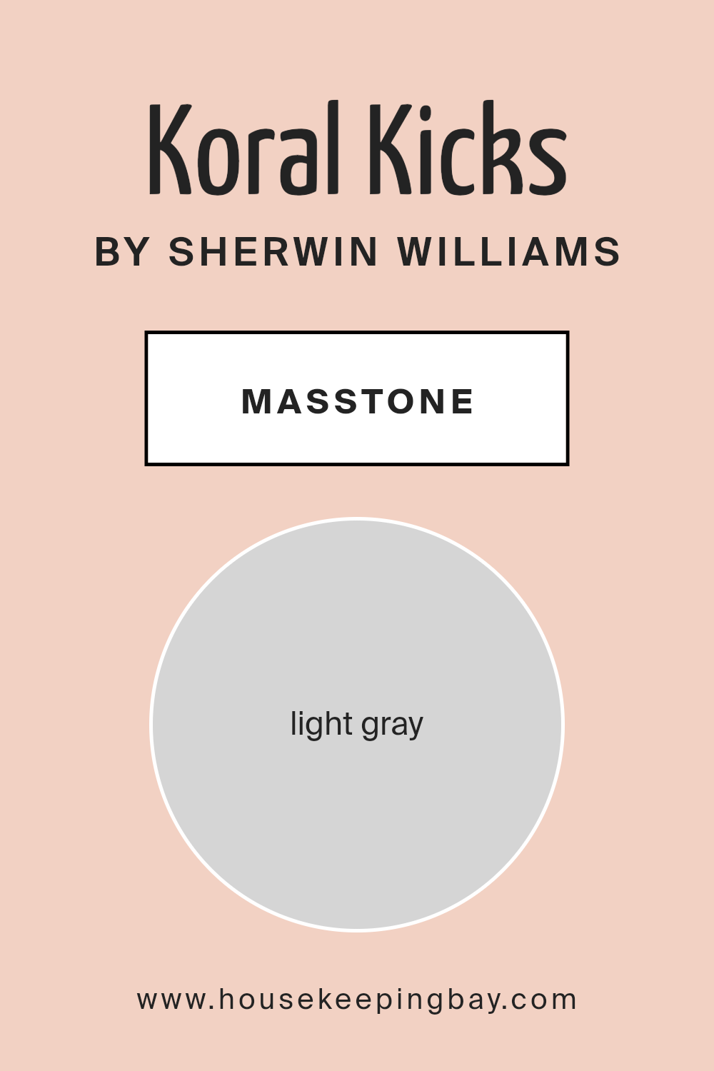
What is the Masstone of the Koral Kicks SW 6610 by Sherwin Williams?
Koral Kicks SW 6610 by Sherwin-Williams shows itself as a light gray, specifically with the color code #D5D5D5. The masstone reflects this light gray tone, creating a versatile and neutral background suited for various home decor styles.
This particular shade of gray can help make rooms feel bigger and brighter since it naturally reflects light well. When used on walls, Koral Kicks can act as a soft backdrop, allowing other colors in the room such as furniture and decorations to stand out. This makes it easy to mix and match different home accessories without worrying about color clashes.
Moreover, its calming nature can provide a serene atmosphere in spaces meant for relaxation like bedrooms and living rooms. Despite its simplicity, Koral Kicks is effective in enhancing the aesthetic appeal of a home by providing a clean and consistent look that supports a wide range of design choices.
Whether you’re aiming for a modern, minimalist look or something more classic, this light gray can adapt smoothly to your vision, making your decorating process simpler and enjoyable.
housekeepingbay.com
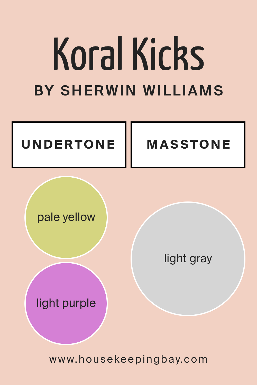
Undertones of Koral Kicks SW 6610 by Sherwin Williams
Koral Kicks SW 6610 by Sherwin Williams is a vibrant shade with a rich blend of undertones that affect its appearance in different lighting and settings. The undertones for Koral Kicks include pale yellow, light purple, pale pink, light blue, mint, lilac, and grey. These undertones play a crucial role in how we perceive the color.
Pale yellow gives a subtle warmth that makes the color feel cozy and inviting. Light purple adds a hint of sophistication and depth, while pale pink softens the overall look, making it more delicate. The light blue undertone brings a refreshing hint, which can make a space feel slightly cooler.
Mint offers a fresh, energetic touch, and lilac contributes to a gentle, soothing vibe. Grey helps in neutralizing and balancing the vibrancy, making the color more versatile.
On interior walls, these undertones can significantly impact the mood and feel of a room. In natural light, the yellow and pink undertones might make the room feel sunnier and cheerier. In artificial lighting, the purple and blue might become more evident, creating a calmer, more serene atmosphere.
The mix of undertones also means the color can appear differently from one wall to another depending on the light source, adding a dynamic quality to the space.
Choosing décor and furniture that complement these undertones can either accentuate or downplay them, giving homeowners creative control over the room’s ambiance.
This complex interplay of undertones makes Koral Kicks a versatile choice for those looking to add both warmth and depth to their interior spaces.
housekeepingbay.com
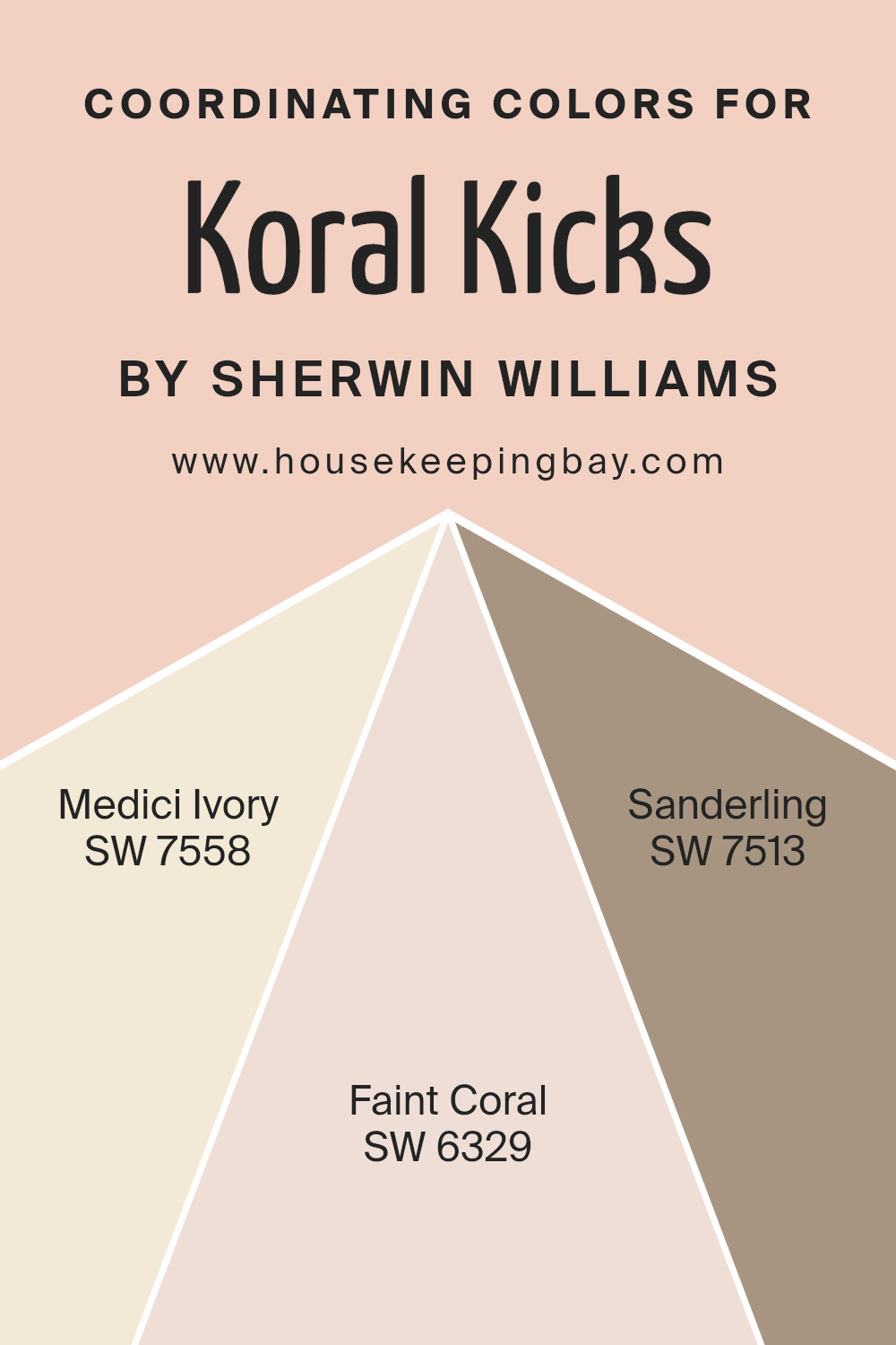
Coordinating Colors of Koral Kicks SW 6610 by Sherwin Williams
Coordinating colors are selected to complement a primary paint color, helping to create a cohesive and appealing look in a space. When choosing coordinating colors, it’s important to consider how they will work together to enhance the atmosphere of a room, balance visual interest, and support the desired mood.
For instance, coordinating colors for Koral Kicks SW 6610 by Sherwin Williams have been carefully chosen to harmonize and offer versatile decorating options.
Medici Ivory SW 7558 provides a soft, subtle backdrop that pairs beautifully with the boldness of Koral Kicks. It is a gentle and warm hue that lends a soothing presence to any room, making it ideal for creating a calm and welcoming environment.
Faint Coral SW 6329 is a lighter, peachy tone that complements the vibrancy of Koral Kicks by adding a touch of airy brightness, perfect for enhancing areas with natural light. Lastly, Sanderling SW 7513 is a muted tan that offers a grounded, earthy contrast to the more vivid Koral Kicks.
This color works well in spaces that aim for a natural and understated elegance. Together, these colors provide a balanced palette that allows Koral Kicks to shine while ensuring the space feels coordinated and thoughtfully designed.
You can see recommended paint colors below:
- SW 7558 Medici Ivory
- SW 6329 Faint Coral
- SW 7513 Sanderling
housekeepingbay.com
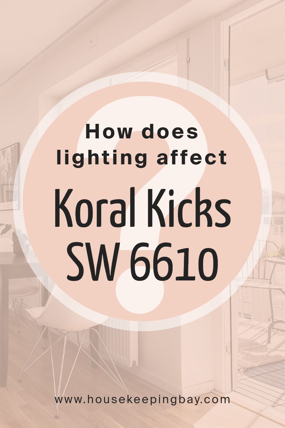
How Does Lighting Affect Koral Kicks SW 6610 by Sherwin Williams?
Lighting crucially impacts how we perceive colors. Colors might look different under various light sources due to an effect called metamerism. This happens when colors change appearance when viewed under different lighting conditions. For instance, the paint color Koral Kicks SW 6610 by Sherwin Williams will appear differently under artificial light compared to natural light.
Artificial Light: When lit by artificial sources such as LEDs or fluorescent bulbs, Koral Kicks SW 6610 tends to look more vibrant and intense. Artificial lighting, especially warmer tones, can make this orange-pink shade appear richer and more dynamic.
Natural Light: In natural sunlight, Koral Kicks SW 6610 can show its true color but may vary depending on the time of day and weather conditions.
Natural light tends to reveal the truest hue of Koral Kicks, highlighting its lively and energetic orange-pink tone.
Room Orientation:
1. North-Faced Rooms: North-facing rooms get less direct sunlight, which can make colors appear slightly duller. In such rooms, Koral Kicks might look more muted and subdued, without the vibrant punch it has under direct light.
2. South-Faced Rooms: South-facing rooms enjoy abundant light most of the day, which can make colors like Koral Kicks pop and feel lively. This color will be at its brightest and most true in south-facing rooms, often looking cheerful and warm.
3. East-Faced Rooms: In east-facing rooms, the color will be influenced by the warm, yellow light of the morning sun, making Koral Kicks appear bright and welcoming in the morning, then softer as the day progresses.
4. West-Faced Rooms: West-facing rooms get the evening sun, which is warmer and can make Koral Kicks SW 6610 look more intense and glowing in the afternoon and evening.
Understanding how lighting affects colors can help in selecting the right paint color for your space, ensuring that it always looks its best under various lighting conditions.
housekeepingbay.com
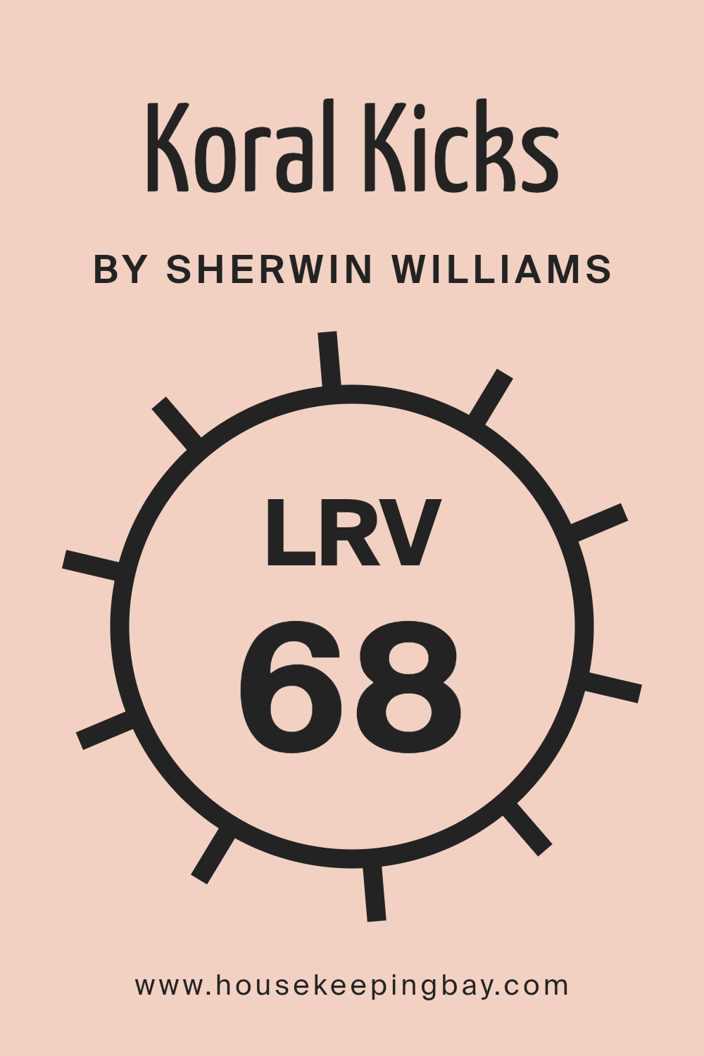
What is the LRV of Koral Kicks SW 6610 by Sherwin Williams?
LRV, or Light Reflectance Value, is a measure that indicates the amount of visible and usable light that a paint color reflects from or absorbs into a surface. Measured on a scale from 0 to 100, a lower LRV means the color absorbs more light and appears darker, while a higher LRV means it reflects more light and appears lighter.
This value is crucial when choosing paint colors because it helps predict how light or dark a color will look on your walls and how it may change under different lighting conditions.
For Koral Kicks SW 6610 by Sherwin-Williams, with an LRV of 68.195, this color is on the lighter side of the spectrum. It means the color will reflect a good amount of light, making spaces appear more open and airy.
In rooms with plenty of natural sunlight, the bright qualities of Koral Kicks will be enhanced, making it a good choice for making small rooms feel larger or for spaces you want to give a light and lively feel. Conversely, in dimly lit areas, it still retains some warmth without leaning too stark or cold.
housekeepingbay.com
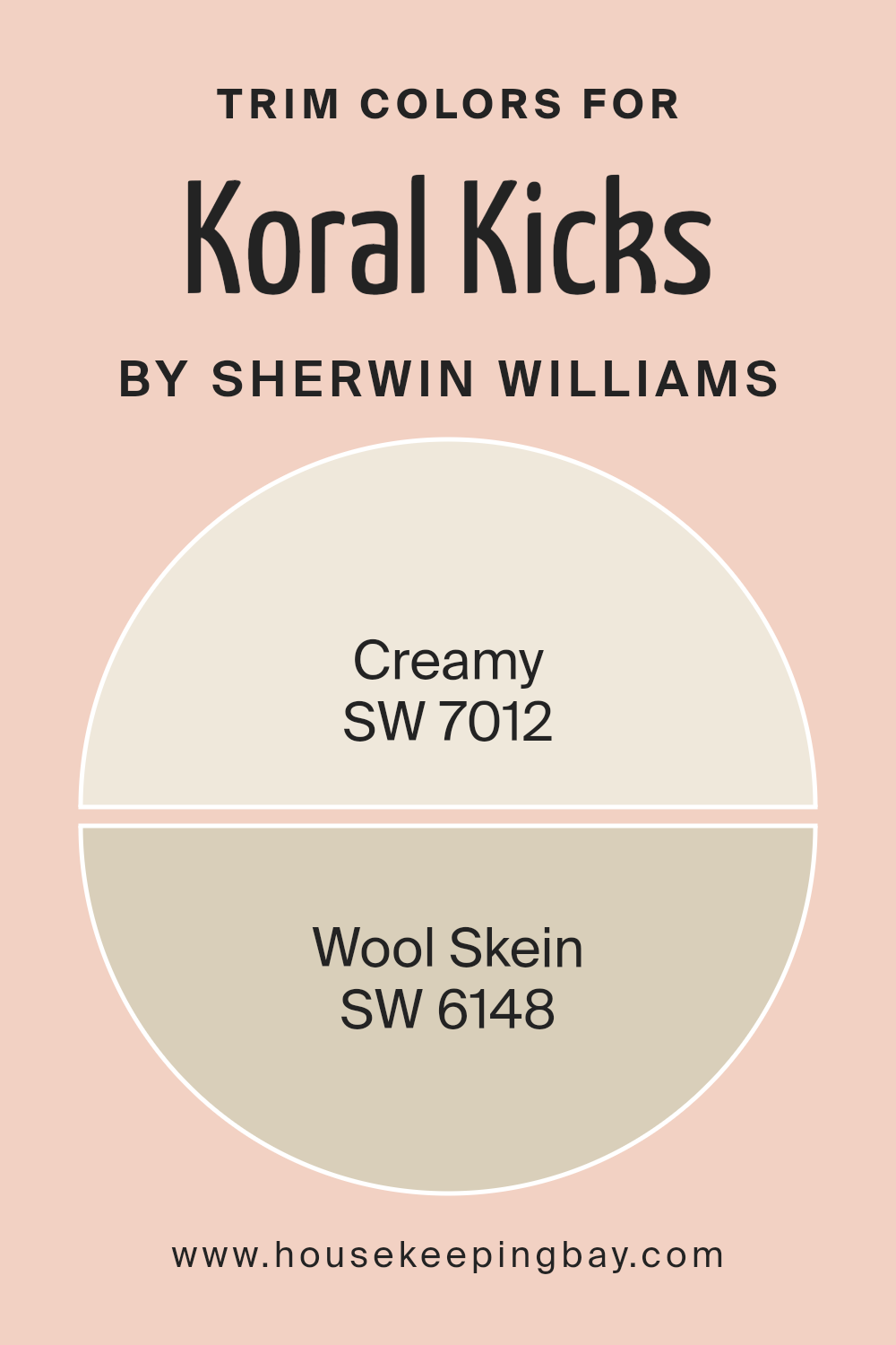
What are the Trim colors of Koral Kicks SW 6610 by Sherwin Williams?
Trim colors, such as Sherwin Williams’ SW 7012 – Creamy and SW 6148 – Wool Skein, play a crucial role in interior or exterior paint projects by defining and highlighting architectural features and edges. These colors can accentuate the details of doors, windows, and moldings, creating contrast that enhances and complements the surrounding wall colors.
For Koral KicksSW 6610, a vibrant and lively shade, subtle trim colors like Creamy and Wool Skein can act as calming elements to balance the overall ambiance without overshadowing the main tone.
SW 7012 – Creamy is a soft, warm white that acts like a gentle highlight, illuminating the more vibrant Koral KicksSW 6610. It brings forward the shapes and textures in a space, making architectural details pop with a subtle, natural warmth. In contrast, SW 6148 – Wool Skein is a muted yellow with gray undertones, providing a soft yet distinct boundary to the boldness of Koral KicksSW 6610. It adds a layer of sophistication and softness, subtly defining spaces with its understated elegance.
You can see recommended paint colors below:
housekeepingbay.com
Colors Similar to Koral Kicks SW 6610 by Sherwin Williams
Using similar colors in your design can be important to create a visually harmonious space. Colors that are alike can seamlessly blend with each other, providing a soft transition from one shade to another. This smooth gradation of colors can be particularly soothing to the eyes and helps in achieving a cohesive appearance in any given area.
Whether you are painting a room or choosing colors for a graphic design project, picking shades that are closely related can make the design feel deliberate and fluid.
For instance, Koral Kicks by Sherwin Williams serves as a beautiful base color that works charmingly when paired with hues like Spun Sugar, a light and airy pink, or Peach Fuzz, a soft, subtle peach that adds a warm touch without overwhelming. Comical Coral brings a bolder, more playful feel, whereas Oleander has a muted berry tone that offers depth.
Quaint Peche is a serene peach that pairs nicely for a gentle vibe, while Romance adds a whisper of rosy warmth to the palette. Peach Blossom and Blushing are both gentle and friendly pinks that provide a tender touch.
Aristocrat Peach, a mature, refined shade, adds an air of sophistication, and Naive Peach lends a fresh, youthful glow, perfect for energizing a space. Each of these colors can stand on its own yet works well within a family of similar tones to create a unified and enchanting effect.
You can see recommended paint colors below:
- SW 6337 Spun Sugar
- SW 6344 Peach Fuzz
- SW 6876 Comical Coral
- SW 6603 Oleander
- SW 6330 Quaint Peche
- SW 6323 Romance
- SW 6624 Peach Blossom
- SW 6617 Blushing
- SW 0027 Aristocrat Peach
- SW 6631 Naive Peach

housekeepingbay.com
Colors that Go With Koral Kicks SW 6610 by Sherwin Williams
Choosing complementary colors for Koral Kicks SW 6610 by Sherwin Williams is crucial as it ensures a harmonious and balanced aesthetic in interior design. These hues play a significant role in creating mood, enhancing space perception, and complementing personal style.
Colors like Ravishing Coral SW 6612 and Habanero Chile SW 7589 add a vibrant pop to spaces, making them feel lively and energetic. These shades are perfect for accent walls or decorative elements that draw the eye and invigorate the surroundings.
Jovial SW 6611 comes off as a softer, more understated tone, providing a pleasing contrast when used alongside the bolder Koral Kicks. It helps soften areas that might feel too intense, offering a gentle backdrop for furnishings and artworks.
Peppery SW 6615, Quite Coral SW 6614, and Lei Flower SW 6613 offer varying degrees of warmth and brightness, from the slightly reserved Peppery to the gentle radiance of Lei Flower.
These colors harmonize well with Koral Kicks, creating a cohesive look throughout the room. Using these colors together allows for a smooth visual flow, making the space not only comfortable but also aesthetically appealing.
You can see recommended paint colors below:
- SW 6612 Ravishing Coral
- SW 7589 Habanero Chile
- SW 6611 Jovial
- SW 6615 Peppery
- SW 6614 Quite Coral
- SW 6613 Lei Flower

housekeepingbay.com
How to Use Koral Kicks SW 6610 by Sherwin Williams In Your Home?
Koral Kicks SW 6610 by Sherwin Williams is a vibrant, cheerful coral shade perfect for adding a splash of color to any home. This paint color is ideal for creating a lively atmosphere in living spaces such as the living room or kitchen. It pairs beautifully with both light and dark furniture, offering versatility in home décor.
You can use it on an accent wall to inject some personality into a room without overwhelming the space. Koral Kicks also works well for painting smaller items like bookshelves or chairs, providing a pop of color that can make ordinary furniture look unique.
Additionally, combining it with soft blues or muted greens can help balance its warmth, making a room feel more inviting. For those who want a fresh and modern look, this shade is a fantastic choice, brightening up any area of the home effortlessly.
Koral Kicks SW 6610 by Sherwin Williams vs Quaint Peche SW 6330 by Sherwin Williams
Koral Kicks SW 6610 by Sherwin Williams is a vibrant and lively shade, sitting on the pink spectrum with a touch of coral’s warmth. This color can inject energy and a cheerful vibe into any space, making it an excellent choice for places meant to inspire activity and joy, like playrooms or creative studios.
Quaint Peche SW 6330, also by Sherwin Williams, offers a more subdued and soft appearance. It leans towards a peachy tone that radiates calmness and warmth, which is better suited for spaces where you want to induce a cozy and soothing atmosphere, such as bedrooms or a reading nook.
Both Koral Kicks and Quaint Peche bring their own unique feel to environments, with Koral Kicks providing a more dynamic and energetic flair, and Quaint Peche fostering a gentle and inviting ambiance. This makes them suitable for different purposes and moods within home or commercial decorating projects.
You can see recommended paint color below:
- SW 6330 Quaint Peche
housekeepingbay.com
Koral Kicks SW 6610 by Sherwin Williams vs Spun Sugar SW 6337 by Sherwin Williams
Koral Kicks SW 6610 by Sherwin Williams is a vibrant and energetic shade, featuring pink undertones with a touch of coral warmth. This color is bold and makes a statement, perfect for lively spaces where you want to inspire activity and enthusiasm. It suits areas like workout rooms, kids’ play areas, or any space that would benefit from a burst of energy.
In contrast, Spun Sugar SW 6337 is a soft, muted yellow with hints of cream, creating a gentle and soothing feel. Its lightness and subtlety are ideal for a calm and relaxing environment, such as a bedroom, living room, or nursery.
This color is great for bringing a sense of light and airiness to a space, helping to make small rooms appear larger and more open.
Both colors reflect different moods and can be used strategically in home decor to influence the atmosphere and functionality of different rooms.
You can see recommended paint color below:
- SW 6337 Spun Sugar
housekeepingbay.com
Koral Kicks SW 6610 by Sherwin Williams vs Romance SW 6323 by Sherwin Williams
Koral Kicks SW 6610 by Sherwin Williams is a vibrant, energetic shade of coral. It has a lively vibe that can instantly perk up any space, making it feel more inviting and warm. This color works well in areas where you want to add a pop of brightness, such as living rooms or kitchens.
In contrast, Romance SW 6323 by Sherwin Williams is a soft, muted pink. It gives off a gentle and soothing feel, perfect for creating a relaxed atmosphere in bedrooms or bathrooms. This color is ideal for those seeking a subtle touch of warmth without overwhelming the senses.
While both colors share a warm undertone, Koral Kicks is bolder and more dynamic, whereas Romance leans towards a calm and serene aesthetic. Each color serves a different purpose based on the mood you want to set in a room.
You can see recommended paint color below:
- SW 6323 Romance
housekeepingbay.com
Koral Kicks SW 6610 by Sherwin Williams vs Naive Peach SW 6631 by Sherwin Williams
Koral Kicks SW 6610 by Sherwin Williams is a vibrant, lively pink with a strong presence. It adds a playful and energetic touch to any space, making it ideal for areas like playrooms or creative spaces where a bright, cheerful ambiance is desired. The shade is bold and can serve as a focal point when used on walls or as an accent color.
Naive Peach SW 6631 by Sherwin Williams, in contrast, is a soft, warm peach tone that offers a more subtle and soothing feel.
This color works well in spaces meant for relaxation such as bedrooms and living rooms, providing a cozy and welcoming atmosphere without overwhelming the senses.
Both colors bring their own unique qualities to a space. Koral Kicks is more about vibrancy and making a statement, while Naive Peach is about creating a gentle, comforting environment.
Their applications differ greatly in terms of mood and energy, allowing them to cater to various tastes and room functions.
You can see recommended paint color below:
- SW 6631 Naive Peach
housekeepingbay.com
Koral Kicks SW 6610 by Sherwin Williams vs Peach Blossom SW 6624 by Sherwin Williams
Koral Kicks SW 6610 by Sherwin Williams is a vibrant, lively shade that tends to energize a space. It has a rich, coral hue that can add a playful and inviting atmosphere to any room. This color works well in areas where you want to stimulate conversation and enthusiasm, like living rooms or dining areas.
Peach Blossom SW 6624, also by Sherwin Williams, is a softer, more subdued color. It has a gentle peach tone that offers a comforting and soothing presence, perfect for creating a relaxed environment. This color is ideal for spaces where calm and rest are priorities, such as bedrooms and bathrooms.
While both colors carry warmth, Koral Kicks is more intense and outgoing, making it a great choice for more energetic spaces. In contrast, Peach Blossom, with its milder approach, is better suited for areas where a peaceful and calming influence is desired. Each color brings its unique vibe, either boosting dynamism or promoting calm.
You can see recommended paint color below:
housekeepingbay.com
Koral Kicks SW 6610 by Sherwin Williams vs Oleander SW 6603 by Sherwin Williams
Koral Kicks SW 6610 by Sherwin Williams is a vivid, bright coral hue, full of energy and playfulness. It’s the sort of color that injects a lot of personality into a space, making it feel lively and inviting. This shade is great for areas where you want to encourage activity and cheerfulness, like a playroom or a kitchen.
In contrast, Oleander SW 6603 is a softer, more subdued pink. It offers a gentle and soothing vibe, perfect for spaces where you want to promote rest and calmness, such as bedrooms or bathrooms. Oleander’s pale tone provides a sense of warmth without overwhelming the senses, making it versatile for complementing various decor styles.
Both colors are from Sherwin Williams, suggesting good quality and availability, but they serve different purposes in interior design based on their vibrancy and emotional impact.
You can see recommended paint color below:
- SW 6603 Oleander
housekeepingbay.com
Koral Kicks SW 6610 by Sherwin Williams vs Blushing SW 6617 by Sherwin Williams
Koral Kicks SW 6610 and Blushing SW 6617 by Sherwin Williams are two distinct paint colors that each offer their own unique vibe. Koral Kicks is a vibrant, energetic coral shade that leans more towards pink than orange. It’s a bold choice that can liven up any space, making it feel lively and cheerful. This color works well in areas like living rooms or dining areas where you might want to inspire a sense of fun and activity.
Blushing SW 6617, in contrast, is a softer, more muted pink. This color is quite gentle and soothing, making it perfect for spaces where you want to create a calm and relaxing atmosphere, like bedrooms or bathrooms. Blushing offers a sense of warmth and coziness, providing a comforting backdrop to any room.
Both colors bring warmth but in different intensities and hues. Koral Kicks is great for adding a splash of energy, while Blushing suits spaces where a serene, soft touch is needed. They could even complement each other in the same home, used in different spaces according to mood and function.
You can see recommended paint color below:
- SW 6617 Blushing
housekeepingbay.com
Koral Kicks SW 6610 by Sherwin Williams vs Aristocrat Peach SW 0027 by Sherwin Williams
Koral Kicks SW 6610 by Sherwin Williams is a vibrant, energetic shade of coral with a strong pink undertone, giving it a lively punch that can instantly energize a space. It is bold and can act as a standout feature in a room when used on walls or key decor items. This shade is great for places where you seek vibrancy and a cheerful atmosphere, such as a playroom or a creative workspace.
Aristocrat Peach SW 0027, also by Sherwin Williams, contrasts Koral Kicks by being a much softer, more subdued color. This peachy hue has a gentleness to it that lends a warm, calming effect to environments. It’s more understated and tends to blend seamlessly into spaces to create a cozy, inviting ambiance.
Aristocrat Peach is ideal for areas where you prefer a soft and soothing presence, like bedrooms or living areas.
Both colors offer distinct vibes and can be used effectively depending on the mood and functionality desired in a space.
You can see recommended paint color below:
- SW 0027 Aristocrat Peach
housekeepingbay.com
Koral Kicks SW 6610 by Sherwin Williams vs Comical Coral SW 6876 by Sherwin Williams
Koral Kicks SW 6610 and Comical Coral SW 6876, both by Sherwin Williams, are vibrant shades but have distinct tones. Koral Kicks is a soft, muted coral with a peachy flair that brings a gentle warmth to spaces, making it suitable for creating a cozy, inviting atmosphere. It’s a versatile color that works well in both bright and dimly lit rooms.
In contrast, Comical Coral SW 6876 is a much bolder and more saturated hue. This color leans towards a vivid pink-orange, which is more striking and lively. It’s perfect for adding a punch of color to an area, ideal for accent walls or decor elements that you want to stand out.
Overall, Koral Kicks is subtler and blends easily with other colors, providing a soothing backdrop for various decor styles. Meanwhile, Comical Coral stands out more and is great for those looking to make a more dramatic statement in their space. Both can enhance a room beautifully, depending on the desired effect.
You can see recommended paint color below:
- SW 6876 Comical Coral
housekeepingbay.com
Koral Kicks SW 6610 by Sherwin Williams vs Peach Fuzz SW 6344 by Sherwin Williams
Koral Kicks SW 6610 by Sherwin Williams is a vibrant coral shade that leans more towards pink. It carries a cheerful and energetic vibe, perfect for spaces that seek to inspire liveliness and warmth. This color makes a strong statement and can liven up areas such as living rooms or bedrooms, blending well with both bright and muted tones.
In contrast, Peach Fuzz SW 6344 is a softer, more subdued peach tone. This color is gentler and exudes a soothing atmosphere, making it ideal for creating a calm and inviting space. It’s especially suitable for areas where relaxation is key, like bedrooms and bathrooms.
Both colors bring their unique essence to a room, with Koral Kicks providing a more dynamic and bold look, while Peach Fuzz offers a tranquil and soft appeal. They can be used separately or together, depending on the desired ambiance and personal taste.
You can see recommended paint color below:
- SW 6344 Peach Fuzz
housekeepingbay.com
Conclusion
My review of SW 6610 Koral Kicks by Sherwin Williams leaves me thoroughly impressed with this vibrant shade. This paint color offers a fresh zest to any space, working well in lively environments like a kitchen or a creative space.
The bold personality of Koral Kicks can also introduce a playful ambiance when used in children’s rooms or as an accent wall.
From my experience, its application proves smooth, with an impressive coverage that resists fading and maintains its vivid tone over time. Pairing it with neutral furniture highlights its intensity, while matching it with soft blues or greens creates a harmonious look.
For those seeking to refresh their home with a lively, yet not overpowering, burst of color, Koral Kicks is a viable option. It provides a fresh breath to worn-out spaces and injects life into the mundane.
Overall, SW 6610 Koral Kicks by Sherwin Williams stands out as a reliable and spirited choice in the vast array of home paint selections.
housekeepingbay.com
Ever wished paint sampling was as easy as sticking a sticker? Guess what? Now it is! Discover Samplize's unique Peel & Stick samples. Get started now and say goodbye to the old messy way!
Get paint samples


