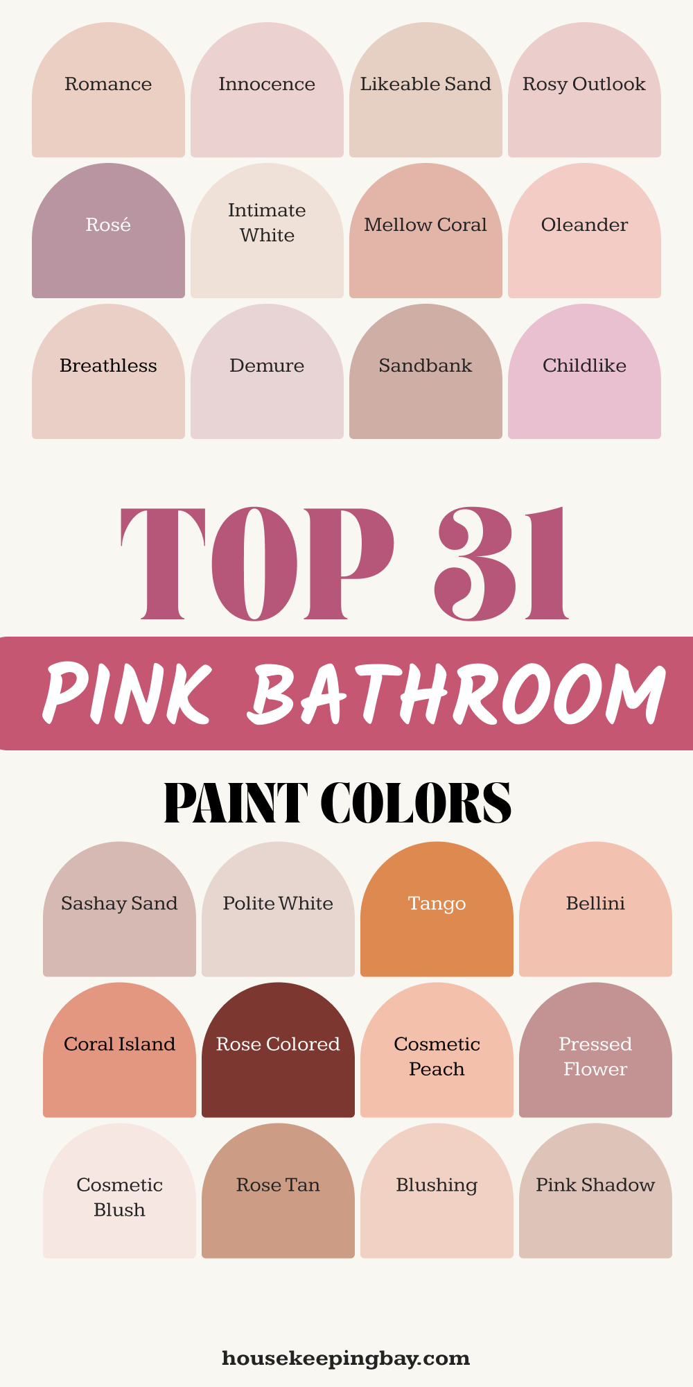
31 Pink Bathroom Paint Color Ideas by Sherwin Williams
Pink Paint Ideas That Work in Real Bathrooms
I’ve seen pink bring life into bathrooms that once felt cold or plain. Pink doesn’t just mean bubblegum or Barbie — it’s a color that can feel fresh, stylish, and even calm, depending on the shade. I’ve recommended it for everything from tiny powder rooms to larger spa-like spaces.
A lot of people assume pink is “too much.” But in reality, the right pink can soften harsh tile, warm up bright lighting, and even make a bathroom feel more personal. Some colors lift your mood in the morning — pink is one of those. It’s gentle on your eyes before your coffee, but still adds energy to the room.
According to a study from Frontiers in Psychology, soft pinks are often linked to emotional balance and comfort. That’s probably why I see so many clients smile when we test out pink samples — there’s something instantly inviting about it.
housekeepingbay.com
How to Choose the Right Pink
Choosing pink for a bathroom isn’t as simple as picking your favorite lipstick shade. Trust me, I’ve seen pink go very wrong when people skip a few important steps.
1. Know the Room’s Light
Lighting changes everything. Natural daylight brings out cooler tones. Warm bulbs make pinks look peachier or more orange. I always ask clients: Is there a window in the bathroom? Is it facing north or south?
Before making a final choice, I tape big samples on the wall and check them morning, noon, and night.
2. Think About the Size
Small bathrooms do better with soft or light pinks — they make the room feel bigger. Powder rooms? That’s where I love using bold or darker pinks because they can handle drama. One of my clients said their hot-pink powder room was their most complimented space during parties.
3. Match the Undertones
Pink isn’t just one tone. It can lean:
- Cool (like blue-based pinks: good with white marble or silver fixtures)
- Warm (think peachy: matches beige tiles and brass hardware)
Hold the pink swatch next to your tile and see if they clash or blend.
4. Pair with the Right Neutrals
Cream, white, taupe — these all do different things to pink. For example:
- Soft pink + creamy white = vintage feel
- Dusty pink + deep taupe = elegant and calm
I always compare at least two neutral paints next to the pink before deciding.
5. Always Sample First
Paint looks very different on a small chip than it does on a wall. I always recommend buying a Sherwin-Williams Color Sample and testing on a few spots. Use two coats. Wait a full day. Look again in the morning. That’s the only way to be sure.
31 Sherwin-Williams Pink Bathroom Paint Colors
Soft & Light Pinks
These are my go-to colors when someone wants something subtle but still warm and friendly. They work especially well in small bathrooms, guest baths, or when you have lots of white tile or marble. These aren’t shouty — they’re whispery, cozy, and easy to live with.
1. Cosmetic Blush SW 7110
Cosmetic Blush is delicate but not dull. I love this in a bathroom with white subway tile and brass hardware. It adds just enough color to feel feminine without going overboard.
2. Rose Tan SW 9001
Rose Tan is soft and a little peachy. I used this for a client who wanted a “sunset glow” in her guest bath. It looked amazing with light wood cabinets.
3. Romance SW 6323
Romance is one of those pinks that feels like natural blush on skin. It has a calming energy and looks beautiful in morning light. I pair this with matte black fixtures for contrast.
4. Faint Coral SW 6329
Faint Coral is not really coral — it’s lighter, like a peach-toned pink. Works beautifully in coastal-style homes with light wood and sandy tones.
5. Innocence SW 6302
Innocence is very pale and clean. Almost a white with a pink undertone. I love using it when someone wants something that “feels pink” but still super neutral.
6. Blushing SW 6617
Blushing looks lovely next to white penny tile or soft linen curtains. It has a tiny hint of orange that makes it warmer — perfect for making cold tile feel less harsh.
7. Intimate White SW 6322
Intimate White is soft and cloudy, with a dusty undertone. Not too warm, not too cool. Great for vintage bathrooms or rooms with clawfoot tubs.
8. Pink Shadow SW 0070
Pink Shadow is a barely-there pink. You might not even notice it unless you’re looking closely. I like this in homes that lean minimalist but still want some personality.
9. Pressed Flower SW 6308
Pressed Flower has a floral, romantic feel. I’d use this in a guest bath with gold-framed mirrors and floral tiles or wallpaper.
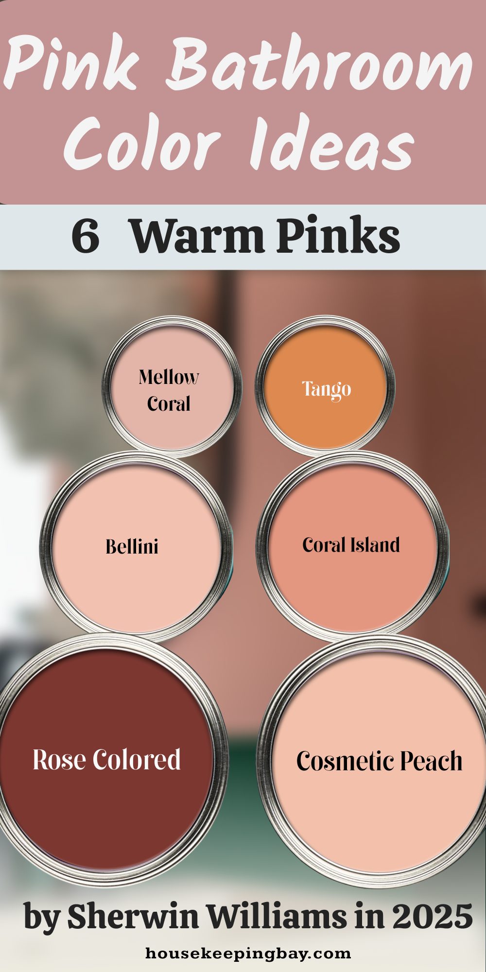
10. Mellow Coral SW 6324
Mellow Coral leans a little more orange but still soft enough to work in a bathroom. Looks beautiful with warm white tile and vintage brass.
Peachy or Warm Pinks
These colors have more warmth — a little orange, coral, or even golden undertone. I suggest these for bathrooms that get natural light or where you want a cozy, cheerful feel.
These make white tiles pop and pair beautifully with gold or brass fixtures.
11. Cosmetic Peach SW 6618
Cosmetic Peach is a soft coral-pink that reminds me of 1950s bathrooms — in the best way. I’ve used this with white tile and black grout for a modern-retro look that my client absolutely loved.
12. Rose Colored SW 6328
Rose Colored feels sunny and bright. It’s not too bold, but it does show up. I like it best in a bathroom with a window, where the light can bring out its cheerful side.
13. Coral Island SW 6619
Coral Island leans orange but still pink enough to feel fun and youthful. I once used this in a kid’s bathroom with light blue towels and sea-themed artwork. It felt joyful without being babyish.
14. Mellow Coral SW 6324 (yes, it fits both categories)
Mellow Coral makes a comeback here because it walks the line between soft and warm. It really depends on the lighting. In a west-facing bath, it glows like sunset.
15. Bellini SW 1664 (from their 2024 palette)
Bellini is soft but citrusy — like a pink-orange sorbet. One client said it reminded her of Italy. It worked perfectly with matte white tile and clay-colored decor.
16. Tango SW 6649
Tango is more saturated and spicy — it’s for someone bold. Still, in the right space (like a powder room with creamy floor tile), it can look stunning and energizing.
Dusty & Mauve Pinks
These shades are soft but not sweet. They feel a bit vintage, a bit grown-up, and very easy to live with. I often recommend these for master bathrooms or relaxing ensuite spaces.
They look especially beautiful with stone, greige, or aged brass.
17. Polite White SW 6056
Polite White isn’t really white — it’s a muted pink-beige. I’ve used this in bathrooms with warm travertine tile. It adds just enough color to soften the room without clashing.
18. Sashay Sand SW 6051
Sashay Sand is like pink with a tan jacket. There’s brown in it, which makes it feel grounded. I paired this with wood accents and creamy walls for a spa-style look that still felt warm.
19. Sandbank SW 6052
Sandbank is dusty and rich, with some terracotta in its tone. It works well if your bathroom has bronze or copper fixtures. It gives warmth without being flashy.
20. Likeable Sand SW 6058
Likeable Sand is a blend of blush and beige. It’s one of those “safe but beautiful” colors I often recommend when someone says, “I want something different but not too pink.”
21. Breathless SW 6022
Breathless has that antique-rose feeling. Soft, slightly grayish, and really elegant. I’ve used it in bathrooms with marble floors and vintage mirrors — it felt like a Parisian apartment.

Bold & Statement Pinks
These pinks are loud in the best way. They add character fast. I usually use these in small powder rooms or half-baths — places where you can take risks without it being too much.
These colors pop against white trim, black tile, or fun patterned floors. If you like personality, this is your group.
22. Dragon Fruit SW 6855
Dragon Fruit is rich, juicy, and unapologetic. It’s a deep magenta-pink that completely changes a space. I used this in a tiny powder room with a floating sink and black fixtures — it turned out to be the most talked-about room in the house.
23. Radiant Lilac SW 6841
Radiant Lilac leans purple, but it’s still pink at heart. I’ve used this in a modern bathroom with geometric tile and glossy white cabinets. The color gave it so much life.
24. Exuberant Pink SW 6840
Exuberant Pink is bright and a little wild. It reminds me of lipstick — confident and sharp. This one works beautifully with gold mirrors and graphic black-and-white tile.
25. Eros Pink SW 6860
Eros Pink is almost fuchsia, very bold. I usually balance this with lots of white or light neutrals so it doesn’t overwhelm the space. Add one vintage rug, and you’ve got a whole vibe.
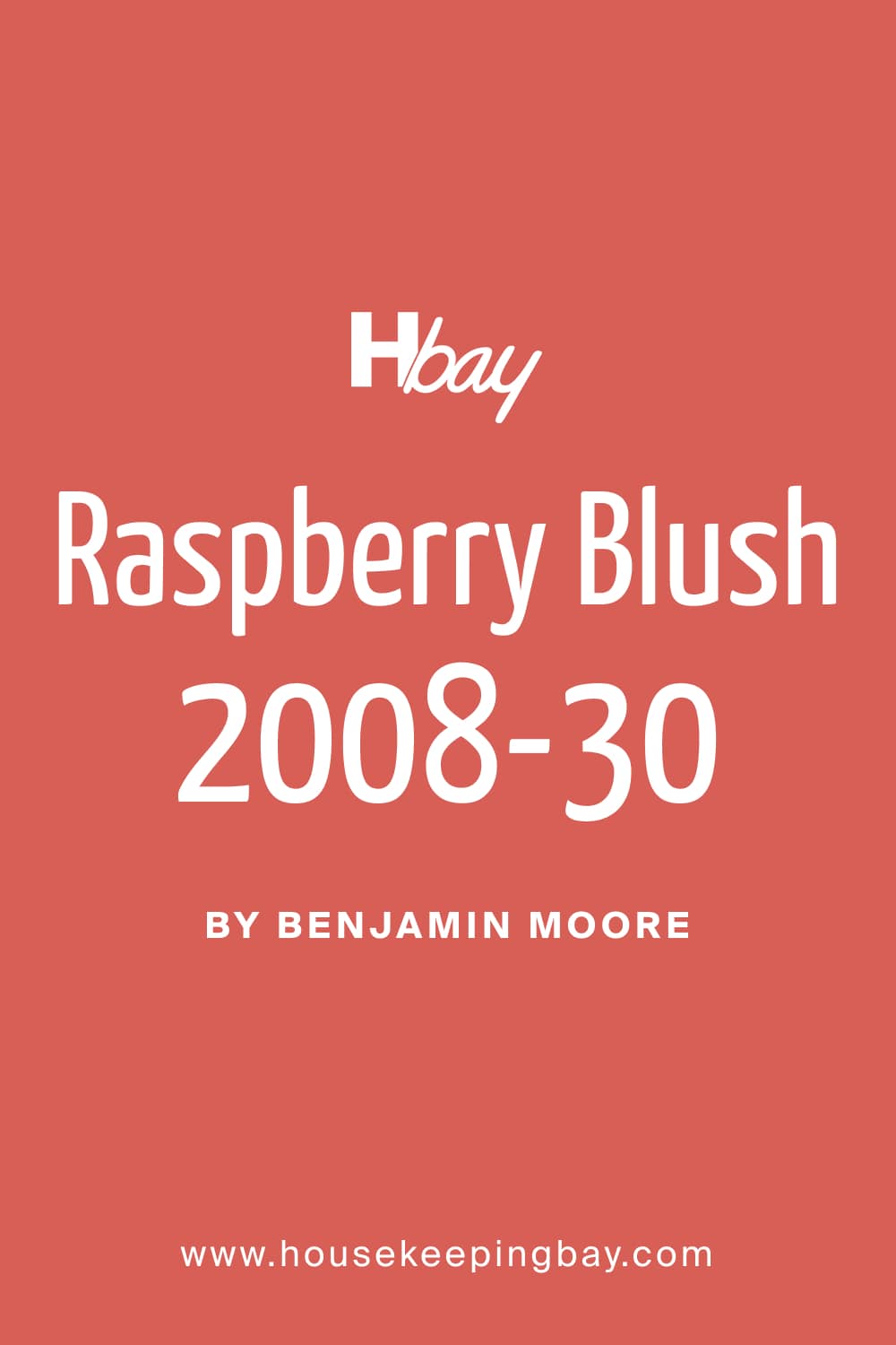
26. Raspberry Blush SW 6836
Raspberry Blush is deep and dramatic. It’s perfect for a moody powder room or to create a feature wall behind a vanity. Add brass sconces and a dark-framed mirror — total drama.
27. Cerise SW 6580
Cerise has a hint of cherry-red in it. This is one of those shades that looks high-end when paired with the right lighting and finishes. A little goes a long way here.
housekeepingbay.com
Neutral-Leaning or Beige Pinks
These are the softest of the bunch. They almost pass for neutral, but with just enough pink to warm things up. I often recommend these to clients who are nervous about color but still want something that feels different than plain white or gray. They pair beautifully with natural textures — think wood vanities, woven baskets, linen curtains.
28. Innocence SW 6302
Innocence is super soft — almost off-white, but with that gentle blush undertone. This is one of my most-used colors when someone says, “I want it to feel calm, not girly.” It looks beautiful with taupe stone or pale wood.
29. Likeable Sand SW 6058
Likeable Sand is back again because it really fits here too. It plays nicely with warm beige tiles, tan towels, and light oak vanities. It’s my “you can’t mess this up” pink.
30. Intimate White SW 6322
Intimate White shows up on different lists for a reason. It’s barely pink, with a tiny hint of dusty rose. I once used it in a bathroom with greige tile and a simple white shower curtain — the whole room felt soft and clean.
31. Rosy Outlook SW 6316
Rosy Outlook has a bit more presence than the others in this group, but it’s still neutral enough for everyday use. I love it with brushed nickel hardware and pale quartz countertops. Think soft, not sweet.
My Tips for Pairing Pink in Bathrooms
Choosing the right pink is just the first step — how you style it matters just as much. I’ve worked with clients who picked the perfect paint, but things only came together once we chose the right finishes and materials.
1. Match the Metal Right
Not all metals work the same with pink:
- Gold or brass makes pink feel warm, vintage, or glam. It’s perfect for peachy or dusty tones.
- Matte black adds contrast and modern energy. I use this combo when I want the room to feel more contemporary.
- Chrome or nickel cools things down and works well with light or cool pinks.
My tip: Lay out your faucet, hardware, and swatches together on the bathroom floor before committing.
2. Pair It With the Right Tile
Here’s what I’ve seen work over and over:
- White subway tile = clean and classic with any pink
- Terrazzo tile = playful and stylish, especially with soft or peachy pinks
- Wood-look tile = calming and grounded, works best with beige-pinks or dusty mauves
- Patterned tile = great with neutral pinks to add extra movement without clashing
3. Be Smart With Lighting
Bad lighting can kill a good paint color. Here’s how I adjust for pink walls:
- Use warm white bulbs (2700K–3000K) — they make pink feel cozy, not cold
- Avoid overhead-only lighting. Sconces or mirrors with side lighting help spread the color better
- Add a dimmer — especially in powder rooms — to shift the mood
4. Add the Right Finishes
It’s the details that finish the look:
- Natural textures like wood, rattan, or linen make pink feel softer and more organic
- Glossy tile or mirrors add contrast to matte pink walls
- Art and textiles — bring in one or two other colors (like sage green or navy) for balance
5. Don’t Overdo It
If you’re using a bold pink, go light on everything else. Let the paint be the focus. For soft pinks, you can layer in more detail — patterned towels, framed prints, or textured rugs.
One of my favorite bathrooms I’ve ever done used Pure White walls, natural oak cabinets, cream linen shades, and just a few gold accents. Simple, but unforgettable.
Before You Pick Up the Brush…
After years of helping people restyle their homes, I’ve noticed something: pink in a bathroom always brings out a little surprise. At first, clients are unsure. Then we put a sample on the wall — and suddenly it clicks. It’s soft, personal, and full of warmth. It feels different than gray or beige. It makes a bathroom feel like it belongs to someone real.
Even the subtlest pink — like Innocence or Pure White — can change how a space feels. It can soften the harshness of tile. It can make mornings feel less sharp. It adds comfort in a room that’s often overlooked.
One client told me, “It’s the only room where I feel calm without trying.” That’s what the right pink does.
Don’t choose pink because it’s trendy. Choose it because it makes you feel good. Whether it’s bold like Dragon Fruit or barely there like Intimate White, there’s a shade that fits your mood, your home, and your everyday.
Paint is the easiest design choice to change — so why not try something that makes you smile every time you walk in?