Dragon Fruit SW 6855 by Sherwin Williams
Bold Hues Meet Exotic Inspiration
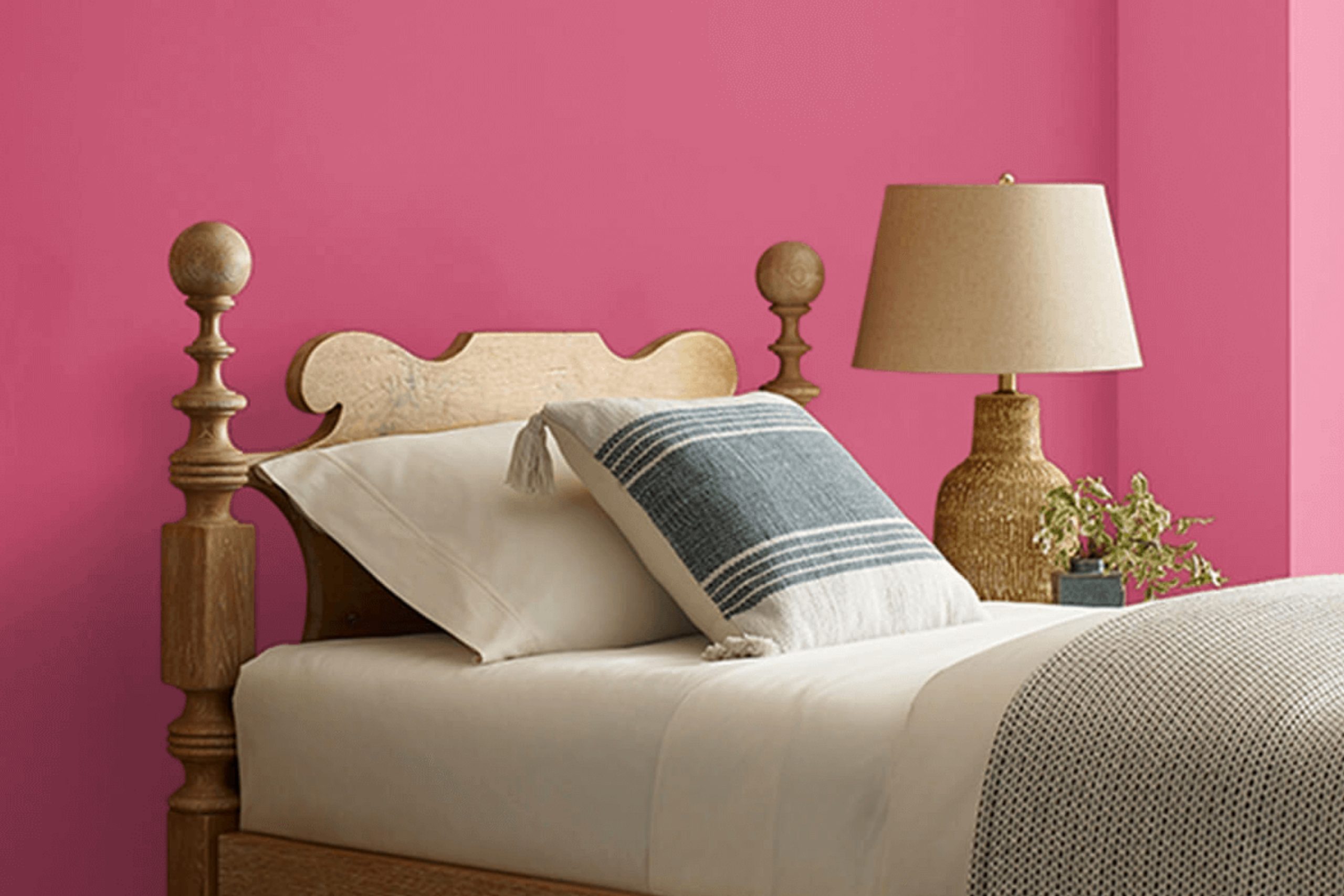
When you’re thinking of brightening up a room with a bold and vibrant color, SW 6855 Dragon Fruit by Sherwin Williams might just be what you need. This shade is a standout with its rich, lively pink tone that can really add a pop of energy to your space. Whether you’re planning to refresh your living room or add a fun splash to your bedroom, Dragon Fruit brings a playful and youthful vibe.
The color is not just striking but also has a warmth that makes any room feel welcoming. It pairs beautifully with neutral shades and can also hold its own with other bold colors. It’s perfect for creating an accent wall or for use in smaller decorative touches throughout your home.
Adjusting the lighting and accompanying decor can bring out different aspects of Dragon Fruit’s character, making it a flexible choice for many styles.
If you’re eager to bring a fresh new look to your home, SW 6855 Dragon Fruit offers a delightful solution that can liven up any space.
via sherwin-williams.com
What Color Is Dragon Fruit SW 6855 by Sherwin Williams?
Dragon Fruit SW 6855 by Sherwin Williams is a vivid, rich pink shade that packs a punch in any space where it’s applied. This color carries the vibrancy and boldness of a tropical fruit, perfect for adding a lively pop to interiors. Dragon Fruit SW 6855 can instantly warm up a room and infuse it with a cheerful vibe.
This shade works exceptionally well in modern and eclectic interior styles. It’s a fantastic choice for a focal wall, a piece of statement furniture, or vibrant decor accents. When paired with minimalist, airy surroundings, Dragon Fruit offers a beautiful contrast that livens up neutral tones.
In eclectic setups, it harmoniously blends with other strong, dynamic colors creating a lively, playful space.
In terms of materials, Dragon Fruit pairs well with soft, tactile textures like velvet and silk which enhance its luxurious feel. It also looks striking against natural wood and exposed brick, providing a rugged balance to the color’s intensity.
Metallic finishes, such as copper and gold, can further accentuate Dragon Fruit, adding a touch of glamour to the interior design. These combinations ensure that spaces featuring Dragon Fruit are both vibrant and inviting.
housekeepingbay.com
Is Dragon Fruit SW 6855 by Sherwin Williams Warm or Cool color?
Dragon Fruit SW 6855 by Sherwin Williams is a vibrant pink shade that adds a lively pop of color to any home. This bold hue is perfect for creating a focal point in a room, whether it’s an accent wall, a piece of furniture, or decorative accessories.
The intense color can energize a space, making it feel more dynamic and cheerful. Because of its strong impact, it works best when balanced with neutral colors like white, gray, or beige, which help to soften its effect and make the space feel welcoming rather than overwhelming.
Using Dragon Fruit in small, well-thought-out touches can also rejuvenate a room without dominating it. It pairs well with darker colors, such as navy or black, to offer a modern and sophisticated look. In rooms where relaxation is key, like bedrooms or bathrooms, using Dragon Fruit in moderation can keep the atmosphere calm and not too busy.
Overall, this bold shade is versatile and can fit various design styles, from contemporary to eclectic, depending on how it’s implemented.
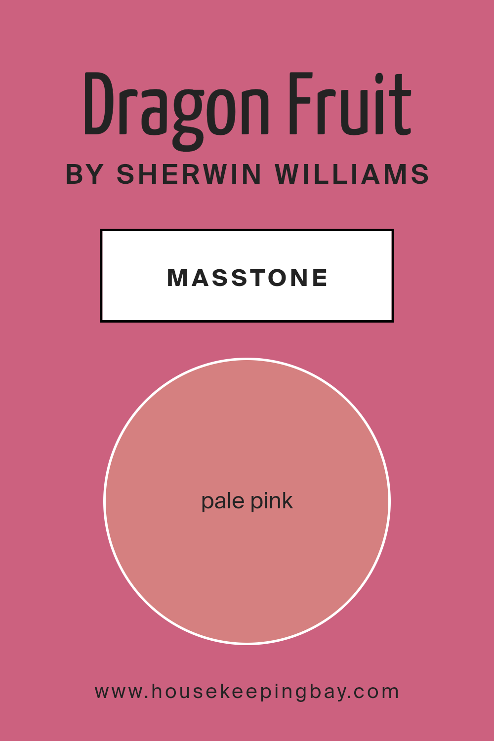
What is the Masstone of the Dragon Fruit SW 6855 by Sherwin Williams?
Dragon Fruit SW 6855 by Sherwin Williams has a masstone that is pale pink (#D58080), offering a soft and inviting tone. This color is gentle and warm, making it an excellent choice for creating a cozy and welcoming atmosphere in homes. Its understated elegance allows it to blend well with other colors, whether you are aiming for a soothing neutral palette or want to pair it with bold, contrasting hues.
In home settings, Dragon Fruit can be used in various spaces. It’s perfect for bedrooms where a calm and peaceful environment is desirable. Its pale pink shade is also suitable for bathrooms and living areas, adding a touch of softness that can make the space feel more relaxing and cheerful.
Additionally, this color works well in nurseries or children’s rooms, as it provides a nurturing ambiance without being overly bright or overwhelming.
Because of its versatility, Dragon Fruit can help create a fresh and modern look while still maintaining a sense of warmth and comfort, making it a popular choice for homeowners looking to add a subtle yet impactful splash of color.
housekeepingbay.com
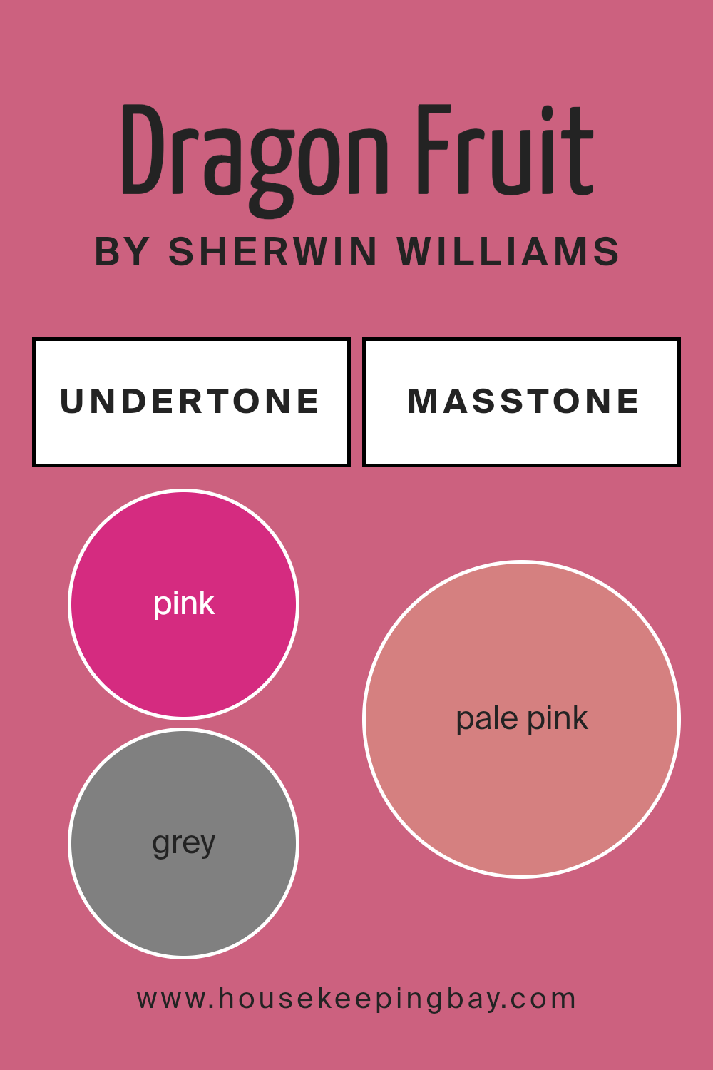
Undertones of Dragon Fruit SW 6855 by Sherwin Williams
Dragon Fruit SW 6855 by Sherwin Williams is a vibrant and dynamic color that can significantly impact the ambiance of any room. It has a range of undertones including pink, grey, orange, light purple, purple, red, fuchsia, pale yellow, olive, lilac, brown, violet, mint, yellow, light gray, light green, and light blue, which are key in influencing how this color is perceived in different lighting and settings.
Undertones are subtle colors that emerge from the main color under certain lighting conditions. They can make a color look cooler or warmer, depending on their hue.
For instance, pink and orange undertones in Dragon Fruit SW 6855 can make the paint appear warmer and more lively, an excellent choice for living areas where a friendly, warm ambiance is desired.
On the other hand, the grey and light blue undertones could provide a more subdued and cooler feel, suitable for creating a restful environment in spaces like bedrooms.
When applied on interior walls, Dragon Fruit SW 6855’s spectrum of undertones works together to provide a versatile appeal. In natural light, brighter undertones like yellow and pale yellow might make the walls look more illuminated and lively, whereas in artificial lighting, deeper undertones such as purple and brown could give a room a more cozy and grounded feel.
This adaptability makes Dragon Fruit a flexible color choice for different rooms and styles, from modern to classic.
Overall, understanding the undertones of Dragon Fruit SW 6855 helps in making informed decisions about where to use this color and what accompanying decor might work best to achieve the desired effect in a space.
housekeepingbay.com
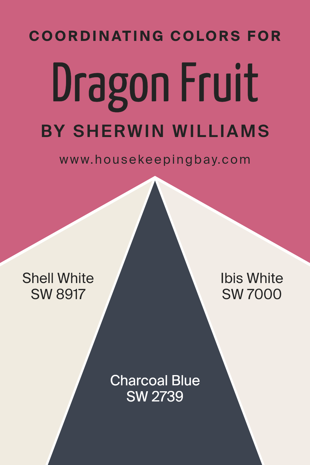
Coordinating Colors of Dragon Fruit SW 6855 by Sherwin Williams
Coordinating colors are those that complement each other well and create a harmonious look when used together in design. These colors are specifically chosen to balance, enhance, or subtly blend with the main color to provide an aesthetically pleasing and cohesive scheme.
For Dragon Fruit SW 6855 by Sherwin Williams, a vivid and lively pink, the selected coordinating colors have been thoughtfully picked to offer contrast and softness to the boldness of the primary hue.
Shell White SW 8917 is a soft, creamy white that offers a gentle contrast to the vibrant Dragon Fruit, providing a calm and soothing backdrop that allows the pink to stand out without overwhelming the senses. Charcoal Blue SW 2739 is a deep, muted blue with gray undertones that adds a sophisticated and grounding element to the palette, balancing the brightness of Dragon Fruit with its cool, dark tones.
Ibis White SW 7000, on the other hand, is a cleaner, crisper white compared to Shell White, giving a more vibrant edge to spaces when paired with the energetic pink, making it perfect for creating a crisp and fresh look.
Each of these coordinating colors supports and complements Dragon Fruit SW 6855, ensuring design choices that are cohesive and visually appealing.
You can see recommended paint colors below:
- SW 8917 Shell White
- SW 2739 Charcoal Blue
- SW 7000 Ibis White
housekeepingbay.com
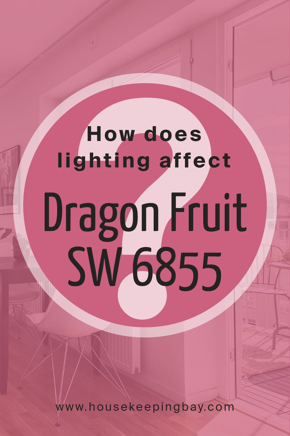
How Does Lighting Affect Dragon Fruit SW 6855 by Sherwin Williams?
Lighting significantly influences how colors appear in a space. The type of light—whether natural or artificial—can enhance or mute the hues, and even alter the mood of a room. For a vibrant color like Dragon Fruit SW 6855 by Sherwin Williams, lighting can create diverse experiences in various settings.
In artificial light, especially under warm, incandescent bulbs, Dragon Fruit SW 6855 appears richer and deeper. The warm glow tends to intensify the color, making it seem more radiant and lively. Conversely, fluorescent lighting can give Dragon Fruit SW 6855 a slightly cooler tone, making the pink appear less warm and more neutral.
Natural light has a dynamic impact on Dragon Fruit SW 6855, changing its appearance throughout the day. In rooms with north-facing windows, which receive less direct sunlight, this color can appear softer and more muted. The lack of intense light can subdue the vibrancy of Dragon Fruit, making it look slightly greyish.
In south-facing rooms, where sunlight is abundant for most of the day, Dragon Fruit SW 6855 appears vivid and electric. The brightness and intensity of the sun can amplify the depth of the color, making it pop and energize the space.
East-facing rooms expose Dragon Fruit SW 6855 to bright morning light, making the color appear bright and cheerful in the early hours. As the day progresses and the natural light diminishes, the color will become softer and more subdued.
Conversely, in west-facing rooms, the color spends much of the day in softer light and then gains intensity in the evening as the setting sun shines in. This exposure brings a dramatic flair to the Dragon Fruit SW 6855, highlighting its vibrant hue in the golden late afternoon and evening light.
In all settings, the way Dragon Fruit SW 6855 interacts with light is crucial for planning its use in interior spaces. Understanding these interactions helps in making informed decisions on paint colors based on room orientation and available lighting.
housekeepingbay.com
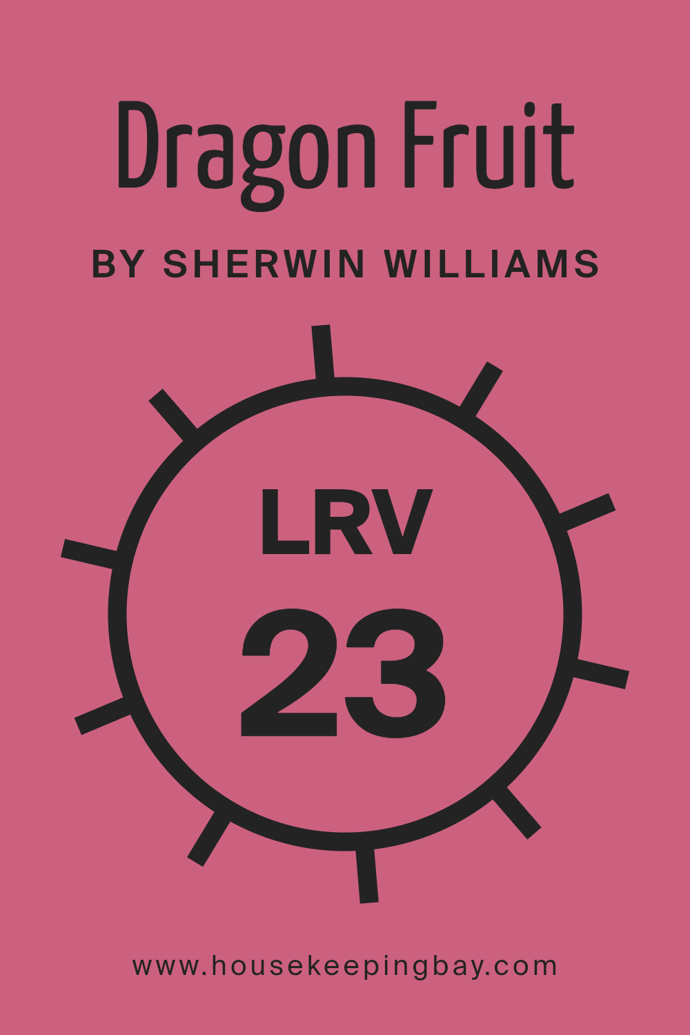
What is the LRV of Dragon Fruit SW 6855 by Sherwin Williams?
LRV stands for Light Reflectance Value and is a measure of the percentage of light a paint color reflects. It ranges from 0 (absolute black, absorbing all light) to 100 (pure white, reflecting all light). This value is crucial when choosing paint because it affects how light or dark a color looks on your walls and how much it will brighten a room.
Higher LRV can make small spaces appear larger and more open, while lower LRVs lend a cozier, more enclosed feel. The lighting of the room plays a big role, as colors may shift in appearance under different light sources.
With an LRV of 22.969, Dragon Fruit by Sherwin Williams is on the darker side, absorbing more light than it reflects. This makes it a bold choice that can give walls a dramatic flair but may make small rooms feel smaller or dimly lit areas even darker. In well-lit spaces or combined with light-colored decor and ample artificial lighting, however, Dragon Fruit can create a rich and sophisticated atmosphere.
The color is more suited for use as an accent wall or in larger, well-lit rooms to prevent it from overpowering the space.
housekeepingbay.com
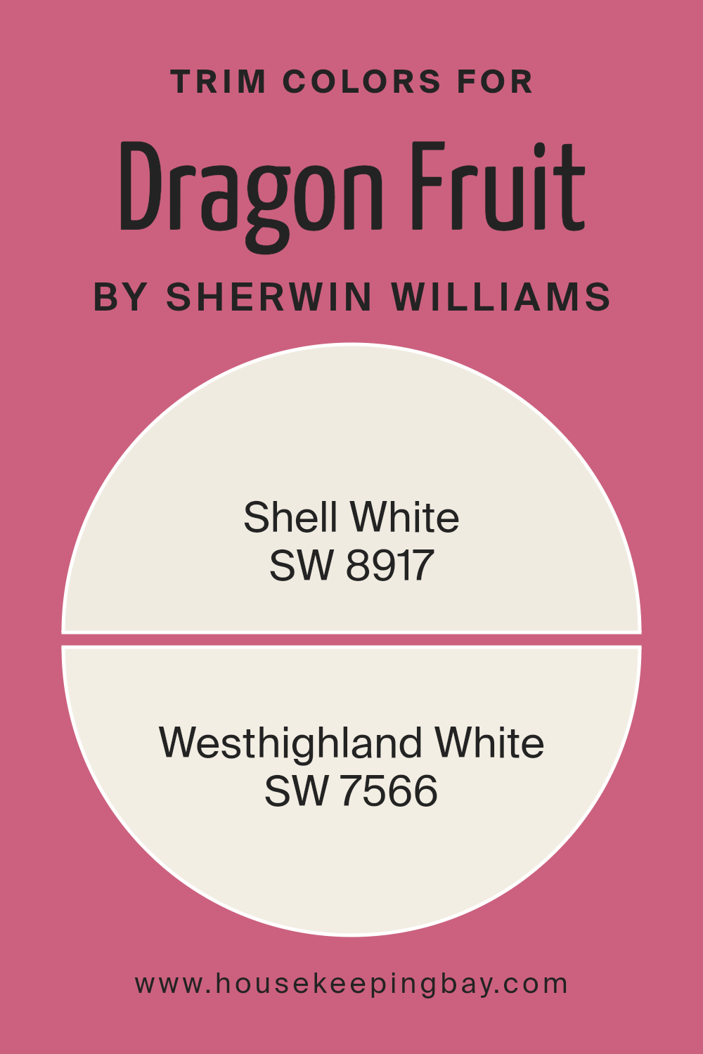
What are the Trim colors of Dragon Fruit SW 6855 by Sherwin Williams?
Trim colors are specific shades used to outline or accent architectural features and details in a room or on an exterior, like window frames, doors, baseboards, and moldings. When paired with a vibrant hue like Dragon Fruit SW 6855 by Sherwin Williams, selecting the right trim color can significantly enhance the visual appeal and create a neat, finished look.
Trim colors help define and complement the main color, influencing the overall ambiance of the space by either subtly blending in or creating a striking contrast.
Shell White SW 8917 offers a soft, creamy tone that gently softens the intense pink of Dragon Fruit SW 6855, providing a subtle transition between the wall color and the trim that harmonizes without sharp contrasts.
Westhighland White SW 7566, on the other hand, is a brighter white with a slight warmth, making it an excellent choice for those looking to softly highlight the trim details while keeping the focus on the bold Dragon Fruit shade.
Both colors support the main hue without overpowering it, ensuring a cohesive and visually pleasant space.
You can see recommended paint colors below:
housekeepingbay.com
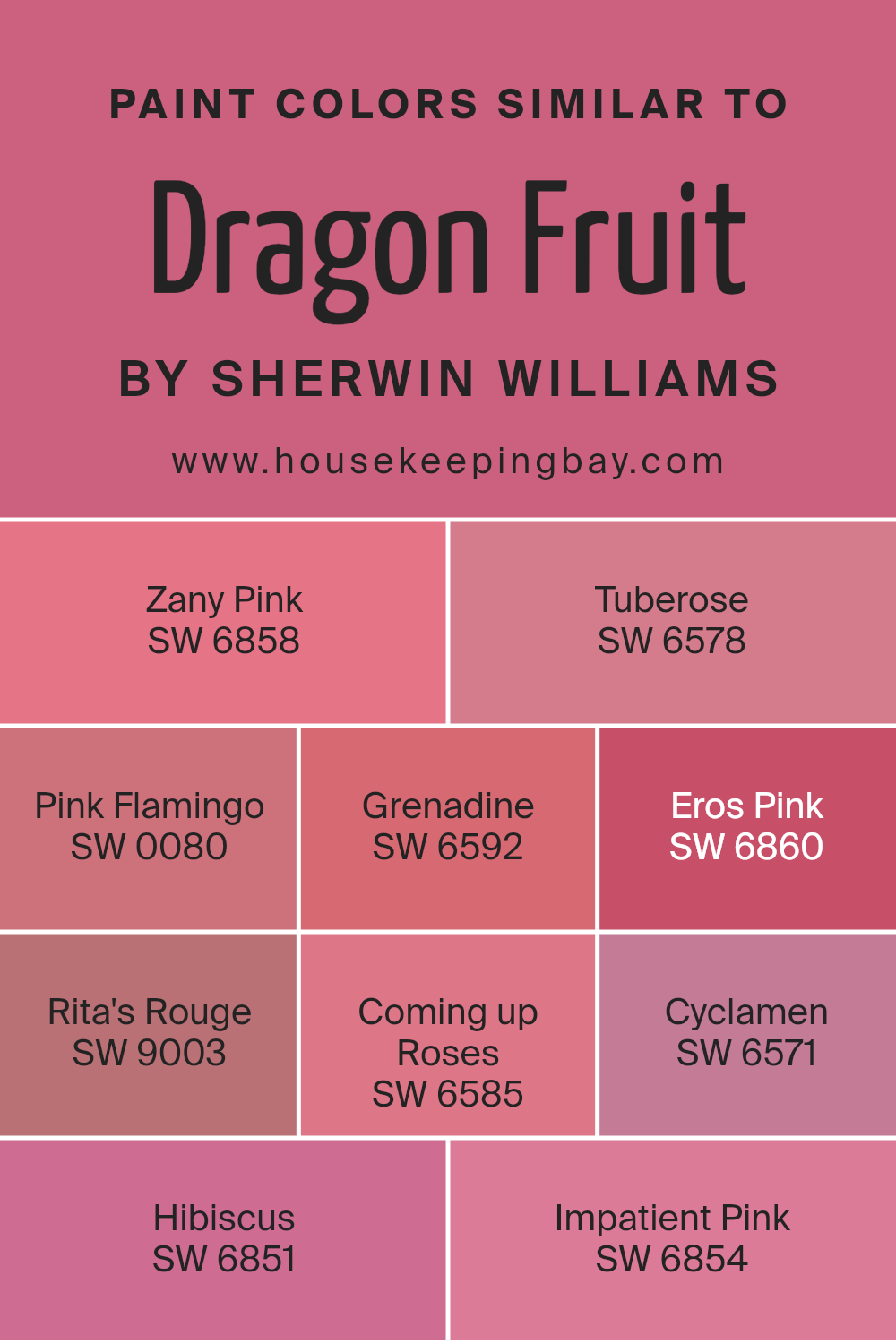
Colors Similar to Dragon Fruit SW 6855 by Sherwin Williams
Using similar colors in a design can create a harmonious and visually appealing effect, particularly when they share the same base tone but vary slightly in saturation or brightness. Such a palette allows for a seamless blend across different design elements, enhancing the aesthetic unity without causing abrupt visual interruptions.
Selecting nearby shades on the color wheel can subtly enrich the visual experience without overwhelming the viewer with high contrasts, making it especially useful for creating a soothing atmosphere.
For example, Zany Pink and Tuberose simulate the vibrant tones reminiscent of summer blossoms, adding a lively yet soft touch to spaces. Pink Flamingo offers a slightly muted and dusky hue that pairs beautifully with more vivid pinks, providing a balanced visual appeal, while Grenadine steps towards a deeper red, offering richness and warmth.
Eros Pink boasts a more saturated version of the base color, bringing depth and energy that can infuse life into any design.
Rita’s Rouge adds an almost coral-like vibrancy, perfect for accenting or making bold statements. Coming up Roses and Cyclamen vary in their intensity, thereby complementing brighter shades or serving well as standalone highlights.
Hibiscus stands out with its deep and lush undertones, ideal for focal points needing a burst of color, and Impatient Pink’s lighter, more subdued tone is well-suited for creating a soft background or for pairing with stronger colors to moderate their impact.
These nuances between similar colors can help achieve a dynamic yet cohesive design palette.
You can see recommended paint colors below:
- SW 6858 Zany Pink
- SW 6578 Tuberose
- SW 0080 Pink Flamingo
- SW 6592 Grenadine
- SW 6860 Eros Pink
- SW 9003 Rita’s Rouge
- SW 6585 Coming up Roses
- SW 6571 Cyclamen
- SW 6851 Hibiscus
- SW 6854 Impatient Pink
housekeepingbay.com
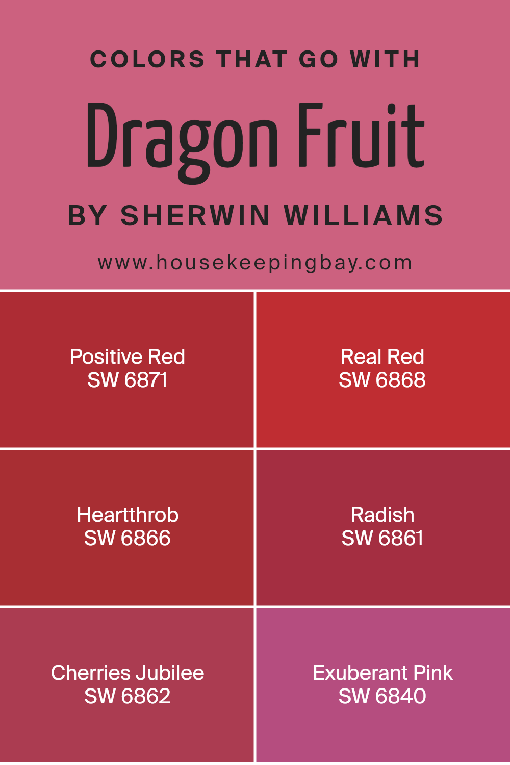
Colors that Go With Dragon Fruit SW 6855 by Sherwin Williams
Choosing the right complementary colors for a vibrant hue like Dragon Fruit SW 6855 by Sherwin Williams can significantly impact the overall feel of a space. Colors like Positive Red SW 6871, Real Red SW 6868, and Heartthrob SW 6866 bring out different aspects of Dragon Fruit, creating dynamic interiors.
Working with these shades allows for a cohesive yet diversified palette, which enhances the primary color’s striking look. For instance, Positive Red offers a bold, uplifting ambiance that pairs well with Dragon Fruit for a room filled with energy and warmth.
Similarly, colors like Radish SW 6861 and Cherries Jubilee SW 6862 provide a slightly varied spectrum of deep reds and maroons, which can soften or enrich the room depending on their use. By selecting such complements, one can achieve a more refined and harmonious aesthetic.
Exuberant Pink SW 6840 adds a soft, playful touch and is perfect for spaces that aim to be both inviting and youthful. By combining these particular shades with Dragon Fruit, it’s possible to create environments that are both visually rich and thoughtfully designed, from vivacious living rooms to cozy, stylish bedrooms.
You can see recommended paint colors below:
- SW 6871 Positive Red
- SW 6868 Real Red
- SW 6866 Heartthrob
- SW 6861 Radish
- SW 6862 Cherries Jubilee
- SW 6840 Exuberant Pink
housekeepingbay.com
How to Use Dragon Fruit SW 6855 by Sherwin Williams In Your Home?
Dragon Fruit SW 6855 by Sherwin Williams is a vibrant, bold pink color that brings a lot of energy to any space. If you’re looking to add a fun splash of color to your home, this shade is a perfect choice. It works great in a playroom or a creative space where you want to inspire creativity and happiness.
You can paint an accent wall with Dragon Fruit to make the room pop without overwhelming it with too much color. This shade also pairs well with neutral colors like whites and grays, which help to balance its brightness.
For a more subtle approach, use it for furniture pieces like a bookshelf or a chair, adding a touch of playfulness to a more traditionally styled room. This color can also bring life to outdoor spaces like a patio area, where it complements greenery and outdoor elements.
Dragon Fruit SW 6855 can help make your home feel lively and joyful.
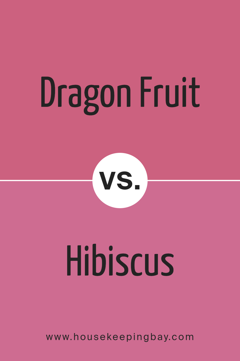
Dragon Fruit SW 6855 by Sherwin Williams vs Hibiscus SW 6851 by Sherwin Williams
Dragon Fruit SW 6855 and Hibiscus SW 6851 by Sherwin Williams are both vibrant, lively colors that can bring energy to any space. Dragon Fruit is a deep, bold pink with a touch of red. This color is strong and makes a statement, ideal for adding a splash of passion to a room.
In contrast, Hibiscus is a lighter, more playful pink with a youthful vibe. It’s less intense than Dragon Fruit and is great for creating a soft and inviting atmosphere. While Dragon Fruit can dominate a space, Hibiscus tends to blend in more smoothly, providing a gentle pop of color without overwhelming.
Both shades work well in creative spaces or as accent colors to inject personality into a room. Their brightness makes them particularly suited for modern or eclectic decor styles.
You can see recommended paint color below:
- SW 6851 Hibiscus
housekeepingbay.com
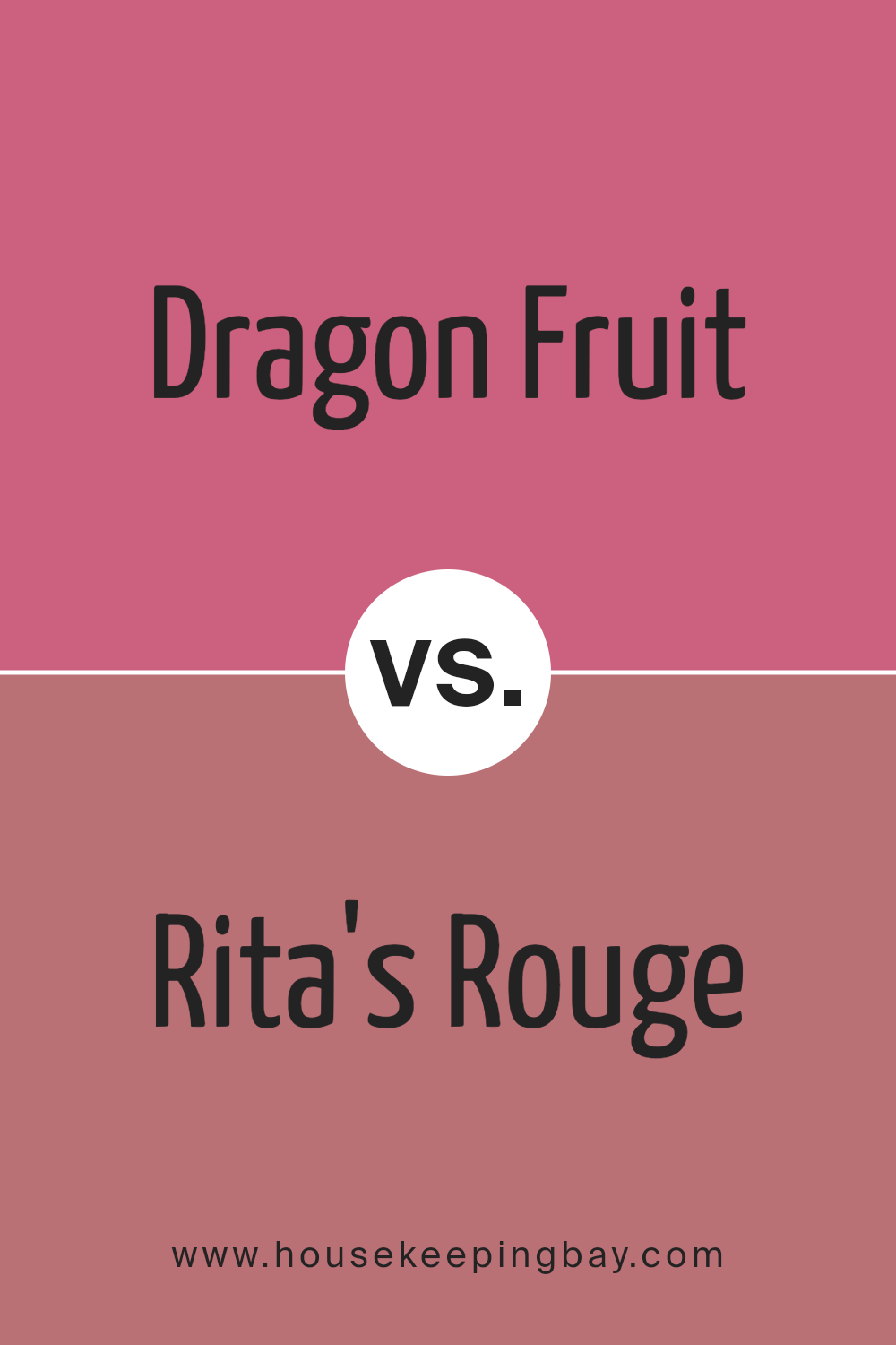
Dragon Fruit SW 6855 by Sherwin Williams vs Rita’s Rouge SW 9003 by Sherwin Williams
Dragon Fruit SW 6855 by Sherwin Williams is a vibrant, bold pink with a playful spirit, perfect for adding a pop of color to any space. It’s bright and can energize a room, making it feel lively and cheerful. In contrast, Rita’s Rouge SW 9003 has a deeper, more subdued shade of red.
This color offers a sense of warmth and sophistication, ideal for creating a cozy and inviting atmosphere. While Dragon Fruit is more striking and potentially overwhelming if used extensively, Rita’s Rouge is easier to blend into various decor styles, providing a rich backdrop without dominating the space.
Both colors can make strong statements but cater to different moods and preferences in interior design.
You can see recommended paint color below:
- SW 9003 Rita’s Rouge
housekeepingbay.com
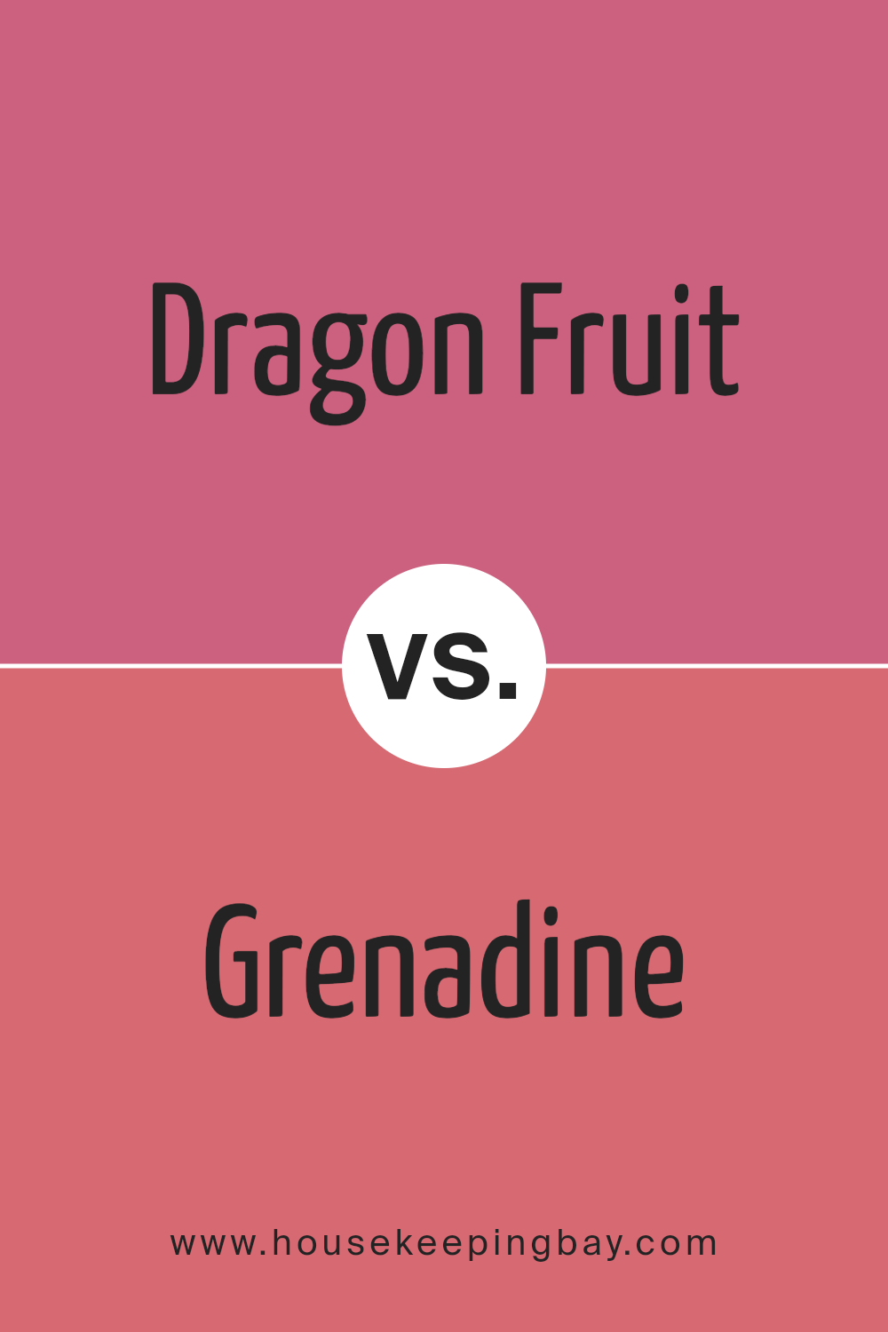
Dragon Fruit SW 6855 by Sherwin Williams vs Grenadine SW 6592 by Sherwin Williams
Dragon Fruit SW 6855 by Sherwin Williams is a vibrant pink shade that radiates a playful and cheerful vibe. This color is bold and pronounced, making it a great choice for spaces that aim to inspire creativity and positivity. Its brightness brings a lively atmosphere to any room, perfect for areas where energy and enthusiasm are desired.
In contrast, Grenadine SW 6592 by Sherwin Williams offers a deep, rich red that suggests sophistication and warmth. This color has a classic feel and provides a strong presence in any space, ideal for creating a sense of comfort and intimacy. It works well in dining areas or living rooms where a feeling of coziness is sought.
Both colors are distinct and can dramatically affect the mood and aesthetics of a space. Dragon Fruit introduces a fun element, while Grenadine creates a cozy, inviting environment. Select between them based on the ambiance you want to achieve in your interior design.
You can see recommended paint color below:
- SW 6592 Grenadine
housekeepingbay.com
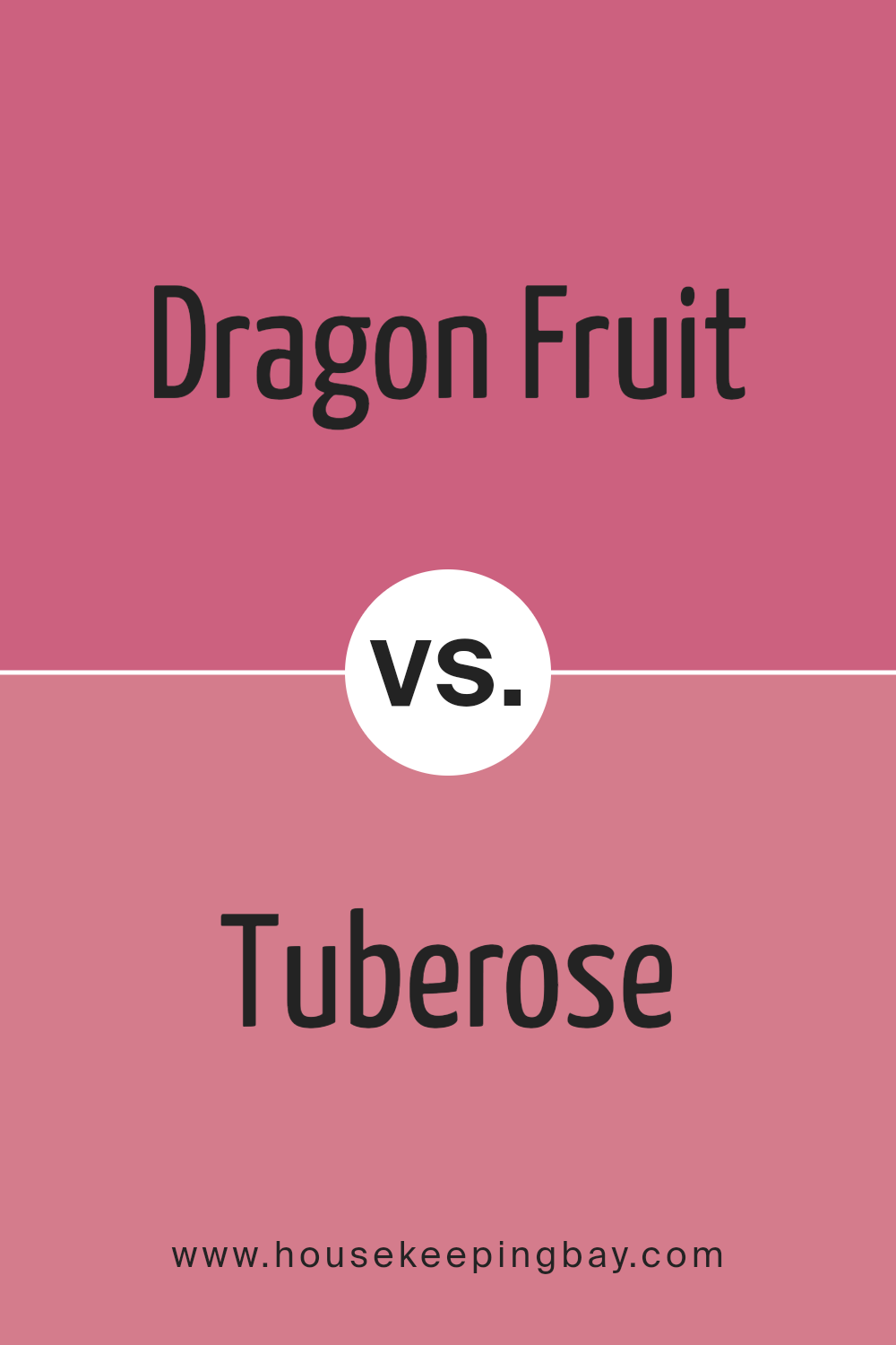
Dragon Fruit SW 6855 by Sherwin Williams vs Tuberose SW 6578 by Sherwin Williams
Dragon Fruit SW 6855 by Sherwin Williams is a vibrant pink shade. It injects a cheerful, energetic vibe into any space, making it ideal for areas that benefit from a lively atmosphere. This color can make small rooms feel larger and more open or add a playful splash to accent walls.
In contrast, Tuberose SW 6578 is a soothing blue with a hint of green, imparting a serene and calm feeling. It’s perfect for spaces where relaxation is key, such as bedrooms and bathrooms. This color tends to make rooms feel cooler and more collected.
Overall, Dragon Fruit is about boldness and energy, while Tuberose leans towards calmness and softness. Both colors offer unique possibilities depending on your design goals.
You can see recommended paint color below:
- SW 6578 Tuberose
housekeepingbay.com
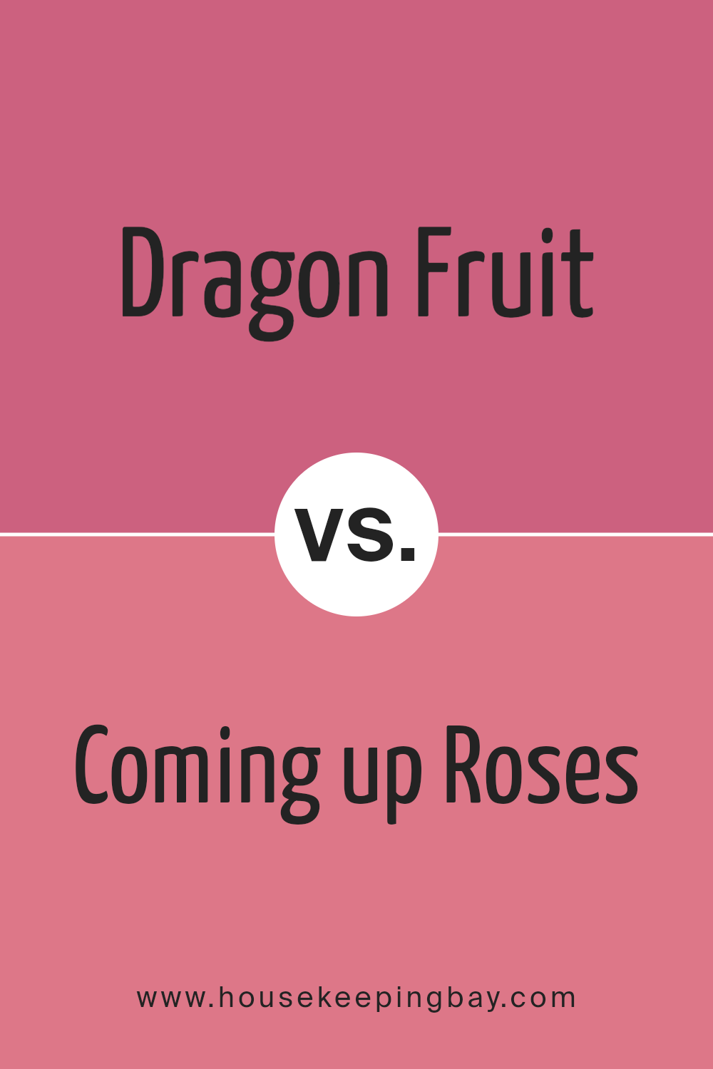
Dragon Fruit SW 6855 by Sherwin Williams vs Coming up Roses SW 6585 by Sherwin Williams
Dragon Fruit SW 6855 by Sherwin Williams is a vibrant pink hue, packed with energy and a vivid flair. It imparts a lively pop to any space, making it perfect for areas that benefit from a dynamic, cheerful ambience. This color could be great in a creative space or a child’s room, where it adds fun and playfulness.
In contrast, Coming up Roses SW 6585 is a softer, more subdued pink. This shade speaks of gentleness and warmth, ideal for spaces where a calming, yet heart-warming quality is desired. It works beautifully in bedrooms or sitting areas where a relaxed, inviting atmosphere is key.
Both colors celebrate the pink spectrum but cater to different moods and settings. Dragon Fruit is bolder and more assertive, while Coming up Roses offers a tender and inviting feel, making each suitable for distinct purposes and tastes.
You can see recommended paint color below:
- SW 6585 Coming up Roses
housekeepingbay.com
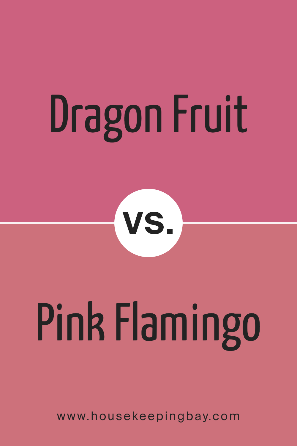
Dragon Fruit SW 6855 by Sherwin Williams vs Pink Flamingo SW 0080 by Sherwin Williams
Dragon Fruit SW 6855 by Sherwin Williams is a vibrant and bold pink, bursting with energy that can really make a space feel lively and playful. It is an excellent choice if you want to create a strong visual impact and add a dose of cheerfulness to any room.
Contrastingly, Pink Flamingo SW 0080, also by Sherwin Williams, offers a softer, more subdued shade of pink. This color is gentler and more soothing, making it ideal for those looking to introduce pink into their decor without overwhelming the space with intensity.
Both colors have their unique appeal: Dragon Fruit stands out with its dynamic and energetic hue, perfect for accent walls or areas where you wish to make a statement. Pink Flamingo, with its calming and less intense tone, works well in larger areas or environments where a restful ambiance is desired. Depending on your decorating goals, each color serves a different purpose but can significantly enhance the aesthetic of a home with their distinct shades of pink.
You can see recommended paint color below:
- SW 0080 Pink Flamingo
housekeepingbay.com
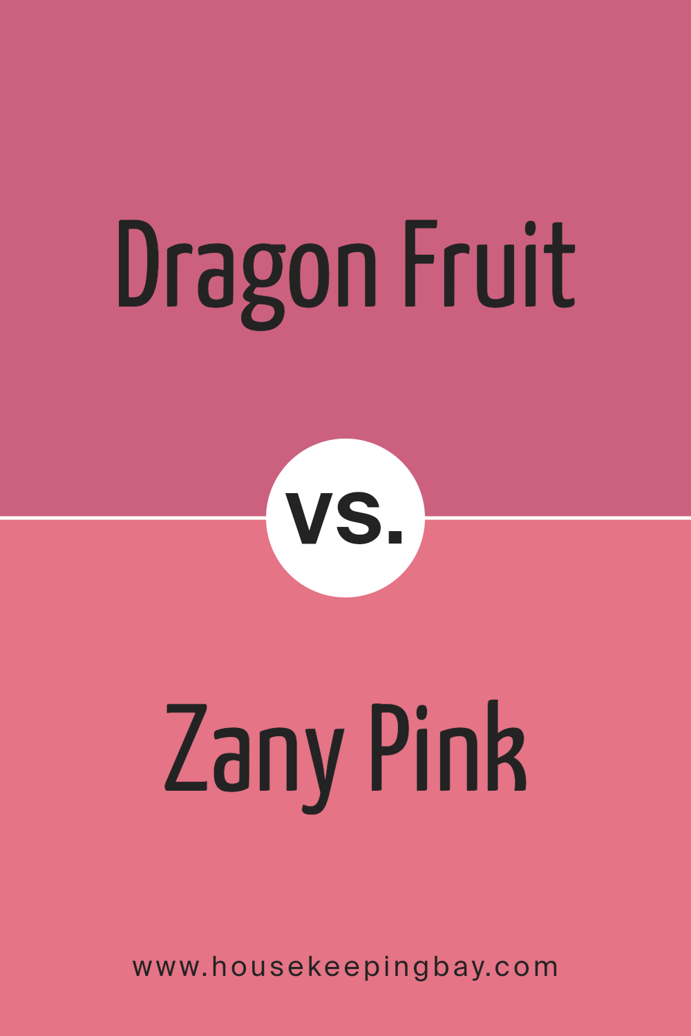
Dragon Fruit SW 6855 by Sherwin Williams vs Zany Pink SW 6858 by Sherwin Williams
Dragon Fruit SW 6855 by Sherwin Williams is a vibrant, deep pink with a touch of red, giving it a bold and energetic look. This shade is perfect for making a strong statement in a space, ideal for accent walls or decor that needs to stand out. It has a lively vibe that can energize a room and works well in creative or dynamic areas.
Zany Pink SW 6858, also by Sherwin Williams, is a brighter, more playful pink. It leans towards a lighter, more whimsical side of pink, which can infuse a space with a cheerful and youthful energy. It’s great for nurseries, playrooms, or any area that benefits from a fun and light-hearted atmosphere.
Both colors share a pink base but differ in depth and mood. Dragon Fruit is richer and more dramatic, while Zany Pink feels lighter and more carefree. Choosing between them depends on the desired impact and the mood you want to create in your space.
You can see recommended paint color below:
- SW 6858 Zany Pink
housekeepingbay.com
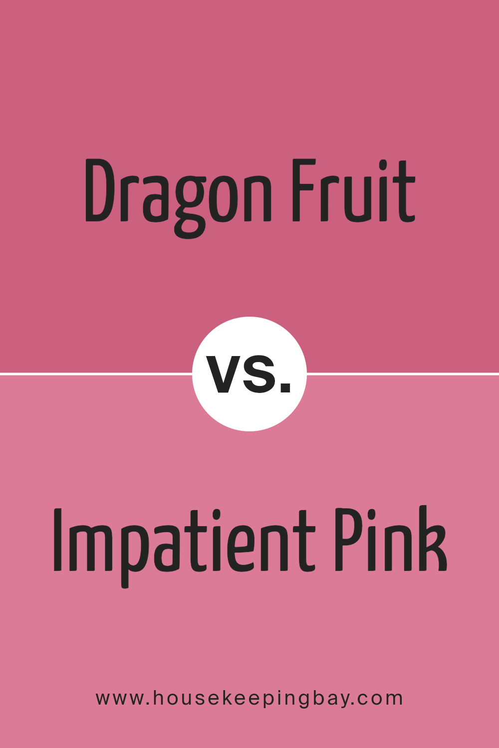
Dragon Fruit SW 6855 by Sherwin Williams vs Impatient Pink SW 6854 by Sherwin Williams
Dragon Fruit SW 6855 by Sherwin Williams is a vibrant and bold pink, perfect for adding a lively splash of color to any space. This shade tends to stand out and can serve as an excellent focal point in a room, particularly suited for accent walls or decorative accessories.
Impatient Pink SW 6854, which sits next to Dragon Fruit on the color spectrum, is a lighter and softer pink. This color is more subdued compared to Dragon Fruit, making it a great choice for those who prefer a more gentle and subtle aesthetic. It works well in spaces that aim for a soothing and gentle feel, ideal for bedrooms or bathrooms.
Both colors share a pink base, but their intensity and impact differ significantly. Dragon Fruit, with its deeper tone, projects more energy and vibrancy. In contrast, Impatient Pink offers a lighter touch, providing a calm and peaceful vibe. Each can beautifully complement various decor styles depending on the desired atmosphere in a room.
You can see recommended paint color below:
- SW 6854 Impatient Pink
housekeepingbay.com
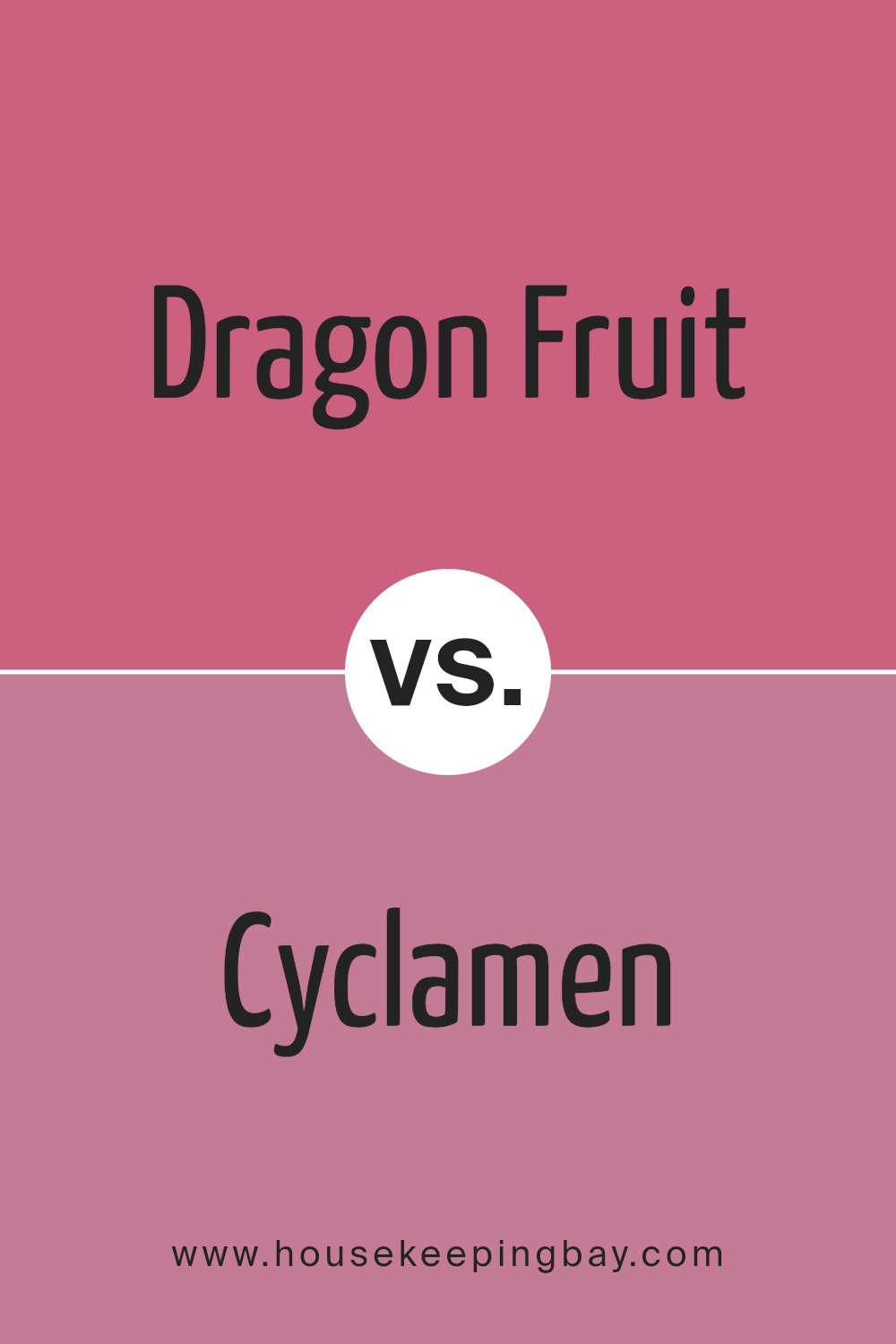
Dragon Fruit SW 6855 by Sherwin Williams vs Cyclamen SW 6571 by Sherwin Williams
Dragon Fruit SW 6855 by Sherwin Williams is a vibrant, bold pink with a hint of red, giving it a lively and energetic feel. It stands out strongly in any space, making it a great choice for accent walls or decor pieces that need to grab attention. This color suits lively, dynamic environments or can add a pop of color to more subdued settings.
On the contrary, Cyclamen SW 6571 is a softer pink, leaning towards a cooler, more delicate hue. This color offers a calmer feel, perfect for creating a soothing atmosphere in spaces like bedrooms or bathrooms. It blends well with other colors, providing a gentle backdrop without overwhelming the senses.
Both colors, Dragon Fruit and Cyclamen, cater to different tastes and purposes in interior design: Dragon Fruit injects vibrancy and energy, while Cyclamen supports subtle elegance and softness.
You can see recommended paint color below:
- SW 6571 Cyclamen
housekeepingbay.com
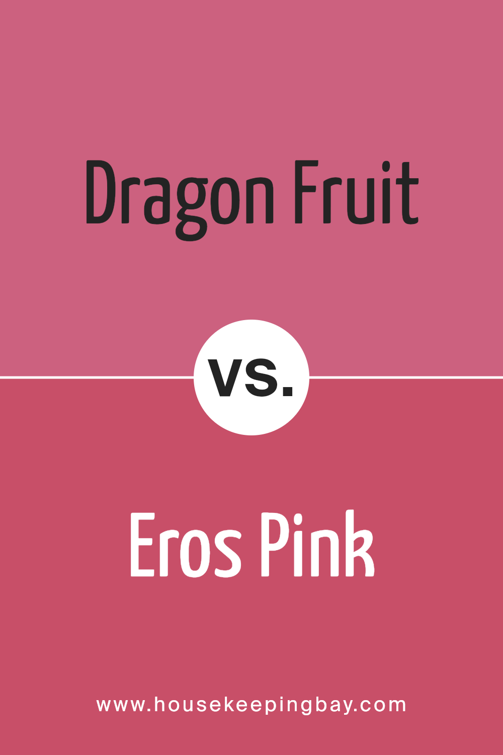
Dragon Fruit SW 6855 by Sherwin Williams vs Eros Pink SW 6860 by Sherwin Williams
Dragon Fruit SW 6855 by Sherwin Williams is a vibrant, deep pink with a bold personality that brings a lot of energy to a space. The color is vivid and can make a strong statement when used on walls or accent areas. It works well in creative spaces or as a pop of color to liven up neutral surroundings.
Eros Pink SW 6860, also by Sherwin Williams, is slightly more subdued compared to Dragon Fruit. It leans towards a rich magenta, offering a sense of sophistication and warmth. This hue is versatile and can be paired easily with both light and dark colors, making it suitable for living rooms, bedrooms, or even offices where a touch of color is desired without overwhelming the overall design.
Both colors can dramatically affect the mood and aesthetic of a room, but Dragon Fruit is typically the bolder choice, while Eros Pink provides a blend of warmth and style without being too overpowering.
You can see recommended paint color below:
- SW 6860 Eros Pink
housekeepingbay.com
Conclusion
Wrapping up, SW 6855 Dragon Fruit by Sherwin Williams proves to be an excellent choice for anyone looking to inject a playful yet confident vibe into their space. As someone who values bold colors that make a real impact, I appreciate how this particular shade can energize a room without overwhelming it.
Its versatility in pairing well with both light and dark accents also gives me the freedom to use it in various decorating schemes. Whether I’m aiming to create a focal point in a particular area or want to add a splash of vibrancy throughout, Dragon Fruit adapts beautifully, ensuring that the rooms feel lively and interesting.
Moreover, its exceptional coverage and color durability help in maintaining the look over time, relieving fears of fading or excessive wear.
Suitable for creative projects and traditional uses alike, this paint color is a reliable and spirited choice.

housekeepingbay.com
Ever wished paint sampling was as easy as sticking a sticker? Guess what? Now it is! Discover Samplize's unique Peel & Stick samples. Get started now and say goodbye to the old messy way!
Get paint samples


