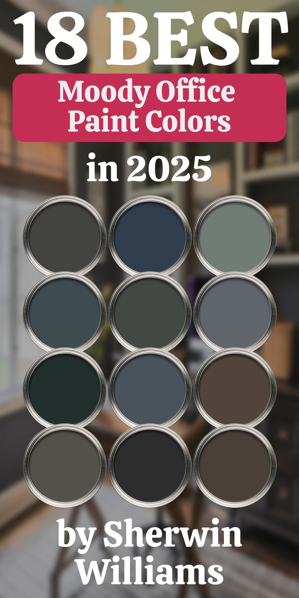
18 Moody Office Paint Colors by Sherwin Williams
Create a bold and inspiring workspace with these deep, rich colors
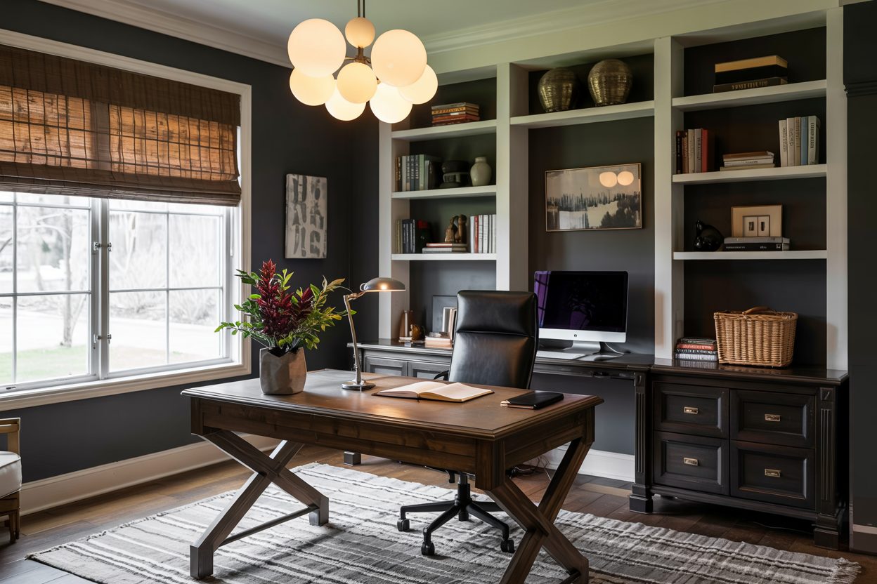
When I think about a home office, I don’t just see a desk and a chair. I picture a place where ideas are born, goals are set, and dreams start to take shape. That’s why choosing the right paint color matters so much.
Lately, I’ve been drawn to moody colors. They have this way of making a room feel important, cozy, and even a little powerful. In my work, I’ve seen how the right deep color can turn a simple office into a space you actually want to sit down and get things done.
housekeepingbay.com
Why Choose Moody Colors for Your Office
Moody colors aren’t just stylish — they can actually make you more productive. Darker, richer shades can create a feeling of calm and focus, which is something we all need when tackling big tasks.
According to a study from the University of Texas, color influences mood and productivity — for example, blues can lower stress, and grays help sharpen concentration .
In my own experience helping people design their offices, clients often say that once they switched to a deeper, moodier color, they felt more “serious” about their work.
housekeepingbay.com
18 Moody Office Paint Colors by Sherwin Williams
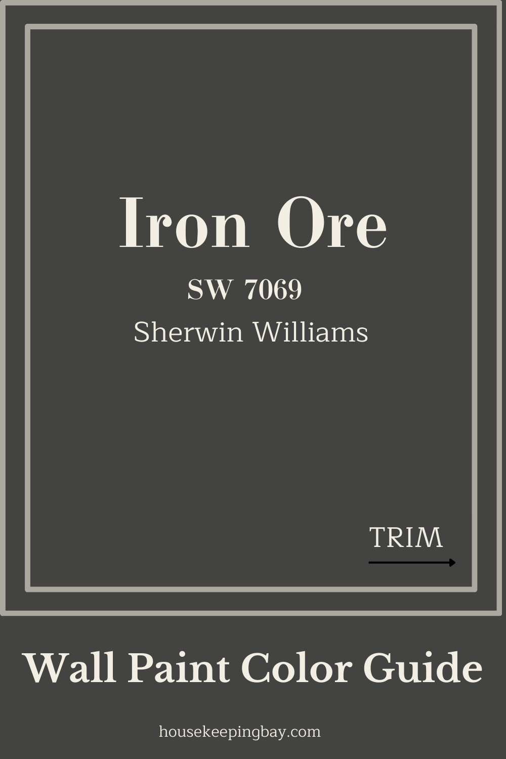
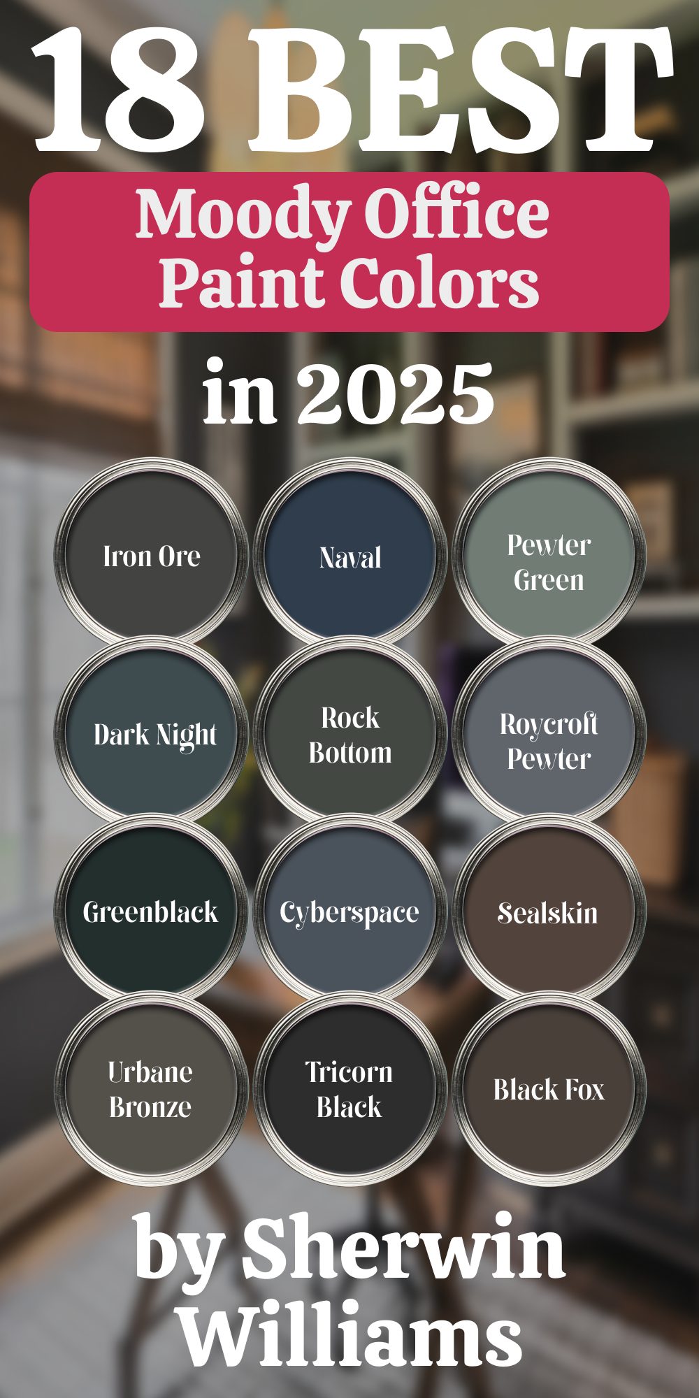
1. Iron Ore (SW 7069)
This color is almost black but with a softness that keeps it from feeling too harsh. I love using it when I want a room to feel grounded but still inviting.
housekeepingbay.com
2. Urbane Bronze (SW 7048)
Sherwin Williams’ Color of the Year in 2021, Urbane Bronze, has a rich, earthy feel. Perfect if you want your office to feel stable and rooted.

housekeepingbay.com
3. Naval (SW 6244)
Naval is a deep navy blue that feels both classic and bold. Frank Lloyd Wright often used deep blues in his interiors to inspire thinking.
4. Pewter Green (SW 6208)
This green has a soft, smoky quality that feels sophisticated but also very calming. I recommend it when clients want to bring a bit of nature inside.
5. Dark Night (SW 6237)
A mysterious blue-green that makes a statement without shouting. It pairs beautifully with natural wood furniture.
6. Rock Bottom (SW 7062)
A rugged, dark olive green that feels strong and quiet. It’s a great background for art or vintage décor.
7. Roycroft Pewter (SW 2848)
This deep gray has a touch of warmth, which makes it easier to live with than a stark cold gray.
8. Greenblack (SW 6994)
As the name suggests, it’s a mix of green and black — perfect if you want something a little more special than basic black.
9. Cyberspace (SW 7076)
A smoky blue-gray that feels very modern. I often recommend it for smaller offices to give them a cozy feel.

10. Sealskin (SW 7675)
A rich chocolate brown that adds depth and a comforting feeling to a workspace.
11. Tricorn Black (SW 6258)
One of the truest blacks out there. Clean, sharp, and strong — for when you really want to make a statement.
12. Black Fox (SW 7020)
Black Fox is a black-brown hybrid. It’s softer than black and feels a little more welcoming.
13. Grays Harbor (SW 6236)
This blue-gray is perfect when you want your office to feel both serious and restful at the same time.

14. Caviar (SW 6990)
An elegant, rich black that adds a lot of character, especially when paired with metallic accents.
15. Studio Blue Green (SW 0047)
This jewel-toned blue-green feels a bit more vibrant but still moody enough for a serious office.
16. Mount Etna (SW 7625)
A smoky blue that’s strong but not overpowering. Works well in rooms that get a lot of natural light.
17. Salty Dog (SW 9177)
A bold navy with a touch of brightness. Great for creative spaces where you want a little extra energy.
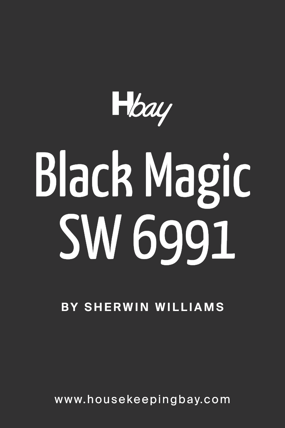
18. Black Magic (SW 6991)
Another beautiful black, but with a slightly softer finish. Very chic when used with gold or brass details.
Tips for Using Moody Colors in a Home Office
When you’re working with darker colors, a few things can make the difference between cozy and cave-like:
-
Use lighter furniture like oak, maple, or white desks.
-
Good lighting is key. Natural light is wonderful, but if you don’t have much, use lamps with warm bulbs.
-
Add different textures — soft rugs, leather chairs, metal lamps — to keep the room feeling layered and alive.
-
Balance the color by leaving some walls lighter if your office is small.
Favorite Combinations I Recommend
Here are a few combinations that have worked beautifully in real offices I’ve staged:
-
Naval + Crisp White Trim + Walnut Desk
-
Pewter Green + Creamy Beiges + Woven Textures
-
Black Fox + Blush Pink Accents + Soft Gray Rug
Each combo gives a different mood, depending on if you want your office to feel powerful, restful, or creative.
The Final Thought
Choosing a moody color for your office isn’t just a style decision — it’s a choice to create a space where you feel strong, inspired, and ready to take on whatever the day brings.
Every time I help someone pick a deeper, richer tone for their workspace, I see the same thing: a new excitement about sitting down to work. Don’t be afraid of the dark. Sometimes, it’s where the brightest ideas are born.
housekeepingbay.com
